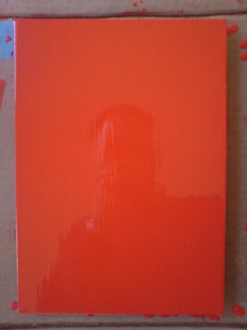
Theoretically, I can get the prep and sanding and tacking and painting of a new coat, and the cleanup, and a bit of documentation, done in a little over an hour now. But I also find it takes a certain kind of hour.
And anyway, I wanted to switch to a roller, and so I went looking at neighborhood hardware stores, to no avail. I explained to one ACE manager what I needed: a roller for laying down smooth oil enamel on steel panel. Yes, it’s primed. No, it’s just a panel. No, can’t spray; it’s custom mixed in a can. Monochr– Just the one color. Not going to paint anything on top of it. He finally said, “It sounds like art.” Well, that remains to be seen. Right now, it’s just a painting.
Well, yes and no. It’s taken me several coats or sessions to realize that I’ve been handling these panels very carefully, like art–but like someone else’s art. Art I’ve bought and need to take care of. I think I’m over that. They need to be made before they need to be conserved.
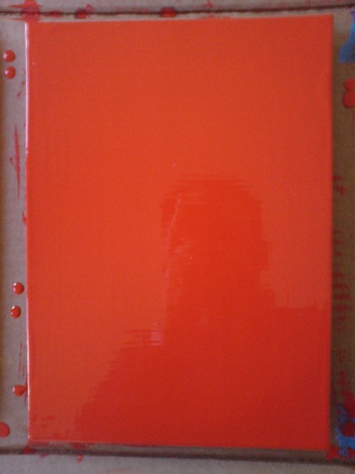
And now that I’m handling them a lot more, and less hesitantly, I’m finding I like the feel of the steel panel [top] better than the aluminum [above]. At least at this gauge, the aluminum is just too light and flimsy. And since I don’t want the metal to have an edge profile of its own, I’m wary of moving up to a thicker gauge.
The sponge brush, well, I’m not sure I’m for it. It does produce a much finer striation than the natural brush I’ve used till now. What I think is that for these layers I know I’m going to sand, it’s not as important. I am interested, though, in how the brush strokes differ, horizontally and vertically, or portrait and landscape [sic or heh, I’m not sure which]. If I can’t get rid of it entirely, I may keep that somehow.
[Note: I missed posting an update #4, but it was sanding, and then cutting the drip/stalactites off, rather than wait any longer for them to dry, which they’d never really do, and then you’d sand across one, and it’d break and shmear like a rood zit.]
Category: projects
You’ll Be My Mirror
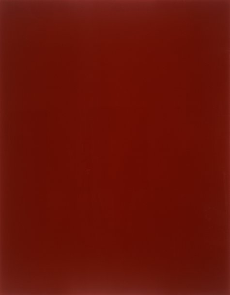
gerhard richter, blood red mirror, cr736-3, 1991, image via gerhard-richter.com via jenettem’s twitter/tumblr to cavetocanvas’s tumblr
You see the problem: this is exactly the effect I’m trying to get with my Rijksoverheid Rood paintings. Only with a brush.
I totally love Gerhard Richter’s mirrors. And his mirror paintings. There was that diptych in Rob Storr’s show. And oh man, that installation at Dia Beacon? I think it was the early gray paintings that helped me into the mirrors. Which is probably why I had never noticed that there were red mirror paintings, too. Of course, the mirrors don’t look like this.
They look like this:
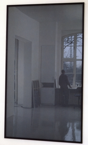
mirror, grau, cr735-1, 1991, image gerhard-richter
There are at least 44 mirror works so far. Including this one I’d never seen, an edition done in 1986 for the Kunstverein in Dusseldorf. I love Richter’s website description of this cork-backed mirror: “This object is not a ready-made but was made to Richter’s specific instructions.”

I think this one sold at Swann last year may have a little chip in the lower corner.
Richter’s specific instructions: make it 210x298mm, a dimension better known as A4. Less well known as the size of the metal panels I’m painting right now.
I think this helps me to sort the things I make into two categories: things I make because other people made them; and things I make and then find out other people made, too.
Marina Knows What She Is Doing.
At the invitation of Jeffrey Deitch, Yvonne Rainer has seen a rehearsal of Marina Abramovic’s performance art project for this year’s MoCA Los Angeles gala. And in a new letter to Deitch, she has refined and reiterated her condemnation of it as an exploitative and “grotesque spectacle [that] promises to be truly embarrassing.”
Would that it were actually embarrassing to the people involved, and to Marina herself. Rainer goes to great, cordial lengths in her open letter to Deitch [reproduced below] to separate her criticism of the gala from Abramovic’s work. While generous, I believe this is incorrect; the only context in which a revolving human head centerpiece on a $100,000 table could be realized is as an artwork. I mean, Abramovic’s certainly not claiming this is just edgy party decoration, is she?
If that were so, the case for embarrassment would be easily made. No, I think the reason this rankles so much is precisely because the gala does take on the mantle of art–and the stamp and stature of the artist. It’s not possible to say that this gala is not art; it is art you cannot afford to experience. It is art that you find humanly, ethically, and socially objectionable. And it is being produced and shown for money in one of our [sic] most reputable museums, by an artist who shows and is celebrated in similar institutions.
That’s a reality of the art world as it’s currently constructed.
Last year between the blog post where I declared the Gala as Art Movement and my presentation on it at #rank, I found two things: 1) Abramovic was deeply engaged in the luxury/sensual/sensory spectacle that is the gala experience’s stock in trade. And 2) Doug Aitken’s MoCA gala Happening was, on one level, a critique of the real estate and cultural forces which used art and museums to shape Los Angeles to serve their own needs. And that critique was utterly and completely subsumed by those very forces, probably without Aitken realizing it.
The Gala is bigger than any artist’s attempt to subvert it from inside the party tent. Aitken tried and failed, but I think Abramovic is just fine with it.
Yvonne Rainer Blasts Marina Abramović and MOCA LA [theperformanceclub.org]
Previously: An Incomplete History of The Gala-as-Art Movement [greg.org]
“Relational Aesthetics for the Rich, or A Brief History of the Gala as Art” [vimeo]
Yvonne Rainer’s revised letter to Jeffrey Deitch, along with its growing list of signatories, is after the jump.
What I Looked At Today: Anne Truitt
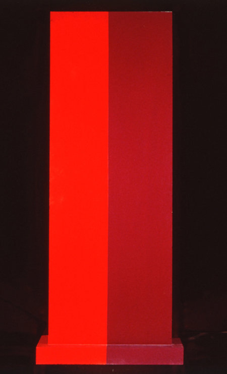
Insurrection, 1962, image: corcoran.org
I needed to see some hard-to-find Chris Burden catalogues–more on that later, but soon–and the quickest place I could find them was the Corcoran School’s library. I called ahead, and they had them waiting for me, so I was in and out of the library in no time.
Which left me with a little time to wander. And there is a very nice gallery with a nice, old Ellsworth Kelly diptych, and this wonderful Anne Truitt sculpture in the center of the room.
Insurrection was installed very dramatically with Hardcastle, another 1962 work, in Kristen Hileman’s Truitt retrospective at the Hirshhorn. Hardcastle confronted you head-on through the doorway, while Insurrection was turned sideways; on edge, with only the slab’s thinness and wooden brackets visible. It was only as you moved around it–following the contours of those unfortunate Karim Rashidian raised platforms–that they switched out: Hardcastle’s heft gave way, and Insurrection widened, revealing that they shared the same structure.
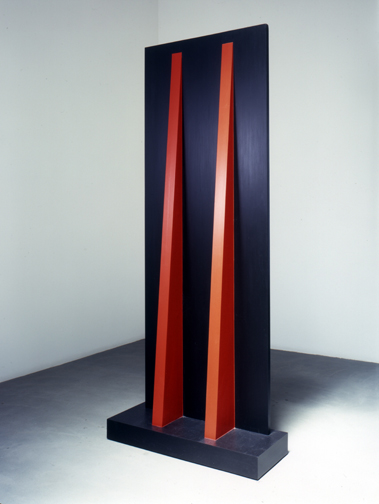
Hardcastle, 1962, via annetruitt.org
The install of Insurrection at the Corcoran, meanwhile, is much less enigmatic. There are off-center approaches from three different sides, so the sculpture is what it is when you see it. Moving around it is an experience, not a discovery. [The full frontal orientation faces the Kelly, Yellow with Red Triangle, from 1973.]
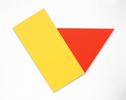
Yellow with Red Triangle, 1973, image corcoran.org
Even though they’re the same shape/structure, I remember Hardcastle‘s monochrome face felt more massive–and then artificial, as its red brackets popped into view. Insurrection’s two-tone reds make it feel more like two volumes immediately, which turn out to be one.
Back down on the floor where they belong, Truitt’s larger sculptures always feel like a presence, in space, and yet they’re paint[ings?] [ed?] And yet there is paint. Maybe 1962 was before her reportedly vigorous sanding and multiple coats kicked in, because Truitt’s surface is most definitely painted with a brush. Kelly’s surface, meanwhile, is only disturbed by the weave of his canvas; I’m going to assume he used a roller. But wow, there’s a brush going around the edges. And how. Just slapped right on there.
I’m trying to better understand the sense of paintings as objects, of the picture plane as nothing of the sort. I didn’t plan today to see these two artists’ works–Truitt’s and Kelly’s–which explore this very idea, in the form of painting/sculpture, but here they were. I still have to look some more, but basically, I came away thinking I might be really knocking myself out too much over my smoothly brushed-on painting surfaces.
previously: many Anne Truitt posts on greg.org
and a little on looking at Ellsworth Kelly
Intergalactic Lens Flares

i love that the headline on this story, “Hubble Directly Observes The Disk Around A Black Hole,” has to be followed immediately by, “but it’s not that disk.”
The spectacular patterns and rays in the photo above of the double quasar known as HE 1104-1805 are apparently imaging artifacts from the Hubble Space Telescope, They’re caused by the circular aperture and the structural elements of the telescope itself.
Meanwhile, the accretion disk is only visible at all because HE 1104-1805 is subject to gravitational lensing, distortions in the light caused by the gravitational pull of an intervening galaxy.
I can’t quite articulate it yet, but there’s something here about the appeal and limits of opticality; the utility and limitations of the narrow, visible part of the spectrum; and the documentation and characterization of distortion that I find very interesting. And then there’s the inextricable relationship between the instrument and its object; which then collapses as the universe itself–the galaxy-as-lens–becomes the instrument for viewing itself.
Hubble Directly Observes the Disc Around a Black Hole [spacetelescope.org, via]
What’s That Strange Disk Around That Black Hole? [discovery.com]
Same But Different: Charles Ray And Le Grand K

I count it as a matter of pride and oddly satisfying accomplishment to learn I’d been thinking some of the same things about the International Prototype Kilogram that Charles Ray was thinking about the International Prototype Kilogram.
Picture Piece: Same but different, the many ur-Kilos [frieze, jan-feb 2000]
Previously: The International Prototype Kilogram, or le Grand K
Here is the International Prototype Kilogram again
There’s No Such Thing As A Free Lunch
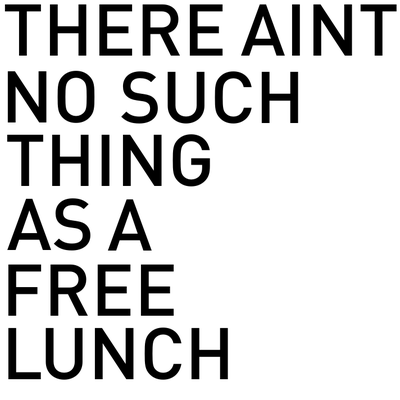
The classic saying, so closely associated with the conservative icon economist Milton Friedman, just sort of came out last night during a brief Twitter discussion with Bill Powhida and Magda Sawon about what, exactly, my point is on Rirkrit Tiravanija’s gorgeous, mirrored objects.
And basically, I think it comes down to my dissatisfaction with what feels like the persistence of a critical adulation of Rirkrit’s socially oriented practice–and, by extension, Relational Aesthetics generally–as anti-market, anti-commodity, gifty experientialism, which does not acknowledge, must less seek to understand and account for, the beautiful luxury goods at the center of so many of these projects.
This seeming contradiction or paradox–I will not call it hypocrisy, at least not on the artist’s part–should be adding a level of complication and contestation to Rirkrit’s work. Instead, it’s reduced to the critical comfort food of free soup and socializing.
I think Rirkrit knows about the “there’s no free lunch” concept, at least on some level. Thanks to Friedman and to Robert Heinlen before him, who popularized the acronym, TANSTAAFL [There Ain’t No Such Thing As A Free Lunch] in a 1966 sci-fi story about lunar colonists rebelling against their earthly overlords, the saying is pretty deeply embedded in the history of postwar liberalism and globalization, the very political and philosophical context Rirkrit’s work engages [and from which he appropriates so many of his forms.]
So now, against my better judgment, perhaps, I think I want to take a closer look at Rirkrit’s practice and the Relational Aesthetics construct from the perspective of Friedman’s foundational libertarianism. It’ll be like opposition research as art criticism. Or maybe it won’t be. To ignore the highly market-oriented aspects of Rirkrit’s work, and focus solely on the dinner parties and sleepovers is to almost perfectly miss Friedman’s point: nothing comes without a cost; it’s just a matter of identifying it and figuring out who’s going to pay.
While no one seems to be paying much critical attention to Rirkrit’s objects specifically, Relational Aesthetics and its evangelist Nicolas Bourriaud have been worked over repeatedly by other critics in ways that can implicate and/or illuminate these shiny baubles. Claire Bishop, Miwon Kwon, and Stewart Martin are just three prominent voices in the debate, which takes RA to task for both feeble anti-aestheticism [Bishop], and for neutralizing and commodifying social practice within the institutional apparatus [Martin]. I really don’t have the chops or the stamina to lay all this out right now [or maybe ever, who knows?] But the Radical Cultural Research Collective’s RA critique critique provides a handy reference point, as does Dave Beech’s horribly formatted analysis of participation.
What I can do right now, though, is ogle this awesome book cover from 1949, which just became a study for a painting I will have to make. This slim book, TANSTAAFL: A Plan For A New Economic World Order by the hard-to-research Pierre Dos Utt, is one of the earliest published references to “ain’t no free lunch.”
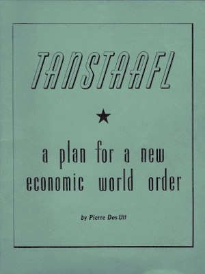
The phrase has its own Wikipedia page, of course.
There ain’t no such thing as a free lunch. [wikipedia]
thanks to Brent for help in approximating Rirkrit’s font for the mockup up top.
Sachs X Ikea X Judd: Great Minds Think Ikea

For he that hath eyes and was paying attention last year, The Selby let him see. For the rest of us, the show at Sperone Westwater is the first time to see Tom Sachs’ awesome Donald Judd furniture hacked together from particleboard scraps from the IKEA AS-IS department.
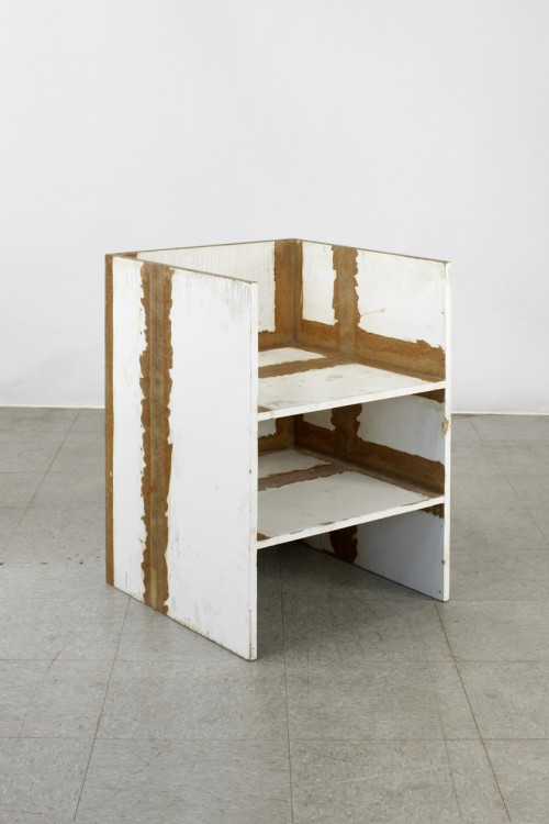
Hacked is, of course, not the right word. The chairs are constructed with Sachs’ characteristic attention to craft and process: they show every drip of resin, every bubble and lump in the fiberglass joinery.
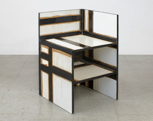
For me, the best part is that the pieces date from 2009. And in November 2009, the first issue of Bricolage Magazine, Tom’s zine, included a feature titled, “Ikea vs Judd.” Because as awesome as they are on their own, they’re even better for not being Enzo Mari furniture.
Tom Sachs: WORKS, Nov 4 – Dec 17, 2011 [speronewestwater.com]
Tom Sachs site [tomsachs.org]
6.14.10 Tom Sachs in his studio [theselby]
Tom Sachs studio film, by The Selby [vimeo]
Previously, resonant, not related: Enzo Mari X Ikea mashup
Richard Prince And Friends
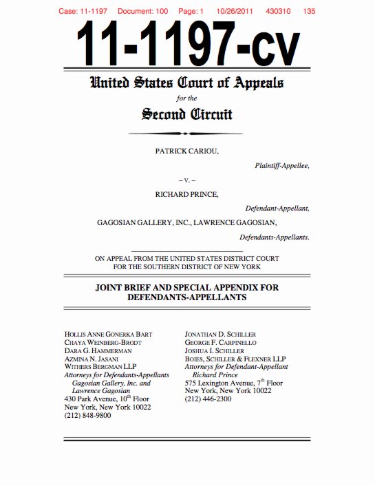
I’ve tweeted on this a bit already, but it’s really worth repeating: Richard Prince’s appeal of the Patrick Cariou copyright infringement decision is a really great read. The brief was filed last week, and I finally got around to reading on Halloween night. I find it makes a very clear and persuasive argument for throwing out Judge Batts’ sweeping ruling, and it’s a nice, not too esoteric discussion of appropriation and fair use as well.
Basically, Prince, his new lawyers, and Larry Gagosian argue that Judge Batts wrongly applied the prevailing legal standards for fair use, especially the most recent, relevant case which had been before the same court, Blanch v. Koons.
I think I’ve written before that Prince’s work, and his first-round defense, relied very heavily on Koons’s winning argument that an artist’s transformations of size, scale, material, and context were sufficient for fair use. But their briefs almost never cited Blanch and did not make that transformative use argument clearly or well. That has changed.
Prince’s lawyers also argue that Batts overreached and erred by finding all 30 of Prince’s Canal Zone works to be infringing, regardless of what, how, or how much of Cariou’s imagery they contained. And that it’s wrong to force Prince to hand over all the artworks to Cariou when the settled precedent of monetary compensation exists.
I think that, at the very least, the court will find that each painting must be evaluated, and that the court will have to decide Prince’s transformative efforts. While I would love to publish such a document, because it would just be the best kind of worlds-colliding art criticism around, I suspect a check will be cut before the judges take out their rulers.
I could rattle on about this all day, but why not just read it yourself? Here is a copy of Prince’s filing, which I’ll host on my Dropbox own site for a while. The 135-page ruling has a lot of very nice, full color illustrations and clocks in at around 7mb.
[OBVIOUS DISCLOSURE ABOUT GREG.ORG AND THE CREATIVE CAPITAL | WARHOL FOUNDATION ARTS WRITERS PROGRAM, WHICH IS COMPLETELY UNRELATED TO THE FOLLOWING PARAGRAPH, HERE.]
And in even more interesting news, Joy Garnett just gave me a heads up that the Warhol Foundation has actually filed an amicus brief in Cariou v. Prince, warning the courts that if Judge Batts’ ruling were to stand, it would put works by other artists in jeopardy, and would cause “such uncertainty in the field as to cause a chilling effect on the creation of new works.” I expect I’ll come back to this after I read it all, but the Foundation’s brief defends Prince’s work as part of a broad, artistic history of appropriation, quoting, and collage. Should be interesting. The Foundation’s 57-pg brief [pdf] is linked directly here.
Previously: the five most ridiculous things about the Richard Prince copyright decision
The Richard Prince decision? You’re soaking in it!
Richard Prince’s Spiritual America
Size Matters?
“THE WITNESS: This could be a cool book.”
“The Movie is called ‘Eden Rock'”
Guggenheim Color by Fine Paints of Europe
Karen Meyerhoff, Managing Director of Business Development at the Guggenheim Museum, and my new hero:
People come to an art museum in part to be inspired by the works of art on view there. And we develop an emotional relationship with those works of art and with the artists that created them.
So much of that emotion is evoked from the imagery and the colors that the artist uses to create that imagery. Color can be…an unconscious communicator. And when we use that color in our living space, we share that emotion with anyone who enters the space.
In creating this second collection, we used our permanent collection at the Guggenheim as inspiration. The permanent collection at the Guggenheim spans from the late 19th century all the way to the present, and we decided to focus on the early part of the 20th century for this purpose.
We had an exhibition on view of–called, “Great Upheaval,” of works from Cezanne all the way up to Kandinsky, and we spent hours and hours in the gallery, working with these paintings, drawing colors out of them.
One of the things that became interesting about that process was that certain colors kept repeating. Not just within canvases by a single artist, but from artist to artist. So it became clear that there was a commonality to this early 20th century palette.
We call the collection The Classical Colors from the Classical Modern period in a sense. And when we had the opportunity to lay these colors out, finally, on a table together, it was very clear that there was this very rich, soft, elegant, classic palette that represented the paintings on view at that time.
These are very complex colors. And we relied heavily on Fine Paints of Europe and their unique tinting system to accurately match those colors and recreate that classical modern palette.
I am nerding out on this so hard right now. The Guggenheim Museum, in “an exclusive licensing arrangement with Fine Paints of Europe, Inc. of Woodstock, Vermont, will introduce two paint collections suitable for residential and commercial use in October 2011.” The “second collection” Meyerhoff refers to above, in a video intro which I transcribed from the website for Guggenheim Color by Fine Paints of Europe, is Classical Colors, “a set of 150 wall colors drawn from much-loved paintings in the Guggenheim’s permanent collection.”
Beyond the concept itself, which is obviously golden–no, wait, it’s conceptually golden precisely because of the art that was chosen, why it was chosen, and how it is being packaged and presented.
Cezanne, van Gogh, Delaunay, de Chirico, Kandinsky, Modigiliani, Gaugin, Pissarro, Franz Marc, whose Stables provides the illustrative detail above. I suspect these artists’ primary commonalities–besides their “very rich, soft, elegant, classic palette,” are being in the Guggenheim’s collection and being dead long enough for any copyright and trademark claims to evaporate.
What makes the Guggenheim Color Collections superior to run-of-the-mill museum merchandise is that it’s actually paint, the stuff the art is made of. Or at least that’s what it’s meant to evoke. Great word, evoke. There’s ample scholarship and conservation data, dissertations and grant-funded research projects galore, on what paints artists actually used. Technology exists to analyze the paint’s spectral and chemical properties with great precision and match it to historical manufacturing information.
None of that seems to have been brought to bear here. In addition to Fine Paints of Europe’s “unique tinting system,” the Collection was “refined.” “Refined in consultation with exhibition designers to ensure the colors are appropriate for a variety of architectural settings.” and “further refined” and “fine-tuned” for a variety of “lighting situations, to precisely match each hue.” These are not recreations, but evocations, and each color “relates to the painting from which it was derived and the artist who created it.”
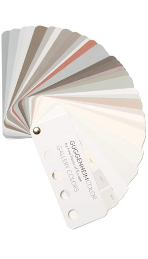
This is distinct from other collection, Gallery Colors, which is–students of The White Cube, rejoice!–actually based on the Guggenheim’s archives of wall paints used in the galleries “by generations of Guggenheim Museum curators, artists, and designers-including Wright himself.” And Jean Nouvel. Up in the middle of the fan there is the charcoal-black he used in the Rotunda for the Brazil exhibit. “These fifty hues,” FPE’s website says, “are intended to guide homeowners and designers in the presentation of art.”
Guide on, Fine Paints of Europe, and art will follow.
Previous Fine Paints of Europe coverage on greg.org, because hello, it’s an officially licensed manufacturer of Pantone Matching System paints: Rijksoverheid Rood
‘The Movie Is Called Eden Rock…’
It’s all in the book, so you could definitely buy it and read about it in depth, but it didn’t occur to me until Brian Dupont tweeted about it [“Aspen : #OccupyWallSt :: St. Barts : Canal Zone. Every apocalypse needs a last stand.”], that there might be a connection between the Occupy Wall Street protests and Richard Prince’s movie pitch.
See, in defending his Canal Zone paintings against Patrick Cariou’s copyright infringement claims, Prince and his lawyers repeatedly cited The Pitch, a 1.5 page text for a post-nuclear apocalyptic movie called Eden Rock in which Cariou’s Yes Rasta photo subjects were one of several tribes. The strategy–failed so far–was apparently to demonstrate how completely Prince had transformed Cariou’s work, thus obviating the infringement claim.
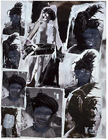
Prince included the The Pitch text in Eden Rock Show, a brief 2007 exhibit of a large collage/painting made up of pages from Yes Rasta at St. Bart’s Eden Rock Hotel. It was included in court exhibits in Cariou v. Prince and, like I said, is in the Selected Court Documents &c. book.
When I started typing this, the way I had remembered The Pitch had me thinking it is occasionally starting to sound like a future documentary, minus the global thermonuclear war part. Now that I’ve re-read and typed it all in I don’t think that anymore. But I’m not so sure Prince agrees with me. But as the view from his position as a pessimistic artist in the lower reaches of the 1%, but not of the 1%, it does have a certain authenticity, and so I thought The Pitch is worth posting:
The Pitch
Charles Company, his wife, son and daughter arrive at the St. Barts airport, late afternoon two days before Xmas, he’s meeting up with his brother and sister-in-law… staying on the island for a couple of weeks…vacation…As he’s landing, he sees out the window a lot of people running around…general commotion.
As the plane taxis up to the gate he asks the pilot what’s going on…
As the Company family disembarks the plane, there’s more pandemonium…
People grabbing, shouting, some hysterical…it’s a tiny airport, but there’s an overload of people waiting to get thru customs and many people literally “crying”…they’re “crying because there are no planes going out…no planes returning to St. Martins…returning to Miami…returning to NYC…returning to London…returning anywhere…
There are no returning flights because these cities and many other major “areas” in the continental U.S. and Western and Eastern Europe have just been obliterated by nuclear attack.
Charles Company and his family are informed of this fact and seemed to melt into the tarmac under 88 degree temps…holding their bags, their backpacks…what will come to be as all their worldly possessions.They hook up with Charles’s brother, who will fill them in with a bit more detail on the events “round” the world. “What are we suppose to do?” is Charles’s wife’s first question…
“There’s nowhere to go”, is the first answer.A good part of the world, “most” of the world, has been nuked and they are here on a tiny French island in the middle of nowhere…which in a year’s time will become part On the Beach, part Lord of the Flies.
Background: Charles is 55, has no military background, is pretty much out of shape…makes his living as an architect.
To make this pitch even shorter I’m going to cut to a year later…
People on the island have broken up into “tribes”…most of the houses have been ransacked and all of the hotels occupied.
Charles Company is now Charlie Company. He has been exercising. Hes also learned to load a weapon, field dress a wound, cook without a fire. His daughter is the #1 scavenger…
He his wife, son and daughter, brother and sister-in-law, (along with several followers) have taken over the Eden Rock Hotel. It’s headquarters.Stockpiled. A Mini-Mart. As best a fortress as can be under the circumstances. Everything is rationed, everything is “used”…
Next: Charles’s son is standing lookout. Thru his telescope out in the ocean he sees what appears to be a periscope…he sounds the alarm…The movie is called Eden Rock…
[from an October 2008 email prepping for the Canal Zone show at Gagosian]
Additional Eden Rock/Pitch Material written MARCH 2008–
More on Eden Rock
1. Rastas and Reggae…they escape from one of the Cruise ships, (they were the band aboard the ship) three days after the bombs went off. They go to the Hotel Manapany. Six band members, two roadies and a manager.
2. The Backpackers…these are college kids, use to spring breaks, know nothing of responsibility or the real world.
They gather first in bars then take over a small hotel just above Shell Beach. They keep partying, drinking, smoking..they are the first to “go native”…the first to smear “war paint” on their bodies…they’re also the first to get wiped out…3. The Amazons…Four Lesbians who escape a second Cruise ship, who bring along part of hte crew and take over the Guanahani Hotel. These are large well built women along the lines of Shena Queen of the Jungle, Wonder Woman, Cat Woman, think Raquel Welch meets Linda Hamilton in the Terminator. Their outfits, hair and make-up remind us of Road Warriors…
4. The Ultimate Ones…this tribe is made up of rich, affluent masters of the universe…these are guys who own the huge private boats parked in Gustavia…they have the loyalty of their crews, they have their own weapons and in the beginning access to food and water. They quickly make deals with the local St. Bart police force. They stay on their boats at first but then take over the Ill de France hotel…these guys are use to privilege and shaping the future…they don’t take “no” for an answer…they believe they “own” the island and everyone is their subject…several come to be assassinated, held hostage, and hanged upside-down…in an opening scene one of them is pictured buried up to his head in the sand at Saline Beach with the tide coming in…
These are the four main tribes along with Charlie Company…
Charlie Company represents “family”
Rastas and Reggae represents “The disenfranchised”
Backpackers represent “alternative”
Amazons represent “sex”
Ultimate Ones represent “power”Richard Prince
—– End of Forwarded Message
[spelling and punctuation original]
Previously: Canal Zone Richard Prince Yes Rasta: The Book
Here Is The International Prototype Kilogram Again
Ever since Wired’s article on the history of the International Prototype Kilogram, or Le Grand K, and the debate over its replacement, I’ve been thinking I’d write something about them again. So I went back to reread my 2009 post thinking about the kilos as both minimalist objects and conceptual constructs, and the occasional appearance of the IPK in other art contexts. And then this one looking at some of Walter de Maria’s early shiny metal objects.
So far, though, the only result has been having this guy and his silicon orb popping into my face a couple dozen times a day as I switch browser tabs.
![]()
Not nothing, but no great breakthroughs yet. I’ll keep you posted.
Rijksoverheid Rood 3: Missed A Spot
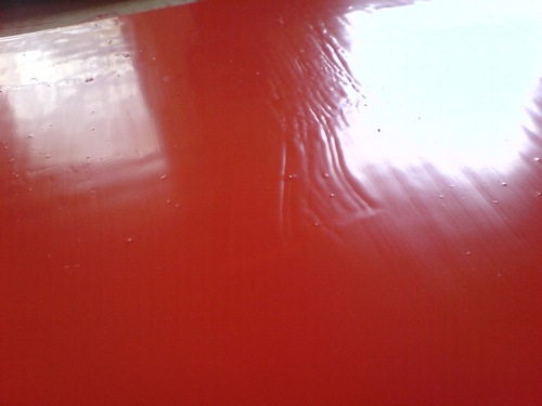
I now know that the bubbles sand right out. But what I learned this time is the importance of checking to see if you missed any spots in your smooth, monochrome surfaces before you clean up your brush and your workspace.
I ended up touching this up not too well with some scavenged drips and a leftover sponge brush. Obviously, it will not survive the next sanding.
Untitled [Extra Street View]
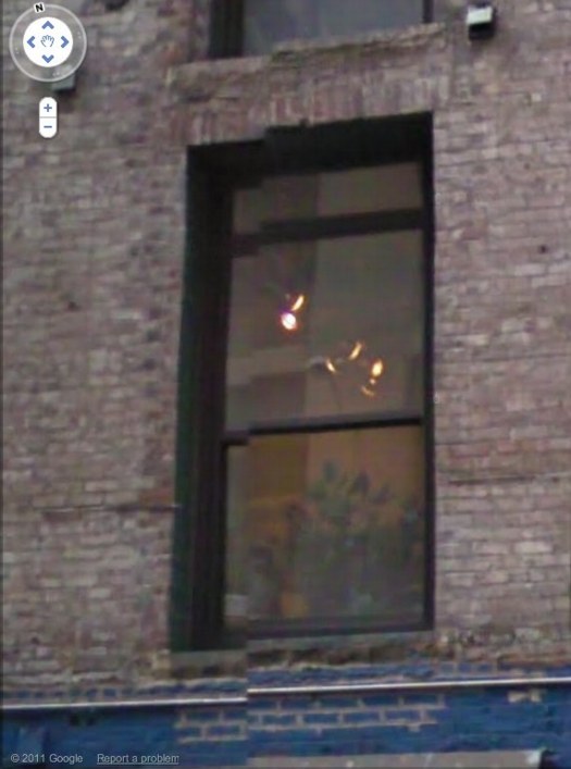
I’m bummed to miss it but “While You Wait,” a group show organized by Brian Dupont in Extra Gallery, his Chelsea art firm’s expropriated lobby is opening right now. [Spoiler alert on the venue’s lobbyness? I can’t quite tell, but I figure it’s clear from the show’s press release.]
Anyway, after Brian invited me, I was trying to figure out what I might do, and saw this image of the building–and the space’s window–on Google Street View. And then it was obvious.
I’ll write some more about the piece later; right now I’ve got to pick up the kid from riding lessons. I mean, proletariat lessons.
OK, comrades, I’m back. Basically, Google Street View is increasingly the first impression, the reference point, even the authority of sorts, for the new places we go in the physical world. In Extra’s case, the distinguishing feature of its unassuming architecture is the mismatched seam Street View gave it. Untitled [Extra Street View] is an attempt to approximate that digital reality in the physical experience of the building, to sort of sketch it into the space. Or maybe to capture it in one spot–the window–or one perspective, from inside the place you’ve just traveled to, looking back toward the pano-mapped street. It’s like a shot reverse shot between the viewer and the Google cam.
Extra Street View
So I got the piece installed last night for “While You Wait…”, organized by Brian Dupont. It really only works in the daylight, so I won’t know yet how it actually looks, but it went in just as I expected it would.
I like this little corner detail here, sort of an Urs Fischer meets William Anastasi meets Roni Horn on Google Street View kind of thing.
