
image of the front page of the Feb. 26, 1942 LA Times, via framework.latimes.com
Back in 2007, this blog experienced a notable conceptual shift, when I found myself writing about things, works of art, I guess, that I wanted to exist, not those that actually existed.
An early example: a historically accurate re-enactment of the “wigwam” of searchlights photographed by the LA Times on the night of Feb. 23, 1942, the infamously hapless false alarm/gun battle/freakout known as the Battle of Los Angeles.
Researching along those searchlight lines led to the discovery of other awesome but implausible subjects for artistic reincarnation, such as the fantastical “dazzle lights” camo apparatus of legendary British camo officer/magician/bullshitter Jasper Maskelyne. And of course, Frosty Myers’ great arc light pyramids, first assembled in the four corners of Tompkins Square Park.
Yes, well, I guess we can move the Wigwam from the list of things I have to re-create someday to the list of things that have, in some way, at least, been re-created.

Last year, some guys from SyFy replicated the searchlight Wigwam in the desert for a bogus investigative show called, “Fact or Faked: Paranormal Files.” They were apparently trying to reproduce the flying saucer-shaped object caught in the apex of the beams in LA Times’ photo, which has apparently been cited as evidence of a military UFO coverup. Really.
The Times’ TV critic Ed Stockly had all the details. Including the show’s complete lack of interest in checking the actual photo, or the negative, both of which are in the Times Archive at UCLA. And which show clear evidence of being altered. The UFO is Whiteout. The beams are painted, the skyline is inked. The whole thing was retouched to make it reproducible for the printing presses of the day.
In the Times’ LA history blog, Larry Harnisch gets all Errol Morris on that photo’s ass, posting seven long times about it. [Take it from one who’s learned the hard way, Larry, strings of minutiae-filled posts are not enough to make a blogger Errol Morris.]
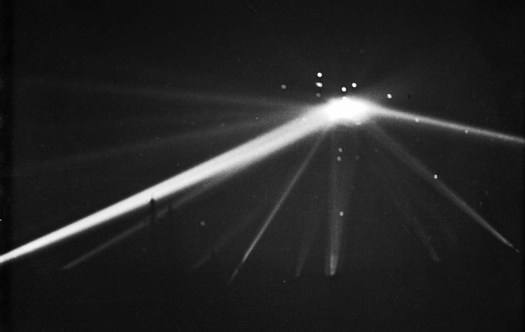
Meanwhile, Scott Harrison’s examination of the Battle of LA and the negative issue at the LAT’s photoblog, Framework is plenty for me. Plus it has better images. The original negative, above, is quite beautiful as is, and it is now on my list of negatives to visit in Los Angeles. And I think I will add printing it old school to my list of projects.
Original post mentioning the wigwam of lights
Category: projects
Rijksoverheid Rood 8: A Whole New Kind Of Sanding
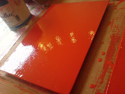
OK, this sanding thing is completely new now.
Before, when I was using the brush, I’d be sanding down drips and bulges around the edges of the panels, and hoping to even out ridges in the brush strokes.
Now that I’ve sanded my first coat of enamel laid down with the roller, though, it feels totally different. The amount of paint that goes on seems like much less–there are certainly no excess drips over the edges. And the slightly eggshell-y, all-over surface levels out a bit, but not completely when it’s dry.
But the big difference are these tiny bubbles, which end up sanding right out, giving the whole surface a pretty smooth touch.
It’d be easier if there were no bubbles, of course. I’d love to paint a coat, have it dry, and see that it’s finally the perfect, featureless, skin-like smoothness I want. But the bubbles showed up again in the new coat [above]. Maybe I’m shaking the paint too much, or not letting it sit long enough, when I open it? But such bubbles couldn’t transfer from the can to the sponge. I suspect they’re coming from the roller, which is probably not saturated enough.
Anyway, it’s working. Which is nice.
On Man-Made Painting After Google
I haven’t yet decided whether to more proactively engage the growing numbers of people who use Google as medium or subject for their artmaking, or to forge ahead alone, buoyed up by the certainty of my own unequaled, Googly aesthetic and conceptual brilliance.
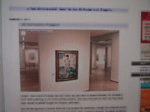
detail of Reconciliation (after @gregorg after thompson after allen [maybe])…
CanvasPeople® probably non-archival inkjet print on canvas
11″ x 14″
2012
Signed Edition of 1 (+ infinite unsigned APs), POR
But then Man Bartlett comes up with a sharp, funny project that turns out to relate directly to my lingering anxiety over what I think of, what I make, what I try to get out there, and how well [or not] I do it.
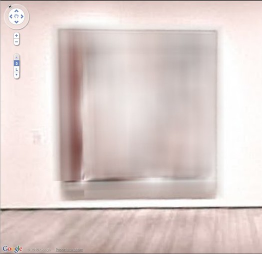
study for Untitled (After Google Art Project, les Demoiselled d’Avignon), 2011
So last year–a year ago today, in fact–my immediate reaction to the launch of the Google Art Project was to zoom in on the blurred out paintings that MoMA hadn’t gotten copyright clearance for–including les Demoiselles d’Avignon and several other iconic Picassos–and to suggest they must now be painted as Google had–there’s no other word–overpainted them.
And then last month, I see that an artist named Phil Thompson had sent screengrabs of the blurred paintings to one of those Chinese painting factories, and has now unveiled the work as his Copyrights project. Which is fine, if not at all how it should be done I’d do it.
But which nonetheless made me tweet about the twinges of annoyance caused by my no-doubt outmoded sense of authorship and originality:

Which prompted Man to take a screenshot of my blog post, pixel-blur everything but the blurred Google Art Project image, and order a print-on-canvas of it. AND a Chinese painting mill cover version. All of which are for sale, and which are hilarious. Though I will let him reveal the Chinese copy in his own good time. It really is awesome.
Reconciliation (after @gregorg after thompson after…) [manbartlett.tumblr.com]
Previously, painfully related, feb 2011: les Blurmoiselles d’Avignon
nov 2010, because it really does come back to Richter, it seems: Blurmany and the pixelated sublime
Rijksoverheid Rood 8: Better Roller
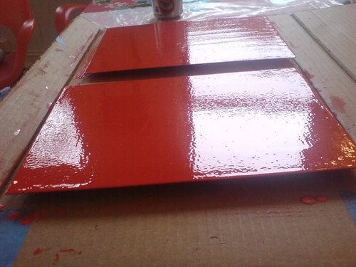
Alright, I think we finally may be onto something. I switched to a high-density foam roller for this next coat, and though it looks kind of eggshelly in the photo, it actually ends up drying to a smoother finish than any brush so far. And it uses less paint, which means no drip/stalactites around the edges, which need to be cut/sanded off.
The rhythm is sort of set now: when I start a new coat, I flip the panel over and wetsand and tack the coat from two sessions prior. That way, the coats go on each side sort of interlaced [I’m painting both sides, and I think it’ll be done when the panel builds up a sufficient edge of paint, not support, and there’s a pretty clean, non-painterly surface with no discernible front/back.] They’re not there yet, but it now seems like they will be.
On the question of posting this kind of log/journal-style info, yeah, it’s still kind of boring to me, mixed with a bit of incredulity that really, why would anyone care? But that’s fine.
Because one of the things I’ve found is that these posts almost always draw out some helpful and interesting emails from people who know paint far better than I do. So it’s really nice to hear from people, to get advice and feedback, to check my assumptions, and to see what other people are doing.
Part of my decision to paint was to learn what it’s really like, to see what paint does, how it behaves. And part of it was definitely to actually see some particular objects in person that I’ve seen in my mind, and which I haven’t really found anywhere else. So it’s all pretty good.
What I Looked At Today: Jean Arp
It’s funny, all this time I’ve been looking hard at the brushstrokes of modernism, abstraction, and monochrome, trying to figure out how they were made–and, thus, how I might make some paintings myself–and I’ve ignored Jean Arp.
When I started wanting to figure out how to do crisp abstraction, I went to look at Dove and Mondrian, only to find drawing & filling in. Sheeler’s precisionist paintings were actually paint-up-to-the-pencil-line sketches.
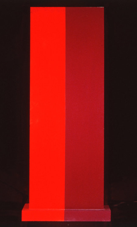
When I started wanting to figure out monochrome objects, I looked at Truitt in front of Kelly, and surprised myself to find brushstrokes just all over the damn place.
Still, Truitt’s still Truitt, and Kelly’s still Kelly. I was at the National Gallery yesterday, accompanying the kid’s field trip, and their Truitt is pretty slick. And of course, their Atrium Kelly seems fantastic, if hard to see from the ground.
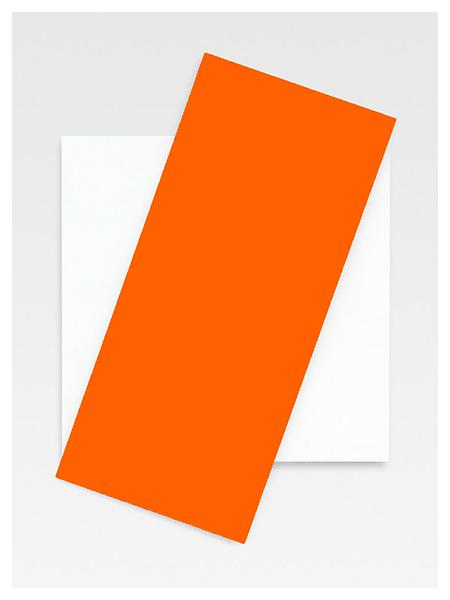
Orange Diagonal, 2008, via matthewmarks.com
And Kelly, talking about his recent relief paintings, did tell Carol Vogel, “What I’ve made is real — underline the word real. It becomes more of an object, something between painting and sculpture.” Which I am totally onboard with.
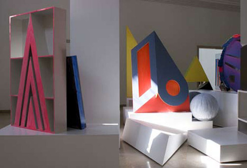
But which also suddenly reminded me of something I’d read about Thomas Scheibitz a few years ago, from a 2008 show at the Camden Arts Centre:
Scheibitz has developed his own grammar for painting on sculpture, which like his paintings, bows simultaneously to a residual interest in illusionism and representation and at the same time relishes the drips, splashes and material traces that are the legacy of painterly modernism. Indeed the whole point of painted sculpture rests upon it being a real object in space, which simultaneously inhabits an “artificial world”, by virtue of its disguised and painted exterior and its imagined and constructed form. It therefore exists in that realm of “second nature” that Scheibitz describes as the location of his work: the paint helps to suggest that the sculpture has a correlative in the “real” world, while simultaneously undermining any such belief. [emphasis added]
Which at one point, I guess I thought I was onboard with, but now I guess I either don’t understand or believe anymore. About Scheibitz’s undermining, that is. Painted sculpture is just not not real; it’s paint. On sculpture. Paint on an object. If line or color vary from form, I don’t see why that has to be illusory or not “true to the material.” Can’t it look like one thing at first, until you look more closely? Tension or complexity is feature; it shouldn’t all boil down simply to instant perception. I think this is particularly true in Scheibitz’s case as well as Truitt’s and Kelly’s.
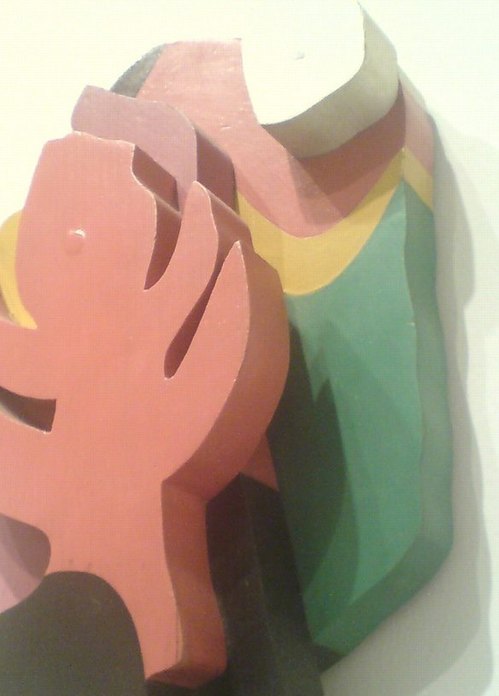
The Forest, detail, 1916, nga has no image
And finding myself with time to stare at Jean Arp’s painted reliefs yesterday doesn’t change that one bit. First off, they are fantastic. The surface is slick, smooth, pristine, nonpainterly.
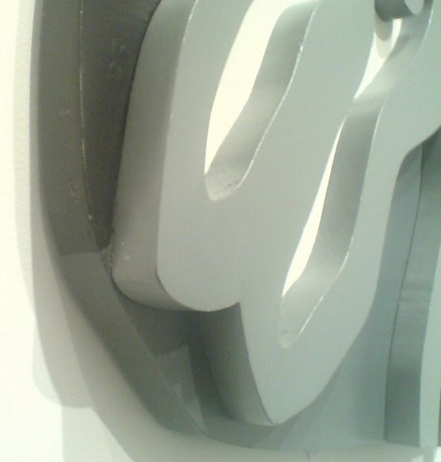
Shirt Front and Fork, detail, 1922, for which nga also has no image?
Without planning to take up Arp in relation to Kelly, Scheibitz, or Truitt, I found myself impressed by these painted lines, painting on wood. They exist apart somehow from the painterly modernist practice of their time, and seemingly in transgression of sculptural modernism, and yet they’re real. Underlined.
I don’t really know much beyond the Mod101 slideshow blurb about Arp, but I guess I’ll start digging and looking.
Dutch Camo Landscape Painting Painting – 2
Another Sunday painting. Or another Sunday spent painting.
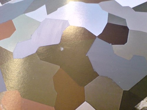
I did another round of taping off and painting on the Dutch Camo Landscape photo of Noordwijk today. The first time, I did two identical gray polygons This time, I did three, with different greys.
The taping is the most time-consuming aspect of the process, the mixing the most uncertain, and the painting itself the most anti-climactic.
Not really knowing anything about color systems or theory, I’m just eyeballing each match. At the moment, there’s something going on, I think, with the way the polys get grouped; I mix one grey, then change it for the next, and then the next. They end up being sequential in a way, related to each other, composed of the same constituent pigments. Until they’re not; the last poly was turning out to be not just lighter, but pinker, redder, and so I gambled and added a new paint, a single drop of red oxide, which blew the whole thing. It eventually came around, though.
Though I’m clearly counting on it somehow, I don’t know what’ll happen when I try to paint next to an already-painted polygon. I mean, on the one hand, I don’t know how paint will handle the tape. On the other, there’s a ridge there now. So I could just paint up to it. But that’d mean some edges will be taped and crisp, and others will be brushed.
At this point, I guess I’m still seeing if paint actually does what I think it’ll do when I do it.
In unrelated news, that brown poly in the center of the photo looks kind of like Iraq.
Rijksoverheid Rood 7: Roller
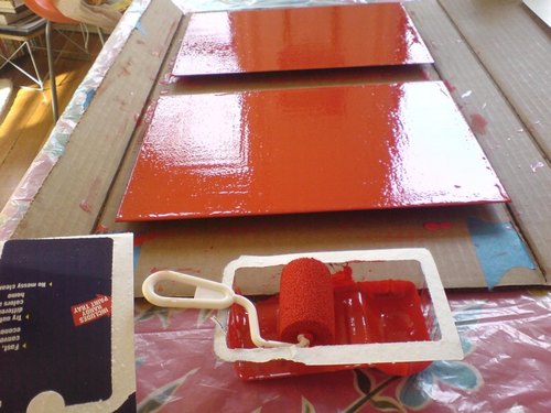
Well, that was a total surface disaster.
The size and disposability of this crappy little foam roller made it irresistible. The bubbly eggshell finish that even contains a few crumbs of foam made it a total failure putting paint down on the monochromes.
The instructions on the back are so specific, I was tempted to call following them a conceptual conceit:
- Pour 1/2 inch of paint into tray
- Roll back and forth on slanted section of paint tray to load roller thoroughly
- When painting, increase pressure on roller as it dispenses paint to pull paint from inside the foam reservoir
- Performance improves as roller becomes fully saturated with paint
- Finish with light strokes
But no.
On the bright side, there aren’t any brushstrokes.
FEW HOURS LATER UPDATE: OK, maybe it’s not so bad. The eggshelling thing is a bit subdued, but there’s far less paint per coat with a roller, no drip, and it’s generally smoother overall. I think I will continue with them a bit and see how it sands and builds up.
Previously: Rijksoverheid Rood paintings: the making of
‘Imagine A World Of Spots.’
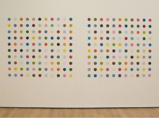
John, John, 1988, installed at Ann Temkin’s Color Chart show in 2008, via moma
Alright, before this thing gets too much farther, let’s check what we know. From the Gagosian Gallery exhibition page::
The exhibition will take place at once across all of Gagosian Gallery’s eleven locations in New York, London, Paris, Los Angeles, Rome, Athens, Geneva, and Hong Kong, opening worldwide on January 12, 2012. Most of the paintings are being lent by private individuals and public institutions, more than 150 different lenders from twenty countries. Conceived as a single exhibition in multiple locations, “The Complete Spot Paintings 1986-2011” makes use of this demographic fact to determine the content of each exhibition according to locality.
Eleven galleries in eight cities. “More than 300 paintings,” exhibited, if I read this correctly, based in part on the locations of the lenders. I recall reading that around a third of the paintings will be for sale.
So the Spot Challenge could be a shopping trip for someone, someone looking for just the right spot painting. Which, interesting, they used to be [still are? are also?] called Pharmaceutical Paintings, and a 2006 Sotheby’s catalogue entry starts the series in 1991, not 1986. Writing for Tate Modern in 2009, Elizabeth Manchester noted that the series began with a definitive suddenness in 1988, at the Hirst-curated group show, Freeze.
She also says there were over 800 spot paintings at the time, and that, “In 2004 Hirst announced that he would end the series, soon.” Well, I believe there are now over 1,200, which seems to complicate the name of the 300-piece Gagosian show: “The Complete Spot Paintings.” Perhaps the clue is in a quote from the catalogue for Hirst’s 1996 Gagosian show:
I want them to be an endless series, but I don’t want to make an endless series. I want to imply an endless series … Imagine a world of spots. Every time I do a painting a square is cut out. They regenerate. They’re all connected … this is more sculpture than painting. I guess it’s infinity … I don’t like the idea of doing them forever because it implies that there is no escape. I like the idea of working it out of my system before I die. I like to imagine that art is more theatrical than real. So an involvement forever is real whereas an implied ‘forever’ is theatrical.
Maybe “Complete” is not “total,” but “finished.” Or maybe an implied finished.
But there’s plenty of time for this later, if necessary. Back to the Challenge. How, exactly, is this supposed to happen? Because Carol Vogel’s description is pretty vague:
unless a private plane is at your disposal, and money is no object, it’s anyone’s guess how much the airfare to tour the galleries would cost; some clever folks might be able to use air miles or get a lucky last-minute deal.
Plane, money, airfare, frequent flyer miles, luck. In fact, Vogel’s ruminations are each more unhelpful than the next.
In addition to money and means, to see all 11 shows, in 8 cities requires time. Sure, you might travel regularly along one or two axes between Gagosian-blessed cities–New York London, NYC-LA, London-Paris, LA-Hong Kong, even. But I’ll bet that no one not named Gagosian will already be in all those cities, plus Rome, Athens and Geneva, between next week and the end of February. So picking up these off-the beaten path galleries will require effort of anyone. Effort and time. And money, of course, but in this case, that’s a given, and so the real constraint is time, or time and money in just the right combination.
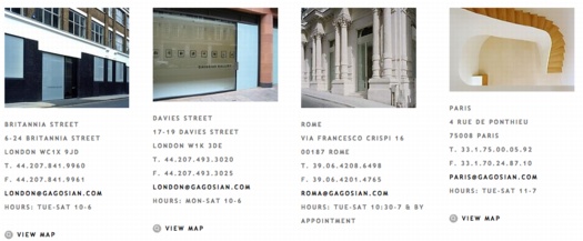
It’s possible that someone with an even slightly aggressive travel schedule already–say, Mr Zeitgeist, Tyler Brûlé–could simply add a weekend jaunt here and there to complete the Spot Challenge.
It’s also possible that someone with a plane and no plans for the next six weeks–the snow is pretty crappy in Aspen this year–could just decide to hit the road. Over, and over, and over. Thus the Spot Challenge is really a challenge to fill the vast emptiness of someone’s life, to provide purpose [sic of the biggest kind] to someone’s leisure time. It’s literally the answer for someone who doesn’t know what to do–not just with their money, but at all. If the spots weren’t so relentlessly, pharmaceutically happy, I’d say that was a little sad.
I’ve begun running the numbers and constructing itineraries, and Hirst is right, it is “pretty difficult to visit all the galleries.” Flying commercial, round-the-world, NYC-NYC, there’s really no way to hit all eleven sites in less than six days. Airfare alone is over $10,000. In coach, which, WTF. For a one-hour hop from Geneva to Paris it’s no big deal, but for the longhaul flights at least, you’d really want to fly business. At least.
Switching to a private jet can ease some hassle, and avoiding the security, check-in, and boarding rituals of the masses will certainly tighten up your time on the ground. But then when you try to pack a couple of cities into one day, you run into the constraints of the galleries themselves. Rome and Geneva don’t open til 11AM, but close at 7. London’s locations open at 10, but close at 6. Athens is 4 hours away and not open Saturday, except by appointment.
And there’s the key. When I started putting itineraries together, I treated the gallery hours as fixed. But what if they were a variable? So say total flight time is 40 hours. Give yourself 3 hours on the ground in each city: an hour each way for transport, plus an hour in each gallery [which means 5 hrs for NYC and 4 hrs for London].
Barring local airport restrictions, if it were possible to coordinate with the galleries so that they’d open for you as soon as you landed, day or night, whatever day of the week, you should be able to complete the Spot Challenge–and get home–in 66 hours, less than three full days. It’d be like an i-banking roadshow on steroids. Or pharmaceuticals.
LOL UPDATE: No sooner to I hit publish than I see Felix Salmon has calculated the total cost of the entire trip for a barely-fictional collector named Pictor Vinchuk. Awesome.
Though I’d suspect that the duration of his deluxe, 5-star scenario–19 days–would be the heaviest investment for our Mr. Vinchuk. Otherwise, if Damien Hirst can really compel a pack of oligarchs to move around the world for three weeks, visiting his seemingly indistinguishable shows, we have truly underestimated his power.
HIPSTER UPDATE: And now Jen Bostic weighs in with a very enticing Hipster/fashionista itinerary. No specific flight info, but there are nice, funky hotels all along the way–and it clocks in at just $13,000 and change–for two.
DUH UPDATE: It’s so obvious, and standing right in front of me, asking if I’d like a warm nut cup. The perfect demographic for dominating the Spot Challenge are flight attendants. International flight attendants with enough seniority to pick their routes would be at the top of the pyramid, of course. They could book the Hirst cities and fill their card without breaking a sweat. Those who can’t work their way to each Gagosian city can still jump seat their way around. [Assuming, probably incorrectly, that their time in between work flights is uncommitted.]
I’d love to see the travel workers who knit our global village together totally take over the Spot Challenge, and secure a high-ticket artwork they could flip easily. But of course, the larger the pool of Challengers, the larger the edition of “Personal Spot Prints,” and hence, the lower the value of each print. With a print factory like HIrst or Murakami, it should be possible to model the effect of dimensions, format, and edition size, to determine how quickly a work approaches £480, the retail price of a Hirst X Supreme skatedeck.

The Complete Spot Challenge
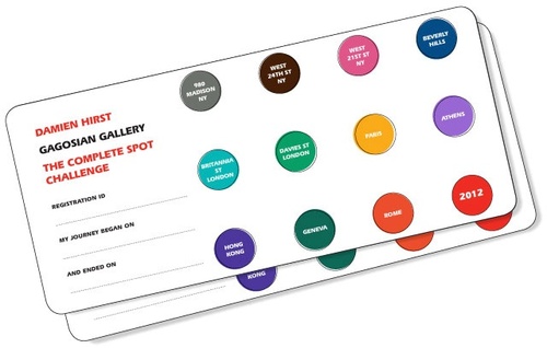
Oh, man, just last night I was goof-tweeting about this, and it turns out it’s already a thing. Registration for The Complete Spot Challenge starts tomorrow:
Visit all eleven Gagosian Gallery locations during the exhibition Damien Hirst: The Complete Spot Paintings 1986-2011 and receive a signed spot print by Damien Hirst, dedicated personally to you.
Registration begins on January 6 and ends on February 10, 2012.
Via Two Coats comes a link to a Carol Vogel story in the Times from last month [whoops, from Jan. 6. Note to self: 12 is the year now, not the month. -ed.] with a few details on the challenge:
To apply, they give their names, the dates their journeys begin and photo identification, like a passport or driver’s license.
Each registrant will then be issued a special “Spot challenge registration card,” with 11 empty circles. At each location the person shows identification and has the card specially stamped (each gallery has its own color) by one of the designated gallery officials. The contestant’s presence will be noted on a gallery database.
Asked how he came up with the idea, Mr. Hirst responded in an e-mail: “I figured it would be pretty difficult to visit all the galleries, and totally admirable if anyone managed it, so admirable in fact that I thought they would deserve a work of art, so we came up with the idea to do the challenge. I’d love it if people manage it. I remember the golden tickets in Willy Wonka, maybe it’s a bit like that.”
How awesome that he invokes the utterly deranged Willy Wonka for this thing, which goes beyond difficult; I think it’d positively hellish. Which is really perfect.
It’s not an overstatement to say that the art pilgrimage has been a key organizing principle of mine for most of my adult life. I’ve considered the personal experience of art, visiting it, going out of my way for it, making special trips for it, sacrificing for it, as a form of collecting, equal to or greater than actually buying works. There have been plenty of times too, when I’ve chosen to travel to see some art rather than buy some.
And I’ve done compleatist tours in the past. I traveled to the various locations of John Cage’s Rolywholyover and Felix Gonzalez-Torres’ retrospective, and visited works I love when they’re installed in different locations. And let’s not even start on biennials and art fairs.
And now, Damien Hirst is turning the idea of a transformative art pilgrimage into a grueling, round-the-world race, with a “free” five-figure print at the finish line. It’s kind of despicably brilliant, really. Like a Black Friday riot for billionaires. Fantastic.
Obviously, I’ll be registering immediately.
UPDATE FROM THE REGISTRATION: the “Personal Spot Print”:
Acceptance and use of the Personal Spot Print constitutes permission (except where prohibited by law) to use your name, image, likeness and photograph (all at the discretion of the Sponsor) for future advertising, publicity in any and all media now or hereafter devised throughout the world in perpetuity, without additional compensation, notification or permission.
Damien Hirst Spot Challenge [gagosian.com/spotchallenge]
Dutch Camo Landscape Painting Painting
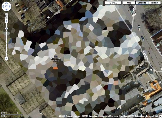
While moving some art around this week, I found a bag of acrylics I bought early last year, when I planned to paint the Dutch camo landscapes. Trying to figure out how to do it led me to start looking more closely at the painting techniques of a whole range of works–from Dutch Golden Age landscapes to Picabia to Hard Edge to Douglas freakin Coupland–and to various paint/photograph combos.
I wanted to match the ploygonal camo colors right, so I’d looked at various digital-to-analogue conversion strategies, to extracting the Pantone colors from each polygon, then sending an autogenerated list off to some paint company, who’d produce each one for me. I was going to have the colors matched by someone. I studied the various color theories, from Goethe forward. My master painter brother-in-law would tell me about the different companies’ different pigments mixing and drying differently. I took notice just last month of how Richter knows and manipulates the drying rates of the various layers of the various paints he squeegees.
I basically ended up trying to get the painting perfect in my head. First.
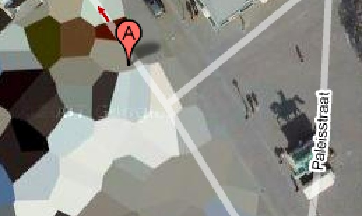
Anyway, with the collection of paints I’d bought fresh in my head, after I put away the Rijksoverheid paintings, I just decided to paint one of those camo things. So I got one of the smaller prints, of the crazy camo ball over Noordwijk–yep, it’s still there— taped off the two polygons that were an identical gray, and I mixed the paint in a little tray. By looking at it, and seeing when it was done. And it matched. And so I painted those two polygons in a few minutes. And that was it.
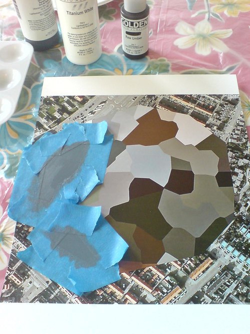
At the second I was done, I realized I coulda/shoulda taped off some more polys and kept going, some of the other gray-family ones. I can see how the project could proceed like that, working the paints in succession to match a little family of colors. And wow, acrylic dries so fast, I could just keep right on going. Though I still have to see whether I can tape over painted photograph, or if it requires something else. Whatever, the point is, it works, and I did it, and seriously, what the hell was taking me so long to get started?
Whether it turns out to be interesting or good, of course, is another question. Which now I know I’ll be able to find out.
Previously, 09/2009: Houses of Orange
Rijksoverheid Rood 5: Thinner
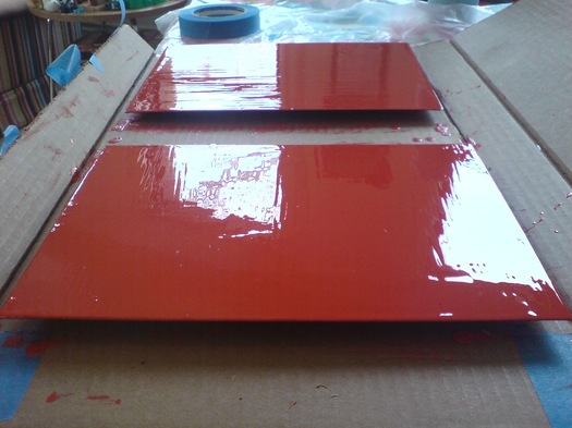
Since I appear to only be able to find the time bandwidth to paint on the weekend, sometime I might have to investigate terms that already haunt me anyway, like “weekend painter.” At least I’m not painting on Sunday, right?
Anyway, another sanding and another layer of Rijksoverheid Rood on the two panels, this time with a little bit of thinner added to the paint. It felt different, for sure. We’ll see how it ends up.
On Close Encounters, Scriabin, Schoenberg, Bernstein
OK, here are some more details about how the crazy-awesome synthesizer/lightboard came together in Close Encounters of the Third Kind, courtesy of Ray Morton’s 2007 book on the making of the film.

Maybe not surprisingly, it grew and evolved along with the crucial scene, known as the Box Canyon scene. Originally, Spielberg’s idea was to use run&gun documentary style film of humans meeting aliens on a very hastily constructed tent base. [the idea of the Mothership landing in a McDonald’s parking lot was nixed early on]. This grew to a runway, which became a stadium, which became a Box Canyon on the backside of Devil’s Tower.
Except that there was no way they could shoot all that at night outdoors, so they ended up moving the entire production to Mobile, Alabama, where they created the world’s largest soundstage out of a pair of WWII-era dirigible hangars, nearly bankrupting everyone in the process.
And though I mentioned Douglas Trumbull as a possible creator, Morton’s book credits Spielberg and art director Joe Alves [who, as production designer on Jaws, had also created Bruce the shark]
Inspired by Russian composer Alexander Nikolayevich Scriabin (1872-1915), who had theorized that specific musical notes prompted listeners to think of specific colors, Spielberg came up with the idea of connecting the Moog synthesizer to an array of colored lights so that each time a note was played on the Moog, a corresponding color would flash in the array. Alves suggested that the colors appear on a huge video screen but Spielberg wanted something resembling an athletic field scoreboard. Developing this idea, Alves decided to segment the board into several rows of colored rectangular panels. He then needed to find a logical way to relate the colors on the lightboard with the musical notes being played on the synthesizer. He wasn’t quite sure how to do this until he saw a television program that featured Leonard Bernstein talking about composer Arnold Schoenberg (1874-1951).
Schoenberg had devised a method of musical composition that utilized all twelve tones in the chromatic scale. Realizing that there were also twelve colors in a secondary progression on the color wheel, Alves decided to link the tones and the colors (beginning with middle C and yellow), which gave him a row of twelve rectangles running across the board. He then added three more rows on top, consisting of lighter tones and higher octaves, and two more rows on the bottom, consisting of darker tones and lower octaves, for a total of seventy-two rectangles A full-scale version of this color board would be created when the actual set was built.
First off, how hilarious that Alves got the idea of a Schoenbergian twelve-tone scale from Bernstein; Bernstein hated that shit. I’m going to guess that Alves is referring to Bernstein’s notorious Norton Lectures at Harvard in 1973, in which he argued for tonal music as a universal language against Schoenberg’s chromatic system. The lectures titled, The Unanswered Question were aired on PBS.
Previously: Close Encounters Jam Session
On The BELLMAC-32, And Perhaps The World’s Largest Plotter Pen Drawing
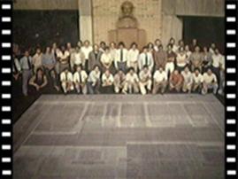
BELLMAC-32A Layout in the Ball Labs, Murray Hill Lobby, image: ieeeghn.org
Look closely, at least until I can track down a larger version of this snapshot.
Because it may be the world’s largest plotter pen drawing.
It’s a 20×20-foot layout of the BELLMAC-32, the world’s first 32-bit microprocessor, developed by AT&T just before they divested themselves of Bell Labs and the RBOCs beginning in the late 1970s.
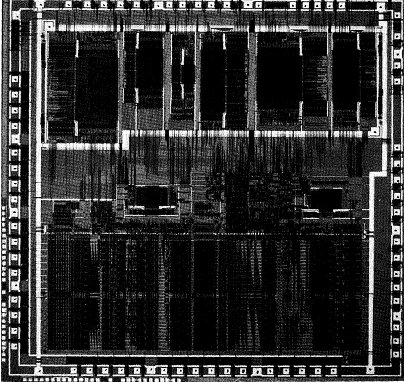
BELLMAC-32A microphotograph, via ieeeghn.org
According to a first-hand history of IEEE fellow Dr. Sung Mo (Steve) Kang, developing the BELLMAC-32 constantly uncovered the limitations of the design, testing, manufacture, and QA process for microprocessors:
Chip layout verification was another huge challenge. At that time, no CAD tools were available for the entire chip layout verification. As a result, we had to generate many CALCOMP plots and Scotch-taped them together to form a 20-foot-by-20 foot plot that was placed on the floor in a huge room. To make sure interconnects were formed properly, all terminals were labeled and wires were traced by using color pencils to make sure the lines ran continually. Although primitive, this method uncovered many errors and, in the end, produced error-free layouts and fabricated chips. We used a huge empty room in Building 3 of AT&T Bell Labs at Murray Hill or the main lobby area to complete the checking.
I love that creating the most advanced computer chip of the day still involved PhDs crawling across the floor with colored pencils.

Still from Microprocessor for the Information Age, a 1982 industrial film on the making of the BELLMAC-32, via AT&T’s Archive
And of course, there’s the giant drawing itself, spit out by a printer in tiles and taped together. Was Wade Guyton even born when this all went down? Yes, but still. So awesome.
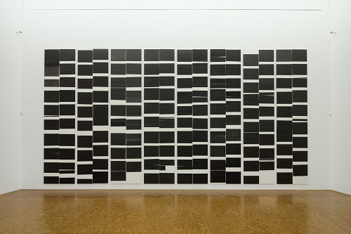
Now to track down a working CALCOMP plotter and recreate it. Because it’s probably too much to hope that AT&T or one of their computer engineer diaspora rolled all those sheets up and stuck them in their moisture-free basement. Right?
Microprocessor for the Information Age (1982) [techchannel.att.com thanks greg.org reader robin edgerton]
First-Hand: The AT&T BELLMAC-32 Microprocessor Development [ieeeghn.org]
previously: Shatner, plotter art, and the drawing machine as seen at the beginning of the digital age
Where Is Enzo Mari’s ‘Where Is The Craftsman?’
In what is probably the most ideologically analytical essay ever written about paperweights, curator Barbara Casavecchia notes that many of the 60 paperweights she selected from Enzo Mari’s collection “are the product of a manual labor–serving as fragmented evidence of the persistence of non-alienating forms of work, specifically within the craftsman-like dimension inherent to production that Mari has investigated for years.”
One incarnation of Mari’s investigation was an exhibition and discussion forum he organized in 1981 titled, “Dov’e l’artigiano”/”Where is the crafstman”. It was presented first at Fortezza da Basso in Florence, and then at the Triennale in Milan. There was a catalogue published–which I can’t find anywhere–and at least one review–which I can only find a few quotes from, but otherwise, the Italians have not yet processed or digitized their contemporary design history yet.
In his latest book, Venticinque modi per piantare un chiodo/25 ways to drive a nail, Mari says the objective was to “illustrate the unresolved ambiguity of the relationship between industrial design and ‘handmade.'”
Excerpts from an Ottagono review of “Dov’e l’artigiano” place the show and Mari’s critical view of the alienating labor conditions of mass production at the center of the debate over Italian design, culture, business, even a national identity of sorts. On the one hand, some Italian producers, still modernizing, hid the fact that their consumer products were partially made by hand because they “did not want to lose the noble title” of industrial design. And others hid the fact that they’d begun using industrial manufacturing processes because they didn’t want “to lose the prestigious title of an object ‘made by hand.'”
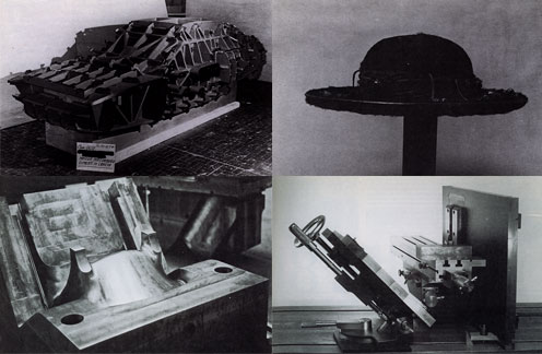
As he had done in 1973 with his autoprogettazione plans, exhibition, and product line, Mari eschewed theoretical arguments in favor of a “didactic exhibition” of objects and the close analysis of their creation. For the show he uncovered hundreds of examples of artisanal and craftsman-like processes being used to make mass-produced industrial design. Here are the objects and categories I’ve been able to find so far:
- Industrial prototypes and models made by craftsmen, such as hand-formed auto body parts by Italdesign’s Giorgetto Giugiaro and Aldo Mantovani for Alfa Romeo [top left, I think]
- Scale models and testing prototypes of turbines.
- A hand-made mold for high-quality plastic chairs [bottom left].
- The schematic drawing for an integrated circuit, which apparently took over 1800 man-hours to create. [I believe it]
- “Technological masterpieces” such as US nuclear submarines, one-off industrial objects.
- An 18th-century-style table with legs “built in series with industrial machinery, but finished with a stroke of the chisel to make it ‘unique.'”
- A Borsalino custom-made for the Pope [top right].
- A machine-like sculpture by Mari collaborator Paolo Gallerani [bottom right].
Oh yeah, and the whole show took place inside a geodesic dome.
I’ll add more objects and pictures if/as I find them. It’s hard to process a 30-year-old exhibit you’ve only just found out about. But it makes me think of things like, well, obviously, pen plotters and that insane William Shatner integrated circuit drawing movie. And NASA workers using giant clothespins to glue the mylar strips toghether for Project Echo satelloons. And Richard Serra sculptures made in defunct shipyards and Richard Prince car hoods. And hand-embroidered Gap kids’ dresses that turn out to have been made by children in India. And etsy and custom Nikes and pre-stressed jeans. And Ikea furniture that offloads all the non-alienating labor processes onto the customer.
Which is all by way of saying I have no grand theories on the current state of the relationship between craft and industrial production; but I think they’ve turned out to be not quite as incompatible as they seemed in 1981.
LINKS/RELATED
This all started with the catalogue essay for Enzo Mari: Sixty Paperweights, An Intellectual Work, which just closed in Berlin. [kaleidoscope-press.com, tanyaleighton.com]
Maddamura’s discovery of the Ottagono review is one of the few online sources of info on the “Dove’e l’Artigiano” show [image, too: maddamura.eu]
Mari’s new book, 25 Ways to Drive A Nail, is not available in English yet. [google books tho]
Close Encounters Jam Session
I’m sure the original’s long gone, but I want the Moog synthesizer-equipped lightboard from Close Encounters of the Third Kind.

The idea of communicating with extraterrestrials via “a basic tonal vocabulary” synched to a gridded light show is like the lovechild of Carl Sagan and Ellsworth Kelly, conceived at an outdoor Pink Floyd concert. In a good way.
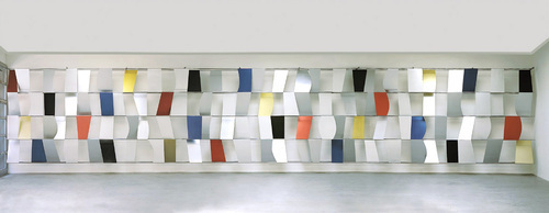
Sculpture for a Large Wall, 1957, image: moma.org
[Just an aside, the story of Kelly’s Sculpture for a Large Wall is utterly fantastic. I’m glad that it’s safe and at MoMA, but the utter failure of Philadelphia to keep it should be discussed every time the Eakins or Barnes stories are told.]
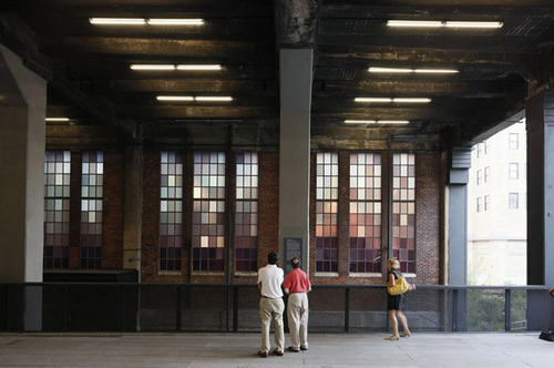
Spencer Finch, The River That Flows Both Ways, image by iwan bann via thehighline
I would have expected Spencer Finch or Leo Villareal to have made one of these already. Or any one of a number of early Silicon Valley IPO nerds. But I can’t find any record of replicas anywhere. So I will step in where I must.
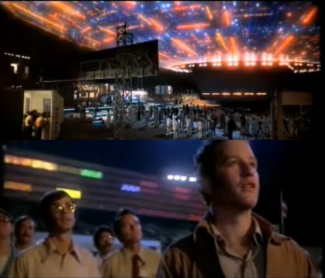
My first guess was that Douglas Trumbull gets the credit for the board; and maybe he designed and executed it. But according to Ray Morton’s definitive-sounding 2007 book on the making of Close Encounters, it was Spielberg’s idea to have a colored lights that correspond to each Moog tone. John Williams composed and recorded the music in advance, so it could be played back on set for filming what was called “the jam session.” I’ll gladly overlook this somewhat Milli Vanillistic approach to jamming in exchange for the score and the rig’s schematics.
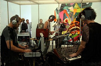
Rirkrit Tiravanija, Untitled (Rehearsal Studio No. 6, Silent Version), 1996, installed at MCA Chicago, image via artforum
Because obviously, when you exhibit this, you’ll expect the first thing everyone will play is that iconic five-note greeting. Then they’ll get into a jam session of their own. You’d probably want to make it possible, via the web or USB stick or something, for people to execute their own compositions, to let the computer “take over the conversation” once in a while. And you’d probably stream the piece over the web, too, give it its own channel. Maybe schedule some performers to come in and use it.
Then for good measure, put the whole thing on a golden CD and launch it into space, and wait for a response.
Off the Golden Record
