‘Combine Paintings’ And Pillow Talk

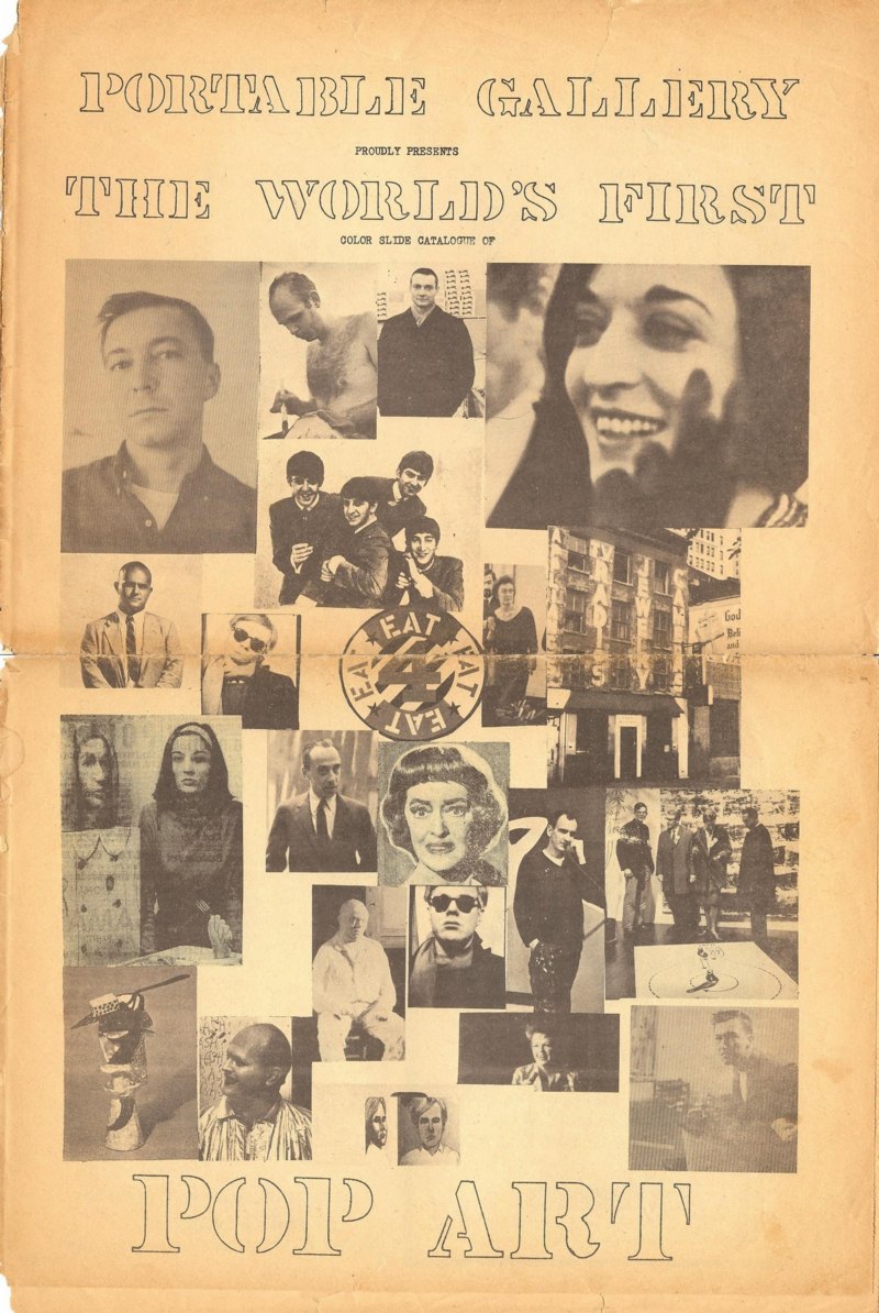
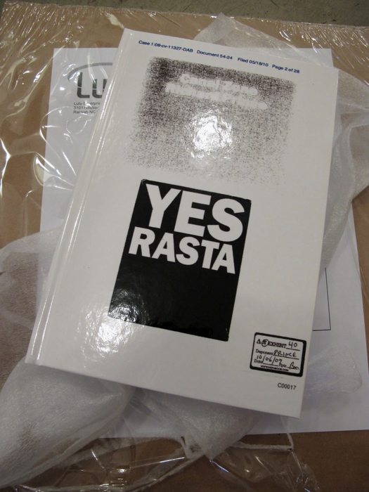
Oh, now that’s interesting. I can’t find an actual print copy of the Portable Gallery Bulletin anywhere, but Joel Finsel has scans of a couple of pages in Swimming Naked At The Y, his biography/oral history blog about Edward Meneeley.
portable_gallery_johns_1.jpg
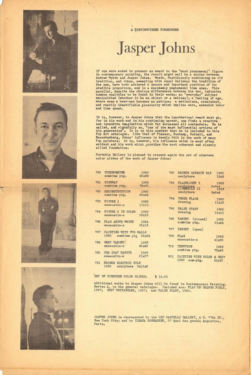
image composited from scans at Joel Finsel’s Swimming Naked at the Y
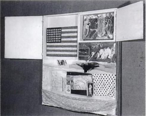
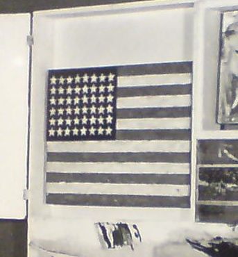
One example: the Jasper Johns page from what they called “The World’s First Pop Art Newspaper,” but which is actually titled “The World’s First Color Slide Catalogue of Pop Art.” Given the Beatles reference, I gather it was published in early 1963, a full five years after Johns’ groundbreaking solo show at Castelli, but before his Jewish Museum show. And after his bitter breakup with Rauschenberg, and after he’d written PGB a letter describing his and Bob’s agreement to not show, sell, or publish images of Short Circuit:

Dear Sir,
I’ve always supposed that artists were allowed to paint however-whatever they pleased and to do whatever they please with their work–to or not to give, sell, lend, allow reproduction, rework, destroy, repair, or exhibit it…

That quote has stuck with me like glue ever since I read it, all through Cariou v. Prince, and right on through to Gerhard Richter’s destroyed paintings. But more on all that later.
PGB’s text is a little over-the-top, I’m afraid, not terribly meaty critically, but then, it was really designed to sell a box of color slides for $15. This was the collection from which Short Circuit was excluded. Or maybe it was the slides of Bob’s work, who knows? Anyway, it didn’t happen.
Point is, check out the works that were included:
portable_gallery_johns_comb.jpg
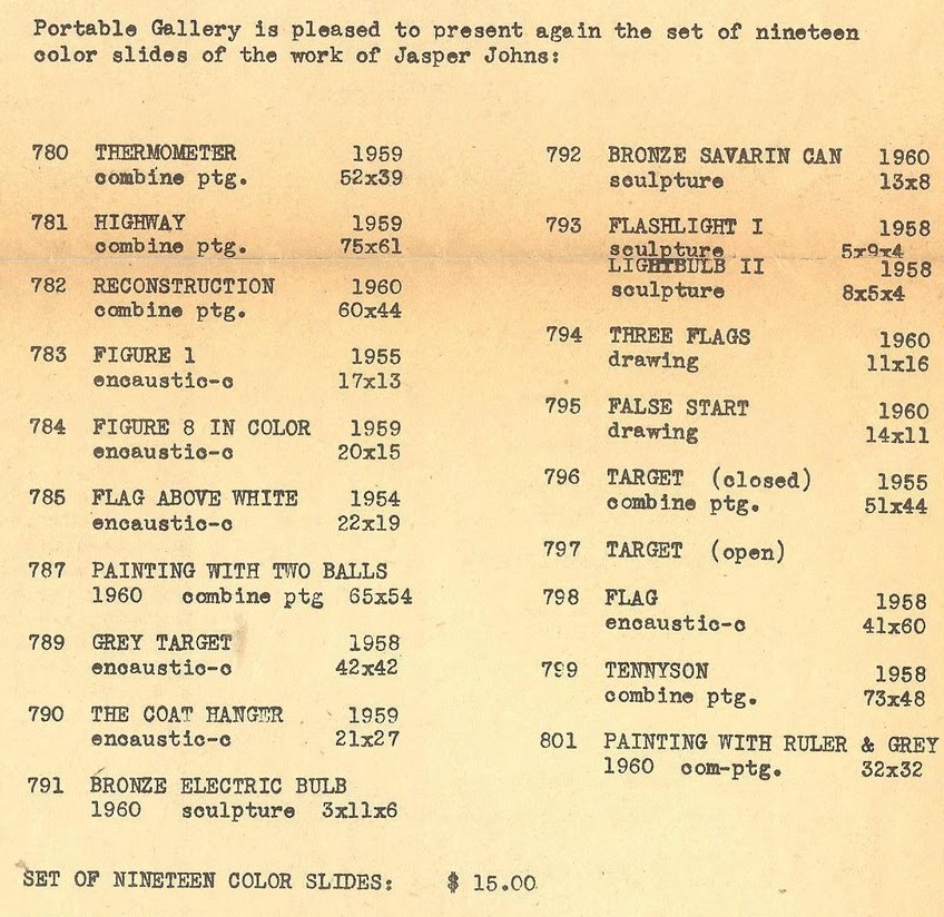
Thermometer (1959), Reconstruction (1960), Tennyson (1958), Painting with Ruler & Gray (1960), [below] and going all the way back to Target (1955), are labeled as “combine paintings.”
johns_ruler_gray.jpg
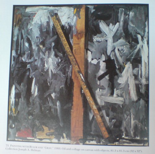
Painting with Ruler and Gray, 1960
But combine paintings are what Rauschenberg made. It reminds me of something in Calvin Tomkins’ 2005 New Yorker profile of Rauschenberg:

Johns recently told Joachim Pissarro, a curator at MoMA, that he thought the term “combine” had been his suggestion. Pissarro asked him what he thought it meant, and Johns said, “It’s painting playing the game of sculpture.”
Rauschenberg doesn’t recall that the word “combine” came from Johns.

I’m sure.
There’s more that article, including Rauschenberg telling Tomkins that “the most important thing” he got from Johns was not the combine or, say, the title, crucial Wittgensteinian graphic element, and entire conceptual construct of Erased de Kooning Drawing, but “Courage. Persisting upstream.”
But that’s not the point, at least right now. It’s just that an early stage in Johns’ career, someone who knew him and Rauschenberg well was writing about his work using a term that is–or became–associated exclusively with the work of his former partner.
johns_tennyson_rausch_bed.jpg
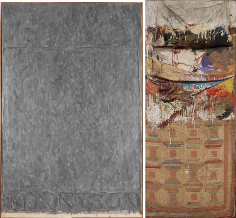
Tennyson, “encaustic and collage on canvas,” and Bed, “Oil and pencil on pillow, quilt, and sheet on wood supports” [image, right: moma]
I’ve often thought that a lot of Johns’s 50s and 60s works looked and felt like combines, but I’ve never seen the term applied. To take only a recent example, combines are only mentioned twice in the catalogue for the amazing 2007 show Jasper Johns Gray, both times by the Art Institute’s James Rondeau and both only in reference to Rauschenberg’s work. One was a “tender” and “unsupported” interpretation of the two-panel Tennyson as a double bed, “Johns’s own, wildly restrained response to Rauschenberg’s Bed, a landmark combine painting made two years earlier.”
Bed is, famously, paint on an actual pillow, sheet and quilt, making references to both AbEx and Albers-style geometric abstraction. Tennyson, meanwhile, is two Bed-size canvases pushed together, with pillow-like shapes on top [Rondeau shows how these pillows are given volume and shape in Tennyson drawings] and another, separate canvas laid face down across them like a blanket. And all covered with gestural abstract brushstrokes.
These works don’t have to be exactly the same, with handwritten footnotes on the back, to be seen as relating to each other, do they? Artworks made next to or around each other during the artists’ most important, intense, insular, and productive relationship? How is it possible, or more precisely, why is it the case, that no one in 50 years has considered Johns’ work as “combine paintings”? What would be different if we did?

In The Backroom With Jasper Johns

Thumbnail image for rausch_johns_short_circuit.jpg
Well this is interesting. I don’t know how I missed this before now, but Albert Vanderburg was the associate editor of Portable Gallery Bulletin whose 1962 article discussing the impact of Rauschenberg’s inclusion of Johns’ flag painting in Short Circuit prompted Johns to write in. According to Vandenburg’s own recollection, that’s not all it prompted:

We had behind-the-scenes access to many museums and galleries and came to know many artists we might otherwise never have met. It was often necessary to move paintings in order to properly light and photograph them and it was a touching experience sometimes to see the backs of famous canvases. Ed had the habit of photographing any interesting work he spotted in back rooms even though I sometimes grumbled over the shambles it made on the production end. The negatives were printed in reels the size of a motion picture, then cut frame-by-frame and mounted in cardboard holders, so a beautiful Picasso sandwiched in between Roy Lichtenstein and George Segal exhibitions didn’t make for efficient processing, not to mention packaging and promotion which meant all those interesting individual items had to eventually be found a spot in the catalogue with suitable companions since we had long since given up selling individual slides.
One of those backroom items created another of my stormier sword-crossings with the Powers That Be. Before Jasper Johns appeared publicly on the scene, Robert Rauschenberg had created one of his “combine” sculptures which included a small all-white example of the American flag series which later helped make Johns a major star. Ed had managed to catch it before the work was withdrawn from public view. Not fully aware of the undercurrents, I wrote an article about the political influences in the New York art world and used that work as an example of ways more established artists lend a hand to up-and-coming ones. I had meant it admiringly but it was taken just the opposite, complicated by the fact that the special relationship between Rauschenberg and Johns had ended and had not yet emerged from a sour phase and perhaps even more so by the fact that the small Johns painting had itself become more valuable than the work as a whole. Their dealer, Leo Castelli, read my article, telephoned and told me I was a “beetch” and forbid us to sell the slide of the work. So when I designed the catalogue called “The World’s First Pop Art Newspaper”, the slide was offered as a free special bonus. Although Leo forgave Ed and continued to cooperate with future photography sessions, he never forgave me. I thought then he was a silly little man and I still think so while giving him due credit for the absolutely brilliant job he did in helping make Rauschenberg, Johns, Lichtenstein and others into the giants of twentieth century art which they later became.

Ha, yow, not often you hear Leo Castelli called a silly little man, but not often you hear him calling someone a “beetch,” either. Good times. Also, it was not an all-white flag painting. Unless, of course, it was. The vintage photo I’ve been using [above] was taken by Rudy Burckhardt and dates from, I think, 1958. I didn’t realize Meneeley and Vanderburg had their own shot, too. But maybe there’s a Portable Gallery Bulletin slide floating around out there somewhere, and maybe it shows a white flag?
UPDATE: I can’t find any copies of Portable Gallery Bulletin for sale or in archives, never mind “The World’s First Pop Art Newspaper.” But Joel Finsel’s extensive bio/blog of Ed Meneeley has a photo of Ed’s own, lone copy, from early 1963, probably the next issue after Johns’ letter:
portable_gallery_pop_cov1.jpg
Hmm, Finsel also quotes the paper as offering “a free color slide of the Beatles!” which I guess one could get confused with Johns.
The Panther’s Tale: 014b [pantherhawaii.com]

Two Months.

Thumbnail image for rausch_johns_short_circuit.jpg
Two months. I’d feign shock, but frankly, it’s been almost a year since I figured it out, and I’m only now posting it.
Last January, while going through the newly opened Castelli Gallery Collection at the Archives of American Art, I found some documents relating to the “loss” of the Jasper Johns Flag which had been inside Robert Rauschenberg’s 1955 combine, Short Circuit. [Remember, it was probably the first flag painting Johns made, and certainly the first one ever shown, by an easy three years. Complicated.]
There were notes about calling the NYPD 9th precinct and some preliminary paperwork for an insurance claim, all commencing on Tuesday, June 8, 1965. The insurance adjuster’s follow-up memo says a “theft” occurred, not just of the Johns, but of a similarly small sculpture edition by Roy Lichtenstein, on 6/6/1965, the previous Sunday. From the gallery’s storage facility on 1st Avenue. Obviously, they called right away, as soon as they found out.
johns_flag_burckhardt_cu.jpg
Actually, no. I decided to track down the police report, only to run into a dead end. There were no reports of art thefts on or around the 8th at all. After a couple of fishing expeditions by mail, a kindly NYPD records officer took pity on me, and returned one of my $10 checks with a phone number on it. I called, explained what I was looking for, and she said she’d try to expand the search a bit when and if she could.
A few weeks later, just about a year ago now, I got a single page form with no details, just the basics of the police report. The date of the theft was listed as April 15th, nearly two months before Castelli called either the police or the insurance company.
Which means either the gallery didn’t realize the flag painting had been removed, or they did, and it spent two months trying to figure out what happened before giving up and filing an insurance claim.
It was the more interesting of the two.
Last winter, I reached Edward Meneeley, an artist and photographer who knew Johns and Rauschenberg well in the 1950s. Meneeley published the Portable Gallery Bulletin, a subscription newsletter/slide service which was used by schools, libraries and scholars to keep up with the latest New York shows. The Bulletin ran Johns’ only published comments on Short Circuit in 1962. Johns wrote a letter to the editor to refute the charge that Rauschenberg’s refusal to allow the Bulletin to distribute images of Short Circuit was due to art world “politics” and an attempt to rewrite history.
Meneeley recalled the hubbub surrounding the disappearance of the Johns Flag. Ed said, he had been photographing Ileana Sonnabend’s inventory/collection at the warehouse, and so he was there quite a bit during the spring and summer of 1965. He was asked a couple of times if he’d seen or knew anything, and so was “everyone else.” [I took this to mean people who were working around the galleries and the warehouse.] Which sounds like there was a general awareness that the flag painting had disappeared.
[Meneeley also said he thought Short Circuit had ended up in Sonnabend’s collection, but I asked Antonio Homem about this, and he confirmed that this had never been the case. Michael Crichton had originally written the work was in Castelli’s collection, but this was also not the case; the Rauschenberg Foundation told me it remained in Bob’s collection until he died.]
jj_ins_061165_castelli.jpg
I’d thought that a two-month search for a missing Johns painting would leave a trace of some kind in the Castelli Archives, but if it’s there, I couldn’t find it. Once I had the April 15 date, I went through every page of the Gallery’s notebook and memo collection, as well as Castelli’s own daily calendar. There are lunches with RR, and finally, around June 11th, mentions of “JJ Insurance,” [little detail above] but otherwise, nothing.
There are plenty of mentions of insurance for all kinds of people in the archive materials, and other instances of JJ and RR claims–works were getting insured, damaged, assessed, and repaired all the time–so the mention above could be unrelated. But it does make me wonder if the claim for Johns’ Short Circuit flag painting was filed on behalf of Rauschenberg–or Johns? Does the practical fact that when it’s missing, Flag was being treated as an autonomous Johns painting affect how it should be seen art historically? In other words, can we thus assume it was a Johns painting, and not–or not merely–the raw material of a Rauschenberg combine?
Ed’s account also makes me curious about how widely known the 1965 theft–I guess we can call it that now–actually was. How many people were questioned? Did people gossip and speculate about it for a while? Who else knew? And was it registered as stolen with the appropriate industry databases? A year and a half, and I finally know the answer to that last question.
“Loss of Painting – American Flag – Jasper Johns”

The Maze (1967/XXXX), Tony Smith

smith_maze_aspen_ubu.jpg
For issue 5+6 of Aspen: The Magazine in a Box (1967), guest editor/curator Brian O’Doherty conceived of a conceptual art exhibition in a box. [Which really should be staged in real space somewhere. Has it ever been?]
One of the first things you notice when you open the box is the little stack of cut and scored black matteboard, which is a make-it-yourself scale model of Tony Smith’s The Maze (1957 1967).1 When assembled, if any ever were, the pieces formed four monolith-like blocks, which were to be placed in an open rectangle:
smith_ubu_mazeGrid2.gif

As is clear from the drawings, “The Maze” was originally designed for a particular space. Thus the pathways around the pieces as well as through it are an integral part of the design. For this reason it is a labyrinth rather than a monument.
I did not think of the symmetry of the piece as I was doing it, but I happened to notice when making the drawing that the central part is a five-foot square; the part including all the passages is a ten-foot square; then if you take the extension along the room, it is a fifteen-foot square. So it is a lot of expanding squares.
On the other hand if you take different divisions, for instance if you take all these squares and carry them through, they make a grid which interpenetrates– the two sets of grids interpenetrate one another. In a certain sense it is a labyrinth of the mind. You can see that it becomes quite complex, but at the same time everything falls in very, very simply.
–Tony Smith
The Maze was designed for the exhibition Schemata 7, at Finch College Museum, May 1957 1967. The above statement has been adapted from the catalogue.
The actual dimensions of the modules were 6’8″ by 10′ by 30″ (two modules) and 6’8″by 5’by 30″ (two modules). The models have been scaled down to fit in this box. The models may be set up standing free on neutral ground. They should be set up in accordance with the plan indicated in the drawing. Those who wish to reproduce the work in its original dimensions (in metal or wood) may do so.
The individual pieces may be cut from the enclosed cardboards by a matte-knife (e.g. the General 850 available at any art supply store) guided by a metal ruler.
The parts should be attached as indicated i.e. the appropriate edges should be opposed to the grey areas. (Elmer’s Glue All may be used). “White” edges should be darkened with ink or water color.
The drawing below may serve as a guide.

smith_ubu_maze_guide.gif
It’s been more than 14 years since I discovered Aspen; 5+6 was the first, and for a long time the only, issue I could find. And it’s almost ten years since I found the entire run of Aspen reproduced on Ubu.com, a move which brought Aspen out of unciteable obscurity. And now it’s more than two years since I cooked up auraprogettazione, a comprehensive [sic] exhibition of the rare examples of instruction-based art work that the artist actually gave permission to make. And yet I only just now noticed that Smith authorized reproduction of The Maze. Has anyone ever done so? Before me, I mean, because I just added it to the list.
1: UPDATE So yeah, I thought 1957 was an extraordinarily early year for Smith to have exhibited an installation of four matte black minimalist sculptures, and at Finch College or anywhere. So Ubu’s text is incorrect, and Smith’s Maze was shown in Schemata 7 at Finch in May 1967, right around the time Aspen was published.
ANOTHER UPDATE Grace Glueck’s May 14, 1967 review of the opening of Schemata 7 says the show’s working title was “Walk-In Sculpture,” and gave each of seven artists a chance to show their attitude “to scale and enspheric space.” Of The Maze, Glueck wrote:

The room is kept in a subdued light and, though the scheme is simple, a walk among these gloomy, primeval presences evokes the feeling of an endless forest.

Sounds like a wildly different experience from the toy-sized cardboard model.
In addition to Smith, Schemata 7 featured work by Les Levine, Ursula Meyer, Brian O’Doherty, Will Insley, Michael Kirby and Charles Ross. So far, I can’t find any installation shots of the original Finch version, but I’m on it.
UPDATE 3 And here’s John Perreault’s review of Schemata 7 for the Village Voice. He puts it in the context of pioneering minimalism shows like Primary Structures, which had just happened a few months earlier in 1966. Still no pics, though.

Big Universe, Big Data

Ross Andersen has a fascinating interview with JWST scientist Alberto Conti about the orders of magnitude increases in the amount of astronomical data being gathered these days:

There are two issues driving the current data challenges facing astronomy. First, we are in a vastly different data regime in astronomy than we were even ten or fifteen years ago. Over the past 25 to 30 years, we have been able to build telescopes that are 30 times larger than what we used to be able to build, and at the same time our detectors are 3,000 times more powerful in terms of pixels. The explosion in sensitivity you see in these detectors is a product of Moore’s Law—they can collect up to a hundred times more data than was possible even just a few years ago. This exponential increase means that the collective data of astronomy doubles every year or so, and that can be very tough to capture and analyze.

How Big Data Is Changing Astronomy (Again) [theatlantic]
Related: posts on the Palomar Observatory Sky Survey, an early decades-long attempt to photograph the universe.

Richteriana, Postmasters Gallery, 12 May 2012

gregorg_drp-04_bikini.jpg
Destroyed Richter Painting No. 04, 2012, oil on canvas, 110x110cm

Postmasters is pleased to announce:
RICHTERIANA
GREG ALLEN, DAVID DIAO, RORY DONALDSON,
HASAN ELAHI, FABIAN MARCACCIO, RAFAËL ROZENDAAL
May 12 – June 16, 2012
opening reception, saturday, may 12, 6-8
Postmasters‘ new exhibition Richteriana attempts to examine the current canonization of Gerhard Richter, presenting six artists whose works pre-date, update, expand, and subvert “the greatest living artist’s” own.
…[snip much amazing thinking and description of great artists and their work]…
Greg Allen’s Destroyed Richter Paintings channel the elder artist’s own private documentary images back into the photo- based painting feedback loop he once deemed “photography by other means.” They reproduce the experience of encountering Richter’s lost originals, while becoming new objects themselves. By engaging the sprawling Chinese photo-painting industry that has grown up in Richter’s wake, Allen forefronts the market’s incredulous perception of the artist’s autonomy–and his right to declare or destroy his own work.

More to come, obviously.
Previously, related:
a destroyed Richter/Palermo collaboration
“I am practising photography by other means.”
On repainting Gerhard Richter
Overpainted vs Destroyed Gerhard Richter

On The Catalogues Of Giants

weight_of_art_history.jpg
top right is Bonnefoy’s beautiful but otherwise ridiculous Giacometti, and center left is Gober’s Sculptures and Installations, which turned out to be lighter than it looked.
So yeah, hmm, I probably should have glued up the braces on the back of this panel before gessoing it. Well, they’re on there now!
And since they’re set in a bit, my clamps won’t work, and they might mar the surface anyway, so blanket on carpet to cushion the facture, board on glue, the weight of Art History on the board. And I still end up standing on it.
I have to remind myself this is still way more information than I ever got in advance about a painting.
Previous fun with art books: 2002: Rem Koolhaas book under a Wade Guyton table sculpture

Opening: ‘Canceled’

As in “Canceled” is opening, not “Opening is canceled.”
Thumbnail image for mondo_yes_rasta2.jpg
I’m very stoked to announce that Canal Zone Richard Prince Yes Rasta: Selected Court Documents from Cariou v. Prince et al… will be included in an exhibition at The Center For Book Arts.
“Canceled: Alternative Manifestations and Productive Failures,” curated by Lauren van Haaften-Schick, opens April 18th and runs through June:

This exhibition presents cancelled or otherwise prohibited exhibitions that now exist as publications or in other formats. These publications document the process and politics of cancellation, exist as an alternative manifestation of the exhibit, act as a critique of the forces that called for its cancellation, or they may be an admission and exposition of an ultimately productive failure. In the context of the Center for Book Arts, Canceled highlights the book form as a crucial means of disseminating documentation and information on a wide and accessible scale, potentially in ways that are more historically stable, and more effective, than the original exhibition would have been. Through utilizing printed matter, these artists and curators have found alternative routes by which the politics surrounding the presentation and creation of art become at least as relevant as the work itself.

Publications, Works, and Documentation: Bas Jan Ader, Greg Allen, Jo Baer, Wallace Berman, Christoph Büchel v. Mass MoCA, Patrick Cariou v. Richard Prince, Dexter Sinister, Exit Art, Brendan Fowler, Guerrilla Girls, Hans Haacke, David Horvitz, Douglas Huebler, Wu Hung, Jill Magid, Rhoda Rosen, Seth Siegelaub, Temporary Services, Lawrence Weiner, Werkplaats Typografie, Anton Vidokle, Marion van Wijk and Koos Dalstra, Amy Wilson, David Wojnarowicz, and others.

After seeing Patrick from Mondo Blogo’s photo above, Lauren asked for the original hardcover edition, which, right? I love that cover, with the legal exhibit reproducing the covers of both Prince’s and Cariou’s books. I mean, that’s where my title came from. Maybe I’ll have to bring that back on a revised edition.
Canceled: Alternative Manifestations and Productive Failures (April 18, 2012 – June 30, 2012) [centerforbookarts.org]

Blurring Of Google Art Project Comes As No Surprise

It looks like Les Blurmoiselles d’Avignon have some company.
The Google Art Project has released a new batch of 134 museum participants, bringing the total to 150, though only 51 institutions are offering Street View Museum View. And a couple of those, like Tate Modern and the Crystal Palace at the Reina Sofia, have basically no art, just space. [Tate Modern Museum View rather brilliantly drops you into the Turbine Hall, facing a blank temporary wall. ]
But if any museums besides MoMA gave to deal with living artists, or works still under copyright, I haven’t been able to find them. And so MoMA wins this round for adding a rotating show–Kathy Halbrecht’s contemporary installation in the 2nd floor Kirk Varnedoe Galleries [I am calling them this forever now, btw]–of contemporary art, thereby demonstrating that living artists are easier to get clearances from than estates.
moma_gmap_rosa1.jpg
Most of them, anyway. Fortunately, there are some exceptions, and they look awesome cloaked in Google’s Blurmany-style algorithms. Oh the first really is the best, too. Sanja Ivekovic apparently didn’t sign on to have her atrium installation, Rosa of Luxembourg become Rosa of Luxembourg of Google Art Projects.
ivekovic_rosa_install_moma.jpg
Lady Rosa of Luxembourg (foreground), with the Gëlle Fra (background). Photograph by Christian Mosar. Courtesy Casino Luxembourg–Forum d’art contemporain , via moma.org
The monumental column is nice, of course, but the colors on that giant photo are utterly fantastic. That’s the first one I’ll paint.
moma_gmap_rosa4.jpg
Also, is the Bell & Howell helicopter over the staircase blurred out, too? Is that a fluke? Anyway, stepping back into the Varnedoe Galleries…
haveyouseenme.jpg
Still waiting to hear back on this one. I can’t remember what it was, though from this angle, it looks like the bastard lovechild of Louise Bourgeois and Gerhard Richter raised by Thomas Houseago. Of course, after a speculative mashup like that, whoever it turns out to be will almost inevitably disappoint. Sorry, artist. That’s a Reinhard Mucha in the back, though.
moma_gmap_muchaherold2.jpg
And when you head back there, both the Georg Herolds are also blurred. For a moment. Because you take another click/step, and they’re not. The blur disappears. It’s an unexpected reveal as Google’s sheets of virtual ribbed polycarbonate clatter to the ground.
moma_gmap_muchaherold.jpg
Or is it like that stuff on the facade of the Issey Miyake Pleats Please store in SoHo? You’re walking along, blur blur blur, and then you align with the material, and for an instant, you can see in. At least, in this case, for one pano. I suspect this is an oversight, so go try it quickly.
And no offense to Herold, because his underpants dome is quite fetching, but I’d totally get one of those LA acrylic guys to cast me one of these first:
moma_gmap_herold3.jpg
It’s like an ethereal Anne Truitt. Also, don’t you kind of wish that Kippenberger wasn’t turned to the corner, so Museum View could blur its face? Also, it’s interesting that the video monitor on the floor always has the same image in every pano. Was it on pause? Did they ‘shop it in? Does it unsettle you, too, to have the simulation of moving through space without the simulation of moving through time? That is so Street View.
moma_gmap_sculpture.jpg
The Keith Haring mural and the Koons look great. [Which, Pace Prints just opened a show of another Haring mural, a unique silk screened scroll of his Blueprint Portfolio.]
moma_gmap_holzcondo.jpg
Ahh, but we’re here for the blur. Ooh, a very nice double blur from George Condo [right, really?] and Jenny Holzer [left, really? REALLY? Did she maybe insist on the obscuring blur to promote her redacted documents-as-minimalist-paintings show at Skarstedt?]
moma_gmap_holzcondo2.jpg
But take another click forward, and the veil drops again, momentarily, whatever that means on GSV’s frozen timeframe.
moma_gmap_holzer1.jpg
This is awesome, what the algorithm stitching this pano together did to this Holzer bronze plaque. Perfect, really, and such a conveniently discrete, little object. I think I could have that 3D printed before I have it cast.
Such Google Maps-generated anomalies are ususally site-specific by definition. And recreating them is entirely dependent on the alignment of anomaly, real space, and aesthetics. Like the piece I installed in Brian Dupont’s Extra Gallery last fall which translated the [fortunately] misaligned Street View seam running through their window into real space.
As Google Maps gets more hi-res, these noticeable differences between the real world and its corporate map simulacrum will diminish, if not disappear altogether. So it seems important to map them, or at least to note them, and to be able to read them while we can.
MoMA Museum View [googleartproject]
Previously: les Blurmoiselles d’Avignon
Blurmany and the pixellated sublime

A Brief Retelling Of The Story of Short Circuit, aka Construction With J.J. Flag

rausch_johns_short_circuit.jpg
Construction with J.J. Flag, aka Short Circuit, 1955 photo by Rudy Burckhardt
You know what, it’s way past time to wrap up this missing Jasper Johns Flag caper. I’m going to get right to it.
But first, a quick review of the work’s history:
In 1955, three years before his debut solo show at Leo Castelli, Jasper Johns painted a small Flag which was incorporated into a Robert Rauschenberg combine, which was shown at the Stable Gallery annual Stable Show, which opened on April 26. The combine also included a painting by Rauschenberg’s ex-wife, Sue Weil. [Stan VanDerBeek and Ray Johnson were also invited by Bob to contribute a work, and several historical sources say it includes a Johnson collage, but the Art Institute of Chicago, which bought the piece last year, officially only cites the two painters. Though it was Rauschenberg’s stated intention to use the combine to get Johns’ and Weil’s works into the Stable Show, he was the only artist credited with participating.
Both paintings were enclosed behind cabinet doors, which could be opened, but which were originally exhibited closed. [In Paul Schimmel’s Combines show and at Gagosian, the doors were opened and, obviously, untouchable by the public, but I have heard from multiple people now that when Johns saw the Gagosian show, he confirmed that the doors were to be closed.]
The combine is now known as Short Circuit, but in Rauschenberg’s earliest works registry, it has the title, Construction with J.J. Flag. That entry referred to the work’s next known public appearance, in a show at Cornell University’s White Museum in April 1958, Collages and Constructions, curated by Alan Solomon. Johns was also included in the exhibition, which followed on the heels of both artists’ successful solo shows at Castelli that year. Even though Solomon went on to curate both Rauschenberg’s and Johns’ first museum shows at the Jewish Museum, and their participation in the US entry to the Venice Biennale in 1964, which Rauschenberg won, Solomon did not mention this show in their bios. And it was not included in Johns’ exhaustive chronology prepared for his MoMA retrospective.
In 1962, after Rauschenberg and Johns’ particularly bitter breakup, they came to a “solution of differences of opinion” about Short Circuit, which involved not selling the work, or publishing or exhibiting it again.
In his awesome 1977 Johns catalogue, Michael Crichton quoted Leo Castelli as saying that the Johns Flag had been stolen from Short Circuit at some point “before June 8, 1965.” [Crichton also wrote that Castelli acquired the painting, but the Rauschenberg Foundation told me that the artist never parted with the work.]
Thumbnail image for finch_cat_rr_sc_det1.jpg
What’s not behind Door #1? Rauschenberg & Short Circuit in the 1967 Finch College “Art in Process” catalogue
The removal of the Johns Flag apparently freed up Rauschenberg to begin showing Short Circuit again, because he put it on a national tour of collage works organized by the Finch Museum in 1967. He said in the Finch catalogue that Elaine Sturtevant “is painting” a replica of Flag, but the artist’s photo blocks it from view. And the doors were nailed shut for the tour.
It’s unclear when Sturtevant actually painted her Johns Flag, but I’ve narrowed it down to some time between 1968 and 1971, when Rauschenberg’s one-time assistant Charles Yoder says he saw it in the studio. Short Circuit‘s next scheduled public appearance was in 1976, for Walter Hopps’ big Rauschenberg retrospective at the Smithsonian. Upon review of Hopps’ archive, it appears Short Circuit was originally included, then dropped from the show shortly before it opened. Burckhardt’s 1955 image was used in the catalogue. Rauschenberg wrote that he might repaint the flag himself because he “need[s] the theropy [sic].”
[One other thing I found in the Smithsonian archive: a memo from Hopps agreeing to cover Rauschenberg’s travel expenses to the DC opening, but refusing to pay for “his friend.”]
In 1980, Calvin Tomkins told the story of Short Circuit‘s missing Flag in his Rauschenberg biography, Off The Wall. He appears to have based his account on Crichton’s version, though he added a detail that could only have come from Castelli himself about an unnamed dealer bringing the Flag in for authentication. The notion that Castelli apparently let the painting walk back out of his gallery without a fuss is what triggered my interest in the first place. I mean, seriously, how could there be a Johns Flag painting on the loose, and no one does anything about it?
Anyway, Short Circuit was also not included in a 1985 show at the Hirshhorn on artist collaborations curated by Cynthia McCabe and David Shapiro. Shapiro later described the work as being in a sad state of repair and missing its Johns Flag. No mention of Sturtevant. According to the Rauschenberg Foundation, however, Short Circuit has never been damaged or repaired. It finally went on public view–the first time with the Sturtevant–in 2005 in Schimmel’s show at MoCA.
And that’s where we are.
So next week, I’ll finally get around to talking about what I’ve found out about the disappearance of the Flag, the aftermath, and its fate. And there’ll be a bit about how it alters Johns’ history–or at least it should–and then what it means for Rauschenberg’s, too. Stay tuned.
An admittedly imperfect way to see all the previous greg.org posts on the search for Johns’ Short Circuit flag painting

LLOLZ On Gerhard Richter’s Annunciation After (A Postcard Of) Titian

richter_titian_hirsh_2905.jpg
Annunciation after Titian, CR 343-1, 1973, collection Hirshhorn Museum, image: gerhard-richter.com
I confess, I love Gerhard Richter in the 70s. Here are some of the best/funniest excerpts from a interview he did with art historian/curator Gislind Nabakowski that was first published in Heute Kunst in 1974. The subject was Annunciation after Titian, a series Richter painted in 1973, after visiting Venice in 1972 for the Biennale.
The first in the series, above, is in the Hirshhorn’s collection. The series has not been shown together since it was first exhibited in 1973 at the Galleria la Bertesca in Milan.

GN:What made you choose a fifteenth-century painting as a model and create a sequence based on Titian’s Annunciation?
GR: Because there’s something about this painting, or any painting, that grabs me if they’re good–irrespective of the impact they had at the time, why they were made, the story behind them. I don’t know what motivated the artists, which means that the paintings have an intrinsic quality. I think Goethe called it the “essential dimension”, the thing that makes great works of art great.
I beg your pardon?!

Continue reading “LLOLZ On Gerhard Richter’s Annunciation After (A Postcard Of) Titian”

Star Wars: The Topher Grace Edit

As part of his study of the art of editing, and to do good for all mankind, the actor Topher Grace recut Star Wars episodes 1-3 into an 85-minute prequel which focuses on the transformation of Anakin into Darth Vader. Paul Sciretta attended a secretive screening of the Grace Edit, and prepared a detailed write-up for Slashfilm. Given what Grace had to work with, the remix sounds pretty good. But then there’s this:

Before the film screened a trailer for another film Topher Grace is remixing — Steven Spielberg’s Close Encounters of a Third Kind. I’m not sure that film needs a remix, or could even benefit from a remix, but am interested to see what the experiment will look like. After that, Grace hopes that other actors, editors and filmmakers will run with the ball, produce and showcase remixed films on a annual basis within this private community.
Jason Reitman has been directing live stage reads of classic film screenplays at LACMA, showing how a filmmaker can make different choices with an interesting cast can completely change a written screenplay. This seems like the next evolution of that, but also an exercise in storytelling with the use of crafty editing. I’m not sure I completely understand Grace’s motives in creating this film, but I enjoyed it regardless.

Close Encounters has already gone through several notable edits, as Spielberg tinkered with it. [The director himself considers the 2001 Collector’s Edition to be the definitive version.]
I’m kind of fascinated with this idea of using commercial films and their inputs as raw material, and especially with seeing people inside the Hollywood bubble, who are likely to be indulged rather than sued, softening up the crowd. I may get around to making my shot-for-shot remake of Gus Van Sant’s Gerry yet.
Topher Grace Edited The ‘Star Wars’ Prequels Into One 85-Minute Movie and We Saw It [slashfilm via umm,

Make No Small Plans: Autoprogettazione 2.0

Look, I don’t care if you ARE Domus and you have Paola Antonelli herself as a judge; it is no small thing to call your design competition Autoprogettazione 2.0:

Autoprogettazione 2.0 is an invitation to consider the potential of a diffused, localised manufacturing network combined with the self-build ethos proposed by Mari for the future of furniture design. It is an open-ended process that seeks to leverage the combined intelligence and talent of the design community and collaborative, open-source networks. Selected projects will be exhibited by Domus in an exhibition exploring the future of manufacturing hosted in Palazzo Clerici, one of Milan’s most prestigious palazzi.
The submission deadline is 27 March 2012.

The categories are table, chair, lamp, and storage, and the designs will be judged in part by how awesomely they exploit the fancy CNC and 3-D printing setups in the FabLab.
Frankly, it sounds interesting and on the up and up, but all a bit out of my league. And anyway, I don’t quite get how these new, cutting edge technologies are really the optimum solution for the space’s adaptable, quick & dirty, utilitarian, functional program. Not to be a curmudgeon about it, but my gimmicky meter is redlining right now.
Call for ideas: Autoprogettazione 2.0 [domusweb.it via, uhm, I forget. remind me?]
4/14 UPDATE And we have some winners. Nice stuff. You quiero El Gringo. For all the fab FabLab capabilities, it looks like plywood is still the go-to material for knock-together utilitarian furniture. [via @cityofsound]

On Repainting Gerhard Richter

First, Happy Birthday, Mr. Richter.
richter_destroyed_ship1964.jpg
Destroyed 1964 Richter painting, image from Gerhard Richter Archkiv via Spiegel
I don’t know if Joerg knew at the time he first tweeted about it–he is plugged in and German, so who knows?–but I certainly had no idea when I picked up on the topic of Gerhard Richter “destroying” paintings by painting over them. But it turns out that the 74 paintings listed as “[DESTROYED]” on Richter’s website are only a fraction, barely half, of the paintings he’s actually destroyed so far.
In an interview with Ulrike Knöfel for Spiegel, Richter talks about the 60 or so photo-based paintings he destroyed in the 1960s during a very self-critical period of his career. Not to worry, though, because, being Gerhard Richter, he photographed them first

These photos, most of which were never published, are now either in the Gerhard Richter Archive in the eastern German city of Dresden, where the painter was born, or in a box in his studio in the western city of Cologne. They are testaments to his refusal to compromise.

Mhmm. Though the ambivalence/regret/equivocation Richter expresses in the interview reveal that a refusal to compromise is not automatically a win. Couldn’t he have just put them away and not looked at them for a while instead?
None were apparently included in Richter’s first catalogue raisonne, the source for his website’s “[DESTROYED]” list. And many appear to date from the earliest phase of his recognized work, 1962-4. Oh but wait, his much-discussed 1962 Hitler IS online, described as “believed to have been destroyed.”
richter_hitler_2431.jpg
Hitler, 1962, image via gerhard-richter.com
That seems like a new category, loaded with ambiguity. I like it much better than “[DESTROYED]” or even “Richter painted over this work in ___. The painting is now entitled ____.” Which, it turns out, has another example:

Today, Richter says he’s surprised at how many works he continued to destroy after the 1960s. Perhaps he will return to one motif or another, he adds, noting that “otherwise it would be a shame.” One painting, in particular, comes to mind. It was painted in 1990 and shows two young people standing in front of Madrid’s Museo del Prado, Spain’s national art museum. However, two years later, he painted over this work, turning “Prado, Madrid” into “Abstract Painting, 1992.”

Which, yeah, there is no Prado, Madrid in the CR, and there are at least 279 Abstraktes Bild done in 1992, so, this’ll take a bit of digging. I’ll update the post when/if I find it. [I’ll have to do an update post anyway, because I’ve already found at least two other overpainted paintings.]
This painting over thing is one thing. The other, which I’m kind of fascinated by now, is the relationship between painting and photography as it plays out in these destroyed paintings. Which, of course, still exist as the artist’s photographs. It’s like Barthes’ Camera Lucida; they’re gone, but not. I can’t tell if this is Spiegel’s interpretation or reportage:

Still, since his urge to destroy some of his paintings also made him feel uneasy, he photographed them before doing so.

But someone has to have already looked at this backup, insurance, documentary, archival, post-mortem, forensic, ghost aspect of the way these two mediums intertwine. Right?
richter_destroyed_bikini_ptg.jpg
Photo of destroyed Gerhard Richter painting, 1960s, by Gerhard Richter, image: Gerhard Richter Archiv Dresden via Spiegel
Meanwhile, the obvious thing–and isn’t that what I’m here to point out?–is to recreate these destroyed Richters. Whether you paint the archival photo, crop marks and background and all, in a meta-Richterian gesture, or just try your darnedest to bring their destroyed, painted subjects back to life, I’ll have to figure out. But paintings based on a painter’s photographs of paintings based on photographs? What’s not to love?
It’d be trivial to the point of meaninglessness to just print the Spiegel jpgs on canvas, or to order them up from Chinese paint mills. But I’d be interested to see just how much more meaning could be gleaned by painstakingly copying them by hand. Even if the answer is very little, that’s still an important datapoint.
His Own Harshest Critic | A New Look at Works Destroyed by Gerhard Richter [spiegel.de via bigthink]