How Ya Conserve Me Now?

“Found painting, FOUND courage” images: @videodante

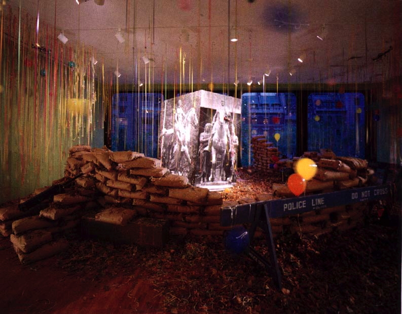
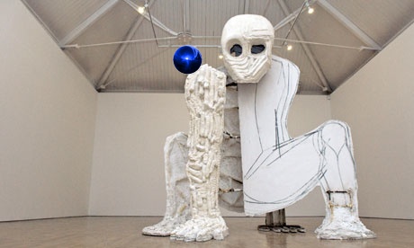
The stairwell in the entrance to the University of Oregon library contains a large mural, Mission of a University, painted in 1937 by art professor Nowland Brittin Zane, of a quote by another faculty member, Frederick George Young. A social science professor and dean in the 1920s, Young saw the divine mission of a university aligned with the founding principle of Oregon itself: to elevate and preserve the white race.

Installation view of Nowland Zane’s mural, Mission of a University, 1937, in U. Oregon’s Knight Library, before intervention, image: uoregon.edu

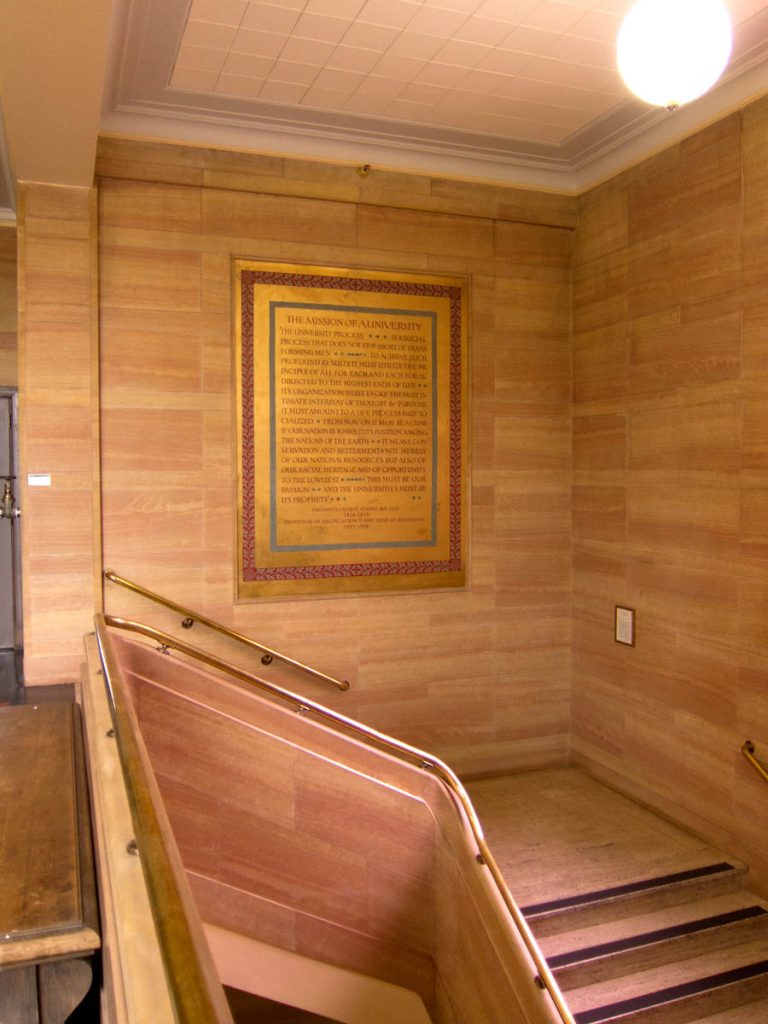
Last night @videodante tweeted out photos he’d received of a fresh painting intervention on Zane’s mural: a slash of red paint crossing out “racial heritage.” As interesting, though, is the handwritten label for the new work, left on the wall [below].

“Which art do you choose to conserve now?” via @videodante

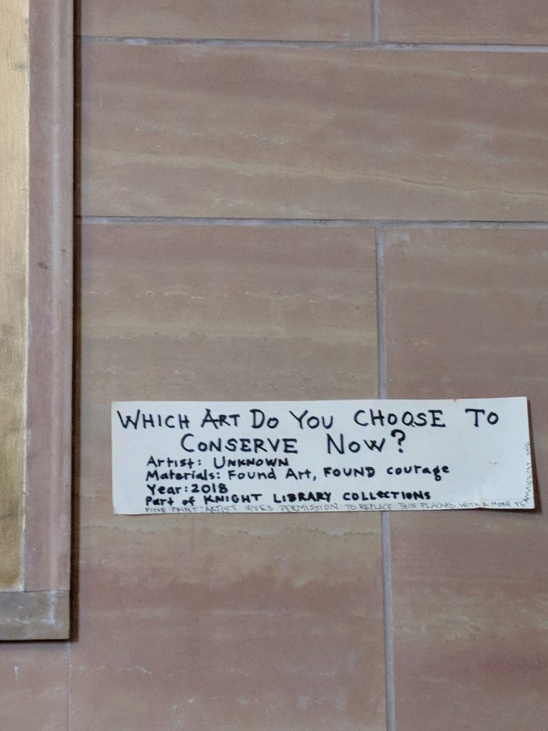
The materials, “Found Art, FOUND courage” are almost as awesome as the title, “WHICH ART DO YOU CHOOSE TO CONSERVE NOW?” Is it the title, or an epic challenge to the institution’s perennial decision of which facts, which history, which brushstroke, and whose heritage are their actions perpetuating? This quote has been recognized as racist and offensive–and has been the subject of critical and activist efforts to remove it–for years. There are at least three spots in the bottom corner of Zane’s painting where conservators chose to erase someone’s addition. So this is one more choice to be made in an ongoing dispute, and the artist knows what is at stake.

The author of this new work, though, offers another solution in a “fine print” addendum, apparently added on the spot, as the text curls up the side of the label. If the library is troubled by impending conservatorial complicity in reasserting white supremacism, the “artist gives permission to replace this placard with a more permanent one.”

What if they just leave it?

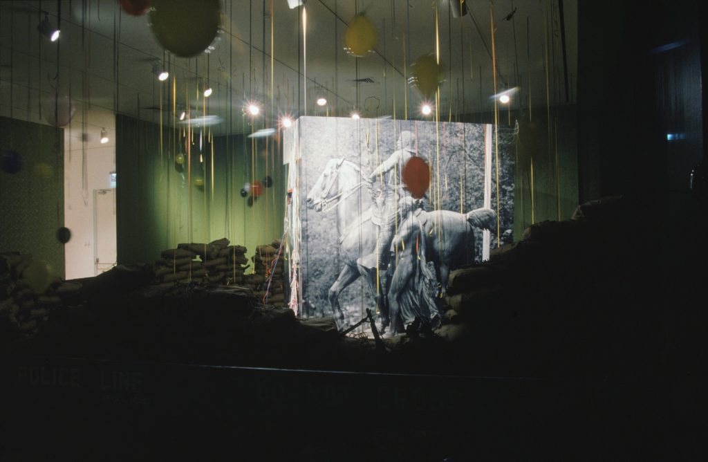
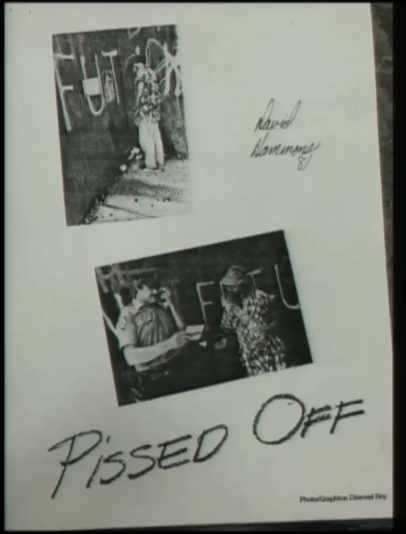
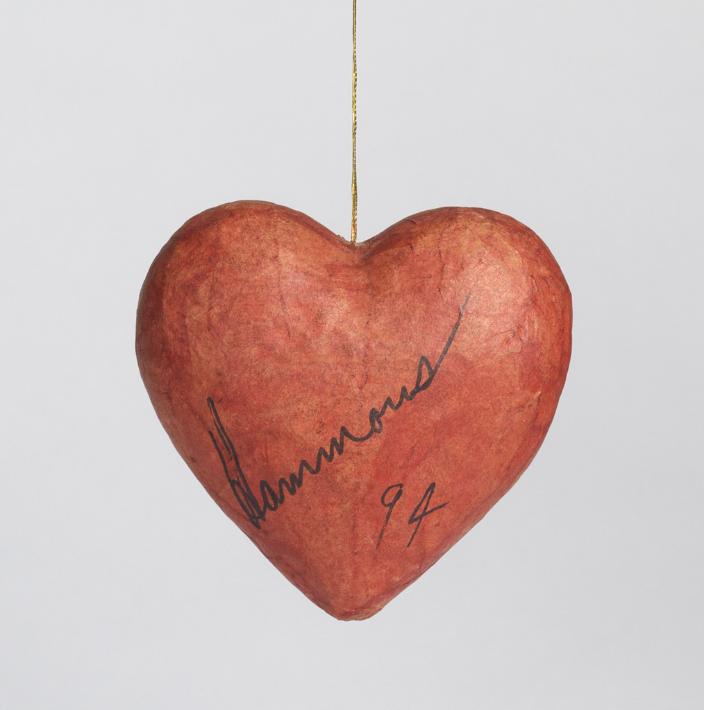
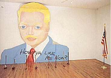
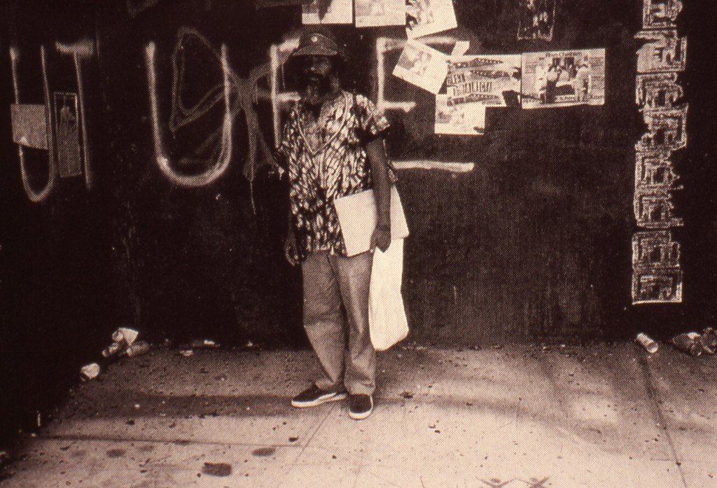
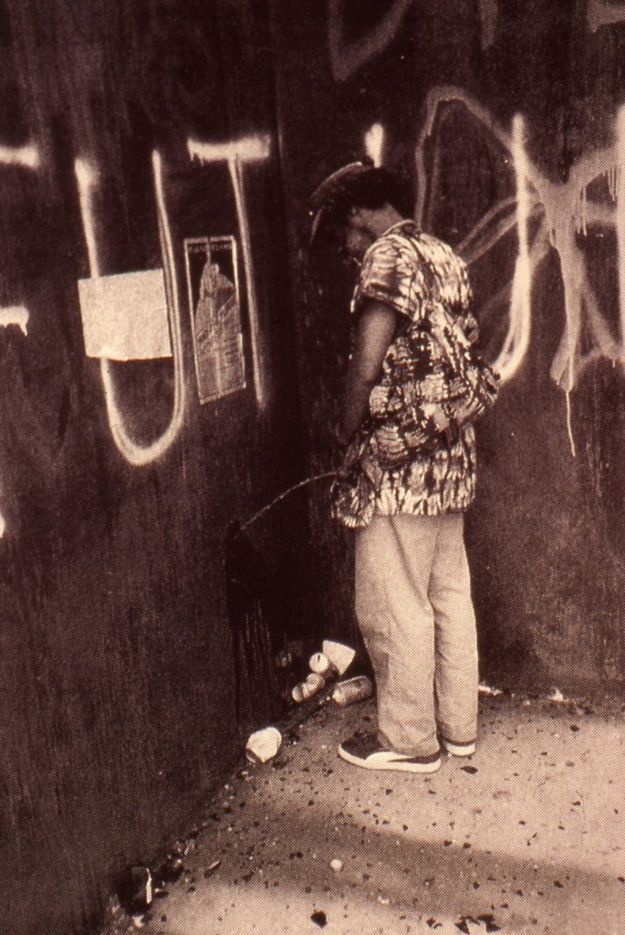
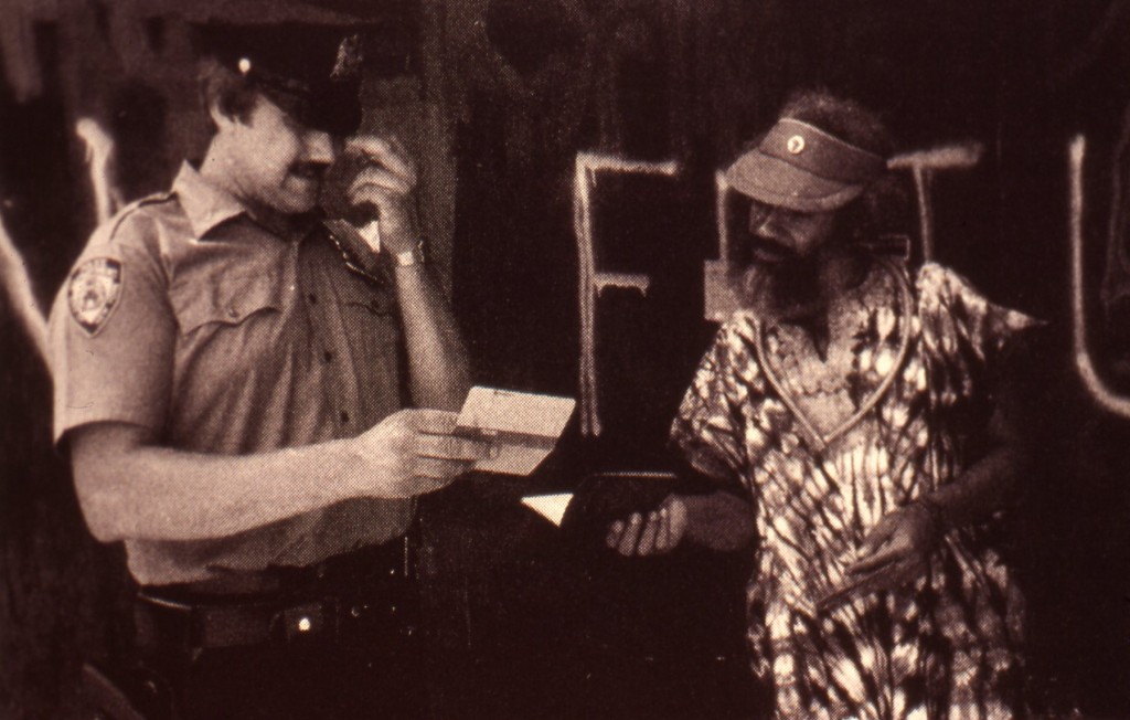
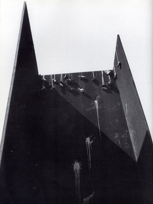
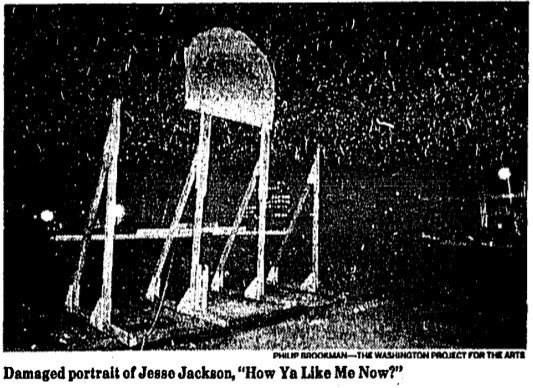
With David Hammons on the brain at the moment, I think of his 1989 outdoor painting of a blonde Jesse Jackson, How Ya Like Me Now? which was vandalized as it was being installed across from the National Portrait Gallery in Washington, DC. Hammons subsequently showed it with a row of sledgehammers. And of six American Indian activists who painted Theodore Roosevelt’s statue in front of the American Museum of Natural History in 1971, who had their charges dropped if they paid the museum’s cleanup costs.

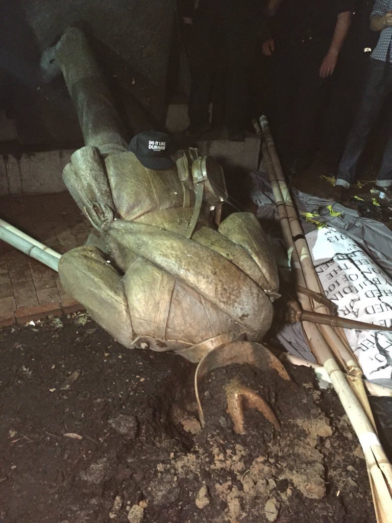
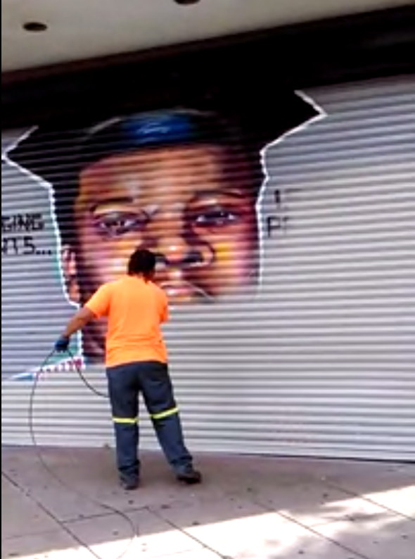
Since the beginning of the Black Lives Matter movement, and the increased protests of confederate memorial statues, I’ve come to see painting as crucial, even central. After decades of inertia, monuments are suddenly painted or pulled down. Then they’re quickly covered with tarps or boxes or removed. Take an object. Do something to it. Do something else to it.

What if we recognize these gestures as generative, not destructive? What if we leave them? Keep them? Look at them? Study them? And when the time comes, conserve them?

Public Enemy Nos. 2–?

David Hammons, Public Enemy, installation at MoMA, 1991

I’ve written about “Dislocations” before. It’s one of the contemporary shows at MoMA that left a deep impression on me when I first moved to New York. It was in 1991-2 when Rob Storr curated huge, room-dominating sculptures by Chris Burden and Louise Bourgeois, and installations [!?] by Bruce Nauman, Adrian Piper, the Kabakovs, and David Hammons.

I just found this 5yo photo of Hammons’ Public Enemy, which I guess I had looked up because I was deep into photomurals at the time, and really wanted to find (or make) Hammons’ big photocube of the piece’s namesake, Teddy Roosevelt and his Grateful Savages [sic, obv].

Public Enemy, 1991, installation view from MoMA’s archive

In the intervening years MoMA has upped their archival game significantly, by putting a ton of exhibition material online, including the press release, checklist, brochure, installation photos, and a pdf of Storr’s catalogue. [Oh wow, Sophie Calle was in that show? Guess her intervention–removing paintings from the Modern’s galleries–was so subtle, I forgot.]

This was the first work of Hammons’ I’d ever seen, probably the first time I’d heard of him. Which seems crazy now, but reading the show’s time capsule of a catalogue, maybe I wasn’t so far behind. Storr waxes and marvels at what is now known about Hammons’ practice:

Hammons has preferred the city as a workplace and its citizens as his audience and sometime co-workers. Street flotsam and jetsam are his materials. What he brings to the gallery is all and sundry that it traditionally excludes. What he extracts from those materials and brings to the objects and installations that he has created outside the museums are the marvels and mysteries that lie already and everywhere to hand along heavily trafficked thoroughfares, in public parks, and in the so-called vacant lots littered with the evidence of their constant nomadic occupation and use…

“I like doing stuff better on the street, because art becomes just one of the objects that’s in the path of your everyday existence. It’s what you move through, and it doesn’t have superiority over anything else.” [he said in an otherwise unpublished interview which I now think we should unearth. -ed.]

Storr goes on about Hammons’ improvisatory process, “like jazz,” in which, despite a year of lead time, “all options remained open and the result wholly unforeseen” until the artist arrived to install the work. Which must have given MoMA an institutional heart attack.

And which, really? Because you can’t just pick up four huge photomurals or a substrate for them. And those sandbags seem very manufactured and ordered from somewhere. True, if you just work fast enough, those NYPD barriers were all over town, free for the taking. [Do they still have those? For throwback protests?]

Silent Sam confederate soldier statue suddenly torn down at UNC Chapel Hill, image: @yesyoureracist

What I thought about yesterday was whether Public Enemy still existed, or could be recreated. What I wonder about today, though, is what it’ll take for Uncle Teddy to get the Silent Sam treatment.

Public Enemy was installed in “Dislocations” at The Museum of Modern Art from Oct. 1991 through Jan. 1992 [moma.org]
Previously, related: Chris Burden’s Other Vietnam Memorial was in “Dislocations”, too

David Hammons’ Spade Again

David Hammons, Spade, 1972, 26×20 in., sold Apr 2017 at Swann Gallery, now at Sotheby’s with a 60% markup. This unmatted photo is from Swann, and it looks like the print had some tape ripped off of it. Sotheby’s fixed that by cropping their jpg.

I was very interested to see this David Hammons print on silver paper when it came up for sale a year ago at Swann. And now that it’s back at Sotheby’s, I’m kind of interested in what’s up. I don’t remember it selling before, but Swann says it did. [For just $25k, or a $20k bid+premium, against a $30-40k estimate. Maybe it sold afterward.]

For an important approach (face imprinting) to an important subject (spade) for an important artist (DH, prounounced duh), that was only realized in a tiny fraction of the original edition (50 declared, six printed), it seems like it should’ve been snapped up and kept.

Oh right, now I remember why I was so interested in it: because I wanted to finish off the edition myself. There was a Warhol print on silver foil paper, too. Seems tricky to execute.

David Hammons, Moving to the Other Side, 1969, screenprint, image via Swann

Not as complicated as making it in the first place, though. Hammons’ process of turning a bodyprint into a silkscreen was described in a 2007 sale of a 1969 proof, Moving to the Other Side [above]:

“When I lie down on the paper which is first placed on the floor, I have to carefully decide how to get up after I have made the impression that I want. Sometimes I lie there for perhaps three minutes or even longer just figuring out how I can get off the paper without smudging the image that I’m trying to print.” [Young, p. 8.]
Then the artist applied a fixative to secure the image to the thin layer of margarine, often, as in this work, with multiple impressions. The artist took this work one step further making a screenprint of a monotype, moving the print across the paper to create a multiple self-image.

This process made me think Hammons mirrored his profile for Spade, but I think they’re actually the two sides of his face, composited.

Anyway, a Spade in the hand…

Lot 426 David Hammons, Spade, 1972, no 1/50, screen print on silver metallic paper, est. $40-60,000 [sothebys]

UPDATE: wow, $100,000. Epic flip.
UPDATE UPDATE: Not really, more like epic shop. $100,000 is what a collector pays, and the markup for a collector who did not know or know where to buy this work just a year ago is 400%.

Assuming the seller bought it last year for $25k, their take yesterday after premiums (25% buyer, 10% seller) is probably only $72k. So their net is around $45k. Not bad for one work for a year, but not epic.  Combined, the two auction houses got $35k ($7k for Swann, $28k for Christie’s). The original owner got around $18k. Plus 45 years with the work. Hard to say he’s not the winner here.

Pissed Off: Can You Hold It?

c.1990 Xerox poster for the Exit Art exhibition of David Hammons’ 1981 performance, Pissed Off. image NYU Fales Library Exit Art Archive via SAAM

I have been interested in David Hammons’ performance/interventions staged at Richard Serra’s T.W.U. for a while, so I made a point to listen to Columbia and Smithsonian American Art Museum pre-doctoral fellow Abbe Schriber’s presentation at SAAM yesterday.


Titled, “Word on the Street: David Hammons’s Negotiation of Rumor, ca. 1981”, Schriber spoke of Hammons’ “strategy of obscurity” and the careful ambiguities around the two projects, Pissed Off, and Shoe Tree, in which, respectively, the artist pissed on and threw sneakers over a three-plate Serra prop piece installed on a Tribeca traffic island at the intersection of Sixth Avenue & Franklin Street.


What I did not realize, is that Hammons sat on these works without announcing or showing them for nine years. The work was first shown publicly in the 1990 Exit Art exhibition, “Illegal America.”
Whether it’s the myopia of the blogger and tweeter compelled to feed the content beast, or the tyranny of the new, it’s hard to imagine maintaining this kind of years-long silence about a work today.  But that could also be the perplexity of hindsight. Maybe Hammons didn’t show Pissed Off because no one wanted to see it. Or he didn’t have the right context for it.
Which made me wonder again. Hammons’ Pissed Off was included in Exit Art’s 1990 show “Illegal America.” [Was the Xeroxed “poster” above, in the Exit Art archive at NYU, what was included in the exhibit? Was anything else?] But the 1990 show was a restaging of a February 1982 show of the same name. “Illegal America” was the first show Jeanette Ingberman and Papo Colo staged as Exit Art, and they did it at Franklin Furnace, which was located half a block from the site of Serra’s–and Hammons’–works. You could see Serra’s work from Franklin Furnace’s front door.
At SAAM, Schriber discussed Hammons’ interactions with JAM, an alternative space for emerging African American artists which had moved a couple of blocks west of Franklin Furnace, but she did not mention this earlier incarnation of “Illegal America.” 26 of the 36 artists in the 1990 show had also been in the 1982. Hammons was not among them. Was he going to be? Was he not?
Richard Serra, T.W.U., 1980-81, installed in Tribeca, image via publicartfund.org
It does seem like quite a coincidence that Hammons created two works involving the racialized and bodily precarity associated with illegal actions within pissing distance of the projected site of a show about artists working in the medium of illegality itself.
Could it be? “Illegal America” opened in February 1982, and included The Real Estate Show, which had taken place in 1980. Pissed Off happened sometime in 1981, but T.W.U. was only installed until July 30th, 1981, so that gives some parameters. Would Hammons have visited Franklin Furnace before, during or after Pissed Off? Would they have known of his work? Were they interested? Or not? If Hammons was going to be in, he wasn’t. If he wanted to be in, he wasn’t. Did something go down?
Would the Exit Art folks or Franklin Furnace have known in 1982 about the subject of Hammons’ artist statement for the 1990 show, which Schriber presented, and which I had never heard of?
“Pissed Off” is about the fact that in New York City a man doesn’t have any public access to relieve himself in a decent manner. There is no way for a gentleman to relieve himself in a gentlemanly manner without having to buy a drink.
Keep the rage going.
What started Hammons’ rage? Sure, a city and a system that denied the needs of its citizens on the most basic, bodily level, and putting a gentleman at risk of police intervention for the most basic necessities, but was there anything else?
Can you imagine Hammons and Bey the morning of Pissed Off, one of them with a camera, and at least one of them dressed in a dashiki that, as Schriber put it, gave him “the look of a city forager.”  What if they visited Franklin Furnace that morning? To drop off some slides? To talk about a show? Have a chat? Just to look around? What if they said they were there for a meeting? What if they asked to use the men’s room? Can you imagine what could have happened?
Hammons’ nine year wait seems short, and also way too long. And I don’t think he’s done.

44 America: David Hammons’ House Of The Future & America Street, 2007-2017, 2018

David Hammons & Albert Alston, House of the Future, 1991, photographed in 2006 by ksenia_n

In 1991 the artist David Hammons was invited by Mary Jane Jacobs to create a site-specific work in Charleston, South Carolina for a new, visual arts program linked to the Spoleto Festival. Jacobs had patterned the exhibition, “Places With A Past”, after the Skulptur Projekt Münster. Spoleto founder Gian Carlo Menotti hated the whole thing; the exhibition divided the board and got the director fired (he came back a couple of years later, after Menotti quit), but the show’s art historical reputation has only grown.

That said, Hammons’ is the only one of 61 installations left standing, thanks in large part to his early decision to collaborate with Albert Alston, a local builder, who seems to have maintained and championed the work over the ensuing 27 years.

Hammons and Alston built House Of The Future on a vacant, city-owned lot on Charleston’s segregated East Side using architectural fragments and materials from renovation and demolition projects nearby. It is a 6×20-foot teaching model of Charleston’s signature style, with labels for each component. At some point, a young, local artist used the ground floor as studio space, and Alston oversaw other public programmatic uses. On the back of the House, Hammons painted a quote from African American writer Ishmael Reed:

The Afro-American has become heir to the myths that it is better to be poor than rich, lower class than middle or upper, easy going rather than industrious, extravagant rather than thrifty, and athletic rather than academic.

[Though Reed gets–and takes–credit for the quote, it seems that it actually originates with musician/composer/sociologist Ortiz Walton. Reed quoted Walton’s critical history of cultural exploitation, Music: Black, White & Blue in a 1973 review for Black World Magazine. Reed & Walton seem to have been frequent collaborators and interlocutors, so maybe this is one more of those Hammons/Alston situations. In any case, the quote itself was criticized by some in the community, and it has disappeared and reappeared from the wall of House Of The Future with various repaintings. According to an unrelated 1995 lawsuit by a disgruntled muralist, though, it was integral to the community’s embrace of the installation that helped preserve it after the Spoleto Festival ended.]

Oh, say, can you see?

At some point after the May 1991 opening of “Places With A Past”, Hammons’ second element was realized kitty corner from House of The Future. America Street is a small, grassy bump of a park on another vacant lot, where Hammons’ iconic African American Flag flies from atop a 40-foot pole. A black and white photo of a group of children looking up, as if at the flag, filled a sidewalk-scale billboard that had previously featured ads for liquor and Newports. From this 1996 account of the Spoleto fallout over “Places With A Past”, it sounds like the works survived some entropy, if not straightup neglect. But both the flag and the picture have been replaced over the years.

Hammons’ America Street, January 2017
Detail of David Hammons’ America Street, 1991, a billboard photo of local kids looking up, img: gsv, jan 2017

I have not visited Hammons’ piece(s), except in Google Street View. The first thing I noticed was they differed in appearance from the historical photos. I realized GSV’s own decade of historical imagery is useful here, for marking the changes this tiny house and its neighborhood have undergone.

Clicking through the changes wrought by time on a piece of Southern vernacular architecture, I immediately thought of the work of my late neighbor, the photographer William Christenberry. He would travel back to his native Alabama year after year for decades, photographing the same houses, churches, and stores, usually documenting their deterioration and subsumption by kudzu.

William Christenberry, Red Building in Forest, Hale County, Alabama, 1983, image: Hemphill

What I was seeing in Hammons’ and Alston’s piece was the opposite: a structure built from the castoffs of renovation and gentrification, surviving thanks to a small but persistent maintenance effort. And through it all, year in and year out, no matter the storms or racial strife that battered some other flags in South Carolina, Hammons’ star-spangled banner is still there.

In the spirit of Christenberry, I decided to make some historic GSV printsets [prints of screenshots; GSV is a screen medium] of Hammons’ and Alston’s House Of The Future and America Street. I’ve followed Christenberry’s format, but I’m skipping the traditional photographer’s approach of making editions of a bajillion in a thousand sizes. Each set of 7-9 images is printed small (8×10 in.), in an edition of 2, plus 1 AP: one for you, one for the museum, one for me. Because srsly, why overthink it? If anyone actually wants to buy them, I turn into some kind of crazed Amazon artworker pick&packing prints all day? Hard pass right now, thanks. If you don’t move in time to get it, just make your own.

All the pics are after the jump.

Continue reading “44 America: David Hammons’ House Of The Future & America Street, 2007-2017, 2018”

Untitled (Sold Out), 2017, Leather Wrapped Stone from Nordstrom

david_hammons_rock_head_1998.jpg
David Hammons, Rock Head, 1998, image via: hairisforpulling
In 1992 David Hammons took clippings from the floor of a barber shop in Harlem and affixed them to the crown of a melon-sized stone from Harlem. He brought the stone back to the barber shop for a haircut alongside his friend and muse, the Lower East Side poet John Farris. The performance is known as Haircut. Hammons has made several similar sculptures of black hair attached to stone, then trimmed and cut with tramlines, which have been titled Rock Head or Stone Head. They are inspired by history and their surroundings. Black living is at their core. They honor uniqueness and celebrate the individuality of each piece Hammons creates.
made_solid_pitoc_wrapped_stones.jpg
Made Solid is a collection of leather products designed and handmade in Los Angeles by Peter Maxwell and Mia.
Our design is inspired by our history and our surroundings. Western living is at our core.
We honor uniqueness and celebrate the individuality of each piece we create.
“The name Made Solid references the connection we create through our creative process and the end result of our labor. Making a solid connection between the raw leather our hands touch and the well used pieces our friends love is our constant goal.

“We are connected to our surroundings, bringing natural elements to our work. Ocean, sand, stone and sky are referenced.
“We bring our lifestyle to our work.”
made_solid_nordstrom_stone.jpg
In 2013, Maxwell and Mia conceived “one of their most popular and recognizable pieces” in collaboration with “one of their oldest friends,” Los Angeles designer Cristy Pitoc. Their Leather Wrapped Stones are sourced locally, “selected for shape and color,” and vegetable tanned leather is stretched around each stone with the wet molding technique used in saddle making. The edge is stitched, beveled and burnished by hand. “The leather is bound to the stone for life.”
“Use as a paper weight, worry stone, doorstop, art object – whatever it is to you.”
made_solid_wrapped_stone_hemingway.jpeg
Wrapped Leather Stones have been featured in design-appreciative blogstores, literarily themed artisanal and locally sourced menswear emporia, and well curated home and lifestyle shops to, I’m sure, appropriately contemplative acclaim.
For the Holiday 2016 season Made Solid Leather Wrapped Stones were also curated into the Love, Pop-In Stores at select Nordstrom locations and at Nordstrom.com:

A paperweight? A conversation piece? A work of art? It’s up to you, but this smooth Los Angeles-area stone–wrapped in rich, vegetable-tanned American leather secured by sturdy contrast backstitching–is sure to draw attention wherever it rests. A traditional hardening process gives the leather a beautiful ombré effect. Like all Made Solid leather pieces, this one is cut, shaped, sewn and finished by hand in artist Peter Maxwell’s Los Angeles studio. Using vintage leatherworking tools and traditional saddle-stitching techniques, Maxwell aims to create beautiful designs that embody both simplicity and functionality, and that develop rich character and patina over time.

The collaborative contributions of Mia and Pitoc went unmentioned, but the availability of a leather wrapped stone did not, and Nordstrom’s Leather Wrapped Stone went viral in December as an object of superficial, reflexive media mockery and superfluity, the diametric opposite of their creators’ intentions. It appears they also sold out, but at what must be considered too high a cost, or too low a return; at the moment no Wrapped Stones are available in Made Solid’s online store.
Earlier this week Nordstrom confirmed they would no longer carry the licensed merchandise of Ivanka Trump, citing poor sales. Yesterday Ivanka’s father tweeted in outrage over the haters’ and losers’ slights, and the White House press secretary literally said Nordstrom’s decision to discontinue stocking Ivanka was an attack on the president’s policies and family. Discount clearance stores TJ Maxx and Marshall’s also both dumped the toxic, failing brand. Today as I type this, the other White House flack is violating federal law by literally declaring a commercial promoting Ivanka’s brand and telling people to go buy it.
Untitled (Sold Out) (2017) consists of things that actually did sell at Nordstrom, namely a Made Solid Leather Wrapped Stone. So whatever it is to you, it is now also a declared, limited edition inspired by [our rapidly unraveling] history and its surroundings. Though I will endeavor to pin it down, the size and location of the edition is presently unknown. Both small and medium Made Solid Leather Wrapped Stones purchased from both seasonal appearances at Nordstrom are included, but Made Solid Leather Wrapped Stones purchased elsewhere, are not, no matter what their size.
Fakes already abound, but if you believe you have an example of this artwork, please provide images and appropriate documentation of the provenance, and I will gladly issue a signed certificate. Requests for confidentiality will be honored.

The Daily Practice Of Refusing

herbert_tell_them_I_said_no_cover.jpg
I’ve recently enjoyed and been enlightened by Martin Herbert’s new collection of essays, Tell Them I Said No published by Sternberg Press. Herbert considers ten artists who have left the “art world” and how. I put that in scare quotes because some artists stop making work, while others stop showing it, and others refuse to perform as public figures discussing or representing their work.
It’s a very thoughtful group of essays about a fascinating and challenging group of artists who, it turns out, are engaging with art and artistic practice entirely on their own terms. The artists are Agnes Martin, Albert York, Charlotte Posenenske, Stanley Brouwn, David Hammons, Lutz Bacher, Christopher D’Arcangelo, Laurie Parsons, Cady Noland, and Trisha Donnelly.
A couple of excerpts from Herbert’s introduction:

As performed today, [self-detachment] pushes against the current in an epoch of celebrity worship and its related feedback loop, increasingly universal visibility and access. A big part of the artist’s role now, in a massively professionalized art world, is showing up to self-market, being present. On all channels, ideally: see how, aside from all the photo opportunities, far-from-digital-native figures take to social media or splash themselves when possible across magazines (which grander galleries now produce themselves) or collaborate with fashion designers, all gates open.

In such a context of hectic short-termism and multiple types of oversharing, some kind of voluntary retreat, some respect for the Joycean triumvirate of silence, exile, and cunning, might constitute a vanguard, if a difficult and apparently suicidal one to countenance today since it seemingly requires earning the right to leave.

None of this, meanwhile, has transpired in a steady-state art world. Rather, the urge to pull back, where felt, echoes changing conditions over decades, from the swing toward dematerialization and its intersection with critique, to art’s transmogrification into a backcloth for the power plays of the prosperous.

Each case Herbert examines is particular; he does not try to force artists’ experiences and choices into an over-arching historical analysis. But as I found myself nodding along in recognition and admiration for these artists, I came to feel a case being made against the structures of the market- and celebrity-centered art world we’re soaking in.
This multi-faceted questioning reminded me of another paradigmatic challenge, posed by Helen Molesworth in the Dec. 2016 issue of Artforum. Molesworth asks why shock, countering shock with shock, and a strategy of épater le bourgeoisie persists as the dominant mode of modernism and the avant-garde:

Must meaning be predicated on shock? Why was a cut or a break always required for something to be historically serious or significant? Why couldn’t continuity or gentleness, even, be imagined as a hermeneutic of radicality? As someone with a nascent interest in domesticity and the quotidian, I felt that shock didn’t help me understand much of anything.

Molesworth goes on to discuss powerful examples of engagement, listening, connection and self-reflection as alternatives to the received models of attention-grabbing spectacle and an ever-intensifying cycle of shock and desensitization. In a similar way, while the artists Herbert discusses don’t show a singular path out of the current hall of mirrors, they remind us of the overlooked potential of engaging art with questioning, silence, and refusal.
Who could refuse to buy Tell Them I Said No at Amazon for like $24? [amazon]

Have Yourself A Hammons Little Christmas

david_hammons_heart_ornament.jpg
Untitled (Heart), 1994, via swann
This is a papier mache heart ornament signed by David Hammons, which he gave to Sara Penn in 1994. Penn was the owner of Knobkerry, a Tribeca dealer of African and Asian textiles and home furnishings which Hammons filled with work in January 1995.
Infiltrated might be a better word. Hammons made work by, with, and around Penn’s merchandise, combining cultural signifyin objects to create charged puns. [The show was the hook for one of my favorite texts on Hammons’ work, “Wreaking Havoc on the Signified”, by Coco Fusco in Frieze.]
hammons_flyswatter_knobkerry.jpg
Untitled (Fly Swatter), 1992, image via swann
Anyway, it looks like Penn accumulated a nice stash of Hammons swag. In 2008 a small African American Flag (1990) and Untitled (Mona Lisa), a little, postcard-size collage from Penn sold at Swann, the NY auction house. The collage is dated 1989 and has “Marry, Christmas David” inscribed on the back. A five-foot long sculpture titled Untitled (Fly Swatter) (1992) sold in 2010. It was called “The World’s Most Expensive Fly Swatter?” after blowing out the estimate.
Sounds like the Knobkerry show was a long time coming. Also that David Hammons probably has an off-the-hook Christmas Tree.
Oct 6, 2016 | Lot 168, David Hammons, Untitled (Heart), 1994, est $6-9000 [swanngalleries.com]

The Sign Of Las Cruces, Or How Ya Like Me Now? LAND Edition

daniels_malls_landmd.jpg
Chapter 7: Pending Cipher for the Open Present, image: Daniel R. Smalls via hyperallergic
Daniel R. Small’s contribution to LAND’s land were installed in New Mexico, where they have upset the locals with their scary symbols and indecipherable glyphs. From an email Small sent to Hyperallergic’s Kemy Lin:

There was also a very hostile reaction from a local neighborhood when the installers from Lamar were up the billboard ladder. A group of locals surrounded the base of the pole shouting obscenities and claiming that the billboards were either Satanic or Islamic.

Which sounds a lot like what happened when the Washington Project for the Arts installed David Hammons’ How Ya Like Me Now? across from the National Portrait Gallery as part of Richard Powell’s 1989 exhibition on Black Culture and Modernism:

But a billboard-size portrait of a pink-cheeked Jackson suddenly appearing on the streets of DC with no explanation and a Kool Mo Dee lyric for a title was bound to arouse controversy. And when WPA curator Powell, who is black, left three white staffers to finish installing the piece, a crowd of young black men formed, voiced their protest against the artwork–and then took a sledgehammer to it and tore it down.

On the bright side, that work ended up in Glenstone, so maybe Small should just ride it out.
Billboard Art Project Sets Off Terrorism Scare Near US/Mexico Border [hyperallergic]
previously: How Ya Like How Ya Like Me Now?

How Ya Like Me Now? Trenton Edition

mike_brown_trenton_mural_bmarshall.jpg
About two weeks ago, artists from the Sage Coalition in Trenton, New Jersey, sought and obtained permission from the Trenton Downtown Association to paint a mural on the metal shutters of a vacant storefront. They decided to paint a large portrait of Michael Brown and the text, “Sagging pants…is not probable cause.” The artists saw it as relevant to both the memory of Brown and his killing in Ferguson, Missouri, and to their own experience with racial profiling at the hands of the police in Trenton.
Yesterday, according to NJ.com, “The Trenton Downtown Association elected to remove the image after hearing concern from police officers that the mural sends a negative message about the relationship between police and the community.” TDA director Christian Martin “said police said the painting did not promote peace in the community.”

The image was buffed by a municipal graffiti blasting crew yesterday. Sage collaborator Byron Marshall shot and narrated the scene.
hammons_how_ya_wpa.jpg
David Hammons, How Ya Like Me Now?, reinstalled inside at WPA, 1988
The situation feels like an inversion of the destruction of How Ya Like Me Now?, a 1988 billboard-sized painting by David Hammons of a blonde, blue-eyed Jesse Jackson, which was momentarily installed across the street from the National Portrait Gallery in DC. It was almost immediately set upon by sledgehammer-wielding locals who did not care for its negative message.
‘Sagging Pants is Not Probable Cause’ Mural Removed After Concerns From Trenton Police [nj.com]
Previously: How Ya Like How Ya Like Me Now?

Balling Art In Harlem USA


Oh hi, no, NBD, just a video of David Hammons making a basketball drawing in a skylit stairwell. Shot probably in 2000-01 by EV photographer Alex Harsley.
If you’re one of the three other people in the world who’s seen it on YouTube, let me know. 3 VIEWS, PEOPLE.
And here’s the gang hanging out on the stoop at 4th Street Photo Gallery in, what, 1994? just talking art. There’s the timestamp, Sep.24.1994. Hammons, Herb Gentry, a couple of folks I don’t recognize. From just before Phat Free/Kick The Bucket. “11 views”!
[Sept 2014 Update:Thanks to Mary Anne Rose for correcting me. That’s not Herb Gentry in the fedora after all. Listening to the video again, it turns out he’s named Junior. Also, Rose identified the painter Gerald Jackson in the light blue cap.]

Herb Gentry: “Listen, if you’re an older guy, you should be ahead of that by now.
Hammons: “Not necessarily.
HG: Well, where’re you gonna be?
DH: You can be anywhere. You can be wherever you want to be. This is one of the last places that anything still should go. And it still goes, but nobody’s going with the anything. Everyone has slipped into some category-some formula. And they’re waiting for their formula to show up on the chart. And it ain’t gonna show up.”
Balling Art in Harlem U.S.A. [photodirect’s youtube channel]
Bucket Party [same deal]

Stop And Piss: David Hammons’ Pissed Off

Serra_TWU_PAF_Svennevik.jpg
T.W.U., 1980-81, photo by Donna Svennevik, via publicartfund.org
Richard Serra was on a roll in NYC in 1980. In the run-up to the debut of Tilted Arc, he had two Cor-Ten sculptures installed in Tribeca: St John’s Rotary Arc was in the exit plaza of the Holland Tunnel, and T.W.U. (above) was in front of the Franklin St. entrance for the IND subway. It was named for the Transport Workers Union, which had just gone on an 11-day strike as the sculpture was being installed.
david_hammons_dawoud_bey_twu_1.jpg
By 1981, T.W.U. was looking a little beat, strewn with empties, and covered with wheatpasted flyers and graffiti. That’s when Dawoud Bey shot a series of photos, posted recently on Black Contemporary Art’s tumblr, of David Hammons pissing on the sculpture.
The sequence apparently begins with Hammons in khakis, Pumas, and a dashiki, with a matching shoulder bag, just standing there in the south-facing space of Serra’s sculpture. In the next photo, he’s turned away from the camera, doing his business.
david_hammons_dawoud_bey_twu.jpg
Then we see Hammons, talking with an NYPD officer, presenting papers, maybe a passport? The caption reads, “David Hammons receiving a citation from a police officer.” Which might have happened! But really, we don’t know.
david_hammons_dawoud_bey_twu_3.jpg
These photos are not journalism; they’re documentation of a performance Hammons titled Pissed Off. I don’t know when or how the title emerged; it’s hard to trace the historic trajectory of Hammons’ practice apart from the art world’s later embrace/interpretation of it.
But considering that other tellings of the story say that Hammons was “arrested” or “almost arrested,” I feel more comfortable in just saying we don’t know.
What happened, and what’s in the photos, are not the same thing. There were actions and interactions here beyond the frames and before, after, and in between the clicks of the shutter. Like, where’d the white shopping bag and folder Hammons is holding in the first photo go? Is Bey holding them? It makes me think of one of the best pieces I’ve ever read on Hammons’ work, by Christian Haye and Coco Fusco, from Frieze, May 1995:

[Hammons] is, in actuality, a masterful investigator of how an oppositional black cultural identity can be generated through a dialogue with ‘high’ culture, particularly as it is articulated through standard English. His method relies on punning and other kinds of word games that short-circuit the dominant cultural interpretation of any given object or term to be redirected for his own purpose.

This practice, which Haye discusses using Henry Louis Gates’ concept of signifyin’, applies as much to Bey’s photos as to Serra’s sculpture. The art world can think it’s funny and transgressive to see Hammons pissing on Serra, but do they even notice that he’s splashing onto their shoes, too? That everyone assumes or accepts the retributive outcome of Hammons’ encounter with the cop may just be the most critically damning aspect of Pissed Off.
david_hammons_bey_serra_shoetree.jpg
David Hammons, Shoe Tree, 1981, on Richard Serra’s T.W.U., 1980, image via grupa ok, (who rightly call it an assemblage)
Speaking of shoes, Hammons did another performance at T.W.U.. For Shoe Tree (1981), Hammons threw 25 pairs of sneakers over the top of Serra’s 36-foot tall steel plates. Some call it a performance, but unlike his documentation for Pissed Off, Bey’s photo shows no artist, no action, no street, no building, even, just the stark angles of the top of Serra’s paint-splattered sculpture against an empty afternoon sky.

How Ya Like How Ya Like Me Now?

hammons_how_ya_wpa.jpg
How Ya Like Me Now?, a large painting of a white Jesse Jackson by David Hammons, was one of seven outdoor works in “The Blues Aesthetic: Black Culture and Modernism,” an ambitious exhibition organized in the Fall of 1989 by Richard Powell at the Washington Project for the Arts.
The other six outdoor artworks were installed without a hitch, but approval for Hammons’ painting to be erected on a DC city-owned parking lot dragged on for six months, three months after the show opened. When the OK was suddenly given [with no explanation of either the delay or the decision], WPA staffers hurriedly erected How Ya Like Me Now? on the lot at 7th & G Streets [where the Verizon Center currently sits], across the street from one of the intended target audiences for its questioning title, the National Portrait Gallery.
The NPG had no portraits of blacks on display at the time. And Hammons suggested that a portrait of Jackson, arguably the most prominent African American in the US in 1988, would already be in the museum if he’d been white. Jackson had lost the Democratic Party’s nomination for president to Michael Dukakis after hitting a wall of white voter resistance in Wisconsin, a phenomenon of racist reluctance pundits called “the Bradley Effect.”
But a billboard-size portrait of a pink-cheeked Jackson suddenly appearing on the streets of DC with no explanation and a Kool Mo Dee lyric for a title was bound to arouse controversy. And when WPA curator Powell, who is black, left three white staffers to finish installing the piece, a crowd of young black men formed, voiced their protest against the artwork–and then took a sledgehammer to it and tore it down.
hammons_head_wapo89.jpg
The Washington Post showed a photo of the only piece left standing on 7th Street, Jackson’s blonde afro and part of his blue eyes. After some back and forth in which Hammons kind of complained that the WPA did not install the work as high off the ground as had originally been called for, and the WPA complained about the city’s footdragging delays and said it was going to send the scalped Jackson back to Hammons for repair, the damaged tin painting went back on view, encircled by hammers, for the remainder of the exhibition.
All of which makes me very interested to know when and how How Ya Like Me Know? ended up in its current home in a private DC collection.
The most complete account of this story I can find online is this 1998 Duke Alumni Magazine article on RIchard Powell, who went on to become a very prominent art historian and author [duke.edu]

David Hammons On Not Liking To Show In Gallery Spaces That Much

On a visit to Alexandria, Egypt, artist David Hammons asked a curator to ask a local non-profit, Alexandria Contemporary Arts Forum, if he could do a project with them:

I had to explain that it wasn’t going to be in their gallery. They had hoped it would be–it’s a very nice space, a marvelous, beautiful restoration of an apartment. As beautiful as the space was, that was too easy to do. I don’t particularly care for galleries. I’d rather walk through the city and find my own spaces.
I do that a lot in New York. I’ll find something and call people up with the address and tell people to go look at it. It could be a stack of wood in the subway or something that looks like a Joseph Beuys or something lying around. [emphasis added]

Then there’s this. about works where he predicted rainbows over Paris and rain in Munster:

was watching a video on YouTube in which Ornette Coleman presents a tune called “Spring” in Germany; he tells the audience, “Follow the idea of the song, not the song itself.” He also said, “Follow the idea, not the sound.” I was impressed with that. Follow how my ideas are put together, as opposed to whether the rainbow appears or the rain comes. I use this logic a lot. It moves in the realm of poetry as opposed to the actuality that people are used to or expect.

[via artforum]