
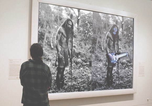
On Friday March 22, I went to see Kenneth Goldsmith reading Richard Prince’s The Catcher In The Rye in front of a Prince rephotography piece in MoMA’s 2nd Floor galleries. I’d been bummed to have missed Goldsmith’s talk on Wednesday night [granted, I had an opening of my own, but still] so I wanted to make sure I didn’t miss this most appropriate event. When he saw my tweets about it, KG graciously offered to reserve a ticket for me, a gesture which set a certain expectation in my mind of guest lists, seats, or crowd control.
Even as I asked at the desk for the ticket, though, my sense began to change. I suspected, and was right, that this was not a ticketed gig, or even a gallery talk-style crowd with a limited number of slots which, if you didn’t get one, you could shadow and eavesdrop on anyway. The ticket was for getting into the Museum. Which, of all things and all places, I did not need a comp for MoMA.
You Can Buy The Liston Range Rear Light
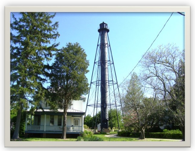
I know the US Government is selling off lighthouses all the time, but the Liston Range Rear Light in Delaware strikes me as exceptional.
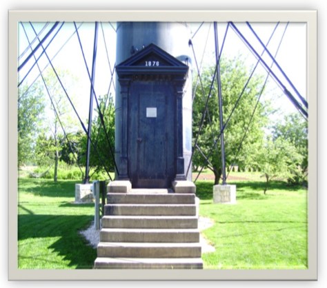
It is a 120-ft tall, braced iron tube built in 1876 that sits, unusually for a light house, three miles inland from the mouth of the Delaware River. It stands on around half an acre of land. It’s a few miles south of 95; I think that’s the exit where the Denny’s is. There’s a 100sf building at the base that’s included, but the adjacent keeper’s house and assistant keeper’s house were sold quite some time ago. The cylindrical tower is lined with wood, and the steel spiral staircase has five landings, in case you need to rest on the way up.
As a range light, it is twinned with a front light which is lower and closer to the water’s edge. Ships navigate by aligning the two lights in a range light.

The Liston Range Rear Light still contains its 2nd-order Fresnel lens, which is unusual.
It is now being sold by the US Coast Guard. The current bid is $10,000. I repeat, $10,000.
One catch, and it’s a big one, is that the Coast Guard retains title to the Fresnel lens unless and until it decides it doesn’t need to be in the range light aid to navigation business anymore. At which point, it may decide to give the lens to the lighthouse’s owner. Who must agree “to display the Fresnel Lens if and when it is discontinued in accordance with the standards set forth in the Guidelines on the Care and Maintenance of Historic Classical Fresnel Lenses.”
It’s a bummer about the Fresnel Lens, but until I can get my hands on one of those late 19th century War Dept. Gettysburg observation towers, this range light might have to do.
Liston Light Tower [gsaauctions.gov]
Liston Rear Range, DE [lighthousefriends.com, bottom image of Fresnel Lens, LOC via LHF]
Liston Rear Range Light [wikipedia]
Introducing CZRPYR2: The Appeal + The Appendix

So I did this.
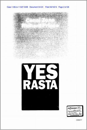
I am very pleased to announce the latest title from greg.org, Canal Zone Richard Prince YES RASTA 2: The Appeals Court Decision in Cariou v. Prince, et al., Also The Court’s Complete Illustrated Appendix. It is available now.
It would have been available sooner. It really should have been available sooner. I got it all together by the end of the day the Appeals Court decision came down, but there was seemingly endless futzing and back & forth with the digital publisher about proofing and formatting, etc. So sorry for the delay.
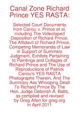
CZRPYR2 is a follow-on and indispensable primary source companion to Canal Zone Richard Prince YES RASTA, [above, available here], which contains the full transcript of Richard Prince’s incredible 7-hour deposition, as well as many key filings and exhibits from the first phase of Cariou v. Prince.
I wondered what you wondered: why not just add the Appeals Court decision to the original book? And if CZRPYR2 was only the decision itself, I might have done just that. Or not bothered with it at all. But then I found the beautiful Appendix the Court created for the decision, and I realized it deserved a permanent place in the history of the case, a book of its own.
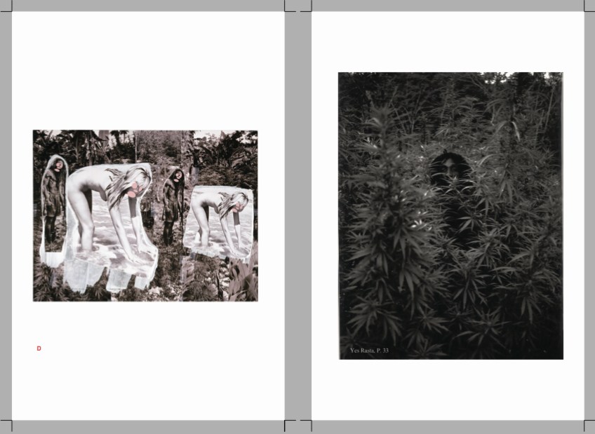
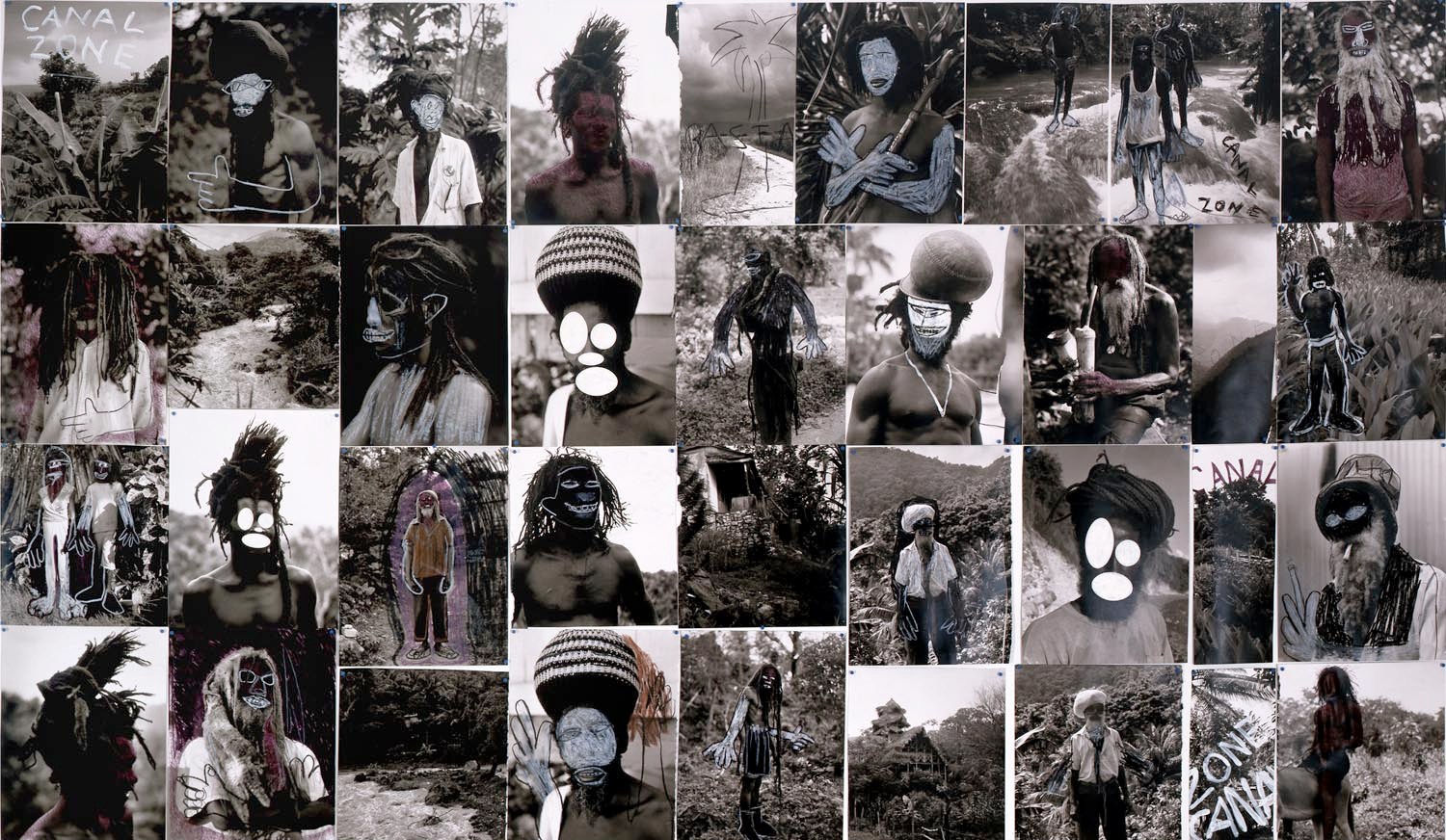
Following on Patrick Cariou & friend’s own slapdash effort, the Appeals court produced a high-quality, carefully cross-referenced catalogue of each use of Cariou’s YES RASTA images in Prince’s Canal Zone paintings. This indexing was the basis of the judges’ Solomonic decision to divide the Canal Zone series into 25 non-infringing works, and 5 infringing?-who-knows-let’s-look-again works. Where applicable, the Court added highlights to Cariou’s images, arguably creating yet another transformative work. And submitting it into the public record.
For this 142-page volume, I integrated the Court’s collections of Prince & Cariou images, to facilitate painting-by-painting review of Prince’s appropriations. And I annotated them for easier referencing. But otherwise the Court’s primary documents are preserved, with an eye to posterity, as they were prepared,
CZRPYR2 is in this way a salute to the Court’s own transformative, creative spirit.
Buy Canal Zone Richard Prince YES RASTA 2: The Appeals Court Decision in Cariou v. Prince, et al., Also The Court’s Complete Illustrated Appendix (142 pages, b&w, 6×9-in.) for $12.99 [createspace]
Buy Canal Zone Richard Prince YES RASTA: Selected Court Documents from Cariou v. Prince, et al for $17.99 [they can ship together, but I’ll probably only sell 2-vol. sets in person. Maybe on a blanket next to Central Park.]
On The Restoration Of 101 Spring Street
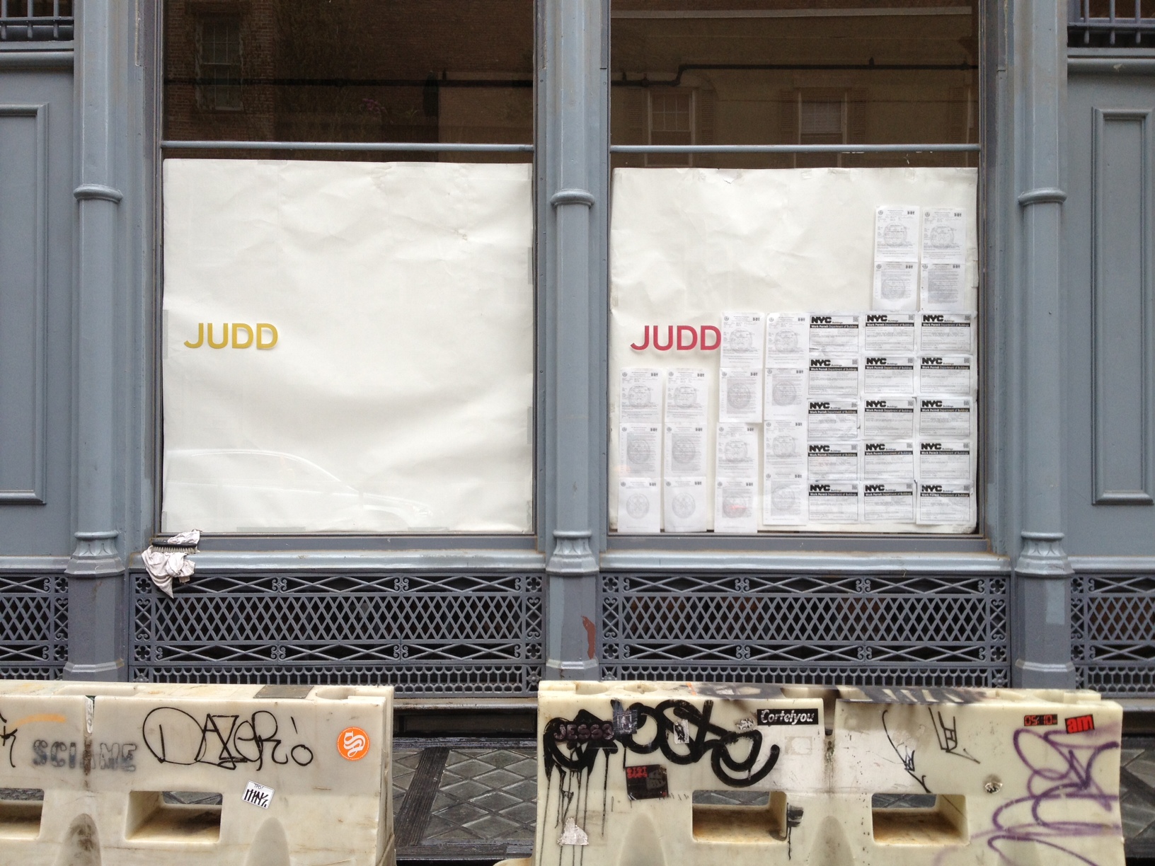
I don’t know how they knew, but I was asked to write about ARO’s restoration of 101 Spring Street for Architect Magazine. I’ve been a huge fan of Donald Judd’s architecture since I first visited his spaces almost 20 years ago, so I was somewhere between concerned, wary, and freaking out over what was going to happen to the artist’s works.
So I attended the Judd Foundation‘s preview last week [EXCLUSIVE GREG.ORG IMAGES ABOVE, BELOW]. Basically what happened was, after 19 years of life-consuming effort and stress, a shit-ton of money, and a near-fanatical approach to conservation, 101 Spring Street is done and saved. [Well, technically, it’s almost done. Like 99% done.]

The second biggest surprise was ARO’s absolutely amazing transformation of the subterranean levels at 101 Spring into the beautiful, light-filled offices of the Judd Foundation. I’d been in the basement once before, way back when, and it was a dingy, dark, leaky mess. Now the original 19th century sidewalk vaults and floorlights [below] work and look fantastic. Even as they go to extraordinary lengths to preserve their dad’s spaces, Judd’s kids also managed to create something for themselves as well.

Meanwhile, I tried to write about Judd in the empiricist style of Judd. It turned out to be very difficult. And if no one noticed or said anything about it, Ima guess that I was only partly successful at it. Still, a very nice thing to write about.
101 Spring Street by Donald Judd (and ARO) [architectmagazine]
The Judd Foundation will start guided visits of 101 Spring Street in June 2013. [juddfoundation.org]
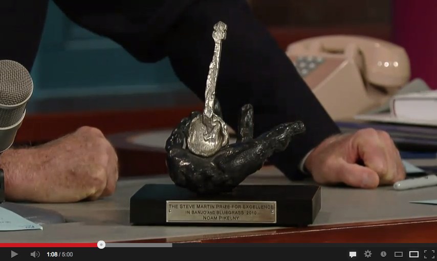
More Relevant With Eric Fischl
By way of announcement, Eric Fischl’s trophy for the Steve Martin Prize for Excellence in Banjo and Bluegrass has been added to this important and growing list of prizes and awards designed by contemporary artists. Thanks @HeartAsArena
Borderline
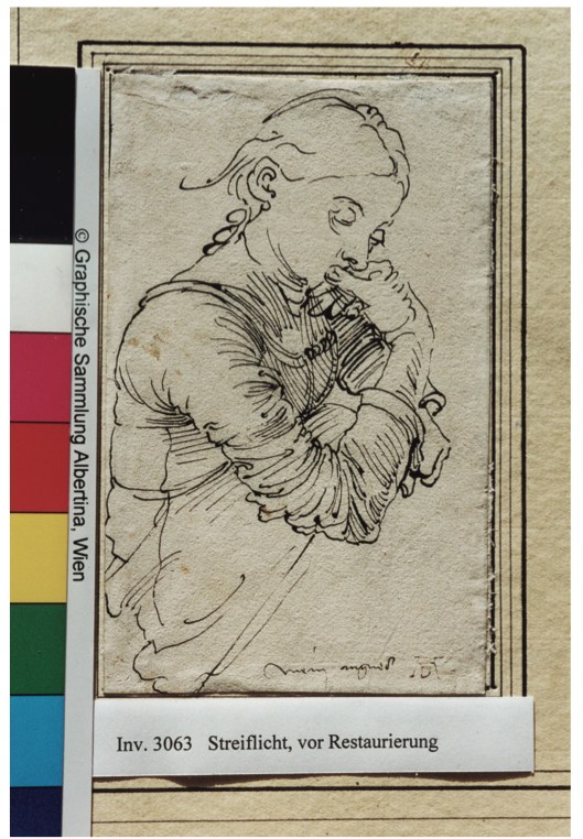
It still feels a little precious and Slate-pitchy to say it, but two of my favorite things about the National Gallery’s extraordinary exhibition of Albrecht Dürer drawings from the Albertina are the mats and the paper.
And I say that fully admitting that both times in the show, Dürer’s works leave me feeling like I chose the wrong Renaissance (Southern) for my art history degree in college. The power and presence and detail of seeing Dürer’s marks in person and in depth is something that slideshow seminars can’t approach.
And these particular aspects of the works that caught my attention are also those that go undiscussed, or get ignored or cropped out of reproductions, catalogues, too, including the NGA’s. So it’s been hard to follow up on my own, or to find reference images. And the NGA’s restrictions on taking photos of 500-year-old artworks hasn’t helped.
I posted a bit about Dürer’s prepared paper already. My favorite is the blue wash, which was apparently an attempt to replicate the color of the unique blue rag paper the artist found on his trip to Venice.
In Hyperallergic Weekend, Thomas Micchelli made the superclose observation that these papers behave differently; ink marks made on painted/prepared paper sit more crisply on the surface, while those on carta azzurra, whose color is infused, soak in and soften a bit. I will have to go back and look now.
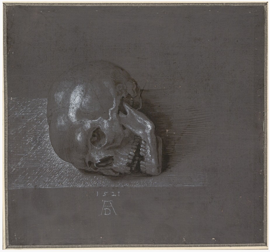
But I guess the intriguing thing for me is imagining Dürer basically painting a monochrome, which he then happens to draw on. I know, it’s a bit perverse. But it’s also something he did over and over. The Albertina’s online collection database includes examples of many other colors that Dürer used over the years: red-brown, grey, green, brown, blue over pink, even violet. Like on this study of a skull from 1521 (Albertina Inv. 3175).
The skull also shows a bit of the ink border that someone, at some point, seems to have drawn around the Albertina’s works. A few dark works, like the grauviolet ones, have wide, thinly brushed borders, but most have a single pen line. These are not often reproduced, but they are visible in the Albertina’s online database. They seem to echo the border of etchings, Dürer’s most renowned medium. They’re also just the beginning.
The Albertina drawings all have additional, concentric lines drawn on the mounts and mats, like little frames. Some are decorated, or hashed, but most are just plain. Still, it’s that they exist, the remnant of someone’s decision to augment the works of one of the Renaissance’s greatest artists for public display.
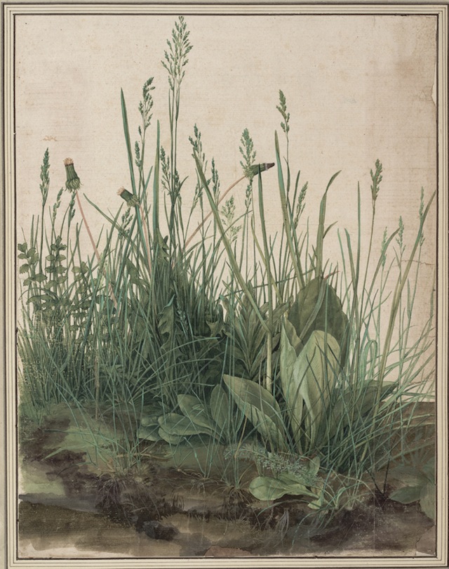
Until Micchelli’s Hyperallergic piece, the only image I could find was the top, from a restoration report for Agnes Mine, Dürer’s portrait of his fiancee. But check out the drawn frame on two of Durer’s most celebrated works: The Great Piece of Turf. Then notice those decorations on the frame around Left Wing of a Blue Roller.
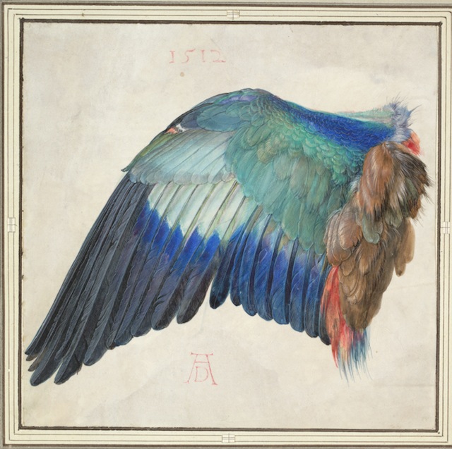
Between the background washes and these inked frames, I started imagining an entirely monochrome, abstract version of the Dürer show; sort of a Stephen Prina-style The Complete Works on Paper of Albrecht Dürer. As soon as I can track down any more info on just how Dürer prepared his paper, I’ll try one out.
Dürer in DC: Some Observations on the Great Observer [hyperallergic]
Albrecht Dürer: Master Drawings, Watercolors, and Prints from the Albertina runs through June 9, 2013 [nga.gov]
Abertina Sammlungenonline [albertina.at]
The $72,000 Question

One recent night I, like you, perhaps, was flipping through a new issue of Artforum, and I saw this ad from Gemini G.E.L., the pioneering LA print foundry, for Honeymoon, a new edition by the late Franz West.
I am a longtime admirer of both Gemini and West, and particularly of West’s multiples, of which this was the first–and alas, probably the last–he would produce with Gemini. Also, how interesting that it’s being advertised in the making by these two women.
So I decided to check it out on Gemini’s website. Which is really a webshop, with a shopping cart, etc., for all their available works.
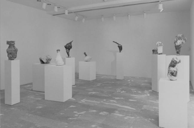
And there it is, Honeymoon, 39 inches in diameter, but only 1/4 inch thick? The one in the ad looks thicker. Papier-mache, though, is classic West. [The first works of his I saw in person were in a MoMA Projects show in, wow, 1997 (above). So long ago, but more recent than it feels. There were painted papier-mache rock-like sculptures on pedestals and furniture. I was really mystified, but then I came around to it pretty quickly.]
Honeymoon was “Projected,” Gemini said, as a “series of 28 unique works.” Unique, yet strangely anonymous, impersonal, and abject: a papier-mache pulp moon, that’s it. But still kind of interesting. I mean, there is so little there there, but even so, there’s something there. It’s a material minimalism, an economy. I could feel myself getting a little wistful staring at this moon, thinking of West’s life and work, ended too soon.
And I thought, I really needed to buy this Franz West, right then and there. So I did. I put it in my shopping cart, paid, and got my email confirmation. Total price: $36, plus free shipping.
Richard Prince’s Canal Zone Paintings: Now With 83% Less Infringiness!
Word is definitely out, but it’s nice to see that copyright insanity has taken a step back for now.
The US Appeals Court largely reversed the earlier court ruling against Richard Prince, finding that the US District Court erred in finding his Canal Zone series paintings infringed the copyrights of Patrick Cariou. Specifically, they said that Judge Deborah Batts used the wrong standard in determining infringement and rejecting fair use.
The Appeals Court judges declared that at least 25 of Prince’s paintings made obvious transformative use of Cariou’s photos. And after laying out a fairly expansive criteria for fair use, it ordered the court to re-review the other five Canal Zone works for infringiness. [That list includes Graduation (inaccurately reproduced below), Meditation (with the dude on the donkey), Charlie Company, Canal Zone (2008), and Canal Zone (2007) (above, which is actually collage, paint on book pages fixed onto a board, which was not in the Gagosian show or the catalogue; it was only shown in St. Barth’s. So why is it even covered by US law? Was it even made in the US? Is it even in the US? Is it impounded with the rest of the Canal Zone works? If so, WHY?]
In addition to citing previously unmentioned quotes from Richard Prince’s own deposition, the judges said that Prince’s intentions, or the unstated lack thereof, were not necessarily required to decide if something is fair use. Fair use can be in the eye of the beholder, specifically the “reasonable observer.” This seems both obvious, and slightly amazing to me. It also jibes pretty well with the amicus brief filed in the appeal by the Warhol Foundation.
It also means that fair use is not dependent solely on an artist making an explicit case for it. If Prince’s refusal to articulate a Koons-scale structure of critique and commentary is not required to appropriate something into your artwork, that would fortify a fair use defense. Rather than discuss art on the law’s terms, Prince has pulled the law toward considering art on its own terms.
Another fascinating aspect of the decision–and by fascinating, I mean obvious and totally in agreement with me–is the court’s emphasis on the changes in size, format, and process between Cariou’s book pages and Prince’s giant inkjet/collage/paintings. [cf this discussion of scale recently] The court went so far as to create its own reference work, similar to the distorted exhibit Cariou entered, but clearer, documenting each painting and the Cariou images and fragments used in it. It’s really nice, and would be very handy for anyone wishing to make their own Canal Zone paintings. Ahem.
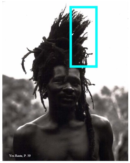
Study for Untitled (After YES RASTA, p. 59), 2013
Anyway, there is more to come, including possibly a new round of evidence and testimony about Cariou’s photos and their appearance and alteration in Prince’s work. Or perhaps someone’ll try to settle. Cariou’s lawyer’s on contingency, I believe, and 40% of nothing is nothing. So who knows how this thing ends. After more than two years since the first cluster)($#%k of a decision, though, today’s gotta be something of a relief for Team Prince.
Here, btw, is a roundup of previous Cariou v. Prince posts, including readings, reviews, and info about the book I made, Canal Zone Richard Prince YES RASTA: Selected Court Documents from Cariou v. Prince, which contains the transcript from Prince’s amazing 7-hour deposition in the case:
Early days of THE BOOK:
the five most ridiculous things about the Richard Prince copyright decision
The Richard Prince decision? You’re soaking in it!
Richard Prince’s Spiritual America
Size Matters?
Actual found blurb: “THE WITNESS: This could be a cool book.”
Introducing: Canal Zone Richard Prince YES RASTA: The Book
More documents from the case, like:
The Movie Pitch that started Canal Zone: “The Movie is called ‘Eden Rock'”
The great Amicus brief filed by the Warhol Foundation
Some CZRPYR reviews and events:
Canal Zone YES RASTA &c. reviewed in The Brooklyn Rail
HOLY SMOKES REVIEW at the Poetry Foundation by Kenneth Goldsmith, which is really humbling and amazing
Apr 2012: CZRPYR included in “Canceled,” curated by Lauren van Haaften-Schick, at the Center for Book Arts
Sept 2012: Audio & coverage of a Printed Matter talk with Joy Garnett and Chris Habib where we actually discussed and looked at Prince’s paintings, which almost never happens.
Looking a bit at the amazing language of depositions, in relation to the live staging of the deposition we did for AFC.
A great discussion of a a WTF image: Virginia Rutledge and Penelope Umbrico talking copies
Buy Canal Zone Richard Prince YES RASTA: Selected Court Documents from Cariou v. Prince online, or in person at Printed Matter.
The Richard Serra Cookie Incident
When the worst thing to happen last week was still tax day, the folks at Blue Bottle Coffee wrote about rumors circulating in the larger SFMOMA art dessert community about the Richard Serra Cookie Incident. [404 link updated to archive.org, 5/2016]
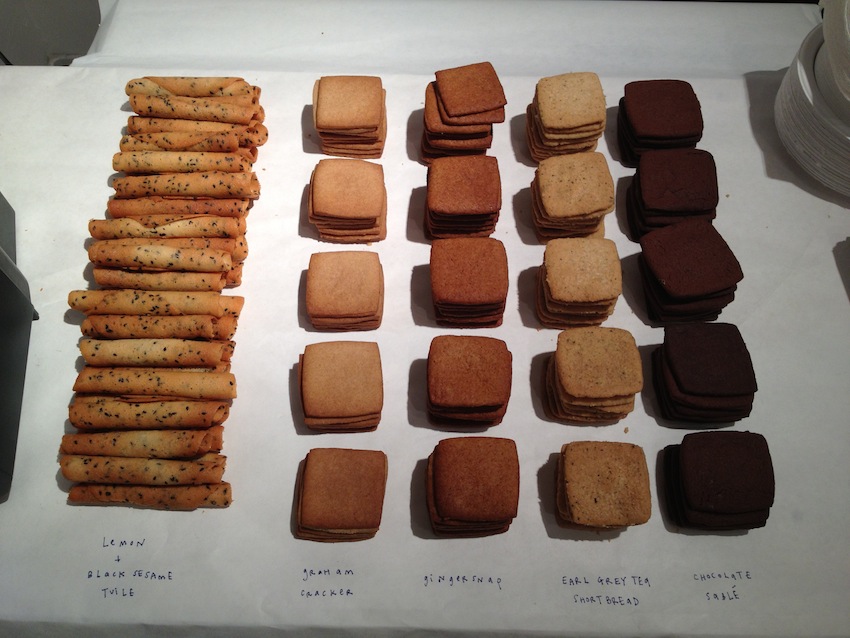
not-Serra cookie parts image by Charles Villyard
BBC is the outfit responsible for creating the desserts about art at SFMOMA. They have a new book about it. Modern Art Desserts. Available now. It does not include the recipe and assembly diagram, custom-printed on a napkin, for the 2010 cookie-based examination of Richard Serra’s 1969 prop piece, Right Angle Plus One, which is in the Museum’s collection.
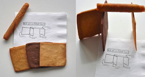
Serra, it turns out, was not amused by the cookie-based critique, as the pastry chefs found out when they met the artist during Gary Garrels’ 2011 drawings retrospective. The best line is also a call to arms:
Going through his retrospective on a routine basis while it was up was such a treat for us. It was also heart-wrenching since EVERYTHING IN THE SHOW LOOKED LIKE A GIANT COOKIE!
Right Angle Plus One is related in time and form to four prop pieces and lead rolls currently on view at Richard Serra’s show at David Zwirner.. It is now impossible to look at that show and not think of recreating it in cookies. Go ahead, just try it!
Setting The Serra Story Straight [bluebottlecoffee via wayne bremser]
Richard Serra Early Works, through June 15, 2013 [davidzwirner]
The Offices of Fend, Fitzgibbon, Holzer, Nadin, Prince & Winters
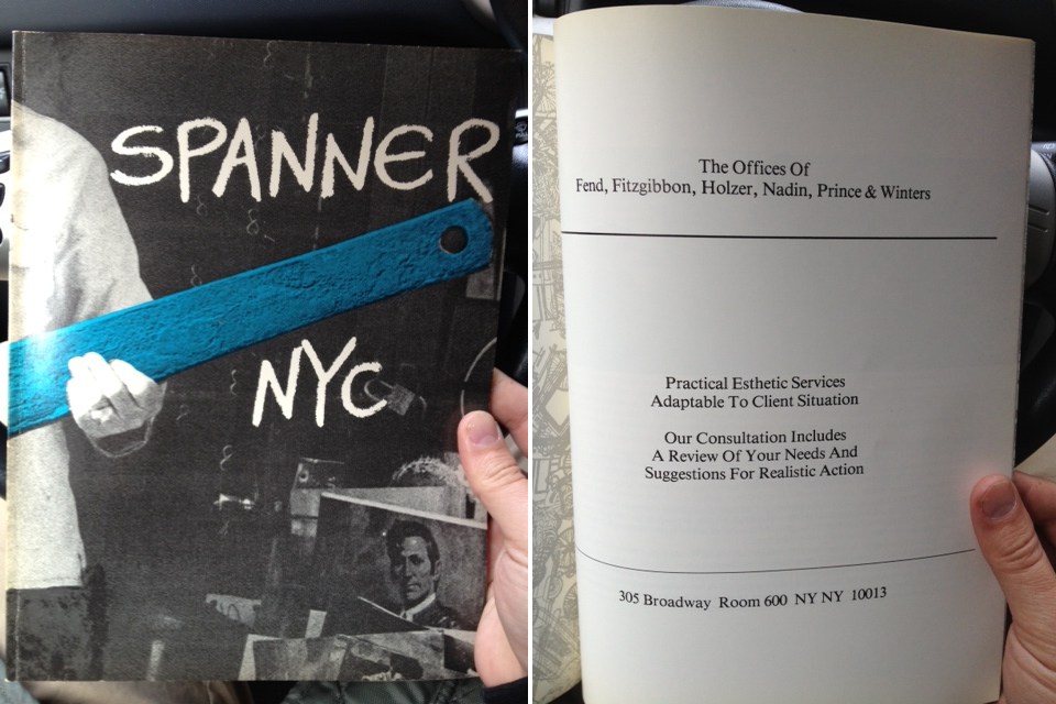
A couple of weeks ago at Printed Matter I found copies of Spanner NYC, an arts magazine published in 1979-80 by Colab folks including Dick Miller & Terese Slotkin. In the back of the third/blue issue was a full page ad from “The Offices of Fend, Fitzgibbon, Holzer, Nadin, Prince & Winters,” offering their “practical esthetic services adaptable to client situation.”
There’ve been a ton of shows related to Colab recently, and I’d known The Offices at least by name, or as a line in a few peoples’ CVs. As the recent creator of a corporate entity designed to operate in the art world, though, I guess I’ve been newly sensitized to such ventures. And I realized I had no idea what, if anything, The Offices actually did.
So first, the basics. The Offices seems to have been a conceptually driven, services-based, artist collaborative run on the ad agency or consultancy model. Which might be considered alongside corporate experiments like N.E. Thing, Co in Canada; Art & Language in the UK, that other UK group that infiltrated companies all over, which I can’t remember the generic name; and even the art-as-professional service work of Michael Asher. Or maybe it’s a failed utopic version of a massive sellout operation like Takashi Murakami’s Kaikai Kiki, Ltd.
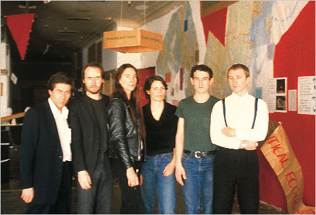
The Offices sounds like it was an outgrowth of Colab, or at least created by artists involved in Colab. Peter Fend called it a “spinoff.” Here’s a photo from, perhaps, a board meeting, with all the name partners: [l to r] Robin Winters, Richard Prince, Jenny Holzer, Coleen Fitzgibbon Peter Fend, and Peter Nadin.
Actually, it could be at Peter Nadin Gallery, the artist’s studio transformed into an accretive exhibition space with Chris d’Arcangelo and Neil Lawson, where artists created work in response to the space and what had been made & shown there before. That continued for eight months from 1978-9, ending with a memorial show to mark d’Arcangelo’s death.
Or maybe it is the show on ecologically optimizing North America’s political and economic systems by reorganizing boundaries around its saltwater marsh basins. That show included work, a poster, by Fend and Holzer. I would have pegged Fend for the instigator of The Offices, but in telling the story of the basins project, Political Economies After Oil, he writes that Holzer “asked Fend to join her in a six-person artist team intent on “functional” projects.”
Continue reading “The Offices of Fend, Fitzgibbon, Holzer, Nadin, Prince & Winters”
A Domestic Proposal: At Home With Voice Of Fire
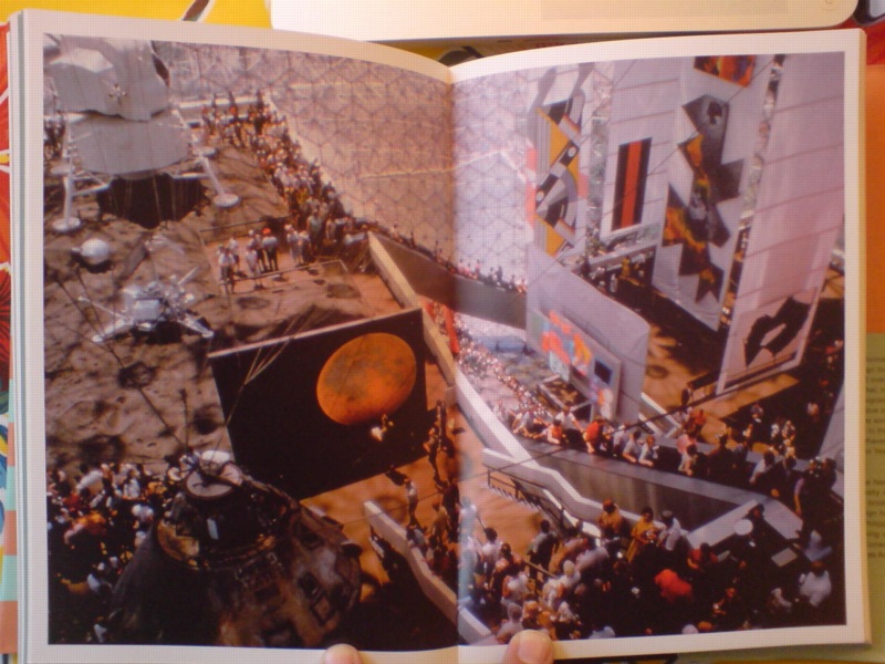
photomurals and satelloons to the left, painting to the right. image: USIA via Jack Masey’s book, Cold War Confrontations
With Barnett Newman in the air recently, I began looking back through the greg.org archives, and I found this 2009 post about the art and space objects at Expo 67, which is a great read, if only for the smackdown delivered by NY Times critic John Canaday.
I was already into satelloons and photomurals and World’s Fairs as odd, underconsidered contexts for art when it registered that Alan Solomon had curated a whole painting show for the US Pavilion in Montreal. He basically asked all the artists for work that could be hung vertically, would hold up visually in a giant geodesic terrarium, and would pretty much only be seen from an escalator. And that’s what he got.
Barnett Newman’s Voice of Fire is there in the upper right corner, looking really small between the Lichtenstein and Johns’ Dymaxion Map. Which just goes to show you, because here it is in the National Gallery of Canada, which bought it in 1989.
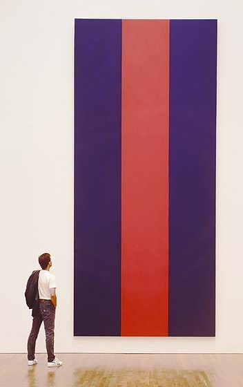
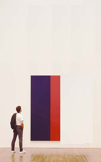
A work of confounding scale. And not without its charms. It’s not my favorite Newman, but I like Voice of Fire. It looked great in Ann Temkin’s Philadelphia retrospective. And last night, I wondered what it’d be like to live with. Because at 8′ x 18′ it is pretty unwieldy. In principle it’d be nice to have 20’+ high space at home to hang it freely. But that kind of room is really a gallery, even if your breakfast nook is just through the door.
So barring that, you could turn it sideways, which is how Newman painted it. If 12×25 is too long a run of uninterrupted wall for you, though, you’re stuck. And so I wondered about cutting it down.
We sure don’t cut up paintings into saleable parts like they used to. Like they did with altarpieces [hello, Piero at the Frick] where everyone on his Grand Tour got to take home a panel or predella.
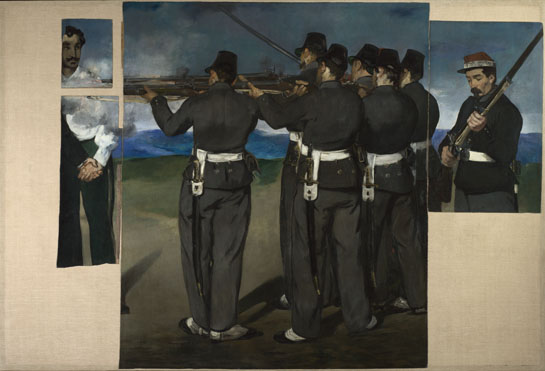
Even barely a hundred years ago, Manet’s heirs were chopping up the uncomfortably political Execution of Maximilian into more marketable groupings. And look, now most of it’s in the National Gallery [of England].
I’m not saying there’s no contemporary precedent: Gerhard Richter cut a squeegee painting into 64 little ones. And this BMW Rauschenberg campaign reminds us that Aaron Young painted dozens of panels at once at the Armory that one time, with the motorcycles.
I’m just saying maybe it’s not enough. We could do more. I understand Voice of Fire is very well known in Canada, and that the National Gallery’s purchase of it was controversial. So should Canadians ever face an arts crisis where, say a Taliban- or ayatollah-style regime takes over that is decidedly unsupportive of the kind of painting Newman practiced, I’d think cutting it down and dispersing the painting would be far better than burning it. Or bombing it, Buddhas-of-Bamiyan-style, out of existence.
Or maybe it’s just the populist thing to do. Voice of Fire would suddenly be much easier to display in a modest home. Or several, actually.
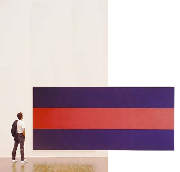
To start, you could cut it two ways: in quarters [above] or in slices [below] slices. Each approach yields four attractive, wall-filling pieces, each 4×8.5′, that preserve the original proportion while making a rich, full allusion to Newman’s overall composition. Reassembling such a group for an exhibition 500 years from now would be trivial.

You could also cut it into 8 pieces, roughly 4×4, almost easel-size. Voice of the Fireplace. But then it seems like you’d be losing a lot to the stretchers. So, what, you’d mount the pieces? Frame them? I imagine you’d get a mix of decor decisions from the various owners. Which, yes, no, I haven’t thought through the pricing and sales strategy yet. This is really just starting out.
Seeing Stars: These Two Interviews On Aperture Right Now
Oh, nothing, just my Q&A with Aperture editor Brian Sholis hanging there online next to THOMAS RUFF. Brian and I went back and forth, discussing the photographs in Exhibition Space and how they relate to art historical developments like conceptual photography and Minimalism.
Meanwhile, Michael Famighetti interviewed Ruff for Aperture’s upcoming Summer issue, and the photographer talked about the beginnings of his Sterne series, the giant photos made using imagery from the European Southern Observatory’s Southern Sky Survey. Ruff’s work was one of the triggers for my own interest in the Palomar Observatory Sky Survey, which was the ESO’s Northern predecessor. Anyway, I think this is the first he’s discussed the series’ origins in English:
MF: Could you talk about the role of research in your work? Where does a project begin?
TR: If I see an image that attracts, upsets, or astonishes me–one that stays in my mind for a long time–I begin working. This is the starting point of the research: I try to find out how the image was created and in what context–historical, political, or social–the image belongs. After clarifying these questions I begin to create “my own” image, the image I have in my mind, the image that was triggered by the image I saw. Sometimes it can be done in a straightforward way, with a camera, but sometimes you need to reflect on how you can manage to make this technically. For example, when I had the idea of photographing the night sky, I realized that with my small telescope, I had no chance of getting high-quality images of stars, so I looked for an observatory with a big telescope where I could take the photographs myself. But they wouldn’t let me in. So I had to give up the idea of being the author of the photograph, and worked with large-format negatives from the observatory’s archive.
Yes, authorship.
And speaking of authorship [and much more], in his talk with Jörg Colberg for Conscientious, Ruff mentioned authorship and his new show at David Zwirner:
JC: I was going to ask you about that, the idea of landscape photography. Scientific photographs, say the Mars rover images, in principle are landscape photographs along the lines of early survey landscape photography in the American West.
TR: That’s where it continues. On top of that, it’s also about automated photography, photographs made by robots. That’s all part of it, the surrender of authorship… Ma.r.s. contains a bit more authorship than Stars where all I did was to select the area and to do the cropping.
All I did? After all this time, do we find out is Ruff a traditionalist?
Thomas Ruff: Photograms for the new age [aperture.org]
Interview with Greg Allen [aperture.org]
Previously: Thomas Ruff’s Sterne
Organizer-Artist vs Artist-Organizer
The new Frieze begins its series of artists talking about curating and being curated [sub req] with Daniel Buren’s classic 1972/1992 statement in Harald Szeeman’s Documenta 5, “Exhibitions of an Exhibition.”
I never registered it before, but Buren uses the term “organizer” for curator. Which is ironic, because at apexart several years ago, at the thin wedge of the emerging trend/abuse, they moved away from using the term “curator”–in favor of “organizer.” And the sense I’ve gotten while working on Exhibition Space is that they were seeking to get away from exactly the curator-as-artist/exhibition-as-art pretensions or associations that Buren was kvetching about in 1972.
In any case, now that I’m an organizer, and apparently the worst of Buren’s fears realized, here are some excerpts from his 1992 English translation of “Exhibitions of an Exhibition”:
Exhibitions of an exhibition
More and more, the subject of an exhibition tends not be the display of artworks, but the exhibition of the exhibition as a work of art….
The works presented are carefully chosen touches of color in the tableau that composes each section (room) as a whole.
There is even an order to these colors, these being defined and arranged according to the drawn design of the section (selection) in which they are spread out/presented.
These sections (castrations), themselves carefully chosen “touches of color” in the tableau that makes up the exhibition as a whole and in its very principle, only appear by placing themselves under the wing of the organizer, who reunifies art by rendering it equivalent everywhere in the case/screen that he prepares for it.
The organizer assumes the contradictions; it is he who safeguards them.
It is true, then, that the exhibition establishes itself as its own subject, and its own subject as a work of art. The exhibition is the “valorizing receptacle” in which art is played out and founders, because even if the artwork was formerly revealed thanks to the museum, it now serves as nothing more than a decorative gimmick for the survival of the museum as tableau, a tableau whose author is none other than the exhibition organizer.
Which, in 2003, prefaced his response to the idea, proposed by e-flux and Jens Hoffman, that “The Next Documenta Should Be Curated By an Artist.”:
Could a large-scale exhibition like Documenta be entrusted to an artist? If the tendency remarked upon here continues to hold, my response would undoubtedly be “yes.” For the artist-organizer would erase the faults inherent in the organizer-artist. For example, it would be worth betting that the announcement of an artist-organizer, whoever he or she might be, would cause an immense outcry of lamentations from the choir of the majority of all the other panic-stricken and destabilized artists.
This will be a varied and serious song. Its reasons for being will be intelligent, stupid, and revealing at the same time. They will be founded on jealousy, on the one hand, and fear of the artist-organizer’s positions, on the other. Artists, exacerbated individualists if ever they existed, would show that their corporatist spirit is not as remote as it may seem. One would notice, then, that the critiques suddenly raised by the announcement of the name of an artist-organizer had never been raised by the announcement of any organizer-artist. This a priori predictable reaction already bears within itself the fruits of extremely positive debates, for they reveal a state of fact that has been occulted for over thirty years.
And The Award Comes From…
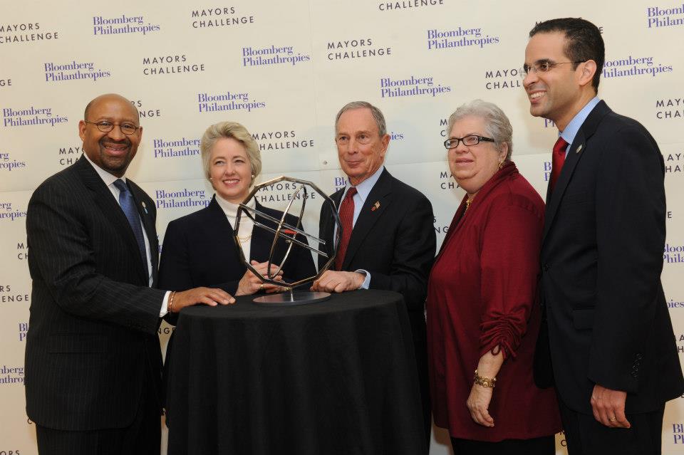 image via Bloomberg Philanthropies’ Facebook photostream
Congratulations to the mayors of Philadelphia, Houston, Santa Monica, Chicago [not present] and Providence for winning Bloomberg Philanthropies’ inaugural Mayors Challenge Prize for Innovation Award, thereby securing grants of five or one million dollars for your city’s innovative project, plus this wonderful trophy, created exclusively for the Mayors Challenge Prize by noted Icelandic/Danish artist Olafur Eliasson.
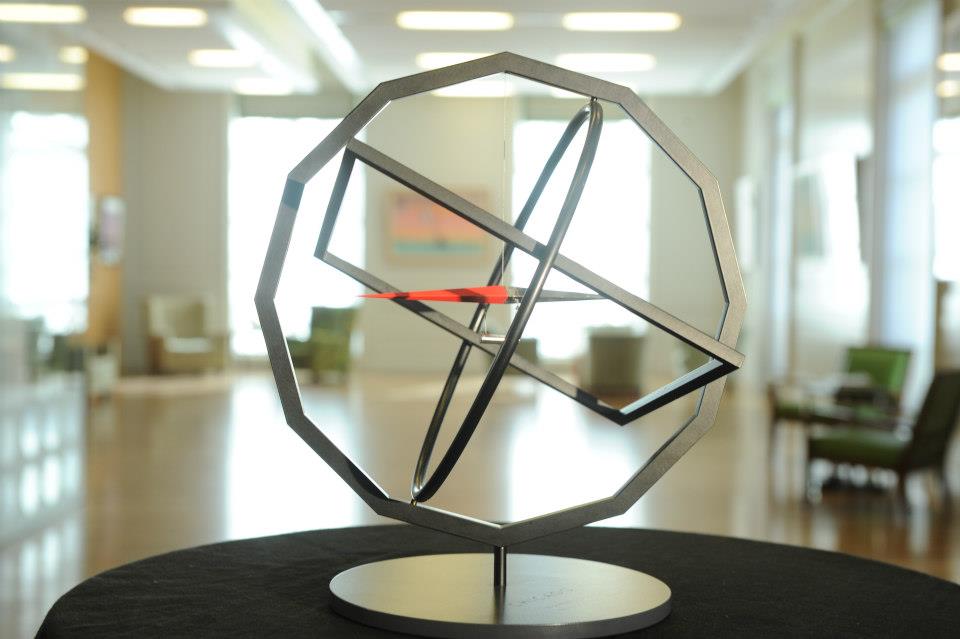 image via Bloomberg Philanthropies’ Facebook photostream
As the LA Times’ Christopher Knight reported, the grand prize winner, Providence’s stainless steel trophy will be shiny, while the other winners’ trophies will have a blacker finish. All will consist, however, of a compass suspended from a circle nested in a square nested in a dodecagon, which represent, respectively, movement toward a common goal; the angle of rotation of the earth; a map; and the demarcation of time in hours and/or months.
Olafur’s Mayors Challenge Prize is the slow-ripening fruit of Bloomberg [Mayor’s and Philanthropies’] collaboration during the Public Art Fund-sponsored NYC Waterfalls project. It joins a rarified group of trophies designed by artists of the day, including:
Lawrence Weiner’s adaptation in 2012 of his 2004-6 sidewalk installation Bard Enter for the trophy accompanying the $25,000 check that accompanies the newly endowed and renamed Center for Curatorial Studies Bard College Audrey Irmas Award for Curatorial Excellence.
And Jenny Holzer designed Human Rights First’s Sidney Lumet Award for Integrity in Entertainment, which was presented in 2011 by Phillip Seymour Hoffman to Michelle and Robert King, the creators of The Good Wife. Here she is at the gala with the Kings and The Good Wife co-star Josh Charles. Not clear what the scrolling truism is. Maybe, “Entertainment industry’s self-regard comes as no surprise.”
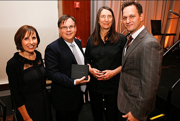
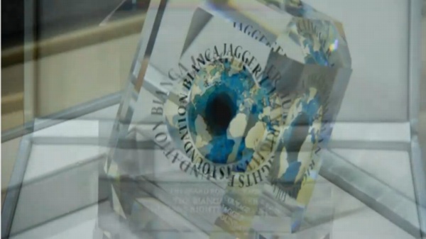
image: swarovski.tv
Also in 2011: Marc Quinn created The Bianca Jagger Foundation For Human Rights’ “Award For Courage,” in collaboration with Swarovski. It was a painting, which he did for the Foundation’s logo, which was used in the award. The inaugural recipient, Ai Weiwei, was unable to attend the gala, held at Phillips de Pury in London, where donated artworks, including Quinn’s painting, were sold to raise million of dollars. UPDATE: Quinn also designed the “Award For Leadership,” whose recipient, Chief Almir Narayamoga Surui, Chief of the Gamebey Clan of the Suruí People of Rondônia in Brazil appears also to have been unable to attend what looks to have been a dazzling, self-funding evening.
Is this a flurry of artist-designed awards? Perhaps, but the genre does have a history.
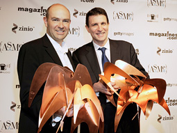
There’s the Ellie, of course, replicas of Alexander Calder’s stabile Elephant, which have, since 1966, been given by the American Society of Magazine Editors to winners of the National Magazine Awards. [That’s Chris Anderson and David Remnick hauling home three each in 2009, via adage] I can find no information on how Calder’s sculpture came to be used, nor can I see any info on the “original” stabile. Which situation I find interesting.
And Ernest Trova’s COUNCIL OF FASHION DESIGNERS OF AMERICA AWARD, commissioned in 1981. We read that DVF brought in the life-size version of COFDOAA to CFDA HQ. But this particular one was Brooke Astor’s, from 1989, and it was sold last September at Sotheby’s. $1,750.
And my favorite, which has been sitting on my desktop for months now, and whose genesis has the greatest similarity to Bloomberg’s Eliasson: Rockefeller’s Kelly. In 1967, Governor Nelson Rockefeller commissioned Ellsworth Kelly to create the New York State Award. The felt banner, produced by the noted art banner publisher Betsy Ross Flag and Banner Co. in an edition of 20, was given to admirable arts and culture-related projects and institutions by the New York State Council of the Arts.
UPDATE: I’m sorry, did I say that was my favorite? It was until five minutes ago, when I discovered that in 1998 Robert Rauschenberg created the Equine Posterior Achievement Award for People For The American Way. The horse’s ass was cast in bronze by Robert Graham, and has been presented as needed to political and cultural leaders “whose abilities to misrepresent an issue, manipulate his or her followers and pander to our basic instincts reach such ridiculous levels we don’t know whether to laugh or cry.” God Bless you, Robert Rauschenberg, and God Bless The United States of America. [By 2014 Ted Cruz had won the EPAA at least twice, but I guess things have taken an unfunny turn since, because I haven’t seen any more recent winners.]
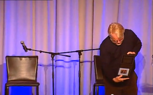
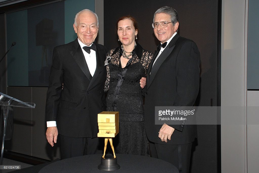
UPDATE UPDATE: via Brent @HeartAsArena comes this news: in 2010 Steve Martin commissioned his friend Eric Fischl to create the statue for the Steve Martin Prize For Excellence In Banjo And Bluegrass. Martin discussed the award on the David Letterman Show whence this screenshot was taken.
Oct 2013 Update: Americans for the Arts presented their National Arts Awards last night in New York to, among others, Dakota Fanning.
19-year-old Dakota Fanning received 18-pound, bronze Koons bunny @americans4arts gala yesterday pic.twitter.com/eDWk3EUKCf
— katya kazakina (@artdetective) October 22, 2013
And as the AftA press release confirms, Jeff Koons designed the award statue in 2009.
Nov 2013: Another award statue designed by Jeff Koons and unveiled tonight, the Smithsonian Magazine American Ingenuity Award!
This is an image of my design for the @smithsonian magazine American Ingenuity award. They will be presented tonight.
— Jeff Koons (@JeffKoonsStudio) November 20, 2013
Hey look, there’s a tiny selfie in there!
The ten winners in this, the 2nd year of the award, include St. Vincent, Doug Aitken, and Dave Eggers. Too bad the first year’s Ingeniuses don’t get one. I’m sure they got a nice plaque, though. Or a light bulb.
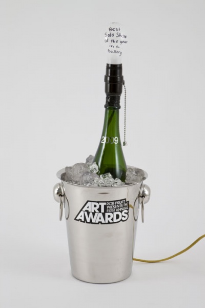
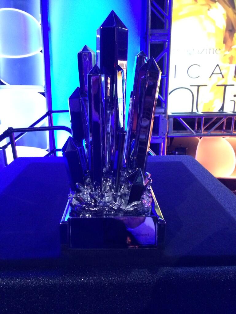
Nov. 2014 update: Did someone say lightbulb? I don’t know how I completely forgot that Rob Pruitt designed the trophies for his Rob Pruitt Art Awards, held in association with the Guggenheim in 2009 and 2010. The 2009 trophy was a champagne bucket lamp, with a light bulb that Art in America, at least, saw as a Jasper Johns reference. There were ten distributed, and more made, for sure.
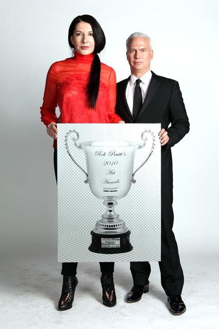
image via guggenheim’s flickr
For the 2010 trophy, Pruitt designed an engraved sterling silver cup–and then handed out screen printed paintings of the rendering. Probably a budget thing. Here is the one for Solo Show of The Year, Museum, modeled by its winner, Marina Abramovic, and her curator, Klaus Biesenbach.
Santa Monica wins Eliasson sculpture; awaits a much bigger one [latimes via @KnightLAT]
May 2018 Update: Hrag tweets from the Noguchi Museum gala that recipients of the Noguchi Award receive a desktop-sized Red Cube. Unlike the original, which is perched on a corner, the trophy version nests in a small, black base. [Also, the Noguchi Award was not initiated until 2014 (pdf), a year-plus after this compilation was first posted.]
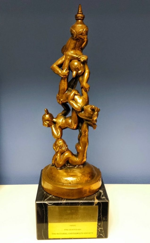
And just like that new updates beget new information. Everyone’s a winner! @RealSparklePony [accept no substitutes] tweets that the National Cartoonists Society’s Reuben Award [below] for Outstanding Cartoonist of the Year, is based on a sculpture by the NCS’s longtime honorary president, Rube Goldberg. The statue was introduced in 1954, when the award was switched from the Barney to the Reuben, and the eight previous OCOTYs, got theirs backdated. [The award ceremony is Memorial Day Weekend, so it’s coming right up!]
But no photos beyond 1998, which seems odd. Not as odd as the award statue they unveiled at the 2008 American Art Award gig at Hearst Tower, though. WT actual F? It is officially called Walking Whitney Museum, and it is by Laurie Simmons.
Does this mean there are 15 other artist-designed trophies for this one award? Yes, yes it does. And more. The Whitney’s American Art Award was begun in 1992, first in partnership with Cartier, and the director of the museum decided from among artists recommended by curators, who are in the collection, who will create an edition to be awarded to a corporate friend of the museum. In 2007 Whitney ISP Fellow Stéphanie Fabre wrote about the American Art Awards with refreshing candor:
The commissioned artwork is given as a prize, to honor the generosity of a rich individual or company, yet the exchange also highlights the commodity aspect of the work. The work of a mid-career artist has a decided worth, and the transaction between the corporation and the museum acknowledges this. But in the process the work also acquires a fetishistic value. Although the monetary value of the artwork given by the museum to its donor may be lower than the value of the gift given by the corporation to the museum, the work possesses a superior symbolic value, in part as a result of its affiliation with the Whitney. In addition — and as corporations know when they invest in art — art is often seen as elevated, noble, and permanent, and these associations add to the museum’s clout in the gift exchange.
And the catalogue [pdf] has all the photos. We have tapped a rich vein I am ashamed to have somehow never heard of. And here I thought I knew all the gala potlatches in Manhattan back then.
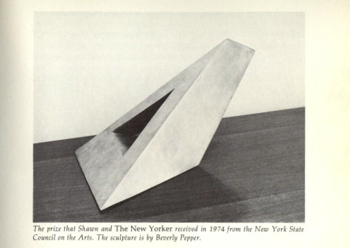
Perhaps the Whitney cribbed the artist-a-year idea from Governor Rockefeller? @TedGrunewald just tweeted an incredible, fierce, sharp, wedge-shaped steel Beverly Pepper sculpture, which was the 1974 New York State Award. This pic comes from a spread in Brendan Gill’s 1975 memoir, “Here at the New Yorker”. Wallace Shawn eyed theirs warily: “It is not only a prize; it is also a weapon.”
Glitches Of The Stations Of The Cross
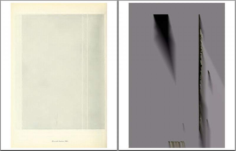
So I’m reading the Guggenheim’s little exhibition catalogue for Barnett Newman’s Stations of the Cross, which, as I noted, has been digitized by the museum in conjunction with the Internet Archive, and is thus available for instant and free viewing or download.
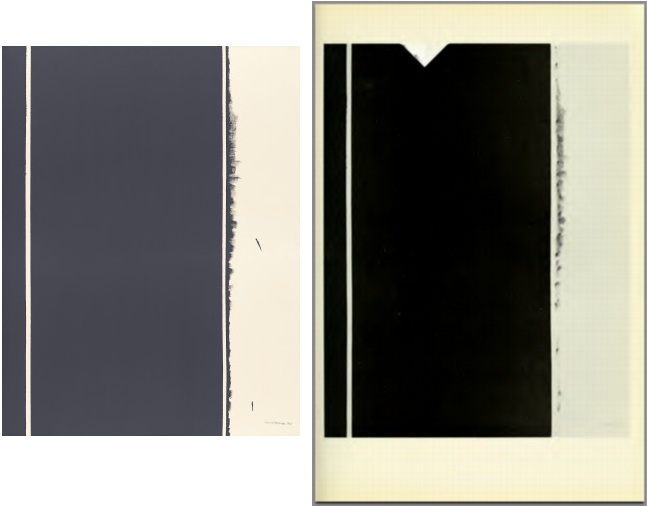
And then the little PDF constantly hangs up Preview, which is supposed to be like the most stable application in the entire OS, I thought, so what is up? And it’s always at page 31. Which, when I can see it, about half the time, has a full-page illustration of Twelfth Station [right], with a giant divot taken out of the top. Which, after a flash of doubt, I confirm [left] is not how the painting actually looks.
[Heads up: Stations of the Cross is not on view right now; it was in the NGA’s Tower Gallery, but the whole East Wing is being shut down for renovations, starting, apparently, with the gallery holding the greatest paintings.]
After repeatedly crashing, I thought, maybe I could print my way ouf of this problem, and so I printed the Internet Archive’s file to a new PDF. And watched my 1.4mb file balloon to 282mb, which obviously takes its own sweet time to open to page 1.
As well as Page 31, which is now a glitch masterpiece, that obviously, I must now paint.
On the theory that monochromes somehow confound either scanners or compression algorithms, I checked the PDF for the Guggenheim’s 1975 Brice Marden exhibition, but it appeared disappointingly glitch-free.