
Oh, yeah. With this awesome cheese grater screen, Mona Hatoum has just won a 10-year pass in my book; she can do whatever she wants.
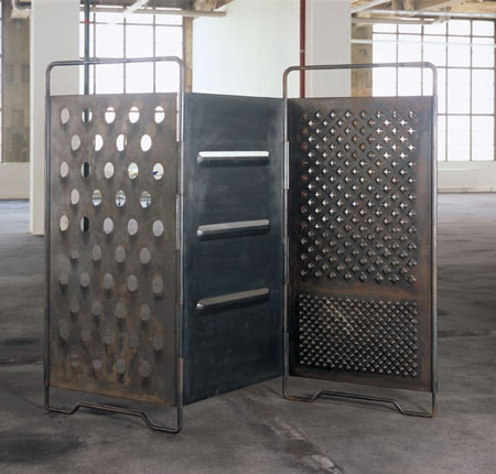
Oh, really? It’s called Grater Divide? And it was made in 2002? Well, her 10-year-pass is just about up.
Wall Works
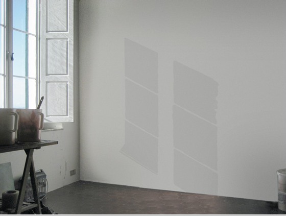
I’ve always admired the series of site-specific Wall Works produced over the years by Edition Schellmann, even though I’ve never mustered the courage to buy one. Fear of commitment, I guess. Too nomadic.
Well, no, that’s not quite right. Because their finitude is part of their appeal. The way they thwart commodification and exchange by being limited, by nature and design, to a finite number of installations.
You could cheat, I suppose, and reinstall your Judd elements once you know the ratio. Or re-paint your Darren Almond sunlight once you know the angle or time. But then what have you got? If you’re going to ignore the artist’s intention, you might as well save the dough and fabricate the whole thing anyway.
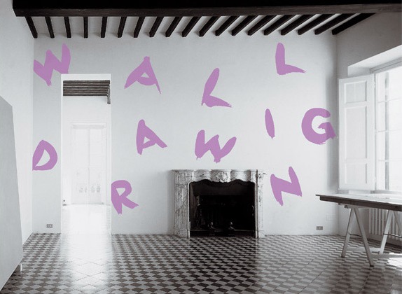
Anyway, none has ever made me sad, until now:
Wall Drawing, Sol Lewitt, 1992
description:
“wall drawing” to be written on a wall in the hand of the owner, medium and size to be chosen by the owner. Limited to 10 installations. Certificate: an 8 x 10″ black and white photograph of the installation, sent by the owner to the artist, who will sign, number and return it.
I guess finitude is the right word:
Finitude. To be carefully distinguished from “mortality.” Finitude refers not to the fact that man dies but to the fact that as a free choice of his own project of being, he makes himself finite by excluding other possibilities each time that he chooses the one which he prefers. Man would thus because of his facticity be finite even if immortal.
Esso De Cherbourg
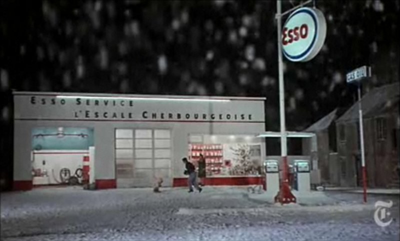
It may not be the absolute origin of my desire to live in a converted, modernist gas station, but AO Scott’s recent reminiscence reminds me that the Esso station at the end of Jacques Demy’s incomparable Les Parapluies de Cherbourg is one of my formative cinematic and architectural experiences.
I got completely blindsided by the film in the early 1990s when I basically wandered into the Time Warner screening room at MoMA and watched a preview of the restoration of the film spearheaded by Demy’s widow, Agnes Varda, who was on hand to discuss it. Truly not worthy, but there you go.
Uh-oh, something looks screwy with these prices; is there an issue with US availability of the DVD? [amazon]
Colorama
I really need a photomurals tag at this point. The Kodak Colorama billboard was installed in the Great Hall of Grand Central Station from 1950 until around 1990, when the station began a long-overdue restoration.
Anyway, 18×60 foot backlit, color transparencies, “the biggest photographs in the world,” one a month for forty freakin’ years. It’s like if Norman Rockwell had a son named Jeff Wall who went into advertising.
According to the Kodak Colorama mini-site, company executives Adolph Stuber and Waldo Potter originally thought to recreate “Kodak’s success with projecting color slides to a staggering size for the 1939 World’s Fair,” but the Great Hall’s sunlight forced them to go the backlit route.
Just as regular photomurals were first printed in wallpaper-like strips, the Colorama transparencies were made of 18-inch [and later 36-in] rolls pieced together witn tape.
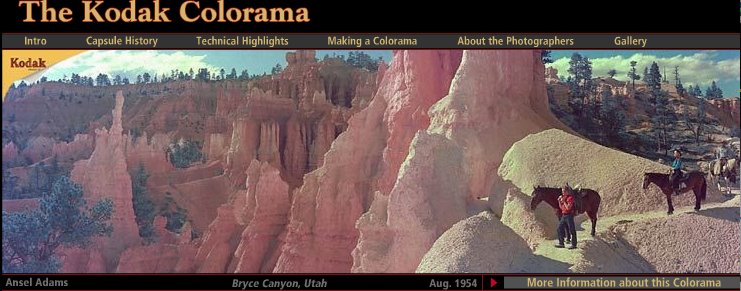
Colorama was designed to promote “a critical cause — photography for photography’s sake.” Which means something different to a company that sells cameras and film. The majority of the Colorama pictures were by Kodak staff photographers, who inserted amateur photographers in glorious landscapes.
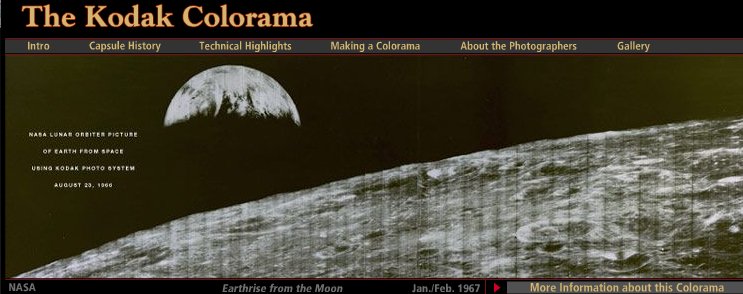
But not all. There are several Coloramas over the years by Ansel Adams, including the August 1954 panorama of Bryce Canyon, Utah up top. The 1967 Earthrise image above is the only black & white Colorama photo. Apparently, it had been covered a lot immediately after NASA received the transmission from the Lunar Orbiter, and the Colorama appearance kind of leveraged that familiarity.
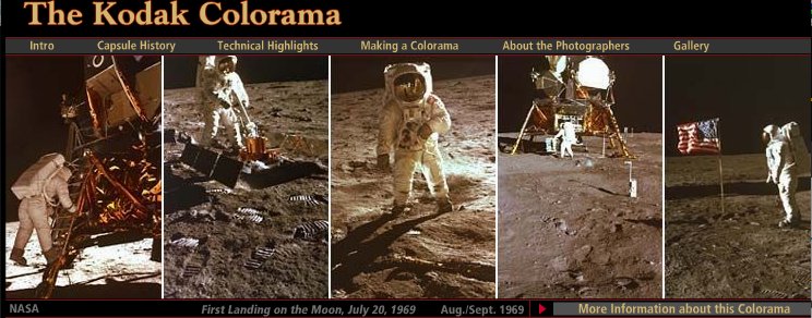
Contrast that, though, with the 1969 Apollo 11 images, where Kodak engineers rushed to print NASA’s just-released negatives from the moon landing, and ended up scooping Time, Newsweek and Life, to the benefit of the “awed crowds.”
The Kodak Colorama [kodak.com]
Last summer, Kodak donated the Colorama Archive to Eastman House [eastmanhouse.org]
Aarhus Madness
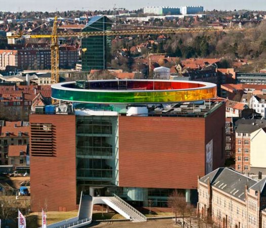
O wow.
Olafur Eliasson’s Your Rainbow Panorama opens Thursday on the roof of ARoS Aarhus Kunstmuseum in Denmark. It’s a 360-degree glass promenade which paints the cityscape with every color of the spectrum.
Too bad the promenade roof’s not rainbow-tinted glass, too. That’d make one helluva signature on Google Maps.
Image and statement via olafureliasson.net [olafureliasson.net]
More images at designboom [designboom.com]
Previously: Olafur: The Magazine?
Color Experiment paintings
Apropos Of Absolutely Nothing Else Posted On greg.org In The Last Seven Months
Weight, Weight, Don’t Tell Me
On October 4th, 1994, at an artist panel discussion for MoMA’s Cy Twombly retrospective, Richard Serra made an offhand comment about how “The last century of art has been based on a misreading of Cezanne.”
To a young, impressionable student/fanboi still putting his contemporary art world view together, this was a shock. Because it was Serra, and because I still assumed there was some right art historical “answer” to be gotten to, and because Serra didn’t bother to say how everybody got it wrong, it lodged in my brain for years.
And so it was that at some point a couple of years later, when I met him at a party, I asked him what he’d meant. Of course, he didn’t remember what he’d said, or the context, so he gamely tried to float a couple of possible theories, but nothing that matched the seeming conviction with which I’d remembered him saying it. So I tried to forget about it.
And I thought I had, at least until just now, when I was reading Serra’s discussion with Gary Garrels in the Richard Serra: Drawing catalogue. They were talking about the “jump” in Serra’s work after 1989 in terms of Cezanne:
GG: Those double-panel drawings, rather than dealing with a wall or with a room or a space, deal with internal relationships.
RS: They are masses in relation to one another. They’re not about composition or figure-ground; they emphasize the comparison of different weights in juxtaposition.
GG: So this, to me, is again another jump.
RS: For me they have more to do with Cezanne than with Malevich. I wasn’t looking at Cezanne when I conceived them, but in retrospect, I see a clear connection in the way they deal with weight and mass in relation to shape. They’re the opposite of the floating shapes of Constructivism and Malevich, referred to in drawings like Heir
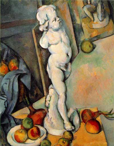
The comparison of the diptychs with Cezanne may be a stretch, but no one else comes to mind who deals so physically with mass and weight. No one talks about the weight of Cezanne, but there’s a manifestation of weight there that’s not in Picasso, not in Matisse, barely in anyone who follows. Cezanne is obviously interested in gravity and in the relation of weight to plane. Take Still Life with Plaster Cupid [ca. 1894], in the Courtauld, where he punches a hole in the space, and you think the apples and onions are going to roll off the table. The only thing holding them in place is their weight. They have the weight of cannonballs.
So the answer, then, is C) gravity.
But then, literally, as I’m typing this in from the book, it’s 41:00 into the recording of the panel, right where Serra says it:
I think Twombly has a big range– a big range of evocation. I think that’s what he does. He doesn’t present an image; he evokes a sensuality, and it’s unlike anything in post–I think. I’d have to go back to someone like Baziotes, maybe–there’s nothing in the American brain like that. Americans are much–maybe Brice. Americans are much more heavy-handed, much more flat-footed, much more aggressive.
This is the opposite of Cezanne. And the whole inheritance of the New York School kind of goes Cezanne; Cubism; into Abstract Expressionism; Pop Art pretty much hangs things back on a grid; the grid comes back up again in Minimalism. That seems to me all an extension of a certain kind of classicisim and aggression and a standardization coming out of Cezanne, a misreading of Cezanne, albeit. And Twombly takes the opposite attack. It’s very lyrical. And very open. And very…delicate.
Brice Marden: Yeah, I think it’s really great that he left town. [crowd laughs]
OK, then. I seem to have misunderstood the question. The correct answer is actually D) Serra likes to think in terms of major historical frameworks. I’m glad that’s all cleared up.
‘One Of The First Works That They Made After Becoming A Couple’
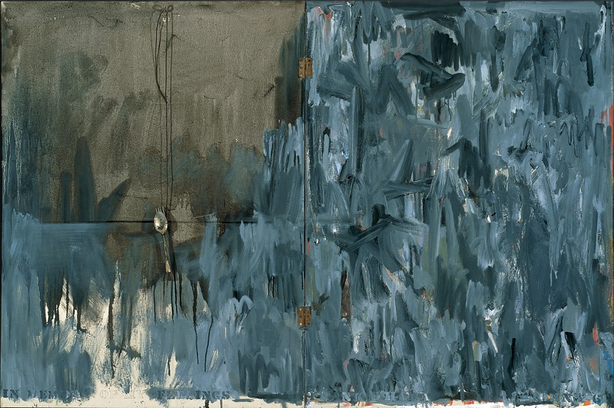
In Memory of My Feelings – Frank O’Hara, 1961, Art Institute of Chicago
I’ve had a jpg of Jasper Johns’ 1961 painting, In Memory of My Feelings – Frank O’Hara on my desktop for months now. It was one of the most important works in the National Portrait Gallery’s “Hide/Seek” exhibition, and I took the chance to study it up close several times throughout the run of the show.
I have also been a little wary to write much about it, and its seemingly powerful resonance with Johns’ Short Circuit flag, partly because I was unsure of how much to read in, and how relevant or not the associations I was seeing really were.
In Memory of My Feelings definitely relates to the other, larger Flag–at 40×60 vs 42×60, it’s nearly identical in size. But unlike the 1955 Flag, or any other flags, it’s made of two canvases hinged together. Hinges, functional and not, are just one unexamined element that appears in both Johns’ and Rauschenberg’s early work. [Light bulbs are another. Maps, just barely.]
When In Memory is discussed, the somber, grey tones come first. Then there’s Johns’ stenciled inclusion of the words “dead man” next to his own name on the bottom. And the overpainted skull that you can barely make out in the upper right quadrant somewhere. And that’s it, and then the Frank O’Hara reference takes over, and the irony that Frank O’Hara would die five years after this was made–as if this had anything to do with the painting, or Johns’ painting of it.
And so I wondered why I couldn’t find anyone talking about what IS clearly visible through the overpainting in the lower right section [detail above], which is a series of vertical red and white stripes. A flag. Or maybe two. Photos weren’t allowed in NPG exhibition, and I can’t remember now. But there is at least one flag painting under there.
One person who does talk about In Memory of My Feelings, though, is “Hide/Seek” co-curator Jonathan Katz. In a gallery talk video, Katz talks about putting Johns’ and Rauschenberg’s works side by side to show it for the first time in the context of their relationship, and particularly their breakup.
Katz talks matter-of-factly about these artists’ relationship and collaboration in a way that no curator ever has. And keeping the bitterness of the breakup in mind certainly brings a lot of content to the fore in Johns’ painting. It feels especially necessary for understanding why Johns might have chosen to reference this poet and this poem. [Spoiler: it’s about dealing with the despair of a breakup.]
But Katz, whose delivery is slick and precise, not a word out of place, drops what I think is a bombshell? And just keeps on going:
When [Johns] and Rauschenberg met, one of the first works that they made after becoming a couple, was the famous–even iconic–Jasper Johns American Flag painting. This is a picture of that flag, in grey, reversed. The obverse of the picture that they made when they got together.
In one sense, it’s obvious, and in another, it’s ridiculous. Or at least unheard-of. Yes, definitely unheard-of. Katz is proposing, in passing, fundamental changes to the understanding of bodies of work, practices, and histories of two of the most important artists of the last 100 years.
This is the compelling thing for me about Short Circuit, an early 1955 Rauschenberg combine with a Jasper Johns flag behind a hinged door. A work which was originally/also titled Construct with J.J. Flag, and which was exhibited by Alan Solomon under both their names in 1958. It makes the otherwise incredible, even shocking assertion that Johns and Rauschenberg collaborated and made some of their most important work together seem perfectly obvious.
Powerless Structures, Fig. 19, 1998
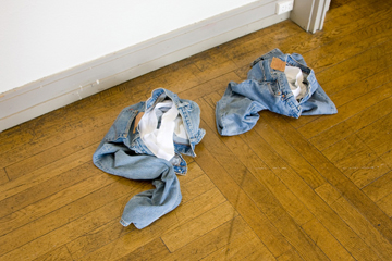
All this Rapture hype reminds me of this old school Elmgreen & Dragset piece from their Powerless Structures series. Even though I’m sure the Rapture people are sure the two guys not wearing these outfits are goin’ straight to hell.
Image via art21, where this piece appears to be titled, “Home Is The Place You Left,” which is actually the name of their 2008 exhibition in Trondheim.
For that matter, everyone from Perrotin to Konsthall Malmo lists the jeans as Levi’s, but when they were at the Swiss Institute back in the day, they were Diesel. Just sayin’.
The Secret Bauhaus’s Other Ball
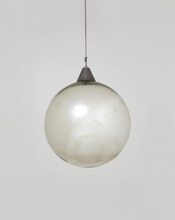
Andy helpfully pointed out this mirrored glass ball, which I’d missed in the catalogue for Phillips’ upcoming design auction.
Everyone knows the Bauhaus was a huge party school. And during the Winter 1929 semester, Oskar Schlemmer had put an extra emphasis on partying, “to preserve the character of the Bauhaus community.” And so what had started as a metal shop farewell get-together for Marianne Brandt on 9 February 1929 with the tasteful theme, “Church Bells, Doorbells, and Other Bells” [Hmm, one of the few cases where it sounds better in German: “Glocken Schellen, Klingel Fest.”] became a raging, balls-out “Metallisches Fest,” which took over the entire, iconic Dessau building. As MoMA’s 2009 catalogue tells it:
The pure qualities of metal lend themselves to costumes with decorations that magically transform the Bauhaus through shimmering, reflective surfaces. According to Schlemmer, “The Bauhaus was also attractive from the outside, radiant in the winter night: the windows with metal paper stuck inside them, the light bulbs–white and colored according to the room–the views through the great glass block–for a whole night these transformed the building of the ‘Hoschschule fur Gestaltung.”
Party on, Oskar! I’m glad the Bauhaus Arkiv is so careful with all their materials, they don’t let anything more than a postage-stamp-sized image slip through to the web.
I can’t remember where I found this copy of the Bauhaus wallpaper sales brochure which came out soon after the Fest, but it wasn’t the Bauhaus Arkiv:
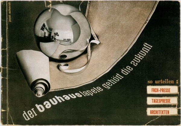
And Marianne Brandt Geselleschaft only had a tiny version of this Brandt self-portrait taken a mirrored glass ball.
Though to their credit, the firm did throw another Metallische Fest in 2005, even if the guest of honor had long since departed for good.
Lot 130 Bauhaus Mirror Ball, est $5-7,000 [phillipsdepury.com]
Previously [as in previously on greg.org, but after the Bauhaus, obv]: Shiny Space Balls? Yes Please!
Oh wait, Muybridge was before the Bauhaus
Serra ‘Designs His Works To Last.’
Well this certainly wasn’t in his MoMA retrospective.
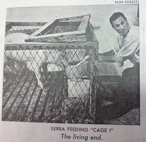
There are rubber and neon pieces dated from 1966-7, of course, and because they look prescient now, Benjamin Buchloh’s catalogue essay discusses early Richard Serra sculptures like Doors and Trough Pieces as “the official beginning of his oeuvre.” But Buchloh dismisses Richard Serra’s first solo show in May 1966 in Italy, where the young artist was traveling on a Fulbright, as nothing but “his rather literal responses to Rauschenberg’s combines.” Fortunately, the show got written up–with a picture, even–in Time Magazine:
Charline Von Heyl Is Reading Your Blog
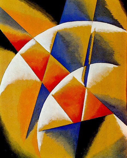
Von Heyl-bait: Spatial Force Construction, 1921, Lyubov Popova
A couple of weeks ago Charline von Heyl made a refreshingly badass presentation on painting at the Hammer Museum. [It was organized by UCLA’s art department.] The tenor was quite different, it quickly became one of my favorite artist talks since Thomas Houseago’s Public Art Fund lecture at the New School last year.
Von Heyl talks a lot about her sources and tactics, including design, folk and indigenous art, and overlooked and bad [Bad?] painting. Rather than narrating a trajectory for her work, or elaborating on her technique, she focuses on how she looks, and on how central that is to what she does eventually turn out.
So obviously, this from the q&a:
I find the idea of time in painting super-interesting in every respect, you know, the speed of the brush, the way the backwards/forwards thing goes, the time of the paradox, which is probably my idea of irony, the material thing that switches things around.
And so all those things really feed into each other, and the time of looking is constantly feeding into it, constantly. And it’s really–one of the first things I do when I go to the studio is to get different books and check different things out.
And for me, the whole blog thing is a godsend. If I put in one of my favorite paintings, some weird Popova painting or something like that, and go to images and blog, there’s a kindred soul, you know, somebody who has the same taste. And from there, you find other blogs because he’s going to go somewhere, And I think books have been so important for me, but now, blogs, painters’ blogs are, I mean, there are a lot of people who are super smart when it comes to looking, and it’s really fun to look at it. I use that a lot, too.
A follow-up question asked what blogs she looks at, and she balked; she can’t name her favorite books, either, she said, because she doesn’t know the titles. It’s a result of being immersed in “this community of images.” So it makes sense that the one blog she did manage to namecheck is Bibliodyssey. [She also said she does read Notes on Looking, too.] In the sixties several American artists, most notably Larry Rivers and Andy Warhol, used money as the subject of their paintings. Calling on their example, a broke E.A.T. organized a gambling event last week to finance further activities. Currency was designed by Warhol, Robert Whitman, Robert Rauschenberg, Red Grooms and Marisol [and Tom Gormley], on an escalating scale. But Swedish artist Oyvind Fahlstrom’s design was turned down for political reasons–it depicted Nixon inflating and deflating himself…Their gambling night was an amusing comment on the current situation as well as, hopefully, a way to outflank the museum-bank gallery-cartel syndrome. The gambling night was held at Ted Kheel’s Automation House on the Upper East Side, which connected to the head end of one of Manhattan’s first cable TV companies. Proceeds were actually flagged for E.A.T.’s Community Television Center and Artists & Television program, which had solicited proposals for artist-produced TV shows. The bill that the Getty credits to him is by Red Grooms. They mistook the reference to Davis as a signature because they keep the bills wrapped up with a strip of paper, which covers up Grooms’ signature. And now we know. Thanks! We’re used to protest movements that come in colors–the yellow of people power in the Philippines, Ukraine’s orange, the green of Iran’s brutalized democrats. We’re less accustomed to seeing protests quashed with color. But in Uganda, security forces sprayed opposition leaders and activists with a vivid pink dye–a mark intended both to humiliate dissidents and make it easier for police to nab them. The first publicized use of dye cannons was in Cape Town, South Africa in 1989, in a fiasco that became known as the Purple Rain Protest [image below via wikipedia] An anti-apartheid demonstrator seized the cannon and turned it on the white-painted buildings in the square, including the National Party headquarters. “The purple shall govern” became a rallying cry for the democracy movement. So I’m kind of dying because there’s a screening next week, and I’m trying to figure out how to go. Three houses were used for the principal location; the production moved from one to another depending on the direction of the sun. “Terry’s not really a stickler for continuity,” Mr. Fisk said.
UCLA Department of Art Lectures: Charline von Heyl [hammer.ucla.edu, thx
Author Posted on Categories art, inspiration, interviews
ArtCash

ArtCash by Rauschenberg (top) and Tom Gormley, via nymag
Whatever else it was, Billy Kluver, Bob Rauschenberg and Robert Whitman’s Experiments in Art & Technology was wildly successful at never selling out; the collaborative was constantly broke and getting bailed out by whomever they could find. E.A.T. was booted from the Pepsi Pavilion at Expo70 as soon as it opened over wild cost overruns. I saw a thick folder of invoices, IOUs, and pleas for petty cash in the Castelli Archives. I hear there’s an identical stack, probably even thicker, in the Foundation for Contemporary Arts. And then the other night, I find this 1971 article about art and money in [where else?] New York Magazine:
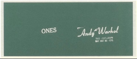
$25 got you $25 ArtCash bucks, which you could use to win “TV sets and original graphics.” At least a few people just took the ArtCash. According to the lot description of an unbroken $500 bundle of Warhol Ones at the 2009 Dumbo Arts Center benefit auction, the ArtCash bills were printed [but not engraved] by the actual American Banknote Company.
E.A.T. published three signed ArtCash posters showing either the fronts or backs of the various denominations. Here’s a composite showing two of the three [l via pdp; r via artnet]
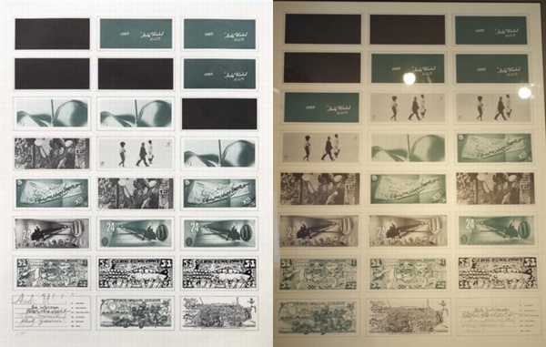
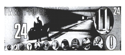
The denominations were $1 [Warhol], $3 [Whitman], $12 [Rauschenberg], $24 [Gormley], $51 [Grooms], and $88 [Marisol]. Which means each print had a face value of $468. Considering that Phillips sold the copy on the left for just $1,875 in 2008, these may be the worst-performing Warhols on the market.
Whoa, in tallying that out, I took a closer look at each bill; Gormley’s look to include the World Trade Center, which might mean that that underground moving walkway is in Albany, which might make that figure there then-governor Nelson Rockefeller.
The E.A.T. Archives at the Getty includes several more stacks of ArtCash, including some by Jeff Davis, who, who?
Jan 2013 UPDATE: Good things come to those who blog. greg.org reader and/or ArtCash Googler Sarah Hollenberg of the University of Utah Art & Art History department writes that the Jeff Davis mentioned above is none other than the country’s greatest example of printing your own money, Jefferson Davis, President of the Confederate States of America. Hollenberg:Police Action Painting
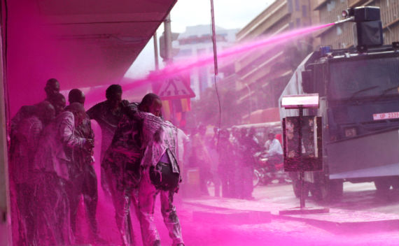
Police spraying protesters in Kampala, Uganda, May 10, 2011 [image james akena/reuters via cfr.org]
I haven’t been able to get these images out of my head since Brian Sholis pointed to them; they’re stunning and disturbing at once.
As Time Lightbox’s Ishaan Tharoor put it,
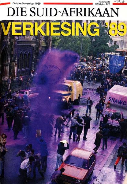
In 2008, after Indian police painted protestors purple in Srinagar, Slate’s Explainer put together a concise history of the dye cannon. Which is, well, ironic, considering how aesthetically similar the police painting images are to the Indian Holi Festival, where crowds bombard each other with powdered pigment as part of an equalizing, anarchic celebration of religious joy.
Clearly this is not art; but it is painting. And the sobering political implications and power dynamics depicted in these incredible–even, I hate to say it, beautiful–images makes me question the glib, benign assumptions I hold for that word, that action.
For a long time, I’ve been fascinated by the military definition of ‘painting,” the use of laser sighting and guidance systems to target weapons ranging from guns to missiles. It made me wonder what other seemingly paradoxical contexts “painting” has found its cultured, refined way into. I guess I can add one more to the list.
Color in the midst of protest [time lightbox]‘The Whole Kit And Caboodle’