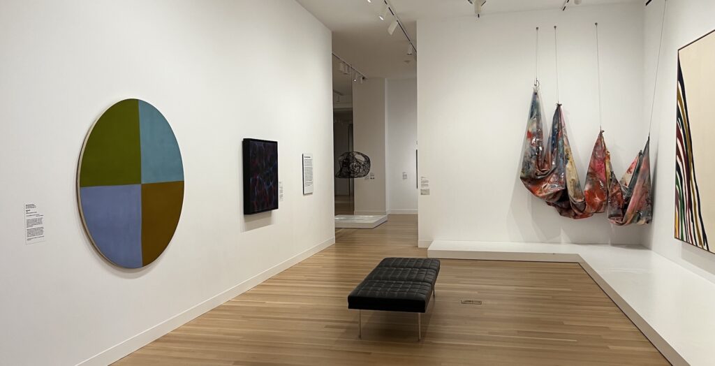
You can’t go to the National Portrait Gallery without going to the American Art Museum, and vice versa. So after the Felix thing yesterday, I made a run through the SAAM contemporary galleries. Nam June Paik’s neon America was blinking red, and this gallery of DC artists was a great grouping.
[THE] Mary Pinchot Meyer painting in a public collection was up, next to a nice Kenneth Young, a classic Sam Gilliam, and a good Morris Louis. Behind me was a weirdly levitating Anne Truitt and a huge Alma Thomas. The way they hung a Carmen Herrera outside the gallery, but visible between the Meyer and the Thomas, was a nice touch.
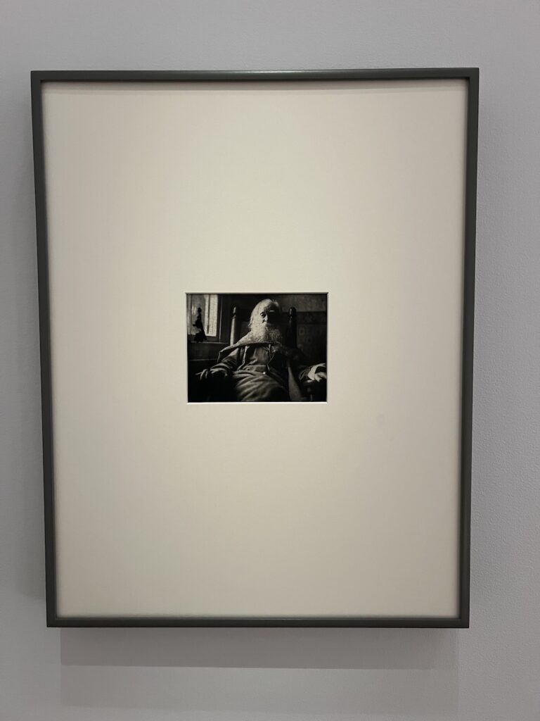
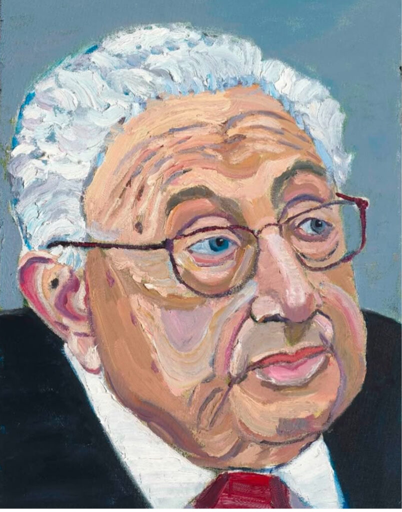
Queer Ancestor: Thomas Eakins, Walt Whitman, 1891, printed 1979 [? how’d that work?] installed with FG-T at the NPG
Well that took five minutes.
The erasure or diminishment or downplaying or whatever of the gay, AIDS, and immigrant identity of Felix Gonzalez-Torres and those identity characteristics as vital context and reference in which he made his work in the 1980s and 1990s, is real and should be called out and resisted. It happened publicly and messily at the Art Institute. It happened similarly at Zwirner. It happened in subtle, coercive ways art historians and critics called “oppressive.” But addressing it’s not a question of either/or, but of both/and, as Johanna Fateman skeeted, and expanding the meaning of the work, the contexts in which it resonates, and the changes in the world around it every time it’s exhibited should build on the artist’s achievement in its original moment, not replace it.
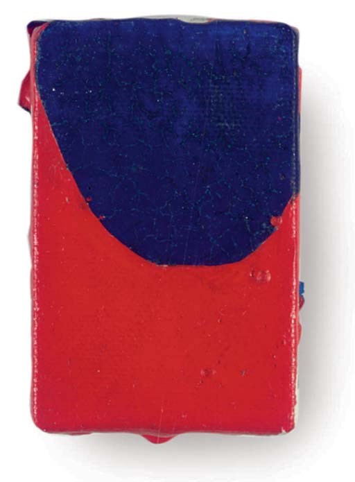
Anyway, this debate is not advanced by the current outcry over the show at the National Portrait Gallery at the Smithsonian, Felix Gonzalez-Torres: Always To Return, because the claimed erasure is not happening. I’m not going to litigate Ignacio Darnaude’s impassioned but wrongheaded, blinkered, and inaccurate article condemning the way “Untitled” (Portrait of Ross in L.A.), a 1991 candy pour is presented. Its connection to AIDS is not erased. Felix’s connection to Ross is not erased. And as I walked out of the Felix galleries, past the James Baldwin and The Voices of Queer Resistance exhibition next door, and on through the permanent collection install, I have to say, there is no museum anywhere doing more of the work right now than the NPG & SAAM.
l to r: eakins’ whitman, leaves of grass, ross in la @ npg
So. Here is the way “Untitled” (Portrait of Ross in L.A.) is presented.
Specific Objects Without Specific Form, the 2010-2011 retrospective of Felix Gonzalez-Torres’ work, curated by Elena Filipovic, was a pivotal influence in the posthumous reconsideration of the artist’s work and legacy. It was co-curated with three artists, Danh Vo, Carol Bove, and Tino Sehgal, in three European museums: WIELS (Brussels), the Fondation Beyeler (Basel), and MMK Frankfurt.
Frequent changes and reinstallations were the default, and each artist brought entirely different concepts for reimagining the work and its history. I would be surprised if a hundred people on earth saw every iteration and variation over the show’s 15-month run, and so the massive catalogue, published in 2016, is the primary vehicle for transmitting the experiments and experience of the exhibition.
The core of the catalogue, at least as it relates to the recontextualization of Gonzalez-Torres’ work, is a 20+ page conversation between Tino Sehgal and dealer Andrea Rosen. Rosen is the single most influential figure in the history of FG-T’s work, and the single biggest reason it’s been preserved, shown, and studied during his life, and after his death. I don’t know of any more extensive discussion of Rosen’s views on Gonzalez-Torres’ work, and the core of her message here is that it is about change.
Though there are some persistent, static objects in Gonzalez-Torres’ body of work, the most significant ones are all recreated every time they’re shown. It is the discussion and decisions that occur around each of these realizations that constitute the history of the work. Those changes, and marking them, and questioning them, and questioning the context a work is presented in each time it is realized, are, Rosen argues, central to Gonzalez-Torres’ original intention for his work.
“He would always say,” Rosen quoted Felix as saying, “‘If someone chooses to never install a work again, or manifest a manifestable work again, it may not physically exist, but it does exist, because it did exist.'” Some of his works have recently been manifest at the National Portrait Gallery, and the changes and decisions around them have prompted criticism. This has happened before, with these same works, with the same institution, even, and with some of the same people—including Rosen—stewarding Gonzalez-Torres’ work. The most public shift and criticism has been specific objections about specific identities: the seeming erasure or diminishment of the artist’s identity as a gay man, a person with AIDS, and a Cuban-American, as generative to his work. It got attention after Rosen brought David Zwirner in to co-represent the artist’s estate. But, as this show, and this book, and this interview, document it’s been underway for much longer.
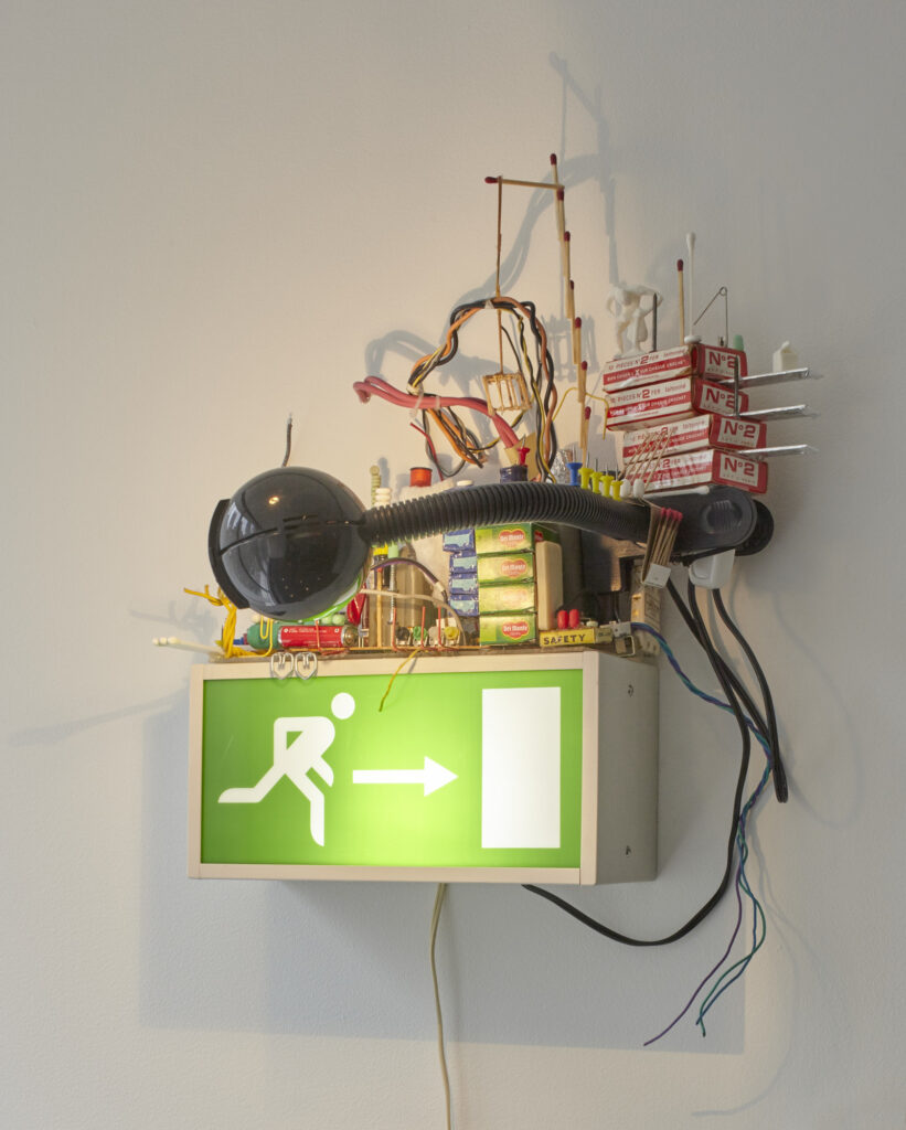
Sarah Sze, Migrateurs, 1997, seemingly random stuff artfully arranged atop a European-style exit sign, collection: MoMA, a 2016 gift of John Silberman in honor of Ann Temkin
I’ve always loved Sarah Sze’s earliest works, beautiful installations seemingly made on the fly out of the most ephemeral and inconsequential materials. And I was always bummed that I didn’t get one of the sculptures she made on top of the exit signs at the Musée d’Art Moderne de la ville de Paris for a show she did with HUO in 1997, which I remember being surprised to see again, and up close, when one was sitting on Marianne Boesky’s credenza.
So I was rewatching Sze talking with Carol Mancusi Ungaro in 2008 about Migrateurs (1997) for the Artists Documentation Project. And they’re talking about how sticks of gum sag under the weight of carved soap sculptures, and how the green Tic Tacs have faded more than the white ones, when a collector I knew from MoMA back in the day, John Silberman, turned up on screen. It was his sculpture, and I thought, well, at least I lost it to a good home.
But then I realized it had sold at Christie’s, in the summer of 2007, in a sale I watched closely because it had the first Anne Truitt Arundel painting to come up at auction [which flew away from me], but yet I’d completely missed it, and John hadn’t. And so that made sense why he’d brought the sculpture to a conservation conversation: the Christie’s pic has the sagging gum.
Sam Francis, Untitled [archive no. SFP83-183.], 1983, 3 x 2 in, acrylic on canvas, sold at Christie’s in 2007
What else I’d completely missed? A Sam Francis painting. Now with most Sam Francis paintings, it’s a matter of ignoring them. So imagine my surprise. This Francis is 3 x 2 inches, one photo, no information beyond its authentication, so getting missed is probably a big part of its tiny history.
Ellsworth Kelly, Red on Blue, 1963, 7 x 5 in., ink on paper, via Matthew Marks, 2020
So now I’m on the lookout for a c. 1997 sortie de secours sign, which I can hot glue a tiny Sam Francis painting to. Then I can just fill in the rest with stuff from that drawer in the kitchen.
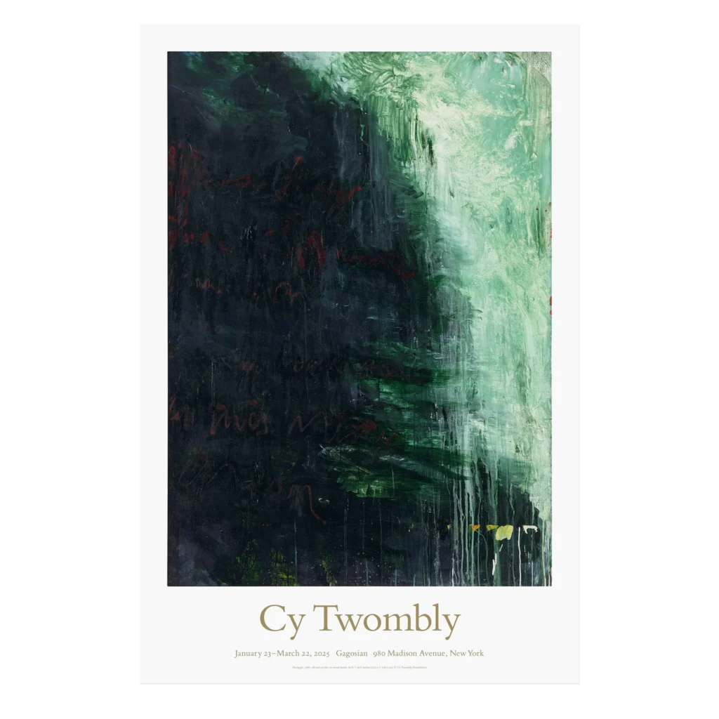
Cy Twombly exhibition poster featuring Paesaggio, 1986, via image via gagosianshop
Well, the poster for the last Twombly show in Gagosian’s 980 Madison space sold out by lunchtime of the first day, if you’re wondering how the $20 Twombly fandom’s doing.
Speaking of Lutz Bacher, one of her greatest installations was a pair of works shown during the last few days of the 2012 Whitney Biennial. Andrew Russeth wrote very movingly about it at the time. Alas, you cannot visit it as he recommends.
The AMoM shirt from Nolen Strals and Soft Labor’s Sarah Hromack is now available in a limited edition of 50, with 100% of proceeds going to Grief & Hope’s GFM to support artists and art handlers who’ve suffered losses from the LA fires. There are less than 45 remaining.
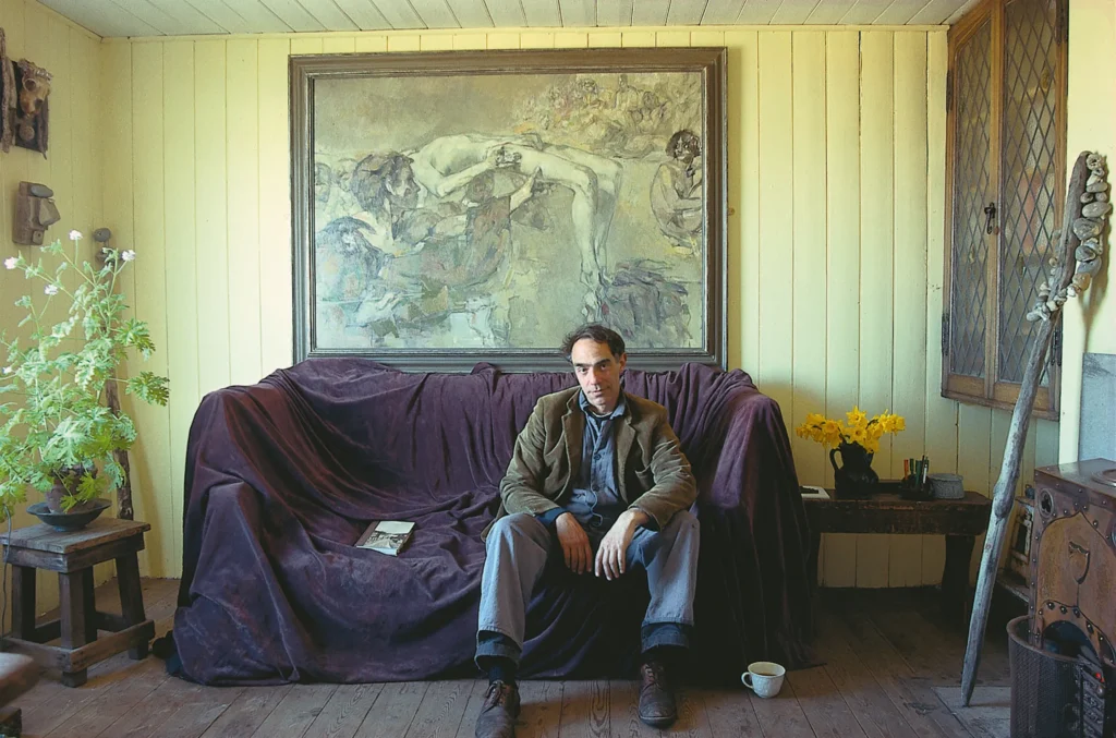
Derek Jarman at Prospect Cottage in Dungeness, in front of a painting by Robert Medley, photographed for World of Interiors in 1989 by John Vere Brown
The World of Interiors has run the same story about visiting Derek Jarman at Prospect Cottage three times: the first was in 1989. The second was in June 2019, and ngl, I can’t figure the hook. Jarman’s partner Keith Collins had died the year before, so the cottage was in limbo, but the Art Fund campaign to rescue it wouldn’t come until 2020. There was a restoration of The Garden (1990), and an exhibition of paintings he made at Dungeness that spring, but neither seems big enough. I just saw it trending in a sidebar, but it turns out the third time was last February, the 30th anniversary of Jarman’s death. So bless the editors and algorithms of World of Interiors, I guess.
What caught my attention was the large painting over Jarman’s sofa, in a style like none of his other works. Which makes sense, since it was not by Jarman, but by Robert Medley. The painting “is entitled Sebastiane, and is autobiographical in the sense that Robert was in the film of that name that Derek made in 1974.”
Each issue of the 1980s Eye Magazine had a different editor inviting artists to make a work, which would be copied and collated into a spiral-bound volume. Sometimes artists would submit an entire edition of prints, or objects, and some issues were published looseleaf, or in boxes.
There is no comprehensive archive of Eye Magazine. The largest holding I’ve found is in the Sackner Archive of Concrete and Visual Poetry at the University of Iowa, which has seven issues from between 1982 and 1986, including the most famous [sic] one, Cobalt Myth Mechanics, Eye No. 14, edited in 1986 by Paul Hasegawa-Overacker, otherwise known as Paul H-O. Earlier issues in the Sackner archive list edition sizes of 150 or 155. Cobalt Myth Mechanics is listed in Iowa as having a run of “around 200,” and all signed editions are numbered out of 200.
But an old eBay listing scraped by worthpoint quotes Paul H-O in a 2011 online text, now unfindable, as saying: “[the] binding process and handmade covers were, in fact, killing me… They were so labor intensive each copy averaged over two hours after collating so I produced the copies in small batches, and in fact never finished more than about 150.”
The 1987 announcement of Eye #14 in The Print Collectors’ Newsletter says the contributing artists all “share social concerns.” From H-O’s editiorial note: “Not one of the people who’ve made these pages is guilty of not caring about man’s fate.” MoMA reproduces 16 artist folios, but not the title pages or H-O’s text.
The point of all this is that Eye #14 includes two unique contributions from now-canonical artists, and one of them is also an art market star: Karen Finley, and David Hammons.
At the beginning of the first Trump administration, I began a project to capture moments of historic significance “in the manner of the most relevant painter of the age, George W. Bush.” Well, that project got gigantic and depressing as hell very fast.
But nothing in the intervening years has changed my view, though, of George W. Bush, who, in addition to giving us this Supreme Court, remains the most relevant painter of our age.
Responding to a prompt for a painting of the age, dickius skeeted, “This painting by G. Walker Bush. It really captures an era defined by the worst people on earth getting away with their crimes — indeed, being rewarded for them.”
In February 2020, weeks after Biden’s inauguration, I went to see Bush’s paintings in person at the Kennedy Center. I wondered then about whether the world would be better off with more paintings like this in it. Today, I can’t imagine a better fit.
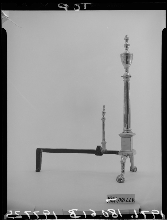
Untitled (Andiron…) was an early part of a series of experiments with the concepts of appropriation, readymades, and the power (or not) of authorship: they’re declared works of art where I didn’t own or control the physical object or environment.
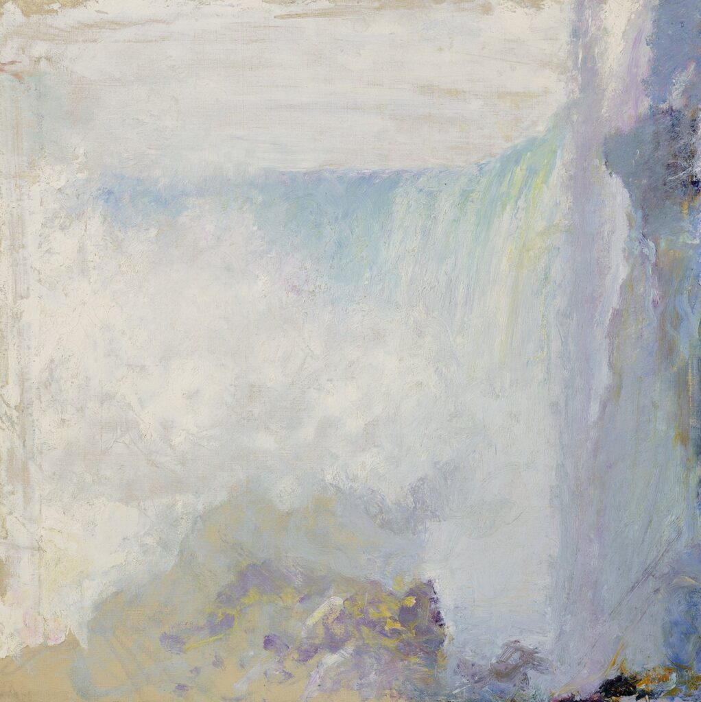
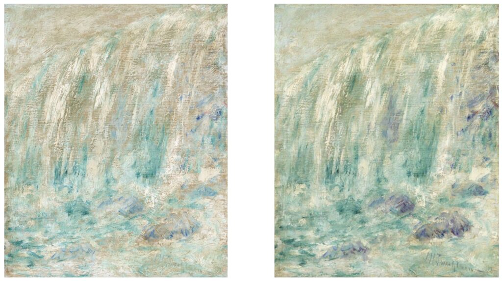
I know almost nothing about Twachtman, except now I learn he visited Niagara twice and painted it multiple times. And this painting looks like it was made around the same vantage point as the one at the Smithsonian, but this tighter one, with less geology and more mist is more interesting.
Alas, he was not. Or not over this. Because though Niagara was Twachtman’s Rouen, that he painted at least fourteen variations of, this is the same painting. And whoever bought it in 2001 cleaned it with a scrub brush? Left it out in the sun for 23 years? I do not know. But I guess if you can wait 25 years, it’ll only get more ephemeral and atmospheric, and the price will continue to drop commensurately. Meanwhile, in the control group, the Brooklyn Museum is probably storing theirs in the dark.
Hmm, just when I think the narrative arc is complete, it seems the Christie’s painting was described in 2003 as turning up in an attic of a Twachtman family member, but the Christie’s provenance has 18 years of dealer and collector ownership befor then. Is that just the pace at which information trickles out among 19th century painting collectors?
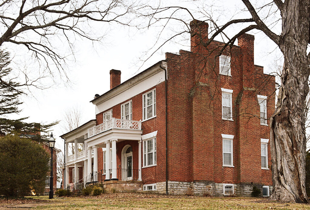
the house formerly known as the Reid-White House, photographed for the Virginia Landmark Register in 2016 by Sarah Traum, in such a way that the post office in the front yard can’t be seen.
What to do with this story from Sally Mann’s memoir?
Every time [Cy Twombly and I] would leave his house and catch a glimpse of the neighboring Reid White house behind the trees, one or the other of us would repeat our favorite line from a story my mother used to tell about the occupant of that house, Mrs. Breasted White. That’s what I swear I remember her saying: “Mrs. Breasted White.” But now, writing that name, it somehow seems highly improbable.
Anyway, we’d say the punch line, sometimes in unison, and then we would both howl with laughter, as if we had just heard it for the first time. Here’s how the story goes:
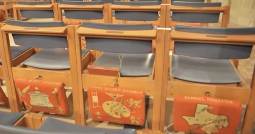
Really, all it took was seeing the sonorous phrase—needlepoint kneelers—and I believed. It was on the cover of a privately published history of a parish’s longstanding ecclesiastical needlework program, which fashion prophet Rachel Tashjian-Wise revealed on a post while visiting family over the Christmas holidays.
Needlepoint kneelers honoring John Singer Sargent and Sam Houston at the National Cathedral, via
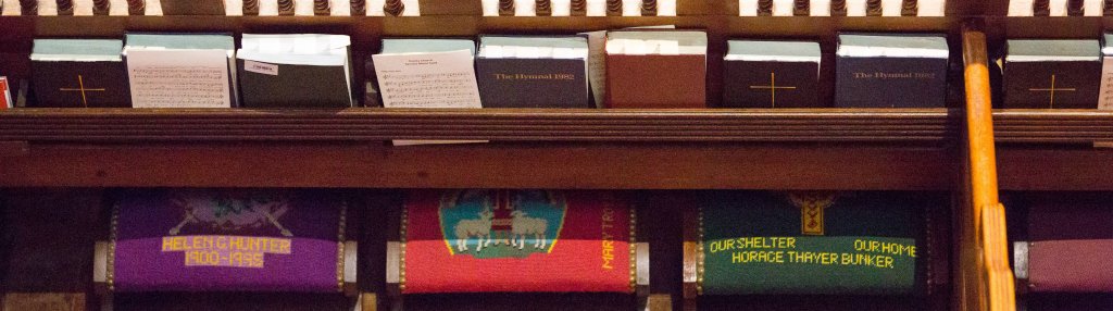
Growing up near, even friendly with, but not in commune with the Episcopal Church, I was fascinated to find an entire world–or rather, a very specific and highly developed part of the world I’d previously never knew or imagined—of ecclesiastical needlework. It brings together faith and devotion, but also memory, community building, philanthropy, gender, class, and history, and that’s even before it gets to craft, technique, design, and the material. And it all plays out within the ecclesiastical, managerial, and social structures of the Church.
Basically, parishioners of a church donate time, talent, and resources, to creating handmade needlepoint cushion covers for the kneelers that line the pews of the church. In one place it may be the historic legacy of a dedicated crowdsourcing effort to beautify a new or rebuilt church, or a lifelong effort to memorialize someone. In another it could be a highly organized and socially prestigious fundraising activity. As with any such laborious handwork, needlepoint kneelers seem historically likely to reflect the value of the role, time, and taste of women in the community. It could be a sign of sacrifice or extreme privilege. [cf. prolific needlepointer HM ex-Queen Margrethe II of Denmark]
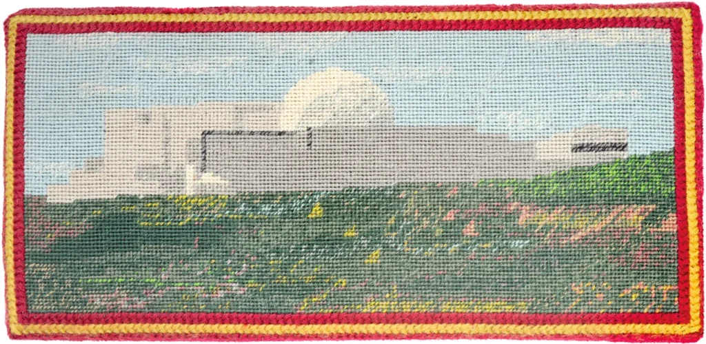
a needlepoint kneeler by Vicky Cropped of Southwold, UK, depicting the Sizewell nuclear power plant via World of Interiors
And an epic post on the National Altar Guild Association’s blog about starting and operating a successful program feels like needlepoint kneelers, as an institution, remain sound. Besides the amazing new (to me) vocab, every observation or piece of advice from Bid Drake, “internationally known ecclesiastical needlepoint specialist [and] author of the Guide to Church Needlepoint Care and Maintenance” feels hard-won from direct experience: “I strongly suggest that you invite everyone in the congregation to help make the kneelers, then teach them Basketweave on small useful pieces like Chrismons, usher tabs, and collection plate silencers.” “If you only give out a third of the yarn with the canvas and tell the stitchers to take their pieces to the ‘Mistress of the Yarns’ when they need more, you will have an instant check on which pieces are being stitched, and which are buried in closets.” “Your local needlework shop should be able to suggest a finisher — one who loves and respects needlepoint, not an upholster who treats $4,000/yard needlepoint like $10 chintz.” [oof]
There’s so much about this cultural dynamic that fascinates me, and how it results in these highly specific objects. I’ve looked in the past without success for scholarly consideration of similar craft- and gender- and class-coded objects; who’d have thought that what was missing in my ersatz needlepoint history project was God. 🙏