
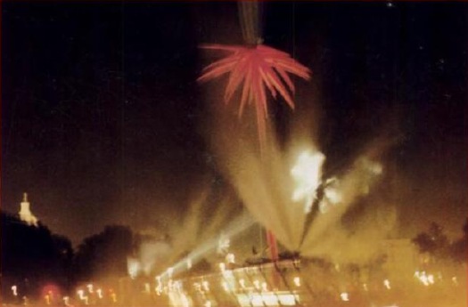
When I first came across the pixelated Dutch landscapes on Google Maps , I imagined the polygonal camo distortions hovering over the sensitive sites. From the ground, I thought, maybe it looked like a Gerhard Richter overpainted snapshot.
But now I think it looks more like the bright, beautiful gouaches by Louise Belcourt which Sharon featured on Two Coats of Paint recently.
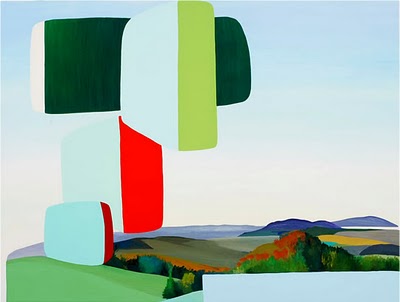
Images: Louise Belcourt’s place in the world [twocoatsofpaint.com]
‘Do-It-Yourself Existential Individualism’
Frieze’s 20-year retrospective of itself continues apace, and wow, it’s like running into an old flame on a train platform.
I hadn’t thought about Daniel Birnbaum’s 1996 essay, “IKEA at the End of Metaphysics” in years, but wow, it’s just all flooding back.
From a Heideggerian perspective IKEA best sellers such as ‘Billy’, ‘Ivan’, and ‘System 210’ do not represent a corruption of everyday life, but have merely formalised what is already there; the IKEA catalogue only makes the tendency towards uniformity more conspicuous. Heidegger’s global ‘levelling’ is not a critique of the common forms of everyday life as such, but of their passive acceptance. At the end of metaphysics, levelling is complete – no one questions the catalogue.
Obviously–well, now it’s obvious, anyway–my own Ikea X Enzo Mari mashup project has its origins in the critical perspective of the company and its ideology which Birnbaum mapped out 15 years ago, and which I absorbed.
Also, I’m reminded how I miss Jason Rhoades.
IKEA at the End of Metaphysics [frieze.com/20/ via ronald jones]
Where To Make A Steichen-Style Photomural: Compo Photocolor
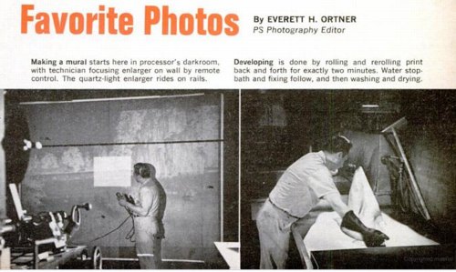
While trying to find out where and how to make a photomural, or at least how they used to make them, I found this slightly ridiculous 1966 Popular Science article about making photomurals in your very own home. And how you basically shouldn’t do it, but instead just mark up a negative and send it off to a photo enlarger somewhere.
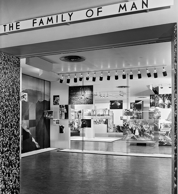
Someplace like–hey-o!–the outfit mentioned in a caption, “Compo Photo Color, 220 W. 42nd St., NYC, specialists in murals and exhibition prints who did famous ‘Family of Man’ photo show.” And so it comes pretty much full circle, back to the most famous photomural exhibition of all.
So who is Compo Photo Color? Or was. Immediately available references are pretty scarce, but Compo seems to have been in business from the 1950s until the early-to-mid 1970s. Its principals were a German immigrant photographer Richard J. Schuler and Ernest Pile, and it was eventually consolidated into Wometco Photo Services, a division of the Miami-based movie theater owner. But back to the apparent heyday, in the 50s.
In a 2001 interview, photographer Wayne Miller, who was Steichen’s assistant and co-curator on Family of Man, and who contributed the most images to the show, talked about working with Compo on the prints:
Riess: About Gene Smith, can I ask you to repeat the story that I lost last time about asking Gene Smith for a print of that image in The Family of Man?
Miller: Oh yes. In The Family of Man, after we had made our final selections of what pictures we wanted to have in the exhibition we asked some local photographers if they’d like to make the print for us, or would they give us the negative and we ll have the print made by Compo Photocolor in New York. Actually we wanted Compo Photocolor to make all of them so the prints would have a commonality, and they would match the other prints quality-wise. And they were very good technicians.
But in this case, because of Gene, he wanted to make the prints, he didn t feel anybody could make the print as well as he could. And he invariably spent not only hours, but days in the darkroom. In fact, in a Life story he would disappear in the darkroom and return, and you almost– here he was seemingly weeks or months afterwards, with a beard and other things, and with the final prints. And it would drive the Life people mad.
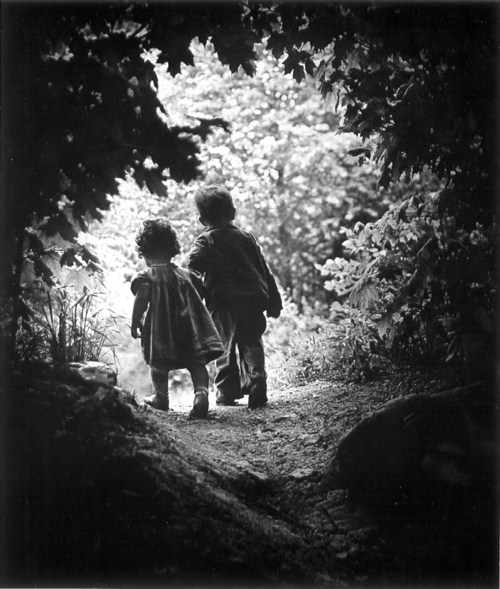
In this case, we had a print that I’d found in the Life morgue of what he [Smith] called “A Walk in Paradise Garden,” something like that, of two children walking out from underneath this frame of bushes. A nice picture, and we wanted to use it at the end of the exhibition. It was going to be about, maybe 30″ x 40″.
I told Gene we wanted to do this and asked him if he’d like to make the print, and yes, he
certainly wanted to make the print. So I arranged for him to get the necessary paper and
chemicals to do this, because his wife Carmen said, “Don t give Gene the money for it, because he’ll spend it on other things.” So after he told me what he wanted, I did get the materials for him. And I gave him a deadline, knowing that he was often not able to meet a deadline, of about three weeks early. So he took this material.
Now the print we had that I’d gotten out of the files had been handled a great deal and it had some cracks in it. It was dog-eared, and it wasn’t a fine print at this point. So at the same time I gave these materials to Gene I sent the print from the Life files over to Compo Photocolor and asked them to make a copy of it, make a negative, and make a print to size. Just so we wouldn t get stuck in case he didn’t come up with the print. Later, when he did do it, we could always replace it. And sure enough, the deadline came and went and we had to put this copy print up on the wall. Because Gene hadn t shown up with his.
A couple of weeks later Gene shows up with these photographs rolled up under his arm. We went up to the museum exhibition space in the morning because the museum didn t open to the public until noon. And I took this print that we had down off the wall, and he unrolled his prints. He had half a dozen of them there, different qualities, and he laid them out beside this print. I was worried about this because I know how he struggles and works so hard on it. He will darken this or lighten that, and he ll use ferro cyanide to bleach little bits. And the delicacies with which he treats a print are just great, they re very great. So I was interested in seeing how it would work.
He laid his out, and he stood back there and looked at these prints. And he walked around a little bit and looked at them some more. Finally, he said, “You know, I think the print you have on the wall is the best one. Let s use that one.” [laughter] So he rolled his up and went along.
That I think points out the fact, I believe, that when you make a photograph, a print of a
photograph of larger than normal size, it picks up a new quality other than one of maybe an 11″x14″ or something. But one like this, maybe 30″x40″, it has a new quality to it.
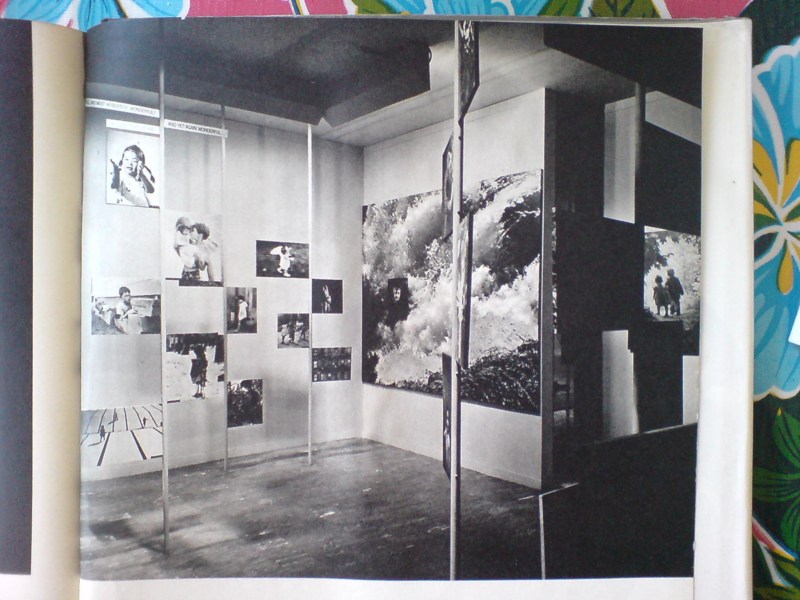
You know, it didn’t occur to me at all until just now, but Paul Rudolph designed the installation for Steichen’s Family of Man, which was photographed by Ezra Stoller, in January 1955,
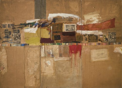
the same year Robert Rauschenberg was collaging photos into such giant combines as Rebus. Hmm.
On War-Era Murals
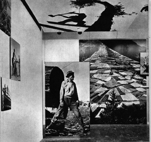
The question or theme or whatever hadn’t crystallized for me, but when Tyler linked to the previous two posts about Lt. Comm. Edward Steichen’s wartime propaganda exhibitions at the Museum of Modern Art, he noted that “there’s a lot of art historical work yet to be done on the impact World War II had on art and artists.”
It’s an interesting way to consider my fascination with the aesthetics and paradoxes of photomurals: their apparent historic status as something other than artwork, much like the photographic medium they’re derive from; their powerful scale, which creates a certain kind of all-encompassing viewing experience that is typically associated only with the later works of revolutionary “high art,” namely the Abstract Expressionists; and of course, the abstract and modernist aspects of the images themselves.
I’m not ready to go beyond the grand theory of “this looks like that,” but I keep seeing and finding resonances between photomurals, which were born in the Depression and came of age during WWII, and some of the major developments of postwar art.
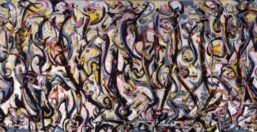
Mural, Jackson Pollock, 1943, collection: UIMA
I mean, I’m re-reading Tyler’s interview with Pepe Karmel about Jackson Pollock’s Mural [above], which was painted in 1943, and there are moments where I can’t help thinking about the 15- and 40-foot images in Steichen’s 1942 Road To Victory show:
It’s an important painting for Jackson Pollock because it’s the moment that announces his future as a painter of large, mural-scale paintings that become environments, and furthermore paintings that are in this distinct, all-over style that changes people’s idea of what a painting might be.
…
It’s like Barnett Newman’s Vir Heroicus Sublimis or Pollock’s own Number 1, 1950. You have to be there. You have to be standing in front of it and feel it filling up your field of vision and feel it wrapping around you and feel yourself falling into the field of the painting. If you don’t have that experience first-hand, you won’t get the feeling of the painting.
…
MAN: You talked about how important the painting was in terms of Pollock’s oeuvre. Can you detail why it’s so important to what came next in American and modern and contemporary art?
PK: The next step is off the wall and out into space. In contemporary art that deals with installation as an art form, which comes out of those paintings in 1950 and that comes out of this painting in 1943. It just doesn’t get more historic than this.
It’s truly a kind of unrecognized monument of American art.
Which isn’t to say that Pollock was referencing or even influenced by photomurals, just that both Herbert Bayer’s installation of Steichen’s photos and Pollock’s first epic-scale painting create an overwhelming spatial experience.
Photomurals were out-and-proud propaganda which had connections to filmmaking and the cinematic screen and to world’s fairs, [See Alvar Aalto’s Finnish Pavilion at the 1939 World’s Fair and the Japanese pavilion at the Golden Gate Expo that same year].
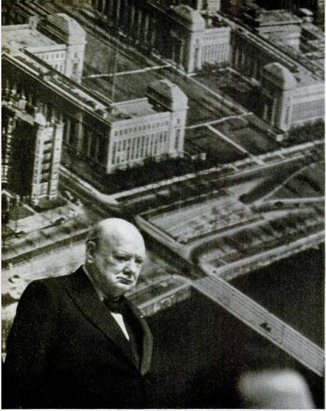
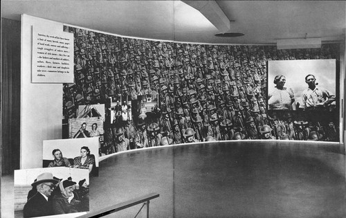
Which is one of just a handful of references to photomurals in LIFE magazine’s archives. In a moment of greg.org confluence, LIFE’s most prominent depictions of photomurals are not in museums or world’s fairs, but in political rallies–they are the ur-Sforzian backgrounds. For example, In 1949, FDR Jr. has a giant wall of smiling children behind him at a UAW convention. A chorus line of garment workers kick in front of a selection of “union heroes.” And when he spoke in Boston in 1949, Winston Churchill stood in front of an aerial photomural of the MIT campus [above] which reportedly “confused [the] television audience.”
How To Make A Giant, Steichen-Style Photomural
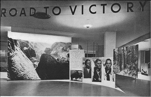
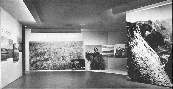
Looking through the installation photos for Road To Victory, Edward Steichen’s 1942 exhibition at the Museum of Modern Art, I find myself asking two things:
Who took these photos, and how did they make them? [Of course, my real question is usually, Where are they now, which really means, where can I get some? But anyway.]
The first question turns out to be harder to answer than I thought. The MoMA Bulletin for the show states that over 90% of the images are from government agencies, military sources, or wire service/news agencies, but they lack any credit line. It’s slightly amusing that most of the photocredits in the Bulletin turn out to be for the installation photos, not the subject photo murals themselves. If Edward Steichen and Carl Sandburg are the creators of Road To Victory: The Propaganda Artwork, then Samuel H. Gottscho is a rephotographing appropriation artist 40 years ahead of Richard Prince. I’ll have to do some digging for an image checklist in the exhibition’s archives.
As for how these things were made, though, there is actually a footnote for that. And the answer is surprisingly painterly:
To make the large murals, the negatives were enlarged in sections upon strips of photographic paper forty inches wide. The museum wall was first sized, then covered with a layer of wallpaper, next with one of cloth, and then the photographs were pasted on the cloth by paper hangers. The seams were lightly airbrushed, imperfections were retouched by hand, and finally the whole mural was painted with dull varnish to eliminate the glaring reflections rendered by the surface of photographic paper.
Fascinating. Photo wallpaper? Overpainted photomurals?
While large prints in the show were mounted on boards, and some murals were affixed to freestanding walls and panels, others were applied straight to the museum’s walls. Given the anonymity of the images, I’m going to guess that approximately none of these prints or murals survived the exhibition, much less the war.
The Road To Victory And Beyond
So in my ersatz zigzagging through the history of photomurals, I kind of skipped from Edward Steichen’s landmark Family of Man exhibition in 1955, where Paul Rudolph deployed enlarged photo prints for content and experience, as well as architectural elements in his exhibition design; to Capt. Steichen’s 1945 exhibition Power in the Pacific, which featured the work of the US Navy photography unit he commanded; to Steichen’s participation in MoMA’s first photography exhibition ever, a 1932 photomural invitational, which was intended to serve as a showroom for American artists, who faced stiff mural competition during the Depression from south of the border.
Sensing a trend here? Wondering what I missed? Wow. Michael from Stopping Off Place just forwarded me the link to MoMA’s bulletin for Road To Victory, a stunning 1942 photo exhibition that rolls up so many greg.org interests, it is kind of freaking me out right now. And the man who is bringing it to me? Lt. Comm. Edward Steichen.
I mean, I kind of stumbled onto the photomural trail last October, when a vintage exhibition print of Mies’ Barcelona Pavilion came up at auction. Its size, scale, and iconic modernist subject suddenly made the photomural seem like a missing link in the contemporary development of both photography and painting. And yet it’s also seeming like not many of these pictures survived, because they were merely exhibition collateral, functional propaganda material, no more an artwork than the brochure or the press release.
And yet these things existed. Is it possible at all that any of these prints still exist in some art handler’s garage?
Anyway, it’ll take me time to process this Road To Victory show, so I’m just going to skip across the most stunning parts: the show’s awesome, explicit propagandistic objectives; the utterly fresh painterly abstraction of these giant prints; the spatial, experiential design of Herber Bayer’s installation; the texts surrounding the exhibit, which traveled around the country in 1942 to apparently wild, patriotic acclaim; and the ironic, complicating aspects of authorship of the show and the work in it.
[Hint: they barely identify, much less mention the actual photographers at all. I, meanwhile, am happy and grateful to credit PhotoEphemera for these small versions of much larger scans of MoMA’s 1942 documentation of the show. Definitely worth diving into.]
Bloghdad.com/Issues
April 7, 2003 11:46 AM
TO: Doug Feith
FROM: Donald Rumsfeld
SUBJECT: Issues w/Various Countries
We need more coercive diplomacy with respect to Syria and LIbya, and we need it fast. If they mess up Iraq, it will delay bringing our troops home.
We also need to solve the Pakistan problem.
And Korea doesn’t seem to be going well.
Are you coming up with proposals for me to send around?
Thanks.
The release of this memo by warrior/wrestler/poet Donald Rumsfeld made me wonder what I was writing about in early April 2003, when the Iraq War was just underway.
And it turns out I was writing about the devastating poetry of Donald Rumsfeld.
Know Hope
Producer Ted Hope is at least three installments into his solid post-Sundance, post-Toronto explication of what he’s calling “The New Model of Indie Film Finance.” It’s a pretty clear-eyed look at the challenges even a celebrated, experienced filmmaker faces in realizing a project–and a profit.
Clearly we are at a point in US film culture where the infrastructure is not serving either the investors, the creators, or the audiences. Good films are getting made but not being delivered to their audience. Last year I went to a film investor conference. Several other producers were invited and we all asked to pitch projects. None of us left with funding, but the investors said to me that I was the only one that addressed how we would deal with the reality of not just getting our film to market, but bringing it to the ultimate end-users — the audience. As artists build communities around their projects in advance of actual production, they are developing a plan to give domestic value to their films. It is hard to imagine that any artist will be able to do enough pre-orders to predict 20% of negative costs from the USA — unless they are working on microbudgets — but taking a step forward is still a better plan than surrender to the unknown.
With uncertain economic conditions, shifting revenue streams, and a continued reliance on admittedly outmoded valuation metrics, Hope describes indie finance as being in “an era of risk mitigation.”
Twas ever thus, though, no? Frankly, if 7500 features were actually made in 2010, the vast majority of which will never make back their production cost, much less turn a profit, it sounds like the film financing business could use more risk mitigation, not less. But I’d guess that exponential increase in production volume over the last decade correlates to the drop in digital/HD production costs. It’s just that those losses are distributed across many more microbudget filmmakers’ uncles than ever before.
Hope hasn’t gotten to the profit part yet, but I expect it has something to do with microbudgets, non-theatrical distribution, and filmmaker audience/community-building. And that the answer has something to do with scrappy, groupie-friendly directors like Ed Burns and Kevin Smith. Stay tuned.
Part 3: The New Model Of Indie Film Finance, v2011.1 Domestic Value & Funding [hopeforfilm.com]
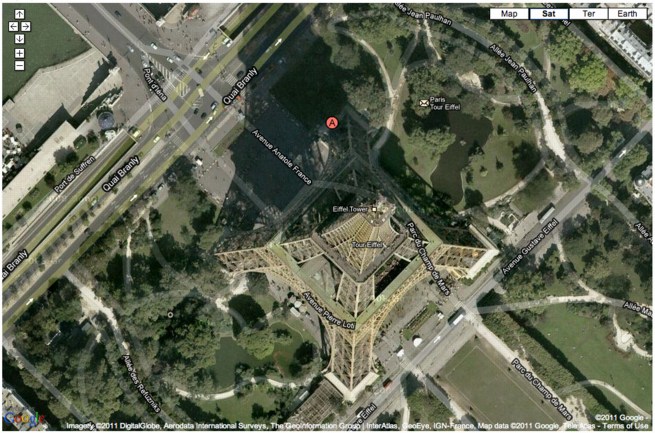
La Tour Eiffel Vu En Ballon
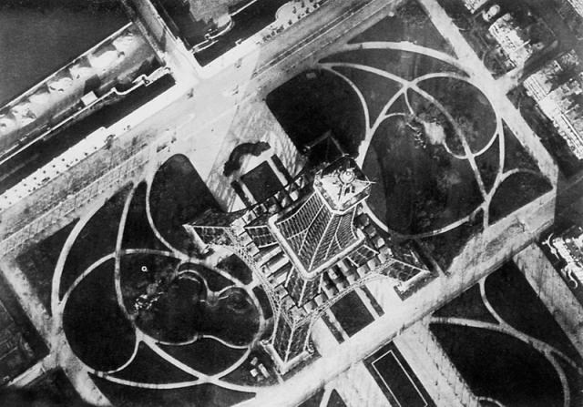
In 1909, balloonist/photographers André Schelcher and Albert Omer-Décugis took this picture from about 50m above the top of the Eiffel Tower. It is one of 40 images they published that year in a book titled, Paris vu en ballon et ses environs.
I just found it in my new Leon Gimpel catalogue, but it turns out to be included in Thierry Gervais’ 2001 article on the beginnings of aerial photography, which I posted about before.
With that angle, I would’ve said Schelcher’s photo looks more Bing than Google Maps, but Google’s got it.
Previously: Le début du point de vue Google Mappienne
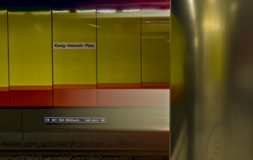
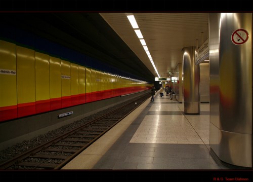
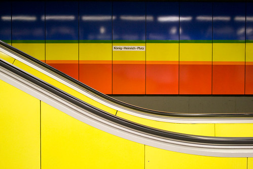
Gerhard Richter Subway Station
It’s hard enough for me to wrap my head around the fact that Gerhard Richter and Isa Genzken were married for 13 years. Now I find out they made a subway station together. A subway station about their relationship.
In a 1993 interview, Hans Ulrich casually asks Richter, “What works of yours exist in public spaces? The Underground station in Duisburg; the Hypo-Bank in Dusseldorf?”
And at first, I’m like, “Oh, right, besides the underground station in Duisburg.” But then when I looked it up, I see that it was only completed in 1992, so the Duisburg Metrocard in Hans Ulrich’s suit pocket probably still had two weeks left on it.
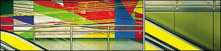
Anyway, the work seems remarkably undocumented. These are about the only pictures I could find. Genzken and Richter received the commissioned for the König-Heinrich-Platz U-bahn station in 1980. All the pieces of the project seem to be enamel on steel wall panels installed throughout the station.
Genzken made two murals facing each other on the train platform, with arcs from circles with radii of 3 and 5km, which relate to scaled down diameters of certain planets,” according to the Google cache of one mobile travel site.
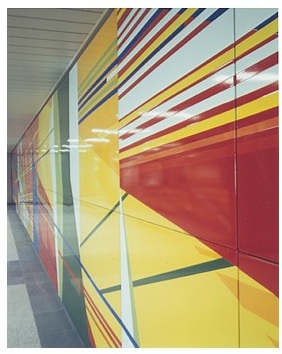
Dietmar Elgar’s bio of Richter quotes Genzken’s project statement: “One curve corresponds to the curvature of Mars on a scale of 1:1,000, another curve to VEnus on a scale of 1:30,000.” Elgar then notes these references were “no coincidence. She was alluding to her romance with Richter.” [Richter apparently painted two abstracts, titled Juno and Janus, in response. Which is adorable.]
As for the station, Richter’s abstract mural adorns the west lobby, while in the east station entrance, the couple installed 24 enamel signs with historical facts about Duisburg. Frankly, I’m not feeling it. Maybe if someone were to go to Duisburg and shoot a flickr photoset of the station, we could get a better sense? Bitte-schoen?
Or maybe the thing to do is to stop looking for art, then you can see it. Here are some photos of the station from the web which happen to show some of Richter or Genzken’s works:
 fotocommunity.de
by R + G Team Dülmen, via fotocommunity.de
by ati sun via flickr
U-Bahn Kunst [duisburg.de]
Previously: giant Richter triptych commissioned by BMW
I’ve Got Mail
I order so many random books, usually from random independent or used booksellers on Abebooks, that don’t arrive with anything like the robotic precision and up-to-the-minute email notification of Amazon, that I never know what’s come in the mail until I open it. And sometimes I’ve forgotten what I even ordered.
Today’s haul was exceptional, though:
Centerbeam is the 1980 report/documentation for a project that, as far as I can tell, was the largest contemporary public art event ever undertaken on the National Mall: Centerbeam and Icarus, a collaborative experiment/performance organized by MIT’s Center for Advanced Visual Studies, under the direction of Otto Piene.
Centerbeam was unveiled at documenta 6 in 1977, and restaged on the Mall in the summer of 1978. It involved video, lasers, giant inflatable sculptures, smoke machines, sound art, a technotopian extravaganza that was apparently a raging success, but also, from the pictures, might have been a hot mess. Not that those are mutually exclusive. Anyway, I thought I’d bought this book a year and a half ago when I first wrote about Centerbeam, but I had not.
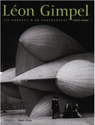
The catalogue for the Musee d’Orsay’s Leon Gimpel exhibition arrived, from Italy, and wow, it’s beautifully produced. The images that get widely reproduced are some of the most arresting, but just a quick look makes me very excited to study Gimpel’s work more closely. The text is only in French, which probably means it won’t get the US distribution presence it deserves. [It looks so easy to buy on Amazon.fr, though.]
And last, whoa, what an incredible surprise: Enclosure 3: Harry Partch? What the hell is this? Experimental composer Philip Blackburn is the last in a series of Partch devotees who labored to publish the visionary composer/ex-hobo’s archive. Most of the Enclosure series is video and audio of performances of Partch’s music, but Enclosure 3 is a dense, daunting, but engrossing facsimile edition of the notes, drawings, clippings, photos, manuscripts, and correspondence Partch kept for himself. It looks utterly fantastic.
I think my version was published in 2005, but the copyright is also from 1997, and there’s only the barest hint at the process of putting the book together. It’s pretty raw. But gorgeous. I’d seen it mentioned on some hip curation webshop, one of those Nieves-type outfits, but when I couldn’t figure out which one it was [turns out it was collectionof.net], I ended up ordering it [much more cheaply] via some Amazon merchant.
Well, my copy arrived, it’s awesome, and it turns out to have come from Squidco, an “improvised, composed experimental music” specialty shop based in, of all places, Wilmington, NC. Who knew, right? Squidco publishes a lot of writing and reviews of experimental music on Squid’s Ear, wow, reaching back to 2003. I had no idea, but now I do, and I’m glad.
Shiny Balls, By Gerhard Richter
Oh no! I mean, oh yeah!
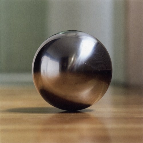
Gerhard Richter did do other steel balls. At the end of his 1973 interview with Irmeline Lebeer, he complains about my favorites of his series, the grey monochromes:
the only problem with them is that they are so beautiful.
And that bothers you?
No, but it’s like a blank canvas. A blank canvas is the most beautiful thing, and yet you can’t just leave it like that. You have to add other elements to it. If it were only a question of perfection, we wouldn’t do anything any more.
You need dynamics and a certain tension.
Without those, everything would be dead. We would all come to an agreement, once and for all, on the sphere. At home, I have these particularly beautiful steel balls.4 But it’s impossible to get any closer to perfection. But we start down that path, it’s all over.
Which is an odd place to put a footnote saying that “Indeed in 1989 and 1992 Richter produced three editions of balls made of gleaming stainless steel.”
The largest was the last, Sphere III [above, via g-r], which was done in an edition of 11. In addition to the title, signature, number and date, each ball is engraved with the name of a Swiss mountain.
Spheres I and II are 8cm [ed. 25] and 5cm [ed. 11], respectively, with no mountains involved. According to the Dallas Museum of Art, which has all of Richter’s balls, they were all published by Anthony d’Offay and fabricated by FAG Kugelfischer, which I will assume is a company. Indeed, under the Schaeffler Group’s guidance, FAG has been a leading German manufacturer of ball bearings for over 120 years.
search results: kugel [gerhard-richter.com]
Previously: Richter’s Balls, Regrets
Art Poster
Honestly, I don’t know why I didn’t see it before. The answer‘s staring me right in the face. And I was so close with the Serra, too.
Annunciation After Titian, 343-1, 1973, Gerhard Richter [image via g-r]
This morning I just cracked open my Richter Bible, and started reading a 1974 interview of the bemused Richter by an insistent Gislind Nabakowski, who pressed the artist for his reasons for implicating himself in the “hackneyed language of symbols” of “the power of the hypocritical Renaissance,” and “sexual domination,” of the painting he’d recently copied, Titian’s Annunciation:
With regard to your approach to painting, you seem willing to encumber yourself with the concept of traditional symbolism, but you don’t illustrate it; you seem to be searching for your own symbolic references. Can you elaborate on this ‘illustrative realism’? Does it represent what the painter sees, or does it reveal his ‘reflections on what he has seen’ i.e., are his paintings platforms for the production of reality?
It certainly doesn’t show what one sees, because everyone sees something different, and what one sees isn’t a painting; it can only remind us of a painting. But, on the other hand, I don’t accept the principal difference between ‘pure’ pictures that only represent themselves and others that just illustrate something. If you take Ryman, Palermo or Marden, for example, in a away their paintings are also illusionistic, and you can only just identify the actual paint or the material if you have the eyes of a paint salesman.
Why did you paint over Titian’s motif and dissolve it?
Oh, I’m sure I didn’t initially plan it that way; I wanted to trace him as precisely as possible, maybe because I wanted to own such a beautiful Titian… [laughs].
That can’t be true. Not even the very first painting is a copy; you intended something else.
Sure. I only copied it from a postcard and not from the original as such. Although I must say that it is indeed possible to reproduce a painting from a postcard that is almost as beautiful as the original. Those few little details that would have been different really don’t matter–but that’s another issue.
Maybe for Richter.
Because when it comes to posters, what do people want to see more than beautiful works of art? The art poster has developed into a genre all its own. A genre and, as every museum shop, dorm quad, and Upper West Side laundry room can attest, a market.
Here is a poster I saw yesterday, Lot 270: Jasper Johns Flag I, which LA Modern is auctioning next month, with a description, “Poster based on the print,” a signature [!], a provenance, and an estimate of $1000-1500:
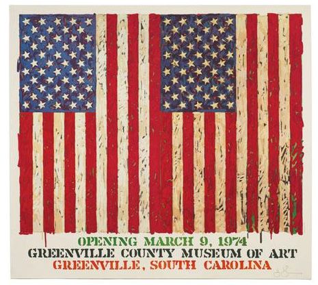
We demand a lot from our art posters. Posters signal our tastes and aesthetic identifications even more purely than the originals, which, by their scarcity, can only be possessed by a few, and thus can’t escape the aura of investment. Posters can also embody a history. You were there in Greenville in 1974, and Jasper signed your poster. That’s how it could look, anyway. We like our posters to faithfully approximate the experience and presence of the original.
And they must also have a significant, authentic presence–poster qua poster–of their own. Which can limit the works available to those that best fit the poster format. So you can blow up Matisse Jazz cutouts, or shrink a Rothko.
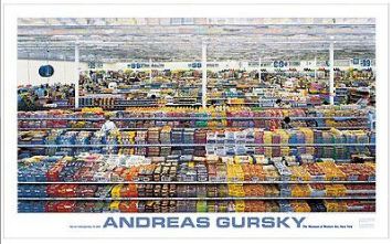
Gursky: 99 Cent, $24.95 [via momastore.org]
Like this powerful work,” Gursky: 99 Cent, a “MoMA Favorite” which pushes up against the dimensional limits of the poster medium [56″ x 34″] just as Gursky’s 207x337cm original tested the most advanced photo printing technology of its day [1999].
But that, as Richter says, is another issue. Just as you can paint a beautiful painting from a postcard, you could use a photo, tiled and transferred to silkscreens at life-size, then taped and folded into a box, to provide the authentic, transformative experience of being in the presence of the original. Assuming you open the box, that is. And that you have enough wallspace. Or maybe that’s what museums and exhibition copies are for. And your copy stays MIB.
So what’d work at that scale? Gursky, of course. But if you’re gonna do Gursky, do the 99 Cent II Diptychon, which unfurls to a positively Bus-like 207 x 682 cm:
99 Cent II Diptychon, 2001, at Philips de Pury in 2006 [image via thecityreview]
Or:
On Frieze At 20
Frieze has been around 20 years? That’s crazy. I feel so old.
I’m really liking the dips into the archives by invited Big Thinkers. Jens Hoffmann’s picks focus on biennials and such. My favorite has to be Jenny Liu’s firsthand report of the Sixth Caribbean Biennial, a giant critique-in-a-boondoggle-in-a-biennial organized by Maurizio Catteland–and Jens Hoffmann:
The idea of a biennial without art could have been cool in a marvellously vacuous sort of a way, puncturing the self-importance of the art world by grotesquely aping it. What we got was a furtive and ungenerous gesture, a covert V-sign flipped at the art world behind its back, when more balls could have made it a divinely impudent mooning in its face. As a critique, the Caribbean Biennial was neutered when the organisers and some of the artists felt the need to prescribe the biennial’s public perception and hide the vacation at its heart. The art was so profoundly and deafeningly absent that some artists took to thinking of themselves as both art stars (whose reputations needed protecting) and art civilians (with commensurate expectations of privacy), while curators took on the role of embarrassed publicists and the spectators of poor cousins at a wedding. There’s something sad about so cynical and ambivalent a gesture as the Caribbean Biennial: one would think that a critique of one’s own practices would be ethical, even idealistic. Here, the humour was both a performance of aggression and a weapon of despair, another cheerless rehearsal of irony and parody.
I still talk to people about the Caribbean Biennial all the time, though as time passes, I have to keep reassuring myself that it actually happened. Or didn’t, as the case may be.
But I still remember it as a sly, subversive prank, and Liu’s obviously generous but disappointed review reminds me that it was less romantic than I want it to be. Seriously, guys, how could you let Jenny down like that?
Trouble in Paradise [frieze]
frieze.com/20/ [frieze.com]
What Other Photo Of A Giant Thing Would You Turn Into A Life-Sized Silkscreen Poster?
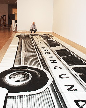 It’s true, I like Mason Williams’ 1967 Bus for what it is.
But right now I love it for how it was made, the whole ridiculous, unanticipated, dogged, improvised, and ultimately successful process: the 4×5 negative; the 16×20 print; the 16-tile silkscreened billboard; the one-ton palletful of paper on the driveway; the cases of Scotch tape on the borrowed dance hall floor, the giant folding by hand; the warning not to open the box in the wind; the realization that after all that, most people are never gonna open the box in the first place.
That last point should negate the question I’ve been pondering, then, which is, if you were to make a giant photomural poster this way today, what image would you use? Assuming–or asserting–that it mattered, and that even though you’re doing it for the process, you’re not just going to use random image noise. [Though that is one option.]
Anyway, a bus is obviously out; you might as well do a reissue of Williams’ original. And though a whole host of large vehicles would be interesting–a dump truck, a train, a plane, perhaps a collector’s G5 as a commission–it might also be a little derivative.
Mondo-Blogo suggested “the ‘dirtbergs’ all over the city now. Facinating how the snow gets so black, and so filled with the most disgusting things.” And I do like their scale, ephemerality and banality, and the combination of abstraction and landscape.
 You can’t go too architectural without treading on William Anastasi’s toes, or without aping Urs Fischer’s totalizing wallpaper. But an interesting structure or storefront does have its appeal, even though the idea is a print that feels more like a picture of something, and not an environment or space. It’s objectification through photography, and in turn, turning that photo into an [ultimately, probably] unseen object in a box.
Cheyney Thompson’s epic lifesize painting makes me want to do a newsstand, though.
And since these are objects, why not a large sculpture? Like the gilded Gen. Grant at Grand Army Plaza? Or Simone Bolivar on Sixth Avenue, for that matter? Why not a Torqued Ellipse? Imagine all the ink that silkscreen’d take.
Or maybe a rock or a tree.
What am I not thinking of? I’d be interested to know. What would you like to see? If I make one of them, I’ll be glad to send you a copy. Though if involves a shipping pallet, I may ask for your FedEx account number first.