
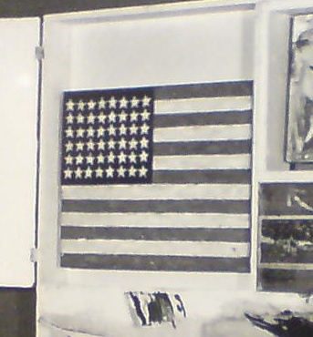
I tried searching the 150,000 million images in the ETH Bibliothek photo archive, too, but I sure didn’t come up with one of these:
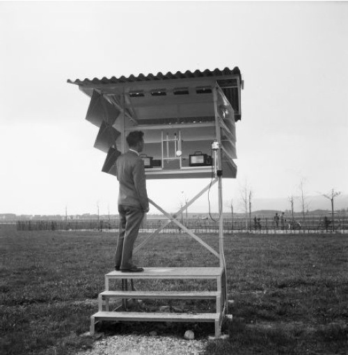
One thing’s for sure, though: if I were ever to show some videos on little screens, I will be definitely be putting my iPads or whatever in some of these things. Just awesome.
ETH Bibliothek Bildarkiv [ba-epics.ethz.ch via anambitiousprojectcollapsing]
‘Active Participation in the Life and Thought and Movement of Their Own Time’
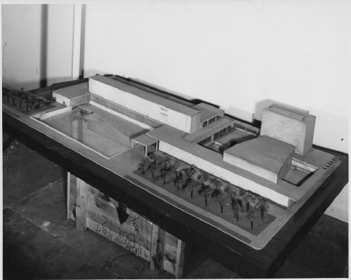
Huh, so I’m poking around online for info on the Saarinens’ unrealized design for a Smithsonian Gallery of Art [above is a SI photo of the model, built in 1939 by Ray and Charles Eames, of all people, perched atop, of all things, the crate for a Paul Manship sculpture. And I’m thinking how it’s too bad that WWII happened, because otherwise we’d have a sweet modernist art museum on the Mall–hah, as if.]
[According to the Smithsonian American Art Museum’s own history, the building never had a chance. It wasn’t Congressional budget cuts or wartime reprioritizations that killed the project–it was the rejection of the modernist design by the Smithsonian Regents themselves, and by the Commission on Fine Arts–because it was modernist.]
[Charles Moore, an influential retired Chairman of the CFA called its “sheer ugliness…an epitome of the chaos of the Nazi art of today.” Which, yow. The Commission which rejected it included sculptors Paul Manship and Mahonri Young, a grandson of Brigham Young.]
But that’s not the point. Point is, a quote stuck out from the book as being both timely and relevant. It’s from Holger Cahill, head of the WPA’s Federal Art Project [and holy smokes, Mr. Dorothy Miller], which organized artists to make work for public buildings and spaces. He believed art and artists and the public all benefit by “a sense of an active participation in the life and thought and movement of their own time.”
I haven’t found the original publication info, but since the source of that 1936 quote only appears on Google as a writing sample for an English 201 course, I put the whole thing after the jump. Take a read and try to imagine it as not a politicized, partisanized view of contemporary art:
Continue reading “‘Active Participation in the Life and Thought and Movement of Their Own Time’”
Eye On Saarinen; Camo On MoMA; Photomural On Wall
You know what, it’s been too long since we had a good, old-fashioned photomuralin’ around these parts.
And one that combines a bit of Google Maps-ready, roof-as-facade architecture? And camo? Even better.
I only go to the Museum of the City of New York for their gala, and I’m the loser for it: because I missed “Shaping the Future,” curator Donald Albrecht’s Fall 2009 exhibition of Eero Saarinen.
The show included the 1939 model for the unrealized Smithsonian Gallery of Art, which he designed with his father Eliel, and which would have sat across the Mall from John Russell Pope’s just-finished neo-classical National Gallery.
But it also included some sweet, giant photos, as the NY Times’ slideshow shows. Check out the big CBS-eye view of Saarinen’s model for Black Rock:
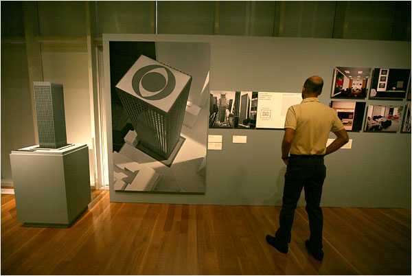
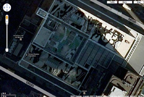
The Google Maps reality is, alas, not so clean. Saarinen’s CBS HQ has the usual skyscraper cruft on the roof.
But fortunately, it’s right across the street from MoMA, where landscape architect Ken Smith’s 2005 Roof Garden is clearly visible. As the American Society of Landscape Architects noted when it gave Smith an award in 2009, the design is rooted in historic concepts of camouflage and the abstracted simulation of natural forms.
And speaking of simulation, check out this giant color photomural from the MCNY exhibition, which almost makes you feel like you’re right there in the living room of Saarinen’s 1953-7 Miller House [which the family recently donated to the Indianapolis Museum of Art].
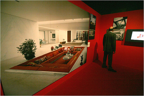
Weird, the angle of the Times photo really exaggerates the sense of perspectival space in ways that a straight-on shot like the one arthag took does not.
Review | Eero Saarinen: Shaping the Future [nytimes, for full-size images: Librado Romero/NYT]
Like Some Michael Crichton Novel
 Maybe it’s the CSI-ification of everything, but as I dig through archives and piece together timelines, and interview people–oh, I haven’t really mentioned the interviews, have I?–while trying to track down the story of Robert Rauschenberg’s Short Circuit and its little, missing, Jasper Johns Flag, I sometimes feel like a character in a John Grisham novel.
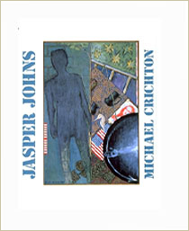
Which is funny, because the greatest book I’ve found on Jasper Johns so far is by Michael Crichton. Seriously, with his 1977 book, Jasper Johns, created for the artist’s mid-career retrospective at the Whitney, Crichton defined the exhibition-catalogue-as-pageturner genre.
After my most recent visit to the Smithsonian’s Archives of American Art last week, I had a few minutes to spare, so I ducked into the Museum of American Art Library across the hall to flip through Crichton’s catalogue and to see if there was any mention of Short Circuit in the supposedly exhaustive catalogue for Anthony d’Offay’s 1996 show of Johns’ Flags. [There wasn’t, and though it had a couple of good ideas, David Sylvester’s essay was uncharacteristically uninteresting.]
Well, flipping through Crichton’s book was riveting. I could only read a few pages, but it felt like a mystery, a suspenseful, personal investigation into the artist, his thinking, his process, and his work. It was chock full of quotes from people who know and work with Johns, evidence of Crichtons’ conversations and interrogations. I wanted to read every one. And it was only the recurring image of my kid waiting, alone, on the curb outside her pre-school, wondering why her daddy had forgotten her, that forced me to stop. It’s an intense, infectious curiosity that I admit I haven’t really felt towards Johns’ work before.
In the course of this recent, somewhat intense look at Early Johns, I’ve been struck and sometimes a bit put off by the artist’s apparent/reported hermeticism, his opaqueness. Not that I want art spoon-fed to me, or served up like some all-I-can-consume Baselian buffet. But if Johns wants to be obscure, closed, personal, private–yeah, I’ll go with closeted–then fine. Far be it from me to pry. And far be it from me to take advantage of that reticence by projecting my own theories and interests and speculations on the artist and his work, as a great deal of critical writing about Johns seems to do.
But while he addresses and acknowledges Johns’ seemingly impenetrable work and persona, Crichton also quotes a close friend saying something like, no, “Jasper wants to be understood.” [I’ll look it up later when my copy of the catalogue arrives.]
the very flaggish, hinged In Memory of My Feelings – Frank O’Hara, 1961, Art Inst. of Chi., via NPG
And that, coupled with the remarks from the curators of “Hide/Seek” that it was the first time Johns has ever allowed his work to be seen in a queer context [that link it to Michael Maizels’ discussion of the show], makes me feel that this longer, closer look at this painting–these paintings–is not just alright, but right. And that Johns would agree.
Anyway, the point is, buy this book. No, no, the point is, Johns rewards close, intense looking, and Short Circuit, both in its original state and throughout its fraught, altered history, feels like a key touchpoint in the works, lives, and careers of these artists. And it turns out that no one has gotten its story totally straight yet, not even Michael Crichton.
There is a note in Crichton’s Johns story that begins:
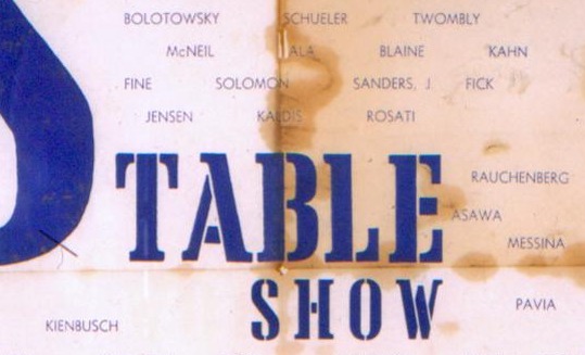
As a curious historical incident, a Johns painting was seen at the Stable Gallery in 1956, as part o a Rauschenberg painting.
Actually it was 1955. But then there’s this bombshell:
Leo Castelli later acquired the Rauschenberg with the two doors. He kept the painting in his warehouse. One day he examined the painting and dsicovered that the Johns flag had been stolen.
Wait, what?? Castelli bought Short Circuit? So it was not, after all, in Rauschenberg’s personal collection his whole life after all. And I only find this out after I leave the Castelli Archive. I wasn’t even looking for this kind of stuff. While it explains what Short Circuit was doing in Castelli’s warehouse, it doesn’t explain when Bob sold it, or why Leo bought it. Or why or when Bob got it back.
The artist Charles Yoder told me last month that Short Circuit was in Bob’s collection–and had Sturtevant’s replacement Johns Flag when he went to work for Bob in 1971. [Though the first published mention of Sturtevant I can find is still the Smithsonian’s 1976 catalogue, which ended up using Rudy Burckhardt’s original, Johns-era photo.] I guess I’ll have to get back to the Archive and look for Castelli’s own collection records. And his correspondence with Bob. And then look for the 1967-8 Finch College Collage checklist and/or catalogue, to see who was listed as the owner of Short Circuit, which was, remember, still described as containing a Johns Flag behind its nailed-shut doors.]
So this means that sometime between–well, we really don’t know when it was, just sometime before June 6, 1965–Castelli bought Short Circuit. And found the Johns Flag missing. But Crichton’s not through. “Castelli recalls a final incident in the story,” he writes:
Years later, a dealer–we do not need to say who–came to me and said, “Someone has brought me this Johns painting and I don’t kno wit, and I wondered if you could tell me about it, the date and so on.” I knew immediately what it was; it was the stolen painting. I said, “The painting has been stolen and I would like to keep it right here. I don’t want it to leave my gallery.” But this person said he had promised the person he got it from, and he didn’t feel he could leave it with me, and he said he would have to talk to the other person, and he was very insistent. So I said, “Well, all right.” I never saw the painting again.
“Castelli recalls”! “We do not need to say who”!
Well, this saves me a trip into Calvin Tomkins’ archives at MoMA; because I will bet that Crichton’s footnote is the source for the secondhand version of this incident Tomkins included his 1983 Rauschenberg bio. And where Tomkins ended broadly–and obviously wrongly–with “and nobody has seen it since,” Crichton nails the quote from Castelli: “I never saw the painting again.”
Which puts us back to where this whole thing started. Except that I think I now know–because I have been told by people who would know–who that dealer was, and who he was presenting the painting for. And based on some interviews I’ve done since, I am pretty sure I’m right.
But that turns out not to be the same as figuring out when the Johns Flag went missing, or more importantly, where it went, and where it is now. And even when Crichton quotes Castelli himself as calling the painting “stolen,” and I’ve seen it mentioned [albeit as “lost”] in an insurance report, when Castelli had the painting back in his gallery–and had chance to get it back from someone he obviously knows–he let it walk out the door again.
Michael Crichton died unexpectedly in 2008 while undergoing treatment for throat cancer. His art collection, including the Flag painting he bought directly from his friend Jasper Johns, which he considered his single most important acquisition, was auctioned last Spring at Christie’s. Mike Ovitz waxes a little hagiographic, and I deeply don’t get the Mark Tansey thing, but the video that Christie’s produced about Crichton and his passionate, intellectual engagement with art is really pretty good.
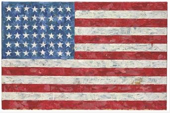
Measuring 17.5 x 26.75 inches, Crichton’s Johns Flag [above] is much smaller than the Flag which Castelli first saw in 1958 in Johns’ studio, an experience he later called, “Probably the crucial event in my career as an art dealer, and… an even more crucial one for art history.” It was slightly larger, though, than the Flag in Short Circuit [13.25 x 17.25 in.]. And it was painted between 1960-66, exactly the time when Short Circuit‘s Flag was being contested and lost–and shortly before Castelli got it back, and let it walk back out of his door. Crichton’s Flag sold in May 2010 for $28.6 million.
Stedenboek
This just in from the greg.org Department of Stunningly Beautiful Digitized Maps of The Netherlands:

Bibliodyssey has some highlights from the National Library of the Netherlands’ fresh upload one of the rarest and most beautiful atlases in history, mid-17th century Dutch cartographer Frederik de Wit’s Stedenboek, or Book of Cities.
Who knew that the Dutch had such a long, rich, aesthetically awesome history of defense-related polygonal alterations of the urban landscape?

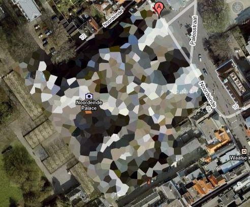
At least maybe now we have some idea where that crazy camo blob in Nordwijk came from:
Stedenboek [kb.nl]
Dutch City Atlas [bibliodyssey]
‘Loss of Painting – American Flag – Jasper Johns’
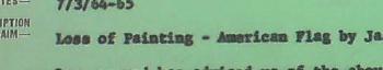
So here is where, after a few months of searching, I basically get caught up to the editors of Johns’ collected writings, who noted in 1996 that Johns’ Flag painting disappeared from Leo Castelli’s warehouse sometime “before June 8, 1965.”
After a couple of days of digging through the newly opened Castelli Gallery archives at the Archives of American Art, I found that date on the gallery’s insurance claim reporting the “Loss of Painting – American Flag by Jasper Johns valued at $5000 $12,000.” [the higher figure is written in by hand.]
The insurance company’s memo acknowledging the claim said that “Mr. Mellors is to meet with the assured on Wednesday afternoon regarding the details of the claim.”
June 8th was a Tuesday, and sure enough after his visit, Mr. Mellors had more to add. A follow-up memo is titled more clearly, “Theft of Painting – 6/6/65 – “Desk Explosion 65″ by Lichtenstein.” Mr. Mellors, it said, “…when discussing the loss on “American Flag” by Jasper Johns was informed of the above loss by Mr. Castelli.”
So what we have now is not just a “before June 8,” and a “loss” [although that is still the word used in relation to the Johns], but a date: “June 6” and a “theft.” And not just one work, but two.
The only other documentation I could find is a small note, “Call headquarters for 9th Precinct,” “Warehouses/ 75 Cliff St/ 25 First Ave” and the name [?] “Kay Kaz.”
The 9th Precinct is the East Village, which makes me think it was the First Avenue location. Kay Kaz, I have no idea, and I can’t find anything online so far. But this was not Leo’s handwriting, so I am assuming someone was taking this information down on the phone.
Frankly, I can’t tell if I’m more Law & Order: Art Victims Unit or Columbo, but this is feeling very real to me, trying to piece together what happened, where, when, and with whom, just using a few old memos.
The 6th was a Sunday, so it seems as if someone made a weekend visit to the warehouse, found the Johns missing from Short Circuit, called the police, then called the gallery to give instructions about following up with the police. And then on Tuesday, they filed a claim for the Johns, while seeing if anything else was missing. And by Wednesday, they found a Lichtenstein gone, too.
As it turns out, both works are similarly sized: small and portable. The Johns Flag is 13 1/4 x 17 1/4 inches, and Desk Explosion is 20 x 16 x 4–wait, 4-in? It’s a sculpture. An enamel-painted metal freestanding sculpture on a 4-inch deep base, made in an edition of 6:
Small….Explosion (Desk….Explosion), 1964, : image via lichtensteinfoundation.org
Either way, maybe tracking the Johns is now a matter of tracking the Lichtenstein.
So what do we know now? First, that the AAA’s Castelli Archive is awesome. I could blog those boxes out for days if the photo restrictions were a little more conducive. Instead, I find them more illustrative of the way that art historical information is still transmitted: in relatively hermetic dribs and drabs.
My previous assumption that the Johns may not have been “stolen” stolen because it was never reported as such turns out to have been wrong. Well, those reports existedtl, anyway, even if the Johns wasn’t exactly described as “stolen.” [I was also wrong about a couple of other assumptions and speculations I made in earlier posts, which I’ll get to separately and soon.] But generally, the information I’m finding does appear to have been found by at least someone, sometime, before. So I wonder what I’m doing: if all these curators and scholars have already been over this before, am I just playing art detective for my own belated educational amusement?
But questions still arise that keep me on the hook:
- Where’d those precise dimensions come from? Castelli? Rauschenberg? Johns himself? Someone had them on hand at the time the police were notified. I guess that answers the question about whether the Flag was an autonomous work?
- Why were Rauschenberg or Short Circuit not mentioned at all in the insurance claim?
- And the claim–and a half dozen 8×10 glossies of Rudy Burckhardt’s original photograph of Short Circuit was in Castelli’s Johns file, not his Rauschenberg file? [Just end it with an uptone and it becomes a question.]
- And what was Short Circuit even doing in Castelli’s warehouse? Wasn’t it in Rauschenberg’s own collection his whole life? In which case, why wasn’t he filing insurance claims on it?
- What IS up with that Lichtenstein?
- Rudy Burckhardt?
- And obviously, who is Kay Kaz, and what’s s/he doing in the middle of the memo about the polce?
Untitled (Portrait of Ross in LA)
Untitled (Portrait of Ross in L.A.), 1991
RB Before I knew you I saw something… You know what I’m going to say?
FGT I dedicated a piece to Ross.
RB Exactly. I thought, this is so sweet, I want to meet him. He dedicated this thing to me and I don’t even know him. (laughter) It put me in the best mood. And then someone said to me, “You idiot, why would he dedicate something to you? It’s his boyfriend.”
-Ross Bleckner interviewing Felix Gonzalez-Torres in the Spring 1995 issue of Bomb Magazine. This is about as funny as Ross gets. He really is as foolish as Felix is thoughtful. Well worth a read.
Bonus: did you know that by Fall 1994, after five solo shows and with his retrospective set to open at the Guggenheim, Felix had never had a review in the New York Times? [I just checked, and the closest was a paragraph in a cranky 1990 survey of Minimalist revival by Roberta Smith. She called his stacks “almost laughable.”]
Matrix Or Minecraft?
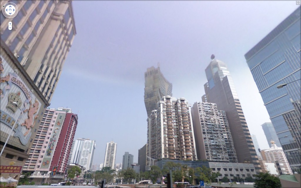
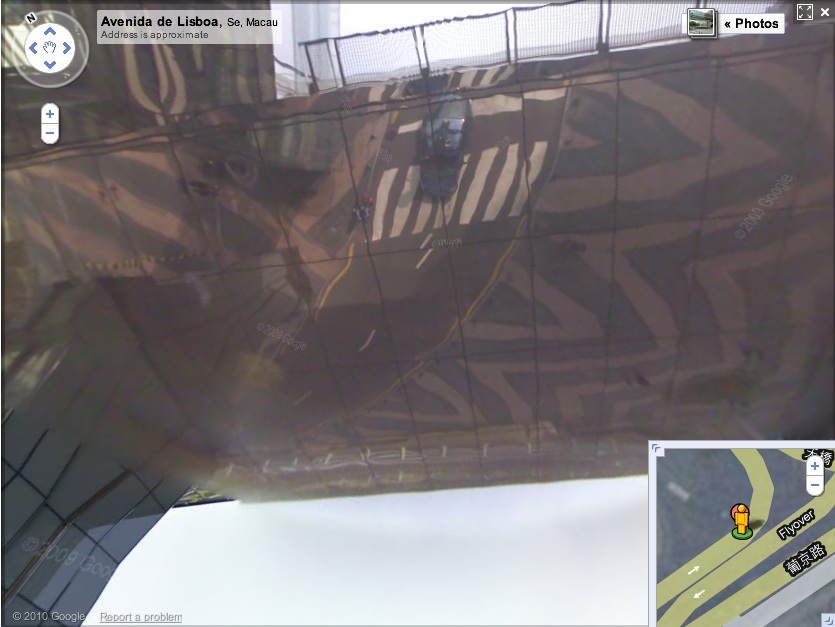
Via one of my Senior Street View Scouts John comes this eerie shot from Simple Ranger’s Street View essay of Macau. [Here’s the live link.]
Seriously, is that building real? Even if I wander over to look at it up close, my doubts only increase.
And frankly, looking up at the sky and seeing the Google Street View car reflected in the curved, mirrored underside of the Grand Lisboa Casino’s elevated pedestrian walkway is not helping.
Bondeno Street View
Compared to Germany’s digital scrim effect, the Italian Google Street View opt-out regime is extraordinarily, even romantically, naturalistic.
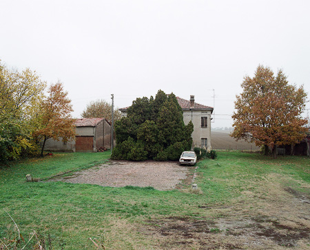
Haha, no. It’s a photo from Elmar Haardt’s careful and unassuming project documenting Bondeno, a seemingly unremarkable small town in Ferrara. [via the incomparable mrs deane]
Zombie Mark Cross Now Stalks The Earth
Reading through the press release for the new upscale family travel site Poshbrood.com, I was surprised and promptly filled with dread by the chance to win a “faboo Mark Cross saddlebag.”
Because that means someone has brought the luxury brand back from the dead because, what, zombies are really on trend right now? Because if you have any concept of venerable or luxury or heritage or leather or gift or anything when you hear the name Mark Cross, it has literally nothing to do with anything actually happening or made this millennium. And that residual brand goodwill embedded in your brain is now the intellectual property of a roving band of scavenging garmentos and opportunistic luggage salesmen.
Which, God bless’em, credit where it’s due, but also blame, awful, tacky blame.
The Four Color Process Manifesto
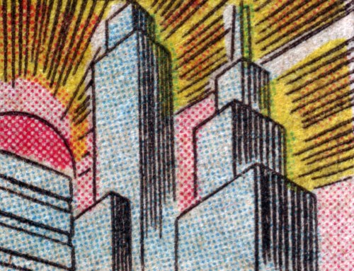
One of the first Japanese sayings I learned was “Chiri mo tsumoreba, yama to naru,” “Pile up dust and it becomes a mountain.”
At his incredible blog Four Color Process, John Hilgart continues to mine the gap between comic book art and comic book printing. Looking back over his year’s collection of images, often tiny details pulled from the seemingly insignificant corners and backgrounds of old comic book frames, he’s come up with an excellent and expansive essay. He doesn’t, but I’ll call it the 4CP Manifesto:
Gone are the page, the frame, the plot, and localized contextual meaning. What remain are the color process and what are generally called the “details” of comic book art. These are the two lowest items on the totem pole of comic book value – poor reproduction and the least important, most static elements of the art itself. Our proposition is that these elements are important and aesthetically compelling.
Who is responsible for this art? At the level of a square inch of printed comic book, no one was the creative lead. 4CP highlights the work of arbitrary collectives that merged art and commerce, intent and accident, human and machine. A proper credit for each image would include the scriptwriter, the penciller, the inker, the color designer, the paper buyer, the print production supervisor, and the serial number of the press. Credit is due to all of them, to differing and unknowable degrees, for every square inch of every old comic.
[image: Gotham Dawn, via 4CP]
In Defense of Dots: the lost art of comic books [4cp.posterous.com, thanks city of sound for the heads up]
Previously: Four Colour Process [greg.org]
What I Looked In 2007 & Again Just Now: Myron Stout
Doug Ashford ended the 2009 presentation I just posted about, “Abstraction as the onset of the real,” with a slide of this beautiful painting, Untitled, 1950 (May 20) by Myron Stout.
Washburn Gallery had a sweet little early Stout show in 2007, which I’d completely forgotten about. Back when he was still writing about art, NY Times chief art critic Michael Kimmelman reviewed the show:
…his mentor remained Hans Hofmann, who helped him see how to construct a purely abstract picture, while his great inspiration was Mondrian, about whom Stout observed that “the tangible and sensational world was still the raw material for the universality which he would create for himself.” In other words, Mondrian, like Stout, remained firmly connected to nature and the real world.
Things that happened in 2007 can seem so long ago and far away. I need to hustle up some Stouts to look at, pronto.
‘Art Directly Builds Who We Are – It Engenders Us’
I’m still trying to figure out quite what he said, but whatever it is, Doug Ashford said the hell out of it. Forget speaking or writing like this, I wish I could even think like this. Brains back on, people! Vacation’s over!
Over all, our efforts in the Democracy project were to try to see how democracy happens at the site of representation itself, not just where information is transferred or built, but rather at the very place we recognize ourselves in performing images, where we have the sense we that we are ourselves, feel a stability that is hailed and recognized by others. A radical representational moment, whether collective or not, is one that suggests we can give ourselves over to a new vision through feeling, an experience linked to contemplation and epiphany. In this way no public description of another, in frame or in detail, can be presented as politically neutral. So when Group Material asked, “How is culture made and who is it for?”, we were asking for something greater than simply a larger piece of the art world’s real estate. We were asking for the relationships to change between those who depict the world and those who consume it, and demonstrating that the context for this change would question more than just the museum: a contestation of all contexts for public life. In making exhibitions and public projects that sought to transform the instrumentality of representational politics, invoking questions about democracy itself, Group Material presented a belief that art directly builds who we are – it engenders us.
From Doug Ashford’s “Group Material: Abstraction as the Onset of the Real,” an adapted paper presented in 2009 at the “New Productivisms” conference at Museu d’Art Contemporani de Barcelona, as published online by the european institute for progressive cultural policies [eipcp.net via @mattermorph via @joygarnett]
‘On Kawara’s Last Piece!’

Maybe it was the news, or those long family car rides over Christmas with his cousin’s evangelical radio station going the whole way. But Frank Wick has of late been considering The Big Questions of Life, questions such as, “When The Rapture comes, will On Kawara have enough time that day to finish his painting?”
I guess the answer has been there all along in Kawara’s audio piece, Kawara’s Four Thousand and Four Years, B.C. and Two Thousand and Eleven Years, A.D.. He that hath ears, let him hear.
What I Looked At Six Months Ago: Douglas Coupland’s Roots Paintings
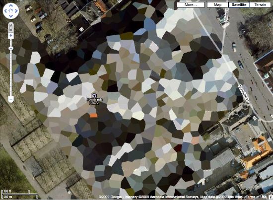
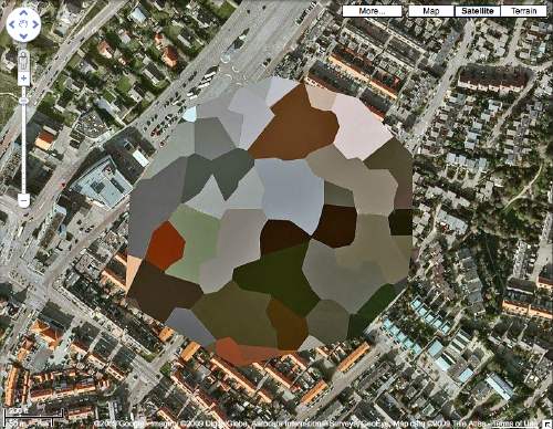
Holy smokes, it’s been 15 months since I found the Dutch Camo Landscapes on Google Maps; just over a year since I started systematically screengrabbing them; a little less than a year since Google’s particularly beautiful Delaunay triangulation distortion was replaced by a more typical pixelation algorithm; and about the same time since I last posted one of the “What I Looked At” installments, where I tried to figure out how to approach painting these things by studying the techniques of other hybrid, found, hard-edge, geometric digital, photographic, reductivist, surveillant, abstract, or Dutch Landscapes. Folks from Albert Cuyp and Picabia to Arthur Dove and Sheeler to Mondrian to Sherrie Levine [below].
The longer I take to think about how to paint without actually trying to paint, the more I keep accumulating and questioning potentially resonant work. And I wonder: what would it mean to consciously appropriate someone else’s technique? if I taped my edges, would there be more of a connection to Odili Donald Odita? If I made little polygonal stencils and squeegeed, would it be too Brillo? Is there an implication in the kind of precise painterly edges of Mondrian as opposed to the surprisingly tentative edges of Sheeler, or the just-fill-it-in forms of Dove? Should I skip the paint, and just blow those bad boys up and print the hell out of’em on the biggest canvas/paper I can find?
It [basically, obviously] boils down to some ongoing uncertainty or doubt or skepticism or insecurity or whatever over whether these things should exist. Emphasis on things and should. Does everyone who makes stuff feel that? It’s like Baldessari’s classic fortune cookie of a painting, “I will not make any more boring art,” but with the make in flux as much as the boring. I just remained unconvinced about the justification for these images as objects. [On the “bright” side, like the unshot film in the director’s mind, the unmade artwork does remain perfect–for me, anyway.]
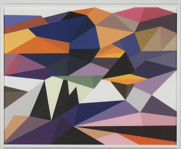
Anyway, all this comes to the fore because last summer, I saw images of some polygonal abstracted landscape paintings by Douglas Coupland, which were part of, or inspiration for, or somehow connected to, the Fall/Winter clothing and home furnishings colabo he designed for the Canadian retailer Roots. They were exhibited and for sale in Coupland X Roots pop-up stores in Vancouver and Toronto.
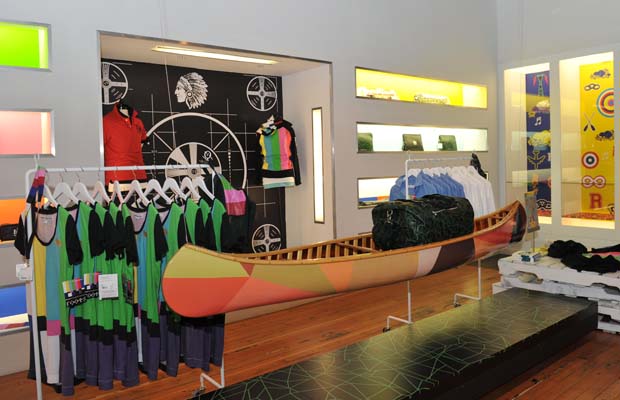
There was zero info online, so last summer and fall, but I deduced that they were digital reductions of iconic paintings by the Group of Seven, the early 20th century landscape painters who rather self-consciously set out to create a national cultural and visual identity for Canada via its landscape. Coupland’s Roots collection was an extension of that national branding project, only he referenced the unifying forces of electrification, television, and moose logos.
At least that’s what I gleaned from the web and press releases. I tried in vain to get any information on the paintings from Roots, Coupland, or his galleries, but it was total radio silence. So I ignored them back. Only now, as I check back, do I find that “culture guru” Coupland has a show up of the paintings, through this week, at Monte Clark Gallery in Vancouver. Faux-encrypically titled G72K10, the paintings turn out to be exactly what I thought they were.
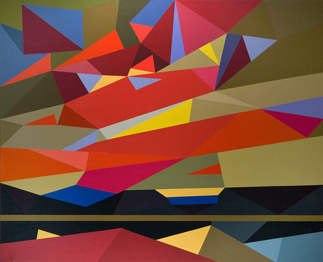
“Thomson (Sunset), 2010, Oil on canvas, 58 x 72 inches” image: monteclarkgallery.com
To a point. Because though the captions say things like “oil on canvas” and “acrylic and latex” and “unique pigment print” it is completely unclear whether the images on the dealer’s website are of the objects themselves or of their digital sources. Maybe it doesn’t matter to Coupland. Here’s how the gallery describes them:
By digitizing the likeness of specific works, Coupland has produced large-scale hard-edged paintings on canvas, presenting his own vision of the Group of Seven in 2010.
Doesn’t sound like he’d use something as retardataire as a paintbrush for a forward-looking project like that. Though it’s hard to tell from the jpg, the date on this unidentified type of limited edition print being auctioned next month by the Writers’ Trust looks earlier than 2010. Or not.
So while I still can’t decide if my painterly obsession is a vice, Coupland’s project is at least makes clear that materialist indifference in the pursuit of digitized aestheticism and conceptual slickness is no virtue.