I like writing the word camofleur.
In response to the burning question [sic] that arose from Ad Reinhardt’s chronology, what was up with Arshile Gorky wanting to start a camouflage school in 1943?
Because everyone knows that Gorky was already teaching camouflage in 1942. He’d spent at least a year, and possibly longer, trying to get a camouflage class started, partly because he and other artists saw it as an alternative for getting called up in the draft. “Can’t fight, too busy camouflaging!”
This need intensified after Pearl Harbor, and even after Gorky was rejected by the draft board for being too old. But that was also because Gorky needed money, and a class of 20 students paying $15/each a month sounded very appealing.
[Hayden Herrera has a chapter called “Camouflage” in her 2005 biography, Arshile Gorky: Life and Work. Most of this info comes from there.]
In his prospectus, Gorky wrote, “What the enemy would destroy, however, he must first see. To confuse and paralyze this vision is the role of camouflage. Here the artist, and more particularly the modern artist, can fulfill a vital function, for opposed to this vision of destruction is a vision of creation…
“Mr. Gorky plans a studio workshop in which each student becomes a discoverer…” The coursework would include modern theory, scale modeling, and “abstract constructions.”
One of Gorky’s particular concerns was how colorblindness might thwart camouflage. He also, we read, had “a plan to camouflage the whole of New York City,” which he felt should be promoted heavily by the New York Times.
According to one of his most satisfied pupils, the then-future art dealer Betty Parsons, the class ran for from three to six months, and was highly popular. Of course, according to Harry Rand’s book, Gorky’s camo course “fared poorly.” If the goal was to provide a steady source of income, I guess these can both be true.
And that might explain Gorky seeking help from Reinhardt to revive or rework the camo school idea in 1943. In any case, Gorky’s eventual dealer, Julian Levy, said that camouflage was the key to the artist’s character, whatever that means.
Previously: Civilian Camouflage Council
image: Garden in Sochi, 1943, Arshile Gorky, via Tate, and Telegraph UK
A Pixel Is Not A Little Square! [Except When It Is]

Thanks to greg.org reader Fred for sending along a link to a memo computer graphics pioneer Alvy Ray Smith wrote in 1995, soon after his company Altamira [the one he founded after Lucasfilm and Pixar] had been assimilated by Microsoft.
The Title: “A Pixel Is Not A Little Square, A Pixel Is Not A Little Square, A Pixel Is Not A Little Square!” [pdf via alvyray.com, a year later, he added, “(And A Voxel Is Not A Little Cube)”] Two guesses what it’s about.
Alvy’s rant sounds exactly like what I’d expect from circa 1995 Microsoft: brilliant, self-assured, and presumptuously prescriptive. Which is not, alas, the same thing as being entirely right or even aware of its own limitations.
Because it gets a little rambling, and because I am basically arguing pixels with the guy who worked on the Project Genesis sequence in Wrath of Khan, I have moved it all after the jump.
Continue reading “A Pixel Is Not A Little Square! [Except When It Is]”
On Warhol’s Rain Machine[s]
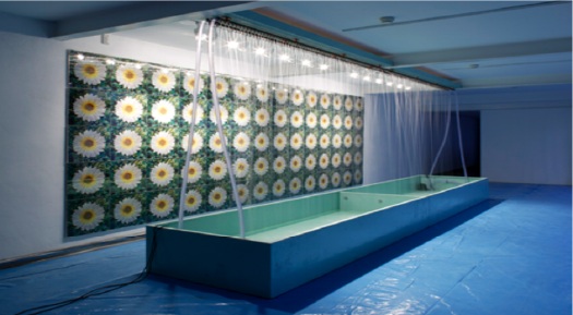
First up, a high five to Andrew Russeth at ArtInfo for highlighting Nicholas Robinson Gallery’s summer installation of Andy Warhol’s unusual Rain Machine (Daisy Waterfall). What a weird, wonderful–but mostly weird–work.
It’s basically a mural of shimmering, lenticular photos of flowers behind an illuminated, recirculating, double wall of simulated rain. Let’s set aside the fact that the raw mechanicality of Rain Machine makes it look like a missing Pop link in the genealogy of Olafur Eliasson’s work. The similarities are both less and more interesting than they first appear.
Begun in 1968, Rain Machine has its origins in two of my favorite pseudo-utopian art/technology events, the Osaka 70 World Expo and LACMA’s sprawling Art & Technology collaboration project, which ran through 1971.
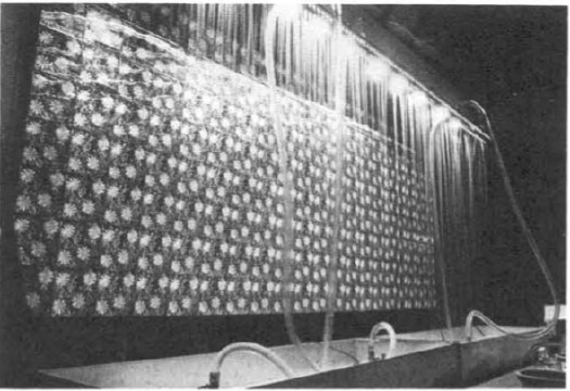
When Warhol was first approached for the A&T Program, which paired artists with cutting edge technology companies to realize a new, innovative work of some kind, he imagined making a wall of 3D holograms that would be barely visible through the mist. But Bruce Nauman had already nabbed RCA’s hologram guy, so Warhol fell back onto decidedly low-tech lenticular imaging.
Then the rain wasn’t working, the prints didn’t line up, the budget was a joke, the US Pavilion exhibition space was cramped, the whole thing was a potential mess. The story is recounted in glorious, play-by-play detail in LACMA’s 1971 Art & Technology Report, which is cheap to buy used, and [brilliantly] available as a free PDF download from LACMA’s online library:
Perhaps the most important decisions determining the work’s final appearance in the U.S. Pavilion at Expo were made not by Warhol but my MT [Maurice Tuchman, LACMA’s A&T curator/organizer], the Expo Design Team members, and some of the other artists in the show. The entire installation operation was characterized by a sense of crisis, and there were moments when the peice seemed simply destined to ignominious failure. In the end, somehow, it worked; many people and particularly the artists who were there installing their own pieces, felt the Warhol to be one of the most compelling works in the exhibition because of its strangely tough and eccentric quality. Robert Whitman commented that “of course Andy’s forcing everyone into the act;” the work istelf, when completed, made that conspicuously evident, and yet it was unmistakably Warhol. When it was rumored at one point just before the opening of Expo that the work might be taken out of the show, as was suggested by several of the Expo Designers and by a visiting critic who was conversant with Warhol’s oeuvre, the American artists who by this time knew the piece intimately objected strenuously.
When Rain Machine came back to LA, it had to be reworked, or debugged, and reconfigured. The most noticeable change is probably the scaled up daisy photos. As Robinson explains, the current installation follows an even newer [remastered?] set of specs developed by the Warhol Museum for its 2002 refabrication of the work.
Update: Interesting, LACMA received a set of nine lenticular daisy photos as a gift in 1999. They’re the larger, single daisy-style, which makes me think they were extras, loosies, or maybe even leftovers from the 1971 Art & Technology reinstallation. A few of these have popped up in the market over the years; they’re not that expensive, though without the rain–hell, even with the rain–they’re a little weird.
Update Update: aha, interesting. according to this auction description, the lenticular photos were commissioned in an edition of 50 for the LACMA show.
Wherein The Inventor Of The Pixel Totally Agrees With Me, Even Though I Don’t Totally Agree With Him

53 years later, the guy who invented the square pixel regrets the error.
In 1957, NIST computer expert Russell Kirsch scanned the world’s first digital image [a photo of his infant son, above] using the country’s first programmable computer. To accommodate the memory and processing capacity of the available equipment, Kirsch had the computer break the image up into a 176×176 grid, and to assign a binary color value, black or white, to each of the resulting 30,976 square pixels.
Apparently, it’s been eating at him ever since, because he has, at age 81, published a suggestion for increasing the “precision and accuracy in scientific imaging” by replacing uniformly square pixels with pixels of variable shapes.
I do not know enough about compression algorithms and data/information loss to know whether Kirsch’s proposed method is either necessary or superior to the state of the art. But it is most fascinating to see one of the inventors of digital imaging remain so engaged and critical of the system he helped bring forth.
And frankly, though I don’t know any of the history or the context, I don’t necessarily agree with him that the grid and the square pixel was an “unfortunate” solution. In the 50+ years since the square pixel became the irreducible unit of visual information, it has acquired its own aesthetic and cultural context.
[Looking through the NIST Museum site, it sounds like the “serious mistake” was using a binary [i.e., b/w] basis for computer scanning in the belief that it was an accurate representation of human neural activity and visual data processing. It also sounds like the NIST folks started trying to correct for it almost immediately.]
When he completely agrees with me and validates my own assumptions, however, I agree with him completely. The man is a genius and a living legend:
…we show that the usual assumption that increased precision is accomplished with higher resolution of square pixel images does not necessarily result in the increased accuracy that can be achieved with the use of variable shape pixels…
PDF: Kirsch, Russell A., “Precision and Accuracy in Scientific Imaging” [nist.gov]
Square Pixel Inventor Tries to Smooth Things Out [wired.com thanks Joerg Colberg, who has been experimenting with cooler-shaped pixels himself lately]
related? coloring the pixels of Mariner 4’s first image of Mars by hand
Chronology For, By Ad Reinhardt
How much of discovery is really just rediscovery? or learning remembering?
I was waiting to read how editor/art historian Barbara Rose had decided to model the chronology at the opening of her 1991 book, Art-as-Art: The Selected Writings of Ad Reinhardt, after the personal+historical “date” portraits of Felix Gonzalez-Torres:
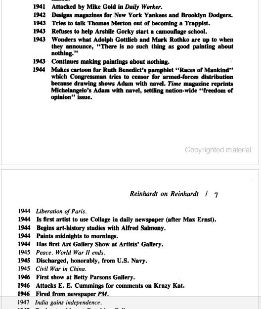
1943 Refuses to help Arshile Gorky start a camouflage school.
1943 Wonders what Adolph Gottleib and Mark Rothko are up to when they announce, “There is no such thing as good painting about nothing.”
1943 Continues making paintings about nothing.
1944 Liberation of Paris
But then I scroll up and see that Reinhardt’s chronology was his own, and that he was constantly reworking it. The version Rose chose was published in the catalogue for Reinhardt’s 1966 retrospective at the Jewish Museum.
So Rose didn’t get it from Felix, but that means Felix must have gotten it from Reinhardt. And sure enough. I pulled down my special 1994 edition Art & Design, which served as the catalogue for the Camden Arts Center exhibition featuring Reinhardt, Joseph Kosuth, and Felix Gonzalez-Torres. And there is Nancy Spector writing about Reinhardt’s influence, both direct, and refracted through the strategies and theories of the intervening generation of conceptualists:
Reinhard’s parodic biographical exercise was, at the time of its creation, interpreted as mere ‘documentation’, as tangential to his artistic enterprise. But, because of Conceptual art’s deployment of linguistic analysis and its use of language as a medium through which to demonstrate the discursive foundations of art, a younger generation inherited the freedom to use words as a viable alternative to image-making. Therefore, Gonzalez-Torres’ various inventories of disjunctive historical incidents and private moments, followed by the year of their occurrence, can and actually do constitute his art…these ‘date’ works use now conventional Conceptual strategies to mimic the idea of an ‘Artist’s’ chronology. More importantly, however, in the over-arching equivalency of everything listed in these works, Gonzalez-Torres is underscoring a crucial reality in today’s world: that the political cannot be divorced from the personal.
I think Reinhardt makes the same case; and I agree with Spector that Rose’s interpretation is incomplete, and that the extremely politically engaged Reinhardt did not mean for his chronology to reveal art to be “a matter of small consequence” when seen from “a perspective of world affairs.”
Spector suggests another reading, that “[Reinhardt’s] inclusion of cataclysmic world affairs in an ‘artist’s biography’…bespeaks the impossibility of divorcing cultural endeavours from the social and political context in which they are pursued.” [image: Untitled, 1988]
Now about that Arshile Gorky camouflage school…
Really? Really.
I’ll confess, when I saw the tweets start flying about Mira Schor’s essay on Otto Dix, Greater NY, and Bravo’s Work of Art, I was skeptical. How the hell was she gonna fit any of those, never mind all three–at once–onto a blog called A Year of Positive Thinking?
By gum, she pulled it off.
Reality Show: Otto Dix [a year of positive thinking]
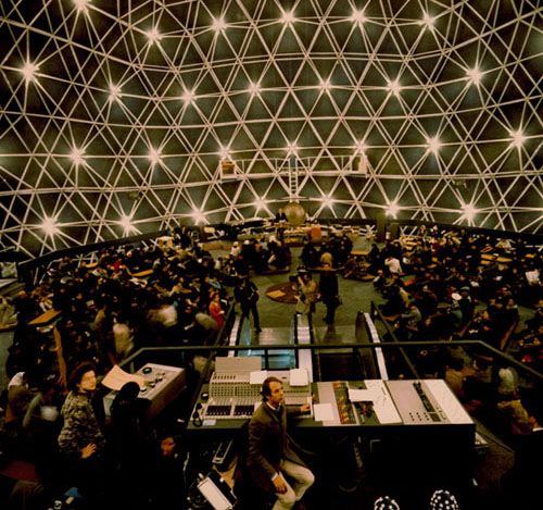
Wilkommen To The German Dome
Corner Reflector, Or Rediscovering An Early Satelloon
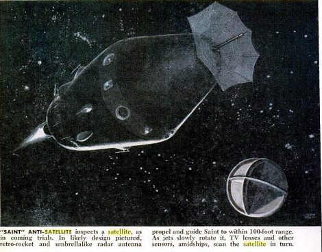
This one’s been sitting on my desktop since April when I posted about that Jan. 1961 Popular Science article about how they made the Project Echo satelloon on a long table with giant clothespins. It was in May, only a couple of months after NASA’s peaceful communications satelloon was made freely available to the world, that Pop Sci informed us of Project Saint, the US Air Force’s program to put the “First Warship In Space.”
That’s Saint on the left up there.
Saint, we read, would disable enemy satellites using one of four techniques: spray paint [for spy cameras’ lenses]; sand [for simulating meteor shower damage]; solar mirrors [for roasting electronics]; or an H-bomb.
Project Saint was canceled in 1962 before any test launches were accomplished.
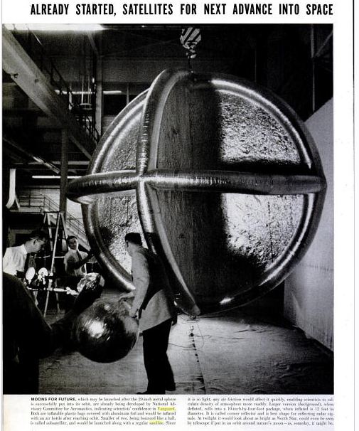
Oh wait, it wasn’t since April; it was since March. That’s right, April was when I recognized the target, the intersecting circular satelloon depicted on the right. It was called a corner reflector, designed to optimize radar wave reflection, and it was included in the https://greg.org/archive/2010/03/23/shiny_space_balls_yes_please_ill_take_two_no_four.htmlincredible LIFE Magazine cover story from June 3, 1957 about Project Vanguard and the race to launch “the first man-made moon,” a race the US would lose a few months later.
See? Here it is, behind the guy bouncing a smaller Mylar satelloon:
US Plans First Warship in Space – Pop Sci, May 1961 [popsci.com]
Project Saint [astronautix.com]
A Man-Made Moon Takes Shape, June 3, 1957 [LIFE/google books]
Bruno Munari’s Original Xerographies, Freshly Copied
After I posted about Sigmar Polke’s photocopied masterpiece Daphne, Mondo-Blogo emailed the great news that Corraini has republished Bruno Munari’s Original Xerographies. I have the original Original Xerographies in a box somewhere; it’s more handbook-ish than I remembered–which is a nice way of saying I’d forgotten about it, but it looks kind of relevant and interesting now:
An original xerography is the result of an image which is moved on the plate of glass of the copier, so that it reproduces both the image and its movement. Therefore, it doesn’t consist in a mere copy, but on the contrary in an original, which is obtained through a process exploiting the whole potential of the copier. Hence it not only reproduces but produces images as well.
From this starting point Munari develops his studies and experiments about working rules of copiers, originally published in the series Quaderni di design curated by Munari himself for Zanichelli (1977).
Each factor of the copying process (with the copiers available in the 70s), from its reading limits to the concentration of the toner, is deeply and systematically examinated and experimented by Munari in every aspect and possibility. The result is a series of samples (“copies”?) that, following his research method both strict and creative at the same time, do not aim towards a specific purpose, but want to collect as many data as possible in order to describe almost every potential of the machine, including its most surprising and unexpected possibilities.
Buy the new edition of Bruno Munari’s Original Xerographies for like $17 [amazon]
Beginning With Anne Truitt’s Japanese Works
I hear blogging is out, everyone’s tweeting or facebooking now. While I don’t quite buy it, I am finding that I’m more likely to keep something I find interesting in my browser tabs for months rather than post it straightaway.
I will now attempt to clear those tabs to the general amusement and edification of my readers:
Soon after her first solo show at Andre Emmerich, Anne Truitt followed her then-husband James to Japan for several years. While there, she experimented with making sculptures from aluminum. She showed them at Emmerich, I believe in 1966, but was not pleased with them, and rather famously destroyed them all before her mid-career retrospective at the Corcoran in the early 1970s. Had them all crushed like a soda can. All but two, apparently.
According to Kristen Hileman’s catalogue, there was an aluminum Truitt in the collection of the Trammel Crow corporation, which could not be found, and another in the collection of a Connecticut collector whose name escapes me [and my Truitt catalogue is in our other apartment, alas.] Anway, that one was apparently damaged or destroyed by exposure, it’s not clear.
I’d never seen images of these lost works, but then suddenly, I stumbled across one on the excellent Los Angeles-based art and space blog, You Have Been Here Sometime.
It turns out to have come from the official site, annetruitt.org, which is a great thing to know about. The piece is called Out and dates from 1964. There are other Japanese works, and also installation shots from the Emmerich show. More geometry and fewer right angles than in Truitt’s later work, enough to make me wonder if the artist had issues with form, not just paint, light, and color, as she explained.
All The Vermeers In New York

A little-known, early Vermeer, the CC145 Concrete Cutter, was apparently on exhibit on Bleecker St this week.
@averybrooks’ twitpics]
Vermeer CC155 [vermeer.com]
‘Waking Up, It Was The First Thing I Saw’
Thanks to Paul Schmelzer at Eyeteeth for pointing to Bob Nickas’s great 1999 interview with Maurizio Cattelan. Good times.
I really wanted to focus on his experience with painting, so this excerpt starts kind of in the middle of the story of Maurizio not having enough time to do a show at de Appel in Amsterdam, so he breaks into the Galerie Bloom, steals everything in it, and exhibits it instead:
BOB: Whose work did you take?
MAURIZIO: Actually we took everything from the gallery …
BOB: Like the fax machine and all the stuff in the office?
MAURIZIO: Everything. We rented a van, and just filled it up.
BOB: This was in Amsterdam?
MAURIZIO: Yes, at de Appel. They wanted me to do a piece in a week. But I’m not used to working so quickly. So I thought the best way to get something that fast was to take the work of someone else.
BOB: That’s a new take on the readymade. [indeed, the show was called “Another F___ing Readmade” -ed.]
MAURIZIO: Well, when you don’t know what to do …
BOB: But didn’t the people at de Appel ask, “Where did all this stuff come from?”
MAURIZIO: The story finished quickly, because the police came and there were problems …
BOB: Were you arrested?
MAURIZIO: No. This is why I did the piece in Holland.
BOB: [laughs] Imagine doing that in New York.
MAURIZIO: It took a while for everyone to calm down, but then we became very good friends and they even asked me to do a show with them.
BOB: But that’s your ultimate punishment — you had to figure something out for another show.
MAURIZIO: Yeah, it’s true.
BOB: Crime doesn’t pay.
MAURIZIO: But I can tell you about the worst punishment I received. Once, I was talking with a collector, and he said, “I really would like to have a painting made by you.” And I thought, “Yes, let’s take this opportunity for once to see how difficult it would be to make a painting.” So I said, “Send me a canvas and some colors and I’ll do it.” He said, “Whatever you want to do, it’s fine for me.” A week later, I received a white canvas — that’s probably still in my apartment — and it was the most horrible nightmare for a year. It was there every morning. Waking up, it was the first thing I saw. After a year, I gave up.
Maurizio Cattelan with Bob Nickas, 1999 [indexmagazine.com]
Vinyl Wrapped Art Car Update
First, the good news: The Jeff Koons BMW Art Car ran in Le Mans!
The bad news: it totally sucked and crapped out after just a few hours. I know how it feels, Jeff. I once helped organize an all-female driver race team in Le Mans that crapped out after just a few hours, and had to swap a borrowed engine overnight, which the Lloyd’s guy said was covered, no problem, and then when the car wrecked, another insurance snake said there was no coverage, so we and our sponsors were gonna have to eat it, and it devolved into an international lawsuit, all because of this one insurance crook boyfriend of one of the drivers, what a disaster. But an absolute blast nonetheless, so a glass to Koons.
Now more good news: it’s only been a couple of weeks since I put out the call, and already, an artist has deployed the latest digital printing & vinyl wrapping technology to create his own art car!

And the bad news: it was Damien Hirst. Before we complain about people cut-n-pasting inaccurate press releases from Rush Limbaugh’s wedding singer about “Hirst spin painting” a new Audi A1 “in his studio,” let’s make one thing clear: Uh, no.

And one more thing: no matter what you think about Jeff Koons or his artwork, you gotta admit, at least his vinyl wrapping crew can match a seam. [via designboom, and propagating fast]
And finally, the good news: I got my fine copy of the first issue of Eye Magazine, and now I can read all the details about that Make Your Own Psychedelic Art Car In 4-Hours With These Stickers! article.
The bad news: Yes, it was Peter Max.
Perfect Lovers (Forever), By Tobias Wong
I only met Tobias Wong a couple of times, but it took me aback to see so many people I do know were described or quoted in Alex Williams’ NY Times piece as Tobi’s friends.
Tobi liked to give other artists’ and designers’ work a sardonic or critical twist. But the first photo in the Times’ slideshow featured a work that was different, an idealistic, almost geekily romantic “fix” of an iconic Félix Gonzalez-Torres sculpture.

Perfect Lovers [actually, Perfect Lovers (Forever) (2002)] is a remake of Félix’s “Untitled” (Perfect Lovers), 1991, a pair of identical, white wall clocks which begin in sync, but which invariably diverge over time.
For his new and improved version, Tobi attached a radio receiver to each clock that syncs it with the official US Atomic Clock. They’ll stay in sync within a second over a million years.
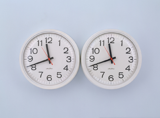
Félix made at least six of his pairs of clocks, which, if they weren’t exactly self-portraits, referred to him and his partner Ross Laycock. Tobias’s references the white version [on a wall painted light blue], which is now in MoMA’s collection, dates from right before Ross’s death, and is listed in Félix’s catalogue as unique.
Before that, in 1990, Félix made “Untitled” (Perfect Lovers) with black clocks in an edition of three. The date given for those works is 1987-1990, which is probably to account for the existence of earlier work.
White Columns has a pair of white clocks hanging behind the desk, officially undocumented, it seems, which were included in a 1988 exhibition as coming from an edition of three.
And at the time of Félix’s death, a 1987 work [officially listed as “additional material,” not work] titled Perfect Lovers, was in the collection of his former partner Jorge Collazo. It consists of a pair of wall clocks, signed, titled, and numbered, “1/3”.
Knowing that Félix made Perfect Lover clocks for all his boyfriends [sic] throws a layer of complexity onto the typically poignant interpretation of the work: yes, they’re identical and in sync (for now), but they’re also mass produced. And replaceable. You can pick one up at the corner. Of these conditions, the one Tobias chose to “fix” in his version was the eventual slipping out of sync.
as always, an update: Turns out there is also an AP of the 1987-90 edition. And the Renaissance Society in Chicago has reportedly left their locally made exhibition copy of “Untitled” (Perfect Lovers), made in 1994, up in their offices. And in 2007, Glenn Ligon wrote in Artforum that he still had the “Untitled” (Perfect Lovers) he made in 1996, soon after learning of Félix’s death.
Say Amen, Yves Klein!
I may have something to write later about Yves Klein, I don’t know. Peter Schjeldahl summed up what I’d already noticed, that the art discourse is very uncomfortable–or at least largely silent–on the topic of Klein’s apparently deep or abiding religiosity/spirituality. I thought that again at the Hirshhorn discussion when Kerry Brougher would actively ignore or steer the heavily spiritualist, cosmic comments made by the artist’s widow Rotraut Klein-Moquay.
 But that’s not important now. What I’m fascinated by at the moment is the very end of this 1959 recording of Klein himself speaking at the Sorbonne. I can’t quite tell what this is–I found it at Ubu.com, but the slightly loopy text and original mp3 rip appear to come from Waxidermy–a commenter calls it a conference on “L’Architecture de L’Air,” but the quote below matches an artist’s text of the same name published in Mon Livre. So it’s likely he just read his texts.
Klein’s talking about the “monochrome propositions” he showed at the Galerie Apollinaire in 1957 and how, though they’re identical, each one is received differently by the public. Then the kicker:
l’observation la plus sensationelle est c’est des acheteurs. Ils choississent parmi les onzes tableaux exposés, chacun le leur et ils le paient chacun le prix demandé–et les prix sont tous différents, bien sûr.
The most sensational observation is of the buyers. They chose among the eleven paintings shown, each to his own, and they each paid the price demanded–and the prices were all different, of course. [my translation]
Then the crowd oohs and roars in approval, Hallelujah! It’s like a good old-fashioned tent revival there in the Sorbonne.
On the one hand, there’s Klein’s presentation of the prices, the transactions, the market interaction, as somehow central to the concept of Klein’s monochromes, as dispositive evidence of–what? I’ll go with the artist’s privilege to characterize his own work and its attributes, of his collectors’ readily accepting [indulging?] his value/price-related constructs. The market, of course, has been the other third rail [sic] of art history. Does the market still honor Klein’s price differentials for these monochromes, I wonder? Somehow I doubt it.
But it’s the other hand, the audience reaction itself, that has me thinking. I made the preacher reference because it seems germane to Klein’s charisma and penchant for showmanship. But the give & take also makes me think of a [possibly peculiarly French?] appreciation of rhetoric as spectator sport; the crowd wasn’t enthralled by the monochrome paintings, per se, so much as by the deftly argued [and proved! by the market!] monochrome propositions. Klein ran the market gantlet and survived with his propositions intact.
The oohlalas reminded me a bit of Ridicule, Patrice Leconte’s classic film of the court at Versailles, where wit and mastery of small talk and jeux de mots are essential to social/political/cultural success.
And the existence of Klein’s art in that time and that milieu made me wonder about the historical popular context contemporary art inhabited in the US. What was the perception and reception of art in post-war America? Today we bemoan art’s loss of primacy as a touchstone of cultural expression, and the decline of art appreciation among the general public. The art world has become, we’re told, too insular and self-absorbed, abandoning its common touch and the concerns and interests of real people. But is that how it went down?
One specific example: I wonder what the role of LIFE Magazine was in shaping the broader view of art, and of influencing artists’–and the art world’s–views of themselves? Surely there are worthwhile dissertations on this topic, either written or in process.
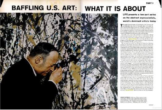
The New York-based LIFE seemed to operate as–or at least consider itself–both a kingmaker and a tastemaker. But LIFE seemed to want it both ways: to declare a trend from its privileged vantage point, and then to proclaim its empathetic bafflement on behalf of John Q. Public. LIFE’s 1949 anointing of Jackson Pollock as “America’s Most Important Living Artist” began a decade of incredulous coverage of Abstract Expressionism as THE American Art.
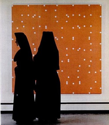
Just yesterday, I found a 1965 article about Buffalo’s Festival of The Arts Today, a remarkable assemblage of avant-garde theatre, music, film, art, and dance, that drew an equally remarkable, diverse-sounding crowd of over 165,000 people in a remote city whose population at the time was just over 500,000:
Can this be Buffalo?
The far-out Festival of the Arts Today was as full of come-ons as a county fair, running from a nude dance number to orchestral works with popping paper bags, to four bizarre plays by Ionesco, to kinetic art that often looked like pinball machines on a jag. Buffalo took it all–the hokum and shocks included–with healthy curiosity and good-humored appreciation, proving how refreshing the arts can be when approached for genuine enjoyment instead of for genuflection.
How well did LIFE’s editorializing about far-out hokum and county fair come-ons capture the persepctive of the people who attended the Festival, and how much of it was projected upon them from Manhattan?
The photo next to this paragraph showed a pair of nuns standing in front of a Larry Poons painting at the Albright-Knox: