Walking Man? What Walking Man?

walking_man_pointing.jpg
Alberto Giacometti’s figures look the way they do because he tried to capture what he called, “The moment I see them” and the way “they appear in my field of vision…” Arthur C Danto said this accounted for “the somewhat ghostly feeling of his figures, as if they were persons whose bodies had been all but erased.”
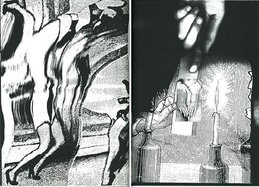
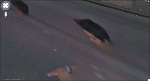
These ideas of figures, distorted, hovering on the edge of perception were very much in my mind when I found the incredible-looking sequence of [self] portraits of a man in the Google Street View panos of the Binnenhof, the Dutch Parliament complex in The Hague. The guy is almost certainly a Google Street View worker who accompanied the new Google Trike as it scanned and photographed the pedestrian-only area.

walking man proof - 3

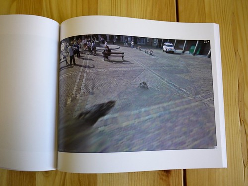
By walking alongside the Trike, the guy ended up inserting himself into thousands of photos, and basically every stitched-together panorama. The stitching algorithm, though, often tried to erase him, or replace his photo with a better [i.e., unobstructed] image of the same spot. The result is a series of fragmented collage portraits, disembodied heads, hairdos and limbs.
I gathered full-sized screenshots from every pano, focusing not of the site itself, but on the guy, and then I bundled them into a book, which I titled, after Giacometti, Walking Man. That was in mid-April.
As I’ve been tweaking the book the last few weeks, though, I found that several of the Binnenhof panoramas have been removed from Google Street View, including all the coverage of the inner courtyard, and every one I illustrated in my blog post.
Google has been getting heat in Europe for its Street View datagathering practices. I’d suspect that investigations in Germany and across the EU–and now even in the US–for surreptitiously collecting personal data across wi-fi networks is a bigger issue for them than ye random blogger’s artbook-ish attempt to fit Street View into critical history of street photography. And yet.
Google had already had the Binnenhof in the bag when they announced the Google Trike last summer, and invited the public to suggest where it should shoot first. Whatever else it was, this seemed like a canny move designed to deflect any possible political heat from the Street View effort: we’ve already got the Parliament on board, who wants to be next?
Now, though, it seems like someone, either within Google or within the Dutch government, or both, is actively deciding it doesn’t want people to examin either the Binnenhof OR the Street View process too closely. And that includes Walking Man, whose portraits are being all but erased.

Muybridge Had A Posse

Now before we get too far, let me state for the record that so long as there’s no thievery or lying involved, but appropriate credit or consideration is, I got no problem at all with a man who takes another man’s photograph, tweaks it a bit, and re-presents it as his own.
That said, I am blown away by the awesomeness of Tyler Green’s investigative interview with photography curator Weston Naef that questions the attributions of many early photographs in the Eadweard Muybridge retrospective at the Corcoran.
muybridge_mirror.jpg
Naef has a pretty compelling, I’d almost say irrefutable, argument that before 1872, Muybridge published many photographs under his name [or his brand, really, since the questions arise about the period from 1866-1872, when Muybridge worked under the name Helios Studio] which were actually taken by others, including his friend and frequent business counterpart, the great Carleton Watkins.
Green and Naef cite specific examples of Muybridge photos slotting right into the missing slots in Watkins’ photo sequences. There are even cases where the shots are identical.
The implications for the Corcoran’s show–the first Muybridge retrospective ever–and the history of photography are pretty significant. Which doesn’t necessarily take away from the exhibition or the catalogue, though Philip Brookman’s account of Muybridge’s career will certainly come in for revision.
I saw the show on opening day, and it is fantastic, an incredible accomplishment, and a wealth of wonderful photographs and stereographs. It was the show and the catalogue that catalyzed Naef’s preliminary research, and the whole thing opens a very interesting window on the development of photography in the US, and especially in California, in the 19th century. There’s much more research and analysis and discovery to be had here. And it’ll be interesting to see how the show changes on its next incarnations at Tate Britain and SFMOMA.
muybridge_mirror_detail.jpg
But I know what you’re all thinking: what does this mean for me? And by me, I do mean me, not you. Well, it means that now I don’t know who made one of my favorite oddball images from the Corcoran show, a stereograph from Woodward Gardens, an early zoo/amusement park in San Francisco. It shows a slightly generic garden scene, but the focus is on a mirrored garden ornament–in which the photographer’s own self-portrait is visible. That thing looks so much like a vanguard satellite, or a satelloon mockup, I am powerless before it. And now I find out it might not be Muybridge at all.
The intro to the 3-part interview: The Newest Eadweard Muybridge Mystery [modern art notes]
Looks like they picked the wrong week to name their otherwise awesome exhibition catalogue: Helios: Eadweard Muybridge in a Time of Change [amazon]
The Corcoran show runs through July 18. [corcoran.org]
note: detail of the mirrored garden orb from UC Berkeley’s Bancroft Library, via Calisphere [thanks for that, too, Tyler]

Found The Kocher Studies Building!

kocher_bmc_mondo.jpg
Looks like I picked the wrong end of North Carolina. While I was bumming around the Outer Banks, Mondo Blogo was surely doing The Lord’s Work in the mountains. Black Mountain College, to be precise, or what’s left of it.
He and his mom [!] visited Camp Rockmont, the Christian boys camp on the shores of Lake Eden, which absorbed BMC’s homebrewed modernist buildings after the school closed. There are great photos of A. Lawrence Kocher’s 1940-1 Studies Building, a low-slung, low-key, low-budget International Style marvel of corrugated metal siding and ribbon windows. Including this one, which features the old re-bar cross or somesuch.
If you can piece it together from the BMCProject website, the architectural story of Black Mountain College is as fascinating as the art and curriculum. Kocher, the editor of Architectural Record, was the last-minute replacement for Walter Gropius and Marcel Breuer. He was also the collaborator on Albert Frey’s first building in the US, the 1931 Aluminaire House, which bears a strong family resemblance to the Services Building.
After discovering that building and pulling it online last summer, I stumbled across a Black Mountain College mystery, a cool, little, unidentified plywood building that I speculated might have been by Kocher. It turned out to be Paul Williams’ Science Building, built in 1949-50 with the help of students Dan Rice and Stan VanDerBeek.
Is there a beautiful, comprehensive exhibition and catalogue for Black Mountain College? Because I really think there oughta be.
Black Mountain Madness [mondo-blogo]

Found The Warhols?

Last fall, I was looking for a way to paper the art world with giant versions of the awesome PDF wanted posters the LAPD Art Theft Detail had created for Richard Weisman’s stolen Warhol Athletes Series paintings.
ftw_poster.jpg
So I created a tongue-in-cheek Kickstarter project to print up a thousand posters. But satirical altruism for cagey Bel Air collectors wasn’t a big draw, and then mysteriously, Weisman dropped his insurance claim, so his company withdrew the $1 million reward offer. [Which you’d think would make the posters all that more collectible. But anyway. I have my proof, I’m content.]
Weisman, who commissioned the series in 1977, said he was not interested in subjecting his family to the invasive scrutiny of the insurance investigation. And it’s not like he’s really missing the works: he and his family still owns several sets of the paintings, and he has donated several more to museums and sports halls of fame.
Bring it up to the present, and the LAPD still lists the works as stolen. But a couple of weeks ago, the NYT’s Virginia Heffernan wrote about a couple of art theft blogs, including Art Hostage.
Had we only known. Barely a week after the heist, Art Hostage chief Turbo Paul had the case all sewn up: “Not Stolen, A Domestic Kidnapping !!!!!”
Which, when combined with Weisman’s subsequent actions, makes it sound like he knows who, if not exactly where, and doesn’t want to pull that thread.
Now if only there were a break in the Pebble Beach “Pollock” case….

Daphne, As Photocopied By Sigmar Polke

daphne_polke_sop2.jpg
I didn’t follow Sigmar Polke’s work closely. At least not consciously.
This excerpt from Reiner Speck’s essay about Polke’s 2004 artist’s book Daphne is awesome, even if it sounds a bit like someone’s been huffing toner at the end:

An oversize anthology of sources of visual inspiration, a photocopied book that paradoxically reveals the artist’s hand, a sketchbook for the machine age–Daphne runs and runs, is caught by the photocopier, and runs some more, only to be bound in the end.
Created directly by Polke himself, Daphne is a book with 23 chapters illustrated in large-format photocopies. Each “copy” of the book differs, as each has been photocopied and manipulated individually, pulled from the machine by the hand and watchful eye of the artist.
Process is revealed, over and over again. Motifs accumulate page after page, as do small graphic cycles. The printed dot, the resolution, the subject, and the speed all determine and are determined by the apparently unpredictable and often impenetrable secret of a picture whose drafts are akin to the waste products of a copying machine.
Even if the motifs in this book provide but a brief insight into the artist’s hitherto secret files and archives, it is still a significant one.
For the first time, we witness an artist’s book with such an aura of authenticity that Walter Benjamin’s seminal essay, “Art in the Age of Mechanical Reproduction,” bears consequent re-reading.
Produced in a limited edition of 1,000 “copies,” each of which has been numbered and signed by Sigmar Polke.

A thousand copies of a 440 page book [40 pg essay, 400 images], each one manipulated by the artist? How long does that take?
Let’s assume, for logic’s sake, that he made 1000 copies at a time for each A3 page [16.25×11.5 in.], manipulating it around the surface of the copier as the copies fly. The Konica Minolta Bizhub Pro 1050 commercial copy/printing system had a maximum speed of 105 pages per minute. But that’s only for letter-size, and it wasn’t introduced to the market until October 2004. [Newer Bizhub Pro models are up to 160 ppm.]
Which means that the 2003-4 state of the copying art was probably around 50-60 larger pages per minute. Say 50, and we have a nice round 20 minutes of copying time per page, 133 hours of copying. That’s 16.67 8-hour days of nothing but copying. Add in lunch, breaks, maintenance, and you’re looking at three weeks, easy, standing there at the copy machine. Let me repeat the word “copying” again, just for emphasis. Copying.
Now imagine coming up with a suitable repertoire of moves for a page on a glass plate. I mean, how varied can you really get? Do these process-centered motifs and tricks emerge from the book, too? If they could be projected sequentially, like the frames of a movie, the 1000 copies of a single page would compress all of Polke’s moves into a 42-second clip. If the movies for two pages were screened side by side, would they reveal randomness, an identifiable bag of tricks, or perhaps Polke’s carefully choreographed handjams?
Surprisingly, the least expensive copy of Sigmar Polke’s Daphne is on Amazon. $675 [amazon]
More images from Sigmar Polke’s Daphne at Stopping Off Place [stoppingoffplace]
[Inadvertently] Related: Nouveau manuel complet du fabricant et de l’amateur de photos
update: oh no/yeah, it’s a “new york trend”! [thanks, andy]

We’re All David Salle Now

So funny, last night at the Brooklyn Museum, Andrew Russeth was saying as how some late Warhol paintings look remarkably like David Salle.
picabia_basel_hopkins.jpg
Villaca Caja, 1929, at Galerie Hopkins-Custot
And I was flipping through The Art Newspaper’s Basel daily edition, and saying this Francis Picabia painting at Hopkins-Custot looks remarkably like David Salle.
Day 3: Christoph Grunenberg, director of Tate Liverpool, on his pick of Art Basel [tan, pdf]

On Ian Wilson’s Art Objects

Ian Wilson’s conversation-based art practice reminded Ben of the introduction to Asif Agha’s 2006 book, Language and Social Relations. An excerpt:

…It is therefore all the more important to see that utterances and discourses are themselves material objects made through human activity — made, in a physical sense, out of vibrating columns of air, ink on paper, pixels in electronic media — which exercise real effects upon our senses, minds, and modes of social organization, and to learn to understand and analyze these effects. It is true that that utterances and discourses are artifacts of a more or less evanescent kind (speech more than writing). But these are questions of duration, not materiality, and certainly not of degree or kind of cultural consequence….

Definitely worth reading the whole piece at Ben’s site, and noting the 60s art context in which Wilson was operating, where artists were actively seeking to supplant the commodified physical object of art with its unbuyable, unsellable concept. In interviews I’ve seen [quoted in Anne Rorimer’s 1995 MoCA catalogue, Reconsidering the Art Object], Wilson talked about his Oral Communication series as art as “speech itself,” and “art spoken,” a construct which evolved from his earliest pieces, Time [begun in 1968], which seemed to be about the process of conversation itself.
But that was also 40 years ago. A lot of non-material art has been made, bought, and sold since then, and I wonder how Wilson’s contemporary continuation or revisiting of these Oral Communication works differs from the originals. And how it differs from any sort of conversational situation which involves one party paying another for the…the what? the time? the privilege? the experience? Is it like a shrink? Or could the payment come from outside the conversation, and in advance? UBS is proud to present Ian Wilson in conversation with Hans Ulrich Obrist?
Speech Objects [emvergeoning.com]

The Art World Has An Attention Span Of A Gnat

I’ve long admired Ian Wilson’s conversation-based art works, though for years I’ve wondered if selling conversations as art doesn’t complicate one’s daily interactions with people, sort of a conceptual version of how doctors always get hit up for medical advice at parties.
As Sarah Douglas reports from Art Basel, though, it seems Mr. Wilson has solved the problem, by having all the conversations he wants, and only selling the documentation. His invoice/certificates are like the commemorative photos on Splash Mountain, available after the fact for your purchasing convenience:

[Wilson’s work] consists of a small room in which the artist conducts half-hour conversations on the heady subject of “the absolute” with anyone who makes an appointment for the privilege. “Oh, that’s very Tino Sehgal,” remarked one fairgoer. “No, no, it’s very Marina Abramovic!” countered another.

Holy crap, people. Could they even find enough people in Basel capable of sustaining a 30-minute conversation on one topic? The guy’s been doing this stuff since before Tino Sehgal was born.
Circles, Nudity, and the Carnivalesque Rule at Basel’s Art Unlimited and Statements Sections [artinfo via @andrewrusseth]

How To Make A Gerhard Richter Painting

I find Gerhard Richter’s squeegee paintings to be both endlessly fascinating and seemingly endless. I don’t sweat too much when I think about the one I didn’t buy when I could have; it’s just so hard to decide that this, this one right here, in front of me, is THE one, not the next one I might see and like even better, oh, let’s just wait and see what the next batch is like. Maybe that’s the key to understanding them, the way they thwart or mock such attempts at aesthetic hierarchies.
richter_abstraktes_1988.jpg
That said, this one, (Abstraktes Bild (666-5)), from 1988, coming up at Sotheby’s evening sale in London, is particularly beautiful, and has a great exhibition history:

…It is the last of a small cycle of five works in this format executed in 1988, one of which is on permanent loan to the Hamburger Kunsthalle (Abstraktes Bild (666-1))
while another is in the Kunsthalle in Emden (Abstraktes Bild (666-2)). The present work is the resolved conclusion of a lengthy process of creation, as described by Dietmar Elger: “the actual making of an abstract painting, which can stretch out over weeks, involves incessant activity, back and forth between opposite poles, with no single element or value permitted to dominate. Richter once described his process for the abstract works as “a multitude of Yes/ No decision, with a Yes to end it all” (Ibid). It also marks one of the earliest instances where Richter started to rescind the use of wide brushstrokes in his abstract work in favour of a rubber squeegee to smear and smudge the paint material across the canvas. This autograph method has since become synonymous with his remarkable output.
[rhapsodic waxing about the harmonies of ultramarine and “the wall power” of Abstract Expressionism removed, but you can read it in the catalogue]
Richter’s working practice has been described as remarkably efficient: he begins by placing a number of white primed canvases around the walls of his studio, eventually working on several of them simultaneously and reworking them until they are completely harmonized, which has been compared by Peter Sager as being “like a chess player simultaneously playing on several boards” (Peter Sager, ‘Mit der Farbe denken’, Zeitmagazin 49, 28th November 1986, p. 34).
Tracts of colour are dragged across the canvas using a rubber squeegee, so that the various strains of malleable, semi-liquid pigment suspended in oil are fused together and smudged first into the canvas, and then layered on top of each other as the paint strata accumulate.
Richter has said “In this process I don’t actually reveal what was beneath. If I wanted to do that, I would have to think what to reveal…that is, pictures that might as well be produced direct…The process of applying, destroying and layering serves only to achieve a more varied technical repertoire in picture-making” (Dietmar Elger, Op. Cit., p. 267).
The painting undergoes multiple variations in which each new accretion brings colour and textural juxtapositions until they are completed, as Richter himself declares, “there is no more that I can do to them, when they exceed me, or they have something that I can no longer keep up with” (the artist cited in: Exhibition Catalogue, Chicago, Museum of
Contemporary Art, Gerhard Richter: Paintings, 1988, p. 108).

June 28, Lot 47: Gerhard Richter, Abstraktes Bild (666-5), 1988, est. 1.5-2.5m GBP [sothebys.com]

Untitled (300 x 404) @ 20 x 200

untitled_300x404.jpgWhen I offhandedly declared a jpg of Richard Prince’s 2003 rephoto, Untitled, (Cowboy) to be my own work a year ago, I had no idea it would ever leave my blog post.
As an idea, appropriating an appropriation might be funny/interesting for about 30 seconds. Or it might be a useful provocation for a discussion about fair use, and the unacknowledged constraints it places on our cultural dialogue and production.
Untitled (300 x 404) may look like a jpeg of Richard Prince’s Untitled (Cowboy), but it turns out to look nothing like Prince’s actual, 30×40 inch work. [Which, itself is actually an enlarged photo of Sam Abell’s Marlboro Man ad from a magazine.]
And that’s something I only began to realize when I started looking around for the best way to print this jpg file in real life. Obviously, it can be reproduced infinitely online–here, have one! But printing it without dramatically altering the original data turned out to be a challenge.
So when Jen Bekman and I started talking about publishing an edition with 20×200, my first question was for their printer. Since they knew their printer was awesome and could pull it off, their first question was for their lawyer.
But as soon as we saw the proofs come in in various sizes, with the pixels rendered in velvety, matte inkjet pigments on that heavy paper, it was obvious that this piece really needed to be published, and it needed to be done by 20×200.
I have no claim on the image, or the idea, or the technical skill of making them, and yet I feel incredibly proud of these prints, which are these beautiful, physical things.
As I figure out how best to photograph them, I’ll post some image of the prints themselves over the next little while. But it might be tough. They’re really the kind of thing you want to see in real life.
Check out prints and details about Untitled (300 x 404) at 20×200 [20×200.com]
Read Jen’s email announcement of the edition [20×200.com]
Previous greg.org posts:
May 18: West Trademark F(*#$Up
May 20: 300 x 404 [sic]: The Making Of
June 10!: Richard Prints: Untitled (300 x 404)

Whoa, Cowboys. The Hirshhorn Yves Klein App Is So-So At Best

I’m as excited as the next guy that there’s an app for the Yves Klein retrospective at the Hirshhorn. I bought it the first day to try it out. I did not expect it to be as cool as the Yves Klein app in my head, which is a Brushes-like painting program where the choice of brushes consists of a flamethrower or a tiny, naked 20-year-old Frenchwoman. I would pay $5 for that right now, and send $5 App Store gift codes to a hundred friends.
hirshhorn_klein_menu.jpg
As it turns out, the app is so mediocre, I started planning my sobering review almost immediately. Alas, I wasn’t quick enough to get ahead of the wave of hype which has crashed on top of the app, including, most prominently, a fluff piece in the Washington Post. The most eyerolling nontroversy so far is from @museumnerd, who tweetwhined about an Android version: “isn’t @hirshhorn promoting Apple products?” [Yes, just like they promote Weyerhauser products when they print their brochures on paper.]
Now it’s important to get some real, constructive feedback out there early, try and nip the horrible practices in the bud before the museum app world is flooded with poorly designed brochureware.
To be fair to the HIrshhorn and the Smithsonian–and even a little bit to @museumnerd–the cross-platform app development imperative lies at the heart of the Klein app’s problem. But I’ll get to that in a minute, after taking a quick look at what the Klein app is, and where its greatest failings lie:
The app contains early iPod-like nested directory/menus of the exhibition and Klein’s various bodies of work; a timeline, and basic map/visitor info for the Museum. At the end of each branch is an image of a work. There are a couple of film clips, but I could not get them to play. Throughout, most of the text consists of quotes from Klein himself.
hirshhorn_klein_model.jpg
[Thanks to a single image of Klein and a bodypainted model at the Monotone Symphony performance [above], the app carries a warning that nudity makes it suitable for 12yo+. And just like that, the Hirshhorn app corners the 13-yo boy iPhone user demographic.]
The text is incredibly small; the size cannot be changed. The volume of text, combined with the number of menu items and–most of all–the amount of screen space given over to a static header and a navigation footer, require scrolling to do or find anything. Images are zoomable, but they turn out to be merely web-resolution, so they immediately dissolve into pixels rather than allow any meaningful exploration. For Klein’s large paintings and close-up surfaces, this is a dealbreaker. Ditto for maps of the Museum, which don’t fit the screen.
hirshhorn_map_app.jpg
I understand that most of the content is taken from a documentary playing in the gallery. This content, which would barely fill a three-fold gallery handout, turns out to be way too much. But the real problem isn’t the Hirshhorn’s 10 pounds of content; it’s with the 5 lb bag.
The Museum built their app using Toura, a multi-platform mobile tour guide content management system from a New York-based startup. Museums just insert their content into Toura’s cloud-based template system, hit publish, and voila! Apps for Everybody! Toura’s model is to give away their easy-to-use development tools for free, and then split the app revenue with the museums and other tourist and travel site operators later.
To museums with no budgets and thinly staffed IT and design departments, a free, insta-app is as compelling as a 10-week, 5-figure app dev project is unworkable. I can’t see that changing soon, and until someone proves otherwise by making a fortune with my nude-avatar-paintbrush Anthropometries app idea, I suspect $0.99 repackaged brochures will be the only game in town for a while.
Which is too bad. Because Toura’s standardized design is so suboptimal and user-unfriendly, that it’s almost better to do without. Especially if it’s as poorly executed on an Android as it is on an iPhone. I checked out the only other Toura-based app available, too, for Pace Gallery’s Conrad Shawcross installation in the IBM Atrium on 57th Street. It’s marginally better, with less text, more iPhone-style slideshows, and working video, but it’s still poorly designed, with tons of wasted screenspace, and no content that can’t be found or done online.
For the biggest multiplatform bang for the buck, then, is seems like museums should focus on making their websites more accommodating to mobile browsing. And for the app-happy museum directors trying to get some PR, put out a free app that is basically a portal to your mobile-optimized site. You can then program it right alongside your web content management.
But this seems like the hurdle, both from a development and a user standpoint: if an app can effectively be replaced by an exhibition webpage or a gallery handout, then it probably should not exist. And it certainly should not exist as a paid product.
Of course, this calculation might be different for the Hirshhorn, a museum whose small bookstore maintains a large section devoted to the selling of its own mail–including old catalogues and exhibition brochures from other institutions.

Prints: I Did An Edition With 20×200.com. It Comes Out Tomorrow.

20x200_logo.jpgLook, no one is more surprised than I am about this. But when Jen Bekman and I started talking about it a while back, it started sounding like the awesomest thing in the world.
So I’ve done an edition with 20×200.com. It looks fantastic. And it will be released tomorrow.
You can get the first look at it–and the first chance to buy one–by joining the 20×200 mailing list.
Actually, it looks even better in various sizes, so I recommend buying several.
After it’s released, I’ll post a bit about the piece and the ideas and work that went into it.
Meanwhile, a huge shoutout to Jen, Eric, Sara, John and the other folks at 20×200.com, who have been great to work with. Thanks, and stay tuned!
20×200.com/mailinglist [20×200.com]

A Sharp Sticker Car In The Eye

eye_artcar_littlelamb.jpg
The day I watched the video of Jeff Koons’ crew wrapping the vinyl decals on his BMW Art Car was also the day I surfed across Little Lamb, Richmond artist/musician Sara Gossett’s awesome blogspot compendium of psychedelia [which has lately been supplanted by a tumblr.]
Home for Christmas, Sara was presented with her dad’s collection of Eye Magazines, from which she culled just a few of the most incredible countercultural images. Eye was Hearst magazine’s demographic play for the youth market of 1968-9, the MTV Generation’s parents. It was the Domino and Vitals of its day, with all that entailed. Which means it lasted for just 15 issues.
Among Sara’s finds: this incredible car-decorating photoshoot. Look familiar? No, seriously. Look familiar? Let me help read you read the caption: “Finished! Time: four hours and seven minutes (the seven minutes to blow up the balloons).” [emphasis added on the most Koonstastic part]
eye_artcar_littlelamb2.jpg
Alas, as a visually inspired type, Sara had no text, or info about the shoot, or even what issue it was in. With some digging, though, I think I found it: Eye, Vol. 1, Issue #1 from, wow, March 1968, the September 10th of the Sixties:
“The Almost-Instant-Flamboyant-Fluorescent-Decal-Decorated Car”
Like I said, sound familiar? I asked a friend who is well-versed in such things, and he identified the car as, not a BMW, but a Lancia Fulvia. If any was involved, the artist’s name is currently unknown. But I bought the cheaper of the two copies of the magazine from the web, so we should know in 5-8 business days.
UPDATE: Uh-oh, could this be true? From a completed ebay.ch auction: “Why is this Man Smiling? Peter Max – 3 pages of Peter’s artwork on cars“!
eye_march_68_ebay.jpg
Eye Magazine, 1968 [hello little lamb, thanks sara]

How To Make A Jeff Koons BMW

koons_bmw_paris.jpg
It’s a testament to the PR-fed, context-free media machine, I guess, that Olafur Eliasson, the last artist to make a BMW Art Car, goes entirely unmentioned in the promotions of Jeff Koons’ iteration. [One exception: Richard Chang at the Times.] Or maybe it’s a testament to Olafur’s machine: he gets to have his over-the-top, ice matrix experiment, but he never has to be trotted out and lined up on the lawn at a car show as another corporate trophy.
koons_bmw_printer.jpg
True, Koons’ hyper-graphic BMW is also more in the tradition of earlier, painted Art Cars by the likes of Calder and Warhol. His design, while dazzling and generally awesome, also feels deeply insignificant. It makes clear the difference between art made of cars and cars decorated by artists.
koons_bmw_vinyl1.jpg
Which I don’t mean in a bad way, understand. Far from it. Significance is not always a virtue.
koons_bmw_vinyl2.jpg
The breakthrough of the Koons BMW [which I have to laugh at when I say it, because it’s a car dealer in Virginia. There’s Koons Ford and Koons Nissan, too, and all these cars around DC have the Koons signature on the back, which makes me smile in traffic sometimes, imagining they’re all a big, banal, found object edition.] Anyway, the breakthrough of the Koons BMW is technological. It’s the opposite of Olafur’s impossibility; you can almost literally replicate it anywhere.
As this making of video shows, the design is a vinyl wrap, designed and printed in Koons’ studio, and with a double layer of clearcoat. Everyone should have a giant vinyl wrap printer in his house.

The design templates for standard vinyl wraps are widely available. Judging by the mom&poppiness of the businesses wrapping their ads on Scions these days, it can’t be that expensive. All that’s lacking, obviously, is an artist’s touch.
There are now no barriers to an artist making his own vinyl wrap design, and selling it in edition. Be sure the design is flexible enough to look good on whatever car models collectors might have. [Or you could make them work a little bit by limiting it to, say, Range Rovers.] You’d probably let it be reprinted as needed, but also limit the certificate to one car at a time. And consider offering some zipcode exclusivity for sales; you wouldn’t want any awkward moments in the parking lot at the Atlantic Golf Club in Bridgehampton. Or maybe it’d be interesting, who knows?
If Editions Schellmann can do a series of editions of artists’ doors, and if Art Production Fund can do shower curtains, why can’t some enterprising foundry publish a whole set of artists’ vinyl car wraps? It would not be significant, but it could be awesome.

HowTo: Make A Vija Celmins Night Sky Painting

celmins_dark_galaxy_mckee.jpg
The Brooklyn Rail’s Phong Bui interviewed Vija Celmins about her show at David McKee Gallery

Brooklyn Rail: About the night sky paintings, I always wanted to ask you, with all of the subtleties of gray tones embedded in the white stars and the black sky, how do you build up the surface while controlling the balance of tones?
Vija Celmins: Well, the rather boring technique is this: what I do is I first draw in a pattern that breaks the surface, and then I draw the different sizes of circles for the stars. Next, with a small sable brush, I apply a tiny drop of liquid rubber; it hardens and I build up to a desirable thickness. I then paint different layers of ivory blacks that have been mixed with burnt umber, ultramarine blue, and sometimes with a bit of white. And I use alkyd, which takes about two days to dry, and once it’s dry, I then take off the little rubber bumps, which create those little holes with various kinds of white, which is mixed with a little bit of cerulean blue, and sometimes with raw umber or yellow ochre.
Rail: What kind of white?
Celmins: A combination of titanium and zinc white. And I keep filling those holes until they come up to the same level as the black surface.
Rail: That’s intense.
Celmins: And I often sand it a little, so that the whole surface is totally uniform, flat, and has very tight skin.

It’s the perfect balance between boring and intense that makes her paintings such marvels.
Vija Celmins with Phong Bui [brooklynrail.org via two coats of paint]
image: Dark Galaxy, at David McKee Gallery through June 25 [mckeegallery.com]