
I guess that’s the whole point of camo, you just never really know what you’re gonna see.
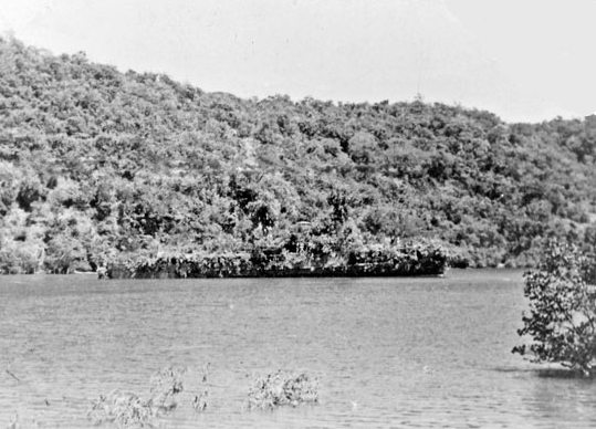
In February 1942, the Dutch minesweeper the HNLMS Abraham Crijnssen survived the Battle of the Java Sea, in which the Japanese Navy crushed Allied forces [AU, UK, NL, US] and invaded the Dutch East Indies [aka Indonesia].
To evade detection from the air and retreat to Australia, the Crijnssen‘s captain ordered the 186’ ship disguised as an island by covering it with branches.
Unlike the official, formal Razzle Dazzle camouflage technique used in WWI to confuse submarines, the Crijnssen‘s improvised approach worked. The ship survived and eventually ended up in the Dutch Navy Museum at Den Helder, the city at the tip of the North Holland peninsula which has long been a strategic nexus of Dutch naval and shipping operations.
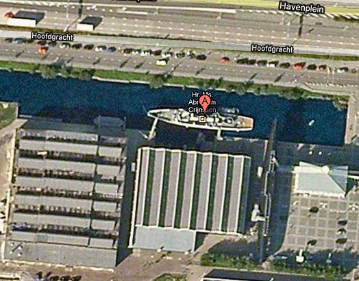
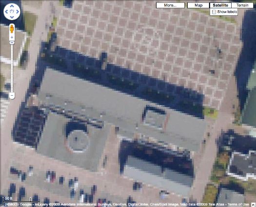
In fact, when you look up the Crijnssen on Google Maps, there turns out to be a huge complex of Dutch Polygonal Camo just to the east, the main base for the Royal Dutch Navy.
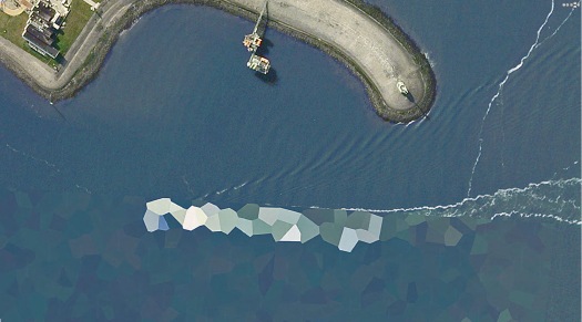
And the camo extends out into the water in order to cover a ship caught by Google’s Aerodata photographers just as it passed by the world’s most undeniably phallic breakwater. Wonder what the sailors’ nickname for that is.
Here a Google Map with both generations of Dutch naval camo, side by side:
View Larger Map
HNLMS Abraham Crijnssen at the Historical Naval Ships Assn [hnsa.org via boingboing]
Called It
Been waiting to finally see one of these. Looks like this week is my chance:
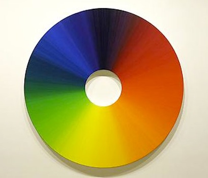
In the main gallery upstairs, Eliasson exhibits a series of watercolor drawings on paper. Configured in sequences, they use ellipses and circles as narrative exercises on the perception of space and movement. While shades and hues play an important part in these watercolors, the oil painting Colour experiment no. 3 (2009) is part of ongoing research into color conducted at Studio Olafur Eliasson. The studio has been developing a set of handmade oil paints that range through the full spectrum of visible light, experimenting with their physical properties and interactions. Circular in form, the painting expands on the traditional model of a color wheel, wherein each of 360 degrees is painted in one color and corresponds to its complementary afterimage located directly across from itself.
That image above is Colour experiment no. 7, 2009, which was shown in Seoul, but I’m just sayin’
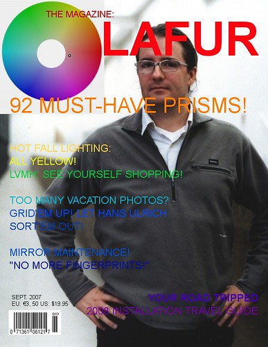
Olafur Eliasson, Multiple shadow house, February 11 – March 20, 2010 at Tanya Bonakdar Gallery [tanyabonakdargallery.com]
The Scale Of The Warhol Foundation’s Criminality Will Blow Our Minds
 The ever-unfolding scandal of the Andy Warhol Authentication Board and the Warhol Foundation’s apparently massively criminal machinations is just mind-boggling.
Richard Dorment wrote in the New York Review of Book last fall about veteran London dealer Anthony d’Offay’s run-in with the Board over a Red Self Portrait, an early (1964-5) silkscreen work which was signed and dated by Warhol, and inscribed, “to Bruno B,” as in Bruno Bischoffberger, his longtime European dealer. A painting which Warhol chose for the cover of his first catalogue raisonne, published in 1970. Which included the painting.
And despite all this, the Authentication Board declared the painting was not authentic. Anyway, the Book Review has now run a series of letters and replies and followups including corroborations from Paul Alexander, new accusations by Warhol Foundation chairman Joel Wachs, and fierce rebuttal by Dorment.
It seems that, after the d’Offay/Bruno B rejection, the Board set to work contacting owners of other Red Self Portrait paintings with the intention of proactively deauthenticating them. And now at least one owner has filed an anti-trust suit against the Foundation and the Board, charging conspiracy and fraud. [The Foundation controls and sells several thousand works by Warhol easily worth several billion dollars on the street.]
Anyway, it’s all there for the reading, but the most devastating piece in my mind is the letter by Rainer Crone, the German art historian who collaborated with Warhol to publish that first catalogue raisonne. First off, it’s just a great story, well told, and a strong, firsthand argument for Warhol’s significance. Crone addresses the evolution of the mechanical reproduction techniques and Warhol’s awareness of its implications for the idea of authorship. [He also describes silkscreening as, “in the end, a fusion of painting and photography,” which is so obvious, I’d never thought of it that way before.] The ending is unequivocal:
When, in 1986, Warhol came to London for his show at Anthony d’Offay’s gallery, he signed in d’Offay’s presence one copy of my 1970 book in two places: one signature was across the dust jacket, which reproduces the “Bruno B” Red Self Portrait eight times. The other was on the book’s half-title page. It is important to realize that Warhol and myself–as I described above–together chose the “Bruno B” Red Self Portrait for the cover of the book. Warhol’s signature across the “Bruno B” image on the dust jacket gives further unequivocal evidence that Warhol still in 1986 not only was authenticating the work itself, but remained proud of the painting, as well as of my early catalogue raisonné (then sixteen years in print), which had proved so many times before to be a very reliable source.
It is hard to believe that Warhol would have signed my book and the image of the “Bruno B” Red Self Portrait if there had been the slightest doubt in his mind that it was not “his work.” The combination of the dedication on the back of the painting with the choice of that image for the cover of the catalogue raisonné, together with his endorsement sixteen years later of the image by signing across it, leave no room whatever for any doubt as to the authenticity of the work and the artist’s intention.
To deny a painting chosen by the artist for the cover of his first scholarly publication when that work is signed and inscribed to the artist’s longtime dealer is an act of folly and gross misjudgment. Art scholarship does not consist of the theories constructed after the artist’s death by those who never knew him. Its bedrock is the body of work that the artist authenticated–beyond a shadow of doubt–in his lifetime.
Will the Warhol Foundation’s financial leverage in the art world help it blunt or silence any real discussion of its practices? Do Warhol collectors or Foundation grant recipients–or applicants, for that matter–feel it best to just shut up and let it pass? Does pointing to this reporting mean I’ll never need to stress about finding the time to apply for another Arts Writers Grant?
What Andy Warhol Really Did [nybooks.com via @harrislieberman]
Previously, from almost exactly 4 years ago: BBC documentary on Richard Eckstract’s denied Red Self Portrait [image reproduced above]
[2022 update: reader, it did not blow any minds.]
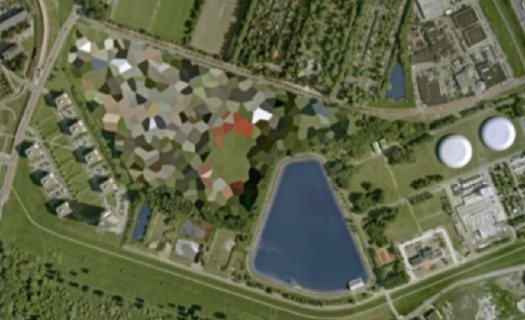
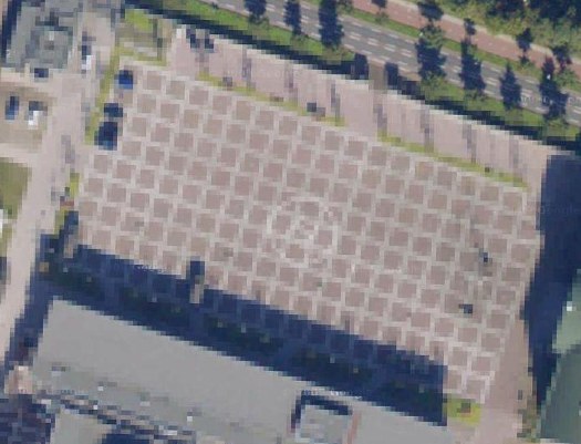
The Everchanging Dutch Camo Landscape
Gather ye screengrabs while ye may, I guess.
The camo-obscuring of sensitive sites on Google Maps by the Dutch Intelligence Service (MVID) is a dynamic process. One of my favorite sites I found last November is a complex along the Maas in Rotterdam. The polygonal camo zone is surrounded by an equally artificial-looking geometric landscape:
But when I pulled up that old post, the embedded Google Map showed a new, unobscured image:
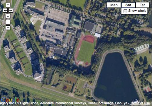
Thereby revealing the existence of a previously classified football field.
But wait, the image isn’t unobscured after all; it’s just obscured at a higher resolution. Oh no! It’s Dutch Camo 2.0!
My project just got overlaid with a thick, historicizing blanket of obsolescence. Which, for a bunch of Dutch landscape paintings, is probably just as well.
And I must say, I DO like what they’ve done to that helipad-equipped grid.
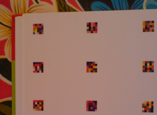
On Drop Shadows And Diagrammatic Abstraction
I swear, I didn’t plan to go all Errol Morris and do three posts about one photo in one catalogue about one artwork. So look at this other photograph!
The second thing you notice–first if you just crack it open, second if you start from the front–in the Serpentine Gallery’s Gerhard Richter | 4900 Colours is what I bought it for: page after page of reproductions of the panels in all eleven possible configurations. The Serpentine’s own Version II comes first, with large, 2×2 assemblies shown, one per page.
With drop shadows. Seriously. Drop shadows. Are these photographs? Part of me wants to think that photos in a Richter book would all be taken under such perfectly identical lighting that it creates exactly identical shadows. But I am doubtful.
There is one squeegee painting reproduced, but it has no shadow, or frame, or any indication of three dimensionality. And it’s pretty obvious that all the other Versions of 4900 Colours are illustrated, not by photos, but computer graphics–diagrams. Does this matter? And if it doesn’t, what does it mean to simulate three dimensionality with dropshadows?
Buchloh, whatchagot?
The Diagram
A diagram is not a painting. It’s as simple as that…I can make a painting from a diagram, but can you? – Frank Stella [ed note: this is from an apparently cantankerous 1964 radio interview with Judd, included in Gregory Battcock’s “Minimal Art: A Critical Anthology.”]
…the diagram contributed a dissenting voice to the heroic chorus of abstraction, recognizing the degree to which the painter and the spectator as perceptual and desiring subjects are always already contained in systems of spatio-temporal quantification, control, and statistical registration.
Mhmm. I like this idea of diagrammatic abstraction and how it is an overlooked underdog. But could that just be my own subjective anti-subjectivity talking? Maybe I agree because I happen to have found my own “schemata of statistical data collection” to use as my “necessary and primary matrices determining a pictorial/compositional order”?
Also, I don’t see how Richter’s “low-tech colour production [could] subvert the new digital spectacularisation of colour [8]” while he simultaneously publishes more-perfect-than-real digital simulacra of his work, augmented with Adobe Illustrator’s systems of simulated tempo-spatiality.
I take issue with this. I also realize that I’m putting Buchloh on the hook directly and Richter, too, by implication, for tiny, seemingly peripheral-to-picayune issues I have with the catalogue that fall well within the scope of book design. But they transform the book from a documentation to a blueprint, a schematic. Which is fine. But drop shadows?
And anyway, why should any spectator’s seemingly arbitrary perceptual minutiae take a back seat to Buchloh’s, or anyone else’s?
Do my questions really and truly seem less germane than this spectacular footnote to the digital spectacularisation of colour–I mean, wow. Just wow–and tell me what is going on here?
[8] It is certainly not accidental at all that at the time of the writing of this essay, a new electronic device operates on the site of an advertisement for eBay Europe. Under the imperative appellation ‘CHOOSE YOUR COLOUR’ a field of randomly ordered colour chips appears, very much in the manner of one of Richter’s earlier colour chip paintings. The site’s digitally vibrating colour squares appeal to spectators to find precisely ‘their colour’, i.e., to comply with an order to suture their desire (performed on the computer’s touch pad) and to yet another commodity to be acquired.
A banner ad on eBay Europe! What does Benjamin Buchloh buy–or sell?!–on eBay Europe? It is certainly not accidental at all!
Meanwhile, the commodity that is 4900 Colours, 2007, was acquired by La Collection de La Fondation Louis Vuitton pour la creation. I don’t think I’ve enjoyed reading an exhibition catalogue this much in fifteen years.
Gerhard Richter: 4900 Colours
4900 Colours: The Making Of
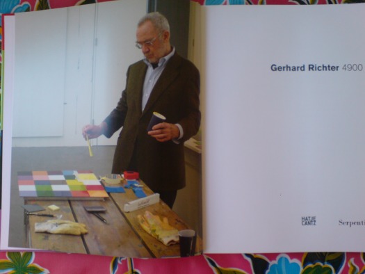
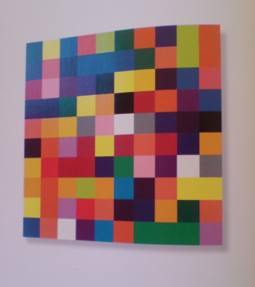
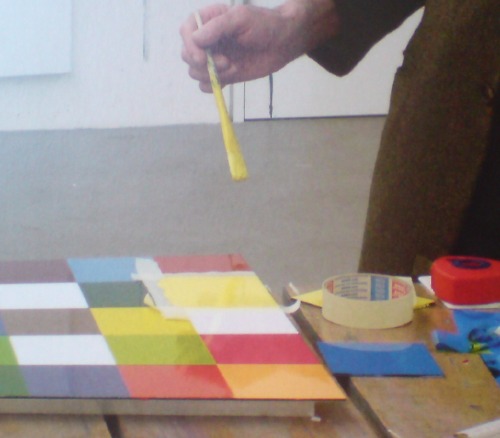
OK, now it’s been bugging me a bit, this catalogue photo of Gerhard Richter with a paint brush, ostensibly going to town on the work that is the lone subject of the book, 4900 Colours, which is comprised of randomly generated color grids on 196 enamel-on-aluminum panels.
First off, I think the explanation is correct that the painting in the photo is actually a study, a prototype, a concept, a related-but-distinct work. But as the first thing a reader sees upon opening the catalogue, the photo powerfully argues–or implies–that Richter painted the work we are about to see.
Which I am relieved to know he didn’t, remember? Mine is not one of those gripes about an artist painting his own paintings, a la Koons–who proudly doesn’t–or Hirst–who shamelessly doesn’t, except when he embarrassingly does. If any painter actually is a painter, it’s Gerhard Richter, amiright?
But Richter’s whole project seems based on the premise of not romanticizing the painter’s gesture or the artist’s subjectivity. It’s why he uses photographs as subject matter. And color charts. Mechanical. In the case of 4900 Colours, it’s why he outsourced the colors and placement to a randomizing computer program. [Not that he was remotely the first artist to deploy randomness or computer instructions in his work, of course.]
But wait, that’s not all! Here’s Benjamin Buchloh’s rather torturous description of the making of 4900 Colours:
Analogously to expanding the technological order of painting’s composition, Richter has also decided to dislodge the very process of manufacturing the painting from the hand to the mechanical devices of the spraygun handled by a technical collaborator. (The colour chips making up the paintings are individually spray-painted lacquer squares. Once solidified, they are inserted like elements of a mosaic into the prefixed structural arrangement. Each element consists of 25 coloured squares glued or taped onto the supporting Aludibond panel.) These decisions form the base for the permutability of the 4,900 colour chips and panels, since they were conceived from the start as a structure of permutation that could vary its own quantitative arrangements in 11 different presentational constellations.
[I know, I could have stopped before that last sentence, but that’d be like leaving a birthday party just as they’re bringing out the cake. Someone needs to endow an editorship at Harvard.]
Buchloch goes on to say Richter is not, like some artists [Moholy-Nagy, *cough* Judd], triumphantly declaiming “the superceding of painting’s artisanal past,” with his mechanicism; his is “a rather detached, not to say resigned, acceptance of the inevitable regimes of technological production.”
Sigh. Then if the facture-free production of 4,900 Colours is so intrinsic to both its “monotonous polychromy” and its–I love this–“almost Beckettian complacency in the exhaustion and hopelessness that technological progress without social transformation has inflicted on the subject,” why is the artist posing on with a brush as he gets ready to lay down the last stroke?
I think the explanation lies in the contradictory expectations that persist around Richter and his work. The Buchlohs among us want their Beckettian techno-anomie. The Joe Hage collector-fanboys among us want the intimacy of hanging around the studio and being present for The Moment of Creation. The gallerygoers among us want permission to just soak, guilt-free, in the beauty of a work. While the bookreaders and bloggers among us apparently just want to overanalyze a single photo in a single book on a single work.
One Of 4900 Colours
So my copy of the Serpentine Gallery’s catalogue for “Gerhard Richter: 4900 Colours“ finally came. This is the frontispiece, a photo by Joe Hage [who is turning up everywhere in Richterland now? He’s the collector who’s helping the artist with his evermore-info-intensive website. The staff of whom are also running the @gerhard-richter Twitter feed. He bought a half-interest in September, RIchter’s little painting of the World Trade Center, which he and the artist donated to MoMA. And now he’s hanging out with the artist as he puts the finishing touches on the 4900th colour? (It’s tough when you start out on a parenthetical, only to end up with it as your main thought. Makes me want to just leave off the last bracket.)]
Anyway, my points–besides, “notice how sharply Mr. Richter is dressed for work”–are two, and somewhat inter-related:
He is painting with a brush and taping his edges. Enamel on aludibond, a European brand of aluminum composite panel. Not being any kind of painter, I’ve been slightly obsessed with what Benjamin Buchloh regularly calls facture, the technique for application of the paint. And frankly, I’ve been wary/nervous/feelin’ like a cheater for thinking about taping my polygonal edges on my Dutch Landscape Paintings, for whatever reason.
So when I posted his 2001 quote to Michael Kimmelman this morning, before the book arrived, “Idiots can do what I do,” I didn’t think it would feel like such a personal invitation. “Thanks, I will!”
But now to the issue of Richter using tape and a brush. 4900 Colours is comprised of 196 48.5 sq. cm panels, each with 25 squares. That’s [hold on, doing the math] 4900 squares–ah, right–in 25 colors. The colors were arranged on each panel following a randomizing computer program.
4900 Colours has 11 “Versions,” which I believe refers to their possible configurations on the wall. Version I was all 196 in a single 49×49 square. The Serpentine showed Version II, 49 2×2 squares. And so on. The position and orientation of each panel is similarly determined in aleatory fashion. But as far as I understand it, there is only one set of 196 panels, not eleven. But even if there are not 1,960 additional panels that Richter had to paint with masking tape, a brush, a Dixie cup, and a fine tweed jacket, that’s still a helluva lot of squares to paint.
Why that surprises me? I guess I just saw the vast, pixilated scale of this work, and the industrial luster of the panels themselves, and I assumed he had it fabricated. That the paint was mechanically applied. That he just hit ENTER on his random colorgrid generator app and exported the data file to a shop. That they glued the acrylic paint chips to the Aludibond, so mechanical and repetitive, an idiot could do it. And then a couple of weeks later, a truck backs up to his studio with all those gorgeous crates. It appears this was not the case at all, and that is really pretty stunning.
[But surely, this is not standard operating procedure? Is that how massive, repetitive/mechanical images like the electron microscopic photo mural made for the atrium of the De Young, made, too? Entirely by Richter’s hand? Doesn’t he have people for that? He’s closing in on 80, I want him to have some people for that. See, here I am again with the parenthetical wrapup.
update: eh, bad example. The De Young’s Strontium is made of C-prints.
update update: with encouragment from @manbartlett, I checked all 196 panels, and I can’t find one with that color configuration. Which would mean it’s a one-off or a study or a prototype. Whew.
Buy Gerhard Richter: 4900 Colours for around $43 at amazon [amazon]
Previously: What I looked at today – Gerhard Richter
Richter On Idiots
A 2001 visit to Gerhard Richter’s studio, from when Michael Kimmelman used to write about art:
He puts a canvas on an easel at the end of the room and slides the photograph into a projector. The photo appears, projected onto the canvas, and Richter begins to trace it with a piece of charcoal and a ruler. Tracing each minute detail of a photograph, as he does, usually takes Richter a couple of hours. Then he is ready to paint.
”Idiots can do what I do,” he says, although of course he doesn’t really think so. ”When I first started to do this in the 60’s, people laughed. I clearly showed that I painted from photographs. It seemed so juvenile. The provocation was purely formal — that I was making paintings like photographs. Nobody asked about what was in the pictures. Nobody asked who my Aunt Marianne was. That didn’t seem to be the point.”
The point, among other things, was to distance himself from the clichés of artistic expression — all the spontaneous, fiery, warm and fuzzy modes of painting — so as to make people really look and not reflexively swoon. By using deliberately banal photographs, impersonally mimicked, he was doing the exact opposite of what painting was expected to do, not grabbing a viewer by the lapels but methodically copying an everyday image. In time, some of the pictures have come to look expressively painted, perceptions having changed, but making methodical copies was Richter’s intent.
An Artist Beyond Isms [nyt via john bailey]
As Seen On TV: Echo II Satelloon Inflation Video
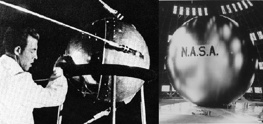
I’ve been searching for historical and primary source material for Project Echo, one of NASA’s earliest missions, which kicked into high gear in 1958. The giant, inflatable satelloons were functional–passive reflection communication satellites. That they were shaped just like Sputnik, only a hundred thousand times bigger, and were visible to the entire world with the naked eye, were, I’m sure, just a happy Space Race coincidence.
Echo I [above, right] was 100 feet in diameter and launched in 1960. Echo II was 135 feet, and launched in 1964. By then engineers at NASA’s Langley Research Center figured out that over-stressing the aluminized Mylar would help the giant sphere keep its shape, even if it deflated a little bit. [Echo I was found to have partially caved in a few months after launch.]
Film and TV cameras were included in the Echo II rocket–the film canisters were recovered in the ocean, but I haven’t found images from the footage. Video of the Echo II Inflation, however, is right here. Retired Goddard engineer Ron Muller screened it as part of a history of The Echo Project at a 2004 NASA conference on solar sails. It’s pretty awesome, right down to the end. [The avi is available for download at the conference page.]
I put a little film strip together after the jump, too:
Continue reading “As Seen On TV: Echo II Satelloon Inflation Video”
On The Existence Of Duchamp
I finally picked up a copy of the exhibition catalogue for the 1973-4 Duchamp retrospective organized by the Philadelphia Museum and the Museum of Modern Art. Here is the end of Hilton Kramer’s non-review of the show for the New York Times:
Miss d’Harnoncourt and Mr. McShine have, I must say, done a brilliant job in assembling the visual evidence and in marshaling an elaborate elucidation of its alleged meanings (in a massive volume of essays not yet published). To understand the history of modern art in any comprehensive way, one must see this exhibition, and to grasp the nature of the ideology that has dominated an important part of that history one must read the essays brought together in this forthcoming volume. But one must be prepared to examine a cadaver, and to read through a literature that assumes with absolute confidence that the subject is immortal. One must be prepared, on other words, for the greatest Duchampian joke of all.
I’m starting to think, I must say, that Hilton Kramer did not much care for Marcel Duchamp.
The Eternal Sunshine Of Souren Melikian’s Spotless Mind
I was going to call it a guilty pleasure, but entering Souren Melikian’s reality distortion field every weekend is clearly a vice.
Melikian covers the art world for the International Herald Tribune–which, for him, begins and ends at the auction house–and his byline always sits atop the upper right-hand corner of the NYTimes.com Arts page.
Though his topics are tied to the vagaries of the sales calendar–one week it’s Chinese jades in London, another contemporary art, this week it was Old Masters and French landscapes in New York–Melikian’s soaring optimism is untethered by context, history, inconvenient facts, or actual reporting. While he may actually attend some of the sales he covers–he may have his own desk at Drouot, for all I know–he could just as easily be writing about flipping through the Christie’s catalogue. The Pat Kiernan Reads The Morning Papers To You of the art world.
Whatever his technique, though, and no matter how poor Melikian’s subject is always, always the same: the booming market is full of connoisseurs, ready to throw caution to the wind in pursuit of an ever-dwindling inventory of masterpieces. Here’s the setup for today’s column, titled “Old Masters Set Off Intense Bidding”:
Buyers pounced on Old Master paintings this week with a determination that has not been witnessed at auction in a long time.
Two reasons combined to account for what felt at times like a rage to buy. The gloom induced by the recession is slowly receding and awareness that supplies are drying up is spreading fast.
That’s wonderful! Except that the next sentence–and most of the rest of the sales Melikian recounts–completely belie that upbeat thesis. Here’s the next sentence:
The scarcity of goods was actually made painfully obvious at Christie’s on Wednesday. The need to fill their catalogues with a minimum number of lots had apparently persuaded the departmental heads to accept too many second division works and to estimate them at levels more appropriate for gems.
Oh, you mean no good works, unrealistic estimates, and half the lots failing to sell. As for those pouncing bidders: “A single $6 million bid came in and the auctioneer wisely knocked down the Goltzius…” and “Where one might have expected competition to break out, only one hand went up.”
You can literally click on any of his articles and find a hilarious gem, but here are a couple of choice Melikian Musings from last fall’s contemporary sales, which, we were told, “revealed for the first time a deep interest in works on paper”:
The auction market is booming and, when it comes to contemporary art, it is charging on at an accelerated pace, as it did before the financial turmoil broke out in the autumn of 2008.
This week, those attending Christie’s and Sotheby’s evening sessions traditionally reserved for the most important works might have briefly thought that there never was a recession. No awareness of it appeared to linger in the bidders’ minds as they ran up paintings, drawings and sundry three-dimensional works to three times the estimate, or more…
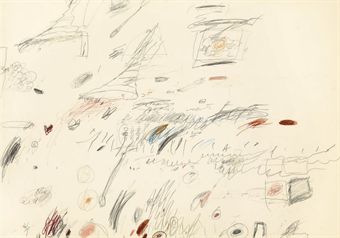
Other large prices paid for works on paper confirmed that a new pattern was emerging. A typical exercise in random scribbling by Cy Twombly made $722,500, nearly double the high estimate. The sketch does not markedly differ from the nascent bouts of creativity of 4-year-olds expressing pencil in hand their joie de vivre. Interestingly, this similarity to early childhood artistic endeavor has no bearing on the price. Visual aesthetics are clearly not among the primary considerations driving contemporary art buyers.
Contemporary art loves you too, Souren. In my mind, I picture Melikian at a Paris salesroom, indistinguishable, in his double-breasted suit, combover, and excruciatingly coordinated tie-and-pocket-square combination, from the affectedly elegant antiquities dealers he’s chatting up. In other words, he embodies the International Herald Tribune of a certain age, the age before the Times gutted it, when the paper still mattered, when it served as the primary news source and the paper of record for a well-heeled, English-speaking, international touristocratic diaspora. No matter how bleak the news from a couple of days ago was, I’m sure Melikian’s perennially sunny shopping outlook held equal appeal for the Tribune’s antique-hunting readers and its antique-peddling advertisers.
So sure, I read him for the pointless outrage, but I also read him for the nostalgia. Just as they aren’t making any new Old Masters, they sure as hell aren’t making any new Souren Melikians.
In Your Face, Detroit!
The nightly LED show on the facade of the new Motor City Casino in Detroit [via sweet juniper]
Multiverse a now-permanent installation by Leo Villareal at the National Gallery of Art:
I think it’s clear that when it comes to this sort of thing, DC clearly has Detroit beat!
That’s What She Said
So I went to the Archives of American Art at the Smithsonian this morning to do a little research on the Washington Gallery of Modern Art. Unfortunately, most of the WGMA’s archives are still at the Corcoran, which merged [ahem, subsumed or salvaged?] with the WGMA to save it in the late 60s.
Still, I did find another account of “the Gallery’s Wesselmann Incident,” as WGMA Chairman Julian Einenstein put it. And though it differs from the version Mary Meyer biographer Nina Burleigh heard from Alice Denney, it doesn’t necessarily contradict it.
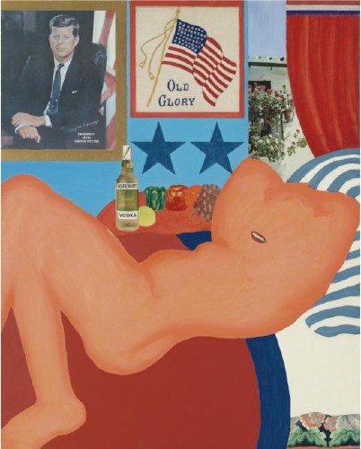
In May 1963, Einenstein was told by James Truitt–yes, husband of, and a Gallery trustee, and someone who was very involved in its creation–that Art News would be running an editorial about the WGMA rejecting Wesselmann’s Great American Nude #21, above.
It turns out they were just running a letter from the artist, complaining about the situation, but before they knew that, Einenstein composed a letter to Art News editor Thomas Hess, giving him “the facts.” The letter was apparently never sent. [I’m not quoting at length here because I didn’t really pay attention to what restrictions I agreed to about publishing Archive material. The kid was getting a little antsy in her stroller, and I didn’t want to wear out her welcome.]
The whole thing went down in April. Einenstein framed the dispute as the result of “internecine warfare” between WGMA director Adelyn Breeskin, and the assistant director, Alice Denney, who was curating the show. Breeskin reportedly thought the painting of a nude figure with JFK was “in poor taste,” and rejected it. Einenstein said it was Breeskin’s decision to make.
Denney sought to reverse the decision “by both subtle and direct means. The pressure which she was able to apply was considerable,” leading Einenstein to call a full Board meeting. Eleven Board members then voted, not on whether the painting was appropriate or not, but on whether Breeskin had the authority to make the decision. They all affirmed she did, and #21 was out.
You can see how this version could mesh with Burleigh’s [which is Denney’s]. And it’s easy to imagine Einenstein’s description of Denney’s “considerable” pressure including getting Meyer to take the issue straight to JFK himself. What Einenstein didn’t mention, though, was that Breeskin had already told the Board she would be resigning. The folders for the months before and after the “Wesselmann Incident” are full of Einenstein’s letters soliciting recommendations for a replacement director.
Whether the Board was staying supportive of its director’s authority, even as she was on her way out, or whether some Trustees didn’t want the painting, but didn’t mind having Breeskin’s fingerprints on the knife, is still not clear. But I’m tempted to just say, “Forget it, Jake, It’s Washington.”
Danish Moisture Farmers
Ten years, people. That’s how long it took me to spot this. Ten. Years. What can I say, I got no excuse. I let you down.
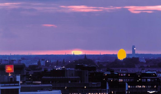
Olafur Eliasson, Double Sunset, 1999 [olafureliasson.net]
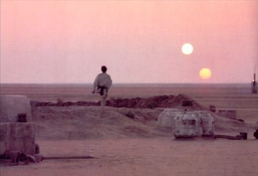
While I’m on the topic, my friend John Powers has been killing it with his new blog Star Wars Modern.
You may know him from such web awesomeness as Star Wars: A New Heap, which he published on Triple Canopy last year. Clearly, there’s more where that came from.
Nice Rack! R.H. Quaytman On MoMA/PS1’s Blog
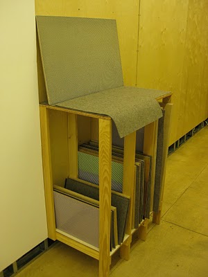
So jealous. MoMA bought R.H. Quaytman’s awesome little storage rack of paintings, Iamb: Chapter 12, Excerpts and Exceptions, with Painting Rack, which the artist filled over the course of eight years, and showed in 2009 at Miguel Abreu. [Abreu, whose whole program is pretty much en fuego, had two of my favorite shows last year: Quaytman’s and Liz Deschenes.]
Before that, she showed a storage rack full of paintings at Orchard [I miss them], in 2008, which is where Anaba got this photo. Then, it–or the show, anyway, was called Chapter 10, Ark, and it had more paintings in it, and you could pull them out like books. These racks are the most significant works of a blindingly smart artist whose paintings seem designed to actively thwart significance, at least individually.
P&S Curatorial Assistant Paulina Pobocha has a very nice writeup of it at Inside/Out, MoMA/PS1’s forum-style blog.
Few people know it, unfortunately, but MoMA was the first museum anywhere to have a blog. Back in 2004, while I was co-chair of the Jr. Associates, we pushed hard for over a year to get permission to start a blog for our group’s education and fundraising activities. There were even raging debates over whether we could call it a “blog.” [No, it turned out.] It went well while we had a Museum employee dedicated to it, but when she went to grad school, it kind of fizzled.
It’s good to see they’ve finally got some sweet blog momentum going.
R.H. Quaytman’s Storage Rack: An Archive of Images and Associations [moma.org]