

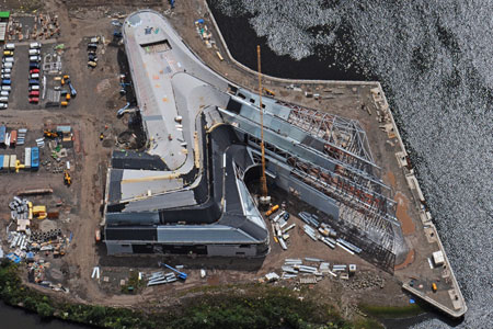
The BBC has nice footage of the mockup for Michael Arad’s World Trade Center Memorial waterfalls, which was constructed in Brooklyn last week. My impression: unexpectedly Olafur-esque.
Also, the [engineer?] guy saying it is to be an “Eternal Waterfall” that never gets turned off. Unless it gets cold or something. File that away for after the Memorial’s dedicated, when we will be able to see/hear if they actually turn the Eternal Waterfall on and off during operating hours, which will seem like the logical/inevitable thing to do.
9/11 waterfall design unveiled [bbc]
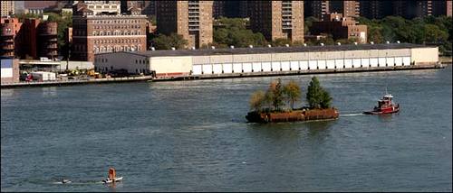
The East River School
Zaha Hadid’s Torqued Sheds
This is really a beauty of a Zaha Hadid takedown of her firm’s riverfront museum in Glasgow–and so much more.
I came for the roof-as-nth-facade condemnation:
And this futility just deepens… the building is an example of ‘Google Earth Urbanism’. That is to say; all this complexity can only really be seen from directly above. Without a spare helicopter, all you are really left with is the façade, which is marginally more interesting than your typical shed, and the blank slug-like form of the ‘swooshing’ S-shape, which meets the ground with all the elegance of a squished gastropod.
and stayed for the thorough routing of turn-of-the-century Stylist Modernism:
He says the competition-winning concept they had to work with was a system of ridges and valleys, which had to be translated into a structure.
Read that again.
So this is what has happened to the Modernists’ quest for a synthesis of the Engineer and the Architect in the last 80 years. Absolute disassociation. The architect wins the competition with a shape, which the brains then have to spend time figuring out how to solve. This isn’t exactly a full circle (the negation of the negation blah blah), but this is a very strange cultural position to be in, a truly postmodernist one. Now of course the Modernists’ quest for synthesis was vulgar and naïve, and of course this quasi-dialectical teleological view of the world and its cultural expressions had to be surpassed (ha!), but is this really where we’ve ended up, nearly forty years after Pruitt-Igoe and Complexity and Contradiction? The best architects in the world as decorators, as stylists? And what’s more – all that structure, all that difficulty, all of the real work of the building will be completely clad, both inside and out, expressed only as shape.
Zaha Hadid Architects – Purveyors of Architectural Melancholy [youyouidiot via things magazine]
Everyone’s An Earth Artist: Lamanites
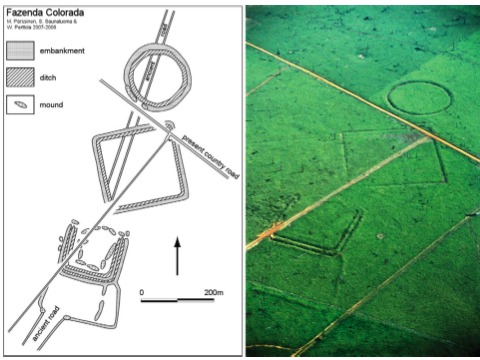
I guess if God can appear to a backwoods New York farmboy, send an angel to groom him for four years, and then command him to translate a sheaf of golden plates into the Book of Mormon, He can also guide Robert Smithson to build the Spiral Jetty in Utah; lure me out to visit it within a couple of months of its reappearance in 1994; and start me a-bloggin’ years ago about Earth Art and Google Maps; so that, when it’s on Discovery Channel, there’ll be someone to point out that the Pre-Columbian geometric earthworks in western Amazonia are–duh–Lamanite-era copies of Nephite-style forts.
But since that would require paying even a little attention or credence to the archaeology-based school of Book of Mormon apologists I’ll pass.
It’s enough for me to think of the headaches these earthworks will give to Michael Heizer.
‘Astonishing’ Ancient Amazon Civilization Discovery Detailed [discovery.com]
Pre-Columbian geometric earthworks in the upper Purús: a complex society in western Amazonia [antiquity.ac.uk]
Everyone’s An Earth Artist: Dolphins
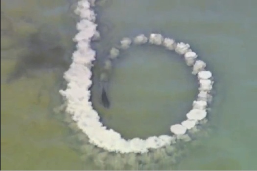
I know dolphins are supposed to be super-intelligent and all, BUT. While this detournement of Smithson’s Spiral Jetty executed from rapidly dissipating, tail-agitated mud is passably performative, as a critique of entropy, it’s a little too pat and predictable. Back to the studio, dolphin!
Life: Bottlenose dolphins mud-ring feeding [youtube via, uhh..]
On Tom Wesselmann And The DC Dither
When DC art lecturer and blogger John Anderson emailed to ask if I’d heard about the scandal surrounding the Washington Gallery of Modern Art and the Tom Wesselmann, I was like, “Tom Wesselmann scandal? Do tell!”
He pointed me to Nina Burleigh’s account of it in A Very Private Woman, and now that I’ve read it, I’m kind of confused.
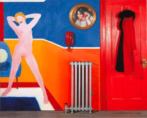
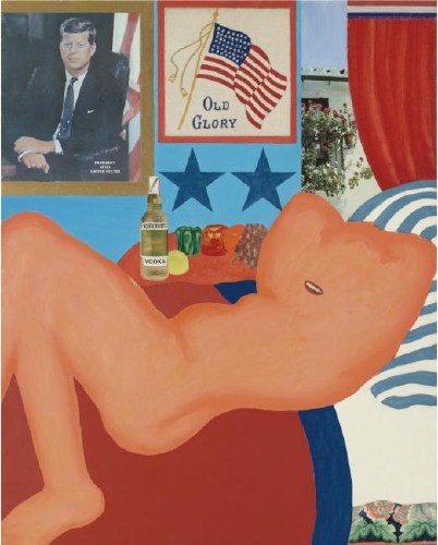
According to Burleigh, the problem involved Wesselmann’s Great American Nude #44, 1963 [top], which was included in Alice Denney’s “The Popular Image Exhibition” in April 1963. Several of the Gallery’s trustees previewed the show and “questioned the propriety of the collage” which included “a framed portrait of the president of the United States with the silhouetted nude body of a movie star,” who was interpreted to be the recently deceased Marilyn Monroe:
[The trustees] called for a personal meeting with Alice Denney. They demanded that she remove Tom Wesselmann’s Great American Nude No. 44 from the show. “It was ironic, because we all knew what was going on at the White House,” said Denney’s assistant at the time, Eleanor McPeck. “Kay Graham and Marie Harriman and some others insisted this picture be taken down and taken out of the show. The board was very conservative. They were simply not prepared for it.”
Alice Denney objected, but the board members were the museum’s financial lifeline. Reluctantly, the curator prepared to take the Wesselmann down. But behind the scenes the matter had come to presidential attention. Mary Meyer, by then one of the president’s occasional lovers and a confidante, told him about the little art imbroglio. She described the Wesselman collage with the Monroe nude beneath his official portrait. She told him about the ladies of the gallery board, all in a dither. The image of grande dames such as Marie Harriman scrambling to protect his reputation was too funny. The president laughed at the story and told Mary to tell the little Gallery of Modern Art that he wanted the Wesselmann to hang. The collage stayed in the show. [pp. 182-3, footnote: Alice Denney, Eleanor McPeck]
Which is awesome and hilarious, and it’s become a part of Wesselmann’s own story, too. But. That nude in Great American Nude #44, modeled after the artist’s wife Claire, is hardly Marilyn Monroe. And with that actual radiator, actual coat, and actual telephone that was wired to ring every six minutes, this thing is more a multimedia assemblage than a “collage.”
And as for JFK, I know JFK. JFK was a friend of mine. And you, head of a woman cropped from a Renoir painting, are no JFK.
All Burliegh’s descriptions of supposedly scandalous elements–the sitting president leering at a reclining nude–actually match up to an earlier Wesselmann, Great American Nude #21, painted in 1961 [below]. But that nude looks even less like Monroe than #44, who, you could at least imagine just had her dress blown off by a steam grate.
As the luck of the market would have it, both of these Wesselmanns have been resold in the last few years. Great American Nude #44 sold at Christie’s in 2002 for $944,500. “The Popular Image” is listed at the top of its exhibition history. Then in 2007, the Abrams publishing family sold Great American Nude #21 at Sotheby’s for $4.1 million. But there’s no mention of “The Popular Image” at all. After a 1962 exhibit at Tanager, Harry Abrams bought the picture in 1963 and didn’t show it publicly until 1976.
A press release for the Sotheby’s sale [pdf] boasted about #21‘s controversy:
Demonstrating the potent power of Wesselmann’s imagery, the work was censored from a 1963 exhibition at the Washington Gallery of Modern Art reportedly because the image of the President and a nude appeared together, perhaps with the Marilyn-like lips, a loaded reference to Kennedy, and Monroe, who was recently deceased. Wesselmann wrote a letter to the editor of Art News in the summer of 1963 against the museum’s decision to censor the work.
So what really happened? Was #21 in “The Popular Image” show, only to get pulled after all? Did word of JFK’s pillowtalk intervention come too late, or only after the fact? Or was #21 the image bandied about when deciding on Wesselmann’s inclusion in the show, but it was never at risk of actually making it in? And was #44 ever at risk of being pulled from the show? The only thing I know for sure is that despite some rock-solid sources, the Washington Post never mentioned the issue–or Wesselmann’s participation in the show–at all.
Mary Meyer, Proto-Minimalist?
I’ve been poking around to find examples of the artwork of Mary Pinchot Meyer, the Washington DC painter who was connected romantically to both Ken Noland and JFK. When her work is discussed at all, she’s generally been associated with the Washington Color School, typified by Noland’s and Morris Louis’s saturation techniques using liquid paint on unprimed canvas.
But that’s clearly not what’s going on in this work, Half Light, from 1964, the year she died. It is crisply painted geometric abstraction. If it resembles anything, it’s proto-Hard Edge-style Minimalism.
[2019 update IT IS NOT. According to Mollie Salah’s May 2019 lecture at the National Gallery of Art, Meyer did in fact use the archetypal WCS staining technique, figuring out how to control the edge of her paint. We need to see more even more!]
“This looks like that” is a pretty feeble art critical tool, I know, but it’s still fascinating to consider Meyer’s work when looking at, say, Carmen Herrera’s Rondo, which was made a year later in New York, and which entered the Hirshhorn’s collection in 2007, only after Herrera’s incredibly prescient-seeming work was “discovered” by the market in 2004.
Whatever the circumstances, contexts or differences between these two artists’ works, Herrera’s remarkable story serves as a reminder of just how incomplete our generally accepted notions of art history are, even–or especially–for the very recent past. And it also throws deserved doubt on the arbitrariness of amateur vs. professional, and successful vs failed when it comes to artistic production.
It’s impossible to say from one painting, of course, but do we know that Mary Meyer should not be considered one of most accomplished painters ever to work in Washington DC?
Half Light, 1964, donated in 1976 to the Smithsonian American Art Museum by Meyers’ sons [americanart.si.edu]
Rondo, 1965, Carmen Herrera, Hirshhorn Museum purchase, 2007 [hirshhorn.si.edu]
The Washington Wives School
You start pulling on a thread, and you never quite know what starts to come out. For some great stories about the Washington Gallery for Modern Art and “The Popular Image Exhibition,” reader JA suggested, I should really check out Nina Burleigh’s 1998 book, A Very Private Woman: The Life and Unsolved Murder of Presidential Mistress Mary Meyer. So I did, and wow. No kidding. But I’ll get to that.
In addition to conducting an affair with JFK and getting killed soon after his assassination, Mary Pinchot Meyer was also one of Anne Truitt’s best friends, Kenneth Noland’s lover for a fairly extended period, and a very serious painter herself.
As Burleigh describes it, Georgetown and DC’s insular, faux-hemian postwar art community–including the members of the nascent Washington Color School–provided the havens for Meyer’s emotionally rocky life. [There are no images in the book to support it, but Burleigh repeatedly hints Meyer’s own painting was central, if not formative, in the development of the Color Field School generally, and in Ken Noland’s adoption of his signature bulls-eye specifically. Timing and other people seem to disagree with this idea, but I can’t immediately find any images of Meyer’s work. (see new post above) I’ll have to come back to this.]
New art, whether it was Abstract Expressionism in the 50s or Pop Art in the 60s, was met with criticism and suspicion from even the most politically liberal of Washington’s fundamentally conservative, power-anxious, ruling class. And art and culture were strictly gendered at a deep level almost unimaginable today–or maybe not.
A couple of brief excerpts really captured the character and challenges of Truitt’s environment in a very unfamiliar way. For me it makes her creative and career accomplishments all the more remarkable to see more of the very specific local culture in which she was working.
Often the main ties between art and power were through the wives, many of whom either sat on gallery boards or were amateur artists themselves. For at time it seemed every other wife in Georgetown was either taking painting lessons or setting herself up in a studio, though most remained firmly in the dilettante class. Presidential candidate Adlai Stevenson was linked romantically with one of the Washington women who painted, Sarita Peet, who went on to marry artist Robert gates, one of Mary [Meyers’] teachers at American University. Undersecretary of State Dean Acheson’s wife was a painter. Helen Stern, wife of lawyer Philip Stern and one of Mary’s closest friends, painted. The wife of Estes Kefauver, Nancy Pigot Kefauver, was a painter. [she was the one tapped by the Kennedys to create the Art In Embassies program. -ed.] Tony Pinchot Bradlee, Ben’s wife, eventually had her own show of sculptures. V.V. Rankine, the wife of a British speechwriter, shared studio space with Mary for a time. In a few years, Mary herself became one of the links between Washington artists and power politics.
Portraitist Marian Cannon Schlesinger, then married to Arthur Schlesinger, recalled that most Georgetowners were not all that interested in art but liked having artists in their midst to buttress their cultivated sensibility…
Marital ties between politics and the arts brought support to real artists who were struggling without money or personal connections. Having a cabinet secretary as a guest on the opening night of one’s show was all to the good. Better yet, the women’s husbands often had the money to buy the work…
Among serious artists, the capital was ruefully regarded as a backwater. New York was where they’d rather be. Washington did not provide much of a market for modern art, recalled Alice Denney, who handled the work of many of the big New York abstract artists in Washington. “I couldn’t sell a Jasper Johns then.” [p.154-5]
Whaddya know, the assistant director of the WGMA and the curator of “The Popular Image” had previously been a dealer. [Founded Jefferson Place Gallery, in fact, the Deitch Projects of its time and place.]
DC’s spirit of suspicion, amateurism and of dismissing artmaking as a wifely diversion reached a zenith/nadir in an event that sounds so much like a script for a Paul McCarthy video, I want to see it re-enacted:
By the late 1950s modern art was not regarded as subversive; rather it was just silly, or at best baffling. In 1961 the Washington wives of a group of scientists and diplomats won fifteen minutes of fame [sic] when they decided to become abstract artists during their regular bridge games. Those who took breaks from the card tables went into the kitchen and splattered canvases with kitchen items–flour, syrup, ketchup, house paint, and anything else that would stick. After a few months they showed their “paintings” to their husbands, who found them amusing, and to a few Washington galleries, who showed interest and offered to buy them. Then they broke the story to the Washington Evening Star, which covered their stunt with tongue-in-cheek glee. “An Artistic Slam,” said the headline. “Ten suburban bridge club women have pulled a fast one on modern art…Among them they have 37 children.” [p155-6]
Is it really that far off from Clement Greenberg’s description of Anne Truitt a couple of years later in Vogue?
update: Thanks to DC arts veteran and expert John Anderson for insights and corrections.
Anyone Tell Me About Vern Blosum?
 As I’ve been digging into the history of modernism and contemporary art in Washington DC, one of the most prominent events I keep coming back to is “The Popular Image” and its performance companion, the “Pop Art Festival.”
Organized Alice Denney in the Spring of 1963 for the fledgling Washington Gallery of Modern Art, “The Popular Image Exhibition” was a very early exhibition of Pop Art, coming at the same time as the Guggenheim’s Pop/Object show [which, unlike the DC show, traveled around the US], and less than six months after Walter Hopps’ seminal “New Paintings of Common Objects” show in Pasadena. Alan Solomon, who wrote an essay for the DC catalogue, then reconfigured the show a bit that fall for the ICA in London [1], where it introduced the US variant of Pop to Europe.
I’m most fascinated with the Pop Art Festival, which included a Happening by Claes Oldenburg designed for a DuPont Circle dry cleaners; a sprawling Judson Church/Yvonne Rainer/Kluver/Who knows who else dance performance in an Adams Morgan rollerskating rink; and an opening night tape recording performance by renowned Pop Artist John Cage. I know, right? But let’s wait on that. There’s a mystery from the show first.
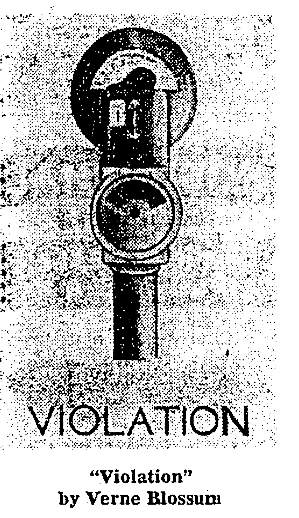
A Washington Post preview from April 14, 1963 titled, “Eruption of Pop Art Slated for This Week,” mentions an artist I’ve never heard of, and who I can’t find mentioned in any other reporting or reviews of the show: Verne Blossum.
“Verne Blossum, who is inspired by parking meters with red ‘violation’ flags,” is mentioned between Roy Lichtenstein, “who likes comic strips,” and Jim Dine, “who attaches a lawnmower to a canvas and paints around it.” Blossum’s painting [above], is reproduced alongside Large Campbell Peeling Can by Andy Warhol. So that’s a pretty nice grouping. And yet.
And yet, they spelled his name wrong, for one thing. It’s Vern Blosum.
In 1967, the NY Times reported that his parking meter paintings series, titled “Time Expired,” was the subject of questions at a lunchtime docent tour at MoMA. “It’s a series of time paintings culminating in a giant expiration,” he replied. But no work by Blosum appears in the Museum’s collection today.
In his Smithsonian archives interview in1972, Larry Aldrich also mentioned buying Blosum’s work, but none is listed in the Aldrich Museum’s collection database, either.
I mean, it sure seems like the guy was doing something right in the 1960s; his almost complete [apparent] disappearance–or at least his delayed re-indexing online–makes me want to find out more.
UPDATE: Woohoo, I’m hearing details from a couple of people, and am following some hot leads. This has the markings of a great story. Stay tuned.
[1] In his May 2009 dissertation at Case Western, titled “Just what was it that made US Art so Different, so appealing?” [pdf] Frank G. Spicer III notes that Blosum, George Brecht, and Robert Watts were in the DC incarnation of “The Popular Image,” but were not shown in London.
Never Mind! Bruce High Quality Foundation Made The Gate, But Not The Article
A little while back, when I realized that Bruce High Quality Foundation, the ambiguous, anonymous art collective and The New Hotness, were behind The Gate, I took them at their word and began to question whether what we knew or assumed about the project was true, misinformation, or both. As they put it,
When there are moments of clear misinformation, those are generally used to make people be more conscious of the potential that it’s all made up. They have a function so that you always know it has been written by someone somewhere.
Specifically, I wondered if the fantastic and seemingly serendipitous documentation of The Gate and the front page NY Times article by Randy Kennedy that followed were, if not fabricated, then at least planted, managed, manipulated or produced in some way by BHQF.
I should say that at the time, I was also writing arts features for the NYT. Though I don’t know Randy Kennedy personally, I have a huge admiration for his work. My questioning of how the The Gate story was presented should in no way be construed as casting doubt on Kennedy.
But just imagine a publicist were involved. And/or that the Brooklyn designers who photographed and witnessed The Gate were friends or even enlisted participants of BHQF members. The contours and details of Kennedy’s article could be entirely accurate, and from a journalistic standpoint, he’d be totally in the clear.
What would change is the perception and interpretation of BHQF and their work. What if Bruce–who, at the time, refused even to identify themselves as BHQF–had a publicist who helped them get their project into the NY Times? It’s as far-reaching as it is far-fetched.
More plausible, though, would be the idea of setting up not just the execution of The Gate, but its publicity. The Gate‘s $2,000 budget was a challenge to the conflation of budget and value in public art. Christo and Jeanne-Claude’s Gates had been loudly–and, I argued, inaccurately–presented as a $20 million “gift” of the artists to the public. Robert Smithson’s widow Nancy Holt allowed his scruffy Floating Island to be realized posthumously with a $250,000 budget, which organizers touted as the “anti-Gates.”
This was the context for BHQF’s brilliant, absurdist, and flagrantly shoestring idea. But the question seems obvious, even intrinsic: if a floating gate chases a floating park and the Times doesn’t cover it, is it public art?
So anyway, I contacted the two designers who were the Times’ sources for the The Gate article, and I asked them more about their experience as BHQF’s first audience. Basically, it all checks out. Here are some excerpts from their email accounts:
Continue reading “Never Mind! Bruce High Quality Foundation Made The Gate, But Not The Article“
Mind The Storr: On Gerhard Richter’s September
Seriously, I could fall into Gerhard Richter’s website and not surface for days. There’s just so much stuff. And related stuff. And meta-stuff. Auction histories for specific works? Cross-referenced Atlas pages? It just goes on and on and on.
Recently, two interviews with Rob Storr were added: one is about Richter’s Cage Paintings, which Storr showed at the Venice Biennale in 2007, and which are now at the Tate. [It’s a comically great business model to make and sell giant series of paintings intact instead of slogging it out one by one.] There’s a lot of discussion and still photos of the making of palette knife & squeegee process for the abstract pictures–I always thought Richter only painted them on a table, but there he is on his ladder. And Storr has a thoroughly enjoyable smackdown of the fiercely “deterministic” Rosalind Krauss’s connection of Richter and Johns. I’d pay cash money to see that panel discussion.
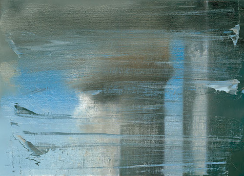
Same day/same outfit is another video, Storr is in the office at Marian Goodman, discussing September, the small monitor/TV screen-sized painting of the World Trade Center attack that opened Richter’s latest show at the gallery. [Yeah, I know it was actually a photo of the painting.]
It’s funny, I’d conveniently forgotten how central war, destruction, civilian casualties, and terrorism have been to Ricther’s work and his experience. How does that happen? Anyway, it’s interesting stuff.
Gerhard-Richter.com [gerhard-richter.com]
German Landscape Paintings? Triangulation X Gerhard Richter
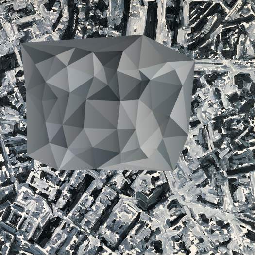
Now that I can make any map or image into a color-averaged, triangular camo abstract wonderscape, I am in big trouble.
Triangulation – web interface [triangulation.jgate.de via andy]
original image: Stadtbild PL, 1970, Gerhard Richter [gerhard-richter.com]
IKEA X Michelangelo Antonioni Mashup: The IVAR Dolly
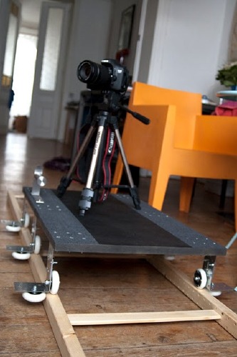
So awesome. With a few skateboard wheels, some L-brackets, and some grip tape, Brussels-based videographer VJ Aalto turned the ladder-shaped side bracket from Ivar, my Ikea component system of choice, into a EUR18 dolly track.
The great-looking test videos are on Vimeo, and the complete parts list is
in the comments on Ikeahacker.
EOS 7D + DIY dolly / 1st indoor test from Aalto on Vimeo.
Hey, look, next to the window, another bookshelf waiting to be sacrificed! Run it from the ceiling for a Professione: reporter remake!
Ivar loves dolly [ikeahacker via @MatthewLangley]
A Still More Glorious Daybreak Awaits

I’ve been telling people in person all about Lucy Raven’s multimedia tour of Daybreak, Utah since it came out last fall; it’s way past time that I mention it here. Daybreak is a massive real estate development strategy disguised as an advanced, master-planned, Community of The Future. It’s Kennecott Copper’s parent company’s venture to maximize the value of tens of thousands of acres of land they’ve accumulated–and as often as not, filled or flooded or contaminated with the remnants of their century-old, open-pit mining operation–on the southwest side of the Salt Lake Valley. It’s a 70-year plan to build a 100,000 acre suburb.
Or it was. Or is. Or was. Raven’s text, photos, and interviews at Triple Canopy caught this industrial-scale city planning operation last year, just after the real estate market went off a cliff. To overextend the metaphor, Daybreak is lying on the ground, twitching, and not quite realizing what happened to it.
Anyway, the part I love to quote is Kennecott Land’s Myranda Baxter explaining Daybreak’s “village centers”, warmed over New Urbanist retail offerings for “all your basic daily needs”:
In other words, there’ll be a medium-sized grocery store, all your mom-and-pop restaurants and little cafes, bakeries, dry cleaner, hair dresser–but on a small. scale. There are offices above the shopping areas, and the parking, as you’ll notice, very little parking on the streets, because it’s all tucked. behind the buildings. So it becomes a very pedestrian-friendly area and not a strip mall.
One funny incident was, the last time the commercial director came here he said, “I love all the people you send my way, who are interested in opening businesses, however. If there are any more tanning salons–[laughs]–I have about 30 tanning salons that want to open a business here, and I don’t need any more applications.”
Daybreak, by Lucy Raven, Issue 7 [canopycanopycanopy.com]
On Abstraction And The Ready-Made Gesture
As someone who backed into a project last September of making paintings of readymade abstraction, I was nervous, stoked, and inspired by “Besides, With, Against, and Yet: Abstraction and the Ready-Made Gesture,” the group show curated by Debra Singer which just closed yesterday at The Kitchen.
I feel like I have no business making paintings, frankly, and no matter how fantastic I find the Dutch Landscape images I’m using, I can’t help but wonder about the soundness of my basic idea. That said, it’s invigorating to see, just as I started poking deeper into the techniques and drivers of various strains of abstract painting, an abstraction show full of artists I really like.
Colby Chamberlain articulates the show’s ambivalence quite nicely in his Artforum review:
Thus merged, abstraction and the readymade risk canceling out each other’s legacies. The secondhand status of a readymade sunders abstraction from its aspirational and emotive content, whereas the uninflected appearance of an abstract painting curbs the readymade’s penchant for mischief. (To this day, nothing accommodates the definition of “art” so comfortably as stretched canvas.)
Add photography to the mix, and it only gets more complicated. I think of an artist like Liz Deschenes whose work regularly and rigorously addresses painting and abstraction at the same time it pushes the understanding of the photographic subject and process. And then there’s the whole OG school of found abstractionists like Aaron Siskind. And Richter. I still can’t help but think that readymade and abstraction are just two of the many balls he keeps in the air as he paints. Anyway, I’m rambling now. Great show at a great space with a beautiful website that’s as tauntingly useless as a diamond ring encased in a paperweight.
Lindsey Adelman’s Autoprogettazione Chandelier
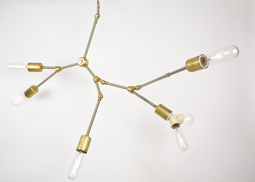
I’ve recently stepped up my search for more examples of objects that resonate with Enzo Mari’s autoprogettazione model: artists and designers who offer not just the non-authorial conceit of “made by anyone,” but “permission to make it yourself.” It’s a surprisingly fine filter that keeps a lot of nominally instruction-based pieces off the list.
Anyway, I’ll make an open plea later. Right now, though, I’ll just give NY designer Lindsey Adelman a huge high five for publishing her “You Make It” chandelier. Adelman’s main practice is creating intensely produced chandeliers and lighting made from custom, modular hardware systems and handblown glass. They’re several thousands of dollars, and it shows.
Which makes it remarkably easy for Adelman to be so generous with the level of detail she offers on technique and parts sourcing for a $120 You Make It option; despite the beauty and conceptual similarity, there is no mistaking the one product for the other.
You Make It Chandelier [lindseyadelman.com via @ianadelman]
Related: Enzo Mari X IKEA mashup, ch. 4: Finish Fetish