
Bell Labs engineer Billy Kluver helped design photocells so that dancers triggered lights and sounds and films [with images by Stan VanDerBeek and Nam June Paik.] According to
media art net, this excerpt was from a 1965 TV performance of the work in Hamburg. [mediaartnet.org]
Related: Merce Cunningham video at Ubu
A Closer Look At Tauba Auerbach’s Pixels
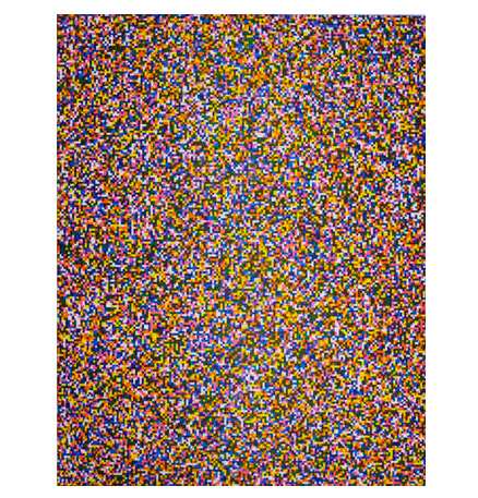
I’d seen Tauba Auerbach’s text- or letter-based paintings before, but I didn’t know about her prints. She did a couple of pairs of prints using pixels last year with Berkeley-based Paulson Press. There’s a black and white set, 50/50, where exactly 50% of the pixels shown are white and 50% are black, and then there’s an 8-color set called A Half Times A Half Times A Half.
Without knowing how or why they were made, I was first drawn to the different resolutions, which she calls “fine” [above] and “coarse” [below]. [And the color ones obviously remind me of Gerhard Richter’s Farben painting series from the early 1970s, which became the basis for his stained glass window in the Koln Cathedral.]
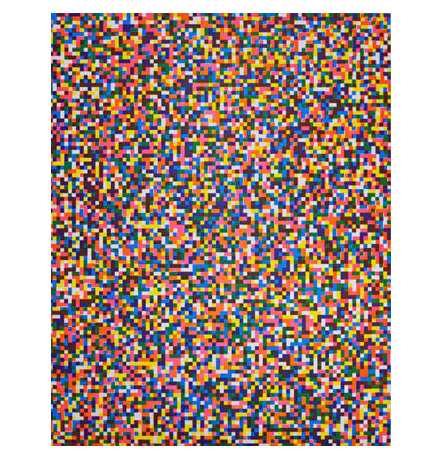
Then I realize they’re aquatints, etchings–Paulson Press specializes in intaglio printing–and not printed digitally, so there’s an interesting transition from digital to physical. And the printing technique itself adds a layer of imperfection to a “perfect” digital original.
Of 50/50, Auerbach said [pdf]:
I was thinking about binary as a language, like binary code for computers, as well as just the binaries within the English language, and how in binary code there’s just zeros and ones.
You have to represent everything, including the ambiguous, with just those two components.
So she’s started introducing randomness. The b/w pixels are randomly placed, but it really pops in the color etchings:
I created three plates. And these three pigment primaries are like the process primaries used for printing –cyan, magenta, and yellow. And on each plate there’s a random pattern of colored squares and blank squares, and they overlap at varous probabilities to create seven possible colors–or eight if you include the white. So, the three primaries, the three secondaries, and then a seventh color where all three overlap, and then the white where none overlap.
So if I’m reading that right, each plate could be printed with any of the three colors. The plates x inks would generate a the number of permutations–though it’d be doubled if the top and bottom of the rectangular plates are reversed.
As I’m typing this, it sounds like a Sol Lewitt, too, an early, exhaustive Lewitt serialization made in the mature Lewitt’s palette. But there are at least 84 possible combinations for each print–if the top/bottom of each plate don’t matter, there are 816–and Auerbach’s edition size is only 30. Sounds like introducing a bit of randomness into the process was plenty. I’m sure her printers were relieved.
Tauba Auerbach prints [paulsonpress.com via 16 miles of string]
Tauba Auerbach prints press release – pdf [paulsonpress.com]
Heh, Joghurtbecher

Not only is Becher German for gridding up large assortments of black & white photos of similar things in a self-consciously futile attempt to catalogue the entirety of the built environment, it also means cup!
Beierle + Keijser’s joghurtbecher [beikey.net via kottke]
Stephen Shore Interview At Vice
Here are some dots I never would have connected. When Stephen Shore took his photography-changing 1972 road trip from New York to Amarillo, was he going to see Stanley Marsh 3?
No se, but as this portrait shows, Shore definitely made it [back?] to Marsh’s by 1975:

I’ve been a huge fan of Shore’s work for a long time, and I have a hard time seeing myself asking a single one of the questions Steve Lafreniere asks. Maybe that’s why this interview is so interesting.
Stephen Shore interviewed by Steve Lafreniere [viceland.com]
image: Stephen Shore, Stanley Marsh and John Reinhardt, Amarillo, Texas, February 15, 1975 [viceland.com]
July 24, 1973 Was A Tuesday
I was researching a project just now, came across this, and then noticed the date:
ROBERT SMITHSON, 35, A SCULPTOR, IS DEAD
July 24, 1973, Tuesday
Page 41, 227 words
Robert Smithson, a sculptor, was killed in the crash of a light plane on Friday, along with the pilot and a photographer, as they were inspecting one of his “Earth works” under construction on a ranch near Amarillo, Tex. He was 35 years old and lived at 799 Greenwich Street.
Israelis Just Wanna Have Fun, Huh?
Wow. This is a commercial for Cellcom, an Israeli cell phone provider. Check out the [so far unacknowledged] original, “Yeah, yeah, We speak perfect English. Just Serve,” a documentary short made by Wholphin editor Brent Hoff and Josh Bearman at the oceanfront border of the US and Mexico. It was included on Wholphin vol. 3:
Now check out the Palestinian remake/response:
Unbelievable. [via andrew sullivan]
On Billboards, Or More Precisely, Not On Billboards
Damn, but that is one fantastic propaganda billboard. James Hill shot it for the NY Times. Apparently, it’s in Abkhazia, and the two guys are the presidents of Abkhazia and South Ossetia, two breakaway provinces of Georgia.
LAXART curates an art billboard pretty well, and I guess the medium’s appreciated more there, but I’m really surprised at how rare are the instances of traffic-stopping, naturalistic [sic] photography on a billboard.
There’s Felix, of course, and maybe he’s part of the problem, because he set my expectations so high with his 1992 MoMA Projects show, which consisted of a photo of his and Ross’s unmade bed on billboards around Manhattan. Coming across those things in the cityscape blew my tiny little mind.
But then, it was the early 90s, and Benetton was certainly making use of naturalistic or photojournalistic imagery in its advertising. We’re so inured to the standard billboard vocabulary–Alive! Newport compositions, supergraphics, 3D gimmicks, blownup print ads–that they stop registering, if not become completely invisible. And yet unless we go to Abkhazia, all we get is Patrick $#*%ing Mimran’s vapid fortune cookie sayings.
Convergence
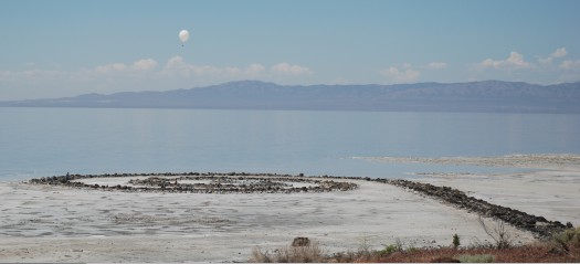
If I’m a little high right now, it’s just because these conservators just hit like every art button I have:
To photo-document Spiral Jetty, we used a tethered helium balloon about 8-10 feet in diameter, attached to a digital camera that would take an image every few seconds until the camera’s memory card filled up. Each of us let out string from a spool and sent the balloon up anywhere from 50 to 600 meters, depending on what we were trying to capture and other factors such as wind and amount of helium to give lift. The results were absolutely amazing! Now I have a low tech, low cost way to take aerial images of the sculpture — something I plan to do on an annual basis. These images can be paired with data that we collected using a Total Station survey instrument in order to create scaled 3D maps and diagrams of the Jetty and its materials.
Extending the Conservation Framework: A Site-Specific Conservation Discussion with Francesca Esmay [art21.org via man]
Night At The Apollo Program, Or How The Moon Is Made Of Cheese
Saturday night we went to the Kennedy Center in Washington for the National Symphony Orchestra’s commemoration of the 40th anniversary of the moon landing, Salute to Apollo: The Kennedy Legacy. It was the wackiest cheesefest of a concert I’ve ever been to.
We tried to puzzle out how a program like this came together. NASA was heavily involved, of course, and there was a mix of the nerdy with the obligatory and the available. But I have to think that the prime directive for the evening was written by NSO conductor Emil de Cou, who might be a gigantic space nerd.
The Playbill mentions de Cou’s multiple NASA colabos, including the smashing success of the NSO’s multimedia performance of Holst’s The Planets at Wolftrap in 2006, with narration written by de Cou and performed by Leonard Nimoy and Nichelle Nichols.
Three of these planets were repeated on Saturday, only instead of Spock and Uhura, the narrators were Scott Altman [commander of the last space shuttle mission] and Buzz Aldrin, who is a giant, if amiable, ham. But also a good sport, since Neil Armstrong apparently doesn’t do parties anymore. In addition to his Presidential Medal of Freedom, Aldrin wore some kind of bulbous, metallic, Airstream bowtie. We had truly excellent orchestra seats, and even the most eagle-eyed among us couldn’t figure out what had landed there around Buzz’s neck.
The Planets [“Mars,” “Saturn,” “Jupiter”] were accompanied by dramatic pans of NASA imagery on the large overhead screen. But I’m getting ahead of myself. The performance started, naturally/bombastically enough, with a gorgeous montage of Apollo 11 from Theo Kamecke’s long-forgotten, recently rediscovered and remastered 1971 feature documentary, Moonwalk One–which was cut to the theme from 2001.
2001, of course, came out in 1968, in the middle of the Apollo program, but before A11. And yet it suddenly felt inextricably linked to it, or conversely, the NASA programmers and audience themselves felt a continuity between the scientific and engineering facts of their missions and the science fictions of the time. Like how members of actual Mafia families began patterning their behavior on The Godfather. This is not some cockamamie theory, as the rest of the NSO program clearly illustrates:
Horst was followed by John Williams’ theme song to–no, not what you’re thinking, not yet–Lost in Space. Introduced on video by June Lockhart, who then made a “surprise” live appearance on stage. She was over the moon with excitement, which I took as a sign that she doesn’t do much onscreen work these days. She was thrilled to be there.
Then there was a medley of Star Trek themes, introduced on video by a funny/kooky Nichelle Nichols. She looked great. Clearly, de Cou has stayed in touch. About ten seconds into the orchestra’s intense rendition of ST:TOS, I realized I should have been recording it on my phone to use as my ringtone. But I didn’t.
Nichols didn’t appear on stage, instead the orchestra headed straight into its John Williams Star Wars medley.
Then Denyce Graves came out to sing a moon-related aria from Dvorak, which was the accompaniment to, was accompanied by–it was hard to tell–a montage of beautiful film footage of astronauts jumping around the moon and driving their moon buggies, scenes which caused the audience to erupt in bursts of laughter. Which was not funny, because the song, from Rusalka, is basically the Czech Little Mermaid singing about trading her voice for love or something.
Anyway, then Jamia came out. Never heard of her, but she’s apparently the black Hannah Montana. Then Chaka Khan came out in a Victorian bordello outfit to sing some NASA-commissioned anthem by a famous jingle composer [“You deserve a break today/ So get up and get away”]. Then the Army chorus sang “America the Beautiful” and John Phillip Sousa. I didn’t even know it had words. And then we left.
God bless America and its grandiose cheese spectacles.
For the Record, The Spiral Jetty First Re-Emerged In 1994.
Not 2004 when the state put up a sign pointing to it. Not 2002, when my sister first took a college date out to see it but Artforum’s Nico Israel couldn’t find it. 1994.
After a Salt Lake City artist friend, Patrick Barth, told me that Robert Smithson’s Spiral Jetty was partially visible in mid-summer 1994, I drove to the Jetty in my sister’s car–no way I’d take my own car–in early August 1994. The larger rocks were visible, forming a fragmentary outline of the structure. They were all covered in glistening salt crystals.
So please, enough with the, it re-emerged whenever the New York Times first found out about it nonsense.
On The Art Of Failure And Vice Versa
I’ve had Christy Lange’s long 2005 Tate Magazine essay about revisiting conceptual art systems open in my browswer tabs for weeks now, but I hadn’t read past the Walter deMaria section that first led me to it. Well, it’s just wonderful, and it builds to a wonderfully satisfying failure of an ending. Here are a couple of paragraphs on Jonathan Monk:
In Return to Sender (2004) Monk co-opts On Kawara’s series I Got Up (1968-1979), in which Kawara sent postcards to friends and colleagues systematically reporting his whereabouts. Tearing the pages out of a catalogue that documented the work, Monk dutifully sent the pages back to the original addresses, hoping for responses, yet knowing Kawara had long left the location. “That’s something where the possibility of failure is there before you start,” says Monk. Using Kawara’s own system as a point of departure, he created another, more illogical system, resuscitating a work from the past.
…
What contemporary artists such as Ström, Landers and Monk tap into is not the cold rationalism of conceptual artworks, but the cracks in their objective systems, or the vague, fleeting appearance of insecurity or doubt. Combined with their own conflicts about the system of the art world, what they allow us to see is not the patent successes of previous works, but their occasional futility and failure. While some conceptual art is rigorous and methodical, intellectual and distanced, it can also be paradoxical or daft, emotional or romantic. There is something fragile and fallible about taking on a project that can’t be finished, performing an act that can’t succeed, or creating a work that will never be seen. It is the repeated, unsure attempts and predictable small failures that constitute the self-effacing and endearing quality of meaningless work.
I guess I’ll have to get the book, but Kawara’s I Am Still Alive is typically described as a series of telegrams, and none of the examples I’ve ever seen include a return address. Still, great stuff.
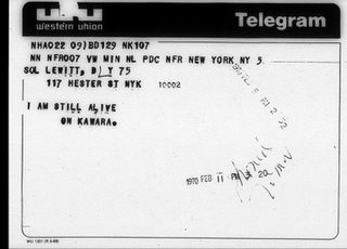
Here’s a tidy description from the book [published in 1981 in an edition of 800] of Kawara’s daily process, which I guess would be easy enough to reverse engineer from his various bodies of work:
Kawara’s days in New York were no different in any respect from those in Mexico. As soon as he awoke, he prepared and sent off his I GOT UP postcard. He spent six or seven hours painting the date. He typed years B.C. on his typewriter. From time to time, in answer to requests for his work or as private communications, he would send telegrams to places around the world saying: I AM STILL ALIVE ON KAWARA. And then, before going to bed, with a slash he would cross off the day on his hundred year calendar.
The book reproduces all of Kawara’s ‘I am still alive’ telegrams through the end of 1977 in original size and chronological order.
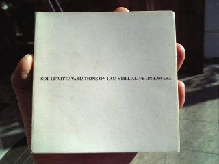
Also, this: Variations on I am still alive On Kawara, by Sol Lewitt, pub. 1988 [image via bookendless]
Bound to Fail, Tate, Summer 2005 [tate.org.uk]
Related to the exhibition, “Open Systems: Rethinking Art c.1970”, which ran through Sept. 2005
Also related:
Signed, Richard Nixon
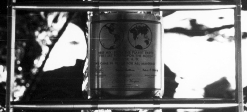
Left behind on the moon:
This commemorative plaque, attached to the leg of the Lunar Module (LM), Eagle, is engraved with the following words: “Here men from the planet Earth first set foot upon the Moon July, 1969 A.D. We came in peace for all of mankind.”
It bears the signatures of the Apollo 11 astronauts Neil A. Armstrong, commander; Michael Collins, Command Module (CM) pilot; and Edwin E. Aldrin, Jr., Lunar Module (LM) pilot along with the signature of the U.S. President Richard M. Nixon.
[via nasa images]
Julius Shulman Is Dead! Long Live Julius Shulman!
Like everyone else, I see modern architecture–the whole modern world, or at least the West Coast of it–in glorious black and white, thanks to Julius Shulman. Just as Hugh Ferris’s smoky charcoal skyscraper renderings defined Gotham a generation earlier, Shulman’s has been the formative, definitive lens through which postwar Los Angeles has been seen and understood.
So even as I miss him in one human sense, I’m kind of relieved he’s finally gone. Now maybe a new perspective of modernism has a chance to take hold. Or maybe an old one, who knows? Just something, anything besides relentless Shulmanism.
Christopher Hawthorne has a couple of open-eyed remembrances of Shulman and his double-edged relationship to the city he documented so long and loved so much:
Shulman’s vision of modern, stylish domesticity was in many respects an airbrushed one. It’s hard to believe anybody actually ever lived the way the carefully posed models in his photographs seemed to, carrying a tray out onto a poolside terrace, or sitting in perfectly pressed suits and dresses on the edge of a Mies van der Rohe chaise longue, city lights twinkling in the distance.
But his images were impossible to resist as a kind of mythmaking, even for the most tough-minded observers of life in Los Angeles. To look for any length of time at a Shulman picture of a great modern L.A. house is to get a little drunk on the idea of paradise as an Edenic combination of spare architecture and lush landscape.
Hawthorne also wrote another, more personal reminiscence of Shulman:
He was known for a certain blunt irascibility by that point in his life – he was 94 when we met, for God’s sake – but I never saw that side of his personality. He was dogged in his view that life in Los Angeles, as he told me once, was “simply glorious,” and that put him at odds with the generation of photographers, architects and artists who followed him, many of whom were more interested in exploring a grittier, less elevated vision of what it meant to be here.
The one time I met Shulman was after a public event, where his cantankerous charisma was turned up to 11. It was impossible not to be rooting for him all the way that night, even though I kind of regretted it in the morning.
That phrase, though, about others who “were more interested in exploring the grittier, less elevated vision of what it meant to be here [i.e., in Los Angeles]” gets to me. Hawthorne saw Shulman as a promoter; I’d probably go with evangelist. But the point is, sometimes it’s not a matter of exploring what it means to be someplace, it’s a matter of just being there and seeing what’s around you. It’s like Shulman knew what he’d see before he ever got there.
You Had Me At Muschamp in Monaco
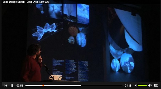
Herbert Muschamp in a giant weather balloon movie in Monaco WHAT?
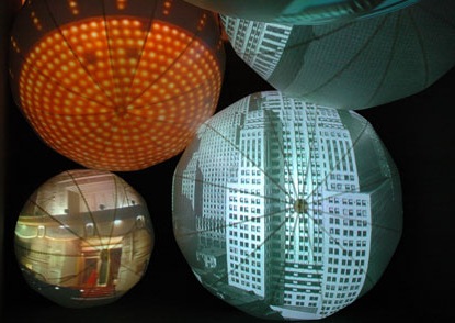
This is something we did in Monaco where we put Herbert Muschamp’s text, “Bubbles in the Wine,” to film. It was my job to go out and find these weather balloon manufacturers that had these funny-shaped screens that had projectors inside them. And what Peter with Imaginary Forces did was to figure out how to cut a nine-screen film simultaneously so you sometimes get a single image, you sometimes get multiple images on the balloons.
That’s Greg Lynn, speaking last year at MoMA’s “Design and the Elastic Mind” exhibition, as presented by Seed Magazine.
Sure enough, he wasn’t making it up. In 2006, Germano Celant brought in Lisa Dennison to help curate, “New York, New York,” a giant summer show at the Grimaldi Forum. Lynn, Imaginary Forces, and UN Studios worked as United Architects, the collaborative they formed for the World Trade Center rebuilding competition.
Here’s the brief:
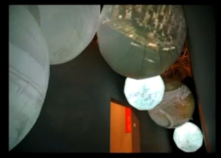
UA created an immersive space that told the story of the last 50 years of New York Architecture through an animated narrative, scripted by Herbert Muschamp. Eight synchronized films and a uniquely New York soundtrack told a story of the past, present and future of the city. By suspending eight 20-foot balloons with interior projection from the ceiling and walls, IF transformed the balloons into a new architectural media delivery system.
And here’s IF’s quick making of video, which Warner Music Group unceremoniously stripped the soundtrack from:
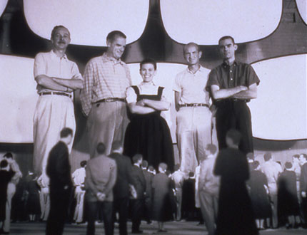
Hmm. First off, this all sounds straight from the Eameses’ expo playbook. Their collaboration with George Nelson, for example, at the 1959 American National Exhibition in Moscow. Glimpses of the USA was a 7-screen film epic of American material awesomeness, shown in a dome pavilion, and designed to blow hapless Commie minds. [My mind was blown a little bit just by this photo of the Eameses standing inside a mockup of the pavilion. via]
And of course, the Eameses went on to make approximately one million movie/slide/multimedia presentations and exhibitions for IBM, a format which was later cloned in every Park Service visitors center I went to as a child. So on the bright side, there’s no need for a proof of concept!
All told, the installation as realized, with the balloon screens seemingly dispersed on either side of the narrow, Nauman-esque exhibition space, doesn’t seem to have quite the impact that UA originally imagined. Check out the drawing over Lynn’s shoulder above, where the balloons are all clustered like sperm around an invisible egg. [Which would have been you, by the way, the viewer. You were the egg. And Joe Buck was the sperm. Muschamp is whooping in Heaven right now at the thought, I’m sure.] Point is, the panoramic wall is closer to what UA realized in their “New City” installation at MoMA.
Meanwhile, there’s not much online about “New York, New York,” which was subtitled, “Cinquante ans d’art, architecture, photographie, film et vidéo.” From the Art in America writeup, it sounded like a sprawling mess and a bit of a trophy dump, not necessarily a bad thing. Of course, half the article is about expo logistics and insurance and transporting masterpieces [sic], so who knows? Also, I can’t find this Muschamp “Bubbles” essay anywhere online. Please tell me someone somewhere’s working on a collected works.
Monaco starts around 3:30: Seed Design Series | Greg Lynn: New City [seedmagazine, thanks greg.org idol john powers for the tip]
Experience Design | Bubbles in the Wine, 2006 [imaginaryforces.com]
Now I Feel Twice As Useless About My Shirtboards
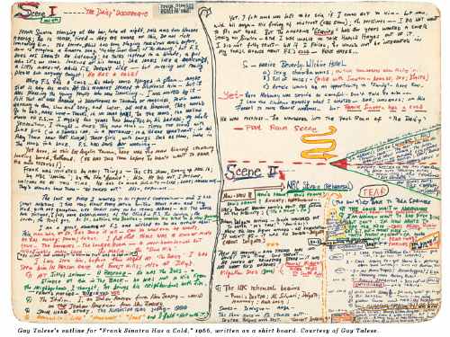
Gay Talese writes everything everyday on shirtboards—
INTERVIEWER
Do you use notebooks when you are reporting?
TALESE
I don’t use notebooks. I use shirt boards.
INTERVIEWER
You mean the cardboard from dry-cleaned shirts?
TALESE
Exactly. I cut the shirt board into four parts and I cut the corners into round edges, so that they can fit in my pocket. I also use full shirt boards when I’m writing my outlines. I’ve been doing this since the fifties.
INTERVIEWER
So all day long you’re writing your observations on shirt boards?
TALESE
Yes, and at night I type out my notes. It is a kind of journal. But not only my notes–also my observations.
INTERVIEWER
What do you mean by observations?
–including the outline for the Greatest Magazine Article Ever?
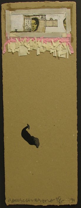 Robert Rauschenberg developed his abstract/pop collage techniques on shirt boards, while traveling to Italy and Morocco with Cy Twombly in 1951-3. The pair [couple?] of young artists fresh from Black Mountain College were traveling on Twombly’s grant money, which meant Rauschenberg had next to nothing to buy art materials with.
So he collaged cheap prints, newspaper, feathers, drawings, and random stuff onto the shirtboards from their laundry in an irreverent twist of his teacher Josef Albers’ technique.
In 1990, just as Walter Hopps’ incredible show, “Robert Rauschenberg the Early 1950s” was preparing to debut at the Menil, the artist collaborated with Styria Studio to produce meticulous replicas of 28 of the shirtboard works in an edition of 65.
Within the first five minutes of walking into the Menil for the first time, I met Cy Twombly standing in front of his chalkboard painting in the lobby. He had just completed his interview for Hopps’ catalogue. Needless to say, I made it back to Houston for the opening, and then saw the show multiple times at the Guggenheim SoHo.
Beyond instilling a deep appreciation for Rauschenberg’s interest in abstraction and conceptualism both, that show changed the way I look at shirtboards forever. Not that I’ve ever done anything about it, of course, just that it hits a nerve. What’s worse about Gay Talese: he lives in my old neighborhood, so we might even share a shirt laundry.
a nice discussion of the Shirtboard works [icallitoranges]