Now I Feel Twice As Useless About My Shirtboards

talese_shirtboard.jpg
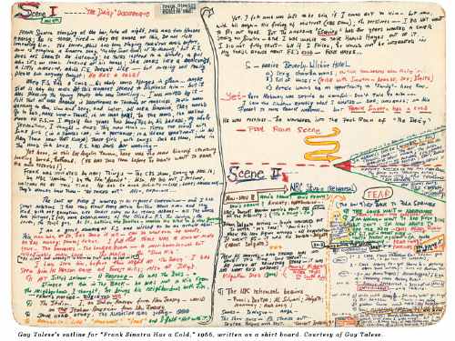
Gay Talese writes everything everyday on shirtboards

INTERVIEWER
Do you use notebooks when you are reporting?
TALESE
I don’t use notebooks. I use shirt boards.
INTERVIEWER
You mean the cardboard from dry-cleaned shirts?
TALESE
Exactly. I cut the shirt board into four parts and I cut the corners into round edges, so that they can fit in my pocket. I also use full shirt boards when I’m writing my outlines. I’ve been doing this since the fifties.
INTERVIEWER
So all day long you’re writing your observations on shirt boards?
TALESE
Yes, and at night I type out my notes. It is a kind of journal. But not only my notes–also my observations.
INTERVIEWER
What do you mean by observations?

–including the outline for the Greatest Magazine Article Ever?
rauschenberg_shirtboard1.jpgRobert Rauschenberg developed his abstract/pop collage techniques on shirt boards, while traveling to Italy and Morocco with Cy Twombly in 1951-3. The pair [couple?] of young artists fresh from Black Mountain College were traveling on Twombly’s grant money, which meant Rauschenberg had next to nothing to buy art materials with.
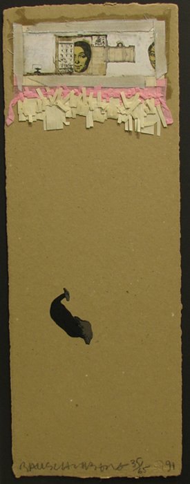
So he collaged cheap prints, newspaper, feathers, drawings, and random stuff onto the shirtboards from their laundry in an irreverent twist of his teacher Josef Albers’ technique.
In 1990, just as Walter Hopps’ incredible show, “Robert Rauschenberg the Early 1950s” was preparing to debut at the Menil, the artist collaborated with Styria Studio to produce meticulous replicas of 28 of the shirtboard works in an edition of 65.
Within the first five minutes of walking into the Menil for the first time, I met Cy Twombly standing in front of his chalkboard painting in the lobby. He had just completed his interview for Hopps’ catalogue. Needless to say, I made it back to Houston for the opening, and then saw the show multiple times at the Guggenheim SoHo.
Beyond instilling a deep appreciation for Rauschenberg’s interest in abstraction and conceptualism both, that show changed the way I look at shirtboards forever. Not that I’ve ever done anything about it, of course, just that it hits a nerve. What’s worse about Gay Talese: he lives in my old neighborhood, so we might even share a shirt laundry.
a nice discussion of the Shirtboard works [icallitoranges]

Do Tell

Solicitors for the National Portrait Gallery are apparently threatening legal action against a US Wikipedia user for downloading 3,300 digital photographs of paintings in the UK museum’s collection, and then uploading them to Wikipedia. Says Londonist:

All of the paintings are thought to be from the Victorian era or earlier, and are therefore in the public domain. The rather gristly bone of contention, however, is whether the high resolution images of those paintings are protected by their own copyright.

Seems that the NPG is claiming both copyright infringement for its photographs and database right infringement. Neither of these rights currently exist under US copyright law.
Obviously, I’ve been thinking quite a bit latelyabout the issues around reproducing artwork and the incipient loss/cost/penalty when art is transmitted in a copyright culture. It was always my understanding that museums which hold public domain works–which is the vast amount of material in museums, basically everything over 95 years old–tried to control reproduction of the work by limiting access to the work itself, or by requiring contracts for shooting work, or for using authorized reproductions. [Monticello, for example, has an insane, draconian, and expensive shooting policy that practically requires you to hire a gardener to follow behind and refluff the grass where your tripod had been standing.]
According to the NPG’s solicitors, at least, US and UK laws differ on whether a photograph of an artwork has a copyright in itself, something distinct from the artwork being depicted. Should be interesting.
National Portrait Gallery To Sue Wikipedia User? [londonist via momalearning’s twitter]

ORLY? Did The River Cafe Really Sue Over Eliasson’s Waterfalls?

So earlier this week, the NY Post’s Adam Nichols reported that the owner of the River Cafe, was suing for $3 million damages caused by Olafur Eliasson’s The New York City Waterfalls:

Their suit, filed in Brooklyn Supreme Court last week, demands that the project’s creators — New York’s Public Art Fund and Danish artist Olafur Eliasson — be ordered to cough up the cash for repairs.
“There were 90 to 120 days of saltwater rain coming down on us,” restaurateur Buzzy O’Keeffe said.

[Waterfalls ran 110 days, from June 26 to Oct 13, 2008, but for the last six weeks, the operating hours were cut in half.] ArtInfo, CityFile, New York Magazine, and some blogs picked up the Post’s story.
BUT. I’ve searched through the relevant court filings, both for the Kings County – Brooklyn Supreme Court and Civil Court, and I can’t find any record of an actual lawsuit.
Then on Thursday, the Brooklyn Paper’s Mike McLaughlin talked with O’Keeffe for a story titled, “Buzzy prepares his sue-fflé over arborcidal artwork” with details [“The complaint, filed in Brooklyn Supreme Court on June 29…”] which make things even less clear:

The suit says that the River Café, owned by Michael “Buzzy” O’Keeffe, “continues to suffer damage and business loss as a result of the defendant’s negligence.”
Despite the court paperwork seeking $2.983 million in damages, O’Keeffe told The Brooklyn Paper that “the River Café is not suing anyone.” He declined to elaborate.

So what began as a dispute over prematurely browned leaves last summer has now become extensive salt-spray-related structural damage and a year of lost business. And at least two reporters appear to have received, or been shown “court paperwork” by O’Keeffe, but there’s nothing independently verifiable from the actual court.
I’ll be honest, I started digging in this story to find some interesting/entertaining details buried in the lawsuit filing. But so far, it seems like the real story is just a whiny crank with a sweetheart lease talking smack because business is down in a depression and his city-funded arborists don’t come around enough.

After After After

From Linda Yablonsky’s article on The Pictures Generation in Art in America:

Bloom remembers seeing Levine’s appropriated Walker Evans photos and thinking, “Oh my God, that is so radical and so insane. It was also brilliant. Sherrie didn’t address any of the esthetic issues, just narrowed it down to the most essential idea about what constitutes ownership of an image, and that was it.”
Joel Wachs, now president of the Andy Warhol Foundation, was a city councilman in Los Angeles in the ’80s and an avid collector of art. In 1984, he saw Levine’s “After Walker Evans” appropriations from 1981 and became the first person to buy one. “I remember having a hard time accepting it at first,” he says. “What was this art, copying someone else’s pictures? Then it started to open me up to a much broader way of thinking about art. The art itself had all the formal qualities I liked and also made people think about male dominance in the art world. Sherrie’s work was $300 and Cindy’s was $800, but some male painters were getting $75,000. When Kruger said, ‘Your body is a battleground,’ that was a clarion call for a political movement.”

aftersherrielevine.jpg
Also, hmmm:

In 1936 Walker Evans photographed the Burroughs, a family of sharecroppers in Depression era Alabama. In 1979 in Sherrie Levine rephotographed Walker Evans’ photographs from the exhibition catalog “First and Last.” In 2001 Michael Mandiberg scanned these same photographs, and created AfterWalkerEvans.com and AfterSherrieLevine.com to facilitate their dissemination as a comment on how we come to know information in this burgeoning digital age.

Copying as a creative strategy carries within it the assumption of other copies.
Photo Play [artinamericamagazine via afc]
related: Untitled (300 x 404, after Untitled (Cowboy), 2003 by Richard Prince)

Chris Burden’s B-Car

burden_bcar_pose.jpg
In April 1975, Burden brought something of an end to the series of extreme and/or dangerous performances that brought him such critical acclaim and notoreity. For a piece called “Doomed,” he installed himself under a pane of glass in the MCA Chicago, and refused to communicate or move until someone made a gesture to help him. 48 hours into the piece, a museum guard named Dennis O’Shea offered him a drink of water, at which point Burden got up, smashed a clock, and left.
Said Peter Schjeldahl in the New Yorker,

“Doomed” unmasked the absurdity of the conventions by which, through assuming the role of viewers, we are both blocked and immunized from ethical responsibility. In O’Shea’s case, the situation was complicated by his duty to maintain the inviolability of art works. There should be a monument to him, somewhere, which would commemorate the final calling of the bluff of art as a law unto itself.

What soon followed was B-Car. Burden:

During the two month period between August 24 and October 16, 1975, I conceived, designed, and constructed a small one passenger automobile. My goal was to design a fully operational four-wheel vehicle which would travel 100 miles per hour and achieve 100 miles per gallon. I imagined this vehicle as extremely lightweight, streamlined, and similar in structure to both a bicycle and an airplane.
Once the project was conceived, I was compelled to realize it. I set the goal of completing the car for two shows in Europe. I saw building the car as a means toward the end of driving it between galleries in Amsterdam and Paris as a performance. When I arrived in Amsterdam, I knew that the accomplishment of constructing the car had become for me the essential experience. I had already realized the most elaborate fantasy of my life. Driving the car as a performance was not important after the ordeal of bringing it into existence.

chris_burden_b-car_cov.jpg
[A book about the B-Car was published by Ronald Feldman in association with his 1977 show of the car and its documentation. With the Internet, nothing is really rare anymore, just varying degrees of expensive.]
The B-Car‘s adolescent soapbox derby form and Burden’s deadpanned motivation for the project–“realiz[ing] the most elaborate fantasy of my life” resonates with Schjeldahl’s description of the artist as, “a boyish gimcracker diverting us by diverting himself.” In one sense, Burden’s ongoing use of toys, and his toy-like deployment of industrial machinery, equates artistic production as a reversion to childhood, a mix of “I’ve always wanted to do that!” and “my kid could do that!”
But it reminds me of another seemingly unassuming but obliquely profound artist, Peter Coffin, who said he made his incredible 2007 sculpture, Untitled (Staircase) because “it stuck in my mind.” [pdf] Of course, it also reminds me of John Ivers of Bruceville, Indiana, who built himself a roller coaster in his backyard. It’s called Blue Flash.
peter_coffin_staircase.jpg
Previous Chris Burden: video of Beam Drop and other projects; Chris Burden’s TV ad

The DaVinci Crowd

c-monster_mona_lisa.jpg
When I first saw Sebastian’s stunning photos of the Mona Lisa at C-Monster, I was, naturally, stunned. I haven’t been to the Louvre since 2005, when la Joconde was moved to its new, purpose-built space, designed by Peruvian architect Lorenzo Piqueras, la Salle de la Joconde.
When I’d last seen it, it was in its temporary hyperbaric chamber, and looked a lot like this picture from Steve and Sygi’s 2001 Mediterranean cruise [which apparently stopped in Paris?]:
mona_lisa_sygi_2001.jpg
And of course, before that, it was in its own similarly sized but nicer capsule in la Salle des Etats, where it was surrounded by several invisible paintings.
So, stunned. Despite having provided a dedicated room, with a freestanding wall, and a massive laminated podium [whose main function, it seems, is to properly position the painting’s LED footlight, which is color-calibrated to counter the yellowing effects of age], and a curved rail, the Louvre finds it necessary to add another, temporary ropeline a couple of meters farther back.
This, ironically, for a picture whose most powerful innovation, according to the Louvre curator of 16th century art Cecile Scaillerez, is “abolish[ing] the distance between the model and the viewer by getting rid of a foreground, which created a barrier in pictures of the time.”
The sheer scale of the ridiculousness of this museological condition set my mind racing. The Mona Lisa has been moved eight times within the Louvre. Wouldn’t it be awesome to do a show where each work–I don’t know what, but they’re probably some paintings or whatever, that’s not important now–is shown in a recreation of each of these various installations?
Ooh, there’d be that classic belle epoque 1911 hang it was stolen from:
Mona_Lisa_stolen-1911.jpg
You could just whip up a chair rail out of injection molded plastic or whatever, paint the whole thing White Cube White, maybe Triple Candie the vitrines and railings a bit to provide suitably ironic recontextualization.
And five or so others, I guess. What do they look–wow, searching for photos of the Mona Lisa is mind-numbingly boring. Did you know there’s even stock photography of excessive crowd control measures in front of the Mona Lisa that looks like half the photos of the Mona Lisa in the world?
mona_lisa_fotosearch.jpg
Or that the other half are photos of people taking photos of the Mona Lisa? Turns out if someone isn’t actually coming to the Louvre on a pilgrimage to see the World’s Greatest Painting, they’re coming to self-consciously note their position at the vortex of the painting’s massive cultural scrum.
So the Mona Lisa and contemporary art: is there anything interesting or useful to be learned, studied or said? When you’re one of six billion monkeys who’ve stepped away from our typewriters for a bit to take in some Art, the odds that you are the one who’s going to spit out something worthwhile are pretty damn slim.
But there’s a world of difference between “there’s nothing left to say” and “there’s nothing to be said,” and what does it mean for the contemporary art world if all it can do is gawk, sneer, or sigh at the Louvre’s greatest attraction?
thomas_struth_louvre-IV.jpg
Thomas Struth, Musee du Louvre, IV, 1989
It seems folly to carve it out and claim it’s irrelevant. Did you know that the official American artscape [sic] of the last two generations–blockbuster museum exhibitions and the NEA and NEH included–is a direct result of Jacqueline Kennedy seducing Andre Malraux into loaning the Mona Lisa to the National Gallery and the Met in December 1962? And that Jackie enlisted Mark Rothko, Franz Kline, and Andrew Wyeth [?] in her plan? I did not. Until I read Bob’s blog post about Margaret Leslie Davis’s book, Mona Lisa in Camelot. Here’s a picture from Davis’s website of the Mona Lisa getting off the boat in New York:
mona_lisa_in_nyc_davis.jpg

Pictures At A Pictures Generation Exhibition

lawler_ubs_brochure.jpg
Of all the work in the Met’s Pictures Generation show, Jack Goldstein’s surprised and intrigued me the most, but I liked Louise Lawler’s the best. That Pollock/soup tureen photo that’s been making the marketing rounds for the show is smart and sublime.
But I was annoyed enough by the smugness of this wall text on another Lawler that I had to write it down. [And my iPhone typing technique was so bad, it’s taken me until now to decode what I wrote–and it turns out to be published on the Met’s site anyway]:

Arranged by Donald Marron, Susan Brundage, and Cheryl Bishop at Paine Webber, Inc. is both deadpan and poignant. Unlike the trophy paintings and sculpture hung proudly in reception areas, this trio of Lichtenstein multiples is lower down on the value scale and thus suitable for the decor of an office. The pictures hover like flies vying for the attention of a pair of anonymous bankers who ignore the “art” while struggling to send a fax. Lawler’s diminution of her role as an “author” is meant both to highlight the collaboration of others (here, Paine Webber CEO, Castelli Gallery rep, and corporate curator) and to direct the viewer outside the boundaries of the image and toward the real life of which art is always a part. It is unlikely, however, that any of the arrangers appreciated the irony that Lichtenstein’s pictures, originally meant to acknowledge (with a wink) their own status as commodities, now adorned the walls of an office copy room. What Lawler reveals is that the meaning of the artwork lies not in its origins but in its destiny. [emphasis added on the condescending, insidery part]

Really? And why, exactly, is that unlikely? I don’t know Brundage or Bishop, and I’ve only known Don Marron a bit over the years through my fundraising work at MoMA. But it doesn’t take a masters in curatorial studies to appreciate the ironies at play here; if anything, there are several layers of irony that seem to have been invisible from within the privileged wall text scriptorium at the Met.
First, there’s that wink. When Lichtenstein put Benday dots on a painting, it was an ironic commentary on art’s commodity status. When he cranked out prints for sale in editions of 250, not so much.
[One unintended irony: the two Lichtenstein comic panel prints, from 1965, are among his earliest and most important works. The artist himself considered “Sweet Dreams, Baby!” which was produced for the Original Art portfolio, “11 Pop Artists, vol. III,” to be among his first successful “Pop prints.” So while prints generally are considered to be “lower down the value scale” monetarily, these prints by this artist are in fact, quite significant art historically. Not that anyone at the Met is likely to appreciate that (wink).]
The fact that there are labels next to the works tells me they were selected and installed by Bishop or her Paine Webber staff, and that makes sense for a space that is probably not an office, but a common area or trading floor. But in the art-collecting corporations I’ve worked in, the commoditized nature of art–and viewer–was made exquisitely aware to you.
lawler_pollock_tureen.jpg
The Met’s curator may not know this, but it’s not unusual for employees to be permitted to choose the artwork for their office, and to have the value of the artwork be based on his seniority or profitability. First pick from the corporate collection can be as much of a perk or as the view or number of ceiling tiles you get.
But none of that is the reason the Met’s wallquote bugged me so much. As awesome as I’m sure it is to be there, or to have your work shown there, or in the collection, the Met–any museum, really–is still a mausoleum for art. Lawler’s work is so fascinating precisely because it explores the life [sic] of art outside of the white-glove, white cube of the museum, and it gains power from the unexpected resonance between the autumnal colors of a Pollock and the Qing porcelain; between a Lichtenstein print and a fax machine. It should be a reminder of what gets lost when art’s only presumed destiny it do end up in a museum. But it’s unlikely that anyone at the Met can appreciate that irony.
update: Louise Lawler, on the other hand, sounds awesome. As does the late Mrs. Burton Tremaine, whose tureen and Pollock that was. In conjunction with a 2007 show in Geneva reuniting the Tremaine Series, Andrea Miller-Keller, the Wadsworth Atheneum curator who gave Lawler her first museum show and who introduced her to the Tremaines, has compiled a pdf of articles, interviews, and documentation about the series and the people. Mrs. Tremaine provided the subtitle, “You’re going to love the thermostat next to the Miro.”

On The Likelihood Of The National Gallery’s Barkley Hendrickses Ending Up In The White House, Ch. 1

The “What art should the Obamas hang in the White House?” story rolls slowly onward. Last week in ArtInfo, Ruthie Ackerman published the suggestions of several of the art world’s greatest minds. Greatest among equals, obviously, is Magda Sawon of Postmaster Gallery, whose list began,

“I am seconding Greg Allen of the brilliant blog greg.org to bring Sir Charles aka Willie Harris (1972) by Barkley Hendricks to the White House. It’s a tremendous painting from a still-under-the-radar master that puts Kehinde Wiley to shame.

Hear, hear!
Now that we have consensus, let’s move this plan forward, shall we? The National Gallery of Art brought Sir Charles into the collection in 1973, along with another remarkable Hendricks portrait, George Jules Taylor. Neither have ever been shown in the National Gallery itself, though both are included in “The Birth of Cool,” the highly acclaimed Hendricks retrospective organized by Trevor Schoonmaker of Duke’s Nasher Museum of Art.
b_hendricks_nga.jpg
By the criteria the Obamas set for themselves, that means the works couldn’t come into the White House until they go back out of public view, 2010, after the retrospective winds up in Houston. Plenty of time to make the case for this awesome painting; let’s take a closer look at it!
Duke art historian Rick Powell explains that Sir Charles was the professional name of a Dixwell Avenue drug dealer in New Haven whose customers were mostly students from the little college a couple of blocks to the east, where Hendricks was studying for his MFA. The Willie Harris reference, meanwhile, is from A Raisin in the Sun; like that fictional Harris, Powell says, Sir Charles “would frequently disappear with [his customers’] money.”
Hmm, could the Obamas ever really bring themselves to hang a painting in the White House of a small-time, money-thieving, pimped out, drug dealer–from Yale??
super-fly.jpg
Hendricks described Sir Charles’s style as “player chic,” which the ever-proper Powell feels compelled to address at some length:

While the term “player chic,” hinting at illicitness and misogyny, points to the ostentatious fashion statements of pimps, street hustlers, and other disreputable members of a black demimonde, the same style of dress–platform shoes, body-hugging jumpsuits, leather pants and maxicoats, real and artificial fur–was worn by a broad spectrum of African Americans. Most were not connected with life’s shadier side, but many did feel an affinity for this provocative “outlaw” persona. The most obvious broad-based celebration of the “player chic” aesthetic in the early 1970s was the commercial success of Super Fly (1972), a feature-length film directed by Gordon Parks Jr., about a drug dealer who undergoes a change of heart…

Uh, not to quibble, but wouldn’t the phenomenal critical and financial success of Shaft, made in 1971 by Gordon Parks Sr., count as a broad-based celebration of player chic, too?
in which case, wasn’t the swaggering black male “outlaw” archetype thoroughly established, even romanticized in popular culture, making Hendricks’ choice of Sir Charles as a subject a little less transgressive or controversial, at least among the edgier liberal audiences at Yale and–
Wait a minute, where was Hendricks’ audience? The guy was still in art school when he painted these things in 1972, and then they were in the National Gallery a few months later? How’d that happen?
Stay tuned.

Enzo Mari x Ikea Mashup, Being Mashed Up

I realized I’d been putting off the actual assembly of my Enzo Mari table, daunted by the impending exactitude and fearful of the commitment of actually screwing all the pieces together.
Which seems to fly in the face of Mari’s original “just hammer it together” intentions for the autoprogettazione series.
I knew that without jigs and a flat surface and proper squaring equipment and such, I was invariably going to misdrill something, and then I’d be trying to redrill holes 1/8th of an inch to the left somewhere, and–
The joint that really made me nervous was the first one I’d have to do, drilling a 5/16″ hold through the center of all the side truss pieces [right about where the knot is in this photo] AND through the ends of the center truss, so that I could thread a carriage bolt through, and hold the entire table together properly. Forever.
Rather than risk screwing this up, I decided to piece each truss together with a steel bookend, and then hammer and wood glue enough joints to hold it. Then I’ll drill and screw the major joints after it’s together.
The carriage bolt and wingnut assembly method is a nod to the original autoprogettazione kits of precut wood, which were produced in 1973 by Simon International and sold briefly as the Metamobile Series.
mari_christies_simon.jpg
I hadn’t thought of how much those simple wingnuts changed the nature of the autoprogettazione concept. They’re the difference between project and product.
The Metamobile kits weren’t just precut wood; they were also predrilled. And that required the construction of jigs, the use of some workshop- or factory-grade hardware, and probably even an assembly line, or at least some batch work. In other words, they were exactly what the autoprogettazione series was supposed to not be: mass produced.
mari_effe_table.jpg
Furniture sold as a kit of parts that comes ready to assemble, with just one tool, just follow the slightly baffling instruction diagrams exactly, and voila! Sound familiar? Enzo Mari beat me to an Ikea mashup by about 35 years.
Related: 14 June 2000, Lot 103: ENZO MARI, A PINE DINING TABLE
“designed 1973, manufactured by Simon International for the Metamobile Series, the square slatted top on open understructure secured by wing-nuts”, sold for £5,875. [christies.com]
Dec 15, 2006, Lot 2: ENZO MARI, AN EXTREMELY RARE “EFFE” TABLE
“Manufactured by Simon International, ca. 1974. from the Metamobile series…Acquired directly from Dino Gavina, c. 1975,” sold for $14,400 [sothebys.com]

House On The Moon On The Ericsson Globe

globe_arena_with_house.jpg
Josh Foer is on fire, and I’m like a moth to the flame. Foer’s guestblogging at BoingBoing, and is just lobbing up one crazy-awesome megasphere after another. It was his charticle in Cabinet a while back about the history of giant spheres that introduced me to satelloons in the first place.
So it’s no surprise that he surprises me again with an offhand reference to the Globe Arena in Stockholm, which is just “the largest spherical building in the world.” And it also happens to be at the center of the Sweden Solar System, the world’s largest scale model of the solar system, where Pluto is a ball 300km away.
No, the Globe, which Ericsson just paid to have renamed the Ericsson Globe, also has a small stuga, a traditional red Swedish cottage stuck on top of it for the summer.
A month ago, the Swedish artist Mikael Genberg, whose primary medium seems to be the traditional red Swedish cottage, attached one to the Globe in preparation for his much larger project, which is to dispatch a traditional red Swedish cottage-building robot to the moon in 2012, and have it build a traditional red Swedish cottage there. On the moon.
I’m not sure how this syncs with the Sweden Solar System, where I assume the 100-m diameter Globe is standing in for the sun, not the moon, but the visuals are pretty irresistible.
Sweden Solar System [atlasobscura.com via boingboing]
Ericcson Globe, aka Stockholm Globe Arena [wikipedia]
houseonthemoon.com project blog [houseonthemoon.com]
MikaelGenberg.com [insane, optimized for Netscape 4, unclickable]
Swedes sending robot to the moon to build nice little cottage [gizmodo.com]
image and video: Röd stuga på Globens topp [svt.se]

Do You Know Who I Am?

Artforum’s William Pym covering the extremely non-chalant X-Initiative opening this week:

Jordan Wolfson, hovering by Barcelona’s Latitudes, took several prods before he could even remember that he was participating in a group show with healthy buzz opening at I-20 Gallery round the corner later in the week. Eventually waking up to the idea that he was a professional artist talking to a writer, Wolfson pointed at a nearby projector. “I lent that to them,” he volunteered with a goofy puff of pride. “That’s my claim to fame.”

International Association of Art Critics cardholder Tyler Green twittering his way through the museums of New England:

So much attitude from admissions staff. MFA needs to train them on AICA members. Geez.
10:04 AM Jun 22nd from UberTwitter

At Worcester Art Museum, where admissions person tried to keep me out. Train the staff on accredited press, WAM…
10:00 AM Jun 21st from UberTwitter

Me at Larry’s, for John’s late Picasso show last month:

Me: I wonder if you can tell me about the documentary screening in the corner gallery?
Gallery attendant: No.
Me [flummoxed]: I mean, is there any information ab–
Attendant: No, there isn’t.
Me, [baffled]: Is there someone who does know who I can ask, I’m just interested to find out who prod–
Attendant: No, there isn’t anyone.
Me [weighing whether to ask for people at 24th street by name, or whether to just do the cold, “Do you know who I am?” and then deciding against it, since she clearly doesn’t give a flying $#% who I might be, and why should she, there’s only like three of these paintings for sale, and my question isn’t even remotely on the trajectory for someone who might want to buy one, and can’t I just go dig up the early 70’s Picasso filmography online anyway?]: Ooo Kaay. Thanks.

It occurs to me that we invariably bring a cartload of subjective baggage along with us when we see art, and often we’re only vaguely aware the extent to which that subjectivity and expectation colors–no, it’s more than that, it shapes and molds and transforms–our experience.
Whether we see as an artist or a collector, a curator or a trustee, a flaneur, a writer/critic/journalist, a complete civilian, if such a thing is possible anymore, makes a difference.
And when I couldn’t find it online, I made a quick call, and some very helpful folks at Gagosian told me the film was Picasso: War, Peace, Love, (1970), by the artist’s long-time friend, photographer Lucien Clergue, and that it was originally produced in 1968 for Condor Films, in Zurich, as Picasso: Krieg, Frieden und Liebe.
I’ve got to remember to add it to IMDb.

Beat It

“They’ll kick you, then beat you,
Then tell you it’s fair”

Spectacular video from Michael Jackson, Iranian Freedom Fighter. [via the awl]

John Steiner’s Balloon, 1857

While this 1857 ambrotype of John Steiner’s balloon preparing for an international crossing from Erie, Pennsylvania to Canada is the first known photograph of a flying machine, Steiner’s was not necessarily the first balloon.

Still, kind of awesome.

FWIW, Steiner had to bail out over Lake Erie in dramatic fashion. His balloon made it to Canada and was found some time later.

The Smithsonian has the story–and the photo, which is on display at the National Air and Space Museum.

Photochroms? Photochromosomes?

photochrom_journeyskull.jpg
On his incredible illustration blog A Journey Round My Skull, Will has posted several selections of photochromes, or photochroms, or photochromosomes. [here and here] They were color-retouched photolithographs popular around the turn of the last century. They used at least six, and usually 10-15 tinted stones for each image.
I think the eerie light and tone looks like Darren Almond’s Full Moon photographs, but I like Will’s alternate description of the process, too: “Max Ernst photoshops livestock into the xeroxed ruins of Caspar David Friedrich paintings.”

And Even MORE Astonishing? Matthew Barney Has A Watch

From Linda Yablonsky’s account of a Matthew Barney/Elizabeth Peyton colabo on Hydra, sponsored by Dakis Joannou:

“Barney looked at his watch. ‘Just about two hours,’ he said to Peyton. ‘Not bad. After all, there’s a limit to how long you can ask people to wait.’ Coming from the king of slow, this seemed even more astonishing than the event.”

Reminds me of the demolition derby/used car gig he put together in LA a little while back. If nothing else, Barney is a masterful social engineer, transforming his guest list/audience “from jaded personalities into humble acolytes.”