This Weekend: Nothing But What Is Therein Contained, By Steve Roden

airform_nothing_inproc.jpg

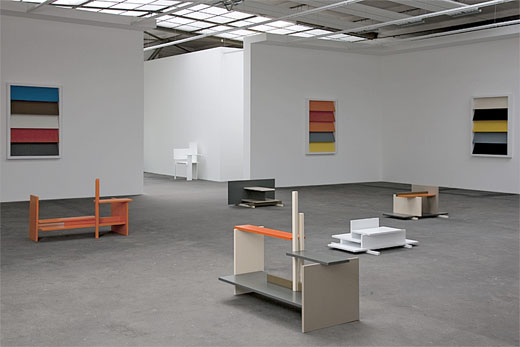
Steve Roden’s sculpture and sound installation, nothing but what is therein contained is in the previously closed off top rooms of Founder’s Hall at Girard College. It was created as part of the Hidden City Philadelphia festival, and this weekend, June 27th and 28th, is the last chance to see it. Which is really bumming me out, because we’ll be in Philadelphia for the 4th of July.

I’d emailed my compliments to Roden, praising how the “pure arbitrariness” of the system he used to construct this sculpture turned out so fantastically. When he emailed back and thanked me, he also pointed out there was “indeed there was much more specificity to the project than arbitrariness.” I felt like smacking my head, “that’s what I meant, not arbitariness, specificity!” as if they were somehow interchangeable.

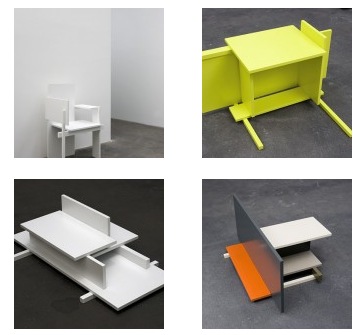
And yet, it was kind of what I meant. Roden described his process on his blog. The title is a phrase from Girard’s will, instructing the architect what kind of building he should design:

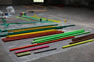
I took the phrase and translated it into numbers based on the alphabetical sequence of the letters, and then cut pieces of wood accordingly.
these pieces (running from a 1 foot length for an “a” to an 8 foot plus a 12 foot for a “t”) were then painted in groups, a different color for each letter.

i then began to build the structure, beginning with the first letter – “n” – and drilling and wiring the consecutive parts improvisationally, essentially using the letter sequence as a score towards determining what piece of wood would come next.

The colors and painting, meanwhile were partly inspired “by the sketchbook of amish deaf mute craftsman henry lapp, who lived outside of pennsylvania just around the time the building was finished…”
airform_nothing.jpg

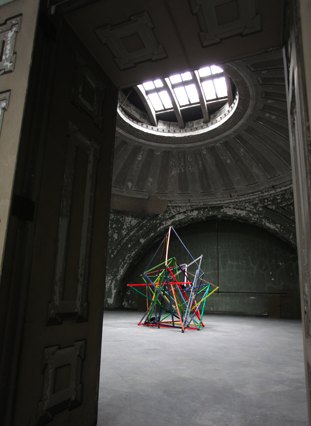
So yes, highly specific, and to an outsider, seemingly purely arbitrary. And yet, they are also the deeply intuited choices of an artist who has spent two years researching and experiencing the building, the institution, the space, the history, the city, the work inhabits. And out of that experience and those choices emerges a singular, even inevitable object. [The work itself also contains sound and text elements.]

I realized while I’d remembered Roden’s explanation of how Stephen Prina’s green monochrome paintings with dimensions based on Manet’s oeuvre informed his early explorations of constraints and systems from his interview with Catherine Wagley last year, I’d forgotten the intuition, which was the objective, if not the whole point:

it opened my eyes to how process could potentially be used to generate a relatively awkward or difficult stage for an intuitive process to then take place. so i started a painting with a ridiculously stupid idea – taking an issue of art in america and building an image using the first letter of every name in an advertisement for an exhibition, in the same font and same relative scale. it was the kind of thing i would have reacted against, so i tried it. it was incredibly frustrating, even boring at times, but also freeing. i started to make works using found letter structures within books and texts to see what might happen – what was i gaining and what was i losing by following such a process? i wasn’t sure, but both the process and the finished works were more interesting to me.

Great stuff. I wish we were in town.
nothing but what is therein contained, Saturdays & Sundays through June 28 [hiddencityphila.org]
more pics and making of: nothing but what is therein contained… [airform archives]

Les Ballons du Grand Palais

The Grand Palais was already the best of the three venues in the world capable of accommodating my Satelloon project–a re-creation of NASA’s Project Echo (1960), the 100-ft metallic spherical balloon which was world’s first communications satellite, and which was also known as the most beautiful and most-viewed object ever launched into space–but now it’s practically inevitable.
Unless someone tells me that the Pantheon or Grand Central Station have already hosted legendary air shows dating back a hundred years…

These photos from Branger & Cie via the Smithsonian show balloons and blimps on display at the 1re Exposition Internationale de Locomotion Aerienne, which debuted in the nave of the Grand Palais in September 1909. They ran until 1951. Which makes bringing back the spirit of the Air Show both spectaculaire et logique!

satelloon_grand_palais.jpg

Previously: Les Satelloons du Grand Palais]

Le début du point de vue Google Mappienne

pt_lou_philippe_ballon.jpg
On June 19, 1885 Gaston Tissandier and Jacques Ducom set off in across Paris in a balloon. They were on a photo expedition, and managed to get seven shots. This one, of the pont Louis-Phillippe, at the western tip of the Ile St-Louis, was the most successful, in that it was nearly straight down. Though it was not the first aerial photo of Paris, it caused a sensation and was exhibited and reproduced widely for many years.
The photo historian Thierry Gervais wrote about it in a 2001 article in Etudes Photographique, “Un basculement du regard, Les débuts de la photographie aérienne 1855-1914”:

In 1885, Gaston Tissandier and Jacques Ducom know the objectives and results of aerial photographs obtained by Nadar. When they fly over the capital on June 19, their goal is clear: “After many attempts, it still needs to be demonstrated that the proofs obtained in a balloon may be as sharp as those taken on land in the ordinary conditions and resolve in a word completely the problem of free balloon photography.”
Beginning at the Auteuil aeronautical workshop, the 13 x 18 camera, known as a touriste, is set on the edge of the platform, with the lens oriented to the ground. The crossing of Paris is done from Porte d’Auteuil to Ménilmontant via a light wind from south-west which takes them up to Meaux. Seven photographs are made, five of the capital and two of the banlieue. If “all are good enough to be reported,” that of the Ile Saint-Louis holds particular attention, taken at 600 meters, this photograph is of a perpendicular sharpness that “leaves nothing to be desired.”
The photograph of Île Saint-Louis gained real notoriety. Mentioned in the columns of le Bulletin de la Société française de photographie, it was noted that “now that any party was able to shoot the Geography, Topography and Military Arts,” it will be reproduced on many occasions. It is published in an article in la Nature describing the expedition. In 1886, Gauthier Villars printed rotogravure and photoglyptie in the book of Tissandier titled, La Photographie en ballon. Two years later, Albert Londe chooses to illustrate his chapter on aerial photography in La Photographie moderne. In 1889, it appears alongside the tribute of Paul Nadar at the Exposition universelle.
But the diffusion also means that the photograph of the Ile Saint-Louis is one-of-a-kind in the late 1880s. Tissandier and Ducom’s experimentation was not followed by an intensive production of aerial photographs. Commandant Freiburg made several attempts to shoot from a balloon, but the military are confronted with a problem context. To be out of reach of projectiles, the balloon must be at least 5000 meters. Accordingly, the camera needed to be equipped with a telephoto lens to produce legible images. Having noticed, during the Exposition of 1889, the value of aerial photography for the strategy, the military focuses its attention on getting results with long lenses.

What strikes me is how little has changed in over 100 years, at least from this perspective.
Here’s the same shot today on Google Maps:
tassindier_google_map.jpg

Giant Satelloon-Shaped Downtown Megastructures I Haven’t Known But Loved


Downtown Megastructures, originally uploaded by sokaris73.

I can’t find any details online about this “Downtown Megastructures” image by Klaus Pinter and his colleagues in the Austrian architecture collaborative Haus-Rucker beyond what sokaris73 put in the flickr caption: it dates to 1971, and was apparently included in a 2000-1 show, “Radical Architecture,” which traveled from Dusseldorf and Koln to Villeurbanne.
haus_rucker_moma.jpg
MoMA showed a similar-looking 1971 gouache/photo collage last year, though, in Andres Lepik’s “Dreamland: Architectural Experiments since the 1970s”. Titled Palmtree Island (Oasis), it’s a dome island [an Uptown Megastructure?] super-imposed on Nervi’s 1963 bus terminal at the George Washington Bridge.
Seems the 60’s and 70’s love affair with inflatable architecture was not just contained to America and the nude Stones fans at Ant Farm. In 1968, the Musee d’Art Moderne de la Ville de Paris showed “Structures Gonflables,” a giant show of blow-up design and architecture. Not big enough, though, if this photo of a dirigible blimp being stuffed into the museum is any indication:
struc_gonflables_paris.jpg
Coming at this balloon genre from the NASA point of view–not to mention the corporate and government world’s fair pavilions point of view–it’s beyond ironic that inflatable megastructures were often considered embodiments of anti-establishment, countercultural ideology. The Architectural League had a traveling exhibition on the subject in 1998, “The Inflatable Moment: Pneumatics and Protest in ’68,” which Metropolis Magazine wrote about at the time. Good stuff.

Sculpture In The Medium Of Rietveld

wohnseifer_berliner_stuhl.jpg
I’d seen this installation shot of Johannes Wohnseifer’s show at Johann Koenig in Berlin, but I couldn’t track down any details of the sculptures until now. But I see from Contemporary Art Daily that Koenig has finally posted some awesome detail images.
In an exploration of representation and tranformation/distortion through production, Wohnseifer has created a series of sculptures using the same nine components as Gerrit Rietveld’s 1923 Berliner Stuhl. Rietveld originally sold this chair as a build-it-yourself kit [the all-white example of the chair’s original configuration can be seen below, and in the background of the installation shot].
wohnseifer_cadaily.jpg
In each of his shelf-like but ultimately non-functional sculptures, Wohnseifer “plays with the idea of object ‘recycling,’ a widespread practice in non industrial countries, in which discarded materials with almost no more value are transformed into practical or also humorous products.” I guess “plays with” here means “doing the opposite,” since he transforms an unconventional-looking but functional chair into a definitionally non-practical object, a sculpture of almost classical abstract form.
Wohnseifer’s show closes tomorrow in Berlin

Daniel Libeskind The Least Surprising Prefab Architect In The World

libeskind_prefab_int.jpg
Bwahaha, if ever there were an architect whose work looked like it was all churned out of an idea factory from weary bins full of identical parts, it’s Daniel Libeskind. And sure enough, just in time for the prefab business to be declared dead, the NY Times reports that Libeskind has unveiled a “limited artistic edition” 5,500-sf prefab villa, which can be yours–installed, in Europe–for just EUR2-3 million apiece.

Mr. Libeskind says he was involved in every aspect of the design, from the door handles to the kitchen layout to the placement of a barbecue area.

“We never really wanted it to be a prefab,” Mr. [Michael] Merz [spokesman for the Berlin company distributing the villa] said. “We want to position this as a piece of art.”
Buyers will also be promised regional exclusivity, ensuring that they are the only ones in their neighborhoods with the design.

And don’t forget, everything’s symbolic! There are no renderings of The Barbecue Of Community, but here’s a picture of the Sectional Sofa of Solace, criss-crossed by the Zig-Zags of Enlightenment.
The size, too, is important, 5,500 equaling both the number of passengers on the ship little Danny sailed into New York Harbor on as a boy, and also the drop in the Dow since the project began.
Libeskind Designs a Prefab Home [nyt via curbed]

Hirokazu Koreeda Interview At The Rumpus

I thought Hirokazu Koreeda was going to be making a samurai jidai-geki. Wait, he did, in 2006. Hana yori mo naho. Here’s a review: “The only samurai movie with pink flowers on the cover.”
Odd then, that even considering how much they talk about his films being somehow representative of Japan, the period movie doesn’t come up at all in his interview with Shimon Tanaka, published at The Rumpus.
The Rumpus Interview with Hirokazu Koreeda
Previously: A 2004 interview with Koreeda after Nobody Knows won for best actor at Cannes

The [Latest] Death Of Prefab

Christopher Hawthorne writes about the latest trend in prefabricated modernist architecture: going out of business.
Michelle Kaufmann, Marmol Radziner, Empyrean…
Apparently, when you design houses for a perennially small niche, build them at a cost premium, and no bank will provide loans for them, it’s hard to make a go of it in a depressed real estate market. Who knew?
Prefab movement needs to rethink its model [latimes via christopher’s twitter]

There’s A Sale At Jenny’s!

colombo_20x200.jpg
Jen Bekman’s Art for The People gallery, 20×200 is having a sale, 20% off all prints and photos through Tuesday. [see details and promo code info here.]
There’s a bunch of interesting stuff; among my favorites are Jorge Colombo’s iSketches famously created, like his recent New Yorker cover, with the Brushes iPhone App. They’re a really nice mix of painting, drawing, digital, and street…what’s the word, photography? reportage? Whatever sketches are.
jason_polan_20x200.jpg
Another great series is Jason Polans’ larger-scale prints based on drawings from the American Museum of Natural History. Great stuff.

Verner Panton Vilbert Chair For Ikea


Verner Panton Vilbert Ikea chair, originally uploaded by JForth.

The dates for Verner Panton’s Vilbert Chair run the gamut, but they cluster around 1993.
He created the chair for Ikea, and it didn’t sell for very long–I’ve seen “six months,” “a season,” and “a year”–and apparently, it didn’t sell very well, either.
As you’d expect from Ikea, it’s made out of melamine-coated MDF. I’m not a huge fan, but I find it very amusing to see how Panton fans and modernist furniture aficionados spin a famous designer’s commercial failure on the cusp of his resurgence.
One hack design site gets just about everything about the chair wrong in one, short sentence: “IKEA began a Panton revival when they reproduced his Vilbert Chair in 1994.”
One Dutch dealer says, “Only shortly Sold as Ikea made the Chair from different Materials as Verner Panton Required.”
But the most frequently repeated explanation, is “The design was perhaps too radical for IKEA shoppers and not that many were sold, making them rare to find today.”
and
This chair proved to be too abstract for the mindset of the Ikea clientele…”
Oddly, the Vilbert is not faring much better in its afterlife as a rare, connoisseur’s collectible, either. At auction, one sold for $450 in 2002; an unopened Vilbert didn’t sell in 2003; six sold for EUR 266 apiece in 2006, two didn’t sell for 400 pounds in 2007. Examples for sale online range from EUR275 to EUR450, while the most sensible prices are still in the thrift shop/garage sale range: EUR25 and “Sure, whatever, just take it.”

An Open Letter To Bootleggers Of Video Quartet


Dear Bootleggers of Christian Marclay’s 4-channel masterpiece, Video Quartet,
First off, you’re fabulous. Second, rather than pan back and forth and back and forth across the four screens, if you would please station yourself to the side and get as wide a fixed shot as you can, maybe get a wide angle lens, even? Mkay? Great, thanks.
Hey, look at that, Video Quartet is showing at the Nasher Gallery at Duke until July 26th! School’s out, could be pretty uncrowded!

Check In Kyiv

Artforum reports today that The Art Newspaper reported Tuesday that the Washington Post reported that Ukrainian mogul/collector Viktor Pinchuk is the “fourth stakeholder” in the made-up “sale” of Damien Hirst’s £50 million diamond skull.
What no one reports, though, is that the Post published this claim over a month ago in a feature story by Their Man in Ukraine, John Pancake, about a Pinchuk-backed Hirst “retrospective” in Kyiv. Pancake did not make any characterization of his source, treating it as a passing fact. [The only Pinchuk-related source Pancake’s piece is Pinchuk Art Center director Eckhard Schneider, whose appointment was announced last fall in a press conference where the collector also admitted he was a repeat buyer at Hirst’s landmark Sotheby’s auction.]
I won’t speculate why it took the art world press more than a month to find out about an art story in the Washington Post. As for the reported sale of the skull “to a group of investors” in 2007, though, it would be nice if anyone could report what actually happened: that the “investors” who supposedly bought the Hirst from Hirst, his manager, and his dealer, were Hirst, his manager, and his dealer.
The involvement of an outsider, even as a minority “investor” whose percentage of ownership is then used, venture capital-style, to calculate the valuation of the venture. But with dozens or more transactions, charity auctions, and exhibitions between Pinchuck and Hirst, Pinchuk’s would hardly be considered an arms-length transaction.
And so the skull’s sole conceptual triumph–as a manipulative value distortion field which renders art and pop journalists powerless–continues.
Previously: Damien Hirst skull how-to photos
Also: No way that thing cost $20 million to make

Wait, What? Mrs Jeff Lubin Closed Mrs John L. Strong?

I was a bit skeptical when Nannette Brown and her husband Jeff Lubin bought Mrs John L. Strong, the venerable Madison Avenue stationer in 2002. But if Mrs Lewis, who’d been seeking to retire, was willing to sell to them, what could one do but trust her?
And for sure, the expansion opportunities–the readymade papers, stationery, and related gift products–that the Lubin-Browns saw as the brand’s low-hanging fruit seemed plausible, even though the company didn’t consider itself something as crass as a brand. [We gave the little desk calendars as Christmas gifts, and they were always exceptional, right down to the packaging.]
Once one overcame the conceptual hurdle that Mrs Strong was a brand, a business, it seemed possible, maybe even not undesirable, that it could be grown and evolved into, say, an American Smythson. But it didn’t seem necessary, more like renovating an ancient house to triple mint.
As Mrs Brown told Forbes just last November, “Although the company turned a small profit at best, I thought it was a great opportunity to build a much bigger brand and to introduce it to a larger audience.” That audience, she figured, would order frequently if Mrs Strong’s products were more closely linked to the fashion world:

“For example, if Marc Jacobs is using a certain coloration, or Lanvin a certain beadwork, that might translate into company designs,” she says. “Two seasons ago, Zac Posen did a caramel-colored croc that I loved, and I used that for envelope linings.”

Well that didn’t turn out so well. One has a right to be surprised and more than a bit dismayed to learn that a couple of weeks ago, Mrs Brown abruptly pulled the plug on Mrs John L. Strong and announced the death of luxury:

Eighty-year-old luxury stationer Mrs. John L. Strong is closing due to the economic downturn, according to a press release CEO Nannette Brown sent out today. “This is a sad day for Mrs. John L. Strong and a sad day for luxury as the world has become increasingly bereft of unique, hand-finished products,” Brown says in the release. The brand’s Madison Avenue atelier and Barneys boutique will both close, as well as its finishing facility in the garment district and outpost in Beverly Hills. The company built a following of A-list clients over the years, from Oprah Winfrey and Bruce Springsteen to Tommy Hilfiger and Anna Wintour.

Let’s just acknowledge upfront that one problem might be targetting, the perception of who constitutes an A-list clientele. Wintour’s obviously a special case, but I can’t imagine a single, solitary customer of Mrs. John L. Strong who would be swayed or encouraged by an association with Oprah, Bruce, or Tommy. [When we were ordering baby announcements post-Brown buyout, one of the samples in Mrs. Lewis’s stack was for Francis Bean Cobain, and another for a Matt Lauer kid. I didn’t blink at the latter, but I’ve always wondered whether the Cobain thing was a plant, a prop.]
Which wasn’t even my point. My point was that Mrs Strong was a profitable, if small, business as it was. NY Mag didn’t include it, but Mrs Brown’s press release had two other quotes with which one must take issue. First, from Tom Kalenderian, EVP GMM, Men’s and Chelsea Passage Barneys New York: “Upon assuming the stewardship of Mrs. Strong, Nannette Brown restored the luster to the brand infusing her exquisite taste and infinite dedication…” Not to impugn Mrs. Brown’s fashion sense or dedication in any way, but the fact is, she was basking in a luster, not restoring it.
Then there was this other, somewhat oddly tensed quote from Mrs Brown herself:

“…investor’s failure to finance the business’ expansion plans combined with a challenging retail and economic environment, left the company with no alternative but to close its doors. Further efforts to capitalize or sell the business had failed.”

It is always awkward to talk about one’s own money. The investor in Mrs Strong was, of course, Mrs Brown and her husband, Mr. Lubin, who, it was just announced Monday, was leaving his post as managing partner of the European operations of Cerberus Capital Advisors, the private equity firm whose controlling equity stake in Chrysler was just wiped out by the company’s bankruptcy and acquisition by Fiat. [As an aside, soon after Lubin joined Cerberus, the company named former Bush treasury secretary John Snow as its Chairman. Mr. Lubin’s nominal former boss, the head of Cerberus’ International Advisory Board, is Dan Quayle. Another partner is indicted Bernard Madoff associate Ezra Merkin.]
Which is not my point, either, except that the “challenging economic environment” Mrs Strong faced can be particularized to some degree to the reversals facing Mrs Brown and Mr. Lubin. And to the customer segment who looked to Oprah for luxury and fashion inspiration.
Which is to say that there exists at least the possibility that Mrs John L. Strong might be able to find a new life, not as a global luxury brand, but as the small, largely invisible, extremely specialized business it once was. At the very least, Mrs Strong’s archives and inventory of dies and papers should be brought back into service, and not just as a side business of Kate’s Paperie or whatever.
I would expect that an old guard clientele of Mrs Strong would show sufficient goodwill toward a talented, slightly obsessive, self-effacing, stationery connoisseur–a Jonathan Hoefler of paper with a passion for understated service–to sustain a small, efficiently run business. Then let the brides have their thing, properly guided, and when the status quo ante is stabilized, the new steward can explore thoughtful, appropriate, organic product growth–or not.
Mrs John L Strong perfected a certain rareified tradition of personal paper as a direct embodiment of personal identity. Unfortunately, Mrs Brown’s fashion-focused strategy was dependent on people whose identity stood solely on their Zac Posen crocs. One hopes that Mrs Brown will take her stewardship seriously enough to pass Mrs Strong into appreciative, if humbler, hands. Because I’ve got two boxes of stationery left, and I will be needing to reorder in a year or so.

Richard Prints: Untitled (300 x 404)

Untitled (300 x 404, After Untitled (Cowboy), 2003 by Richard Prince)
I just got my first edition of Untitled (300 x 404, after Untitled (Cowboy), 2003 by Richard Prince) from the printer. It’s a 1px = 1mm version, which came out to be 12 x 16 inches, inkjet printed on aluminum.
Though it’s crazy to feel any sense of accomplishment for an image I appropriated whose fabrication I outsourced, I’m actually kind of stoked. The print looks fantastic, with a graininess that doesn’t map to the supposed pixel dimensions.
When you zoom in on a screen, a pixel is so nice and tidy and square. But unless you’re a mosaicist or a North Korean cardflipping stadium extravaganza director, physical pixels are probably not going to be square. Who knew?
Anyway, since it cost the same to make one as a dozen, there’s an edition of ten, with a couple of proofs. If I had a dealer, a gallery, an artist career, or an idea to have any of the above, I’d probably sell them. I’m sure they’d be cheaper than the Richard Prince.
Previously: West Trademark @)#(*$ed Up
Untitled (300 x 404): the making of
update: Just found out via Joerg’s post that the original photographer was not Jim Krantz, but Sam Abell, the great National Geographic photographer. He shot it in 1996 for Leo Burnett, Marlboro/Philip Morris’s agency. PDN had an interview with Abell about it last year, on the occasion of Untitled (Cowboy)‘s prominence in Prince’s Guggenheim retrospective.