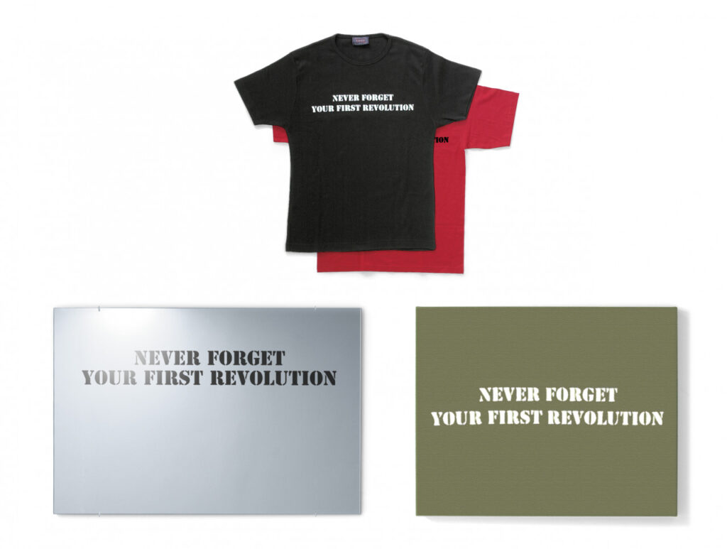
Tania Bruguera, Terror Chic, 2005, ink on t-shirts, shoulder bag, mirror, canvas, ed. 50, published for the 51st Venice Biennale by Editions Schellmann
Coming in 2005, smack in the middle of the Global War On Terror™, the 51st Venice Biennale may have been #toosoon for Tania Bruguera to drop two editions named Terror Chic. Twenty years and a few revolutions in, let’s see how it’s going.
One edition is what we might now call the Terror Chic Capsule Collection: a group of fifty objects—mirrors, messenger bags, t-shirts, stretched canvases—each printed with what Edition Schellmann calls Bruguera’s “thought-provoking slogan, ‘NEVER FORGET YOUR FIRST REVOLUTION.'”
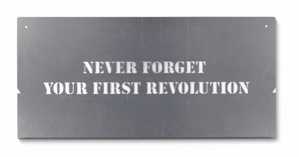
The other is more interesting: a Terror Chic metal stencil in an edition of 200, “to be used to print slogan on T-shirt, bag, wall, car, or any other object.” Now we’re talking. Bruguera’s stencil hasn’t even sold out yet, but it’s efficiency and durability have surely already spawned several revolutions, as well as a whole trend of fundraising edition stencils.
Meanwhile, if you’re in the market, never forget to shop around. The revolution can be had with a vip discount.
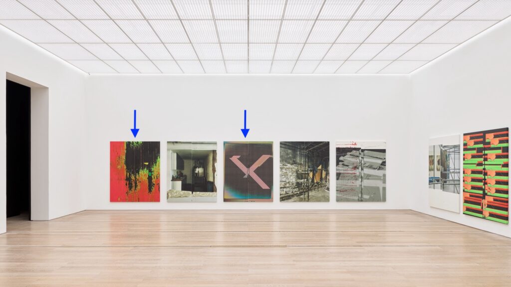
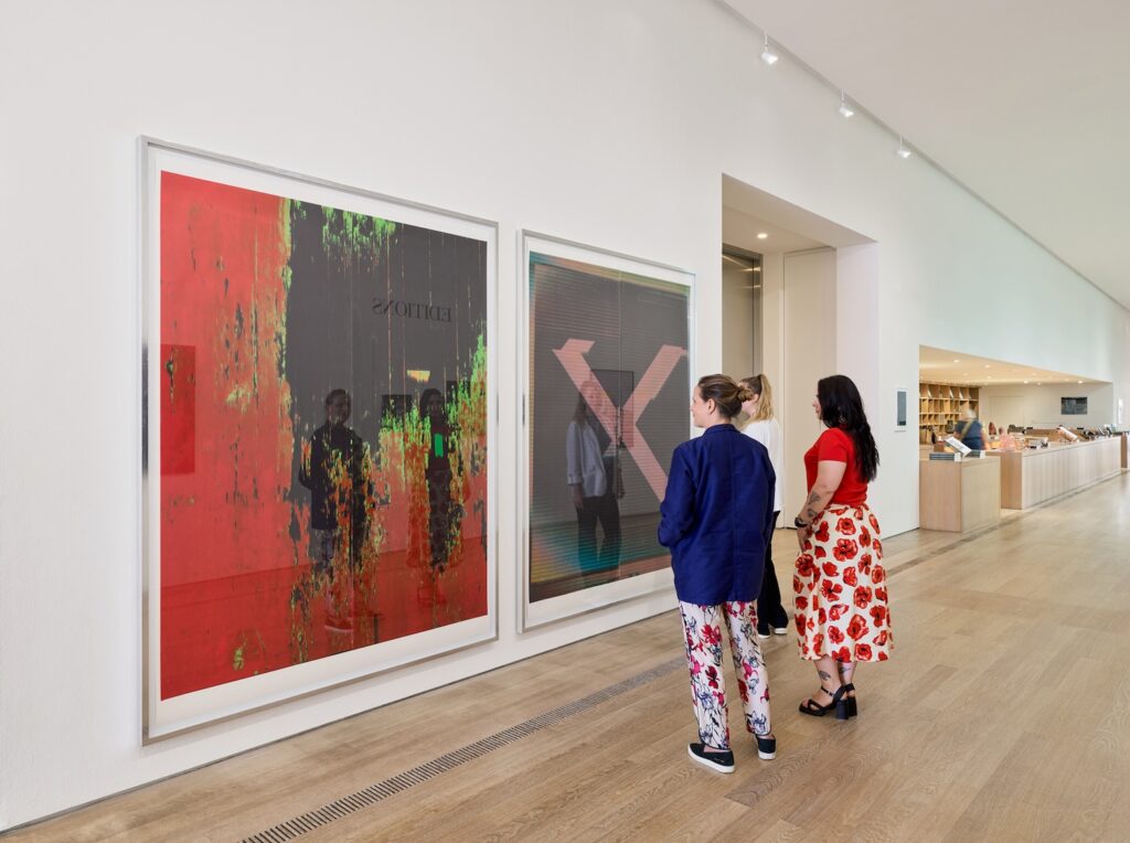
X Poster (Untitled, 2007, Epson UltraChrome inkjet on linen, 84 x 69 inches, WG1211), 2019, UV-resistant ink on paper on the right and, presumably, actual Untitled, 2007, Epson UltraChrome inkjet on linen, 84 x 69 inches, WG1211 on the left. image via PrintedMatter
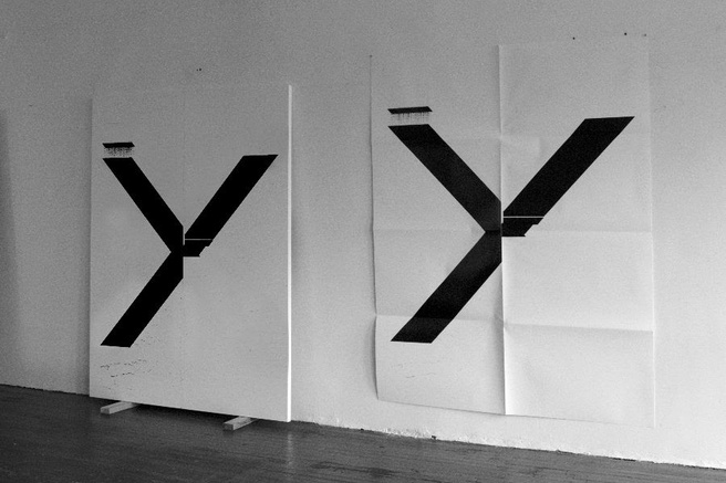
For six years, from 2014-19, Guyton made full-scale print facsimiles of his paintings as fundraising editions for Printed Matter. They were all posters of earlier black X-on-white paintings, and folding them by hand felt like part of the concept. From the proofs installed at the Beyeler, that does not seem to be the case anymore. These look as flat as the day they rolled off the Epson.
TFW I thought I’d seen these before, not just at the Beyeler, and I was like, “Duh, that’s his MO.” But no, I don’t mean in the “all Guytons look alike” mode. I mean in the sense that I felt like I’d seen these paintings before, at Guyton’s 2023 show at Matthew Marks. The X painting, WG5707, depicts a different scan of a different, earlier X painting than the one at Marks. And in fact, the 2024 Beyeler painting in the 2025 Beyeler print has striations that look like a photo of a monitor of a scan of a transparency of a painting, rather than just a scan of a transparency of a painting.
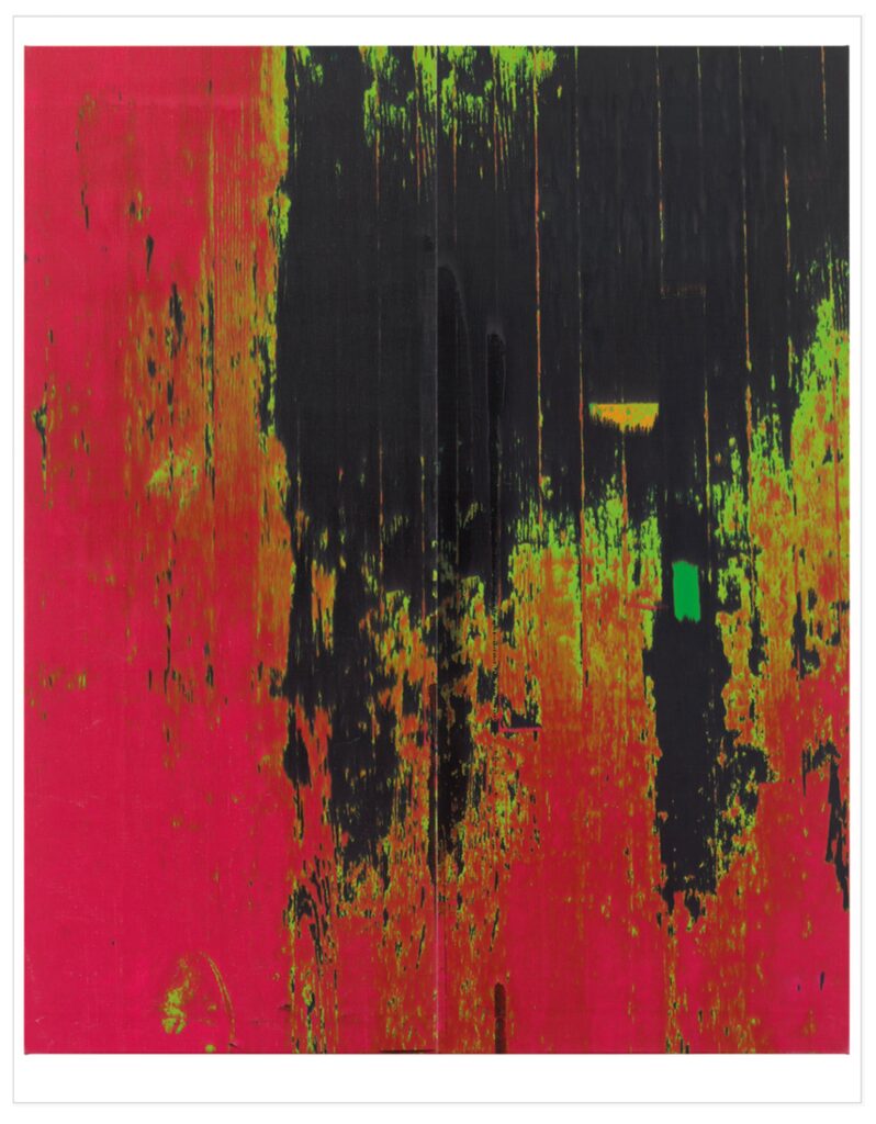
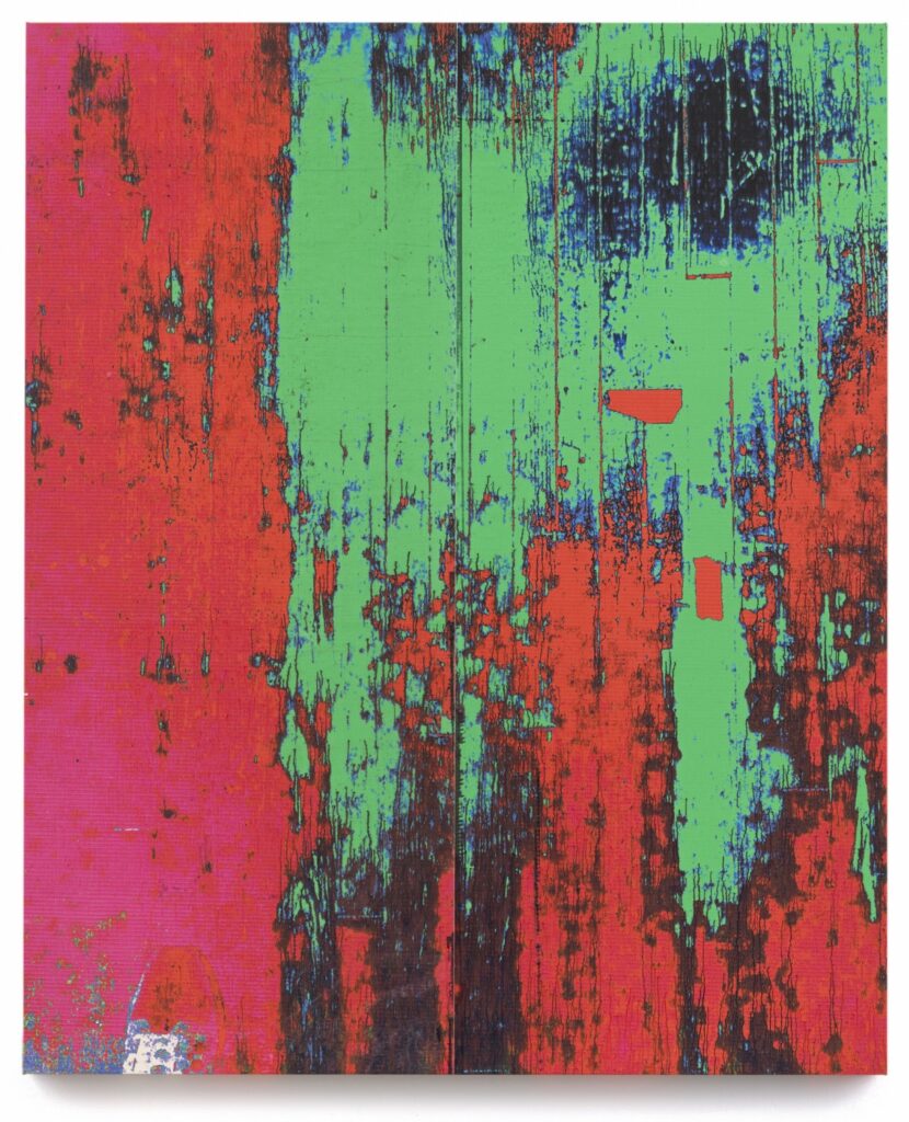
the jpg rendering of the 2025 print of the 2024 Beyeler painting, WG5703
But the other one, WG5703, the photo of Guyton’s studio floor, is, in fact, the same photo, though not the same painting.
Guyton likes to paint, photograph, and repaint the floor of his studio, and these Clyfford Still-like layered abstractions are the glorious result. But what these two paintings show is not found wear & tear. The tape, the shoe[?] in the lower left corner, the separations [not just layering, it turns out] of color. This is the same photo, in different states, printed on canvas, twice. Three times, actually; the Beyeler already has another variation from 2021.
But from observing these little differences in the same content, Guyton has expanded his source image folder to include screenshots of the Times, and photos of his studio, his work, and his life. His 2021 show at Marks in LA included images of Guyton recording his temperature. In 2023 there were paintings made of photos of protests, and a Manet ham.
As the vagaries of printing become absorbed into the language of his work, Guyton has expanded what he says by making work of what he sees. His work, his shows, images, and the world around him, have all become animating subjects of his mature process. Mature, but not static; processes are revealed in between the finding and the printing. As these two floor paintings show, the images flowing around him may also be manipulated, altered, and created.
At first I thought the recursiveness was new, too, but I think it was always there; the works, their shifting formats, their nested titles, their numbering system, all make us aware of the artist’s awareness. The beauty of that churn, that cycle, of making and showing and remaking, is a compelling subject for at least a hundred people going to Basel for the 20th or 30th time for buying and selling. One hundred plus ten artist proofs.
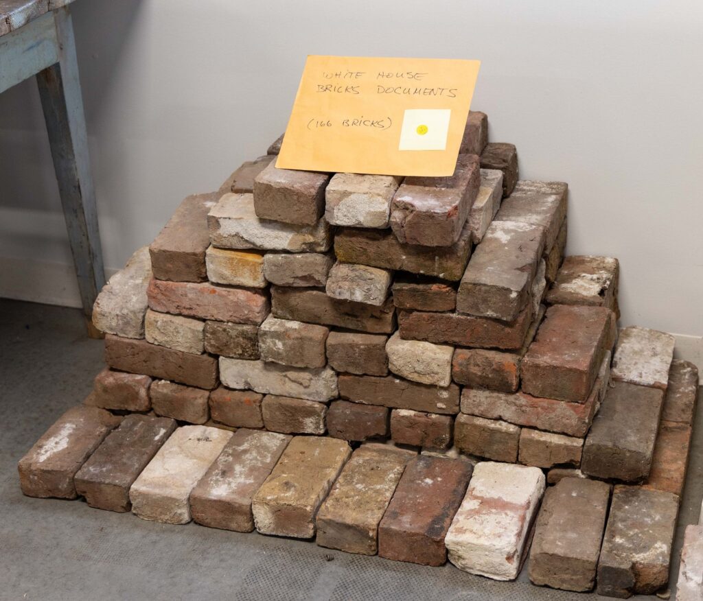
Enslaved people made the bricks for the White House from clay on or near the White House grounds at least twice. After the White House was burned in 1812, most of the original 1792 bricks were too damaged to use in the 1814-17 reconstruction. The 1817 bricks were removed during the 1948-52 gut reconstruction of the White House by President Harry s. Truman. 95,000 went for projects at Mount Vernon. 10,000 went to a project at Fort Myer. A New York congressman bought White House bricks left over from the Fort Myer pile, along with 1600 lbs of White House stone, and stored it at some guy’s farm for a while. When came to pick up most of it, he left this lot of 166 bricks. “This may very well be one of the last large groups of White House bricks in public hands,” says the Shenandoah Valley auctioneer Jeffrey S. Evans.
I’m trying to imagine the excitement if these original White House bricks were returned to the White House, or if they were exhibited publicly near the White House today. Or tomorrow.
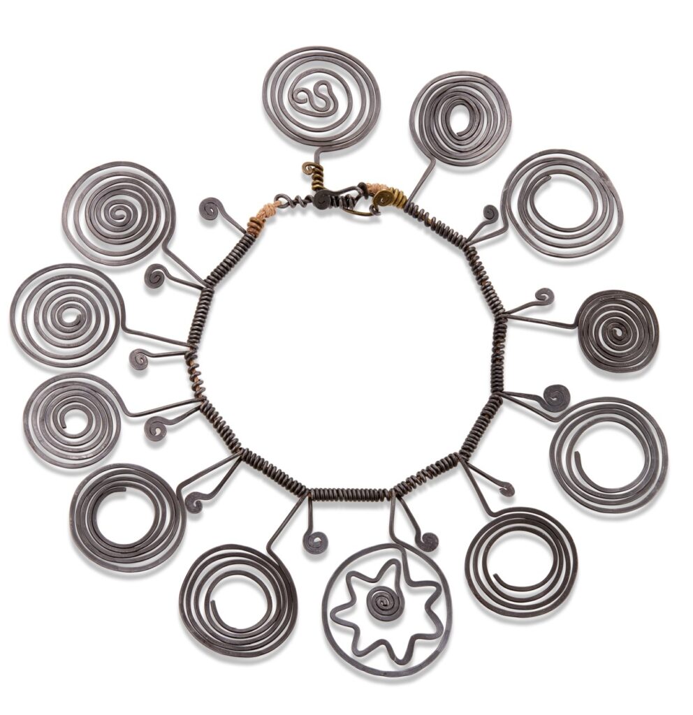
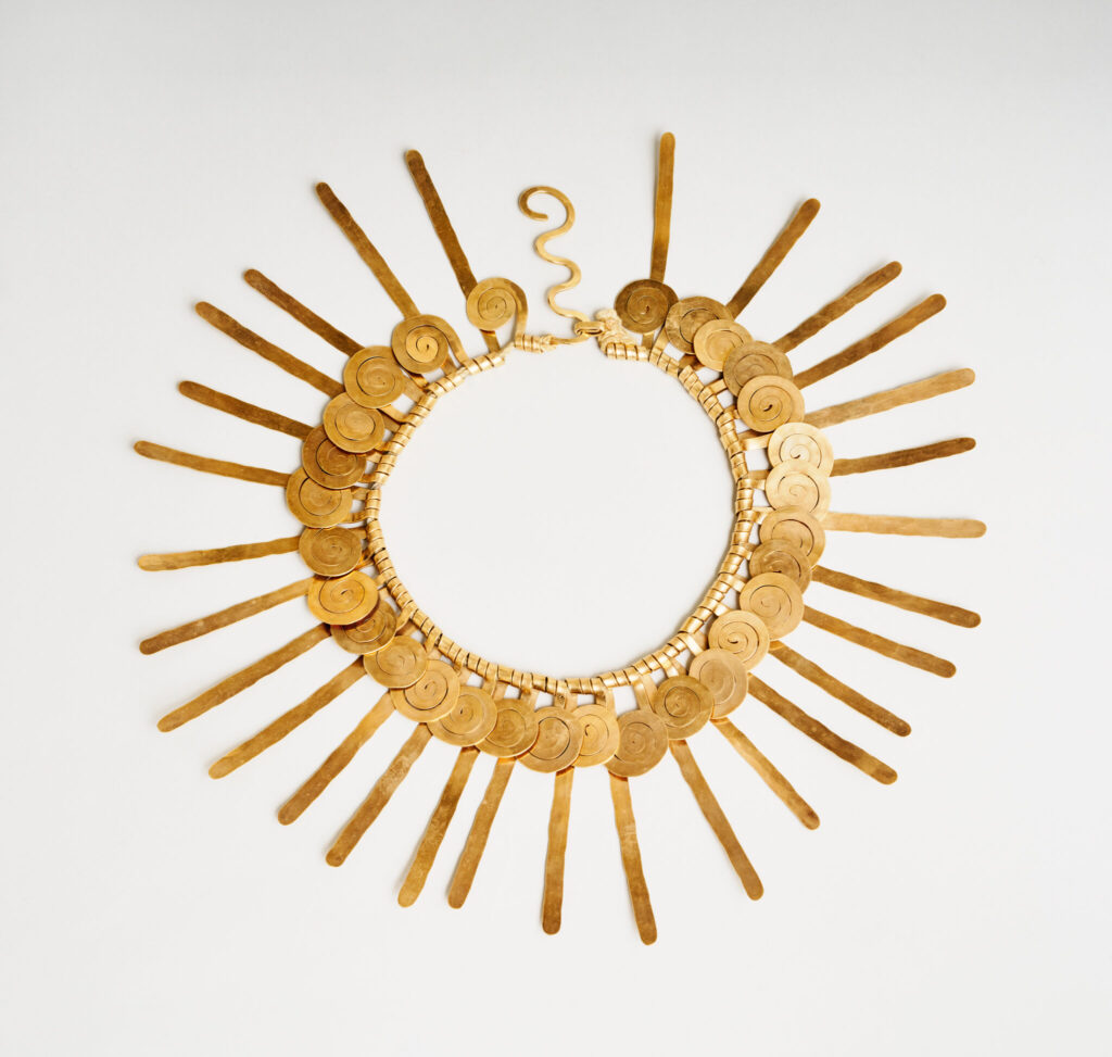
According to the Alexander Calder Foundation, there were 61 pieces of jewelry included in the artist’s first retrospective, Calder Mobiles, at the George Walter Vincent Smith Gallery in Springfield, Massachusetts, in November 1938. Was Encircled Star, 1938, among them? Christie’s doesn’t say. All they know is that Anne Bass bought it in 1972, when she was 31.
Alexander Calder, necklace, 1937, gold wire and cord, via calder.org
It is also not clear whether the similar necklace from 1937, in gold wire instead of steel, was not available, or if Bass figured steel was safer for wearing on the subway in the 70s.
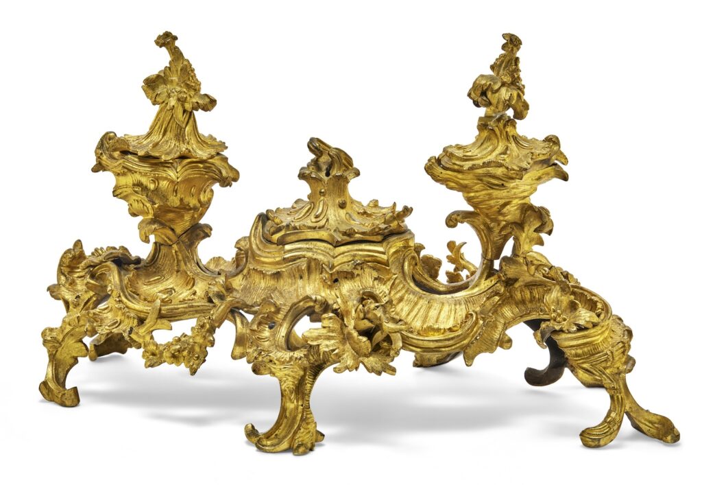
Encrier d’Époque Louis XV, 1740, gilt bronze, H 27 cm, selling 19 June 2025 at Christie’s Paris [update: ou pas! it did not sell]
And speaking of celebrated metalwork of the ruling class, this rocaille inkwell. Holy moley, how is this real? It has resulted in the following words, a kind of poetry, at once luxurious and terrible, which I reproduce here in French and translation:
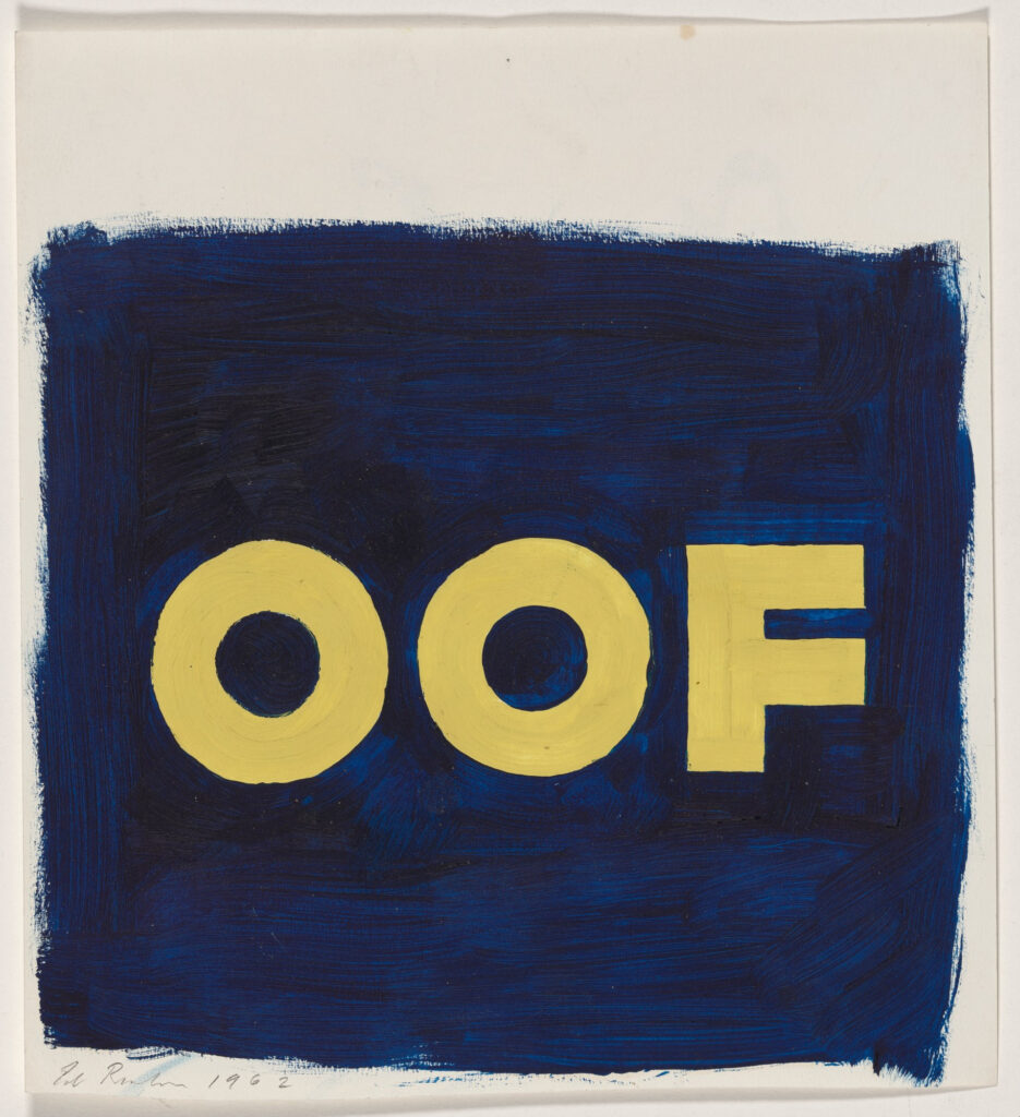
Ed Ruscha, study for OOF, 1962, oil and pastel, probably 12 x 11 in. or so, via the National Gallery of Art
The National Gallery has acquired an incredible study for Ed Ruscha’s OOF, but, amazingly, that is not important now. Because on the back is this:
Aux armes, les citoyens! verso, from Ed Ruscha, it says
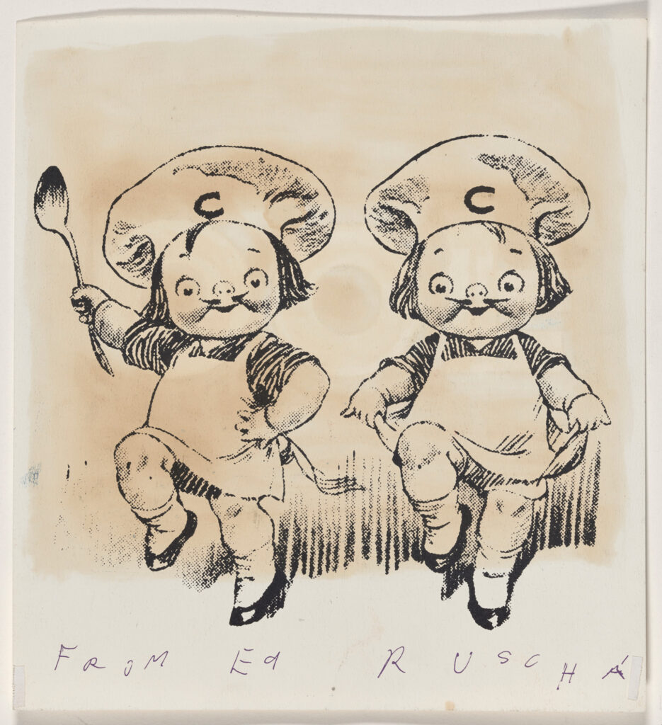
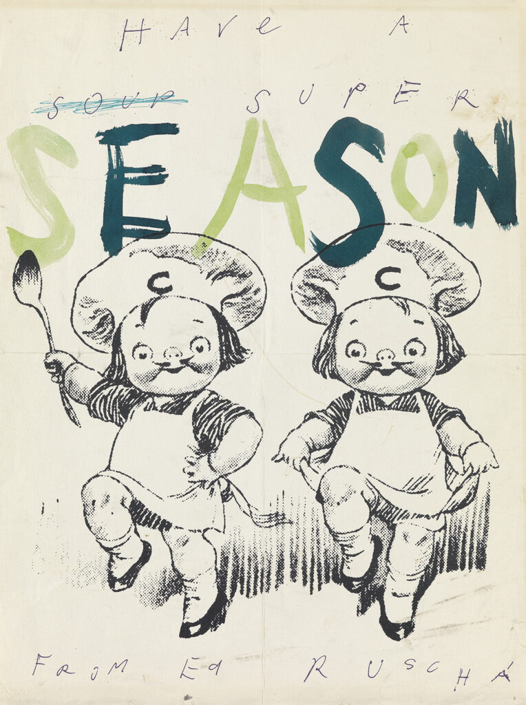
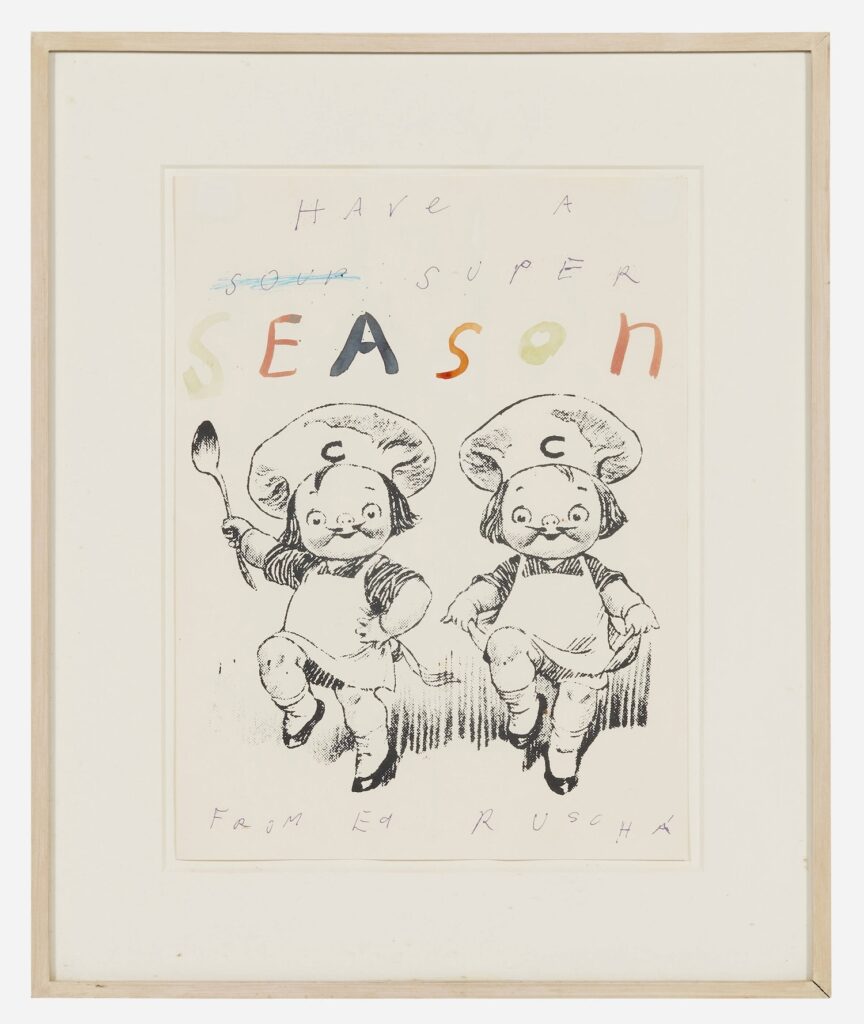
These are the Campbell Kids, used to sell soup. What are they doing on the back of Ed Ruscha’s study? I think they were left over from his 1960 Christmas card.
Ed Ruscha, paint on litho, 1960, 14 1/4 x 10 3/4 in,. sold at Swann in 2019 as part of a Ruscha grab bag
This one sold at Swann along with a whole stack of Ruscha deepcuts. The Campbell Kids have been lifted from a print illustration, obviously, but seeing them both, it turns out the “From Ed Ruscha” handwriting is printed, too.
Amazingly, there is another one coming up for sale, if the emperor allows it, in Los Angeles in two weeks. So the OOF sheet had the “Have a soup super” trimmed off. How long did Ruscha use his leftovers as scratch paper? Are there Campbell Kids on the verso of any other drawings? So many questions!
What I do know is that this LA Modern image, without the OOF oil soaking through, will be easier to make a t-shirt from. Stay tuned.
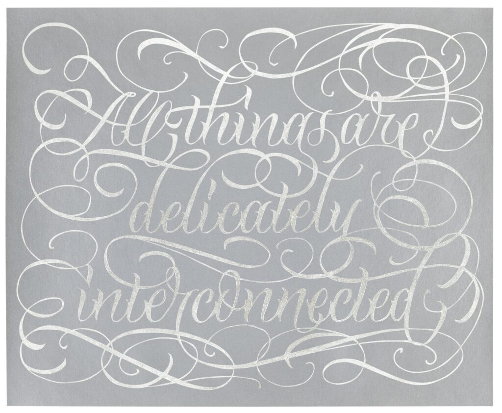
Jenny Holzer, delicately interconnected, 2020, palladium leaf on silkscreen ink on paper, 18 x 22 in., ed. 100+15 APs, this one selling at Phillips on 24 June 2025
In April 2020 I was not quick enough—nor, tbqh motivated enough—to run down one of the prints Jenny Holzer created for Hauser & Wirth as a fundraiser for Earth Day, which then also became a fundraiser for the WHO’s emergency COVID response. But since then, their unabashed etsy calligraphy has really grown on me, and makes me want to see “Live Love Laugh” carved into an exotic granite bench.
Fortunately, all 100 original buyers were flippers, because they come up for sale pretty regularly, unframed. And, after donating portion of the proceeds to support auction houses in need, they usually get most of their original purchase price back. A good reminder for anyone in the Holzer benefit print racket: the houses and the Hausers always win.
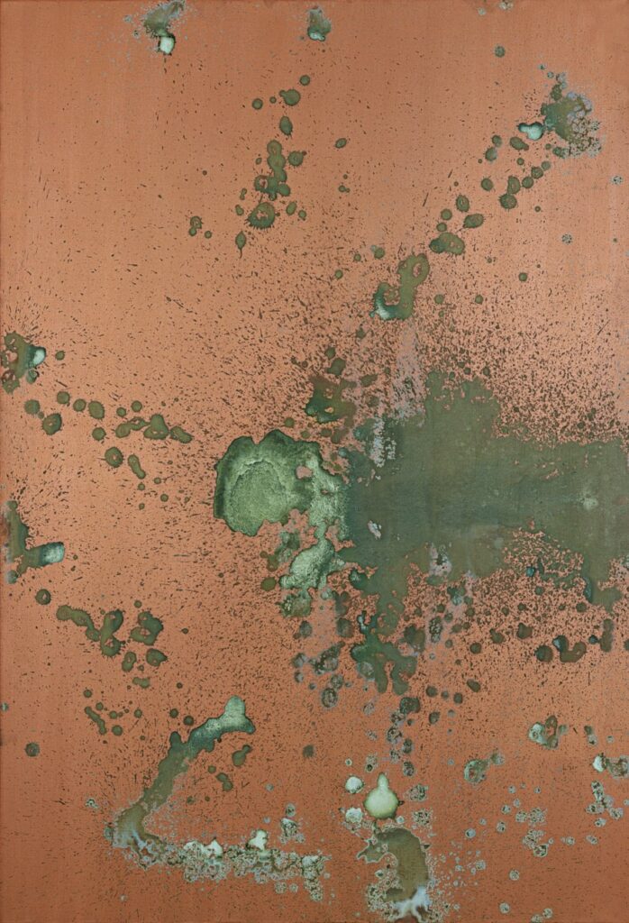
I’ve heard in the long run they stink, but then, so does Versailles. I do like Warhol’s Oxidation Paintings, though. I like how they went from Piss Paintings to Oxidation Paintings as their critical discourse expanded and their market value increased. How a taxonomy developed, where Piss Paintings are just the ones with piss on gesso.
I like how my sporadic attempts to research the Oxidation Paintings reveals that almost every piece of writing about them longer than a caption is the same. They use the same journal quotes about Ronnie Cutrone and vitamin B; the same Pollock, Duchamp, Mapplethorpe references; the same washed up comeback narrative, recovering from the same celebrity portraitist dismissals.
Is this all there is? Or is this all there is that keeps the market open and prices up?
From the press release: “[The show] offers a glimpse into a moment when Warhol, often perceived as emotionally remote or mechanically detached, engaged with the most intimate forms of mark-making. And it reminds us that beneath the surface, there is always a question of presence, of process, and of transformation.”
Andy Warhol, Oxidation Painting, 76 x 52 in., turned the other way, via Skarstedt via Phillips
Indeed, how were these paintings actually made? If it’s as straightforward as they seem, why did Warhol say it was so difficult? Do vitamins or other intake really affect the color outcome? Has someone tried to replicate these? And how does a painting made on the floor get a top and a bottom? Because Skarstedt is showing this one turned the other way, as Phillips did in 2022 .
[Morning after update:] greg.org hero Christian Oldham reminds us that Sturtevant had a great story about Warhol asking her to make one of his piss paintings, and she said, “Andy I don’t have the right equipment.” The rest I’ll leave to her.
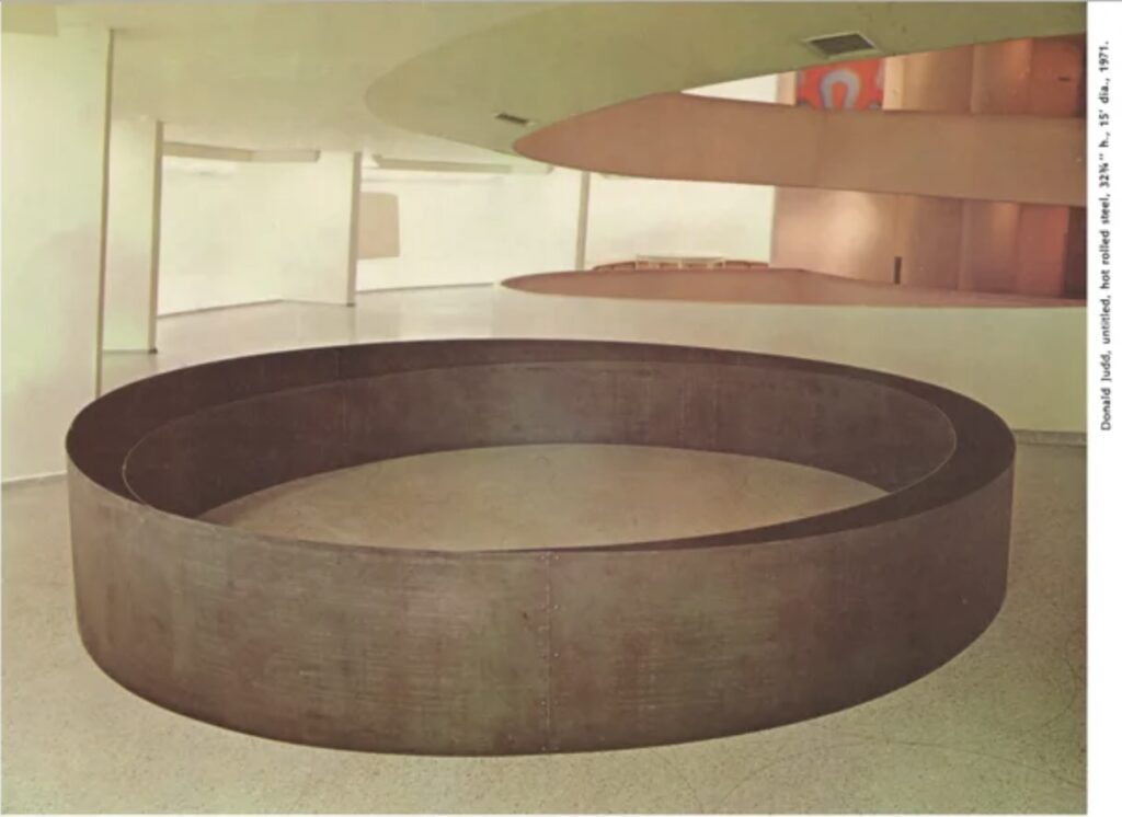
Donald Judd, Untitled, 1971, 32 3/4 in. x 15 ft diameter, hot rolled steel, as installed at the Guggenheim International, via artforum
Donald Judd was extremely critical of the Guggenheim for, among many things, not buying art from him and other artists over the years. In 1990, around the time of the Guggenheim’s controversial acquisition of works from Giuseppe Panza, Judd wrote about participating in the Guggenheim International:
The one time that I’ve been involved with the Guggenheim is that for one mass exhibition I made a circular work of steel for the ramp in an attempt to deal with and acknowledge F.L. Wright’s architecture, which the museum itself is now desecrating, meanwhile, contrarily, expanding north and overseas. Despite my warning, this work was sold over a summer by Joe Helman to someone in St. Louis, who in passing on, passed it along to the Guggenheim, which evidently concluded that the work and the owner should remain together and stored it outdoors to irreparably rust. Years went by. Then last year Diane Waldman wrote that the museum wanted me to remake the piece. Well, the museum destroyed a work of art. Should the artist make good? I don’t want to have my work in Count (1940) Giuseppe Panza di Biumo’s Collection in the Guggenheim Museum and in its corporate departments of mass MOCA, Salzburg and Venice. I don’t share the attitudes back of this kind of behavior.
The 15-ft diameter work, above, comprised two concentric circles of steel. The inner one was of uniform height. The base of the outer circle matched the 3% grade of the Guggenheim’s ramp, and so the top appeared to be level. This discrepancy created an interesting tension and instability, even in an old photo. This image ran in an issue of Artforum with Richard Serra’s similarly round, steel, and site-specific work embedded in the pavement on 183rd St in the Bronx, on the cover. [Serra made it for the 1971 Whitney Annual.]
And besides the torqued ellipses, obviously, Judd’s sloped work also reminded me of a steel wedge Serra made for a ramp in what used to be a loading dock at Gagosian’s 24th St space. And the whole point of mentioning it here is that leaving the work outside to rot and then assuming the artist will remake it for you is almost exactly what happened with Cady Noland’s Log Cabin.
This circular Judd is not on the Guggenheim’s collection list at the moment.
Donald Judd’s “Una Stanza Per Panza” is a fascinating, rambling, exasperated defense of the primacy of the artist in making and making decisions about his work, threaded through a fierce, bitchy, gossipy rant about the pomposity and presumptuousness of problematic and profiteering collectors. And dealers. And museums. Some museums. The ones who didn’t support working artists for decades, but who then give tens of millions of dollars to a collector who made grand, hollow promises to hoover up works on the cheap.
It was all driven by the years-long conflict with Giuseppe Panza over the terms for realizing artworks, sold by Leo Castelli as certificates or plans on paper. Judd’s understanding was that these were permanent, site-specific installations to be constructed under his supervision. Panza saw them as authorizations to make Judd sculptures when and where he desired, including making local copies for museums, and for sale. The evolving realization [sic] of how far apart these views of art were is a subcurrent of Judd’s 25,000+ word text. Though whatever his position at any given moment or paragraph, Judd never wavers in his own rightness.
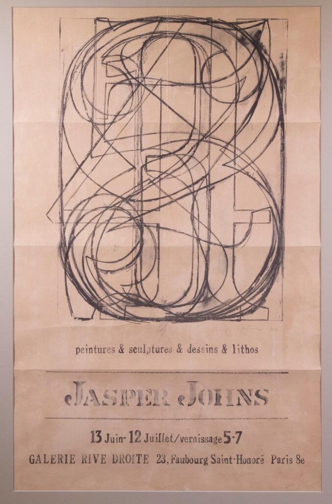
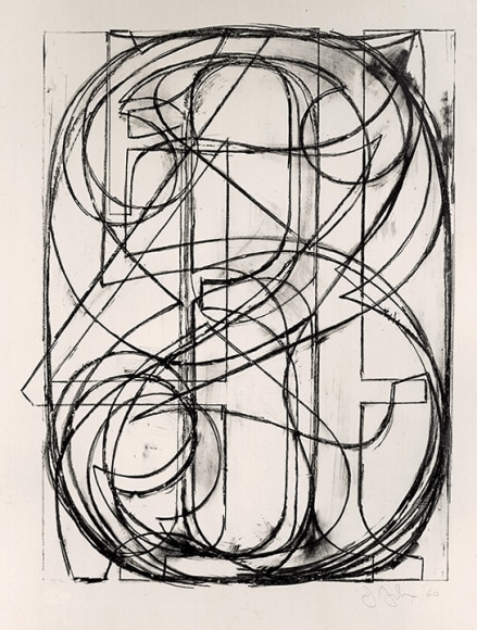
Even MoMA lists it as 1960, and they got their copy from the artist in 1961, so maybe. But the exhibition being announced here, Jasper Johns’s first show in Europe, absolutely took place in the Summer of 1961.
I get the confusion, though. Because the poster—most were actually mailers—reproduces a Johns lithograph, signature, date, edition number and all. 0-9 (ULAE 3), 1960, was published in an edition of 35. And whoever got No. 28 photographed it for this poster. Did the Galerie Rive Droite produce the poster, with Johns’s name in his already distinctive stencil? Or was it made in the US? That freeform accent over the Saint-Honoré makes me wonder. In any case, it has a nearly uniform handmade elegance that belies its offset print reality.
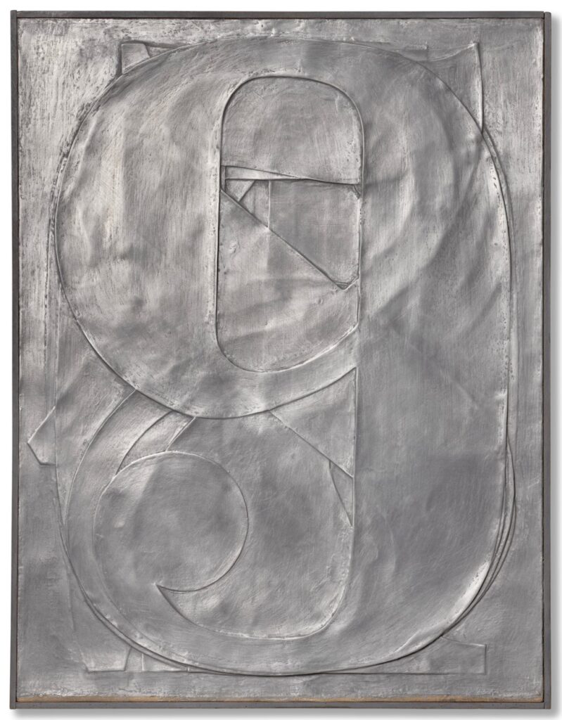
Jasper Johns, 0-9, 1961, sculp-metal and collage on canvas, 67.6 x 54.2 cm, originally shown at Galerie Rive Droite, and sold in 2024 at Christie’s
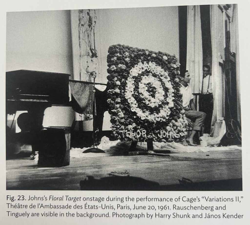
Galerie Rive Droite was around the corner from the US Embassy where, in the week after his opening, Johns, Rauschenberg, Jean Tinguely, and Niki de St-Phalle organized an art-filled performance for pianist David Tudor. June 20, 1961.
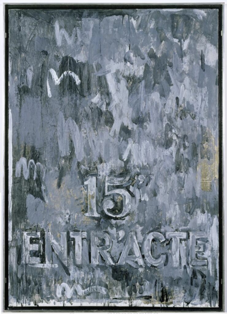
Jasper Johns, Entr’Acte, 1961, encaustic & collage on canvas, 92 x 65 cm, currently the Collection Ludwig
Johns sent flowers in the shape of a target* and whipped up a painting in the Paris studio of Alabamian ceramist Fance Franck. Though there was no actual intermission and the action never stopped, Entr’Acte was placed on stage for 15 minutes. Like the Sculp-metal 0-9 collage in the exhibition, Entr’Acte was bought by the secretary at Galerie Rive Droite, Georges Marci.
But was it really? To Google her now, Georges Marci shows up in the provenance of various blue chip artworks, is repeatedly called the “grand dame of contemporary art in Switzerland,” which has to be a self-anointed thing, and is known for opening the first gallery in Gstaad. But I guess people never thought the tapes would be made public, because in her 1974 oral history for the Archives of American Art, dealer Judith Richardson basically called Marci a thief who murdered her husband.
Richardson worked for both Sidney Janis and Ileana Sonnabend, Castelli’s ex. Which meant she worked with many overlapping artists with Galerie Rive Droite, run by Jean Lecarde. Lecarde wanted to open a gallery in Switzerland, and to get around the residency requirements, he transferred all the inventory to Marci’s name. And then she just froze him out and kept it, and he went bankrupt. This is how Arman tells the story, Richardson said. Arman was there, she said he said, when Marci set her depressed Egyptian husband up with the pills he used to kill himself. And then she got all his Coptic art.
Anyway, where were we? Johns found encaustic in Paris, borrowed a studio, and made this painting in like a day or two. While also finding time with Bob to shoot some paintings at St Phalle’s. Eric Doeringer just saw one at the Tate, shot by both Rauschenberg and Johns, and texted me about it. Turns out it was in St Phalle’s show that opened June 30, 1961. A busy summer in Paris.
Previously, related: The Performance Art in Embassies Program * I have long wanted to see, then make, this flower arrangement, but I can’t remember where I’ve ever seen a photo of it. Somewhere, though. I’ll look.
In her MoMA retrospective, Leah Dickerman had a photo of Rauschenberg painting on stage while David Tudor played the piano. But she also said Johns carried his painting on stage to signal intermission, while Tomkins said Johns refused to go on stage. Both could somehow be true.
Shunk & Kender, is there anyplace you weren’t in the 60s? Jasper Johns’ Floral Target, 1961, at David Tudor’s performance of Cage’s Variations II in Paris, via Roberta Bernstein’s chronology in JJ CR, vol 5
I knew I’d seen it somewhere. A closer look at Roberta Bernstein’s chronology shows Johns was booked and very busy in Paris: he made two plaster casts** in Tinguely’s studio; his costumes appeared on Merce dancers June 12; his show opened June 13; Tudor’s performance on the 20th; and he helped install Saint-Phalle’s show, which opened on the 28th. Also, what part of this itinerary did Shunk & Kender plan to be there for? Because it is amazing that they were around for an impromptu concert that came together in a matter of weeks.
** About those plaster casts: they were made from moulages made of the sculp-metal 0-9 and a similar Figure 3 from the Rive Droite show. So a 2nd generation cast. Which Johns used to promptly cast four more 0-9 in aluminum and, in 1997, four Fig. 3 in bronze. I low-key love that this feels like Johns wanting to keep engaged with works of his own that he expects not to see again, at least for a while.
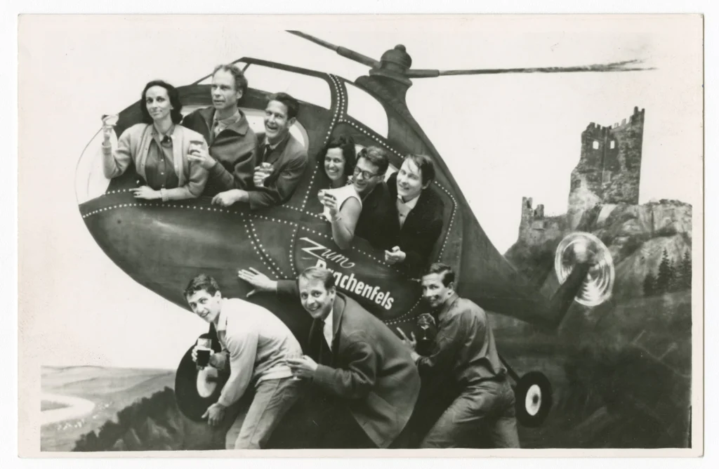
And then Bluesky blew my mind when Michael Lobel and Michael Seiwert both posted this photo:
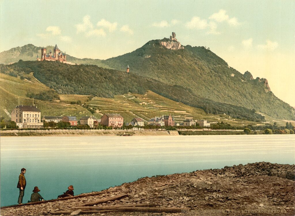
Inside: Carolyn Brown, Merce Cunningham, John Cage, Doris Stockhausen, David Tudor, Michael von Biel; Underneath: Steve Paxton, Karlheinz Stockhausen, Robert Rauschenberg, a 1964 photo from Königswinter at the Robert Rauschenberg Foundation, via Museum-Brandhorst
Germans see this 1964 photo taken during a Merce Cunningham Dance Company world tour and are like, Mein Volks! The Tate caption incorrectly says it’s from Cologne, but it’s got Drachenfels written right on the helicopter. Seiwert points out that in 1964, Stockhausen was living near Königswinter and Bonn, the capital of West Germany, so it would have been an obvious destination for our intrepid dance troupe.
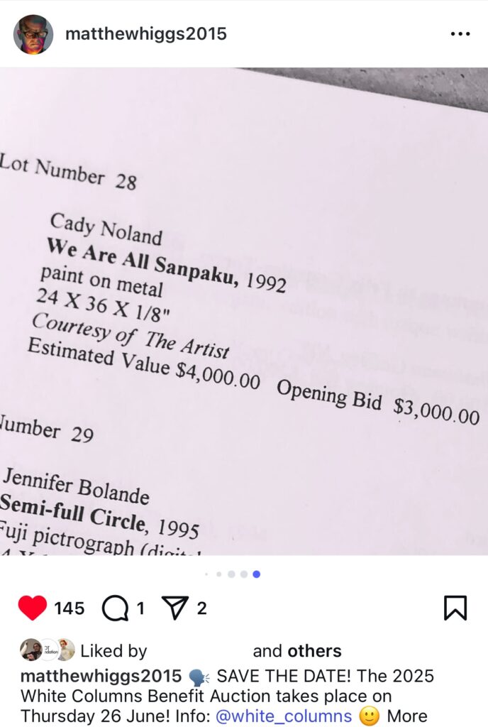
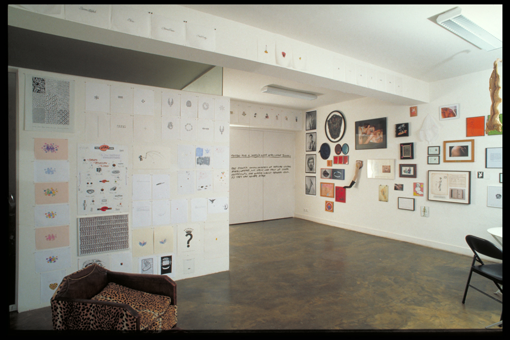
White Columns’ archives have a lot of amazing stuff, but not all of it. Director Matthew Higgs regularly posts outtake gems to his instagram, like he did yesterday when he announced the upcoming White Columns Benefit Auction (June 26, tickets and exhibition start next Friday) by posting some pics of previous benefit auction checklists.
Like this one from at least 1996, when Cady Noland donated a work from 1992 that does not appear anywhere else in the public record. What is/was it? A cozily sized screenprint on aluminum, sure, but of what?
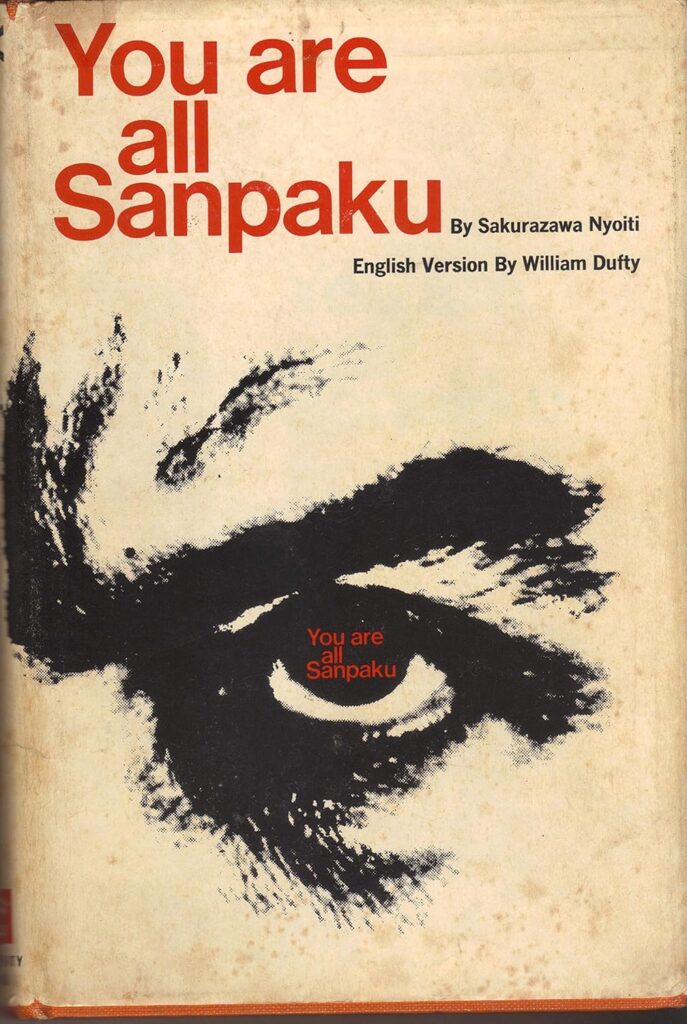
We Are All Sanpaku is a phrase that probably felt so culturally obvious at one point that it was hard to imagine having to explain it. But We Are All Sanpaku’s moment was not 1992. It had already reached New Yorker cartoon punchline by 1985. Nixon was sanpaku, and—most crucially here, I think—Charles Manson was sanpaku, too.
We Are All Sanpaku is the despairing public’s confessional response to the 1965 declaration, You Are All Sanpaku, a best-selling book on Japanese physiognomy and macrobiotic diets by a guy with at least six aliases, including Georges Ohsawa. Sanpaku, three whites, is when the sclera, or white of your eye, is visible on three sides of the iris, rather than the normal [sic] two. Like your blood type and being born in the year of the goat, sanpaku has dire health, psychological and prophetic implications.
After diagnosing the western world—and the most prominent people in the news in the 1960s and 70s, including JFK, Marilyn Monroe, John Lennon, Nixon, and Manson—with not meeting Japanese beauty standards, Ohsawa said it could be cured with brown rice.
Sakurazawa Nyoiti is just one of his names
Which, whatever, my point here is that the aesthetic possibilities of what Noland painted on that metal sheet are a rich feast, and I want to see it. Charles Manson’s mugshot that ran on the cover of LIFE? The ominous eye from the first edition dust jacket? Nixon? In the spirit of sanpaku, I might just make something up and pretend it’s real.
Autochrome postcard of the ruins of Burg Drachenfels above the shiny newness of Schloss Drachenfels above Königswinter, c. 1900, LOC via wikipedia
In the Niebelungenlied, the dragon Fafnir lived in Drachenfels, a mountain towering above the Rhine. Siegfried killed him and became invulnerable by bathing in his blood. The poems of Byron and travelogues of Schlegel turned the Burg Drachenfels and other ruins of medieval castles along the peaks of the Rhine Gorge into Romantic tourist destinations, from which western culture has not recovered. Since 1883 a railway has taken tourists to the Burg Drachenfels, which once protected Cologne from southern invasion. Halfway up is the Niebelungenhalle, a shrine to Richard Wagner filled with Hermann Hendrich’s paintings of the Ring Cycle.
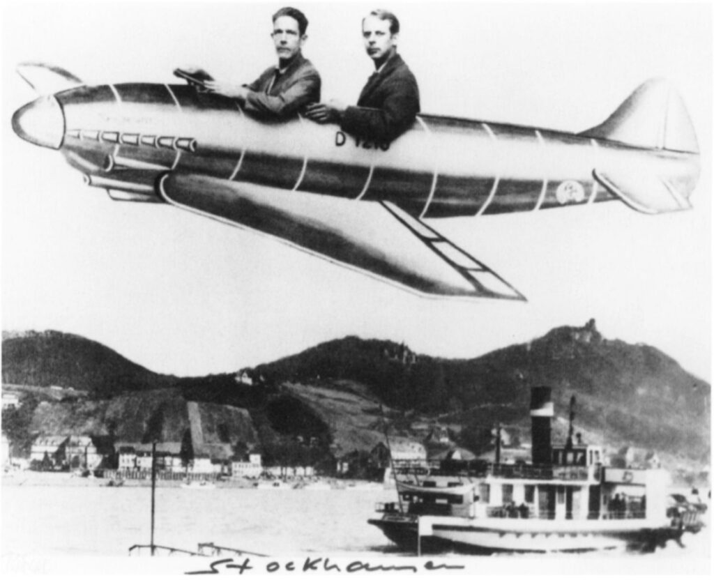
At the base of the railway, in the town of Königswinter, from the end of WWII until the rise of cellphone cameras, Richard Kern ran his family’s Schnellfotografie studio, taking instant souvenir photos for tourists. His 90th birthday last fall was the occasion for all of Germany to remember their childhood visits to Königswinter, when they sat on the donkey, and behind the cardboard plane.
“Untitled”, 1990. Installed in Tattoo Collection. Galerie Jennifer Flay, Paris, France. 3 Jun. – 18 Jul. 1992. Conceived by Air de Paris and Urbi et Orbi, image via Air de Paris by way of FG-T Fndn
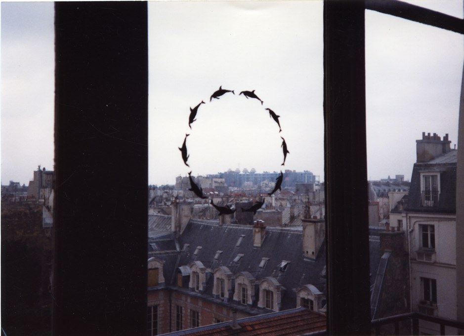
Last weekend the curators of the National Portrait Gallery and Archives of American Art’s exhibition, Felix Gonzalez-Torres: Always To Return, held a public conversation about Felix Gonzalez-Torres tattoos. It was great. But no one, including the curators and art historians who have Felix tattoos, and not me, the rando blogger who’s written about them twice, quite knew the origin of the tattoo Felix made as an open edition in 1992.
In my question to the panel, I said I thought it had been created for a show of artist tattoos, but no one else had heard that, and then I saw that info is not on the Foundation’s website, and I was like, Oh no, did I just Felixsplain something to the professionals and get it wrong?
No, I did not. But I did forget that I’d written about the show sixteen years ago.
Tattoo Collection, installation view, Summer 1992 at Jennifer Flay Gallery, Paris, via airdeparis
“Tattoo Collection” began as a project in 1991, conceived by gallerists Florence Bonnefous and Édouard Merino and Lawrence Weiner, for Air de Paris in Nice. The first 30 artists to create tattoo designs were also asked to invite someone else. Its first incarnation, of Weiner’s design on Bonnefous’ back, took place on a Monaco rooftop. Over two years the project expanded to six other galleries and almost 200 artists. 33 years ago today, 3 June 1992, it opened at Jennifer Flay’s Paris gallery as a summer group show.
In the years since I posted about it, Air de Paris has filled out the “Tattoo Collection” archive with a press release, a 2014 interview, a couple of installation photos, and the names of 189 participating artists, and the consignment forms for most of them—but only some of the tattoos themselves.
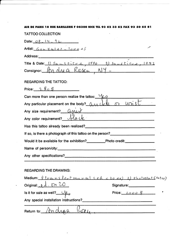
“Untitled”, the 1990 rub-on transfer edition of a stylized ring of ten dolphins that was included in Felix’s January 1990 show at Andrea Rosen, was included here, too. The consignment form from 14 Aug 1992 lists two works, both “Untitled” (or “sans titre,” so the survey was filled out by AdP, not Andrea Rosen), with dates of 1990 and 1992. The former is a rub-on transfer (ed. 20), and the latter is a photostat for the open edition tattoo.
Felix Gonzalez-Torres consignment survey for Tattoo Collection, 1993, airdeparis.com
AdP’s basic instructions survey on the consignment form say the tattoo can be bought by anyone, should be black, and should be placed on the “ankle or wrist.” Unsurprisingly, these were not static; the parameters in the certificate Meg Onli got when she purchased her edition from Rosen in 2011 are different and more expansive.
What does seem certain, though, is the connection between the tattoo and the rub-on transfer edition from two years earlier. Though the source of the dolphin motif is still unknown, the source of the tattoo image is the 1990 edition.
There is also much to be explored in the larger Tattoo Collection project. Bonnefous got the inspiration from the instructions for Weiner’s works, that “the work need not be built.” Between this conceptual core and the impermanence of the body, it’s seems realistic to say that the show—and the work—continues to this day, and it’s only our knowledge of it that is limited. Or our memory.