This post will be updated as more motivs emerge.
the making of, by greg allen

This post will be updated as more motivs emerge.
Europe: it really is the little differences.
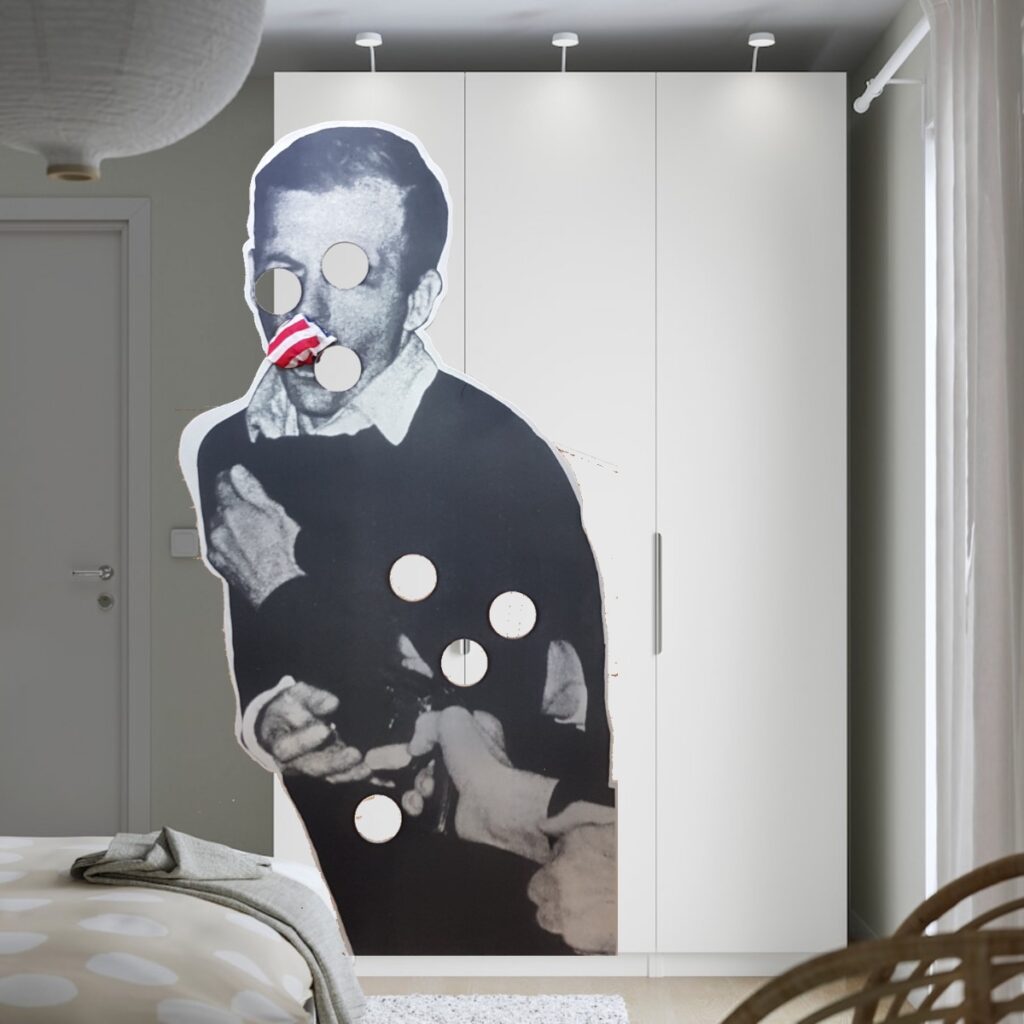
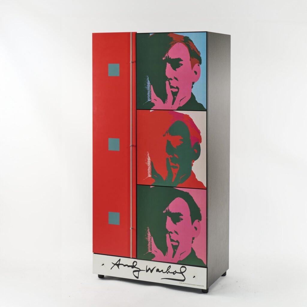
It was during the entirely normal activity of researching some Enzo Mari modular shelves that I stumbled upon the absolute licensing mayhem of the Art Design by hb Collection Limited Edition Europe Andy Warhol Foundation Wardrobes, Cabinets, and Cupboards. The first one I saw is above, half of Warhol’s 1966 work, A Set of Six Self-Portraits silkscreened onto the varnished MDF door of a wardrobe. In addition to Warhol’s signature—AND the 1997 copyright credit for The Andy Warhol Foundation, Licensed by MMI [putting a pin in that for later]—silkscreened on the bottom of the drawer like you do on any piece of furniture containing licensed imagery, I guess? In addition to this, there is also the label inside, with the edition number, 405 of 500, and eight metal hangers.
If there were only 500, it would be enough. But there are 500 OF EACH.
Continue reading “Warhol Cupboards And The Expanded Field”
I have to study politics and war so that my son can study baseball and coaching the college swim team, so his son can study poetry, painting and music, so his son can also study painting of an occasionally quite similar style to some of the late works of the son one son up that yet somehow goes unremarked, so that his son can study art dealing and opening a gallery to show the son one son up from him but also the son two sons up from him, though only the works that looked like Picasso, said Allen Goss Twombly (1860-1954) at some point, apparently.
I am still trying to wrap my head around the enormity of what Duncan Mclaren’s accomplishing in his day-by-day, work-by-work, trip-by-trip, show-by-show documentation of On Kawara’s life. But without it, I somehow would have not realized that Kawara painted one Today series work in Salt Lake City.
I say somehow because I didn’t clock it when I saw this painting in 2012, at David Zwirner’s show, “Date Painting(s) in New York and 136 other cities.” Which was very much a show about Kawara making date paintings all over the world/in New York City. Or so I thought.
Actually it was a show of date paintings made all over the world, which is not the same thing. Mclaren’s project of combing through the data of Kawara’s oeuvre, is about the making, and of finding the glimpses of the artist and his life in work that seems to obscure it.
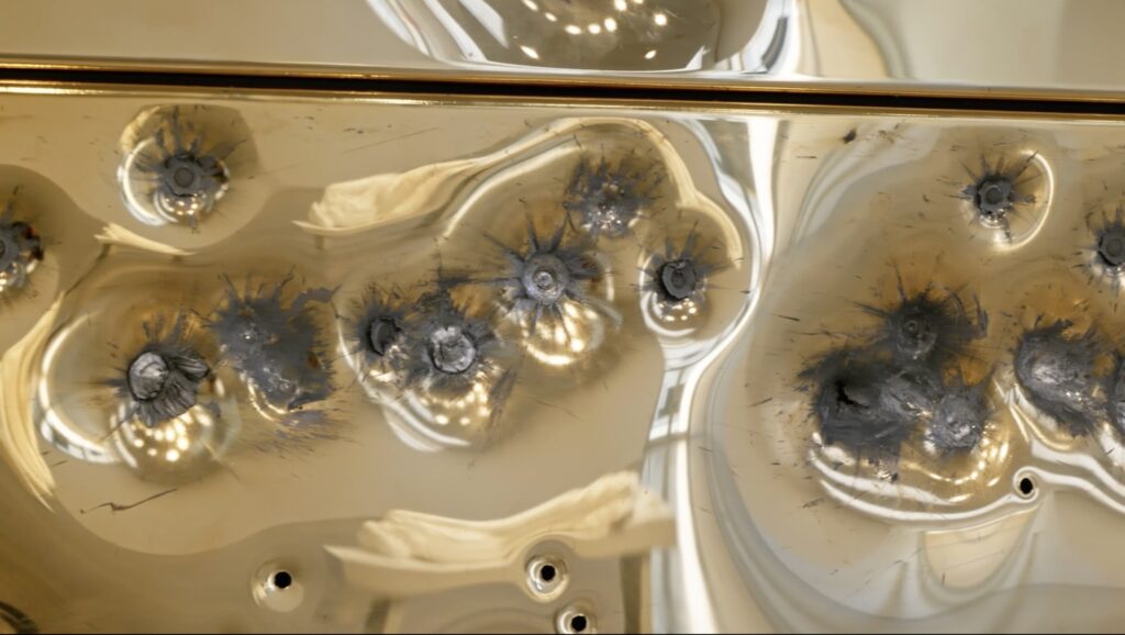
In his Brooklyn Rail review of Maurizio Cattelan’s Sunday, Andrew Paul Woolbright makes an observation that I haven’t seen mentioned anywhere else, but which feels like it is central, even foundational, to the work:
Composed of gold plates perforated by bullet holes, Sunday’s surfaces seem to swell, making them formally strange—somehow both ballooned-up and torn-through. Their self-violation as a luxury surface is produced by an uncanny shockwave of physics. Freud defined humor as an important act of transgression, and it is the separation of the audience from what went into making the sixty-four gold-plated panels that is transgressive: in a top-secret invite-only warehouse in Queens, through trick doors and passcodes, Catellan led a group of collectors and art-world VIP’s into an underground shooting range where marksmen fired on the gold plates, an act that detourned the process of violence by making it into an exclusive event.
If he hadn’t made a solid gold toilet named America, I might not have believed it, but I think Cattelan’s project was over months ago.
And so the gold-plated, bullet-riddled wall is just the morning-after detritus of a happening where people thrilled to be party to the spectacle of violence.
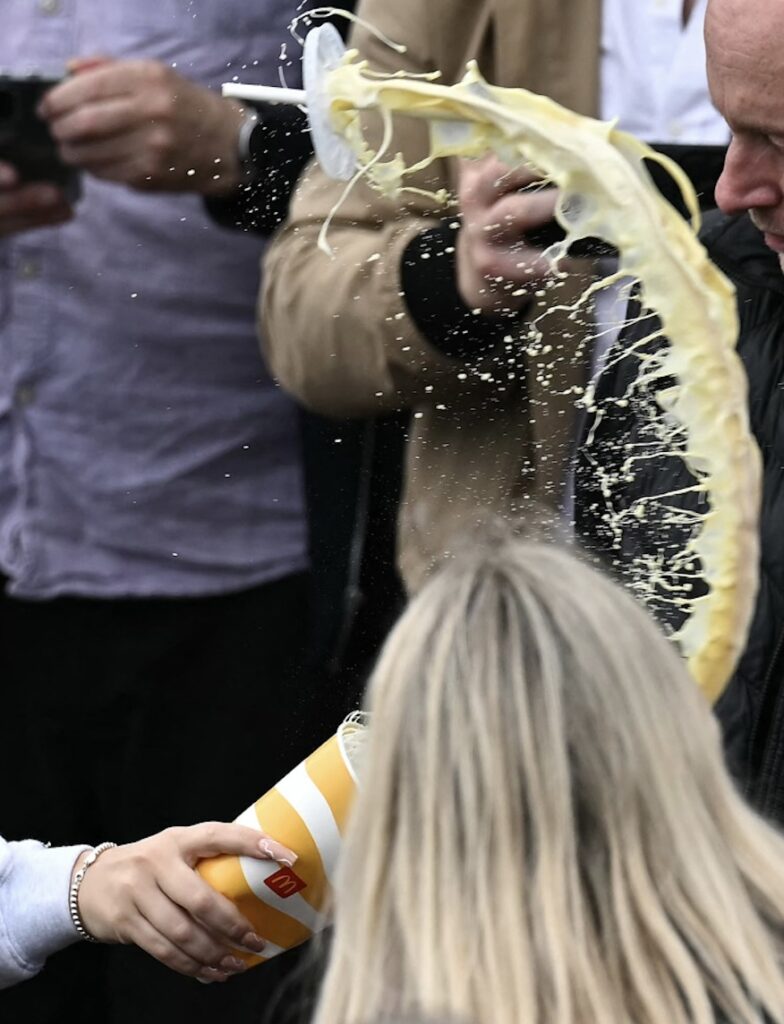
And it bends toward Nigel Farage’s face.
[image detail from Ben Stansall of AFP/Getty’s sublime triptych of an activist nail art aficionado dousing Farage with a large banana shake from the McDonald’s in Clacton-on-Sea]

New York prosecutor Joshua Steinglass presented as evidence of Trump’s routine coverup and document fraud a falsified invoice for a shell company created to hide a different $125,000 hush money payment as an “Agreed upon ‘flat fee’ for advisory services.”

I post it here for the same reason Bump posted it at the Post: to praise Michael Cohen’s choice of clip art. It is a distorted rendition of 3-D Bar Graph Meeting, a stock image created by Scott Maxwell of Lumaxart. A version of it created on Christmas Day 2007 was uploaded the next day to flickr.

Though he’s moved his operation to Shutterstock, one of Maxwell’s last updates to his blogpost blog, The Gold Guys, was from 2017: a unified quorum of rainbow stick figures expelling a gold-plated wannabe king, and the word IMPEACH.
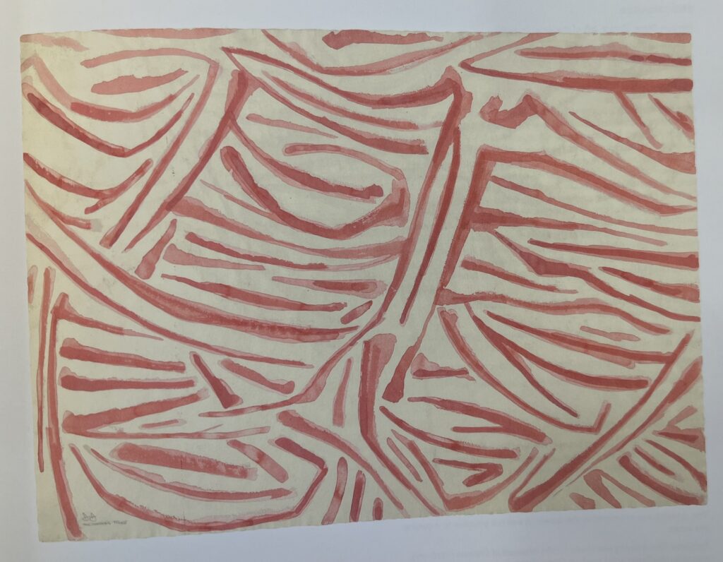
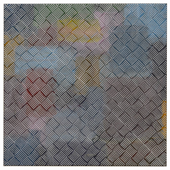
Maybe not being able to find the flagstones motif source, a Harlem wall glimpsed once through a taxi window and then lost, changed Jasper Johns’ approach a bit. Because by 1973, he did take note of the inspiration The Barber’s Tree. At least for the sketch [above], if not the painting, which turned out to be a mostly typical crosshatch motif executed in red and white.
And now we know what Johns knew.
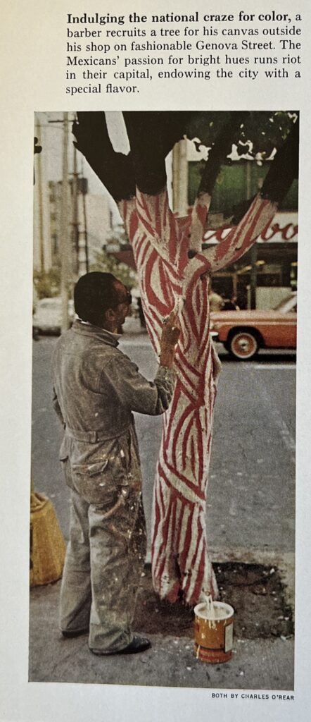
Here is photographer Charles O’Rear’s image from “Mexico: The City That Founded A Nation,” a dispatch by Louis de la Haba and Albert Moldvay from the May 1973 issue of National Geographic.
It is small, and slight, but indeed eye-catching. It’s not clear who is responsible for this cringe caption, though, about “Indulging the national craze for color” and “The Mexicans’ passion for bright hues,” when every barber pole north of the border has the same color scheme.
What is notable, perhaps, is that Johns chose this painting—found, vernacular, and anonymous—only after seeing this on the preceding page:
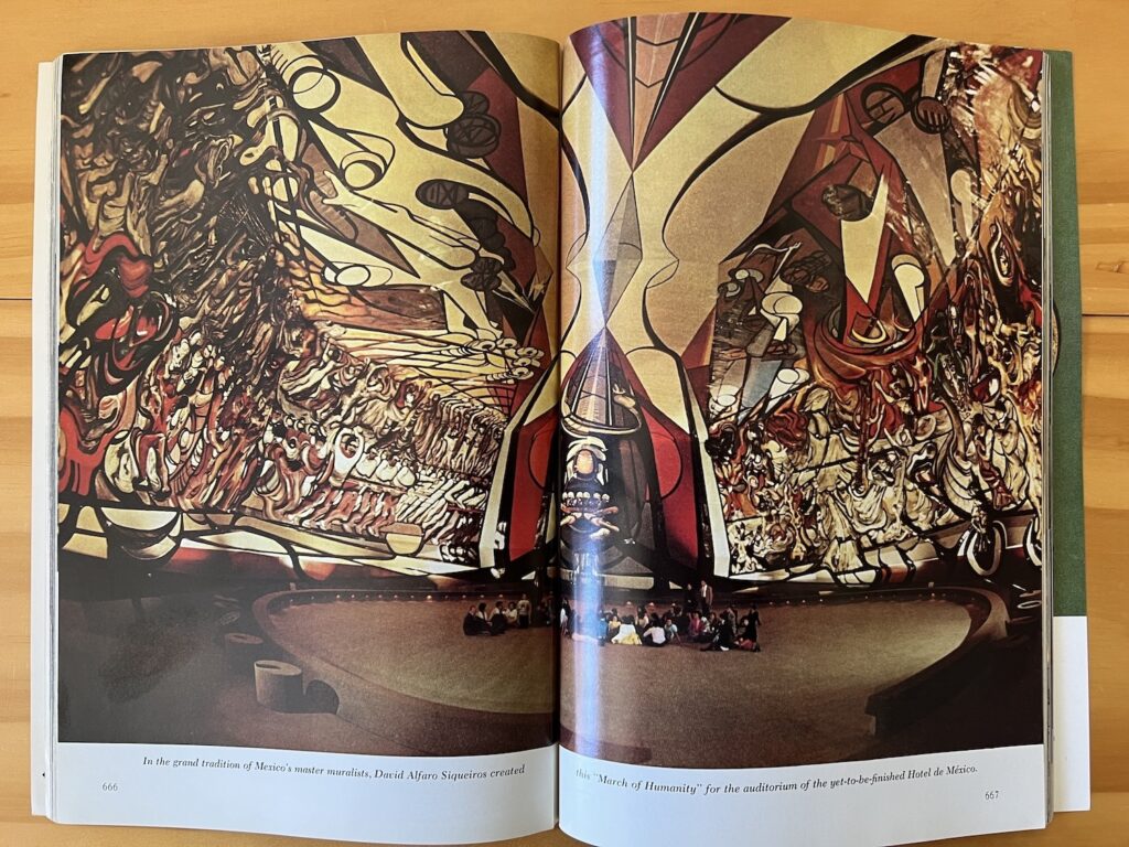
Looking on the web for contemporary images of David Alfaro Siqueiros’ absolutely gargantuan mural, la Marcha de Humanidad, in what was supposed to be the auditorium for the Hotel de Mexico, I can’t see that anyone managed to capture it more fully than Albert Moldvay did in 1973. The Mexicans sure have a national craze for murals. Jasper Johns, not so much.
[Next morning update: Joke’s on me, it’s been on my shelf the whole time. While looking for an image of the 1975 painting The Barber’s Tree, I stumbled on it and O’Rear’s photo in Michael Crichton’s 1977 Whitney catalogue:
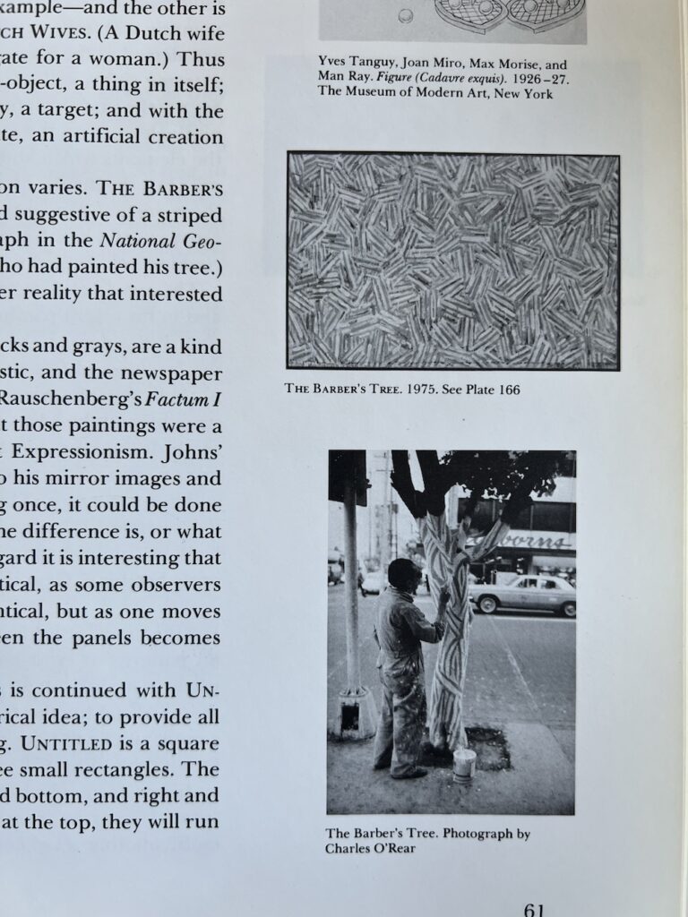
I’ve been saying it is barber pole-colored, but Crichton describes The Barber Tree (1975) as “flesh-and-blood colors.” Which, you’ll have to trust him, because the catalogue only had black & white images, and it was in the Ludwig’s collection until they donated it to the National Art Museum of China in 1996.
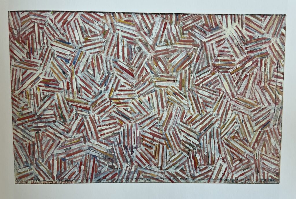
Now that they’re all together, maybe the overlapping structure of the cross-hatches is what carries through from the tree. Crichton noted Johns deployed different structures in the cross-hatch paintings of this period, 1973-76, including various degrees of mirroring or duplication. That is not what’s going on here.
Previously: Jasper Johns Drawings CR Driveby
The February 2024 installment of Donald Baechler’s collection sale really feels sorted by style, like it was Baechler’s collection of works that looked like his.
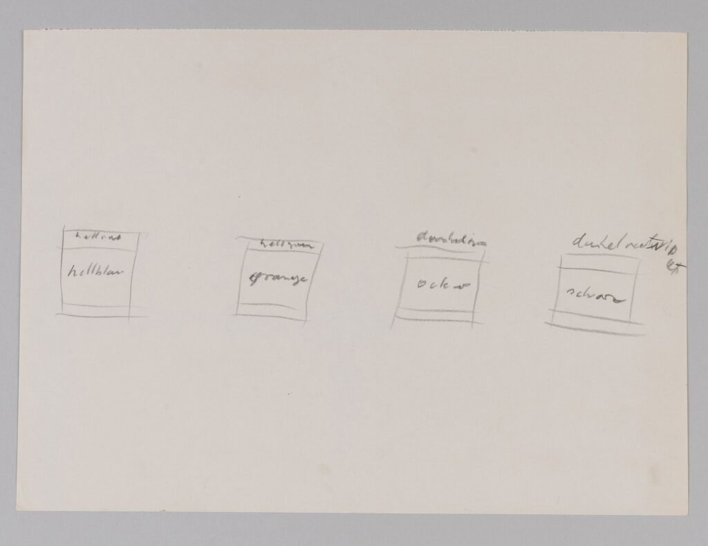
What caught my eye, though, is this little unsigned, undated sketch which we nevertheless somehow know is by Blinky Palermo.
Maybe it was a diagram for Baechler to make his own Palermos? Maybe it’s a diagram for anyone to make their own Palermos?
Hellrot/Hellblau, Hellgrun/Orange, Dunkelgrun/Ocker [?/?], Dunkelrotviolett/Schwarz [s/o Claudio for taking a run at the third one]
Light red/Light blue, Light green/Orange, Dark green/Ochre [?/?], Dark red-violett/Black
Has anyone seen these combos realized?
I updated Firefox the other day, and when it restarted, it did not give me the option to restore my previous session. So I lost the like 100+ tabs in five thematically grouped windows that I’d been holding onto, some for years. Others were fresh, things I was going to blog about. Now they’re gone, I’m sure they were going to be the best blog posts I’ve ever written.
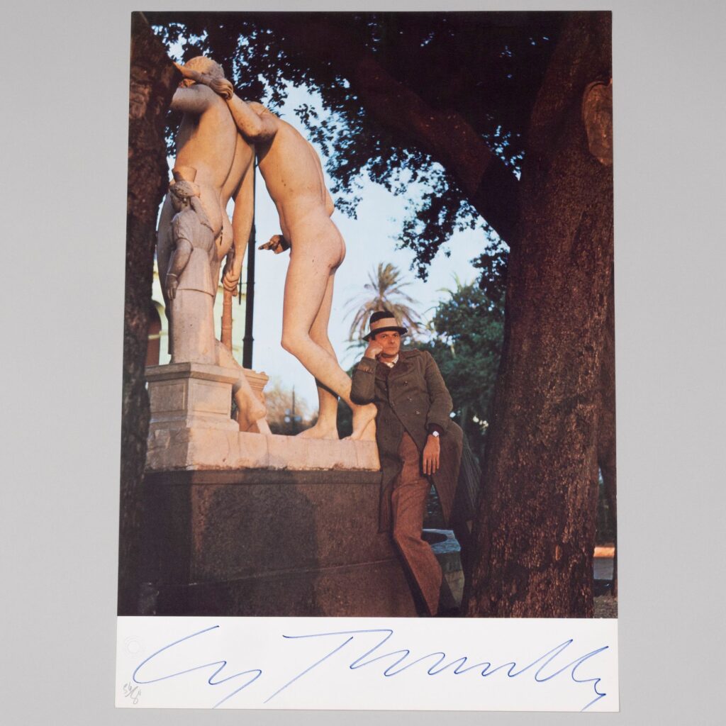
Oh, actually, here’s one I’ve already written around: In 2021 I wrote about the signed exhibition poster from Cy Twombly’s 1974-75 show at Lucio Amelio’s gallery in Naples, which featured the swagged out artist striking a pose next to Castor and Pollux’s backsides. Amelio and his shows were instrumental in both the development of Twombly’s boat motifs, and the subsequent completion of Untitled (Say Goodbye, Catullus, to the Shores of Asia Minor) after two decades in the artist’s studio—and Amelio’s AIDS-related death in 1994.
This copy, ed. 56/80, belonged to Twombly’s friend Donald Baechler, who died in 2022. Much of Baechler’s collection was sold at Stair Galleries last fall, but for whatever reason, this one piece hung back. It’s a slightly weird thing, and it’s weird to see it twice.
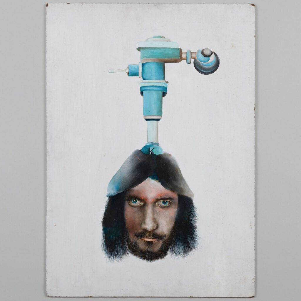
And that reminds me, in that same auction are several highly unexpected 1970s, student-era paintings by Richard Prince, which are being sold by a former friend and Nasson College classmate. Among them: this self-portrait with a toilet flush valve coming out of his head, so either an oblique Duchamp Fountain reference, or a stoned unicorn Jesus, who am I to say? The longer it stares at me on my screen, though, the more i want it.
Choire Sicha wrote about his friend Eric McNatt, who sued Richard Prince for copyright infringement after Prince used McNatt’s photo of Kim Gordon—which he shot for Paper Magazine, which paid him $100—for Prince’s own Instagram portrait of Gordon.
As Choire put it so well, “Everyone involved here is still an outsider punk kid in their own mind.” Well, as it turns out, when the settlement was announced, I realized a friend of mine from way back in the day was McNatt’s litigator from Cravath, and I don’t think he has ever thought of himself as an outsider punk kid, then or now.
But Choire’s point observation is still useful, because some outsider punk kids in their own minds still hustle to survive, making $100 for licensing their now-famous photo a second time, and other outsider punk kids in their own mind testify in their depositions to making $45 million a year. So it really is the little differences
The Portrait of Kim Gordon | Why Eric McNatt Sued Richard Prince [vulture]
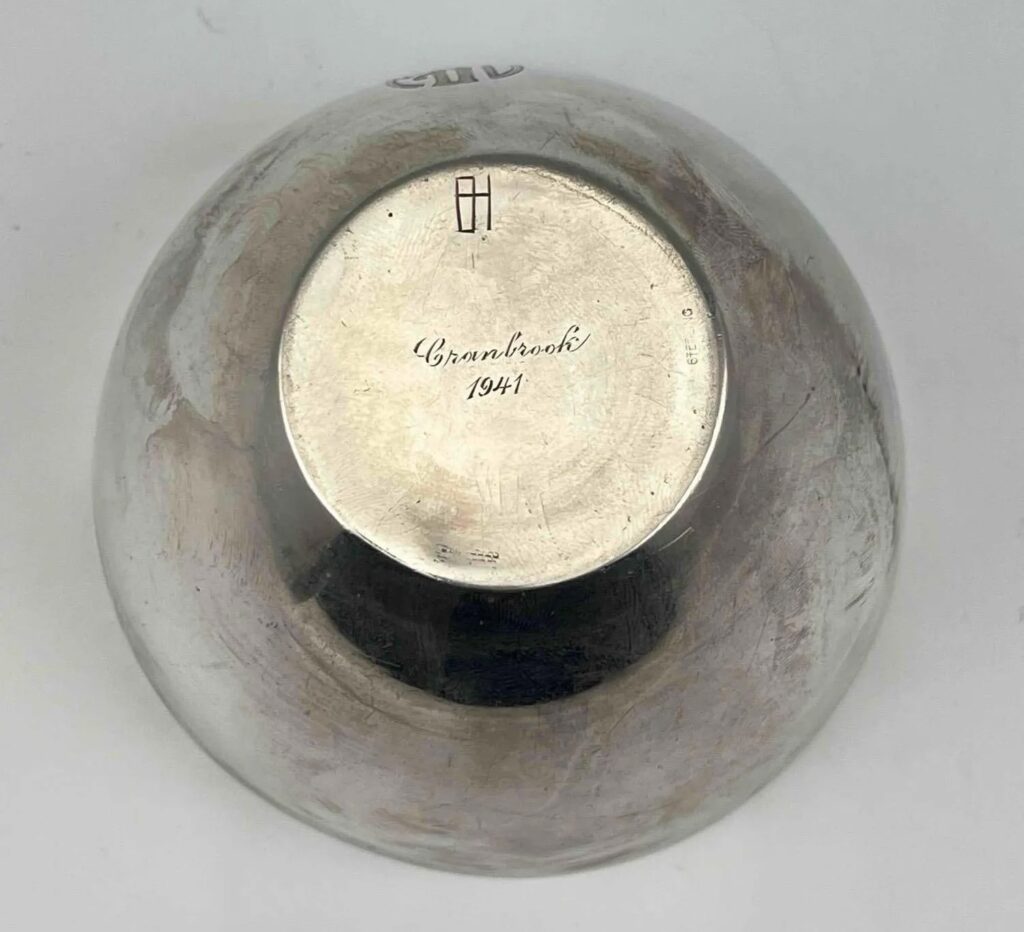
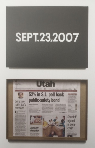
In January—and not even the beginning of January, either, it was the 28th, so barely three months ago—a “Cranbrook Academy Modernist” silver bowl and saucer, listed as “produced by a student under Harry Bertoia,” in 1942 sold at an estate auction for $370, only barely more than the scrap value of its 410 grams of silver. Never mind that they had a date of 1941 and Bertoia’s monogram engraved on the bottom.
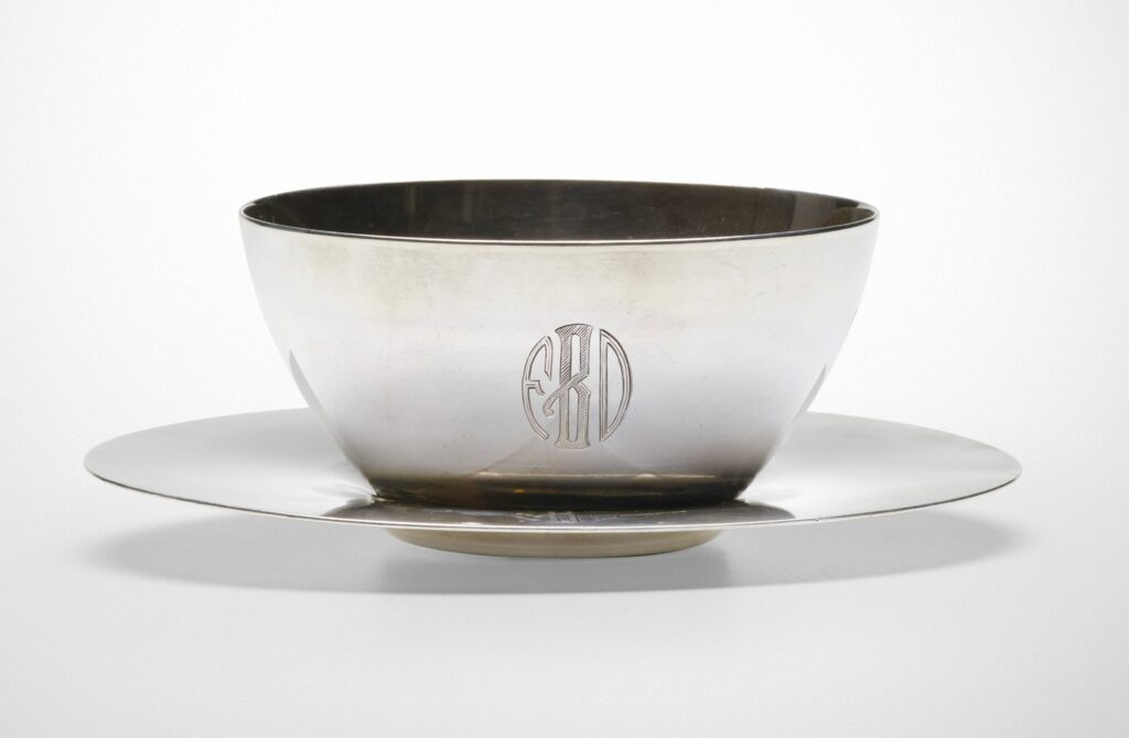
They just turned up at Wright, where it’s instantly $1,600. I thought it was just a quick and easy flip after checking its listing in the Harry Bertoia catalogue raisonné. But the bowl’s entry there has up-to-the-minute provenance and a patina that’s cleaner than January’s, but duller than Wright’s. So maybe it was the monogram that led to the attribution, which led to spotting the pieces in a 1942 Cranbrook installation photo, which led to the creation of the newest CR entry for hollowware, updated Feb. 29. Nice hustle all around, I guess, now if we can just figure out who the FDB monogram belonged to, we’re set.
[update: sold for $4,788]
Previously, artist silver-related: Thank you for your silver service, Donald Judd X Puiforcat
Sometimes after all the relentless perfection what you really want is a Gerhard Richter Spiegel that has really seen some stuff. You just know this one has never spent a minute of its life in a box in a freeport, and shouldn’t that be a premium instead of an 80% discount?
Lot 97 ending online 7 Jun 2024: Gerhard Richter, Spiegel, 1986, est. €2,000 – €2,500 [update: sold for €2,900] [lempertz]
Somewhere amidst all his publishing and other art world activities, Primary Information’s James Hoff created an album, and now he’s released it.
Hoff calls Shadows Lifted from Invisible Hands an autobiographical record: “Each track is composed from sources drawn from his own involuntary aural landscape, specifically musical earworms and tinnitus frequencies.”
It is not only ambient media remixed from catchy pop songs—though it is partly that. The aural elements that make up the album’s four tracks are “non-cochlear”; both earworms and tinnitus appear or are experienced inside the head without external stimulus. They’re sounds we get stuck with and accustomed to, the kind of “internal soundtrack” that, by definition, no one else hears. So it’s exceptional that Hoff transforms them into something intentional, and something that can be shared.
[TWO WEEKS LATER UPDATE: Just read about artist/musician Lola De La Mata’s project where she actually recorded her tinnitus [??] or whatever sound phenomenon was being generated autonomically in her ear, using an anechoic chamber. Absolutely fascinating and wild.]
James Hoff | Shadows Lifted from Invisible Hands is on digital and vinyl [bandcamp]
Uneasy on the Ear: An Interview with Lola De La Mata [thequietus]
Sure, curating is great, but have you ever just gone through an artist’s six-volume catalogue raisonné of drawings in chronological order, seeing every wild, weird, and eye-popping thing they worked on for 60 years?
I’ve dipped into Jasper Johns’ drawings CR before, but have not spent any sustained time with it until this week, when I went looking for the diagram he made to explain a print to a pushy university president. [It wasn’t included.] And it is fascinating. It feels more revealing than the paintings CR—which I have and enjoy, don’t get me wrong—like it tracks the artist’s process more closely. Here are just a few snapshots of things that caught my eye:
This watercolor and pencil version of one of Johns’ early Flag paintings is one of two works made on pages from an old college yearbook; the logo of a sorority, Alpha Delta Pi, is visible in the lower right corner. Also it looks like it was spraypainted. ALSO, it was a gift from Johns to Susan Weil, Robert Rauschenberg’s ex-wife.
Continue reading “Jasper Johns Drawings CR Driveby”