In the 2015 Guggenheim catalogue for On Kawara — Silence curator Anne Wheeler wrote that there were eight Code drawings: three made of hash marks in colored pencil; two typed texts of extremely large and small numbers; two pictograms; and a poem printed in braille.
Duncan McLaren counts nine Code works: there are actually four Code hashmark drawings, with varying titles. But then he says there are eight, because two pictograms are the same. Except the two pictograms McLaren references seem to be just two sides of one of the pictograms Wheeler mentioned, in a catalogue; the other was a poster in a window. And he notes that braille is only a mystery if you don’t know braille. Honestly, I’m taking braille and pictograms off my Code list.
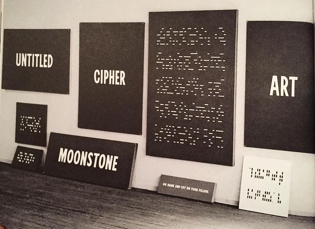
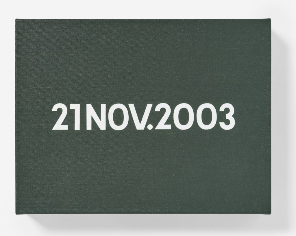
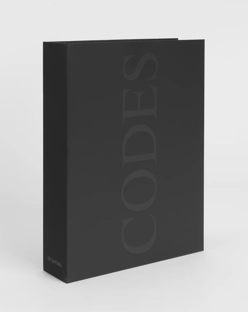
And I’m adding back the Date painting-style, graphically encoded paintings Kawara made in 1965, before starting the Date paintings, which he destroyed. The surviving Code works begin in 1965, and cluster in the 1960s. But except for a 1996 artist book, most of Kawara’s Code works were unpublished and almost entirely unconsidered until his Guggenheim retrospective in 2015. One filled sixteen pages and the cover of a massive, major 1996 catalogue, and yet seems to have gone unacknowledged. In 2015 Ben Slyngstad, a gallery guide at the Guggenheim, deciphered Kawara’s last Code drawing, Voice from Moon (2011), which turned out to be the transcript of the July 20, 1969 moon landing. Unaware of Slyngstad’s achievement, McLaren also deciphered it in 2022, and identified the source of the title and the transcript as the front page of the NY Times.
Which is all prelude to the mindboggling realization that in 2024 McLaren, Anders Delbom, and Tommy Wrede deciphered all but one of On Kawara’s surviving Code works. McLaren’s account of the deciphering extends over seven parts, and it is quite a journey, and it ends with a call for help in cracking the last Code. Which is the first, but first:
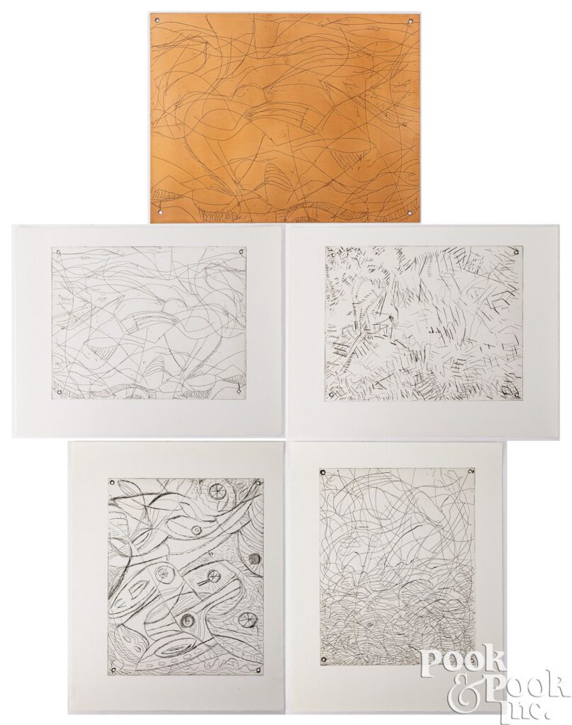
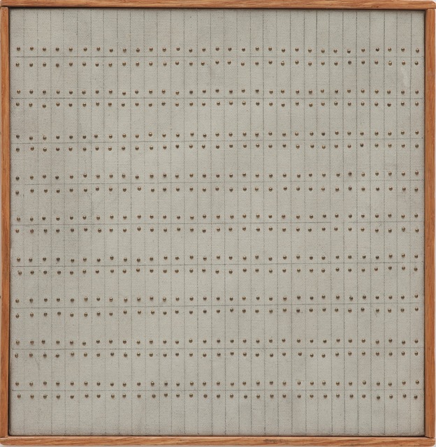
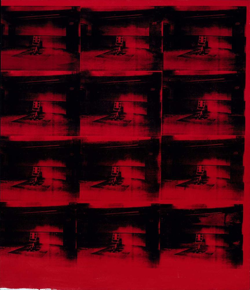
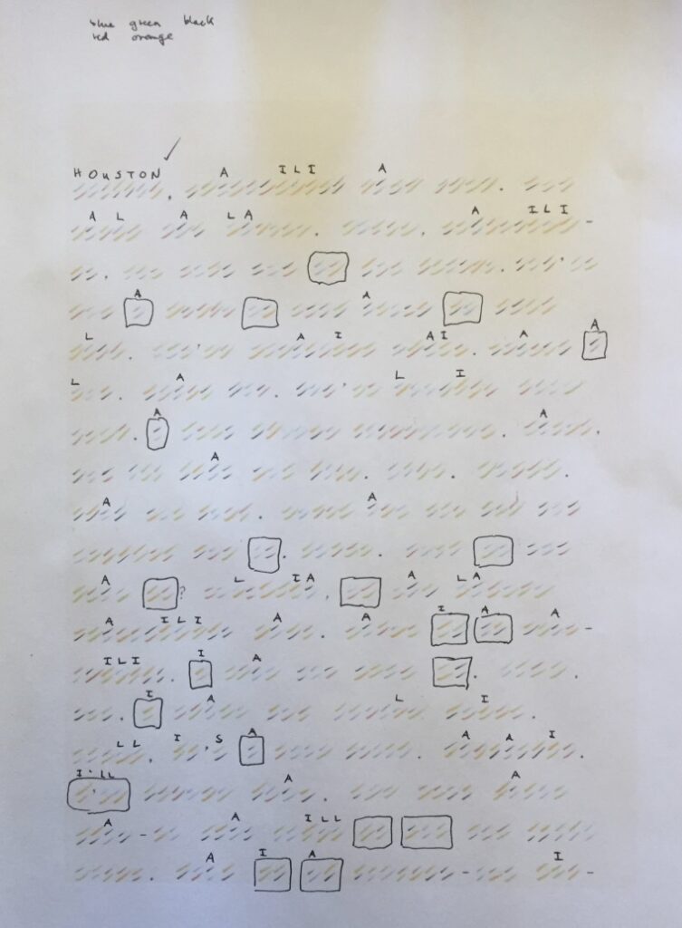
The hashmark drawings—one of which, Les Lettres d’Amour/ Love Letters (1965), was also reproduced as a seven-page screenprint in the Codes (1996) artist edition—end up being straightforward enough susbtitution ciphers, where a pair of colored hashes represents a letter from the Roman alphabet.
One drawing, Traveler’s Song, or Traveler no Uta (1965) turned out to be a partially translated Japanese folk song, with the mix of English and romanized Japanese lyrics complicating typical pattern/frequency recognition.
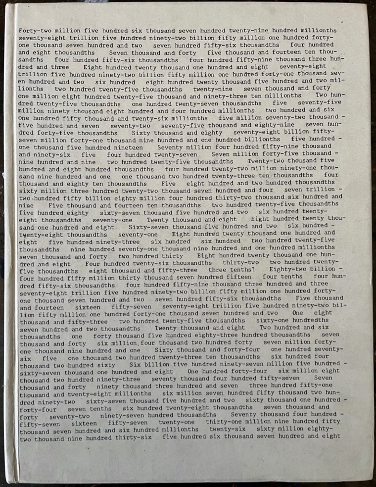
The two large number Code works, include Eight Quintillion… (1969), six pages of typed out numbers, and No Title (1996?), in which each typed out number corresponds to a sentence or line? And thus the constituent digits substitute for letters. Kawara gave a clue to the [most unlikeliest] source of the 1969 text in a rare 1970 interview. Fortunately the same cipher key was used for the sprawling 1990 text, too.
The last Code work to decode is the earliest, Code, or Colored Cryptogram (1965), in the collection of the National Museum of Modern Art Tokyo. The hashmarks appear to encode Japanese phonetic syllables. And as the surprise at what McLaren and his collab have accomplished wears off, it’s replaced by surprise that they haven’t cracked the Japanese code, too. I mean, come on, it’s been a year!