Here I am fiddling around with printers to make a paperback version, and he just ‘grams it out.
Of course, it IS his deposition.
For a couple of months now, Richard Prince has been showing Deposition (2025), the single channel video version of his second court-ordered deposition in a copyright infringement lawsuit, at Gavin Brown’s Sant’Andrea de Scaphis space in Rome. The show runs through this Friday, July 25, to andiamo!
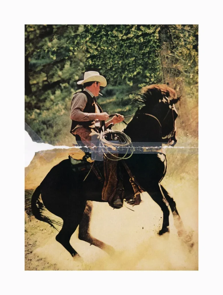
Richard Prince, Untitled (cowboy), 2016, C-print in two parts, Richard Prince Studio via Sant’Andrea de Scaphis
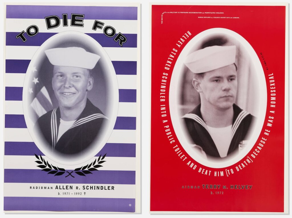
I realize though I’d seen the posters, and the basics of the situation, I’d never known the brutal details of Schindler’s killing. Or of the violent harassment Schindler experienced and tried to report, repeatedly, from the moment in late 1991 when he’d transferred to to the USS Belleau Wood until his murder October 27, 1992, days before Bill Clinton defeated George Bush in the US presidential election.
Clinton had campaigned to end the military’s ban on gay soldiers. Bush and his Defense Secretary, the draft dodger and parent of a gay child Dick Cheney, and many other Republican politicians, supported the ban, and fostered the atmosphere of homophobic violence and discrimination under the guise of military unity. Actually, gays were the real threat to this culture, they argued, what with the blackmail, and the AIDS.
I also did not realize the vast extent to which the US Navy abandoned and gaslit Schindler’s mother and family, and to which they covered up the culture of abusive bigotry encouraged by the officers on Schindler’s ship, and to which they obstructed investigations and attempts to seek accountability, much less reform. This all unfolded after the posters had gone up and worn down, after Clinton agreed to a compromise with the powerful and bigoted senator from Georgia, Sam Nunn, the policy known as Don’t Ask, Don’t Tell.
2013 installation view of Bureau’s posters and Alix Lambert & Bob Nickas’ portrait at the New Museum’s 1993 show, via Big Red & Shiny
Bureau was the design studio of artists Marlene McCarty and Donald Moffett, a continuation of sorts of Moffett’s involvement with the activist collective Gran Fury. At some point, or eventually, it all just became too much, too intense, too traumatic, and Moffett sought refuge in the studio, and in art, making abstract paintings. He seemed to address it in his 2019 Brooklyn Rail conversation with Dan Cameron, but rereading it now, it’s actually Cameron who does the talking, both questions and answers.
The way I’d remembered the posters installed was the way I’d remembered all Bureau’s posters, in an alternating grid, which was also how they were shown in 2013 at the New Museum’s NYC 1993 time capsule survey. I mention them now because a pair of posters just turned up in LA Modern’s post-Pride queer swag auction. But also because we live with one of Moffett’s earliest abstract paintings at the center of our home; we pass it hundreds of times each day. And its beauty now reminds me of the psychic cost Moffett paid to get to the place where he made it. Also, we’re entering an era where government-led bigotry and violence against its own people are expanding, and we need to remember how it went down before, and how to counter it.
Isa Genzken, Spiegelbild, 2001, mirror mosaic on board, 50 x 40 cm, ed. 100, published by the Kunstverein Dǔsseldorf
See, that’s how you shoot a photo of a mirror artwork. The Kunstverein für die Rhineland und Westfalen, Düsseldorf showed us the way, way back in 2001, when they published Spiegelbild, Isa Genzken’s contribution to their bougie annual artist editions series for their members.
Isa Genzken, Spiegelbild sold at Van-Ham in 2015 via a photo that emphasizes the 1 cm gridness of it all
It’s been downhill ever since. Shooting mirrored artworks from behind a blank white scrim to eliminate any reflection or trace of presence is a sales tactic, like staging a house. This kind of market lubrication and context erasure betray the experience of any artwork; mirrors just make it obvious. But the impact remains, and spreads, and eventually we’re swamped by the art equivalent of white modern farmhouses with grey laminate floors, everything around us optimized for resale.
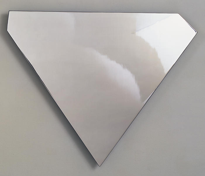
Ellsworth Kelly, Mirrored Concorde, as published in 1971, in the catalogue for Riva Castleman’s show Technics and creativity II Gemini G.E.L. at MoMA
Looking up something else in the catalogue for Technics and Creativity II, MoMA’s 1971 exhibition about Gemini G.E.L.’s process, I was stopped in my scrolling tracks by this excellent full page photo of Ellsworth Kelly’s Mirrored Concorde.
It absolutely looked like the future. And in a sense, it was: Mirrored Concorde was an edition in progress, just entering production with an undetermined edition size. Which, hold that thought. But the image itself, with its dramatic lighting, refractions, and straightforward mirrored materiality really hit.
That’s not quite how the work has turned out, alas, though it’s still a beautiful thing. It seems like there were only 16 made by 1972, when the work was officially published: an edition of 12, plus two copies each for Kelly and Gemini.
Unlike the free sculpture above, the examples out in the world have variousbases and pedestals that make me wonder if it’s a little top-heavy. Christie’s incorporated the base into the 50 7/8 in. height, but while they broke out the metal pieces, neither Brooke Alexander nor Matthew Marks included the base in the depth.
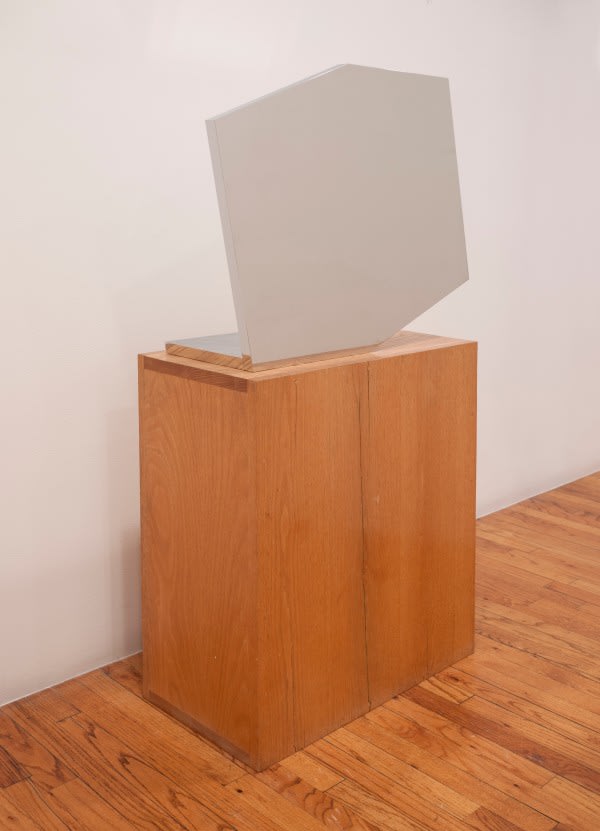
The truncated rectangular shape is one Kelly used as early as the 1950s; this one feels like it could be the hexagonal outline of a 3-D cube diagram. The mirror finish is very unusual in his work. After cutting, the 1-inch steel plate elements were ground, lapped, and polished on the sides and edges, then nickel- and chrome-plated. Which, I guess that’s ok, but could they not have just kept polishing? [Asked the guy who didn’t make one of these things, much less sixteen.]
Ellsworth Kelly, Untitled, 1985-86, polished steel, 30 x 24 3/4 x 3/8 in., ed. 9+7, image: Gemini GEL
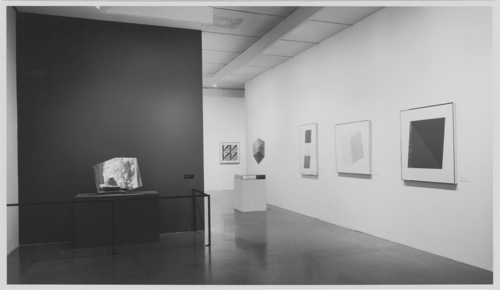
Mirrored Concorde proof installed at MoMA’s Technics & Creativity II: Gemini G.E.L. in 1971, on a wonky pedestal and roped off, but reflecting the Sculpture Garden, photo: James Mathews for MoMA
So maybe I like the top pic so much because it actually feels like a mirror-finished object. Every other image of Mirrored Concorde makes it look like Featureless Matte Finish Concorde. Seeing James Mathews’ installation photo of the MoMA show, I can confirm.
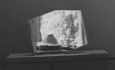
detail: Ice Bag in Mirrored Concorde
Even on its wonky pedestal, behind its stanchion, and against its painted accent wall, Mirrored Concorde manages to look like a portal to another dimension. Because what it actually reflects is the world in front of it: the museum’s sculpture garden through the Philip Johnson addition’s windows, with one of Claes Oldenburg’s Ice Bag sculptures peeking its motorized head up. Let this be one more argument in support of photographing mirrors to look like mirrors.
I am slow, but the Ellsworth Kelly print that’s the first lot in Roy and Dorothy Lichtenstein’s estate sale is even smaller than the smallest Kelly prints.Blue Curve, 1999, is just 8 x 6 inches. It was made as a benefit print for the Archives of American Art in a big edition, 220+38AP, so aggregated surface area-wise, it’s probably right in the middle.
Kelly was honored with a medal the AAA’s benefit gala in October 1999, which coincided with an exhibit of items from the artist’s archives in the Archives Gallery. The AAA had a gallery in the lobby of 1285 6th Avenue, the UBS Building with the Scott Burton street furniture.
Louise Lawler, Untitled (Warhol/Lichtenstein), 1991, 6 x 8 in cibachrome mounted at 20 x 16 inches, ed. 1/100, a holiday treat to “Roy + Dorothy!”, which will be sold at Bonhams
The house of Roy and Dorothy Lichtenstein has been emptied into the online showroom of Bonhams, where everything will sell this month. There are so many things that have a bit of excitement because they were the Lichtensteins’, like some rugs, chairs, dishware, books, but come on.
But then there’s their Louise Lawler, a small photo, inscribed on the back: “Roy + Dorothy! M.C. + H.N.Y., L.L.” The edition number is 1/100, and it suddenly made me wish I’d been in the top 100 on Lawler’s Christmas card list in 1991.
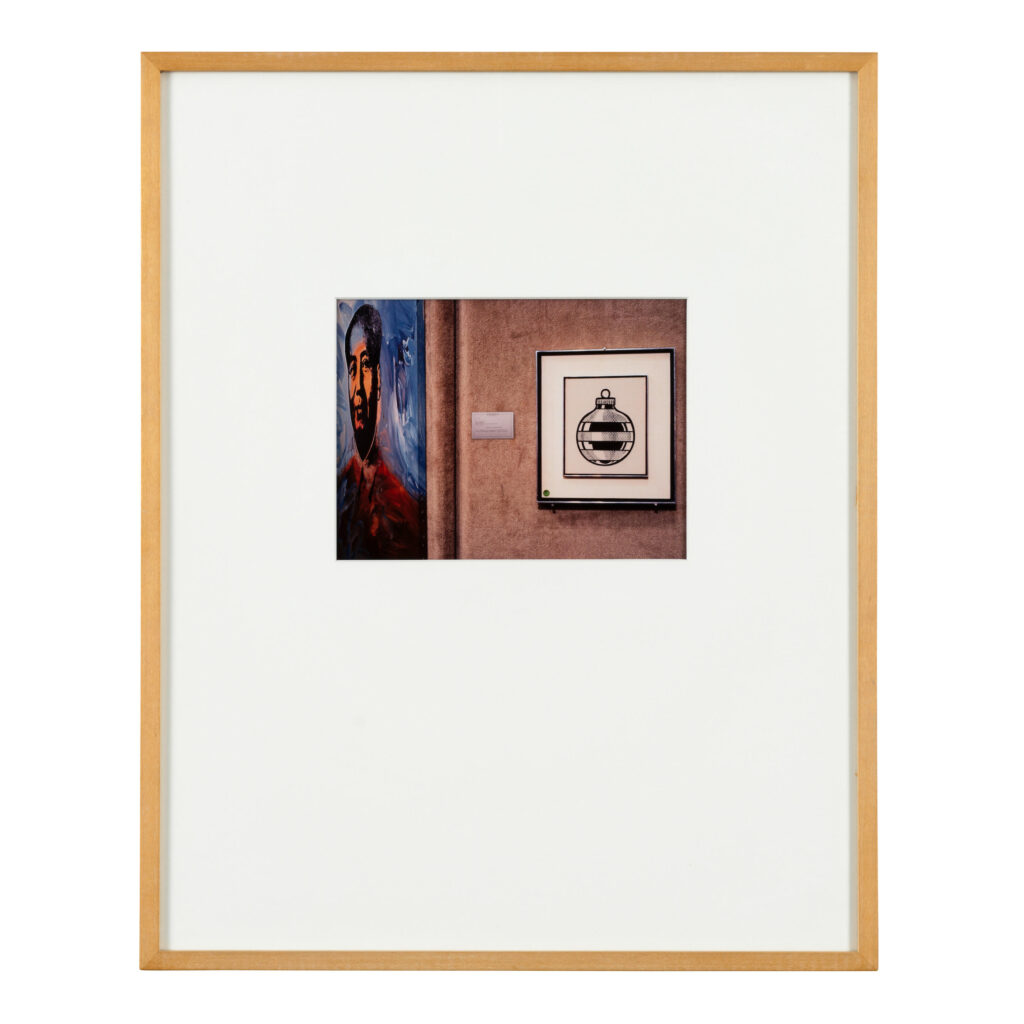
According to its entry in the Roy Lichtenstein Catalogue Raisonné, that drawing, Xmas Ornament, 1963, was likely a gift from the artist to Emily & Burton Tremaine. Between 1973 and 1976, it rolled through six dealers, collectors, and auction houses before finding someone who wanted to keep it. Until November 1991, anyway, when Lawler photographed it at Sotheby’s. In those short weeks, did it all just come together with that euphoric satisfaction of finding the perfect gift for someone? Of course, she also did kind of plant a stake by declaring an edition of 100.
But maybe they weren’t all Christmas gifts after all. Marion Lambert’s AP2/10, with a new title, Mao and Ornament, and an impossible date of 1990/91 on the label, came from Metro Pictures. It was sold in 2021 to benefit charity. Ed. 40/100 was acquired from Metro Pictures in 1993. It didn’t sell in 2023 in Cincinnati. So plenty more out there for you, let this one go by, if not unnoticed, at least unbidden. I will take it for $10.
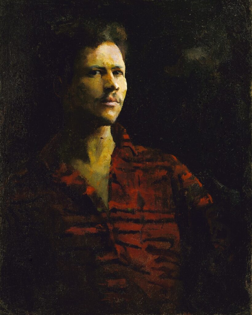
William H. Johnson, Self-Portrait, 1923-26, oil on canvas, 29 3/4 x 23 3/4 in., collection SAAM
William H. Johnson left South Carolina for New York when he was 17, and began studying painting at the National Academy of Design. He painted this self-portrait in his early 20s, giving himself lighter skin than in later portraits.
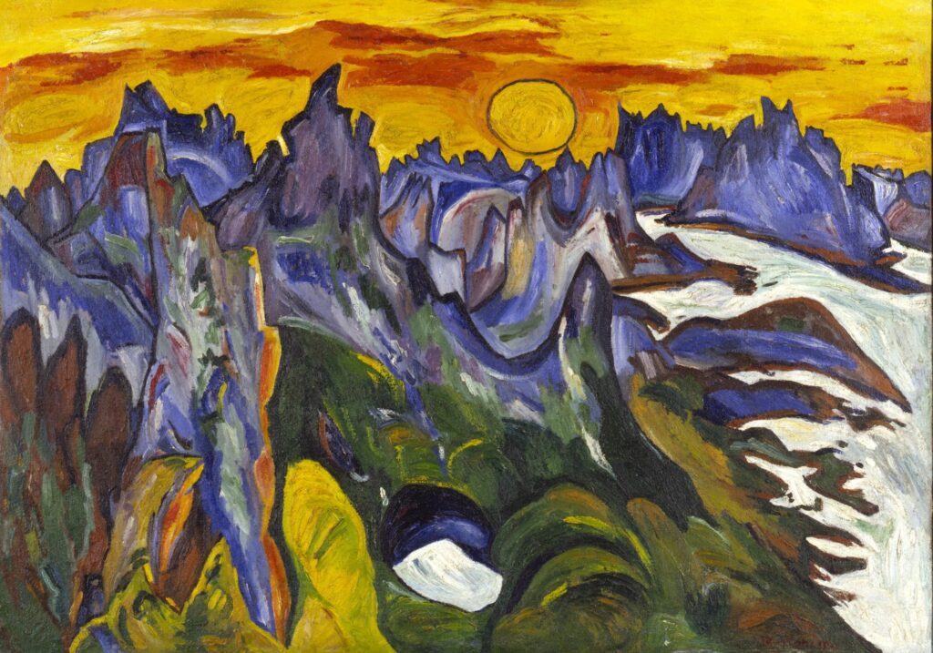
William H. Johnson, Midnight Sun, Lofoten, 1937, oil on burlap, 41 5/8 x 59 1/8 in., collection SAAM
He went to Europe in 1926 to study modernism, married Danish artist Holcha Krake, and spent a decade working, showing, and traveling in Scandinavia. He painted several extraordinary, expressionistic views of Lofoten, Norway. These landscapes and his European-era figure paintings feel like they could have evolved from Soutine, or Hartley.
William H. Johnson, Breakdown with Flat Tire, 1940-41, oil on plywood, 34 1/8 x 37 1/2 in., collection SAAM
Johnson returned to NYC with Krake in 1938, and began painting in an African American vernacular mode that feels as close to Horace Pippin as to Picasso. After Krake’s death from cancer in 1944, Johnson moved back to Denmark, making American and African American history paintings for a while, but a mental health crisis led to his return to the States, the end of painting, and hospitalization until his death in 1970.
The Harmon Foundation was established by a white real estate developer named William Harmon to collect, promote, and exhibit art by Black artists. There are some problematics in the Harmon Foundation’s story—they removed portraits of W.E.B. Dubois and Paul Robeson from exhibitions because of their communist sympathies, for example—and it’s not clear if Johnson’s reputation suffered from his association. It does feel like he’s been sort of stuck at one museum, though.
There’s a lot that doesn’t immediately make sense. But the most important thing—besides donating its large collection of art to HBCUs and the Smithsonian, and besides Johnson’s own work, of course—is that William Harmon created his foundation after years of pseudonymous philanthropy and non-predatory student loaning—under the name of an ancestor, Jedediah Tingle.
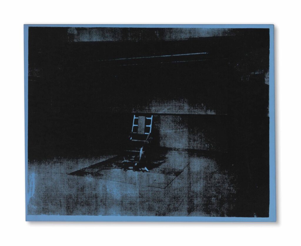
Andy Warhol, Little Electric Chair, 1964-65, oil and silkscreen on linen, 22 x 28 in., acquired by Cy Twombly and sold by his Foundation in 2014
The electric chair paintings are some of Warhol’s absolute best, but the little blue electric chair owned by Cy Twombly is a standout. The Christie’s lot description for the Twombly Foundation’s unloading of the painting extols this specific painting’s heavily inked contrast:
Housed for many years in the private collection of the artist Cy Twombly, it was this divergence between shadow and light that attracted the artist to this particular painting—an admiration bolstered by his understanding of chiaroscuro gained from his detailed study of Italian Renaissance painting undertaken during his time in his adopted homeland.
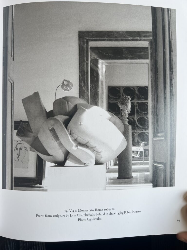
I totally forgot that there was a huge Warhol Tunafish Disaster painting in the background of Ugo Mulas’s photo of a massive John Chamberlain foam sculpture at the Franchetti-Twombly palazzo. I feel like a more systematic look is called for.
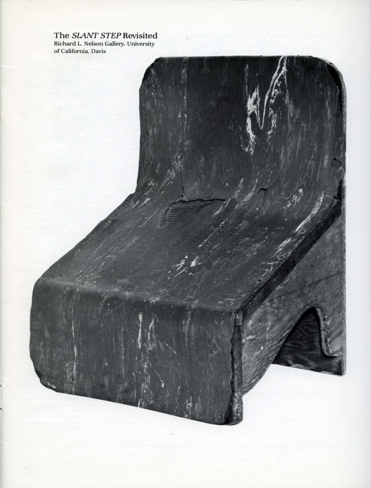
It’s been told and retold enough that even if you’ve somehow never heard it or seen its inspiration, it’s clear that several generations of artists ascribe to the Slant Step Theory of post-minimalist and conceptual sculpture: In 1965 William T. Wiley bought a plywood & linoleum stool with a steeply slanted seat at a Bay Area thrift shop. Installed in the studio of his student at UC Davis, Bruce Nauman, the Slant Step’s nonfunctional mystery and alluring form made it an aesthetic fetish object. It inspired at least two shows in the 1960s and several more since. It got passed around, stolen and rescued, surviving as an intentionally absurd teaching prompt until it entered the collection of UC Davis’s museum.
As far as I can tell, the first time it was publicly recognized as a stool for helping you squat on the toilet and take a better shit was only in 2014, well into the Squatty Potty era. Even so, it’s not clear that later showshave addressed this fundamental reinterpretation of an enigmatic totem as a highly specific, utilitarian, biological tool.
It reminds me of the novel-for-some-mundane-for-others theory of paleolithic tally sticks as lunar or menstrual calendars. And of Ursula K. Leguin’s Carrier Bag Theory of Fiction, where human experience can be understood through narratives other than violence and conflict, and motives other than competition, killing, or subjugation. The Slant Step Theory may be similarly narrow and incomplete. It’s not a mystery; it’s just you.
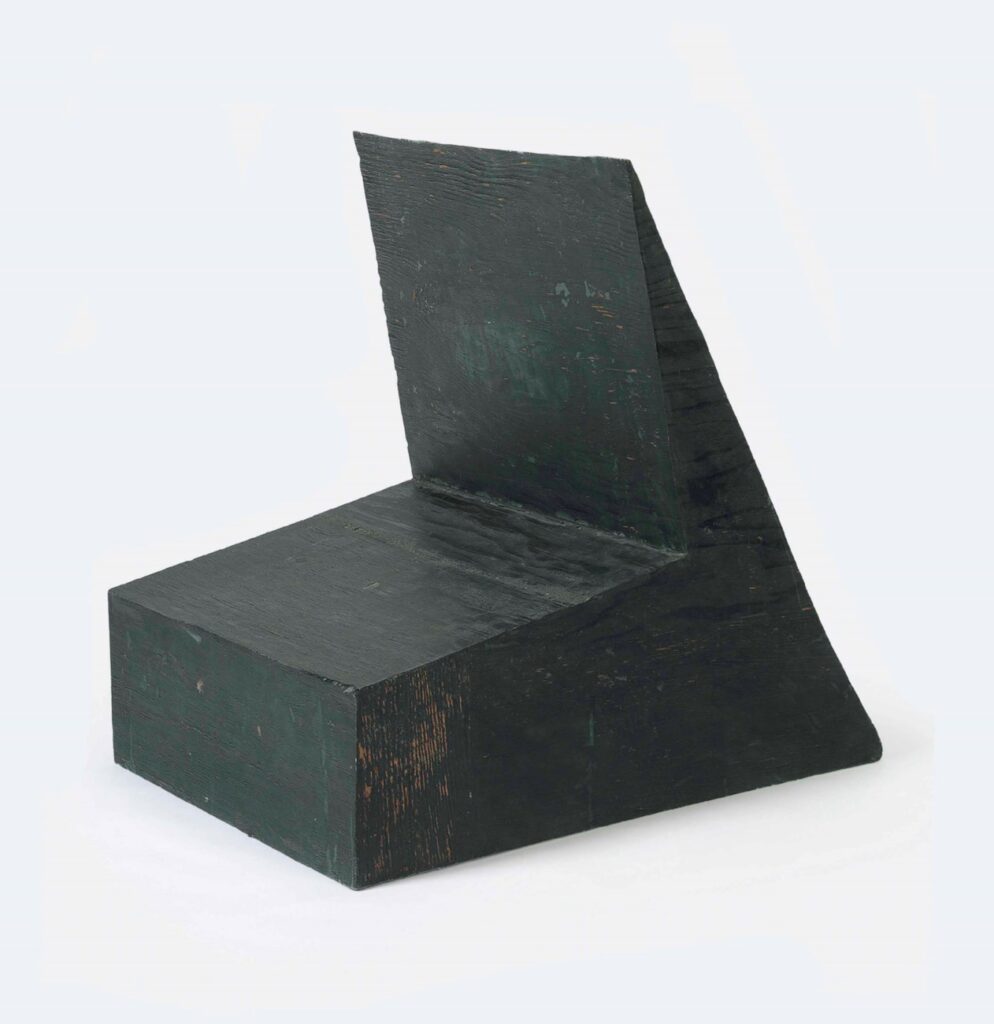
Bruce Nauman, Device to Hold a Box at a Slight Angle, 1966, fiberglass and polyester resin, 29 5/8 x 23 1/2 x 30 in., acquired by Cy Twombly in 1969, and sold by the Foundation in 2014
Nauman made Device to hold a box at a slight angle in 1966, with the Slant Step in his studio. It had already been shown twice before Philip Johnson’s partner David Whitney curated it into Nauman’s first show at Castelli in 1968. It went from there to documenta 4, and when it came back, Cy Twombly bought it, in 1969.
The Cy Twombly Foundation sold it in 2014. What happened to it in those 45 years? I don’t know of any photo of Twombly interiors in which Nauman’s Device appears. Did Twombly study it? Contemplate it? Respond to it? Store it away? If a revision of the Slant Step History of contemporary sculpture is in order, who knows what might be learned by tracing Twombly’s connections to and from this Nauman he kept for so long?
Look at it this way: if you were selling the biggest known lunar meteorite sphere in your auction, and you needed to show how much bigger it was than all the other lunar meteorites that have been ground down into spheres, would you photograph it next to a grapefruit you got at the Sotheby’s banana cart on York Avenue?
No, you absolutely would not. You would do exactly what Dr. Matthew Hoffarth is doing here, and so would I.
Dia has released a video about Walter de Maria and his work there. It’s specific in many interesting ways. If someone is polishing the top of Vertical Earth Kilometer in Kassel, we don’t hear about it, but there are interviews with the longtime caretakers of Dia’s permanent De Maria installations in the US: Bill Dilworth (New York Earth Room); Patti Dilworth (Broken Kilometer) and Robert Weathers (Lightning Field). Bill Dillworth died in December 2024, and the project is dedicated to his memory. [h/t Chris Nanos]
Related, somehow not previously: In 2023 Jeffrey Weiss wrote about the history, changes, and poetics of De Maria’s Earth Room after it had been removed, renovated, and remade. HVAC and new windows substantively changed the character of the work and the visitor’s sensory experience of it. But the implications extend far beyond questions of aroma, humidity, or ambient sound, toward permanence, aesthetic and the nature of the art experience.
[later that day update]: @octavio-world’s post adds new context: the Dilworths both left/retired in 2023, after the renovation/alteration, and were replaced by a rotation of minimum wage workers. So while extolling both the primacy of the physical experience of De Maria’s works, and listening to the singular people who have experienced it, that connection was broken. I mean, yay oral history, but that feels like an important thing to have omitted from the story, especially when it makes it sound like a memento mori and not a corporate/conservatorial decision.
[update: I’d had the Dilworths’ name spelled right, then I changed it after doublechecking a quote, and seeing it spelled wrong in the video captions. I’ve changed it back. Dia could do the same. Thanks for the correction.]
There’s a lot going on in the July/August issue of The Brooklyn Rail. A bunch of people respond to Bob Nickas’ obituary/autopsy of the contemporary, which has apparently been dead art walking lo, these 25 years.
I think Rhea Anastas’ argument is useful, that the frame of the contemporary, and the art industry and auction and product trends associated with it have obscured the view of the art in our midst.
Bernardo Daddi, The Virgin Mary with Saints Thomas Aquinas and Paul (det.), ca. 1335, Getty Museum. [L] prior to the Getty’s acquisition; [R] after the Getty’s removal of the baby, via The Brooklyn Rail
In her fascinating and sobering Irving Sandler Essay, conservator Annika Svendsen Finne looks at a controversial 1993 acquisition by the Getty of a 14th century gold ground painting of the Madonna by Bernardo Daddi, “contingent upon the removal of a large painted baby from the work’s surface, which had been added by a later artist.”
Svendsen Finne looks back across the mere decades since the baby’s erasure; at the reflections of the conservators involved; at other contemporary examples of the genre; and the interpretive advances of art historians since, and wonders if maybe the Getty should have slowed their roll, and recognized the constraints of context of their own decisions.
Look, the 21st century’s been rough on everyone, including art. It does sound like it’d be better, though, if we just step back for a minute before throwing it all out. A minute, or a generation, whichever.
At one point in my life I decided instead of just normal engraved stationery, I wanted a watermark. So I went to Mrs John L. Strong, and sat down with Mrs Lewis. Mrs John L. Strong has its own watermark, so surely they would know a paper mill that could accommodate my plan, I suggested. Mrs Lewis explained very tactfully, in as positive and genteel a way as possible, that no. Mrs Strong would certainly be able to help design a beautiful paper that evoked the subtlety of a watermark. I was glad to hear it, that we would be able to produce a paper with a watermark.
She said, “What part of ‘no’ did you not understand?” only it was the Vanderbilts’ stationer on Madison, so it came out like, “It’s interesting when two people have a conversation about the same thing, how they understand it differently.”
Zooming in, zooming in, where is the Twombly watermark on these CODES prints at Yvon Lambert
The point is, yesterday I read that in 1996, not so far from the time I was pursuing my watermark, Yvon Lambert published On Kawara’s CODES in an edition of 150 “on 180gr/m2 pure rag paper made especially for the book by the Moulin de Fleurac* and watermarked by Cy Twombly.” And I realized I’d been doing it wrong. But to know how wrong, I needed to figure out wtf is going on with why Cy Twombly is making and watermark paper for On Kawara.
He did not, and it was not. The listing for CODESin the Bibliothèques de Paris clarifies: “Chaque feuille porte la signature d’Yvon Lambert en filigrane (réalisé par Cy Twombly)” So the watermark is Lambert’s, as written by Twombly.
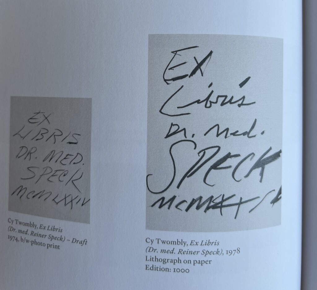
And Twombly also made his bookplate. So far I can find images of neither. But we do have two versions, four years apart, of Twombly’s ex libris for Dr. Reiner Speck, courtesy of Dr. Speck’s show of Twomblyphemera at Maison d’Art.
Cy Twombly Ex Libris draft, 1974, and Ex Libris, 1978, ed. 1000? via Maison d’Art’s catalogue for Fragments of an Adoration
Do I need to check the prints CR to get a full bookplate inventory? Is a watermark a print, a drawing, or a sculpture?
*Lambert’s choice of mill for his small batch watermark paper is instructive. He did not ask Arches. Though Moulin de Fleurac sounds prized, specific, and ancient, it only started in the 1970s.
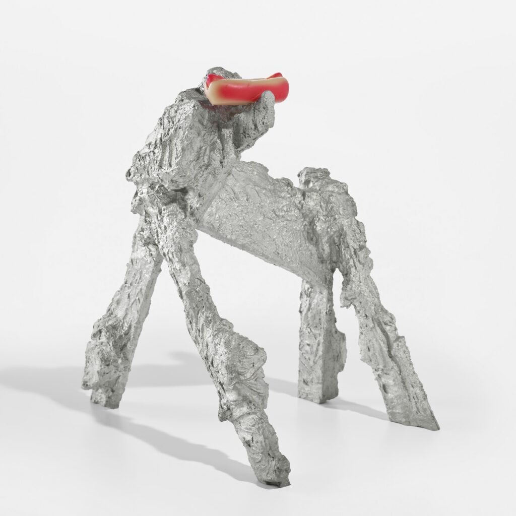
Rachel Harrison, Hotdog Dog, 2011, aluminum and urethane, 22 5/8 in. tall, about as tall as a Dingo or small Saluki, ed. 15+3AP, selling 17 Jul 2025 at Phillips
I’m reluctant to be a dog painting person, but I have no problem being a dog sculpture person. As long as it’s Rachel Harrison’s Hotdog Dog, a 2011 edition in, of all things, cast aluminum. Conservators are smiling.
There is one coming up at Kenny Schachter’s latest binge & purge auctions, this time at Sotheby’s.