Plagiarism is Necessary, Kader Attia

dosseh_nekfeu_putain_mylar_attia.jpg
kader_attia_ghosts_saatchi.jpg
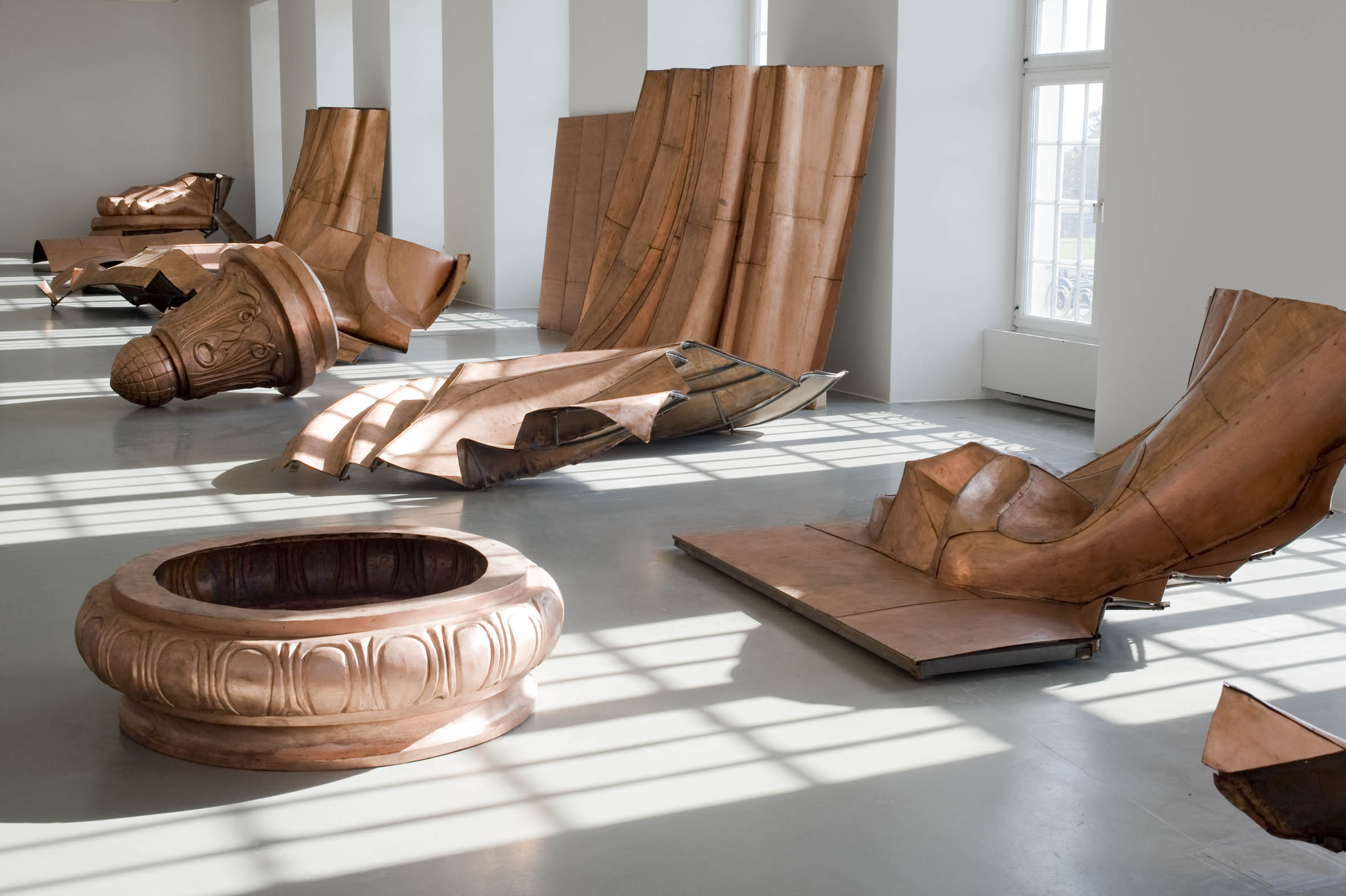
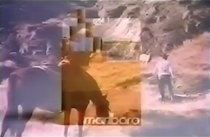
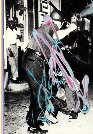
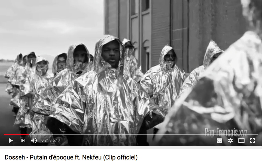
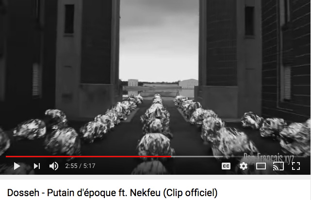
Top: screencap from “Putain d’epoque”, with people standing in mylar ponchos. Bottom: Ghost, 2007, molds of kneeling family members made of aluminum foil, installed at Saatchi in 2009. via
Kader Attia has filed a plagiarism lawsuit against French rappers Dosseh and Nekfeu over visual similarities between the music video for “Putain d’epoque” and Attia’s 2007 installation Ghost. I’m a non-expert in French intellectual property law, so I can’t say whether the visual echo legally outweighs the differences in material, execution, setting, content, and concept. [Attia discussed the genesis of Ghost in AiA in 2009.] But I know mylar when I see it, and when I don’t. The works are utterly different, even though there is a one-second dronecam shot in the video that shows the men kneeling face down, as if in prayer. Is that really what this is about? Because it does not feel like plagiarism. The effect is apparently that the just-released song is stripped from the video while it’s being litigated.
dosseh_nekfeu_putain_mylar_attia_kneeling.jpg
via
Attia’s complaint is based on artists’ rights, and the resistance to “non-consensual use” of artists’ work: “Everyone is plundering us, whether it’s advertising or the cultural industry.”
That quote comes from Kendell Geers, who wrote an open letter to Attia defending quoting and plagiarism and the freedom all artists rely on to use and interpret the world around them as they make their work.

Since 1988 I have developed a body of work and a language around the very subject of plagiarism, taking my cue from Lautréamont, the French poet born in Uruguay, who said “Plagiarism is necessary. Progress implies it. It holds tight an author’s phrase, uses his expressions, eliminates a false idea, and replaces it with just the right idea.” His revolutionary text Poésies was the Holy Water that baptised the Surrealists, a text written between the lines of words plagiarised from other authors. I have always wondered if Paul Gauguin was inspired by Lautréamont when he said that “Art is either plagiarism or revolution,” but there can be no doubt who inspired Guy Debord when he wrote his revolutionary book the “Society of the Spectacle” in 1967. He said that “Ideas improve. The meaning of words participates in the improvement. Plagiarism is necessary. Progress implies it. It embraces an author’s phrase, makes use of his expressions, erases a false idea, and replaces it with the right idea.”

Well played, Guy.
Geers calls for all artists and “every human being who believes in changing the present for a better future” to defend artists’ freedom to express themselves, and especially for artists with power and presence in the marketplace to defend those without. As Powhida tweeted about Geers’ statement, “It’s amazing. Collectively we have to stand up for individualism. This is the hardest thing in this star fucked market.”
As I always say, I replace melancholy by courage, doubt by certainty, despair by hope, malice by good, complaints by duty, scepticism by faith, sophisms by cool equanimity and pride by modesty.
Or maybe I should say it again this way: ‘Poetry is for everyone.’ Poetry is a place and it is free to all cut up Rimbaud and you are in Rimbaud’s place.
Un clip de Dosseh et Nekfeu accusé de plagiat par l’artiste Kader Attia [lemonde.fr]
Putain d’époque ! Lettre ouverte de Kendell Geers à Kader Attia à propos de son action en justice pour plagiat contre Dosseh et Nekfeu [lemonde.fr via @frieze]

The Thousand Year Box

How quickly can turn the winds of history.

peter_marino_hoods_artspace.jpg
screencap: artspace


In August Artspace published an interview celebrating self-styled “art architect” Peter Marino. The “Dark Prince of Luxury,” who has become the architecture dom to the world’s wealthiest people and brands, told Andrew Goldstein the secrets of his success and career ascent in the New York of Skidmore, Owings & Merrill and Warhol’s Factory.

[AG:] It would seem trauma is an excellent crucible for talent.
[PM:] It really is. If you just lead your normal, banal life you don’t get enough fried brain cells to be an artist. [Laughs]

And of fortuitous meetings with future clients like the refugees Marella and Gianni Agnelli:

Everyone from Europe was coming to New York to see the art scene. And it was a double whammy. The kids today don’t remember the violence of the Red Brigades in Italy, but the communists were this close to overrunning the whole country. So all the cultured, wealthy, sophisticated people came to New York. It was a very frightening moment.
And they all needed a place to stay.
And they all needed places to stay in New York.
Enter Peter Marino.
Right place, right time.

Part 2 of the interview ended with his wishes for his legacy:

I’d like to think that my architecture really expressed the times in which we lived, or helped define the time in which we lived. Because, for me, that’s one of the definitions of great art…So, I try so hard in the stores I do, in the homes I do, to make it so that if you took this compendium of my work, it would express the time in which we live.

In this, alas, I have no doubt that Marino has succeeded. Whether it’s nine-figure flagships for Chanel or similarly costly New York collector townhouse renos, and estates for “rogue Mexican bond traders,” Marino’s work embodies the defining spirit of our age: immense wealth expended on limitless craft and luxury for the pleasure of a tiny few.

Continue reading “The Thousand Year Box”

We The People

PAF_Danh_Vo_We_The_People_James_Ewing_01.jpg
Public Art Fund installation, 2014, image: James Ewing via PAF
I have been thinking a lot about [among other things, obviously] context. How much the time, place, history, experience, and state of mind influence our experience with an artwork.
I think of my encounters with Vermeer’s View of Delft, and of reading about Lawrence Wechsler’s crucial visits to Vermeers in The Hague while covering Bosnian war crimes tribunals at the International Criminal Court. Art provides solace, sanity, respite, and sometimes, it makes difficult truths known, quietly and powerfully, to those who seek, sometimes through what Berger calls, “a felt absence.”
A lot of people I see are turning to art for some of these same things right now, trying to grapple with the devastating results of the US presidential election. Which might be nice. But I can’t help thinking of a work I liked immensely, but which now feels all but unbearable.
Danh_Vo_WE_THE_PEOPLE_Photo_Nils_Klinger_Fridericianum_01.jpg
Fridericianum install shot by Nils Klinger via CAD
The Public Art Fund brought some to New York in 2014, but Danh Vo began showing pieces of We The People, his full-scale replication of the Statue of Liberty, at the Fredericianum in Kassel in 2011. That show’s title, JULY, IV, MDCCLXXVI, came from the tablet in the Statue’s hand.
Oddly, I didn’t remember the press release for the show being this explicit:

the sculpture is dissected into its individual parts and thus abstracted. In his recreation, Vo concentrates on reproducing the thin copper skin (the iron scaffolding supporting the figure is missing), which gives WE THE PEOPLE a special fragility. The broken icon, the destroyed allegorical figure of Libertas, forms a strong counterpoint to the massive materiality.

Maybe it’s the difference between abstraction and reality. Or their collapse into each other. A felt absence.

Untitled (Satelloon), 2007, In Mark Leckey: Containers and their Drivers at MoMAPS1

leckey_satelloon_ps1_365-in-nyc_insta.jpg
via [instagram/365days_in_nyc]
I will have more to say about it because it is blowing my mind in unexpected ways, but it has already taken me too long to shout it out: Mark Leckey has included my piece, Untitled (Satelloon), in “Containers and their Drivers,” his survey at MoMA PS1.
The satelloon is incorporated into a new installation of Dream English Kid 1964-1999 AD (2015), an autobiographical piece Leckey assembles through what he calls “found memories.”
The satelloon is a refabrication of a Beacon satellite, the 12-foot Mylar inflatable that was shown publicly at the US Capitol and other sites in the run up for NASA’s Project Echo. Echo 1A, which launched in 1960, was 100 feet in diameter, and was the first visible manmade object in space. In Leckey’s installation, though, the satelloon serves as a reference, I believe, to Echo II, the 135-ft successor, which launched in 1964.
Satelloons have been big around here for nearly 10 years, and I’ve been engrossed by their aesthetic power, and what can only be called their exhibition and display. They are beautiful objects created to be seen, and they have many implications.
Part of this became the subject of “Exhibition Space,” a show I organized at apexart in 2013, which was the occasion for fabricating this particular object. At the time, I was reluctant for a whole host of reasons to declare the show, and the objects in it, to be artworks. But I’m chill with it now, thanks in no small part to Leckey’s own powerful and generous practice over the last several years of curation-as-art, as well as my own subsequent developments.
In any case, a huge thanks and congratulations to Mark Leckey, along with curators Stuart Comer and Peter Eleey, and the folks at PS1, who have been a pleasure to work with. I had no idea how Mark would end up incorporating the piece, but it looks utterly transfixing, and I cannot wait to see it in person.

Nameless (Cowboy), 2016

untitled_cowboy_1980.jpg
Untitled (Cowboy), 1980-84, Ektacolor, 27×40 in. image:skarstedt
In 1932, when it was still a minor filtered cigarette brand for ladies, Philip Morris sold the Canadian rights for Marlboro to Imperial Tobacco. As Marlboro grew into a globally recognized, male-targeted brand exemplified by cowboys and racing sponsorships, Philip Morris has tried to gain a foothold in the Canadian market by leveraging Marlboro’s US & international prominence. And Imperial has fought back, with both litigation and steady cat & mouse marketing.
canada_maverick_rooftop_jimsbo.jpg
Maverick c.1970s, image via jim’s
Imperial sells Marlboro, while Philip Morris’ cigarettes otherwise known as Marlboros have been sold using lookalike, soundalike brands such as Maverick and Matador. In 2006, “dark market” laws took effect, removing tobacco products from Canadian store displays, and forcing consumers to ask for cigarettes by name. Though they kept their distinctive-and globally supported-“rooftop” packaging, Philip Morris took off any brand name at all. Imperial filed a trademark infringement claim against these nameless cigarettes. In 2012, Canada’s Federal Court of Appeals agreed, finding that Philip Morris’s nameless, but not unbranded and not generic, cigarettes courted confusion. [Philip Morris responded by renaming them Rooftop.]

Imperial was not above sowing a little confusion itself. When they got word that Philip Morris was planning to air rebranded cowboy commercials for Maverick in the early 1970s, Imperial had art director William Irish rush out their own Canadian Marlboro Man commercial.
Marlboro_Canada_01_700px.jpg
Nameless (Cowboy), 2016, digital inkjet print, 16×24 in., ed. 2+1AP
A laconic voiceover about nothin’ much is combined with a man, more farmhand than cowboy, wanderin’ through a hilly landscape, looking for a lost sheep. The images seem as unremarkable as the US Marlboro campain was sublime. Which I guess fits a campaign whose purpose is not to seal a brand’s relationship to a particular romanticized worldview, but to cockblock it.
Marlboro_Canada_02c_700px.jpg
Nameless (Cowboy), 2016, digital inkjet print, 16×24 in., ed. 2+1AP
Still, stills from the ad have a certain aesthetic appeal, and they successfully make the necessary associations, if only to ultimately thwart them. They will definitely work on their own terms as nice-sized photographic prints, which look like what they look like. In tribute to their origins, they will not be signed.
Marlboro_Canada_03_700px.jpg
Nameless (Cowboy), 2016, digital inkjet print, 16×24 in.
Marlboro_Canada_05c_700px.jpg
Nameless (Cowboy), 2016, digital inkjet print, 16×24 in., ed. 2+1AP
And my favorite part of the Canadian Marlboro Man ad is also its most distinctive visual: the clunky, pseudo-subliminal product reveal. This is accomplished through a burst of edits, each only a few frames long.
Marlboro_Canada_09_700px.jpg
Nameless (Cowboy), 2016, digital inkjet print, 16×24 in., ed. 2+1AP
Thanks to the video encoding, a couple of frames of an unfamiliar, off-brand-looking-but-not pack of cigs is superimposed on footage of a poseur-looking-but-not sheep rancher.
Marlboro (cigarette) [wikipedia]
Maverick as Marlboro [box vox]
Marlborough [sic] from William Irish [vimeo via box vox]
Why Marlboro Country ends at the border [theglobeandmail]

Agnes Martin Mini Storage

martin_day_and_night_mayor_gallery_lawsuit.jpg
[Not?] Agnes Martin, Day and Night, 1961-64, enamel on linen or acrylic on canvas, 72×72 in., currently Collection The Mayor Gallery, London

I was already soaking in some Agnes Martin-related research when the news broke last week of a lawsuit filed against the Martin catalogue raisonné, its authentication committee, and Arne Glimcher, the artist’s longtime dealer, who controls it all. And so I did some preliminary digging and looking, and oh boy, unless you own an off-market Martin, is it an entertaining mystery.

Continue reading “Agnes Martin Mini Storage”

The Complete Agnes Martin GIFs: A Retrospective

[UPDATE: Now that the Guggenheim’s show has closed, we can call this a retrospective. I’m pleased to announce Agnes Martin: The Complete GIFs, which will remain on continuous loop, I guess.]
Oh my goodness.
CtdiuJ3WgAAJS9j_700px.gif
“When your eyes are open you see beauty in anything.” [via]
Oh look, here is another one.

Continue reading “The Complete Agnes Martin GIFs: A Retrospective”

Warhol’s ‘Homage To Marcel Duchamp’?

warhol_duchamp_fountain_polaroid_swann.jpg
This interesting Polaroid from the Warhol Estate just turned up at Swann.
It’s apparently titled Urinal (Homage to Marcel Duchamp), which would make it kind of fascinating. But there’s nothing except an estate authentication stamp on it, no title, date, signature, nothing. So where did the title come from?
It’s also on a previous owner’s website, without the Urinal or the parentheses in the title. The provenance says it came from the tag sale portion of Sotheby’s 1988 Warhol auction.
Warhol_Urinal_verso_alpha137.jpg
verso of this Warhol Polaroid, image via alpha 137
But it also says it’s a photograph of a urinal, when it is in fact an awning over an arched window. And what looks like adhesive on the back runs along one side, here the left, which would normally be the top of a Polaroid image. So how was it oriented again?
Assuming it’s what it says, though, it’s interesting that Warhol made his homage to Duchamp’s famously inverted sculpture by inverting an image. Or an object, a print (Polaroids are one-offs).
[Also worth noting: in 1973 Warhol bought the prototype for Arturo Schwartz’s 1968 Fountain edition. And Dakis bought it from the 1988 auction.]
update: Homage To Marcel Duchamp is a lot of reference for one Polaroid to bear. And it is probably worth considering how many Polaroids Warhol shot in his lifetime: approximately fifty hundred bajillion. And do they all have titles? Do any of them? What is another Polaroid with a title?
Sale 2431 Lot 126 ANDY WARHOL, Urinal (Homage to Marcel Duchamp), est $3-5000 [swanngalleries]

Untitled (Erster Blick), 2016

untitled_erster_blick_probe_1.jpg
greg.org Untitled (Erster Blick), 2016, digital print and graphite on white bond, 38.6 x 27.3 cm (uncropped), ed. 100+20+10+6
I’m pleased to offer a limited edition, a sort of palate cleanser for Frieze London, an amuse bouche if you will, for FIAC.
Untitled (Erster Blick) is a digital inkjet print and graphite work on white bond. It is a slightly enlarged facsimile of a page from the press clippings archive of the Zentrum für Elektronische Korrelationen und Magnetismus at Universität Augsburg’s Institut für Physik.
It will be available until Thursday, October 27, when bidding opens at Christie’s Kensington for Gerhard Richter’s Erster Blick, a slightly enlarged illustration from the Frankfurter Allgemeine Zeitung published on 26th July 2000. The First Open Prints & Multiples sale is scheduled to begin at 2:00PM London (1:00PM UTC), and Richter’s work is Lot 76, so perhaps a little after 3:00? But don’t dally. And don’t come looking for mine if you lose out on Richter’s, because it will be gone, and you will lose twice.
richter_erster_blick_43-100.jpg
Lot 76 | Gerhard Richter, Erster Blick, 2000, offset print, 18.2×15.1cm, ed. 100, plus 20, 10 TP, 6 TP, est. GBP 2000-3000. via Christie’s
Following Richter’s offset print, Untitled (Erster Blick) will be available in an edition of 100, plus 20 Roman numeral copies, plus 10 trial proofs, plus 6 other trial proofs, marked Probe. All will be numbered, signed, and stamped. It is the artist’s intention they remain uncropped, but who knows? It’s a wild world out there.
[UPDATE: Thanks to all, and to those getting more than one, that’s fine, awesome even, but please consider others in your voracious collecting frenzies. Also, the prints will be numbered/designated in the order listed above. So if fewer than 100 prints sell before the auction, there will be no proofs. So buy early, then buy late? I really have no idea how this thing will play out.
The price for Untitled (Erster Blick) is $US20, shipped. Or it was. The edition is closed and no longer available. Thanks to the collectors and connoisseurs who purchased prints, they will be produced and delivered promptly, stay tuned.
UPDATE: Oh wow, the Richter didn’t sell [either, ha].
Previously, related: Untitled (Tanya), 2014

Richtersgarten

gerhard_richter_garten_sothebys_floor_sm.jpg


Part of me wants to make this post about auction houses shooting coverage, or about editing-generated hype for off-season auctions of off-peak squeegees. But I think I really just wanted to register my disapproval that such videos of such sales of such paintings are now a sufficient hook for attention from the Times. Which even I don’t care about at this point. So it must be the very existence of this video. But that is enough.
[sotheby’s via nyt]

A Memorial To The Border Between The United States Of America And Mexico

alexis_madrigal_border_wall.jpg
image via @alexismadrigal
I haven’t been, but I feel like I’m very familiar with the border wall that extends into the sea between the US and Mexico.
Several artists have made projects around it, including using it as a volleyball net, or painting one side of it. It’s telling that the Berlin Wall was also painted, on the free side, or rather, on the side that did not erect the wall. Israel’s wall in the occupied West Bank is painted in that direction, too.
Anyway, when I saw Alexis Madrigal’s photo of the border wall built in the ocean, I thought what I always thought: it’s as cool as it is terrible. [I think Madrigal was attending #RiseUpAsOne, concert/festival sponsored by Fusion at Friendship Park on the US side.]
When the political divisions currently ripping the US apart, and the political, cultural, racial, security, and economic differences between the US and our neighbor get sorted out, and our terrified, weaponized national border stance eases, I hope that this section of the wall will stay and become a memorial.

Untitled (George Washington’s Coffin), 2016 –

george_washington_coffin_twine_ha38019-2.jpg

I cannot explain how I didn’t catch this when I saw it many months ago, but re-reading Steve Roden’s blog post about his return to painting after a year-long hiatus, this completely floors me:

Recently, I have also been obsessed with a photograph of two seemingly insignificant pieces of wood about the size of the inner part of a closed fist. The photograph appeared in an auction catalog, and I was fascinated to discover that these seemingly ordinary, or pathetic objects were pieces of George Washington’s coffin, and as such, their presence transcends their objectness.

Probably! But right now it is their objectness that I’m obsessed with.

Continue readingUntitled (George Washington’s Coffin), 2016 –”

More Aaron Kuriloff, Please

kuriloff_two_pillows_dwan_boxes_aaa.jpg
Aaron Kuriloff, Two Pillows, 1963, image and caption from Walter Hopps’ Boxes catalogue, Dwan Gallery, 1964, image: aaa.si.edu
In his Dwan Gallery catalogue essay, James Meyer calls him “a now-forgotten trader in readymades,” but I recognized Aaron Kuriloff’s name from Donald Judd: Complete Writings 1959-1975. Judd reviewed Kuriloff’s April 1964 show at Fischbach Gallery for Arts Magazine. He did not like it, dismissing the artist’s lightly assisted readymades as domestic misfires done better by George Brecht.
Now that I’ve seen some pictures, though, I’m kind of intrigued. For Boxes, the February 1964 group show organized by Dwan Gallery director John Weber, Andy Warhol sent three Brillos and a Heinz Ketchup, scooping the Stable Gallery by a month. And Kuriloff sent Two Pillows, 1963 [above], in which blue ticking-covered pillows were inserted in a blue-painted wood shelf.
No wonder Judd didn’t like it. I bet Haim Steinbach would, though. And Mark Stahl, who had a similarly promising-but-brief career with similarly found objects in the 1980s.
No less than Brian O’Doherty liked Kuriloff’s work, too. He reviewed the Fischbach show for the Times:

Both these shows, one [George Ortman] turn­ing symbols into objects, the other [Kuriloff] objects into symbols, make a new cross‐roads where the traffic is getting heavier –a cross‐roads at which Jas­per Johns originally planted his painted flags, breaking our reflex responses to the most loaded of symbols.

I’ll add some more images of Kuriloff’s works from 1963-67, the only period I’ve been able to find so far, and let’s just have a fresh look.
three_switches_aaron_kuriloff_thibaut_nyt_14dec1963.jpg
Aaron Kuriloff, Three Switches, 1963, Thibaut Gallery, image via nyt
The Times has at least two other reviews of Kuriloff’s work, both illustrated. In December 1963, he was in “Hard Center,” a group show at Thibaut Gallery organized by Elena and Nicolas Calas. From Brian O’Doherty’s review it sounds like it focused on the recontextualization as art of mass or consumer objects, an early example of Pop getting in formation. And the artist list shows just how far Pop has shifted since: Robert Breer, Nicolas Calas, Kuriloff, Walter de Maria, and Robert Morris. There’s a catalogue out there somewhere.
kuriloff_laundry_bag_4seasons_nyt_15mar1965.jpg
Aaron Kuriloff, A Laundry Bag, installed in 1965 at The Four Seasons, image: nyt
In 1965 Kuriloff is mentioned in a benefit sale/exhibition held at the Four Seasons. It seems kind of a mess, frankly, and the Times report doesn’t do it much justice, just sneering at now-acclimated art audiences not rioting over Pop Art. Kuriloff’s A Laundry Bag was just that, mounted against a green background, with a label, Erased de Kooning Drawing-style. Priced at $500 for mental health charity, it’s not clear if it sold.

What Is The Question?

kw_schema_aquafresh_2003.jpg
Kelley Walker, Schema Aquafresh plus Crest with tartar control, 2003, digital file, image: camstl.org
I am not at all ready to address the discussion and protests surrounding the exhibition of Kelley Walker’s work at CAM St Louis, but the statement by Paula Cooper caught me up. “The role of the artist, it has been said, is to ask questions, not answer them.” Chekhov said that, and he’s not wrong, but not right enough, either.
And KareemEstefan responded, in a tweet exchange with Pedro Velez, “True–but does Walker know what Qs his art is asking?”
That reminded me of the paragraph I’d cut from the top of Mirta D’Argenzio’s Rauschenberg essay I quoted yesterday. I am pretty sure this is the artist speaking:

“Gertrude Stein said on her death bed when they asked her what the answer was and she said, ‘What is the question?’ So I have to keep the question changing. The only way to do that is with an open mind.” It’s rather like the riddle of the sphinx. Rauschenberg, the insatiable, suggests that the riddle be left unsolved, and indicates that the very purpose of art is to keep changing its questions.

The very purpose of art is to keep changing its questions.
It seems to me that this is what is happening to Walker and his work in the 13 years since he made it. Not only have the questions changed, the audience has, too. And sounds like neither the artist, the curator, nor the institution understood that.
The sharpest thinking I’ve seen on Walker’s work is still Glenn Ligon’s essay in Parkett from 2010 [pdf]. Ligon finds the utter insufficiency of thought or discussion around Walker’s use of black imagery to be significant in itself, both a “dilemma” and a source of “enormous vitality.” He correctly identified “Kelley Walker’s Negro Problem” as the art world’s problem, too. And America’s. He’s still right.