Museumnacht At ARCAM, Or Greg.org: The Exhibit

stroom_poster.jpgWhen we last considered the techno-militartistic merits of pre-WWII era sound location devices, I wondered where to start. And now I know: the Netherlands.
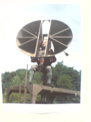
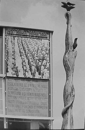
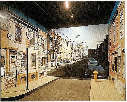
I’m not sure why, but it was acoustic locator-palooza over there. On the wall of the awesome library in Stroom, the visual arts center in The Hague, I spotted a large poster of a guy sitting in a German-style portable locator. And there were two more images in Stroom’s recently published journal, Podium for Observation
Turns out they’re from the Museum Waalsdorp, which is located on a military base outside of The Hague. And apparently, they’re not German-style at all; they were designed in Waalsdorp in 1927 by an engineer named Ir.van Soest. And they have some there. But it’s only open on Wednesdays, and only with advance reservations.
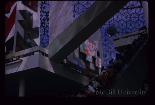
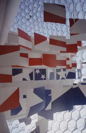
In Amsterdam on Museumnacht, meanwhile, we headed from the Stedelijk to ARCAM, the city’s architecture center & museum, because their current exhibit, “Music.Space.Arch.,” sounded like I could have curated it myself. Or blogged it, more like:

The focus of the exhibition is the suggestion of space as created with the aid of acoustic objects. The spatial experiences relate to various scales, ranging from the intimacy of the individual to the spacious openness of the urban space.
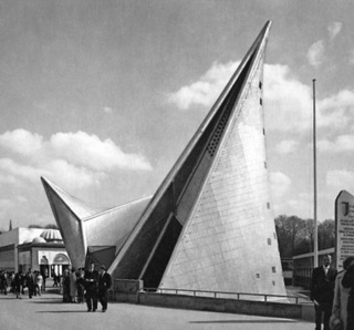
Included among the collected objects are the ‘Side Scan Sonar’, which brings the urban space surrounding ARCAM to the visitor, and listening equipment with which enemy aircraft were detected in the Second World War. With ‘Sound Scrape Shoes’ by Ricardo Huisman, the ARCAM building becomes the source of the experience, while in the presentation of the famous Philips Pavilion of 1958, the proportions are completely different from what we are familiar with.

Acoustic locators AND a re-creation of the Philips Pavilion? How could we miss?
Well.
corbu_philips_arcam3.jpg
We literally arrived at ARCAM one minute after the tap dancer had begun her show. Now for me, tap dancing is to real dancing what rhythmic gymnastics is to real gymnastics, or what synchronized swimming is to swimming: an over-aestheticized mutation that is somehow unaware of its own awfulness. And that’s on a good day.
When you have a Dutch punk tap dancer–an alternative tap dancer, in a country where they probably have a Bureau of Alternative–in tasseled pants, dancing in the dark while an assistant shines a flashlight on her shoes, whose “intimate interaction” with ARCAM’s building basically meant pushing the entire contents of the exhibit into the corner so she could erect her hollow tap floor, it is really unforgivable and unsalvageable. And that’s even before the audience participation segment began.
corbu_philips_arcam_wire.jpg
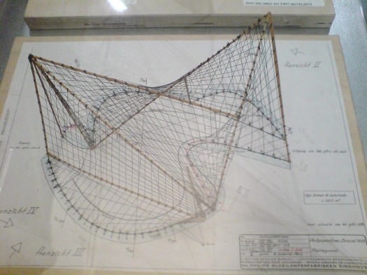
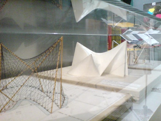
So we stayed in the corner, where the “completely different” proportions of the Philips Pavilion re-creation turned out to mean three A2-size models borrowed from the Atomium. Fantastic, but tiny. That wireframe’s especially nice.
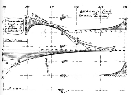
But the projection on the exterior of the museum of Le Corbusier, Xenakis, and Varese’s Poeme Electronique, considered to be the first immersive multimedia environmental installation, had been turned off, another casualty of the evening.
acoustic_locator_arcam.jpg
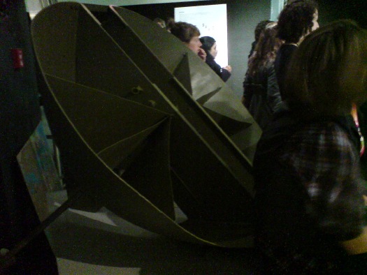
Oh, and there on a pedestal, behind some people’s butts and under their coats, was a real live Van Soelst acoustic locator. Only it wasn’t from Museum Waalsdorp; it was from somewhere else entirely: the Wings of Liberation Museum in Best. Holland must be the most acoustically located country in the world right now.
And so as we left behind a slightly chaotic-seeming jumble of awesome objects brought together by an amorphous, subjective theory, I realized that the only way to tell this blog apart from a multi-million-euro art, architecture & cinema center is that I’m the one without a tap dancer.

¡Pasarán In! The Spanish Pavilion, Paris 1937

spanish_pavilion_1937_ext.jpg
Worlds Fairs turned out to be the perfect venue for photomurals–they were catchy, usually didactic, packed a visual punch, and got the point across to the shuffling masses. And at least in the 1930s, they looked like the future.
So to a government whose future was being immediately threatened, like the Spanish Republic under siege by Franco and his fascist army, a publicity- and sympathy-generating pavilion at the 1937 Paris Expo literally seemed like a matter of survival.
José Luis Sert and Luis Lacasa designed the small, simple pavilion, which didn’t get completed in time for the opening, and which anyway, ended up being overshadowed by the bombastic, dueling pavilions of Nazi Germany and Stalinist Russia.
So to get attention, a huge photomural/banner of Republican loyalists was hung over the entrance. [Intriguingly, in two of the three most widely circulated photos from the Expo, including the Le Monde photo announcing the opening, the mural is cropped out or coincidentally obscured by a tree branch.] As kk_redax’s photo on flickr shows, the photomural was changed periodically:
Sert, Josep Lluis, and Lacasa, Spanish Pavilion at Paris Expo, Photo Panel with Parade formation
Like breakdancing was to gangs, world’s fairs were designed as a non-violent means for competitive, conflicting nation states to jockey for supremacy. But the Spanish Civil War pushed the Republican government to a new, urgent level of pavilion-building. The war, which was fought on the ground through media, posters, photos and newspapers [and also guns and bombs], also gave birth to modern photojournalism. And the Paris Expo was the site of Spain’s immediate experiement in architecture as military polemic. And then there’s the art.
The Republican government sought to garner international support by assembling modern works by sympathetic artists that express powerful and overt political outrage, including a large painting of an upraised fist by Joan Miro . And unveiled on the ground floor was Picasso’s Guernica.
guernica_calder_pavilion.jpg
Painted in 24 days in his new Left Bank studio in the spring of 1937, Guernica‘s duotone palette reflects how Picasso and the rest of the world learned of the Nazis’ devastating saturation bombing foray: via newspaper photos and newsreels. Photography had an even more direct impact on the making of Guernica: Picasso asked his companion Dora Maar to document the painting process, and there’s a scholarly case that “the tonal variations Picasso observed in Dora’s photographs appear to have influenced the development of those in the middle stages of the painting.” Though it sets the bar pretty high for the rest, it’s not much of a stretch to call Guernica the greatest photomural of the 20th century.
But wait, that’s not all! In the Pavilion Guernica was installed next to Mercury Fountain, an abstract, kinetic sculptural tribute to the Almaden region of Spain, which at the time produced the lion’s share of the world’s mercury. Oh, the fountain was by Alexander Calder. While Guernica‘s world travels are well known, Mercury Fountain is a Calder whose relocation was both successful and imperative. It currently sits at the Fondacion Miro in Barcelona, sealed behind glass, in order to contain its toxic vapors.
Guernica, meanwhile, is now encased in glass for its own protection.
…The Spanish Pavilion [pbs.org]
A comprehensive post about El Pabellon Espanol, in Spanish [stepienybarno.es]
The Mexican Suitcase, rediscovered Spanish Civil War negatives by Capa, Chim, and Taro [icp.org]

Stephen Shore’s Photomurals, I Mean, ‘Architectural Paintings’

shore_signs_vsba.jpg
that sidewalk, that exit sign, that door. installation image of Stephen Shore’s images, 1976
So yes, I’ve got a million other things to do, but thanks to this Mies thing being auctioned, and Michael Lobel’s article on photography and scale–and by implication, photography and painting, pace Chevrier’s forme tableau–I’m become slightly obsessed with the history of photomurals.
From what I can tell so far, I have the field largely [sic] to myself, but there is definitely some interesting work out there–and some interesting writing about it. And who should turn up as one of the innovators of these scale-blasting photomurals, but the master of the snapshot himself, Stephen Shore?
Just this past May, Swiss art historian Olivier Lugon published an article in Études photographiques titled, “Before the Tableau Form: Large Photographic Formats in the Exhibition Signs of Life, 1976.”

Signs of Life: Symbols In the American City
was a groundbreaking and somewhat controversial show held at the Smithsonian’s Renwick Gallery as part of the US Bicentennial celebrations. Conceived in 1974 on the heels of the publication of Learning From Las Vegas by Robert Venturi, Denise Scott Brown and Steven Izenour, it was, depending on who you asked, an exultation, an examination, or an elitist excoriation of commercial and populist vernacular architecture and design. They filled the gallery with iconic roadside signs, and they created dioramas of archetypal American living rooms to give all Our Stuff the museological treatment.
And to photograph it all–and to create giant, deadpan photomurals of the American residential streetscape–Izenour selected a young photographer whose seemingly unstudied roadtrip snapshots had just been shown at the Met, Stephen Shore.
shore_signs_neco1.jpg
Lugon quotes Venturi & Scott Brown’s explanation of the show [I’m translating back here from French, so it’s probably off a bit]:

“The idea was to cross the model of the billboard, this image made for distant, fugitive, distracted perception of the driver, with that of the newspaper, which is a density swarming with information.” The art museum is thus invaded by two different but interdependent media regimes: the advertising billboard’s principle of rapid distraction, and the extreme informational concentration of the newspaper, two opposing models for aesthetic contemplation, where the distance of the viewer from the image is either too far or too close.

Despite working at like 100x his previous [and, for the most part, subsequent] scale, Shore’s illusionistic photo backdrops manage to capture the banality he loves. Banality in a good way, of course. I think this street is my favorite:
shore_signs_neco2.jpg
Maybe because he wasn’t a fetishy print guy–Shore rather famously sent all his film to Kodak to be developed, just like civilians–he readily embraced the print quality of the photomurals. Which–I love this–turned out to be paintings.
Lugon explains that the Signs Of Life photomurals were made with an expensive, state-of-the-1976-art, 4-color airbrush-like printing system from the Nippon Enlarging Color Company, which had been licensed for the US by 3M. Who marketed it to trade fairs and restaurants as Architectural Painting. With the public and art world attention from Signs of Life, 3M brought Izenour on to promote the new medium for use by artists and museums.
In 1977, Popular Science ran an article explaining how Architectural Painting technology worked. A specially prepared color negative was scanned and split into CMYK, and the quick-drying paint was applied in overlapping strips, inkjet-style, by a computer controlled, scanning sprayer. 3M technicians then touched up the finished print by hand. All in, it cost $10-25/sf.
Expensive enough to be the second largest line item on Signs of Life‘s budget, and sexy enough that Venturi et al. used it again almost immediately. For their controversial [i.e., steaming hot mess, according to Robert Hughes, who I’ll happily believe just this once] exhibition design for the Whitney’s Bicentennial blockbuster, 200 Years of American Sculpture, the architects installed a 27-foot-tall cutout photo by Shore of Hiram Powers’ iconic marble, Greek Slave, on the canopy of the museum. Ezra Stoller says it was “inspired by Caesar’s Palace,” which I’m sure was a compliment:
shore_powers_whitney76.jpg
Once again, I start programming a bonus DVD for “The Original Copy,” Roxana Marcoci’s current show at MoMA on photography and sculpture. But I think the real story here is painting and photography.
Jean Francois Chevrier gets credit for the term forme tableau, which he used to describe the large-format photographs which began to assert a place on the wall and in the discourse that had previously been reserved for painting in the 1980s [and since]. Then Lugon mentions how Sherman, Prince, Kruger, etc. had appropriated the photography of commercialism–advertising and movies [Untitled Film Stills began in 1977]. And now here’s Shore, right there in the thick of things, making giant photos with his new-fangled, trade show backdrop printing techniques–which turn out in the end to actually be paintings. [And sculpture. And architecture.]
The kicker, though, is one of the complicating factors for why I’m finding photomurals so interesting right now. And I write this as a guy who has two of Felix Gonzalez-Torres’ Parkett billboard/photomurals because, once you install one, it’s up, it’s done, it’s gone: they managed to thwart the market. Here’s Lugon:

The photomural reveals itself to be extremely vulnerable. Its own installation, its dependence on conditions of fixation and lamination make it enormously fragil: with rare exceptions, it does not survive its exposition. It’s one of the fundamental points that distinguishes it from painting: its incapacity to become an object of collection.
When it was developed in the 19th century, photography constituted precisely a pure image for collecting: one acquired it to conserve, because it was capable of bringing all objects in the world together into a system of thesaurisation and generalized comparison, but it’s difficult to show. Small and grey, taking poorly to the wall, and with a surface that deteriorates in the light the more one views it. The grand format photos of the interwar years reversed this logic: photography became the image of exposition, but it renders it improper for collecting.
Only the forme tableau would succeed in crossing these two qualities, to make of photography an image at once for exhibiting and collecting–two criteria indispensable for accessing fine art’s economic system.

I guess I’ve gotta call Stephen Shore now and see if that’s really true, about his photomurals, I mean.

Voice Of The Taxpayer (1990) By John Czupryniak

newman_vof_ngc.jpgWhen it was publicly announced in March 1990 that the National Gallery of Canada had purchased Barnett Newman’s 1967 painting, Voice of Fire for $1.8 million (Canadian), there was an immediate press and political uproar that so much public money would be spent on what seemed like so little. A conservative MP, who was also a pig farmer, challenged that anyone with “a couple of cans of paint, a roller, and ten minutes” could make Newman’s 18-ft tall bands of red and blue.
Greenhouse owner and house painter John Czupryniak’s wife Joan, upon seeing the news reports, told him, “Hey, anyone could paint this, even a painter.” And so he did.
Mr. Czupryniak studied reproductions of Voice of Fire and because he was unfamiliar with canvas painting techniques, he built up a 16×8 panel of plywood, and made a full-scale replica of Newman’s work. He struggled with the title before arriving at Voice of the Taxpayer.
Thumbnail image for voice_of_taxpayer_ott_cit.jpg
Then he offered it for sale. The government price was $1.8 million. For you, though, or any Pierre off the street, it was just $400, the cost of time and materials. Almost immediately, Voice of the Taxpayer became part of the art controversy. The picture of the Czupryniaks posing with the [for sale] painting was published in The Ottawa Citizen.
In the art world’s critical self-examination of the Voice of Fire controversy, noted art historian Thierry du Duve published an essay, “Vox Ignis, Vox Populi,” in the Montreal art journal Parachute which focused on Mr. Czupryniak’s response. It is awesome:

Like many avant-garde painters, Czupryniak paints against. A transgressive gesture along the lines of Dadaism, Voice of the Taxpayer assumes its full significance only in diametrical opposition to the tradition it attacks. A postmodern parody of modernism’s celebrated flatness, Voice of the Taxpayer is a quote, a pastich that appropriates the work of another, empties it of its meaning, and presents itself as a critique of ‘the originality of the avant-garde and other modernist myths.’ Better still, in its abstract guise Voice of the Taxpayer is a real allegory of the art world as institution, neither more nor less than Courbet’s L’Atelier du peintre. Is it a bad painting? No it is bad painting, if you get the difference.
It is actually a subtle and refined conceptual piece whose feigned innocence makes the emperor’s new clothes visible to all. The “indispensable vulgarity’ (Duchamp) of its title provokes the return of the repressed of the sole ‘convention’ that modernism forgot to deconstruct, the money of the people on whose back the elite builds its culture. In short, Czupryniak has got it all: he is more provocative than Rodchenko, more sarcastic than Manzoni, more strategic than Buren, more political than Haacke, more nationalist than Broodthaers, more demagogical than Koons, more neo-geo than Taaffe, all this with Duchamp’s caustic humour, and sincere to boot!

It is an epic of art criticism. Or maybe Parachute was punked by the theorist’s smartalecky brother, Jerry du Duve, I can’t quite tell. Whichever du Duve, he, too, expressed his doubts:

The critical interpretation of his Voice of the Taxpayer which I gave above is perfectly plausible, and that’s what worries me. A perverse and cynical art historian, I would have appropriated Czupryniak just as he appropriated Voice fo Fire. I would have taken a painter and made him into an artist, an ‘artist in general.” But I am not interested in defining an artist in this way.

Oh wait, never mind! Du Duve suddenly flips [“I only played at being cynical to show you how absurd it is.”] and makes an argument for Voice of the Taxpayer based not in cynicism, but in sincerity. Czupryniak “emulated Newman by simulating him just as Newman had emulated Mondrian by painting against him.” In fact, Voice of the Taxpayer embodies what du Duve calls “the fundamental ethical meaning of the ‘reductive’ aesthetic governing Voice of Fire, as well as all great modern painting” [italics in the original, bold added because, holy smokes!]: painting that demonstrates its true universality precisely because “anyone can paint this, even a painter.”
expo67_flag_lifemag.jpgDu Duve then considers at great length how Mr. Czupryniak’s pricing scheme deftly maps out the incongruities between artist and painter, value and worth, elites and the public, boss and laborer, exploiter and exploited. Every dollar between $401 and $1.8 million, he writes, accrues to Newman’s status as an artist as perceived by the cultural elites–and as extracted by them for their own aesthetic pleasure from the unappreciative public [the Taxpayers] who got stuck with the tab.
I’m surprised du Duve doesn’t mention it, because I can’t stop marveling at how Mr. Czupryniak’s project maps so closely with Newman’s and the creation of Voice of Fire.
Newman, a celebrated artist was invited by his government, to make a work almost to spec, for which he received $423.60 to cover the cost of materials. But not his labor. Instead, his contract with the USIA guaranteed him full control over the painting’s “equity,” which his wife went on to monetize rather successfully. I guess we should add Voice of the Shareholder to the chorus.
What is the fate of Mr. Czupryniak’s historically important masterpiece? Did he sell it? Did he keep it? Does it still exist, perhaps turned into a red and blue storage cabinet in the nursery? In 20 years, no one seems to have asked, so I have put in a call to find out. Stay tuned.
Thierry du Duve’s “Vox Ignis, Vox Populi” was reprinted in the 1996 anthology, Voices of Fire: art, rage, power, and the state. Buy it from Amazon, or try to read the essay in Google Books’ preview mode.
[image right of Ivan Chermayeff’s Newmanesque flag panels in Buckminster Fuller’s US Pavilion at Expo67: Mark Kauffmann for LIFE]

Flame Canada

newman_voice_of_fire.jpg
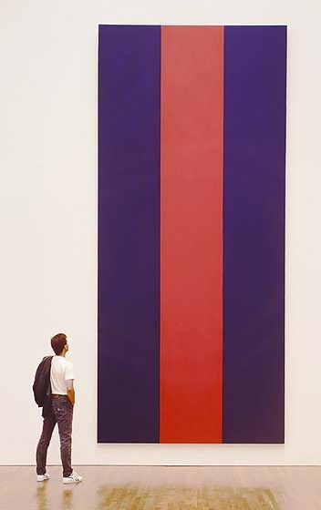
Speaking of National Gallery of Canada upheavals, Walrus Magazine, late-career post-minimalist kitsch, and Blake Gopnik:
In March 2010, Walrus celebrated the 20th anniversary of longtime NGC contemporary curator Brydon Smith’s purchase of Barnett Newman’s towering 1967 painting, Voice of Fire for $1.8 million, which was apparently a lot of money, even in Canadian. The announcement [of the price] set off a political firestorm of conservative, populist wrangling and hearings. It was Canada’s own homegrown version of the American Right’s culture war on the NEA, the NGC’s most famous controversy.
Well, famous in Canada, anyway. As Greg Buium noted in his article, “Firestorm”:

Internationally, the affair caused barely a ripple. Art in America published a short news story. Blake Gopnik, chief art critic at the Washington Post, was then a doctoral student at Oxford and only heard about it from his family back home in Montreal.

And here I am agreeing with Gopnik again! Awkward! Newman painted Voice of Fire for “American Painting Now,” Alan Solomon’s exhibition in the Buckminster Fuller dome at Expo 67. Which I wrote about and dug into rather deeply last October. I even quoted from Voices of fire: art, rage, power and the state, a 1996 anthology of the controversy, and yet I’d forgotten it until reading Buium’s piece. [Maybe it’s just me.]
According to Smith’s account of the making of, Newman’s painting, 8×18′ high instead of 8×18′ wide, Voice of Fire was designed to Solomon’s request for “very large,” vertically oriented paintings able to “hold their own” in a “soaring airy structure” and amidst a lot of visual “competition,” and which, because of the steady movement of crowds through the pavilion, “visitors would not be able to spend long periods looking at.”
Smith also wrote about having spontaneous discussions with Annalee Newman about her husband’s “concern at that time about the undeclared war in Vietnam,” a concern which hovered over the entire pavilion project. Co-editor John O’Brian quoted Solomon as saying, “Given world conditions at the moment, [the plan is] to soft sell America rather than show our muscle.”
Yeah, capitalism, but I’ve always thought Voice of Fire was the best painting of Newman’s weakest period, the hard-edge acrylics, which filled the last big gallery of Ann Temkin’s Philadelphia Museum retrospective. [Hold on, I’m trying to forget that triangle-shaped canvas all over again.]
A late-period acrylic, made to order by an ambivalent artist for a drive-by spectacle designed to distract from the war. With stripped-down, hard-edge abstraction that provides the perfect symbol for anti-intellectualist critics of the art world’s shenanigans. It all sounds like a prime candidate for Blake Gopnik’s Kitsch You Didn’t Think Of! list.
And yet he left it off. With such political savvy I predict a bright future in Canadian art politics for Dr. Gopnik.

On Warhol’s Rain Machine[s]

warhol_rain_machine_nr.jpg
First up, a high five to Andrew Russeth at ArtInfo for highlighting Nicholas Robinson Gallery’s summer installation of Andy Warhol’s unusual Rain Machine (Daisy Waterfall). What a weird, wonderful–but mostly weird–work.
It’s basically a mural of shimmering, lenticular photos of flowers behind an illuminated, recirculating, double wall of simulated rain. Let’s set aside the fact that the raw mechanicality of Rain Machine makes it look like a missing Pop link in the genealogy of Olafur Eliasson’s work. The similarities are both less and more interesting than they first appear.
Begun in 1968, Rain Machine has its origins in two of my favorite pseudo-utopian art/technology events, the Osaka 70 World Expo and LACMA’s sprawling Art & Technology collaboration project, which ran through 1971.
warhol_rain_machine_at.jpg
When Warhol was first approached for the A&T Program, which paired artists with cutting edge technology companies to realize a new, innovative work of some kind, he imagined making a wall of 3D holograms that would be barely visible through the mist. But Bruce Nauman had already nabbed RCA’s hologram guy, so Warhol fell back onto decidedly low-tech lenticular imaging.
Then the rain wasn’t working, the prints didn’t line up, the budget was a joke, the US Pavilion exhibition space was cramped, the whole thing was a potential mess. The story is recounted in glorious, play-by-play detail in LACMA’s 1971 Art & Technology Report, which is cheap to buy used, and [brilliantly] available as a free PDF download from LACMA’s online library:

Perhaps the most important decisions determining the work’s final appearance in the U.S. Pavilion at Expo were made not by Warhol but my MT [Maurice Tuchman, LACMA’s A&T curator/organizer], the Expo Design Team members, and some of the other artists in the show. The entire installation operation was characterized by a sense of crisis, and there were moments when the peice seemed simply destined to ignominious failure. In the end, somehow, it worked; many people and particularly the artists who were there installing their own pieces, felt the Warhol to be one of the most compelling works in the exhibition because of its strangely tough and eccentric quality. Robert Whitman commented that “of course Andy’s forcing everyone into the act;” the work istelf, when completed, made that conspicuously evident, and yet it was unmistakably Warhol. When it was rumored at one point just before the opening of Expo that the work might be taken out of the show, as was suggested by several of the Expo Designers and by a visiting critic who was conversant with Warhol’s oeuvre, the American artists who by this time knew the piece intimately objected strenuously.

When Rain Machine came back to LA, it had to be reworked, or debugged, and reconfigured. The most noticeable change is probably the scaled up daisy photos. As Robinson explains, the current installation follows an even newer [remastered?] set of specs developed by the Warhol Museum for its 2002 refabrication of the work.
Update: Interesting, LACMA received a set of nine lenticular daisy photos as a gift in 1999. They’re the larger, single daisy-style, which makes me think they were extras, loosies, or maybe even leftovers from the 1971 Art & Technology reinstallation. A few of these have popped up in the market over the years; they’re not that expensive, though without the rain–hell, even with the rain–they’re a little weird.
Update Update: aha, interesting. according to this auction description, the lenticular photos were commissioned in an edition of 50 for the LACMA show.

Welcome To The Kabul Dome

In 1956, USIA exhibitions director Jack Masey had a problem: the Soviets and the Red Chinese and their big pavilions usually had a lock on the International Trade Fair in Kabul [that’s the capital of Afghanistan, you know]. The US Commerce Secretary had decided America should be all over those non-aligned/third world trade fairs, but the US had, like, a few animatronic chickens, and a television, that’s it. Then Masey called Buckminster Fuller. The story–and many, many more of Masey’s expo exploits–is told in his 2008 book, Cold War Confrontations: US Exhibitions and their Role in the Cultural Cold War, but I’ll let Thomas Zung’s Buckminster Fuller: anthology for a new millennium tell it.
Actually, let me paraphrase my way to the specs and the punchline. Sometimes you don’t realize how badly something’s written until you try to retype it yourself:
One week of engineering; one month of construction and packing; one dome and one engineer flown to Kabul on one DC-4; untrained Afghan workers assembling color-coded parts getting the thing built in 48 hours. 100-ft diameter, 35-ft tall, 8,000 sf uninterrupted floor space made it the largest Geodesic structure in the world at the time. Made from 480 3-inch aluminum tubes, weighed 9,200 lbs, nylon skin: 1,300 lbs.
And it totally killed at the fair. Afghans loved the US had them building it themselves. It reminded them of a yurt. It basically kicked Commie ass. Zung, are you ever gonna come through?

The Department of Commerce had now become interested in the kudos value [sic] of Geodesic domes. The Geodesics, it was argued, dramatized American ingenuity, vision, and technological dynamism; as structures to house American trade exhibits they would be tangible symbols of progress. Fuller’s three-way grids were better propaganda than double-meaning speeches broadcast to regions in which radios were scarce. Domes as large as the Kabul dome, and larger, were flown from country to country, girdling the globe; and many of these also set attendance records. Within a short space, Fuller’s domes were seen in Poznan, Casablanca, Tunis, Salonika, Istanbul, Madras, Delhi, Bombay, Rangoon, Bangkok, Tokyo, and Osaka.

Mhmm. News reports of the time cite the television and large projection screens as the big draws, actually, but I’m sure it was the dome’s awesomeness.
Hard to say from the photographs, though, because I can’t find a single image of the Kabul Dome in Kabul, or any of its other tour stops. As with so many other aspects of Fuller’s visual/cultural legacy, original photos and archival documentation are on lockdown, and many of his acolytes seem content to just marvel at the mathematical elegance of the Geodesic schematics.

100-ft Spheres In The Center? On Buckminster Fuller’s Original Expo 67 Pavilion

From the Other Things I Didn’t Know About What Goes Inside Geodesic Dome Pavilions Department:
Christine Macy and Sarah Bonnemaison devote a chapter in their 2003 book, Architecture and nature: creating the American landscape to geodesic domes, including this description of Buckminster Fuller’s original vision for the US Pavilion at Montreal’s World Expo 67:

His [Fuller’s] design of 1964 featured a dome nearly twice the size [of the 250-ft diameter, 3/4 dome by Fuller and Shoji Sadao that was realized] with a massive interior gallery. From this elevated vantage point, the viewer would focuse their attention inward to a hundred foot diameter Earth tranforming slowly into an icosahedron, before it opens up, unfolding like a flower as it descends to the floor. [what a sentence. -ed.] In this way, Fuller’s “geodesic” globe transforms into his “Dymaxion” map of the Earth before the visitors’ eyes, displaying the “one world island in one world ocean.” And then it would come to life. Wired with tens of thousands of miniature light bulbs, this great map would begin to pulsate with patterns–showing world resources, electricity generation, the flow of transportation and communication systems across the Earth. This interactive display, this giant bio-feedback device, would be the playing surface of the “World Game.” Assembling in teams or playing by themselves, visitors were intended to chart out optimal paths to link resources with industries and population centers, to streamline transportation flows and maximize satellite coverage The aim, according to Fuller, was to “make the world work successfully for all of humanity…without anyone gaining advantage at the expense of another.”

Since he had not actually been asked to design the exhibit, just the pavilion, this idea was rejected and replaced by a selection of quilts, duck decoys, and Cary Grand billboards.

American Painting Now Then

buckminster_fuller_montreal.jpg
How to account for my dogged fascination with the temporary/permanent, futuristic/historic paradoxes of Expo art and architecture?
Buckminster Fuller’s 20-story Biosphere was far and away his greatest single success and the hit of the most successful modernist world’s fair, the Expo 67 in Montreal. And yet how little did I consider what was in it: a giant exhibit of the movies; The American Spirit, an exhibit of NASA satellites and space capsules; some crafts or whatever, and American Painting Now, 23 huge paintings commissioned by Alan Solomon from a “Who’s Who of modern art,” including :

James Rosenquist, Claes Oldenburg, Andy Warhol, Jasper Johns, Jim Dine, Ellsworth Kelly, Barnett Newman, Robert Rauschenberg and Roy Lichtenstein. Their works illustrated trends such as abstract expressionism, op, pop, hardedge and geometric art. Like the space component, this part of the American exhibition was truly spectacular. The works, gigantic, simple and colourful, paid a vibrant tribute to the creative vitality of artists who now count among the great masters of 20th century painting.

Uh, and from Fuller, too, from the looks of that giant Dymaxion Map right there.
expo67_fuller_warhol.jpg
From a 1996 book on Voice of Fire, Barnett Newman’s own 17-foot tall contribution, we learn Solomon requested that the artists [all male?] “contribute paintings that are (a) large in scale and (b) vertical in format.”
newman_voice_of_fire.jpgI want to quote “Exorcism in Montreal,” the April 30, 1967 review by NY Times critic and famous Newman nemesis John Canaday, in its entirety, but I won’t:

Here we have the same old clique of names that have been handed the favors regularly in Venice and everywhere else on the circuit. A natural response to the list is “Oh, no, not again!” There is that tiresome Barnett Newman, who this time turns out three vertical stripes in two colors–but they are 17 feet high. There’s Jim Dine, with nothing but two big slabs of enameled canvas, in two flat colors, bearing in one corner a notation as to the brand of paint used–and the panels are 35 feet high. There is Roy Lichtenstein being Roy Lichtenstein again, but now 29 feet high.
There are all the rest of the club, not including some whose work was not fully installed on press day, and some whose work seems to me to have more substance than the ones listed, for instance James Rosenquist’s colossal “Firepole.” I have chosen the most vacuous because in this setting even they are part of a genuinely spectacular show fulfilling demands that could not have been met by any other kind of painting.
The dimensions given above tell that the paintings, most of them done for this spot (what other spot could hold them?), are gargantuan…they are played against strips of sail cloth in heights up to that of a 10-story building. It is as if the whole water-treading esthetic that they represent had been originated and sustained by some genii who knew that one day a form of painting bold enough and shallow enough to supply enormous bright banners for this pavilion would be necessary.

And then there’s Canaday’s assessment of the NASA artifacts, which basically hits it home for me with the art/science beauty paradox:

…since technology is creating the most beautiful objects today, and the most imaginative ones, Apollo might also be thought to have added one more muse to the group that he has always chaperoned.
Of course, there is no separating the fascination of the Apollo Command Module as a scientific object from its quality as an esthetic one, with its self-generated form and its patina burnt into it during the minutes of its descent rather than by centuries of weather, but it is a beautiful object all the same–inherently beautiful, and no other word than beautiful will do–as well as an historical monument with emotive associations And that is what great works of art used to be.

Ah, so it’s just the domes and the satelloons.
expo67_satelloons_mcgill.jpg
Update: From Architecture & Nature (2003), more details/corrections on who showed what: Kelly had a 30′ canvas, no title given. Robert Indiana, Cardinal Numbers. At just 13’x15′, Robert Motherwell’s Big Painting #2 was anything but. Lichtenstein: Big Modern Painting [sensing a theme here?] Helen Frankenthaler was The Woman Painter. And the Dymaxion Map was by Johns, “a small [sic] token to his friend Fuller’s desire to have the map be the centerpiece of the pavilion.”
Interior images of Biosphere, the US Pavilion at Expo 67 from The Dixon Slide Collection at McGill University. [mcgill.ca]
Q: was this the Ellsworth Kelly? [no, see update above]
Previously: Hmm. That satelloon & command module show was so good, they used it again at Expo 70 in Osaka.

Floating Cloud Structures, Or We All Live In A Fuller Satelloon

fuller_cloud_nine_orig.jpg
Just like how, once you’ve learned it, you start hearing a word all the time, now I see satelloons everywhere. Including at the Buckminster Fuller retrospective last year at the Whitney [which went on to Chicago this summer.]
Buckminster Fuller and his architecture partner Shoji Sadao mocked up this photo of a photocollage, Project for Floating Cloud Structures (Cloud Nine) , around 1960. Cloud Nines are self-contained communities of several thousand people living inside enclosed geodesic spheres a mile wide, which float over the earth’s surface.
Because the geodesic structure increases in strength as it gets bigger, and its surface increases at a power of two, while its volume increases at a power of three, Fuller hypothesized that heating the interior air even one degree will set the Cloud Nines aloft.
Obviously, as a sexy, futuristic utopian image, Cloud Nine is hard to pass up, but holy crap, Bucky, did you think for two seconds about the urban fabric and the social experience of living trapped in a floating dome? I’d love to see someone write an SF story about it. Because I think it might be a fantastically totalitarian disaster.
fuller_cloud_nine.jpg
There are two versions of the Cloud Nine image: [the earlier?] one has smooth, silvery, featureless spheres. I’d call them satelloons, even. The other [above] has line drawings of the geodesic structure collaged onto it.
It was only now, as I get around to finally posting about them, that the relationship between Cloud Nines and satelloons might be more than formalistic. The original satelloon, Project Echo launched in 1960, the same year Fuller and Sadao designed their giant floating spheres. Could there have been a connection?

The easiest, most obvious thing to do might be to ring up Shoji Sadao. What is he up to these days, anyway? You’d think that given the recent interest in Fuller’s work, a guy who worked so closely with Fuller on so many major projects–he’s credited with the dome at the 1967 World Expo in Montreal, arguably the most spectacular Fuller structure ever realized–would be all over the place. I mean, it was only a few years ago that he gave up his position as executive director of the Noguchi Foundation in Long Island City. And then he curated that great Fuller-Noguchi show in 2006. [Sadao was also a longtime collaborator with Noguchi and the chief overseer of his legacy.] Anyone spoken with him lately?

Frosty Myers Winners

latimes, wigwam of searchlights
Before I realized that if I wanted to see an exhibit of a 100-ft silver balloon, I’d have to make it myself, I was still just ruminating on art I hoped/wished someone would make. One of those projects I want/need to see is a re-staging of the Los Angeles Times photo of the panicked air raid searchlights that criss-crossed the sky on the night of Feb. 25, 1942. Six civilians died in that apparent, still unexplained false alarm, and the Times’ caption on the photo above described how the “searchlights built a wigwam” over the city. Wouldn’t that be fantastic?
Well, now I wonder if there is someone to get to do it.
16 Miles pointed to an awesome 2001 Art in America article by Suzaan Boettger on Sculpture in Environment, a pioneering New York City-wide show of public sculpture organized by Sam Green, the director of the ICA in Philadelphia, which took place in October 1967.
The main focus of Boettger’s article is an intriguing and prescient unmonumental work by Claes Oldenberg, and Robert Smithson’s seminal roadtrip article/work, “The Monuments of Passaic,” which [not] coincidentally, he made the day before. And the hook for 16 Miles’ post is the death of Tony Rosenthal, whose Alamo cube still spins where it was shown, in Astor Place. But there are other great details: Oldenberg had first proposed creating a traffic jam; Robert Morris’s jets of steam proposal was considered “too ephemeral.” Isamu Noguchi was still pitching his playground idea [“too expensive.”] Alexander Calder liked to help the Negros. &c. &c.
frosty_myers_searchlights75.jpg
But anyway, Boettger mentions this “a nocturnal event by Forrest Myers, who projected four carbon arc searchlights from Tompkins Square Park.” It’s not clear what they were called, but this description from a 2006 Art in America profile of Frosty Myers explains what these sculptures were:

“Searchlight Sculptures,” nighttime installations of carbon-arc searchlights that were sited at the four corners of Tompkins Square Park in the East Village in 1966, in Union Square in 1969, in a park in Fort Worth in 1979, and elsewhere. The beams tent upward to join at an apex in the manner of a vast pyramid.

Elsewhere included Artpark in Lewiston, NY, where Myers created a Searchlights pyramid in 1975 [see above]. You must admit, it does look very wigwammish.
You may know Myers from such previous greg.org appearances as: being instrumental in E.A.T. and the art/tech collaborative’s ambitious artfest-in-a-mirrored-dome, the Pepsi Pavilion at the Osaka ’70 Expo. And maybe being one of six artists whose work was secretly smuggled onto the moon on the Apollo 12 lunar module.
Remembering Tony Rosenthal, Remembering “Sculpture in Environment” [16miles.com]
A Found Weekend, 1967: Public Sculpture and Anti-Monuments, Art in America, Jan. 2001 [art in america via findarticles]
[Searchlights imagevia ekac.org]

Who What? Kocher & Frey’s Aluminaire House?

aluminaire_model.jpg
Let me get this straight: the first modernist prefab in the US; one of two US houses included in Phillip Johnson’s 1932 International Style exhibition at MoMA [the other: Neutra’s Lovell House]; built in 10 days from off-the-shelf industrial materials, with no formal plans or blueprints; Albert Frey’s first US project; bought and disassembled in hours, then saved and bastardized by Wallace K. Harrison; quoted nearly perfectly–concept, materials, and form–by Kieran Timberlake in their Cellophane House; and yet somehow Aluminaire House itself was not included in “Home Delivery,” MoMA’s 2007 show on the history of the modern prefab Please tell me I just missed it or blocked it from my memory.
But I’m hardly the only one.
Lawrence Kocher was editor of Architectural Record and later involved with Black Mountain College. The 27-year old Albert Frey was fresh off the boat from Le Corbusier’s studio. They whipped up Aluminaire House from donated parts and materials for a 1931 building show and Architectural League exhibition at Grand Central Palace, an expo hall that filled the block between 46th and 47th streets and Park and Lex.
aluminaire_house.jpg
Kocher’s concept was a light-filled, modernist prefab house made of innovative, industrial, mass-produceable materials: aluminum, steel and glass. The 3-story, 5-room, 28×22-ft, 1,200 sf building was barely more than a mockup, an exhibition pavilion. Frey later compared it more to a refrigerator than a building in its construction; it was light steel bolted together with nuts and washers and skinned in ribbon windows and corrugated aluminum, a material Frey would use extensively in California. The floor was ship decking covered in linoleum. Interior walls were rayon fabric. It was supported on five aluminum pilotis.
The main living space [LR/DR, Kit, MBR, BA] was on the second floor. The living room was double height, open to a partially enclosed library/2nd bedroom on the third floor, which also had a terrace. A second bathroom with shower was cantilevered over the living room, which frankly sounds like a joke.
aluminaire_plan.jpg
Harrison bought the Aluminaire House for a thousand dollars after the expo ended, and reassembled it at his house on Long Island. In ’32, Johnson showed the house in the International Style exhibition, but didn’t include it in the catalogue. Harrison proceeded to enclose the ground and third floors and add on some circular structures, rendering the house nearly unrecognizable.
Which is why it was almost demolished in 1987-8 when Harrison’s estate was chopped up and developed. The architecture department of the New York Institute of Technology took the Aluminaire House on as a school project. They studied and dismantled it, then eventually reassembled and restored it on a new pad on their Central Islip campus. Which looks to be about 10 minutes south of Exit 55 on the LIE, within easy pilgrimage visiting by every design snob in the Hamptons.
And yet, no one really seems to care or know about it. In a brief blurb about a 1998 Arch. League show on restoring Aluminaire House, Herbert Muschamp got the location and story of the house wrong. No one who writes about it sounds like they’ve actually seen it. There aren’t any contemporary photos of it online, only one shot from Harrison’s yard.
aluminaire_gmap.jpg
It’s on Google Maps, of course, and that’s Microsoft’s Bird’s Eye view on the right. But no mention of it on NYIT’s site. [The architecture department was moved from Islip to a campus in Old Westbury, so if it served any academic purpose before, the Aluminaire House seems kind of orphaned now. A 2007 messageboard post said that it was to be relocated as part of a redevelopment/selloff of part of the campus. If it hasn’t happened yet, I’m sure it won’t happen for a while.
But it sounds to me like there’s an unloved, unappreciated pile of historic modern awesomeness in the middle of Long Island that needs to be liberated and returned to loving domestic use. At the very least, will someone take half an hour on the way to the beach and go shoot some freakin’ photos?
The only lengthy discussion of Aluminaire House I can find online: docomomo’s 1998 Modern Movement Heritage by Allen Cunningham [google books]

Les Ballons du Grand Palais

The Grand Palais was already the best of the three venues in the world capable of accommodating my Satelloon project–a re-creation of NASA’s Project Echo (1960), the 100-ft metallic spherical balloon which was world’s first communications satellite, and which was also known as the most beautiful and most-viewed object ever launched into space–but now it’s practically inevitable.
Unless someone tells me that the Pantheon or Grand Central Station have already hosted legendary air shows dating back a hundred years…

These photos from Branger & Cie via the Smithsonian show balloons and blimps on display at the 1re Exposition Internationale de Locomotion Aerienne, which debuted in the nave of the Grand Palais in September 1909. They ran until 1951. Which makes bringing back the spirit of the Air Show both spectaculaire et logique!

satelloon_grand_palais.jpg

Previously: Les Satelloons du Grand Palais]

This Poeme Electronique Was Brought To You By Philips

expo58_corbu_philips.jpg
Hello, Earth to Le Corbusier archive!
Corbusier conceived Poeme electronique for the Philips Pavilion at the 1958 Expo in Brussels. It was an 8-minute immersive light, film and sound experience which told mankind’s long, hard slog towards peace.
Don’t forget the architecture. The multi-channel version of Poeme electronique, with a score by Edgard Varese, was projected on the walls of the tensile tent-like pavilion, which was designed by composer/architect Iannis Xenakis, who was working for Le Corbusier’s firm at the time. Xenakis recalled–perhaps wishfully, I don’t know–that the parabolic concrete forms came directly from his graph-based score for his 1954 composition, Metastasis. [The piece was staged last March at the Barbican as part of a Xenakis program, concurrent with the Corbusier exhibition.]
xenakis_metastasis.jpg
Here’s Poeme Electronique in its single channel version:

This brief segment produced in 2000 for a virtual reality recreation of the Poeme Electronique experience also includes period footage, photos, and a couple of interesting looking models from the Philips archives:

Le Corbusier; Iannis Xenakis; Edgard Varèse
«Poème électronique: Philips Pavilion»
[mediaartnet.org via things]
previously: E.A.T. and the Pepsi Pavilion, Osaka Expo 70; a lost piece of corporate-sponsored installation art?