
Ooh, I’ve been going through boxes of books in storage, and there have been some great finds. [And also some total crap books that, what, I have no idea, except that at one point in my life it was apparently impossible for me to leave Rizzoli emptyhanded.]
On the bright side, there was also Maurice Tuchman’s original 2-vol catalogue raisonne for Chaim Soutine, published in 1993, which I don’t think I’ve opened for 15 years. It’s so fantastic. Full-page, full-color illustrations for almost every work [of course, the Barnes’s Soutines are reproduced in black & white.]
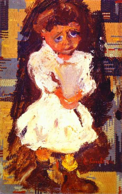
One painting I’ve never seen in person, and hadn’t noticed before, is this late [c. 1934 or 1937] Portrait of a Small Child, also known as La Pauvrette. [The artist told Max Kaganovitch, the dealer who bought it in 1937, that she was embarrassed by her worn out shoes. He always painted from life, too, so I’m willing to believe he didn’t just imagine this.]
What caught my eye this time–besides the kid’s eyes, which, right??–was the abstract gridded dot pattern in the background. As if Soutine painted the girl on top of an Alma Thomas, or this was part of his geometric pointillism period, which, given his manic, spontaneous expressionism, would make him even more disturbing.
But it turns out to be linoleum. For whatever reason, I can’t figure out, but maybe it was Soutine’s perennial poverty, he painted this on a 9.5 x 15-inch piece of linoleum flooring.
Though he occasionally painted on wood, or on canvas mounted to a board, this is the only known painting Soutine did on linoleum. Kaganovitch wrote that upon purchasing the piece, the artist initially wanted to “finish” it by painting out the patterns, but he decided to leave it. Which seems unprecedented.
In 2006, Kaganovitch’s heirs sold La Pauvrette at Sotheby’s in London for around 388,000 pounds. So on the bright side, it’s not in a museum, which means it is now on my to-buy list. On the other hand, to clear that list, I will need a billion dollars.
20 Jun 2006, Lot 457: LA PAUVRETTE, est. GBP 150,000-200,00 [sothebys]
Author: greg
‘Domestic Objects’ Opens Tonight, Sept 5 @ Bridge Gallery
And speaking of art and politics….
I am stoked to announce my participation in “Domestic Objects,” at Bridge Gallery on the Lower East Side. The show opens tonight, Wednesday, September 5th, and runs through October 18.
In addition to my piece, the show includes work by John Powers, Susanna Starr, and Jer Thorp & Diane Thorp. “Domestic Objects explores concepts of our constructed private spaces, belonging, family, domesticity, and material possessions.”
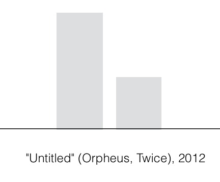
Which seemed to me like an excellent context and time for “Untitled” (Orpheus, Twice), 2012. It’s a piece I’ve actually been thinking about for a couple of years, but this is the first time it will be installed.
I’ve been thinking about art that doesn’t exist, and why not. “Untitled” (Orpheus, Twice), 2012, is a speculation, or a wistful reimagining, of Felix Gonzalez-Torres’ 1991 work of the same title. I’ll probably write more about it later, and how it came to be, but now I’m going to hit the road.
If you’re able to make the opening tonight, it’d be great. Otherwise, I hope you’ll get to see the show while it’s up.
Domestic Objects, 5 Sept – 18 Oct, Bridge Gallery, 98 Orchard St (Del/Ess) [bridgegalleryny.com]
Thinking About Art, Politics, And Milton Glaser’s Mural
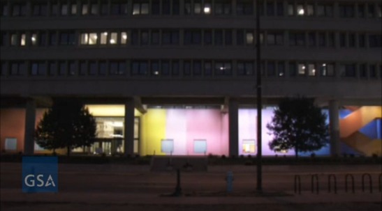
I’ve been wanting to write about Color Fuses, Milton Glaser’s 1974-5, 27×672-foot gradient mural in Indianapolis, all week, ever since Richard McCoy’s great Art21 post about the GSA’s restoration of the work’s 34 monochrome sections, and the realization, finally, of Glaser’s original lighting effects.
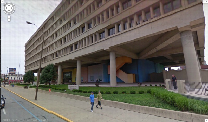
image: google maps
Besides my well-documented fascination with monochromes and gradients, I found myself intrigued by Glaser’s stated purpose for the mural, which wraps around the stark, ground-level loggia of the Minton-Capehart Federal Building, designed by local modernist eminence and Philip Johnson alumnus Evan Woollen. Glaser wanted to create “a mural that would express a spirit of openness and thus a new sense of government.”
The architect, for his part, hoped the mural would help make the building feel “cheerful, disarming, fresh, welcoming, and inviting.” Which is, let’s face it, a helluva thing to hope for your Brutalist, concrete, ziggurat superblock.
[Walking around the building on Google Maps gives a nice sense of the mural in daylight, including the backside, which is across the parking lot, and the bluish south end, which is largely blocked by privacy wall around the building’s daycare center. Even ignoring the unfortunately undulating wall–an out-of-place motif picked up by the single, sad wave of shrubs on the building’s strip of security plinth grass–the Minton-Capehart can only be my second favorite example of brutalism and daycare, way behind the playground on the plaza of the J. Edgar Hoover FBI Building.]
So I’m inclined to believe that the project went down a little differently at the time, a time when the GSA had revitalized and professionalized its Percent For Art program under the 2nd Nixon administration. [A distracting sop to the elites, he figured.] It’s not clear, for example, whether Glaser came to the project under the new system, as a world-class, committee-reviewed pick, or the old way, in which case he would have been suggested by, and thus, subsidiary to, the architect.
Which would be interesting to know, because another benefit of not blogging about immediately, is reading Alexandra Lange’s post about how modernist architects [occasionally] recognized that their severe forms might [just sometimes!] have needed a bit of humanizing.
But then watching the GSA’s video of the original/new lighting scheme, which adds slow ripples [undulations!] of light/dark around the building, I immediately thought of art. Specifically, Paul Sharits, who had been making painting-like, flickering, multi-projector, monochrome film installations for several years already when Glaser created his mural. [Writing about Sharits’ 1972 piece, Soundstrip/Filmstrip, Rosalind Krauss said it “muralizes the field of projection.”]
Paul Sharits’ Shutter Interface, first shown at ArtPark in NY in 1975, here at Greene Naftali in 2009.
And I wondered about the different ways art functions, and is treated, both at the time and through the lens of history and criticism. Partly because I’d never heard of Glaser’s mammoth mural before. Or of any other art he’s made. It seems to fall into this population of things people commissioned, made and showed, that are/aren’t/look like/function as art, which are [happen to be?] made by designers. And which are excluded from consideration within the context of art and art history. And politics is at the center of this boundarymaking.
The clearest example of this is the US Pavilion at Expo 67 in Montreal, the geodesic sphere designed by Peter Chermayeff and his exhibition firm Cambridge Seven Associates. Which had both spacecraft and satelloons and flag-like, Ellsworth Kelly-like supergraphics, and giant, commissioned paintings from the likes of Barnett Newman, Warhol, and Johns.
I don’t know yet how to make sense of Glaser’s mural, but I bridle at what I instinctively feel, that despite its awesomeness and Glaser’s immense influence, Color Fuses is somehow a less significant work because it’s art by a designer. Or art for the government. Or art the architect will put up with. Especially when I read Glaser’s intentions for the piece, which, by 1974, transparency and a new form of government were certainly on a lot of peoples’ minds.
And finally, last night, I found Hillman Curtis’s video profile of Glaser on Brainpickings, where the designer talks about art’s role in culture. It’s “benign” and “pacifying,” he says, and succeeds best when it creates “commonalities” by which “the likelihood of us killing each other is diminished.”
Again, I don’t think that perspective has been very prominent in the art world discourses of the day. It could be dismissed as hyperbolic, an at once idealistic and yet embarrassingly low bar. And yet, lately, the polarization in our cultural and political spheres make me wonder if not throttling each other is actually something we’d do well to focus on. Even if pacification by painting undulating rainbows on government buildings is not the best role demanded by the times for art.
Restored & Renewed: Milton Glaser’s 1975 Artwork, “Color Fuses” [art21.org]
Color Fuses’ Mural Restored at Minton-Capehart Federal Building [gsa.gov]
Art Matters To Architecture [designobserver]
Running Presidential Fence
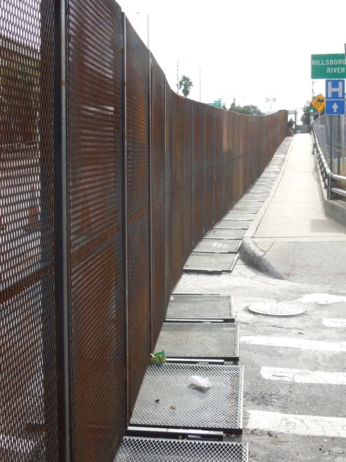
I’m really trying to get this writing thing done tonight, but I just have to point out that Richard Smith’s photo of the Secret Service’s six-mile perimeter fence at the RNC in Tampa is awesome. It’s like if Christo and Serra were cellmates and Cady Noland was their baton-wielding guard.
Fence Comes Down [narrativemag]
UPDATE:
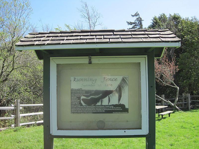
Speaking of Running Fence, there are two historical markers in Marin County commemorating Christo & Jeanne-Claude’s 1976 project.

see full size images at the Wikipedia entry for Running Fence. Please.
This anniversary marker is located in the quarter-acre Watson School Historic Park in Bodega. An outdoor vitrine contains an installation photo by the artists onto which was added the following text:
Running Fence
September 10, 1976
On September 11, 2001,
the Board of Supervisors of the
County of Sonoma selected this
site to commemorate the contributions of
Christo and Jeanne-Claude.
Their vision,
dedication and
perserverance made
the Running Fence
possible. This art
project consisted of:
42 months of collaborative efforts with ranch property owner participation, 18 public hearings,
3 sessions at Superior Court, an environmental impact report and the temporary use of the hills, sky, and ocean.
Rising from the Pacific Ocean south of Bodega Bay the 19 foot high 24.5 moile long Running Fence ran west to east,
following the rolling hills of Marin and Sonoma counties to the Colati ridge. [Format and italics original.]
Watson School Park is currently listed as closed for renovation. It is not known whether the marker is affected.
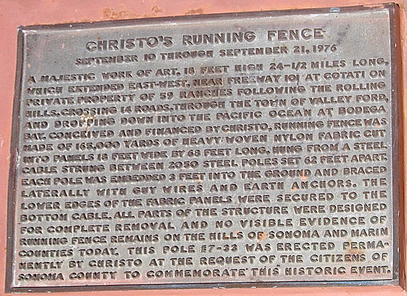
Meanwhile, in December 1976, the County Landmarks Commission in Sonoma designated Pole #7-33 as Historic Landmark #24, and installed a bronze plaque [above] that reads:
CHRISTO’S RUNNING FENCE
September 10 through September 21, 1976
A majestic work of art, 18 feet high 24-1/2 miles long, which extended east-west, near Freeway 101 at Cotati on private property of 59 ranches following the rolling hills, crossing 14 roads, through the town of Valley Ford, and dropping down into the Pacific Ocean at Bodega Bay. Conceived and financed by Christo, Running Fence was made of 165,000 yards of heavy woven nylon fabric cut into panels 18 feet wide by 68 feet long, hung from a steel cable strung between 2050 steel poles set 62 feet apart. Each pole was embedded 3 feet into the ground and braced laterally with guy wires and earth anchors. The lower edges of the fabric panels were secured to the bottom cable. All parts of the structure were designed for complete removal and novisible evidence of Running Fence remains on the hills of Sonoma and Marin Counties today. This pole #7-33 was erected permanently by Christo at the request of the citizens of Sonoma County to commemorate this historic event.
The County’s landmark information lists the site as “containing steel pool [sic] from original art installation.”
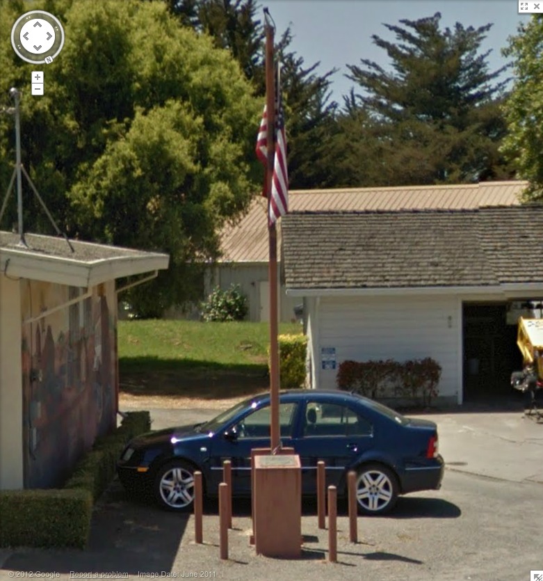
I believe this is it, next to the post office. Looks like it’s presently being used as a flagpole.
Oh, the Bodega bay Heritage Gallery has a photo of the fancier plaque on the other side of the pole. Also, Running Fence was acquired by the Smithsonian American Art Museum. Remembering Running Fence was on view in 2010.
If moving it away from that mural didn’t destroy its context, I would definitely replicate that, as is, stanchions, flag and all. Maybe a vinyl wallpaper photomural would work.
We Built It.

A photo I’ve been waiting to see from the RNC in Tampa, unidentified source via brian boucher
factchecking update: you know, I’m gonna go with: this debt clock photo is as true as this one.
Art Voices, Infinity, And Apocalyptic Tattoo
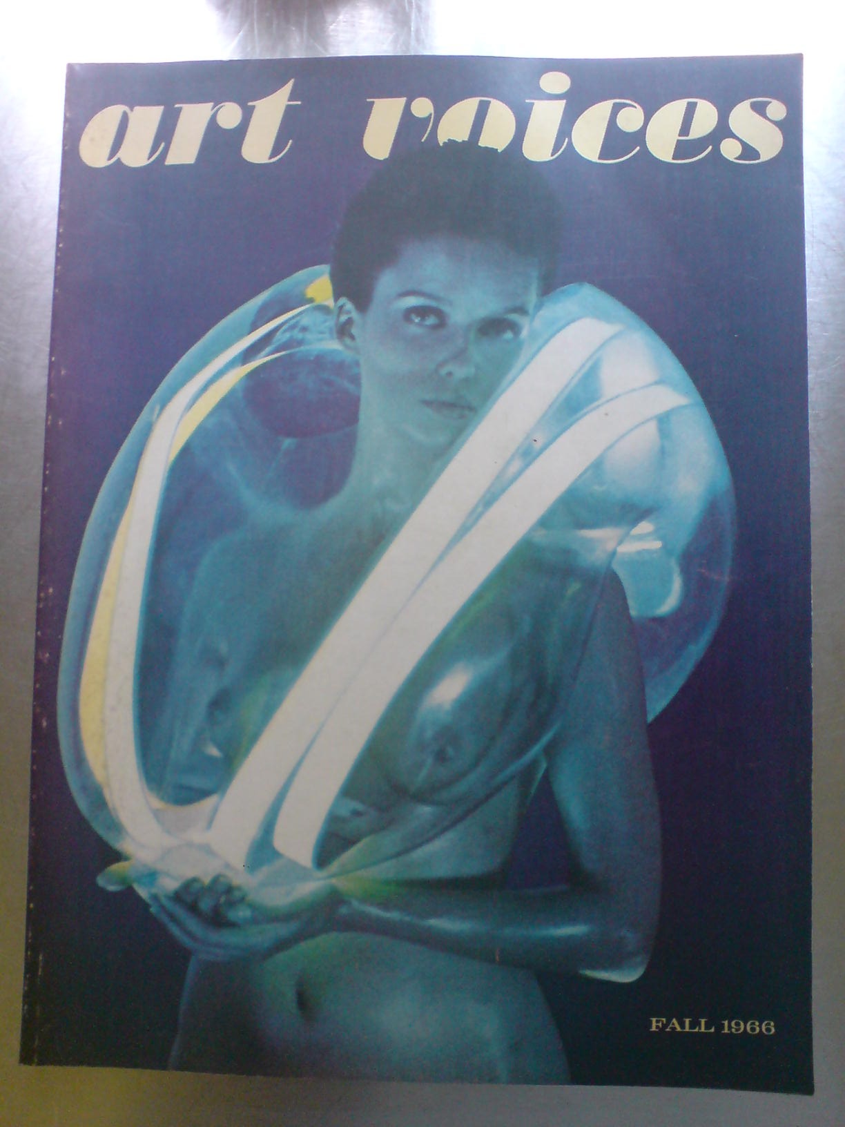
Well look what I unearthed while reorganizing my books in storage. The Fall 1966 issue of Art Voices, a short-lived magazine that, I swear, I bought for the articles.
Seriously. It’s the issue where Robert Smithson & Mel Bochner published “The Domain Of The Great Bear,” their photo-essay/article-as-art expedition through the Hayden Planetarium. I mean, sure, you could read it in Robert Smithson: The Collected Writings, but don’t you want to see it printed slightly bigger?
Anyway, in the short features section up front, right before Lawrence Alloway’s essay on early space age films, is this awesome story by pioneering downtown journalist Walter Bowart about a secret, artist-run tattoo parlor called Apocalyptic Tattoo. It’s not turning up online anywhere, so I’m putting the whole, short, thing after the jump:
Continue reading “Art Voices, Infinity, And Apocalyptic Tattoo”
The Photographic Archive
In response to Olia Lialina’s post last week about screwy reproductions of her c.1996 lo-res digital imagery, Cass Fino-Radin writes about how Rhizome deals with archiving and documenting digital art in its native formats, platforms and resolutions: by photographing it.
This very issue of how low-resolution digital images gum up the hi-res assumptions our visual systems are built on is was one of the unexpectedly central discoveries of making Untitled (300 x 404) project. Though initially, at least, the losses and distortions of moving a thumbnail-sized jpg through the media channels were for me evidence or symbolic of the information that’s lost through ridiculous copyright restrictions, and not so concerned with archiving or perpetuation.
But that’s not important right now. Because just a few days before reading about Fino-Radin’s archival challenges, I stumbled across another data-driven use of old-school photography, on Project Echo.
I just received a rare print copy of the 1961 Bell Systems Technical Journal devoted to Project Echo, which has a dozen papers reporting Bell Labs’ findings and processes of tracking and operating an inflatable, reflective communications satellite. What’s extraordinary about the papers is what’s always fascinated me about the Echo satelloons in the first place: they were analog experiments done largely by hand, and before computers were practical tools for real-time tasks.

And so, for example, in order to record all the satellite tracking data and readouts at the Holmdel, NJ receiving and transmission station, they took pictures of the control panel. Here’s the description from Bell Labs project engineer Dr. William C. Jakes’ paper [available from dtic.mil as a pdf]:
In order to have a record of the positions of the various moving elements of the system during a satellite pass, each element was provided with synchro read-outs which were periodically photographed. Pictures were taken at one-second intervals of a panel carrying the two-speed azimuth and elevation position dials for the DAC, M-33 (optics), 60-foot dish, and horn antenna. A Greenwich Mean Time clock also appeared in the photographs. Position angles could be read to +/- 0.01 degrees, and time to 0.5 second. An enlargement of one frame of such a record is shown. [above]
But wait, there was more:
The 60-foot dish and horn antennas were each equipped with a bore-sight camera [!] that could be started at will whenever the satellite was visible. Pictures were taken at four frames per second, and included a reticle for indicating angular offsets to an accuracy of +/-0.01 deg. and a time-coded counter.
I have contacted archivists for Bell Labs, and unfortunately, no such operational film records have survived. In the company’s possession, anyway. But I am still looking.
It’s A Mozingo Thing
My great great grandmother had an awesome name: Mary Argent Mozingo. She was married to the equally well-named Ruffin Sullivan. They were country people, farmers, I suppose, in Wayne County, North Carolina. I knew their daughter, my great grandmother, who lived to be 105, but I never heard her talk of her parents. We found their names when we were in the market for names, and were surfing through family history records. My wife vetoed Mozingo, and my grandmother nixed Ruffin with a swiftness that hinted at family stories that did not get told very often.
While I was still campaigning for Mozingo–just, you know, as a second or third middle name, a fun option, maybe? no?–my mother did say that her grandmother always insisted her mother’s name was Mozzinger. Or Mottsinger, and if it weren’t for some ignorant census clerk somewhere who couldn’t hear or spell right, we wouldn’t even be having this conversation. In any case, it’s not Mozingo.
This was the woman who eventually edited out the stories of working in a cigar factory in Richmond as a young girl, where she won five dollars once for the quickest rolling. And who destroyed oral history tape recordings of her family’s history because of, well, I guess we can only speculate now, since those stories have been lost.
And there’s no chance that a lone census taker messed up, Ellis Island-style, on the Mozingo. If anything, my ancestors’ insecurity about Mozingo is one of the prime indicators of their true Mozingoness.
As LA Times writer Joe Mozingo found out, when he went searching for the origins of his name, which he’d always heard was Italian. Other Mozingos heard it was Portuguese, or Basque. Obviously, to almost everyone not named Mozingo, that is, Mozingo is an African name, brought to early colonial Virginia by one Edward Mozingo:
Edward had been a servant to Col. John Walker, a member of the colony’s legislature. When Walker died in 1669, his widow inherited Edward and remarried a powerful Virginian, John Stone.
Edward sued Stone for his freedom. Little is said about the lawsuit in the court record, only that there was an appeals hearing in the high colonial court, that “Divers Witnesses” testified and that the judges concluded “Edward Mozingo a Negro man” had served his term after 28 years of indenture.
Joe Mozingo’s three-part story of uncovering the Mozingo truth overflows with examples of hardship, racism, insecurity and denial that runs so natural and deep Americans have been soaking in it for centuries.
And that’s just the white Mozingos. People whose identity and racial worldview don’t have room for the complexities of rural intermarriage in 18th century America. For the Black Mozingos, meanwhile, the countervailing impact of generations of discrimination, opportunity, passing, and self-loathing still play out in a Goldsboro, NC barbecue restaurant–which turns out to be the same place we’ve stopped for lunch every summer on the way to the Outer Banks.
The ways family functions as a machine for transmitting memory are one subject of my set of 12 short films, The Souvenir Series; I think I have to add the way family desperately tries to keep things silent for centuries to the mix, too.
In Search Of The Meaning Of ‘Mozingo’, part 1, part 2, and part 3 [latimes via my cousin cara]
John Cage’s Europeras 1 & 2, On Stage Now At The Ruhr Triennial
I’m done waiting. This Europera 1 & 2 post is apparently not going to write itself.
The Ruhr Triennial opened last weekend with what is only the third [production and fourth -ed.] staging of John Cage’s grandest* composition, the 1987 Europeras 1 & 2. It’s basically a chance operations tour de force that runs the entirety of the European opera canon–arias, stories, costumes, props, sets, lighting, libretti, staging, orchestra–through the I Ching wringer, which performance is conducted, so to speak, by the cues of a 2.75-hour clock. As Cage put it, “For 200 years the Europeans have sent us their operas. Now I’m returning all of them.”
All six performances in the Triennial’s home venue, the vast, repurposed industrial Centennial Hall Bochum sold out immediately. So far three have happened, directed by the director of the entire Triennial, avant-garde composer Heiner Goebbels.
So I’ve been monitoring the reviews jealously, and with some indignation. The scale and ambition and significance of the work is being respected—the work has only ever been performed in Germany [update below: not true]—but it seems that both critics and directors alike still struggle with the vocabulary and the very concept of Cage’s chance-driven work.
In the only English-language review I’ve found so far, The Financial Times’ Shirley Apthorp describes Europeras’ “extravagant evening of associative nonsense” as both “chaos” and “minutely choreographed absurdity.” Writing for FAZ Eleonore Buening criticized Goebbels for putting the “chaos Cage conceived a quarter century ago back in a Museumsvitrine.” If I read my German correctly, “The director placed too little confidence,” Buening writes, “in the expiration of the clock, the will of the participants, or even Comrade Chance.” And did Cage ever have a better comrade?
I have never seen Europera 1 & 2, but I’ve been studying up on them for the last year or so. The original staging, commissioned in 1985 by the Frankfurt Opera, was the dissertation subject of Laura Kuhn, who was involved in the production, and who has since become the director of the John Cage Trust.
Europera 1 & 2 strikes me as a simultaneous negation and celebration of opera as an art/theatrical form, but also as a cultural and historical institution. His chance-based composition removes narrative, character arcs, literary and stage conventions, and authorial intentions from the experience of a performance. Chance is not chaos or absurdity; it’s a different syntax. How does any opera performance seem if you don’t know the story or speak the language? Would you ever call it chaos or nonsense?
An opera diehard may want to identify the source of every passing prop, aria, or orchestral passage in Europera—did the Stump The Operahead trivia quiz during the intermission of the Met’s weekly radio broadcast ever tackle Cage? Just like a moviehound might try to flag the source of every clip in Christian Marclay’s The Clock. But that risks missing Cage’s point [which is not Marclay’s]: that the experience of the montage has quality and meaning and value in itself, apart from the original content and its juxtapositions, not because of them.
And maybe critics actually are better attuned to this now, and the problem [sic] is just/still the directors. In FAZ, discussing the “Children’s Jury” who Goebbels convened to award unconventional prizes during the Triennial, Buening found a new twist on the classic MTV Crisis when she worried that the media-saturated, “Multi-tasken” Kids These Days might be bored by Cage’s 1980s jump cut revolution. After watching a rehearsal of Europera Ruhr Nachtrichten writer Julia Gass said Cage foreshadowed the “TV Zapp Era”; actually, he was soaking in it. Cage’s vision of the future was surfing the 400 operatic channels of the past.

Europera may be Cage’s most ambitious and explicit appropriationist work. According to Kuhn’s firsthand account of the making of, Cage, relying on the collection of Lincoln Center’s library, determined to include only operas that were in the public domain. For the flats and sets, he had researchers in Germany compile engravings and illustrations of composers, architecture, and animals from pre-20th century books. With these copyright-free source sets established, Cage used chance operations and a time log to generate the content of the opera.
And this, apparently, is where Goebbels’ otherwise extraordinary production falls short. I’ll try to account for the differences—or more precisely, the changes—between Goebbels’ version and Cage’s, the immediately apparent one is his replacement of simple, graphic flats with actual operatic sets. Buening sees this as too deterministic, too willfully absurdist [in the mold of Robert Wilson, who, inexplicably, is the Triennial’s English talking head for Europera], and stuck to the cliches and one-liners of operatic theatricality. And too much of the director’s own indulgences, which runs diametrically counter to Cage’s purging intentions.
It’s a perennial problem with Cage’s interpreters, who take the indeterminacy of his compositions as license to do whatever they want. Not coincidentally, that sounds like exactly the criticism voiced in OMM by Sebastian Hanusa over the previous production of Europeras 1 & 2 at the Hannover State Opera. [It opened in October 2001, and I confess, I was not paying much attention to German opera gossip at the time.] According to Hanusa, Lowery kept the aria singers offstage, and instead of the chance-derived staging, he created various storytelling set pieces. It sounds almost as bad as Cage’s sabotaged NY Phil debut in 1964.
But it’s better than nothing? I don’t know. Is it the kind of thing you can watch on DVD? Will Europeras ever be staged in the US? [YES, SEE BELOW.] Frankly, we may still not be ready for it. Or maybe we’ve superseded it; with the right code and a few browser tabs on YouTube, we can generate our own Europera anytime we want. Man Bartlett’s #12hPoint, I’m looking at you.
UPDATE/CORRECTION: Thanks to DJW for correcting me; Europeras 1 & 2 was staged in the US. Christopher Hunt brought the original Frankfurt production to Summerfare at SUNY Purchase in 1988. According to John Rockwell’s bemused NY Times’ review, the New York version, which took place on a grander stage, was actually closer to Cage’s original vision, which the Frankfurt Opera had to rework after its main theater was damaged by arson just before the Europeras‘ premiere. Anyway, more to come on that.
* OK, the 639-year-long organ performance of As Slow As Possible, also from 1987, at St. Burchardi church in Halberstadt is also pretty grand. But I’d argue its grandeur is more the performance, not necessarily the composition.
Things About Art & Politics I’ve Just Read That I’d Like To Keep Around Longer Than A Tweet
From Allan Sekula’s response to Nato Thompson’s “Debating Occupy” roundup in Art in America [Jun/Jul 2012, on scribd, which oy]
The “art world” is a small sector of culture in general, but an important one. It is, among other things, the illuminated luxury-goods tip of the commodity iceberg. The art world is the most complicit fabrication work-shop for the compensatory dreams of financial elites who have nothing else to dream about but a “subjectivity” they have successfully killed within themselves. Thus the pervasive necrophilia of the art system. Alfred Jarry spoke at the turn of the 20th century of a “disembraining machine.” We can speak now of a “self-embalming machine.” Hook yourself up to the dripfor the antiquarian future.
Will do.
Meanwhile, in the summer of 2004, in advance of the Bush/Kerry election, Frieze did a similarly structured but more abstract roundup of artist comments about art and politics, which makes for a sobering, ambivalent read. Here’s Paul Chan’s response to the carefully worded question, “Can you give an example of a piece of art you think is politically effective?”
When the Soviets invaded Czechoslovakia in 1968 to quash the ‘Prague Spring’ (a series of economic and free speech reforms that liberal-minded Czech communist leaders enacted), the people of Prague were overwhelmed and could not resist militarily. So they did the next best thing: they painted all their street signs white. For eight months the Soviets could not arrest resistance leaders, shut down pirate radio and television stations or break up organized meetings, all because they couldn’t fucking find them.
Which is true? I guess? The Wikipedia entry for the Prague Spring cites Paul Chan. But from his Mar. 2007 Artforum text, “Fearless Symmetry,” [which only shows up on Google in this wonky page and] which ends like this:
But how do we verify, following Rancière, the efficacy of our practice? How do we test the work so that we know it is something made that has become more than something simply made? If we use Rancière as a departure point, perhaps a confrontation is in order. That is to say, the place to verify the practice of equality in the pursuit of a form of freedom (which seems to me like a pleasing if wonky definition of art) might well be a confrontation with a force of order that divides and partitions the ghostly whole back into measured forms of understanding and consumption. If the work is indeed a work, it will resist this partitioning at every turn and claim for itself the autonomy that can come only from the practice of imagining the presence of this now not-so-secret equality in every line, shape, color, and sound. Confronted with such a presence, the police order that longs to divide in order to own can only blush: out of frustration, out of confusion, perhaps even out of fear. But tell me-honestly-when was the last time you blushed looking at art?
Whoa also this, same question to Kara Walker, from the Frieze thing:
I like to think of Donald Judd’s Marfa complex as exemplifying the strivings of White patriarchy. But that’s just me; I don’t think he intended that.
On James Lee Byars On The Modern’s Fire Escape
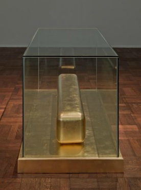
Monument to Cleopatra, 1988, currently on view at Michael Werner
I’ve been thinking a lot about James Lee Byars lately, for a whole variety of reasons. He’s been problematic for me. I’ve always felt suspicious that his sculptures, all gold leaf and marble and monumentally deluxe, are not just decorative art, but decorator art [most excellent people, but you know what I mean.] And his camp and vanity, with all the lame´, read to me like the Zen Dali artist’s version of the court jesterish, affectations decorators use to peddle their marked up wares. All of which makes the relentless pursuit of Perfection, Truth & Beauty seem a little, again, problematic. And though I obviously can’t blame Byars for him, the ascendance of Terence Koh hasn’t helped the case for monochrome life-as-art.
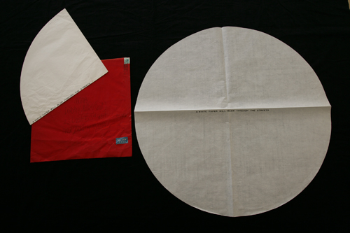
A letter/multiple dated Dec. 5, 1966, from James Lee Byars to Dorothy Miller, with text: “A white paper will blow through the streets.” via MoMA Archives
But then I found out about all the wild letters. In 2007, MoMA Archivist Michelle Elligott put together a show of Byars’ art object-based correspondence with longtime painting & sculpture curator Dorothy Miller, just one of the many people he corresponded with–or at least sent stuff to–over the decades. Which are obviously and unabashedly ridiculous and awesome at the same time, a simultaneous state I had never before considered for the rest of Byars’ work.
And just yesterday, in fact, I think I figured out something else, related to another of the things that’d bugged me about Byars: his fantastical bullshitting. Like, to cite just one example, what was up with what Byars’ official bio calls his “notorious 1958 exhibition in the stairwell of New York’s Museum of Modern Art.”
Roberta Smith wrote in Byars’ 1997 Times obituary that Miller “arranged his New York debut, a show of folded-paper pieces displayed in an emergency stairwell of the museum for a few hours one afternoon.”
And though the Museum’s press archive has no record of it, Elligott mentions the “show” in the story of the 26-yo artist coldcalling from the front desk:
After seeing a work by Mark Rothko, Byars became determined to meet the artist, and in 1958 he hitchhiked from Detroit to New York and presented himself at The Museum of Modern Art, requesting an introduction. Miller was called down to meet with him. Legendarily, that same year Byars had his first exhibition at a U.S. museum, when Miller allowed him to briefly install his large works on paper in the Museum’s emergency exit stairwell. From this point forward, Byars considered Miller an important mentor and turned to her repeatedly for support.
That “Legendarily” is exactly the buggin’ I’m talking about. Elligott notes a stairwell mention in a 1967 Byars letter as “likely a reference to a show he allegedly mounted in a Museum stairwell in 1958.” And Elligott expanded on her skepticism of the stairwell “show” in a 2008 interview:
I think the stairwell exhibit story is somewhat unlikely, and that it is quite probable that Byars propagated this legend after some sort of small incident. Regardless of what happened, I do believe that Byars aggrandized the event, much as he continually cultivated his larger-than-life personality.
Which is better. I mean, artists, they’re gonna do what they do, but I don’t want my museums to be lying to me, or to be just going along with the hype.
Which brings me to yesterday, when I finally cracked open the little catalogue from Byars’ 1995 Fondation Cartier show. And read psychoanalyst/critic/PS1 adjunct curator Jean-Michel Ribettes, seeming to swallow Byars’ story whole by just cold referring to it as “his first show in an American museum–the Museum of Modern Art in New York.” But then, finally, Ribettes has some more details, presumably heard from the artist himself:
Byars’s enormous works in ink on Japan paper were hung on the five-storey fire escape. The curator, Dorothy Miller, not only agreed that the show would last just a few hours, but she and other collectors (like architect Philip Johnson and David Hayes) purchased all the pieces, which Byars himself delivered to their houses that very night, crisscrossing New York into the early hours of the morning.
So it’s less of a “show” and more of a “sale.” And this appropriated but unsourced Byars bio says Miller bought “two paper works and allows him an exhibition lasting a few hours.” And how’s this for five-storey fire escape? At MoMA in 1958? Which would’ve gone right up against the P&S department’s window?
And here is a tall [1.8m], if not enormous, work on Japanese paper, dated 1959, which Philip Johnson gave to NYU in 1969. It was included along with several related, smaller, ink drawings, in the Grey’s “NY Cool” show of abstract non-expressionism.

So we have a charismatic, young hitchhiker calling from the lobby, and probably dropping names of his Japanese mentors, folks like Morris Graves and Soetsu Yanagi, and asking to talk to Rothko. And when you bring him upstairs, he unrolls some of his drawings, which, hello, he’s a 26yo hitchhiker, are probably pretty cheap. And maybe PJ and Hayes passed by and went in for a drawing, too. From the Zen monk who’d set up shop and was now meditating on the fire escape outside Dorothy’s window. Now I am OK with this. But I would not call it an exhibition.

Which is all good, because what Byars showed at the Cartier Foundation was The Monument To Language a 3-meter wide gold-leafed bronze sphere. And you know how I am about big, superlatively beautiful, shiny balls.
2007: James Lee Byars: The Art of Writing [moma.org]
Frank Lloyd Right, Or The Sforzian Hearth

Ooh, the party conventions are coming, Sforzian Fashion Week, and the NYTimes’ advance team is reporting on the GOP advance team whose once-every-four-years job is to make the Republican candidate for president come across as a man of the people on TV. Here’s Jeremy Peters:
The campaign aides are determined to overcome perceptions that Mr. Romney is stiff, aloof and distant. So they have built one of the most intricate set pieces ever designed for a convention — a $2.5 million Frank Lloyd Wright-inspired theatrical stage. From its dark-wood finish to the brightly glowing high-resolution screens in the rafters that look like skylights, every aspect of the stage has been designed to convey warmth, approachability and openness.
Yes. OK.
This time, Samantha Stark reports in the Times video, the stage is now fronted by open, non-hierarchical stairs reaching down into the crowd. Which, yeah no, ask McCain, Bush, and Dole about that convention convention.
What is actually different is that the 13-screen video wall is now all asymmetrical and casual-like, with all the screens “framed in dark wood to give the feeling of looking into someone’s living room.”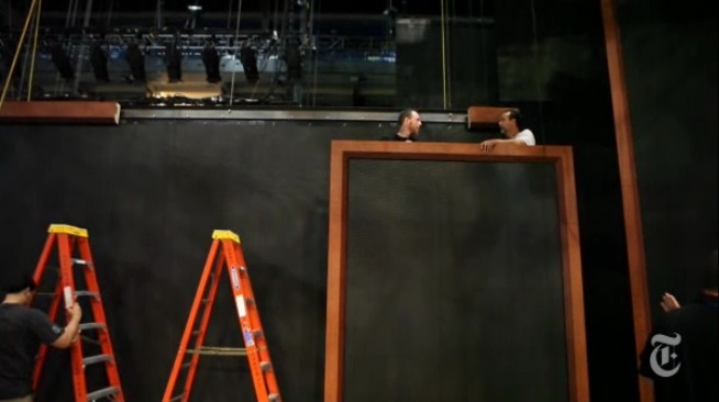
Why, it’s practically a Sforzian frame cluster, a slightly enlarged version of the one the Romneys have on the grand piano at Lake Winni.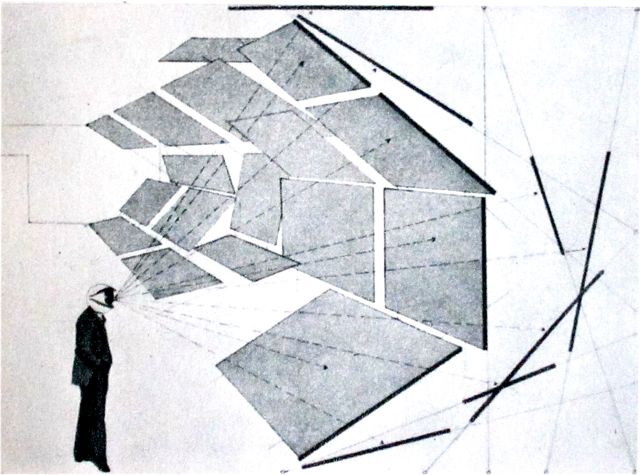
If you can see any FLW, please let me know, because all I can see in Edward Linsmier’s sexy still and video images is Herbert Bayer’s all-encompassing field of vision [above]. Maybe a Bauhaus reference is too heady [or foreign] for Romneyvolken to cop to. Or maybe they’re wary of acknowledging the importance of the fundamentally subjective viewing experience they’re trying to manipulate.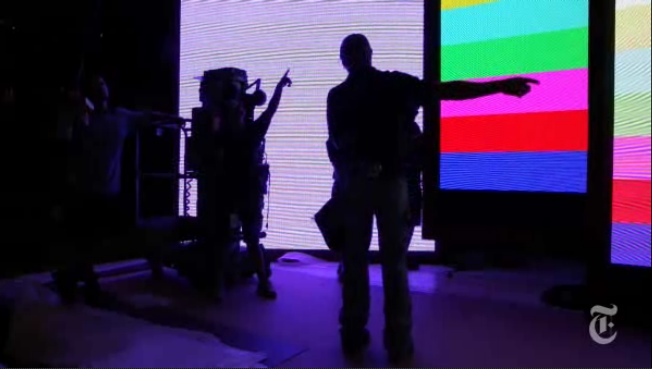
Except, oh wait, that’s the whole point of the show, the event, and the article: letting us know how it’ll be just you and me, America, TV-hangin’ living room to living room with our bestest, richest friends.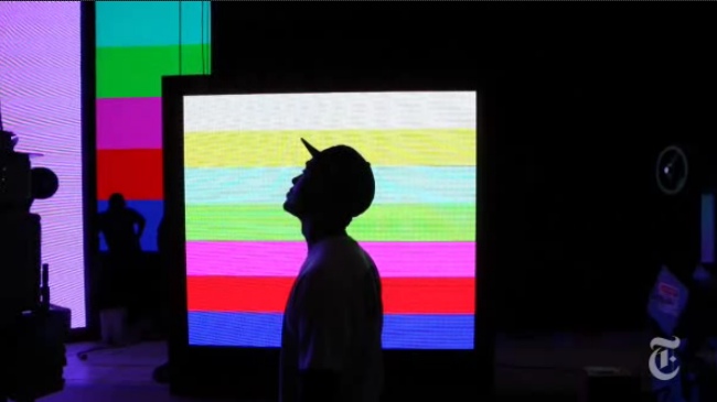
More than hang, though, Linsmier’s images of the set’s big, test-pattern-y bands of glowing color, stacked against each other like that, with silhouettes of roadies all around, make me want to paint. Crank out a whole $#)%ing frame cluster of to-scale paintings.
Stephen Prina meeting Olafur Eliasson at Liz Deschenes’ place, with a cameo by Jeremy Blake.

Romney Campaign works feverishly to project relaxed image [nyt]
Thoughts On The Future Of Beef Husbandry In Grass Valley, Utah
American grain-fed beef will still remain the number one choice of Americans who dine out. Health food fanatics with bogus credentials will continue to slam producers and consumers of beef for destroying the environment and the health of children who are supposedly being poisoned by red meat when organic vegetables, tofu and soy milk are their answers to the world’s health problems. More and more pressure in the form of increased year around recreation demand by citizens cloistered much of the year in their Wasatch Front and Southern California neighborhoods will test the patience of ranchers and farmers in the valley who find their gates left open, livestock scattered, sprinkler pipes shot full of holes, crops trampled by four-wheelers and fences cut so hunters can get closer to that “real good hunting spot.”
…
One thing that won’t change is that there will always be some young men or women who are willing to sacrifice guaranteed vacations, retirement programs, forty-hour weeks and twelve holidays a year with pay, just for the challenge and satisfaction of being a rancher/farmer. The drive or motivation to be a provider of food and fiber for a nation is still alive in a few young people in Grass Valley. May that hunger to work with the soil and the beasts never be lost or destroyed.
excerpted from Verl Bagley’s extensively researched history and future of “Beef Husbandry in Grass Valley,” p. 222 of the impressive if not quite comprehensive Grass Valley History, Including the Communities of Box Creek, Burrville, Greenwich, Koosharem, published privately in 2005, which I saw a heavily used, duct-taped copy of near the register at the Koosharem Cafe the other day. And when I inquired about it, the lady helping me called down to the store to see if they had a copy. And then she called over to Carol’s place, and sure enough, Carol had a copy I could buy, did I know Carol? And that’s when I had to confess that until she said it on the phone just then, I was unsure how to pronounce Koo-SHARE-em, we were just on a quick, first family history visit. But Carol was right down the road, and sure enough, she answered the door with a copy, and was surprised to take money, didn’t I pay down to the store?
In any case, an unexpected and invaluable resource for my research into the contentious history of irrigation in and around Burrville.
The New Sforzian Aesthetic

This is awesome. Someone flew a banner over a Paul Ryan event in Lakewood, Colorado, carrying a @PaulRyanGosling-esque quote, “Hey Girl, Choose me, lose choice.” And though he didn’t know what it was, CNBC reporter @EamonJavers tweeted a photo of it.
We’re all Scott Sforzas now.
Banner Above Paul Ryan-Led Event: ‘Hey Girl, Choose Me, Lose Choice–P. Ryan’ [theatlantic via @alexismadrigal]
Hot Mountain

So I’m walking to the lodge at Snowbird the other day, and they’re sealing cracks in the parking lot with tar on the ends of these long stick/wand things, and suddenly it’s all palimpsests and Brice Marden all over the place.
Cold Mountain 2, hirshhorn.si.edu