Looking back at some of the other projects of FREE SOL LEWITT co-curator Daniel McClean, I have basically concluded that we have been walking in a weird parallel in the art world for ten-plus years, without ever actually meeting.
In 2000, when we were still buying a fair amount of his work [i.e., when it was last affordable enough for us to buy, or to buy more than one thing], McClean curated an installation in Japan by Gabriel Orozco.
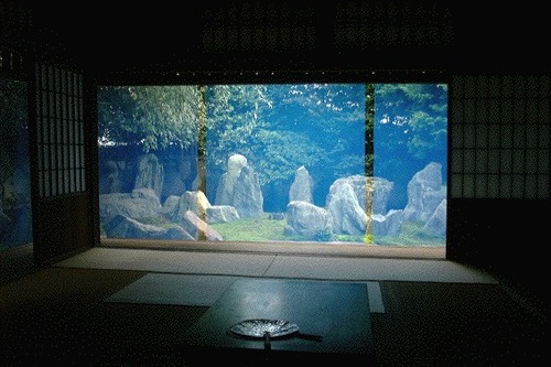
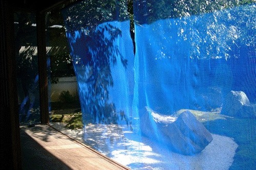
Called Blue Memory, Orozco hung a screen of fine, blue netting/fencing on the edge of the eaves of Kyoto garden designer Shigemori Mirei’s house, where the bamboo sunshades usually go. It’s classic Orozco, a transformative effect produced with modest, found or offcast materials.
See more images at Shima/Island, a series of four temporary installations and artist/curator-led seminars in 2000-2001 about the Japanese landscape. [hi-ho.ne.jp]
Artistic License: Daniel McClean on Contracts and Aesthetics [bombsite]
Category: architecture
Fuller Fly’s Eye Dome Gets Miami Makeover
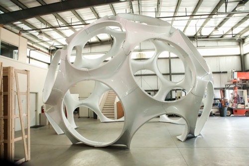
So everyone dutifully reproduced the press release about Craig Robins putting Buckminster Fuller’s 24-foot version of the Fly’s Eye Dome through a “historic restoration” by boat fabricator Goetz Composites, yet no one seems to have followed through with picture of the completed job. Well here you go, from Goetz themselves.
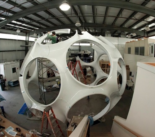
In 2008, Max Protetch exhibited the fiberglass dome, a prototype manufactured in 1976-7–which used to be described as a 26-foot diameter dome, btw–at La Guardia Place in the Village. The photo below is from his installation at Protetch: Beacon last year.
![]()
Said the press release:
Eric [Goetz] and his team, working with Daniel J. Reiser and John Warren who fabricated the original structure with Bucky, have gone to extraordinary lengths to engage this process with the same meticulous detail as a world-class fine art restorer.
Which is apparently not the same thing as restoring a world-class work of art, or even a piece of design, where the patina is to be preserved, even treasured, but more like a Pebble Beach concours-style project, where you chrome-plate all the screws.
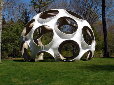
Maybe it could be argued that stripping off the blue paint on the inside brings it closer to its “original condition.” But looking at the raw fiberglass interior of the 33-foot dome Jack Lenor Larsen installed at Longhouse Reserve in Easthampton, I wonder if original originally meant something else.
Larsen’s dome was first loaned to him by Fuller’s daughter Allegra Fuller Snyder. It was constructed by John Kuhtik, whose company Emod had by then been working to produce the Fly’s Eye dome “for nearly a decade”, presumably with Fuller’s blessing and involvement.
Anyway, I guess I’m stoked that Protetch hustled and saved one of Fuller’s rare artifacts, even if saving it means stripping it of its history. I’m sure it’ll look shiny and fantastic in Miami.
Restoration of Buckminster Fuller’s iconic Fly’s Eye Dome at America’s Cup [archdaily]
In Afghanistan Did Buckminster Fuller A Statecrafty Geodesic Dome Erect
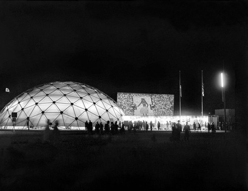
US Pavilion at Jeshyn Fair, 1956, photo by James Cudney
In the Spring of 1956, as the Jeshyn Fair celebrating Afghan independence approached, and the Soviets were well along in constructing a massive pavilion, US diplomats in Kabul thought the US better have one, too.
A USIA officer named Jack Masey commissioned Buckminster Fuller to create a 100-foot diameter geodesic dome in two months. His Raleigh, NC-based firm, Synergetics, Inc., apparently completed it in one.
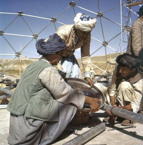
Pashto laborers assembling Buckminster Fuller dome, 1956, photo by Jack Masey
It was airlifted to Kabul, where a crew of local Pashto erected it in two days. The aluminum & plastic-coated nylon dome tent pavilion was a hit, “perhaps the most significant cultural event” of the “golden age” of US-Afghan relations, according to the creators of “In Small Things Remembered,” an exhibit looking at the history of the two countries’ relationship.
The show, which closed yesterday at the Meridian International Center in Washington, DC, was organized by Dr. Curtis Sandberg, VP of the Arts at Meridian, and sponsored by the State Department. It comprised photos discovered in various archives and foreign service officers’ private collections, such as Masey, above, and James Cudney, top, who spent eleven years in Afghanistan taking pictures, and developing various photography- and media-based culture, education, and diplomacy programs. Cudney passed away in 2009, but some more of his Afghan photos can be seen in the previews of two 2010 calendars he or his family created on lulu.com. They look pretty amazing.
Anyway, the US Information Agency and Dept. of Commerce continued to use the Kabul dome for trade fairs across Asia. As USIA’s director of design, Masey would go on to select Fuller to build the US Pavilion at the Montreal 67 expo, too.
In Small Things Remembered, at Meridian through June 5 [meridian.org]
Esso De Cherbourg
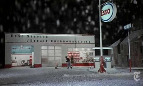
It may not be the absolute origin of my desire to live in a converted, modernist gas station, but AO Scott’s recent reminiscence reminds me that the Esso station at the end of Jacques Demy’s incomparable Les Parapluies de Cherbourg is one of my formative cinematic and architectural experiences.
I got completely blindsided by the film in the early 1990s when I basically wandered into the Time Warner screening room at MoMA and watched a preview of the restoration of the film spearheaded by Demy’s widow, Agnes Varda, who was on hand to discuss it. Truly not worthy, but there you go.
Uh-oh, something looks screwy with these prices; is there an issue with US availability of the DVD? [amazon]
Aarhus Madness
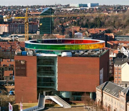
O wow.
Olafur Eliasson’s Your Rainbow Panorama opens Thursday on the roof of ARoS Aarhus Kunstmuseum in Denmark. It’s a 360-degree glass promenade which paints the cityscape with every color of the spectrum.
Too bad the promenade roof’s not rainbow-tinted glass, too. That’d make one helluva signature on Google Maps.
Image and statement via olafureliasson.net [olafureliasson.net]
More images at designboom [designboom.com]
Previously: Olafur: The Magazine?
Color Experiment paintings
The Secret Bauhaus’s Other Ball
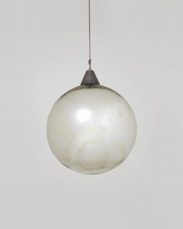
Andy helpfully pointed out this mirrored glass ball, which I’d missed in the catalogue for Phillips’ upcoming design auction.
Everyone knows the Bauhaus was a huge party school. And during the Winter 1929 semester, Oskar Schlemmer had put an extra emphasis on partying, “to preserve the character of the Bauhaus community.” And so what had started as a metal shop farewell get-together for Marianne Brandt on 9 February 1929 with the tasteful theme, “Church Bells, Doorbells, and Other Bells” [Hmm, one of the few cases where it sounds better in German: “Glocken Schellen, Klingel Fest.”] became a raging, balls-out “Metallisches Fest,” which took over the entire, iconic Dessau building. As MoMA’s 2009 catalogue tells it:
The pure qualities of metal lend themselves to costumes with decorations that magically transform the Bauhaus through shimmering, reflective surfaces. According to Schlemmer, “The Bauhaus was also attractive from the outside, radiant in the winter night: the windows with metal paper stuck inside them, the light bulbs–white and colored according to the room–the views through the great glass block–for a whole night these transformed the building of the ‘Hoschschule fur Gestaltung.”
Party on, Oskar! I’m glad the Bauhaus Arkiv is so careful with all their materials, they don’t let anything more than a postage-stamp-sized image slip through to the web.
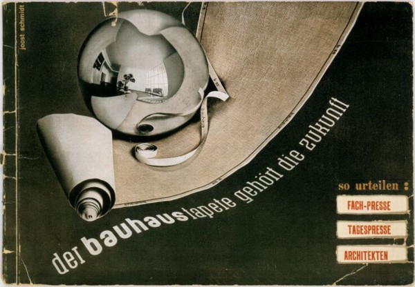
I can’t remember where I found this copy of the Bauhaus wallpaper sales brochure which came out soon after the Fest, but it wasn’t the Bauhaus Arkiv:
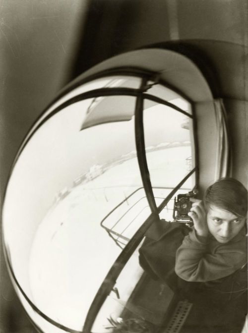
And Marianne Brandt Geselleschaft only had a tiny version of this Brandt self-portrait taken a mirrored glass ball.
Though to their credit, the firm did throw another Metallische Fest in 2005, even if the guest of honor had long since departed for good.
Lot 130 Bauhaus Mirror Ball, est $5-7,000 [phillipsdepury.com]
Previously [as in previously on greg.org, but after the Bauhaus, obv]: Shiny Space Balls? Yes Please!
Oh wait, Muybridge was before the Bauhaus
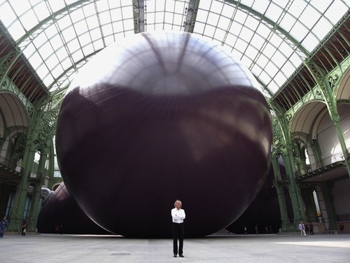
Leviathan Is Architecture
Believe me, I know how this looks.
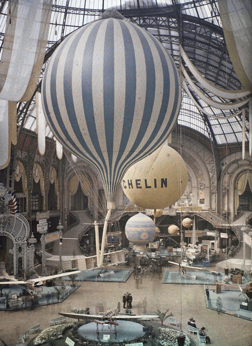
But also this. Balloons and the Grand Palais go way back:
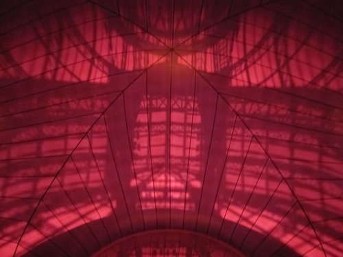
And anyway also this, Leviathan has a groin vault:
and is the venue for a concert performance by minimalist composer and maximalist stuffed animal shaman Charlemagne Palestine:
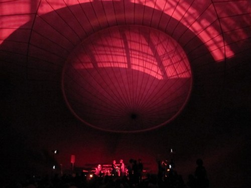
[image of Anish Kapoor posing in front of Leviathan via mymodernmet, as baited by starwarsmodern. Images of Charlemagne Palestine performance inside Leviathan via Monumenta 2011]
There’s No Escaping Leviathan
Hm, OK.
I think we’re in the clear here, satelloon-wise. It is true that Anish Kapoor’s Leviathan is inflated, and 35 meters tall.
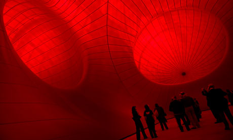
But when you enter the Grand Palais to see Leviathan, you enter Leviathan itself. It’s a space, a bulbous, three-chambered cathedral of a space, “like going into the belly of a whale,” says the Guardian. Though of course, it’s really going into the belly of a cinematic whale. So it’s a belly of imagination.
But it’s a space, not an object. At least, not at first. When you exit, though, it’s a thing. And well, hm. At first, things look pretty grim, which is to say, satelloonish.
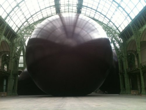
But ultimately, it’s a different thing, very different. One thing that’s emphasized in Kapoor’s talk to the Guardian is the light and space of the Grand Palais, and its vast expanses of glass:
“This is a terror of a space, probably much more difficult than the Turbine Hall,” Kapoor said. “It’s three times the size, huge horizontally and vertically and above all the light is a killer. It’s almost brighter than it is outside.”
There are any number of spaces–dirigible hangars, stadiums, train stations–that could hold a 100-ft mirror-skinned aluminum sphere; but in this time, there are no art spaces except, now, the Grand Palais. And that’s part of the point.
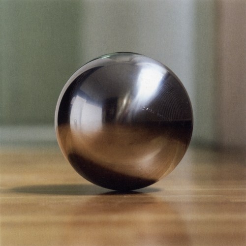
Not only can satelloons not escape the problems Gerhard Richter diagnosed for spheres–they’re too beautiful and perfect–they blow these problems up [sic] to gargantuan scale. Which is kind of interesting.
Monumenta 2011 has a Facebook wall [facebook.com]
Open House Teardown
In 1997 or so, the Junior Associates at MoMA organized a day of studio visits in Williamsburg. Worried about where to eat, we packed our own food, sandwiches from a fellow board member’s startup, Cosi. We ate lunch on Meg Webster’s roof. Most people took the bus to Momenta, but a brave group of us decided to walk, unprotected, up Berry Street. The very idea that we might be from Manhattan being beyond their imagination, some people sitting on the stoop of a vinyl-clad house stopped us and asked if we were Dutch.
This Long Island daytrip comes to mind when I read about Open House, a reconceptualization of Levittown which is the latest project from Droog Lab and Diller Scofidio + Renfro.
I hope if my heroes ever organize a self-indulgent, vanity symposium and an utterly disconnected, irrelevant publicity stunt exhibition about the suburbs that misses like five real points and replaces them with trite photo-op interventions designed solely for the benefit of the critics they bus out from the city for the afternoon, my review of their debacle will be as tactful and constructive a devastating takedown of the shitshow as Alison Arieff’s is.
Conceptual Suburbia: A Design Project Descends on Levittown [nyt]
The US Expo 67 Pavilion Has Seven Fathers
I’m getting pretty comfortable with my love affair/obsession with the US Pavilion at the Expo 67 in Montreal. I mean, it’s got Buckminster Fuller; Alan Solomon curating gigantic paintings; photomurals; and satelloons, what’s not to love, right?
So seeing Design for a Fair, the 1968 promo short film by Peter Chermayeff is awesome just as it is. The vintage footage and photos are some of the crispest I’ve seen, and it really is pretty crazy on a whole bunch of levels that this thing existed at all.
But maybe the greatest thing–even better than the giant graphic designed flags that look like a lost Ellsworth Kelly, as if there wasn’t enough giant, escalator-optimized, actual art already–and even better than the sheer soft power/propaganda play that was so drop-dead awesome it won the future for the day–is the voiceover.
Because the whole thing really sounds like Chermayeff’s idea. Every last bit of it, dome to nuts. It’s fantastic. Chermayeff, of course, is an architect and exhibition designer, and his former firm, Cambridge Seven Associates, or C7A, was contracted by the US Information Agency to produce the US Expo entry.
And so, as Chermayeff tells it, they knew they wanted a 3/4 geodesic dome, so they ordered one. And they wanted some giant art, so they ordered that. And the moon stuff, and the Hollywood and all the happy parts of American culture.
Now I don’t doubt a thing; I’m sure that’s exactly how it all went down. It’s just that that’s not how it’s typically remembered. Architects only remember Fuller; the art world only recognizes Solomon and the artists, not the venue or the show or the implications of it; and everything else is artifact and prop. [And the poor lunar photomural, I’ve hardly found anyone remembering that at all.]
The historical focus is either on the general awesomeness of the spectacle and mood, the political context and propaganda, or on the parts in isolation. What Design for a Fair reminds me of, though, is the visitor’s experience, the carefully orchestrated messaging, and the reality that it was orchestrated by a contractor working to a brief provided by the USIA. It was a government-funded gesamtkunstwerk, a massive piece of installation art before the fact, and probably one of the most cost-effective public diplomacy efforts of the Cold War era. It literally seems unimaginable today.
The Free Speech Movement Monument Was Censored.
In 1989, a group of veteran activists organized the Berkeley Art Project to create a monument marking the 25th anniversary of the Free Speech Movement. Mark Brest van Kempen’s conceptual proposal won the elaborate national competition and dialogue. It is a 6-inch diameter circle of earth surrounded by a granite circle that reads, “This soil and the air space extending above it shall not be a part of any nation and shall not be subject to any entity’s jurisdiction.”
Remarkably, the Berkeley University administration only accepted the monument on the condition that any reference at all to the Free Speech Movement be stricken from the work and any surrounding publicity.
A podcast I’d never heard of but really like now, 99% Invisible, has the story of the Free Speech Monument, and an interview with the artist.
For added perspective, check out the 1992 statement by FSM leader Michael Rossman, who opposed the selection of a conceptualist monument–until Berkeley’s president added to its conceptual power by censoring it:
If this story be remembered as part of the work, it will stand for the ages, or until a censorious jackhammer erases it from the Plaza. A century hence, our descendants may read the truth written in stone: What happened here in 1964 was so significant and so deeply contested that nearly thirty years later the university administration still would not permit faculty and students to honor its name, but instead insisted on censoring their political expression. In this perversely perfect monument to the FSM, they may read a larger truth applying far beyond the campus: that the issues opened in that conflict and era, of civil liberties and rights, had still not been resolved, but continued deeply contested.
The Invisible Monument To Free Speech [99percentinvisible.org via someone awesome I can’t remember who, but probably Geoff Manaugh, since he’s the subject of the previous episode]
The Berkeley Art Project, by Michael Rossman [mrossman.org]
WTF Copyright! Photomurals At The Louvre

Good grief. When McDonald’s in the Louvre made a giant photomural wallpaper from a Jake Dobkin photo of REVS & COST tags, which was included in a Hugo Martinez book, did they bother to ask either REVS or COST or Hugo or Jake for permission? No, of course not.
They just licensed the images from the French publisher, which actually didn’t have reprint rights to license. And the whole thing appears to have been settled for $800, or approximately two hours of Patrick Cariou’s lawyer’s time.
Revs & Cost in le Louvre [ekosystem’s flickr via c-monster]
Hotel Palenque Street View

I’ve been meaning to post more about this for months, but now I’m glad I waited. In January curator/writer Pablo Leon de la Barra posted Google Street View photos of the Hotel Palenque on his blog, Centre For The Aesthetic Revolution.
I need to put a [sic] after basically every word in this sentence, but it’s pretty jarring to see a place you know only from an old artwork alive and well and part of the real world. Hotel Palenque was supposed to be a white man’s fictional, archeological non-site, not an actual site, where people stay when they come to town, and certainly not a real, surfable place on Google Street View.
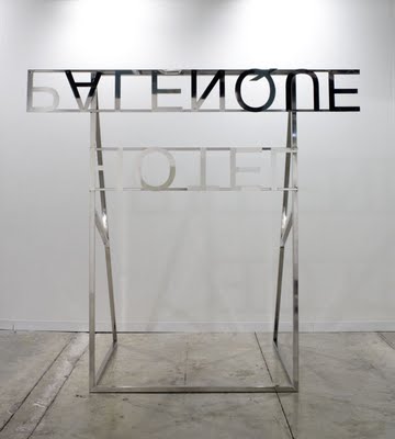
But this is all precisely de la Barra’s point, too. He originally Googled the hotel because he was preparing a text on Jonathan Monk’s Color Reversal Nonsite with Ensuite Bathroom [2009, above] for the Museo Rufino Tamayo in Mexico City. Monk’s work is a mirrored replica of the Hotel Palenque sign, only upside down and backwards, as it would be loaded in a slide projector.
Just as the entropy of development means that once-remote earthworks are now tourist attractions on the GPS grid, de la Barra lays out how Smithson’s exoticized, Yucatan jungle ruin/playground is now more fully recognized as someone else’s [sic] home turf. And while it may be surprising to hear that Smithson’s Hotel Palenque was only presented for the first time in Mexico in 2005, it should surprise no one to learn that Smithson sounded like a drunken gringo.
REVISITING HOTEL PALENQUE THANKS TO GOOGLE MAPS [centre for the aesthetic revolution]
HOTEL PALENQUE IS ELSEWHERE: ON JONATHAN MONK’S HOTEL PALENQUE SIGN’ A TEXT BY PLB IN RUFINO MAGAZINE
Hotel Palenque, 15 Avenida 4 de Mayo on Google Maps [google maps]
Previously: non-site non-art, Smithson’s Hotel Palenque
Visiting Artist: U of U lecture on Smithson
On Size Matters
And speaking of Richard Serra. I can’t figure out how James Meyer’s 2004 Artforum essay on the problematics of size in contemporary sculpture got by me until now. It ends too soon, but it’s pretty great.
Beginning with the overwhelming Tate Turbine Hall pieces by Olafur Eliasson and Anish Kapoor, Meyer retraces the history of sculptural size and scale, and how minimalism’s supposedly non-anthropic form was still keyed to the human viewer’s presence. And how post-minimalist folks like Tony Smith and Richard Serra got into, basically, a size arms race, which manipulated the spatial power and experience of the institution instead of critiquing it or fostering self-aware perception. [I’m collapsing a whole lot here. It’s really worth a read.]
Anyway, I mention it now for two reasons, the first being that Meyer begins his history with the 1940s and Abstract Expressionist murals:
SCALE ENTERS THE DISCUSSION of postwar art within the context of Abstract Expressionism. The development of the mural canvas by the late 1940s introduced a bodily scale into painting–a scale that was variously described as one sustained between the painter and the work and between the viewer and the work; on one hand, a phenomenology of making, and on the other, one of perception. Jackson Pollock famously spoke of his drip method as a means to “literally be in the painting.” Mark Rothko noted that he painted “large pictures … precisely because I want to be very intimate and human.” Mural scale was seen as an antidote to the easel scale of Cubism and Surrealism and the illusionism this embodied. As Pollock observed in the same statement. “The tendency of modern feeling is towards the wall picture or mural.”
Which means postwar sculpture and space becomes yet another aspect of the photomural’s history and influence I have to look into.
The other, bigger [sic] reason, though, is Meyer’s articulation of size-ism and awe-based exhibition experience. His is one of the few strongly argued critiques of otherwise-sacrosanct subjects like Richard Serra’s giant torqued sculptures and the museums that fit it, particularly Dia:Beacon and the Guggenheim Bilbao:
Having demanded and inspired the enlarged spaces that museum directors and trustees find it so necessary to proffer, Serra’s sculpture has become the contemporary museum’s major draw, an attraction of sufficient size and impact.
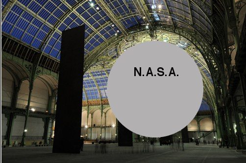
This challenge to the pervasive art world conflation of size, significance, and permanence is basically the context out of which I hatched my own idea to exhibit a Project Echo satelloon in an art space. The problem being, of course, that since all the world’s biggest, newest museums were built to accommodate Richard Serra sculptures, there are less than five venues that could actually show a 100-foot diameter spherical balloon sculpture. They’re just as prone to stylistic and functional obsolescence as a 19th century, fabric-walled salon.
Of course, the real problem is I hadn’t read it, and I really should have.
No more scale: the experience of size in contemporary sculpture, James Meyer, Artforum Summer 2004 [findarticles]
Linked Hybrid: Steven Holl Rebuilds The World Trade Center In Beijing
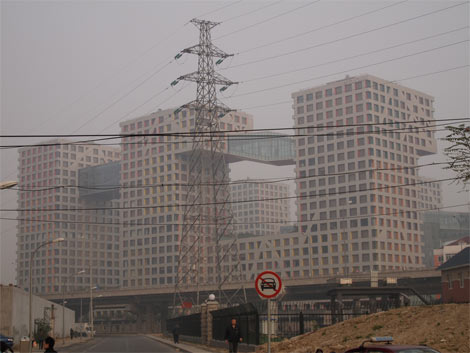
So Dan Hill’s posted another of his typically incisive analysis of an urban situation. This time it’s his extended and engrossing account of visiting Linked Hybrid, the massive urban development in Beijing, designed by Steven Holl Architects, which was just opening at the time [late 2009].

above and top via cityofsound
After being repeatedly shooed away by gun-toting guards from what Holl had pitched as “an open and porous public space,” Hill found his way in, and eventually ended up in the marketing office where there’s this poster of–what to call it without sounding utterly inappropriate? A bombshell? A landmine? A plane flying into a tower?:
More incredibly again, the adjacent wall features another poster of exaggerated Hybrid-like building on an urban skyline, under the phrase:
“Let citizens all over the world gather under the banner of the United States with the spirit of freedom.”
What can this possibly mean in this context? The absorption of the brand of ‘starchitecture’ is easy to see in a culture shifting through the gears of consumer culture, but of the brand of the United States?
That’s no moon. It’s the proposal for Memorial Square, the World Trade Center site put forward in 2002 by Holl, Charles Gwathmey, Richard Meier, and Peter Eisenman, or as they called themselves at the time, the Dream Team.
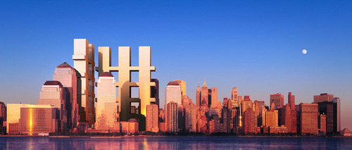
Memorial Square, 2002, “Dream Team,” image via renewnyc.org
At the time–the day after the unveiling, actually, at a screening of my short film, Souvenir (November 2001), which was followed by Etienne Sauret’s incredible documentary short, The First 24 Hours–I recognized the form the Dream Team was proposing as a gargantuan evocation of the fragments of the World Trade Center’s facade.
They denied the reference, even as they awkwardly argued and edited around it on the Charlie Rose Show. But I think it’s self-evident. Anyone wanting to argue otherwise to me should read those two posts and the links within first. Then I’ll tell you my story about asking Eisenman about it face-to-face.

What’s fascinating now, though, in rewatching that Charlie Rose episode, is not the Dream Team proposal’s basis in the wreckage of the World Trade Center, but its multiple similarities to Holl’s Linked Hybrid.
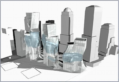
Holl and Meier especially discussed the Memorial Square proposal as primarily a public space, one which is entered from the city by “multiple portals.” Holl even calls the structure a “hybrid.”
While the Team took great pains to deny the proposal had any “signature” style, I would speculate otherwise. The overall concept of structure capturing “a moment” in history and memory comes from Eisenman’s proposal [above] for Herbert Muschamp’s WTC charette.
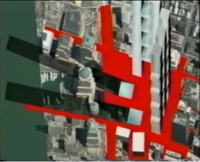
Meanwhile, the form is Holl’s, as is the idea that its entire surface would glow at night on one face. The rendering resembles nothing so much as the skyscraper cousin to Holl’s residence for the Swiss ambassador to Washington.
Dan Hill makes a persuasive critique of the simultaneous successes of Linked Hybrid as a structure and its failure as the open urban experience Holl envisioned. And it’s tempting to take comfort from afar and tut-tut the clunky shortcomings of Chinese modernization. But
are the urban and sociological failures of Linked Hybrid really any better or worse than the manipulated politicized mess that Daniel Libeskind’s World Trade Center plan has wrought?
I think the more sobering path is to recognize the remarkable extent to which Holl succeeded in realizing his Dream Team’s proposal for downtown Manhattan in Beijing–and to acknowledge that, there but for the grace of George Pataki go we.
Linked Hybrid’s marketers invite “citizens all over the world [to] gather under the banner of the United States with the spirit of freedom.” But on this day, when citizens all over the world gather to protest the continued imprisonment of Ai Weiwei, the co-creator [with Swiss architects Herzog & deMeuron] of the China’s most famous public building, the Bird’s Nest Olympic stadium, can we really say “our” public sphere is superior, or even free?
Architecturally speaking, at least, we are all New Yorkers now, and Beijingers, too.
[2018 UPDATE: In 2018 The New York Times reports that five women who worked with Meier, either at his firm or as a contractor, have come forward to say the architect made aggressive and unwanted sexual advances and propositions to them. The report also makes painfully clear that Meier’s behavior was widely known for a long time, and that his colleagues and partners did basically nothing to stop it beyond occasionally warning young employees to not find themselves alone with him. This update has been added to every post on greg.org pertaining to Meier or his work.]
