
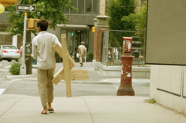
People walking the city streets with made-on-the-spot chairs. First there was the Chaise Bordelaise. Then it was the Sedia Veneziana. And yet, though The Generator by Raumlabor has had two incarnations at Storefront for Art & Architecture this year, there has still not been a New York Chair. Instead, it’s CHAIRS X URBANITY.
Well, we take what we can get. After we make it, that is. Unfortunately, I was out of town, and thus was unable to make and/or take anything at all. Sigh.
Generator 02: Chairs for Urbanity [storefrontnews.org]
Generator Event at NY Festival of Ideas, May 2011 [flickr]
CHAIRS X URBANITY Chair Fare Make and Take August 13, 2011 [facebook]
Previous Raumlabor coverage: sedia veneziana, chaise bordelaise
Category: architecture
Autoprotestazione
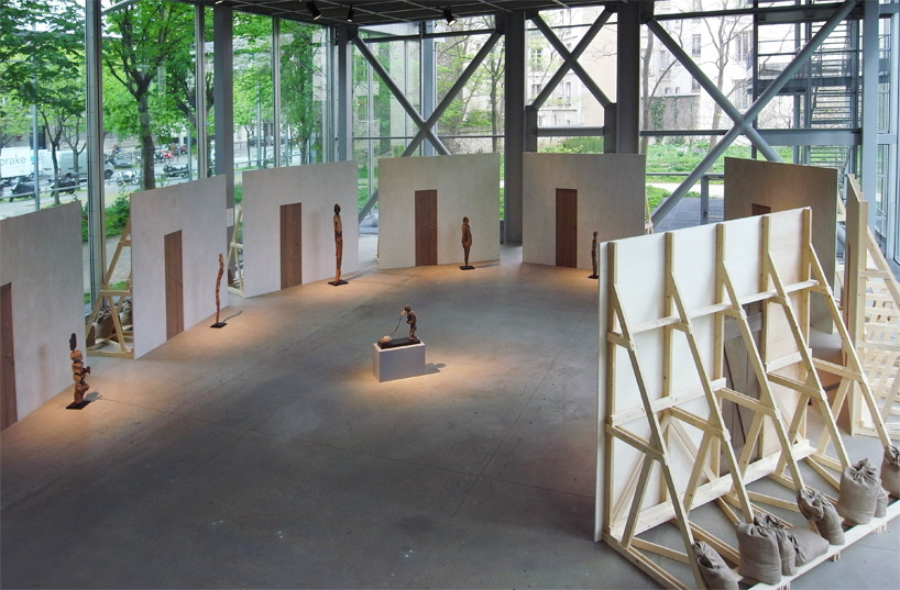
image: designboom
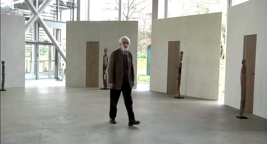
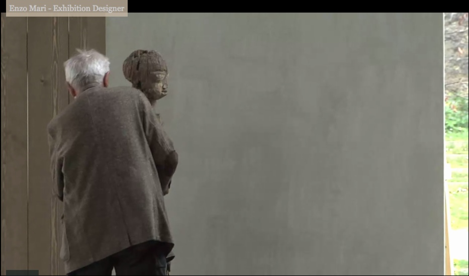
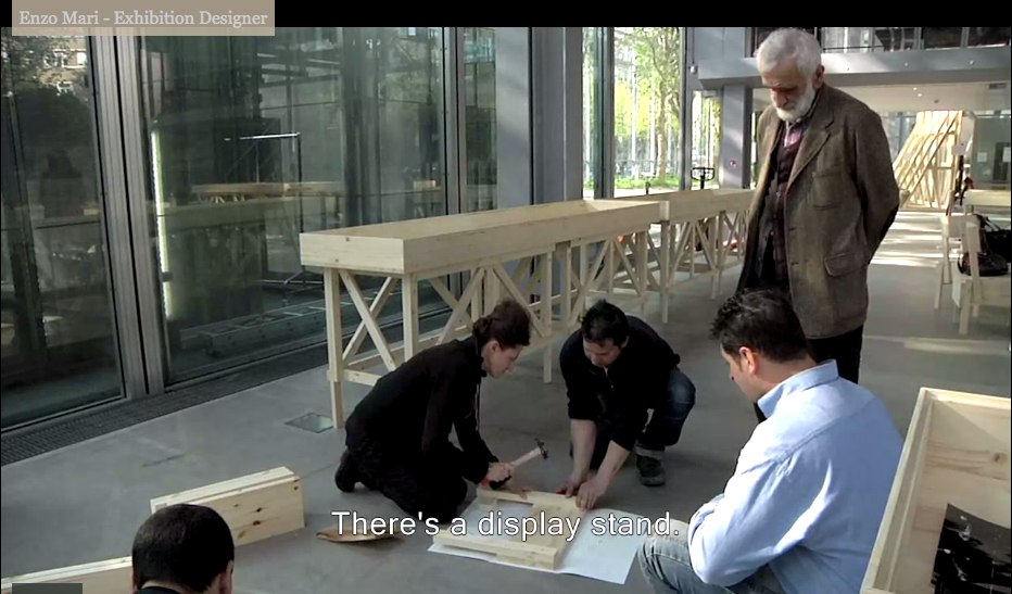
Enzo Mari was brought in to design the exhibition at the Fondation Cartier, Vaudon-Vodun, African Voodoo Art from the Collection of Anne and Jacques Kerchache. It’s simple and spectacular, and designboom has, as usual, rather comprehensive visual coverage of the project.
Above, a “film set” Mari calls The Village, autoprogettazione-esque backdrops to evoke the original context in which Kerkache would have first encountered the impressive household guardian figures. At least that’s how Mari explains it in the exhibition’s making-of interview video:
Holy smokes, filmmakers having Mari manhandle one of the guardians! Whether it’s our aging Maestro or the conservators, your insanely staged B-roll stunts are gonna give someone a heart attack!
You don’t bring in a legend like Mari for his finesse at grouping sculptures. You bring him in to fill your glitzy Nouvel folly of a museum with endearingly humble-deluxe, purpose-built pine furniture!
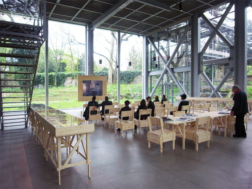
image: designboom
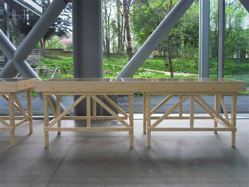
For the major autoprogettazione moment in the film/lecture/reference/public event space, with EFFE tables and SEDIA I chairs. Mais, qu’est ce-que c’est ca? New additions to the series? What’s that wood-framed flatscreen?
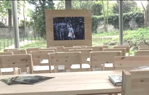
And are those DIY display vitrines ringing the room?
images above via designboom.com
Because the laborer should be able to knock together his own home theater–autoprogezzione?–and a case for his ephemera collection in a weekend using just the most humble materials from the corner hardware store. Or as designboom puts it, and quotes Mari:
the showcases, designed for this exhibition, partake of the same vocabulary.
“‘autoprogettazione’ has been a project for making furniture that the user could assemble simply from raw planks of wood and nails. a basic technique through which anyone with a critical mind could address the production of an object.”
So it’s for the [vitrine] user with a critical mind. Autoprogettazione as Institutional Critique. Can I have my show now, please?
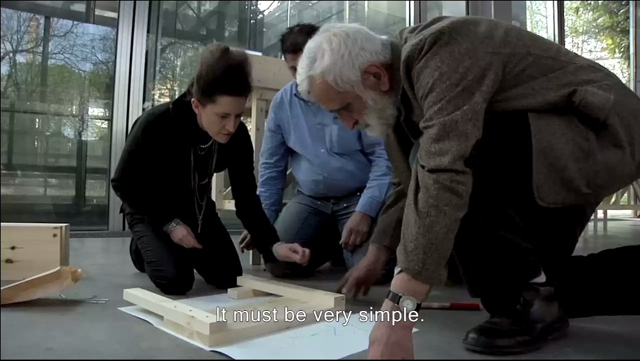
Let’s go to the tape: “There’s a display stand.”
No no, no pressure, just Enzo #$()%ing Mari watching you build his iconic chair there.
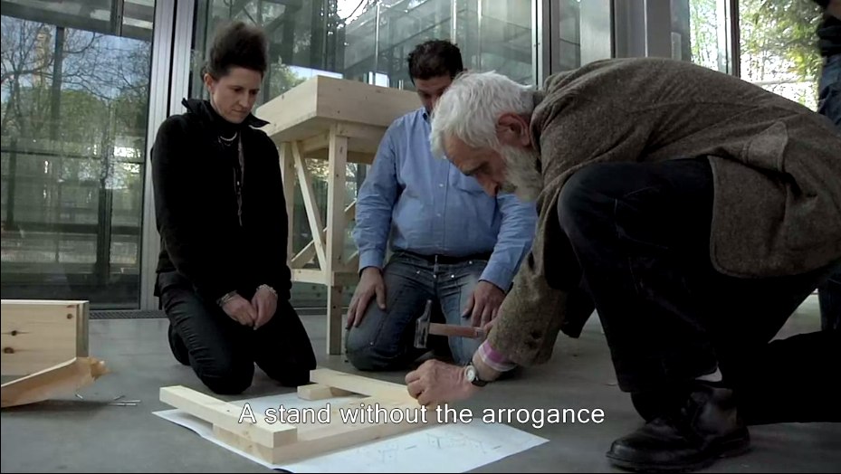
“It must be simple.” Oh no, you B-roll knucklehead don’t do–
“A stand without the arrogance” YOU DID IT! YOU MADE HIM PICK UP THE HAMMER!
Oh, the horror. Why not just take him to a computer and make him fake type something for you? Or walk faux-purposefully down the Boulevard Raspail? How could– No.
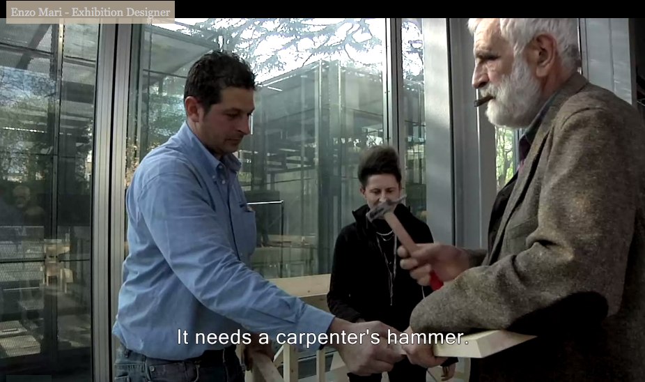
You did not just ask Enzo Mari to hammer something while he was holding it. If you can’t get your $#)(%ing shot, that’s your problem, don’t take it out on a great man like Prof. Mari. “It needs a carpenter’s hammer”? It needs a revolution. Langlois did not lose his job at the Cinematheque so that museum marketing video directors could wrap their late capitalist tyranny in the honorable flag of auteur theory. To the autoprogattazione barricades!
Right after we lock down the salvage rights to those 30 chairs, four tables, eight vitrines–and one flatscreen.

Here’s a shot, though, from Comrade Elena Vidor’s flickr.
UPDATE woo-hoo, and here’s an update from Venice, where Bruno Jakob has installed Breath, a very similar-looking, seven-part series of invisible paintings in and around the Arsenale.

Breath, 2011, via
Vaudou-Vodun, runs through Sept. 25 [vaudou-vodun.com]
View Of New Amsterdam
I’m not sure why I’m so fascinated with the Netherlands, or more precisely, why it’s the source/site/subject of so much of my art/object/image/culture interest. Maybe it’s because of New York, which has always felt to me of a piece with Amsterdam in some way. Whatever, maybe the particulars are not that important right now.
But I’d like to see more thinking and writing and reporting like Steven Erlanger’s NYT piece on immigration, religious tension, politics and Dutch identity.
The sometimes violent European backlash against Islam and its challenge to national values can be said to have started here, in a country born from Europe’s religious wars. After a decade of growing public anger, an aggressively anti-immigrant and anti-Muslim politician, Geert Wilders, leads the third-largest party, which keeps the government in power.
Wow, I just re-read the 2010 post I wrote about remembering Laurence Wechsler writing on Vermeer. It’s the same things. And you know, maybe these particulars are important right now.
Amid Rise of Multiculturalism, Dutch Confront Their Questions of Identity [nyt]
Previously: What I Looked at in 1995: Vermeer’s View of Delft
The World Trade Center Memorial Is A Series Of Tubes
Wow. Nearly camouflaged.
While each pool has a pumping system powerful enough to recycle 52,000 gallons of water per minute, it is the surface of the nearly 1,600 lineal ft of parapets that had to be robust enough to withstand rain, scorching heat, snow and ice as well as the wear and tear of three million annual visitors. For the comfort of the millions of hands that will touch the etchings, the parapets have a heating and cooling system.
“The [National September 11 Memorial & Museum non-profit foundation] was very concerned about making the experience as pleasurable as possible for visitors,” many of whom will want to touch the engraved names, says Robert Downward, an associate with the project’s local MEP engineer, Jaros Baum & Bolles.
JBB and Service Metal Fabricating, the parapet’s Rockaway, N.J.-based supplier, knew of no prototype for a project like this, so they started from scratch to build a back-mounted tubing system that would work within the parapets and the nameplate system. The fabricator built a prototype of the panel, tested it under sunlight and then analyzed the results using computational fluid dynamics modeling.
“We calibrated the model so that it produced results in line with real field conditions,” Downward says.
The result is a network of tubes that feed water behind the bronze plates. The tubes, nearly camouflaged, are underneath the plates and parallel to the rows of names.
“The spacing between the tubes was critical to maintaining comfortable temperatures at the panel surface,” Downward says.
Each parapet section was shipped to the site with the tubes attached. Then, using a series of manifolds, workers connected the tube sections to the piping. The piping is connected to below-grade equipment that supplies the heated or chilled water.
9/11 Memorial Is Centerpiece of World Trade Center Redevelopment [enr via @chton1c]
Conversation in Salt Lake City
Robert Smithson, “Conversation in Salt Lake City,” 1972:
There’s a word called entropy. These are kind of like entropic situations that hold themselves together. It’s like the Spiral Jetty is physical enough to be able to withstand all these climate changes, yet it’s intimately involved with those climate changes and natural disturbances. That’s why I’m not really interested in conceptual art because that seems to avoid physical mass. You’re left mainly with an idea. Somehow to have something physical that generates ideas is more interesting to me than just an idea that might generate something physical.
Nic at A Young Hare has had some great posts lately about the not-legendary-enough Italian artist/architect Gianni Pettena, which made me revisit Pettena’s discussion with Robert Smithson. The interview took place in January 1972, the day after Smithson had delivered his “Hotel Palenque” lecture at the University of Utah, where Pettena was a visiting professor. It was originally published in Domus in Nov. 1972, and included in Smithson’s collected writings.
In the same conversation, Smithson also mentioned his preference for working in “a site that is free of scenic meaning,” one with “views that are expansive, that include everything…” In referring to the Spiral Jetty’s site:
The Salt Lake piece is right near a disused oil drilling operation and the whole northern part of the lake is completely useless. I’m interested in bringing a landscape with low profile up, rather than bringing one with high profile down.
I’d argue that the lake’s utility has only increased since Smithson saw it, and that his installation of the Spiral Jetty has certainly raised its landscape’s profile.
Meanwhile, 185 francs. That’s the price written inside my copy of the 1996 reissue of Smithson’s writings. I bought it at the Musee d’Art Moderne de la ville de Paris, which has [had?] an awesome bookstore. Is it still awesome? I haven’t been for a couple of years now, though I expect I’ll be back before the franc is.
And from the end of the conversation:
Smithson:…I developed that somewhat with the non-sites, where I would go out to a fringe area and send back the raw material to New York City, which is a kind of center–a big sprawling night mare center, but it’s still there. Then that goes into the gallery and the non-site functions as a map that tells you where the fringes are. It’s rare that anybody will visit these fringes, but it’s interesting to know about them.
Pettena: You always show the places from which you are coming, if you are sincere.
None Of Your ‘Unfinished Business’
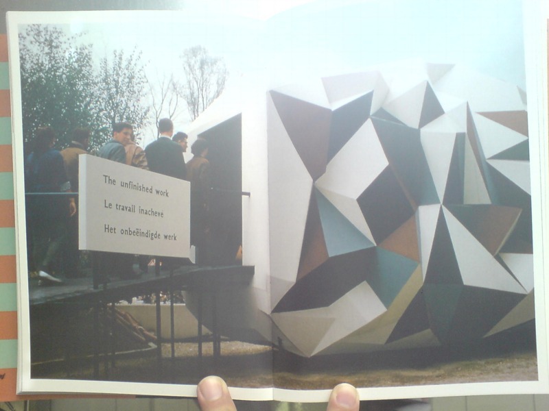
In the early Cold War of the mid-1950s, the Soviet Union countered American condemnation of its repressive actions in East Germany and Hungary with criticism of the US’s internal policies of segregation and racial discrimination. Planners of the US Pavilion at the 1958 World Expo in Brussels, the first since before WWII, warned that “the desegregation issue would be ‘underlined rather than evaded by omission.'” As longtime USIA design director Jack Masey put it in his 2008 book, Cold War Confrontations, “The Unfinished Business” Pavilion was created by Fortune magazine and/for the State Department “as a way to save face–openly and directly–[by anticipating] negative Soviet propaganda about domestic problems in the US.”
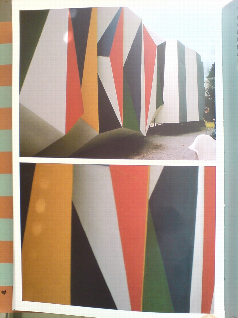
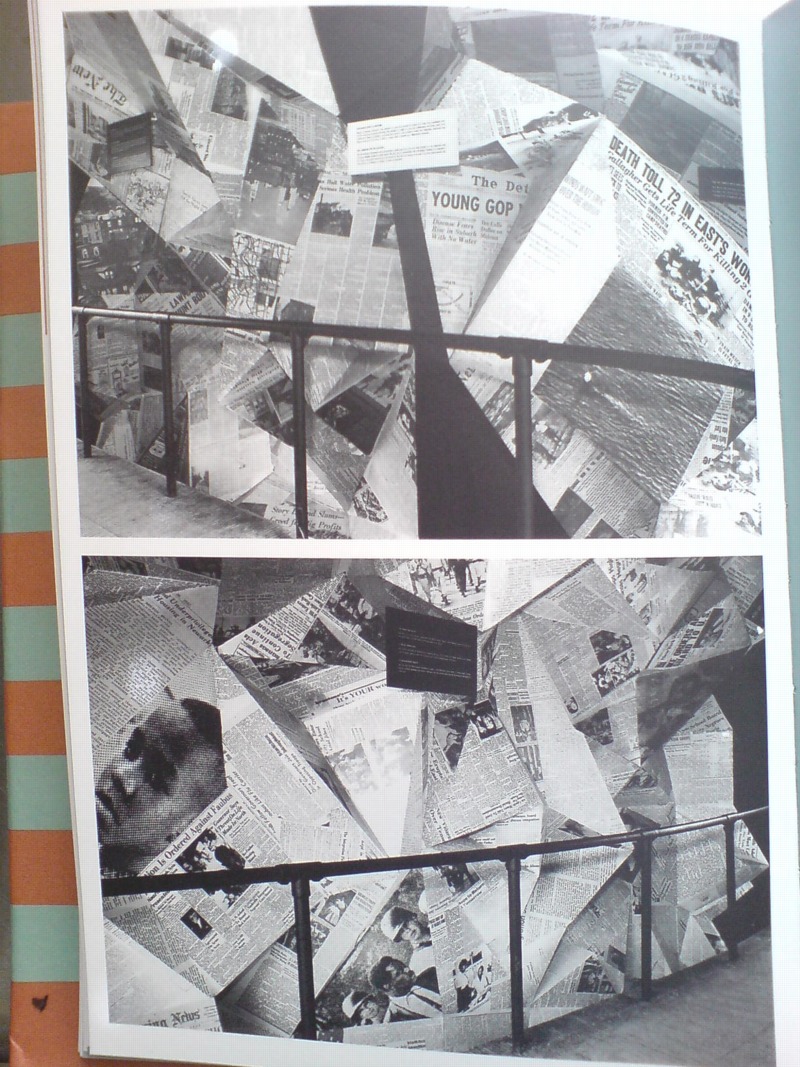
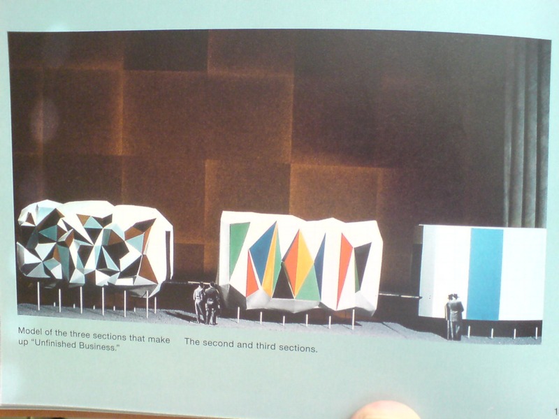
Fortune art director Leo Lionni designed both the pavilions and the exhibit as three distinct sections: past, present and future. The form of each pavilion mirrored the content of its exhibit, though none were so programmatically matched as the first pavilion, where the darkly colored “chaotic crystal” of the exterior [below]
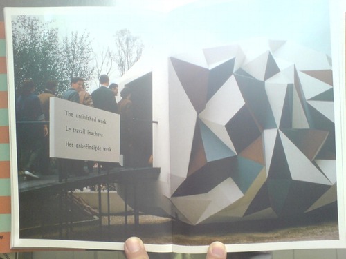
was wallpapered inside with a jumbled, kaleidoscopic collage of US newspapers. Headlines related to desegregation battles were interspersed among other front page stories, presumably to dilute the racism issue by expanding the context, and to underscore the country’s uncensored media as a site of free debate and progress.
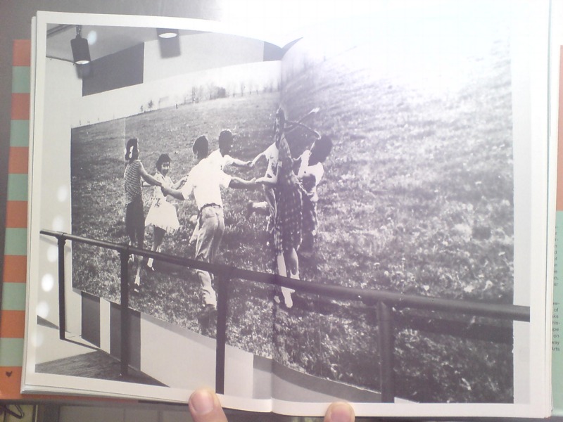
The second, present pavilion had some quotes from President Eisenhower and other leaders, whatever, but it was the bright future pavilion that turned out to be the most incendiary. For its expansive, smooth walls featured large photomurals of amber waves of grain, and a group of happy, young children–“white, colored, and yellow”–playing in a flower-filled meadow.
Which basically made segregationist politicians from the South’s heads explode when they found out about it. Masey gives an overview of the controversy in his book, including some declassified letters from outraged Dixiecrats to Eisenhower’s acting Secretary of State. But Michael Krenns devotes an entire chapter to the political shitstorm surrounding the “Unfinished Business” pavilion in his 1999 history anthology, The Impact of Race on US Foreign Policy: A Reader. Great stuff.
Throughout the Spring and Summer of 1958, angry congressmen criticized the exhibit for “foul[ing] the nation’s nest.” The pavilion was temporarily shut down–the official explanation was “poor craftmanship” on the part of the “Belgian carpenters” who somehow failed to properly execute Lionni’s original concept. By including too many news clippings about Little Rock and Gov. Faubus. Leonni hustled to Brussels to make ordered changes to bring “balance” to the desegregation issue.
They even posted a disclaimer that children of various races playing together “did not represent US policy, but was representative of the freedom of choice available in the US.” And still Georgia’s segregationist senator Herman Talmadge protested, demanding an end to exhibition’s “unwarranted invasion of the rights and prerogatives of the states of the South.”
Faced with calls for a congressional investigation that could turn “The Unfinished Business” into The Neverending Business, the Eisenhower administration caved, and by mid-summer, the State Department shut down what the European press had called “the most effective propaganda in the American Pavilion” and replaced it with an exhibit about the unfinished business of public health.
The Unfinished Business Pavilion, By Leo Lionni
What’s the opposite of writer’s block, the thing where you have so much damn good stuff to write about, you’re paralyzed into inaction? Because that’s what I’ve got, and August vacation voids or not, I just can’t help it; I’m gonna blog it all and let Google sort it out.
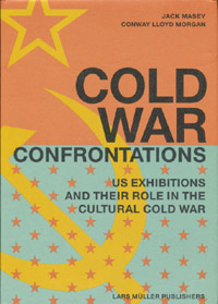 For example, for all the dome- and Expo-loving going on around here, you’d think by now I would have gotten my hands on a copy of Jack Masey and Conway Lloyd Morgan’s 2008 book, Cold War Confrontations: US Exhibitions and Their Role in the Cultural Cold War, but no.
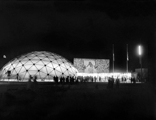
As the longtime design director for the US Information Agency, Jack Masey was basically the client, or the producer, of the expo-related architecture, art, media, domes, pavilions, exhibitions, and propaganda that folks like Buckminster Fuller, Shoji Sadao, the Eameses, and George Nelson became famous for.
Cold War Confrontations is a fantastically surfable book, a thick, highly visual memoir of the USIA’s greatest hits. It’s based on the premise that the structured, official propaganda pageants of world expos, culture exchanges and trade shows, played pivotal roles in the course of post-war world history:
At Expos, however, the teams are not playing games; rather, they competed by presenting to the world examples of a nation’s best architecture, technology, arts, crafts, manufacturing, and performing arts. And in so doing, they sometimes, somehow, change the world. [p. 110]
There were many people who believe[d] that to be true. I sort of want it to be true, at least in the same sense that I’d rather see street gangs settle their differences by breakdancing instead of drive-by shootings. Maybe it’s better to see these expos as reflections of the cultures that produced them, or of their aspirations. Because the views expressed therein do not, it turns out, necessarily represent the opinions of the United States of America as a whole, or of their elected representatives and/or government officials.
Case in point: The “Unfinished Business” pavilion, designed by Leo Lionni [!] for the 1958 Brussels World Expo. Holy Smokes, people.
Masey tells a longer version of the story in the book, but here’s a condensed version: in 1956, a team that included Boston ICA director James Plaut consulted with MIT economist Walt Rostow on the contents of the official US pavilion, which was being designed by Edward Durrell Stone. The idea was to emphasize the US’s people and cultural accomplishments. Rostow’s team also called on the US to be frank and self-critical in recognizing its “unfinished business,” by which they meant “soil erosion, urban decay, and race relations.”
Somehow, though the giant, donut-shaped pavilion had room for a Vogue fashion show on water; a proto-Pop, pseudo-combine street sign streetscape; and a giant, aerial photomural of Manhattan installed in a half-pipe [WTF!? I don’t know! We’ll come back to it!]; there wasn’t room to “address ‘the Negro Problem.'” And so somehow [?] Henry Luce’s Fortune magazine became the State Department’s partner/sponsor of a smaller garden pavilion devoted to “Unfinished Business,” and the magazine’s creative director Leo Lionni designed it.
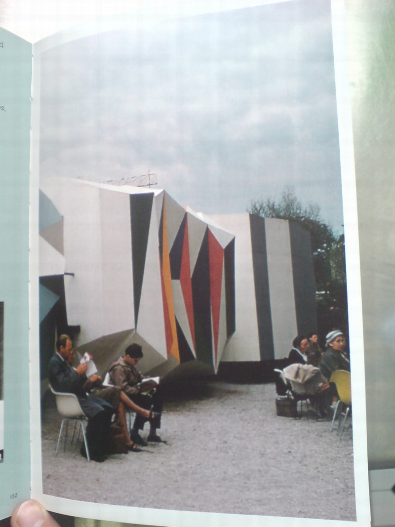
That’s the model above, and it looks pretty damn close to the real thing. Lionni conceived of three linked, raised pavilions, each about six meters long, as a frankly allegorical timeline, in which America’s problems get literally smoothed out. Or as Masey put it, “the content of the interior was also to be conveyed through the exterior.” Which means that the somber, “chaotic crystal” of the past had already given way to the much brighter, Family of Man-colored present. A little more ironing and the square, orderly, utopian future was just steps away. That was the concept, anyway, but that’s not exactly how it turned out.
[to be continued in the morning]
Buy Cold War Confrontations: US Exhibitions and Their Role in the Cultural Cold War on Amazon [amazon]
Yokohama On The High Line
Japan still has a ton of the kind of awesome, ad hoc architecture that is just barely finding its way to 25th Street.
Le Volume Bleu Et Jaune, SVP
I have no willpower. I was going to hold off posting about this incredible project found on an incredible blog until I happily scored the book, but I couldn’t wait. Now I can only hope that my post will somehow bring a copy of the 1974 exhibition catalogue, Le Volume Bleu et Jaune into my clamoring hands that much more quickly.
A Young Hare is a new blog by Nicolas Allinder, aka “nic the intern”, who used to contribute to Ro/Lu. Nic posted about this rather insane project at l’Academy de France, where a group of anonymous architecture students petitioned to study a single room, their studio at the Villa Medici in Rome, for two years. The result: a 1974 installation in the studio in which the traces and volumes of light moving over time were inscribed on the surfaces of the space. Somehow, the exhibition was transferred to the Jeu de Paume in 1975.
Espace Tiphaine Bastille [now Edition Tiphaine put on a show dedicated to the project in 2003. The catalogue shows up in numerous library catalogues, but no inventories, and no scanned versions. Please, francophone web, get to work with the scanning and/or selling.
Le Volume Bleu et Jaune [ayounghare via ro/lu]
Previously, unnervingly related: on an unrealized art project
Sheep Parade
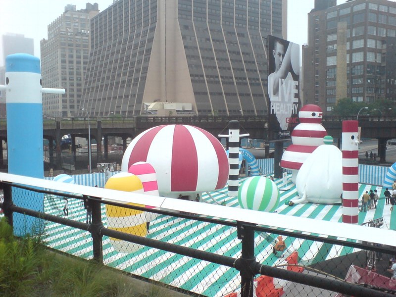
After hipster bouncy castles and food truck happy hours, and shuffling like giddy commuters along a packed, 10-block-long sidewalk the size of a lesser tunnel passageway at Penn Station, I was forced the other night to contemplate the cheery, civic absurdity of the High Line.
Which fortunately turned out to be mostly novelty; the crowd thinned out noticeably on the older, wider section south of 23rd St. I was early for dinner, so I pressed on, keeping a hopeful eye out for Euan as I passed under the Standard; running into him would mean his long, weary nightmare of being stuck, laid over, at Charles de Gaulle had ended. [Alas, he tweeted, it had not.]
Though you’d think it might, entertaining the possibility, however remote, of seeing my most authentically Austin Powers-ish friend did not prepare me for the marching band.
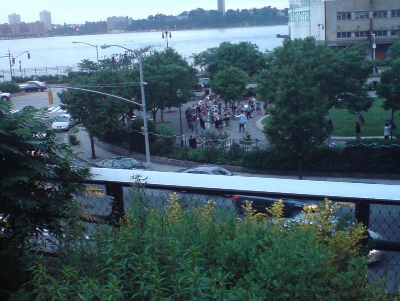
Their music, obviously was heard first. I was coming towards them, or–how thick are these reedy plantings?–perhaps they were coming towards me. Somehow, it was neither. The band remained well within earshot, but largely out of sight to High Liners who didn’t want to stand in the bubbly water feature section above the gas station on 15th St. Wade in, though, and you could see them marching in a circle–yes, there they go, taking another lap–around the oval green of 14th Street Park.
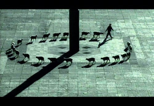
And thus, I was compelled to think again–twice in one day!–of Francis Alys, whose video works, Rehearsal I, of a futile trip made to the accompaniment of a brass band, and Cuentos Patrioticos [above], in which a shepherd leads his flock in a beautifully improbable circle around the Madre Patria in Mexico City’s Zócalo, are the best things in his MoMA exhibit, not counting the skillfully executed vitrines and pedestals. [image via]
Up Newtown Creek, Or This, Anish, It Don’t Stink
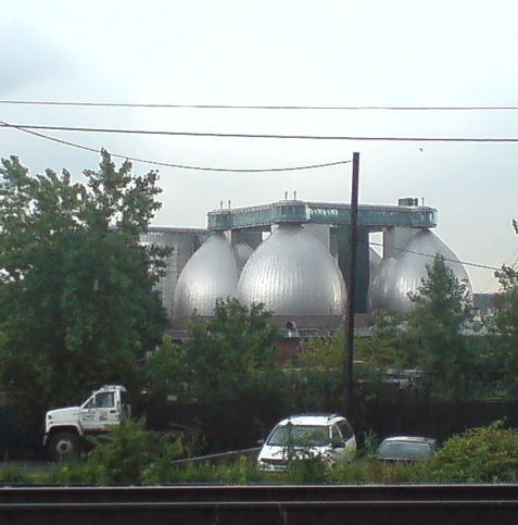
I’ve been moving art and life at our storage unit in Long Island City several times the last couple of weeks, and it’s given me time to really look. Look across the water to the most spectacular structures built in New York City in the last five years: the massive, stainless steel egg-shaped digesters at the Newtown Creek Waste Water Treatment Plant.
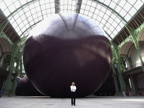
I mean, really. I refuse to be swayed or disheartened [too much] by it–it’s totally different, I say. I really want to put mine in the Pantheon anyway, I say–but several thoughtful folks have expressed their sympathies upon seeing Anish Kapoor’s Leviathan at the Grand Palais photographed from its more satelloonish angles.
But you know what they say in the sewage treatment business, what goes around comes around. If Kapoor has the intestinal fortitude to keep working after the opening of these unsurpassable 145-foot tanks, I can certainly forge ahead with replicating a satelloon.
If anything, it’s even more relevant and imperative than before. Because Newtown Creek is actually designed by Polshek Partners [now Ennead], who also designed the Rose Center at the American Museum of Natural History, an early inspiration for my Project Echo project.
In a way, then, the idea for putting a satelloon in a museum space was hatched from the eggs of Newtown Creek. In another way, though, no, gross.
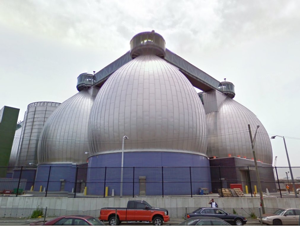
Newtown Creek Waste Water Treatment Plant digesters up close and symmetrical on Google Maps [google]
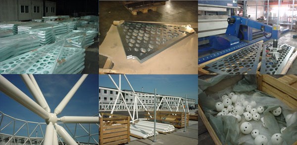
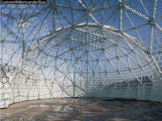
Sportsdomes: Refugee Prison Barge Domecage By Customr
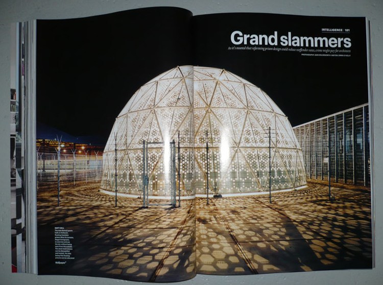
Well here’s one Dutch immigrant detention center that’s not invisible! Just the opposite.
That’s the Sportsdomes DJI up there, by architect Willem van der Sluis, featured in Wallpaper* Magazine in 2008, the same year the project won a Dutch Design Award for his Amsterdam firm Customr.
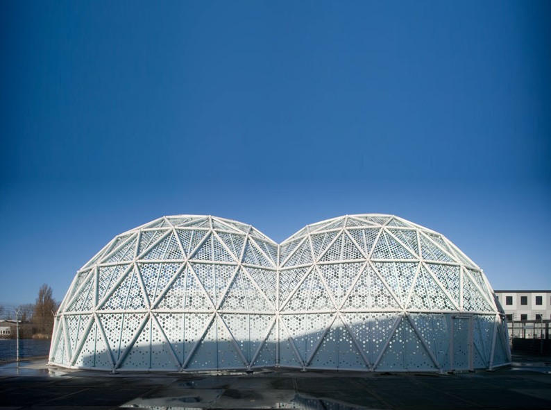
Just like the Kabul Dome the US Government ordered from Buckminster Fuller in 1955, Customr’s Sportsdomes were designed on a tight budget; in a hurry; using the latest modular manufacturing technology; so that they can be erected, dismantled, and moved with minimal skilled labor; primarily in arguable beneficence toward brown people.
Their gradated, perforated metal skin creates an indoor/outdoor space that is meant to offer a pleasant ambiance to detainees for a couple of hours of free play during each of their last weeks in the Netherlands, while protecting their privacy/ hiding their identities from the outside world.
While they were points of contention among the neighbors, the Zaandam domes proved so successful that their patron, the Ministry of Security and Justice, ordered another “domecage” in 2008. Did I say “domecage”? I meant sportsdome.
CustomrWillemvanderSluis [customr.com via design den haag]
Previously:
Dutch camo domescapes
Welcome to the Kabul Dome
De Rijkshuisstijl & The 1 Logo Project
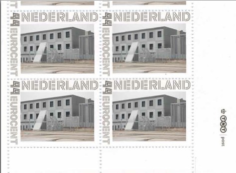
As part of their project Caché-Exposé, investigating the Netherlands’ largely invisible detention and deportation system, the Amsterdam art & design collaborative Foundland documented obscure, anonymous detention sites around the country. Then they used a highly official, public system to distribute their images: design-it-yourself postage stamps.
What with the domes, the minimalist/industrial architecture, these stamps, and–hello, this awesome flag they shot in 2008–I can’t help noticing how beautifully designed the Dutch immigrant prison system is. So thoughtful.
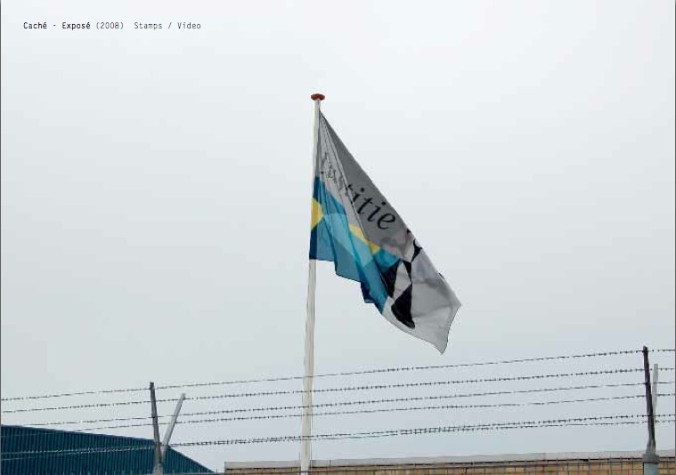
That is the Ministry of Security & Justice flag there, flying over the Zaandam waterfront dome prison. The biomorphic shape is a perspectival view of the scales of Justice, a fragment of the Ministry logo, which is an abstracted, blindfolded Justice.
![]()
Is, or was. Because on Google Streetview, the flag is different. Much simpler.
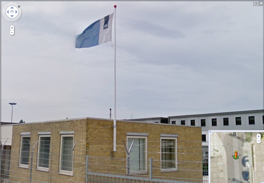
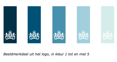
That is the new Rijkshuisstijl, which is officially called the Central Government Visual Identity, but which I gladly transliterate as the State House Style, a four-year effort begun in 2007 to centralize and redesign the Dutch government’s corporate identity. Part of that initiative was the 1 Logo Project, a replacement of 125+ separate ministry and agency logos with a single logo, the national coat of arms on a vertical blue bar.
Ah, I’m told it’s a ribbon. Here’s the English version of the style guide.
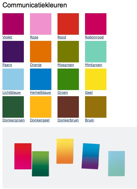
Oh, man, the color palette, 16 colors “inspired by the colorful Dutch landscape painting,” plus five gradients. Get me Colby Poster on the horn.
I am kind of geeking out over this. On the one hand, it’s a normal redesign gig, tastefully done, but typical to the point of banality. On the other, because it’s the state, I can’t help but read every platitude in the mission statement and objectives, every justification of every design decision and element, through a politicized filter. Without knowing really anything about the details or shifts in Dutch poltiics beyond recent surges of right-wing populism, I can’t help but interpret the identification of problems the Rijkshuisstijl was intended to fix as criticism of the parties and governments then in power.
Partly, it’s the Rijkshuisstijl’s incredibly bold assertions of design’s importance and function. And the grand assertions of meaning:
“The symbol exists of a blue ribbon with the coat of arms. Subtle and unpretentious, an authority without being authoritarian.”
The color of the logo is Rijksoverheid Blue. Inspired by the Dutch skies and Dutch light. Blue for calm and reliability. Blue for tradition and enduring values. Blue for harmony and balance.”
“The wide variety of logos previously used by various government organisations made them less recognisable, causing confusion among the public and business community. People were no longer able to see the wood for the trees. Central government organisations seemed to be competing rather than cooperating with each other. This approach compounded the widely held view that central government was fragmented.”
“The mission statement and the motto both underline what central government stands for. They give the central government logo (Rijkslogo) real meaning.”
And then there’s the irony of context, the subjective happenstance of discovering the Rijkshuisstijl while looking at an exposé criticizing the Netherlands’ unjust treatment of immigrants, a project which I’d discovered in turn while reading about the current populist government’s massive cuts to the country’s arts infrastructure. Is this what modernism and Good Design signed on for? Because it’s what they got.
Oh, and there was a symposium, and a book, De stijl van het Rijk/ Style and the State, produced last fall by the Stichting Design den Haag.
Foundland [foundland.org]
Rijkshuisstijl guide in English [rijkshuisstijl.nl]
UPDATE: So the work was actually done by Studio Dumbar in Rotterdam, announced on their site in 2007 [studiodumbar.com]
Dutch Camo Domescapes
I love it when a plan comes together. Or at least when several subjects of interest converge unexpectedly.
It seems the Dutch art world is about to be decimated by sudden and substantial government funding cuts and reorganizations. [for angry details, check sven lutticken’s recent post; for plaintive, possibly resigned reaction from the affected institutions, try the open letter at the Dutch public arts organization, SKOR.]
If the proposed changes really do take effect, and the status quo of one of the most highly developed state-sponsored ecosystems for the arts is actually dismantled at a stroke, I think it’s really important to requestion every comfortable assumption of the involvement between art and politics. It has a lot of obvious problems and weaknesses, but the Dutch system, at least as perceived from abroad, has always seemed like the apotheosis of certain ideals of cultural industrial policy, which, Lutticken argues, now “don’t seem to be worth a penny.”
Anyway, not that they saw them coming, but SKOR tried to understand the political shifts that precipitated these cuts in the December 2010 issue [#20] of their excellent journal, Open, which examines populism and the persistent need for narrative and myth in the democratic process.
Dutch populism seems to center on–surprise–issues of immigration, assimilation, and Muslim vs. Christian cultural influence. As it turns out, one of the contributors in Open 20 is Foundland, a graphics, art, and research group that seems part collaborative, part design firm.
In 2009, Foundland created CACHÉ ÉXPOSÉ, an investigation into the remote, largely invisible, and unreported system of detention and deportation facilities in the Netherlands. The majority of the people imprisoned in the facilities or subjected to the system seem to be immigrants and refugees from largely Muslim countries.
When I read the description of the project, I wanted to see if, like the intelligence- and military-related sites, these politically sensitive detention sites were obscured on Google Maps. Fortunately, Foundland had created a Google Maps list as part of the CACHÉ ÉXPOSÉ project.
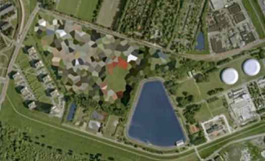
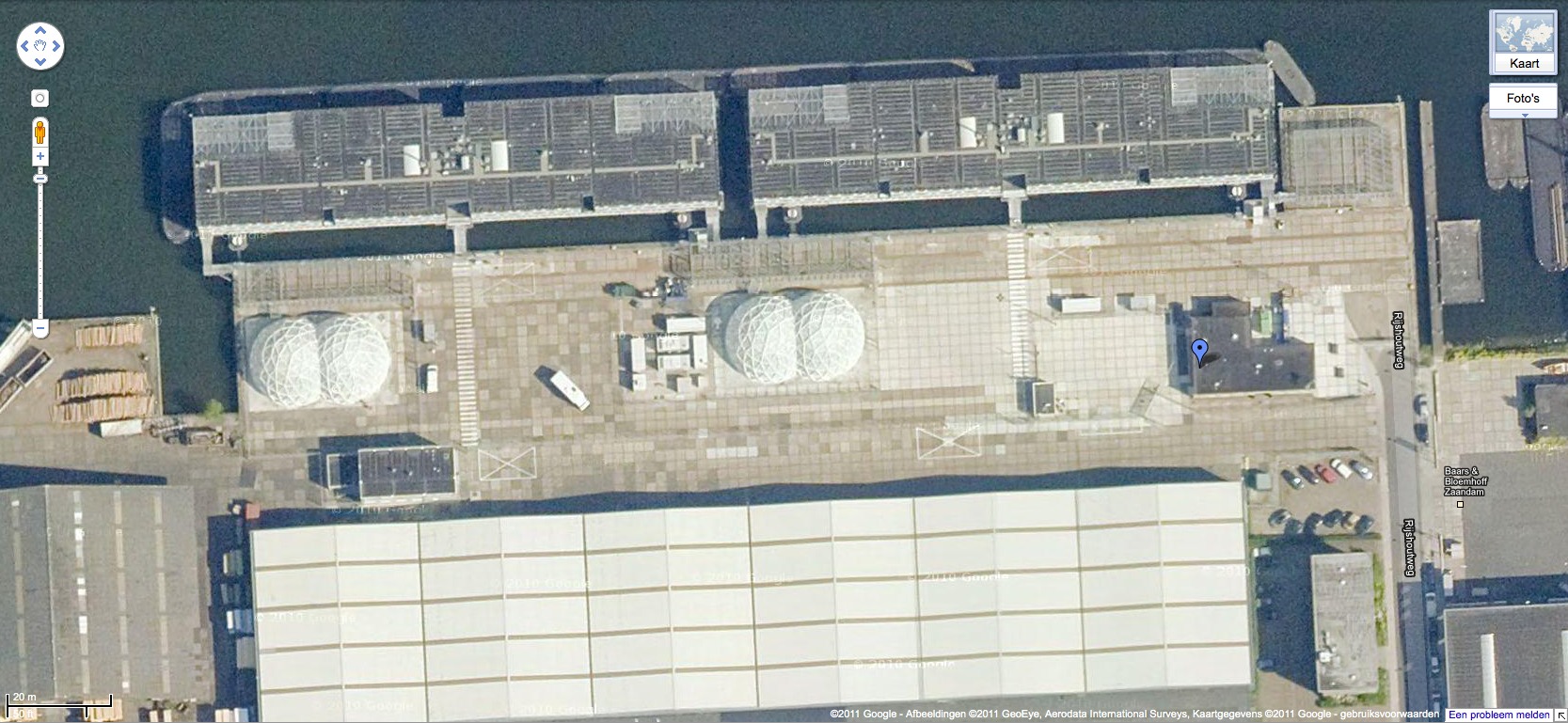
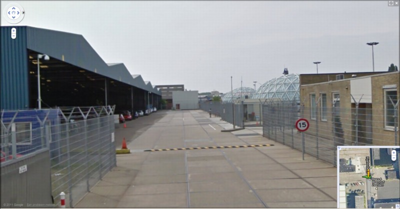
And the short answer is no. Their industrial anonymity is camouflage enough. But then hey-ho, looking at the waterfront detention center in Zaandam, a commercial city northwest of Amsterdam, what do I see? Awesome-looking domes.
Double geodesic domes of unknown purpose, but which look to be at least somewhat transparent or translucent from Street View. What a wonderfully open society the Netherlands must be that in can allow the Google Street View car to drive right up into the middle of its immigrant prisons. Oh wait.
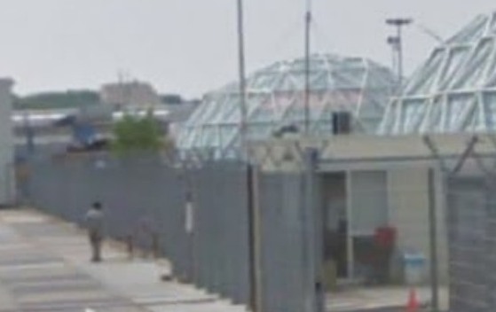
What strikes me, besides the lone figure standing outside the double barbed-wire fence? Is irony the right word to see a geodesic dome, a form which was once erected to great fanfare in Afghanistan, where it served as a symbolic center of friendship, trade, democracy, and political cooperation with the west, being deployed in a back alley prison in Europe filled, presumably, with impoverished immigrants from the Middle East?
Then again, Afghans in 1956 apparently did see the US’s Kabul Dome pavilion as representing The Future. So.
iIkea: Furniture In The Cloud
An aside from Dan Hill’s extended examination of physical retail:
a conversation earlier today, spiraling out of the fact that we have some Ikea furniture (a bed) in a shipping container somewhere, traveling from Australia to Finland, and the thought occurs that Ikea could replace that physical shipping by simply sending a copy of the bed from the Espoo store, and picking up the old one in Sydney. A form of fabrication possible with their already distributed network of components.
On Retail [cityofsound]