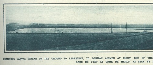
Sweet, near the end of World War I, Paris planned and began construction on a “Sham Paris,” decoy trains, stations, avenues and factories, to confuse German aerial bombers.
Above, a detail from the photo, “Luminous canvas on the ground to represent, to German airmen at night, oneof the great Paris railway stations: The Camouflage Gare de l’Est.”
Like the 1920 editors of The Illustrated London News, I would have liked some aerial photos of the deception.
A Paris Made to be Destroyed–Sham Paris, 1917/18 [ptak science books]
Suspiciously related: Maskelyne’s Sham Alexandria, or The Greatest Camo Story Ever Told
Category: architecture
Blue Room And Love Seat, By Jason Rhoades
I love a lot of Jason Rhoades’ work, but only have a little. I wish I’d known about this sooner:
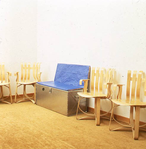
Blue Room and Love Seat is an edition produced with 1301PE’s Brian Butler in 1995, maybe when it was still only 1301.
Anyway, it’s a steel trunk with a cushion on top, for sitting, which contains an inflatable room made from blue tarps. Which sounds delightful, except that it’s inflated by a leafblower, so it’s noisy. And it’s actually inflated by the blower exhaust, so it also pumps noxious fumes into the blue room. Which sort of makes it a portable gas chamber. Which is now kind of depressing.
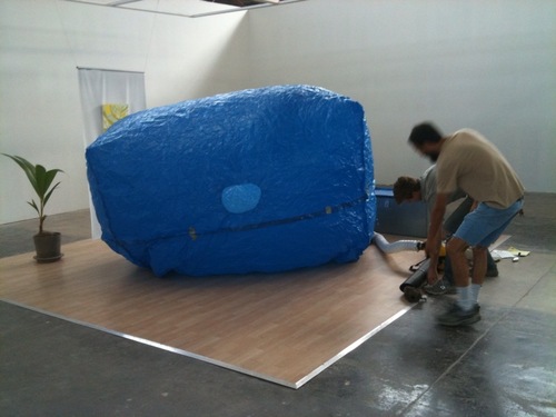
On the other hand, there must be at least one left in the edition, because the gallery inflated it last year for a show.
Blue Room and Love Seat, 1995, Jason Rhoades [1301pe.com]
“Musée Los Angeles, Blue Room and Love Seat [1301pe blog]
How To Make An Ansel Adams-Style Photomural / Folding Screen
I’m sure photomural historians out there are chuckling, wondering when I was finally going to catch up on this, but
HOLY CRAP, PEOPLE! ANSEL ADAMS PHOTO MURALS!
Alright, it’s not quite so unknown. The Polaroid ransacking auction last year at Sotheby’s included a very large print, what Adams called “mural-size,” of the photographer’s iconic image, Moonrise, Hernandez, New Mexico.
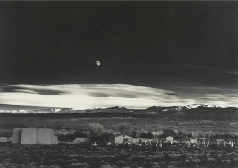
But The Mural Project was actually an Adams thing, a series of images commissioned by the Department of the Interior. Adams traveled around the US, shooting–he took Moonrise on the same trip, and because he hadn’t expensed that day, the photo was his, not the government’s. World War II derailed the project, though, and it was sort of forgotten. Until last year, apparently. When Adams’ original prints were rediscovered in a file somewhere [really?? looking into it. Hmm, this book of the images, which are now in the public domain, was published in 1989.], Interior Secretary Ken Salazar gave the OK in 2010 to install full-scale versions of The Mural Project for the first time. They’re still there, at the Interior Dept Museum. Viewing them requires a reservation.
Adams wrote an essay/letter titled “Photo-Murals” for the November 1940 issue of U.S. Camera [looking into it] in which he argued for large-scale prints, permanently mounted on panels, over wallpaper-style murals. He made such “mural-size” prints for the lodge at Yosemite, and for various exhibitions, but he also took orders for large prints. Most were smaller, around 40×60, but they did get bigger, up to 6×9 feet. The 2003 show of monumental Adams photos Andrew Smith Gallery spent ten years assembling included one such 6×9 print.
But not a screen. Because apparently Adams would occasionally make photo screens, giant prints on multi-panel, folding screens. Which, what?
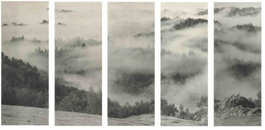
Clearing Storm, Sonoma County Hills, image via christies.com
He didn’t make very many, though; when they sold a big, awesome 1951 screen a couple of weeks ago, Christie’s said there were between 12 and 15, mostly in museums and the Adams Estate. Apparently, he sold one to Interior Secretary Harold Ickes in 1935, though, a deal which according to biographer Jonathan Spaulding, led to the Mural Project commission.
The screen he made for the Skirballs originally had an image on each side; the lot description says how when Jack Skirball invited Adams to come visit in 1981, they were “most anxious to have your opinion on what Audrey has done with the panels of the screen. I don’t want to tell you more until you see them.” It sounds like she remade them into a set of five one-sided panels. No word on what she did with the other image–or what Adams’ reaction was. Even so, the ex-screen sold for $242,500.
Though Adams was always very cognizant of the particular physical qualities of his prints, these screens seem to pose an entirely different argument for the concept of photo-as-object. If murals are related to frescoes, and “mural-size prints” evoke paintings, then Adams’ photo screens–printed to human scale, mounted in angled strips, freestanding in space, where they are intended to be viewed and experienced by moving around them–are akin to sculpture. Photographic sculpture.
Or maybe they’re also sculpture. Because check out this one, Grass and Pool, a three-panel landscape photo and abstract action painting and freestanding object, all in one, and made in 1935. Oh wait, never mind. The image is from 1935, the screen is from the mid-50s. No need to rewrite the history of abstraction today. It was made for David McAlpin, a banker and collector who, as a trustee at MoMA, helped found the photography department in 1940.
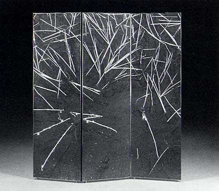
Grass and Pool, sold in 2001 at Christie’s
Adams talked at length with Ruth Teiser about his photomurals and screens–actually, he talked at length with Teiser about everything; she recorded and edited 24 interviews with Adams between 1972-4 for UC Berkeley’s Regional Oral History Project, and later published the 818-page transcript as Conversations with Ansel Adams.
I transcribed some excerpts about photomurals from the Internet Archive after the jump. Adams’ main concern was the quality and character of large-scale prints, a topic which regularly veers into details of what an expensive, annoying, labor- and material-intensive pain in the ass it was to make good, big work.
Continue reading “How To Make An Ansel Adams-Style Photomural / Folding Screen”
Israeli Air Force Has Huge Belgian Balls
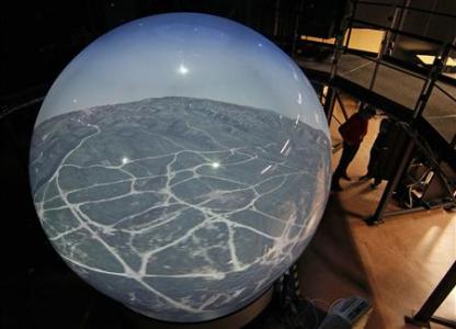
Speaking of huge, impressive balls, Reuters reports that a Belgian firm called Barco is delivering its first order of eight, brand new, 360-degree flight simulators, each of which is a 3.4 meter-diameter cast acrylic sphere. The sphere is ringed by thirteen hi-res projectors, whose images are all laser-stitched together or something in some suitably seamless way.
Alls I know is, 10-foot-wide acrylic sphere screen. Also, Top Gun? Really?
Belgian firm unveils new Top Gun flight simulator [reuters via boingboing]
Welcome To The Talus Dome! Ball -Nogue Shiny Balls
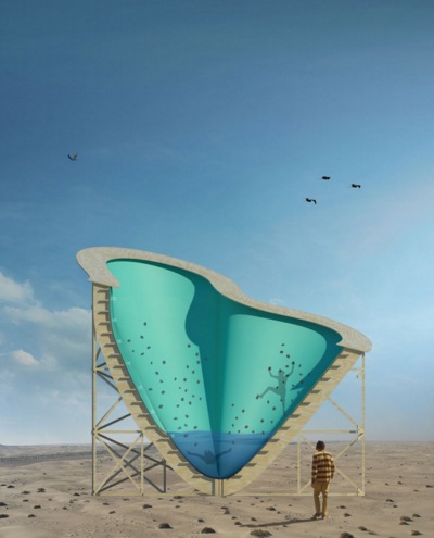
Hoo man, David has an interview with Ball and Nogue about their High Desert Test Site project which is called Yucca Crater, and which appears to be an earthwork, but is man-made. It’s a tricked out plywood recreational structure half-embedded in the desert which looks a bit like a half-pipe, an abandoned pool, and one of those deadly carnivorous pitcher plants. Because it’ll have a climbing wall and a pool in it, in which some random tripping art student will, I’m afraid, drown one day.
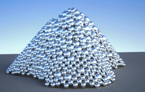
But that’s not important now. Yucca Crater is made from the leftover formwork from another Ball-Nogues project, Talus Dome, a public art commission for the Edmonton Arts Council. [Quesnell Bridge. Holy smokes, people, a mountain dome of giant mirrored spheres.
But why, you may ask, is the form available to bury in the desert if the Telus Dome is not actually complete yet? This is not some CAD/CAM hit ENTER and 3-D print operation. They actually pack those balls into that thing to make it.
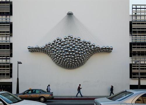
image: Timothy Hursley via arch mag
Like how they made Cradle, Ball-Nogues’ shiny ball 2010 commission for the “updated” facade of what [used to be] Frank Gehry’s Santa Monica Place parking garage. [It’s called Cradle I guess because calling it a bulging “men’s Speedo” or “a big banana hammock” before they finished it might have raised some eyebrows.]
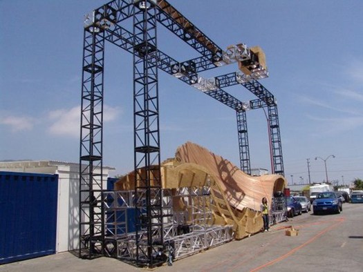
Anyway, who else but Design Boom has a big photo set of the making of Cradle. These balls are just hanging there, each held in place by a steel cable, the specific length of which was determined by rigging the whole thing up in a giant, wooden banana hammock mold. Designboom also shows how the balls themselves were made: they were welded together and blown in China. See how I avoided any innuendo there?
Whatever, I can’t stop staring.
Untitled [Extra Street View]
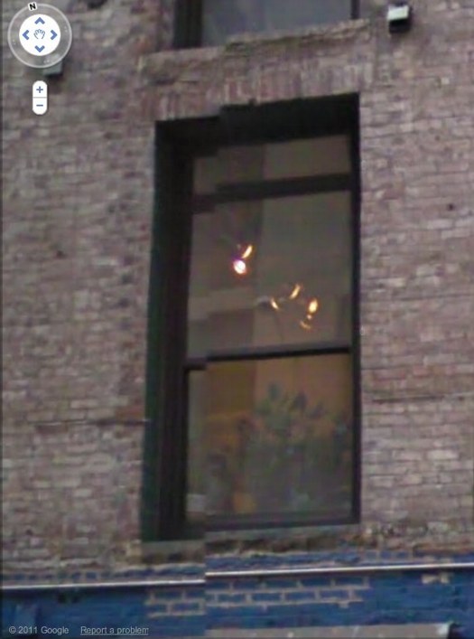
I’m bummed to miss it but “While You Wait,” a group show organized by Brian Dupont in Extra Gallery, his Chelsea art firm’s expropriated lobby is opening right now. [Spoiler alert on the venue’s lobbyness? I can’t quite tell, but I figure it’s clear from the show’s press release.]
Anyway, after Brian invited me, I was trying to figure out what I might do, and saw this image of the building–and the space’s window–on Google Street View. And then it was obvious.
I’ll write some more about the piece later; right now I’ve got to pick up the kid from riding lessons. I mean, proletariat lessons.
OK, comrades, I’m back. Basically, Google Street View is increasingly the first impression, the reference point, even the authority of sorts, for the new places we go in the physical world. In Extra’s case, the distinguishing feature of its unassuming architecture is the mismatched seam Street View gave it. Untitled [Extra Street View] is an attempt to approximate that digital reality in the physical experience of the building, to sort of sketch it into the space. Or maybe to capture it in one spot–the window–or one perspective, from inside the place you’ve just traveled to, looking back toward the pano-mapped street. It’s like a shot reverse shot between the viewer and the Google cam.
Creative America
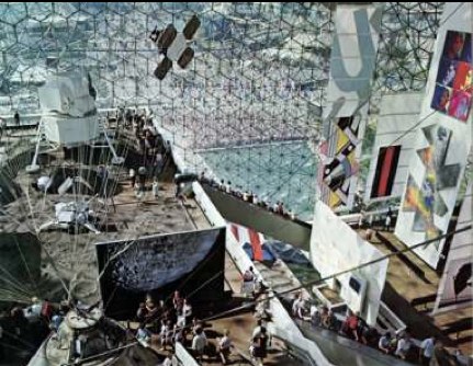
This interior shot of Fuller/Sadao’s US Pavilion at Expo67 almost has it all: installation view of the giant paintings Lichtenstein, Newman, Warhol and Johns made for Alan Solomon’s American Painting Now; plus a giant photomural of the moon, perfect for posing in front of.
There’s another photomural, earthrise from the moon, on the other side, which was a backdrop for the lunar landscape diorama. You can see it in Carl Harstad’s photo:
w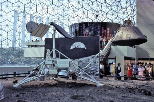
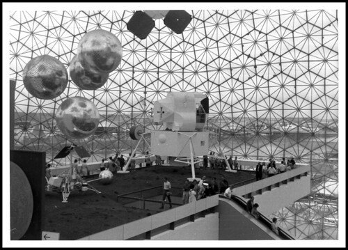
And the satelloon-like weather balloons were just out of both pictures’ edge. Fortunately, Bob Charlton’s mother captured them below:
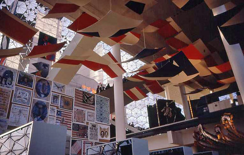
The underside approach for the lunar platform has this awesome installation [image from fan train’s flickr], a series of panels or canvases with abstracted elements of the American flag. It’s a little Ellsworth Kelly, a little Helio Oiticica, and a little Richard Lippold at Lincoln Center, all rolled into one piece of exhibition filler created, I assume, by Cambridge Seven.
This other photo from Carl Harstad of the Hollywood section of Cambridge Seven’s exhibit features, what? I don’t know. I’d guess it’s left over from Joseph Manciewicz’s disastrous Cleopatra shoot, in front of a giant, multipanel headshot of Humphrey Bogart.
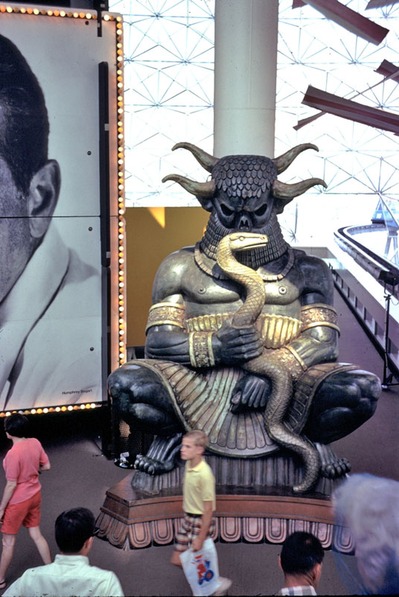
Cambridge’s exhibition carried the overall title, Creative America, and I think it very successfully steamrolled everything–paintings, photomurals, dioramas, film props, spaceships, cultural effluvia–into a single, unified, spectacularized drive-by aesthetic experience. And it was all done by and for the US Government. As I go on about reconsidering ‘non-art’ things like photomurals and satelloons in an art context, I keep coming back to the Expo67 pavilion. At one point, it was all art, or something like it. And vice versa.
[note: I’ve seen it elsewhere, but I took that top photo from former USIA design director Jack Masey’s powerpoint deck on the history of postwar World’s Fairs, which he presented last October at the National Building Museum. I’m about to listen to his archived talk now.]
Shadows To The Left Of Me, Shadows To The Right Of Me
I’ll probably write some more about Andy Warhol’s Shadows, but I want to find more details about its creation and Heiner Friedrich’s involvement. In the mean time, though, I just came across a 1985 Richard Serra quote from the Pratt Journal of Architecture that directly relates to seeing Shadows, which extends more than halfway around the Hirshhorn’s curved wall:
i keep thinking of a very simple phenomenon that struck me when i was a little kid. i used to walk to the beach every day, down to the end of a jetty and back the other way, and it always struck me as being completely significant that the ocean was on the left when i was going down, and when i turned around, it was on the right, and i had a totally different experience just from turning around and walking the other way. i always thought this was very curious. i always thought there were two different places. everybody knows that you don’t have the same experience in turnabout – your relation to the sun has completely changed, left/right brain coordinates are off – everything is different. in fact, you probably have a side you favor as you walk. you probably think differently in each direction. your anticipation and memory change. to me, that’s a sculptural concept. if a sculpture allows for that experience, it implies self-awareness. the content of the work is that the viewer looks at himself in relation to what he’s looking at…
The no-caps is a big clue, but I found the quote in a 2007 post on Airform Archives. As in so many things, Steve Roden was there first.
thinking differently in each direction [inbetweennoise]
Post-Tsunami Shelter Pre-Order
A finalist on a 2006 ABC reality series spent years inventing a car seat that would withstand the type of crash that killed his own infant son. Skyscraper evacuation technology experienced a surge of innovation in 2002. And six months appears to be the amount of time required for Japan’s nascent personal earthquake/tsunami survival shelter industry to go from disaster recovery to product launch.
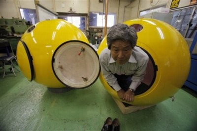
image: ap via guardian
Here is Mr. Shoji Tanaka, CEO of the 10-person, Cosmo Power Co., who has, naturally, removed his shoes to demonstrate the firm’s new Noah disaster shelter. The fiberglass pod fits four, has airholes [presumably watertight], and can “also be used as a toy house for children.”
One would assume the 200-300,000 yen price could be offset by selling advertising. In the event of an actual emergency, live feeds of Noahs being plucked from the receding sea would provide great logo placement opportunities. Assuming the Noah’s occupants survived, of course.
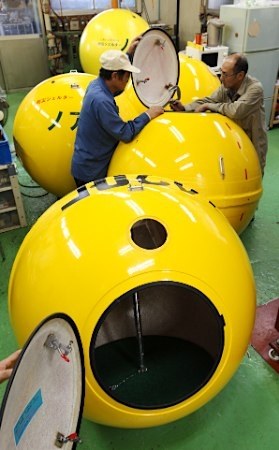
image via goo.ne.jp
Hmm, maybe it’s better to base advertising revenue projections on pre-disaster exposures. Noahs will surely be parked outdoors, in precious parking spaces, on roofs, hanging off of balconies, someplace from whence they can float clear from debris. Ad network them together, and paint or paste the pitches on the side with saltwater-soluble ink or glue.
Anyway, Cosmo has apparently been too busy taking 500 or 600 orders for Noah pods, they haven’t had time to update their homepage for two years. Actually, the Shelter Noa was registered with the patent office in 2008. And yet as of Friday they had only delivered two.
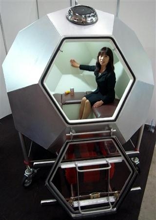
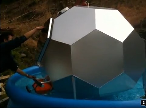
That goo.ne.jp link led to an even better related story, the launch the very same day of the Kimidori Baria 4S, a “soccer ball-shaped” disaster shelter. Because when you’re a prefabricated geodesic dome manufacturing company like Gifu-based Kimidori Kenchiku, the best obvious solution, whether it’s for a dog house, a comic book coffee house, or a tsunami survival pod, is a dome.

Barier concept video intro is probably Gifu, but looks very similar to the cover image of Lloyd Kahn’s 1971 classic Domebook 2.
Hmm, on Kimidori’s YouTube channel contains three seaworthiness testing videos. A warning: these might be too upsetting for sensitive viewers and/or actual tsunami survivors.
For example, here is a Barier 4S floating in a portable pool.
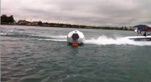
In this open water test, the Barier 4S must endure the wake of a small ski boat.
The third video features a new tsunami shelter shape, a dodecagonal tube, which holds six and can be walked safely to shore like a hamster ball. The first videos were posted within weeks of the actual earthquake itself. I guess it’s a fine line between ganbaro! and too soon!
UPDATE Or too late. I’d meant to post a link to Ken Isaacs’ 1970 dodecahedron pod for Pop Sci, which was designed for another type of escape, when the fellas from Ro/Lu sent along the link to n55’s micro dwellings (2005), the water testing for which included 100% more naked Danes than the Barier.
What I Looked At Today: NGA Monochromes
Well, let’s just get this out of the way: if you can only see one Warhol exhibition in Washington this year, see Shadows. The Warhol Headlines show is very slight. It’s hard to call it a highlight, but a series of three 1982 or ’83 silkscreen paintings of successive pages in the NY Post did remind me a bit of the newspaper On Kawara used to line the boxes of his date paintings. Also, the show includes the three Screen Tests where the subjects appear to be reading and unaware they were being filmed: Alan Solomon, Grace Glueck, and Arman. That really is all.
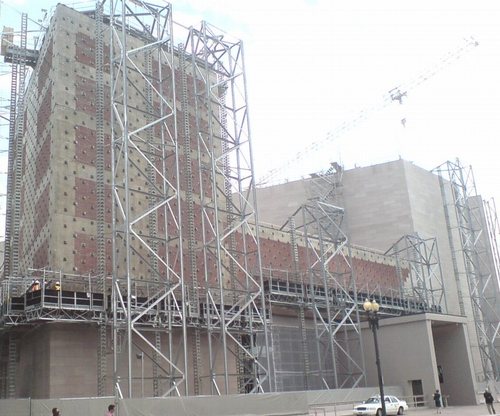
But let’s back up because, hey-ho, did you know the National Gallery’s East Wing was built with red brick infill walls?? It’s like Long Island City up in there behind IM Pei’s Indiana granite.
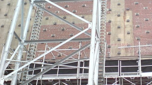
I also love that a construction worker in 1975 declared his allegiance to the Pittsburgh Steelers, practically in the Baltimore Colts’ own backyard. That was the year the Terrible Towel was invented, and when the Steelers did, in fact, win their second Super Bowl in a row. Also, I thoroughly approve of this epic-scale scaffolding. Glaze it and set it up at the beach for me, please.
Anyway, after the Warhol bust, I went downstairs for a close look at one of the NGA’s current strengths: contemporary monochromes. I’m working on some little monochrome panels right now, and I wanted to see surfaces and techniques–and to see if I’m inadvertently copying anyone I don’t want to.
I think I want a really immaculate, glassy, brushstroke-free surface, and I definitely know I want a continuity around the edge of the thin steel and aluminum panels I’m trying. So I figure setting out to study the cleanest, smoothest paintings I can find will be yield some hints.
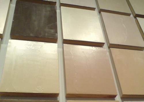
So first up: Byron Kim’s Synecdoche (1991-), the multipanel grid of monochromes based on various art world folks’ skin tones.
What I Looked At Today: Gerald Murphy
Sometimes I really just am slow to put things together. I mean, I’ve written at length, ad nauseam, even, about the history of Mark Cross. Mondo-Blogo had a huge post months ago about what Superfreaks they are. There’s the whole F. Scott Fitzgerald thing. [Which, truth be told, is probably why I’ve willfully ignored them so long.]
But it’s only now, while reading Calvin Tomkins’ 1962 New Yorker profile on Gerald and Sara Murphy [thanks @maudnewton!] that I’ve taken a first, real look at Gerald Murphy’s paintings.
Well, that, and the fact that MoMA actually has their Murphy, Wasp and Pear, on view for the first time in years. It’s certainly the first time I’ve ever remembered seeing it.
The Murphys fled their uptight, US, 1920s socialite life for France, where they proceeded to invent some combination of summer, the Riviera, and modernism. Under the initial tutelage of Diaghilev designer Nina Goncharova, Gerald took up painting alongside his friends Picasso, Braque, Man Ray, Picabia, and Leger. He stuck with it for seven intense years, then abandoned it completely when his son came down with tuberculosis. Tomkins quotes him as saying that discussions with Picasso led him to realize “I was not going to be first rate, and I couldn’t stand second-rate painting.”
Which, wow, just does not make sense. It sounds like ex post facto rationalization, or dealing with grief over his son’s death, or something but it completely ignores the fact that Picasso himself was often second-rate. I think you just never know until you do. And maybe Murphy did, and knew, but still.
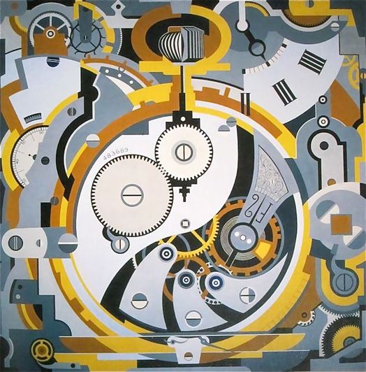
The few paintings that survive [8?] of the few he made [14?] are all pretty great. The Dallas Museum has several, including Watch (1925), an amazing precisionist abstraction that measures an awe-inspiring 6×6 feet. No Sunday painting there.
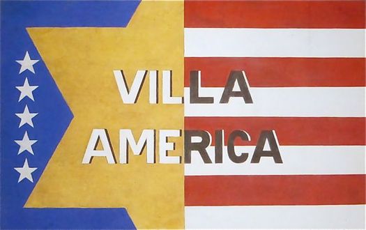
I’m waiting for the catalogue from the DMA’s 2008 ominously subtitled show, Making It New: The Art and Style of Gerald and Sara Murphy. Which better have photos of Villa America, the Murphys’ pioneering modernist-ized outpost in Cap d’Antibes referred to in my favorite extant Murphy painting [top].
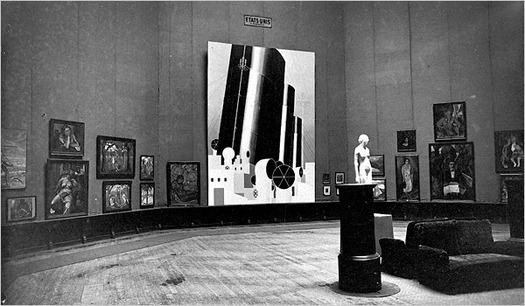
And which also better have more info and more photos of what is now my favorite missing Murphy, Boatdeck: Cunarder, an 18×12-ft masterpiece which took over nearly the entire American section of the 1924 Salon des Independants. Seriously, what Modern was painting 18 feet high in 1923? That is just nuts.
[update: MacAgy originally had Cunarder in the title, and the painting was originally reported to be based on the Aquitania, but Rubin says Murphy said it was the Olympic and the Paris]
A Photomural On Governors Island
It was the other night, while Googling around for Tris Vonna-Michell info, that I found my way back to Carefully Aimed Darts, an awesome art-related weblog which went dormant about a year and a half ago. And I remembered how the very well-(in)formed writing had always left me wondering who was behind it. I’d go to openings or other art world gatherings and try to imagine meeting the writer behind CAD and not knowing it. Maybe I have, who knows?
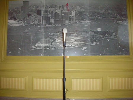
Anyway, it turns out CAD had carefully aimed his/her camera at the microphone in Pershing Hall, on the Manhattan-side tip of Governors Island, where Vonna-Michell had performed in 2009 as part of a Creative Time show.
And there was this wonderful, slightly frayed-at-the-edges photomural of an aerial view of Governors Island, with lower Manhattan filling the top of the image. Judging by the state of the landfill beach that would become Battery Park City, I’d guess the photo was taken in the mid-1970s.
Tris Vonna-Michell: History-Telling [carefully aimed darts]
I, For One, Welcome Our Black Mirror-Wielding Motion Control Camera Overlords
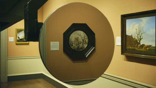
So you should really read Daniel Kasman’s review of the Venice debut of Mark Lewis’s awesome-sounding short film, Black MIrror At The National Gallery, because Kasman is sensitive to both the tone and surprise/reveal of the film in a way that the official synopsis, oddly, does not.
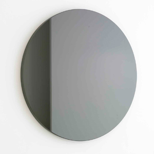
But if you’re not going to read either of those, I’ll just say it sounds like Russian Ark meets 2001, with the Marquis de Custine replaced by Martin Szekely’s silicon carbide “Black Sun” mirror, the Hermitage replaced by the National Gallery, and everyone and everything else replaced by Hendrick Avercamp’s Dutch Golden Era tondo A Winter Scene with Skaters near a Castle.

Sounds awesome.
Venice 2011. Art Is Terror from Any Other Angle [mubi.com]
Orizzonti – BLACK MIRROR AT THE NATIONAL GALLERY – MARK LEWIS [labiennale.org]
Miroir- Soleil Noir, 2007 [galeriekreo.fr]
Avercamp’s A Winter Scene with Skaters near a Castle, 1609 [nationalgallery.org.uk]
‘And I AM. An American Sculptor.’
Between 1981 and 1985, Paul Tschinkel and Marc H. Miller produced 17 episodes of ART/newyork, a subscription-based video magazine about contemporary art for use, incredibly, in public schools and libraries.
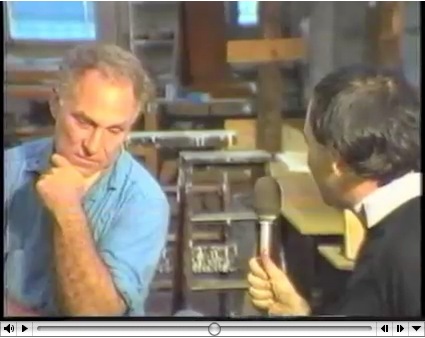
Their 1982 interview with Richard Serra, a Yale classmate of Tschinkel’s, came just as the Tilted Arc controversy was heating up. And speaking of heating up, hoo-boy, does Serra get going about the Pennsylvania Avenue Development Agency conflict with Robert Venturi. Fiery fun stuff.
His 1980 interview with Douglas Crimp covers a lot of the same PADC territory with a bit more specificity. By pointing out, for example, that Venturi’s proposed motif was also favored by Albert Speers, not just that they might as well stick swastikas on Pennsylvania Avenue.
But his story about being told that he’d never get work in this town again is basically the same.
Also interesting, if less incendiary: Serra used to exhibit models of site specific projects-in-progress, such as this rather sexy steel tabletop version of Twain. Do want.
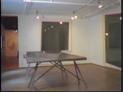
ART/newyork – Richard Serra’s Tilted Arc artist interview [98bowery.com]
order copies of ART/newyork to this very day [artnewyork.org]
Vintage Neutra Plywoodporn
Whatever else it is, Hurricane Irene is the greatest thing to happen to plywood fetishists since the Puerto Rican Day parade.
I love the sight of a freshly boarded up facade under any circumstances, the fiery, manufactured beauty of the plywood grain before it’s sullied by spray paint or Clive Owen movie posters.
Do you remember how they managed to find more of just the right vintage Douglas fir ply in 2001 so they could install Donald Judd’s spectacular 1976 piece, Untitled (Slant Piece) all the way across the back wall of Paula Cooper’s space? I’m getting chills just thinking about it.
I can’t find a picture, either, so these snapshots of the deep, honey-colored plywood I saw around the previously undocumented Richard Neutra lodge I discovered in rural Utah last year will have to suffice:
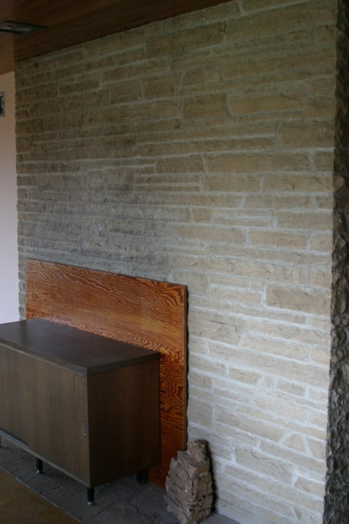
There was this one piece loosely covering up the fireplace in the living room, beautiful, but really, just a teaser.
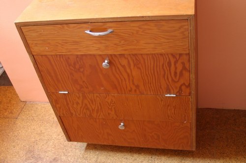
What to do when it’s 1950, and you’re out in a desert field, finishing up your client’s hunting lodge, and you’ve got a bunch of plywood scraps left over? Don’t fret the grain matching, just knock together a small dresser or two.
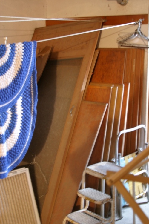
And then just stick the rest down in the basement, so he can use it to close up the house during inclement weather.
Previously: Beckstrand Lodge, Richard Neutra, 1950
