Weight, Weight, Don’t Tell Me

Thumbnail image for serra_amer_flag_worship.jpg
On October 4th, 1994, at an artist panel discussion for MoMA’s Cy Twombly retrospective, Richard Serra made an offhand comment about how “The last century of art has been based on a misreading of Cezanne.”
To a young, impressionable student/fanboi still putting his contemporary art world view together, this was a shock. Because it was Serra, and because I still assumed there was some right art historical “answer” to be gotten to, and because Serra didn’t bother to say how everybody got it wrong, it lodged in my brain for years.
And so it was that at some point a couple of years later, when I met him at a party, I asked him what he’d meant. Of course, he didn’t remember what he’d said, or the context, so he gamely tried to float a couple of possible theories, but nothing that matched the seeming conviction with which I’d remembered him saying it. So I tried to forget about it.
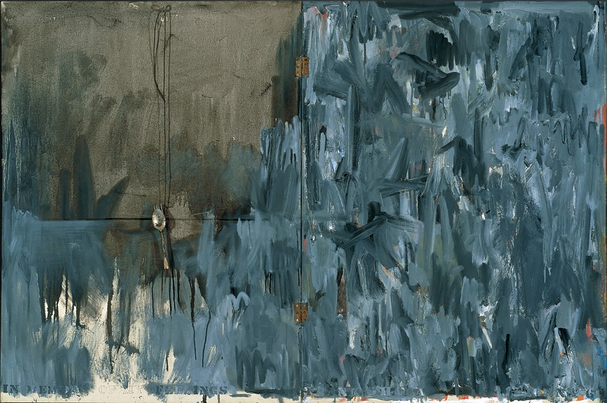
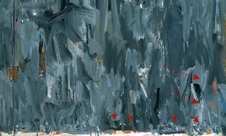
And I thought I had, at least until just now, when I was reading Serra’s discussion with Gary Garrels in the Richard Serra: Drawing catalogue. They were talking about the “jump” in Serra’s work after 1989 in terms of Cezanne:

GG: Those double-panel drawings, rather than dealing with a wall or with a room or a space, deal with internal relationships.
RS: They are masses in relation to one another. They’re not about composition or figure-ground; they emphasize the comparison of different weights in juxtaposition.
GG: So this, to me, is again another jump.
cezanne_cupid_courtauld.jpg
RS: For me they have more to do with Cezanne than with Malevich. I wasn’t looking at Cezanne when I conceived them, but in retrospect, I see a clear connection in the way they deal with weight and mass in relation to shape. They’re the opposite of the floating shapes of Constructivism and Malevich, referred to in drawings like Heir
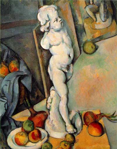
The comparison of the diptychs with Cezanne may be a stretch, but no one else comes to mind who deals so physically with mass and weight. No one talks about the weight of Cezanne, but there’s a manifestation of weight there that’s not in Picasso, not in Matisse, barely in anyone who follows. Cezanne is obviously interested in gravity and in the relation of weight to plane. Take Still Life with Plaster Cupid [ca. 1894], in the Courtauld, where he punches a hole in the space, and you think the apples and onions are going to roll off the table. The only thing holding them in place is their weight. They have the weight of cannonballs.

So the answer, then, is C) gravity.
But then, literally, as I’m typing this in from the book, it’s 41:00 into the recording of the panel, right where Serra says it:

I think Twombly has a big range– a big range of evocation. I think that’s what he does. He doesn’t present an image; he evokes a sensuality, and it’s unlike anything in post–I think. I’d have to go back to someone like Baziotes, maybe–there’s nothing in the American brain like that. Americans are much–maybe Brice. Americans are much more heavy-handed, much more flat-footed, much more aggressive.
This is the opposite of Cezanne. And the whole inheritance of the New York School kind of goes Cezanne; Cubism; into Abstract Expressionism; Pop Art pretty much hangs things back on a grid; the grid comes back up again in Minimalism. That seems to me all an extension of a certain kind of classicisim and aggression and a standardization coming out of Cezanne, a misreading of Cezanne, albeit. And Twombly takes the opposite attack. It’s very lyrical. And very open. And very…delicate.
Brice Marden: Yeah, I think it’s really great that he left town. [crowd laughs]

OK, then. I seem to have misunderstood the question. The correct answer is actually D) Serra likes to think in terms of major historical frameworks. I’m glad that’s all cleared up.

‘One Of The First Works That They Made After Becoming A Couple’

johns_memory_feelings_1961.jpg
In Memory of My Feelings – Frank O’Hara, 1961, Art Institute of Chicago
I’ve had a jpg of Jasper Johns’ 1961 painting, In Memory of My Feelings – Frank O’Hara on my desktop for months now. It was one of the most important works in the National Portrait Gallery’s “Hide/Seek” exhibition, and I took the chance to study it up close several times throughout the run of the show.
I have also been a little wary to write much about it, and its seemingly powerful resonance with Johns’ Short Circuit flag, partly because I was unsure of how much to read in, and how relevant or not the associations I was seeing really were.
In Memory of My Feelings definitely relates to the other, larger Flag–at 40×60 vs 42×60, it’s nearly identical in size. But unlike the 1955 Flag, or any other flags, it’s made of two canvases hinged together. Hinges, functional and not, are just one unexamined element that appears in both Johns’ and Rauschenberg’s early work. [Light bulbs are another. Maps, just barely.]
When In Memory is discussed, the somber, grey tones come first. Then there’s Johns’ stenciled inclusion of the words “dead man” next to his own name on the bottom. And the overpainted skull that you can barely make out in the upper right quadrant somewhere. And that’s it, and then the Frank O’Hara reference takes over, and the irony that Frank O’Hara would die five years after this was made–as if this had anything to do with the painting, or Johns’ painting of it.
johns_memory_feelings_det.jpg
And so I wondered why I couldn’t find anyone talking about what IS clearly visible through the overpainting in the lower right section [detail above], which is a series of vertical red and white stripes. A flag. Or maybe two. Photos weren’t allowed in NPG exhibition, and I can’t remember now. But there is at least one flag painting under there.
One person who does talk about In Memory of My Feelings, though, is “Hide/Seek” co-curator Jonathan Katz. In a gallery talk video, Katz talks about putting Johns’ and Rauschenberg’s works side by side to show it for the first time in the context of their relationship, and particularly their breakup.

Katz talks matter-of-factly about these artists’ relationship and collaboration in a way that no curator ever has. And keeping the bitterness of the breakup in mind certainly brings a lot of content to the fore in Johns’ painting. It feels especially necessary for understanding why Johns might have chosen to reference this poet and this poem. [Spoiler: it’s about dealing with the despair of a breakup.]
But Katz, whose delivery is slick and precise, not a word out of place, drops what I think is a bombshell? And just keeps on going:

When [Johns] and Rauschenberg met, one of the first works that they made after becoming a couple, was the famous–even iconic–Jasper Johns American Flag painting. This is a picture of that flag, in grey, reversed. The obverse of the picture that they made when they got together.

In one sense, it’s obvious, and in another, it’s ridiculous. Or at least unheard-of. Yes, definitely unheard-of. Katz is proposing, in passing, fundamental changes to the understanding of bodies of work, practices, and histories of two of the most important artists of the last 100 years.
This is the compelling thing for me about Short Circuit, an early 1955 Rauschenberg combine with a Jasper Johns flag behind a hinged door. A work which was originally/also titled Construct with J.J. Flag, and which was exhibited by Alan Solomon under both their names in 1958. It makes the otherwise incredible, even shocking assertion that Johns and Rauschenberg collaborated and made some of their most important work together seem perfectly obvious.

Powerless Structures, Fig. 19, 1998

elmdrag_home_left.jpg
All this Rapture hype reminds me of this old school Elmgreen & Dragset piece from their Powerless Structures series. Even though I’m sure the Rapture people are sure the two guys not wearing these outfits are goin’ straight to hell.

Image via art21, where this piece appears to be titled, “Home Is The Place You Left,” which is actually the name of their 2008 exhibition in Trondheim.

For that matter, everyone from Perrotin to Konsthall Malmo lists the jeans as Levi’s, but when they were at the Swiss Institute back in the day, they were Diesel. Just sayin’.

The Secret Bauhaus’s Other Ball

bauhaus_ball_pdp130-sm.jpg
Andy helpfully pointed out this mirrored glass ball, which I’d missed in the catalogue for Phillips’ upcoming design auction.
Everyone knows the Bauhaus was a huge party school. And during the Winter 1929 semester, Oskar Schlemmer had put an extra emphasis on partying, “to preserve the character of the Bauhaus community.” And so what had started as a metal shop farewell get-together for Marianne Brandt on 9 February 1929 with the tasteful theme, “Church Bells, Doorbells, and Other Bells” [Hmm, one of the few cases where it sounds better in German: “Glocken Schellen, Klingel Fest.”] became a raging, balls-out “Metallisches Fest,” which took over the entire, iconic Dessau building. As MoMA’s 2009 catalogue tells it:

The pure qualities of metal lend themselves to costumes with decorations that magically transform the Bauhaus through shimmering, reflective surfaces. According to Schlemmer, “The Bauhaus was also attractive from the outside, radiant in the winter night: the windows with metal paper stuck inside them, the light bulbs–white and colored according to the room–the views through the great glass block–for a whole night these transformed the building of the ‘Hoschschule fur Gestaltung.”

Party on, Oskar! I’m glad the Bauhaus Arkiv is so careful with all their materials, they don’t let anything more than a postage-stamp-sized image slip through to the web.
I can’t remember where I found this copy of the Bauhaus wallpaper sales brochure which came out soon after the Fest, but it wasn’t the Bauhaus Arkiv:
bauhaus_wallpaper_cov-sm.jpg
And Marianne Brandt Geselleschaft only had a tiny version of this Brandt self-portrait taken a mirrored glass ball.
marianne_brandt_kugelportrait.jpg
Though to their credit, the firm did throw another Metallische Fest in 2005, even if the guest of honor had long since departed for good.
Lot 130 Bauhaus Mirror Ball, est $5-7,000 [phillipsdepury.com]
Previously [as in previously on greg.org, but after the Bauhaus, obv]: Shiny Space Balls? Yes Please!
Oh wait, Muybridge was before the Bauhaus

Serra ‘Designs His Works To Last.’

Well this certainly wasn’t in his MoMA retrospective.
rs_cage_1-det.jpg
There are rubber and neon pieces dated from 1966-7, of course, and because they look prescient now, Benjamin Buchloh’s catalogue essay discusses early Richard Serra sculptures like Doors and Trough Pieces as “the official beginning of his oeuvre.” But Buchloh dismisses Richard Serra’s first solo show in May 1966 in Italy, where the young artist was traveling on a Fulbright, as nothing but “his rather literal responses to Rauschenberg’s combines.” Fortunately, the show got written up–with a picture, even–in Time Magazine:

Continue reading “Serra ‘Designs His Works To Last.’”

Charline Von Heyl Is Reading Your Blog

popova.jpg
Von Heyl-bait: Spatial Force Construction, 1921, Lyubov Popova
A couple of weeks ago Charline von Heyl made a refreshingly badass presentation on painting at the Hammer Museum. [It was organized by UCLA’s art department.] The tenor was quite different, it quickly became one of my favorite artist talks since Thomas Houseago’s Public Art Fund lecture at the New School last year.
Von Heyl talks a lot about her sources and tactics, including design, folk and indigenous art, and overlooked and bad [Bad?] painting. Rather than narrating a trajectory for her work, or elaborating on her technique, she focuses on how she looks, and on how central that is to what she does eventually turn out.
So obviously, this from the q&a:

I find the idea of time in painting super-interesting in every respect, you know, the speed of the brush, the way the backwards/forwards thing goes, the time of the paradox, which is probably my idea of irony, the material thing that switches things around.
And so all those things really feed into each other, and the time of looking is constantly feeding into it, constantly. And it’s really–one of the first things I do when I go to the studio is to get different books and check different things out.
And for me, the whole blog thing is a godsend. If I put in one of my favorite paintings, some weird Popova painting or something like that, and go to images and blog, there’s a kindred soul, you know, somebody who has the same taste. And from there, you find other blogs because he’s going to go somewhere, And I think books have been so important for me, but now, blogs, painters’ blogs are, I mean, there are a lot of people who are super smart when it comes to looking, and it’s really fun to look at it. I use that a lot, too.

A follow-up question asked what blogs she looks at, and she balked; she can’t name her favorite books, either, she said, because she doesn’t know the titles. It’s a result of being immersed in “this community of images.” So it makes sense that the one blog she did manage to namecheck is Bibliodyssey. [She also said she does read Notes on Looking, too.]
UCLA Department of Art Lectures: Charline von Heyl [hammer.ucla.edu, thx gregPosted on Categories art, inspiration, interviews

ArtCash

eat_artcash_nymag71.jpg
ArtCash by Rauschenberg (top) and Tom Gormley, via nymag
Whatever else it was, Billy Kluver, Bob Rauschenberg and Robert Whitman’s Experiments in Art & Technology was wildly successful at never selling out; the collaborative was constantly broke and getting bailed out by whomever they could find. E.A.T. was booted from the Pepsi Pavilion at Expo70 as soon as it opened over wild cost overruns. I saw a thick folder of invoices, IOUs, and pleas for petty cash in the Castelli Archives. I hear there’s an identical stack, probably even thicker, in the Foundation for Contemporary Arts. And then the other night, I find this 1971 article about art and money in [where else?] New York Magazine:

In the sixties several American artists, most notably Larry Rivers and Andy Warhol, used money as the subject of their paintings. Calling on their example, a broke E.A.T. organized a gambling event last week to finance further activities. Currency was designed by Warhol, Robert Whitman, Robert Rauschenberg, Red Grooms and Marisol [and Tom Gormley], on an escalating scale. But Swedish artist Oyvind Fahlstrom’s design was turned down for political reasons–it depicted Nixon inflating and deflating himself…Their gambling night was an amusing comment on the current situation as well as, hopefully, a way to outflank the museum-bank gallery-cartel syndrome.

The gambling night was held at Ted Kheel’s Automation House on the Upper East Side, which connected to the head end of one of Manhattan’s first cable TV companies. Proceeds were actually flagged for E.A.T.’s Community Television Center and Artists & Television program, which had solicited proposals for artist-produced TV shows.
Warhol_large.jpg
$25 got you $25 ArtCash bucks, which you could use to win “TV sets and original graphics.” At least a few people just took the ArtCash. According to the lot description of an unbroken $500 bundle of Warhol Ones at the 2009 Dumbo Arts Center benefit auction, the ArtCash bills were printed [but not engraved] by the actual American Banknote Company.
E.A.T. published three signed ArtCash posters showing either the fronts or backs of the various denominations. Here’s a composite showing two of the three [l via pdp; r via artnet]
artcash_left.jpg
The denominations were $1 [Warhol], $3 [Whitman], $12 [Rauschenberg], $24 [Gormley], $51 [Grooms], and $88 [Marisol]. Which means each print had a face value of $468. Considering that Phillips sold the copy on the left for just $1,875 in 2008, these may be the worst-performing Warhols on the market.
Whoa, in tallying that out, I took a closer look at each bill; Gormley’s look to include the World Trade Center, which might mean that that underground moving walkway is in Albany, which might make that figure there then-governor Nelson Rockefeller.
gormley_artcash_cu.jpg
The E.A.T. Archives at the Getty includes several more stacks of ArtCash, including some by Jeff Davis, who, who?
Jan 2013 UPDATE: Good things come to those who blog. greg.org reader and/or ArtCash Googler Sarah Hollenberg of the University of Utah Art & Art History department writes that the Jeff Davis mentioned above is none other than the country’s greatest example of printing your own money, Jefferson Davis, President of the Confederate States of America. Hollenberg:

The bill that the Getty credits to him is by Red Grooms. They mistook the reference to Davis as a signature because they keep the bills wrapped up with a strip of paper, which covers up Grooms’ signature.

And now we know. Thanks!

Police Action Painting

uganda_pink_cfr.jpg
Police spraying protesters in Kampala, Uganda, May 10, 2011 [image james akena/reuters via cfr.org]
I haven’t been able to get these images out of my head since Brian Sholis pointed to them; they’re stunning and disturbing at once.
As Time Lightbox’s Ishaan Tharoor put it,

We’re used to protest movements that come in colors–the yellow of people power in the Philippines, Ukraine’s orange, the green of Iran’s brutalized democrats. We’re less accustomed to seeing protests quashed with color. But in Uganda, security forces sprayed opposition leaders and activists with a vivid pink dye–a mark intended both to humiliate dissidents and make it easier for police to nab them.

The first publicized use of dye cannons was in Cape Town, South Africa in 1989, in a fiasco that became known as the Purple Rain Protest [image below via wikipedia] An anti-apartheid demonstrator seized the cannon and turned it on the white-painted buildings in the square, including the National Party headquarters. “The purple shall govern” became a rallying cry for the democracy movement.
purple_rain_za.jpg
In 2008, after Indian police painted protestors purple in Srinagar, Slate’s Explainer put together a concise history of the dye cannon. Which is, well, ironic, considering how aesthetically similar the police painting images are to the Indian Holi Festival, where crowds bombard each other with powdered pigment as part of an equalizing, anarchic celebration of religious joy.
Clearly this is not art; but it is painting. And the sobering political implications and power dynamics depicted in these incredible–even, I hate to say it, beautiful–images makes me question the glib, benign assumptions I hold for that word, that action.
For a long time, I’ve been fascinated by the military definition of ‘painting,” the use of laser sighting and guidance systems to target weapons ranging from guns to missiles. It made me wonder what other seemingly paradoxical contexts “painting” has found its cultured, refined way into. I guess I can add one more to the list.
Color in the midst of protest [time lightbox]

Richard Serra Was Not Pleased With The US Government.

serra_amer_flag_worship.jpg
Richard Serra, The American Flag is not an object of worship, 1989, 288 x 376 cm
One of the artworks ImClone CEO Sam Waksal bought from Gagosian but didn’t pay sales tax on in 2000 was a huge, $350,000 Richard Serra drawing titled, The American Flag is not an object of worship.
Interestingly, when the drawing sold at Sotheby’s in 2004 [for $232,000 against an estimate of just $80-120,000. There really ought to be a word for a deal where you weasel out an 8.25% “discount” after dumbly overpaying by 50-300%. Maybe a Waksale.], the provenance only mentioned collector/Dia board member/Kim Heirston dater Dr. Pentti Kouri [who passed away in 2009] and the Leo Castelli Gallery, where the work was originally shown.
And what a show it was.
“8 Drawings: Weights and Measures” opened in September 1989, in the wake of the Tilted Arc controversy, and six months after the 1981 sculpture was removed [and according to the artist, “destroyed”] from Federal Plaza in lower Manhattan. And from the titles Serra gave the massive paintstick on paper works, I don’t think he’d quite gotten over the loss.
serra_castelli_poster_wtmeas.jpg
Poster/flyer for “Richard Serra 8 Drawings: Weights and Measures”
There’s a room in the Met’s Serra drawings retrospective with several works from the Castelli “Weights and Measures” show, including The United States Courts are partial to the Government [105×185 in.], No mandatory patriotism [93×201 in.], and the massive The United States Government destroys art [113×215 in.], which is owned by the Broads.
I can’t find out online, and I don’t have my Serra drawings catalogue raisonné with me to check, but it would be interesting, if maybe a little too neatly literal, if the cumulative dimensions of the eight “Weights and Measures” drawings added up to 120 feet, the length of Titled Arc. It’d turn the drawings into fragmented shadows of the lost sculpture, ghost slabs floating in a gallery before being dispersed to haunt collections around the world. Serra’s not averse to coding such biographical or historical references in a work’s dimensions; I seem to remember hearing that the dimensions of the six forged steel blocks in his 1996 sculpture 58 x 64 x 70 were derived from his and his wife Clara’s eye heights. [I can’t find any mention of that now, though; I’ll have to check.] Anyway, TBD all over the place.
[UPDATE: thanks to the Communications office at the Met for sending along the checklist, which also includes the dimensions of the other two W&M drawings in the show. The four drawings mentioned here do, in fact, add up to 62 linear feet. So a 120 ft total is in the realm of the possible.]
2015 UPDATE: yes, but maybe not? I can’t believe I never published the result of this research, but I did gather the dimensions of all the W&M drawings, and they ran about 117 linear feet. If they each have 4.5-in larger framed dimensions, they’ll add up to 120 feet, but I doubt Serra’s numerological interests would incorporate frames. I’d love to be wrong about that and right about the dispersed, destroyed ghost of Tilted Arc, but I think it’s the other way around. Oh well.
serra_castelli_poster_wtmeas_dim.jpg
Weights & Measures, annotated, dimensions in inches

On Looking Into Tarkovsky’s Mirror

tarkovsky_mirror_balloon1.jpg
I just watched Tarkovsky’s 1975 film The Mirror for the first time as an adult, basically; when I saw it in college, I had no clue and was bored out of my gourd by it. In fact, for a long time, I’d conflated it, burning houses and whatnot, with The Sacrifice.
tarkovsky_mirror_balloon2.jpg
Anyway, the largely plotless, highly autobiographical film is a memory-like collage of documentary footage and vignettes set in disparate time periods. When I say, plotless, though, I mean it’s a movie about a guy who spent ten years trying to make a movie about his childhood purely as an excuse to show the awesome scenes of a Soviet military balloon from the Spanish Civil War. At least that’s how it looks to me now.
tarkovsky_mirror_balloon3.jpg
tarkovsky_mirror_balloon4.jpg
tarkovsky_mirror_balloon5.jpg
Previously: an image of a guy on a balloon inspecting Echo II at Lakehurst, NJ

From The Department Of Corrections: Side-Stepping

You never know what you’ll find digging around in archives, even your own. While looking back at greg.org posts about Alexander Payne and Dany Wolf, I bumped into this gem from 2003, the reconstructed list of artworks Sam Waksal bought from Gagosian Gallery without paying NY state sales tax, and how much he paid.
At the time, I’d written that not only had Waksal, the CEO of ImClone whose case broke around the same time his friend Martha Stewart was getting charged with insider trading, the newbie collector hadn’t negotiated a discount from the gallery beyond the sales tax. And that the ploy of having empty boxes–or in some of Waksal’s purchases, just the invoices–sent out of state, had “been tripping up art world naifs since the 80’s, at least.”
Well, this statement was incorrect on several fronts. The investigation of Waksal had followed on the fraud investigation of certified art world naif Tyco CEO Dennis Koslowski, remember, which had been triggered by an art sales tax evasion inquiry involving the fictitious shipment of 3rd-rate Monets to a factory in New Hampshire. But in a subsequent 2004 wrap-up on the caper, the NY Times’ Timothy O’Brien reported that as many as 90 art world figures were implicaited in DA Robert Morgenthau’s investigation, including many non-naifs.
And as for the 80’s, well.
On a recent visit to the Leo Castelli Gallery collection at the Archives of American Art, I came across a letter from the gallery to Mr. Frederick Weisman, one of the biggest collectors around, who had apparently been confused by the arrival of an empty box at his Sunset Blvd office. The letter was dated Jun 22, 1965:

The package you received was intentionally empty. It represents a Lichtenstein banner that Richard purchased. The package was sent to your California address to side-step New York City tax. I hope this hasn’t caused you any unnecessary concern.

It’s not specified, but I’ll assume the banner was Pistol, 1964, the best of the three Lichtenstein made with the Betsy Ross Flag & Banner Co., Richard, of course, is the Richard Weisman of Find The Warhols! fame, who does in fact live in California. And so, it would seem, does the banner.
lichtenstein_gun_banner.jpg
The history for a Pistol banner sold at Sotheby’s in 2008 mentions its inclusion in a 1967 exhibition at the Pasadena Museum, which Weisman’s uncle Norton Simon would soon take over.
It appears the only nair around here is 2003 me.

The Fall Of Bootleg (Empire)

gordon_bootleg_empire_pdp.jpg
In 1997 Douglas Gordon surreptitiously videotaped two hours of Andy Warhol’s Empire during an installation in Berlin. He called it Bootleg (Empire):

‘I did a version of ‘Empire’, which was called ‘Bootleg Empire’, it is almost like the amateur version of the auteur masterpiece — it’s very shakily done. I lived in Berlin for a while and I went to see Warhol’s ‘Empire’ and I thought ‘I may never get to see this again’, so I filmed it for an hour went to the pub and then came back and filmed it for the last hour. So mine only lasts for two hours — so it’s like ‘the best of’ or something. But quite often my version is seen with his films in exhibitions, which is kind of funny as mine is slightly more dramatic as it is shaky and there are shadows of people walking in front of the camera.’ (Jean Wainwright ‘Mirror Images’ (Interview with Douglas Gordon) Art Monthly, Dec-Jan 2002/03, No. 262) [via a new path]

In 1998, he released Bootleg (Empire) as a video edition of eleven. For whatever reason, maybe because he has the word “bootleg” in the title, it’s often referred to as an homage. How many intellectual property battles could be dodged if everyone made sure to use that word, I wonder.
Anyway, one of the Bootleg (Empire) editions didn’t sell Friday at Philips de Pury. The estimate was $30-40,000.
And the details seem confusing. The lot description says “installation dimensions variable,” as you’d expect from a Gordon. But when another of the edition sold in 2000 at Christie’s [for $9,400], the description said it was “for view on monitor only.” The Christie’s edition also contained two tapes, a VHS and a Beta, but the duration is given as only 62 minutes, not two hours. Philips doesn’t bother to provide the duration information in their catalogue, but the piece was two hours long at the Guggenheim’s “Haunted” exhibition last fall.
So far, I can find mentions of at least three other Bootleg works, all of which predate Empire. Bootleg (Big Mouth, Cramped and Stoned), use slowed down, slient concert performance footage from the Smiths, the Cramps, and the Rolling Stones, respectively.

The Artist Presently Known As Man

140hberlin_standingflag.jpg
Not quite sure what to make of this, but this image showed up this morning on the golden livestreaming page for Man Bartlett’s piece, #140hBerlin.
And though maybe he wasn’t even born when it came out, it immediately made me think of… Sandra Bernhard’s 1990 performance film, Without You I’m Nothing
bernhard_flag_without_you.jpg
So yow, I just watched that clip on rutube.ru? Which, while it might offer Man some programming, if not costuming, ideas, also ties into Berlin’s own history.
And wow, I just listened to Bernhard’s cabaret cover of “Little Red Corvette” for the first time in maybe a decade, and damned if it isn’t one of the most American things about America this American has ever heard.
#140hBerlin runs for 140 hours through May 17. [manbartlett.com]

Leviathan Is Architecture

echo_satelloon_color1.JPG
Believe me, I know how this looks.
kapoor_sphere_portrait.jpg
But also this. Balloons and the Grand Palais go way back:
gimpel_grand_palais_airshow09.jpg
And anyway also this, Leviathan has a groin vault:
leviathan_groin_vault.jpg
and is the venue for a concert performance by minimalist composer and maximalist stuffed animal shaman Charlemagne Palestine:
kapoor_leviathan_palestine.jpg
[image of Anish Kapoor posing in front of Leviathan via mymodernmet, as baited by starwarsmodern. Images of Charlemagne Palestine performance inside Leviathan via Monumenta 2011]

Sforzian, Deleuzian. Deleuzian, Sforzian.

“One idea could be using mirrors so photographers could do their jobs out of the president’s sight line, the White House’s Earnest said.”
My mind is blown and I am still picking up the pieces after contemplating the possibility that White House photographers might be instructed to shoot using mirrors so as not to disrupt the president’s line of sight.
I mean, the compositional challenges pale in comparison to the artistic compositional goldmine that such an environment would provide. I mean, just imagine. Here’s one AP shot I didn’t post the other day about Sforzian backdrops at Fort Campbell. Check out how the floating reflection of the camo netting draped over the crowd barrier, which is picked up in the teleprompter:
obama_campbell_camo_ap.jpg
With mirrors, photos of the president would be like rainbows, visible only from the single specific angle that aligns the lens, the mirror, and the face.
Street photographers would suddenly have an edge. Lee Friedlander, traveling with the President:
friedlander_rushmore.jpg
I’ve slowly been making my way through Kierran Horner’s analysis of Andrei Tarkovsky’s The Mirror in relation to Gilles Deleuze’s concept of the ‘time-image.’ I had just gotten to this part when I found the AP White House photo policy story:

Left alone, Alexei locates and sits in front of a large mirror hung on the wall. The next shot begins stationary behind Alexei, facing his reflection in the mirror, and the camera slowly pans in over his shoulder, focusing ever more tightly on his reflection, until, gradually, the reflection becomes the sole image of the frame, staring back toward the actual Alexei.
tarkovsky_mirror_0.jpg
There is then a sharp cut to reveal a medium close-up of Alexei sat contemplating his reflection from the opposite angle. This shot/reverse shot dynamic and the ‘eye-line match’ are common to most conventional cinema, establishing an object, or person, as perceived by a character from their point of view.
tarkovsky_mirror_1.jpg
As David Bordwell and Kristin Thompson describe it ‘shot A presents someone looking at something off-screen shot B shows us what is being looked at’ (2004: 303). However, as in this case, the ‘eye-line match’ refers conversely to an interaction between two characters, here, the actual Alexei and his virtual counterpart. It is as if he is reacting to/with his reflection. This dialectic can be read as representing the Deleuzian ‘crystal-image’:
tarkovsky_mirror_2.jpg
‘In Bergsonian terms, the real object is reflected in a mirror-image as in the virtual object which, from its side and simultaneously, envelops or reflects the real: there is a ‘coalescence’ between the two. There is a formation of an image with two sides, actual and virtual. It is as if an image in a mirror, a photo or a postcard came to life, assumed independence and passed into the actual, even if this meant that the actual image returned into the mirror and resumed its place in the postcard or photo, following a double movement of liberation and capture.’ (Deleuze 2005b: 66-67)

I see Barack Obama as Alexei. And a virtual presidency. Can you begin to imagine what kinds of images this would produce? Forget the stunning conceptual aspects for a minute; has anyone at the White House thought through the political implications–should we call them the optics?–of not permitting the cameras’ eyes to gaze upon the President directly?
Maybe not mirrors, then, but what about one-way mirrors? Is that what they’re thinking? Put the photgraphers on the darkened side of a one-way mirror. Fortunately, there’s only 225 hours of Law & Order-related programming on basic cable each week to communicate the absolute trustworthiness of anyone speaking on the mirrored side of the glass.
wh_pool_spray_nyt.jpg
Before getting too fixated on the complications of presidential imagemaking, though, it’s worth remembering that the White House is already a supremely weird place for photographers to work. Go back to 2009, just days after President Obama’s inauguration, when the NY Times’ Stephen Crowley pulled back the curtain on the surreal and utterly staged 12-second tradition known as the “pool spray.” These are the images whose authenticity is suddenly, apparently, of such great concern.
Previously: WH beat photogs upset at staged photographs they don’t take