In Fighting Cubists Of All Sorts

cubists_of_all_sorts_nyt.jpg
Mr. Kenyon Cox expresses the views of a sound artist and a rational human being in relation to the so-called art of the cubists and the futurists in an interview reported in the Magazine Section of THE SUNDAY TIMES. The cant of these people already fills the air. We all know too well that judgment of their silliness by common-sense methods will not avail to silence them. They may all be arrant humbugs, or some of them may be weak-minded persons who really believe their unintelligible markings and scratches signify something. Mr. Cox. well says:

This is not a sudden disruption or eruption in the history of art. It is the inevitable result of a tendency which has grown stronger and stronger during the last fifty years.

We need not dwell upon this branch of a particularly painful subject. Mr. Cox really says all there is to say about cubist “art.” But it should be borne in mind that this movement is surely a part of the general movement, discernible all over the world, to disrupt and degrade, if not to destroy, not only art, but literature and society, too. There is a kind of insanity extant which had its remote origin, it must be said, in the earlier developments of the democratic spirit. Its kinship to true democracy and to real freedom in thought, action, or expression, however, is slight and indefinite, but the cubists and futurists are own cousins to the anarchists in politics, the poets who defy syntax and decency, and all the would-be destroyers who with the pretense of trying to regenerate the world are really trying to block the wheels of progress in every direction.
There have been cubists and futurists in religion who have made of faith a mockery, that have their counterparts not only in politics but in all forms of art, including music, in the industrial movements and in philanthropy as well. Their only need seems to be that all that is old is bad, all that has been proved is false, all that has been cherished should be destroyed, all that is beautiful should be despised, all that is obvious should be ignored. Their power is wholly negative, they have nothing to replace the things they would exterminate.
They have no true message to impart, but there is no room, nevertheless, to doubt the potency of their appeal to many of the disheartened, embittered, and discontented, as well as the mentally ill-balanced. Of course, they will not destroy art, supplant literature with ribald nonsense, abolish economic law, or permanently retard the growth of nations. But we have no present hope that their influence will not grow and produce evil results. The mirth they cause encourages them, the ridicule they receive actually strengthens them. The only influence that can overcome them is sound education. What the cubist artists show is false art. The reasoning of their brothers in other fields is false. In fighting cubists of all sorts the trustworthy weapon is the truth. [Emphasis added.]
A New York Times editorial, published March 16, 1913 condemning, among others, Brancusi, Duchamp, Matisse, and Rodin [nytimes.com]
Related: CUBISTS AND FUTURISTS ARE MAKING INSANITY PAY, by Kenyon Cox, National Academy of Art, March 16, 1913 [nyt]

On John R. Pierce, Or The Satellite Has Two Daddies

john_r_pierce_port.jpg
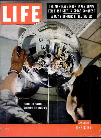
Everyone [sic] probably has the story tucked away in their head that science fiction author Arthur C. Clarke was the father of the communications satellite. I only recently realized, though, that satellites have, if not a thousand, then at least two fathers.

Dr. John R. Pierce
was Executive Director of Bell Labs’ Research Communications Principles Division. He coined the word “transistor.” And in 1955, independent of Clarke’s 1945 conception of manned, geostationary satellites, Pierce published a proposal for an unmanned communications satellite.
“Orbital Radio Relays” was published in April 1955 in Jet Propulsion, by the American Rocket Society. Pierce calculated that relays in space would be useful for transoceanic communication and proposed three types:

(a) 100-foot reflecting spheres at an altitude of around 2,200 miles; (b) a 100-foot oriented plane mirror in a 24-hour orbit, at an altitude of 22,000 miles; (c) an active repeater in a 24-hour orbit.

He was concerned with maintaining proper orientation in cases (b) and (c), the geostationary orbits, and so concluded that (a), a 100-foot inflatable sphere, was the easiest, most feasible starting point.
So yes, Pierce’s proposal triggered NASA’s early work on Project Echo, and NASA teamed with Pierce’s Bell Labs to operate it. Meanwhile, by 1960, Pierce was already well along on developing the first commercial satellite, Telstar I, which launched in 1962.
I’m kind of blown away by how much major work Pierce was involved in, but also at the breadth of his contributions and interest. And yet I’d basically never heard of him [or, rather, made the connection.] He wrote regularly for a non-expert audience on the role of technology in art, music, and literature. His 1968 collected essays is titled, Science, Art, and Communication.
But he was no technological evangelist, no Marshall McLuhan-style pop guru. And certainly not even remotely avant-garde. As far as I can tell, there were no Billy Kluver-style artist collabos for John Pierce.
Pierce opened a speech about Echo I at the Economic Club of Chicago on Dec. 8, 1960 by quoting Milton:

Sweet Echo, Sweetest nymph–
Sweet Queen of Parley, Daughter of the Sphere!
So may’st thou be translated to the skies
And give resounding grace to all Heaven’s harmonies!

So even as he zeroed in on the cost and technical calcuations needed to realize them, Pierce had to have been conscious of the beauty, the aesthetic perfection, even, of the satelloons he conceived.
A few weeks ago, I stumbled across an insane collection of photo negatives relating to Project Echo, including this image, of Pierce at the Palmer House hotel for the Economic Club dinner, prepping a fully functioning demo how Echo I works. Fully functioning. They are not miming; there are actual vacuum tubes and whatnot underneath that transmitter dish and the horn antenna. And of course, there’s a chandelier-sized satelloon hanging from the ceiling. Dr. John R. Pierce is now my favorite performance artist, and I must collect the ephemera from his most important work.
jbpierce_echo_palmer.jpg

9 Artists/ 9 Spaces: OG Minnesota Awesome

Oh, RO/LU, you are so awesome for posting this.
wegman_9spaces_rolu.jpg
9 Artists/ 9 Spaces was a public art exhibit organized in 1970 for the Minnesota States Art Council, while the Walker Art Center’s new building was under construction. The concept of creating temporary, site-specific works was almost unheard-of, but it’s since become an international norm of public art practice. The show was organized by none other than Richard Koshalek, who was assistant curator at the Walker at the time, but who is now the director of the Hirshhorn Museum.
From a purely practical standpoint, I’m afraid Peter Eeley is right, 9 Artists/ 9 Spaces “proved in many ways a disaster.” If anything, Eeley’s list of problems–“works were vandalized; damaged by accident; and shut down by the police for reasons of safety, fear, and improper permitting”–completely undersells the near-total mayhem surrounding the show.
Fortunately, Peggy Weil published what is apparently the first extended history of 9 Artists/ 9 Spaces as part of a larger exploration of public art. It is truly incredible.
Just one incident: William Wegman wanted a large vertical image to be rendered in horizontal format, so he proposed a large billboard painting of Minneapolis’s Foshay Tower on its side. The work, unfortunately titled What Goes Up Must Come Down, was installed on the U of M campus. Only no one notified the campus police of the project, and they freaked and called the FBI, who “showed up at Koshelek’s office the next morning to inform him that they’d read it as a bomb threat and dismantled it.”

Wegman himself posted about the 40-year-old show on his blog
a couple of weeks ago, after being contacted by the Walker; the billboard is apparently featured in a new tapestry created for the museum by Goshka Macuga. In fact, digging around a bit, almost the only info online about 9 Artists/ 9 Spaces seems to come from Weil and this Macuga project.
Whatever happened on the ground at the time now seems frankly awesome and entertaining; the very idea that public art could instantly provoke a wide range of heated responses seems almost quaint. But of course, such bemused hindsight requires an idealized, incomplete grasp of the political and cultural context of the show; the idea of bombings and long-term occupations of parks in St. Paul sounds positively surreal, but it happened.
The failure, really, is ours, for not remembering, knowing, studying, and learning from this rather spectacular-sounding show. Someone get me Koshalek on the horn!
Peggy Weil’s history of 9 Artists/ 9 Spaces, 1970-71, organized by Martin Friedman and Richard Koshalek [linkall.com, via RO/LU, who has other links and pictures]
What Goes Up Must Come Down [wegmansworld (!!)]

WTF Copyright! Photomurals At The Louvre

Revs & Cost in le Louvre !
Good grief. When McDonald’s in the Louvre made a giant photomural wallpaper from a Jake Dobkin photo of REVS & COST tags, which was included in a Hugo Martinez book, did they bother to ask either REVS or COST or Hugo or Jake for permission? No, of course not.
They just licensed the images from the French publisher, which actually didn’t have reprint rights to license. And the whole thing appears to have been settled for $800, or approximately two hours of Patrick Cariou’s lawyer’s time.
Revs & Cost in le Louvre [ekosystem’s flickr via c-monster]

Witch Balls And Gazing Balls

I’ve seen a million and one lawn ornaments without ever noticing any connection to satelloons. And then I saw this odd ball self-portrait of Edwaerd Muybridge last spring at the Corcoran [detail below], and I”m like, big shiny Victorian garden balls and satelloons!
muybridge_mirror_detail.jpg
Actually, I see it was the other way around: Muybridge was in May, and tricky photographs using mirrored balls that happened to be satellites was in March.
vanguard_life_06031957.jpg
Anyway, that’s when I realize I have no idea what they’re actually called, or how to find them, because they’re called something besides “those+glass+lawn+balls” or whatever. And so I start trying to figure out when I might accidentally run into our neighbor who has one, so I can ask.
Then last fall, on a trip to Amsterdam, we were walking through the antique scientific instrument district, we went into Staetshuys Antiquairs, which had some incredible and odd-looking globes and orreries in the window. And there on the edge of the mezzanine:
witches_balls_ams.jpg
Big [and small] shiny balls. Thick-looking, silvered glass globes, but hanging on chains, not sitting on grass. Staetshuys’s Stephan Meulendijks explained that they are called witch balls, and they served to deflect evil spirits from the windows of your house in 18th century England. Most witch balls I see discussed online, though, seem to date from the late 19th and early 20th century.
Wikipedia’s entry for witch balls shows hand-sized globes, but a couple at Staetshuys measured at least 30-40cm. [Actually, the one pictured, from the V&A, which was originally “acquired as a ‘Witches ball,'” and is now labeled a “bauble,” is “almost certainly a Christmas tree decoration.”
Anyway, the garden variety, are known as gazing balls, which is pretty close to a satelloon after all.

Andrea Bowers On The Political Landscape

Thomas Lawson’s 2010 interview with Andrea Bowers is like five kinds of great. It concerns the works in her show at Susan Vielmetter in Los Angeles, “The Political Landscape.” Bowers’ story of making a video piece about activist and Bush-era public land auction-saboteur Tim deChristoph has some nice critiques of the Earth Art Boys. And it’s surprising how surprising so many of the reactions were to her immigration- and border-related drawings.
bowers_vielmetter_olivado.jpg
But I can’t not post a bit of the discussion of the centerpiece of the show. Titled No Olvidado – Not Forgotten, the 10-foot-high, 23-panel mural/drawing contains the names of several thousand people known to have died crossing the Mexican-US border:

AB: Yes, it’s a hundred-foot drawing.
TL: And it is set up as a memorial, it’s a very grand piece. Let’s talk about it. Since it is monumental, it presumably required a different way of working?
AB: Right. I worked with a graphic designer and several assistants. It resulted from a conversation with an activist, Enrique Morones. He founded an organization called Border Angels. They started off in I think ’86, providing water and blankets to people crossing the border.
TL: And many die in the attempt–are they killed out there in the desert, or do they die from exposure and thirst?
AB: It’s both, but in many cases nobody knows. A lot of people die from dehydration or temperature, but there are also people who are killed. So Enrique collects names of anyone who dies migrating from Mexico to America. He actually has about ten thousand names. He finally admitted that the group of names he provided to me, a list of four or five thousand, is only up to the year 2000.
I’ve always been making memorials in one way or another, but memorials that I thought would never be made, or memorials that were kind of impossible to make. I’m fascinated by the Vietnam Memorial in DC, and how listing names functions in general. An important part of what I do concerns this documentary-type collection of information.

A Story about Civil Disobedience and Landscape: Interview with Andrea Bowers [eastofborneo.org]

Verne Blosum Found! Or Rather, Found By Verne Blossum

vb_twin_expiration_uncg.jpg
You stumble upon something that Google doesn’t know anything about, and you post about it, and then a while later, the other handful of people wondering about the same thing eventually email you, and you try to figure this stuff out together.
Thus it is that the Verne Blosum Fan Club is proud to welcome the Greensboro Chapter to the table.
The other day, a curator from the Weatherspoon Art Museum contacted me after seeing my 2010 posts about the pioneering Pop Art painter Vern Blosum. Because it turns out the museum which is affiliated with UNC-Greensboro, has a Verne Blossum painting, Twin Expiration, above, from 1962.
verne_blossum_wp.jpg
I first found out about Blossum when his parking meter painting, Violation was illustrated alongside Andy Warhol in a 1963 Washington Post article about Alice Denney’s foundational Pop Art show at the Washington Gallery of Modern Art.
Then it turned out MoMA has a Blosum parking meter as well, Time Expired, purchased for them in 1964 by Larry Aldrich. [No, I’m not typing it wrong, his name shows up in contemporary sources with both one s and two, with an e and without.]
blosum_sjsu.jpg
The Weatherspoon discovery [for whatever reason, their collection database has not been indexed by Google] comes on the heels of another out-of-the-blue email from some folks in California. Seems they’d come across Vern Blosum in the catalogue for Pop Art USA, a 1963 exhibition curated by the Pasadena Art Museum’s own John Coplans. That Blosum, titled 25 Minutes.
vb_pop_art_usa.jpg
Clearly, there’s a theme, and I’m not just talking about parking meters. 25 Minutes was apparently lent by the L.M. Asher family. Betty Asher was one of the major collectors and supporters and curators at LACMA for many years. Just phenomenal. And her son is Michael Asher.
The Weatherspoon’s Blossum turns out to have been donated in 1981 by Robert Scull, probably the most famous [or infamous, depending] Pop Art collector of them all, in honor of Virginia Dwan, who has had a long, generous relationship to the museum.
For an artist who seems to have mysteriously disappeared from the art world, Vern[e] Blos[s]um sure left behind, not just an intriguing body of work, but also an incredible body of collectors.
The work continues.

Hotel Palenque Street View

palenque_streetview.jpg
I’ve been meaning to post more about this for months, but now I’m glad I waited. In January curator/writer Pablo Leon de la Barra posted Google Street View photos of the Hotel Palenque on his blog, Centre For The Aesthetic Revolution.
I need to put a [sic] after basically every word in this sentence, but it’s pretty jarring to see a place you know only from an old artwork alive and well and part of the real world. Hotel Palenque was supposed to be a white man’s fictional, archeological non-site, not an actual site, where people stay when they come to town, and certainly not a real, surfable place on Google Street View.
monk_color_reversal_nonsite.jpg
But this is all precisely de la Barra’s point, too. He originally Googled the hotel because he was preparing a text on Jonathan Monk’s Color Reversal Nonsite with Ensuite Bathroom [2009, above] for the Museo Rufino Tamayo in Mexico City. Monk’s work is a mirrored replica of the Hotel Palenque sign, only upside down and backwards, as it would be loaded in a slide projector.
Just as the entropy of development means that once-remote earthworks are now tourist attractions on the GPS grid, de la Barra lays out how Smithson’s exoticized, Yucatan jungle ruin/playground is now more fully recognized as someone else’s [sic] home turf. And while it may be surprising to hear that Smithson’s Hotel Palenque was only presented for the first time in Mexico in 2005, it should surprise no one to learn that Smithson sounded like a drunken gringo.
REVISITING HOTEL PALENQUE THANKS TO GOOGLE MAPS [centre for the aesthetic revolution]
HOTEL PALENQUE IS ELSEWHERE: ON JONATHAN MONK’S HOTEL PALENQUE SIGN’ A TEXT BY PLB IN RUFINO MAGAZINE
Hotel Palenque, 15 Avenida 4 de Mayo on Google Maps [google maps]
Previously: non-site non-art, Smithson’s Hotel Palenque
Visiting Artist: U of U lecture on Smithson

Robert Irwin’s Black Plane

irwin_whitney_chinati_16m.jpg
Andrew Russeth has a great post about the making of Robert Irwin’s Black Plane. As part of the Whitney’s 1977 survey of the artist’s work, Irwin had the museum staff paint the intersection of 42nd St & Fifth Avenue, a certain heart of the city, with blacktop sealer. The image above is an aerial photo from the Chinati Foundation newsletter, 2001, which accompanied an interview of Irwin by Marianne Stockebrand.
It, along with the date of the Chinati publication, December 2001, reminds me of a proposal for the rebuilding of the World Trade Center site that Ellsworth Kelly made in October. In early 2003, after seeing an aerial photo of the site in the Times, Kelly painted a green trapezoid as a stand-in for the large grass mound he envisioned, and sent his collage to Herbert Muschamp. The artist also noted that other artists he’d spoken to, including Joel Shapiro and John Baldessari, also thought that nothing should be rebuilt on the WTC site.
ellsworth_kelly_ground_zero_nyt.jpg
Muschamp arranged for Kelly’s collage to be donated to the Whitney.

On Size Matters

And speaking of Richard Serra. I can’t figure out how James Meyer’s 2004 Artforum essay on the problematics of size in contemporary sculpture got by me until now. It ends too soon, but it’s pretty great.
Beginning with the overwhelming Tate Turbine Hall pieces by Olafur Eliasson and Anish Kapoor, Meyer retraces the history of sculptural size and scale, and how minimalism’s supposedly non-anthropic form was still keyed to the human viewer’s presence. And how post-minimalist folks like Tony Smith and Richard Serra got into, basically, a size arms race, which manipulated the spatial power and experience of the institution instead of critiquing it or fostering self-aware perception. [I’m collapsing a whole lot here. It’s really worth a read.]
Anyway, I mention it now for two reasons, the first being that Meyer begins his history with the 1940s and Abstract Expressionist murals:

SCALE ENTERS THE DISCUSSION of postwar art within the context of Abstract Expressionism. The development of the mural canvas by the late 1940s introduced a bodily scale into painting–a scale that was variously described as one sustained between the painter and the work and between the viewer and the work; on one hand, a phenomenology of making, and on the other, one of perception. Jackson Pollock famously spoke of his drip method as a means to “literally be in the painting.” Mark Rothko noted that he painted “large pictures … precisely because I want to be very intimate and human.” Mural scale was seen as an antidote to the easel scale of Cubism and Surrealism and the illusionism this embodied. As Pollock observed in the same statement. “The tendency of modern feeling is towards the wall picture or mural.”

Which means postwar sculpture and space becomes yet another aspect of the photomural’s history and influence I have to look into.
The other, bigger [sic] reason, though, is Meyer’s articulation of size-ism and awe-based exhibition experience. His is one of the few strongly argued critiques of otherwise-sacrosanct subjects like Richard Serra’s giant torqued sculptures and the museums that fit it, particularly Dia:Beacon and the Guggenheim Bilbao:

Having demanded and inspired the enlarged spaces that museum directors and trustees find it so necessary to proffer, Serra’s sculpture has become the contemporary museum’s major draw, an attraction of sufficient size and impact.

satelloon in the grand palais, mockup with serras
This challenge to the pervasive art world conflation of size, significance, and permanence is basically the context out of which I hatched my own idea to exhibit a Project Echo satelloon in an art space. The problem being, of course, that since all the world’s biggest, newest museums were built to accommodate Richard Serra sculptures, there are less than five venues that could actually show a 100-foot diameter spherical balloon sculpture. They’re just as prone to stylistic and functional obsolescence as a 19th century, fabric-walled salon.
Of course, the real problem is I hadn’t read it, and I really should have.
No more scale: the experience of size in contemporary sculpture, James Meyer, Artforum Summer 2004 [findarticles]

Richard Serra Drawings: The Making Of

Richars Serra’s work, and especially his drawings and sketches, have a pretty foundational place in my art worldview. So I’m stoked to see the Met’s drawings retrospective, especially after Brian Dupont’s process-oriented perspective on the work and the show.
I get really wonked out thinking about Serra’s process and have tried to imagine how to capture the conception and fabrication of his steel sculptures in a show–or in as visceral a way as his corner splash pieces do. Besides the rare chance of seeing Serra’s sketchbooks, I think Brian makes a good case that the large oilstick drawings embody their own making as much as anything Serra’s ever done.
Intent or Artifact: Richard Serra’s Drawings. [briandupont]

One Foot Scale

nist_foot_standard.jpg
The curators of NIST’s collection of historical and scientific artifacts have thrown open the racks in hopes of crowdsourcing the origins of some unknown pieces.
On top of the list: this brass one foot scale, in a handy, fitted, velvet-lined travel case, which is obviously the inspiration for Walter de Maria’s High Energy Unit [also here]. Love that thing.
demaria_highenergy_bar.jpg
Anyway, case closed. What else ya got, NIST?
One Foot Scales: NIST Digital Collections crowdsourcing initiative [nistdigitalarchives]