
Oh Gerhard-Richter.com, why did I ever doubt you?
Last February, while holed up in the Snowpocalypse, I thought the hell out of the Serpentine Gallery’s catalogue for Richter’s 4900 Colours. The work consists of 25 enamel color squares arranged randomly on 196 5×5 aluminum laminate panels, and it relates very closely to the random, pixel-like stained glass window the artist created for the Cologne Cathedral in 2007, which was in turn related to an earlier color grid painting Richter did in the 1970s.
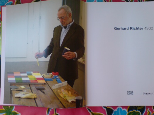
The frontispiece of the catalogue [above] shows the artist, nattily dressed, with brush and paint in hand, contemplating the final yellow square on a 25-square panel. Yet the text describes the actual production process for 4900 Colours, which involved random color placement determined by computer [the same program used to create the window], and mass production of enamel tiles, which were assembled and bonded to the aluminum substrate.
How to reconcile this apparent contradiction: Benjamin Buchloh praising the work’s industrial facture, while the making of photo captures The Touch of The Master’s Hand? And to complicate matters–or to solve the paradox–the grid on the painting Richter was photographed working on does not match any of the 196 panels in the piece.
The answer was right there on gerhard-richter.com all along. Almost. A search for all paintings made in 2006 and 2007, around the time of the cathedral window and 4900 Colours, turns up ten paintings, all 2007, titled 25 Colours, which have identical dimensions and materials, and which appear to have identical colors, as the 196 panels in 4900 Colours.
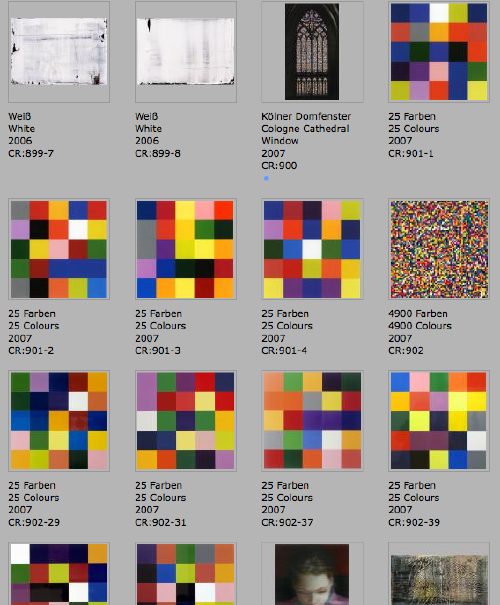
Thanks to the artist’s catalogue-raisonne-as-you-go numbering system, we can see the order in which they were created, and their apparent relationships or context. The Cologne Cathedral window is actually listed under paintings as CR:900, and is followed by four 25 Colours works, CR:901-1 through 901-4. Then comes 4900 Colours, CR:902, and six more 25 Colours numbered–wait for it–CR: 902-29, -31, -37, -39, -49, and -50. Which sounds like a series of four works, plus a series of panels, 196 of which go together, and 6 of which become autonomous works.
But. The photo Richter’s painting up top doesn’t match any of these ten, either. And if sharing a CR number means anything about their production, then the six 902 paintings are made exactly like 4900 Colours: at an auto body shop. Are CR:901’s handpainted? Is the photo in the book of a reject, or a study, a 900.5 whose handpainted facture didn’t pass muster? I guess we still don’t know.
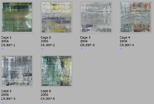
This chronological view, though, adds another dimension to the context of Richter’s process, and it ties together three major projects involving randomness: 4900 Colours, the Cathedral window, and a suite of six large abstract paintings named for John Cage. There are 25 more squeegee paintings in between the window and the Cage paintings, but they are listed under only two CR numbers: 898 and 899. If I understand my Richter process, that means he worked on them in two batches, which might have taken “weeks.”
I’d completely forgotten that the installation video for 4900 Colours reminded me of Cage’s incredible exhibition-as-performance, Rolywholyover.
But I remembered watching Rob Storr talk about the Cage Paintings, though he doesn’t project their relationship forward. Or sideways. Richter’s window was dedicated in 2007, but the design was unveiled, fabrication had begun, and fundraising had been completed in September 2006. Which means Richter was working on the window and the Cage Paintings concurrently.
Storr quotes Cage on how, whatever randomness exists in your process, what’s not “an accident is what you decide to keep.” Which is about as close an answer as I can get for what happened to that grid painting up top.
So did the need for window randomness lead Richter to Cage, or did Cage lead Richter to randomness? I guess I’ll have to start digging.
Category: art
Gerhard Richter 4900 Colours Microsite
In addition to the world’s greatest artist website, artist Gerhard Richter also makes paintings.
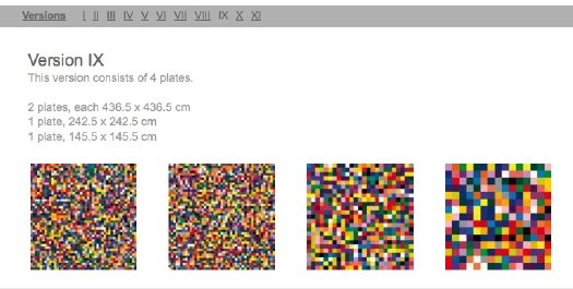
Now these two endeavors come together with the debut of a micro-site devoted to 4900 Colours, the set of 196 5×5 grids of 25 randomly applied enamel-painted squares, mounted on Aludibond panels. 4900 Colours can be exhibited in any of 11 configurations. Above is Version IX, which I chose for its apparent zooming-in-on-pixels quality.
One point of note: the website lists 4900 Colours in the /editions/ folder. Update: the microsite URL has changed; it is now listed in /paintings/
And two points of great relief: the 4900 individual squares were indeed sprayed-on enamel, not handpainted by the finely dressed artist; and there are no drop shadows. I think we are making real progress here.
www.gerhard-richter.com/art/paintings/4900-colours/ [gerhard-richter.com via @gerhardrichter]
Previous coverage of 4900 Colours:
The Making Of, with special guest star Benjamin Buchloh
About facture and that handpainted square
About drop shadows and diagrammatic abstraction
Lichtspiel/ Lightplay by Laslo Moholy-Nagy
That Google Street View snafu yesterday reminded me of a still from Laszlo Moholy-Nagy’s 1932 abstract//constructivist short film, Lichtspiel, or Lightplay.
Normally, I’d say that’s the art-nerdiest possible free association in the world, but I’ve actually been meaning to write about Moholy-Nagy’s film for a while. Or more specifically, about his incredible kinetic assemblage/sculpture used to make Lichtspiel, the Light Space Modulator.
Light Space Modulator is a motorized sculpture made of glass, mirror, steel, and acrylic, and it was a crucial object–or project–for Moholy-Nagy for more than two decades. The dates generally given for its construction are 1922-30, but the artist worked on or with it until he died in 1946. Last fall, Alice Rawsthorn wrote in the Times about the tragicomic scene of the refugee artist fleeing the Nazis in the 1930s, family and Light Space Modulator in tow, and having to explain the sculpture to customs and border officials along the way. The original was given by Moholy-Nagy’s widow to the Harvard Museums, but more on that later.
According to the artist’s official chronology, Lichtspiel [full title: Lichtspiel schwarz weiss grau] was made around 1930 in Berlin, and first shown in 1932 [MoMA has a brochure, designed by the artist, for an exhibition and screening.]
According to MKZ:
Lichtspiel, schwarz-weiß-grau was originally supposed to consist of six parts, but only the last part was filmed. The first five parts were supposed to show different forms of light in set combinations: from the self-lighting match, automobile headlights, reflections, moonlight, and colored projections with prisms and mirrors to the production of the “light prop,” [i.e., the LSM]
This surviving segment/film, one of 7 extant Moholy-Nagy films, is listed with a 6-minute run time, but there are several excerpts and variations floating around. Here’s the original, I think:
The Times has a great account from 1952 of a screening of an “abstract art film” program organized by “Captain [Edward] Steichen” for the Museum of Modern Art’s “enterprising, energetic Junior Council,” which included both Lichtspiel and the early direct animation films of Len Lye.
But SFMoMA’s version is 5:17. The Minimalist Issue of Aspen Magazine, Nos. 5+6, published in 1967, includes a 1:40 excerpt on super-8 film. Fortunately for everyone without Aspen and/or an 8mm film projector, there’s Ubu.
Dali’s Pen Is
While scoping out the 1974 video art conference at MoMA, “Open Circuits, the Future of Television,” filmmaker Jose Montes Baquer decided that for some reason, Salvador Dali should be the artist he would collaborate with for his documentary. Baquer tells the story of gaining audience with Dali at the St Regis to pitch the project in an all-too-short interview with Christopher Jones for Tate, Etc. Magazine in 2007:
Then Dalí took a pen from his pocket. It was plastic and ivory coloured with a copper band at the centre. He said: “In this clean and aseptic country, I have been observing how the urinals in the luxury restrooms of this hotel have acquired an entire range of rust colours through the interaction of the uric acid on the precious metals that are astounding. For this reason, I have been regularly urinating on the brass band of this pen over the past weeks to obtain the magnificent structures that you will find with your cameras and lenses. By simply looking at the band with my own eyes, I can see Dalí on the moon, or Dalí sipping coffee on the Champs Élysées. Take this magical object, work with it, and when you have an interesting result, come see me. If the result is good, we will make a film together.”
The 2008 MoMA exhibit, “Dali and Film,” says this quote came from a letter from the artist. The resulting film, Impressions of Upper Mongolia, Hommage to Raymond Roussel, concerns the relationship between macro and microscopic, and was shown on Spanish TV in 1976. As interesting as it is, Baquer’s interview doesn’t exactly help make sense of what the film actually turned out to be. But the mentions of painting over film stills, and Vermeer, and the Dutch penchant for mapmaking as an art form, almost persuade me to put up with Dali’s pompous shenanigans to watch it.
Dali: The Great Collaborator [tate.org.uk]
Google Lens Cap View?

I was on the phone, trying to give directions to a friend to a small Japanese grocery store in Rockville, Maryland, so I pulled it up on Google Street View. Which turned out to be useless, but weirdly beautiful. Turns out all the Street View panos on that section of the busy road are out of focus, with mottled light patterns that look like the inside of a perforated coffee can.
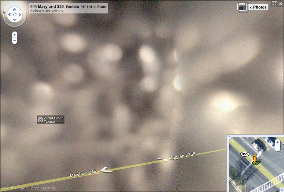
Either last week’s earthquake has sucked Rockville Pike into a wormhole, or someone skipped the “1. Remove cover from panoramic camera stalk” step in his Street View Driver’s Manual.
Two Degrees Of Project Echo: Les Levine’s Slipcover
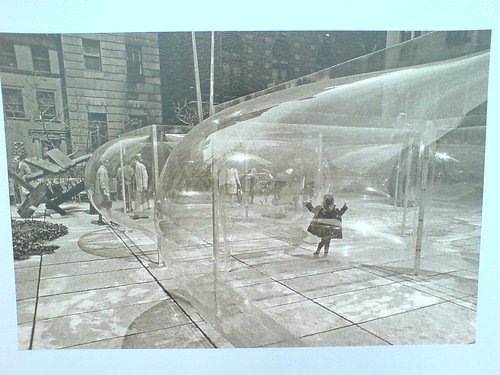
Holy smokes, people, just watch how these things turn out. In April, I spotted this photo at MoMA; it was in the second floor hallway just past the cafe, with no caption, and a date: 1970. I spent a few weeks trying to search up the name of the artist who made this remarkable, undulating acrylic structure in the Garden, to no avail [MoMA’s records didn’t have any more info about the photo.] I looked through the archive of shows, trying to match it, nothing.
Look at that thing, though, it’s like an ur-Dan Graham. an ur-Greg Lynn, for that matter. A more permanent Ant Farm inflatable. Suddenly, it occurred to me to ask John Perrault, who’s probably forgotten more than I’ll ever know about postwar art in New York. Sure enough, he nailed it: Les Levine. Star Garden, but 1967, not 1970.
Turns out 1967 was a great year for Levine–actually, looking through his works at the Center for Contemporary Canadian Art, a lot of years were great years for Levine. The Silver Environment (1961), vacuum-formed mirrored plastic? fabric? The perceptually disorienting acrylic bubble structures like Star Garden or Supercube Environment (1968)?
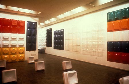
Disposables (1968) [above], a pop-minimalist grid of vacuum-molds of household objects, sold cheap and meant to be thrown away when their moment is over? Wow, Levine’s Restaurant (1968), New York’s only Canadian Restaurant, operated as a artist project, like Gordon Matta-Clark’s Food or Allan Ruppersburg’s Al’s Cafe, only earlier? Is that really TV test pattern print clothing there in 1978?
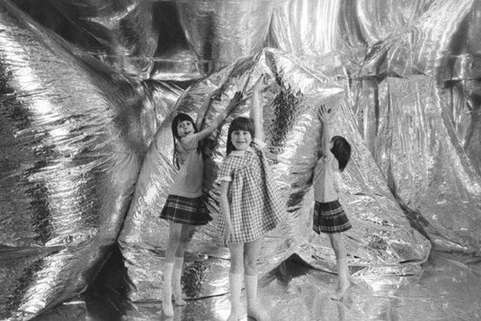
And then there’s Slipcover, a 1967 installation at the Architectural League [image via], which ran concurrently with Star Garden: three rooms covered in sheets of mirrored Mylar, where the space is constantly in flux because of the giant Mylar balloons inflating and deflating. The NY Times article shows Levine working on a balloon while one Linda Schjeldahl seals the edges of the Mylar wallcovering. Schjeldahl, Schjeldahl, where have I heard that name before?
Of course! The University of North Dakota’s archives of Gilmore Schjeldahl, founder of the Sheldahl Company!
The Company was the primary contractor for the Echo II Program. There are also files which contain information about the Echo I and II satellite balloons, as well as samples of Echo I and Echo II skins, and a file containing information about an art exhibition by artist Les Levine in 1967, at the Architectural League in New York City, which featured rooms made of Sheldahl’s Mylar laminates.
Billy Kluver, whose company Bell Labs operated the Project Echo satelloons, introduced Andy Warhol to Mylar and helped him make his 1966 Silver Clouds.
Meanwhile, the manufacturer of those satelloons supplied the same Mylar for Les Levine’s 1967 Slipcovers. Who had some help installing from his friend Linda Schjeldahl, the daughter-in-law of the company’s founder. A friend who, like her husband, Peter, was somewhat involved in the New York art world at that point.
Let Brillo Give You The Moon–Free!
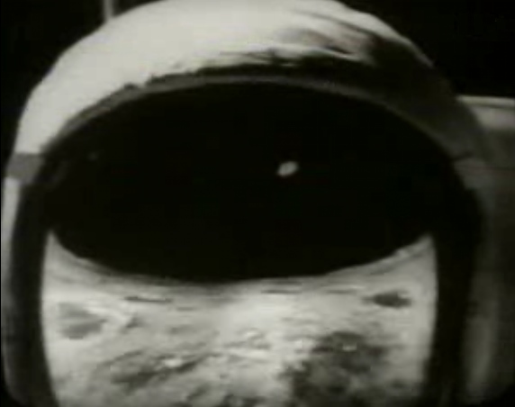
I was half-watching the German artist Ferdinand Kriwet’s Apollovision, a film & sound & video collage of the Apollo 11 moon landing as American media spectacle made, incredibly, in 1969, when I heard this:
Now you can follow the Apollo astronauts as they explore the Sea of Tranquility and the Ocean of Storms!
Brillo offers you an Official Rand McNally 18×24-inch Moon Map
Just send two labels from any Brillo product
to Brillo Moon Map Offer
Let Brillo give you the Moon–free!
Which is hilarious, except that it’s completely not. How quickly did Brillo Boxes transmute from banal, everyday product to icon of Pop Art? For those who lived through the 60s, the dissonance might have been jarring, but now, Brillo just is an art object. What was it like to see it in 1969, when Pontus Hulten was, er, figuring out what to do with all those leftover boxes? Or when the folks in Pasadena and LA were asking Andy if they could whip some up, too, would he mind? It’s for a show? What was Brillo in the culture at the moment it was making Art History?
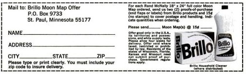
I’m not sure it was anything, or that it really cared terribly much about Art History. As I write this post, the only Google result for “Brillo Moon Map” is from a
rather simple, beautiful ad in the August 8, 1969 mega-moon issue of LIFE magazine. It’s just one of many ads with lunar tie-ins, ads for everything from frozen foods [“Everybody who’s been to the moon eats Stouffer’s”] to frozen foods [“Congratulations Neil, Buzz and Mike. We’re just glad we could help./Frozen meals provided by O’Brien, Spotorno, Mitchell, a subsidiary of the Del Monte Corporation.”] to toothpaste [Crest: “The Astronaut Dental Care Program”].
Hulten and the folks in Toronto who exhibited actual cardboard Brillo boxes got their shows up just in time, because by 1969, Brillo had redesigned its packaging. [update: in 1967, actually.] Which meant that the 1970 Pasadena boxes were now out of sync with the product they replicated; they were historic, not copies of Brillo’s boxes anymore, or even James Harvey’s, but copies of Warhol’s Brillo Boxes.
Was there any moment where Warhol contemplated keeping them conceptually linked, maybe instead of varying the size, having the 1970 Brillo Boxes fabricated to look like Brillo’s 1970 boxes? I’d guess no, but I haven’t even heard the idea floated before. Warhol made his Brillo Boxes point in 1964, and the rest is history.
But what are the conceptual implications of the Brillo Boxes, and how did they develop? They were sculptures, symbols, objects, appropriations, readymades [at least the cardboard versions exhibited were]. If they had a conceptual element to them, though, might that affect the whole Hulten Box Affair, which I obviously can’t wrap my head around?
Watch Kriwet’s Apollovision (1969) on Ubu [ubu]
I’m Ready For My Closeup, Brother DeMille
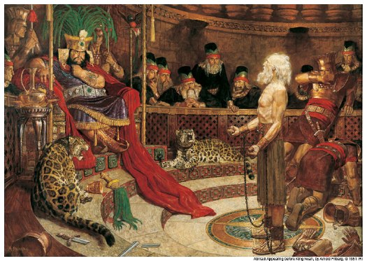
The things you learn at church. So of course I knew that the late illustrator Arnold Friberg’s dramatic paintings of scenes from the Book of Mormon, with ripped Nephites and Lamanites striding around the Promised Land, are lodged in every Mormon’s head for the last three generations. [If you don’t believe me, as you study Friberg’g painting above, go ahead and listen to this impromptu ukelele rendition of “Abinadai” by the at least somewhat LDS ska masters GOGO13, who ask the eternal question of wicked King Noah (L), “Why you got that flower pot on your head?”]
And I knew that Friberg also did the concept studies, opening titles, and some key costume designs for Cecil B. DeMille’s 1956 The Ten Commandments. What I did not know is how closely those two men–and those two over-the-top religious projects–were intertwined.
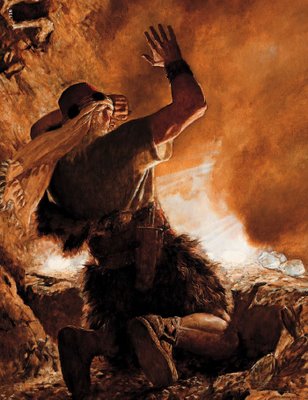
So let it be written: Brother of Jared sees the finger of the Lord, Arnold Friberg, 1951
Friberg was commissioned to make twelve BofM paintings in 1951 for the LDS Church’s children’s magazine, The Children’s Friend. Four ran in 1953 and four in 1954, but Friberg stepped away from the project for several years, after growing frustrated with doctrinal micromanaging of the images. [1]
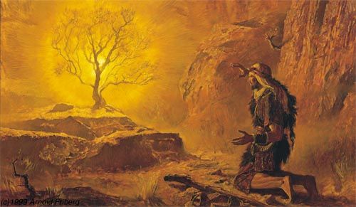
So let it be done: Moses and the Burning Bush, Arnold Friberg, 1954
It was DeMille seeing a portfolio of Friberg’s Book of Mormon lithographs in 1954 that clinched him the The Ten Commandments gig. Friberg’s illustrations were extremely close to the finished look and feel of the movie, and in the process of working on the film, Friberg and DeMille became close friends.
Which led to DeMille meeting the President of the LDS Church at the time, David O. McKay. Who invited DeMille to speak at Brigham Young University’s commencement in 1957. Which he did. He basically gave a sermon about the Ten Commandments. As part of BYU’s The Board, a community service–meets-Mechanical Turk resource, someone named Laser Jock retyped DeMille’s entire speech from one of BYU’s two surviving transcripts. It’s available on PDF. He was quite a preacher. [DeMille’s relationship with BYU was such that after his death in 1959, his extensive archive was donated to the university. It is in the Harold B. Lee Library’s Special Collections department, which seems to be almost entirely unavailable–or even unindexed–online. Amazing.]
Anyway, Friberg went back to finish the last four Book of Mormon paintings after the film, and they were published in The Children’s Friend between 1961 and 1963. But more importantly, the paintings were included in softcover copies of the actual Book of Mormon starting in 1961. Which all but put the canonical seal of approval on them, paintings essentially functioning as scripture.
There has to be several doctoral theses worth of material about the cultural and theological impacts of Friberg’s religious superheros, and on the symbiotic relationship between one of classic Hollywood’s most bombastic religious spectacles and one of America’s most unorthodox religions. Maybe there already are.
[1] Apparently, Churchs officials [whether ecclesiastical leaders of bureaucrats, I don’t know] at the time had a strong aversion to LDS artists making portraits of Christ. They had no problem with using non-LDS artists’ naturalistic representations, though. After much back and forth, Friberg’s solution was to only show Jesus as a tiny figure descending from the sky.
This reluctance eventually faded, and there are plenty of illustrations of Christ by LDS artists in use, and even more in circulation. But I distinctly remember the frisson of faith when the Church commissioned a new portrait of Christ, and the rumor mill began churning about why it was the most accurate ever, because it was based on Christ’s ID badge for the Church Office Building or whatever. nother thesis topic, perhaps.
Brigham Young University Commencement Exercises
Commencement Address: Mr. Cecil B. DeMille
Introduced by Pres. David O. McKay
May 31, 1957 [theboard.byu.edu]
Journal of BofM Studies: The Book of Mormon Art of Arnold Friberg: “Painter of Scripture” [maxwellinstitute.byu.edu]
Fumis de L’UX
The only word I can think of is the one Things already used: epic.
Sean Michaels goes long and deep for a Brick Magazine profile of the not quite invisible, not quite underground world of L’UX, Untergunther, La Mexicaine de Perforation, the culturebusting, space-infiltrating collective[s] who built a cinema in the catacombs of Paris, and who surreptitiously restored a giant clock in the Pantheon.
At least those are the activities we know about. Michaels talks at length with Lazar Kunstmann as well as with other urban explorers, to try to map out just what’s going on down there. I can’t say we really know any more than we did, but it’s still fascinating stuff.
I have written a lot about LMDP and Untergunther over the years. In 2004, I interviewed Kunstmann and was the first to publish the screening program for LMDP’s subterranean cinema, l’Arenne de Chaillot.. And when the Pantheon clock story broke, I posted pictures of their awesome Rietveldian crate chairs.
It’s been great stuff and great fun, but I’ve never been under any illusion that I’m breaking news or actually investigating. I’m just asking questions that seem obvious to me, but that other journalists or writers never seemed to ask [like what films would you show in a secret catacomb cinema?], and which Kunstmann and his UX colleagues decide to answer.
Michaels ponders at length the somewhat maddening empirical unverifiability of some of UX’s sensationalistic press coverage:
Kunstmann’s tales, the activities he recounts, the cataphile culture he invokes–it is, [UX chief] Lanso suggests, a fumis. It is smoke. It is the smoke that fills our vision, fills newspaper pages, conceals the group’s true projects and real work.
…
As for what this “real work” is, Lanso will not say. These projects, she underlines, are secret. “Don’t think that I say this against you, or against journalists in general. It’s the same for everyone. To be able to do what we do, this is how it has to work.”
I have reached a dead end. Lanso’s secrets are tantalizing, but I can neither confirm nor deny them. UX’s deepest riddles cannot be Googled. The question I ask is, Do I believe them? And then I ask, Do I want to believe them? And then I know my answer.
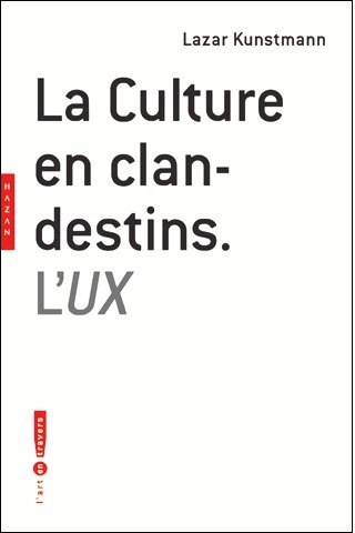
One thing I DO know for sure, I missed the debut of Kunstmann’s book last year. La Culture Clandestins, L’UX, which I now just ordered from Amazon.fr. Stay tuned.
The Lizard, the Catacombs, and the Clock: The Story of Paris’s Most Secret Underground Society by SEAN MICHAELS, Brick, Summer 2010, Vol 85. [brickmag via things]
Buy La culture en clandestins : L’UX [amazon.fr]
Melvin Sokolksy Bubble Collection, Pas Touché
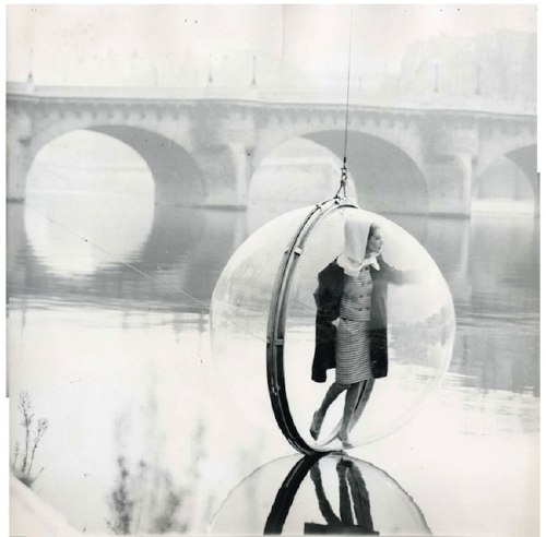
Melvin Sokolsky’s classic Bubble Collection photoshoot for Alexey Brodovitch’s March 1963 Harper’s Bazaar got BoingBoinged this week, and given the recent reorientation of the blog towards retrofuturistic orbs, Jason kindly passed along exactly what I was looking for: the making of, unretouched photos from Sokolsky’s set, showing the bubble’s cables and guy lines.
According to Photo.fr, Sokolksy erased the wires right in the negative for the shots Bazaar ran, but vintage prints of outtakes were exhibited last Spring in Paris. My favorite has to be the one above, where Simone D’Aillencourt barely alights on the Seine; it’s similar to the shot used on the cover of the artist’s 2000 monograph, Melvin Sokolsky: Seeing Fashion.
Bubbles Collection images have been circulating a lot online, but the best place to see them [assuming you love Flash, that is] is Sokolsky’s own site. They’re under “Classics > Paris 1963,” and in addition to a couple of shots of the crew and the crane at the end, there’s a fantastic color shot of a bubble floating against the New York skyline. Was Bubble Over New York [actually Weehauken] a prequel to Bubble on the Seine or an encore?
Quand Melvin Sokolsky faisait des bulles [photo.fr]
Melvin Sokolsky portfolio site [sokolsky.com]
Sokolsky Bubble Collection prints, vintage and modern editions, are out there [artnet]
Making Copies
The Times reports happily on the bright future of enlarging and printing our digital images–a future which is here today!
Some companies offer the option to print onto a stretched canvas. The effect is instant art, ready to be hung. Canvas Pop (canvaspop.com) specializes in taking everyday photos, including candids snapped with a camera phone, and blowing them up without losing detail. Company technicians work on each image to ensure that an iPhone photo looks as good stretched across four feet as it does on a 4.5-inch screen.
…
It also provides postproduction help for people who are not skilled at Photoshop. Want that Hawaiian beach landscape to be a wee bit longer? Wizard Print can use so-called liquid expansion to stretch an image while keeping it proportional.
Directly related, and by directly related, I mean directly opposite: Untitled (300 x 404) [20×200]
The Wildman Of Chelsea
So woohoo, Andrew Russeth pointed back to a Charlie Finch artnet gossip column from 1998, and just wow. I was there, I mean, I remember a lot of that stuff, and it is freaking me out how alien and long ago and far away it all sounds.
One thing I didn’t know or remember, was Finch’s story from John Weber, about how he found a 1961 Robert Smithson painting in his storage while preparing his move to West 20th Street. It was called The Wildman of Chelsea.
Finch’s is the only mention I could find of it online.
But it got me thinking [again]. Smithson’s Floating Island was posthumously realized based on a simple 1970 sketch, right?
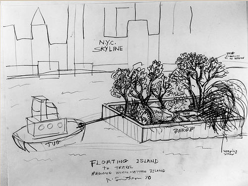
And Smithson left plenty of other comparably detailed sketches for projects. Who’s to say that The Wildman of Chelsea isn’t an early work in the series?
What’s to stop someone from realizing Wildman right now, right here? With all the beards and jorts pegged jeans around town these days, it could probably be done and posted to flickr before dinnertime.
Obviously, what’s really needed is a band of historically accurate enthusiasts to start researching this stuff in depth, and then re-presenting it, for both the aesthetic benefit of the public, but also for one’s own experiential edification. It’s like Marina Abramovic’s white-coated MoMA crew meets Civil War re-enactors. For Smithson.
The Robert Smithson Re-enactors Society.
These Lovely Arting Gifts
From Artforum:
On Thursday evening, the 2010 Renaissance Arts Prize awardees were announced. Winners Barbara Nati, Steffi Klenz, Laura Mergoni, and Natalia Saurin received awards donated by David Morante, cofounder of the prize and former Consul General of Italy in London, and a set of the rare Illy Art collection espresso cups Stati d’Animo, designed by artist Mario Giacomelli in 1997.
Oh, excuse me, espresso.
Washington Color School Dropout
I was talking shop with Tyler Green this weekend, and he told me that the Washington Post’s art critic Blake Gopnik actually did devote more than a paragraph in a review of two unrelated shows at a different museum to the National Gallery’s extraordinary exhibition of Mark Rothko’s black paintings. They’re incredible works, and the installation the East Wing’s skylit Tower Gallery is both beautiful and bold, and not just because they break with art world convention by continuously playing Morton Feldman’s related, minimalist composition, Rothko Chapel in the gallery.
But yeah, no, I still couldn’t find anything more than a cursory mention in a slight, “big picture” piece about monochrome painting in DC. For once, though, it’s not Gopnik that got under my skin.
It’s the arts editors [sic] at the Washington Post who, in 2010, not only published a sloppily argued, clichée-ridden letter about shows at Washington’s top three museums–the National Gallery or Art, the Hirshhorn Museum, and the Phillips Collection–which the obviously hadn’t seen. They managed to write a headline that matched the letter for proudly ignorant bluster:
My kids could match these color-crazed artists
Saturday, June 12, 2010; A13
I read with much interest Blake Gopnik’s review of new exhibits at the Phillips Collection [Arts & Style, June 6].
I can’t help but compare the artists’ work with that produced by some artists very close to me. While Mark Rothko’s blacks at the National Gallery invite “deep immersion and profound explanation” and Yves Klein’s blues at the Hirshhorn are about an “astonishing gesture of reduction,” my sons’ graphite on blue-lined white backgrounds invite profound explanation about the astonishing number of orcs a person can depict being killed in one scene.
It’s almost enough to make me feel sympathy for Gopnik, who actually has to work with these philistines. Or at least it helps explain some of his Corky St. Clair-isms.
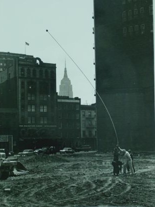
Len Lye’s Wind Wands Saved The West Village
Len Lye called his kinetic artworks Tangible Motion Sculptures, or just Tangibles, because they made visible motion and other phenomena, like the wind. In 1960, he and his wife Ann, along with some other friends, headed over to huge vacant lot near their home in the “West Greenwich Village,” and set up the first Wind Wand. It was a 40-foot aluminum tube with a small sphere on the end to catch the breeze.
Judging by this photo, from the Len Lye Foundation at New Zealand’s Govett Brewster Gallery, where the wand is leaning in the opposite direction from the blowing flag, this Wind Wand was a little too long and heavy to work quite right.
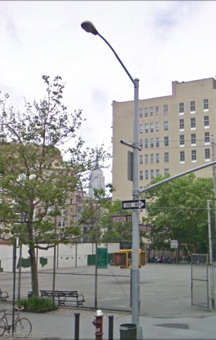
Also, the photo is backwards. That vacant lot, at the corner of Horatio and Hudson Streets, is now a city park. The building houses White Columns. Here is a correct version, followed by the current site on Google Street View.
Which reminds me, I hope the preservationists are taking up the cause of cobra head street lights.
By 1961, Robert Moses had announced plans to raze the West Village, including the Lyes’ house in Bethune St and their neighbor Jane Jacobs’ place and replace it with high-rise residential towers. To prove that their neighborhood wasn’t a slum, local artists rallied to stage a one-day exhibit at St Luke’s Chapel. Though Franz Kline apparently contributed a painting inside, the Times’ small article didn’t mention him, only the presence of Lye’s eight Wands in the playground. Roger Horrock’s biography of Lye quotes an unnamed news source as saying the St Luke’s wands, which ranged “to nearly 30 feet,” were a hit with the kids: “The wands became ultra-modern May Poles just right for a junior bacchanal.”
Lye later installed two Wind Wands on top of their house on Bethune Street, and five at NYU, where he taught. Miraculously, their gentle, hypnotic swaying fended off the forces of flashy, high-rise redevelopment, thereby preserving the West Village forever as a quirky, affordable haven for artists of all sorts. And so it remains to this very day.