Chip Of Fools

Washington Post art critic Blake Gopnik commenting on the tiny chip of porcelain Eva and Franco Mattes, the formerly anonymous artists behind 0100101110101101.org, reportedly took from one of Marcel Duchamp’s urinal sculptures:

In the case of Duchamp’s “Fountain,” could it be that the Italians are actively helping his art do its work? The Duchamp urinals we now see in our museums are visibly handcrafted replacements for his mass-produced industrial original, which disappeared early on. By pawning off a piece of handicraft, made by a hired artisan, onto his collectors, I think Duchamp was poking fun at any fool who insisted on getting an “original” Duchamp, instead of heading to their neighborhood plumbing supplier. The chip of porcelain in “Stolen Pieces” is an extension of Duchamp’s chipping away at precious art and its status as collectible commodity.

Ah, um, no.
Actually, as has been reported recently by no less august a source than The Economist, Duchamp’s Fountains replicas include two or three actual, vintage urinals Duchamp signed, showed, or sold; and somewhat more than twelve which were cast, just as porcelain is, from a clay sculpture [aka “the prototype”] made from Arthur Stieglitz’s photo of the “original.”
duchamp_prototype.jpg
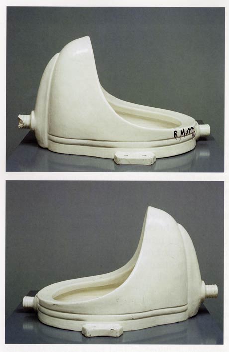
16 are included in Duchamp’s catalogue raisonnee, including the lost original and a presently lost 1953 reproduction, but not including the prototype or the additional casts Duchamp’s dealer Arturo Schwarz apparently made and has been shopping around privately.
Now to Gopnik’s fools. Here is a list, as compiled by Cabinet Magazine in 2007, of traffickers and current owners of Fountain:

  • The Philadelphia Museum of Art
  • Moderna Museet, Stockholm
  • San Francisco Museum of Modern Art
  • Tate Modern, London
  • National Gallery of Canada, Ottawa
  • The National Museum of Modern Art, Kyoto
  • Dina Vierny Foundation– Maillol Museum, Paris
  • Indiana University Art Museum, Bloomington
  • National Museum of Modern Art, Pompidou Center, Paris [which has been both pissed in and attacked with a hammer since the Matteses’ own assault]
  • The Israel Museum, Jerusalem
  • National Gallery of Modern Art, Rome
  • Duchamp dealer and MoMA trustee Sidney Janis
  • Duchamp dealer and edition publisher Arturo Schwarz
  • Larry Gagosian, who sold one to its present owner

Three are in private collections, not including Schwarz’s extras. The prototype was sold to Andy Warhol in 1973. Dakis Joannou purchased it at Sotheby’s auction of Warhol’s estate in 1988. In case you couldn’t tell, that’s the prototype up there, glazed and signed just like the rest of them.
Which ones of these does Gopnik consider fools and the butt of Duchamp’s joke? The Moderna Museet, whose Fountain was donated at Duchamp’s request? Or the Philadelphia Museum which, thanks to the Arensbergs, indefatigable Duchamp collectors and supporters for decades, now houses the largest collection of the artist’s work in the world, and which was secretly chosen by him as the posthumous recipient of his elaborate, last work, Étant donnés? All the rest? Or just all of them?

update:At AFC, Paddy has a great 1961 quote from Duchamp about his object selection criteria. Me, I unfortunately started my period commentary search in the 1973 Duchamp retrospective catalogue by Anne d’Harnoncourt and Kynaston McShine. But so far, it’s really thin. So much effort appears to be devoted to his surrealism and his traditional works: drawings, etc., that really strike me as uncompelling. Funny what a couple of generations of soaking in interpreted Duchampisms will do to a discourse.

Anyway, my point, I hope it’s clear, was not just to harsh on Gopnik, but to correct what I believe to be an inapt and unsupported claim that Duchamp considered buyers of readymades (et al) “fools,” or that they didn’t know what an “original” meant in the artist’s context. Just consider how many boites en valise he published. I’m happy to be set straight, but I believe that Gopnik doesn’t have a clue that he’s basically implying that Duchamp’s entire object-based oeuvre is a prank–which the leading museums of the world have apparently fallen for for fifty+ years.

The Civilian Camouflage Council

December 1942, the US is at war, and everyone is tinkering in his basement, doing his part to protect the civilian and industrial landscape against the latest technological threat: aerial photo reconnaissance. From a lengthy, fascinating article in Popular Mechanics:

But today civilians around the world, particularly in the United States where the home workshop abounds, are beginning to do what nature forgot: fooling the spy in the sky with camouflage. A recent estimate indicates that more than 5,000 civilians have taken up camouflage research as a serious occupation.

That number did not include the teams of artists and theater designers and architects at various museums, or much of the art and design departments at Pratt, where dean James Boudreau could be seen demonstrating Pratt’s “sun machine,” which “duplicates sun-shadow conditions at any given moment of the year”:
pratt_sun_machine_popmech42.jpg
“Since military camouflage is well in hand,” Pop Mech said reassuringly, and while “the government has not yet completely coordinated local civilian camouflage efforts,” the field is “wide open to patriotic and inquisitive minds.”
popmech_camo_1942.jpg
There followed a primer on basic camo strategies–including Dazzle painting–shadow and lighting, and photo mapping, all illustrated with photos of people photographing painted and sculpted models as if from the air.
Though they were namechecked, the groundbreaking, eerily prescient work of New York’s Civilian Camouflage Council [!] went unremarked.
Founded by Long Island architect Greville Rickard, the CCC had, with Pratt’s Boudreau, organized an exhibit of industrial camouflage designs at the Advertising Club, which opened December 8, 1941. In Dec. 14 review of the show titled, “Art In A Practical Service To War,” the NY Times’ Edward Alden Jewell said,

This is a show that every one should see. It illustrates vitally important defense methods as applied to needs that are immediate all over this country. A fortnight ago such needs might have been looked upon by the public as remote and more or less theoretical. Such is the terrible swiftness with which events have moved, they must now be recognized as of prime consequence.

Jewell then went on to discuss shifts in camouflage as they related to art history:

The progress of the art of camouflage in, say, the last three decades seems not altogether unrelated to certain “key” phases in the development of painting and sculpture. As I understand it, principles oof Impressionism and even of Cubism were examined and to some extent adapted to the uses of the camoufleur during the last World War. But in contradistinction to this trend, teh present trend parallels what in art parlance we designate as Naturalism. It may be said that in the year 1941 camouflage, whether industrial or strictly military, goes with marked singleness of purpose “back to nature.”

The show also included contributions from Stanley McCandless, then at Yale, who is known as the father of modern stage lighting.
In August 1942, the CCC-sponsored Pratt exhibit had been combined with military material and restaged at The Museum of Modern Art. Organized by The Modern’s Carlo Dyer, “Camouflage in Civilian Defense” was one of at least eight war-themed shows The Modern organized and sent on tour in 1942. Doing its part to beat back isolationism!
Fooling the Spy in the Sky, Pop Mech Dec. 1942 [via google books]

‘Mock Fuselage On Stilts’

mock_fuselage_popmech_dec42.jpg
First up, let me just say these are fantastic; I would love to see this row of bombardier training simulators parked in any gallery in the world, right next to Chris Burden’s homemade B-Car.
But then you’d have to ask The Question: a full year after Pearl Harbor, and this is really as far as we’d gotten? If all you had to go by was the pages of Popular Mechanics, you’d have to conclude the US’s entire wartime response consisted of scale models, plywood mockups, and canvas bombers on rolling stilts.
Bombardiers Train in Mock Fuselage On Stilts, Popular Mechanics, December 1942 [popmech via google books]

Non Realizzate: Proposta Per Un’Auraprogettazione

Apex Art just announced that Courtenay Finn and Gary Fogelson were selected for this year’s open curating slots. Finn’s proposal uses a work by Bruce Nauman as a jumping off point for a show about “the role of reading in artistic practice.” Fogelson’s will tell the incredible-sounding history of alternative, arts, and experimental filmmaking shown in the 1970s on Boston’s WBBI TV. Congratulations to both of them, and get cracking, time’s a wastin’!
I’d had an idea for a show percolating for a while, so I submitted it. As I re-read it now, it’s fascinating how much of it is stuff I’ve blogged about over the last couple of years. In a real sense, the blogging process was central to the development and coalescence of the show’s ideas, if not for the actual proposal, which I wrote up and submitted anonymously, as Apex Art requires.
It tied for 45th place out of 320 entries. 86th percentile, which is alright, I guess, in a B-show kind of way.
Anyway, it was inspired, as the title suggests, by Enzo Mari. It challenges the common conception of aura by applying Mari’s autoprogettazione reproduction strategy to instructions-based art practice.
And because it also includes references to the great gatherer of Unrealized Projects, Hans Ulrich Obrist, I thought I’d go ahead and share my proposal here. If you’re one of the 40 international, anonymous judges who rated it less than 4/5, I do hope you’ll drop me a line and tell me what might have improved it for you.
Many thanks to those folks who gave me feedback and art historical suggestions on the idea as I was putting it together, too. I don’t want to sound namedroppy–until we polish this bad boy up and put on this jargon-laden, Stingelpainting party somewhere else, then I’ll be thanking you often and loudly, I’m sure.
apex_dibbets.jpg
Proposta per un’auraprogettazione

A project for making easy-to-assemble furniture using rough boards and nails. An elementary technique to teach anyone to look at present production with a critical eye. (Anyone, apart from factories and traders, can use these designs to make them by themselves. The author hopes the idea will last into the future and asks those who build the furniture, and in particular, variations of it, to send photos to his studio…) – Enzo Mari, Proposta per un’autoprogettazione, Duchamp Center, Bologna, April 1974

Walter Benjamin’s concept of aura is commonly understood as a quality that distinguishes an original art object from its mechanical reproduction. Recent alternative readings [Samuel Weber, 1996], particularly of cinema–Benjamin’s archetypal medium of modernity–consider aura as something not lost in (re)production, but instead contingent upon it. Aura is generated through contextualized reception via dispersed, multiple ‘originals,’ as literary or musical aura is transmitted via books and scores.
When coupled with Benjamin’s functional reconfiguration of the distinction between author and reader [“through a highly specialized work process…the reader gains access to authorship”], production of an auratic artwork at a [spatial/temporal] remove from the artist herself becomes feasible. The instruction performs such a distancing function.
From Moholy-Nagy through Lewitt, artists have used instructions and plans to challenge the privileging of gesture and authorship. The emergence of Conceptual art saw the concurrent normalization of instruction-based practice and the “dematerialization of the art object” [Lucy Lippard, 1973].
apex_stingel.jpg
Lippard’s own seminal exhibition 557,087 (Seattle, 1969) was executed remotely using artists’ instructions, which comprised the show’s catalogue. Similarly, Do It (1993-) an ongoing exhibition/archive by Hans-Ulrich Obrist, solicits, executes and disseminates instructions from contemporary artists. [“With Do It in hand, you will be able to make a work of (someone else’s) art yourself.”]
Despite their critique of object/market complicity, instructions are regularly sublimated by capitalist constructs [i.e., editioning, certificates of authenticity] that reassert control and facilitate commodification.
Authorization thus emerges as a crucial and highly contested point of inflection/exchange for instruction-based work. Only five of 168+ instructions in Do It generate objects. One, a Felix Gonzalez-Torres candy pour (1994), was problematized when the artist’s catalogue raisonné [Cantje, 1997] reclassified it as “non-work” and reconfigured fabrication authority only for Do It‘s curators, not its audience.
apex_mari.jpg
A more conceptually robust corollary is art that applies a model exemplified by the Italian designer Enzo Mari, whose 1974 exhibition/catalogue, Proposta per un’autoprogettazione, (Proposal for a self-project) included not just blueprints for making 16 pieces of furniture, but explicit authorization to do so.
Mari’s autoprogettazione structure synthesizes Benjamin’s potential for multiple, auratic originals with the critical empowerment of readers-qua-authors, consumers-qua-producers, viewers-qua-artists.
apex_zittel.jpg
Auraprogettazione will be the first ever survey of this distinctive, exceptional genre: auratic objects, fabricated by whomever, in accordance with artists’ published instructions and authorization. Preliminary research has identified consonant works–painting, sculpture, photography, assemblage, clothing–by at least eleven artists: Daniel Buren, Jan Dibbets, Stephen Kaltenbach, Lia Maisonnave/Ciclo de Arte Experimental, Yoko Ono, Tobias Rehberger, Rudolf Stingel, Joep van Lieshout, Franz West, Zhuang Da, and Andrea Zittel.
Alongside the ‘originals’ exhibition, the gallery may be activated as a site of open, facilitated art production, or as an aggregator/repository of audience-made originals. Additional artists may be solicited to create new, permissioned, instruction-based work. And as with Mari’s original, Auraprogettazione‘s publications in print and online will propagate instructions for the exhibited works.

What Do We Think Of Ed Ruscha’s Photogrids?

ruscha_gasstation_grid.jpg
10 works from Twentysix Gasoline Stations, 1962/1989, each 50x58cm, edition of 25
I am a huge Ed Ruscha fan, have been for a long time. His artist books of typological photographs were some of the first works of art I bought out of college [fortunately, since they’re all 10-20x more expensive now].
But I confess, though I find them entirely appealing, I’ve never really been completely comfortable with the sets of 1960s photos Ruscha republished in large-scale, large-ish editions, beginning in the late 1980s and 1990s.
They’re important images, but they seem so inextricably linked to the books to me. And books are hard to show, and not as sexy to collect. So yeah, it’s totally fine, of course, but these have always seemed a little bit too much like eye candy and cashing in.
ruscha_pool_grid.jpg
Pools, 1968/1997, each 40x40cm, edition of 30 plus 10 artist proofs.
So it’s not at all surprising to me that these two particular sets were in Halsey Minor’s collection, and will be auctioned off this week.
But even though they’re dated 1962/1989, Phillips de Pury’s exhibition history for the [to me problematically named] set up top, 10 works from Twentysix Gasoline Stations, says they were shown in 1982, at the big Ruscha mid-career show at SFMOMA [but oddly doesn’t mention the follow-on venues, the Whitney and LACMA. Or maybe it’s not so odd; Phillips’ catalogues have always been a little spotty, with just as much verbiage and annotation is necessary to move the merch, not further the scholarship.]
Which I didn’t see, obviously, but maybe I’d be a little less skeptical towards these works if Ruscha has had a history of showing them in larger, exhibition-size formats? If anyone knows where Ruscha talks about these republished photos, or where they’re discussed at all, I’d love to hear about it.

What’s Happening?

oldenberg_stars_poster.jpg
This explains the “two or three Happenings” discrepancies; there was a matinee Happening on Thursday.
Also: “Globe Poster – Baltimore.”
I’ve had this on my desktop so long, I’ve forgotten where I ganked it. Oh, that’s right, Oldenburg’s print poster & ephemera catalogue raisonne, Printed Stuff (1997).
Previously: What’s Happening? Claes Oldenburg’s Stars via Time and Alice Denney
What’s Happening? Tracking Stars, Claes Oldenburg’s 1963 Washington DC Happening

Hilton Kramer: TMI

God bless him, even if he’s on the wrong side of [most of the intervening 40 years of] contemporary art history, you gotta love Hilton Kramer’s eviscerating takedown of MoMA’s 1970 conceptualist exhibition, Information, curated by Kynaston McShine:

The exhibition is, in its way, amusing and amazing, but only because it upholds an attitude one had scarcely thought worth entertaining: an attitude toward the artistic process that is so over-weeningly intellectual that it is, in its feeble results, virtually mindless. Here all the detritus of modern printing and electronic communications media has been transformed by an international gaggle of demi-intellectuals into a low grade form of show business. It leaves one almost nostalgic for a good old-fashioned hand-made happening.

Though he only mentioned one artist by name in his NY Times review [Hans Haacke], Kramer did note the “great many blowups of junky photographic materials…of earthworks,” which I assume is a reference to the four Gianfranco Gorgoni photos that introduced the just-completed Spiral Jetty to the public.
Show at The Modern Raises Questions, July 2, 1970 [nyt archives]

Otto Piene’s More Sky

otto_piene_more_sky.jpgAlright, all y’all who didn’t tell me about Otto Piene’s classic of the books-written-in-longhand era, More Sky: what else have you been hiding?

Otto Piene literally opens up new horizons here in both art and art education. His book is a plea for more scope, more space for art–for making public property artful and making art public property–for freeing the arts from the tight economic bonds that give the curators and the collectors a near monopoly. He writes, “The artist-planner is needed. He can make a playground out of a heap of bent cans, he can make a park out of a desert, he can make a paradise out of a wasteland, if he accepts the challenge…. In order to enable artists of the future to take on planning and shaping tasks on a large scale, art education has to change completely. At this point art schools are still training object-makers who are expecting museums and collectors to buy their stuff….”
The first part of More Sky covers “things to do” arranged alphabetically, A-M (Piene will take up N-Z some other time.) Like city planning, clothing, collaboration, electronic music, elements, engineering or government, graffiti, graphics, green toad jelly.
All these notes cohere into a larger statement in support of an environmental art for social use, the interaction of art and architecture and the city and the open landscape, a total ecological and elemental aesthetics.
The last part of the book, “Wind Manual,” gives a practical demonstration of things to do in just one area. But it’s a big one–the whole sky–and a lot can be done in it, making use of the wind; making human clouds, rain, rainbows; and making things that fly and float. This section is made up almost entirely of full-color illustrations of some of the things that man the artist can do to purify the skies polluted by man the money-maker and rendered fearsome by man the war-maker. The illustrations show different kinds of flags, banners, ribbons, wind socks, wind sculptures, riggings, kids and other things.
The first part was written plain, in the Spring of 1970, with no trace of artspeak jargon. And the second is plainly drawn and colored. (Piene is more versatile than most contemporary artists: he can do his abstract light-ballet things, and he can span rivers with man-made rainbows, and he can draw a recognizable picture of a bull.) The “Wind Manual” was originally drawn for instant use in schools and colleges in Pittsburgh–it was created as part of a Piene-guided public art project called Citything Sky Ballet.
The MIT Press
Massachusetts Institute of Technology
Cambridge, MA 02142

Otto Piene’s More Sky is available the 1973 edition with the fun, blue cover, and a print-on-demand version with a boring black cover. So heads up when you buy. [amazon]

Works On Paper

Thanks to Judd [no relation] Tully, I pulled Martha Buskirk’s book, The Contingent Object of Contemporary Art down again and was reminded of how awesome it is on the fascinating conflicts between Giuseppe Panza di Biumo and Donald Judd [and Dan Flavin, and Carl Andre, and Bruce Nauman].
To one degree or another, these artists disputed Panza’s fabrication of their works from plans, schematics, and certificates he had bought. The most spectacular disagreement, where Judd took out ads and wrote manifestos disclaiming sculptures and installations which Panza had realized, seems the most cut & dry. On paper.
Buskirk goes through Panza’s archives at the Getty–and Christopher Knight’s collection catalogue–to show that “Judd signed a series of certificates that were remarkably broad in the latitude granted to Panza,” that authorized Panza and followers to reconstruct work for a variety of reasons, “as long as instructions and documentation provided by Judd were followed and either he or his estate was notified.” This even included the right to make “temporary exhibition copies, as long as the temporary copy was destroyed after the exhibition; and, most astonishingly, the right to recreate the work to save expense and difficulty in transportation as long as the original was then destroyed.” [emphasis, appropriately, in the original]
The questions seem inevitable, especially in an era when Panza was the first, earliest, only, or largest buyer of both Minimalist and conceptual work. In a 1990 interview, he even conflates the two: “Minimal art is closely connected to the project, and the collector has the right to produce it, but his freedom of interpretation is very limited. He must simply see to it that the fabrication conforms to the project.”
Knight’s collection catalogue, Art of the Sixties and Seventies, gets a special mention for making “a tacit argument for the connection between minimal and conceptual art by presenting both through an intermix of photographs of objects and installations and reproductions of plans, diagram, certificates, and other documentation.” The publication of which Judd also protested, it turns out.
I wonder how much these document-based conflicts are related to the particular circumstances of Panza’s collecting: remotely, en masse, via correspondence, and largely alone. He told Knight in 1985 [before these particular conflicts arose over a show at ACE Gallery in LA of Panza work that was fabricated locally instead of shipped] that he basically spent all his free time managing paperwork for his collection. It’s not surprising if it all starts to look conceptual at some point.
[I’d point out that Panza and Flavin, at least, eventually got square, at least judging by the presence of one of Panza’s pieces in Judd’s NGA retrospective.]

A Spy In The State Department

felix_dad_state_dept.jpg
No, not Michael Whitney Straight. Felix Gonzalez-Torres, in a 1995 interview with Rob Storr:

There’s a great quote by the director of the Christian Coalition, who said that he wanted to be a spy. “I want to be invisible,” he said, “I do guerilla warfare, I paint my face and travel at night. You don’t know until election night.” This is good! This is brilliant! Here the Left we should stop wearing the fucked-up T-shirts that say “Vegetarian Now.” No, go to a meeting and infiltrate and then once you are inside, try to have an effect. I want to be a spy, too. I do want to be the one who resembles something else.

Thanks to the de la Cruzes, Felix got his chance. They must have loaned his 1991 candy pour, Untitled (Portrait of Dad) to the State Department’s Art in Embassies Program at some point, because it was also included in an AIEP 40th anniversary exhibition in 2004, which was installed in the Diplomatic Reception Rooms. Sitting on a sheet of plastic, and with a little label perched next to it. Classy.
Around the World in 40 Years: ART in Embassies Program Celebrates its 40th Anniversary [state.gov]
[image from Felix Gonzalez-Torres anthology, 2006, ed. Julie Ault, p. 84]

On Photographs, Stars, Abstract Images, Reality

More from Giuseppe Panza’s 1985 Archives of American Art Oral Histories interview with Christopher Knight, this time on Panza’s preference for abstraction:

But I believe that the modern science reveal to our knowledge a world which is far above the possibility of our eyes to see. Our eyes have limit in having perception of reality. But knowledge is going well above this limit. For this reason we don’t need anymore to use images which our eyes can perceive. Because the world which we can know through our intellect, through our knowledge, is wider than the image coming through our eyes. If you look at the microscope, anything which is around us, you see an abstract image. If you look to photographs of stars, they are abstract images. For this reason, abstraction is a closer image of the real which is above around us. It’s a tool more efficient to inform us about reality.

This especially stuck out because it resonates so well with my idea to re-create one of the most extraordinary photographic achievements in history, the National Geographic Society-Palomar Observatory Sky Survey, a 10-year mission to create an atlas of the universe [actually, those detectable objects in the slice of sky visible from the Northern Hemisphere]. The NGS-POSS produced a grid of 935 pairs of photographs of the night sky, which were printed and distributed to universities around the world [country?]
Scientifically, they are completely obsolete; paper prints of the glass negatives turned out to be a poor research medium. And subsequent surveys have had orders of magnitude greater resolution.
ngs_poss_177959.jpg
So the only justification I can see for their continued existence is as an art object; they certainly are beautiful. Printing another set would underscore their both their obsolescence and their beauty, and the ambitious folly of such scientific endeavors, which later artists such as Bernd and Hilla Becher would only begin to hint at in their work

‘It’s An Inducement To Memory’

Giuseppe Panza di Biumo, interviewed by Christopher Knight in 1985 for the Archives of American Art:

DR. PANZA: Well, the connection between Abstract Expressionism and Pop Art was made through Rauschenberg, because if you look at Rauschenberg, you see also the sign of the painting. We don’t see only the collage, also the object, the real object. And for this reason, it was natural for me to arrive at the Pop Art. However, when the Rauschenbergs came into my house there was some people which was very interested, but very few, but some was very fascinated by the work by Rothko and Kline, and Tapies, and to see this kind of art so different, so vulgar, made with the objects which are really found by upsetting the container of the trash, was a scandal for these people. [Laughs.] But I felt a great interest in the work by Rauschenberg because I see from the nature of this details, a relationship to something which happened in his past. It’s an inducement to memory, the work of Rauschenberg. Are all the ties made with the connection to something real, which is fading away, because it’s a fact which happened in the distant past when perhaps the artist was young. The quality of this material, which became old because are perishable materials. The paper, the wood, the objects add this kind of distance to the memory, making the object stronger because is alive in the memory. Because it’s a matter of fact, but something which we have strong experience in the distant past, is by the memory in some way changed, became more beautiful, because lose reality and get more ideal reality. This process is very strong in the work of Rauschenberg, especially in the ones made in the fifties.

Just working my way through. Panza’s English doesn’t skim very well, but his descriptions of James Turrell installations are fantastic, some of the clearest I’ve ever read. For example, this account of a 1973 visit to a room in the artist’s house, which I confess, I’ve never heard of–is it a reference to the Main and Hill Studio installations in 1968-70 mentioned in Turrell’s bio?:

DR. PANZA: In Santa Monica, in his house, there was another room which was completely dark. This room was nearby a street corner, with lights in the middle of the street. One side of the room was overlooking a small road with a little track. The other side was looking at the main street with many cars passing through. And there was a lamps of public light nearby; there was some small houses nearby. And Turrell, at the end wall of this room, made holes which was possible to open and to close in different positions of the wall. Opening the hole was facing the streetlight, it was possible to have inside the room only the light coming from the red, the green and the yellow light, leaving [off] the light of the street.
MR. KNIGHT: Of the streetlight?
DR. PANZA: Yes, the streetlight. And the room was filled of, for some minutes, of a beautiful red light. And after, the yellow one. And after, the green one.
MR. KNIGHT: And it would change.
DR. PANZA: And closing this wall but opening another one, it was possible to see only the light projections of the cars which was passing fast in the main street. And this light was coming inside the room like a lightning, filling the room with very strong light, but for a very short time. And afterward disappear; the room became again dark. Opening another hole, it was possible to see only the car coming from the small street, and for some minutes the room was completely dark, but after, some small dim light was coming into the room stronger and stronger. This light had shape, and this shape was going around the room when the car was turning in the main street. And there was a completely different feeling of the light. And opening another one, it was possible to have only the light coming from the far away public light from the street, not the one nearby the house, but one very far. And this light was very dim, but was filling, in a very peaceful way, the room. It looks like the moonlight. It was giving the same kind of emotion, because was visible only the shadow of the objects inside. There was a confused notion of the volume of the space. The room was looking very much larger, almost endless, because there was almost no shadow, a very faint shadow. Everything inside the room was looking like having lost material quality, gaining some kind of ideal entity, which was no more earthly, but heavenly. Something very strange, very metaphysical. And there was a series of this experiences which was very beautiful, made in a very simple way, showing the quality of many kind of light.

This use of only found light, it’s like those seemingly pop/superficial pieces that use reflected light from TVs showing cartoons, like in the Mondrian Hotel’s elevator lobbies, crossed with a quintessentially Los Angeles mockup of the timeless/profundity of Roden Crater. Someone please tell me this still exists.
update: haha, of course not. It turns out it’s the building that used to be called the Mendota Hotel, and the works are his seminal, site-specific, Happening-like Mendota Stoppages. I’d always read Mendota as a studio, not a house [though it was, in fact, both.] Of course it is now a Starbucks.

Remains

ian_wilson_nyt74.jpg

On some day in January 1972, there was a discussion between Count Panza and Ian Wilson. What was said remains in the collection of Count Panza.

–A guess at what a young gallery assistant named Jeffrey Deitch typed up on a piece of paper which itself is now in SFMOMA’s collection.
What happens to an Ian Wilson piece when one of the participants dies?
Art collector Giuseppe Panza di Biumo, 87, has died in Milan [lat]
previously: The Paper of Record