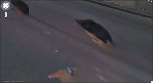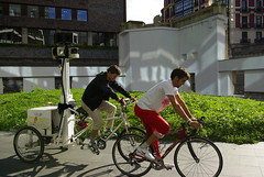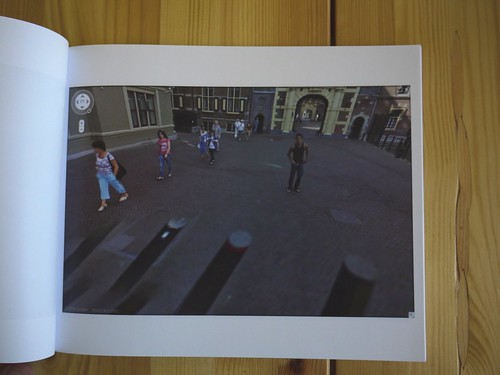
In the Summer of 2009, an unidentified young man came upon the Google Street View Trike preparing to map the Binnenhof, the center of the Dutch government, in The Hague. He decided to tag along.
The man walked alongside the Google Trike, persistently inserting himself in the foreground of its nine computer-controlled cameras’ panoptic fields of vision.
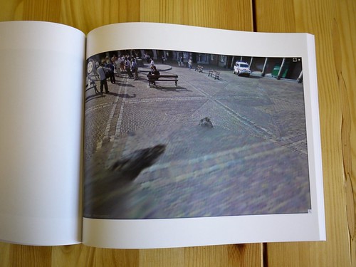
Meanwhile, Street View’s automated panorama generation system read his presence as a data anomaly and consistently attempted to erase him from the photos.
The resulting images, extracted from nearly every Street View panorama of the Binnenhof complex, reveal the history and process of their own making. They are at once a minute detail in Google’s extraordinary, ongoing portrait of the entire world, and one man’s wresting of control of his own image and his audacious assertion of his own presence.
I discovered these images in February 2010.
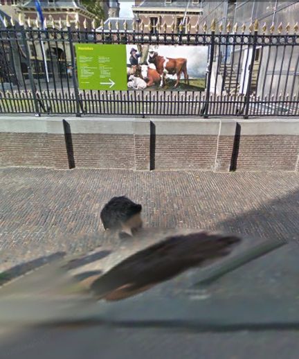
At first, it was the distortions of time, space and perspective in these photos that caught my eye. As I began mapping out [sic] the scope of the project, however, I became fascinated by how this man seemed to travel almost precisely at the distance that simultaneously kept him in frame, but also all but guaranteed his algorithmic erasure.
Then I tried to understand the images as portraits, or self-portraits. As the exercise of the flaneur. The product of the flaneur’s gaze. An artifact of a moment in time, in space, evidence of the photographer’s decisions. As photos or cinema. Surveillance or subversion. Indexing, seriality. As virtual or real, documentary or manipulation, strategies or tactics. I looked at Muybridge and Marey. I went back to re-read Benjamin, Bergson, Barthes, de Certeau, Sontag, but these images seemed to thwart every attempt to put them into a critical or historical context as photographs.
And yet they’re so easy to look at and use; we all become Street View-proficient, if not fluent, within moments of our first encounter with it. And the walking man apparently made them on a whim, by doing nothing more than strolling along.
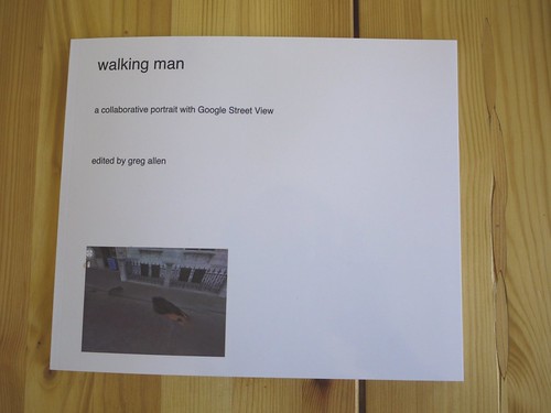
I decided to extract, compile, and print the entire set of photographs as a book. The title, walking man, is a reference to Alberto Giacometti, whose sculptural notions of distance and vision I was studying at the time. “Self-portrait” is an acknowledgment of their subject’s creative intent, and “collaborative” refers not only to Google’s operation of the camera, but also to their first pass at selecting images, and to the crucial aesthetic impact their manipulations have on the images they ended up publishing.
The images are actually screencaptures from Google Maps in Safari that include every appearance of walking man within each panorama. Though I composed each screenshot, I consider this a found work, or a work made of found images. Which is why I’ve been looking lately at work by folks like Sherrie Levine and Larry Sultan.
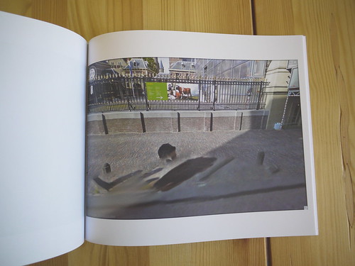
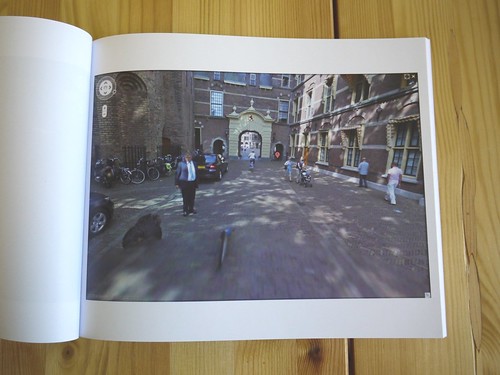
With three exceptions, each of the 55 Street View panoramas in the set is represented by one photograph which includes all portrait elements. The first panorama in the series includes both the walking man and his reflection in the window of the Binnenhof security office, but they are at too wide an angle to include in one screencapture. So the images were extracted separately After sending the book to the printer, I found that another panorama also included a nearly straight-down image of walking man’s legs, which would not fit within the browser window on my laptop monitor. The other exception, below, was just too beautiful to resist, there are so many awesome things going on in this photograph.
This proof copy was created using blurb.com. It’s 120 pages, and includes 57 portrait images and a reference Google Map, and a short introduction to the project. I thought the format might be too big, but it turns out it looks fantastic. The photos are a little dark, but that’s only because most of them were shot in the morning shade. My photos are dark because I shot them inside without a flash.
I am considering a limited print run, including editions reserved for the artist and the photographer, both of whom are currently unidentified.
There are several more shots from the proof on flickr.
Previous, related: How your Street View panoramas are made