Photography Is Dead

In Frieze, Jennifer Allen [no relation] declares the death of photography. Film photography, that is:

Digitalization brings photography closer to cinema, too. The galloping horse that Eadweard Muybridge photo-graphed with 24 cameras can now be captured with one high-speed digital camera. While analogue cameras take five frames per second, the digital ‘burst mode’ can take 30 high-quality frames per second (and over 1,000 in lower quality). Photographers may keep their fingers on the button and choose the best frame later. In light of these developments, artists who made photographs look like film stills – Cindy Sherman in her series ‘Untitled Film Stills’ (1977-80) or Raymonde April in her series ‘Sans titre’ (Untitled, 1979-80) – anticipated the transformation of photography from a fleeting image to a moving one.
Yet, if a camera can take 1,000 frames per second, are the resulting images photographs, stills or clips? If an artist prints one frame selected from 1,000 is she a photographer or an editor? Words like ‘snapshot’ and brands like Kodak’s Instamatic cameras reflected the old desire to capture a moment that would otherwise disappear. With the speed and storage of today’s digital cameras, it becomes hard to miss any moment.

If photography actually is dead, I’d hope it’d get a little better sendoff. Allen’s onto something, but her piece ends before she’s even able to make an argument. The obsolescence of film- and chemical-based photo technology is undeniable–not that anyone’s denying it–but that means that photography’s really just as dead as the medium it once supposedly killed: painting.
Long Exposure [frieze.com]

Roel Wouters’ Shiny Silver Balls

Suddenly silver mirrored balls are everywhere.
Music video and filmmaker Roel Wouters created the trailer for last year’s International Film Festival Breda:

A silver sphere on an endless checkerboard floor is the default for many 3D modeling applications. It can be seen as an icon for a sterile, makeable world. Reality though, is dirty and unpredictable. By recreating this icon in reality the beauty and imperfection of real life gets emphasized.
The recording was the result of 3 people controlling different parts of the installation, Roel controlled the speed of the balls, Benoit (Eurogrip) controlled the speed of the dolly and Sal focussed and zoomed the camera. It turned out to be a play were the 3 of us playing harmoniously together.


It’s awesome. Coincidentally–actually, several coincidentallies–a selection of Wouters’ work was screened just today in Den Haag, organized by a cinema club called Cinetoko. Cinetoko is a collaborative effort between Motoko, a motion and video design studio, and <>TAG, an art/tech/culture catalyst of some kind. It happens at the Zeebelt Theater, which is safely to the west of any Google Map camo or StreetView complications. [via manystuff thanks andy]

Shiny Space Balls? Yes, Please, I’ll Take Two. No, Four.

vanguard_hankwalker_life57.jpg
I could feel Mondo-Blogo was baiting me as I scrolled through the photos from MoonFire, Taschen’s luscious 2009 commemorative book for the anniversary of the Apollo 11 landing. He was amped about the text by Norman Mailer, and the multiple insane limited edition versions of the book–with or without embedded lunar asteroid fragments and lander-style display cases–designed by Marc Newsom. I, meanwhile, was sensing some ur-satelloon spheres coming on, and–BOOM. This photo above.
But what was it? I couldn’t tell the mission, and I couldn’t find the same or similar images of such Sputnik-like satellites in progress, no matter how hard I Googled. And from the preview, neither Mondo nor I could read the captions. The trade edition of the book wasn’t out yet, at least in the stores–and space bookshops, and the National Air and Space Museums–I visited last week. What to do? I asked Taschen’s publicist for help, and voila. Project Vanguard.
This is a previously unpublished 1957 image from LIFE Magazine photographer Hank Walker of the Project Vanguard team at the Naval Research Laboratory, hard at work on the world’s first “earth satellite.” [Well, not quite the first, as it turned out.] But almost no one in the US knew about Sputnik on June 3rd, 1957 when LIFE ran an excited cover story about Vanguard’s development [“Man-Made Moon Takes Shape,” “Shell of Satellite Mirrors its Makers”] That’s Vanguard scientist Alexander Simkovich, by the way.
vanguard_life_06031957.jpg
Walker’s other LIFE photos of Project Vanguard from the Spring of 1957 are just as awesome. Some of the most artistic highlights:
The crating: Apparently, at least 35 Vanguard and Vanguard II satellite shells were manufactured in Detroit by Brooks & Perkins, then shipped to Washington for assembly. I have to wonder what Eva Hesse was doing while these things were being packed:
vanguard_hwalker_life_crate.jpg
The see-through model: Instead of an internal sphere full of scientific instruments, the 20-inch Vanguard II satellites were designed with a suspended, miniaturized, stacked core, as this plexiglass model showed:
vanguard_hwalker_plexi_life.jpg
This looks remarkably like the cutaway drawing for the first patent ever issued for a satellite structure. Satellite team leader Robert C. Baumann filed the patent in August 1957, and it was granted in 1958. In the mean time, of course, the Soviet Union had launched two Sputniks and the rocket carrying the first, grapefruit-sized Vanguard satellite, had exploded on the launch pad on live television [that satellite was recovered intact and is on view at the Air & Space Museum, btw]:
satellite_patent_baumann.jpg
The making of: Brooks & Perkins manufactured the vanguard shells from sheets of magnesium [below], then plated them with gold. A remarkably detailed Time Magazine article from April 15, 1957 explains the rest of the manufacturing process:

When the satellites came from their manufacturer, Brooks & Perkins, Inc. of Detroit, they were thin-skinned magnesium spheres plated with gold. Aluminum is better for reflecting sunlight, but since aluminum will not stick to gold, the gold had to be covered with a thin film of chromium. Aluminum will stick to chromium, but it also mixes with it and loses part of its reflecting power. So the chromium film in turn had to be coated with glassy silicon monoxide, and then with aluminum.
The delicate work of depositing the coatings was done by the Army Engineers at Fort Belvoir, Va. Each satellite was put in a vacuum chamber and turned, like a chicken on a spit while the materials in the coatings were evaporated electrically and deposited on its surface. The final coat was a second layer of silicon monoxide.

vanguard_hwalker_black_life.jpg
In terms of the Space Race, Project Vanguard was only a fair success, and it was quickly superseded. A Vanguard II satellite launched in 1958 is currently still in orbit and is the oldest man-made object in space. So that should mean that at least a couple dozen of these iridescent masterpieces still roam the earth–or are stuck in crates in NASA scientists’ grandchildren’s garages waiting to be liberated and exhibited. The search is joined.
Oh, look, here’s one that’s off the list: a 1958 Vanguard Lyman Alpha replica or flight spare on display at the National Air & Space Museum’s Udvar-Hazy site at Dulles.

What’s Happening? Tracking Stars, Claes Oldenburg’s 1963 Washington DC Happening

raw_notes_oldenburg_stars.jpg
It’s been a few months, and now I’ve been researching it so many places, I can’t remember exactly where I first discovered that Claes Oldenburg did a Happening in Washington DC. And an early one, too. He was invited by Alice Denney, the assistant director of the fledgling Washington Gallery of Modern Art, for The Pop Art Festival she was organizing alongside her pioneering show of Pop Art, “The Popular Image Exhibition,” which opened in April 1963.
Pop was still barely being defined. By including a lecture/tape recorder performance by John Cage and a multi-ring dance event organized by Billy Kluver and featuring Yvonne Rainer and the Judson Church crew, Denney’s expansive view seems to have equated Pop with early 60s avant-garde. If there’s a thread that persisted, it was the artists’ engagement with the popular culture, in contrast to the prevalent self-referential mode of Abstract Expressionists. [The WGMA had just opened with the first Franz Kline retrospective.]
Anyway, it’s a bear trying to find out what this Happening was all about. There was one, there were two. It/they happened at a rug cleaners off of Dupont Circle, and/or in the Gallery itself. It was called Stars and/or Cleaners.
The confusion is partly the ephemeral, had-to-be-there nature of the medium, and partly the fragmented, subjective nature of the accounts I’ve collected so far. Whether written in anticipation of the event or in its aftermath, PR-excited or cynical, they’re incomplete and/or inconsistent. And none is definitive or gives a clear picture of Oldenburg’s intentions or plans, or even what happened. And of course, there are few-to-no substantive reviews.
And then there’s the art historical blind spot that DC inhabits in the art world, and that the art world inhabits in DC. [The Kennedy era seems to be one of the few times that official Washington seemed interested, not just in contemporary art, but in art as it was happening. And that obviously didn’t last, though the institutional vestiges of Camelot and the WGMA linger on, from the NEA to the Art In Embassies program to the Washington Project for the Arts, which is on its third or fourth life right now under my friend Lisa Gold.]
So rather than just write up some mega-post posing as an MFA thesis, I’m going to post an anthology/bibliography for Stars, which will include the articles and accounts I’ve found, plus some interviews I’m doing with folks who were involved with the Happening itself. I’ll keep this post updated with links as I go:
Claes Oldenburg: Raw Notes (1973) contains “Documents and scripts for the performances: Stars, Moneyhouse, Massage, The Typewriter, with annotations by the author. It was republished in 2005.
It turns out Stars was originally called Cleaners, after its first chosen/intended venue. The dates were April 23 & 24, 1963:

This is a town of initials, automobiles and cleaners to mention some important things. Also long dresses + monuments. I will be asked no doubt in what way does what i do here reflect Washington…
My pieces have two titles, the first being one which describes the form of the piece…The second title is the thematic title.

Oldenburg selected Aristo Rug Cleaners, located on P Street around the corner from the WGMA. His notes mention the activity of the site, and how “the interaction of white shirts and brown and black (employees)” embodied the city itself.

After a visit to Washington for the purpose of using the place [the cleaners], I did form the title STARS, already more specific than the first stage. This came from seeing very clear stars in the sky on the last moment of my visit and seemed to concentrate certain physical properties of the place, f. ex. the patriotic motif. The radiated way the streets are built. But the title was still abstract in that it was achieved part from a particular place in Wash. where the piece might be done.

Then Oldenburg set out to design the event, collect props, and cast all his players during a two-week preparatory visit. Next up will be a friendly preview of the performance from that prep period by Washington Post columnist Art Buchwald.

We’re All Chris Burden Now

chris_burden_through_night.jpg
Through The Night Softly was a 1973 performance piece-as-latenight-TV-commercial by Chris Burden. It’s a 10-second video of the artist, in a Speedo, inching on his stomach across a parking lot full of broken glass. [View it on UbuWeb.] Burden wanted to be on “real TV,” and 10 seconds after the local LA news was all he could afford at the time.
[clarification after watching it again last night: Through The Night Softly is Burden’s title for the actual performance and/or the video of it, which goes on longer than 10 seconds. TV Ad is the clip of TTNS on TV.]
More than the cringe-inducing action itself, which is closely related to other works he was making, Burden talks about the piece in terms of its context–its startling juxtaposition and inexplicability among shampoo commercials and Movies of The Week. In the EAI video compilation above, he also talks about how hard it was for the TV station to take him seriously, even though they both realized he was a “small customer.”
Well, consider that problem solved. Slate’s Seth Stevenson has a fascinating video about Google TV, which lets you buy actual TV ad time the way you buy AdWords: a few DIY clicks at a time.
Stevenson made a goofily paranoid 30-second commercial out of vintage stock footage, then spent just $1,300 to run it 54 x/wk on Fox News, where it was seen by several hundred thousand 1.4 million [!] people.
They got a thousand people to visit their website, which is a horrible conversion rate, but who cares? You could have a dozen more interesting goals and invitations to the viewer that make more sense. Or none at all. Can you imagine what the video art world could or should be doing with this? The mind reels.
Assuming Google would allow it, of course. When AdWords first came out, I regularly used it for publishing, not advertising. I’d write little haiku-like ads keyed to search terms that had no ads at all, like, at the time, Agnes Varda. [Hmm, nearly eight years later, a Google search for “agnes varda” still returns no ads.]
Anyway, it lasted until Google announced their IPO, and they instituted a new TOS for the program. It’d be interesting to see what the contours of Google TV’s commercial standards are, and how they affect content.
I suspect Chris Burden’s original ad wouldn’t fly today. But I’d love to be proved wrong. And I’d love to see these ads run, then get taped and uploaded in context to YouTube, where they could continue to reach an audience. LAXArt organized a series of artist-produced billboards around Los Angeles. And Creative Time programs video art onto giant monitors in Times Square. Where’s the public art organization curating and running 10-30 second video art on cable? What about an artist or group of artists creating programming for the format and airing it themselves? BHQF-TV, anyone? Stick a sponsor slide on the end for a couple of seconds and the piece pays for itself.
How I Ran an Ad on Fox News [slatev.com via @joygarnett]

Sehgal, Herzog, Patel, Oldenburg: Some Links I Like

A great post on language & progress, Claude Levi-Strauss & TIno Sehgal. Some of the most interesting commentary I’ve read on discerning the actual structure and contours of Sehgal’s This Progress, too. [futureofthebook.org via @briansholis]
Which makes me wonder: do the works come with NDAs? Are they secrets? Trade secrets? Can the instructions be shouted from the rooftops? Could the unwritten transmitted/purchased instructions be performed or recited publicly as entertainment, as part of a critical discussion, or in an effort of collective preservation? Are they really just a couple of lines [“Roll around kissing constantly. Every few minutes, strike a pose from a famous work of art.”] or are they more elaborate? Obviously the parties concur that there is some intellectual property right being transferred, but what is the implication for the artist–or his dealer or a collector or museum–either disseminating the instructions or refusing to do so?
Ramin Bahrani’s short film Plastic Bag tells the story of a lone plastic bag’s Odysseus-slash-V’Ger-like journey to find home and its creator. Werner Herzog stars as the plastic bag. Seriously. [via mrdanzak, thanks andrew]

Speaking of epics, Grain Edit has a wonderful interview with Sanjay Patel, the Pixar animator/illustrator/Charles Harper fan who went from self-publishing the awesomely kawaii Little Book Of Hindu Deities to creating a modernist graphic version of the Ramayana. [grainedit]
I’m liking what I can see of Eamon O’Kane’s paintings about Le Corbusier’s somewhat dickish relationship with and interventions in Eileen Gray’s architectural masterpiece, the E-1027 Villa at Roquebrunne. They’re at See Line Gallery, but the big pictures are at the LATimes. [Related: at a 2007 MoMA conference, Beatriz Colomina called Corbu’s alterations of E-1027 an architectural “rape”.]
I’ve been doing some research on early Happenings staged in Washington DC by Claes Oldenburg. More on that as it develops, of course, but there’s no need to wait on sharing this very self-amused Time Magazine account of “The Pop Art Festival” organized by the Washington Gallery of Modern Art in April 1963:

Blue Wrench.
Happenings are old stuff in the artiest alcoves of Manhattan, but of course that means nothing in Washington square. This one was prepared by Artist Claes Oldenburg, who makes those huge sailcloth hamburgers. Washington society prepared by getting itself puffed, powdered and sloshed. Little dinners were eaten intimately in Georgetown. The jolly crowd then collected at the gallery to see what was going to happen. Nearly everyone sat on campstools–White House Art Adviser Bill Walton, FAA Administrator Najeeb Halaby, Mrs. Arthur Schlesinger Jr. Those. [sic]
A member of the gallery staff announced that she had successfully achieved blue ice cream. She had mixed blue dye and vanilla ice cream with a monkey wrench. The New Frontier moved an inch forward on its stools.
This was obviously going to be some happening.

Does anyone know how Time and others [Old Media types, mostly] insert the unique tracking url into my copy&pasted quote of their article? I assume it’s to prevent/track automated scraping and republishing, but from their page code, I can’t figure out how they do it.
And lastly, I went to hear John Gerrard talk about his time/duration-intensive work at the Hirshhorn last week. He’s got a very different project going on, what with the environment, and the orbit of the sun and energy and industrialization and video game engines and what not, but it was nice to see that he’s nearly/slightly as engrossed with using Google Earth as a creative tool as I am. He pulls colors from the satellite images to create site-specific palettes for his digital landscape re-creations.
Which, whoops, come to think of it, may be problematic. Just yesterday, Stefan at Ogle Earth laid out a not-insigificant case for why it matters that–whoops–all satellite imagery, including Google’s–is color-enhanced. “It is the case that colors in satellite imagery are always false, albeit made to look realistic (just as with those pretty pictures of galaxies and planets).” [ogle earth via @felixsalmon]

Wanted: Smithson’s Movie Treatment For Spiral Jetty Poster

smithson_jetty_poster.jpg
I’ve been working on a shot-for-shot remake of the Spiral Jetty film for a while, and so I’m quite familiar with the storyboard-like drawings Smithson did for it. Familiar with them as drawings, that is. He called them Movie Treatments.
It’s a little embarrassing to admit I didn’t realize Smithson had used a treatment/storyboard for the flyer/poster of the 1970 Dwan Gallery exhibition of Spiral Jetty until I read it in Kathleen Merrill Campagnolo’s essay on the Jetty and its camera imagery in the Smithsonian’s Archives of American Art Journal. But there it is:

DWAN 29 WEST 57 STREET NEW YORK OPENING OCTOBER 31 TO NOVEMBER 25
A 16 MM, 35 MINUTE COLOR AND SOUND FILM ON THE SPIRAL JETTY WILL
BE SHOWN DAILY AT 2:00 IN THE GALLERY FOR THE DURATION OF EXHIBITION.

The Dwan exhibition consisted primarily of Gianfranco Gorgoni’s large-format photos of the Jetty, eight of which were included in Kynaston McShine’s historic “Information” show at the Museum of Modern Art that summer.
Given the iconic aspects of the photos and the powerful influence of the film–not to mention the experience of visiting the Jetty itself–it’s somehow odd to think of encountering the Jetty first in terms of Smithson’s site/non-site paradigm, as a situation represented in a gallery.
It’s also interesting to note that the film only played once a day, not on a continuous loop as is often the case now. It was an event more than an installation.
Anyway, I would like you to send me one of these posters, please. If you have one you don’t need, or perhaps some extras. It need not be signed. Thank you.

On The Soviets On The Moon

moon_luna9.jpg
It doesn’t feel like a tangent to go from satelloons and museums on the moon to other aesthetic aspects of space and the space race. Plus there’s the fascination at discovering, as a grown man, how much I hadn’t been taught as a kid. As an American kid.
No one tried to ignore Sputnik or Yuri Gagarin, of couse, but it never registered with me that the Soviet Union reached the moon first. And landed the first spacecraft on it. And took the first pictures of the dark side of the moon. And from the surface.
The Soviets’ Luna Program began way back in 1959, when Luna 2 hit the moon [after shedding a bunch of small Soviet emblems, apparently.] This, beefore America even got a balloon into orbit around the earth.
Also in 1959: Luna 3 returned photos of the far side of the moon.
And in 1966, Luna 9 made the first soft-landing on the moon and transmitted back the first five photos from the surface.
To avoid embarrassment in the case of failure, Russian missions were typically only announced after they succeeded. This meant that each achievement was met worldwide with a sense of surprise and skepticism/resentment.
The first image sent back from Luna 9, however, was intercepted by the University of Manchester’s Jodrell Bank Centre for Astrophysics, which scooped the Russians’ own announcement.
As an image, there’s something familiar about it, at least in retrospect; it looks like what we [now] know the surface of the moon to look like. But in 1966, it had to have packed a punch. Add to that the level of political intrigue, the rivalry of the Space Race, and the ever-present military/nuclear threat of the Cold War, and this image becomes an incredibly powerful, important artifact.
One which I’d never heard of, or seen before last week. It’s as if Apollo and 1969 wiped away the contentious, anxious experience and history of the earlier years. And along with it, the memory, recognition, and appreciation of the achievements that came first.

Ken Price & Josef Albers At Brooke Alexander

josef-albers-ken-price-1.jpg
Roberta Smith loves loves loves the Ken Price/Josef Albers show at Brooke Alexander. I all but stumbled across it a couple of weeks ago after finding Brooke’s interview with Price (PDF), and I have to agree. It is incredibly fresh.

Its overarching theme is that abstraction is reality-based, distilled from lived experience, and actualized through highly personal approaches to process and materials. It’s a lesson in life as much as art.

Albers’ paintings and especially the prints, are additive, while Price’s method is subtractive: he builds up layers of paint, then sands it down.

‘Marina Abramovic Is A Total Stone Cold Diva.’

Ivan Lozano’s post about Marina Abramovic, Joan Jonas, Tino Seghal, and the conservation of performance art is absolutely fantastic. [It’s built off the Performance Workshop Klaus Biesenbach held a couple of weeks ago, which was written up by Carol Kino in the NY Times.]
The idea of a single orthodox means of retroactively preserving or documenting or re-performing or whatever early performance art strikes me as unreasonable; I like the idea that artists can decide if and how they want their work to live on, whether if it’s as a score, video documentation, ephemera, or in Seghal’s case, unwritten verbal transmission.
Lozano hits the nail on the head with his awesome characterization of Abramovic [above]. And kudos to her for making a strong play for preserving her own work and for influencing the present and future of the medium. But one thing about her stone cold divadom that he doesn’t mention that came immediately to mind was her establishment of the Marina Abramovic Institute, which is charged with the preservation of performance art.
It reminds me of the Eric Carle Musem of Children’s Book Illustration, another ostensibly comprehensive history-writing institution which was founded by a practitioner–who wasn’t waiting for history to decide his place in the history books.

Found, Sort Of: Vern Blosum

You remember how, a couple of months ago, I could find next to nothing online about Vern Blosum, the mysterious artist whose crisp, deadpan paintings of parking meters were featured in one of the very first museum exhibitions of Pop Art, “The Popular Image,” organized by Alice Denney in the Spring of 1964 1963 at the Washington Gallery of Modern Art?
Well, we’re making a little progress. I’ve been in touch with people who know or knew Blosum and his work. As I piece his story together, I’ll present it here. For an artist to show alongside Warhol, Rosenquist, and Oldenburg, and to be collected by MoMA and Larry Aldrich [1], and then to practically disappear, well, it’s fascinating.
What I really wanted to do, of course, was to find and see Blosum’s work, to see how it might relate to those earliest Pop contemporaries, and maybe see how it holds up. But all my searches came up empty. Until tonight. Somehow, Blosum’s entry in an art history teaching image database at California State University [WorldImages at SJSU, to be specific] showed up on Google.
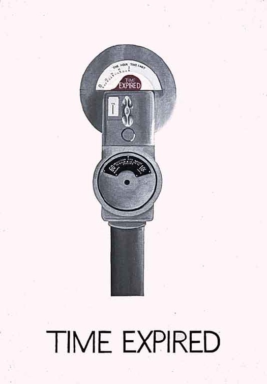
There’s a very clean image of Blosum’s 1962 painting, Time Expired, which is listed as being in MoMA’s collection [a mystery again because MoMA’s online catalogue comes up a blank]. I’m looking into that, but first, just look at this.
It’s not a flat, billboard style like Rosenquist, or a flattened silkscreen image like Warhol or a deliberately graphic/comic style like, say Lichtenstein. And it’s not photorealistic, and certainly not Photorealist, despite how Cal State apparently teaches it, Instead, it’s quite illustrative, the city street version of Wayne Thiebaud’s diner desserts. I think it’s really quite nice.
blosum_sjsu.jpg
[1] Actually, I misread that. One of the only web results for Blosum was in Larry Aldrich’s 1972 interview with Paul Cummings in the Smithsonian’s Oral History collection at the Archives of American Art. That led me to a couple of lengthy discussions with folks at the Aldrich Museum about whether they have the Blosum painting Larry clearly said he’d bought. They don’t.
Now I see why. Aldrich is talking about the MoMA painting above, Time Expired. He created a multi-year fund for Alfred Barr and Dorothy Miller to purchase new work from emerging artists, and he was telling Cummings what works the Museum got from the fund each year. This 1962 Blosum came into the collection in 1963, just as, or just before, Denney was assembling her show in DC.
It’s funny, because the dynamics and challenges for museums to collect new work don’t seem to change that much. It can still be tough, or at least problematic, for curators to ask their donors to buy unproven and/or less expensive work, partly because of ask fatigue, and partly because big donors like to donate for big things.
Also, Aldrich’s unabashed discussion of using his fund to get the Museum’s curators to do his “shopping” for him is simultaneously awesome, refreshing, and cringe-inducing.

One to help young American artists, and quite frankly, the second one was a personal selfish one in thinking that in essence they could help my efforts and sort of do my shopping for me, because, as I said, I could only get out once every two weeks and sometimes I wasn’t even able to successfully do that. And I was under an impression, which I since learned was a mistaken impression, that they had people combing New York galleries all the time. Which I discovered was not the case.

He then recounts all these collecting war stories where he “loses” work to the Museum, or where he complains that prices have gone up because he’d let MoMA buy an artist’s work before he got it himself. He sounds a bit tacky, but passionate, with a good eye, and in his telling, at least, if there were any potential conflicts, the Modern always prevailed.
Previously: Anyone tell me about Vern Blosum?

Catching Up With Vito Acconci

acconci_attention_studies_eai.jpg
While rummaging around in Vito Acconci’s early exhibition history for traces of Kathryn Bigelow’s work [more on that in a second], I came across a set of three early, short Super 8mm films I’d never heard of: Three Attention Studies, 1969.
They’re all 3min. each, the length of a Super 8 cartridge, and made in conjunction with Peter Lupario, but it’s the last one that’s most interesting:

In Catching Up, the performer and cameraman walk side by side across a field. Sometimes the performer falls as the camera continues its pace; the performer must make an effort to catch up and return into the frame.

If that’s Lupario in the still above–and it doesn’t look like 1969 Acconci to me–these three films are notable for featuring the artist behind the camera, as the viewer, instead of in front, as the performer/subject.
These studies preceded by several months the 1970 body-related performance pieces for which Acconci became known. In a 1983 retrospective of the 8mm works at the Whitney, curator John Hanhardt said Acconci is “one of the first artists to successfully develop a significant oeuvre in the Super-8 film format.” [PDF via vasulka.org]
So this Catching Up, I’d like to see. If anyone knows where it exists digitally, I’d love to hear about it.
Now back to Bigelow. I’m beginning to think that the Acconci project that most closely matches the dates, descriptions, and details of Bigelow’s recollections is his 1973-4 Super 8 “feature,” My Word. [Of course, I haven’t seen it, even though it showed at X-Initiative last September.]
At two hours [or 90-something minutes, which may be an earlier, pre-1983 version], it required a lot of shooting. Hanhardt describes it as

composed of written statements alternating with shots of the artist in his studio and around his building. Acconci is the central protagonist whose gestures, actions, and written statements are all addressed to women–women are the other, unseen, presences in this work. The point of view of the camera can be interpreted as that of the women, silently confronting Acconci, or that of Acconci himself, mirroring his every move.

I don’t like to, but I can imagine that’s Acconci riding some kind of bondage apparatus with a large film projection behind him in the My Word frames below:
acconci_my_word_whit.jpg
My Word was a turning point, the last time Acconci included himself on-camera in his work. If this is the one, Bigelow actually shot some, part, or all of one of Acconci’s most significant works. Too bad the Academy doesn’t have some kind of lifetime achievement in dues-paying hardship award.
Previously: Tracking down Kathryn Bigelow’s early conceptual oeuvre

The Lady In Blue Meets The Lady In Red

abramovic_bkgrnd_cmonster.jpg
“The lady clad in bright red silk was having her picture taken from every angle around Abramovic’s performance. It was spectacular.”
C-Monster has an awesome photoset and a firsthand account of experiencing Marina Abramovic’s MoMA performance, The Artist Is Present. She touches on the intensity of the line, and the realization that the artist is making you sit and wait, possibly for hours, too, and how the entire atrium is transformed around the silent artist. When all is said and done, thousands of people will have projected their own experiences and “performances” onto Abramovic; it’s an aspect of the piece I hadn’t considered before.
This is my favorite of C-Mo’s shots, though, because it so perfectly captures the idea of an individual with her own strategy using the media to insert herself into Abramovic’s piece.
This is interesting me right now for other reasons, which may be why it caught my eye.
Photo Diary: Marina Abramovic at MoMA. [c-monster.net]

Quick, Do Not Think Of Rielle Hunter

From a 1983 New York Times profile of up-and-coming artist/photographer Cindy Sherman:

One day several years ago, in the studio of David Salle, who borrows extensively from the media, Miss Sherman saw a soft-porn magazine photograph of ”a housewife looking sexy” and decided she’d try to look like that. Thus were born the ”Film Stills” with their sex objects and immaculately-packaged good girls. Miss Sherman says she was not consciously making a feminist statement when she began these pictures. ”I never thought of it as political work,” she says, ”I don’t think of myself as a very political person”…
…Maintaining full control over her ironies remains something of a problem.

Portrait Of The Photographer As A Young Artist [nyt via @briansholis]

And Who Was Writing Those Ian Wilson Invoices?

I’m slightly fascinated with the talk-based artwork of Ian Wilson. The last couple of weeks, I’d been working on a Conceptualism-related proposal, and so I had out my catalogue for Ann Goldstein and Anne Rorimer’s awesome, formative [for me, anyway] 1995 MoCA show, Reconsidering the Object of Art: 1965-1975.
Fifteen years, and I think I’d never read the entry on Ian Wilson. Maybe it’s info fatigue by the time I’d get to the W’s, or maybe the blank page where the images usually go just registered as a section divider?
Anyway, Rorimer discusses Wilson’s “search for an art in which no evidence of physicality would intrude.” His work evolved from the instigation of casual conversations about “time” to a less subject-centered, “Oral Communication.”

Whereas his Time work stemmed from his understanding that a word might represent a concept, Oral Communication grew out of his realization that the Time project principally concerned the process of communication. The designation Oral Communication, he decided, more pertinent served to characterize an endeavor whose ultimate subject and object, he once stated, “is speech itself,” or “art spoken.”

Maybe it’s the institutional vs commercial context, but while Rorimer mentions Wilson’s dutiful contributions to checklists and catalogues for shows he was invited to participate in–even the invitation card for a newly configured work for a group, a 1972 Discussion at John Weber Gallery–there is no acknowledgment of the other, seemingly crucial evidence/remnant/ instantiation of Wilson’s work: his invoices and receipts.
And Andrew Russeth just emailed me this awesome anecdote he reported from a Performa 09 panel discussion last fall:

No matter how difficult or intangible the work, of course, most agreed that artists or their dealers will eventually find a way to sell it, leaving the museum to work out some of the details later. [Soon-to-be-announced incoming MoCA director Jeffrey] Deitch recounted that, as a gallery assistant at John Weber Gallery in the mid-1970s, he once typed the words “There was a discussion” on a piece of paper as a record that collector Count Giuseppe Panza had talked to artist Ian Wilson, who abandoned sculpture to make art only by talking. He then made out an invoice for $1,000.

Maybe if MoCA ever reissues the Reconsidering The Object catalogue, they will add a correction.
Deitch Defends Dakis Joannou Show at the New Museum [artinfo]