What Is Progress, And The Paper [Of] Record

Can I just suggest that, when you buy an article from the New York Times Archive, you go ahead and buy a 10-pack? In addition to supporting your local paper in their time of financial distress and dire need [ahem], you can use the other nine articles for exploring whatever random people, thing, or history crosses your mind?
Which is how I found Roy Bongartz’ Sunday arts feature from August 11, 1974: “Question: How Do You Buy A Work of Art Like This?/ Answer: With A Check”
The piece could’ve been read straight in one of Powhida and Dalton’s #class sessions. Burden, Beuys, LeWitt, Acconci, de Maria, Bochner, Ray Johnson, Ian Wilson:

…these artists, all of them young “conceptualists,” had decided to lift their work clear out of the category of investment property. By shifting the emphasis of their work to the pure thought and by refusing to offer any saleable object, they were mounting a deliberate attack on the traditional business of art. The artists’ intention was to leave the dealer with nothing to sell, the collector with nothing to buy, and the museum with nothing to squirrel away.
[turn page, see continuing headline, “Buying Conceptual Art – Photos, Sets of Directions, Receipts”]
…The secret is that there is always something to sell.

Artists need to eat. Collectors want to buy. Ronald Feldman “authenticates” Burden’s gunshot wound with a check. And voila! These rebels’ most cunning attempts to escape or destroy the art market have been thwarted before brunch. We can now move on to the crossword.
But beyond the apparent news-worthy novelty of certificates, documentation, and instruction-based work, and the vastly divergent view now of some of the namechecked artists–Ryman and Sandback have a conceptualist collectible object problem?–you know what the funniest thing about the past is? It’s the little differences:
That as long as the instructions [which sell “for as much as $8,000”] are followed, “it doesn’t matter at all whether it’s you, Sol LeWitt or your Uncle Elmer who does the marking.”
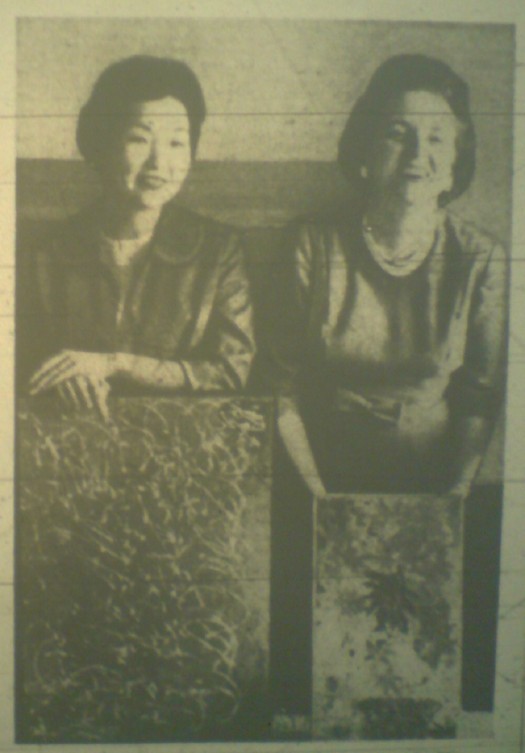
That dealer/wife Mrs. John (Susan) Gibson is aghast at an invitation “from a Washington DC gallery” to show Robert Cumming’s text & photo-based work–wait for it!

–in the photography section! Mrs. Gibson insisted Cumming’s work go into the fine arts section because he was not showing photographs, but conceptual art. The reply was, well, we hope this is what photography will become. “Too late,” said Mrs. Gibson. “This is what fine art has become.” It was a standoff–no show for Cumming.

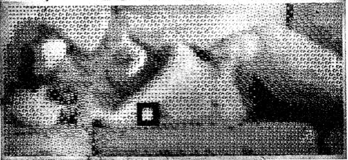
And then there’s the eerie familiarity of Ian Wilson, “a kind of extremist even in SoHo, [who] simply comes in and talks. This is all that he does, and he’s made a career of it.”
The quote is from Sonnabend director Ealan Wingate:

“Here the art becomes so abstracted there is no object whatever. Yet in a way there is always an object because an idea can be a subject. [hey, wait– -ed.] There is, also, always the piece of paper, the bill of sale, which says you bought it.”

And then comes Bongartz’ explanation of the paper gauntlet Wilson threw down across the ages to Tino Seghal:

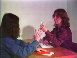
You can commission Wilson to do a piece; for example, he may come to your house and talk with you about Plato for a while. The two of you might discuss, say, the subject of unreality, and that would be it–and you’d get your receipt.

For all the fun of digging through the Times’ archive on my own coin, it’s not all eye-opening, perspective-correcting or knee-slapping blog fodder. Even at $1.50, you sometimes click through to a dud, but overall, it still feels like money well spent. And not just because seeing vintage discussion of an under-remembered predecessor should at least cast a critical shadow on the current hype over Seghal’s artistic innovations.
There’s an extra, bonus level of irony, though, in paying to read a 36-year-old Times article about artists successfully selling nothing–and then in worrying that I’m quoting and recapping it too much, thereby damaging the damaged Times’ economic position, or at least earning me the wrath of the copytheft maximalists.
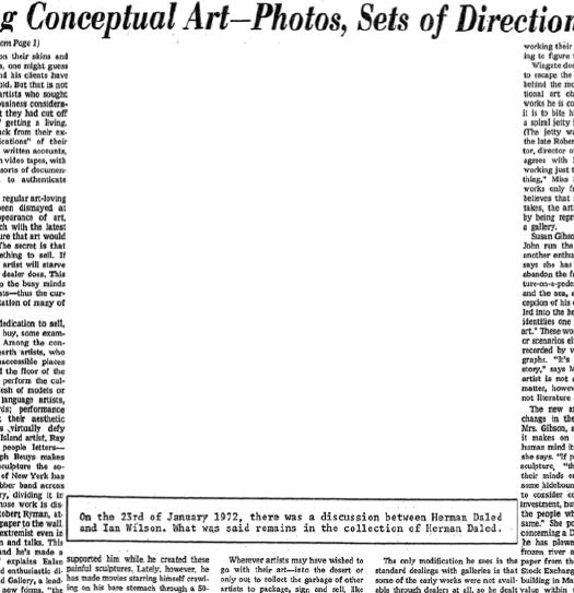
But, oh, look, here’s the whole article for free online. Apparently, the Times repackaged a bunch of arts coverage in 1978 as a topic-based anthology. Which was scanned into Google Books. Of course, it’s formatted differently, probably from a different edition of the paper. So it doesn’t have the $1.50 PDF version’s awesome illustration of Wilson’s work:
ian_wilson_nyt74.jpg
The secret is that there is always something to sell.

Selections From The NASA Library: How-To Build A 100-Foot Satelloon

EL-2000-00292.jpg
Part of re-creating the Project Echo satelloons as art objects is tracking down the documentation and history of it all, identifying archives and primary source materials, and finding out how, exactly NASA built these early, early satellites.
Because it’s more than technically possible to replicate their efforts. America’s first forays into space were literally ad hoc: the prototype Echo satelloon was twelve feet in diameter because that’s how big the ceiling was in the workshop. They figured out how to fold the balloon after one engineer saw his wife’s rain bonnet. They pressure-tested the Mylar skin on an armature made of 1-by lumber, pulleys and weights. [image above: nasaimages.org]
I thought I’d have to track down a NASA archive facility in some Maryland backwoods, and make an appointment, and I may still. But it turns out NASA has converted a lot of the technical and fabrication documents for Project ECHO–ECHO I and ECHO II–to PDF format. The compilation of links at Astronautix.com is pretty high in the Google results.
Here’s what I especially like:

In An Art Film That Time Forgot. Kathryn Bigelow IS. That Girl On Lawrence Weiner’s Sofa.

Like everyone else reading it on OSCAR NIGHT®, Andrew Hultkrans’ 1995 Artforum interview with Kathryn Bigelow gave me hope for the films-by-artists genre, if not quite from the direction people might expect. To hear a double OSCAR® winner say of film noir, “That’s how I moved from art to film, so to speak: I went through Fassbinder on my way to noir.”

ANDREW HULTKRANS: It’s quite a leap from Conceptual art to the culture industry. KATHRYN BIGELOW: It does seem like a departure. I was studying painting at the San Francisco Art Institute and one of my teachers put me up for the Whitney Program, so I went. This was ’73 or ’74, when Conceptual art really came to the fore. I did a couple of videos with Lawrence Weiner, and I worked with Art & Language, an artists, group who were critiquing the commodification of culture. So I was very influenced by them, and my concerns moved from the plastic arts to Conceptual art and a more politicized framework. And I became dissatisfied with the art world – the fact that it requires a certain amount of knowledge to appreciate abstract material.
Film, of course, does not demand this kind of knowledge. Film was this incredible social tool that required nothing of you besides twenty minutes to two hours of your time.

Wait, Lawrence Weiner videos? No, not that one.
weiner_bigelow_done_to.jpg
Bigelow appeared with Sharon Haskell in Weiner’s Done To, 1974, which Alice Weiner describes as:

…simple camera frames which are silent and/or unconnected to a complex soundtrack running parellel [sic] to the images. There are brief instances where image and sound meet; however, the majority of the images are overtaken by at times symphonic, at times cacophonous soundtracks which displace the normal filmic viewing experience. The standard film format for going from frame to frame — and then and then and then — is what the film is concerned with.

E.A.I. has a fuller synopsis, and VDB has a tiny clip viewable online.
weiner_bigelow_green_eai.jpg
She also appeared briefly in Green as Well as Blue as Well as Red, 1976, [above, vdb clip here] where her off-camera conversation with Weiner is mixed over the shot of two women reading from a red book at a rainbow-painted table.
Bigelow is credited as an editor and production/script consultant on Weiner’s first narrative-based work,Altered To Suit, 1979 [vdb clip]. From Alice Weiner’s synopsis at EAI:

“The mise-en-scene, the whole story, takes place in one location, the artist’s studio. A delicate psychological allegory on ‘a day in the life of’ anchors the displacement of (filmic) reality and the alienation of the (players) self. Devices such as incongruity between the image and the soundtrack, odd camera angles, and plays on objective focus are integral and explicit components of the narrative.

Altered To Suit overlaps with the beginning of Bigelow’s own film work; she made her first short, The Set-Up, which she completed in 1978 while at Columbia.
Bigelow mentioned two other very early, art film-related gigs in an interview with Gavin Smith published in Jessmyn & Redmond’s 2003 anthology, The Cinema of Kathryn Bigelow: Hollywood Transgressor [seriously]: She appeared “for about five seconds” in a Richard Serra video, and she shot some B-roll for a Vito Acconci installation.

[He] needed these slogans and phrases on film loops that would play on the wall behind him during a performance piece he did at Sonnabend in a rubber bondage room he created. The job was to film these slogans. I’d never worked with a camera. I was starving to death. If I hadn’t been at the brink of economic disaster, I think I never would have had all these detours.

I haven’t been able to figure out which Acconci performance/installation Bigelow’s referring to. Acconci showed at Sonnabend in 1972, ’73, and ’75. But 1972 was Seedbed, where the artist hid under a ramp masturbating for several weeks. The 1973 performance, Recording Studio From Air Time consisted of a video feed of Acconci in an isolation chamber/ confessional for two weeks, analyzing a romantic relationship in a mirror. I haven’t found a description of the 1975 show, but MoCA curator Anne Rorimer has written that after 1974, Acconci “dismissed himself as a live presence” and began using video and audio of himself in his performances. If her description and timeline is accurate, I’m guessing this is what Bigelow filmed, and what Acconci showed in 1975.
While Googling around to identify the Richard Serra video with Bigelow’s cameo, I found Bettina Korek’s fresh post at Huffington, about Bigelow’s art career. She links to “Breaking Point: Kathryn Bigelow’s Life In Art,” an exhibition at castillo/corrales in Paris which has been on since mid-January and continues through next weekend.
The most likely possibility for the Serra video is his 1974 game show/game theory critique of TV, Prisoner’s Dilemma, in which Spaulding Gray and Leo Castelli are supposedly at risk of getting stuffed in a SoHo basement for 50 years [The video was shot at 112 Greene Street, the first home of White Columns. 16miles.com has an installation shot from White Columns’ 40th anniversary show of stills from Prisoner’s Dilemma.]
Sure enough, sometimes it still makes sense to get up and walk across the room, because Serra discusses it two interviews, with Liza Bear and Annette Michelson, in Richard Serra: Writings/Interviews.
With Michelson, he explains how the angry art world-y studio audience tore down the screen to save Castelli. And in the notes for Bear’s earlier interview, the video’s credits include: “D.A.’s Secretary: Kathy Bigelow.” So there you go.
UPDATE: BUT WAIT, THERE’S MORE! Francois from castillo/coralles emailed with some more information: “Vito Acconci, when visiting the show, mentioned [Bigelow] had collaborated on his installation ‘Pornography in the classroom’, originally conceived in 1975.”
Which should put the issue to rest, except that “PITC” doesn’t seem to fit with Bigelow’s account, either of the work she did [filming slogans and phrases], the installation/performance [bondage equipment, with video projected behind Acconci], or the venue [Sonnabend]:
“Pornography in the classroom” as it’s known today is a slideshow of images from 1970s porn magazines, projected over a single channel video monitor [originally Super8mm film] of an ascending and descending penis, which is accompanied by the artist’s voiceover [“Thar she blows!”] It was shown at Gladstone in 1998, and the Kramlichs [of the San Francisco video art-collecting Kramlichs] bought it. It’s an edition of one, though Acconci apparently retains the master slides and film. The Kramlichs donated “PITC,” along with many other of their video works, to the New Art Trust, a consortium of museums and archives.
In a fascinating-to-video-collectors article in the 2001 Journal of the American Institute of Conservation, Timothy Vitale all but says flatout that the current incarnation of “PITC” is not just artist-remastered, it is completely new media. Neither the slides nor the video show any traces of aging or reformatting. If Bigelow did, in fact, shoot footage for “PITC,” her camerawork has almost certainly been replaced.
Of course, I’d think that, given her lucid discussions of her and others’ conceptual and performance work, I don’t think Bigelow would confuse “phrases and slogans” with “bobbing penises.” My guess is she didn’t work on “PITC”. And if she did, she may not want to talk about it.

The Weirdest ‘Actually’ In The New York Times

was in Carol Vogel’s article on the Hirshhorn’s upcoming Yves Klein retrospective [and the Kleins being auctioned to coincide with it]:

A colorful figure who was an aspiring judo instructor, Klein studied Rosicrucianism and was obsessed with philosophical and poetic investigations of space and science. He actually leapt into space one morning in 1960 by throwing himself out the window of a house in Paris, an act that was documented by Harry Shunk in the photograph “Leap Into the Void.”

Actually? Documented?
klein_leap_void.jpg
Actually, Leap Into The Void is famously known to be a photocollage. Klein did leap–into a tarp waiting to catch him. He then altered the photo, replacing the tarp with an image of the empty street.
klein_vide_journal.jpg
In Vogel’s defense, she’s hardly the first to take Klein’s photo at face value. If Paul McCarthy is to be believed, he made a filmic homage to Klein while an art student at the Univeristy of Utah in the 1960s. He told the LA Times’ Susan Muchnic that he jumped from a second story window–and hurt himself in the process. It wasn’t until some years later that McCarthy actually saw Klein’s image–and learned that it was doctored.
Klein published the image in November 1960 in a parodic newspaper under the tabloid-style headline, “l’Homme dans l’Espace!” Wikipedia’s Klein entry says the photo and the paper denounced “NASA’s own lunar expeditions as hubris and folly,” but of course, there was no lunar program to speak of and in 1960, no human had ever flown into space.
According to the Klein archive, the photo was taken on October 17, at 3, Rue Gentil Bernard, Fontenay-Aux-Roses, in the suburbs south of Paris. Looking at the Google Street View of the location, the house is gone. Actually, looking at the photo, the house is not a house; it’s a large gate, maybe a gatehouse, but still.
klein_void_googlemap.jpg
The site now is a contemporary church dedicated to Sainte Rita, which I can’t think is a coincidence. Klein made multiple pilgrimages to the monastery of Santa Rita in Cascia, Perugia and dedicated work to her. His affinity for Rosicrucianism has been mentioned, but I’ve never heard any discussion of the connection between his Catholicism, mystical or otherwise, and his most famous image. The Pompidou’s 2006 Klein retrospective didn’t explore the role of his religion much. But assuming that the site was associated with Sainte Rita when Klein selected it for his photo/performance, I’d think there’s a connection. Not just with the idea of the Void, which is frequently associated with Zen, but with the leap [of faith?]–or the patent fakery of the image itself.
UPDATE Indeed, the location was not a coincidence. It was across the street from Klein’s judo school. According to Kerry Brougher the Sainte Rita de Cascia folks only moved in years later.

On Ken Knowlton, Bell Labs, Art & Technology

knowlton_harmon_nude_nyt.jpg
Ken Knowlton’s artistic collaborations have been less well-known that his Bell Labs colleague, Billy Kluver, who created E.A.T. Experiements with Art & Technology, with Robert Rauschenberg and who introduced Andy Warhol to Mylar. But we’ll get to that.
kluver_balloon_nyt.jpgIn collaboration with Leon Harmon, Knowlton made some pioneering, ASCII-style artworks, including a reclining nude transformed from photograph to a printout of dot-matrix symbols, which was featured in a NY Times article in 1967 [“Art and Science Proclaim Alliance in Avant-Garde Loft,” Oct. 11, 1967].
The report was about an art/technology “news conference ‘happening'” held in Rauschenberg’s loft, and attended by corporate and union leaders, and politicians, including Sen. Jacob Javits, who is shown with large, pillow-shaped Mylar balloons floating behind him in “the Chapel,” the two-story space at the back of Rauschenberg’s Lafayette St. building. [The occasion was a reorganization of E.A.T.]
They’re the same balloons Andy Warhol had used in his April 1966 installation, Silver Floations, which he’d learned about from Kluver. [Bell Labs, of course, was also the ground operator of the Mylar communications satelloons of Project Echo, which launched in 1960 and 1965.]
Anyway, 18 months later, it’s Kluver whose seen batting these balloons around, with nary a mention of Warhol to be found. Odd.
Willard Maas made an awesome short film about the show in 1966. It’s at YouTube or UbuWeb:

Poemfield no. 2, Stan VanDerBeek & Ken Knowlton

Stan VanDerBeek and Ken Knowlton at Bell Labs collaborated on a series of digital structuralist computer/graphic/text animations in 1966. They used BeFLIX, [Bell Flicks], an 8-bit graphics programming language Knowlton developed in 1963.
The Tate’s clean version of Poemfield No. 2 isn’t loading right now, so here’s the YouTube version:

Meanwhile, go back to the Tate’s site for several other crisp copies of VanDerBeek’s works.update: Fuller, VanDerBeek, Cage, I’m just following Steve Roden around. Check out the collection of 1967-8 event posters from the University of Illinois he just posted.

‘Preparing An Exhibit For The House Space Committee’

I’m still looking for the c. 1958-9 images of the 12-foot satelloon prototype being inflated in the US Capitol Building as part of NASA’s push to fund the 100-foot version.
house_space_comm_1962.jpg
But look what I found in the March 14, 1961 edition of the Washington Evening Star, right above the story about the Mclean bridge club’s Ab Ex artist hoax:

Workmen preparing an exhibit for the House Space Committee put another ring around a huge globe in the rotunda of the old House Office Building. Each ring represents the path of a satellite…

that’s where my photo of the microfilm got cut off, but they’re both Russian and US satellite paths. No idea yet what the hearing discussion was [see update], but this was just a couple of weeks before Yuri Gagarin became the first person to orbit the earth, so I’d imagine this exhibit, whatever its purpose, was soon forgotten.
I’m sure it’s too much to hope for, that the metal bands of satellite orbits hand-assembled 50 years ago for a congressional hearing exhibit [?] have survived in a government warehouse somewhere. But the photo’s credited to the AP, so at least there’s a chance of finding a vintage print of it, right?
UPDATE: Eh, from the Washington Post coverage a few days later, the Space Committee, which by 1961 was called the House Committee on Science and Astronautics, was contesting Defense Secretary Robert McNamara’s rushed order for the Air Force to take over all military space development and to prepare to subsume NASA. So there you go.

Bedazzled Joannou

The story smells a little planted, but as long as a couple of these awesome Razzle Dazzle, Dakis Razzin,’ New Museum critiquin’ posters find their way into a mailing tube and land on my doorstep, I will definitely play along:
Whoa, look at this incredible protest poster Hrag spotted on the street. Somehow, he managed to track the artists down. That kid has mad Googling skillz! Unbelievable! And awesome!
numu_antiestablishment.jpg
New Museum Ethics Quagmire Gets Its Own Unofficial Ad Campaign [hyperallergic via @tylergreendc]
Previously: BeDazzled camo at RISD; Koons Razzle Dazzle On Dakis’s Yacht

‘A Bunch Of Kids Offering Tours’

I often wonder what it’ll do to my kids to grow up immersed in contemporary art the way they are: reading Jacob Lawrence’s Migration Series at bedtime; seeing every vertical line in a painting as a “zip”; choosing to watch “The Way Things Go” over Yo Gabba Gabba; asking 20x day to hear the story of “daddy’s friend Jamie” who hides in the sculpture.
So I am stoked to get to see a little further down the road, thanks to Jovi Juan’s awesome account of his sons’ participation in Tino Seghal’s “This Progress” at the Guggenheim.

People walked into the performance with no context. When a lady on the second day started screaming, “How can you charge 17 dollars for an empty museum and a bunch of kids offering tours? I want my money back! I want my money back!”, the two boys were surprisingly affected. The whole episode made them sad, seeing the staff having to deal with the hysteria. In the end, she didn’t get her money back, and she left in anger.

Well, except for that part, which was a little sad. But the point is, they get it, and it can be serious and meaningful to them.
Tino Sehgal’s “This Progress”: The Missing Children’s Guide [wsj via afc]

Bidwell And The Lost Virginia Abstract Expressionists

bidwell_abex_star61.jpg
In 1961, Hazleton Laboratories, a pioneering biological sciences testing company based in Falls Church, Virginia, was growing rapidly. For one of their expansions, executives and scientists were given allocations to buy cutting edge abstract art for their offices.
Which was fortuitous because, as a group of forward-thinking Hazleton wives in McLean told their husbands, their bridge club was actually sponsoring a very promising young abstract painter named Bidwell. Perhaps after a bit of vetting by some galleries in the District who know this kind of art, the company might consider collecting Bidwell’s work?
So the wives took Bidwell’s paintings to three galleries in DC for evaluation. One canvas, “Snow in July,” which was executed with housepaint and a stick in an action painting style reminiscent of Pollock, was said to exhibit a “tremendous sense of design and color,” and might sell, the dealer said, for as much as $150. I believe that is “Snow In July” on the left in the photo above, being held by Mrs. Jiro Kodama. The painting Mrs. Lewis Van Hoose is holding is unidentified.
The bridge club arranged a private showing of Bidwell’s work–and then revealed to their husbands that the whole thing was a scam. For six months, the women had taken turns painting the works themselves during their bridge games. Their original plan was not just to sell the work to Hazleton, though; according to the front page story in the Washington Evening Star, it was really to “show how modern art can be phony.”
I first learned of the McLean bridge club’s “artistic slam” from Nina Burleigh’s 1998 book, A Very Private Woman: The Life and Unsolved Murder of Presidential Mistress Mary Meyer. She cited the Star article as an example of postwar Washington culture’s derisive, even philistine view of modern art. The suburban wives’ parodic production is almost a perfect mirror of the amateur-yet-serious pursuit of abstract painting by the Georgetown wives Burleigh cast as Meyer’s peers.
Of course, there are many problems with this story, at least as it comes down. Conflating McLean and Georgetown makes as much sense as Greenwich and Greenwich Village. And the Bidwell exercise only came to light after the fact, and was only ever depicted as a generalized condemnation of modern art’s scammy bankruptcy: the wives declined to name the actual galleries they claimed to have visited, and the reporter, Gilbert Gimble, didn’t bother to check, or to question the wives’ misrepresentations of the work. And no actual art experts were asked about the project; it was all just a sensible, amusing, suburban pin in the “high-brow” art world’s balloon.
baffling_us_art_life59.jpg
But as contemporary critique, the Bidwell incident was hardly novel, or even up to date. By 1961, Abstract Expressionism had been presented as America’s official Dominant Art Form–or at least LIFE Magazine’s–for over a decade. LIFE kicked off the “debate” over whether Pollock was “America’s greatest living artist,” way back in 1949. But even in 1959, they were still publishing multipart, pseudo-analytical service pieces for understanding “Baffling U.S. Art”.
What if, instead, Bidwell were taken at face value–or at least at the face value afforded by decades of art critical hindsight? Are there feminist implications to the reality that parody was apparently the only means available for these women to engage the prevailing cultural discourse? [Their next collaboration, they said, would be “to write a sexy novel.”] Or that the only way for women’s art to make the front page of the paper is as farce?
Reading about the bridge club’s actual process and project, I’m struck by how it resonates with the works of later artists and collectives, from Paul McCarthy to Matthew Barney to Karen Finley to Gelitin and Reena Spaulings and Bruce High Quality Foundation.
I’ve included the entire text from Gimble’s article after the jump. It ran on page A1 of the March 14, 1961 edition of the now-defunct Washington Evening Star, and is available via microfilm at the DC Public Library. Make of it what you will.

Continue reading “Bidwell And The Lost Virginia Abstract Expressionists”

‘Hier ist die Future’ By Matthew Thompson

thompson_resurrection_city.jpg
I just bought this incredible poster at the Martin Luther King Jr. Memorial Library, designed by Mies van der Rohe, in DC. It’s for “Hier ist die Future,” an exhibition held last year at the library by British artist Matthew Thompson.
Thompson explored the intersections of King and Mies, civil rights and modernism, by re-creating a minimalist, triangular plywood shelter designed by UMD architecture professor John Wiebenson and his students for Resurrection City, the 2,800 person encampment on the National Mall organized as part of King’s and the SCLC’s Poor Peoples’ Campaign in the summer of 1968.
matthew_thompson_res2.jpg
The PPC was intended to expand the Civil Rights Movement’s mission to include the needs and rights of the poor; Resurrection City, originally conceived as City of Hope, was to be an in-government’s-face reminder of the invisible poor while King and others lobbied for new jobs, welfare, housing, and education-related legislation.
Unfortunately, King’s assassination that April, followed by poor organization, horrible weather, and then Robert Kennedy’s assassination in June, left Resurrection City an ineffective mess.
wiebenson_res_city.jpg
Thompson obtained the original drawings and plans for the Resurrection City shelters from Wiebenson’s widow, along with archival photos and materials of the encampment. He furnished his version with a Barcelona chair, his poster, and a 1971 coffee table book on urbanism.
The Social Sciences division of the library did a video podcast with Thompson that offers the best discussion and documentation of the project I’ve found so far. [dcpl-socialsciences.blogspot.com]
The Library also posted installation shots for “Hier ist die Future” on flickr [flickr]
“Hier ist die Future,” by Matthew Thompson, 8 January – 28 February 2009

Henri Matisse, Photographer

Jeffrey Weiss’s Artforum article on the implications of forensic analysis of paintings has me stoked to see “Radical Invention,” Stephanie d’Alessandro and John Elderfield’s incredible-sounding exhibition of experimental Matisse in the 1910s.
Weiss calls out the potential trap of uncritically trusting or reading too much into previously unavailable x-ray analysis: seeing every technical detail of a painting’s construction and material “compels us to take process for truth,” and to “conclude that the temporality of change itself represents the very content of the work.” It’s not what it is, or even what we see, that matters, but the making of.
“Radical Invention” carefully argues for the importance of Matisse’s modernist use of series, which complements Weiss’s own study of how Matisse used photography:

Much later, beginning in 1935…Matisse–or his studio assistant and model Lydia Delectorskaya–photographed works in progress with a handheld Kodak, producing a proliferation of images, sometimes as many as twenty or more so-called etats (states) of a single painting or drawing. The small photos, which were often pasted together onto sheets of gridded notepaper, are startling, especially to the degree that they conjure a sense of system. In any case, they radically formalize Matisse’s methodology, and we might go so far as to speculate that, by this time, Matisse was painting states for the camera. The fact that he permitted these photographs to be published and that he even showed some of them–enlarged and framed–together with the final painting in a gallery setting surely also suggests such a thing. This is to argue…that the photographs came not just ot record the artist’s working method but to motivate it–or, better, that they served to stage process as both developmental and iterative.

This just blows my mind a little bit. I’ve always thought of Matisse as somehow an age and an artist apart from the development of photographic modernism; but in fact, he was living right in the middle of it. Why wouldn’t he use it? Now where are these photos?
STATE OF THE ART: MATISSE UNDER EXAMINATION, Jeffrey Weiss, Artforum, March 2010

The Allure Of Permanence

eldorado_box.jpg
A lot of people are excited about the takedown of Nicolai Ouroussoff in Design Observer this week. And I can see their quaint, anti-starchitect point. But for me, Ouroussoff’s biggest crime only became clear this afternoon. That’s when I had to learn about Eldorado Stone,
“THE MOST BELIEVABLE ARCHITECTURAL STONE VENEER IN THE WORLD™”
not from the architecture critic the NY Times imported from Southern California–Eldorado’s biggest market!–but from the bed of a contractor’s truck on the way to kindergarten pickup.
eldorado_profiles.jpg
Is there a more exquisite tagline in the entire design world? Oh wait:

BELIEVABILITY
To us, it’s more than a corporate tagline.
It’s at the very core of our company philosophy.

My sincere apologies. I didn’t mean– It’s just– What else could you call the intersection of honesty in design and fake rocks, but “most believable”? I’m blown away. Please go on:

We constantly ask ourselves, does our Mountain Blend Stacked Stone evoke the precision of a hand-laid, dry-stack set? Is our Bucktown Rubble an accurate representation of the stonework of rural Pennsylvania? Does our Veneto Fieldledge really look like it was just gathered from a pristine meadow?

Relentless self-reflection. Precision. Accuracy. Representation.

Three Critical Steps There are three critical steps in the creation of TMBASVITW. The first is the careful selection of stones from nature that will form the basis of our molds. Our craftsman [sic] sort through tons of stone, piece-by-piece, selecting only rocks that complement each other and have just the right shape, texture, size, and detail.
After the optimal stones are selected, special molds are fabricated…
Deep moss green. Russet brown. Golden umber. Nature’s palette is limitless. And the palette of Eldorado Stone isn’t much smaller. Drawing on more than 30 years of research and development, Eldorado utilizes a vast array of pigments in the stone-coloration process–the third and final step in achieving unmatched depth and variation.

Holy smokes, this is not some injection-molded, hide-a-transformer boulder from SkyMall. These folks are mass-producing believably artfully random rocks in more than two dozen completely different, national and regional styles!
This is our world, people! Every river rock fireplace, every gated community gate, every tanning salon and Starbucks in every upscale strip mall built in the country the last ten years was made with fake rocks of–it turns out–varying degrees of believability.
Who among purported fine artists is collaborating with the proven craftsmen of Eldorado Stone to bring more believability to your contemporary artworks? Who? Because while you dither about video installations, the Eldorado Stone Crew artist collective already has an installation video in the can:
eldorado_cube.jpg
eldorado_admire_work.jpg
eldorado_stone_crew.jpg
As the video demonstrates, the quantity of Stone needed to fabricate this cube-shaped sculpture is around 320 sq ft [8 x 8 x 5], plus 64 lineal feet [8 x 8] of corner pieces.
And their hardcover inspiration catalogue? The title alone is worth $24.95: The Allure of Permanence. It’s like the most believable Tuscan farmhouse subdivision in the world, built out of pure language.
Eldorado Stone [eldoradostone.com]

In The Hopper

hopper_sun_empty_room.jpg
I’m afraid there’s part of me that sees Edward Hopper as a little too loved-it-in-high-school, the Salinger of painting. But I still like Empty Room in the Sun, 1963, and I really like the way Brian O’Doherty talks about Hopper and his work. And the possibility that there may be something worth going back and studying:

Rail: Would you say there’s a subtle similarity between Rothko and Hopper?
O’Doherty: Sam Hunter made a wonderful comment. He said “Hopper does realist Rothkos.” Hopper is far deeper than the sentimental interpretations of him, the easily available loneliness and isolation. The void at the center of Hopper is very much the inner void. His second to last picture, “Sun in an Empty Room” is the closest he got to that exploration of who he was. There’s not enough done on this, because it becomes difficult to articulate. I do believe the void of his deepest nature, which was mysterious to him, is similarly re-enacted in much of Rothko’s art, his opposite in so many ways. Rothko’s daily self was exquisitely sensitive. Underneath he was exploring this void, he was on his quest. It’s not often said that Hopper was on a quest. Rothko was on a quest. Both sounded the void. That’s a little facile, but it’ll do for the moment. It’s that void that returns to us those fictions of self.

June 2007: Brian O’ Doherty with Phong Bui [brooklynrail.org]

The Not So Spiral Jetty

spiral_jetty_v09.jpg
For a generation of art watchers, Robert Smithson’s Spiral Jetty existed primarily as an image, via the making-of film and Gianfranco Gorgoni’s iconic aerial photographs, which were exhibited at MoMA’s seminal Information show and were published in Smithson’s Artforum essay on the work. This mediated encounter with the work inevitably affected its interpretation. But similarly, the 16 years of visibility and visitability since the Jetty’s re-emergence from the Great Salt Lake can lull you into a sense of complacency that you now know the work. And by you, of course, I mean me.
The latest issue of the Smithsonian’s Archives of American Art Journal includes an excellent essay, “Spiral Jetty through the Camera’s Eye,” by doctoral candidate Kathleen Merrill Campagnolo, which looks at how Smithson used photography and film to shape not only the reception of the Jetty, but its conception and evolution as well.
For example, at first, and even until a week after it was supposedly completed, it wasn’t actually a spiral. The image above is from a contact sheet Gorgoni took in April 1970. It shows the Jetty:

…with a single, simple curve to the left, creating a hook shape with a large circle of rocks at the end…In a recently published account of the construction of the sculpture, the contractor Bob Phillips reveals that Smithson considered this first curved jetty, as seen in Gorgoni’s photographs, to be complete, but about a week after the construction crew had been sent away, he called them back to alter the configuration…
…Not surprisingly, the early version of the sculpture was not included in any of Smithson’s Spiral Jetty works. In fact, by the time he had finished his essay in 1970-71, the text reads as if the form the jetty took was a foregone conclusion from his first arrival at Rozel Point.

Campagnolo’s article has another Gorgoni photo, of Smithson and Richard Serra looking at a lost/destroyed sketch of Jetty v1.0 with v2.0 superimposed on it.
To see the sketch, you should really read the article. But I am reproducing the top half of the image here because I am in awe of Serra’s impressive Jewfro.
serra_jewfro_gorgoni.jpg
PDF: Vol 47: 1-2, The Archives of American Art Journal [aaa.si.edu via the Archives of American Art Blog Really? Yes. It’s awesome. [blog.aaa.si.edu, probably via tyler green, since it mentions hockey]