The Not So Spiral Jetty

spiral_jetty_v09.jpg
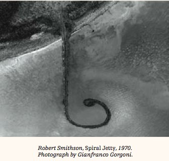
For a generation of art watchers, Robert Smithson’s Spiral Jetty existed primarily as an image, via the making-of film and Gianfranco Gorgoni’s iconic aerial photographs, which were exhibited at MoMA’s seminal Information show and were published in Smithson’s Artforum essay on the work. This mediated encounter with the work inevitably affected its interpretation. But similarly, the 16 years of visibility and visitability since the Jetty’s re-emergence from the Great Salt Lake can lull you into a sense of complacency that you now know the work. And by you, of course, I mean me.
The latest issue of the Smithsonian’s Archives of American Art Journal includes an excellent essay, “Spiral Jetty through the Camera’s Eye,” by doctoral candidate Kathleen Merrill Campagnolo, which looks at how Smithson used photography and film to shape not only the reception of the Jetty, but its conception and evolution as well.
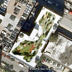
For example, at first, and even until a week after it was supposedly completed, it wasn’t actually a spiral. The image above is from a contact sheet Gorgoni took in April 1970. It shows the Jetty:

…with a single, simple curve to the left, creating a hook shape with a large circle of rocks at the end…In a recently published account of the construction of the sculpture, the contractor Bob Phillips reveals that Smithson considered this first curved jetty, as seen in Gorgoni’s photographs, to be complete, but about a week after the construction crew had been sent away, he called them back to alter the configuration…
…Not surprisingly, the early version of the sculpture was not included in any of Smithson’s Spiral Jetty works. In fact, by the time he had finished his essay in 1970-71, the text reads as if the form the jetty took was a foregone conclusion from his first arrival at Rozel Point.

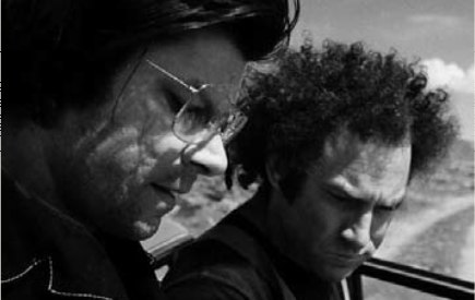
Campagnolo’s article has another Gorgoni photo, of Smithson and Richard Serra looking at a lost/destroyed sketch of Jetty v1.0 with v2.0 superimposed on it.
To see the sketch, you should really read the article. But I am reproducing the top half of the image here because I am in awe of Serra’s impressive Jewfro.
serra_jewfro_gorgoni.jpg
PDF: Vol 47: 1-2, The Archives of American Art Journal [aaa.si.edu via the Archives of American Art Blog Really? Yes. It’s awesome. [blog.aaa.si.edu, probably via tyler green, since it mentions hockey]

Wait, ‘Highly Developed Dutch Cartographic Traditions’?

dutch_adam_map.jpg
From Ken Johnson’s thrilled NYT review of “Pride of Place: Dutch Cityscapes of the Golden Age,” which was at the National Gallery last winter:

The painters of the golden age in Holland brought the city onto center stage and made the cityscape a genre unto itself.
This urban motif evolved out of highly developed Dutch cartographic traditions. Large, intensively detailed maps included in the show suggest an almost obsessive preoccupation with geographical facts.
One of the strangest pieces is a painting of Amsterdam, seen as if from a hot-air balloon. Seemingly every building, street, canal and boat in town is carefully rendered, and shadows of clouds pass over the city and surrounding fields, creating an almost surrealistic mix of the real and the schematic. (Aerial views from Google Maps come to mind.) Made in 1652 or later by Jan Micker, it is a copy of a similar work from 1538 by Cornelis Anthonisz.

I confess, I liked the exhibit, but at the time I was not sufficiently attuned to the highly developed cartographic traditions of the Dutch. And anyway, the oblique angle on that bird’s eye-view map look more like Bing to me.
At the Height of Power for the Netherlands, the City in Glorious Detail [nyt]

Molly Dilworth’s Painting For Satellites

Last fall as the Dutch Landscape paintings idea was kicking into gear, artist Molly Dilworth emailed me a link to her rather awesome project, Paintings for Satellites.

For the last couple of years, since the dawn of the Google Earth Era, Dilworth has been exploring different techniques for creating giant paintings for the once-invisible, now-primary facade known as the roof.

As you can see above, she used a piece of Google/Aerodata’s distinctive polygonal Dutch camo in the study for her most recent piece, which was executed in November on the roof of 547 West 27th street in Chelsea.

The finished painting is more free-form and organic, and is executed, as are all her rooftop works, out of found, discarded paint, so the color’s always a surprise. Very nice work, I hope it’s still visible when the snow thaws.

Paintings for Satelites photo set [flickr via c-monster]

On Celestographs And Photograms

strindberg_celestograph.jpg
Apparently, in the 1890s, the Swedish modernist playwright August Strindberg went through a period of intense imagemaking. He created paintings and photographs [hold that thought] that sound and look decades ahead of their time using chance and natural/chemical processes such as burning and oxidation. Technically, his photographs are better called photograms, but Strindberg called them “celestographs”:

Strindberg distrusted camera lenses, since he considered them to give a distorted representation of reality. Over the years he built several simple lens-less cameras made from cigar boxes or similar containers with a cardboard front in which he had used a needle to prick a minute hole. But the celestographs were produced by an even more direct method using neither lens nor camera. The experiments involved quite simply placing his photographic plates on a window sill or perhaps directly on the ground (sometimes, he tells us, already lying in the developing bath) and letting them be exposed to the starry sky.
The black or darkly earth-colored pictures that eventually appeared are strewn with a myriad small, lighter dots that Strindberg thought were stars. That they might have been drops of dew, some kind of atmospheric particles, or just some dirt in the developer cannot be ruled out.

It’s remarkable that Strindberg was so acutely aware of the subjectivities of photography’s mechanics while remaining apparently oblivious, or at least sanguine, about the unavoidable influences of his chemical process.
deschenes_tilt_swing.jpg
The celestrographs remind me of similarly produced photograms by Liz Deschenes, which she showed at Miguel Abreu last summer. From the press release for Tilt/Swing:

Deschenes fills Bayer’s empty panels with empty photographs – photograms evacuated of all representational content. By exposing photosensitive paper to the darkness of night and bringing the sheets back indoors before sunrise to fix them with silver toner, she produces a range of slightly reflective sheens. The photogram circumvents the responsibility of figurative depiction in favor of temporal record. The photographic moment has passed, but the possibility for another image begins, or continues. The passersby may scan the slippery surface, detecting their own cloudy features. Although out-of-focus and incomplete, we are pictured. The resulting image, more absorptive than reflective, is fleeting. As the exhibition proceeds, the atmospheric circumstances will tend to slightly oxidize the photograms’ surfaces, manifesting a third, time based material operation.

The Celestographs of August Strindberg, by Douglas Feuk, Summer 2001 [cabinetmagazine.org via vvork, thanks andy]
Strindberg’s celestographs were in Massimiliano Gioni’s 2008 exhibit, After Nature [newmuseum.org]

On Thomas Ruff At Aperture

thomas_ruff_17h16m-45.jpg
Joerg has an interesting recap of Thomas Ruff speaking with Philip Gefter a couple of weeks ago at Aperture.
I’m a fan of several of Ruff’s series of work–and distinctly not a fan of others, but hey. Here’s a bit about the Sterne/Stars photos, one of several of Ruff’s appropriation series:

Ruff has worked a lot with images that are not his own, be it the stars, the newspaper clippings, or the images of machines he found on a set of glass plates he bought. Each of those series centers on investigating the essence of authorship or reality in photography: The stars he picked as the most objective photographs one could possibly produce (as an astronomer I’m not sure I agree with this)…Here’s a photographer who not just decided to play with images to have them fit his artistic vision – instead, it’s a photographer who has looked at what photographs can do from a very large number of angles…

I love that Joerg’s an astrophysicist/photographer.
Though Ruff uses contemporary plates from an entirely different survey form a different observatory in an entirely different way, his Sterne are definitely an inspiration for my plan to show and reprint the NGS-Palomar Observatory Sky Survey.
Also an antecedent, if not a direct influence: Ruff’s Jpegs series, which blows up low-res web-scavenged images to grand, pixelated scale. Even though the discussion was scheduled to promote Gefter’s new book and the limited edition of Ruff’s Jpegs catalogue [published by Aperture, with an essay by my buddy Bennett Simpson], the jpeg images didn’t make it into Joerg’s notes.
Neither, alas, did much input from Gefter. He’s a very attuned guy, and it was great to work with him on some of my pieces for the Times. So basically, I’m a 360-degree fanboy over this event, and am hoping Aperture will indeed post video of it soon. Or ever.
update: aha, they did. right here. Thanks again, Joerg.
Ein Abend mit Thomas Ruff [jmcolberg.com]
Thomas Ruff: Jpegs

#Class-y! Collector Panel Saturday 2/27, 6-7pm

Hey Snow People,
I’ll be participating in a “non-hierarchical panel discussion” about collecting art tomorrow, Saturday, 2/27 at #class, that’s hashtagclass, Bill Powhida and Jen Dalton’s show/performance/talk-in at Edward Winkleman Gallery.
The gig is organized by Barry Hoggard and James Wagner, there’s an interesting-looking roster, and it kicks off at 6pm. I’d love to see a bunch of greg.org readers in the crowd, though if you can’t make it, you can always watch the proceedings on the hashtagclass blog’s livestream.
Collecting with your Eye, not your Ear [hashtagclass.blogspot.com]
UPDATE/REPORT Well, that was fun. “non-hierarchical” turned out to mean any/all of the following: sitting around a table in the center of the gallery, surrounded by the audience, which, incidentally, is also how a discussion/interview I did a few years ago at Witte de With was set up; all the images on Barry & James’s collection website are the same size and most everything cost under $1000; or no artists in the discussion have sold much work for more than mid-six figures, if at all. Non-hierarchical, but not by choice.
But it was all good. The one instant I was worried–which John Powers noted, too–was when the one artist pointed in my direction and said, “I would never sell a work to him!” At which point, I looked around–are you talking to me?–and realized he was actually pointing to the screen behind me, which contained a juicily obnoxious quote from Tobias Meyer about bidding and sex, or something. So I dodged that bullet.

On Etienne-Jules Marey And The Photographic Depiction Of Time

mauritshuis_portrait1.jpg
I’ve been thinking about this image from Google Street View, the one of the Mauritshuis which contains two distorted images of the guy’s head. As that elongated lower head shows, Google’s image knitting algorithm apparently combined two photos of the guy, two photos separated by a couple of seconds and/or feet.
It’s like an automated cubism, or futurism, I thought, the photography of multiple simultaneous perspectives, or of motion. Which led me to the work of Etienne-Jules Marey, the pioneering 19th century French physiologist and chronophotographer.
Marey used photography and early cinematography to study motion, and he developed a chronophotography gun which printed multiple exposures on a single surface. Like this pelican landing:
marey_pelican.jpg
I found a couple of eerily relevant Marey quotes from the excellent compilation by GregP [no relation] on Interfacial Effects, a research-lookin’ blog about art and temporality:

“Marey made it possible for the avant-garde to become receptive to new values: instead of escape into the past, the unreal or the dream, there was the double cult of machines and their propulsion […]” (148) inspiring Giacomo Balla & Luigi Russolo, Marinetti, and ultimately Duchamp (1912 Nude Decending a Staircase)
Etienne-Jules Marey : a passion for the trace, François Dagognet
“artists who wished to give form to the new experience of time Bergson so articulately voiced were drawn to Marey’s pictures. They were an irresistible and particularly fecund visual source. For artists the attraction of the photographs lay in one important particular: they were the first images to effectively rupture the perspectival code that had dominated painting since the Renaissance. Marey’s pictures depicted chronological succession within a single frame. Chronophotography provided a language for representing simultaneity – what was popularly understood to be Bergson’s idea of time.”
Picturing time: the work of Etienne-Jules Marey, Marta Braun [google books]

Many of Marey’s studies have been digitized by the BIUM at the University of Paris and are available online.

Your Imploded View (2001) By Olafur Eliasson

For all my talk lately about satelloons, Olafur’s stayed very politely quiet about his own giant, swinging aluminum balls. Maybe because he only has one? Seriously, though, I hope it’s an edition.
imploded_view_olafur_kemper.jpg
Your Imploded View is a 51-inch diameter, 660-lb polished aluminum sphere that swings like a pendulum. It dates from way back to 2001 [!], though it’s not clear when it was first realized. At that weight and dimension, it has to be solid, which is rather spectacular. Such precision-manufactured geometry reminds me of the fantastically produced objets de science like Le Grand K, the International Kilogram Prototype stored outside Paris.
Anyway, the Kemper Art Museum at Washington University in St Louis purchased Your Imploded View in 2005, and it’s on permanent view in the atrium there. Kemper curator Meredith Malone’s YouTube video is nice and informative, but HD would be better for capturing the sculpture’s experience. Don’t miss they guy using the special, custom-made Your Carpet-Wrapped Pushing Trident to get the ball swinging.

Your Imploded View (2001) by Olafur Eliasson on permanent view at the Kemper Museum, St Louis [kemperartmuseum.wustl.edu]

Some Writings On Giacometti & Looking

giacometti_moma.jpg
These are mostly for me, just kind of gathered here without order or comment for the moment. I’ve been thinking about Alberto Giacometti lately, and his sculptural, spatial pursuit of that moment when a figure comes into view.
Arthur C Danto in The Nation 2001 about Sartre in 1948 on Giacometti:

Sartre says something even more striking about Giacometti’s figures. “The moment I see them, they appear in my field of vision the way an idea appears in my mind.” This is a way of explaining the somewhat ghostly feeling of his figures, as if they were persons whose bodies had been all but erased. Giacometti was legendary for destroying his work–his studio floor would be found littered with broken plaster in the morning, after undoing a night’s work. I think this was the result of an impossible effort to eliminate whatever gave them the solidity that belonged to their material condition as sculpture.

Rosalind Krauss in Artforum 2001 quoting Sartre in 1948 on Giacometti:

“Giacometti,” Sartre wrote, “has restored an imaginary and indivisible space to statues. He was the first to take it into his head to sculpt man as he appears, that is to say, from a distance.” And because this is man as he is perceived, it is fitting that these sculptures should all be vertical, since Sartre equates perception with walking, traversing space, doing things, just as he links imagining with the body’s repose. If one dreams lying down–as in the sculptor’s earlier, Surrealist, s leeping women–one perceives standing up.

Michael Kimmelman in NYT 2001 on Giacometti’s MoMA retrospective:

In the 1940’s and 50’s, when he made extremely thin heads, flattened on both sides like pancakes, Giacometti talked about the effect of looking at somebody straight on, then from the side. He was rejecting the Cubist idea that it was possible to keep different views of the same person in sight at the same time. ”If I look at you from the front, I forget the profile,” he said. ”If I look at you in profile, I forget the front view.” Which is precisely what happens: if we move 30 degrees left or right off-center of these heads, the face becomes a profile. Back six inches, the profile disappears. If we move: the work is about our distance from the figures, our position vis-a-vis the heads or striding men or standing women.

Kimmelman in the NYT 1996 reviewing David Sylvester’s incredible book, Looking at Giacometti:

The issue for Giacometti became the pursuit of what he called likeness. Roughly, it had to do with trying to represent the real experience of seeing, apart from artistic conventions: on the simplest level, conveying the actual swimmy sense of distance and engulfing space when viewing figures across, say, a broad street, or conversely, the vertiginous foreshortening you get when standing face to face with someone. Likeness also had to do with something less tangible but still real: the intense sensation of the shared gaze between living artist and living model. Mr. Sylvester contrasts Giacometti with Matisse in this respect. “The Matisse sculptures present a figure seen whole and entire now, in an instant of time, in any instant of time, meaning outside time,” he writes. “The Giacometti sculptures seem to present figures as they are perceived while time passes.”

I’ve GOT to get Sylvester’s book out of storage this weekend. That, and Herbert Matter’s photobook of Giacometti’s sculptures. I have my Bonnefoy, of course, which is beautiful to look at, but nearly impossible to read. Just, wow, what is going on there?
image: City Square, 1948, via moma.org

Mauritshuis Gets Google Street View Camo?

mauritshuis_gmap.jpg
Because I now appear to be constitutionally incapable of doing otherwise, after mentioning the Mauritshuis, the Vermeer-loaded Royal Picture Gallery in The Hague, I checked to see if was camo-obscured on Google Maps.
[I kind of knew it wasn’t, because it’s situated smack in between two prime Dutch Camo Landscapes: the Noordeindepaleis and the Ministry of Defense HQ, but I looked anyway.]
And while we knew that Google Street View has come to Den Haag, I didn’t realize it was just a couple of months ago. And with the Google Trike, no less.
Here’s where the museum–a 17th century mansion, is supposed to be, but whoa.
mauritshuise_streetview1.jpg
It’s apparently camouflaged as a generic glass & steel office building. Took me three passes to find it. By which point, I became kind of fascinated with the way Street View knits together its panoptic images, particularly when they include people. I love Google’s Cubist-meets-Robert Lazzarini-meets-Julia Scher-meets Hans Holbein the Younger portrait style.
mauritshuis_portrait1.jpg

What I Looked At In 1995: Vermeer’s View Of Delft

vermeer_view_of_delft.jpg
The inconvenient intrusion of war and political upheaval [i.e., the collapse of the Dutch government and the looming withdrawal of Dutch troops from their frontline deployment in Afghanistan] into my Dutch Landscapes project has sent me trying to re-find some discussion of Vermeer that’s stuck with me for years.
Like so many hundreds of thousands of others, I made a trip to the National Gallery in Washington in the winter of 1995 to see the first Vermeer exhibition in almost 300 years. It was a DC that may be hard for folks today to even conceive of: the show was abruptly opening and closing, thanks to massive snowfall and two government shutdowns orchestrated by an obstructionist Republican agenda led by Newt Gingrich. [I know, right? He seems so nice.]
Anyway, 21 of the world’s 35 Vermeers were there, including View of Delft, loaned by the exhibitions only other venue, the Royal Gallery at the Mauritshuis in The Hague.
The Essential Vermeer puts the date depicted in the painting as early May, 1660 [the evidence: leaves on the trees, the boat activity, and the empty tower on the Nieuwe Kerk, because the bells were in the shop]. It seems so banal, so placid, so idyllic.
But I remember reading a discussion of how deceptive, or at least complicated, this peace was, in light of Delft’s own history. The argument centered on the high-contrast beam of sunlight Vermeer punched through his rainclouds to illuminate the Nieuwe Kerk, in the center background of the painting.
William of Orange had used Delft as a base for launching in 1568 what became the Eighty Years War, against Spain, the Hapsburgs, and the Holy Roman Empire, which turned on issues of religious intolerance, taxation without representation, and centralized power. William was assassinated in 1584, and because his family’s traditional seat, Breda, was still in Spanish hands, he was interred in the Nieuwe Kerk. So are his successors in the House of Orange-Nassau, who continued the fight, and who have ruled the Dutch Republic since it won its independence with the Treaty of Westphalia, which was signed on May 15, 1648.
But wait, there’s more! In 1660 the city was also still recovering and rebuilding after the Delft Thunderclap of 1654, a massive gunpowder explosion at a waterfront munitions warehouse that killed over 100 people–including one of Delft’s most well-known painters, Fabritius Carels–injured thousands more, and leveled a huge section of the city.
If Vermeer were alive in 2013, then, the equivalent painting might be the rainy skyline of lower New Amsterdam from the Hudson, where a ray of sunlight picks out the details of an unobstructed St Paul’s church–if George Washington and all the subsequent presidents were buried there. If there’s a Dutch equivalent of a bald eagle with a tear in its eye, Vermeer showed remarkable restraint by not including it.
UPDATE I’ll get out my DVD set in the morning to confirm, but I think Tyler Green’s right, it’s the first essay in Lawrence Weschler’s 2004 book, Vermeer in Bosnia, which was originally published as “Inventing Peace,” in The New Yorker, Nov. 20, 1995.
Yep, here we go, Weschler’s setup for the remarkable story of how the head of the International War Crimes Tribunal in The Hague kept himself sane by looking at the Vermeers at the Mauritshuis:

For, of course, when Vermeer was painting those images, which for us have become the very emblem of peacefulness and serenity, all Europe was Bosnia (or had only just been): awash in incredibly vicious wars of religious persecution and proto-nationalist formation.

Wow, maybe I should re-read the whole thing rather than post updates every page, but. Weschler quotes Harry Berger’s idea about Vermeer’s deployment of “‘conspicuous exclusion,’ of themes that are saturatingly present but only as a felt absence.”
What a fantastic phrase, which immediately reminds me of a comment left by Jerome Bertrand on Ogle Earth’s original 2006 coverage of the Dutch Google Map censorship issue:

All the same, someone at Royalty level (AIVD?) would choose to typically blur out certain private residences – so it ends up you can find them quicker than others by just scanning for blurred spots in the area. This is helpfull [sp] when you need to know what’s hot.

Dutch Camo Landscapes On Google Streetview? Nee

no_google_streetview_rott.jpg
You may recall how Google Maps recently changed the polygonal camouflage on one of the Dutch landscapes I was using for my painting project.
I was back there, getting a clean shot of the nicely distorted grid plaza–the site belongs to the Koniklijke Marine, the Royal Navy, and is apparently the home address for the Royal Marine Band–when I saw that the Streetview icon was activated. Looks like Google’s camera cars reached the football field-filled outskirts of Rotterdam.
But not all of them. The available imagery shows that Google is excluding all street-level imagery from around the camo’d compound. The previous official explanation for camo-obscuring intelligence-sensitive sites was that the Dutch government claimed jurisdiction to censor aerial photography, but not satellite imagery. I guess there’s another law that forbids street-level photography from public roads, too? Yes and no.
A quick stop at the ur-Dutch Camo Landscape, the Noordeinde Paleis in The Hague, shows that Streetview is unavailable for its entire perimeter. But the other camo’d complex, a Royal Garage or something, to the northwest through the park, shows up just fine. The south perimeter of that giant, cut-n-past camo blob is just fine, which makes me think that the building being camo’d–I think it’s the HQ of the Defense Ministry itself–is on the next street up, which is, indeed, blocked. Unfortunately, Noordwijk ann Zee, the beachfront town that is the site of my favorite inexplicable, airdropped camo blob, has not yet been added to Streetview.
Update: In actual governmental/military news, the Dutch coalition government just collapsed in the face of growing opposition to extending the deployment of 2,000 Dutch troops in NATO’s operations in southern Afghanistan.

On Reading Auras

As you can guess from the mentions of Sherrie Levine, I’ve been studying the issues around copying and reproducing and originality and authorship. And whenever you do that, Walter Benjamin comes up, specifically his concept of aura.
Basically, it’s what an original work of art has that a reproduction doesn’t. Except when it does. It’s what declines or disappears in the process of mechanical reproduction–especially in the cinematic process, which interested Benjamin greatly–but then it comes back sometimes. Somehow.
Just in case quoting or arguing Benjamin at length is tedious or pretentious to the Twitterized reader, I’m putting a few quotes and sources after the jump, for my own reference later. They are:
Sherrie Levine
John Perrault
Samuel Weber
Grant Wythoff
Miriam Brantu Hansen

Continue reading “On Reading Auras”

Uncle Rudi, Is That You?

ft_uncle_rudi.jpg
Who are the freaks and nerds who call out picayune corrections in newspaper articles? Me, for one.
On a New York Times piece I did once, I changed an entire line during the copyediting process. The piece was much, much better for it, I think, but I got chewed out afterward because, apparently, it required several people staying late to re-layout a whole page, which delayed the closing of the section.
As penance, I’ve been pretty fastidious ever since about quickly slipping the Times’ web editors little corrections–usually of peoples’ names, ex the kind of things that might cause unnecessary embarrassment–for Arts stories. [Oy, in one pseudo-liveblog post from Miami Art Basel, the correspondent misspelled basically every name she dropped. And no, it was not Linda Yablonsky; she is an exquisite name dropper.]
Anyway, last weekend, the Financial Times mentioned the new Gerhard Richter biography in Jackie Wullschlager’s survey of books on German painting. Their whole point was about how loaded Richter’s blurred portraits of his family were, such as Uncle Rudi.
The FT transposed the captions with the Richter and a portrait by Otto Dix. When I tried to do my typical one-click correction, I was surprised to find that the FT doesn’t appear to even publish an address for corrections. Or for reaching the editors.
Setting aside the whole implication that the very idea of being corrected didn’t cross their minds, the whole FT website contact interface turns out to be oriented to subscribers/users and the support of the paid consumption experience.
As such, it has taken a week for me to receive an automated reply, and now my comment had been forwarded to the appropriate department. As the fresh screenshots show, the error remains.

Gareth Long’s Untitled (Stories)

gareth_long_seymour.jpg
Gareth Long’s giant lenticular prints based on the iconic-yet-anachronous 1991 cover designs for JD Salinger’s books are freaking me out right now.
They’re like Noland or Morris Louis canvases, reanimated through some immediately dated, retrofuturistic technology. Something an aesthete in an early Star Trek movie might have had hanging on his wall. Jeremy Blakes that still work in a blackout.
Which is why they freak me out so much. A Color Field painting hangs unobtrusively, even decoratively, on the wall. A Blake requires turning it on and watching it. You can’t work with those things on in the background, any more than you could sleep with the Flavin on.
Long’s lenticulars thwart all that passive/active viewing negotiation by always being on. If they’re in the room with you, you can’t not look at them.
Go ahead, try it. They’re on view through next weekend at Kate Werble Gallery on Vandam St.
Above: Untitled (Seymour) is the most Salinger cover-esque, while Untitled (Zooey) is the most unabashedly psychedelic. Both images are from Long’s site, where he also offers video clips of the pieces.
Colby Chamberlain ties this “restless” aspect to Salinger in his Artforum review [artforum]
Untitled (Stories) [garethlong.net]