
“I came because of Prince.” Untitled (Screenshot), 2015, png
cf. @gregorg. ibid.
Category: etc.
Redneck-Flown Confederate Flag

What’s that? #20 – Soyuz TMA-5 Flown Flag? Oh nothing, just a flag, like you’d see anywhere.
Next month RR Auction is selling a Confederate Flag that flew on the International Space Station. It is signed by Salizhan Sharipov, the Russian cosmonaut who brought at least five of the flags to the ISS in 2004-5, and by NASA’s own Leroy Chiao, who was the commander of the pair’s 6-month expedition.
The flags caused an uproar when they first started appearing on the flown souvenir market in 2006, and both Chiao and Sharipov acted like they had no idea how those flags might’ve–Confederate flags, you say? Well how’d that–who coulda–
Which seems like total crisis PR-driven bullshit, and a lot of needless racist hassle for a couple hundred bucks. But anyway, here one of the apparent five flown is.
#20 – Soyuz TMA-5 Flown Flag, est. $200, sold for $437.33 [rrauction]
How Did A Confederate Flag Get Aboard the International Space Station? [spaceref]
Paul Revere (Attr.), Time Capsule Plaque, Silver, Engraved Text, c.1795
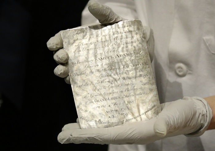
image: via usnews
I may have tweeted smack about it when I thought it was just old newspapers and coins, but that’s only because initial headlines of Samuel Adams’ and Paul Revere’s time capsule in the cornerstone of the Massachusetts State House criminally underplayed the presence of this amazing, engraved silver plaque.
THIS is EXACTLY the kind of thing people should put in time capsules: slightly-precious-but-not-too items handmade to commemorate the occasion. These artifacts capture the moment, but more importantly, they retain an historical significance, and who knows, in time they may accrue an aesthetic aura as well.
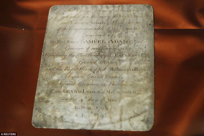
image via reuters
The Boston time capsule plaque also benefits from the connection to the still-relevant Revere brand; whether he actually made it or not, it feels plausible, authentic. There is also the handmade aspect: I have an engraved ring, and a stationery die, but a whole engraved plaque? That’s something.
[It’s not the intern who wrote this USNews piece’s fault for describing every item in the time capsule in terms of its market value, and the impact a Revere attribution & provenance might have on it. Every report has that. It’s just another sign of who we’ve become as a culture. Like Antique Roadshow.]
A more interesting cultural change is the invisibility/illegibility of whatever the plaque actually says, and what it might mean. The Masonic context goes unremarked or glossed over in the mainstream coverage of the plaque. He that still hath ears, two hundred years on, let him hear, I guess.
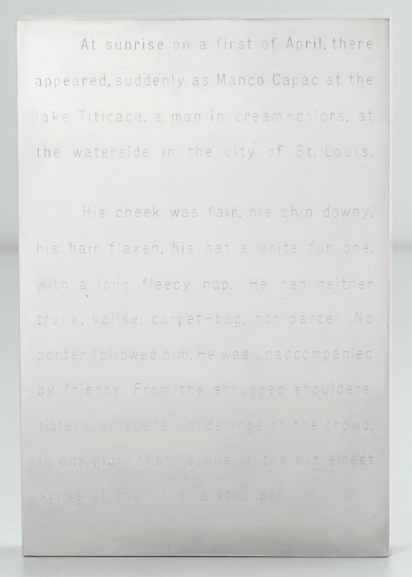
Invisibility was one of the qualities of engraved text that appealed to Walter De Maria early in his career; he made a series of polished steel or aluminum works with engravings on them: Garbo Column (1968) had a list of the reclusive actress’s 27 films; Melville (1968, above, which I have swooned over before) features the opening of the author’s first hit novel, The Confidence Man.

The Barnett Newman-scale monochrome painting De Maria asked Michael Heizer to make for him for Dwan Gallery’s 1968 Earthworks show has its title engraved on a polished steel plaque in the center: The Color Men Choose When They Attack the Earth. Can you read it in this picture?
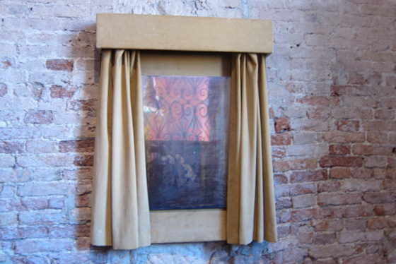
Walter De Maria, Silver Portrait of Dorian Gray, 1965, at the Prada Fndn’s exhibit in Venice in 2011, image: @fabyab
De Maria created at least one work in silver. It was for his patron at the time, Robert Scull, who fronted the dough for the fabrication of a series of polished metal sculptures. Silver Portrait of Dorian Gray (1965) is just that: a mirrored silver plaque behind a velvet curtain that darkens and oxidizes over time. The artist’s instructions on the back offer the owner the chance to wipe away the stains of aging, though: “When the owner judges that enough time has passed, this plaque may be removed to free and clean the silver plate.” The promise of immortality, the opposite of a time capsule, at least for the mirror. Your call, Miuccia!
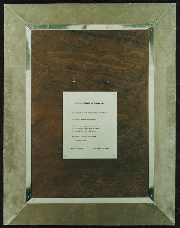
image:
UPDATE A brief dive into the history of time capsules tells us we need to pay more attention to the Masons, and to the Egyptians. The birth of the modern/20th century time capsule is linked to the discoveries of relic-filled Egyptian tombs and pyramids. And in a list of the International Time Capsule Society’s 1991 list of the Top Ten Most Wanted Time Capsules is this:
5. George Washington’s Cornerstone
Today’s custom of burying time capsules is in part an outgrowth of Masonic cornerstone-laying ceremonies. Through the centuries, Masons have officiated at rituals which often include placing memorabilia inside building cornerstones for later recovery.In 1793, George Washington, a Mason, performed the Masonic ritual upon the laying of the original cornerstone of the U.S. Capitol. Over the years, the Capitol has undergone extensive expansion, remodeling and reconstruction, but the original George Washington cornerstone has never been found. It is unknown whether there is anything inside of it.
Here is a Mason’s explanation of the cornerstone laying ceremony, one of the only public Masonic rituals. [“When the brethren are sharply dressed, and well-rehearsed, it’s an awesome thing to behold.” mhmm.] And Wikipedia’s article on cornerstones has a brief account of a 19th century cornerstone laying ceremony in Cork, which involved “a trowel specially made for the occasion by John Hawkesworth, a silversmith and a jeweller.” So maybe these engraved plaques are also a thing?
Coins, Newspapers Found in Time Capsule Buried by Paul Revere [usnews]
Previously, very much related: While We’re On The Subject Of Polished Metal Objects: Walter De Maria
On Scraper Capitalism
Last summer I wrote about discovering Artisoo, a company selling oil paintings of thousands of artists’ images on Amazon. “Chinese Paint Mill has appropriated Google Images and put it up for sale on Amazon,” I wrote.
Which reminded me of LifeSphere, the Spamerican Apparel botcompany Babak Radboy wrote about that systematically turns every public domain image into every possible Zazzle product.
We have all set our sights way too low.

image via @tomasvh
This week Dutch National Geographic photographer Tomas van Houtryve began posting pictures of iPhone cases featuring a photo of his, which had recently been selected as a Time Magazine photo of the year.

screenshot from pbs.org
PBS reported that NYT photographer Tyler Hicks found iPhone cases for sale featuring several of his images, including dire pics of Ebola patients and Palestinian children being shot by snipers in Gaza:
“Who wants to buy a picture with a dead child on it,” said Tomas van Houtryve…”If any human being in the process had seen that, I don’t see how it could possibly get through”.
Which is exactly the wrong question and the right answer for this situation. They and the outrage associated with them only exist once they’ve been searched for, and the product will only exist after it’s been ordered. Because these images, like tens, hundreds of thousands more, have been scraped from the web and turned into products by bots.

By focusing on the laughably limiting category of public domain images, Spamerican Apparel was too timid and deserves to fail. For these Amazon iPhone case sellers copyright’s no object, and Google Images is just the start. Cropping is strictly default settings, actual image be damned. Among the 6,324 phone cases offered for sale by Lynn A Carter are hundreds printed with the center of PR photos of various cars. They have descriptions like, “Daly R Martinez NVDWiaj2848OHOgq Case Cover Iphone 5c Protective Case Alfa Romeo Giulietta 36.” Daly R Martinez is another Amazon seller. The string is a product ID, different from Amazon’s ASIN. Then there is product + the data that was scraped with the image. SEO enough for Amazon.

They really do just grab any damn image at all. Like this, LvukQDp7415hnQVt Snap On Case Cover Skin For Iphone 6 Plus(kerry Washington). It’s a red carpet photo from October 2013. There are nearly 300 other Kerry Washington phone covers like this.

L to R: “Corner Blocked Kitchen With Stainless Countertops Sleek White Cabinets”; “Kitchen Peninsula With Quartz Countertop In Kitchen”; “Eclectic Kitchen With Artistic Pendant Lights” iphone cases
My favorites so far have to be the kitchens. The scrapers have found Pinterest, and have turned it into iPhone covers. Here’s the one on the right, on a Pinterest board called “Junk Ideas.” Scrapers are turning the great image vortex of our digital ocean into an actual island of plastic garbage on demand. Who are these people?
I will wager they are not the people listed on Amazon, but more digital simulacra. Searching for the sellers turns up a Chinese-language website run on a free .tk domain which is used to manage case returns for various Amazon IDs. Poking around the domain also turns up a quick&dirty Amazon upload management dashboard. It looks to me like a Chinese case manufacturer is flooding Amazon with hundreds or thousands of bogus sellers, each with thousands of scraped data-derived products. That award-winning photographers’ images and names got scraped as well should come as no surprise.
What Amazon will do about this vast, digital garbage dump of a retail offering is not clear. Maybe this is just the way it’s going to be from now on, every image always available on every product. Maybe we will adapt to Scraper Capitalism by becoming Sifters, consumers attuned to the surreal moments, the horrific, the sublime, the sea glass and driftwood of the web. We’ll develop tools for surfacing them, and critical faculties for appreciating them. If we do, Amazon will have them, just 1-Click away.
Protestors’ Folding Item, 2014

Installation view: Protestors’ Folding Item (LRAD 500X/500X-RE), ink on Cordura, nylon webbing, LRAD, 2014, Collection: NYPD Order Control Unit
NYPD used an “LRAD” sound cannon today on high school students who staged a Ferguson walkout (via @SeismoMedia) pic.twitter.com/soUovemuUj
— Michael Tracey (@mtracey) December 2, 2014

Installation view: Protestors’ Folding Item (LRAD 500X/500X-RE), 2014, Collection: NYPD Order Control Unit
This is related to this: Traveler’s Folding Item or, in French, Pliant de Voyage, an Underwood typewriter cover as Readymade by Marcel Duchamp.
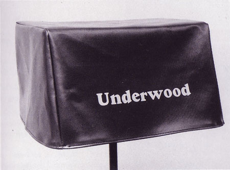
Traveler’s Folding Item/Pliant de Voyage, 1964 Schwartz replica of the lost 1916 original
From Tout Fait,
On the most basic level, Traveler’s Folding Item stands as a typical Readymade. It demonstrates the clear displacement of an everyday object from its original context and function. A cover with no typewriter for it to protect is utterly useless. It tempts the viewer to look underneath its skirt, and suddenly it takes on some very sexual meanings. Museums often strategically display the typewriter cover in a manner so as to tempt the viewer in this manner as if it were a woman’s skirt. Joselit explains, “This item, which Duchamp identifies with a feminine skirt, should be exhibited on a stand high enough to induce the onlooker to bend and see what is hidden by the cover” (90). In this way, this Readymade acts as an invitation to voyeurism.
You know what else is utterly useless and tempting? An LRAD with a cover on it. Which is why I am stoked to announce my latest work, Protestors’ Folding Item, a series of LRAD covers, installed on LRADs.
What does it mean to declare LRAD covers a Readymade? Such a designation definitely does not hinge on my making them, or my cashing the checks for their sale. Sorry, flippers, they’re only available to institutions. [Carlyle & Co. folks and the Zabludowiczes, call me, we can probably work something out.] If anything, it’s a relief not having to worry about fabrication or sales. I can really just focus on the work. True, it takes some effort to gather documentation on venues and edition size, but it’s not something a diligent registrar can’t handle.
Given the interest my institutional collectors have in control, it also might be difficult to arrange loans to show them in galleries or museums. Which doesn’t mean they won’t be seen publicly. In fact, at the apparently increasing rate LRADs are being deployed, I’d say my CV is about to explode.
What would the legal implications be for my declaration of these Readymades? Could copyright or VARA or droit moral be used to assert control over the public display of these, my works?
In Alberta, Canada, an artist has fended off gas drilling and pipelines on his farm for eight years by copyrighting his land as an artwork [and by charging oil & gas companies $500/hr to discuss it]. Yves Klein once signed the sky.
According to my fabricator’s website, “The LRAD 500X / 500X-RE systems [underneath Protestors’ Folding Item] produces a sound pattern that provides clear communication over long distances. The deterrent tone can reach a maximum of 149 dB (at one meter) to influence behavior or determine intent.” My work, too, is designed to provide clear communication, influence behavior, and determine intent. That’s why they go so well together, like a glove on a hand. Really, they’re inseparable. You can’t have one without the other.
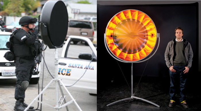
L: You Hear Me, 2007, R: Eye See You, 2006
“The art world underestimates its own relevance when it insists on always staying inside the art world. Maybe one can take some of the tools, methodologies, and see if one can apply them to something outside the art world,” said Olafur Eliasson. In T Magazine. “If we don’t believe that creativity as a language can be as powerful as the language of the politicians, we would be very sad — and I would have failed. I am convinced that creativity is a fierce weapon.”
I hope LRAD cover readymades, are too, and that collectors of my work will preserve its integrity by exhibiting it only as originally intended, with the covers on the LRADs.
17 U.S. Code § 106A – Rights of certain authors to attribution and integrity [law.cornell.edu]
Hong Kong Police Street View

Police in Hong Kong have deployed a new mobile pepper spray platform against protestors near Mong Kok.
I start with this image via @krislc, Kris Cheng, because it gives nice context, also the guy is watermarking it with his face? I’m filing that trick away for future use.
At first it looked like it’s made out of PVC pipe, but it’s surely painted steel. Actually, it looks like a smaller variation of the stairs in Home Depot.
Most of the info comes from @galileo44, Galileo Cheng. Like this picture of the police conferring on Portland St. With their pepper spray cannons on their backs. Unless those are #umbrellas.
Here is krislcc’s Vine of the new platforms in use on her. Galileo calls them castles. They’re hand pumped. Like Super Soakers or something. Incredible.
Here’s another. What is most striking to me about this one is how the two police officers move together: one with the pepper spray, the other with a video camera. Kris Cheng says the the pepper spray isn’t that strong; the effects didn’t last more than 45 minutes. But the police will play a long game with those images.
Speaking of long game, holy smokes. I thought I’d scout out the Mong Kok streetscape on Google Maps, and this is what came up:

It was startling to be met by an unblurred face. And the vantage point was so high. But turn around. This is a pano. Or a “Photo Sphere.” From September, of the intersection blocked by a sit-in. It’s credited to nJohn.
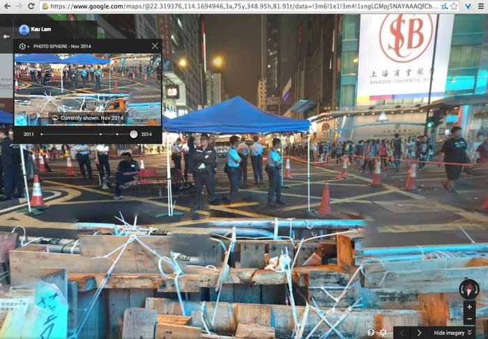
There are more recent Photo Spheres, too. Including November, by Kau Lam. The protestor-decorated police barricades are stitched together pano-style. Google Maps as a reporting platform. When will it go live? Will Google get castles of its own, or will cameras on long sticks suffice?
Inspiration For My Quiet Place Everywhere: 1965 Kaiser Jeep Fleetvan

Except for every Grumman LLV I pass, I’ve never wanted to turn a mail truck into a slicked out room-on-wheels as much as I want this 1965 Kaiser Jeep FJ-6A Fleetvan.

And since the USPS is not letting the Grummans loose in the wild yet, this Jeep may be my best chance. I mean, check out that glass, it may even be better. I could totally park that as an office somewhere. Or a roving gallery. Or a podcast studio. Or an Enzo Mari mobile bookstore. This is Cabin Porn™ I can get behind.
Hm, actually, after reading through all the projects, rat rods, parts salvages and failed snowcone stand dreams in the FJ boards at ewillys.com, I may pass.
Hard to find 65 FJ-6A Fleetvan – $3500 (Grapeview) [seattle.craigslist.org via bringatrailer.com]
Which, given the ad histories here, seems a little high [ewillys.com]
Previously, most definitely related: Bombiani Librimobile, 1955, by Enzo Mari
W.H. Auden’s The Shield Of Achilles, Read By A Machine
I’m not BFF’s with Siri, but sometimes I do like to have things read to me by my computer. So when I finished reading Michael Sacasas’ post about psycho dad videos and performative parenting, I wanted to read the rest of W.H. Auden’s “The Shield of Achilles”. And then I wanted to hear it, so I had the text-to-voice synth Alex read the poem, too.
And for no particular reason, I’ve put it online.
The Shield of Achilles, by W.H. Auden, read by a computer [mp3, 4.7mb dropbox, greg.org]
Podcast: Play in new window | Download
Subscribe: RSS
Aspen, The Unpublished Magazines In A Box
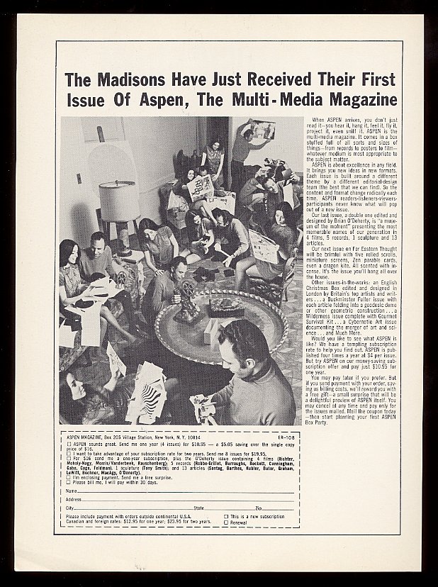
Here is an ad for Aspen Magazine in which The Madisons are composited all over their living room with pieces of various Aspens, including Brian O’Doherty’s “Museum in a Box,” Aspen 5+6 (1967). Actually, the text calls it a “museum of the moment.”
And here are a bunch of awesome-sounding Aspens which really did not happen like this.
Our next issue on Far Eastern Thought will be brimful with five rolled scrolls, miniature screens, Zen parable cards, even a dragon kite. All scented with incense. It’s the issue you’ll hang all over the house.
Other issues-in-the-works: an English Christmas Box edited and designed in London by Britain’s top artists and writers…a Buckminster Fuller issues with each article folding into a geodesic dome or other geometric construction…a Wilderness issue complete with Gourmet Survival Kit…a Cybernetic Art issue documenting the merger of art and science…and Much More.
O’Doherty’s 5+6 really turned out to be Aspen’s peak. That British box took at least two Christmases to arrive, and the Far East issue finally appeared, sans incense, four years later, the last one. Which is too bad; I’d love to see these other issues realized.
Nuclear Chain Reactional Aesthetics
As cool as it might be as an object, there’s something about that “Manhattan Project Glass” window that just ain’t sitting right with me. I will not be bidding.

The Faces of Project Y, detail, assembled by Alex Wellerstein, via nuclearsecrecy.org
But researching it has led me to some absolutely amazing other objects from the dawn of the nuclear age that are well worth pursuing in an artistic context.
Let’s start with The Faces of Project Y, by historian Alex Wellerstein. A couple of years ago Wellerstein pulled all the recently declassified ID badge photos from the 1,200+ people who worked on Project Y, the code name for the Los Alamos section of the Manhattan Project. Then he tiled them up into one giant, 31×40 grid. It’s awesome.
That’s Richard Feynman smirking in the center of the detail, just above the woman with the Gerhard Richter blur. Wellerstein puts faces to other notable names on his blog, Nuclear Secrecy, and has created some swag coffee cups and other merch with the images on it. A giant print would be nice. But what’s needed, clearly, is wallpaper. Rather than lose the 29 folks on the bottom, incomplete row, maybe you could get all the images as individual files, and just let it flow till the wall is full.
I don’t know how I missed the extraordinary career and sad story of nuclear sculptor James L. Acord. Thanks to Seth David Friedman for pointing me to Tom Moody’s incredible 2001 tale of Acord’s rare, realized masterpiece, Monstrance for a Grey Horse. I will keep reading.
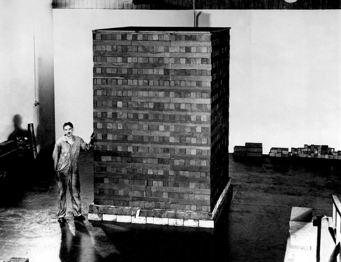
Then there is the first nuclear reactor, the Chicago Pile-1, built under the football stadium of the University of Chicago in 1942. To create a sustained, controlled nuclear chain reaction, Enrico Fermi and his team embedded uranium balls in a giant, quasi-spherical lattice of 45,000 graphite bricks, which were supported by a lumber grid, which was enclosed by a square, black rubber balloon.
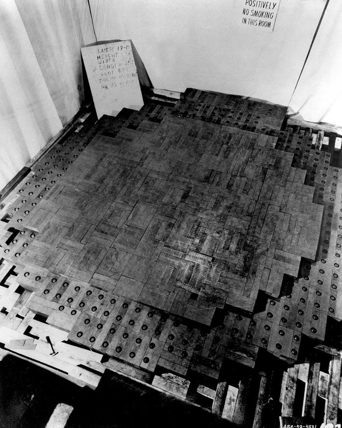
Last year the Dept. of Energy posted photos of CP-1 to flickr, and it was basically Carl Andre’s greatest sculpture. Ever.
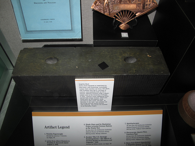
CP-1 graphit brick at the Atomic Testing Museum, img via flickr user rocbolt’s CP-1 photo album
At least four of the graphite bricks are known to survive. Here’s one at Oak Ridge. This photo by Kelly Michals is of the brick at the Atomic Testing Museum in Nevada. I don’t know why you couldn’t recreate the thing anew. From a window with a dodgy backstory, an untimely death, and a bunch of mug shots, to a nuclear Carl Andre Death Star inside a Kaba’a. These dots practically connect themselves!
This Window From Hanford Is Being Sold As ‘Manhattan Project Glass’
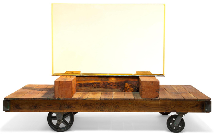
Here is a window from the world’s first full-scale nuclear reactor in Hanford, Washington, USA. It is 3 feet high, 4.5 feet wide, and six inches thick and weighs 1,500 pounds.
I will buy it from someone who bought it from a junkyard in Walla Walla. I will strip it from its casement, except the bottom, where I will install three LEDs. Then I will attach it to an H-shaped base made of 8-inch timbers. I will attach this base to an old wooden cart.
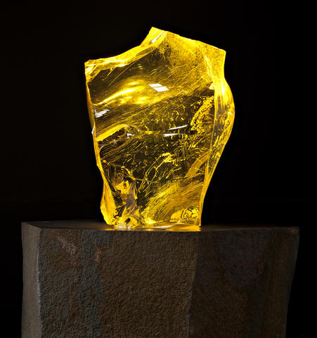
I will take other, smaller windows of leaded glass salvaged from the reactor, which are 16×26 inches, and weigh 800 pounds, and I will carve some of them into sculptures. I will polish some large shards of this glass into abstract sculptures.
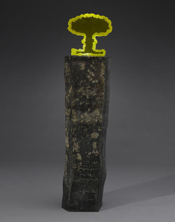
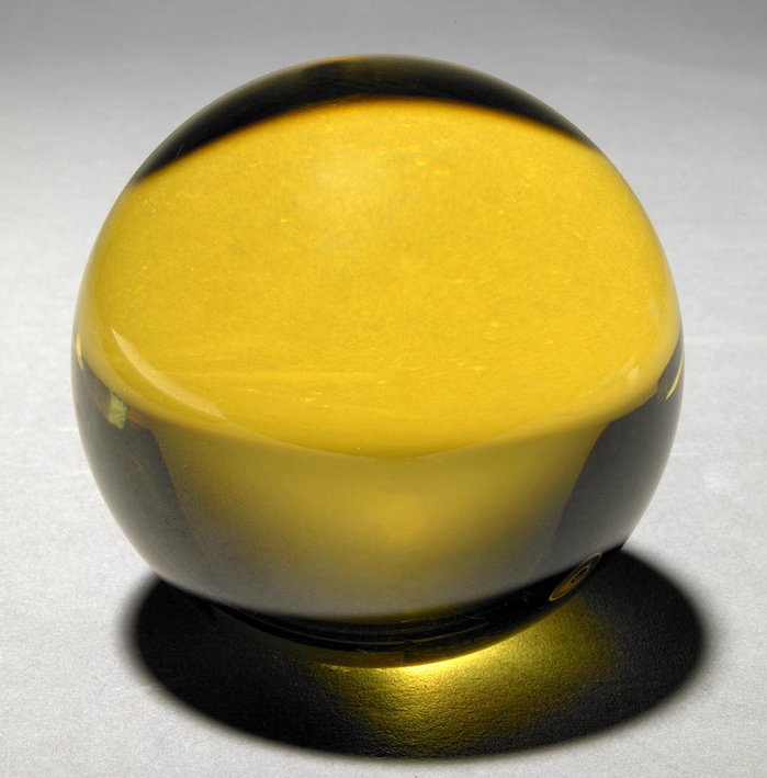
I will carve one piece into the shape of a mushroom cloud. I will set these sculptures on a basalt column mined from the reactor site. I will carve two pieces into spheres.
Someone will cut other pieces of this glass into an indeterminate number of 2-inch cubes. Someone else will carve one piece of this glass into a 1.5-inch skull.
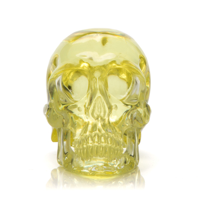
I will try to sell as much of this stuff as I can through a booth at the Mineral & Fossil Co-op in Tucson. I will sell a 4-inch diameter sphere for $10,000 and a shard sculpture for $48,000 at Bonham’s.
The next year, I will show more shards and the mushroom cloud and the big window at the Mineral & Fossil Co-op in Tucson. Where no one buys the mushroom cloud ‘curiosity’ for $150,000. I will fail to sell the mushroom cloud for $100,000 at auction.
The next year, I will try to sell the big window on the trolley at auction for $150,000-250,000.
The Internet will explode. Yet no one will ask why, if the windows from the Manhattan Project were 16×26 inches, and this one is 36×54 inches, it is not actually from the Manhattan Project, but maybe from any other period of the Hanford site’s five-decades of operation, when its nine reactors and five large-scale plutonium processing complexes produced most of the plutonium for the 60,000+ weapons in the US nuclear arsenal.
And no one will ask why, if the glass is not actually radioactive or contaminated in some other way, even though it was salvaged from one of the most toxic sites on the planet, one of the first EPA Superfund sites [pdf], where specialized crews of hundreds of people spend five years dismantling structures containing such windows in ways that don’t dislodge even a flake of plutonium-laden paint, to the cost of $150 billion and counting, with decades still to go, maybe it wasn’t installed in a reactor? Maybe it was parts? Maybe there’s any documentation or provenance information at all regarding this glass’s actual historical use?
And certainly no one will ask about the downwinders of Hanford, and the soldiers and employees and their families, who have suffered from birth defects and cancer for the entire span of the nuclear age, and who have faced stonewalling, footdragging, and abrogation from the government and the military.
A blogger looking at this situation, who was initially drawn to the window because of its resemblance to minimalist sculpture, and its macho-retro-sexiness; and who would then get a little hot and bothered because he has a thing for Cold War-era spheres; and who knows his way around an auction, who would probably start digging. And then he would try to piece the story together, and try to get into the mind of the people involved. And it would keep him up late, when he was supposed to be doing other work. And then in the morning he would decide that the whole thing is screwy from top to bottom, and makes absolutely no sense at all, and what is going on with our world and history and politics and people and money.
Stapler Man’s Identity Is Unknown To This Day

Rohit Mahajan tweeted tonight that this was one of the images deleted from Weibo on June 4th. It’s an amazing photo, though apparently not amazing enough to elude interpretation.
If I’m reading this correctly, it also seems that the weibo user, with the name Freedom Abib/barkcheekhandle is posting from the US, not from within China. FWIW. morning after update: and now the account, which I’d seen via the tw.weibo.com site, has been deleted.

[via @heresrohit]
V for Visor: V. Stiviano V. On Trend

Vanessa Stiviano & counsel, image via Gawker/Spalsh/DesignObserver
I’ve tweeted before, and I’ll tweet it again, but Vanessa Stiviano’s boss anti-paparazzi visor is the greatest thing about the entire Donald Sterling/Clippers/racist billionaire debacle. Stiviano’s photo-thwarting look will have far-reaching implications for our media and celebrity culture, you heard it here first.
Well, technically, you probably already read something along those lines at Design Observer, where Rob Walker did a great analysis of the visor as a part of Stiviano’s carefully constructed, photo-mastering looks:
This object privatizes the face in a manner that’s undeniably a protest (stop taking pictures of me!) and just as undeniably a confrontation (you cannot resist taking pictures of me wearing this object!).

vstiviano screenshot via @MichelleLHOOQ
Me, I see it as the vanguard of a broader trend that really speaks to this moment in history:

screenshot: google images
Rob Walker| Object in the News: The Face Privatizer [designobserver]
FOIA Party

The FBI has provided these photos in response to USA Today investigative reporter Brad Heath’s 2012 Freedom Of Information Act requests. They have been redacted under FOIA exemption (b)(6), to protect the personal privacy of FBI personnel. Presumably, the presence of Timon from Lion King was determined not to violate the privacy of the attendees at this retirement party.
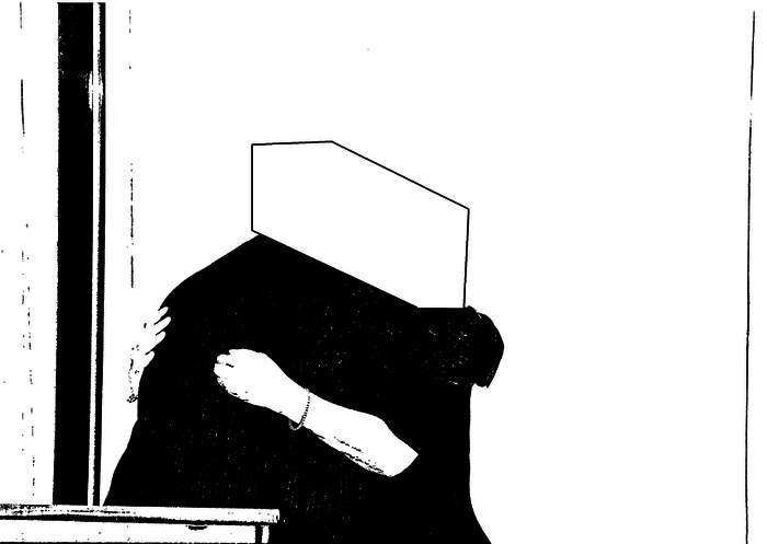
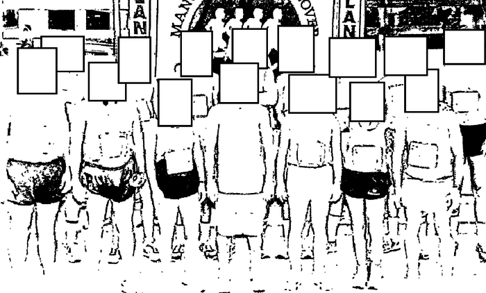
There is no way to redact the FBI’s inspiration, however. Color me impressed. [@bradheath via @AlJavieera]
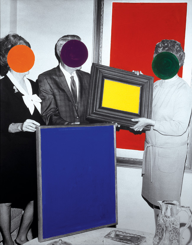
John Baldessari, probably 1988 or so, image via thegroundmag.com
Niépce’s View From The Window, The Making Of
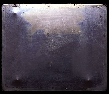
The world’s first photograph, a persistent image made by exposing chemicals to light, was taken in 1826 by Joseph-Nicéphore Niépce. [NEES-uh-fore NYEHps]
It’s the view from a window of his house in Le Gras. It was made by projecting the view through a camera obscura onto a small pewter plate coated with bitumen and developed with lavender oil. The exposure took several days [The sun can be seen hitting opposite sides of the buildings.] Niépce called it a heliograph.
Niépce eventually partnered with Louis Daguerre who was also working to fix images chemically, but Niépce died, his less inventive son stepped into the partnership, and thanks to some branding jiujitsu, Daguerre basically crossed the history finish line alone in 1839 as the inventor of photography. [Niépce son did write a pamphlet in 1841 titled, Historique de la Découverte Improprement Nomée Daguerreotype, procédé d’une notice sur son véritable inventeur feu, M. Joseph Nicéphore Niépce (History of the discovery improperly misnamed daguerreotype, preceded by a note from its real inventor Joseph Nicéphore Niépce.) So there’s that.]
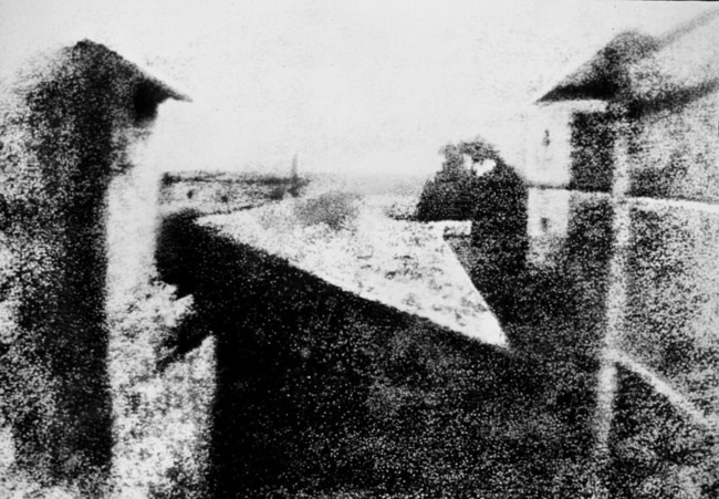
An enhanced view of Niepce’s View, flipped to match the actual view
View from the window at Le Gras, known as Point de vue de Gras in French, was lost until 1952, when the historian/collector Helmut Gernsheim tracked it down. It’s now in the collection of the Ransom Center at UT Austin.
Niépce’s house, in a village called Saint-Loup-de-Varennes, is now a museum, open for visitors in July and August [and other times of the year for a flat EUR150 get out of bed fee.]
The property was divided in the mid-19th century, but the house is largely intact. Yet it was unclear exactly from which window the image had been made. Gernsheim thought it was from the attic. This French site discusses all sorts of details about maps, lenses, exposure times, focal lengths, angles, and suggests it was on the 1st floor.
Or maybe that window’s not even there anymore. A restoration project at the house in 1999 found evidence of a remodeling that moved the window on the 1st floor sideways by 70cm. Here’s a short video about the investigation, trapped inside a tiny Flash window.
Alas, you can’t try to recreate Niépce’s photo yourself, because photos are not allowed in the photography museum. The operators have sold exclusive rights to some agency. Here’s the sign on StreetView.
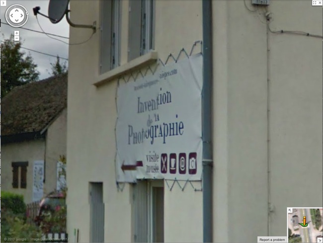
View from the Window at le Gras [wikipedia]
Niepce house museum [niepce.org]
