Going Long On Terry O’Shea

terry_oshea_slab_end.jpg
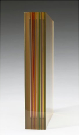
Terrance O’Shea, late 1960s, 11x11x2 slab of laminated plexiglass
This summer while poking around into the conflicted treatment of the Pasadena Art Museum’s Warhol Brillo Boxes, I found a tangential mystery: 10 or 30 or 40 or more Kellogg’s Corn Flake Boxes Warhol authorized for the LA County Museum of Art seem to be unaccounted for. Warhol “donated” 100 boxes in 1971; the donor/collectors on LACMA’s influential Contemporary Arts Council paid for the fabrication; but now the museum only has 57 in their collection, and at least ten have turned up in private collections and/or at auction.
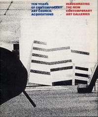
lacma_cac_cat.jpgStill haven’t figured that out. But one thing leads to another, and so I’m looking at the catalogue for the last known appearance of “all” the Warhol boxes, a 1973 show organized by Maurice Tuchman titled, Ten years of contemporary art council acquisitions, inaugurating the new contemporary art galleries, [left] and I see this title, how can I not?
Documentation of the Artist’s Act of Placing One of His Sculptures in the La Brea Tar Pit, 1971, by Terrance O’Shea.
And the work consists of a photograph–a 4×5 transparency, actually, and a notarized letter/certificate. And the sculpture is a Lucite-looking prism or wedge, and there’s no letter, and the LACMA website only has a thumbnail image of the letter, no text.
And the web searches for Terrance O’Shea are incredibly meager-to-nonexistent. Even though he was apparently the first LA plastics artist to win the museum’s [CAC-funded, btw] New Talent Purchase Award–in 1966.
But I turn out not to be the only guy looking at Terry O’Shea in 2010. The folks at Cardwell Jimmerson in Culver City had just restaged a pivotal 1971-2 CalArts exhibition titled, “The Last Plastics Show,” which had included O’Shea’s work. Both times. Here’s how their press release set it up:

By then [1972] the subject of plastic, resin and arious automobile-body technologies as expressed in California art had been thoroughly explored in multiple exhibitions up and down the west coast and extending east to Detroit and the Jewish Museum in New York. Moreover, the sunny technological optimism associated with California in the nineteen sixties had suddenly darkened; the hostile reception greeting LACMA’s 1971 blockbuster “Art and Technology” exhibition being a case in point. This was indeed the end of an era, as older art practices and institutions (plastics and Chouinard Art Institute, for instance) gave way to the new (Conceptualism and CalArts). It was in this historical context that the artist/curators Judy Chicago, Doug Edge, adn DeWain valentine gave the exhibition its decidedly self-mocking and surprisingly poignant title: “The Last Plastics Show.”

So I spoke with Tom Jimmerson, who gave me a brief sketch of O’Shea’s work and life. He was sort of an artist’s artist’s artist, it seems, difficult to work with, and yet friend to many. Apparently holding artspeak and underwear in equal disdain, O’Shea was known to suck in his gut and let his pants fall to the ground at openings when the conversation got too hi-falutin’.
terry_oshea_runes_68.jpg
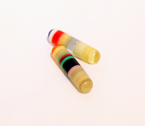
Runes, 1968, Terry O’Shea
He made impossibly tiny works out of the shards of plastic he’d salvage from his buddies’ castings: intricate capsules, spheres, eventually some book-sized slabs, which he’d keep in black velvet bags and present with a magician’s flourish for the viewer to hold and manipulate. The gallery is working on an O’Shea show for 2011, Tom said, and it sounds fascinating.
But Tom didn’t know the details of the LACMA piece, or the story behind it. So he put me in touch with Doug Edge, one of O’Shea’s best friends [O’Shea himself died from complications associated with a life of heavy living], he’d know. And so he did. I just spoke with Edge the other day. Here’s how it went down:
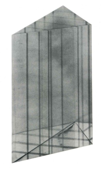
In 1966, Terry went to see Maurice Tuchman and showed him his work, which he pulled out from one pocket after another. O’Shea was soon awarded the New Talent Award, which meant the museum would purchase a work for the collection. Only Tuchman or whoever never really followed up. Perhaps there was some ambiguity about the artist’s responsibility to produce or present options for the curator [or the collector’s committee] to choose from. Or maybe the museum was supposed to approach the artist, visit his studio. Either way, though there was, in fact, a sculpture–it was a clear, polished wedge with channels carefully routed out and filled in with colored resin, like all O’Shea’s sculptures, it was laboriously fabricated and detailed–the acquisition hung in the air until 1970.
oshea_lacma_wedge.jpg
On May 28 1970, O’Shea and two friends–Edge didn’t name names, but would only say that one was “a real big guy–went to the museum at about 2AM, and using the fence surrounding it in some sort of catapulting maneuver, Terry had his big friend heave the little wedge into the tar pit next to the museum.
Not that LACMA knew, of course. It wasn’t until many months later, perhaps precipitated by an administrator at the museum following up on an unfulfilled pledge of work, that O’Shea informed the museum that he had, in fact, delivered their work, and they were already, in fact, in possession of it.
He created a sculpture and then he–he didn’t destroy it, exactly; he “placed” it in a way that it can now only be experienced as a photograph.
This work lingered in my mind for a few months. But after seeing “The Original Copy,” Roxana Marcoci’s show of photography and sculpture at MoMA, I really picked up the pace on tracking down O’Shea’s LACMA work. Which seems almost entirely undiscussed in the art and art historical world. And yet, not only does Documentation of the Artist’s Act… fit Marcoci’s premise like a glove, but O’Shea himself was operating at a critical juncture in LA’s artistic history, a singular link between plastics and finish fetish–which he deployed toward his own, idiosyncratic ends–and the Conceptualist irreverence of, say a Nauman or an Oppenheim, or a Ruscha, who also happened to make a work involving LACMA and fiery destruction.
But anyway, keep that all in mind while reading O’Shea’s letter, which Edge graciously read to me over the phone. It’s after the jump, because even though I’ve found some other of O’Shea’s work that shows this LACMA piece was not just a one-off joke, it’s hard to imagine this post going even longer that it already has.

Continue reading “Going Long On Terry O’Shea”

Rodeo, Cowboy

ernst_haas_rodeo57.jpg
Now I love me some rodeo, but primarily bull riding. It pains me to think how many rodeos I’ve missed at Madison Square Garden.
So seeing legendary Magnum photographer [wait, is there any other kind?] Ernst Haas’ 1957 photo of a bronc rider in MSG turn up at Phillips de Pury’s photo auction this week was a nice treat.
Of course, it’s an estate print, and I can’t quite tell why the estimate seems higher than most every size and edition option available for retail here.
prince_joke_gf_cowboy01.jpg
It almost makes me want to see what a thumbnail edition looks like; why should Richard Prince provide all the fun, right? And no sooner do I say that, than a Prince triptych pops up in the auction catalogue: Untitled (Joke, Girlfriend, Cowboy), 2001 actually includes a motion-blurred image of a Marlboro Man riding his horse through the snow.
Of course, that edition, published by Hatje Cantz, looks like it’s still available in the primary market, too. And at a quarter the price. And the auction site even grabbed their jpeg from the publisher. I guess Phillips’ operating premise is that there’s still money to be made selling art to the Google-less. Good luck.

How To Make 4-Color Halftones

So after posting about Four-Color Process, I was looking around to see who is working to preserve this masterful, cheap, laborious-looking halftone printing process. I mean, we brought letterpress back, right?
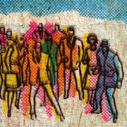
Well. So far, on the printing front, I’m not quite seeing it; if there are artisanal small-press folks keeping true to the art and technique of old school, cheap, slightly sloppy, pulpy, CYMK, halftone/Ben-Day printing, I haven’t found them.
But it looks like there are book artists–some say illustrators, others hate the term graphic novels, and anyway, they’re not making comic books–who do use halftone techniques. [The only thing they have in common is a love of old dots and a bitterness toward Roy Lichtenstein.]
fies_halftone_howto.jpg
Just last month, in fact, artist Brian Fies published two lengthy tutorials on using Photoshop for creating halftone images. Having come up using halftone dots, and after skilfully deploying the consciously retro technique in his award-winning book, Whatever Happened to the World of Tomorrow, Fies is able to provide good historical info on how comic illustrations used to be created, and to show how he approximates the original feel using digital tools.
Fies’ technique successfully recreates the halftone style of vintage comics, but only up to the point of printing. One characteristic of crappy 4-color printing is the slight bleed or misalignment of color fields; with his digital perfection, Fies always 4-colors inside the lines.
eddie_campbell_zipatone.jpg
The other veteran artist, Eddie Campbell, uses halftone sheets very expressively the way they were originally designed, within his analog drawing process. While the results still print up perfectly, Campbell’s conscious, persistent exploration of a seemingly obsolete medium is pretty sweet.
UPDATE: Here’s where I confess my “search” for 4cp didn’t yet actually involve asking any people who I thought might actually know about it. To wit, Andy from Reference Library informs me that the 15th issue of Dot Dot Dot, whose uncracked spine is looking at me right now from my shelf over there, even, apparently set off a bit of a print-on-demand lovewave towards the Risograph V8000 stencil printing machine, which “gives tumblr kids a way to experience registration, moiré, and the good old dot pattern.”
Also, Rollo Press and Ditto both do great Riso work. Below, a beautiful Riso spread from Ditto’s Why Shapes What, with artwork by Vanessa Billy.
ditto_why_shapes_what.jpg
Dots, Part 1; Dots, Part 2 [brianfies]
Zipatone-related posts from Eddie Campbell [eddiecampbell]

Four Color Process

4cp_crowd.jpg
Trying to clear some browser tabs. From John Hilgart, the guy who brought the world Comic Book Cartography, comes his next foray into the overlooked, undersung details of comics history, Four Color Process. It’s an incredibly beautiful collection of vintage comic book scans made with an eye to the unique aesthetic qualities of the cheap, obsolete, half-tone printing process.
4cp_steranko.jpg
For a while, I’d always considered it more an exercise in artful magnifying and cropping, but a post a couple of weeks ago changed my mind. In discussing some psychedelic examples from 1968 of Jim Steranko’s groundbreaking work on Nick Fury, Agent of S.H.I.E.L.D., Hilgart writes:

Perhaps a great artist, but not a realistic illustrator, Steranko tended to emphasize the flatness of comics even when he piled on the detail. It is design not illusion, dynamic yet inorganic.
All of these factors make Steranko a fascinating case when considering four-color process in the history of comic books. He clearly had an interest in solid colors, embracing rather than running from the limited building blocks of the process. He also freely acknowledged the divide (and the arbitrary yet essential relationship) between the line art and the lurid color that process printing smacked down on top of it. Many of his panels use color as an illustrative element, completely separate from the black ink beneath it. His art was only “finished” in the printed comic book itself.
Steranko’s early work systematically exploits the same aesthetic forces that the 4CP gallery foregrounds as defining elements of mid-Century comic books generally. In 2010, when vintage comic book art is reproduced in crisp, acid-free, book format, the original reproduction of Steranko’s art begins to look and feel closer to fine art lithography. Forty-year-old pulpy reproductions may in fact be the definitive editions, anything else being a cheap approximation. [emphasis added]

This resonated with something a friend said to me about my recent looks into early Lichtenstein paintings and the unusual seascapes collaged from reflective materials. And not because dots is dots. Just the opposite. He mentioned seeing a bunch of early, large Lichtenstein paintings recently and being struck by how “Op” they are, in that they induce all sorts of optical effects of moire-like shimmering, etc. He noted that because this aspect of the work is dependent on experiencing the painting in person, and is totally lost in reproduction, that it’s rarely discussed or acknowledged by critics and historians. [Which makes right now a good time to take Roberta Smith’s advice and see the wealth of Lichtensteins on view in New York right now, especially the early drawings show at the Morgan Library, which is a tour de force of Ben-Day dotsmanship.]
In case anyone needs more convincing, Hilgart went on to post a pair of images, one vintage and 4cp, and the other contemporary and digitally remastered. The differences are alarming. And though I could see an artist’s point who preferred a higher-resolution, more refined reproduction, the lost historical accuracy is undeniable.
This morning, the kid was trying to memorize a phone number, and I found myself explaining area codes to her. How they’re linked to a city or a whole state, even, and how you can tell where a phone number’s from. And then I stopped short trying to explain why New York City got 212, because I realized that without a rotary phone handy, there’s no way she’d get that it was the quickest number to dial. And of course, then there’s number portability, and overlays, and speed dial, and is she even ever going to need to memorize a phone number anyway? But that doesn’t negate the real history and context behind them.
Jim Steranko and Four-Color Process, 1968 [4cp.posterous.com via khoi]

Daniel Libeskind And The Grand Academy Of Lagado

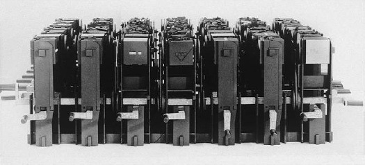
God bless the Internet and all who surf upon her. A couple of weeks ago, I wrote about what I thought was an esoteric topic, even for greg.org: the fantastical lost machines from “Three Lessons of Architecture,” Daniel Libeskind’s exhibition at the 1986 Venice Architecture Biennale.
libeskind_writing_machine.jpg
And yet, within hours of posting about them, I got an email from one of the guys who had been Libeskind’s grad student at Cranbrook and who had built and installed the machines. Hal Laessig is now artist/architect/developer in Newark, and he was gracious enough to share his stories from the “Three Lessons” project, and from Libeskind-era Cranbrook. They range from insightful to hilarious to outrageous, and I’m working on putting our interview together right now.
In the mean time, here’s a clarification about the references for the machine Laessig oversaw, the Writing Machine, which I had incorrectly described as being inspired by Raymond Roussel’s Reading Machine.
As it’s described here, at the very bottom of this ancient article on hypertext, the Reading Machine Roussel exhibited in 1937 was basically a book on a Rolodex. Color-coded tabs helped the reader navigate through multiple layers of cross-references and footnotes. Interesting, but nothing at all to do with the form of Libeskind’s version, which took its inspiration from somewhere else entirely.

Continue reading “Daniel Libeskind And The Grand Academy Of Lagado”

Bernd & Hilla Becher Made A Movie. In Color.

And so far, I can’t find it anywhere:

UEZ: when your work first started to appear and was classified as Conceptual art, did you have a secure visual language which you knew would be viable over time? Or could you have arrived at completely different forms of presentation, or made your photographs the basis for videos?
BB: We did make a film once, on the Hannover mine.
HB: Actually, there’s no need at all to talk about failures.
BB: Because that was such an enormous complex. We made a film about it because we wanted to show the atmosphere. Then we looked at the shots, still uncut, and were totally disappointed.
UEZ: How did you make the film?
HB: We borrowed a 16mm camera from Sigmar Polke. The advisor was Gary Schum, in part, who has made a load of beautiful artist films, with Gilbert and George, for example. The idea was that this colliery was not a tightly knit conglomerate, as is usually the case, but rather a diffuse structure held together by belts, by roads.
BB: The atmospheric element was important. On top of that, we were in a hurry. We thought that if we photographed our way through the whole plant, it would take years. Then we made the film in two or three days.
HB: The thought was to drive through this very extensive industrial estate, to show the connections among preparation plant, winding tower, power plant and cokery. But as it turned out, there was so little movement there that the only movement in the film was provided by the camera.
UEZ: Because the colliery was already shut down?
HB: No. Strictly speaking, if you look at a mine like this, the only thing that moves is the wheel of the winding tower. I was thinking at the time of the early Charlie Chaplin films, where the camera sits on the tripod and everything else moves in front of it. Or Hitchcock’s film Rope, which takes place in one room.
UEZ: How strange that you give us these examples, as in fact you didn’t let the camera stay still.
HB: But panning the camera, up and down, right and left–that was no good.
UEZ: When did this experiment take place?
BB: 1973-74.
UEZ: Did you destroy the film in the end?
BB: No.
UEZ: We’re talking about a black-and-white film?
BB: No, it was in color.

That’s from an interview the Bechers did with Ulf Erdmann Ziegler in 2000. It was originally published in Art in America in 2002.
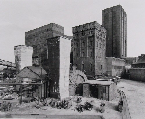
The Hannover Coal Mine was one of ten mining sites the Bechers photographed as early as 1966, but with a concentration in 1971-74, and presented in an “un-Becheresque” way: by site, not by typology. The Van Abbemuseum acquired one portfolio, 85 prints of the Hannibal Mine in Bochum, in 1976, but most of the hundreds of images from each site were unpublished negatives.
And at the time of the interview, the SK-Stiftung in Cologne [which houses the couple’s portfolio archive], began working to process and print images. They did a show, which traveled to the Huis Marseille in the Netherlands. And a catalogue, Zeche Hannibal (Coal Mine Hannibal), which sounds rather interesting.
becher_hannover_moma.jpg
Hannover Mine 1/2/5, Bochum-Hordel, Ruhr Region, Germany, 1973, Bernd & Hilla Becher [via moma]
As it happens, 200 of over 600 photos the Bechers made at Hannover have just been published in their own book. Zeche Hannover (Hannover Coal Mine) came out in Germany in July.
And it looks like MoMA acquired a selection of the Bechers’ mine landscapes in 2008. When seen together, they end up forming a higher-level series, a typology, not of structure, but of site. So they’re looking more Becheresque all the time. I’d still like to see that film, though.

I Rumori Dell’Arte

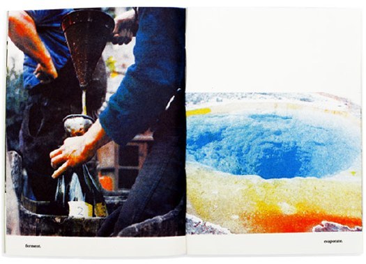
russolo_intonarumori_1919.jpg
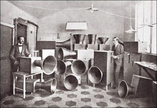
That’s Futurist painter Luigi Russolo on the left being helped by his friend Ugo Piatti, probably around 1913 or 1914. They stand amidst Russolo’s musical instruments, intonarumori, noise-intoners, which were designed in accordance with the principles laid out in Russolo’s Futurist music manifesto, l’Arte dei Rumori, The Art of Noise.
Though the trajectory of his ideas and influence is not quite as clear as The Hydra’s otherwise excellent recounting of his legacy imputes, Russolo was an innovator and visionary in the use of noise, found sound, in musical composition.
In The Art of Noise, Russolo makes a bold, lucid argument for music of the future to adopt the sounds of the world, especially the sounds of the machine, which had irrevocably changed the world’s aural landscape:

Ancient life was all silence. In the nineteenth century, with the invention of the machine, Noise was born. Today, Noise triumphs and reigns supreme over the sensibility of men. For many centuries life went by in silence, or at most in muted tones. The strongest noises which interrupted this silence were not intense or prolonged or varied. If we overlook such exceptional movements as earthquakes, hurricanes, storms, avalanches and waterfalls, nature is silent.

In the pounding atmosphere of great cities as well as in the formerly silent countryside, machines create today such a large number of varied noises that pure sound with its littleness and its monotony, now fails to arouse any emotion.

Then there’s this, the source noise for his Intonarumori, the sounds of the modern world:

the gurglings of water, air and gas inside metallic pipes, the rumblings and rattlings of engines breathing with obvious animal spirits, the rising and falling of pistons, the stridency of mechanical saws, teh loud jumping of trolleys on their rails, the snapping of whips, the whipping of flags. We will have fun imagining our orchestration of department stores’ sliding doors, the hubbub of the crowds, the different roars of railroad stations, iron foundries, textile mills, printing houses, power plants and subways. And we must not forget the very new noises of Modern Warfare.

Indeed. Russolo’s first public demonstration of Intonarumori was in Modena in April 1913. An instrument called the scoppiatore variously called the exploder or crackler, it replicated the sound of an internal combustion engine, not, actual explosions. That would be the detonatore, which came soon after.
I realize that it was not mentioned specifically in Russolo’s list of noises, but how can you not think of hail cannon when you see that photo up there? Russolo was born in 1885 in the formerly silent countryside of the Veneto, which was at the heart of the hail cannon boom [sorry] at the turn of the century. Thousands of hail cannon were installed across the region in 1901-02; in 1904, the Veneto was the site of the first official scientific study of hail cannon’s effectiveness. [They failed, and once-enthusiastic farmers turned against them en masse and sold their hail cannon for scrap.]
Did Luigi perhaps recall a pastoral orchestra of hail cannonfire from his youth when he wrote his manifesto? I have no idea, but it’s interesting to think about. None of the intonarumori recordings on Ubu sound like the modern hail cannon these guys try to throw their Barack Obama basketballs into.
On an object note, Russolo’s original Intonarumori were destroyed or scrapped, but his nephew Bruno Boccato has refabricated some following his uncle’s original plans. I think these are they.

Oh, And Hail Cannon. Must. Remake. The Hail Cannon.

Good grief, it was only a couple of hours ago, and I can’t even remember what took me to this three-year-old link roundup on BLDGBLOG that mentions hail cannons. I mean, hail cannon.
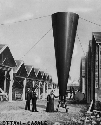
hail_cannon_casale.jpg
Turns out they still make’em, they just don’t make’em like they used to. It’s something that the Wikipedia entry on hail cannon calls them “pseudoscientific” devices. Because whatever scientific data exists for them now–and it’s not at all clear that there is much/any–it’s pretty obvious that hail cannon are technotheoretical holdovers from the turn of the 20th century.
The promise of vintners being able to their crops by creating and channeling explosive shockwaves to pulverize hail in the hyperlocal atmosphere had been shooting around Europe since at least the days of Benvenuto Cellini, the Mannerist goldsmith & sculptor who claimed to have stopped the rain and hail with artillery fire.
Between 1896 and 1899, Austrian inventor Albert Stiger tested his design for a giant, megaphone-shaped mortar cannon that fired a smoke ring 300 meters into the air–and spared his village fields from hail damage. The Italians seized upon the hail shooting technology with incredible fervor, and within a year, there were 10,000 hail cannon protecting the vineyards of Northern Italy.
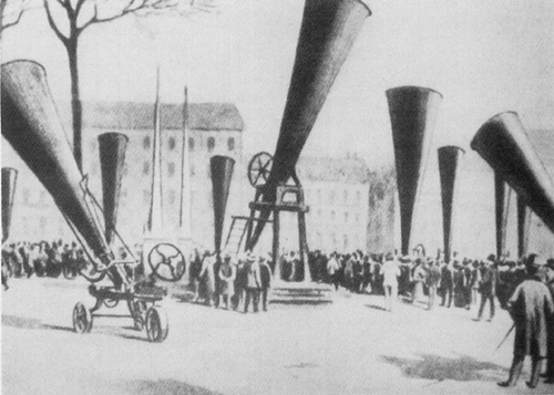
The first two International Congresses on Hail Shooting were held in Italy [Casale in 1899, and Padua in 1900], by which point at least 60 different models of hail cannon were on the market. So far, though, neither event was as extensively documented as the Troisième Congres international de defense contre la grêle, [the Third International Congress on Hail Shooting,] held in Lyon in 1901 [below, via]
hail_shooting_lyon_1901.jpg
For three days, the streets, parks, and plazas of the cities were filled with hail cannon. Were there live demos scheduled? Did people lay out picnics [well, it was Novembre] and listen to the big finish of the 1812 Overture over and over? Did the vineyards of Europe, laid out with a grid of hail cannon–an anti-Lightning Field–echo with rhythmic explosions during the most vulnerable months of the growing season? [Did I suddenly start speculating as if were auditioning for the guestblogging slot at BLDGBLOG?]
Eh, if they did, it didn’t last. Governments and scientists began questioning the data behind hail shooting, and by the time the Fourth conference rolled around in Graz, Austria, hail cannon salesmen were prohibited from attending. Suddenly sober and facing the facts–that hail shooting couldn’t be demonstrated to actually have any effect–the European hail cannon industry all but disappeared by 1905.
And so it is that refilling our cities’ public spaces with several orchestrasful of hail cannon would be a powerful, performative tribute to man’s indomitable urge to control the weather using military technology.
Q: Why is this Romanian Wikipedia page on Hail Cannon so darn good? [ro.wikipedia.org]

How To Make A Biennale Pavilion Architectural Intervention

mos_def_satelloons.jpg
MOS, of the PS1’s woolly mammoth carcass MOSes, is one of seven architecture firms and collaboratives included in “Workshopping: an American Model for Architectural Practice,” at the Venice Architecture Biennale. The exhibit is curated by Michael Rooks of the High Museum and Jonathan Solomon of 306090.
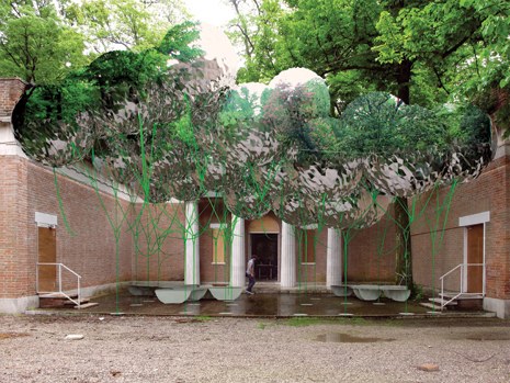
mos_venice.jpg
The idea is to creat a canopy of spherical Mylar weather balloons in the courtyard of the US Pavilion. From MOS’s project text:

if you’ve seen the structure, i’m sure you’re wondering, ‘why is it made out of helium balloons, why does it make a canopy, why is there seating, etc… is it referencing other projects? is it analogical? is it utopian? is it micro-? is it urban? is it domestic, what is it? is this even architecture?’ (unfortunately, we can’t answer that last question. this type of project is like diet-architecture, a copy without the calories. it’s got a sort of bitter aftertaste that you might grow accustomed to, or you might not. that’s ok. we like fake architecture.)
we’ve been wondering, what kind of architecture would haruki murakami make? well, when we finally write our text we would definitely tell you that it does, indeed, mean something and it does reference things, but why would you really want to know all of that anyway? do you really think it would make it better? I mean, what about just enjoying this weird artifice, this fake social space? hey, it wiggles. look at this strange alternate environment made of reflections and repetitions. enjoy the visual noise. have you ever seen N.A.S.A.’s echo project? google it. what can we say, we just love the aesthetics of radar reflectors and inflated satellites. they are of another reality. seriously, even if we wanted to fully explain it to you at this very moment, we couldn’t. even though we’re trying not to be, we’re only human. also, they need this text before we’ve finished the design. did we mention that we are working with the son of andy warhol’s ‘silver clouds’ fabricator? we’re very excited about this. he lives in duluth. [emphasis added because, well]

So just Google, aesthetics, and a flip three degrees of Andy Warhol reference and voila, instant pavilion! I can’t wait to see what their actual text is. The exhibition opens Thursday.
MOS, Instant Untitled [designboom, thanks john]
Workshopping.us [workshopping.us]

Art Is Where You See It

Dealer-turned-public art empresaria Emi Fontana talking in Artforum about West of Rome:

…people believe that public art needs to occupy planned and assigned spaces. What we’re doing is much more fine-tuned: You have to find the space that resonates with the work and with the artist’s practice in general. This is fascinating to me. It’s something you can do well in a city you love, and I really love Los Angeles. I came here for romance, but when the romance was over I realized I still had a huge romance with the city. It is a constant source of inspiration for me.

Baby Ikki bugs, but Emi rocks. But I always thought that West of Rome was selling in some way, too, not just putting on shows outside the gallery/museum/institutional/white box paradigm.
Aha, West of Rome converted to a non-profit and became West of Rome Public Art in 2009.
Also, 500 Words is really such a consistently interesting feature. So seemingly simple, yet so rich. It’s the chocolate mousse of Artforum.com.
500 Words | Emi Fontana [artforum.com]

John Cage’s One11: The Making Of, Now In English

cage_one11_docu2.jpg
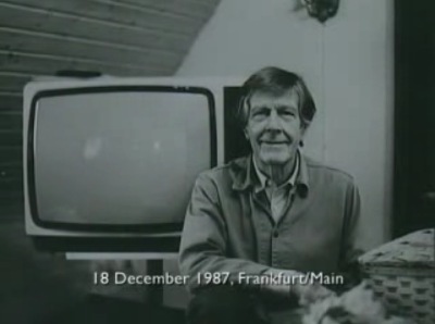
A couple of weeks ago, I watched Henning Lohner’s film essay/documentary about working with John Cage to make One11 and 103, Cage’s only feature film project, completed just before he passed away in 1992.
It’s on YouTube, chopped up in several parts, and mostly in German [One11 and 103 was made for German TV], but now Ubu has posted the English version, so you non-Germans can actually figure out what’s going on. [ One11 and 103 is online, too, though it has the 3sat logo burned into the upper corner, which turns the whole thing into a 90-minute promotional bumper for the station.]
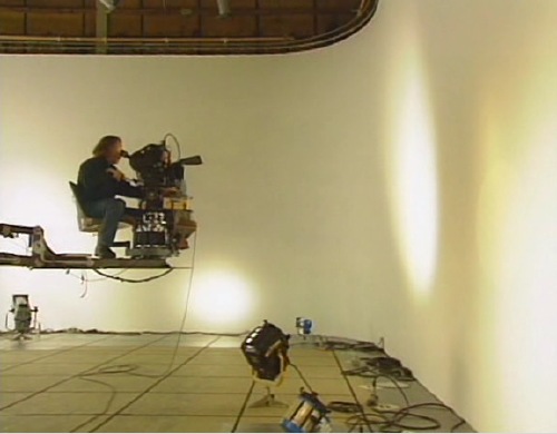
For One11, Cage and his collaborator Andrew Culver used a computer program to generate a series of chance operations, instructions for light placement and movement within an empty soundstage; for camera movement and positioning; shot length; and for editing.
Narrative- and nearly content-free, the 17-segment film was accompanied by 103, a 17-segment orchestral composition that was also based on chance operations. The film’s title follows Cage’s numbering system: the eleventh composition for one performer, in this case, the camera man. So while Cage explains the film as being “about the effect of light in a room,” it’s also very much about the perception, movement, and recording of the cinematographer, Van Carlson.
cage_one11_docu.jpg
Cage made the point to Lohner early on that his idea wouldn’t “waste” any film. And sure enough, it turns out the final shooting ratio was an astonishing 1.4:1, with less than 600 meters of extra footage–which, we are told, was used in the opening and closing credits. It’s almost like Cage went to film school during the Depression.
The obvious appeal of an abstract light show aside, watching all this self-conscious randomness [I’ve been going through and replacing “random” with “chance,” since that’s the specific term Cage uses. I think there’s a meaningful difference.] really puts the conscious decisions of location and content into high relief. It also makes me want to remake One11 in another environment and see what happens. I’d also wonder how many more decisions could be randomized, and to what effect? Eventually, if you put a decision factor into play, the randomness of it will generate a distinctive effect, if not an actual style. It’s one of the conundrums of Cage’s work that I like picking through.
One11 and 103: the making of [ubu.com]
You know, at $27, it wouldn’t kill you to buy Mode Records’ DVD version of John Cage: One11 with 103, either, from The Complete John Cage [amazon]
NOW THAT I THINK ABOUT IT UPDATE: You know, posting this really seems like a departure for Ubu. I mean, Ubu began posting vintage, impossible-to-buy-or-even-find works, but with One11 and 103, they basically ripped a commercial DVD published in 2006 by a small, well-known, high-quality independent publisher of modern music. Am I missing something here?
UPDATE UPDATE: Yeah, Ubu’s versions of both One11 and Making of One11 first appeared on The Sound of Eye, an equally amazing art film and experimental music blog, albeit one with a different approach to posting works that are readily available in the commercial market. Ubu announced a collaboration with Sound of Eye a little while ago.

The Raum der Gegenwart, Then And Now

moholy_raum_gegenwart1.jpgIn addition to being the subject of his film and photographic work, Laszlo Moholy-Nagy’s Light Space Modulator modulated light and space as a sculptural installation, and it served as a Light Prop for an Electric Stage. But in 1930, the artist had also planned on installing it at the Hannover Provincial Museum.
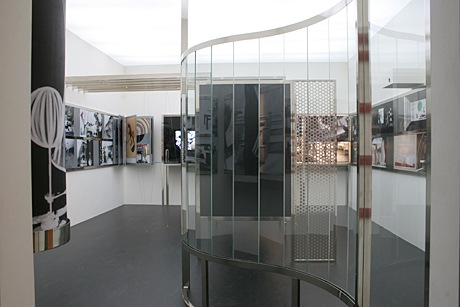
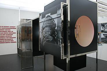
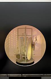
Alexander Dorner, the director of the Landesmuseum, had invited Moholy-Nagy to design the final room in the chronological reinstallation of the museum’s collection, the Raum der Gegenwart, The Room of the Present Day. The room was to have interactive exhibition elements devoted to film, architecture, and design. And at its center: the definitive art work of Moholy-Nagy’s future, the Light Space Modulator, performing inside its light-lined cabinet. Was to have, because Moholy Nagy’s plans were never realized in Hannover.
Frankly, it sounds more like the Room of the Multimedia Future. In the press release for Licht Kunst Spiele, an exhibition of Light and the Bauhaus last year at the Kunsthalle Erfurt, the Room of the Present Day was said to have anticipated “an art which does completely without the hand-painted, auratic picture.” [Anticipated is right; Walter Benjamin didn’t write “The Work of Art in the Age of Mechanical Reproduction” until 1935. I guess aura was in the air.]
moholy_nagy_raum4.jpg
And speaking of reproduction, the curators for that show, Drs. Kai Uwe Hemken and Ulrike Gärtner teamed up with designer Jakob Gebert to finally realize Raum der Gegenwart according to Moholy-Nagy’s designs and intentions. From the photos, the Raum looks like a life-size Light Space Modulator, the Light Prop transfigured into a Light Stage. Or Light Theatre.
moholy_nagy_raum1.jpg
The Raum traveled to Frankfurt for the Schirn Kunsthalle’s Moholy-Nagy retrospective, and it has now settled into the Van Abbemuseum in Eindhoven, where it is part of Museum Modules, a show about, I guess, famous museum exhibition re-enactments. [images via crossroads mag and vanabbemuseum.nl]
moholy_nagy_raum2.jpg
Whether that is the Van Abbemuseum’s 1970 Light Space Modulator in there, or yet another replica, I don’t know, but I’ll assume it’s the former. Perhaps the answer lies in “The Raum der Gegenwart (Re)constructed,” a thorough and fascinating-sounding article by Columbia’s Noam M. Elcott‌, which was recently published in the Journal of the Society of Architectural Historians.
update: Yes and no. Elcott’s article is fascinating, though, and he praises the “historical acumen and curatorial courage” of putting the Light Prop in the lighted box it was arguably conceived for. He goes further, arguing persuasively that Light Prop, as an embodiment and producer of cinematic abstraction, is the conceptual center of the Raum der Gegenwart. Very interesting stuff.

So Many Light Space Modulators

licht_raum_mod_bauhaus_70.jpg
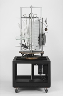
Laszlo Moholy-Nagy, Licht Raum Modulator, 1970 reconstruction, image: bauhaus.de
Did I
say a few minutes?
Laszlo Moholy-Nagy spent around eight years [from 1922-30] building his Light Space Modulator, and then he carted it around Europe, and to America, reworking it and repairing it until his death in 1946. His widow Sybil donated it to the Busch-Reisinger Museum at Harvard in 1956.
Anyway, while the kinetic and light art movements it prefigured were kicking into high gear, the original LSM was in quite a state of disrepair. It sounds far, far away from Moholy Nagy’s own early description of it, which included not only the motorized glass, cellophane, aluminum, and steel construction we know, but a stage-like box lined with synchronized, colored lights. [I was going to quote some of the description from Medienkunstnetz, but it doesn’t clear anything up; just read the whole thing.]
Yet Moholy-Nagy’s posthumous influence was growing, and the LSM was exhibited widely throughout the 1960s in its second[ary] mode as a room-filling projection. After some malfunctions and damage during a big KunstLichtKunst exhibition at the VanAbbemuseum in Eindhoven, though, something had to be done.
In 1969-70, the Harvard art historian-in-training Nan Piene was studying Moholy-Nagy’s work and wanted to include the Light Space Modulator in an exhibition at Howard Wise Gallery in New York. [Nan’s then-husband, Otto Piene, also showed kinetic and light works at Howard Wise. He was a fellow at MIT’s Center for Advanced Visual Studies, which he took over in 1974.]
So with Mrs. Moholy-Nagy’s permission, Mrs. Piene had the LSM refabricated. Twice. One copy went on view at Howard Wise in 1970. One went to the Venice Biennale. One was flagged for the Bauhaus Archiv in Darmstadt, and the other ended up back at the Van Abbemuseum.
In his NYT review of the show, Hilton Kramer wrote at length about the implications of this “entirely new kind of art object–costly and painstakingly made facsimile reproductions of certain classic works of modern art.” Moholy-Nagy’s intent, according to Piene according to Kramer, was the Constructivist fusion of object and space, light and motion, perception and experience. But.

As usual with Moholy, what we have here is not a completely successful work of art but a brilliant statement about a new possibility for art. In an age of conceptual art, when ideas need only be stated to be taken for realizations, the distinction I am making may seem a little archaic. But for those of us who remain firm in our belief that what is important in art is not what the artist says he is doing or intends to do or is said to have done, but what he actually achieves in the work itself, the distinction is crucial.

Just as I didn’t research the Eames Solar Do-Nothing Machine with the intention of tracking the history of Moholy-Nagy, I didn’t dig into the refabrication of the LSM with the intention of agreeing with Hilton Kramer about conceptual art. But here we are. With his Telephone Pictures, Moholy-Nagy was famously ahead of the curve on outsourced production, so it might be natural to see his work as fitting easily with the era’s emerging conceptualist norms.
Here’s a video of the Eindhoven Light Space Modulator in action:

I have to say, it’s fantastical and beautiful, but it’s also precious and underwhelming. Like Kramer, I am glad it exists, but I don’t quite know what to think of it. Maybe that it works best as film and photo, i.e., as a prop, shot, cropped and edited by Moholy-Nagy’s own eye.
In 2006, Tate Modern and the Busch Reisinger arranged with the Moholy-Nagy estate, now controlled by the artist’s daughter Hattula, to make yet another, yet more definitive replica of the Light Space Modulator, which by now is going by an earlier, more correct title, Light Prop for an Electric Stage. After the Tate showed it, Peter Nesbit, the [Daimler Benz] Curator at the Busch-Reisinger showed their new, functioning replica alongside the static original in Light Display Machines: Two Works by Laszlo Moholy-Nagy.” Except that one condition of the replica authorization agreement was that the 2006 version, at least, “not be considered a work of art.”
That is the word according to a paper/discussion presented at Tate in October 2007 by Henry Lie, the director of the Harvard Art Museums’ Straus Center for Conservation Studies. [Lie discussed the details of the history of the LSM LPfaES at a workshop titled, “Inherent Vice: The Replica and its Implications in Modern Sculpture,” which is just about the most awesome collection of art reading material this side of the Packing, Art Handling & Crating Information Network.]
The 2006 replica was made by a German engineer named Juergen Steger, and Lie’s presentation goes into exquisite detail on his build. Steger referenced not only the original and all the photo and film evidence, but also the 1970 replicas, which were built, I should have mentioned, by Woodie Flowers, an MIT graduate student who went on to become a rather legendary robotics professor at the school.
When I first stumbled across this whole Light Space Modulator replication business a couple of months ago, I decided to email Prof. Flowers to see what was up. He called me right back, and we had a quick, intense, funny, and fascinating chat about the project, how he got involved, and how it went down. I will go into more details of Woodie’s account in…in a few minutes.

Light Space Modulator, Remade

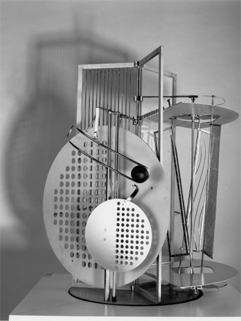
moholy_nagy_light_prop_br.jpgI’d known Laszlo Moholy-Nagy’s 1930 kinetic sculpture Light Space Modulator indirectly as a film subject, and then in 2002 through incredible color photographs Oliver Renaud-Clement showed at Andrea Rosen in 2002. [And again, in direct relation to the artist’s sculptures in 2007.]
The press release for that show quotes Moholy-Nagy on the LSM:

…a structure that is made to develop the sense of space and explore the effective relationships which must be within the quality range of any architecture – an ABC of architectural and projective space…
The mobile was so startling in its coordinated motions and space articulations of light and shadow sequences that I almost believed in magic.

Which is nice.
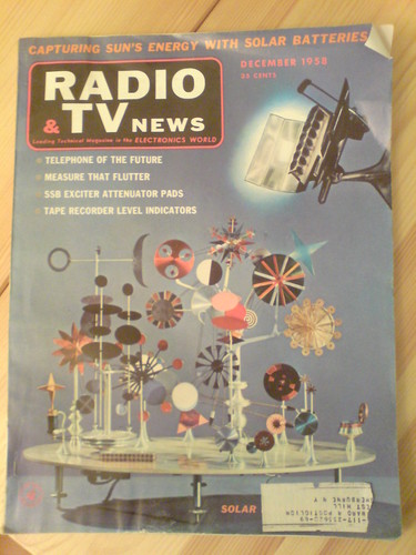
But I came to know it not as an object itself, a sculpture, and not as a film prop [the original title for the work is Light Prop for an Electric Stage], when I began researching the replication a similar object, Ray and Charles Eames’ Solar Do-Nothing Machine.
The Eames's Solar Do-Nothing Toy on the cover of Radio & TV News, Dec. 1958
Eames called their creation, built in 1958 for an Alcoa ad campaign, a “toy,” not a work of fine art. My own interest was to use the context of art to recreate the Do Nothing Machine–I want one and want to see and experience it in person. But it quickly became apparent to me that the Eameses’ modernist, experimentalist work already resonated with the contemporaneous history of light and kinetic sculpture. Which Moholy-Nagy’s work both prefigured and directly influenced.
Filled with dazzling close-ups of whirring, colorful components, the Eameses’ film of the Solar Do-Nothing Machine could be a Technicolor Hollywood remake of Moholy-Nagy’s film, Lichtspiel. But the Light Space Modulator turns out to be directly related to this project in another not insignificant way: it’s actually a replica.
Moholy-Nagy worked on the LSM for an easy decade until 1930, but he also tweaked, repaired and altered it for use and exhibition up until his death in 1946. His widow Sibyl Moholy-Nagy gave the work to Harvard’s Busch-Reisinger Museum in 1956.
But that was not what was exhibited when light and kinetic was the new hotness in 1970, both at the Howard Wise Gallery in New York, and at the Venice Biennale. And it’s not what is exhibited now or since, or what is shown in nearly every image of the Light Space Modulator published these days. Those are all refabrications, or replicas, or approximations, really, of the original–or at least of its final state.
So from Eames, I’ve been diverted by the fascinating history and reincarnations of the LSM. Which I’ll get into in a minute.