image: walkerart.org
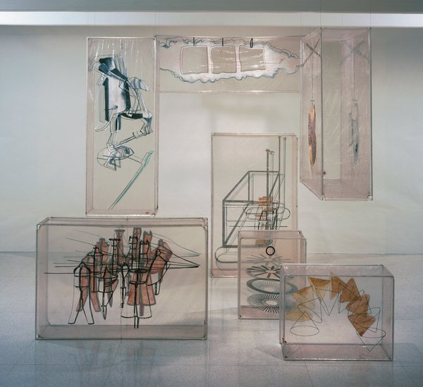
Welcome to one of the oldest tabs in my browser: the inflatable balloon set for Merce Cunningham’s 1968 piece, Walkaround Time, which is based on Marcel Duchamp’s Large Glass, which was made by the company’s artistic director at the time, Jasper Johns.
I’d backed into the pieces–seven cubes of silkscreen-and-paint on clear vinyl, reinforced with aluminum frames–a few months ago, and realized I’d seen them–and not thought much about them–at the opening of the newly expanded Walker Art Center in 2005.
Which I now regret, but which makes Merce’s title resonate a little more. Cunningham dancer and longtime collaborator Carolyn Brown explains that Walkaround Time was a reference to a particular kind of purposeless movement taken from ancient computer history, when “programmers walked about while waiting for their giant room-sized computers to complete their work.” It’s just taken me this long to appreciate–or even to see–the work. And for some great additional links to appear.
I can already tell this is going to go long.
03/2012 UPDATE: Unfortunately, none other than former MCDC stage manager Lew Lloyd informs me that the term “balloon” is not really accurate; they were transparent vinyl boxes fit onto armatures, which could be broken down for travel. Given my noted satelloon bias, I will still think of them as balloons in my heart. For the rest of you, though, remember: not balloons. [end update]
Category: inspiration
Henri LaChambre And His Nancy Balloon
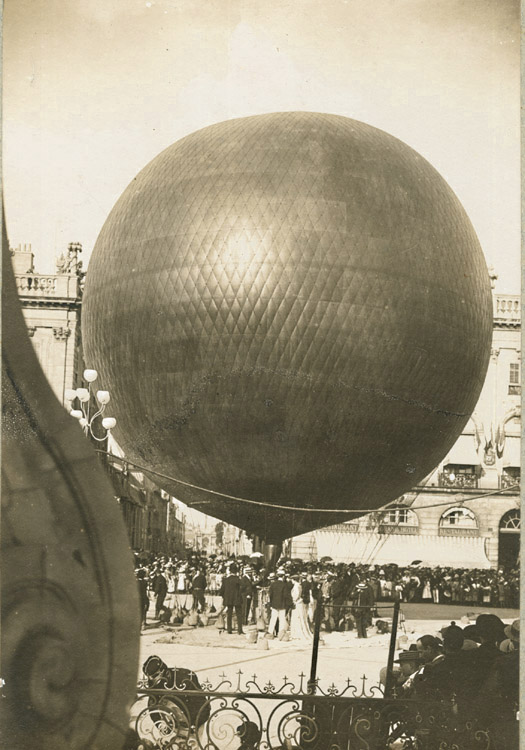
Rather than post this beautifully composed 1895 photo of Henri LaChambre’s rather awesome gas balloon inflated at Nancy, I should’ve freakin’ bought it by now.
Of course, my problem is that, now that I’ve seen it, I’ve filed it away for future flea market reference, where I’m sure I’ll just stumble upon a photomural-sized print of it for a euro.
Anonymous – Henri Lachambre and His Balloon at Nancy, France, $450 [vintageworks.net, thanks to whoever sent this to me, I forget, sorry]
Previously: Les Ballons du Grand Palais
Please Sir, I’d Like Some Meer
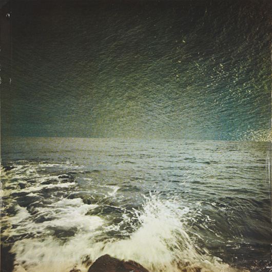
Also up at Phillips today was this nice little [25x25cm] seascape, Meer (Sea), a 1973 offset print by Gerhard Richter.
Richter replaced the sky in one snapshot with the sea from another. This particular example sounds like it had some condition problems, but with an edition size of 250, plus a dozen or more proofs, I’m sure a better one is never too far away.
Meer (Sea), 1973 [gerhard-richter.com]
Related? Lichtenstein’s Electric Seascapes
Hiroshi Sugimoto
Cage’s 4’33” For Orchestra
Ausgezeichnet, this is so awesome. Amidst a fierce, ongoing, politicized debate, Google has released the first Street View panoramas for Germany. To assuage privacy concerns, the company is allowing homeowners to assert their Verpixelungsrecht, that is, their Right to Pixelation. Some 240,000 locations are thus set to be blurred out. From what I can understand, though, the rollout is still in its early stages, and so only a handful of blurred buildings have gone live. This is not a matter of privacy. And don’t tell me it has a damned thing to do with the Nazis and Stasi; that’s patently absurd. If anything, the Stasi would have exercised their Verpixelungsrecht to obscure their buildings from public view, taking advantage of the cloak of secrecy the idea provides. That’s the danger of this. Well, who’s Stasi now, because that is exactly what is happening next door in the Netherlands, where the Intelligence and Defense Ministries actively distort the Google Maps imagery and block Street View access for dozens of sites they have unilaterally deemed sensitive. [Search greg.org for “Dutch Camo” for details, such as they are.] Ugly, isn’t it? As someone in the audience said when I spoke on the topic at a meeting of the Green party in Berlin a few weeks ago, it is as if they are digitally bombing the German landscape. Actually, no it isn’t, and–holy crap, wtf?–no it isn’t. refers not to the visual plenitude and truth that we usually associate with photography, but rather to its moments of representational inadequacy, to photographic blur and lack of focus that results in deliberately obscured imagery. It’s worth noting that Richter began his blurred photo-painting series soon after fleeing East Germany. So fantastic. When I started digging around a bit on its history, I just assumed Jean Tinguely’s kinetic masterpiece, Homage to New York, would itself be the most interesting find. Not quite. Forty years ago Tinguely’s grandadas thmbed their noses at Mona Lisa and Cezanne. Recently Tinguely himself has devised machines which shatter the placid shells of Arp’s immaculate eggs, machines which at the drop of a coin scribble a moustache on the automatistic Muse of abstract expressionism, and (wipe that smile off your face) an apocalpytic far-out breakthrough which, it is said, clinks and clanks, tingles and tangles, whirrs and buzzes, grinds and creaks, whistels and pops itself into a katabolic Gotterdammerung of junk and scrap. Oh great brotherhood of Jules Verne, Paul Klee, Sandy Calder, Leonardo da Vinci, Rube Goldberg, Marcel Duchamp, Piranesi, Man Ray, Picabia, Filippo Morghen, are you with it? I am, Brother Alfred, I am! Say amen, somebody! There are times in human history when the things men have been accustomed to doing and have long accepted as a part of the established order erupt in their faces. This is the situation right now–the universal crisis is forcing us to redefine our cultural values. We are like the man who is astonished to discover that the suit he has on does not fit him any longer. Religion, ethics, and art have all transcended themselves, especially art, which, instead of being art as we know it, has come to demonstrate man’s attitude toward his basic problems. So it is senseless to ask whether or not Tinguely’s machines are art. What they show in a very significant way is man’s struggle for survival in a scientific world… He goes on to call Tinguely a Meta-Dadaist, which is quite nice. And to someone who lived through the horrors that produced it, it makes more sense than being nostalgic for Dada. Jean Tinguely – Homage to New York (1960) “It’s one of the most exciting things I’ve seen in the art season in New York.” Our stop at the Stedelijk over the weekend gave me On Kawara on the brain. The purity of the consciousness in question thus could be seen as the children’s perfectly beautiful indifference to the spectacle of exhibitionism before which, be they never so fully alive and absorbed in the round of their activities, they could not even begin to know how to react, how to become present. It is this radical failure in the know-how of response, this “blindness” before the panopticality of artworks raised on high, this easeful neutrality, that the archival project On Kawara: Pure Consciousness at 19 Kindergartens aims to invite its own “beholders” to consider and, perhaps, to emulate–no doubt with the same unwitting theatricality and slight desperation that the sophisticated adult always betrays when attempting to rediscover within herself what Friedrich Nietzsche called, in Beyond Good and Evil, the seriousness that one had as a child at play (den Ernst . . . , den man als Kind hatte, beim Spiel). That is one helluva sentence. Looking at objects and vintage photos in isolation, it blows my mind that Enzo Mari is somehow not a famous, formative artist, but only [sic] a designer. How did that happen? Did he make all his work in secret? Did he never try to show it? Did he just never sell it? Or enter an art dialogue? Did he get muscled out by Fontana and Manzoni for the parochial art world’s Seminal Sixties Italian Artist slot? Continue reading “Why Enzo Mari Is Not Your Capitalist Art Market Stooge” The focus of the exhibition is the suggestion of space as created with the aid of acoustic objects. The spatial experiences relate to various scales, ranging from the intimacy of the individual to the spacious openness of the urban space. Acoustic locators AND a re-creation of the Philips Pavilion? How could we miss? I couldn’t really articulate it at the time, but the overwhelming absence of modernist architecture was an integral part of growing up in Raleigh, North Carolina. The country roads were widened, and winding capillaries and cul de sacs were cut into the pine forests on either side, which were given ever more oblique English-sounding names, and whose lots were promptly filled with tens of thousands of Colonial Williamsburg knockoffs. But I did date a girl in high school who lived in an early 70s, wood-clad, contemporary-style house. It was just off of Ridge Road. Just off of Ridge Road was also where the Argentine-by-way-of-Harvard architect Eduardo Catalano designed himself a house in 1954, when he came to teach at the just-founded School of Design at NC State. How did I never go to this house? Catalano’s house was an 1800 square foot glass box underneath an absolutely stunning 3600-sf hyperbolic paraboloid roof which, holy crap. It’s, well for one thing, it was Wolfpack Red. LIFE Magazine called it the “Batwing House” in 1957, and noted that “the shape makes it possible to have a thin roof with great structural strength [apparently, thin meant just 2.5 inches. ed.]. It is supported on the ground at only two points. Catalano is now trying to arrange mass production of its roof in aluminum instead of costly laminated wood strips.” Aluminum? How about poured concrete? That’s what Le Corbusier and Iannis Xenakis built the striking paraboloid peaks and folds of the Philips Pavilion out of at the 1958 World Expo in Brussels. How quaint of Brussels and Corbu, to be only 3-4 years behind the architectural innovations of Raleigh, North Carolina. But Williamsburg will out. Catalano left for Boston in 1956 and sold what he always called the “Raleigh House” to some locals. Who sold it to some people who rented it. Who sold it to a guy who asked Karl Gaskins, the architect who, it turns out, designed my HS friend’s house, to design an addition, which was never realized. And who abandoned it behind chainlink fencing for six years so it could rot. That was from 1996 to 2001, exactly the miniscule window of time when the last vestiges of my intention to move back to North Carolina “someday” overlapped with my own dotcom bubble. When no saviors could be found, the house was razed and the lot divided for two McMansions in 2002. And Catalano spent the last eight years of his life trying to have his Raleigh House roof, at least, re-created, maybe at the NC State Museum of Art? At the garden of his former school, NCSU? At the former, he was politely rebuffed. At the latter, he faced a surprisingly vocal opposition from professors in the landscape design department. To these pine tree-pushing philistines, I say, “Whatever.” And I will add Catalano’s house to the list of Things I Want To See, And So Must Rebuild. A series of sixty-one photographs showing the life and activities at a relocation center in California form an exhibition opening in the auditorium galleries of the Museum of Modren Art Friday, November 10, under the title Manzanar: Photographs by Ansel Adams of Loyal Japanese-American Relocation Center. Mr. Adams has also written the accompanying text. The exhibition, an unusual demonstration of the use of documentary photography, will be on view through December 3. The exhibition is described as “an activity of the Museum’s Photography Department,” and its acting curator, Nancy Newhall. Pull every string he has at the Museum, and still the best Ansel Adams can do is a three-week show in the basement. It’s hard to do bad interview with Errol Morris. But this exchange with Amanda Katz for the Boston Globe is particularly awesome: We have this idea that reading leads to self-betterment. But reading can, properly considered, lead to self-immiserization! related: a Morris-length rumination on immiseration by geopolicratus. Here are some things I find I have kept open for several days or weeks, which I guess is one measure of how they are sticking with me: Karen Green has a show of her most recent art work at the Space Art Gallery in South Pasadena. Thematically, it is similar to her show last year: The work of making the pieces in “Latent Learning Experiments,” Ms. Green said, held her together in the year after her husband’s death. “I kept making art because I didn’t know what else to do, and that’s what I’ve always done,” she said.
The only thing cooler than this 2006 televised [!] performance of John Cage’s 4’33” by the BBC Orchestra is the fact that at least 1.5 million people have watched it since. [via
Posted on Categories inspiration
Blurmany And The Pixelated Sublime
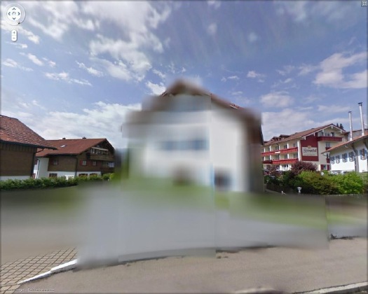
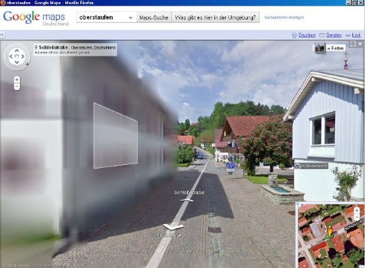
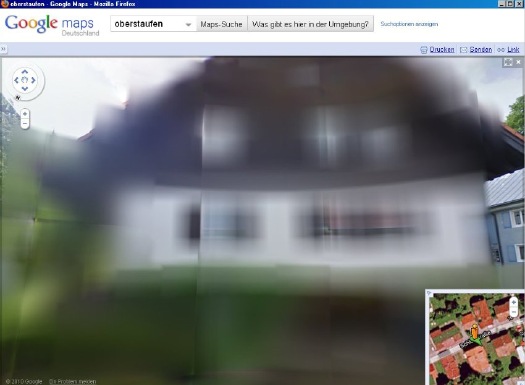
And the hunt is on. The few opt-out houses spotted so far have fed the media firestorm anew, and the examples cited by Der Speigel or FAZ [Google Translate] from Oberstaufen, the tourist village which first invited Street View to town, have been removed by Google “for review.”

At the center of the debate is my old blogging 1.0 buddy Jeff Jarvis, whose rather hyperbolic post on the subject, “Germany, what have you done?” was translated and republished by FAZ. [thanks greg.org reader/cinematographer Sanne Kurz, who tweeted about Jeff’s column.]
Sanne had referenced Germany’s complicated history of a giant state surveillance apparatus that elisted millions of citizens to spy on each other. Jeff’s having none of it:
While obscuring active military bases or the royal palaces may be justified for security reasons, the Dutch government’s Google Maps pixelation program also renders maps of entire villages and town centers unusable as it hides abandoned NATO weather stations–or nothing at all.
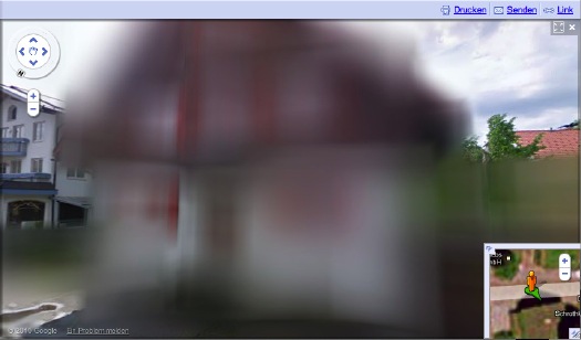
The state needs to be held accountable in its efforts at information control and censorship, but I can’t disagree more strongly with Jarvis’s unnecessarily extreme, incendiary language to criticize the individual assertion of some control over his own data. Referencing the Street View pano above:
Google’s German Street View blurring looks utterly fantastic. And for that matter, fantastically German. By which I mean, of course, that it looks like a Gerhard Richter painting.
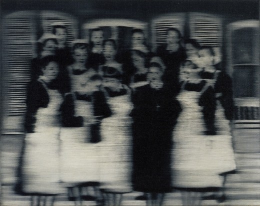
Nurses, 1965, image: gerhard-richter.com
Richter’s signature blurring technique calls into question the status, context, and veracity of the photographs that are his source material. Richter, Rosemary Hawker has argued,
I would think that the persistence of a few deliberately obscured images on Google Street View will serve as a useful corrective to the convenient, info-rich panorama’s seductive call, and will help remind users that they are, in fact, not in “the German Landscape,” but in a corporately controlled, commercial, and contested simulacrum of it.
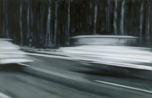
Two Fiats, 1964, via gerhard-richter.com
Far from “bombing” the supposed digital public sphere, the people who exercise their Verpixelungsrecht are asserting the individual’s right to virtual protest, to engage the digitization of his entire world on his own terms.
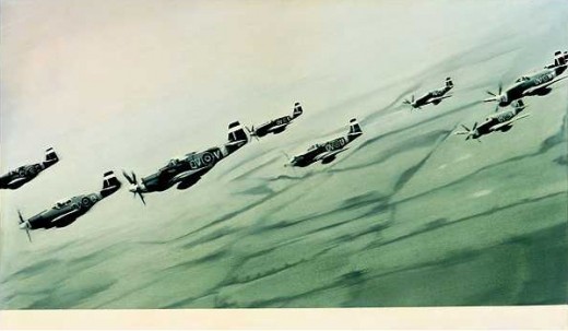
Mustang Squadron, 1964, image: gerhard-richter.com
Google has filed for patents to place advertising, “virtual billboards,” within Street View, reserving for itself the right to control and alter its ostensibly objective representation of the world for its own reasons, including, but not limited to, its own commercial gain. If someone painted their URL on the front of their store, would there be an outcry if Google threatened to blur it out unless they got a piece of the action?
Jeff argues that it’s folly for politicians to restrict innovation like geo-tagged facial recognition that, who knows, might be useful in locating Katrina victims. But who’s to say that, when our reality gets augmented to death with advertising and tracking, opt-out blurring isn’t where the real value will be? It’s the unlisted number of the future.
Or the vanity phone number. As an inadvertent-but-eager connoisseur of Google Map pixelation techniques, I could just as easily envision a premium Street View image management business emerging out of this controversy. In fact, it’s already started.
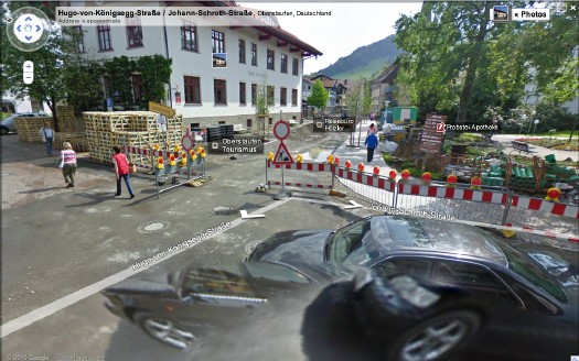
Just look at the unsightly street closure and construction project right in front of the Tourism Office of the otherwise-scenic Oberstaufen. Sheesh, no wonder they baked Street View a cake. Now check out the screenshot Spiegel got, where an embedded photograph from Panoramio helps clean things right up, mostly:
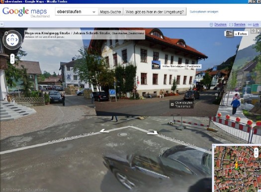
The Street View we see now is a mere shadow of the virtual world–or the virtualized real world–to come, and I’d like to think that when it comes to building and designing that world, digital citizens will be able to vote with more than their wallets.
At the very least, when people start paying Google to decorate their Street View houses with Blingee crap and animated gifs, mark my words: we’ll be grateful for the visual respite these Richterian Street View sites will provide.
Related, actually from over a year ago: Gerhard Street ViewTinguely’s ‘Black Tie Dada,’ Or Worlds Collide In MoMA’s Sculpture Garden
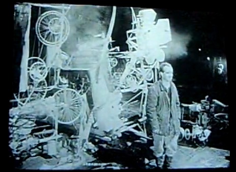
After making a name for himself in Europe with his “meta-matics,” automatic drawing machines, Tinguely came to New York in the early winter of 1960 and spent three weeks building Homage in the Sculpture Garden of the Museum of Modern Art. Billy Kluver helped him build the self-destructing sculpture from parts scavenged, thanks to multiple trips with curator Peter Selz, from the Newark dump.
Homage was performed? exhibited? destroyed? before an invited audience of around 250 on the evening of Thursday, March 17, 1960. I haven’t figured out who was there, but in a 2008 Brown Bag Lunch Lecture on the work, Columbia art historian Kaira Cabanas said someone referred to it as “Black tie Dada,” which might have just earned it a mention in my history of the gala-as-art movement.
The popular story is that the piece somehow malfunctioned, caught fire, and prompted NY firefighters to intervene just 30 minutes into the 90-minute event. Actually, even the Museum’s description of its own artifact from Homage says this. But it also has the incorrect date for the event, March 18, so perhaps not.
March 18 is the stated publication date for the Museum’s press release [pdf], though, which said the machine would be “set in motion” and “shown” only from 6:30 to 7:00. So it’s possible that everything went as planned.
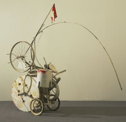
[Also, people apparently picked through the wreckage for souvenir fragments, but I can’t find any mentions of them surfacing. Besides MoMA’s conveniently self-contained hunk, above, the Tinguely Museum has a few manageable pieces.]
But really, the press release and the pamphlet/handout prepared for the event, is a gold mine of quotes and commentary. I double dog dare you to think of Alfred Barr the same way after reading his statement:
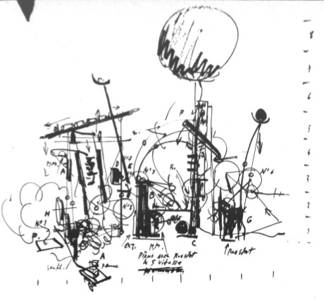
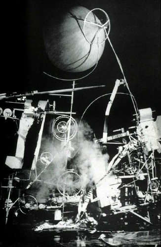
Ahem, also, did you see that weather balloon that was part of the piece? Here’s the sketch from the brochure:
And here it is, atop another performance photo, probably, again, from David Gahr:
The brochure quote from original Dadaist Richard Huelsenbeck adds back some of the fatalistic frisson that can be lost in a nostalgic, artifact-centered look back at a troubled historical moment:
Anyway, Robert Rauschenberg was an early fan of Tinguely’s, and soon became an exhibition collaborator. Last winter the Tinguely Museum in Basel had a show about their working friendship. Which featured this awesome photomural of Homage To New York:
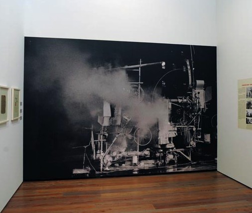
It’s probably from one of the performance images David Gahr shot for Kluver and MoMA. I don’t think it’s archival in any way, but it’s a great way to evoke the physical presence and scale of the assemblage.
I can’t find it now, but someone wrote how Tinguely kind of announced the Kinetic Art movement with Homage To New York, and then declared its end with “a similar” installation in front of the Duomo in Milan in 1970. Which cracked me up, because, hello, have you seen what Tinguely put in front of the Duomo in 1970? And was that similar to what Homage to New York was? Because I doubt it, but if so, wow.
Actually, let’s go to the tape. Or the film. Because D.A. Pennebaker shot the event, and made a documentary short, Breaking it up at the Museum, which features Tinguely previewing the piece, some details of the machine in motion, the takedown, the crowd, the applause, Tinguely’s curtain call, and a couple of audience member reactions:
“Why?”
“Well, it was something new, and visually, it was marvelous.”
“I felt like being in ze Twenties again.”
As Patrick said, a time machine.Is That An On Kawara Boardbook? Yes, Please.
Which makes me sad to have missed the San Francisco Art Institute’s show this summer, On Kawara: Pure Consciousness In 19 Kindergartens. It was about a project where Kawara installed a week’s worth of his date paintings in kindergarten classes around the world. [It’s not new; I first heard of it in 2003 at an Ikon Gallery show.] Because just look at this tasty documentation. Is that an artist’s book? Or better yet, an artist’s boardbook? aha, a box set?

From the gallery site: Why Enzo Mari Is Not Your Capitalist Art Market Stooge
But you know what, he was a famous artist, or at least he showed his art for a long time in a series of prominent places, in exhibitions that were considered important and are now considered historic, even. And yet even as some of those events are being revived, revisited, and reemphasized, Mari’s involvement in them is not.
I was going to solve this mystery, and find the answer, using the two dozen or so browser tabs I’ve accumulated in the last 24 hours. But you know what, I think I’m just going to cut ‘n paste my links and let the info sort itself out.
Thing is, there probably ARE people who know exactly how or why Mari the Artist’s career or influence is the way it is; and it’ll be easier to try and track them down rather than engage in armchair speculation. Or I’ll just pigeonhole Hans Ulrich in Miami, either way.
So here’s what I’ve got:Museumnacht At ARCAM, Or Greg.org: The Exhibit
 When we last considered the techno-militartistic merits of pre-WWII era sound location devices, I wondered where to start. And now I know: the Netherlands.
I’m not sure why, but it was acoustic locator-palooza over there. On the wall of the awesome library in Stroom, the visual arts center in The Hague, I spotted a large poster of a guy sitting in a German-style portable locator. And there were two more images in Stroom’s recently published journal, Podium for Observation
Turns out they’re from the Museum Waalsdorp, which is located on a military base outside of The Hague. And apparently, they’re not German-style at all; they were designed in Waalsdorp in 1927 by an engineer named Ir.van Soest. And they have some there. But it’s only open on Wednesdays, and only with advance reservations.
In Amsterdam on Museumnacht, meanwhile, we headed from the Stedelijk to ARCAM, the city’s architecture center & museum, because their current exhibit, “Music.Space.Arch.,” sounded like I could have curated it myself. Or blogged it, more like:
Included among the collected objects are the ‘Side Scan Sonar’, which brings the urban space surrounding ARCAM to the visitor, and listening equipment with which enemy aircraft were detected in the Second World War. With ‘Sound Scrape Shoes’ by Ricardo Huisman, the ARCAM building becomes the source of the experience, while in the presentation of the famous Philips Pavilion of 1958, the proportions are completely different from what we are familiar with.
Well.
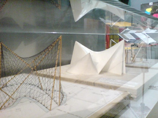
We literally arrived at ARCAM one minute after the tap dancer had begun her show. Now for me, tap dancing is to real dancing what rhythmic gymnastics is to real gymnastics, or what synchronized swimming is to swimming: an over-aestheticized mutation that is somehow unaware of its own awfulness. And that’s on a good day.
When you have a Dutch punk tap dancer–an alternative tap dancer, in a country where they probably have a Bureau of Alternative–in tasseled pants, dancing in the dark while an assistant shines a flashlight on her shoes, whose “intimate interaction” with ARCAM’s building basically meant pushing the entire contents of the exhibit into the corner so she could erect her hollow tap floor, it is really unforgivable and unsalvageable. And that’s even before the audience participation segment began.
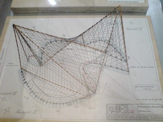
So we stayed in the corner, where the “completely different” proportions of the Philips Pavilion re-creation turned out to mean three A2-size models borrowed from the Atomium. Fantastic, but tiny. That wireframe’s especially nice.
But the projection on the exterior of the museum of Le Corbusier, Xenakis, and Varese’s Poeme Electronique, considered to be the first immersive multimedia environmental installation, had been turned off, another casualty of the evening.
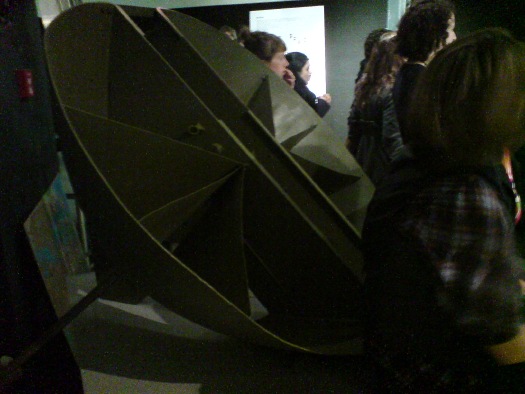
Oh, and there on a pedestal, behind some people’s butts and under their coats, was a real live Van Soelst acoustic locator. Only it wasn’t from Museum Waalsdorp; it was from somewhere else entirely: the Wings of Liberation Museum in Best. Holland must be the most acoustically located country in the world right now.
And so as we left behind a slightly chaotic-seeming jumble of awesome objects brought together by an amorphous, subjective theory, I realized that the only way to tell this blog apart from a multi-million-euro art, architecture & cinema center is that I’m the one without a tap dancer.Enzo Mari, Artist
Look, I don’t doubt that Enzo Mari hates the art world as much as he hates design. Even more, probably, since he’s a faithful communist in an era when–Picasso bedamned–it’s really hard out there in the art market for a Red.
But.
Mari is just as resolute about not distinguishing between art and design. And he makes art. Objects. And has, for over 60 years.
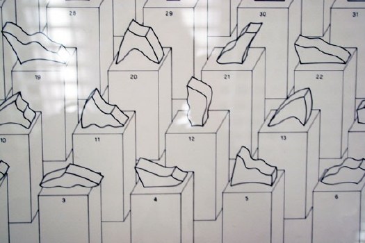
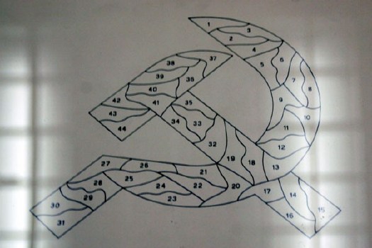
Just check this out, 44 valutazioni, a suite of 44 abstract sculptures Mari exhibited at the 1976 Venice Biennale.
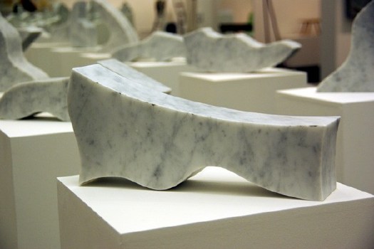
When they’re listed in order the title from each piece becomes the line in a poem by Francesco Leonetti, and when they’re assembled, well, hello, comrade! A hammer and sickle! Old school.
installation images of Mari’s GAM Torino show from designboom‘s extensive galleries.
We’ve brought Group ZERO back, right? At some point, the art world, and art history, are going to have to take Mari’s artworks into account, because, damn. He was doing minimalism and seriality a full decade before Judd and Lewitt.
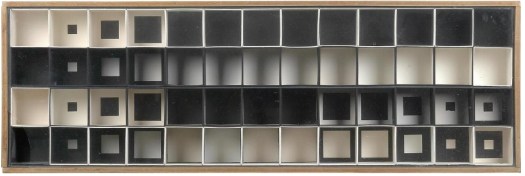
What are these struttura of which no one really seems to speak? [Except here, in a 30-year-old Italian monograph titled, naturally, Enzo Mari, Designer, which includes a chapter on Mari’s “research of form” and these “instruments of perception”?]
1956, struttura no. 301? Really? The only thing more eyebrow-raising than your date is your estimate: EUR6-8,000 at Dorotheum.
[OK, so maybe six years before Lewitt. Here’s his 1962 painting Objectivity at the National Gallery of Art:]
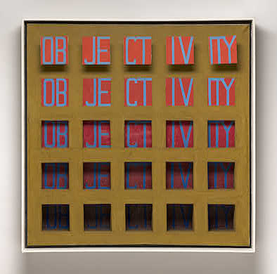
[I guess I was thinking of Lewitt’s 1967 Dwan Gallery show–and exhibition poster/print–and his 1968 photo object, Schematic Drawing for Muybridge, as seen here in flickr user clarkvr’s snap:]

But then there’s kinetic art, too. And what in the world is this? Omaggio a Fadat, 1967, a machine for “creating virtual volume” made from 64 lights, switches, steel, and perspex?

I mean, I know he had a show last year [2008-9, actually] at GAM Torino, but even if you call it “The Art of Design” and include a bunch of awesome sculptures, shoehorning 60 years of stuff into one gallery of a municipal museum is not exactly a retrospective. Look at this Omaggio, for example, if you can:
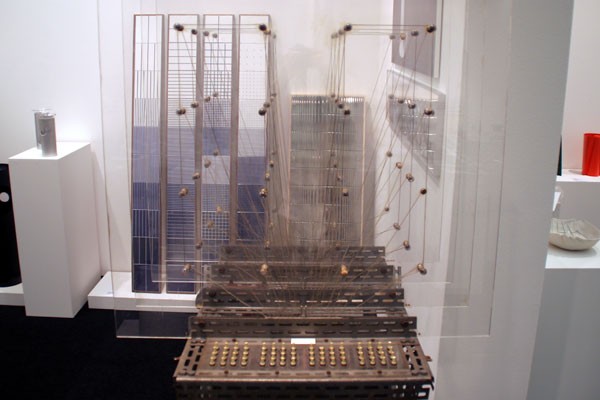
Also, he curated the show himself. Or designed it himself, using objects selected by his friends. Believe me, I know DIY’s his big thing, but seriously. It’s not like Mari’s an unknown quantity, and his influence is readily acknowledged–hell, he’s a huge influence on me, and building his autoprogettazione table as an art exercise, then devising an exhibition based on his principles of authorized reproducibility have kept him on the top of my mind for much of the last four years, at least–but he seems relegated to the designer’s corner, and his artwork–oh how sweet, the designer makes art, too!–with him.
Or am I missing something? Please say yes. [hmm, after some market-related digging, Mari’s problem may be that he makes Italian art, and only two Italian artists are allowed to become well-known outside of Italy each decade. Not much to be done about that, I guess.]Eduardo Catalano’s Raleigh House


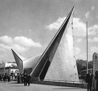

Triangle Modernist Houses has the whole happy/sad tale of Catalano’s masterpiece, and a bunch of photos [trianglemodernisthouses.com now usmodernist.org]Ansel Adams’ Japanese American Internment Camp Photos At MoMA. Shhh!

Someday this will all look and sound really coherent, I swear. But for going on, wow, 20 years, some of the most powerfully influential photos for me have been the images Ansel Adams took at Manzanar, the desert prison camp where Japanese-American families were interned at the outset of WWII. Deeply outraged that the US government would imprison its own citizens en masse, Adams set off to document the situation in 1943. In late 1944, he published a book, Born Free and Equal, which contained his text and a selection of the photos.
I spent years chasing down a copy of the book. And collecting prints from the series. And working with the Museum. And yet it was somehow only last week that I found out that in November 1944, Adams’ Manzanar photos were exhibited at the Museum of Modern Art.

Given that Adams had been asked by Edward Steichen to join his elite Naval Aviation Photography Unit, and that Adams was close with the Modern’s photography curator Beaumont Newhall and his wife, one might think that Adams’ wartime photos would have received the same prominent promotion and large-scale exhibition printing that Steichen’s Power in the Pacific show received a couple of months later.

And one would be deeply and completely wrong. According to the most tepid press release in the Museum’s history,
Ansel Adams donated his Manzanar photos to the Library of Congress [loc.gov]
Previously: I Mean, Just Look How Happy They Were! [greg.org]Les Immiserables
Did you say immiserization?
I did indeed!
Like self-immolation, but into misery instead of fire.
Yeah, self-immolation is slightly different. That’s for Brunhilde. Anyway, I picked up the Dreiser story…A Small Collection Of Awesome Browser Tabs
Andrew Russeth’s look into the market and objects of Marcel Duchamp is pretty great. I’ve been keeping Duchamp’s practice on a low burn for several months now. One thing Andrew reminded me of, is looking through the chronology in the MoMA/PMA Duchamp retrospective catalogue. For a guy who supposedly stopped making art in like 1915 or whatever, Duchamp sure spent a lot of time over the years making, picking & packing Boites en Valises.
Oh, another thing Andrew reminds me of: how great dealer Francis Naumann’s book about Duchamp’s objects, Marcel Duchamp: The Art of Making Art in the Age of Mechanical Reproduction is.
Dan Hill’s been really busy of late, and so the time lapse has grown between the classically long, thoughtful posts on City of Sound. Which makes it even more imperative to read his recent contemplation of the ever-so-slightly undulating grid of Carrara marble on the facade of Alvar Aalto’s Finlandia concert hall in Helsinki. That guy knows how to see and think. Hil, that is. Aalto’s no slouch, either, but you know what I mean.
Perhaps in unconscious preparation for a long-overdue Terry O’Shea retrospective, Grace took a photo of the biggest La Brea tar pit from the second floor of LACMA in 2007.
Here is how the books in three galleries in a row looked Saturday. This one happens to be from Pruitt’s show Maccarone:
Which, by the way, I know I love the Monsters, but I was not ready for the Ikea paintings. They were rather engrossing. He paints over the Ikea knockoffs-on-canvas using a phenomenal amount of paint. The first one in the doorway, on the left, is full of flesh tones, and has this incredible surface, caused in part by Pruitt’s use of Saranwrap or something to smooth down the thick, undulating surface. Of course, when he removed the plastic, the paint came up in spots, forming little peaks. In other places, gaps in the paint exposed the Ikea image below, and in still others, the creases of the plastic remained. If I’m the first, I should not be the last to consider Pruitt’s Ikea paintings alongside the overpainted photographs of Gerhard Richter. Yes, that’s right. At the very least, it’s an interesting and unexpected reference.
Distinctively unawesome: UbuWeb has been knocked offline. [via eyeteeth]Consider The Artist
