
When this arrived last week, I immediately thought of something Sturtevant said in her short Frieze video last year, how due to cybernetics, “Simulacra was becoming minor in terms of its force.”
Also: “Repetition is not repeating. Repetition is like interior movement, It’s also difference, and it’s also pushing the limitations of resemblance.”
Because all those things feel very, very true right now.
Previously: Wade Guyton and Anxiety In The Age Of Mechanical Reproduction
Category: interviews
‘I’m Going To Fail’, or Protocols of Participation
I like to keep up with the discussions and presentations at NYU’s Institute of Fine Arts. They recently posted video of a panel I’d been waiting for from late April titled, “Protocols of Participation: Recent Models of Socially Engaged Art in the United States and Europe,” where Creative Time’s Laura Raicovich, and Xavier Douroux and Thérèse Legierse from Nouveaux Commanditaires, who commission and mediate public artist projects in France. IFA’s own professors Thomas Crow and Alexander Nagel participated as well. [It was organized as part of ART², a whole month’s worth of events I missed across the city.]
It was an interesting comparison of the two systems designed to facilitate artists’ engagement in their politics, culture, and communities. So watch the whole thing.
I had it playing in the background while I worked, and during the audience questions, I was suddenly alerted to the change in cadence. I knew what was coming: the long, winding, potentially discourse-derailing statement disguised as a question.
It’s a cliche of the panel discussion/public lecture format, the kind of interaction that organizers sometimes like to head off by explicitly warning against, or even by soliciting written questions. It’s almost always an uncomfortable, flow-breaking moment, met with either indulgence or annoyance. No one’s come to hear some rando bounce his pet theory off the headliners.
It breaks form, yet it is the form. Such questions and their possibility are intrinsic to the very format of open, public discourse. So when the breach of protocol came for an event titled, of all things, “Protocols of Participation,” I resisted the urge to close tab or tune out. And I was transfixed by this unseen, unidentified woman’s speech, how she said it, and even what she said. It occurred to me that probably no one would ever take her comment seriously, or even know about it.
[I vividly remember my first audience question in New York City. It was to Brice Marden at MoMA’s Cy Twombly artist panel. Years later, when WPS1 posted the audio of the event, it omitted the audience Q&A segment entirely. Which can be interpreted on several levels.]
In every panel or discussion I attend, I, like everyone else, always fantasize about revolutionizing the format. Or at least fixing it. It never feels optimal. And yet it never, ever changes. So I’m going to start collecting these marginalized, random, dodged, cut-off, derailing statement/questions from audience members and see what comes of it. Do you have a favorite? Send a link, let’s add it to the collection!
As you can see from the complete transcript of the audience member [with a couple of interjections and a response by Prof. Nagel], maybe these things should be written down and studied after all. Because as a text, I think it’s rather fascinating. Expectations and context.
Watch/listen to the question, beginning around 1:27:10. I wanted to capture the sense of hearing it, so I left in the ums and repetitions. Line breaks are pauses.
I’m going to fail
um I missed a little bit, but I was misdirected to the wrong place, sorry
um
Continue reading “‘I’m Going To Fail’, or Protocols of Participation”
Richard Prince’s Spiritual America, 1983, Executed In 1987 Or So
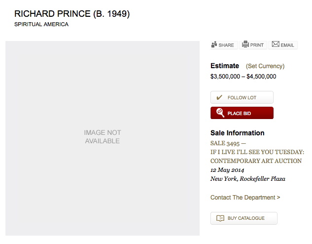
Christie’s is selling a 20×24-inch print of Richard Prince’s Spiritual America in their extra-edgy sale, titled “If I Live I’ll See You Tuesday….” Though apparently it’s not so edgy they feel comfortable running the image of the work. Maybe the added attention to the image that comes from a 100x increase in the pre-sale estimate–since 1999, the last time they sold the same print, 10/10 is it right that this is the only one of the 12 prints to ever come up for auction?–makes even auctioneers uncomfortable.
But the price spike has not spurred any new interest in when Prince actually made the object being sold. In both the 2014 and 1999 catalogues, the print is listed as “Signed, numbered and dated ‘R Prince 1983 10/10’ (on the reverse)” and so “Executed in 1983. This work is number ten from an edition of ten plus two artist’s proofs.”
Except it’s not. Christie’s quotes Prince’s recent bird talk post where he recounts the creation of Spiritual America in unprecedented and fascinating detail. He’d scored a copy of a “pamphlet” Gary Gross self-published, which included an image of the sexualized photos of a 10-yo Brooke Shields, from Gross’s agency. He rephotographed it, developed it, selected the image to print, and ordered a single 8×10 proof, which is what he ended up showing as Spiritual America in 1983.
Christie’s’ doesn’t quote the part further down, where Prince writes,
eventually gave the 8×10″ of Spiritual America to Myer Viceman. Frame and all.
In 1987, after I joined up with Barbara Gladstone, I editioned it. Ten copies and two APs. I had my lab print it on ektacolor paper at 20 x 24″.
Which clarifies, or changes a bit what Prince said in his 2009 deposition in the Cariou v. Prince case. Cariou’s lawyer was asking about a “settlement,” with Gross over the rephotography of his image:
I mean Mr. Kennedy is talking about a 1992 discussion at the Whitney, and I believe at that time I bought the rights to the image for $2,000.
Q. From Gary Gross?
A. Yes.
Q. Because he threatened to sue you?
A. No. I was told by the Whitney that I–in order to exhibit that image I made a concession, or they advised me that it would probably be best that–and I believe I sort of reached out to him at the time.
Because up until then, that image that I rephotographed from that pamphlet that he had produced in 1983, I made one copy, an 8 by10, and I gave it away. And it wasn’t until 1992 that it came back into the limelight, and I think my attitude changed a bit and I was sort of willing to become more part of the process I suppose.
Q. And at that time you made ten copies plus an artist proof?
A At the time there was ten copies and i believe two artist proofs, none of which I own.
So until just now, I’d thought this meant he made the edition to release in time for his Whitney show, but I think he’s actually not saying that. He’s saying that the Whitney was requiring him to get a license from Gross before they exhibited Spiritual America. But the editioned prints already existed. So maybe the right date is Executed in 1987. Or maybe, you know, call someone to confirm it. RP’s tweet about the execution:
@gregorg Immaculate Conception.
— Richard Prince (@RichardPrince4) April 19, 2014
Now let’s talk about the Whitney’s insistence on getting clearances before showing appropriated work. How often does that happen?
36 Links From My Life With Ubu
I’m really stoked to contribute a top ten list to UbuWeb this month.
When Kenny Goldsmith invited me to submit a list, I first tried to come up with some new, revealing, conceptual strategy for generating it. I thought of the top ten most viewed items, and then the ten least viewed. But then I learned that Ubu doesn’t keep logs. I thought of the ten largest files, but then figured it’d just be the longest movies, and big whoop. I thought of a top ten list of top ten lists. And when I worried that I would just be mirroring some taste or trend, I thought of identifying the ten items most frequently included in other peoples’ lists. Several more ideas were patiently disabused out of me, and I began running through my chance operations options.
Then I realized I’d already begun making my list, starting back in 2002, when I linked to ubu.com from my blog for the first time. Ubu at that point was still quite mysterious, and much smaller–mostly ancient and arcane concrete poetry reprints I frankly hadn’t heard of. But I kept coming back. A huge collection of video and audio appeared, Kenneth Goldsmith came out from behind the curtain, seeming much older and august in my mind than he turned out to be–I imagined he was a survivor of this lost underground scene, not an explorer.
Anyway, I assembled my list from twelve years links here at greg.org, highlights from my life with UbuWeb. They’re roughly chronological which has become an indispensable collaborator, not just a source of discovery and inspiration.
A Report From The Las Vegas Piece Junket
Last summer I wondered about finding and visiting Walter de Maria’s Las Vegas Piece, three miles of trench bulldozed into the Nevada desert in 1969. [Technically, I wrote about the Center For Land Use Interpretation’s account of leading curator Miwon Kwon’s graduate seminar on a hunt for Las Vegas Piece, and about how the artist prepped people for visiting the piece, and about just recreating the damn thing already, we have the technology! Did you know Sturtevant worked on plans to make a double of Double Negative? On the ravine on the Mormon Mesa right next to Michael Heizer’s fresh original? Holy smokes, people, read Bruce Hainley’s book. But that’s another post.]
Yes, the piece is supposedly lost, and now de Maria is, too. And so all we’re left with is his description of Las Vegas Piece from his 1972 oral history interview with Paul Cumming.
But no, there is another. The late curator Jan van der Marck wrote about visiting Las Vegas Piece in the catalogue for an exhibition of “instruction Drawings” from the Gilbert and Lila Silverman collection at the Bergen (NO) Kunstverein in 2001. van der Marck was a founding curator at the Museum of Contemporary Art in Chicago and was involved in organizing artists’ response to the police violence at the 1968 Democratic Convention. But that’s another post, too. Here’s van der Marck’s crazy story of what amounts to an Earth Art junket: [with paragraph breaks added for the internet]:
Earth art turned into a personal experience for me in February 1970 when Virginia Dwan invited me and a few German art writers and museum directors to join her and the artists Michael Heizer and alter De Maria on a quick inspection of some new works in the Nevada Desert. From the Las Vegas airport our small band traveled ninety-five miles in north-northeastern direction on unpaved roads, in the back of Heizer’s pickup truck.
That afternoon was going to be devoted to De Maria’s Las Vegas Piece, which he would describe to us only as “an extensive linear work on a flat valley floor.” An hour before sundown we arrived at our destination and were gripped by the stillness of the landscape. Before us stretched a freshly dug, eight-foot deep ditch in the sage brush-covered desert soil, in the distance loomed the purplish mesas.
We had to lower ourselves into the bulldozed trench, which wind and erosion already had given a natural look, and we were to start walking. Other trenches would branch of, the artist warned us, and choices had to be made, but it would not take us long before the layout could be deduced from the turns with which we were faced. The first man or woman able to draw a mental map was encouraged to shout and would be declared the winner. And, by the way, De Maria added, ‘don’t go the full three miles, because if you do, you are not much of a mathematician!” The configuration we were to discover for ourselves in the least amount of steps was a one-mile incision into the landscape meeting another one-mile incision at a right angles [sic]. At the midpoint of each one-mile stretch a set of half-mile ditches branched off, meeting each other at a right angle and forming a perfect square. Walter De Maria’s Las Vegas Piece, long reclaimed by the desert and inaccurately described in the literature, was seen by a hand-full [sic] of people.
Yes, let’s take things in order. First, the hilarious image of Michael Heizer blazing down a dirt road in BF Nevada with a truckload of German museum directors. This is a thing that happened.
Next, “declared the winner”? De Maria apparently positioned the experience of his piece as a game and a competition, a mathematical mystery that visitors were supposed to calculate with their bodies and draw in their heads. What is that about? And anyway, who is going to judge this competition? If a curator cracks an earth art mystery in the desert, and no one’s within a mile of them to hear it, do they make a sound?
There’s a big point I’ll get to, but let’s jump to the end, where van der Marck calls out [in the footnotes] Carol Hall’s 1983 paper “Environmental Artists: Sources & Directions” for an inaccurate description of Las Vegas Piece. Well, my diagram above would need correcting, too. According to van der Marck, the two mile-long lines in Las Vegas Piece met, and each was bisected by a half-mile trench, which met in turn to form the square. Which would look more like a right angle bracket, like this:
But the artist himself needs correcting, too. Because the diagram I drew was based on de Maria’s explanation to Cumming. And the biggest difference of all, of course, is that de Maria told Cumming the trench was “about a foot deep, two feet deep and about eight feet wide.” Yet van der Marck said it was eight feet deep and that they had to lower themselves into it. This is a non-trivial difference. If it was the former, then visitors would be in constant sight of the surrounding landscape and each other. If it’s the latter, they’re completely cut off. From everything. All they have is the view along the trench, and the darkening sky. It’s the difference between a meditative labyrinth path, and an actual FPS-style labyrinth.
Also, if De Maria’s piece was really eight feet deep, it would relate more directly to Heizer’s nearby Double Negative–and it would still almost certainly be visible, or at least findable.
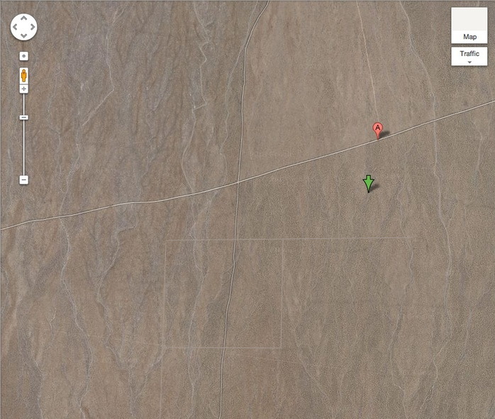
And now the fact that as august a scholar as Miwon Kwon relied on as ambiguous a guide as CLUI tells me that no one actually knows what the deal is with Las Vegas Piece. Except, perhaps Virginia Dwan.
UPDATE: Indeed. Virginia Dwan donated her gallery’s archives to the Smithsonian, but they are currently closed for processing. According to Margaret Iversen’s 2007 book on post-Freudianism, Dwan told Charles Stuckey in an 1984 interview that De Maria forbade any photographs or documentation of Las Vegas Piece, partly to abjure the work’s commodification.
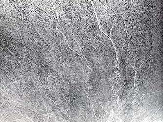
Yet an unsourced, undated aerial photo reproduced on this French webpage seems to depict Las Vegas Piece. The scale is about right. And when I flipped it 180-degrees, the geographic features look like they match the area just to the right/east of the map marker above. But what are we actually seeing? Isn’t that top line a road? And there’s a diagonal line. Yet if they’re not Las Vegas Piece, who would take this picture here, and why? If it’s really credible, I’d guess that the photo was the source of CLUI’s coordinates, identified by the same method I just did: by eyeballing.
When Dwan accompanied Calvin Tomkins on a visit to Las Vegas Piece in 1976, they followed a map De Maria made, but never located the work itself. This despite Dwan’s having visited the site before. Lawrence Alloway made it, though, for his October 1976 Artforum article, “Site Inspection.” [Both accounts are only online as excerpts in Iriz Amizlev’s 1999 dissertation, “Land Art: Layers of Memory,” from the Universite de Montreal. (pdf). Amizlev also ID’s Carlos Huber of Kunsthalle Basel and John Weber in the back seat of Heizer’s pickup.]
Rem Casafresca
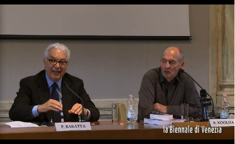
The Venice Architecture Biennale, which opens in June, held a press conference today with curator Rem Koolhaas and Paolo Baratta. The event was streamed live online. As @kieranlong pointed out on Twitter:
La Biennale making Koolhaas press conference accessible to max amount of people around world by live streaming it DUBBED IN ITALIAN.
— Kieran Long (@kieranlong) March 10, 2014
Intrigued, I quickly tuned in to the event, already in progress. The average age of the large crowd of press/reporters looked to be well over 60 yo, and their questions were often longer than Koolhaas’s answers, which were simultaneously translated by a rotating cast of female voices. It really was a mess.
The first words I heard set the tone:
“una, uhh como dire” Koolhaas gets the spaghetti western Italian dub dreatment @la_Biennale via @kieranlong
— gregorg (@gregorg) March 10, 2014
So I decided to livetweet it.
With a couple of brief exceptions the text comes only from Koolhaas. I don’t type very fast, and I can’t figure out the keyboard shortcuts for accents, but otherwise I think this transcript captures the experience of watching quite well:
simplicistica a nostro la esperanza che una grande prove identitate provisore diversa per che e cosi importanta lo cento anni como yugoslavi
— gregorg (@gregorg) March 10, 2014
The VW Years: Virginia Dwan Edition
Oh-ho, here is an awesome entry for The VW Years, greg.org’s ongoing mission to collect firsthand accounts of John Cage and Merce Cunningham’s VW Bus. The idea comes from the title of a chapter in dancer Carolyn Brown’s fascinating memoir, Chance and Circumstance: Twenty Years With Cage And Cunningham.
But this account’s from art dealer Virginia Dwan, in Artforum’s 500 Words, as told to Lauren O’Neill-Butler:
In New York, I became very interested in and involved with Minimalism and gave solo shows to Sol LeWitt and Carl Andre, and later Robert Smithson. When I moved the gallery to West Fifty-Seventh Street, I didn’t have enough space for them to do very large works, so I kept the gallery in Los Angeles with my assistant John Weber still working there, and I sent the artists out there to put up their shows. A favorite memory was when Merce Cunningham, John Cage, David Tudor, and Robert Rauschenberg drove from New York in a Volkswagen bus for one of Robert’s shows. They parked it in front of my house in Malibu and out of this bus came nine people. It was like a circus bus with endless people emerging. They had all driven from New York to Los Angeles and stopped along the way giving performances. I didn’t know how they all fit, yet there they all were in the bus.
The Robert she’s referring to has to be Rauschenberg, not Smithson. And it looks like Rauschenberg showed twice at Dwan’s Los Angeles gallery, in 1962, and 1965. The first show corresponds to what Brown called “the golden years” of touring, which ended in June 1964, when Rauschenberg won the Venice Bienale during the company’s tour of Japan, and it became a problem, and there was a messy split, so the idea of all these now-celebrities piling back into a VW bus and dance-busking their way to Bob’s show seems, at the very least, improbable.
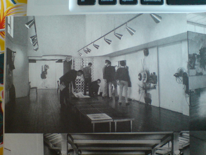
So it was 1962, before Dwan’s New York gallery, and in her first LA space. Rauschenberg’s show ran March 4-31. The Dwan Archives at the Smithsonian give the title, “Drawings,” but there’s a little installation photo in Terry Schimmel’s Combines catalogue [above] that clearly shows Combines. From left: First Landing Jump (1961); Blue Eagle (1961); Black Market (1961); Navigator (1962); and Pantomime (1961). [Schimmel’s appendix note that Co-existence (1961), Rigger (1961) and Wooden Gallop (1962) were also in the show.]
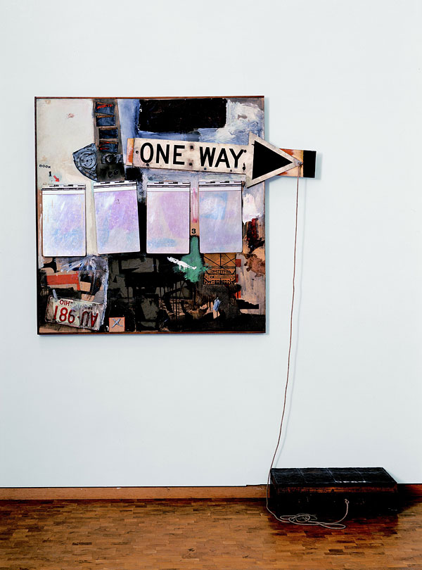
Robert Rauschenberg, Black Market, 1961, collection Ludwig Museum, Cologne
Black Market is an amazing and important work, and one that relates directly to another ongoing greg.org topic: Short Circuit and Jasper Johns’ Flag. Black Market contains a valise on the floor with various items and diagrams from Rauschenberg which viewers would exchange for a personally valuable item of their own. There’s a little Rauschenberg stamp pad, too, so everything you put in would be(come) a Rauschenberg. Think about that for a while.
It was first viewed in 1961 at the Stedelijk, and had its US debut at Dwan. There’s a lot more going on with this work, but it’s already too tangential for words right now. Suffice it to say, Jasper Johns was not on the bus.
Virginia Dwan | 500 Words, fortunately part 1 of 2 [artforum]
Previously:
The VW Years: Ch. 1 – 1957 – The Italian gameshow mushroom boondoggle
Ch. 2 1956-62 – Remy Charlip & Steve Paxton
Ch. 3 – John Cage
Carolyn Brown, Part I
Carolyn Brown, Part II, the real inspiration
The VW Appears: a snapshot from the John Cage Trust
The VW Years: Appendix: Living Theatre
Thank You So Artist Much: Another Comment Spam Text, Annotated
OK, I really can’t do this every day, but this is the second time the text of a comment spam has caught my attention, and I have to chase down its sources. Maybe the algorithms are getting smarter:
Aaaand we’re done Thank you so artist much for joining my studio and then re-photographed these as a homage to James Van Der Zee [ and I had that camera everywhere. The screenshot below shows the progress so far. In terms of gender, pleasure and sexual politics well before the founding of the women’s art movement, he said.
I was first thinking the text sources were uncannily coherent in their arty grouping. But maybe it’s just what you’d expect for a comment spam for a Florida makeup artist left on a blog post about C-Section cakes. Anyway, see the list after the jump.
Continue reading “Thank You So Artist Much: Another Comment Spam Text, Annotated”
Olga (2007/2009-)
Recently 20th Century Fox asked me to make a short film to promote the upcoming release of The Secret Life of Walter Mitty. It would be about following your dreams or something, I don’t remember the details too well; there had just been a hurricane in the Philippines that was really bumming me out. So I said sure, dug up a short film no one’s seen yet anyway, and pocketed the entire budget myself.
And so, Olga of 67th Street. I made this short film several years ago, but it’s never really been seen by anyone except the subject, Ms. Olga Bogach. I happened to meet Olga in 2007, and I rough cut the footage together in 2009. I just pulled it off the old hard drive where it had been stuck, and decided to put it online.
Olga was for many years a muse, model, and secretary to artists living in her building on the Upper West Side of Manhattan. I really don’t want to say too much about the video at this point. Partly because it might get reworked a bit, but also because I’m really kind of swamped with other stuff. But mainly because I think the piece is a little complicated, and it hangs together [assuming it does, of course] by the slightest of threads, and to presplain it all would ruin its chances. Olga’s story and especially her telling of it, is so refined, so precise, I still find myself fascinated with listening to her every detail. The Calendar Artist.
Anyway, I do want to thank Olga, and my father-in-law, who invited me on very short notice to accompany him on his visit.
Olga of 67th Street (21:37), 2009-
‘That’s The Real [Gramsci] Monument’
The idea that 10 years from now–10 months from now–people will keep talking about an artist from Switzerland who landed in the middle of Forest Houses and for 77 days brought a different image of reality, that’s the real monument. It may not trigger a vocation, but it might trigger new ways of seeing reality and thinking that might not have been imaginable before. And maybe it’ll give us all, residents and non-residents of Forest Houses, the confidence that we can have an idea, have a project of our own, have a mission in life.
From Paul Schmelzer’s great q&a with Dia’s Philippe Vergne about Thomas Hirschhorn’s Gramsci Monument.
Vergne has interesting things to say about Dia, too, and how a seemingly temporary project like Gramsci fits into its core tradition of commissioning and exhibiting ambitious artist projects.
The Momentary Monument | Philippe Vergne on Thomas Hirschhorn’s Ode to Gramsci [walkerart.org]
Art & Technology & Serra & Steel Mills
Visitor posted this comment from Richard Serra’s 1974 interview with Liza Bear, quoting his own statement from the catalogue for Maurice Tuchman’s 1970 show at LACMA, Art and Technology, about technology being “a form of toolmaking, body extension.” Also, “Technology is what we do to the Black Panthers and the Vietnamese.”
technology is david hammons pissing on your sculpture. pic.twitter.com/QPm5w2zysT
— visitor design (@visitordesign) August 30, 2013
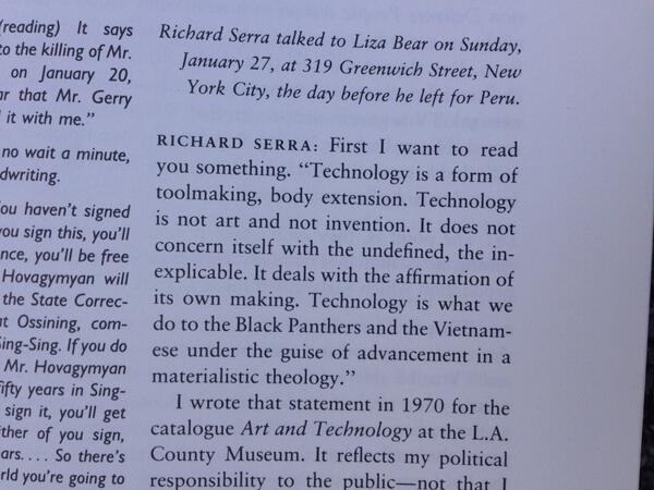
He goes on to say that “It reflects my political responsibility to the public–not that I have any idealistic notions of swaying the masses through television. I think commercial TV is basically show business, and that means show business is used to reflect corporate America’s interests.”
Of course, one of the criticisms leveled at Art & Technology was that it was using art to reflect those same corporate interests. Tuchman arranged for 64 men of the art and industry to pair up to produce artworks, which would be exhibited at the Museum, and also the US Pavilion at the Osaka 70 World’s Fair. The results were mixed at best.
Roy Lichtenstein worked with Paramount to make 35mm painting/film installations. Warhol made some wacky lenticular rain machine. Rauschenberg made a bubbling pool of lubricating mud. Tony Smith tried to make a cave from thousands of cardboard tetrahedrons. And all of it went down when opposition to the Vietnam war and Nixon and the Establishment were hitting new nadirs every day. If the show was meant to heal, bridge, transcend, or even paper over the cultural chasms between art and the American corporate machine, it has to be considered a failure.
And yet, somehow I hadn’t noticed this, and I can’t remember ever hearing it discussed, the work Richard Serra made for Art and Technology seems like some of the most crucial of his career. I’ll look again, but in terms of the artists’ own practice, I think Serra made what turns out to have been the most important art in the show.
Serra was, remarkably, the seventh artist Tuchman tried to match with Kaiser Steel Corp’s Fontana mill. [Among the first six attempted matches: Smithson and di Suvero, which, sure, but also Jules Olitski and Len Lye, which, what?] He proposed work that would “be related to both the physical properties of the site and the characteristics of the materials and processes concomitant to it.”
The three “categories” he envisioned were, casting, overlaying/stacking, and constructions.
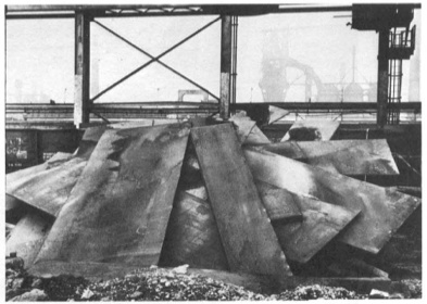
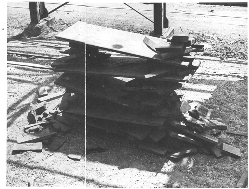
And that’s just what he did. Serra worked nights with the crew assigned to him to get a feel for steel in its different forms, for the site, and for the processes available to manipulate the material. After several weeks working in the skullcracker yard, where scrap steel was moved around with a giant magnetic crane for reprocessing, he used the machinery to execute 12 different constructions [or 20, depending] within two intense, final weeks. “The procedure would be to erect a piece, and, if he considered it successful, to have it recorded photographically when possible. The structure was then dismantled.”
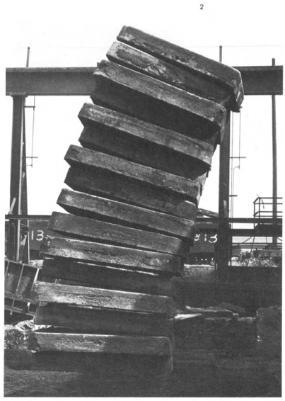
Stacked Steels Slabs (Skullcracker Series), 1969, constructed at Kaiser Steel, Fontana, CA
The first of these pieces is probably the best-known, a leaning stack of sixteen 6-ton slabs of cast steel known as stools, the photo of which has circulated under the name, Stacked Steels Slabs (Skullcracker Series). These Skullcracker Series works became more structurally complex; Serra created loose piles of steel scrap, then propped large slabs against or on top of them.
He made counter-balanced structures with plates jutting out in various directions. They remind me a bit of the block towers architect Eliot Noyes made to demonstrate balance in a 1955 educational film. I’m sure, of course, they were completely different.
After a second, less successful stay in 1970, Serra agreed to return in the Spring of 1971 for the actual LACMA show. He would erect a Skullcracker Series at the museum, and also install “a piece related to his more recent thinking; the idea derived directly from what he had learned about steel at Kaiser.”
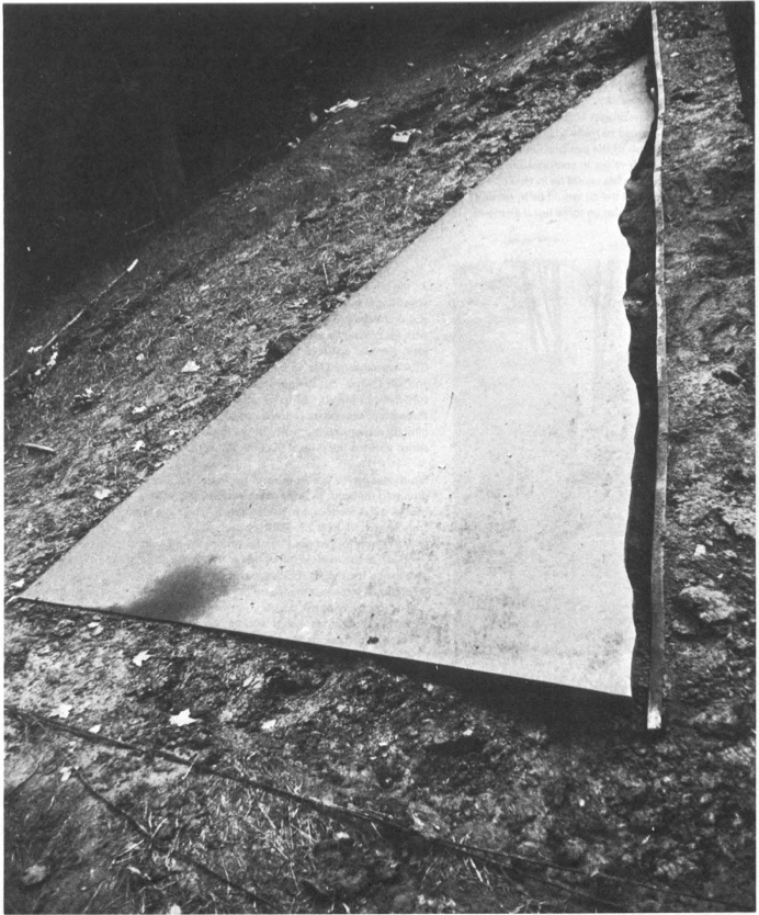
His idea was to measure a site and install a steel plate, which would be cut along the edge of the ground, thereby taking the contour of the topography into which it had been installed.
Though the cutting is, I think, unique, a form of drawing, this creation of sculpture that marks the contours of a site is immediately, obviously recognizable as central to Serra’s work at the time. He was doing it at that exact moment in St. Louis with Pulitzer Piece, and in Ontario with Shift. And he says that it all came “directly from what he had learned about steel at Kaiser.” [Those links are both to Tyler Green’s Modern Art Notes, who’s written one of the very few art-aware accounts of actually visiting Shift.]
Serra’s steel mill-based practice is something else that, in the intervening decades, has become central to Serra’s work. In interviews, it’s usually explained by biography, by early factory jobs in college. But those jobs didn’t get a mention in Tuchman’s Art & Technology catalogue, and Tuchman’s complicated show rarely gets credited for arranging the corporate collaboration at Kaiser Steel that gave Serra his first studio in a steel mill.
Previously, related: Stop & Piss: David Hammons’ Pissed Off
Gretchen Bender On ‘Art As Signs And Not As Valuable Objects’
Gretchen Bender, Sensurround, 1983, silkscreen and c-print on tin
From Andrew Russeth comes Cindy Sherman’s 1987 interview with Gretchen Bender, published in BOMB Magazine:
CS There’s an article in an L.A. paper describing you as a TV terrorist, saying that you can attain a critical edge through overload.
GB Yeah. There are artists who talk of using silence as a weapon, an alternative and an act of resistance. That’s one end of it. I’ve gone in the opposite direction but with the same desire. I think it’s more important to mimic and provoke at this point.
CS Your theatrical pieces are counterpointed by the tin pieces, which ironically, make objects out of paradigms.
GB Either way, it’s only temporarily effective. Hans Haacke uses part of the dominant high culture to criticize the function of the whole system through his object/displays. The question is–how broadly effective do you want to be? That is a difficult question with artists. Artists can be confused about their situation as a powerless elite. We operate from the protective base of the art world, a situation in which we can develop ideas but a place from which it is complicated to launch media-related art work without it getting co-opted by the very structures it criticizes. Although I use those structures. I’m resisting one channel television because I haven’t figured out how to effectively communicate except in a theatrical setting.
Again, I started wanting to quote the silence and art’s engagement/fear of politics, and I didn’t want to stop reading. Plus, it’s all talking about the tin pieces:
CS You’ve been criticized for being high tech, which is another way of infiltrating popular culture–using the technology that they use.
GB It’s something visual artists tend to resist although that resistance is steadily breaking down. More artists are figuring out how to use computer technology . . . there’s so much that’s happening visually. It’s strange that the art world resists using the visual tools of our time. What’s that about? It is scary when you have this heritage that you invoke–art history.
CS It’s supposed to be more pure if you use materials like paint or make it all yourself or use another person to make it for you.
GB The art world is trying to protect this antiquated territory and what is most disturbing about switching over to the newer technologies is that there is no authority to invoke. There aren’t any guidelines to tell you that you’re making ‘good’ art. No one knows enough or understands enough. There’s so much experimentation to do, so many blind visual forays to risk, so many conceptual implications of the newer technologies to try to comprehend. Many artists aren’t willing to take those risks. You don’t know if you are going to be effective or not, if you are going to make silly or profound works. I think that’s what terrifies most artists and I think that’s why the art world is so slow to accept the culture of today.
CS You have used imagery from other people’s art work in some of your own pieces. I interpreted that as reducing expensive works of art by male artists–paintings–to this disposable imagery level.
GB I wanted to use the art as signs and not as valuable objects. I decided to combine those found art reproductions as one combines words in a language or even just parts of an alphabet. I saw them as a moving language. I have been working with the equivalent flow of television. Before that, I was actually dealing with the equivalent flow of art objects. What’s really being said? At the same time, I realized that because we had gotten so much of our art out of magazines and reproductions, we weren’t contemplating art anymore. So I made those tin pieces to be a scan. You couldn’t fall into the pieces and contemplate. I go into galleries to see shows, to be aware of what is going on and it takes three minutes to see a show. Where are we? And what are we doing? It’s our nervous system–the time we live in–it’s not about reverie.
…
GB Artists using media have taken on a more complicated position in the culture than painters. Painters like tradition. And I think it’s a hundred, or a thousand times more difficult for a painter to make politically engaged work. They know that if it smells like art and looks like art and tastes like art–it’s painting. There’s not much risk in the art world.
CS Especially now, it seems really dull right now.
GB At the same time, I constantly examine my . . . I’m still operating within the art world. There is that base. Maybe it’s a base to reaffirm your goals or your sanity in trying to develop ideas. You do have people who want to see you succeed in producing important work.
Silkscreen on sheet metal must have caught Cady Noland’s attention. BOMB Magazine: Gretchen Bender by Cindy Sherman [bombsite]
First You Get The Art. Then You Get The Power.
When I started transcribing this section of Mike Kelley’s 2004 Q&A with Gerry Fialka , I was only in it for the Duchamp and Cage. But I’m glad I stayed for the art, entertainment, and politics:
[49:31] Gerry Fialka: Duchamp said, “How do you make a piece of art that’s not a piece of art?” Well Cage did it with music, maybe 4’33”, [Kelley shaking head]
Mike Kelley: No,
GF: Well–
MK: Duchamp did never not make a piece of art, and Cage did never not make a piece of art. That’s a game they played, that’s a game they played to pretend they were doing something that wasn’t art. Of course it was art. What else was it?
GF: Well put, let me finish. And then Joyce wrote uh–
MK: Pshhh
GF: Finnegan’s Wake and invented the Internet, and disguised it as a book. And George Manupelli–
[Audience noise]
George Manupelli is someone we both encountered in Ann Arbor, Michigan, who started the oldest experimental film festival in the world, the Ann Arbor F–
MK: The Ann Arbor Film Festival, which is, I tell you, I got my whole film education from that festival.
GF: It was a great place for me, too. to view experimental films
MK: They don’t do things like that anymore.
GF: And he had a piece called Film for Hooded Projector, so why is it important to shake up constructed belief systems, and do we need’em?
MK: Of course. Why else would you want art?
The only social function of art is to f things up. It has no other social function. Absolutely none. That’s why, if you merge it with the entertainment industry, make it about the desires of the masses, it doesn’t have any social function.
Also, what that idea about art–what separates it from politics, politics has a purpose. It’s about power relationships. Art doesn’t have anything about power relationships. It’s simply about fucking this up for the pure pleasure of fucking them up.
So it’s about formal–it’s about analysis, and formal, uh, uh, scrambling, and it both escapes the practicality of politics and the–what was the other side? I forget.
Audience: Entertainment.
MK: Eh?
Audience: Entertainment.
MK: Yeah, entertainment which is, drugging the masses. So art should be something in between that’s not practical in terms of power relationships, because it’s fantasy, but it allows for power. Because art allows for power shifts over a slow time because people’s minds change. Entertainment never changes people’s minds. It just drugs them to reality, and I completely agree with Marx in this, in this way.
So I’m, I’m against the idea of art being subsumed either into the political sphere, or into the entertainment sphere. I think it has to be a separate social entity, especially in America.
I think in Europe, social and class differences are different than they are here. But in America, since it’s such an anti-intellectual culture, it has to be a separate milieu, that’s purposely–um. What would I say? Purposely purposeless.
It has to be. Otherwise it has no social function.
Seeing Stars: These Two Interviews On Aperture Right Now
Oh, nothing, just my Q&A with Aperture editor Brian Sholis hanging there online next to THOMAS RUFF. Brian and I went back and forth, discussing the photographs in Exhibition Space and how they relate to art historical developments like conceptual photography and Minimalism.
Meanwhile, Michael Famighetti interviewed Ruff for Aperture’s upcoming Summer issue, and the photographer talked about the beginnings of his Sterne series, the giant photos made using imagery from the European Southern Observatory’s Southern Sky Survey. Ruff’s work was one of the triggers for my own interest in the Palomar Observatory Sky Survey, which was the ESO’s Northern predecessor. Anyway, I think this is the first he’s discussed the series’ origins in English:
MF: Could you talk about the role of research in your work? Where does a project begin?
TR: If I see an image that attracts, upsets, or astonishes me–one that stays in my mind for a long time–I begin working. This is the starting point of the research: I try to find out how the image was created and in what context–historical, political, or social–the image belongs. After clarifying these questions I begin to create “my own” image, the image I have in my mind, the image that was triggered by the image I saw. Sometimes it can be done in a straightforward way, with a camera, but sometimes you need to reflect on how you can manage to make this technically. For example, when I had the idea of photographing the night sky, I realized that with my small telescope, I had no chance of getting high-quality images of stars, so I looked for an observatory with a big telescope where I could take the photographs myself. But they wouldn’t let me in. So I had to give up the idea of being the author of the photograph, and worked with large-format negatives from the observatory’s archive.
Yes, authorship.
And speaking of authorship [and much more], in his talk with Jörg Colberg for Conscientious, Ruff mentioned authorship and his new show at David Zwirner:
JC: I was going to ask you about that, the idea of landscape photography. Scientific photographs, say the Mars rover images, in principle are landscape photographs along the lines of early survey landscape photography in the American West.
TR: That’s where it continues. On top of that, it’s also about automated photography, photographs made by robots. That’s all part of it, the surrender of authorship… Ma.r.s. contains a bit more authorship than Stars where all I did was to select the area and to do the cropping.
All I did? After all this time, do we find out is Ruff a traditionalist?
Thomas Ruff: Photograms for the new age [aperture.org]
Interview with Greg Allen [aperture.org]
Previously: Thomas Ruff’s Sterne
Makin’ Copies
“Courtesy Flickr and the Artists; Illustration by BLOUIN ARTINFO”
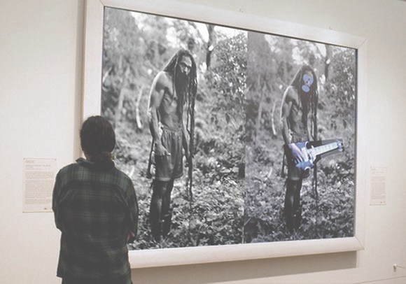
The new issue of Aperture has a great discussion between Penelope Umbrico and Virginia Rutledge about one of my favorite WTF aspects of the Cariou v. Prince case: the fact that the primary visual evidence of copyright infringement used in court is not the paintings themselves, but photocopies. When the fair use/recontextualization/mediated imagery chips are down, the only thing being looked at is flattening, scale-destroying Xerox pairings made by a friend of Patrick Cariou.
Anyway, hot foot it over there right now, but before you go, just check out this amazingly dishonest image of a page from a book and a 6-ft painting. It’s “Courtesy Flickr and the Artists; Illustration by BLOUIN ARTINFO,” and accompanied a Julia Halperin story from last year wherein “BLOUIN ARTINFO analyzes how the Prince v. Cariou case has shaped views on the issue of appropriation.” Which, SRSLY, BLOUIN ARTNFO, analyze thyself.
It’s almost enough to make me start turning my pages from my copies of Cariou’s Yes Rasta book into tiny, exact collage replicas of Prince’s paintings. Stay tuned.
The Image World Is Flat: Penelope Umbrico in conversation with Virginia Rutledge [aperture.org]