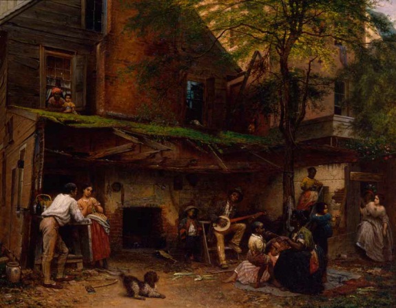
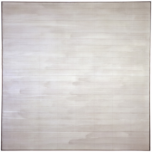
Untitled, 2004, Agnes Martin’s last painting. Image via Phaidon
The visits that maybe stick in the mind are the ones where she would show me four versions of a single painting and she’d say to me. ‘I think this is the best one, what do you think?’ Invariably there was so little difference between them, it was so hard to say, they were all really beautiful. And then she’d say OK we’re gonna keep that one and we’re going to cut up the others. And I would help with a knife slice up the paintings. Those are the studio visits that I think are the sharpest, helping her destroy the work.
What goes through your mind the first time you hear something like that?
It’s her work, and I’m a co-worker in the art field. . . but yeah. It is brutal. I was there at the end of her life and she said ‘go down to the studio, there are three paintings. Hanging on the wall is the one I want to keep, I want you to destroy the other two.’ So I went down to the studio. The two paintings she wanted me to destroy were magnificent – absolutely perfect. The one on the wall was a very stormy painting, unlike anything that she had made since the 60s. I certainly didn’t want to destroy those two spectacular paintings but I did. I sliced them to ribbons and put them in the trash. When I came back. She said, ‘did you do it?’ I said, ‘I did it.’ And that was that. Our last conversation.
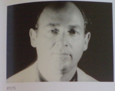
Arne Glimcher, in a Q&A published last month by Phaidon.
The Q&A is timed to the publication of Agnes Martin: Paintings, Writings, Remembrances by Arne Glimcher, an extraordinary collection of Martin’s writings and correspondence, many works, and Glimcher’s own snapshots and notes. He would take extensive notes during his studio visits with Martin in New Mexico, and then transcribe them on the plane home.
He expands on Martin’s last request to destroy some of her work in March 2004:
A mystique exists that Agnes painted very few works but in actuality, she painted almost daily when inspired and that was with some frequency. However, only a relatively small amount of works exist from such a long and productive life because she destroyed most of the works she produced. Probably no artist has ever been a better editor than Agnes Martin. The rejected paintings were shredded with a mat knife. As she grew older, during the last few years, she enlisted the help of friends (myself included) to destroy the unacceptable works, as it was very hard to cut through the thick primed linen fabric. When I once asked her why she was destroying a particularly delicate and beautiful work, she said, ‘It’s too aggressive, and there’s a mistake.’ Most often that referred to a pooling of colour in one of the works that made the brushstrokes discontinuous. The mistake became an unwanted ‘focus’ in a non-compositional painting, which disturbed its serenity.
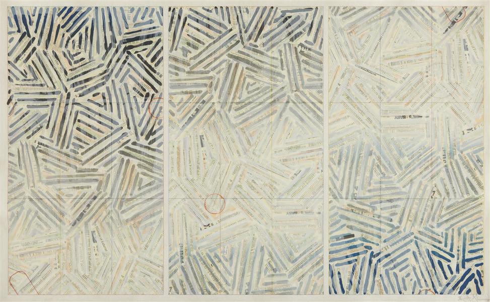
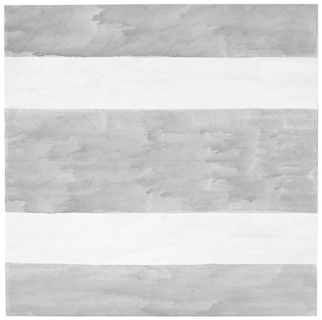
Trumpet, 1967, an earlier last painting by Agnes Martin, image via zwirnerandwirth
I drove to the studio where I found three grey paintings, all of which were beautiful. Using her mat knife, I reluctantly shredded two and spared the one that hung on the wall. It was unique, expressionistically painted with stormy grey asymmetrical brushstrokes covering the surface. Five thin pencil lines visually grounded the passionate wash to the canvas. There is only one other painting with such an expressionistic asymmetrical handling of brush work. It is called Trumpet and was painted in 1967, just before she took her long hiatus and first departure from painting. On first glance, in this last painting, Agnes appears to have taken a new direction. Comparing Untitled (2004) with Trumpet, it is clear that it was not so much a change in style as it was coming full circle home.
[2016 UPDATE: In 2013 Glimcher spoke with Tate Modern curator Frances Morris about his memoir, and the last audience question was about what the last two destroyed paintings looked like:
The two that I had to destroy were very dissimilar from the one that was left, which you saw the picture of. They were much more rigorous; they were less emotional paintings. They looked more like the 70s than they did the 90s, or the late work. They seemed to be a little bit out of context, but perfect paintings, really exquisite paintings. So I took the box cutter and sliced them to ribbons.
]
In reviewing “Five Decades,” a 10-painting Zwirner & Wirth survey in 2003, Holland Cotter called the artist’s practice, “a kind of yoga of painting.” I’m still trying to think it through, and understand why she destroyed so much of her work–or her paintings, really, and maybe that’s the difference–but perhaps it involves a kind of yoga of looking as well.
Buy Agnes Martin: Paintings, Writings, Remembrances by Arne Glimcher via Amazon [amazon]
Ten questions for Pace Gallery’s Arne Glimcher [phaidon via yhbhs]