Weiwei’s Red Lantern

An interesting detail from The Economist’s report on Ai Weiwei’s house arrest, and the irony of the police order to stop broadcasting his own webcams:

And he knows of at least 15 police surveillance cameras mounted within 100 metres of his home. Spotting them is easy, as the police have helpfully chosen to decorate each camera with a bright red lantern.

Which can be seen in David Gray’s photo for Reuters, as published on msnbc’s China blog, Behind The Wall:
120404_china_security_cam.380.jpg
One thing, though: this tweet from March 27 seems to indicate that Ai hung the 15 lanterns himself, not that the police did.

In January, when Ai was taken in for questioning and accused of “damaging” the CCTVs trained on his studio, he said that “he had once hung a red lantern under one of the cameras ‘to make them look nicer’.”
And in December,
BusinessWeek reported that only a single CCTV camera, the one in front of Ai’s door, had a red lantern on it, “marking National Day of the People’s Republic of China.” Which would be October 1st.
So did the police let Ai put up 14 more lanterns? Or did they replace Ai’s lanterns with their own? Do we call these lanterns knockoffs?
House Arrest in China: Orwell, Kafka and Ai Weiwei [economist via new-aesthetic]

LLOLZ On Gerhard Richter’s Annunciation After (A Postcard Of) Titian

richter_titian_hirsh_2905.jpg
Annunciation after Titian, CR 343-1, 1973, collection Hirshhorn Museum, image: gerhard-richter.com
I confess, I love Gerhard Richter in the 70s. Here are some of the best/funniest excerpts from a interview he did with art historian/curator Gislind Nabakowski that was first published in Heute Kunst in 1974. The subject was Annunciation after Titian, a series Richter painted in 1973, after visiting Venice in 1972 for the Biennale.
The first in the series, above, is in the Hirshhorn’s collection. The series has not been shown together since it was first exhibited in 1973 at the Galleria la Bertesca in Milan.

GN:What made you choose a fifteenth-century painting as a model and create a sequence based on Titian’s Annunciation?
GR: Because there’s something about this painting, or any painting, that grabs me if they’re good–irrespective of the impact they had at the time, why they were made, the story behind them. I don’t know what motivated the artists, which means that the paintings have an intrinsic quality. I think Goethe called it the “essential dimension”, the thing that makes great works of art great.
I beg your pardon?!

Continue reading “LLOLZ On Gerhard Richter’s Annunciation After (A Postcard Of) Titian”

Here Is A Giant, Awesome NASA Test Chamber From Fashioning Apollo

John Powers has been on me for months to read “>Nicholas de Monchaux’s Fashioning Apollo, the incredible and unlikely history of the development of the Apollo spacesuits.
And I have been meaning to, I swear, but this insane photo may be just the thing to push me over the edge. Because in his otherwise heady interview with de Monchaux, Geoff Manaugh only captions the images as being from the book.
Which I will have to buy, to find out what this three-story dolly was doing in this massive, origami-ended space lined with sound-deadening foam pyramids. Because seriously, holy smokes.
Spacesuit Interview with Nicholas de Monchaux [bldgblog]

Robert Montgomery: Spectacular Vernacular

robert_montgomery_trafalgar.jpg

I’ve got a few reservations, but I’m really quite smitten with London-based Scottish artist Robert Montgomery’s poetically critical billboard artworks.

The one above was unfurled at a Stop The War protest in Trafalgar Square last October. It reads:

WHEN WE ARE SLEEPING, AEROPLANES CARRY
MEMORIES OF THE HORRORS WE HAVE GIVEN
OUR SILENT CONSENT TO INTO THE NIGHT SKY
OF OUR CITIES, AND LEAVE THEM THERE, TO
GATHER LIKE CLOUDS AND CONDENSE INTO
OUR DREAMS BEFORE MORNING.

If the stark white-on-black text and the clouds and the protest didn’t already remind me of Felix Gonzalez-Torres, this particular photo, which ran on Purple’s blog, even has a bird in flight in the upper right corner.
Montgomery’s standard M.O. is to paste his billboards guerrilla-style, without permission, on top of existing advertisements. But for
an exhibition last month at KK Outlet, the gallery got authorization to install a series of three billboards with something of an Occupy theme. [Occupy had been occupying nearby at Shoreditch, and the artist had a collaborative project planned, but, as he told the Independent, “they got turfed out on 25 January so that didn’t happen.”]
robert_montgomery_dreamed_it.jpg
The deployment of poetry as protest takes its cue, Montgomery readily acknowledges, from the Situationists and Guy Debord, which, baby and bathwater and all, I will accept. My ambivalence, such as it is, really has more to do with Montgomery’s apparent activism on the fashionista front, his day jobs at Dazed and Confused, his carousing with Olivier Zahm, even the galleries that tout their Occupy shows one month, and their design studios working for LVMH the next.
But who’s to complain, seeing as how I followed the linkstream to his work while surfing for extraordinary calf leather shoes myself?
Let he who is without consumerist sin throw the first stone. Is being the global street fashion industrial complex’s social conscience is any more damning than being the art world’s anything?
Montgomery’s disarming, enticing, depressing, enlightening poems are still there, still catching advertising-conditioned passersby, only to release them with an unsettling thought in their heads.
Givin’ me 500 Errors right now, though: Robert Montgomery portfolio site [robertmontgomery.org]
It turned out this way cos you dreamed it this way [kkoutlet.com]
Robert Montgomery opening and installation shots via KK Outlet’s flickr [flickr]
The artist vandalising advertising with poetry [independent.co.uk]

‘Collectors Are My Power Base’

It’s well worth looking at the fuller context of that awesome Jeff Koons blurb about abstraction and luxury being the guard dogs of the upper class. [most recently tweeted by @berfrois] It comes from a late 1988 interview with Brooks Adams and Karen Marta, who were then working under the name Burke & Hare, which was published in Parkett 19:

I try to be effective as a leader. I’m very interested in leadership. I think that my own work has been helping to direct a dialogue, and it’s been participating in it for quite some time. I’m anteing up the pressure and trying to increase the stakes continually. I’ve found that collectors are my power base. You know, I’m able to work as a function of thier support of my work. I think that they have to have some interest in debasement and its political possibilities, even for their own use. I mean, it really has to be for their own use. I think that I give them a sense of freedom. I don’t think that I’m debasing them and not leaving them a place to go. I’m creating a whole new area for them once they’re feeling free. I see it as my job to keep the bourgeoisie out of equilibrium letting them form a new aristocracy.
I think it’s necessary that the work be bought, that I have the political power to operate. I enjoy the seduction of the sale. I enjoy the idea that my objectives are being met. I like the idea of the political power base of art, but it’s not just a money thing. It has to be a total coordination of everything, and money is a certain percent of it, maybe 20% of it. Look, abstraction and luxury are the guard dogs of the upper class. The upper class wants people to have ambition and gumption because, if you do, you will participate and you’ll move through society into a different class structure. But eventually, through the tools of abstraction and luxury, they will debase you, and they will get your chips away from you.

1988 was right after his Banality show, the Complete Spot Paintings of its day, which opened, outrageously, in three galleries at once in New York [Sonnabend], Berlin [Max Hetzler], and Chicago [Donald Young]. But it was before Made In Heaven, it was before he basically went bankrupt–and nearly took Deitch with him–making his balloon dogs and whatnot. It was a Koonsianism several orders of magnitude less intense that the Koonsianism we see today.
fgt_parkett_singapore_2010.jpg
Jeff and Felix sittin’ in a tree. P-A-R-K-E-T-T
His political interpretation also resonates with Felix Gonzalez-Torres’ discussion from 1994:

At this point I do not want to be outside the structure of power, I do not want to be the opposition, the alternative. Alternative to what? To power? No. I want to have power. It’s effective in terms of change. I want to be like a virus that belongs to the institution. All the ideological apparatuses are, in other words, replicating themselves, because that’s the way the culture works.

On Repainting Gerhard Richter

First, Happy Birthday, Mr. Richter.
richter_destroyed_ship1964.jpg
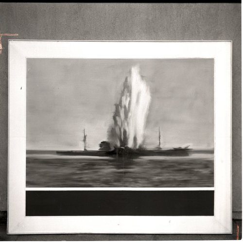
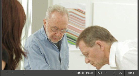
Destroyed 1964 Richter painting, image from Gerhard Richter Archkiv via Spiegel
I don’t know if Joerg knew at the time he first tweeted about it–he is plugged in and German, so who knows?–but I certainly had no idea when I picked up on the topic of Gerhard Richter “destroying” paintings by painting over them. But it turns out that the 74 paintings listed as “[DESTROYED]” on Richter’s website are only a fraction, barely half, of the paintings he’s actually destroyed so far.
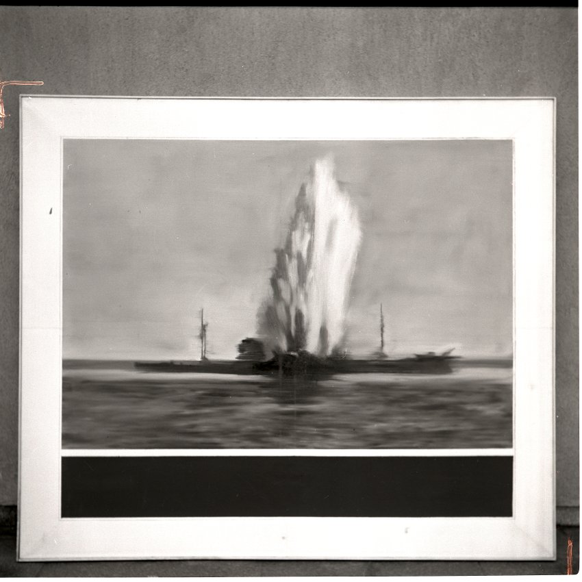
In an interview with Ulrike Knöfel for Spiegel, Richter talks about the 60 or so photo-based paintings he destroyed in the 1960s during a very self-critical period of his career. Not to worry, though, because, being Gerhard Richter, he photographed them first

These photos, most of which were never published, are now either in the Gerhard Richter Archive in the eastern German city of Dresden, where the painter was born, or in a box in his studio in the western city of Cologne. They are testaments to his refusal to compromise.

Mhmm. Though the ambivalence/regret/equivocation Richter expresses in the interview reveal that a refusal to compromise is not automatically a win. Couldn’t he have just put them away and not looked at them for a while instead?
None were apparently included in Richter’s first catalogue raisonne, the source for his website’s “[DESTROYED]” list. And many appear to date from the earliest phase of his recognized work, 1962-4. Oh but wait, his much-discussed 1962 Hitler IS online, described as “believed to have been destroyed.”
richter_hitler_2431.jpg
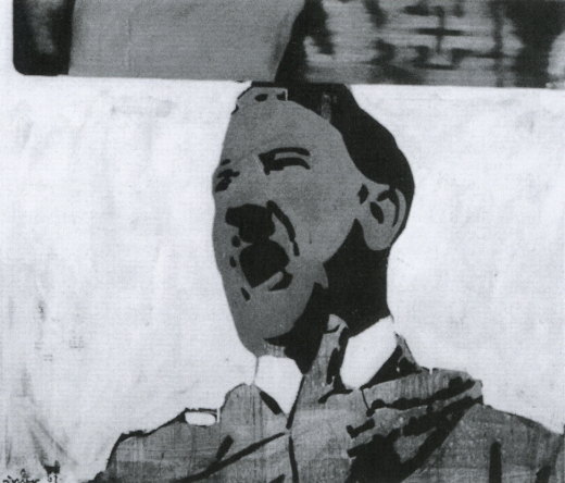
Hitler, 1962, image via gerhard-richter.com
That seems like a new category, loaded with ambiguity. I like it much better than “[DESTROYED]” or even “Richter painted over this work in ___. The painting is now entitled ____.” Which, it turns out, has another example:

Today, Richter says he’s surprised at how many works he continued to destroy after the 1960s. Perhaps he will return to one motif or another, he adds, noting that “otherwise it would be a shame.” One painting, in particular, comes to mind. It was painted in 1990 and shows two young people standing in front of Madrid’s Museo del Prado, Spain’s national art museum. However, two years later, he painted over this work, turning “Prado, Madrid” into “Abstract Painting, 1992.”

Which, yeah, there is no Prado, Madrid in the CR, and there are at least 279 Abstraktes Bild done in 1992, so, this’ll take a bit of digging. I’ll update the post when/if I find it. [I’ll have to do an update post anyway, because I’ve already found at least two other overpainted paintings.]
This painting over thing is one thing. The other, which I’m kind of fascinated by now, is the relationship between painting and photography as it plays out in these destroyed paintings. Which, of course, still exist as the artist’s photographs. It’s like Barthes’ Camera Lucida; they’re gone, but not. I can’t tell if this is Spiegel’s interpretation or reportage:

Still, since his urge to destroy some of his paintings also made him feel uneasy, he photographed them before doing so.

But someone has to have already looked at this backup, insurance, documentary, archival, post-mortem, forensic, ghost aspect of the way these two mediums intertwine. Right?
richter_destroyed_bikini_ptg.jpg
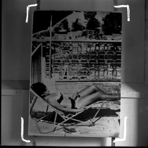
Photo of destroyed Gerhard Richter painting, 1960s, by Gerhard Richter, image: Gerhard Richter Archiv Dresden via Spiegel
Meanwhile, the obvious thing–and isn’t that what I’m here to point out?–is to recreate these destroyed Richters. Whether you paint the archival photo, crop marks and background and all, in a meta-Richterian gesture, or just try your darnedest to bring their destroyed, painted subjects back to life, I’ll have to figure out. But paintings based on a painter’s photographs of paintings based on photographs? What’s not to love?
It’d be trivial to the point of meaninglessness to just print the Spiegel jpgs on canvas, or to order them up from Chinese paint mills. But I’d be interested to see just how much more meaning could be gleaned by painstakingly copying them by hand. Even if the answer is very little, that’s still an important datapoint.
His Own Harshest Critic | A New Look at Works Destroyed by Gerhard Richter [spiegel.de via bigthink]

Douglas Gordon On Painting

Got posts stacked up like flights at LaGuardia, but I can’t get past these paintings by Douglas Gordon [right?] coming up at Christie’s London sale next week.
douglas_gordon_ptgs_93.jpg
They’re 1-m square monochromes of acrylic housepaint with a text and date that’s a reference to a work by another artist. Gordon did these particular paintings around 1993, the same time he was working on his awesome, breakthrough film installation, 24 Hour Psycho. Which, in retrospect, makes it a tough year for a Douglas painting to get much attention. But yet they kind of nagged at me.
And then as I found one of the only discussions of Gordon’s paintings, in a 1993 interview with Thomas Lawson for Frieze, it sounded slightly familiar. But of course, I’d not noticed it much, if at all, at the time. Here’s part of that discussion, which segues so nicely from the one project to the other:

DG: The idea is that these paintings, the way I imagine them, do have a ‘transcendental’ aspect, although I hate that word. Part of the background here is the whole range of ‘endgame’ painting theories, you know, like the Peter Halley/Sigmar Polke/Gerhard Richter positions, and also the Last Exit stuff that you wrote. These ‘thinking’ painters were important to me, partly because of the whole fuss about ‘Glasgow Painting’ in the 80s.
The paintings that you have seen have come about as a result of the attitudes and strategies that I had developed through working outside of a studio; you become steeped in a research, which isn’t based on physical materials.
I was in a show in New York a while ago, and it turned out that the space was the old Betty Parsons Gallery. So I did some research on the place and started making lists of the paintings that had hung on those walls during the 40s and 50s. I ended up making a series of paintings that related directly to these works by people like Ad Reinhardt and Ellsworth Kelly. But although this series came out of a response to a situation, the thing about painting in general is that it satisfies a desire to make work free of a specific context.
TL: I think I’m hearing you admit that you actually make paintings on spec, just like a studio painter would?
DG: Yes. You’ve found me out. But my premise is to take the field of painting as a context in itself – you know, you say the word ‘painting’ and hundreds of expectations or prejudices come to mind. It’s obvious that my interest in painting is not so much in the practical, physical side, as in the idea of it.
I’m interested in the fine line between my intentions and the perceptions of others; that moment when someone encounters something and realises that there is more to it than meets the eye. I’m interested in the moment when someone opens the letter, recognises that it is for them, and starts to wonder why they got it, and what it really means. The same can happen with these paintings: someone sees the piece that uses the title of a Baldessari book and thinks, well, yes Brutus did kill Caesar. But in 1976? And isn’t this the title of another artwork, by someone else, somewhere else, and so on? I would say that all of the work plays with recognition and expectation in this way.
TL: Is there a particular pay-off with the paintings if you crack the code, or is it enough to know generally that these texts refer to works by other artists not on show here? Is it enough to know that there is a clue, without needing to know what the clue is?
DG: I don’t think there’s a particular pay-off. People who don’t recognize the text as a title to a specific piece of art can still have a certain intrigue to play with. If you didn’t know that Slow Motion 1969 refers to a piece by Robert Morris, I think you can still find something that will resonate. Maybe people who aren’t trapped in an art history background can find more.
TL: Do you fetishise your material? Are they well made stretchers, well prepared linen grounds, and all that?
DG: I don’t make a big deal of production values. The paintings simply have to be clean and pragmatic so that there is nothing about them to distract from the ideas they contain. I use available materials and choose colour from a standard household paint chart. I just want the paintings to appear as neutral grounds, no drips, no spots.
TL: I don’t know. By the time you get done they’ll be agitated with blobs and cross hatches, and you’ll be talking up a storm about expressivity.
DG: Probably. Working with shaped canvases, and everything. The paintings are an important project for me, alongside the other things. I’m interested in the ‘big’ media. All those traditions with too much baggage. For instance, I’ve been interested in film for a long time. I always wanted to make an epic as my first film – a real movie, not Super 8 or anything. I thought it might be interesting to take an existing film and re-make it. I wanted a picture with a story which was very familiar to a broad audience; so I started to work with Psycho. What I decided to do was alter the narrative of the original by making it 24 hours long, and without sound.

Sounds crazy, but it just might work!
Hello, It’s Me! [frieze]
Feb 16, 2012, Lot 241: Douglas Gordon, five paintings, est. £50,000 – £70,000 [christies]

‘Bob Made It, But Jasper Made It Art.’

A couple of things that I still wonder about about Rauschenberg’s Erased de Kooning Drawing:
What did de Kooning think? The story of making it is always told by Rauschenberg, or from his side. Did de Kooning ever tell the story? Did he ever see the result? Or talk about it? Did anyone ever ask him about it? I’ve never found any reference at all.
When did Rauschenberg actually make it? The date’s all over the map. SFMOMA currently says it’s 1953. For a long time, it was dated 1953-55. James Meyer had it as 1951-2, but I don’t think I’ve seen anyone else put it that early. Even the extraordinary timeline in John Elderfield’s de Kooning retrospective catalogue has only the basics of Rauschenberg’s travel schedule and his account to go on [“Probably April or After,” it says, since April 1953 was when Rauschenberg returned from his European trip with Twombly.]
[UPDATENever mind. I got the EdKD dating ambiguity mixed up with Johns’ Flag, which has been variously dated between 1954 and ’56, whereas the date for EdKD has consistently been given as 1953 from its very earliest forays into the public view. Thanks to Sarah Roberts, research curator at SFMOMA, who took a moment from her multiyear project documenting Rauschenberg’s work, to point out my error.]
What did people at the time think? Who actually ever saw it? Even someone as early to the work as Leo Steinberg apparently only talked to Bob about it on the phone.
And what about Johns? Who knew about his involvement? What is up with that? For forty-plus years, while Rauschenberg claimed or let others write or publish that he came up with the title, and drew the hand-lettered label, Johns stayed silent about his role in the collaboration. But others surely knew, certainly in the early years when the work was taking shape.
Just before the holidays, I got in touch with Edward Meneeley, and artist and photographer who became friends with many artists and dealers in 1950s and 60s New York because he photographed their artwork. Meneeley created Portable Gallery, a subscription slide service that provided regular installments of art images to libraries, colleges, galleries, and collectors.
I found him because it was his monthly newsletter, Portable Gallery Bulletin, to which Jasper Johns wrote in 1962, explaining that it was artist’s prerogative, plus an agreement between himself and Rauschenberg, not “politics,” behind the refusal to let Portable Gallery publish and distribute slides of Short Circuit.
In a multi-chapter biography published online by Joel Finsel, Meneleey says that he was friends with both Johns and Rauschenberg in the late 1950s, and that he had an affair with the latter behind the former’s back. [He tells Finsel of Johns coming to his loft one morning looking for Rauschenberg, and inviting him in to talk about it, all the while Bob is hiding in Meneeley’s bedroom, eavesdropping on the conversation. Which sounds like a dick move to me, but there you go.]
Anyway, after talking to Meneeley for a while about Short Circuit–which he first saw in 1955, when it was first exhibited at the Stable Gallery–I asked him what people thought or said at the time about Erased de Kooning Drawing.
“Everyone at the Cedar Bar knew,” he told me, but they thought it was just a stunt, a joke. After finishing it, Rauschenberg didn’t do much with it or, as Meneeley put it, “he didn’t know what to do with it.” Until Jasper came along.
[Remember, Bob apparently acquired the original de Kooning sketch of a woman sometime after April 1953. He met and quickly became involved with Johns in the winter of 1954.]
In Meneeley’s recollection of the time, it was Jasper who basically saved Erased de Kooning Drawing from ending up as a barroom one-liner. He mounted it, gave it a title and a label, or really, a drawing of a label. “Bob made it,” Meneeley told me, “But Jasper made it art.”
Which is why I’m interested in hearing what people thought at the time it was made.

The VW Years, Ch. 3: John Cage

The VW bus makes many appearances in John Cage’s own writings, especially his tour diaries in Empty Words: Writings ’73-78:

After winning the mushroom quiz in Italy, I bought a Volkswagen microbus for the company. Joe’s was open but said it wasn’t. At Sofu Teshigahara’s house, room where we ate had two parts: one Japanese; the other Western. Also, two different dinners; we ate them both.
We descended like a plague of locusts on the Brownsville Eat-All-You-Want restaurant ($1.50). Just for dessert Steve Paxton had five pieces of pie. Merce asked the cashier: How do you manage to keep this place going? “Most people,” she replied rather sadly, “don’t eat as much as you people.” [p. 80]

Tarpaulin centered on the bus’s luggage rack, luggage fitted on it. Ends’n’sides were folded over; long ropes used to wrap the cargo up. [p. 82]

We were waiting to be ferried across the Mississippi. We had nothing to eat. We waited two hours. It was cold and muddy. When we decided to leave, Rick and Remy had to push the bus up the hill. Later we learned that the ferry service had been discontinued two years before. [p. 90]

Pontpoint: the company ate by candlelight. Everywhere we’ve gone, we’ve gone en masse. A borrowed private care took two, two such cars took six to eight, the Volkswagen bus took nine. Now airplanes and chartered buses take any number of us. Soon (gas rationing) we’ll travel like Thoreau by staying where we are, each in his own. [p. 95]

In Richard Kostelanetz’s John Cage: an anthology, the dance critic Stephen Smoliar recounted one story Cage told the audience at opening night of the company’s 1970 season at BAM:

The Cunningham Company used to make transcontinental tours in a Volkswagen Microbus. Once, when we drove up to a gas station in Ohio and the dancers, as usual, all piled out to go to the toilets and exercise around the pumps, the station attendant asked me whether we were a group of comedians. I said, “No. We’re from New York.”

This pushes back the end of The VW Years to the 60s at some point.

The VW Years: Ch. 2, Remy Charlip & Steve Paxton

charlip_merce_nocturnes.jpg
[l to r] Viola Farber, Bruce King, Remy Charlip, Carolyn Brown & Merce Cunningham performing Nocturnes in 1956. photo CDF/Louis A. Stevenson, Jr. via the estate project
Remy Charlip was an early collaborator in Merce Cunningham’s orbit. Years before he began his second or third acclaimed career as a children’s book illustrator and author, Charlip danced with Cunningham and Martha Graham in New York and at Black Mountain College. He created the programs for the August 1952 Cage et al performance at BMC which is considered the first “Happening.” They were printed on cigarette paper, and were placed at the entrance next to a bowl of tobacco, with an ashtray on each seat.
charlip_program_bmc52.jpg
image of what has to be a Charlip program for a different Cage performance, via The Arts at Black Mountain College
Though he’s a bit off on the dates, what with Cage only buying the VW bus in 1959, John Held’s Charlip biography lays out the basic configuration of the bus:

As if BMC was not enough, Charlip received continuing post-graduate work from 1956-1961 in the back of a Volkswagen Microbus driven by John Cage, navigated by Merce Cunningham, enlivened by Robert Rauschenberg, with traveling companions Nicholas Cernovich and dancers Carolyn Brown, Viola Farber, Steve Paxton and others.

merce_paxton_brown_cepress.jpg
[l to r] Carolyn Brown, Steve Paxton & Merce Cunningham, 1961, image via cepress
A couple of weeks ago, Paxton talked to the Washington Post about the bus: Later that year [1960? ’61? -ed.] Remy resigned, and I was invited into the smaller company. This meant touring around the U.S. in a Volkswagen bus, which, I was informed, it was my duty to pack. And unpack. And distribute and later collect all the items packed. There were the spaces under the seats, a compartment in the back, and a roof rack to transport nine persons’ personal luggage, the equipment of John Cage and David Tudor for various musical adventures, and the sets and costumes for the tour. The bus was heavy laden, and it never let us down, including at least two tours the the West Coast.
John or Merce drove, and John liked to play Scrabble when off-duty. The rest of us conversed and Viola [Farber] knitted. It was rather like a family around the hearth. Long silence, naps, breaks to stretch and walk about, and usually some amazing treat produced by John, a huge salad perhaps, or once Rogue River pears at perfect ripeness with pear liquor to accompany. David was quiet, Marilyn Wood chatty, Carolyn [Brown] and Viola made comment, Merce sometimes spoke, John and Bob laughed a lot, and both were great story-tellers. I remember the actual driving fondly.

It may have been amidst family-like intimacy of the bus that Paxton and Rauschenberg started the relationship that ended the relationship between Rauschenberg and Johns in 1961-2.
rr_paxton_spring_tr_saam.jpg
Robert Rauschenberg & Steve Paxton, with Alex Hay [l] and Trisha Brown [r] rehearsing Spring Training, 1965. image via SAAM Rauschenberg catalogue, 1976

The VW Years: Ch. 1

cage_merce_rr_avedon_1960.jpg
John Cage, Merce Cunningham, and Robert Rauschenberg photographed in 1960 by Richard Avedon
In a few days, the Merce Cunningham Dance Company will perform for the last time. I have not been a close follower of Cunningham’s work, except in the New Yorker way, how, for the two decades since I moved to the city, Merce and his company were an integral part of the cultural fabric. Merce? You’re soaking in it!
I was always more of a Cage fan. And so it’s been fascinating, and enlightening, and continually surprising over the last year or so, as I’ve been digging into the early days of Rauschenberg and Johns, trying to understand their formative work and context, to see how closely connected they were with Merce and John. How small the circle of artists was which generated so many incredible works and ideas. And yet how infrequently I consider their work in relation to each other, or consider the nature of their collaboration beyond the basic namecheck.
In a way, I guess Rauschenberg and Johns and their intense, but short-lived collaborative period serves as the antithesis of Cunningham and Cage’s lifelong partnership. But they all began so close, and so much together.
Anyway, as I’ve become more familiar and more admiring of Cunningham’s work and Cage’s work with him, I’ve begun trying to piece together the world they inhabited in the late 1950s and early 1960s, when they were just starting out. And one thing that comes up in every story about those days is the VW microbus Merce and his fledgling company would pile into to tour the country. Cunningham’s longtime principal dancer Carolyn Brown even titled the chapter in her 2007 memoir “The VW Years.”
1959_vw_bus_cutaway_cartype.jpg
But I’ll get to that. First, the story of the VW bus itself, how John Cage bought it, and how it figured into various peoples’ accounts of those crazy, early days.
cage_milan_peggy_guggenheim.jpg
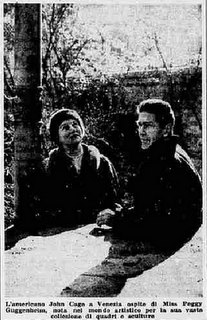
In 1958, Cage had performed at a blowout retrospective concert organized by Johns, Rauschenberg, and hustler/activist/filmmaker Emile de Antonio; and he’d exhibited his scores at Stable Gallery. Then in the taught and performed in Europe, including at Expo ’58 in Brussels, and then settled into a several months’ residency in Milan at RAI, Italian state television. In February of 1959, after hanging out with Peggy Guggenheim at her Venetian palazzo, he appeared on Lascia o Raddoppia, the local equivalent of the $64,000 Question, where he performed new compositions, became famous by the end of the week–and ended up winning 5 million lira in a series of ridiculously rigged questions about mushrooms.
And so he took his winnings and Italian fame back to the US, where he used part of the money to buy a piano for himself, and a white VW microbus for Merce and the company to tour in.
The most extensive accounts of the Italian game show boondoggle and the VW van purchase are from Begin Again, Kenneth Silverman’s Cage biography, and Stefano Pocci’s guest post on the John Cage Trust blog.
Lascia o Raddoppia, Milan, 1959 [johncagetrust]

What I Want To Look At Today: Byron Kim’s Night Sky Paintings

Byron_Kim_Untitled_for_SB.jpg
Byron Kim, Untitled (for S.B.), image via jamescohan.com
Byron Kim’s first show at James Cohan consists of large, nearly monochromatic paintings of the night sky in Brooklyn. Or perhaps they’re of memories of the night sky in Brooklyn, or evocations or references to specific phenomena of the night sky in a city. From the press release:

In this new series of work, Kim paints night in the city, evoking the quality of light and hazy cloud formations in the transition from dusk to dark and beyond. He depicts the state of constant suspension that city dwellers experience; the omnipresent lights block their view into the cosmos and deny a resolution to the day that true darkness delivers. The paintings in this ongoing series, measuring 90 x 72 inches, often have hard-edged, painted borders on two or three sides that act as reminders of the architectural elements like windows, cornices and facades of buildings that frame our views of the city sky. Kim paints his crepuscular skies from memory, creating open spaces that act as trigger points for the viewer’s inner dialogue, giving the imagination room to resonate and remember.

Art in America’s Faye Hirsch talks with Kim about the work, which is somewhat related to his ongoing Sunday Painting series, quick renditions of the daytime sky, which are much more representational [or maybe not? Some of those Dark paintings seem very atmospheric, and the borders do feel like architecture.] And they all kind of remind me of the varied blues of Donald Moffett’s monochrome photographs of the sky, which always felt very poetic to me, and which were always framed and matted in strong white so they looked like windows. Which all makes me wonder if the other unmentioned reference here is James Turrell’s PS1 piece.
Byron Kim, Nov 4 – Dec 17, 2011 [jamescohan.com]
Night Rider: Q&A with Byron Kim [artinamerica.com]
previously: what I looked at today: NGA monochromes, [including Byron Kim]

Gerhard Richter On The Family Of Man

richter_serota_1.jpg
The Tate video of Nic Serota and his team in Gerhard Richter’s studio is nice for many reasons: it includes some squeegee action scenes from Corrina Belz’s Gerhard Richter Painting [which I’m trying to get a copy of; Is there anyone in London who can pick up a DVD for me? Or in the UK anywhere who can accept a shipment and forward it onto me?]
richter_serota_.jpg
For filming, they moved the model of Tate Modern’s galleries into the main studio room, which was full of strips of the Strips series [and hey-ho, a bent strip too, what’s up with that?]
richter_serota_2.jpg
But the most interesting thing to me, anyway, is this exchange from Serota’s interview of Richter, about leaving East Germany:

GR: We had also the possibility to go every a year at least twice to West Berlin, to saw movies and exhibitions. It was the first time I saw the wonderful Family of Man
it was a famous exhibition.
NS: This was the exhibition made by Edward Steichen
GR: Uh-huh, and this was a real shock for me, this show.
NS: Why?
GR: Yeah, so, to see these *pictures,* and I only knew paintings, I was very interested. And they showed so much, and they told so much, these pictures, these photographs. They told so much about modern life. my life.
NS: So was this the moment when you discovered photography? Or the power of photography?
GR: Let’s say the power, yeah, of what photography can do.

steichen_berlin_family_moma.jpg
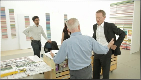
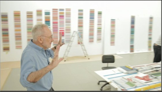
Serota delivers that question with an intensity that makes it feel like a scoop, and I don’t think his reaction is [just] for the camera. I haven’t found any previous mention of Family of Man either by Richter or in relation to his work. Steichen isn’t in the index for the collected writings. There’s no mention of it in Christine Mehring’s study of Early Richter. And though Elger’s bio for the period in question–Family of Man opened 17 September-9 October 1955 at the Hochschule für Bildende Künste–mentions Richter’s trips to West Germany during what was his last year studying mural painting at the Academie in Dresden, there’s no mention of the photo exhibit itself.
As for Richter’s nascent interest in photography, the artist did tell Rob Storr that he received copies of Magnum magazine from an aunt in the West. And Elger notes that his family photo album was “one of the few belongings Richter would take with him when he fled to the West.” But the artist now adds Family of Man to the list of his early photographic influences. It makes me wonder what the show actually showed Richter about photography’s power, and whether the artist went on to study Steichen’s other MoMA photo exhibits, the ones that didn’t travel to Berlin.
Image above: Edward Steichen in the Berlin installation of Family of Man, 1955, via moma.org
Tate Channel | Gerhard Richter (21:58) [tate.org.uk via @aodt]
Previously: The Family of the Family of Man: Steichen, Miller, Rudolph, Stoller

How To Make An Ansel Adams-Style Photomural / Folding Screen

I’m sure photomural historians out there are chuckling, wondering when I was finally going to catch up on this, but
HOLY CRAP, PEOPLE! ANSEL ADAMS PHOTO MURALS!
Alright, it’s not quite so unknown. The Polaroid ransacking auction last year at Sotheby’s included a very large print, what Adams called “mural-size,” of the photographer’s iconic image, Moonrise, Hernandez, New Mexico.
adams_moonrise_polaroid.jpg
But The Mural Project was actually an Adams thing, a series of images commissioned by the Department of the Interior. Adams traveled around the US, shooting–he took Moonrise on the same trip, and because he hadn’t expensed that day, the photo was his, not the government’s. World War II derailed the project, though, and it was sort of forgotten. Until last year, apparently. When Adams’ original prints were rediscovered in a file somewhere [really?? looking into it. Hmm, this book of the images, which are now in the public domain, was published in 1989.], Interior Secretary Ken Salazar gave the OK in 2010 to install full-scale versions of The Mural Project for the first time. They’re still there, at the Interior Dept Museum. Viewing them requires a reservation.
Adams wrote an essay/letter titled “Photo-Murals” for the November 1940 issue of U.S. Camera [looking into it] in which he argued for large-scale prints, permanently mounted on panels, over wallpaper-style murals. He made such “mural-size” prints for the lodge at Yosemite, and for various exhibitions, but he also took orders for large prints. Most were smaller, around 40×60, but they did get bigger, up to 6×9 feet. The 2003 show of monumental Adams photos Andrew Smith Gallery spent ten years assembling included one such 6×9 print.
But not a screen. Because apparently Adams would occasionally make photo screens, giant prints on multi-panel, folding screens. Which, what?
adams_sonoma_screen.jpg
Clearing Storm, Sonoma County Hills, image via christies.com
He didn’t make very many, though; when they sold a big, awesome 1951 screen a couple of weeks ago, Christie’s said there were between 12 and 15, mostly in museums and the Adams Estate. Apparently, he sold one to Interior Secretary Harold Ickes in 1935, though, a deal which according to biographer Jonathan Spaulding, led to the Mural Project commission.
The screen he made for the Skirballs originally had an image on each side; the lot description says how when Jack Skirball invited Adams to come visit in 1981, they were “most anxious to have your opinion on what Audrey has done with the panels of the screen. I don’t want to tell you more until you see them.” It sounds like she remade them into a set of five one-sided panels. No word on what she did with the other image–or what Adams’ reaction was. Even so, the ex-screen sold for $242,500.
Though Adams was always very cognizant of the particular physical qualities of his prints, these screens seem to pose an entirely different argument for the concept of photo-as-object. If murals are related to frescoes, and “mural-size prints” evoke paintings, then Adams’ photo screens–printed to human scale, mounted in angled strips, freestanding in space, where they are intended to be viewed and experienced by moving around them–are akin to sculpture. Photographic sculpture.
Or maybe they’re also sculpture. Because check out this one, Grass and Pool, a three-panel landscape photo and abstract action painting and freestanding object, all in one, and made in 1935. Oh wait, never mind. The image is from 1935, the screen is from the mid-50s. No need to rewrite the history of abstraction today. It was made for David McAlpin, a banker and collector who, as a trustee at MoMA, helped found the photography department in 1940.
adams_grass_pool_screen.jpg
Grass and Pool, sold in 2001 at Christie’s
Adams talked at length with Ruth Teiser about his photomurals and screens–actually, he talked at length with Teiser about everything; she recorded and edited 24 interviews with Adams between 1972-4 for UC Berkeley’s Regional Oral History Project, and later published the 818-page transcript as Conversations with Ansel Adams.
I transcribed some excerpts about photomurals from the Internet Archive after the jump. Adams’ main concern was the quality and character of large-scale prints, a topic which regularly veers into details of what an expensive, annoying, labor- and material-intensive pain in the ass it was to make good, big work.

Continue reading “How To Make An Ansel Adams-Style Photomural / Folding Screen”

Doug Rickard At Pier 24


Via Wayne Bremser comes this nice interview with Doug Rickard, who talks about his Google Street View photo project, A New American Picture. Rickard is in HERE, an exhibit of at Pier 24 Photography in San Francisco. [Bremser’s notes on HERE are here.]
UPDATE Rickard also led Ken Johnson’s NYT review of New Photograpyh 2011, where his GSV photos are called “the most intriguing conceptually” in the vein “revolv[ing] around photography’s relationship to truth.” Johnson’s read of Rickard’s “strangely blurry and bleached, high-angle pictures of decrepit urban and suburban neighborhoods identified with high poverty and crime rates” make you wonder if he actually got the concept:

Resembling stills from surveillance videos, the images speak to the kind of forensic truth that concerns law-enforcement personnel.

Previously: On Bremser’s notes on Street View
on Doug Rickard at MoMA’s New Photography 2011