
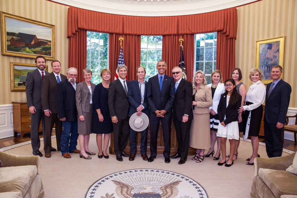
If I had to make a list of photo ops I could never imagine, Michael Heizer standing alongside Pres. Obama and Sen. Harry Reid would be right up there. And yet here we are.
Heizer, along with LACMA director Michael Govan and others, gathered to celebrate the designation of the Basin & Range National Monument, which protects 704,000 acres of Nevada wilderness, ranchland, and Heizer’s decades-long project, City, from oil extraction or encroaching development.
Spiral Jetty‘s on 10 acres. Lightning Field‘s on a few thousand, plus DIA’s bought up 9,000+ surrounding acres to protect the view. With 700K plus a high-powered entourage at the White House, it’s as if Heizer has out-Earthworked all the Earthwork artists with the biggest Earthwork on Earth.
[via @RepDinaTitus]
Category: scott sforza, wh producer
Supreme Sforza
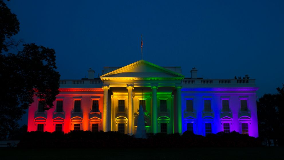
Rainbow White House. Just amazing. I just imagine Frank Kameny suing to get his government job back. [via ap]
Webdriver Torso As Found Logo System
previously: Webdriver Torso As Found Painting System
Souza Over The Rainbow
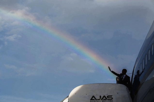
Big up, Pete Souza, who got this shot of Pres. Obama shooting a rainbow from his hand as he boarded the plane back from Jamaica yesterday. I have not seen Sforzian mise-en-scene that tight since Karl Rove tried to put George Bush’s head on Mt Rushmore.
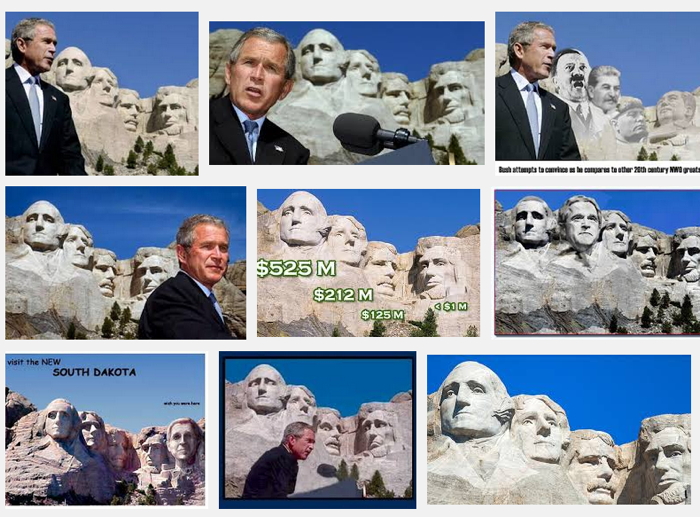
[Which, like so many things from that era, turns out to have been not so slam dunk after all. The image that circulated at the time, which I’m not finding right off, had GWB’s profile lined right up. But Google Image results now for that speech show a wide range of camera angles that miss or avoid the setup. Aesthetic resistance would have been more interesting at the time. Of course Souza’s not just any hack, he’s the White House hack, so he wouldn’t miss.]
What’s not shown in the photo will no doubt be added, the way people started sticking Hitler’s and Sarah Palin’s heads alongside Bush’s. The White House that trolled Netanyahu’s scary bomb poster in their infographic for the Iran nuclear talks had to know that anti-gay people people would be riled up by Obama shooting his rainbow laser everywhere.

But the callous calumny of this twitter ad still caught me by surprise.
President Obama Shoots a Rainbow From His Hand in Jamaica [pete souza via jezebel thx @magdasawon]
Richard Nixon’s Last Look
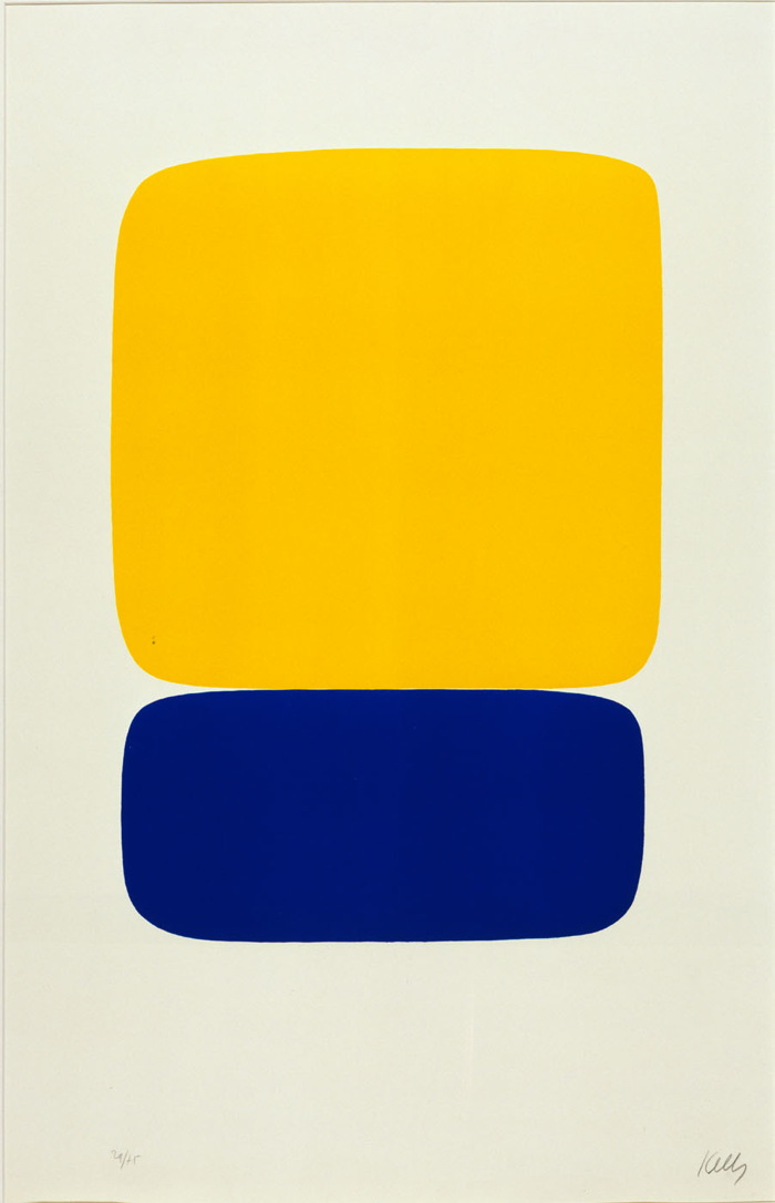
Ellsworth Kelly, Yellow over Dark Blue, 1964-5, from a suite of 27 color lithographs, ed. 29/75, loaned to Henry Kissinger for display in his White House office. Collection: SAAM
Who was Henry Kissinger’s favorite artist? Ellsworth Kelly. But that’s not important now.
While searching through the White House art loan records for the Nixon administration yesterday, I noticed that over the years, Kissinger borrowed several Kelly prints for his office, including the one above. It was a gift of the artist in 1966 to the National Collection of Fine Arts, which became the Smithsonian American Art Museum.
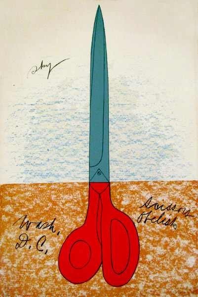
Claes Oldenburg, Scissors Obelisk, aka Scissors as Monument (Scissors Obelisk, Washington, D.C.), 1967 or 1968, ed. 144. Collection: SAAM
I first started wondering about art in the Nixon White House a couple of months ago, after I stumbled across a NY Times article describing a 1978 NCFA White House Loan inventory that showed hundreds of artworks missing, mostly from the Nixon era:
More than 100 prints, including a Claes Oldenburg poster, “Scissors Obelisk,” and an Andy Warhol “Flowers” poster, borrowed and displayed in the White House, at Camp David, and in the Presidential helicopter during the Nixon Administration, have not been found where they were supposed to be.
The reason I’m writing this should now be clear: Richard Nixon had art on his helicopter.
Scott Sforza, Ottoman Cosplayer
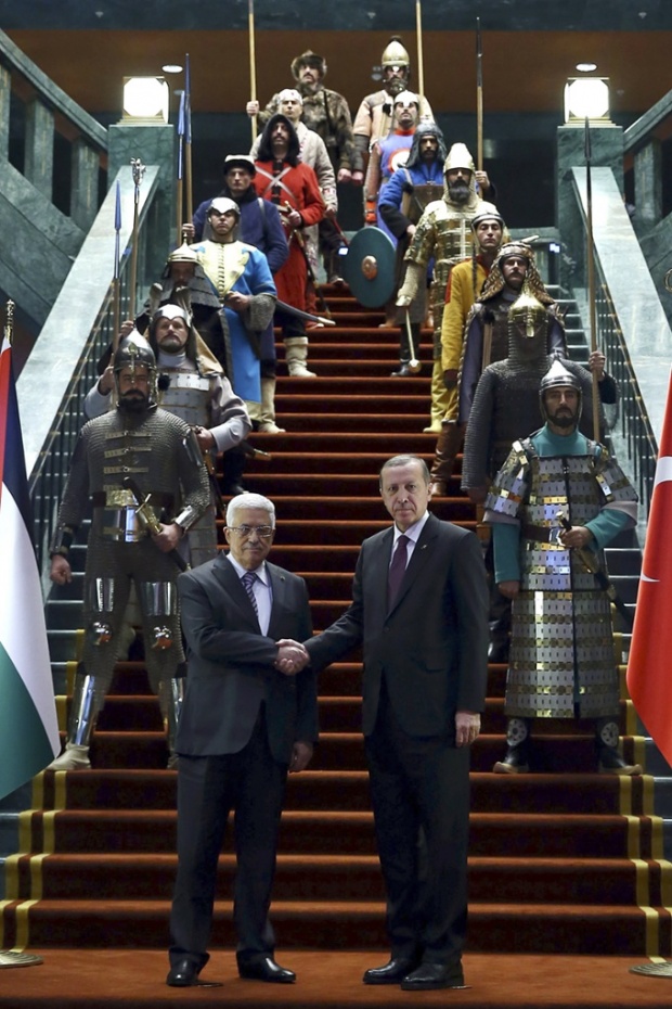
Europe and next to Europe. Ho. Ly. Smokes, Turkey, what the hell is going on with your imperial warrior cosplay Sforzian backdrops? After showing Mahmoud Abbas around the new Presidential Palace, Prime Minister Erdogan took him to a feast and a live jousting demonstration at Ottoman Times.
Abbas welcomed at Turkish presidential palace by Erdoğan – and 16 warriors [guardian, image: getty]
Paris Marching In Place: The Sforzian Montage
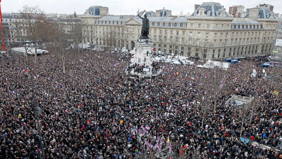
image: crowds at the Place de la Republique, via reuters, I think
Europe. The states of Europe, united against terrorism and intolerance as they marched through the streets of Paris yesterday, led by the families of those killed this week,
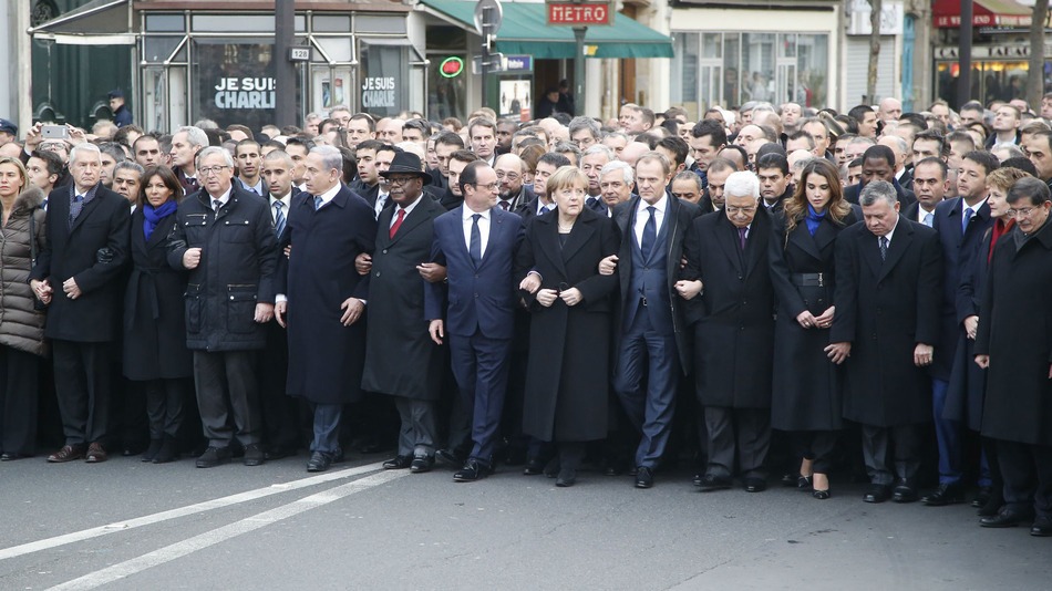
image: ap
and the heads of dozens of countries–including those countries where journalists are regularly jailed, flogged, and killed–marching arm in arm, marching, mar–wait, don’t march yet. Everyone in front, look up and…OK, march now.
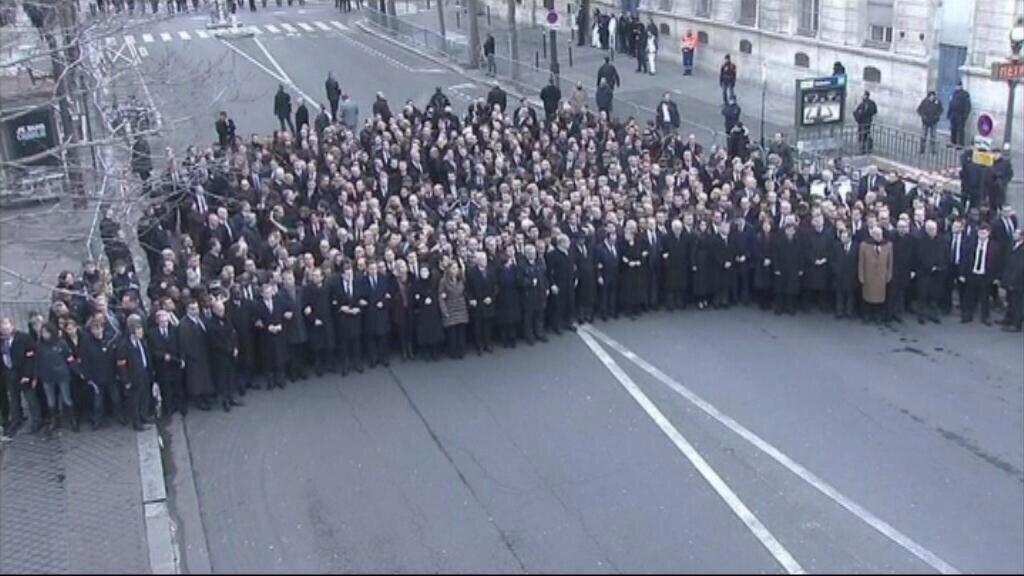
image by unknown, maybe TF1, via @rukhasgunsalu
As anyone who spent a moment contemplating the security nightmare might have guessed, the assembled leaders were actually not among the regular Charlies, but were instead marching in place, for the cameras, on a sealed-off street. If you thought otherwise, it might be because you were meant to. From the photos and slideshows, it sure could have seemed like one Paris March. As Twitter user Gonzalo put it, “Los líderes mundiales no encabezaron la Marcha de París, pero hicieron un montaje para hacernos creer que sí.”
A montage to make us believe they are. Instead of simply crafting a single, standalone image, make a photo-op that blends seamlessly into the broader visual narrative of the event. I believe this colonization of a montage represents an advance in Sforzian technique which warrants more investigation. Stay tuned.
Seasons Greetings
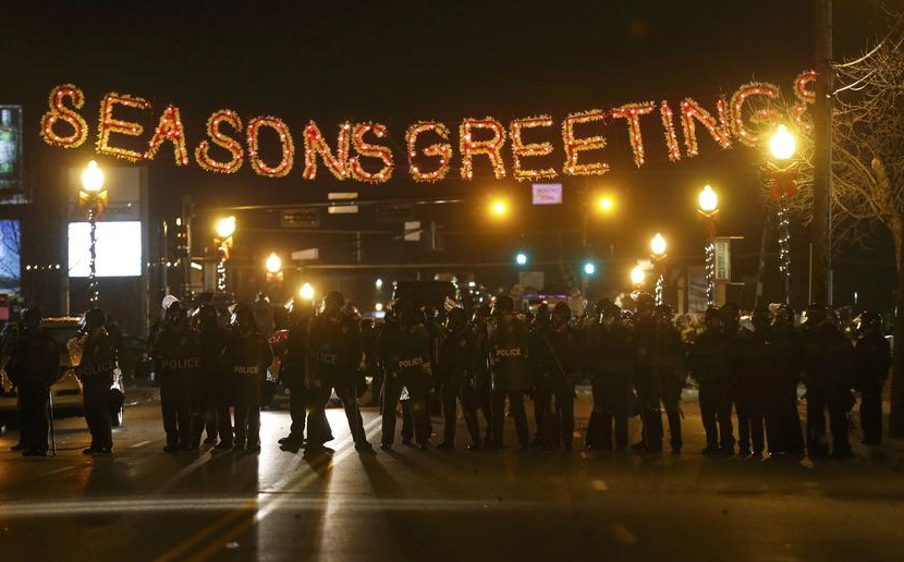
Reuters from Ferguson last night
Uncle Sam’s Club
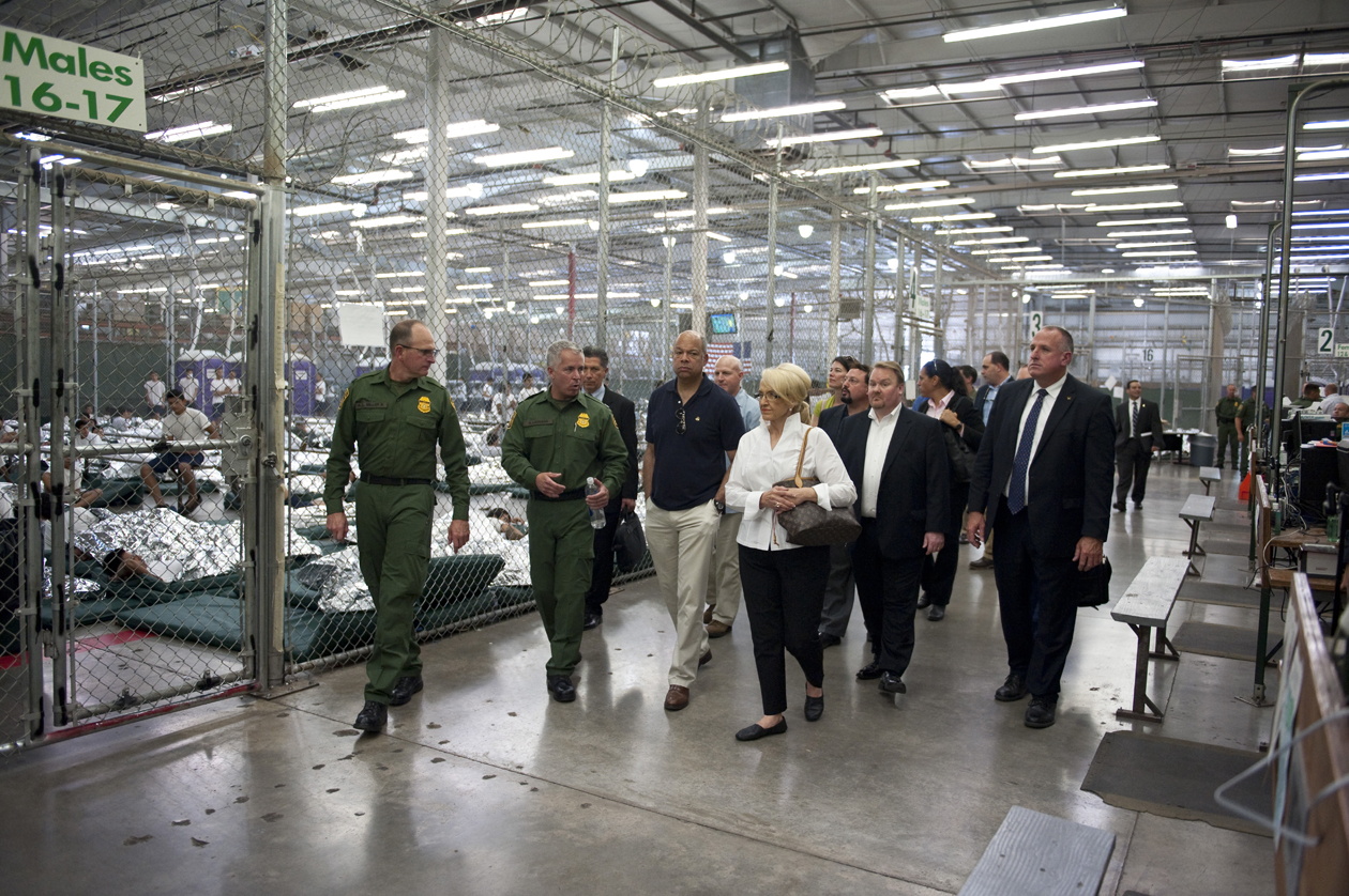
The Department of Homeland Security released this photograph of Secretary Jeh Johnson and Arizona Governor Jan Brewer and their respective entourages visiting the Males 16-17 aisle in the Nogales Placement Center, where several hundred ? thousand? unaccompanied minors are being detained, after being arrested while crossing into the US.
I’m going to be Gurskying up images of these juvenile prison warehouse stores as I find them. I just cannot even right now.
Readout of Secretary Johnson’s Visit to Arizona [dhs.gov/news]
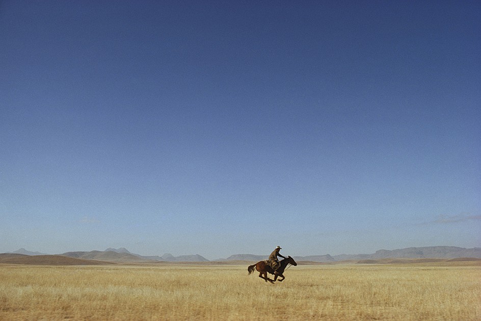
It’s Hard To Keep The Cowboys Straight
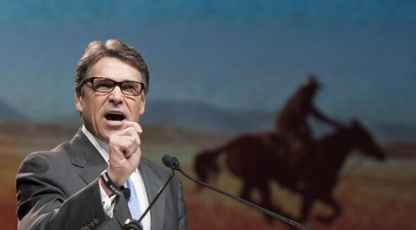
Republicans: Gays, Drunks, Let God Sort’em Out, image: AP/Rex C. Curry via TPM
Yesterday I tweeted about Texas governor Rick Perry wearing his “Smart Glasses” and standing “in front of a Richard Prince mural” in San Francisco where he was condemned for comparing homosexuality to alcoholism.
This morning Mr. Prince tweeted the following, which, like most tweets that don’t mention me, I assumed to be about me:
Getting blamed or credited for everything Cowboy. “Whoever it is, wish they’d cut it out quick. When they will I can only guess”.
— Richard Prince (@RichardPrince4) June 12, 2014
Upon further review, it turns out the photograph of Governor Perry was actually taken last Thursday at the Texas GOP Convention in Fort Worth, where the party was condemned for endorsing anti-gay “conversion therapy.”
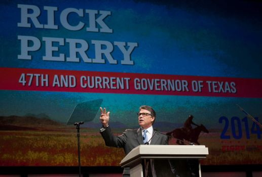
images ap/ray c. curry via chron
The image projected behind Gov. Perry is Lone Rider, Texas, a 1974 photo by William Albert Allard, originally published in National Geographic Magazine.
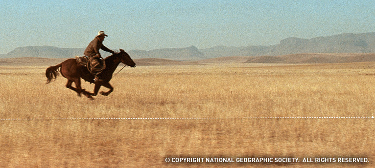
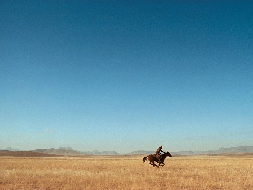
detail of “West Texas Cowboy,” Allard’s National Geographic wallpaper
It is one of the first five results on Google Image search for “texas cowboy riding,” and given the saturation levels and pixellation, I suspect Gov. Perry’s people got their jpg from the National Geographic wallpaper collection and cropped out the copyright info and logo,
and not from the C-prints for sale in Allard’s gallery.
Allard was one of the original photographers for the Marlboro Man and Marlboro Country ad campaigns after they switched from models to real cowboys in the 1970s. Prince would begin rephotographing these print ads around 1980. As far as can be discerned, this image has not appeared in a Marlboro ad, and has not been rephotographed by Mr. Prince. Yet.
greg.org regrets the error.
Art Of The Bush School
You go to war with the paintings you have, not the paintings you might want or wish to have at a later time.
Right now the paintings we have are by George W. Bush.
Why do they exist? Why are they being exhibited? How are they being used and discussed? Why do they matter?

image via flickr
I think the simplest answer for why George W. Bush started painting is because he has nothing else to do. Bush is toxic and unemployable as a political figure. He can’t campaign for Republicans, can’t talk on television about anything important, can’t give speeches for money, can’t write memoirs, can’t travel to certain countries where he runs the hypothetical risk of getting arrested for war crimes. Painting is a harmless and respectable pursuit that offers an aura of cultured acceptability.
As he explained to Jay Leno, the idea of taking up painting comes from Bush’s fantasy of being, or being compared to, Winston Churchill. Churchill painted. Of course, Hitler also painted. If painting makes Bush like Churchill, does it make him like Hitler, too? Is either association, when based on painting, more or less outrageous than the other? Painting becomes a rhetorical device, an uncritical excuse for likening Bush to Churchill. This has political ramifications that should not be ignored, yet they almost always are. That’s the transformative power of painting.
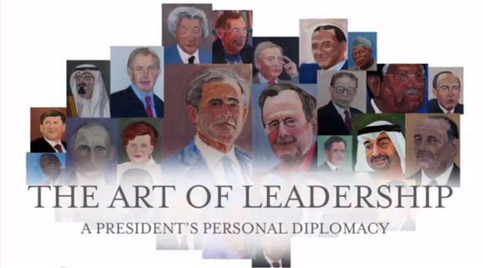
“I was sitting up here wondering how to kind of live life to the fullest,” Bush told the History Channel, a sponsor of the GW Bush Center’s exhibition, “The Art of Leadership: A President’s Personal Diplomacy.” “That’s the wonderful thing about painting. It’s absolutely transporting,” said Laura Bush.
Bush’s painted portraits of world leaders he worked with are central to the premise of the show, which is that “personal diplomacy,” i.e., personal friendships and relationships, are a transformative aspect of a successful foreign policy, i.e., Bush’s foreign policy. Bush is personable and sensitive, which these other leaders felt, which enabled the achievements of his administration, these painted portraits show.
Is that too heavy for you? The paintings are the lone, personal expression in an exhibit that’s otherwise nothing more than documentation of the systematic diplomatic ritual of documentation and exchange. They are flanked by “jumbos,” large prints of photos taken by the official White House photographers, a format which lines the halls of the West Wing. Many portraits are accompanied by state-themed statuettes, books, and objets, the official gifts Bush received from his counterparts.
“But the paintings provide a personal insight that such artifacts cannot,” wrote Dallas Morning News reporter Tom Benning, who toured the show with the artist:
As Bush walked through the exhibit, he stopped at each portrait to share not just an art critique, but a reflection.
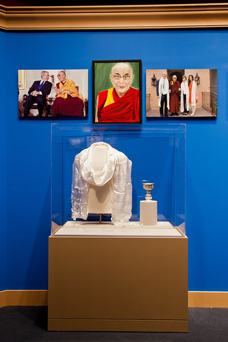
He painted his dad, George H.W. Bush, in a “loving way,” as a “gesture of compassion.” He depicted Blair as a “good pal” with a “determined face.” He focused on the Dalai Lama’s lips to show his “gentle, sweet countenance.”
He aimed for a “sympathetic portrait” of German Chancellor Angela Merkel to highlight her sense of humor. He put a smile on former Japanese Prime Minister Junichiro Koizumi to show that he’s “just a fun guy.”
Afghan President Hamid Karzai is “a little wary” and “suspicious about the future,” reflecting his “enormously difficult job.” Iraqi Prime Minister Nouri al-Maliki “doesn’t look real confident,” a nod to his “fragile democracy.”
“Eyes are very important,” Bush said. “You can convey a feeling about somebody.”
This is as good a time as any to point out that Bush painted his portraits, not just from photographs–a common enough practice as well as a long-established conceptual strategy, though I think only the former pertains here–but from the top search result on Google Images. Many photos were taken from the subject’s Wikipedia entry. Bush based his paintings on the literally first-to-surface, easiest-to-find photos of his subjects.
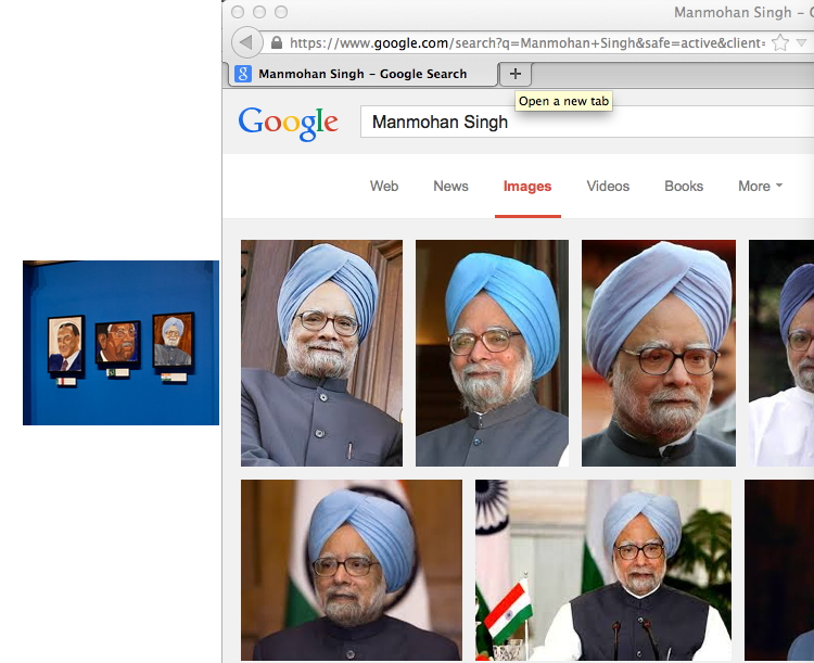
Is this meaningful in any way? If he had one, it would mean Bush’s studio assistant is very, very lazy. But in all his discussion of it, Bush’s painting practice appears to be a solitary one. He apparently did not tap the enormous archive of photos, taken by the professionals who followed him every day for eight years, which are contained in his giant library. Instead, it seems, he Googled the world leaders he made such impactful relationships with himself, and took the first straight-on headshot he saw.
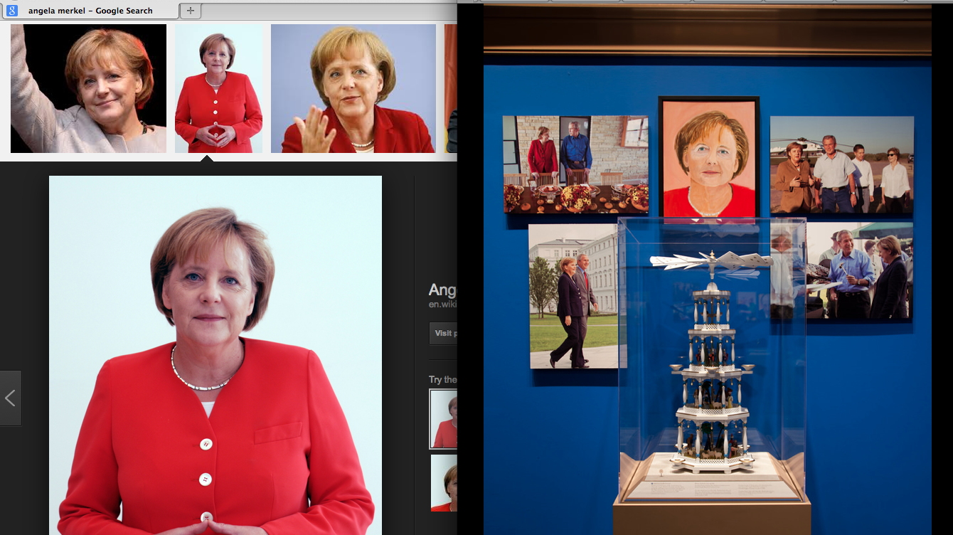
By outsourcing the editorial decisions about the source images to Google and Wikipedia, the rest of the paintings’ decisions can be claimed by The Decider himself. The sources serve as an index of Bush’s subjectivity, interpretations, and technique, only some of which is hinted at in his walkthrough. Maybe there’s an audioguide? Whether they are successful artworks in critical or aesthetic terms is an entirely separate question. But it is disingenuous, dishonest, or delusional to claim Bush’s paintings are not art.
They are the art of our time. The art of the 21st century. The art of the Bush Era and the Global War on Terror that made him famous. And for many who care deeply about art, that is very depressing. And damning. We yearn for art’s relevance in our society, for art to have an impact on our culture. We want people to experience art and to feel it’s important. Unfortunately, George Bush’s paintings accomplish all those missions. They’re the newsiest paintings to come along since George Zimmerman’s eBay auction.
Bush and his paintings grab the media spotlight just as reporters are gaining traction in the years-long struggle to account for the criminality and deception of Bush & Cheney’s CIA torture regime. The 6000+ page Senate report on the CIA, and the CIA’s own equally damning first account of itself, plus its responses, plus vast amounts of documentation of torture practices, are slowly moving toward declassification. Leaks are starting to emerge. Official facts are starting to be documented. The practices that continue to poison US courts, treaties, military & foreign policy, and intelligence, are finally coming into sharper view–and the man responsible for it all is successfully fending off his reckoning with a paintbrush.
Ironically, there is even more important art buried within the Senate’s trove of classified CIA documents. And as Bush was being interviewed by his daughter on NBC, these other artworks were still being actively suppressed. Jason Leopold and Al Jazeera reported that the Senate report contains detailed sketches of waterboarding by Abu Zubaydah, a senior Al Qaeda leader imprisoned at Guantanamo. He did not base his drawings on Google Images, but on his firsthand experience. As a “high-value detainee,” Zubaydah was waterboarded at least 83 times at a CIA black site in Afghanistan, with each interrogation session authorized and closely monitored from the White House.
Zubaydah produced ten drawings on yellow legal paper and index card-sized paper, detailing multiple torture techniques he was subjected to, Leopold reported in 2011. Since the CIA illegally destroyed its own waterboarding videotapes in 2005, these drawings may be the most powerful visual evidence of the Bush torture regime we have left. In March Leopold also obtained and published Abu Zubaydah’s diaries from before his capture, when he had been waterboarded and interrogated by Pakistani intelligence–without, it should be noted, yielding any true or useful intelligence. Which the CIA knew.
The point is, once again, art matters. Art has surfaced in the most dire circumstances, at a crucial moment in our society’s history, produced by someone whose actions and moral standing confound our engagement with it. And culturally speaking, we don’t care; we’d rather see Bush’s folksy pictures from the internet. Every news story about Bush’s paintings represents ten reports not filed about Bush’s torture. In the art world, meanwhile, we’d rather not see it at all. Better to condemn and dismiss it quickly. Snark and move on. Stoke the indignance that keeps us and our practices unsullied. Ward off any engagement with cowering incantations of connoisseurship and facture.
This is how art appears in our society today. Art works, as they say, and this is what it does: it absolves and redeems and defuses and deflects. Ultimately, George Bush’s paintings are important less for what they show than for what they obscure. And the art world’s critical structures seem unable or unwilling to meet the challenge posed by the art of the torture & terrorism school.
The Art of Leadership runs through June 3, 2014 [bushcenter.org]
Untitled (UKR-RUS Flag Carpet)
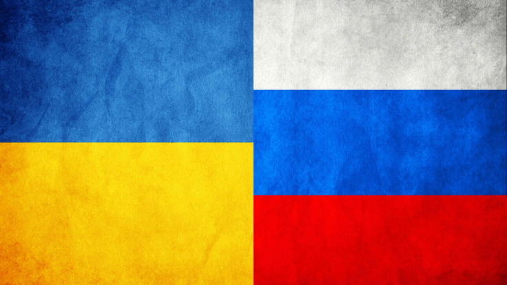
I don’t know what’s going on here. This image was the intro for a Yahoo News slideshow yesterday on Russia’s annexation of Crimea, and so it doesn’t have any caption or credit line.
At first I thought it was just a graphic of the Ukrainian and Russian flags, but looking a bit longer, I started to wonder why it had these irregular, dingy, textured spots on it. Which would be odd for a CG graphic, but normal for a photograph.
But then what’s it a picture of? A wall? A carpet? Is this a detail from a giant flag mural somewhere? Did someone make a flag-themed rug for some international event? Which people have been walking all over like some geopolitically conflicted Rudolf Stingel installation?
Anyway, the obvious solution now is to make such an installation. I can see a whole series of flag carpets, coming soon to a regionally appropriate biennial near you.
FOIA Party
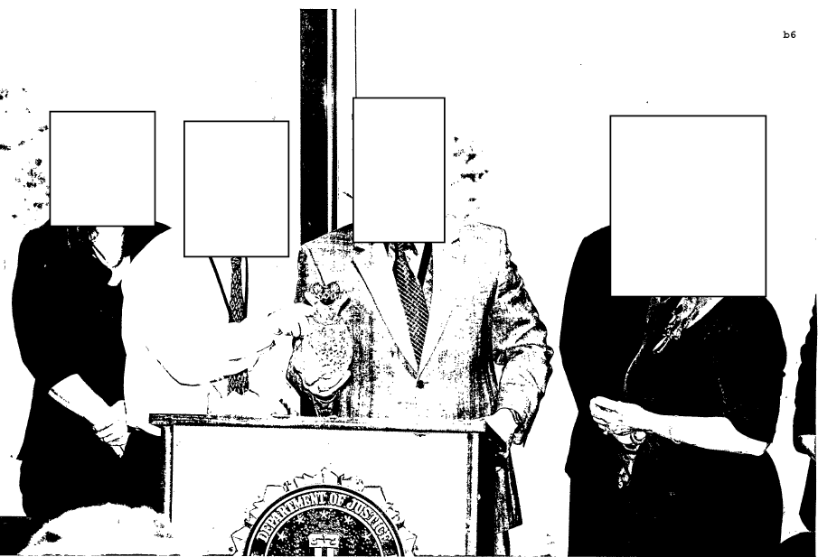
The FBI has provided these photos in response to USA Today investigative reporter Brad Heath’s 2012 Freedom Of Information Act requests. They have been redacted under FOIA exemption (b)(6), to protect the personal privacy of FBI personnel. Presumably, the presence of Timon from Lion King was determined not to violate the privacy of the attendees at this retirement party.
There is no way to redact the FBI’s inspiration, however. Color me impressed. [@bradheath via @AlJavieera]
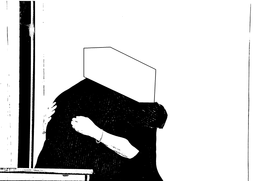
John Baldessari, probably 1988 or so, image via thegroundmag.com
Aujourd’hui c’est la Sforzian Selfie
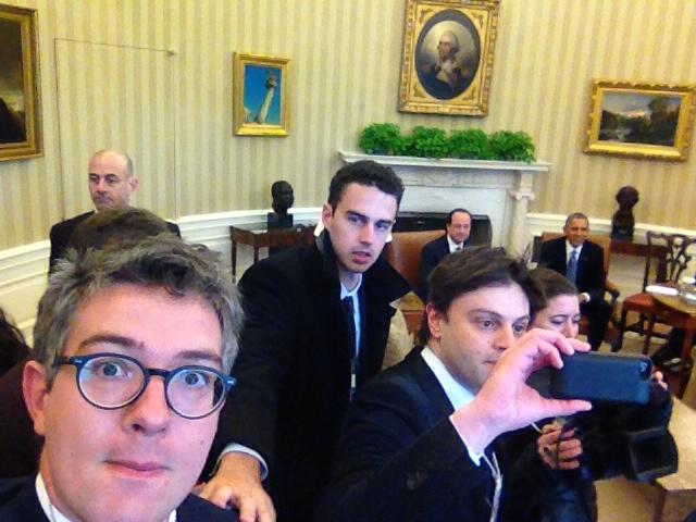
OK, this is pretty sweet. For the Oval Office photo spray with Francois Hollande and Pres. Obama, the French press corps shot a bunch of selfies instead, with the world leaders in the background. The one above is from @ThomasWieder, Elysée correspondent for Le Monde, [via BBC Paris correspondent Christian Fraser, @ForeignCorresp]. It looks like he’s being handled by his handler, too.
@Thornburgh suggests it might be a protest against Hollande’s recent granting of an exclusive interview to Time Europe correspondent Vivienne Walter. Time’s editor at large Catherine Mayer had gloated about the get by tweeting out a selfie from the Elysée Palace a few days ago.
And as we know from White House correspondents, including the media in your shot is an act of aggression, or protest, no matter who’s doing the including.
Previously: Pete Souza, White House Photographer
Hell Yes, Francois Hollande!
Aujourd’hui c’est la rentree
On Googling Richard Hamilton’s Maps of Palestine
I was looking around for something on Richard Hamilton this morning, when I Googled across a 2010 discussion between the artist and the human rights architect Eyal Weizman at Map Marathon, one of the Serpentine Gallery’s Marathon series. It was rather compelling for several reasons.
For one thing, their discussion of the political power of maps was frank and vivid in a way that I’m unaccustomed to in US media or art world forums. They talked specifically of Palestine & Israel, but I quickly took down two quotes that seemed very relevant to, of all things, Google:
the “double crime of colonialism is to colonize and to erase its own tracks” -Eyal Weizman paraphrasing Edward Said.
“All maps of a political kind have nothing to do with the people who occupy the territory being mapped.” -Richard Hamilton.
These both reminded me of Google Maps’ tendency I find so eerie, of Street View cameras and car/trikes to be erased from the panoramas. It turned out at the same time of Map Marathon, I had been working on this Walking Man project, where I followed the Google Trike through The Hague, its European debut, and collected the disembodied portrait fragments of the guy–who turned out to be a Google employee–walking alongside the entire trip.
It would have seemed a bit extreme at the time, but now it feels depressingly plausible, even urgent, to consider Google and its pervasive data collection as a political force and as a surveillance agent. Whatever the benefits of Google Maps–and they are real–we are still in the dark about just how transparent our information is, and how opaque the implications of Google’s deep information structure is. And we won’t know, and we won’t have open, informed debates and political discussion of it until our entire cultural landscape has been transformed by the company. And maybe not even then.
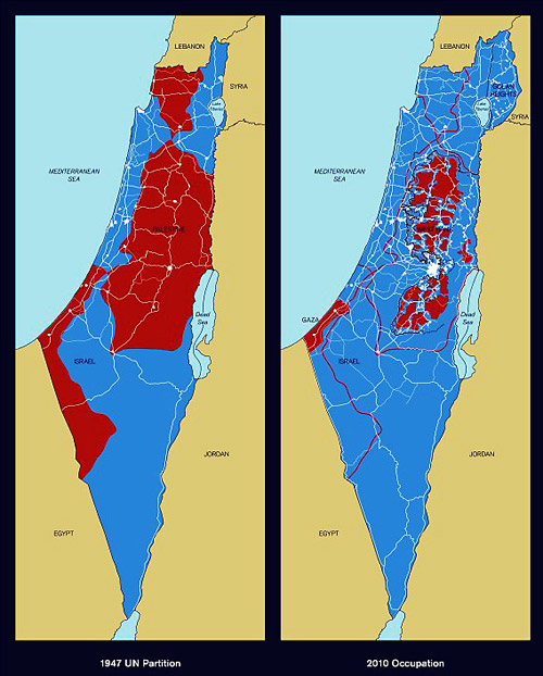
Richard Hamilton,Maps of Palestine, 2010
So this is what’s going through my head as Hamilton and Weizman discuss the artist’s contribution to the show, Maps of Palestine (2010), above. It was a pair of maps from 1947, and 2010, showing the shifts in political control between Israel and Palestine. It basically shows the impact of Israeli military retaliation in 1967 and subsequent settlement activity in occupied territory, and it appears to challenge the practicality of a two-state solution. [Indeed Weizman, upon whose groundbreaking crowdsourced mapping and analysis the newer map is based, believes only a one-state solution is feasible now, and that everyone’s just going to have to figure out how to get along. That’s a dark optimism of a sort, I guess.]
And then I start wondering, what, exactly, are these maps like? I mean, what did Hamilton actually make and show? Unsurprisingly, almost no one seemed able to talk about the maps as images or as objects; some people called them/it paintings, but nearly all the discussion was around their content and its meaning. Adrian Searle wrote about the Maps in The Guardian in the context of Hamilton’s art historical career and extensive political engagement. When a 4-map variation of Maps of Palestine was included in 4th Moscow Biennale, not only was there no image, or dimensions, the title and the very subject have been omitted. In the opening’s press announcement, director Peter Weibel stated, rather amazingly,
There will be quite a few so-called political works at the exhibition. For example, Gerhard Richter’s painting is not just a painting, it also refers to 09/11, and the piece by Richard Hamilton does not just show us a map of Israel, but it asks us questions about war.
Credit lines are a continuation of occupation by other means.
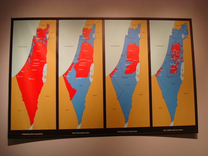
Maps of Palestine, 2011, 4th Moscow Biennale
see full-size img in Al-Madani’s flickr stream
The only image I can find online of the Moscow Maps is from flickr user Al-Madani, and it’s the first to show the work as a physical object. It curls up on the lower corners: an unmounted print of some kind.
It’s only after turning up Rachel Cooke’s interview with Hamilton in advance of his Serpentine show, “Modern Moral Matters,” which coincided with the Map Marathon, that I get my answer. Cooke’s entire anecdote is kind of golden, though:
Hamilton hands me a colour copy of a piece of new work that will hang at the Serpentine. It is a political piece, and consists of two maps: one of Israel/Palestine in 1947, one of Israel/Palestine in 2010, the point being that, in the second map, Palestine has shrunk to the size of a cornflake. I hold the image in my hands, and give it the attention befitting a new work by an artist of Hamilton’s reputation. In other words, I look at it very closely, and I notice something: on these maps Israel has been spelt ‘Isreal’. Slowly, my cogs turn. Hamilton loves wordplay. One of my favourite pieces of his is a certain iconic French ashtray subtly tweaked so that it says, not “Ricard”, but “Richard”. So presumably this, too, is a pun. But what does it mean? Is-real? Hmm. This must be a comment on the country’s controversial birth. Either that, or he wishes to suggest that the Israel-Palestine conflict is a nightmare – can it be real? – from which we will one day wake up. How clever.
“So what are you up to here?” I ask. “Why have you spelled Israel like this?”
Hamilton peers first at me then at the image. “How is it spelled?” he asks. I tell him how the word should be spelled and how he has spelled it.
There is a small silence. “Oh, dear,” says Hamilton. Rita Donagh gets up from her seat and comes round to look at the image over my shoulder. “Oh, dear,” she says. The misspelling is, it seems, just that: a mistake. It’s my turn now. “Oh, dear,” I say. “I’m so … sorry.” My cheeks are hot. Hamilton looks crestfallen. Donagh looks worried. “Can you change it?” I say, thinking that Hamilton works a lot with computers these days. “Not very easily,” he says. Oh, God. On the nerve-wracking eve of his new, big show, I have just told the 88-year old father of pop art that there is a mistake in one of his prints (this one is an inkjet solvent print). Why? Why did I do this? And how on earth will our conversation recover?
After a moment of perplexity, though, Hamilton starts to laugh. “Oh, well!” he says. “I’m sure there’s some way of sorting it out. Not to worry!”
So there we have it. Inkjet print. And from the image published above, it appears they reprinted it with the correct spelling. If only all the Israeli-Palestinian mapping problems could be resolved so quickly.
Also, I wonder if these maps will turn up in Hamilton’s Tate retrospective next month. UPDATE: YES IT WILL. [thanks to Tate Modern’s curators and communications folks for the update]
Map Marathon: Richard Hamilton & Eyal Weizman – Political Plastic [vimeo]
Map Marathon – 2010 [serpentinegalleries.org]
Modern Moral Matters | Richard Hamilton [serpentinegallery.org]
Richard Hamilton: A masterclass from the father of pop art [theguardian]