
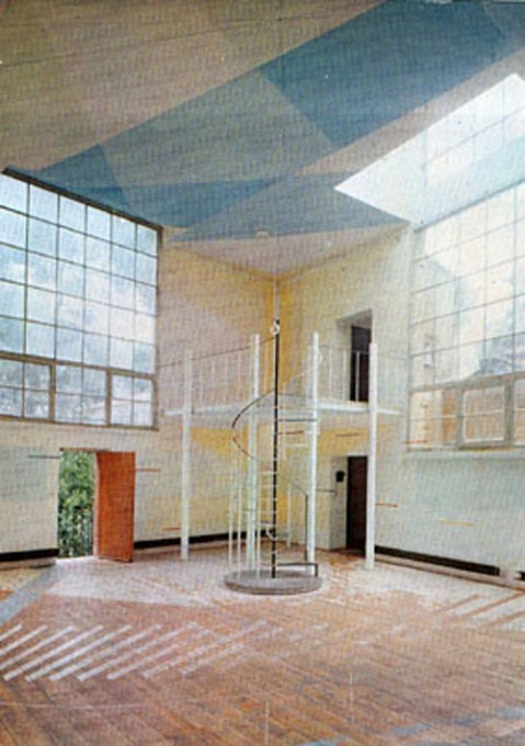
I have no willpower. I was going to hold off posting about this incredible project found on an incredible blog until I happily scored the book, but I couldn’t wait. Now I can only hope that my post will somehow bring a copy of the 1974 exhibition catalogue, Le Volume Bleu et Jaune into my clamoring hands that much more quickly.
A Young Hare is a new blog by Nicolas Allinder, aka “nic the intern”, who used to contribute to Ro/Lu. Nic posted about this rather insane project at l’Academy de France, where a group of anonymous architecture students petitioned to study a single room, their studio at the Villa Medici in Rome, for two years. The result: a 1974 installation in the studio in which the traces and volumes of light moving over time were inscribed on the surfaces of the space. Somehow, the exhibition was transferred to the Jeu de Paume in 1975.
Espace Tiphaine Bastille [now Edition Tiphaine put on a show dedicated to the project in 2003. The catalogue shows up in numerous library catalogues, but no inventories, and no scanned versions. Please, francophone web, get to work with the scanning and/or selling.
Le Volume Bleu et Jaune [ayounghare via ro/lu]
Previously, unnervingly related: on an unrealized art project
Category: writing
Earthworkers
Andrew pulls a great quote from this 1969 New York Magazine article by Rosalind Constable about buying the new-fangled, dematerialized art. But it’s the section right before it that caught my eye.
Constable’s writing about earthworks, particularly Walter de Maria, is a good reminder of the Conceptual context from which these works emerged:
Walter de Maria is generally conceded to have been the first artist to have used the desert for his canvas, and in so doing, to have reversed the usual art process: the work itself is ephemeral–or inaccessible–and the photograph becomes the art.
There’s like five kinds of quaint here, including the immediate invocation of the traditional metaphor of the artist and his canvas. There’s the conflation of ephemerality and inaccessibility, even as notions of remoteness and inaccessibility disappear. Site becomes as irrelevant as experiencing the work in person. Knowledge of the work is derived from seeing a photo, or from hearing or reading a description. The apparent novelty of a site-specific artwork in the remote desert is surpassed only by the idea that a photograph could be a work of art.
But what really gets me is the discussion of Smithson.
Robert Smithson is known as an earthworker (Heizer prefers the terms “landforms” or “exteriorization,” and Oppenheim prefers “terrestrial art”), but other earthworkers would exclude him. Smithson is currently showing his latest collection of rocks at the Dwan Gallery, and it is precisely because he brings them into a gallery ambiance, rather than leaving htem where he found them, that they disown him.
This seems like a pretty hefty oversimplification of the emergence of Land Art. In the battle for linguistic dominance, “earthworks” was Smithson’s coinage; other artists could reject the term, but it seems unlikely they’d claim Smithson wasn’t an “earthworker.” It also ignores the broader critical round-up by folks like Willoughby Sharp, who’d curated a foundational “Land Art” show the year before. And the “Earthworks” group show at Dwan that preceded the Smithson non-sites that were the subject of Constable’s sources’ scorn.
Still, it feels directionally accurate, in that from almost the beginning, the art world discourse of earthworks has generally privileged the convenient and collectible–including mere photographs–over the physical realities of the works.
Though this has changed in the last 15 or so years, with the emergence of a contemporary Grand Tour, the lingering critical effects of this devaluation of site can still be felt.
Ro/Lu Lo/Go
Ro/Lu is en fuego these days, in case you didn’t know, and I’ve been lucky enough to get warmed by their fire.
First off, they’ve been doing this Simple Chair project, an exploration of how and where our stuff is made. It’s making its second appearance at Mass MOCA. I was planning to just write about it more when I saw the publication [to which I contributed a brief article of my Enzo Mari X Ikea table project], but Ro/Lu just keeps on doing stuff, so I can’t sit silently by.
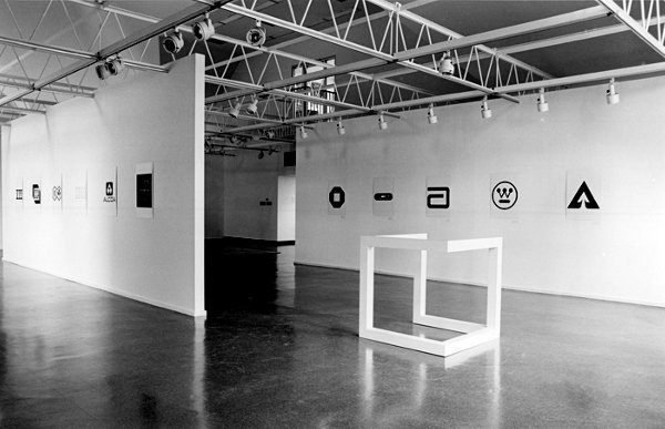
And then, as if reading my mind–or my blog drafts, or maybe communicating telepathically with me through the minimalist/modernist/design/art ether–they posted a link to an awesome-looking 1980 exhibition at The Renaissance Society in Chicago, “Objects and Logotypes: Relationships Between Minimal Art and Corporate Design”.
Whoa. It’s fascinating to see how Minimalism, modernism, and corporate branding were perceived and presented thirty years ago. They all feel digested and processed now, but I get the sense that what curator Buzz Spector is talking about in his essay is not quite the same thing we use those terms for today.
Which may be a way of saying I take issue with many of Spector’s definitions and points, but I’m not quite able to articulate why I think he’s wrong. I mean, I can say that I think Greenberg’s Minimalism-as-“mannerism” does not seem related at all to the principles of usage in corporate visual design. Or that the ubiquitous, homogenizing proliferation of a corporate logo seems like the diametric opposite of Robert Morris’s sculptural gestalt, not its twin.
But Spector’s show still seems like an interesting, important first step for the coming revisiting of Minimalism. And siting avant-garde art practices in parallel to mid-century corporate marketing is pretty compelling to think about. And I really like the idea Spector hangs his show on, that these designers and artists are alike in conflating form and value, i.e., that they “reflect a common faith in the efficacy of form as a means of restructuring society through public exposure to works executed within particular systems of use.”
As I sit here in the middle of a mild obsession with the Netherlands government’s new, painting-inspired rebranding and centralized visual identity system, this idea feels as relevant as ever.
So thanks, Ro/Lu!
‘A Sort Of Collaboration’
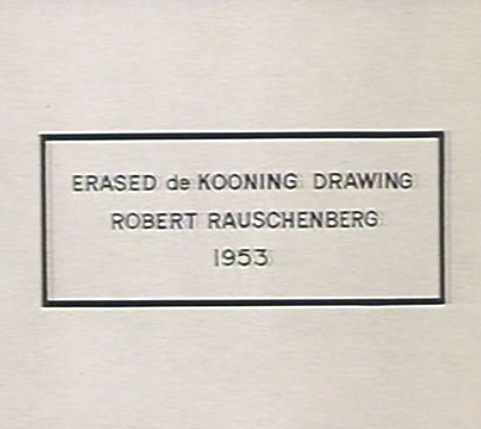
Erased de Kooning Drawing as of 1999 at SFMOMA
When we last left Erased de Kooning Drawing, the late, great Leo Steinberg had finally told his story about getting Rauschenberg on the phone in 1957 in order to sort the damn thing out. Steinberg’s conclusion was that, far from a “Neo-Dada” prank or Oedipal negation, Rauschenberg had offered de Kooning “a sort of collaboration” of erasure. The plausibility of this interpretation was inspired by the equally collaborative combine painting of the same period, Short Circuit.
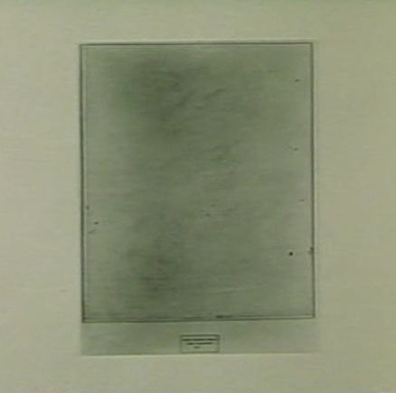
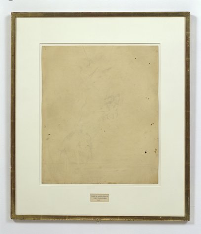
Erased de Kooning Drawing, without present matboard, c. 1970, via Emile de Antonio’s Painters Painting
So to recap quickly: EdKD is a collaborative work. In which erasure-as-drawing is the subject, or the strategy. Each artist with his different markmaking method. And it is inscribed, labeled, by hand, with a flatly descriptive title and claim of authorship. And though it had been unmatted at some point [above] rendering the inscription and the drawing as one collaged work, it was matted in a way that obscured this unity, and it was [eventually] presented as a framed, presented object. A conceptual work, realized. A concept of a drawing erased. Hold all that in your head. Am I missing anything?
Erased de Kooning Drawing, detail, c. 1970, via Painters Painting
Anything besides the small detail that the inscription, the text, the third instantiation of the concept, the generative inverse of the erased drawing itself, was made by Jasper Johns?
For the crucial period of EdKD‘s uptake into the art world’s discourse, Rauschenberg had always claimed that he had written the inscription. That he’d “signed” it. That’s what he told Emile de Antonio on top of that ladder. That’s the only way anyone talked about it. But it is not true.
Vincent Katz has made one of the rare references to the importance of the work’s collaborative creation in Tate Magazine in 2006. But others credit Calvin Tomkins with breaking the news of Johns’ involvement in EdKD in his 2005 New Yorker profile of Rauschenberg:
Johns gave Rauschenberg the title for “Erased de Kooning Drawing,” which came into being in 1953, when Rauschenberg persuaded de Kooning to give him a drawing which he would then erase, to see whether a work of art could be created by the technique of erasure; Johns also did the precise lettering for the title, on the framed matte below the very faint, wraithlike ghost of the erased image.
The title, of course, is not on the matte, but under it. It was originally of a piece with the drawing, until the matte separated it, demoted it, even. Which may intensify the implications of difference between pre- and post-matted drawing.
[Tomkins does not identify the source of his revelation about Johns’ involvement, even though he wrote in the same piece that “Johns recently told Joachim Pissarro, a curator at MoMA, that he thought the term ‘combine’ had been his suggestion.” The latter was a memory Rauschenberg apparently did not share.]
Tomkins may have been the first to publish it, but claim of Johns’ collaboration was first made at least six years earlier, by a seemingly unlikely source: Robert Rauschenberg.
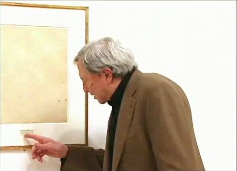
In a 1999 video interview about the newly acquired EdKD, Rauschenberg told SFMOMA curators,
So when I titled it, it was very difficult to figure out exactly how to phrase this.
And, uh, Jasper Johns was living upstairs, so I asked him to, to do, the uh, the writing.
And they say you never get to know your neighbors in New York. Sometimes you make historic works of art together with them.
Except that on Pearl Street, as Castelli famously told it, Johns was downstairs. And Rauschenberg was upstairs, in the loft vacated in the summer of 1955 by Rachel Rosenthal, who had found the building in the Spring of 1954. Rauschenberg was certainly around–and living around the corner–before then. They’d met early in the winter of 1954, began and he and Johns had already created and shown Short Circuit by then. So either Rauschenberg was referring to a time before they moved in together, Or Johns didn’t add his pieces to the drawing before mid-1955. Either way, it sounds like the drawing, to use Tomkins’ odd phrasing, actually “came into being” after 1953, the date Johns wrote on it.
Part 1: ‘FRAME IS PART OF DRAWING’
Part 2: Erasers Erasing in Painters Painting
Part 3: Norman Mailer on Erased de Kooning and other ‘hopeless’ and ‘diminished’ art
Parts 4&5: Leo Steinberg on EdKD and how it’s a collaboration
Part 6: A 3-Way Collaboration, that is, with Jasper Johns. Oh, that’s this post. Just one more, I think.
Torn Scraped Triggered Erasure Produced
Lee Krasner, Bird Talk, 1955, oil, paper, canvas on cotton duck
Lesley Vance on Lee Krasner, in Artforum’s artists on ab-ex feature:
At one point in the early 1950s, Krasner grew dissatisfied with some drawings she had been working on in her studio, so she tore them to shreds and tossed the scraps on the floor in frustration. The sight of those fallen fragments triggered much of her subsequent work–collages made from ripped-apart drawings and, later, from torn sections of paintings.
I had a similar moment of destruction born from discontent a few years ago, only instead of tearing up my painting, I scraped away paint. This act of erasure produced a more intuitive composition and opened the door to the type of spaces I now pursue.
Leslie Vance at Kordansky
Brian Dillon on erasure, palimpsest, etc. [fort-da]
Encounters With Erased de Kooning Drawing
You know what, it’s the weekend. We can have two long Leo Steinberg-related posts at once. Read’em on the NetJets to Basel.
 Though he mentioned it in his most important piece of writing, which was also the most important piece of writing on Rauschenberg, it’s not entirely clear whether Leo Steinberg had actually seen Erased de Kooning Drawing when he wrote “Other Criteria.”
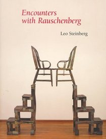
And as he tells the story in his awesome 2000 book, Encounters With Rauschenberg – A Lavishly Illustrated Lecture, Steinberg makes not seeing it the point. I’m really tempted to include all seven pages of EdKD from the 85-page book–the text was published straight from his lectures for the 1997-8 Rauschenberg retrospective at the Guggenheim and Menil, and it really sounds just like him. [I met Steinberg in 1991 when the delightfully friendly woman I was sitting next to for his Picasso lecture series at Rice University introduced us; she turned out to be his host, Dominique de Menil. Life-changing, &c, &c. but not right now.]
But I won’t. Even though it’s out of print and expensive. It really should be a PDF now. Anyway.
Steinberg’s take on EdKD is useful here because he was watching Rauschenberg’s career and involved in its critical dialogue almost from the very beginning; he’s about as well-informed or as thoughtful an audience voice as Rauschenberg could find in the 1950s and 60s. And so his reaction seems like a good proxy for the best perspective possible of the time. And it sounds like, though he felt he had to address it, and though he could argue for its critical or conceptual significance, Steinberg didn’t really like Erased de Kooning Drawing very much. It bugged him. He even apologized to his lecture audience for spending “so much time on a negative entity” and a “one-time exploit.” But but!
The lead-in for his story about first encountering EdKD was, interestingly enough, an anecdote from 1961 and Rauschenberg and Johns, about artists putting personal content into their work, and denying it, and then eventually ‘fessing up, and so about not quite trusting what artists themselves said:
That experience confirmed me in a guiding principle of critical conduct: “If you want the truth about a work of art, be sure always to get your data from the horse’s mouth, bearing in mind that the artist is the one selling the horse.”
And did I abide by my principle? I should say not! My longest conversation with Rauschenberg occurred c. 1957, when I first heard about something outrageous he’d done some years before. And rather than going after the outrage–the horse, as it were–I called the trader.
[uh, don’t want to spoil the story arc, but isn’t not ignoring a lesson in 1957 that stems from looking back from the 80s to a 1961 conversation putting the horse before the trader? Just sayin’. -ed.]
The work in question was Rauschenberg’s Erased de Kooning Drawing of 1953. The piece had not been exhibited; you heard of it by word of mouth. I did, and it gave me no peace. Because the destruction of works of art terrifies.
See, now this is news right there: not exhibited before, word of mouth, a piece you know and worry about without seeing.
How could Bob have done it; and why? The work is often, and to this day, referred to as “a Neo-Dada gesture,” but that’s just a way of casting it from your thought. Obvious alternatives to Neo-Dada suggested themselves at once. An Oedipal gesture? Young Rauschenberg killing the father figure? Well, maybe.
But wasn’t it also a taunting of the art market?–an artist’s mockery of the values now driving the commerce in modern art?
This would put paid, so to speak, to Norman Mailer’s complaint that Bob was erasing to play the market. Steinberg tells how everyone was very aware/shocked/jealous/disturbed when a de Kooning finally sold for $10,000. And Rauschenberg was the one, don’t forget, who got the angriest at Robert Scull for his market-making auction some years later. But all these seemingly contradictory interpretations, Steinberg pointed out, were just assumptions from afar.
So I picked up the phone and called the horse trader himself. And we talked for well over an hour. Occasionally, thereafter, I considered writing up what I remembered of our talk, but then Calvin Tomkins discussed the Erased de Kooning Drawing in his Rauschenberg profile in The New Yorker, and he did it so well that I thought, “Good, that’s one less thing I have to write.” But I don’t mind talking about it and recalling whatever I can of that phone conversation.
On the first question of why, Rauschenberg gave an explanation similar to the one he’d told Emile de Antonio: he was interested in drawing with an eraser “as a graphic, or anti-graphic element,” and found that erasing his own work was unsatisfying.
As for why de Kooning and not some other pre-existing work of art, Steinberg examines and largely discounts the Oedipal explanation, and instead suggests that Rauschenberg recognized or claimed a kindred spirit, that erasure as a technique was central to de Kooning’s own practice. And yes, this section I’m obviously going to quote at length:
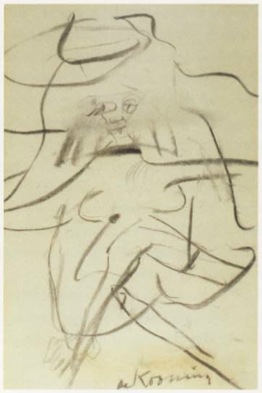
There is another reason, I think, why Bob lit on de Kooning. I live with a de Kooning drawing from the early 1950s–it’s of a seated woman, frontal, legs crossed [below]. The face was drawn, then erased to leave a wide, gray, atmospheric smudge; and then drawn again.
Willem de Kooning, Woman in a Rowboat, 1953
And here is Tom Hess’ account of Bill de Kooning’s working method. I’d like to read you a paragraph from Tom’s book Willem de Kooning Drawings (1972), and I’m encouraged to do this by the example of Rauschenberg’s Short Circuit combine, which, you remember, brought in some of Bob’s friends piggyback. Tom Hess was a friend; hear him describe de Kooning’s habit of draftsmanship.I remember watching de Kooning begin a drawing, in 1951, sitting idly by a window, the pad on his knee.He used an ordinary pencil, the point sharpened with a knife to expose the maximum of lead but still strong enough to withstand pressure. He made a few strokes, then almost instinctively, it seemed to me, turned the pencil around and began to go over the graphite marks with the eraser. Not to rubout the lines, but to move them, push them across the paper, turn them into planes…De Kooning’s line–the essence of drawing–is always under attack. It is smeared across the paper, pushed into widening shapes, kept away from the expression of an edge…the mutually exclusive concepts of line and plane are held in tension. It is the characteristic open de Kooning situation…in which thesis and antithesis are both pushed to their fullest statement, and then allowed to exist together…
This much Tom Hess.
In view of such working procedure, one might toy with this further reason why Rauschenberg’s partner in the affair had to be de Kooning, rather than Rembrandt or Andrew Wyeth. De Kooning was the one who belabored his drawings with an eraser. Bob was proposing a sort of collaboration, offering–without having to draw like the master–to supply the finishing touch (read coup de grace)
I could just go on and on. Steinberg noticed that, despite declaring his early love for drawing, Rauschenberg seems to have pretty much stopped drawing after the early 50s, Erased de Kooning Drawing was really about erasing drawing itself.
And since he brought it up, and in the context of collaboration, too, maybe that makes Short Circuit, which includes two paintings by his partner and ex-wife, a way to wrangle painting into its place, too: subsumed behind closed doors. It’s an admittedly rough analogy, but then, I only just thought of it.
In any case, Steinberg’s collaborative interpretation of Erased de Kooning Drawing is worth holding onto. On with the story:
Meanwhile, Bob and I are still on the phone. And Bob says, “This thing really works on you, doesn’t it?”…Finally, I asked, “Look, we’ve now been talking about this thing for over an hour, and I haven’t even seen it. Would it make any difference if I did?” He said, “Probably not.” And that’s when it dawned on me–it’s easy-come now, but the thought had its freshness once–I suddenly understood that the fruit of an artist’s work need not be an object. It could be an action, something once done, but so unforgettably done, that it’s never done with–a satellite orbiting in your consciousness, like the perfect crime or a beau geste.
Since then, I’ve seen the Erased de Kooning Drawing several times, and find it ever less interesting to look at. But the decision behind it never ceases to fascinate and expand.
It now seems to me that Rauschenberg has repaid de Kooning’s gift to him. For though we all know de Kooning to have been a great draftsman, I can think of no single de Kooning drawing that is famous the way some of his paintings are, except the one Bob erased.
Leo Steinberg On Erased de Kooning Drawing
So ultimately, Norman Mailer’s off the hook. We know that when he wrote about Erased de Kooning Drawing in the 1970s, 1980s, Mailer fragged Rauschenberg for selling it–which he hadn’t–as much as making it. And he got the title wrong: “A drawing from Willem de Kooning erased by Robert Rauschenberg”. Which might mean he never went to see it anywhere it was showing over the years, but it also means he probably felt he got the work, didn’t need to see it. And that he was reading art historian Leo Steinberg’s indispensable 1975 collection of writings, Other Criteria.
That particular wrong version of the inscription on EdKD comes from Steinberg’s title essay, which was first published in Artforum in 1972 as “Reflections on the State of Criticism.” Steinberg originally presented a version of “Reflections” as a lecture at the Museum of Modern Art in March 1968. It was one of a 10-part series of Wednesday night lectures by leading critics and historians [which happens to have been organized by the Modern’s Junior Council then chaired by Barbara Jakobson, which is the predecessor group to the group I chaired for a while, the Junior Associates. Needless to say, I have never felt like a bigger slacker than when I look back at all the stuff the Junior Council did in the 60s. Recordings of the series were restored in 2008, but the Steinberg lecture is not listed among them. I’ll look into that.]
Anyway, Steinberg’s piece is an epic refutation of Greenbergian modernism’s view of both Renaissance and contemporary art. For its compelling critical framework, its defense of content and for identifying what Steinberg called the “flatbed picture plane,” Branden Joseph dubbed “‘Other Criteria’ the single most important article on Rauschenberg’s production.”
Steinberg discussed EdKD along with a 1952 grass painting hung on the wall as an example of Rauschenberg’s early challenges to conventional expectations of orientation:
In retrospect, the most clownish of Rauschenberg’s youthful pranks take on a kind of stylistic consistency…When he erased a de Kooning drawing, exhibiting it as “Drawing by Willem de Kooning erased by Robert Rauschenberg,” he was making more than a multifaceted psychological gesture; he was changing–for the viewer no less than for himself–the angle of imaginative confrontation; tilting de Kooning’s evocation of a worldspace into a thing produced by pressing down on a desk.
Which is interesting, but maybe not quite as interesting as the fact that, as late as 1972 or even 1975, one of Rauschenberg’s greatest critical champions seems not to have noticed that his version of the inscription is actually incorrect. Or that the earliest exhibition date listed on the back of EdKD itself is actually 1973, in a show by an even closer Rauschenberg ally, Susan Ginsburg.
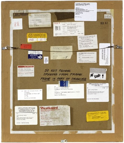
[Interesting sidebar: after posting SFMOMA’s photo of the back of EdKD, a regular greg.org reader told me s/he had seen EdKD getting reframed or rematted “in the late nineties” at Minagawa, and watched as they carefully reattached the archival materials on the back. Maybe Bob was sprucing it up before selling it.]
So anyway, as of the publication of Other Criteria, then, Steinberg considered Erased de Kooning Drawing as a “youthful prank” that was “clownish,” yet prescient. But it’s not clear that the great advocate of close looking had actually seen the work.
Part 1: ‘FRAME IS PART OF DRAWING’
Part 2: Erasers Erasing in Painters Painting
Part 3: Norman Mailer on Erased de Kooning and other ‘hopeless’ and ‘diminished’ art
On Erased de Kooning Drawing, Cont’d
Robert Rauschenberg, Erased de Kooning Drawing, 1953, “drawing | traces of ink and crayon on paper, mat, label, and gilded frame.” via SFMOMA
So the basic question, “What do we really know about Erased de Kooning Drawing and how do we know it?” Is really driven by some recent discoveries that my understanding of the work and its story–its history–turns out to be wrong. Incomplete. Based on some assumptions that should, it turns out, be questioned.
For example, Erased de Kooning Drawing is regularly referred to know as one of Rauschenberg’s most important works, which prefigured or influenced entire movements in contemporary art. But so far, I haven’t found actual evidence that the work was even exhibited before 1973. It’s barely even discussed in the 1960s literature on Rauschenberg, never mind the 50s [It supposedly began shocking the art world soon after its creation in 1953.]
I’m always kind of torn between trying to figure this stuff out by piling on the research and citations and sifting through it, and then posting about it, and just documenting my inquiry, incomplete as it may be, as I go along.
I guess the key here may be laying out what freaked me out, and saying that it kind of blows my mind precisely because I’ve been spending so much time looking back at the relationship and collaboration between Rauschenberg and Johns, and at the stigmatized silence that continues to distort our view and our understanding of their crucial, early work.
A week or so ago, I saw a digitally remastered version of Emile de Antonio’s 1972 documentary, Painters Painting [Here’s the vanilla Ubu version.] De Antonio was a longtime friend of both Johns and Rauschenberg; he helped them get their earliest job together as window dressers for Bonwit Teller. I saw a 1976 note in the Smithsonian archives where Walter Hopps says that Bob called de Antonio “a hustler.” He became a complex and controversial filmmaker with a 10,000 page FBI file. For Painters Painting, he conducted extended interviews with both artists and a critically disparate range of others on the scene [the film was mostly shot in 1970]. According to my MFA brother-in-law, the film is a hilarious staple in art schools, which I think I object to; I may take on the film’s content and form head-on at some point, but not now.
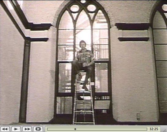
Rauschenberg recounted the story of making Erased de Kooning while sitting atop a ladder in front of the church-like windows of his Lafayette St studio. His delivery is deadpan, deliberately ridiculous, and not a little drunk. De Antonio’s editing is kind of disruptive, but the issue isn’t whether erasing the drawing took “nearly three weeks” or a month, or 15 erasers or 40. The issue is Erased de Kooning Drawing itself:
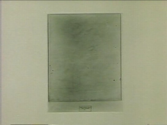
There’s no frame. And no mat. No nothing, just the drawing. Which feels substantively different. De Kooning’s original sheet appears to be mounted onto the piece of paper onto which the label was drawn. Where the mat now seems to separate the label and the drawing, without it, it seems like one thing. A collage, perhaps, but a joined, unified, self-contained whole.
Which makes the label not just a label, but a text, a set of marks, as much a drawing as the erased marks–or the erasure marks. Rauschenberg’s explanation to de Antonio is different from other, later tellings, and from the neo-dada, Freudian interpretations of others. He seems entirely clear about what he wanted to do:
One of the things I wanted to try was an all-eraser drawing. And, uh, I did drawings myself, and erased them. But that seemed like fifty, fifty. And so I knew I need to pull back farther, and like, if it’s gonna be an all-eraser drawing, it had to be art in the beginning.
He was trying to make a mark with an eraser. It’s the difference between erasing a drawing, and drawing with an eraser. And when he was done, the result was both an erased de Kooning and a drawing. And the hand-drawn label declared as much. It’s almost a perfectly symmetrical prefiguring of Joseph Kosuth’s One and Three Chairs, made a dozen years later.

But did Kosuth know and react to Erased de Kooning Drawing in creating his piece? Did de Antonio just happen to shoot the drawing while it was out of its frame, or did it look different–was it constituted differently–in 1970? And before? When did it change to the conceptual object, where the label is demoted, no longer an integral element, diametrically opposite but co-equal with the “drawing,” the concept, but now a separated, ancillary presentation device equivalent to mat and frame? Rauschenberg wrote on the back of the work, “FRAME IS PART OF DRAWING,” but I’m not sure that was always the case.
It seems to me that Erased de Kooning Drawing became one thing in the early 1970s, but before then, it was something else.
Previously: ‘FRAME IS PART OF DRAWING’
Next up: looking back at what was said and written and known and shown about Erased de Kooning Drawing before 1973.
‘Art Doesn’t Begin And End In A Physical Frame’
So I try to take a break from this [now rather long] exploration of the history of Robert Rauschenberg’s Erased de Kooning Drawing by reading my Avalanche magazines.
And there I find an announcement for Oh Dracula, a 1974 Chris Burden performance/installation which took place at the Utah Museum of Art at the University of Utah in Salt Lake City. Really? Yes.
October 6 – October 9, 1974, in fact, which makes it one of Burden’s earliest museum shows.
But it seems that the piece was not just organized by the museum, but as part of the Joint Conference of the Western Association of Art Museums and the Western Regional Conference of the American Association of Museums, which was held in Salt Lake that year. I’ve added it to the research list.
Avalanche said cellophane, but in a 2000 essay in Frieze Ralph Rugoff said canvas. Either way, Burden climbed into a “chrysalis”-like sac and had himself installed in between some of the museum’s exceedingly random 18th century paintings, with candles placed at his head and feet. And there he hid all day.
Rugoff’s piece is about invisibility; he talks about Burden’s hiding pieces, and John Cage’s silence, but not Erased de Kooning Drawing, even though his ending paragraph reminded me of it:
But perhaps the most salutary effect of invisible art lies in the chameleon-like array of meanings which have cloaked it over the past half century. Rather than simply serving as a static limit defining the no-go zone of artistic practice, it has alternately appeared under the guise of the Sublime, of social idealism, avant-garde aggression, personal humility and ironic commentary. No single artist has been able to possess invisibility as a signature medium, and its wayward history gently yet pointedly mocks our waning belief in the cult of originality. It suggests instead that art doesn’t begin and end in a physical frame or a singular context, but lives on in the potentially endless process by which we make use of it.
Oh Dracula isn’t mentioned in Burden’s current bio, and though I talked about Burden while I was lecturing at the University of Utah, no one there mentioned it to me, either. So it’s a different kind of erasure.
Touched by your presence [frieze]
Apropos Of Absolutely Nothing Else Posted On greg.org In The Last Seven Months
Richard Prince Deposition Book All Grown Up
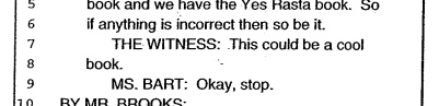
“THE WITNESS: This could be a cool book.”
– Richard Prince Deposition Transcript, p. 328
Dude, Richard Prince just blurbed my book.
Between the lawyers on both sides of Cariou vs. Prince et al, about 275 pages of the transcript of Richard Prince’s 7-hour deposition had been made public as footnotes to various briefs and memos, but there were 101 pages left out.
In the weeks since I compiled the excerpts and exhibits into a book, I’ve been trying to track down the complete transcript. Now I have it, and you can too. After trying multiple sources for obtaining it, a sympathetic party close to the case pointed me to an apparently inadvertent, unmarked exhibit appended to a late court filing, which included the entire 378-page transcript instead of the customary snippets.
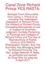 And so I have revised Canal Zone Richard Prince YES RASTA to includ the entire interview, in order, with a handy timestamped topical index, even, and with some additional rounds of legal memos, that give a fuller sense of the give and take that led up to Judge Batts’ royal smackdown of Prince’s transformative use claims.
In addition, to accommodate wholesale requests, I’ve switched printers, so the new, revised edition has slightly smaller page facsimiles, but it is also printed on higher-grade paper. It looks pretty slick.
Because of the additional quality and page count bumps, the cost went up a bit, to $17.99, but it’s still a pretty sweet deal, I think. You can buy Canal Zone Richard Prince YES RASTA directly from Createspace.com, an Amazon print-on-demand subsidiary, of if you like, you can also order it from Amazon. If you’re dying to see it in person first, both Printed Matter and Specific Object have greg.org-stamped copies available.
For folks who have already purchased the book, either in print or electronic format, don’t worry, I’ve got you covered. I made an Appendix which contains all the missing transcript pages, and I’ve been mailing out printed and PDF copies to people who’ve contacted me. Whenever the printed copies run out, I’ll be happy to keep the appendix available via PDF.
Because it really does have some interesting stuff in it, like the quote at the top of the page, which was Prince’s reaction to the exhibit showing the side-by-side comparisons of the Patrick Cariou’s YES RASTA images and the Prince Canal Zone paintings they ended up in. [Obviously, that exhibit is included in the book.]
Now that the whole deposition story can be told, I think I’ll go through and pull out some highlights to share here: some great exchanges, useful insights, or straight-up WTF moments. If you have any favorites, definitely pass them along. And enjoy! The damages hearing is scheduled for May 6, tomorrow!
Buy Canal Zone Richard Prince YES RASTA: Selected Court Documents from Cariou v. Prince et al from Createspace or Amazon.
The book is also available at Printed Matter and Specific Object, both in New York and online.
Tate Something Something Bricks Whatever
I’ve been thinking a lot lately of governments’ relationships to modernism and, by extension, contemporary art, and the controversies that erupt around it.
So I was kind of stoked to see the headline in The Art Newspaper, “Revealed: secrets of the Tate bricks
Newly released documents uncover a heated argument and the search for spares.” The paper apparently filed a Freedom of Information Act request for the documents pertaining to the 1976 outcry over Tate Britain’s acquisition of Carl Andre’s 1966 sculpture, Equivalent VIII, which consists of 120 bricks stacked two high.
Sweet.
But here’s the big get: Tate couldn’t find any extra bricks left to stockpile. Also, “Among the papers is a memo on ‘The Burlington & the Bricks’.”
Seriously, that’s it. Do they publish this long-lost memo or add anything to the Tate curators’ argument in print with Burlington Magazine? No. I guess TAN figures if people really want to know, they can FOIA it for themselves.
In Fighting Cubists Of All Sorts
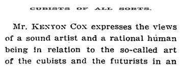
Mr. Kenyon Cox expresses the views of a sound artist and a rational human being in relation to the so-called art of the cubists and the futurists in an interview reported in the Magazine Section of THE SUNDAY TIMES. The cant of these people already fills the air. We all know too well that judgment of their silliness by common-sense methods will not avail to silence them. They may all be arrant humbugs, or some of them may be weak-minded persons who really believe their unintelligible markings and scratches signify something. Mr. Cox. well says:
This is not a sudden disruption or eruption in the history of art. It is the inevitable result of a tendency which has grown stronger and stronger during the last fifty years.
We need not dwell upon this branch of a particularly painful subject. Mr. Cox really says all there is to say about cubist “art.” But it should be borne in mind that this movement is surely a part of the general movement, discernible all over the world, to disrupt and degrade, if not to destroy, not only art, but literature and society, too. There is a kind of insanity extant which had its remote origin, it must be said, in the earlier developments of the democratic spirit. Its kinship to true democracy and to real freedom in thought, action, or expression, however, is slight and indefinite, but the cubists and futurists are own cousins to the anarchists in politics, the poets who defy syntax and decency, and all the would-be destroyers who with the pretense of trying to regenerate the world are really trying to block the wheels of progress in every direction.
There have been cubists and futurists in religion who have made of faith a mockery, that have their counterparts not only in politics but in all forms of art, including music, in the industrial movements and in philanthropy as well. Their only need seems to be that all that is old is bad, all that has been proved is false, all that has been cherished should be destroyed, all that is beautiful should be despised, all that is obvious should be ignored. Their power is wholly negative, they have nothing to replace the things they would exterminate.
They have no true message to impart, but there is no room, nevertheless, to doubt the potency of their appeal to many of the disheartened, embittered, and discontented, as well as the mentally ill-balanced. Of course, they will not destroy art, supplant literature with ribald nonsense, abolish economic law, or permanently retard the growth of nations. But we have no present hope that their influence will not grow and produce evil results. The mirth they cause encourages them, the ridicule they receive actually strengthens them. The only influence that can overcome them is sound education. What the cubist artists show is false art. The reasoning of their brothers in other fields is false. In fighting cubists of all sorts the trustworthy weapon is the truth. [Emphasis added.]
– A New York Times editorial, published March 16, 1913 condemning, among others, Brancusi, Duchamp, Matisse, and Rodin [nytimes.com]
Related: CUBISTS AND FUTURISTS ARE MAKING INSANITY PAY, by Kenyon Cox, National Academy of Art, March 16, 1913 [nyt]
Did You Buy A Copy Of The Richard Prince Deposition Book?
Then please email me if you haven’t already.
greg at greg dot org
Electronic or print, either one. Because I have something for you.
On Size Matters
And speaking of Richard Serra. I can’t figure out how James Meyer’s 2004 Artforum essay on the problematics of size in contemporary sculpture got by me until now. It ends too soon, but it’s pretty great.
Beginning with the overwhelming Tate Turbine Hall pieces by Olafur Eliasson and Anish Kapoor, Meyer retraces the history of sculptural size and scale, and how minimalism’s supposedly non-anthropic form was still keyed to the human viewer’s presence. And how post-minimalist folks like Tony Smith and Richard Serra got into, basically, a size arms race, which manipulated the spatial power and experience of the institution instead of critiquing it or fostering self-aware perception. [I’m collapsing a whole lot here. It’s really worth a read.]
Anyway, I mention it now for two reasons, the first being that Meyer begins his history with the 1940s and Abstract Expressionist murals:
SCALE ENTERS THE DISCUSSION of postwar art within the context of Abstract Expressionism. The development of the mural canvas by the late 1940s introduced a bodily scale into painting–a scale that was variously described as one sustained between the painter and the work and between the viewer and the work; on one hand, a phenomenology of making, and on the other, one of perception. Jackson Pollock famously spoke of his drip method as a means to “literally be in the painting.” Mark Rothko noted that he painted “large pictures … precisely because I want to be very intimate and human.” Mural scale was seen as an antidote to the easel scale of Cubism and Surrealism and the illusionism this embodied. As Pollock observed in the same statement. “The tendency of modern feeling is towards the wall picture or mural.”
Which means postwar sculpture and space becomes yet another aspect of the photomural’s history and influence I have to look into.
The other, bigger [sic] reason, though, is Meyer’s articulation of size-ism and awe-based exhibition experience. His is one of the few strongly argued critiques of otherwise-sacrosanct subjects like Richard Serra’s giant torqued sculptures and the museums that fit it, particularly Dia:Beacon and the Guggenheim Bilbao:
Having demanded and inspired the enlarged spaces that museum directors and trustees find it so necessary to proffer, Serra’s sculpture has become the contemporary museum’s major draw, an attraction of sufficient size and impact.
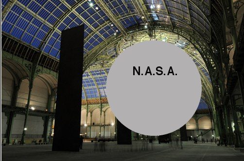
This challenge to the pervasive art world conflation of size, significance, and permanence is basically the context out of which I hatched my own idea to exhibit a Project Echo satelloon in an art space. The problem being, of course, that since all the world’s biggest, newest museums were built to accommodate Richard Serra sculptures, there are less than five venues that could actually show a 100-foot diameter spherical balloon sculpture. They’re just as prone to stylistic and functional obsolescence as a 19th century, fabric-walled salon.
Of course, the real problem is I hadn’t read it, and I really should have.
No more scale: the experience of size in contemporary sculpture, James Meyer, Artforum Summer 2004 [findarticles]