

Maybe I was blinded by the, uh, headlights, but I somehow have not added Richard Prince to the greg.org survey of artists working in the medium of vinyl wrapped car. Dear Mary, 2008, a 1987 Buick Grand National coupe covered in Prince’s biker chick pin-up Girlfriends was shown at Gagosian during Canal Zone.
Dear Mary, 2008 [richardprince.com]
Richard Prince’s Bird Talk
Like, apparently, a lot of folks, particularly writers who are bombarded with awful art press releases, 303 Gallery’s announcement for their current show of Richard Prince paintings came as an atypical surprise. It begins:
303 Gallery is pleased to announce our first exhibition of new works by Richard Prince since 1991.
Some people see leaves falling from a tree and see it as, leaves falling from a tree. Others see it as an inexhaustible mystery of the signified from the mundane closed-off simulation of a world sign.
The world is intolerably dreary. You escape it by seeing and naming what had heretofore been unspeakable.
Naming the unnamable and hearing it named.
These paintings should be shown to the man from Mars.
And it goes on with a refreshing WTF-ness that clearly had to be the artist’s work, not the gallery’s. [That it reminded me of some crypto-poetic, surreal, and increasingly cultish press releases from the early days of the shuttered Daniel Silverstein Gallery only reinforces my impression that Lisa & Mari or whoever did not come up with this stuff.]
What still left me scratching my head, though, was a passage from Richard Prince’s deposition where he totally hates on press releases, even when they’re written well. Patrick Cariou’s lawyer Dan Brooks asked Prince whether he agreed with the press release Gagosian director Louise Neri wrote for Canal Zone [pp293-8 or so]:
DB: But do you find this to be an apt description of your paintings in the Canal Zone exhibition?
MS BART [Gagosian’s attorney]: Objection to form.
RP: It’s not necessarily the way I would have described it had they asked me to write the press release. But I don’t write press releases and I don’t read them.
DB: And this is the first time–
RP: I find them — sorry.
MS. BART: No, you were talking. He interrupted you.
DB: Go ahead.
RP: I find press releases incredibly silly and boring, and I just don’t — I’ve never wanted anything–because they’re really just trying to hype the work. And I don’t particularly like to get involved in that.
DB: And, again, this is the first time you’re seeing this press release?
RP: This is the first time I’m seeing this.
And so I was kind of amazed that Prince would actually write something for a press release. And so I, like a lot of folks, read it and wondered what it all means.
And it means that I, like most people, haven’t read enough of Richard Prince’s writings, because if we had, we’d recognize the press release as excerpts from the artist’s ongoing accumulation of quips, quotes, comments, and Deep Thoughts, which he has termed, “Bird Talk.”
There are a few mentions of it online, and Prince quotes it on his book tumblr, Fulton Ryder, but I can’t yet figure out yet when Bird Talk began. The range of texts, though, shows it to be a living document. One comment about audience [“I would imagine my immediate audience are people just like me. People who are thirty-five.”] sounds like it’s from 1984. A rare book dealer’s catalogue description for a proof of Pynchon’s Gravity’s Rainbow comes from 2003. Most bits sound like Prince’s observations [“Heavy metal is retriabalizing. (sic)”], but there are two [uncredited] Marshall McLuhan quotes, a reference to a 1965 Ad Reinhardt interview with himself, and at least one fantastical speculation [“Vermeer lost over one hundred paintings in a ship wreck.”]
Which means Bird Talk could be seen as a miniature Atlas or Arcades Project on the one [ambitious/generous] hand, or as Prince’s fridge door on the other. Whatever it is, it’s a useful and highly accessible primary source for the artist’s thinking, and even his work [“Rephotography could be a form of re-adjusting sensory bias.”] Which almost no one has ever quoted or discussed; on almost every quote I checked, Prince’s own website was the sole Google result.
Bird Talk [richardprince.com]
Fulton Ryder, Prince’s bookstore/imprint/gallery/tumblr [fultonryder.com]
2010 Prince interview mentions Bird Talk–and the Cariou case [russhmagazine.com]
Sforzian Off Into The Sunset

The first thing I noticed about George W. Bush’s official White House portrait unveiled yesterday was the way he stared off into space. Also in the painting. And the next thing was the painting-in-painting right over his shoulder. It was a western-style painting of men on horseback charging up a hill, and all I remembered about it was that it was Bush’s favorite painting, and that’s why he had it right next to him in the Oval Office.
Well, Christopher Knight has the almost too good to be true story of the painting, which was originally uncoverd by Jacob Weisberg in 2008. The work was commissioned from Wilhelm Heinrich Detlev Koerner in 1916 by the Saturday Evening Post, and it was apparently used to illustrate several entirely different stories over the years before finally acquiring the religious associations Bush fell in love with it for.
Knight goes into exquisite detail on them, but my favorite caption has to be from the painting’s 1917 appearance, “Bandits Move About from Town to Town, Pillaging Whatever They Can Find.” Bush said the posse reminded him of the people who served in his administrations, which, well.
[And if you’re wondering, yes, having Chinese Paint Mill make one is the obvious thing to do, and hell no, I’m still not going to make a near-lifesized portrait of George W. Bush.]
George W. Bush’s unusually frank portrait [latimes, image: Olivier Douliery, MCT via LAT]
Richteriana In The German News
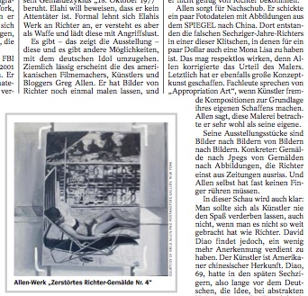
There is a review of Richteriana in this week’s DER SPIEGEL [22/2012]. Google doesn’t do tone, so who really knows, but it sounds alright. There’s not a link or an English version of the Spiegel review yet, but I”ll add them as they appear.
It’s written by Ulrike Knoefel, the art critic whose article about “the separate and secret museum” of destroyed Gerhard Richter paintings provided the impetus [and imagery] for my paintings.
I like that she noted,
Der Hinweis darauf, dass die nicht mehr vorhandenen Richter-Gemälde heute viele Millionen wert wären, brachte Allen dazu aus seinem Werk über Richter auch ein Werk über den Kunstmarkt zu machen.
And of course, then there’s the part about how, “Letzlich hat er ebenfalls große Konzeptkunst geschaffen.”
Mhmm.
If I want my Konzeptkunst to be really große, I may have to go all in, and decide to destroy whichever of the Destroyed Richter Paintings the market doesn’t take. While supplies last.
Trump, Sforza. Sforza, Trump.

Here is Mitt Romney deplaning in Las Vegas, where he met with Gingrich’s bank, and where reality [sic] TV personality Donald Trump is hosting a fundraiser for him.
Suffice it to say, Romney is either actually courting the Trump Birther Faction, or his campaign has yet to master the stagecrafting subtleties of Sforzian backdrops. Either way, it’s win-win for the wire service photographers. [AP via tpm]
Brancusi Self-Portraits
Andy‘s tweet about it reminds me how awesome the show of Brancusi photographs is at Bruce Silverstein. Just remarkable stuff, and great, old prints. The show’s been around a while, and some of the highlights were in MoMA’s show on sculpture and photography a couple of years ago. But still. It is a beautiful show.
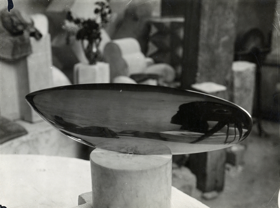
And yes, maybe it’s a bit corny, and maybe photographers roll their eyes at it, but I like the photos where Brancusi includes himself in the composition. The most obvious examples are when he’s shooting a polished bronze sculpture, and he and his camera–and occasionally his flash–are all reflected and distorted in the work itself.
At least two examples are in the Silverstein show: Fish, above, and Bird. Brancusi’s attention to composition and lighting, and to the depiction of his sculptures in three dimensional space–his studio–leads me to see these photos as intentional self-portraits, not inadvertent or unavoidable flaws. They expand the sculpture’s space to include the camera and what/who’s behind it, not just what’s in front of it.

I can’t remember or tell if Brancusi and his appareil are also visible in Prometheus, but it seems like there’s at least one more example, where the artist includes a leg of the tripod in the shot. I may have to see the show again to check.
Brancusi Photos is up through June 23 at Bruce Silverstein Gallery [brucesilverstein.com]
On Gunter Sachs’ Roy Lichtenstein Bathroom
Roy Lichtenstein, Composition, 1969, image via sothebys.com
With the confluence this week of an incredible-sounding retrospective in Chicago and a bonkers-sounding sale at Sotheby’s, I was reminded of one of the weirder things I stumbled across during a dive into Leo Castelli’s papers at the Archives of American Art: the bathtub Roy Lichtenstein was commissioned to make for the St. Moritz penthouse of awesome playboy industrialist collector photographer wackjob Gunter Sachs.
According to a letter Sachs sent to Lichtenstein from Paris on October 3rd, 1968, the two had met in Southampton that summer, and they’d already discussed commissioning some paintings for the soon-to-be-legendary Pop Art penthouse Sachs was constructing in the tower of the Palace Hotel. While Avedon and Warhol were creating portraits of Sachs’ 2nd wife, the then still-smokin’ hot Brigitte Bardot, Lichtenstein was given the bathroom.
Specifically, Sachs wanted him to make some enamel painted panels to go around the tub and sink in the master bath. And he had put together some ideas:
If you permit I would propose that the painting on the large side of the bathing-tub (60×200 cm) should show a girl’s face, perhaps with tears in her eyes, looking at a lake with a swan – a kind of modern Leda. On the little side of the bath (60 x 110 cm) I could very well imagine, e.g., a sunset or a moonset over a calm lake. The painting under the lavatory (60 x 200 cm) could figure a landscape in a thunder-shower. In all these paintings, however, it is very important that you respect accurately the dimensions indicated below in centimeters and inches.
OK, then! Anything else?

Crying Girl, 1964, enamel on steel, via milwaukee art museum
At first I was kind of blown away by Sachs’ audacity to dictate the contents of the images, but then I figured that these were all close enough to subjects Lichtenstein was already doing at the time that it might not be so WTF-ish. [One of the artist’s first attempts at enamel-on-steel production was Crying Girl, a painting produced in a multiple of 5, in 1964.]
Oh, and also, there was this: “As I am obliged to finish the apartment before Christmas, it is very important that I get your paintings till November 2nd, 1968.” And he’d run the deal through Ileana Sonnabend in Paris.
Apparently Castelli, Lichtenstein, and their lawyer all jumped to work, because a contract went back to Paris within the week agreeing to sell one set of drawings and authorizing Sachs to fabricate one single set of enamel panels at his own expense, with payment due in full upon receipt of the drawings.
And then they hustled the drawings to Sachs’ Paris secretary, even though the contract hadn’t come back. And Sachs wasn’t replying to anything at all, and then in December there’s this increasingly testy series of letters demanding payment and signed contracts, which have not been forthcoming, even though the drawings were hurriedly finished and delivered.
“I must tell you that Roy is personally offended by your failure to act,” wrote Lichtenstein’s lawyer Jerald Ordover. A lawsuit was threatened, even though both Leo and Roy found it “most distasteful.”

Leda and the Swan, 1969, enamel, 61x311cm, image: roylichtenstein.org
It’s not clear how, but things must have worked out, because the works exist. And they turned out pretty much just as Sachs ordered them. Leda and the Swan [above] is two steel panels that could fit around a tub. And the sink piece, Composition [top], was actually in the Sotheby’s sale Sachs’ family held this week, a year after Gunter took his own life rather than succumb to what’s believed to have been Alzheimer’s. [It sold for 541,000 GBP.]
UPDATE: Oh, this is interesting. Here’s part of the Sotheby’s catalogue description for Composition:
Lichtenstein, alongside Warhol, sought a pictorial vocabulary embedded in modes of mechanical reproduction. However, unlike Warhol, who pioneered the silkscreen process to transfer his images to canvas, Lichtenstein set out by magnifying and transferring his sketches by hand in a painstaking process that insistently removed all the expressionistic detail of brushwork, further divesting the image of naturalistic representation. Composition, based on Collage for Leda and the Swan, 1968, is a consummate example of Lichtenstein’s Modern Paintings series and of this technique of reproduction.
…
As Lichtenstein played down the idiosyncrasy of the artist’s hand in favour of uninflected surfaces that replicate the look of the machine-made, we are compelled to venerate the movement and melody within this picture’s unique composition. [emphasis added on the parts that are not applicable to this artwork.]
Ah, no. These panels were authorized by Lichtenstein, but fabricated by Sachs. Here’s Gunter: “For the technical execution of your design in enamel I found an excellent German manfuacturer who will be able to transform your painting in a congenial work of Modern Art.”
And here’s the artist’s attorney, Jerald Ordover, writing:
to set forth [Lichtenstein’s] understanding of the terms of your commission to him to create the designs, in the form of working drawings, for the fabrication of three (3) enamel plaques…
…You are to have the plaques made from the drawings at your sole expense.
Which, yes, having them fabricated sight unseen in a German factory from drawings is certainly a process for insistently removing the expressionistic detail of the brushwork that plays down the idiosyncrasy of the artist’s hand. And almost as interesting as the painstaking process by which the auctioneer insistently claims the artist’s hand as a selling point, especially on work where the reason it looks invisible is because it was explicitly absent.
Nov 10, 2011, Lot 225: Collage [sic] for Leda and the Swan, image: sothebys
And the market seems to notice. Last fall Sotheby’s actually sold Collage for Leda and the Swan, a full-scale work on paper for the short end of the tub [60x110cm]. Sachs had apparently gotten rid of it early, because its provenance shows it floated through several dealers’ hands before settling down in 1989. Though called a collage, it looks to me like a straight-up drawing, overflowing with artist’s hand. Which drew pencil lines, then traced them with marker and filled in the rest with acrylic. And it’s signed. So it sold for $446,000.
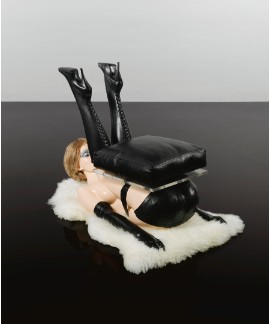
Lot 14: Allen Jones, Chair, ed. 6, est. 30-40,000 GBP, sold for 836,450 GBP [!!]
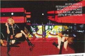
And though I haven’t been able to find installation shots wacked out bondage furniture artist Allen Jones tells Sotheby’s that he saw them in situ:
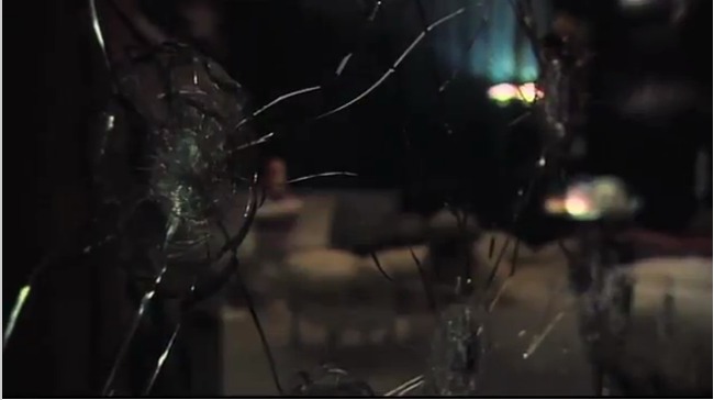
Gunther Sachs invited my wife and me to stay in his penthouse at the Palace Hotel, St Moritz, soon after he had acquired my sculptures. It was the most ritzy place I had ever been in. One wall of the apartment seemed to be entirely glass, with a breathtaking view of the Alps. There were Lichtenstein panels round the bathroom, a flock of Lalanne sheep on the carpet and the set of my sculptures. Giovanni Agnelli was at the party and wanted to stay in the penthouse, but Gunther had said that the Joneses were there. Agnelli, thinking that he meant my sculptures, said “don’t worry, I won’t touch them!” Prominent in the apartment was a large, bullet-proof glass panel with one side splintered in several places. Gunther used to stand behind the glass and invite close friends to shoot him. Their names were inscribed on a plaque next to the glass.
Hahwwhawaitwhaa? Are you kidding me? Where is this bulletproof glass panel and plaque now? Because THAT is what I want to buy.
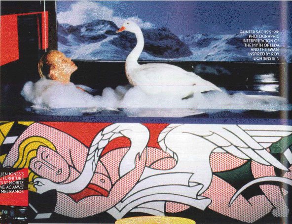
UPDATE UPDATE: OK, maybe my problem is I gave up searching for photos before the Sachs auction. Because in a preview article for the sale, British Vogue ran a 1991 photo by Sachs, of a Leda and a swan in the tub. I didn’t realize the Lichtenstein panels went around the base of the tub; I thought they were backsplash-type deals. But with those views, well.
Also, Vogue gushes about “Roy Lichtenstein kitchen-unit fascias and bath panels,” which what? I guess the delay in payment wasn’t a fatal blow to their friendship, or maybe Sachs commissioned a kitchen from the artist as a make-up. Or maybe a bar, because who needs a kitchen, it’s the Palace Hotel, and this bar in the S&M living room looks very Deco-era Roy to me.
And finally, Vogue doesn’t mention a plaque, but does say that guests who shot at Sachs would autograph their bullet hole. And if these aren’t bullet holes made by the glitterati of Cold War Europe, then why are they in Sotheby’s promo video?
Jasper Johns Making Silkscreens, By Katy Martin
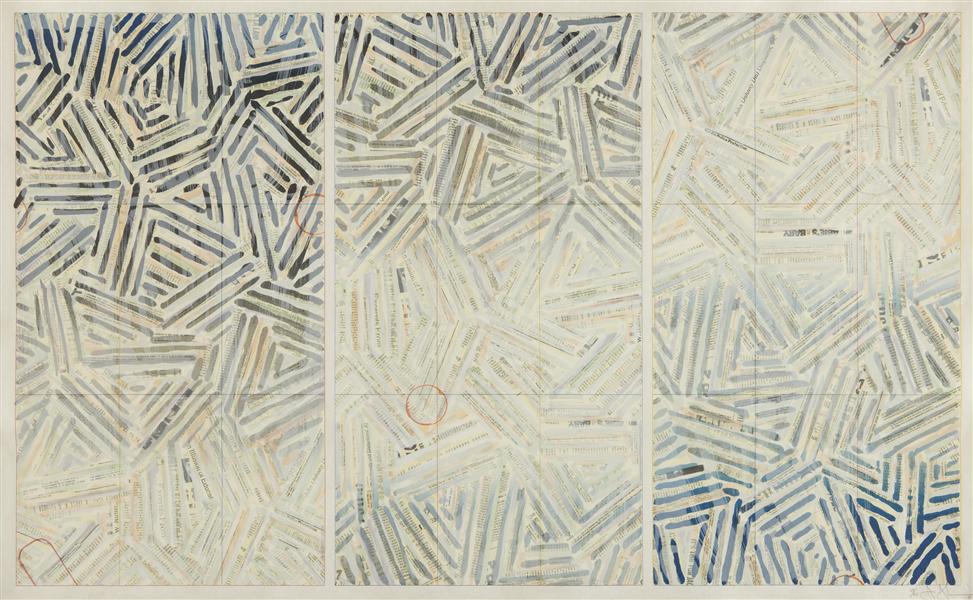
Usuyuki, 1981
Alright, Katy Martin, who made two incredible Jasper Johns films in the late 1970s when you were practically a kid. Uh, actually, yeah, that’s about it. Just watch them.
Harvard’s Sackler Museum just opened a show yesterday, “Jasper Johns/ In Print: The Crosshatch Works and The Logic Of Print,” which features several complex, multi-screen prints Johns made in 1977-80 at Simca Print Artists in New York. Martin’s Super 8mm films documenting the making of are included in the exhibition.
Silkscreens (1978) is a hypnotic performance film showing the printers’ rhythmic routines as they create the 27-screen print, The Dutch Wives (1978).
On her website, Martin mentions folks like Yvonne Rainer, which makes sense, but Silkscreens also makes me think of the 1974 film Humain, Trop Humain, if Louis Malle had shot it in an cramped printing studio instead of a Citroen factory. Great stuff, and with a great, remixed, found/ambient soundtrack by Richard Teitelbaum, which, according to folks who know, like @JohnPyper, would drive actual printers crazy.
The other, longer film, Hanafuda/Jasper Johns (1977-81), combines footage of Johns himself working on two print editions, Usuyuki and Cicada, with audio excerpts of his interview with Martin. Johns kept complicating my notion of silkscreening as a very photomechanical process by repeatedly and extensively painting right onto the screen.
Whether it’s calculated or sincere, Martin’s unassuming questions seem very effective at getting Johns to talk. And after getting so much out of him, my favorite question is the last one, which is only in the published transcript, and which he tries, too late, not to answer:
KM: And then I wanted to talk something about meaning but
JJ: About what?
KM: Meaning. In the work. But I wasn’t sure how far to go with that. But I can’t help thinking about meaning to some degree.
JJ: Well, you mean meaning of images? I don’t like to get involved in that because I–any more than I’ve done–I tend to like to leave that free…. The problem with ideas ís, the idea is often simply a way to focus your interest in making a work. The work isn’t necessarily, I think-a function of the work is not to express the idea…. The idea focuses your attention in a certain way that helps you to do the work.
Richteriana In The News
I find the maxim of not reading reviews of one’s work to be much easier to live by when there are no reviews.
Because at least two takes on Richteriana have already been published, and I like the concept. It’s reassuring but also a but unsettling. And then a little invigorating, to encounter other peoples’ takes on your ideas.
In the Village Voice, James Hannaham called the Destroyed Richter Paintings “outlandish,” which I took to be a good sign, even though I wouldn’t–you know what, no, let’s just let it hang out there:
While partially homage, this work invades the great man’s privacy on at least two levels: first, by showing us images he apparently didn’t want anyone to see, and second, by co-opting and outsourcing his technique.
While I don’t think that’s literally true, the invasion of privacy part, I do think Hannaham is right to find an uneasiness in the images, not just whether they should exist, but whether they do or don’t, and if so, how?
And also Jane Hu did a lot of context work on Richter, his art, his history, his control issues, and the larger Richter and Art Industrial Complexes themselves:
[T]he artist has destroyed or painted over many past works, in order, presumably, to maintain a narrative about his artistic trajectory that satisfies his present sense as a painter. Richter knows as well as anyone that art history traffics in selling a story, as much as it does in telling an image. While the first half of his career produced paintings that tried to approximate photographic realism, he later increasingly turned to abstraction. And in doing so, no matter what other aesthetic reasons he may have had, Richter not only has revised his own biography, but those of his paintings as well.
Her discussion of David Diao’s work Synecdoche, is particularly sharp. On its own, David’s painting is amazing, but his wresting control of a vintage Benjamin Buchloh Artforum exhibition catalogue [whoops, 2nd time I’ve made that mistake. -ed] essay is a blunt and powerful and unsettling gesture.
The more I look at Synecdoche, the more it feels like the most important argument in the show.
Richard Artschwager Chair Picture, 1965 Or So
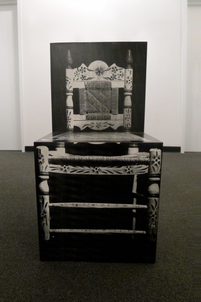
Well that’s mighty interesting. The National Exemplar has an exhibition of Richard Artschwager, which includes this 1965 piece, described as a “three-dimensional ‘chair picture.'” It’s roughly chair-size, and with materials of acrylic and paper and wood, I’m going to say it’s photographic.
What does seem clear, though, is that it was actually [re?]fabricated in 2000 as an edition of 6. And that Artschwager showed this OG Chair along with several related, newer works, at his first show at Gagosian in 2002. Oh hey, and one sold at Bonhams last February for £30,000. [first found via abelow’s artblog artblog]
At A Loss To Explain
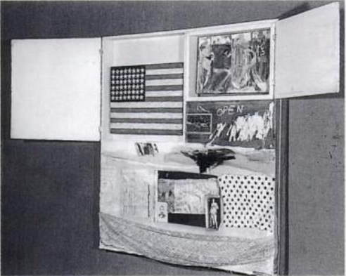
The first thing that was blowing my mind about Short Circuit was not just, how could there have be a Johns Flag before the first [sic] Johns Flag, but how could there be a missing Johns Flag? I mean, seriously, wouldn’t that be rank just below the Gardner Vermeer in terms of stolen art? How could it be missing and the entire art world not have its eye out for it?
In fact, it’s just the opposite situation, where, when they’re not ignored completely, the stories of Short Circuit and its flag painting are misunderstood, misrepresented, and relegated to footnotes. It just didn’t make any sense.
But it also seemed that as long as Short Circuit was ensconced in Rauschenberg’s own collection, and Sturtevant’s replacement flag was in place, no one had ever undertaken an actual search for it, or an investigation into what had happened.
And given the nature and history of the relationship between Johns and Rauschenberg, and the extraordinary custody agreement they reached, which Johns wrote about in 1962, to never show, reproduce, or sell Short Circuit, it’s always been an open question to me whether the flag was actually ever “stolen,” or whether it was just missing. Or removed. Or disappeared [in either the transitive or intransitive sense of the word.]
The question I ended my first Short Circuit post with 18 months ago, which should have been the easiest question to answer, turned out to be one of the most complicated: Was the Short Circuit flag ever registered as stolen?
The first and shortest answer was no.
An Intentionally Incomplete Inventory of Pictures: Richter’s Bilderverzeichnis
Photograph of a painting destroyed by Gerhard Richter, Gerhard Richter Archiv via Spiegel
Since I first started looking into them, I’ve wanted to know why Gerhard Richter destroyed some of his paintings. Because, of course, some of them weren’t “destroyed” destroyed, but just painted over, with their previous state being technically defined as a momentary completion, not a work in process. There are only a few like that in the Catalogue Raisonné, though; most of the works listed as “Destroyed” are presumably actually destroyed.
But at least they all got Catalogue Raisonné numbers. Ulrike Knöfel wrote about a different category of destroyed Richters, largely undiscussed and unseen, which were destroyed before the artist began his catalogue raisonné, and which thus, with maybe one exception, don’t have a CR number, and are thus excluded from Richter’s declared oeuvre. Even if they were authentically created by Richter, and shown in exhibitions, and offered for sale.
As Dietmar Elger points out in his biography of Richter, A Life In Painting, Richter actually conceives of the Catalogue Raisonné as a work of art in itself, one which, like Atlas, is still in process.
I recently met with Dr. Elger during a trip to New York, and we spoke about these dynamics of creation, destruction, recognition, and archiving as they play out in Richter’s practice. Elger runs the Gerhard Richter Archiv at the Staatlichen Kunstsammlungen Dresden, and maintains the Catalogue Raisonné, so he has a seat at the table for much of this history. After a brief fanboy prelude, in which he signed my book [and my copy of the Felix Gonzalez-Torres catalogue raisonne which he was also involved in], we got to talking. [We met for information, not as an actual interview, so I didn’t take notes or record our conversation, and I won’t directly attribute quotes, but just try to capture my recollections.]
Continue reading “An Intentionally Incomplete Inventory of Pictures: Richter’s Bilderverzeichnis”
Painting Truth To Power

Ooh, that is interesting. By covering themselves in paint, members of Occupy Frankfurt effectively inverted the crowd control technique where police use dye cannons to disperse protesters–and to tag them for easier identification and roundup later. Nice to see that painting’s only detained, not dead. I wonder if this kind of painting project happens every May?

Police spraying protesters in Kampala, Uganda, May 10, 2011 [image james akena/reuters via cfr.org]
Occupy Frankfurt protestor and German riot police photographed by Kai Pfaffenbach for Reuters [via boingboing]
Previously: May 16th: Police Action Painting
Color The Tom Sachs Way
While everyone else is cavorting on Tom Sachs Mars, I’m home, watching this rather entertainingly deadpan documentary short about the approved color palette in Sachs’ studio. I imagine it to be a highlight of the new assistant orientation seminar.
COLOR. By Tom Sachs [and film by Van Neistat [youtube]
‘Where Their Fakeness Is Self-Evident And Salable’
While trying not to steal his thunder, let me just post the awesomely vivid ending to LA Times architecture critic Christopher Hawthorne’s review of Williams + Tsien’s unavoidably flawed Philadelphia museum building now housing the art-centered educational institution known as The Barnes Foundation:
Imagine if the Barnes trustees, in the name of improved access to a supremely great but historically cloistered collection, had declared they were going to produce replicas of its paintings by Matisse, Picasso, Modigliani and Van Gogh and hang those in a new building on the parkway.
The howls of protest would have been loud and immediate. The idea wouldn’t have lasted five minutes.
And yet the notion persists that re-creating buildings is somehow more reasonable or at least less obvious and that new rooms can be made to impersonate old ones without much aesthetic risk. That copies of paintings belong in gift shops and on refrigerators, where their fakeness is self-evident and salable, while copies of buildings can go blithely along pretending to be real. That architecture somehow is different.
Memo from Philadelphia: It’s not. [Emphasis added for awesomeness.]
I got a million and 99 problems with The Barnes Foundation, but copying ain’t one. Barnes’s spaces and installations are geared entirely around the pedagogical system of close looking and cross-referencing which he oversaw. Which makes for a suboptimal museum because it was supposed to be a non-museum by design.
Meanwhile, I love that this fakeness all happens next door to the Rodin Museum, which is full of copies, thereby blithely refuting Hawthorne’s analogy without making it any less valid.
Architecture review: A poor replica of Barnes Foundation museum [latimes]