

Mondo Patrick tipped me off to this a little while back, and for a while there, it was kind of turning my table world upside-down.

It’s an autoprogettazione table by Enzo Mari, of course, model 1123 xE, one of the most picnic tabliest of them all, made from the original 1970s precut wood kids produced by Simon Gavina.
It was really tempting, but ultimately the condition issues–there were some split and badly repaired wood pieces on one side which would probably mean losing some of the original wood–and really, the shipping from somewhere outside Torino to, wherever really, where am I going to put a second table project on no notice? And maybe if I could wait for the euro to collapse it’d make financial sense, but–anyway, I passed on it.
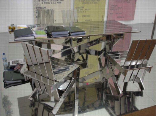
That hammered, golden patina still shines in my dreams, though. Let’s watch the European auctions for a while and see if this bad boy reappears. Meanwhile, I still have this image of Rirkrit’s chrome ghost of 1123 xE to keep me company.
But Is It Art? c. MoMA 1936
The story of Constantin Brancusi’s Bird in Space getting hung up at US Customs in 1926, which did not believe it was a work of art, is well-known. [Just for fun, here’s a story about Richard Feigen smuggling a Brancusi out of India by claiming it was a brass lamp.]
What I did not know, though, was that Customs not only didn’t learn its lesson from the Brancusi situation, it kept on flagging sculpture it didn’t believe to be “art,” and even seems to have picked up the pace.
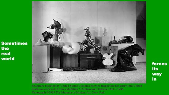
image via moma
You’ll never guess how I found it, but I stumbled across this photo from MoMA, which was included in Fred Wilson’s 1999 archive-diving online project for The Museum As Muse titled, Road To Victory. The site is still active and interesting, even if it does feel a bit quaint and low-res.
Anyway, it shows a veritable boatload of artwork, imported by the Modern for its 1936 exhibition, “Cubism and Abstract Art,” which, the caption says, was “rejected by the United States Customs Service Inspectors for entry into the United States as works of art.”
I mean, help a brother out here: Arp, Arp, Boccioni, Boccioni, Duchamp-Villon? Who else you got?
We’ll talk about the art handling issue after I get back from lunch.
UPDATE Well, consider that can of worms opened. There turns out to be a whole history of cases where the definition of art runs afoul of customs agents. Cubism and Abstract Art, the show and the genres, were just some of the first.
According to the NY Times, 19 sculptures out of 150 were refused duty-free entry under what abstractionists complained was a post-Brancusian reversion to a 1916 Treasury Department rule that required sculpture–but not paintings–to be “imitations of natural objects…chiefly the human form.”
This strict interpretation forced the Modern to delay the opening of the exhibit for a week and to post a $100,000 bond to release the works. I’ll post the full list of snagged works after the jump. The incident prompted Museum president A. Conger Goodyear to rally 100 museums around the country in a letter-writing campaign to have the US customs laws amended. His plan, eminently reasonable-sounding at the time, I’m sure, what could ever go wrong, was “to permit recognized museums to decide what art is.” The article concludes with a quote Fred Wilson also used:
The issue in which the Museum of Modern Art and all similar institutions are really interested is whether the government is to determine by law what is art. In this instance there is no question as to the ‘moral’ character of the objects under consideration. They are denied admission, duty free, on the sole ground that they do not completely meet the requirements established by the existing law and court decisions for ‘works of art.’ The judgment of acknowledged experts is given no weight or consideration.
We believe the act of Congress which makes this situation possible must be amended.
Cubist Art fails to get past Customs [Feb. 22, 1936, NY Times]
UPDATE UPDATE Long and short of it, it’s not clear whether the 1916 ruling was really at issue, or whether it was the 1930 Smoot-Hawley Tariff Act, which raised protectionist tariffs against wide swaths of imported goods, that contained the inadvertent language. But remarkably, the abstract art tariff discrimination continued for more than twenty years. There’s a NYT story from 1958 about Sen. Jacob Javits introducing legislation to modernize the language of the Customs art rule.
Basically, sculpture could be any material, but it had to depict “natural objects…in their true proportion of length, breadth and thickness,” which meant it tripped up African carvings, too. Painting could be anything, as long as it was “traditional materials,” which was ruled to exclude mosaic and collage or assemblage.
The Times reported that collector Donald Peters protested when his $450 1956 Alberto Burri collage was taxed 20% duty as “a manufacture of vegetable fibres” because “it had a background of burlap.” If it was “vegetable matter,” Peters argued, then it was only worth $1, “and the Government was entitled to 20 cents. Mr. Peters lost the argument.”
Which almost exactly mirrors the VAT shenanigans perpetrated by EU bureaucrats last year when they ruled that video artworks were actually electronic equipment, not art, and were thus subject to a higher VAT–but on the artwork’s price level, not the underlying hardware’s. And so it goes.
[Just as an aside, Sen. Javits: kind of a schlub? His wife? Smokin’. What was up with that?]
Swedish Splinter Camo And The New Aesthetic

“K32 HMS Helsingborg Anchored off Gotska Sandoen, cropped,” wikipedia via tna
Every time I go back to James Bridle’s tumblr The New Aesthetic, I’m like, “The New Aesthetic! I’m soaking in it!” and remind myself to visit more often.
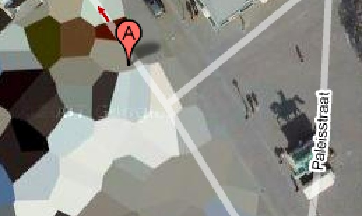
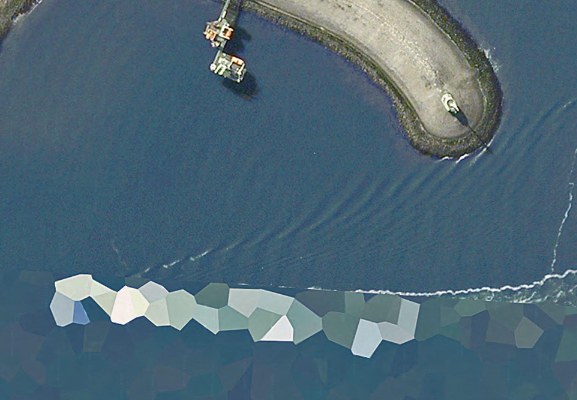
For example, an awesome roundup of splinter-style camo which bears a striking resemblance to the polygonal camo applied to intelligence-sensitive sites on Dutch Google Maps [above, below] which I’ve been tracking–and promising myself I’d paint–for, hey, look at that, exactly two years now!
Anyway, Sweden in particular is still keeping the polygon faith, with their M/90 camo pattern, much sought after by paintball aficionados.
The image above is of a Swedish naval vessel, the new K32 HMS Helsingborg corvette, delivered in December 2009. I know the dates don’t match up, but it sure looks like this ship Google photographed pulling into a Dutch naval base in 2006:
Gerhard Richter Strip Show
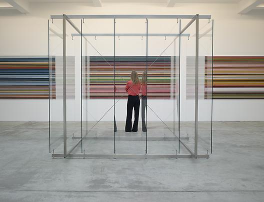
Gerhard Richter: Peinture 2010-2011, installation view, Marian Goodman Paris, image via
Yes, well.
While everyone is transfixed with Gerhard Richter’s c. 2009 on-camera squeegee technique, the artist himself has moved on to a schmear of the digital kind.
Gerhard Richter: Paintings 2010-2011 is on right now at Marian Goodman Paris, and most of the work on view barely seems to meet the promise of the show’s title. There is a large glass plate structure at the center of the gallery, and there are some small poured-paint-on-glass works. And then there’s the Strip series, unique digital prints mounted under Perspex.
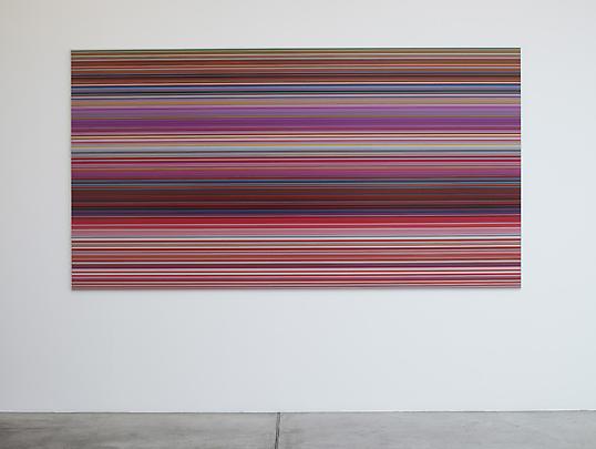
To make Strip, Richter digitally mirrored/extruded vertical slices of an abstract painting–here, the description for the project’s artist book, Gerhard Richter: Patterns. Divided – Mirrored – Repeated explains it better:
The artist’s book documents Gerhard Richter’s experiment of taking an image of his original Abstract Painting [CR: 724-4] and dividing it vertically into strips: first 2, then 4, 8, 16, 32, 64, 128, 256, 512, 1024, 2048, up to 4096 strips. This process (twelve stages of division) results in 8190 strips, each of which is the height of the original image. With each stage of division the strips become progressively thinner (a strip of the 12th division is 0.08 mm). Endless more divisions are possible, but they would soon only become visible by enlargement. Each strip is then mirrored and repeated, which results in patterns. The number of repetitions increases with each stage of division in order to make patterns of consistent size.
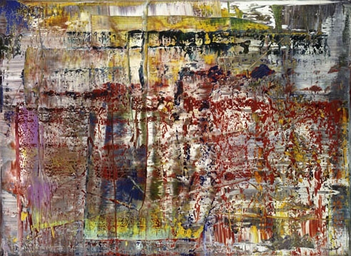
Abstract Painting, CR:724-4, 1990, via gerhard-richter.com
The 520 page [!], EUR450 book documents 221 of these repeated patterns. Marian Goodman’s showing six. At first I expected the Strip works to be the same dimensions as 724-4 (92x126cm), but no, not at all; the Strips are much bigger, 160x300cm.
Buchloh is, as always, agog at the import and implications. An excerpt from a book-length essay as quoted in the gallery’s press release:
The status of painting in these new works is figured as exceptionally fragile, yet it is powerfully formulated in its assimilation to its technological challenges, as though painting was once again on the wane under the impact of technological innovations. Yet in its application of almost Duchampian strategies of fusing technology and extremely refined critical pictorial reflection, Richter’s astonishing new works open a new horizon of questions. These might concern the present functions of any pictorial project that does not want to operate in regression to painting’s past, but that wants to confront the destruction of painterly experiences with the very practice of painting as radical opposition to technology’s totalizing claims, and as manifest act of mourning the losses painting is served under the aegis of digital culture.
Mm-hmm. Richter has been working with photos of paintings and photos of overpainted photos for some time, so on the one hand, there is internal context for the artist’s pixel-width extrusions.
But the horizon of questions Richter’s new works open is only new if you’ve never left the studio. And how could painting, after all Richter’s work over all these years, still have it so rough? If we agree–and we have, cf., Liz Deschenes, Walead Beshty, Cory Arcangel, Tom Friedman (even), Andreas Gursky–that the aegis of painting has long since expanded in the digital culture, then can’t we welcome Richter to the party without pretending he threw it?

Tom Friedman, Untitled, 1998, image via metmuseum.org
Gerhard Richter: Peinture 2010-2011, through Nov. 3 [mariangoodman]
Same thing, documented work by work on the artist’s site [gerhard-richter]
Off The Golden Record
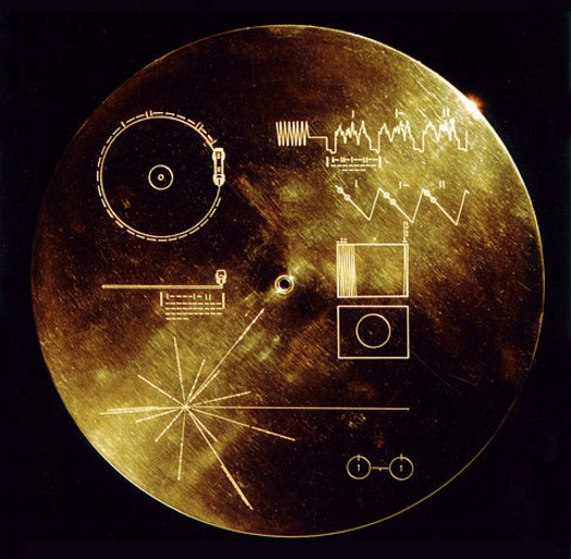
I was stoked to see [thanks to Paul’s link from the Walker’s Off Center] that Trevor Paglen included Murmurs of Earth on the reading list he shared with art21. The book is the authoritative account of the making of the Golden Record, the galactic greeting devised by a committee led by Carl Sagan and attached to the Voyager 1 and 2 space probes launched in 1977.
Designed to last a billion years in the vacuum of space, the gold-plated copper records each contain messages and information about life on Earth for whomever might come across the spaceships, which left the solar system in 2008. The disc includes messages from President Jimmy Carter and UN Secretary General Kurt Waldheim; greetings recorded in 55 languages; nature sounds; and 90 minutes of music [plus one unauthorized, scrawled greeting from the recording tech]. It also includes 116 images, in both black and white and color. The cover includes a map to Earth and instructions for playing the disc. It also includes a stylus.
Which is all great. But what I love most, beside the disc itself, which is gorgeous, is the fact that the images are all recorded in analogue. The upper right quadrant of the cover explains how to decode the rasterized data, one line at a time, into a 512-line image. Color images are encoded three times, in RGB, for reassembly.

The images themselves are mostly information, science, nature, not art, except in the largest sense, that the entire, inspiring folly, a golden object made in a bid for connecting across time, is an artistic project. Or as Carter put it:
This is a present from a small, distant world, a token of our sounds, our science, our images, our music, our thoughts and our feelings. We are attempting to survive our time so we may live into yours.
And there are a few images which aspire for aesthetic distinction, like Wayne Miller’s photo of his own child being born [above], which was included in Family of Man, the landmark photo exhibition Miller curated with Edward Steichen at MoMA.
For my money, though, you can’t beat the idea itself; I wonder how these objects, and how this content would be received. As objects, machines, sounds, images. I want to output the images from the disk and see what they turn out like. Maybe make some prints, even. Truth be told, I want a Golden Record of my own.
So far, I haven’t found one. You have to imagine that NASA didn’t take delivery of all the copies, did they? Aren’t there a few hanging around in the libraries or attics of Sagan’s committee members? Has there ever been a facsimile edition? [I think not.] Don’t you think there should be? [Yes.]
Copyright holders for recordings and images on the disc had originally only given permission for playback outside the solar system [seriously]. But after many years of negotiation, Sagan also managed to clear all the music and all but one image for a CD-ROM, which accompanied a 1992 reissue of Murmurs of Earth.
And so it goes that the US intellectual property industry somehow managed to outcrazy the idea of communicating with extraterrestrials by sending records into outer space. Nice hustle, fellas.
Inspired Reading | Trevor Paglen [art21.org]
Voyager Golden Record [wikipedia]
“Please note that these images are copyright protected. Reproduction without permission of the copyright holder is prohibited.” [nasa.gov]
Buy Murmurs of Earth in some format [amazon]
goldenrecord.org shows all 116 images [goldenrecord.org]
Look Into The Teleprompter
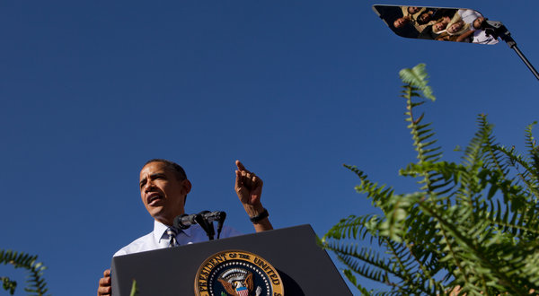
Ooh, this is nice. I can’t remember seeing a White House photographer use a teleprompter to pick up a crowd like this before. Carry on, Stephen Crowley of The New York Times!
Not that Mr. Crowley’s colleagues didn’t find some classically Sforzian shots there at Denver’s Abraham Lincoln High School. The full banner said “Lincoln Lancers.” Which may let the photographers feel like they’ve “discovered” this angle. It’s a lower-key, but no less programmatic Sforzianism.

[via Getty/daylife]
What I Looked At Today: Gerald Murphy
Sometimes I really just am slow to put things together. I mean, I’ve written at length, ad nauseam, even, about the history of Mark Cross. Mondo-Blogo had a huge post months ago about what Superfreaks they are. There’s the whole F. Scott Fitzgerald thing. [Which, truth be told, is probably why I’ve willfully ignored them so long.]
But it’s only now, while reading Calvin Tomkins’ 1962 New Yorker profile on Gerald and Sara Murphy [thanks @maudnewton!] that I’ve taken a first, real look at Gerald Murphy’s paintings.
Well, that, and the fact that MoMA actually has their Murphy, Wasp and Pear, on view for the first time in years. It’s certainly the first time I’ve ever remembered seeing it.
The Murphys fled their uptight, US, 1920s socialite life for France, where they proceeded to invent some combination of summer, the Riviera, and modernism. Under the initial tutelage of Diaghilev designer Nina Goncharova, Gerald took up painting alongside his friends Picasso, Braque, Man Ray, Picabia, and Leger. He stuck with it for seven intense years, then abandoned it completely when his son came down with tuberculosis. Tomkins quotes him as saying that discussions with Picasso led him to realize “I was not going to be first rate, and I couldn’t stand second-rate painting.”
Which, wow, just does not make sense. It sounds like ex post facto rationalization, or dealing with grief over his son’s death, or something but it completely ignores the fact that Picasso himself was often second-rate. I think you just never know until you do. And maybe Murphy did, and knew, but still.
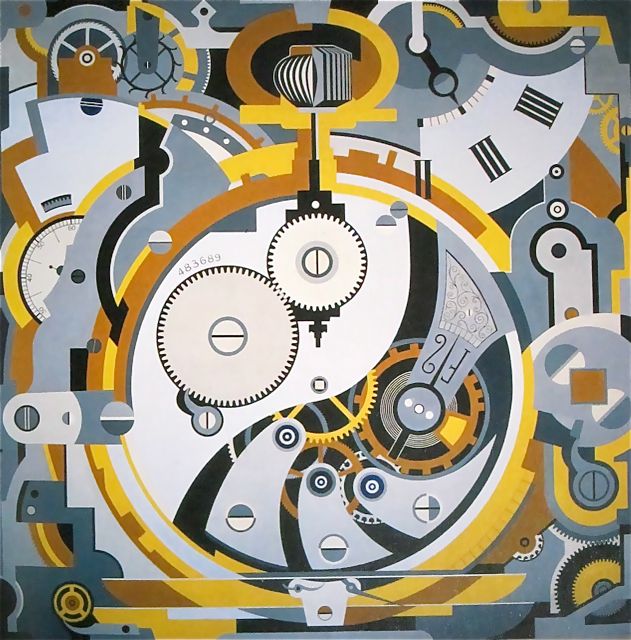
The few paintings that survive [8?] of the few he made [14?] are all pretty great. The Dallas Museum has several, including Watch (1925), an amazing precisionist abstraction that measures an awe-inspiring 6×6 feet. No Sunday painting there.
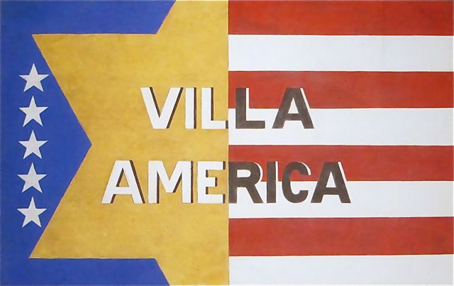
I’m waiting for the catalogue from the DMA’s 2008 ominously subtitled show, Making It New: The Art and Style of Gerald and Sara Murphy. Which better have photos of Villa America, the Murphys’ pioneering modernist-ized outpost in Cap d’Antibes referred to in my favorite extant Murphy painting [top].
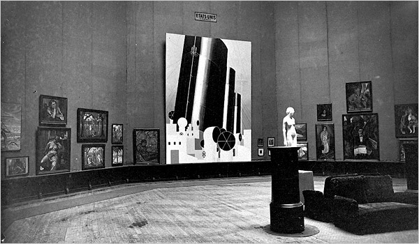
And which also better have more info and more photos of what is now my favorite missing Murphy, Boatdeck: Cunarder, an 18×12-ft masterpiece which took over nearly the entire American section of the 1924 Salon des Independants. Seriously, what Modern was painting 18 feet high in 1923? That is just nuts.
[update: MacAgy originally had Cunarder in the title, and the painting was originally reported to be based on the Aquitania, but Rubin says Murphy said it was the Olympic and the Paris]
This Week In Revolutionary Twitter Juxtapositions
I need a way to put the people in my Twitter feed in touch with each other.

Because what are we fighting for, if not the right to all 50 flavors of Doritos?
Hopping MAD
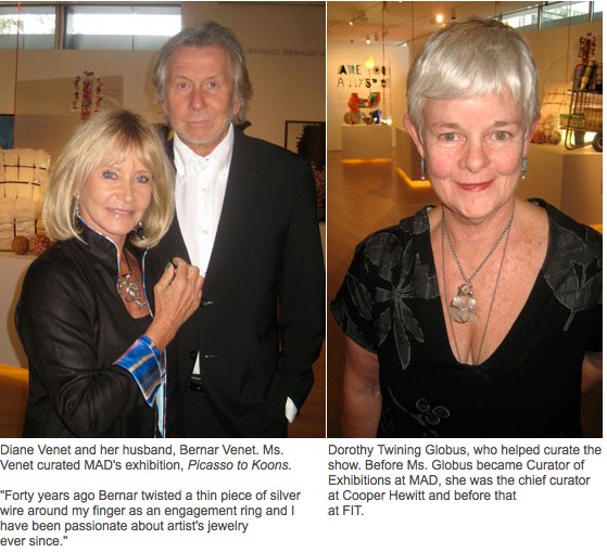
No disrespect for DPC and whoever else he sends off with The Digital, but Jill Krementz’ photoreport from the Picasso to Koons: Artist as Jeweler show at the Museum of Arts and Design, or the MAD1 is the mad-funniest thing I’ve ever seen on New York Social Diary.
First, the concept for the show, in the words of Mrs Barbara Tober, head of the museum’s Global Initiative:
“Eight years ago my husband and I were visiting Diane Venet and her husband [noted traffic circle and corporate plaza sculpture artist Bernar Venet] in France. Diane said, ‘I have a dream. I want to organize a show of jewelry by all the important artists of the 20th century.’ And so now you can see over 200 pieces of jewelry by 20th-century artists. Her dream has been realized.”
Make that “all the important artists of the 20th century–and Lexus Burning Man hack Arne Quinze.”
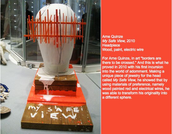
“he was able to transform his originality into a different sphere.”
The packed crowd looks to be exactly who you’d expect to see at an artist as jeweler show: Upper East Siders who can only afford five figure jewelry. They also happen to be exactly the people who you’d never in a million years expect to see on the West Side. So kudos to the Museum for luring them all the way across smelly Central Park South!
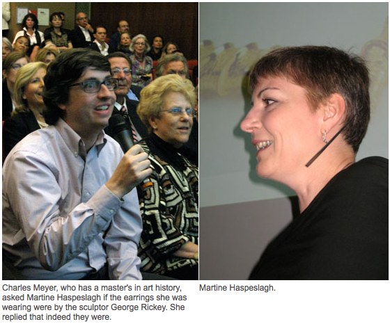
This diptych from a curatorial Q&A is the best but my no means only example of Krementz’s exquisite composition and captioning craft. She really is The Economist of society websites.
But Krementz only keeps the confusion alive over these otherwise awesome enough bunny necklaces, introduced by Jeff Koons for Stella McCartney in 2005 [and apparently not sold out until 2009? Is that what those dates mean?]

It’s been described both ways over the years, and you can’t trust a blog any more than you can the press release it regurgitates, so it’s never been clear to me whether these bunnies are platinum or white gold. Or maybe there are editions of each. One of which was $50,000. Assuming you paid retail, of course.
Someone was wearing one of these in a party pic recently. Where was that? The New Museum, probably.
1 Can’t we all just admit that the Museum of Arts and Design only forefronted its inferiority complex by changing its name just as the craft boom took off, and that they really should fly its craft flag high, and just come out as the MAC?
Cast Out First The Economic Terrorist Beam That Is In Thine Own Eye
From a NY Times article about a gay activist’s petition for Microsoft to stop participating in an online affiliate sales company CGBG, which earns revenue for anti-gay groups like Focus on the Family:
“This is economic terrorism,” said Mike Huckabee, the former pastor, governor and presidential contender, who is a paid CGBG consultant. “To try to destroy a business because you don’t like some of the customers is, to me, unbelievably un-American,” he said in an interview.
From SFGate, Dec. 6, 2005:
Christian group pulls Wells Fargo accounts / Focus on the Family objects to donation to gay rights group
“We don’t expect corporate America to do our bidding on the issues, but when they use the proceeds from our business and give them to others who clobber us over the head, we say enough is enough,” said Tom Minnery, who oversees public policy for the organization.
Focus on the Family’s move follows a recent spate of conservative boycotts and other actions against large companies that support gay and lesbian causes, including Walgreens drugstores and Kraft Foods Inc., both of which contributed to the Gay Games.
Conservative groups also have targeted Ford Motor Co. for advertising in gay media and Procter & Gamble for advertising during the television shows “Will & Grace” and “Queer Eye for the Straight Guy.” The best-known protest may have been the nine-year boycott led by the Southern Baptist Convention against Walt Disney Co. for hosting Gay Days, a week of gay-themed activities at Walt Disney World in Orlando. That boycott ended in June.
From a 2005 Orlando Sentinel article on the Kraft, Proctor & Gamble and Disney boycotts:
As more companies adopt gay-friendly business policies, they risk the wrath of conservative Christian groups prepared to take action with their collective buying power.
“People are willing to fight back with their pocketbooks,” says Tim Wildmon, president of the Tupelo, Miss.-based American Family Association, a conservative group that has boycotted such companies.
HUNK
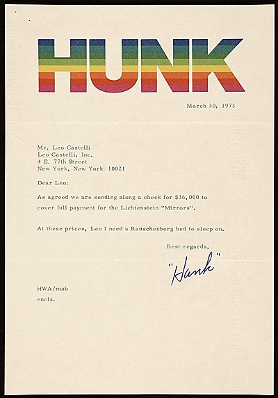
San Francisco collector Harry “Hunk” Anderson’s 1973 letter to Leo Castelli is now in the Archives of American Art. I am going to take a wild guess and say that his awesome letterhead was designed by his good friend Ellsworth Kelly. Which would be awesome. I wonder if Moo got some, too.
UPDATE: Awesome, but incorrect. While Kelly’s Spectrum paintings may have been one of the references or inspirations, a quick email to the folks at the Anderson Collection finds that Palo Alto graphic designer Sam Smidt created the awesome letterheads for Hunk–and Moo, too.
And now we know.
Harry Anderson letter to Leo Castelli, 1973 Mar. 30 [aaa.si.edu via letterheady]
About the Anderson Collection [aacollection]
Previously: What I Looked At Today: Ellsworth Kelly’s Writing]
Eyeballed Autoprogettazione

Toronto-based designer Maté Szemeredy didn’t have the plans to make Enzo Mari’s Autoprogettazione Square Table, so he eyeballed it, based on online photos and published dimensions of finished tables. I’d say he got pretty damn close–those crosspieces may be inside-out and upside down, or maybe they just look cleaner that way–and he got a pretty sweet finish. And all in just two days, too. Nice.
Enzo Mari Autoprogettazione photoset by Datum-Datum [flickr]
Szemeredy’s blog, Things Take Time
The Until The End Of The World Is Nigh
I’m going to assume you’re as freaked out as I am that neuroscientists at UC Berkeley have constructed video from the brain activity of what someone is seeing. Gizmodo has a bit longer explanation of the research, and here’s a making of video, but basically it involves mapping the brain into voxels [volumetric pixels], and monitoring activity across the brain with an fMRI scanner while the person watches video, and then reverse engineering the imagery from the voxellated activity. Once a database of visual/voxel connections was created, they could replicate the process with new video.
And so now they can see the images inside your head.
Which is all freaky enough–even if it didn’t end up looking exactly like Wim Wenders said it would, twenty years ago. BUT IT DOES.
Wenders’ 1991 film, Until The End Of The World is set in 1999, where a neuroscientist’s son [William Hurt] is being chased around the world as he records the neural record of images with a secret device that will enable his blind mother to play them back, and thereby see again. After all the electronics in the world are wiped out by the EMP blast from nuking a renegade satellite that’s about to crash into the earth [holy crap, people], the neuroscientist [Max von Sydow] converts the device to read dreams. And then moody, overwrought German actresses [Solveig Dommartin] become addicted to watching their dreams until the batteries run out. Because seriously, who could have predicted the iPad’s amazing battery performance, amiright?

Anyway, Until The End Of The World was the first film to use HD, for the dream sequences, which were developed with NHK. And this is what they look like.

Here’s the Dream Junky scene on Vimeo, taken from the original theatrical cut.
Wenders was never satisfied with the 158-minute version released in the US, which he had cut down from a “definitive,” 280-minute, director’s cut. In 2001, the director revealed that he had kept the uncut negative of the film, and that the original, chopped version he had handed over to the distributor in 1991 had been a duplicate positive. And so he was able to re-create his original 280-min version from the original negative. Which he did, and which was released on DVD in 2004.
He presented the director’s cut in 2001 at a screening at DGA in New York. The Q&A didn’t start until after midnight.
part 2, part 3 [which has a fascinating story about using Vermeer as a visual inspiration, about 10:00 in, and then aroun 12-13m, he starts talking about the dream sequences] and part 4 [cont’d].
Until the End of the World (Bis ans Ende der Wel ) (Jusqu’au bout du monde) on four Region 2 DVDs
Google Evert View
In her post about how her Mario Kart reflexes started cropping up while she was driving a real car, Sally Adee introduced me to a new term, “everting,” which William Gibson introduced in his 2007 novel, Spook Country, and which she explains as “entering the next phase of its evolution by creeping out of the virtual boundaries that once defined it and into what we consider ‘real life.'”
Which I mention here because it turns out to kind of relate to the piece I’m putting in this show in a couple of weeks–right? that’s what I thought, too–a site-specific work about Google Street View.
Brian Dupont has put together “While You Wait…” at Extra Gallery, in Chelsea.
The show opens on October 6th, and I’ll post more about it after it’s done. I, for one, am interested to see how it turns out.
Consensual Hallucination [lastwordonnothing via theawl]
“While You Wait…” at Extra Gallery, October 6 – November 1, 2011 [extragallerynyc]
It’s All About The Tiravanijas, Baby
Rirkrit Tiravanija, ink on paper, shown at Gavin Brown’s Enterprise in Nov-Dec 2008 as part of JG Reads, image: detail of a shot by James Nova from the opening. j-No has more images of two other dollar bill drawings.
Here’s a 2 min or so clip of the 10h16m film, shot that summer in Giorno’s Bowery studio.
For details of the show, check out contemporary art daily.