
If I’ve accomplished little else with my grandiose ambitions for my satelloon fetish, it has at least turned me into several people’s go-to guy for odd projects involving shiny balls and/or large amounts of Mylar.
So thanks Michael Dumontier of Stopping Off Place for passing along this video short, Masanao Hirayama Memory Master, which is thoroughly awesome.
Hirayama is a Tokyo-based zine artist, and from the timing and the decor, I would guess this was made as part of Hon to Sakuhin (Books and Works), his just-closed exhibition at Pantaloon, a design/event firm in Osaka. The show traveled the Japanese art book circuit, starting out at Edition Nord and Utrecht in Tokyo.
The un-Google Translate-able single jpg website for the Pantaloon show mentions a transformed cafe, video, and “movie-like sequences,” but has no mention of silent Mylar spirits.
Hirayama Masanao’s website, HIMAA [himaa.cc]
Hirayama Masanao show at Pantaloon, 8.20 – 9.25.2011 [pantaloon.org]
Defendant’s Request #2
While doing some family history research, I discovered that one of my grandmother’s cousins, Charles Burr, a farmer in Burrville, Utah, had been killed by W.A. “Boss” Lipsey, a neighbor, in March 1943.
The Burr family version of the story says that Lipsey had run-ins with many other farmers in the valley, and that, after a water rights argument, he lay in wait in the bushes until Burr ventured out to feed his animals, and then he shot him in the back with a 12-gauge shotgun.
A version of the story online mentions a years-long feud between the two, and specifically referred to a fight a couple of years earlier between Burr, Lipsey, and Lipsey’s sons.
I just received the court records for Lipsey’s murder trial, including some information the defense drafted for the judge to pass along to the jury during their deliberations. Here is one, with the judge’s handwritten notations in italics:
DEFENDANT’S REQUEST #2.
The Court instructs the jury that the evidence in the case shows, without dispute, that on August 7, 1941, Charles Burr, with his fingers and hands, dug out the left eye of the defendant.
Refused
July 1, 1943
John L. Sevy, Jr
Judge
The Burr account I have ends:
The family could not believe the verdict of second degree murder with a fifteen-year prison sentence with eligibility for parole after five years. Needless to say, the Burr family did not believe justice had been served.
The account does not mention what I found from newspaper accounts: that Boss Lipsey was denied parole once and appears to have died in the Utah State Prison. As of 1995, when this Burr family history was privately published, it doesn’t sound like there’s been much attempt to reconcile the Lipseys and the Burrs’ versions of their intertwined history. I don’t know if I’m up for trying, or if I’m too close or too far to do it.
05/12 UPDATE Thank you, Google. I have heard from one of Boss Lipsey’ great grandchildren that Boss was, in fact, released from prison shortly before he died. As one might imagine, their family stories emphasize details that the Burr versions omit, like that Lipsey was in his mid-70s when he and 40-yo Charley first fought over their turns for the Koosharem Reservoir’s irrigation water. I may end up putting the Burr family version of the incident online sometime; it was written by Charley’s son Ned, who was around 13 at the time his father was killed.
Untitled [Extra Street View]
I’m bummed to miss it but “While You Wait,” a group show organized by Brian Dupont in Extra Gallery, his Chelsea art firm’s expropriated lobby is opening right now. [Spoiler alert on the venue’s lobbyness? I can’t quite tell, but I figure it’s clear from the show’s press release.]
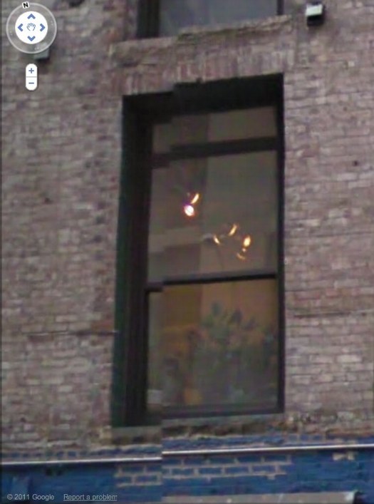
Anyway, after Brian invited me, I was trying to figure out what I might do, and saw this image of the building–and the space’s window–on Google Street View. And then it was obvious.
I’ll write some more about the piece later; right now I’ve got to pick up the kid from riding lessons. I mean, proletariat lessons.
OK, comrades, I’m back. Basically, Google Street View is increasingly the first impression, the reference point, even the authority of sorts, for the new places we go in the physical world. In Extra’s case, the distinguishing feature of its unassuming architecture is the mismatched seam Street View gave it. Untitled [Extra Street View] is an attempt to approximate that digital reality in the physical experience of the building, to sort of sketch it into the space. Or maybe to capture it in one spot–the window–or one perspective, from inside the place you’ve just traveled to, looking back toward the pano-mapped street. It’s like a shot reverse shot between the viewer and the Google cam.
8,190 Details From A Picture
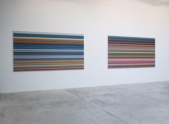
Alright, I’ve looked into it and talked to some folks, and while I was and am right to be incredulous, I now feel a little better about Gerhard Richter’s Strip series of digitally printed works Marian Goodman is showing in Paris [above].
So I talked with some Richter collectors, some people who have seen the work in person, either in Paris or elsewhere, and some folks at Marian Goodman, who thoughfully listened to my grave declaration that “I have some real issues with these works,” and gamely engaged it, almost as if a real sale were hanging in the balance, which, obviously, it was not.
The easiest and best first thing to do: ignore Buchloh. I started reading his catalogue essay, and just decided that his ruminations on the implications these digital prints under plexiglass have for the history of facture would just piss me off, so I set it aside for another day. Ultimately, the way I’ve come around to the work, or at least come to see it as credible, is by considering it within Richter’s own practice and history, not as a dubiously hyped innovation of global import.
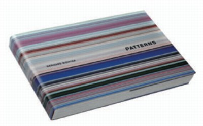
Invariably, in every conversation, the first reply to my skepticism about these giant pixel extrusions was, “Have you seen the book?”
 “The book” is not the slim exhibition catalogue for Goodman’s show, which reproduces 14 examples of Strip, and edition of 72 unique digital prints [53x105cm, mounted on Aludibond] which were chosen from 4,096 possible strips by “chance operation”; as well as the much larger [160x300cm, plexi] works made by combining “selected” strips. [There are also the oil-poured-on-glass Sindbad pictures, but whatever. Off topic. I just want to contrast the different processes, one clearly Cageian, one clearly not, that went into making works out of the system Richter devised.]
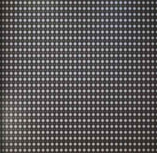
And that system is what’s only really expressed fully in “the book.” Patterns. Divided – Mirrored – Repeated, the massive artist book [41x27cm, 520 pages] published by Walther Koenig in an edition of 800+50, is overwhelming. It consists of 221 spreads showing strips from each of the “twelve stages of division” being mirrored and repeated. I found myself constantly turning back to the key, a diagram of Abstraktes Bild CR724-4, the 1990 squeegee painting which is Richter’s “ready-made” source overlaid with the division and subdivision matrix used to generate the strips. I should have snapped a photo of it, but instead, I’ve simulated it here by hand, with only six divisions, instead of Richter’s twelve:
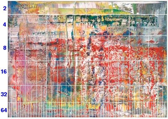
The exponential increase reminds me of the old illustrations of a nuclear chain reaction, which is kind of relevant; Richter has printed digitally manipulated photos of atoms taken with an electron scanning microscope, like his Strontium photomural [below] at the deYoung in San Francisco. Richter conceives of a similarly infinitesimal division continuing here, too, and he apparently only stopped at 4,096 0.8mm-wide strips because the next level of would require magnification to see.
Strontium 2004, 910x945cm, CR888, image via gerhard-richter
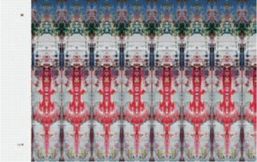
Before seeing Patterns, I originally thought these Strips were just pixel-wide extrusions. They are not. The wider, lower-order strips clearly show the mirroring and repeating. Here’s a detail from the cover of Koenig’s 2011 catalogue [pdf] and an unsatisfying page shot from inside. I’d say these are from the 256 and 128 divisions, respectively:

Even on the 2,048 division strips, you can still see the pointy, mini-Rorschach forms. And yet all the stand-alone editions and works came only from the 4,096 level. Which I assume means the static/boring horizontal stripes running across the larger prints should vibrate up close with nearly invisible mirrorings. And since no one has mentioned it, and everyone’s first and last resort to the book instead, I’m going to assume that effect is either not evident, not successful, or not compelling.
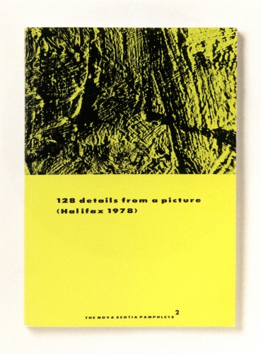
This is not the first time Richter has undertaken a photographic dissection of a painting, of course. He reworks reproductions of his paintings for editions all the time. [He also cut at least one squeegee painting into pieces, which were sold separately, but that’s another story.] His most closely related experiment dates from 1978, where he took black and white pictures of an abstract painting, Halifax, which he used in a photogrid, 128 Photographs of A Picture, and in several artist books, beginning in 1980 with the edition that inspired the title of this post, 128 Details From A Picture (Halifax 1978) I.
Unlike the computational precision that generated Strips, Richter took the 128 Halifax photos “from various sides, from various angles, various distances and under different light conditions.” And yet the end result of both is an apparently randomized, disorientated view of deracinated fragments. A nod to photography’s mechanical “magnifiying vision,” but also a deliberate and thorough sandbagging of its objective, informational idiom.
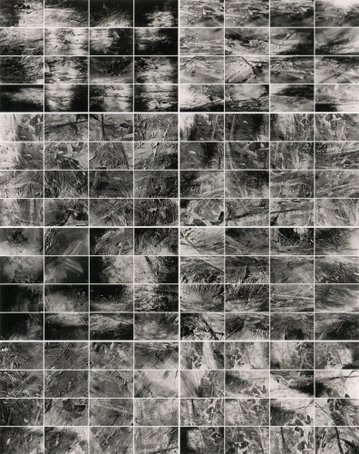
128 Details from a Picture (Halifax 1978) II, 1998, offset prints, image via gerhard-richter
For years, I’ve loved the Halifax photow way more than the painting. Richter’s expedition across the surface of the painting turns it into a landscape, which his images don’t even pretend to map. Richter must like them, too, because he’s kept reissuing them over the years as new books and editions.
So already in 1978, Richter demonstrates there is no way to reconstitute the image of the original painting from the distorted, incomplete photofragments. Not news. But that might be fine. I bet you could reverse engineer a pretty reasonable approximation of 724-4. Or at least an actionable one. Or an interesting one.
And I would bet that, if you fed a hi-res photo of Halifax and the 128 photos into a computer, it would now be possible to crunch the images and solve the puzzle. Not only could you identify all the parts in the photos, analyzing the light angles and camera distances in a 3D animation program should reveal Richter’s position, sequence, and the path he took as he wandered around the painting with his camera.
Richter was able to stay a generation or so ahead in his flight from intentionality, but it seems to have caught up with him.
Previously: Gerhard Richter Strip Show
Similar but not related: Marion Thayer MacMillan’s Water Pictures
Holy Smokes, THAT Doug Rickard!
At MoMA yesterday, I was talking about some Google Maps and Street View projects with a trustee, who was all, “There’s an artist in the New Photography show that uses Google Maps, they’re stunning!”
And it only occurred to me at that moment that the Doug Rickard in New Photography 2011 is the Doug Rickard of American Suburb X, and that he was showing his incredible series, A New American Picture. [The show opened last week; I hadn’t seen it, and the galleries were closed yesterday.]
I really should be discussing it more, because A New American Picture is pretty much the most successful and powerful Street View-based art project out there. Rickard’s images are haunting, and he’s right when he said [somewhere, I’ll find it later] that these photos could not be taken by a camera-wielding photographer; the presence of a human with a lens would destroy the scenes.
Which, as I type it, makes me think of the old Michelangelo chestnut about finding the sculpture in the block of marble. In a way, A New American Picture feels like the photos Rickard uncovered in Street View. Now I’ve got to get back to the museum and see the actual show.
American Suburb, A New American Picture, by Doug Rickard [americansuburb]
New Photography 2011, Sept 28 – Jan 16 2012 [moma.org]
Previously: On Bremser on Street View
Extra Street View
So I got the piece installed last night for “While You Wait…”, organized by Brian Dupont. It really only works in the daylight, so I won’t know yet how it actually looks, but it went in just as I expected it would.
I like this little corner detail here, sort of an Urs Fischer meets William Anastasi meets Roni Horn on Google Street View kind of thing.
Richter Schtick
For the record, I think a press conference is a pretty suboptimal forum for discussing art, even worse than for discussing film.
So while I was first leaning towards laughing at Gerhard Richter’s apparently gruff, uselessly short-for-a-sound-bite answers at yesterday’s Tate press preview, now that I read the mostly stupid questions, I will cut him some slack. If I were a museum marketing guy, I might wish for the artist’s quotable help in promoting a big show, but that is also clearly not Richter’s M.O. He paints, they shoot, he leaves.
This exchange toward the end, though is pretty damn funny:
Q: Members of the press may be surprised to hear that the published version of your collected words runs to more than a thousand pages (laughter) all of which are fascinating and enlightening. And I wondered if you still write about your work?
GR: “No. not enough!” (laughter).
Gerhard Richter talks about Panorama at Tate Modern [phaidon.co.uk]
Canal Zone Yes Rasta &c. In The Brooklyn Rail
Holy smokes, The Brooklyn Rail reviewed Canal Zone Richard Prince Yes Rasta:
Appropriation art is such an accepted part of the contemporary vernacular that some already find it passé–or at the very least no longer trendy. Gagosian isn’t exactly at the forefront of art discourse; perhaps the texts of Cariou v. Prince reintroduce the still-revolutionary possibilities of Prince’s proposition within the broader, non-art context. The court takes the role of the beleaguered parent who has just discovered that her child is having sex, to the point where Judge Batts employs pointed scare quotes in her introduction of “appropriation art” as a term.
A “scrapbook-style curiosity” that reads like a parent discovering their child having sex? I can’t really top that.
Canal Zone Richard Prince Yes Rasta: Selected Court Documents, &c., &c, reviewed by Andrea Neustein and Alex Neustein [brooklynrail.org]
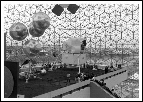
Creative America
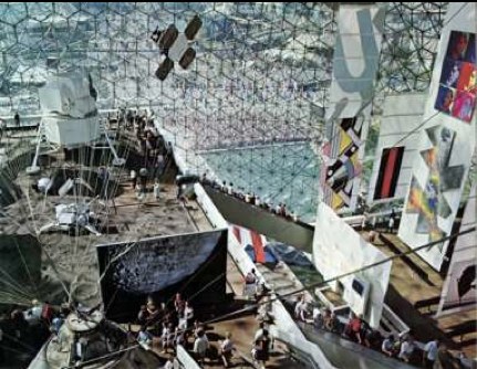
This interior shot of Fuller/Sadao’s US Pavilion at Expo67 almost has it all: installation view of the giant paintings Lichtenstein, Newman, Warhol and Johns made for Alan Solomon’s American Painting Now; plus a giant photomural of the moon, perfect for posing in front of.
There’s another photomural, earthrise from the moon, on the other side, which was a backdrop for the lunar landscape diorama. You can see it in Carl Harstad’s photo:
w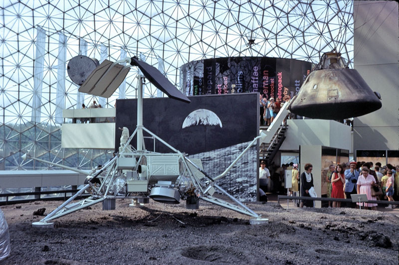
And the satelloon-like weather balloons were just out of both pictures’ edge. Fortunately, Bob Charlton’s mother captured them below:
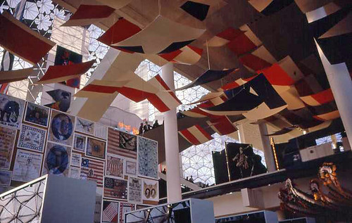
The underside approach for the lunar platform has this awesome installation [image from fan train’s flickr], a series of panels or canvases with abstracted elements of the American flag. It’s a little Ellsworth Kelly, a little Helio Oiticica, and a little Richard Lippold at Lincoln Center, all rolled into one piece of exhibition filler created, I assume, by Cambridge Seven.
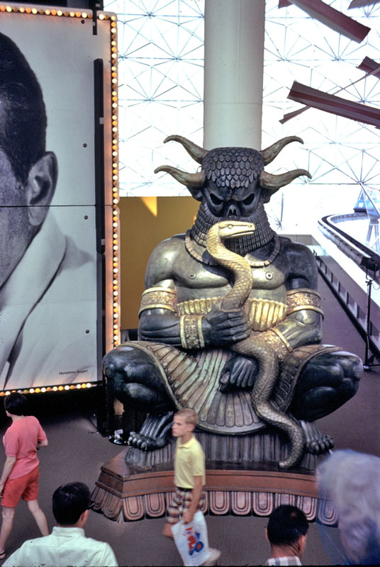
This other photo from Carl Harstad of the Hollywood section of Cambridge Seven’s exhibit features, what? I don’t know. I’d guess it’s left over from Joseph Manciewicz’s disastrous Cleopatra shoot, in front of a giant, multipanel headshot of Humphrey Bogart.
Cambridge’s exhibition carried the overall title, Creative America, and I think it very successfully steamrolled everything–paintings, photomurals, dioramas, film props, spaceships, cultural effluvia–into a single, unified, spectacularized drive-by aesthetic experience. And it was all done by and for the US Government. As I go on about reconsidering ‘non-art’ things like photomurals and satelloons in an art context, I keep coming back to the Expo67 pavilion. At one point, it was all art, or something like it. And vice versa.
[note: I’ve seen it elsewhere, but I took that top photo from former USIA design director Jack Masey’s powerpoint deck on the history of postwar World’s Fairs, which he presented last October at the National Building Museum. I’m about to listen to his archived talk now.]
Shadows To The Left Of Me, Shadows To The Right Of Me
I’ll probably write some more about Andy Warhol’s Shadows, but I want to find more details about its creation and Heiner Friedrich’s involvement. In the mean time, though, I just came across a 1985 Richard Serra quote from the Pratt Journal of Architecture that directly relates to seeing Shadows, which extends more than halfway around the Hirshhorn’s curved wall:
i keep thinking of a very simple phenomenon that struck me when i was a little kid. i used to walk to the beach every day, down to the end of a jetty and back the other way, and it always struck me as being completely significant that the ocean was on the left when i was going down, and when i turned around, it was on the right, and i had a totally different experience just from turning around and walking the other way. i always thought this was very curious. i always thought there were two different places. everybody knows that you don’t have the same experience in turnabout – your relation to the sun has completely changed, left/right brain coordinates are off – everything is different. in fact, you probably have a side you favor as you walk. you probably think differently in each direction. your anticipation and memory change. to me, that’s a sculptural concept. if a sculpture allows for that experience, it implies self-awareness. the content of the work is that the viewer looks at himself in relation to what he’s looking at…
The no-caps is a big clue, but I found the quote in a 2007 post on Airform Archives. As in so many things, Steve Roden was there first.
thinking differently in each direction [inbetweennoise]
Post-Tsunami Shelter Pre-Order
A finalist on a 2006 ABC reality series spent years inventing a car seat that would withstand the type of crash that killed his own infant son. Skyscraper evacuation technology experienced a surge of innovation in 2002. And six months appears to be the amount of time required for Japan’s nascent personal earthquake/tsunami survival shelter industry to go from disaster recovery to product launch.
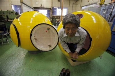
image: ap via guardian
Here is Mr. Shoji Tanaka, CEO of the 10-person, Cosmo Power Co., who has, naturally, removed his shoes to demonstrate the firm’s new Noah disaster shelter. The fiberglass pod fits four, has airholes [presumably watertight], and can “also be used as a toy house for children.”
One would assume the 200-300,000 yen price could be offset by selling advertising. In the event of an actual emergency, live feeds of Noahs being plucked from the receding sea would provide great logo placement opportunities. Assuming the Noah’s occupants survived, of course.
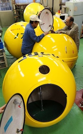
image via goo.ne.jp
Hmm, maybe it’s better to base advertising revenue projections on pre-disaster exposures. Noahs will surely be parked outdoors, in precious parking spaces, on roofs, hanging off of balconies, someplace from whence they can float clear from debris. Ad network them together, and paint or paste the pitches on the side with saltwater-soluble ink or glue.
Anyway, Cosmo has apparently been too busy taking 500 or 600 orders for Noah pods, they haven’t had time to update their homepage for two years. Actually, the Shelter Noa was registered with the patent office in 2008. And yet as of Friday they had only delivered two.
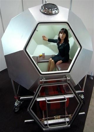
That goo.ne.jp link led to an even better related story, the launch the very same day of the Kimidori Baria 4S, a “soccer ball-shaped” disaster shelter. Because when you’re a prefabricated geodesic dome manufacturing company like Gifu-based Kimidori Kenchiku, the best obvious solution, whether it’s for a dog house, a comic book coffee house, or a tsunami survival pod, is a dome.

Barier concept video intro is probably Gifu, but looks very similar to the cover image of Lloyd Kahn’s 1971 classic Domebook 2.
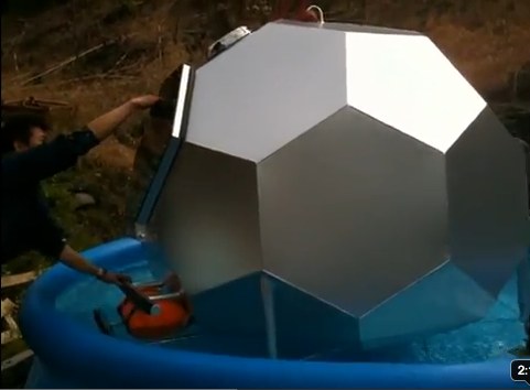
Hmm, on Kimidori’s YouTube channel contains three seaworthiness testing videos. A warning: these might be too upsetting for sensitive viewers and/or actual tsunami survivors.
For example, here is a Barier 4S floating in a portable pool.
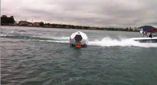
In this open water test, the Barier 4S must endure the wake of a small ski boat.
The third video features a new tsunami shelter shape, a dodecagonal tube, which holds six and can be walked safely to shore like a hamster ball. The first videos were posted within weeks of the actual earthquake itself. I guess it’s a fine line between ganbaro! and too soon!
UPDATE Or too late. I’d meant to post a link to Ken Isaacs’ 1970 dodecahedron pod for Pop Sci, which was designed for another type of escape, when the fellas from Ro/Lu sent along the link to n55’s micro dwellings (2005), the water testing for which included 100% more naked Danes than the Barier.
Rijksoverheid Rood 2
Here’s a look I’m calling Red Steel.
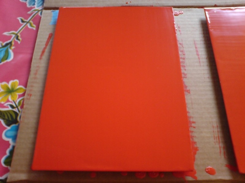
The other side. These stalactites form after the panels are put away to dry, I guess by the paint settling across the surface. Then I have to sand them down before doing the next coat.
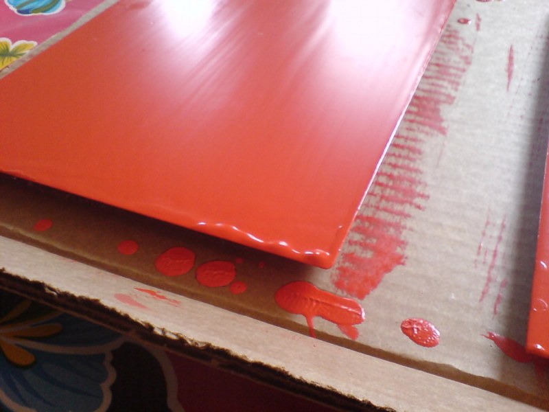
last coat, I switched up the direction of the brushstrokes, which has created a bit of a cross-weave and stalactite thing to sand down. Plus all these bubbles, not sure how those got there.
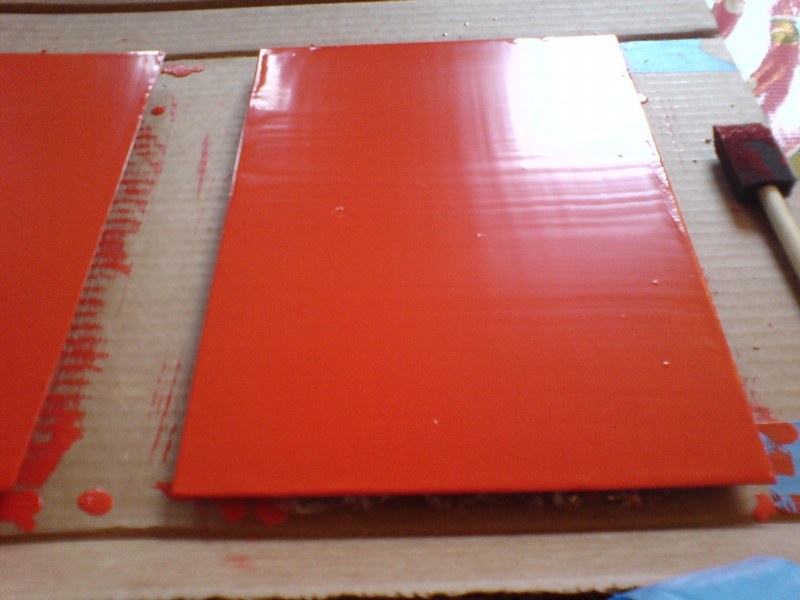
Seriously, this is like the most boringest thing in the world to be typing right now.
What I Looked At Today: NGA Monochromes
Well, let’s just get this out of the way: if you can only see one Warhol exhibition in Washington this year, see Shadows. The Warhol Headlines show is very slight. It’s hard to call it a highlight, but a series of three 1982 or ’83 silkscreen paintings of successive pages in the NY Post did remind me a bit of the newspaper On Kawara used to line the boxes of his date paintings. Also, the show includes the three Screen Tests where the subjects appear to be reading and unaware they were being filmed: Alan Solomon, Grace Glueck, and Arman. That really is all.
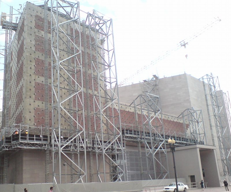
But let’s back up because, hey-ho, did you know the National Gallery’s East Wing was built with red brick infill walls?? It’s like Long Island City up in there behind IM Pei’s Indiana granite.
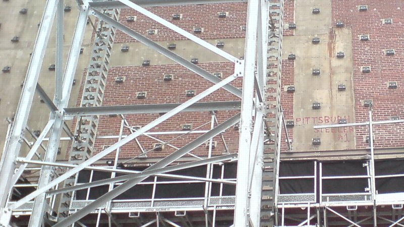
I also love that a construction worker in 1975 declared his allegiance to the Pittsburgh Steelers, practically in the Baltimore Colts’ own backyard. That was the year the Terrible Towel was invented, and when the Steelers did, in fact, win their second Super Bowl in a row. Also, I thoroughly approve of this epic-scale scaffolding. Glaze it and set it up at the beach for me, please.
Anyway, after the Warhol bust, I went downstairs for a close look at one of the NGA’s current strengths: contemporary monochromes. I’m working on some little monochrome panels right now, and I wanted to see surfaces and techniques–and to see if I’m inadvertently copying anyone I don’t want to.
I think I want a really immaculate, glassy, brushstroke-free surface, and I definitely know I want a continuity around the edge of the thin steel and aluminum panels I’m trying. So I figure setting out to study the cleanest, smoothest paintings I can find will be yield some hints.
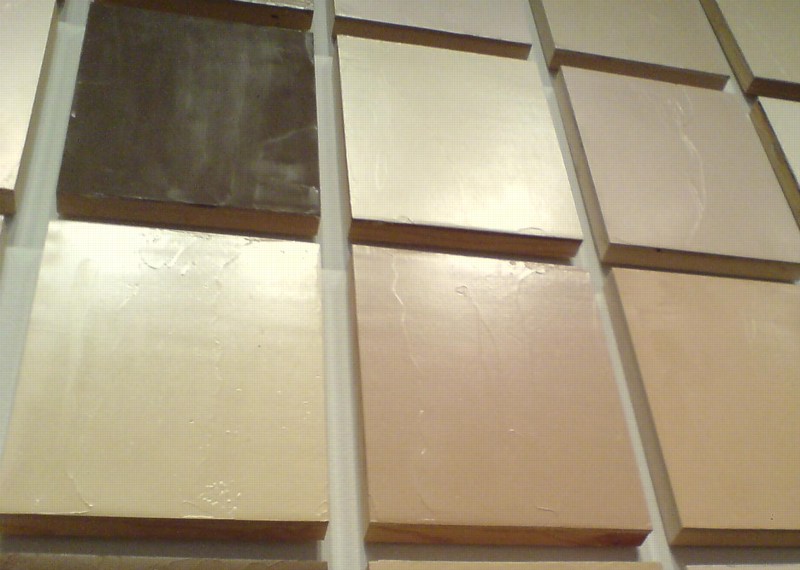
So first up: Byron Kim’s Synecdoche (1991-), the multipanel grid of monochromes based on various art world folks’ skin tones.
‘Defining of Art Assailed’
I– hmm:
Pointing out that the museum’s difficulties in importing art duty free have arisen out of the present tariff law’s definition of art, Mr Packard said that it was not the function of government to define art “any more than it is a governmental function to define truth.”
Prof. Artemas Packard, Dartmouth, and researcher/consultant to the Museum of Modern Art, quoted in “Museum asks end of duty on Cubism,” The New York Times, May 12, 1936.
On The Nightmare Of The Rack

Kriston Capps’ tweet to Powhida about art and immortality instantly reminded me of RH Quaytman’s conversation with Steel Stillman, which ran in Art in America last summer, and which upended my own comfortable memory of first encountering Quaytman’s little storage rack sculpture back in 2008:
SS For “Ark, Chapter 10,” which was the three-person show you organized at the end of your time at Orchard, you made paintings that related to Orchard’s history, and displayed several of them on storage racks similar to ones you have here in your studio. The display of paintings became a sculpture [From One O to Another].
RHQ I felt I needed to acknowledge–within the structure of the pieces themselves–the fact that I would be showing my own works, becoming, in effect, my own dealer. The storage racks, like the racks in a typical gallery’s back room, enabled visitors to pull out the paintings the way a dealer might, when showing them to prospective clients.
SS The racks addressed the nightmare, which perhaps all artists have had, that their work will never be seen.
RHQ Making the storage-rack pieces reminded me of the trauma of putting my stepfather’s and father’s works in storage after they died. Those experiences and the questions they raised–about artists’ estates, and about the life of the work itself once the artist has gone–left a big impression on me.
SS In 2008, you made a book, Allegorical Decoys, whose centerpiece is an essay you wrote about the development of your work. Having been your own dealer, you became, in effect, your own historian and publisher.
RHQ I realized instinctively that, in some sense, the paintings wouldn’t exist unless they were written about and collected. Otherwise, they would be like trees falling in the forest with nobody there to hear them. Writing that essay was an opportunity not just to reflect on my practice, but to locate my work within a larger critical conversation on my own terms.
[image: [From One O to Another], via anaba]
Features | RH Quaytman, June 2010 [artinamericamagazine]
Previously, Jan. 2010: Nice Rack! RH Quaytman on MoMAPS1’s blog