How To Make An Ansel Adams-Style Photomural / Folding Screen

I’m sure photomural historians out there are chuckling, wondering when I was finally going to catch up on this, but
HOLY CRAP, PEOPLE! ANSEL ADAMS PHOTO MURALS!
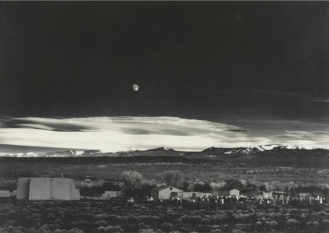
Alright, it’s not quite so unknown. The Polaroid ransacking auction last year at Sotheby’s included a very large print, what Adams called “mural-size,” of the photographer’s iconic image, Moonrise, Hernandez, New Mexico.
adams_moonrise_polaroid.jpg
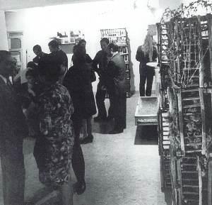
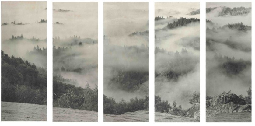
But The Mural Project was actually an Adams thing, a series of images commissioned by the Department of the Interior. Adams traveled around the US, shooting–he took Moonrise on the same trip, and because he hadn’t expensed that day, the photo was his, not the government’s. World War II derailed the project, though, and it was sort of forgotten. Until last year, apparently. When Adams’ original prints were rediscovered in a file somewhere [really?? looking into it. Hmm, this book of the images, which are now in the public domain, was published in 1989.], Interior Secretary Ken Salazar gave the OK in 2010 to install full-scale versions of The Mural Project for the first time. They’re still there, at the Interior Dept Museum. Viewing them requires a reservation.
Adams wrote an essay/letter titled “Photo-Murals” for the November 1940 issue of U.S. Camera [looking into it] in which he argued for large-scale prints, permanently mounted on panels, over wallpaper-style murals. He made such “mural-size” prints for the lodge at Yosemite, and for various exhibitions, but he also took orders for large prints. Most were smaller, around 40×60, but they did get bigger, up to 6×9 feet. The 2003 show of monumental Adams photos Andrew Smith Gallery spent ten years assembling included one such 6×9 print.
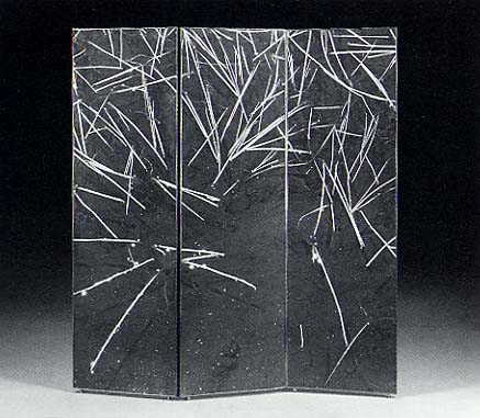
But not a screen. Because apparently Adams would occasionally make photo screens, giant prints on multi-panel, folding screens. Which, what?
adams_sonoma_screen.jpg
Clearing Storm, Sonoma County Hills, image via christies.com
He didn’t make very many, though; when they sold a big, awesome 1951 screen a couple of weeks ago, Christie’s said there were between 12 and 15, mostly in museums and the Adams Estate. Apparently, he sold one to Interior Secretary Harold Ickes in 1935, though, a deal which according to biographer Jonathan Spaulding, led to the Mural Project commission.
The screen he made for the Skirballs originally had an image on each side; the lot description says how when Jack Skirball invited Adams to come visit in 1981, they were “most anxious to have your opinion on what Audrey has done with the panels of the screen. I don’t want to tell you more until you see them.” It sounds like she remade them into a set of five one-sided panels. No word on what she did with the other image–or what Adams’ reaction was. Even so, the ex-screen sold for $242,500.
Though Adams was always very cognizant of the particular physical qualities of his prints, these screens seem to pose an entirely different argument for the concept of photo-as-object. If murals are related to frescoes, and “mural-size prints” evoke paintings, then Adams’ photo screens–printed to human scale, mounted in angled strips, freestanding in space, where they are intended to be viewed and experienced by moving around them–are akin to sculpture. Photographic sculpture.
Or maybe they’re also sculpture. Because check out this one, Grass and Pool, a three-panel landscape photo and abstract action painting and freestanding object, all in one, and made in 1935. Oh wait, never mind. The image is from 1935, the screen is from the mid-50s. No need to rewrite the history of abstraction today. It was made for David McAlpin, a banker and collector who, as a trustee at MoMA, helped found the photography department in 1940.
adams_grass_pool_screen.jpg
Grass and Pool, sold in 2001 at Christie’s
Adams talked at length with Ruth Teiser about his photomurals and screens–actually, he talked at length with Teiser about everything; she recorded and edited 24 interviews with Adams between 1972-4 for UC Berkeley’s Regional Oral History Project, and later published the 818-page transcript as Conversations with Ansel Adams.
I transcribed some excerpts about photomurals from the Internet Archive after the jump. Adams’ main concern was the quality and character of large-scale prints, a topic which regularly veers into details of what an expensive, annoying, labor- and material-intensive pain in the ass it was to make good, big work.

Continue reading “How To Make An Ansel Adams-Style Photomural / Folding Screen”

Camo USS Recruit

I’m not sure what’s cooler:
That during World War I, John Purroy Mitchel, “The Boy Mayor of New York,” built a giant plywood battleship called the USS Recruit in the center of Union Square to drum up volunteers for the Navy,
uss_recruit.jpg
That it was repainted overnight by the Women’s Reserve Camouflage Corps in brightly colored dazzle camouflage to get more business,
Or that there’s a site–and a book!–called Camoupedia.
Camoupedia: A Compendium of Research on Art, Architecture and Camouflage, by Roy R. Behrens (Bobolink Books, 2009) [camoupedia]

Doug Rickard At Pier 24


Via Wayne Bremser comes this nice interview with Doug Rickard, who talks about his Google Street View photo project, A New American Picture. Rickard is in HERE, an exhibit of at Pier 24 Photography in San Francisco. [Bremser’s notes on HERE are here.]
UPDATE Rickard also led Ken Johnson’s NYT review of New Photograpyh 2011, where his GSV photos are called “the most intriguing conceptually” in the vein “revolv[ing] around photography’s relationship to truth.” Johnson’s read of Rickard’s “strangely blurry and bleached, high-angle pictures of decrepit urban and suburban neighborhoods identified with high poverty and crime rates” make you wonder if he actually got the concept:

Resembling stills from surveillance videos, the images speak to the kind of forensic truth that concerns law-enforcement personnel.

Previously: On Bremser’s notes on Street View
on Doug Rickard at MoMA’s New Photography 2011

Blowing Up Tanks: Ellsworth Kelly And The Camouflage Secret Army

ellsworth_kelly_meschers_moma.jpg
ce ci n’est pas un Razzle Dazzle? Ellsworth Kelly, Study for Meschers, 1951, moma
When tiny scans of Gwyneth Paltrow’s Interview interview with Ellsworth Kelly first appeared on tumblr, the only thing you could read was his pullquote about his tour of duty in World War II:

I was in what they called the camouflage secret army. The people at Fort Meade got the idea to make rubber dummies of tanks, which we inflated on the spot and waited for Germans to see.

Which, nuts, right? I guess I’d heard of Kelly’s camouflage involvement before, and I remembered somewhere that Bill Blass had also been in a camouflage division, but I’d never put it all together that these guys were in the Ghost Army, whose operations remained largely classified and unknown until the mid-1990s.
Here is Kelly’s fuller quote, and his photo of himself standing next to a burlap jeep:

ellsworth_kelly_burlap_jeep.jpgPALTROW: Did you design camouflage while in the army?
KELLY: I did posters. I was in what they called the camouflage secret army. This was in 1943. The people at Fort Meade got the idea to make rubber dummies of tanks, which we inflated on the spot and waited for Germans to see through their night photography or spies. We were in Normandy, for example, pretending to be a big, strong armored division which, in fact, was still in England. That way, even though the tanks were only inflated, the Germans would think there were a lot of them there, a lot of guns, a whole big infantry. We just blew them up and put them in a field. Then all of the German forces would move toward us, and we’d get the call to get out quick. So we had to whsssh [sound of deflating] package them up and get out of there in 20 minutes. Then our real forces, which were waiting, would attack from the rear.
PALTROW: So in a way, it was just like an art installation! That’s amazing.
KELLY: One time, we didn’t get the call and our troops went right by us and met the Germans head on. Then they retreated, and they saw our blow-up tanks and thought they were real and said, “Why didn’t you join us?” So, you see, we really did make-believe.
PALTROW: It’s the perfect job for an artist in combat.
KELLY: We even had the tank sounds magnified because tanks would go all night long.

It sounds like Kelly was actually in the 603rd Engineer Camouflage Battalion, one of four units in the 23rd HQ Special Troops, which entered France just after D-Day and ended up seeing quite a bit of action, all with balloons and loudspeakers instead of actual weapons.
23rd_inflatable_tank.jpg
As Edwards Park explains in a fairly detailed history, the 23rd’s main objective was to impersonate various active divisions in order to cover or obscure troop movements. The inflatable weaponry was designed to fool aerial reconnaissance, but the 23rd also acted out the operations of the units they were impersonating/replacing, visiting fake garbage dumps, and laying fake tank tracks at night under the cover of pre-recorded troop sounds and fake radio broadcasts. And they created fake badges and mingled with local civilian populations, passing along disinformation. As Park puts it, “It wasn’t long, in fact, before the 23rd had a voluminous file on visual identifications and the men suffered many a bloody finger sewing bogus shoulder patches on their uniforms before going into action.”
It’s one of many not-too-thinly veiled references to the 23rd’s apparently fruity reputation. I’m sure there’s at least one queer studies dissertation out there on masculinity, war, and the confluence of camouflage, artsiness, and passing for “real” soldiers.
As NPR reported in 2007, most camo/deception soldiers were apparently ordered never to discuss their wartime efforts. But Jack Masey was never told to keep quiet–waitaminnit, Jack Masey? The USIA design director and serial Expo geodesic dome commissioner? Holy smokes! It all makes filmmaker Rick Beyer’s documentary Ghost Army feel like a race against time. I hope he got some good stuff.
23rd_deceive_defeat.jpg
Meanwhile, I guess I’m on the hunt for some 23rd material myself. In 2004, Sasha Archibald wrote in Cabinet about the Ghost Army’s unauthorized insignia for itself, which featured the three-legged triskelion and the motto, DECEIVE TO DEFEAT. [Christoph Cox’s excellent history of sonic deception in the military leads me to believe that everything I knew about the 23rd I learned in Cabinet Magazine.]
And I guess it’s too optimistic to imagine any rubber tanks or vintage camo have survived all these years; I can’t imagine if the top secret thing preserved such artifacts or doomed them. But at the least I could start tracking down some of those Ellsworth Kelly posters.
OK, Meyers’ site points to this 1992 video by/about the WWII paintings of Harold Laynor, who describes himself as part of the “famous Ghost Army,” and says its activities were “unknown to the general public until well after 1980.” Hmm. Laynor also says there was an initial plan in 1942-3 for the 603rd to focus on domestic camouflage. But that the British successes with battlefield camo in North Africa inspired the US to deploy the deception unit in combat.
Related: British WWII bullshit camo stories
The Civilian Camouflage Council, included a lot of folks at Kelly’s school, Pratt
Sounds so-so, but full of facts/details: military historian Jonathan Gawne’s 2002 book, GHOSTS OF THE ETO: American Tactical Deception Units in the European Theater, 1944 – 1945

Israeli Air Force Has Huge Belgian Balls

reuters_flight_sim.jpg
Speaking of huge, impressive balls, Reuters reports that a Belgian firm called Barco is delivering its first order of eight, brand new, 360-degree flight simulators, each of which is a 3.4 meter-diameter cast acrylic sphere. The sphere is ringed by thirteen hi-res projectors, whose images are all laser-stitched together or something in some suitably seamless way.
Alls I know is, 10-foot-wide acrylic sphere screen. Also, Top Gun? Really?
Belgian firm unveils new Top Gun flight simulator [reuters via boingboing]

Welcome To The Talus Dome! Ball -Nogue Shiny Balls

yucca_crater_section_ballnogue.jpg
Hoo man, David has an interview with Ball and Nogue about their High Desert Test Site project which is called Yucca Crater, and which appears to be an earthwork, but is man-made. It’s a tricked out plywood recreational structure half-embedded in the desert which looks a bit like a half-pipe, an abandoned pool, and one of those deadly carnivorous pitcher plants. Because it’ll have a climbing wall and a pool in it, in which some random tripping art student will, I’m afraid, drown one day.
talus_dome_model_ballnogues.jpg
But that’s not important now. Yucca Crater is made from the leftover formwork from another Ball-Nogues project, Talus Dome, a public art commission for the Edmonton Arts Council. [Quesnell Bridge. Holy smokes, people, a mountain dome of giant mirrored spheres.
But why, you may ask, is the form available to bury in the desert if the Telus Dome is not actually complete yet? This is not some CAD/CAM hit ENTER and 3-D print operation. They actually pack those balls into that thing to make it.
ball_nogues_cradle_hursley.jpg
image: Timothy Hursley via arch mag
Like how they made Cradle, Ball-Nogues’ shiny ball 2010 commission for the “updated” facade of what [used to be] Frank Gehry’s Santa Monica Place parking garage. [It’s called Cradle I guess because calling it a bulging “men’s Speedo” or “a big banana hammock” before they finished it might have raised some eyebrows.]
ball_nogues_cradle_dboom.jpg
Anyway, who else but Design Boom has a big photo set of the making of Cradle. These balls are just hanging there, each held in place by a steel cable, the specific length of which was determined by rigging the whole thing up in a giant, wooden banana hammock mold. Designboom also shows how the balls themselves were made: they were welded together and blown in China. See how I avoided any innuendo there?
Whatever, I can’t stop staring.

Guggenheim Color by Fine Paints of Europe

Karen Meyerhoff, Managing Director of Business Development at the Guggenheim Museum, and my new hero:

marc_detail_gugg_fpe.jpgPeople come to an art museum in part to be inspired by the works of art on view there. And we develop an emotional relationship with those works of art and with the artists that created them.
So much of that emotion is evoked from the imagery and the colors that the artist uses to create that imagery. Color can be…an unconscious communicator. And when we use that color in our living space, we share that emotion with anyone who enters the space.
In creating this second collection, we used our permanent collection at the Guggenheim as inspiration. The permanent collection at the Guggenheim spans from the late 19th century all the way to the present, and we decided to focus on the early part of the 20th century for this purpose.
We had an exhibition on view of–called, “Great Upheaval,” of works from Cezanne all the way up to Kandinsky, and we spent hours and hours in the gallery, working with these paintings, drawing colors out of them.
One of the things that became interesting about that process was that certain colors kept repeating. Not just within canvases by a single artist, but from artist to artist. So it became clear that there was a commonality to this early 20th century palette.
We call the collection The Classical Colors from the Classical Modern period in a sense. And when we had the opportunity to lay these colors out, finally, on a table together, it was very clear that there was this very rich, soft, elegant, classic palette that represented the paintings on view at that time.
These are very complex colors. And we relied heavily on Fine Paints of Europe and their unique tinting system to accurately match those colors and recreate that classical modern palette.

I am nerding out on this so hard right now. The Guggenheim Museum, in “an exclusive licensing arrangement with Fine Paints of Europe, Inc. of Woodstock, Vermont, will introduce two paint collections suitable for residential and commercial use in October 2011.” The “second collection” Meyerhoff refers to above, in a video intro which I transcribed from the website for Guggenheim Color by Fine Paints of Europe, is Classical Colors, “a set of 150 wall colors drawn from much-loved paintings in the Guggenheim’s permanent collection.”
Beyond the concept itself, which is obviously golden–no, wait, it’s conceptually golden precisely because of the art that was chosen, why it was chosen, and how it is being packaged and presented.
Cezanne, van Gogh, Delaunay, de Chirico, Kandinsky, Modigiliani, Gaugin, Pissarro, Franz Marc, whose Stables provides the illustrative detail above. I suspect these artists’ primary commonalities–besides their “very rich, soft, elegant, classic palette,” are being in the Guggenheim’s collection and being dead long enough for any copyright and trademark claims to evaporate.
What makes the Guggenheim Color Collections superior to run-of-the-mill museum merchandise is that it’s actually paint, the stuff the art is made of. Or at least that’s what it’s meant to evoke. Great word, evoke. There’s ample scholarship and conservation data, dissertations and grant-funded research projects galore, on what paints artists actually used. Technology exists to analyze the paint’s spectral and chemical properties with great precision and match it to historical manufacturing information.
None of that seems to have been brought to bear here. In addition to Fine Paints of Europe’s “unique tinting system,” the Collection was “refined.” “Refined in consultation with exhibition designers to ensure the colors are appropriate for a variety of architectural settings.” and “further refined” and “fine-tuned” for a variety of “lighting situations, to precisely match each hue.” These are not recreations, but evocations, and each color “relates to the painting from which it was derived and the artist who created it.”
guggenheim_color_fan.jpg
This is distinct from other collection, Gallery Colors, which is–students of The White Cube, rejoice!–actually based on the Guggenheim’s archives of wall paints used in the galleries “by generations of Guggenheim Museum curators, artists, and designers-including Wright himself.” And Jean Nouvel. Up in the middle of the fan there is the charcoal-black he used in the Rotunda for the Brazil exhibit. “These fifty hues,” FPE’s website says, “are intended to guide homeowners and designers in the presentation of art.”
Guide on, Fine Paints of Europe, and art will follow.
Previous Fine Paints of Europe coverage on greg.org, because hello, it’s an officially licensed manufacturer of Pantone Matching System paints: Rijksoverheid Rood

The Plying Of Lot 52

This is pretty awesome. Or it was, for the second there when I first saw the thumbnail in the lot list and thought Maurizio was channeling Baldessari or Prince or whomever.
this lot is of a challenging nature. those of a delicate sensibility may with not to view it. click here if you still wish to view this lot.
It’d still make a nice painting, though. And it does make you wonder about all the other lots.
Lot 52, Sale 7990, London, King Street
Maurizio Cattelan (b. 1960)
Untitled
est. £900,000 – £1,200,000
[christies]
UPDATE: Hmm, GalleristNY discovered the exact same image–that’s been online for over a month–and made the exact same Baldessari comment just thirty minutes after I posted it. Great minds.
UPDATE UPDATE Hah, “This lot is of a challenging nature and hanging over the bar at our Vanity Fair party. With a spotlight on it.”

‘The Movie Is Called Eden Rock…’

It’s all in the book, so you could definitely buy it and read about it in depth, but it didn’t occur to me until Brian Dupont tweeted about it [“Aspen : #OccupyWallSt :: St. Barts : Canal Zone. Every apocalypse needs a last stand.”], that there might be a connection between the Occupy Wall Street protests and Richard Prince’s movie pitch.

See, in defending his Canal Zone paintings against Patrick Cariou’s copyright infringement claims, Prince and his lawyers repeatedly cited The Pitch, a 1.5 page text for a post-nuclear apocalyptic movie called Eden Rock in which Cariou’s Yes Rasta photo subjects were one of several tribes. The strategy–failed so far–was apparently to demonstrate how completely Prince had transformed Cariou’s work, thus obviating the infringement claim.

prince_canalzone_cariou.jpg

Prince included the The Pitch text in Eden Rock Show, a brief 2007 exhibit of a large collage/painting made up of pages from Yes Rasta at St. Bart’s Eden Rock Hotel. It was included in court exhibits in Cariou v. Prince and, like I said, is in the Selected Court Documents &c. book.

When I started typing this, the way I had remembered The Pitch had me thinking it is occasionally starting to sound like a future documentary, minus the global thermonuclear war part. Now that I’ve re-read and typed it all in I don’t think that anymore. But I’m not so sure Prince agrees with me. But as the view from his position as a pessimistic artist in the lower reaches of the 1%, but not of the 1%, it does have a certain authenticity, and so I thought The Pitch is worth posting:

The Pitch
Charles Company, his wife, son and daughter arrive at the St. Barts airport, late afternoon two days before Xmas, he’s meeting up with his brother and sister-in-law… staying on the island for a couple of weeks…vacation…

As he’s landing, he sees out the window a lot of people running around…general commotion.

As the plane taxis up to the gate he asks the pilot what’s going on…

As the Company family disembarks the plane, there’s more pandemonium…

People grabbing, shouting, some hysterical…it’s a tiny airport, but there’s an overload of people waiting to get thru customs and many people literally “crying”…they’re “crying because there are no planes going out…no planes returning to St. Martins…returning to Miami…returning to NYC…returning to London…returning anywhere…

There are no returning flights because these cities and many other major “areas” in the continental U.S. and Western and Eastern Europe have just been obliterated by nuclear attack.
Charles Company and his family are informed of this fact and seemed to melt into the tarmac under 88 degree temps…holding their bags, their backpacks…what will come to be as all their worldly possessions.

They hook up with Charles’s brother, who will fill them in with a bit more detail on the events “round” the world. “What are we suppose to do?” is Charles’s wife’s first question…
“There’s nowhere to go”, is the first answer.

A good part of the world, “most” of the world, has been nuked and they are here on a tiny French island in the middle of nowhere…which in a year’s time will become part On the Beach, part Lord of the Flies.

Background: Charles is 55, has no military background, is pretty much out of shape…makes his living as an architect.

To make this pitch even shorter I’m going to cut to a year later…
People on the island have broken up into “tribes”…most of the houses have been ransacked and all of the hotels occupied.
Charles Company is now Charlie Company. He has been exercising. Hes also learned to load a weapon, field dress a wound, cook without a fire. His daughter is the #1 scavenger…
He his wife, son and daughter, brother and sister-in-law, (along with several followers) have taken over the Eden Rock Hotel. It’s headquarters.

Stockpiled. A Mini-Mart. As best a fortress as can be under the circumstances. Everything is rationed, everything is “used”…
Next: Charles’s son is standing lookout. Thru his telescope out in the ocean he sees what appears to be a periscope…he sounds the alarm…

The movie is called Eden Rock…

[from an October 2008 email prepping for the Canal Zone show at Gagosian]

Additional Eden Rock/Pitch Material written MARCH 2008–

More on Eden Rock

1. Rastas and Reggae…they escape from one of the Cruise ships, (they were the band aboard the ship) three days after the bombs went off. They go to the Hotel Manapany. Six band members, two roadies and a manager.

2. The Backpackers…these are college kids, use to spring breaks, know nothing of responsibility or the real world.
They gather first in bars then take over a small hotel just above Shell Beach. They keep partying, drinking, smoking..they are the first to “go native”…the first to smear “war paint” on their bodies…they’re also the first to get wiped out…

3. The Amazons…Four Lesbians who escape a second Cruise ship, who bring along part of hte crew and take over the Guanahani Hotel. These are large well built women along the lines of Shena Queen of the Jungle, Wonder Woman, Cat Woman, think Raquel Welch meets Linda Hamilton in the Terminator. Their outfits, hair and make-up remind us of Road Warriors…

4. The Ultimate Ones…this tribe is made up of rich, affluent masters of the universe…these are guys who own the huge private boats parked in Gustavia…they have the loyalty of their crews, they have their own weapons and in the beginning access to food and water. They quickly make deals with the local St. Bart police force. They stay on their boats at first but then take over the Ill de France hotel…these guys are use to privilege and shaping the future…they don’t take “no” for an answer…they believe they “own” the island and everyone is their subject…several come to be assassinated, held hostage, and hanged upside-down…in an opening scene one of them is pictured buried up to his head in the sand at Saline Beach with the tide coming in…

These are the four main tribes along with Charlie Company…

Charlie Company represents “family”
Rastas and Reggae represents “The disenfranchised”
Backpackers represent “alternative”
Amazons represent “sex”
Ultimate Ones represent “power”

Richard Prince
—– End of Forwarded Message

[spelling and punctuation original]
Previously: Canal Zone Richard Prince Yes Rasta: The Book

Here Is The International Prototype Kilogram Again

Ever since Wired’s article on the history of the International Prototype Kilogram, or Le Grand K, and the debate over its replacement, I’ve been thinking I’d write something about them again. So I went back to reread my 2009 post thinking about the kilos as both minimalist objects and conceptual constructs, and the occasional appearance of the IPK in other art contexts. And then this one looking at some of Walter de Maria’s early shiny metal objects.
So far, though, the only result has been having this guy and his silicon orb popping into my face a couple dozen times a day as I switch browser tabs.
1kg_silicon_sphere_apco.jpg
Not nothing, but no great breakthroughs yet. I’ll keep you posted.

It’s Dick’s Chick In A Box

You know, for a couple of weeks now, I’ve had this thing Bomb Magazine tumbld sitting in my browser, some teaser for their archive about Richard Serra dangling a chicken in Rauschenberg’s face at Yale, which, of course, he did, in 1966.
Here’s the actual quote from David Seidner’s 1993 BOMB interview with Serra:

DS Here’s another question you’re not going to like. Can you define early Serra and late Serra?
RS If you talk about the pieces that were done in ’66, that’s early work. If you talk about the work I’m doing now, I wouldn’t call it “late work.” But I would call it work that’s certainly more developed.
DS Speaking of the early work, is it true that at Yale you put a live chicken in front of Rauschenberg’s face?
RS No, I actually tied it to a dowel, which was anchored into a block and the chicken was in a box. And when Rauschenberg opened the box, the chicken flew up in the air about fifteen feet, and then stopped, because it was tethered. It began to flap its wings, it crowed and shit. (laughter) They kicked me out for two weeks. They told me I wasn’t “polite to guests.” How can they kick you out of art school?

1966, when Rauschenberg was a full decade beyond his own Chicken Period, but when his taxidermied Combines were getting their first sustained public attention in museums.
What I hadn’t noticed, because I’d stopped at the chicken, and then had been stopped by a tall image of Stacked Steel Slabs, is the next part, where Serra discusses what might be called his High Chicken Period. Oh wait, that’s right, Time Magazine already dubbed it his “Zoo Period”:

DS Why did you give up painting?
RS I was using paint with a certain disdain, with the attitude that any material was as good as any other material. And once you find that you’re not using paint for its illusionistic capabilities or its color refraction but as a material that happens to be “red,” you can use any material as equally relevant. I started using a host load of materials. I was living in Fiesole outside of Florence at the time and I started using everything that was in the parameters of my surroundings: sticks and stones and hides. I did a whole show of 22 live and stuffed animals.
DS Cages.
serra_salita_animal_habitat.jpg
RS Well, cages and habitats. I got very fascinated with the history of zoos. The first zoos were in Florence and the Florentines saw zoos not only scientifically but as aesthetic displays.
DS That was the bridge for you between painting and sculpture?
RS Yes, that was the bridge, I referred to Jasper John’s beer can (Is it real, is it painted?). At one stage, I had a double cage with a live chicken and a stuffed rabbit. I showed the work in Rome and all the Italian artists came and screamed, “ignoble, brute.”
DS The Arte Povera artists?
RS Arte Povera hadn’t started at that time, a year and a half later Arte Povera began and they were all too willing to line horses up in a basement but up to that point they looked at my work as not being legitimate, it wasn’t even Dada.

Dada, again, was the charge/context leveled early on at both Rauschenberg and Johns. Buchloh had brushed off Serra’s first solo1 show, at the influential Galeria la Salita in Rome as “rather literal responses to Rauschenberg’s combines,” yet here is another example, from 1993, pre-Torqued Ellipse revival, of Serra discussing this early show as a “bridge” from painting to sculpture and his early work in direct relation/response to both Rauschenberg and Johns. [Johns’ studio, of course, was also the site of Serra’s first thrown lead corner piece.]
I think the power [or assertions] of Serra’s subsequent achievements overwhelm this first, early body of work. But Serra repeatedly brings it up and has now[once, at least] connected it to his move into sculpture. Whether it ends up being major, earth-shattering work, it is important to Serra’s beginnings and should really be looked at more thoroughly.
1 Serra made the work in the show with his then-wife, fellow Yale classmate and sculptor Nancy Graves. The type of work, and now, Serra’s mention of early Italian zoos, all have direct resonance with Graves’s early animal/taxidermy/museum display work. Much of it will probably never be known now, but there is a lot more to the story of this show.
Just read the whole thing, it’s pretty loopy, with some good comments on Richter, Polke, Tuttle, and Hesse: Richard Serra by David Seidner,
BOMB 42/Winter 1993
[bombsite]

Practice Practice Practice

From the Frieze blog, the Goldsmiths brain trust answers the burning question, “How to get to Turbine Hall”?:

‘Eleven Statements Around Art Writing’ is co-authored by the teaching team -Maria Fusco, Michael Newman, Adrian Rifkin and Yve Lomax – of MFA Art Writing at Goldsmiths, University of London. It proposes a moment in contemporary production: writing as art practice.

That’s right, call it a practice and let the curators and art historians sort it out.
best tweet update ever:frieze_magazine: Dan Fox asks the MA lecturers to clarify their statements about art writing on frieze blog. It’s pens at dawn!”
11 Statements Around Art Writing [frieze via @crosstemporal]

Rijksoverheid Rood 3: Missed A Spot

rood_missed_a_spot.jpg
I now know that the bubbles sand right out. But what I learned this time is the importance of checking to see if you missed any spots in your smooth, monochrome surfaces before you clean up your brush and your workspace.
I ended up touching this up not too well with some scavenged drips and a leftover sponge brush. Obviously, it will not survive the next sanding.

On John Neuhart, 1928-2011

neuhart_solar_do-nothing.jpg

I was very saddened to learn that the great designer John Neuhart passed away last month. He and his wife and fellow designer Marilyn were early and influential colleagues of Ray and Charles Eames, and have been heavily involved in documenting and propagating the history of the Eameses and the Eames Office.
I have long admired Marilyn Neuhart’s work with Alexander Girard, but I most wanted to meet John someday and ask him about his first and [to my mind] greatest project for the Eames Office, creating the Solar Do-Nothing Machine [image above via the scout]
In 2000, Neuhart told the LA Times the story of the making of the Solar Do-Nothing Machine:

I was hired as a graphic designer in the summer of 1957 and was immediately put to work building the mechanical motion displays for the Alcoa solar energy toy, christened the “Do-Nothing Machine.” (Part of a national ad campaign forecasting future uses of aluminum, the Eames Office contribution was one of many solicited from designers nationwide.) Past experience building model airplanes, bookshelves and learning to cut metal in my jewelry class at UCLA had hardly prepared me for what I faced. And the pressure was on; several starts and attempts had been made before I arrived, and the office was facing a looming deadline. We were experimenting with new technologies for which there was little existing experience to fall back upon, adding pressure to the project.
I battled my way through four months of ad hoc, trial-and-error attempts fraught with anxiety. Would I still have a job if this fails? Would my 7-month-old marriage survive the all-night sessions and constant stress? Would I ever get back to graphic design? Was Parke Meek’s ulcer contagious? Finally, I seemed to be on the brink of success. I managed, with advice from co-workers Don Albinson, Parke and Charles, to arrive at a workable system that harnessed solar energy through photovoltaic cells to drive six small electric motors that set in motion a series of decorative pinwheel shapes mounted on an elliptical aluminum platform. We had enough to produce the desired end result–the photograph that would appear in national magazines. My next lesson about the Office was that no one was allowed to even contemplate basking in the glow of success (or to expect praise). It was always on to the next project–in this case, shooting the photograph, wherein I was destined to learn the answer to the age-old question: What did Ray Eames actually do?
At noon one day we started to set up the solar machine and the lights, and by 3 a.m. the next morning we had it placed on a mound of dirt and rocks in front of a sky backdrop that suggested a desert scene. We were all exhausted and irritable by the time Charles started shooting the 8-by-10 images. After a couple of hours, he was on the last sheet
of film. Suddenly Ray screamed, “It isn’t shining!”
Charles emerged from under the camera’s black hood, his hair standing up like a cock’s comb. We all groaned. “What isn’t shining?” he yelled at Ray. “The diamond isn’t shining,” she moaned. “Does anyone know what she is talking about?” growled Charles. “I do,” I said. “She means the diamond-shaped intermittent wheel at the upper part of the machine.” There was stunned silence. Getting it lighted meant more scrambling onto ladders and readjusting the lights. “OK,” said Charles, “If you can get a light on it within 10 minutes, we’ll do another shot.” I ignored the exasperated looks from my fellow staff members and climbed to the top of the ladder to maneuver the light around until Ray shrieked, “It’s shining! It’s shining!”
Charles made the last exposure and we all went home. The next day, when we looked at the six sheets of developed film, you can guess which one was chosen–the one with the shining diamond. I had just passed another rite of passage and now understood Ray’s position in the Eames equation: shining. And, yes, I had a job, my marriage survived and, after more tangential trials by fire, I finally did get back to graphic design. Parke had surgery for his ulcer and made Charles pay for it.

And here is a very nice interview from last year, when Marilyn released her encyclopedic reference book, The Story of Eames Furniture: