Never Mind! Bruce High Quality Foundation Made The Gate, But Not The Article

bhqf_ian_adelman_nyt.jpg
A little while back, when I realized that Bruce High Quality Foundation, the ambiguous, anonymous art collective and The New Hotness, were behind The Gate, I took them at their word and began to question whether what we knew or assumed about the project was true, misinformation, or both. As they put it,

When there are moments of clear misinformation, those are generally used to make people be more conscious of the potential that it’s all made up. They have a function so that you always know it has been written by someone somewhere.

Specifically, I wondered if the fantastic and seemingly serendipitous documentation of The Gate and the front page NY Times article by Randy Kennedy that followed were, if not fabricated, then at least planted, managed, manipulated or produced in some way by BHQF.
I should say that at the time, I was also writing arts features for the NYT. Though I don’t know Randy Kennedy personally, I have a huge admiration for his work. My questioning of how the The Gate story was presented should in no way be construed as casting doubt on Kennedy.
But just imagine a publicist were involved. And/or that the Brooklyn designers who photographed and witnessed The Gate were friends or even enlisted participants of BHQF members. The contours and details of Kennedy’s article could be entirely accurate, and from a journalistic standpoint, he’d be totally in the clear.
What would change is the perception and interpretation of BHQF and their work. What if Bruce–who, at the time, refused even to identify themselves as BHQF–had a publicist who helped them get their project into the NY Times? It’s as far-reaching as it is far-fetched.
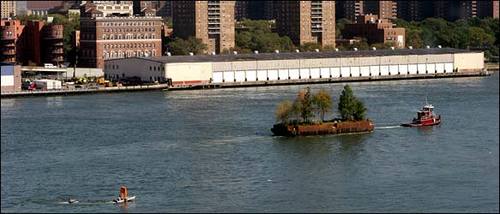
More plausible, though, would be the idea of setting up not just the execution of The Gate, but its publicity. The Gate‘s $2,000 budget was a challenge to the conflation of budget and value in public art. Christo and Jeanne-Claude’s Gates had been loudly–and, I argued, inaccurately–presented as a $20 million “gift” of the artists to the public. Robert Smithson’s widow Nancy Holt allowed his scruffy Floating Island to be realized posthumously with a $250,000 budget, which organizers touted as the “anti-Gates.”
This was the context for BHQF’s brilliant, absurdist, and flagrantly shoestring idea. But the question seems obvious, even intrinsic: if a floating gate chases a floating park and the Times doesn’t cover it, is it public art?
So anyway, I contacted the two designers who were the Times’ sources for the The Gate article, and I asked them more about their experience as BHQF’s first audience. Basically, it all checks out. Here are some excerpts from their email accounts:

Continue reading “Never Mind! Bruce High Quality Foundation Made The Gate, But Not The Article

Mind The Storr: On Gerhard Richter’s September

gerhard_richter_september_mg.jpg
Seriously, I could fall into Gerhard Richter’s website and not surface for days. There’s just so much stuff. And related stuff. And meta-stuff. Auction histories for specific works? Cross-referenced Atlas pages? It just goes on and on and on.
Recently, two interviews with Rob Storr were added: one is about Richter’s Cage Paintings, which Storr showed at the Venice Biennale in 2007, and which are now at the Tate. [It’s a comically great business model to make and sell giant series of paintings intact instead of slogging it out one by one.] There’s a lot of discussion and still photos of the making of palette knife & squeegee process for the abstract pictures–I always thought Richter only painted them on a table, but there he is on his ladder. And Storr has a thoroughly enjoyable smackdown of the fiercely “deterministic” Rosalind Krauss’s connection of Richter and Johns. I’d pay cash money to see that panel discussion.
Same day/same outfit is another video, Storr is in the office at Marian Goodman, discussing September, the small monitor/TV screen-sized painting of the World Trade Center attack that opened Richter’s latest show at the gallery. [Yeah, I know it was actually a photo of the painting.]
It’s funny, I’d conveniently forgotten how central war, destruction, civilian casualties, and terrorism have been to Ricther’s work and his experience. How does that happen? Anyway, it’s interesting stuff.
Gerhard-Richter.com [gerhard-richter.com]

IKEA X Michelangelo Antonioni Mashup: The IVAR Dolly

ikea_ivar_dolly_aalto.jpg
So awesome. With a few skateboard wheels, some L-brackets, and some grip tape, Brussels-based videographer VJ Aalto turned the ladder-shaped side bracket from Ivar, my Ikea component system of choice, into a EUR18 dolly track.
The great-looking test videos are on Vimeo, and the complete parts list is
in the comments on Ikeahacker.

EOS 7D + DIY dolly / 1st indoor test from Aalto on Vimeo.

Hey, look, next to the window, another bookshelf waiting to be sacrificed! Run it from the ceiling for a Professione: reporter remake!

Ivar loves dolly [ikeahacker via @MatthewLangley]

A Still More Glorious Daybreak Awaits

daybreak_raven.jpg
I’ve been telling people in person all about Lucy Raven’s multimedia tour of Daybreak, Utah since it came out last fall; it’s way past time that I mention it here. Daybreak is a massive real estate development strategy disguised as an advanced, master-planned, Community of The Future. It’s Kennecott Copper’s parent company’s venture to maximize the value of tens of thousands of acres of land they’ve accumulated–and as often as not, filled or flooded or contaminated with the remnants of their century-old, open-pit mining operation–on the southwest side of the Salt Lake Valley. It’s a 70-year plan to build a 100,000 acre suburb.
Or it was. Or is. Or was. Raven’s text, photos, and interviews at Triple Canopy caught this industrial-scale city planning operation last year, just after the real estate market went off a cliff. To overextend the metaphor, Daybreak is lying on the ground, twitching, and not quite realizing what happened to it.
Anyway, the part I love to quote is Kennecott Land’s Myranda Baxter explaining Daybreak’s “village centers”, warmed over New Urbanist retail offerings for “all your basic daily needs”:

In other words, there’ll be a medium-sized grocery store, all your mom-and-pop restaurants and little cafes, bakeries, dry cleaner, hair dresser–but on a small. scale. There are offices above the shopping areas, and the parking, as you’ll notice, very little parking on the streets, because it’s all tucked. behind the buildings. So it becomes a very pedestrian-friendly area and not a strip mall.
One funny incident was, the last time the commercial director came here he said, “I love all the people you send my way, who are interested in opening businesses, however. If there are any more tanning salons–[laughs]–I have about 30 tanning salons that want to open a business here, and I don’t need any more applications.”

Daybreak, by Lucy Raven, Issue 7 [canopycanopycanopy.com]

On Abstraction And The Ready-Made Gesture

As someone who backed into a project last September of making paintings of readymade abstraction, I was nervous, stoked, and inspired by “Besides, With, Against, and Yet: Abstraction and the Ready-Made Gesture,” the group show curated by Debra Singer which just closed yesterday at The Kitchen.
I feel like I have no business making paintings, frankly, and no matter how fantastic I find the Dutch Landscape images I’m using, I can’t help but wonder about the soundness of my basic idea. That said, it’s invigorating to see, just as I started poking deeper into the techniques and drivers of various strains of abstract painting, an abstraction show full of artists I really like.
Colby Chamberlain articulates the show’s ambivalence quite nicely in his Artforum review:

Thus merged, abstraction and the readymade risk canceling out each other’s legacies. The secondhand status of a readymade sunders abstraction from its aspirational and emotive content, whereas the uninflected appearance of an abstract painting curbs the readymade’s penchant for mischief. (To this day, nothing accommodates the definition of “art” so comfortably as stretched canvas.)

Add photography to the mix, and it only gets more complicated. I think of an artist like Liz Deschenes whose work regularly and rigorously addresses painting and abstraction at the same time it pushes the understanding of the photographic subject and process. And then there’s the whole OG school of found abstractionists like Aaron Siskind. And Richter. I still can’t help but think that readymade and abstraction are just two of the many balls he keeps in the air as he paints. Anyway, I’m rambling now. Great show at a great space with a beautiful website that’s as tauntingly useless as a diamond ring encased in a paperweight.

Lindsey Adelman’s Autoprogettazione Chandelier

lindsey_adelman_diy.jpg
I’ve recently stepped up my search for more examples of objects that resonate with Enzo Mari’s autoprogettazione model: artists and designers who offer not just the non-authorial conceit of “made by anyone,” but “permission to make it yourself.” It’s a surprisingly fine filter that keeps a lot of nominally instruction-based pieces off the list.
Anyway, I’ll make an open plea later. Right now, though, I’ll just give NY designer Lindsey Adelman a huge high five for publishing her “You Make It” chandelier. Adelman’s main practice is creating intensely produced chandeliers and lighting made from custom, modular hardware systems and handblown glass. They’re several thousands of dollars, and it shows.
Which makes it remarkably easy for Adelman to be so generous with the level of detail she offers on technique and parts sourcing for a $120 You Make It option; despite the beauty and conceptual similarity, there is no mistaking the one product for the other.
You Make It Chandelier [lindseyadelman.com via @ianadelman]
Related: Enzo Mari X IKEA mashup, ch. 4: Finish Fetish

Hey Look, Forrest Myers Has More Of The Moon Museum Etchings

frosty_myers_moon_museum.jpg
Regular readers of greg.org will recall the Moon Museum. Initiated by the artist Frosty Myers–who know prefers to be called Forrest Myers, I take it–the Moon Museum was the first art on the moon, a tiny ceramic chip containing etchings by six artists, which was secretly attached to the lunar landing module for the Apollo 12 mission in 1969.
When I posted about the Moon Museum in 2008, I was happy to even find a grainy picture of the entire thing. Andy Warhol’s contribution, a graffiti-style doodle of a penis, was deemed unfit to print by the NY Times when the art project’s existence was first revealed.
Now Reg at We Make Money Not Art has posted a much nicer, color photo of the chip from Myers himself. It was featured in an exhibition of “art of extreme environments” in Paris last fall. She actually notes that “a few were made,” which is awesome. That means they might be–or become–available some day. At least one other example of the Moon Museum was, in fact, given to MoMA in 1993 by Ruth Waldhauer. It’s described as a “tantalum nitride film on ceramic wafer.” This warrants further inquiry.

‘Little Uglies’

I’ve had a research question simmering on the back burner for a while, trying to figure out what the history of modernism and contemporary art have been in Washington DC. Partly, it was the dearth of good modernist architecture that got me wondering, then a crash course in the history of contemporary art and official Washington generally, and the odd genesis of the Hirshhorn Museum specifically. Then there was some sporadic attempts at securing Washington’s place at the art world table [more on those later].
Then last spring, I attended a dinner in the State Department’s Diplomatic Reception Rooms. Though they were originally built in an off-the-shelf, 1950s corporate modernist style that matched the building, in 1969, Walter Annenberg, Richard Nixon’s newly appointed ambassador to Great Britain, gutted the space and installed the current veneer of neo-colonial splendor. That gut job stood in nicely for the essentially anti-modernist hostility of the Washington Establishment. Little did I know.
In the the latest batch of White House documents released by the National Archives and the Nixon Library this week is an incredible 1970 memo from Nixon to his chief of staff H.R. “Bob” Haldeman, outlining a direct, political assault on the NEA’s support of “the modern art and music kick,” which he he associated with “the Kennedy-Shriver crowd,” art whose supporters “are 95 percent against us anyway.”
The LA Times’ Christopher Knight has some great context and quotes, but the full document is well worth a read [pdf]. My favorite part is the postscript, which has Annenberg’s fingerprints all over it:

P.S. I also also want a check made with regard to the incredibly atrocious modern art that has been scattered around the embassies around the world…I know that [Kenneth] Keating has done some cleaning out of the Embassy in New Delhi, but I want to know what they are doing in some of the other places One of the worst, incidentally, was [career Foreign Service Officer Richard H.] Davis in Rumania.
We, of course, cannot tell the Ambassadors what kind of art they personally can have, but I found in travelling around the world that many of our Ambassadors were displaying the moder art due to the fact that they were compelled to because of some committee which once was headed up by Mrs. Kefauver and where they were loaned some of these little uglies from the Museum of Modern Art in New York. At least, I want a quiet check made–not one that is going to hit the newspapers and stir up all the troops–but I simply want it understood that this Administration is going to turn away from the policy of forcing our embassies abroad or those who receive assistance from the United States at home to move in the direction of off-beat art, music, and literature.

The “little uglies” probably came from MoMA’s International Council, which, along with the DC-based Woodward Foundation, often arranged embassy art loans.
Until the creation of the committee Nixon referred to, that is. The Art in Embassies Program was started in 1964 by Nancy Kefauver, who was selected by John and Jackie Kennedy for the post. In a 1990 NY Times history of the AIEP, David Scott, who helped Kefauver get going, recalled that Washington was scorning modernism just fine before Nixon took over:

“It was at a time when we were still fighting the battle of whether modern art was seditious or evil or un-American…As a result of the McCarthy period, people were very suspicious about having any government agency deal with abstract art. If you didn’t like the art, maybe the person was a Communist.”

Digging around, I’m kind of intrigued by Michael Krenn’s 2005 book Fall-out shelters for the human spirit: American art and the Cold War, which looks at the US Government’s interactions with the private art world, primarily through the State Dept, the USIA, and the Smithsonian. From the preview:

What the government hoped to accomplish and what the art community had I mind, however, were often at odds. Intense domestic controversies resulted, particularly surrounding the promotion of modern or abstract expressionist art. Ultimately, the exhibition of American art overseas was one of the most controversial Cold War initiatives undertaken by the United States.

At $50, though, I might need a little more than a Google Book preview.
Meanwhile, poking around MoMA’s archive site to try and see what some of these ‘little uglies’ might have been, I found the 1966 exhibition, “Two Decades of American Painting 1945-1965,” organized by Waldo Rasmussen, which included 111 works by 35 postwar artists, including Gene Davis, Hans Hoffman and Jasper Johns.
It was a straight-up museum exhibit, not embassy art, but it did travel to India and Australia from Japan, and was accompanied by a film program, The Experimental Film in America, which sounds specifically designed to give Nixon an aneurysm.
And the Johns that was in the show? the a White Flag painting from 1955, which the artist held onto until 1998, when he sold it to the Metropolitan Museum.
johns_white_flag_met.jpg

‘The Art Game In Washington’

Recently I’ve been researching the postwar history of contemporary art and architecture in Washington DC. This article sounds like it could have been written last week:

The Art Game in Washington
Amid a growing art boom, local artists feel they are being overshadowed by national museums, budget-conscious curators, overly commercial gallery owners and a public that all too willingly listens to critics.

by Bob Arnebeck, The Washington Post Magazine, Sept. 17, 1978.

Things ‘We’ Did Not Know In 2009: BHQF Did The Gate

This also goes on my Lists Of Things ‘We’ Did Not Know In 2008 and 2007, Which Is When James Wagner Mentioned It.
I admit, I largely pulled back from the whole Bruce High Quality Foundation hype when it, well, when it started feeling like trendy hype. Nothing courts fame like courting anonymity. So I missed the reference on AFC last summer to BHQF chasing Smithson’s posthumously realized Floating Island with The Gate. And I missed their interview in Art In America last spring where they discussed doing the project before they even had their brand. And I missed James’s mention of it way back in 2007, too.
Ironically, tracking down the anonymous artists behind one of the most supremely perfect public art gestures of the decade was actually on my list of things to do in 2010. I assumed I’d get word to them through Redhead, the gallery at the LMCC, where they showed the The Gate: Not the Idea of the Thing But the Thing Itself later in fall 2005. So I guess I can check it off.
But while I obviously have to relook at BHQF’s subsequent projects in a less reflexively cynical light, I kind of feel the need to re-evaluate The Gate, too. Take their entire approach to fiction, which they discuss in AiA:

BHQF: We believe in the liberating properties of fiction. The whole fictional awning of The Bruce High Quality Foundation is not supposed to be about obfuscation. It’s about framing things in a way that we feel is more accurate-even if it’s steeped in fiction-towards a model we’re trying to engage here.

When there are moments of clear misinformation, those are generally used to make people be more conscious of the potential that it’s all made up. They have a function so that you always know it has been written by someone somewhere.

And then look at how they describe The Gate‘s serendipitous impact on their website:

In keeping with its institutional policy of doing extra-institutional interventions, and at a cost of 2,000 dollars, The Bruce High Quality Foundation set out to film a floating gate next to Floating Island. The foundation members were somewhat stunned by the attention that the project received. In large part the attention came simply because of a photograph taken by one man in the twenty-somethingth floor of an office building in DuMBo, and the image took on a life of its own.

bhqf_ian_adelman_nyt.jpg
The attention, of course, was a front-page story in The New York Times with a beautiful, giant photograph of The Gate chasing Floating Island, captured, we were led to believe, by accident.

As all this [i.e., the be-Gated motorboat chasing the barge] was happening, a group of graphic designers in a studio in the Dumbo neighborhood in Brooklyn, who had been monitoring the Smithson project’s daily passing from their office window, caught sight of the little floating gate chasing the little floating park.
“We all thought it was kind of hilarious,” said Ian Adelman, who took some photographs.

Randy Kennedy’s article continues with detailed reporting of “a fellow designer, Elizabeth Elsas” going down to the riverfront to meet the The Gate boaters. Rereading it now, it’s not clear that Kennedy himself was not on the scene.
Had he been there, of course, then the conceit of the story–thatThe Gate was unexpectedly discovered and photographed by some Brooklyn designers, who thought it was so hilarious they called the Times–completely falls apart. Even if Kennedy did not know about The Gate in advance, it’s possible that Ian Adelman and/or Elizabeth Elsas did, and performed the necessary role of witness–and perfectly positioned photographer–for the event.
Either way, the shade cast by BHQF’s fictional awning now reaches back to The Gate as well, and that project’s details, context, and presentation may be far more premeditated and constructed than they first appeared.

At Play In The Closets Of The Lord

Another in an unanticipated series of instances of projection of emotion upon inanimate objects:

To the cashmere sweater who falls from the closet shelf onto the back of your clothes, the tips of all those dry cleaner hangers you haven’t thrown away are concertina wire, and when you take it out, you are not, as you may think, its savior, but its crucifier.

Primary Atmospheres at David Zwirner

zwirner_cal_2010.jpg
Last month I watched the essentially sculptural process of designing and making fiberglass Eames chairs, and I wondered “how design and art ever stayed separate in those days.”
The answer, of course, was that it didn’t. David Zwirner just opened “Primary Atmospheres: Works from California 1960-1970,” the kind of show I’d totally expect to see in a museum [1] [2]. From the press release:

While most of the artworks included in the exhibition can be referred to as minimal in form, their seductive surfaces, often madeout of nontraditional materials, and their luminescent use of color and light characterize them as uniquely Southern Californian.

The works on view capture some of the more specific aesthetic qualities of the Los Angeles area during the1960s, where certain cutting-edge industrial materials and technologies were being developed at that time. Many of the artists employed unconventional materials to create complex, highly-finished and meticulous objects that have become associated with the so-called “Finish Fetish” aesthetic.
These artists were also influenced by the industrial paints applied to the surfaces of surfboards and cars, as well as the plastics of the aerospace industry.

Industrial and commercial materials and processes, surfboards, cars, signs, aerospace. As awesome and long-overdue as Zwirner’s show is, it sounds like there’s a lot more about the relationship of postwar art and design to be discovered, written about, and shown. So hop to.
Primary Atmospheres: Works from California 1960-1970, through Feb. 6, 2010 [davidzwirner.com]
16miles reports beautifully from the scene of the opening [16miles.com]
image above: works by Craig Kaufmann in vacuum-formed plexi; Larry Bell in mineral coated glass; and De Wain Valentine in fiberglass-reinforced polyester, via zwirner.
[1] In fact, it feels like a slice of the Pompidou’s much larger 2006 survey of Los Angeles, hopefully without the negligent destruction of the non-traditionally constructed art. Several of these artists were also in PS1’s odd “1969” show last year, so not quite as unexposed as the press release implies.
[2] Zwirner’s last Flavin show was the same museum-quality, but not to be found in a museum. And then there was the Flavin Green Gallery and Kaprow shows at Hauser & Wirth. How are there not more museums in town doing small-to-medium-sized, historical contemporary shows like this? The exhibition equivalent of an essay instead of a book? It seems like such a free way to work and think. PS1 is the closest I can think of, though I’m always ready to believe I just don’t get out enough.

Carry On With The Despair

keep_calm.gif
My first reaction on reading the BBC’s 2009 list 100 things we didn’t know last year for 2009 was, “What you mean ‘we,’ Kemosabe?”
But seriously, the “Keep Calm and Carry On” poster was never actually used in WWII, it was only printed in two-and-a-half million times and stockpiled “in the event of a national catastrophe, but remained in storage throughout the war,” and then pulped, except for one which some guy found in a box in 2000 and hung in his bookshop, which he eventually decided to reproduce, because everyone wanted to buy it, and thus started a nostalgic design craze?
I feel like ‘we’ should have known that sooner, if only so we’d be prepared for the BBC’s tips for coping with the nationally catastrophic cold snap:

2. NEVER LET YOUR GUARD DOWN
3. GET USED TO SNOW
4. LEARN TO ACCEPT DEFEAT
5. HAVE LOWER EXPECTATIONS

Also, “46. Franco had one testicle.” puts the whole General Hospital/performance art/Deitch thing into perspective. [via kottke]

On Rotating The Dishes

Sometimes I worry about the dishes.
I think we have half our dishes out, and half in storage. Not fancy china, which we felt right off was a pointless wedding scam, but the everyday stuff, which we still have a dozen place settings of, but no kitchen or dining room big enough to realistically deploy them all.
So we have dinner, take down a couple of plates, wash them, dry them, put them back. Have soup more rarely, take down a couple of bowls–big? small?–put them back.
And this is what I sometimes worry about: do I put them back on top of the stack? Do I put the bowls back in the empty front spot on the shelf? Because if I do that, then guess which dishes are going to get reached for the next time? That’s right, the same ones.
So do I rotate them, put the dishes away at the bottom of the stack? Because the glass dessert plates are underneath the glass dessert bowls, and that means lifting the entire thing up and/or out to put the plates underneath. And the dinner plates are kind of snug under a rack that holds the salad plates, not so easy to get–anyway, I’m rationalzing now; the reality is, I don’t really rotate the dishes that much. Not as much as I feel I should.
As I was explaining this to Jean last night, after a dinner of Indian food which required the use of an extraordinary number of our big rice bowls–four–plus the kid-sized cereal bowls, I actually joked about rotating the dishes because I didn’t want the dishes underneath, or in the back, to be lonely.
But what I really think about isn’t the dishes, or even us or me, necessarily, except that it is. When I pull down and put away the same plate a couple of times a day, always from the top, I imagine what the cumulative effect of repeated use will be over the years.
Then I imagine a guy living alone, eating alone, washing and putting away his dish alone, for years. One dish accumulating the scars and scratches and chips of use, while the three, or five, or seven, or even eleven dishes below it sit untouched.
I see old china at the flea market or in a vintage store, and I imagine finding such a set, and it makes me kind of sad.
But not as sad as imagining the same guy eating and washing and drying his dishes alone, and then carefully rotating them so that they wear uniformly.
Related, and the inspiration for posting this now: Roger Ebert’s reflections on what it’s like not to eat or drink or talk anymore. [suntimes.com]