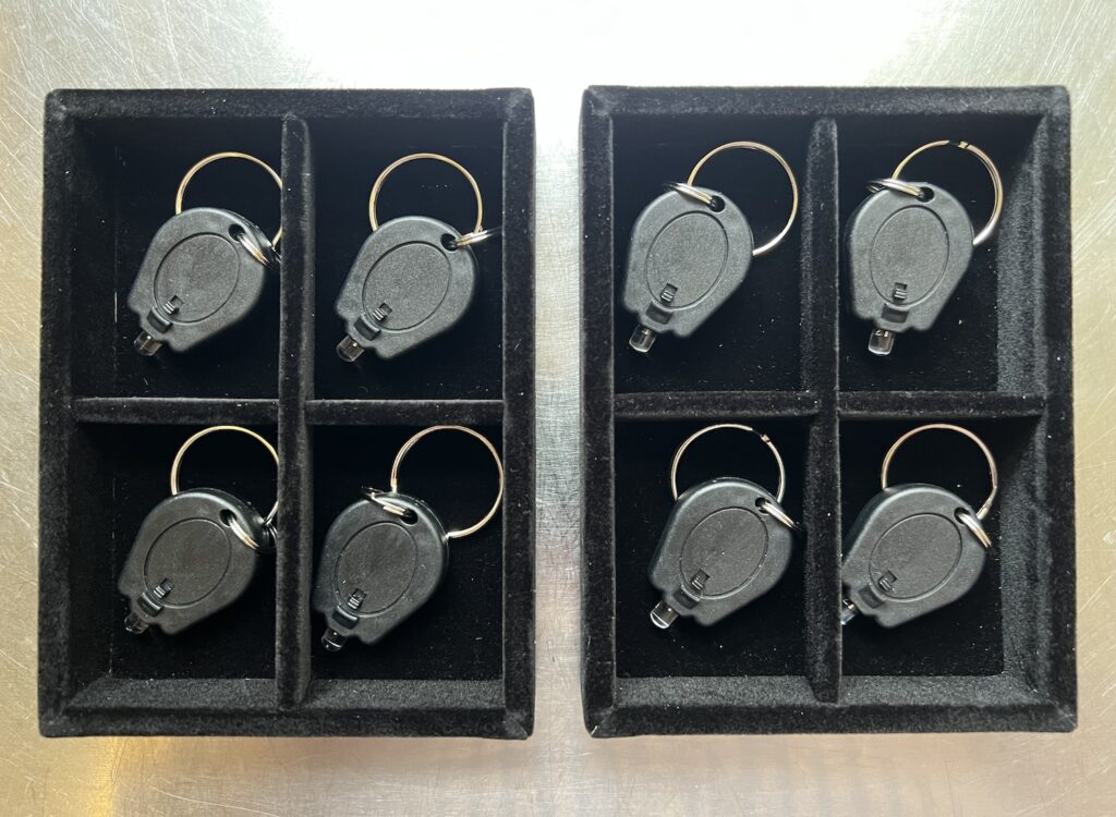
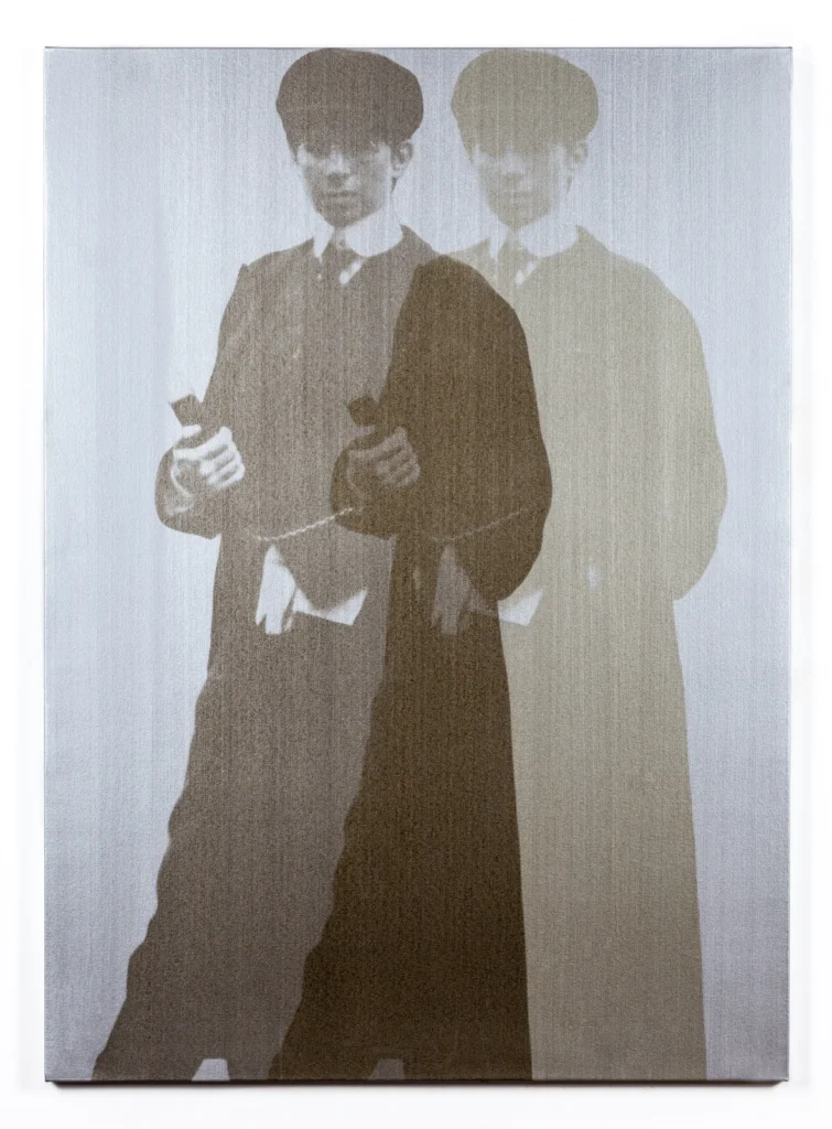
Quartet in Black & Blue, 2025, dimensions variable, ed. 2+1AP
Whenever democracy dies in darkness, art struggles to be born. In darkness. Wait, what? Point is, now you and three friends can experience art together at home, or wherever your dark place is. There really are so many possibilities, and they’re increasing every day!
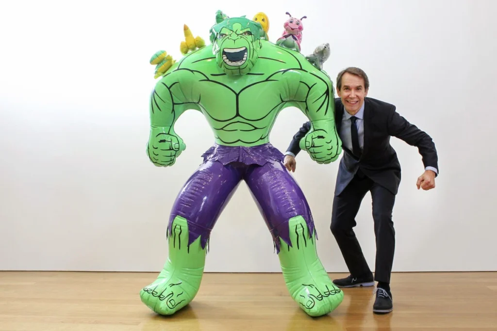
it was there all along: May Tse’s 2014 photo of Koons hulking for the South China Morning Post at Gagosian HK
On the latest episode of artnet’s Art Angle podcast, Andrew Russeth called the Hulks Jeff Koons’s self-portraits, and now every photocall of Koons making deranged faces and poses around his sculptures for the last thirty years makes sense.
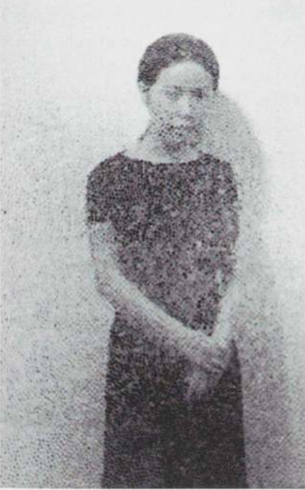
Yayoi Kusama, double exposure self-portrait, 1960, via MoMA’s 1998 catalogue, I think.
I think you have to go back to Yayoi Kusama to find an artist more embedded, photographically, in their own work. To the extent it represents her own obliteration, Kusama’s work is a kind of self-portrait, too, I guess.
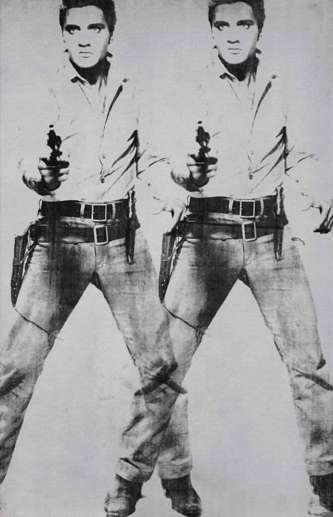
Warhol, Double Elvis (Ferus Type), 1963, silkscreen ink and silver paint on linen, 82 x 53 or so, I’m rounding for legibility. The guarantor who paid $53m for it at Christie’s in 2019 knows how big it is
Koons calls these Hulks Hulk Elvis, presumably because of the stance. Warhol’s Elvises never registered with me as self-portraits the way Deborah Kass’s Yentl paintings do. But clearly, I’ve been missing the signs.
Deborah Kass, Double Ghost Yentl (My Elvis), 1997, silkscreen ink and acrylic on canvas, 72 x 52 in., via Kavi Gupta Gallery
Russeth also referenced Peter Schjeldahl when saying that Koons’ operative mode is rage, which, after all, is what provoked Bruce Banner to transform into the Hulk. The specific line I remember is from Schjeldahl’s review of Dakis Joannou’s collection exhibition at the New Museum, where he was a trustee, and he said “his deepest passion is anger.” But I think Russeth’s closer. Which reminds me, isn’t the New Yorker art critic desk still open? Can we not manifest this?
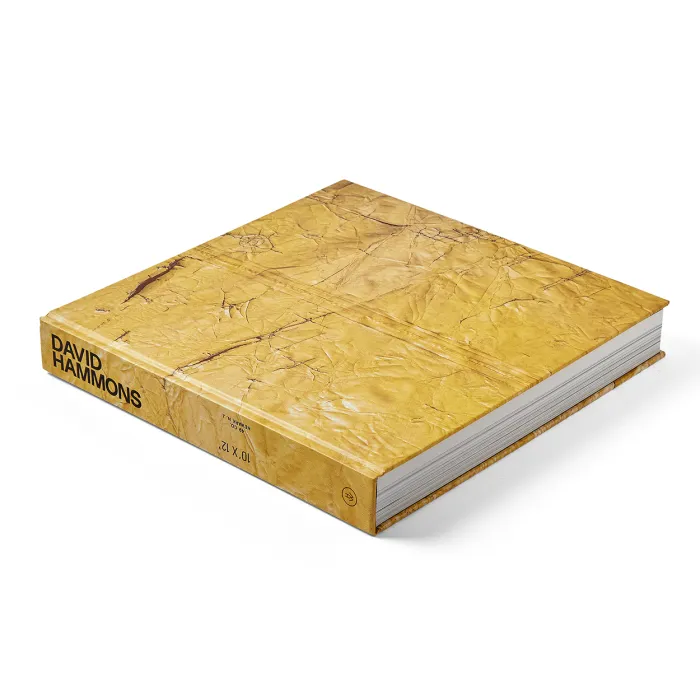
In the first paragraph he calls David Hammons’s massive artist book disguised as a six-years-later Hauser & Wirth exhibition catalogue a gift. But with his review of the 7-lb, textless object for Art in America’s newsletter, TK Smith definitely does the work. I’d say he earned it:
Here, I found myself questioning my desire for this book to be legible, conventional, and useful. Is he challenging me, scolding me, or flirting with me? His refusal to make it easy to intellectualize his work feels like an invitation to a wider audience to exercise a different set of skills: he is inviting us to see as he sees while making room for our own responses and interpretations. It is evident through the book’s images that so much of Hammons’s work is made possible by everyday audiences, whether that audience is indulgently purchasing ephemeral artworks or simply taking time to witness the sublime in the mundane. You travel through the pages and experience what compels you. It may be wholly cliché to say, but the book reads much like jazz—there is a rhythm, but it is not consistent. It lingers here or there, it gets loud and hot before lulling to a confident hum.
Screencap from Spike Jonze’s Her (2013), from a gif by @bladesrunner
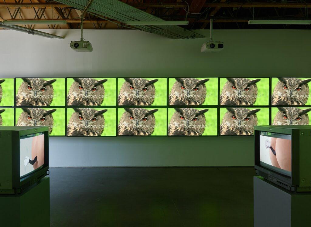
Imagine an internet retail revolution that not only created online shopping, but that brought digital shopping into the physical world. The mp3 store. The gaming store. The stock footage store.
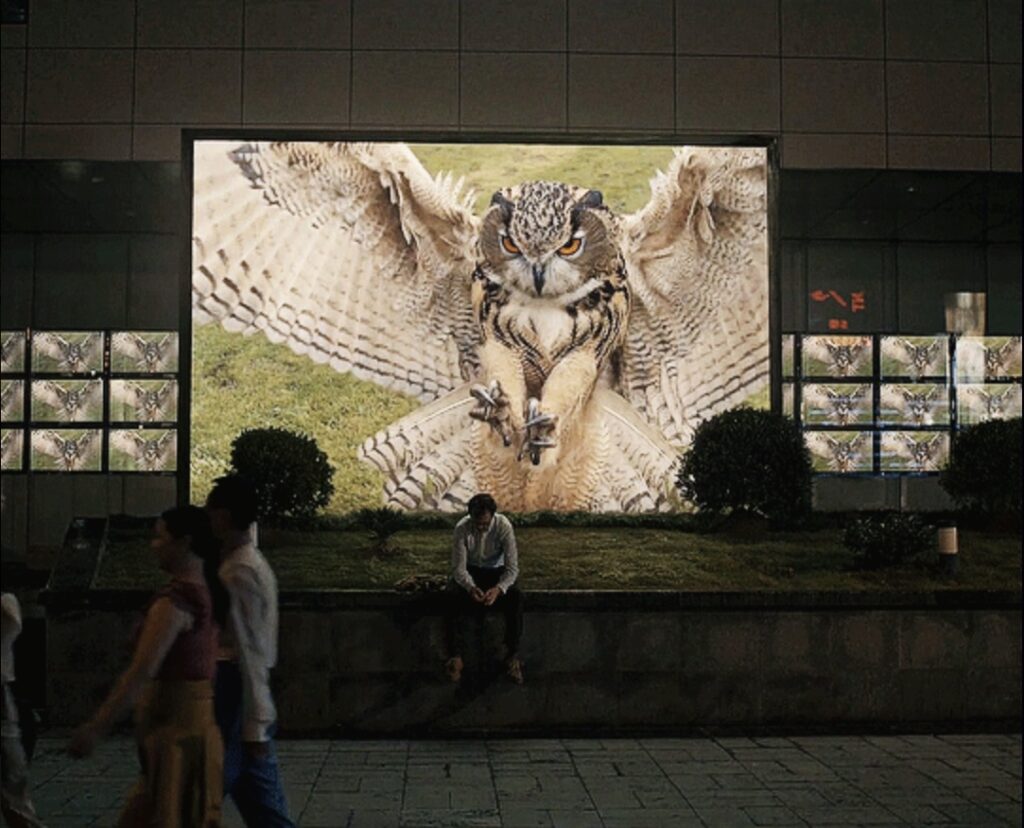
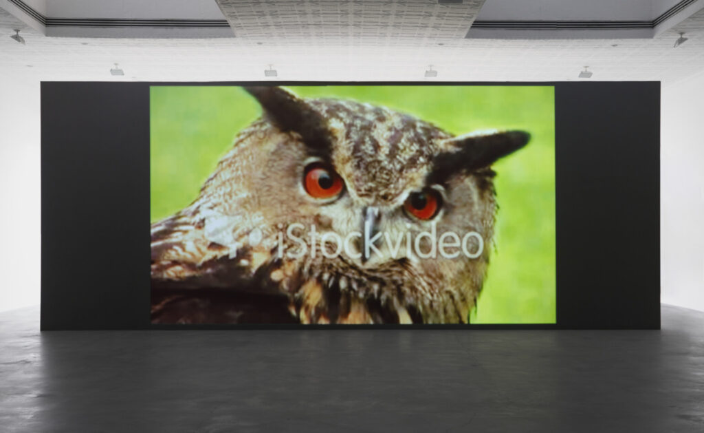
Sturtevant, Simulacra, 2010, single channel 16:9 video, installation view at Matthew Marks, 2022
The stock footage store.
Imagine a bustling day in 2009 or ’10 at the iStockVideo store in Paris, in the old BHV, the department store where Duchamp bought his readymades. Under the high ceiling a long table arrayed with great horned owl footage. A chic but cantankerous Sturtevant and a cheery, slightly sheepish Spike Jonze both rummaging through the tablets, realizing each other’s presence when the reach for the same clip. They look up, Jonze smiles, says, “Pardon” in his downtown French, and pulls back his hand. He casually peruses his way to another clip.
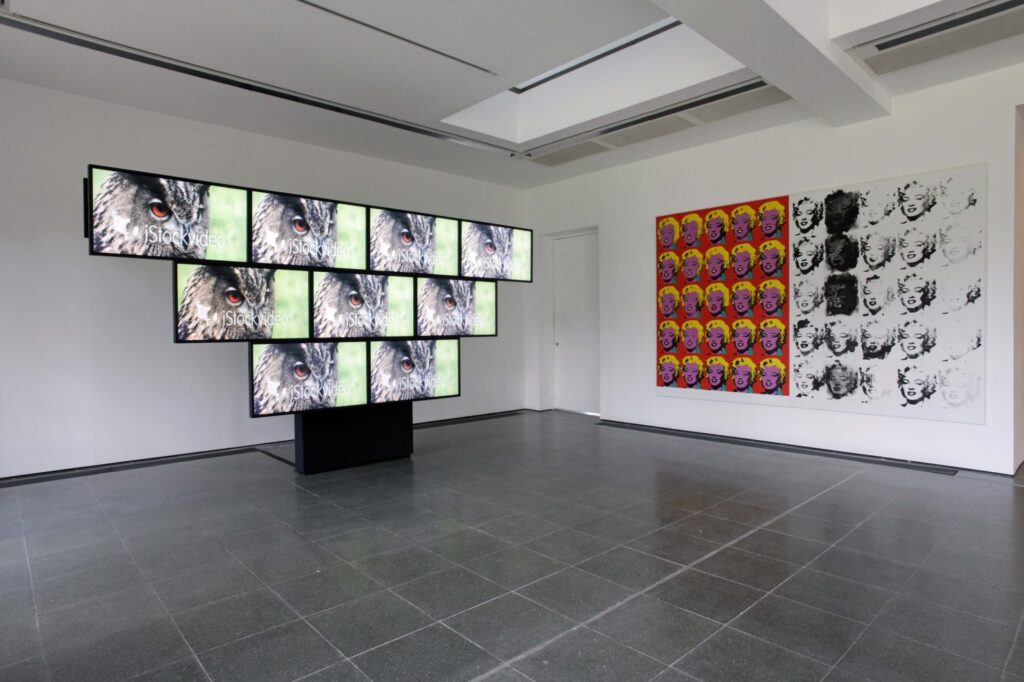
Installation view of Simulacra, 2010, from Sturtevant: Memes, at Freedman Fitzpatrick, 2019, via CAD
Imagine in that world, as in ours, Sturtevant opens a show at the Serpentine in 2013. Spike Jonze’s Her, 2013, was released in France on March 19, 2014, and Sturtevant died on May 7. Imagine this 89 year old Deleuzian, in what would be the last few weeks of her life, going to the cinema to see the movie about the guy in love with his bot. In that world, as in ours, she just opened a show at the Serpentine with a video wall of owl footage. She sees this scene of Joaquin Phoenix on the sidewalk.
installation view of Rock & Roll Simulacra, Act 3 (2013) in Leaps Jumps & Bumps, 2013 at the Serpentine Galleries, image: Jerry Hardman-Jones
Does she then remember that fleeting encounter, years earlier, at the owl clip shop? Is the question I’d rather consider than the one this world has presented me when tumblr’s algorithm presented this gif to me because it thought I “looked interested.”
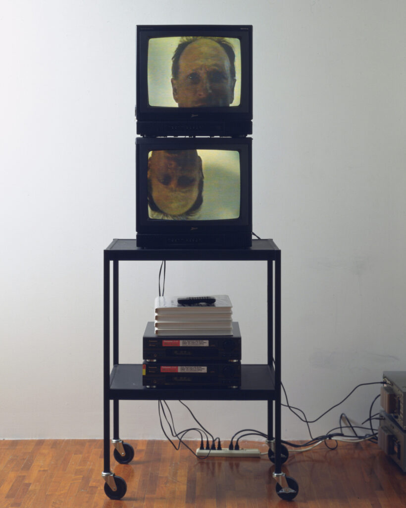
Bruce Nauman, Think, 1993, a 1996 gift of the Dannheisers to MoMA [via @voorwerk]
I saw this two-channel Bruce Nauman piece, Think, on the tumblr and marveled briefly at how, when you were soaking in it, the 1990s aesthetic wasn’t an aesthetic; it was just the world around you.
And then I zoomed in to see what exhibition catalogues were stacked on top of the player, and that’s when it hit me: those are no catalogues. They’re the plastic storage cases for laserdiscs. Sitting on top of two new Panasonic LX-101 mini-players, so new they still have the showroom stickers on them.
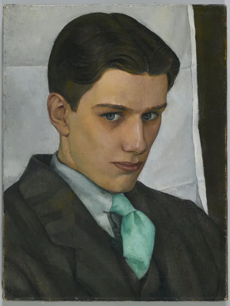
Luigi Lucioni, Paul Cadmus, 1928, oil on canvas, 16 x 12 in., acquired in 2007 by the Brooklyn Museum
In 1926 Luigi Lucioni, 26, and his Art Students League classmate Paul Cadmus, 21, were roommates for a fellowship at the Louis Tiffany Studio on Long Island. In 1928 Lucioni painted this portrait of Cadmus, which got recognition of some kind at the exhibition where it debuted.
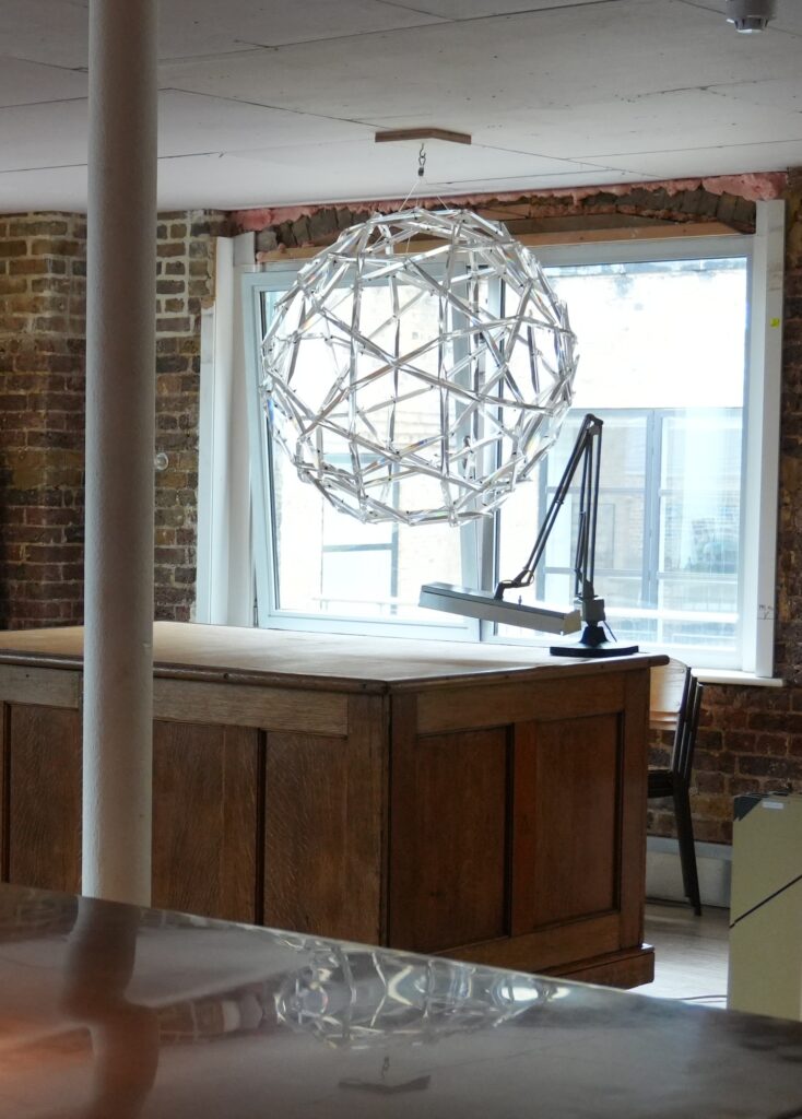
Buckminster Fuller Geodesic Chandelier as installed at Drawing Matter London, image: Jesper Authen
I still don’t have it/one, but that’s not important right now. What matters is that the truncated icosahedron chandelier made of Perspex prisms and fishing line that Buckminster Fuller concocted as a belated wedding present for HRH Princess Margaret and Lord Snowdon remains in good hands, and is well-cared for.
At some point after blogging about its 2007 appearance in a World of Interiors feature, and after tracing its original sale, I realized that was not some random table in a random former cheesemaker’s cottage in Somerset it had been sitting on. It had been acquired by Niall Hobhouse, and the cottage was part of Shatwell Farm. Hobhouse had made the working corner of his ancestral lands into the site of Drawing Matter, his ambitious archive of architectural drawings and research.
Last fall, Drawing Matter moved into town, and the chandelier came with it. Came home, in a way. In 2008, seeking to fill out its history, Hobhouse invited His Lordship to share his recollections of this singular object. Apparently it was too big to fit through the doorway of their private apartments at “KP,” so it was installed over the stairs. And indeed, it was remembered less as a two-years-late wedding present, and more of a way for Fuller to gain an audience, and perhaps, patronage for his world-building architectural schemes.
Anyway, last week Jesper Authen of Drawing Matter kindly sent along a photo of the chandelier, which lends a mid-century Kensington Palace vibe to the archive’s new Central London space. Truly I’ve never seen it looking better.
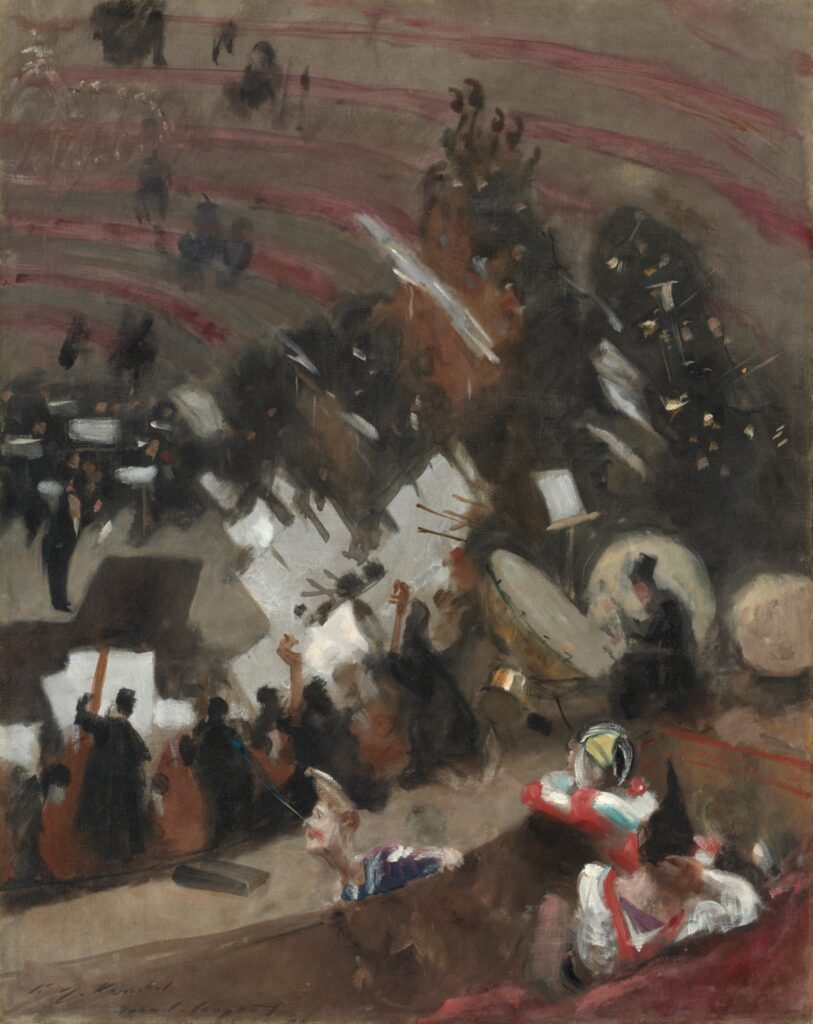
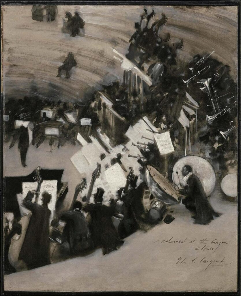
John Singer Sargent, Rehearsal of the Pasdeloup Orchestra at the Cirque d’Hiver, 1879, 93 x 73 cm, on loan to the Art Institute of Chicago
John Singer Sargent made these two vertiginous paintings of orchestra rehearsals in the Cirque d’Hiver when he was in his early 20s. The wild grisaille one at the MFA Boston, tighter, and without the lounging clowns, is thought to be influenced by a similar monochrome rehearsal study by Degas, whose work Sargent knew.
Rehearsal of the Pasdeloup Orchestra at the Cirque d’Hiver, 1879-80, 57 x 46cm, collection, MFA Boston
The extended text at the MFA Boston makes it sound like Sargent whipped out a canvas in the middle of rehearsal and just started painting. It does look that way, though the Art Institute canvas is almost a meter tall. They’re both at the Met rn for the Sargent in Paris show.
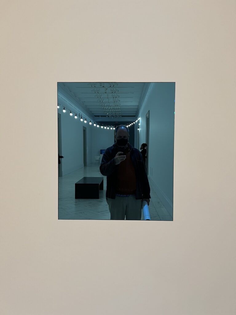
a selfie in the work at npg [honestly, maybe the real art is the way the light reflecting off my dome lines up with the light string behind me]
“If an owner has chosen to lend the work for an exhibition, the owner may choose to simultaneously install the work.”
“An authorized manifestation of [the work] is the work, and should be referred to only as the work.”
Via a recent post to Instagram by the Felix Gonzalez-Torres Foundation I learned what I could have realized many years ago: that “Untitled” (Fear), 1991, the blue-tinted mirror, is not an object, but a work. And as such, it can be presented in multiple manifestations simultaneously.
Recumbent frog, marble, 25.8 by 17 by h. 12 cm, Early Shang (pre-Anyang) era, 1600-1298 BCE, sold at Sotheby’s HK in 2022
Look at this frog. Just look at it. A marble frog the size of a good spaghetti squash, carved with exquisite simplicity, with that flat mouth, the rear legs in relief like a pair of wings, THOSE EYES. It’s barely been published or shown—once at the Century Club in 1955? Does that even count?
Side view of the Sotheby’s HK 2022/Japanese/Eskenazi/Century Club Shang marble recumbent frog
And then in 2022 it pops up at Sotheby’s HK, out of a private Japanese collection, who’d bought it in 1991 from Eskenazi, and is hailed as an outstanding sculpture from the Shang dynasty, one of just three known Shang marble frog sculptures. Of course it would sell for HKD 28 million (USD 3.5m), almost 10x its original estimate.
The exhausting and endless stream of idiots pouring out of America’s fascist clown car these days makes me hate Salvador Dalí’s attention-grabbing, money-craving, absurdist bullshit even more.
Now every time I have to see, like, Dalí putting a starfish on his head for a 1957 photoshoot about how he’s trying to get a sea urchin to make a painting with a swan’s feather in its mouth, or maybe a dry flower, I can only think of how it distracts from the news that he’d just had another audience with Franco.
So instead of calling him out, and the art world folks who stuck by him for the art, from MoMA and the National Gallery to Duchamp to the whole Suzi Gablik crew who summered in Cadaqués, and then pointing out the admittedly striking photo enlargements of 19th century engravings of sea urchins, should I have followed Picasso’s example, and never spoken or blogged his name or work again?
Anyway, in the five seconds I spent trying to reverse image search the engravings he used, I decided that sea urchins are very aesthetic and should not be canceled because of their worst fans. But also that 18th and 19th century engravers copied and recopied each other for generations, and though the details and quality of execution might vary, the results are basically the same. And in that way, they’re like fascists.
Mint, partially in box? The wood base has been unboxed for this photo showing the untouched and apparently intact glass top of a Noguchi Coffee Table, from the era before foam packaging, selling 5 June 2025 at Potter & Potter
The Eames plywood leg splint market knows how to handle splints in their original packaging, partly because there are so many of them. The Noguchi Coffee Table market, OTOH, has to be looking at this thing and scratching their collecting heads.
The crate has a shipping address on it, twice, for Charles Eames at the Venice studio. It feels like a grail of some kind? But of what? That address has a zip code, so it’s after 1963. And it is printed with a large-format dot matrix printer, which, according to my IBM sources, was not even a thing until like the late 1970s at the earliest. Charles died in 1978.
So unless it’s going straight to a new garage, I assume whoever buys this will unbox it immediately, and end up with a nearly 50-yo coffee table that looks like you just bought it at DWR.
Does Hauser & Wirth have a conventional commercial relationship with David Hammons? As Zhou Enlai said when Henry Kissinger asked him about the impact of the French Revolution, “It’s too early to say.”
Installation view, David Hammons, Galerie Hauser & Wirth, Zürich, 2003 via hauserwirth
In a just-published oral history Marc Payot, a president at Hauser & Wirth, remembers the early days:
Donald Judd, Untitled, 1988, woodcut, 60 x 80cm., ed.25+10AP, this example is in the Fisher Collection at SFMOMA
I saw this Donald Judd woodcut on its own and was so shocked by its monochromeness I didn’t even recognize it. All I could see was the blue monochrome screenprint edition Derek Jarman may or may not have completed for the letterpress edition of the script for Blue.
I’d wrestled with trying to fix that only partially realized print by remaking it with the aspect ratio of the film, only to get stuck trying to figure out which version of the film to use. And maybe the Judd felt like a Jarman because it’s printed on 60 x 80 cm sheets, which is the same ratio of Jarman’s print—though his was apparently vertical—and which is also the same 4:3 aspect ratio of 1990s TV.
Donald Judd, Untitled, 1988, 10 woodblock prints, 60 x 80cm, ed. 25+10AP, this set from SFMOMA
But none of this, I think, is Judd’s concern at all. This woodcut was published by Brooke Alexander as part of a portfolio, and that’s how I’ve always only ever seen it. The series of ten prints indexes a rectangle cut by 0, 1 or 2 lines; horizontal or vertical; and positive or negative. The portfolio was made in three colors: cadmium red, blue, or ivory black, in editions of 25+10 aps (each).
But now in this context, it becomes hard to see the one solid print as anything other than a part of a series, the precursor state, the base, for the cuts to come.