Untitled (richardprince4), 2014

Soon after her arrival at MoMA in the late 1990s, Laura Hoptman and I had [what I remember as] a heated discussion about the nature of art. She said that as part of the culture, all art was for the public. I tried to argue that there could be exceptions; she was unconvinced. Of course, to put it more bluntly than she ever did, part of her job was to instill in an eager young collector the instinct to steward his art and money toward the museum. Which, sure. But what I was unable to explain at the time was that I imagined an artist being able to make an artwork not for “the public,” but for a person, that a work could be intended to be experienced solely by a particular person, and that would be enough.
[I didn’t know about Ian Wilson’s conversational works at the time, but that, along with James Lee Byars’ fantastical ephemera, have given me plenty of reasons to recall our invigorating conversation. Also, the irony that it took place on the deck at the Rubell’s hotel in Miami, after a visit to their still-raw DEA warehouse, means I get flashbacks every time I go to ABMB. But that’s not the point right now.]
rprince_gagosian_portraits.jpg
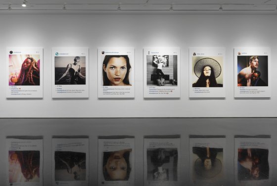
Anyway, last Fall, I wrote about Richard Prince’s Instagram portraits show, and what I saw as the subtle mix of alteration and aspiration that went into them. Our social media personas are one fiction, and his comments and interactions are another, and the construction of the digital interface/frame is yet a third.
francotv_ur_princestagram.jpg
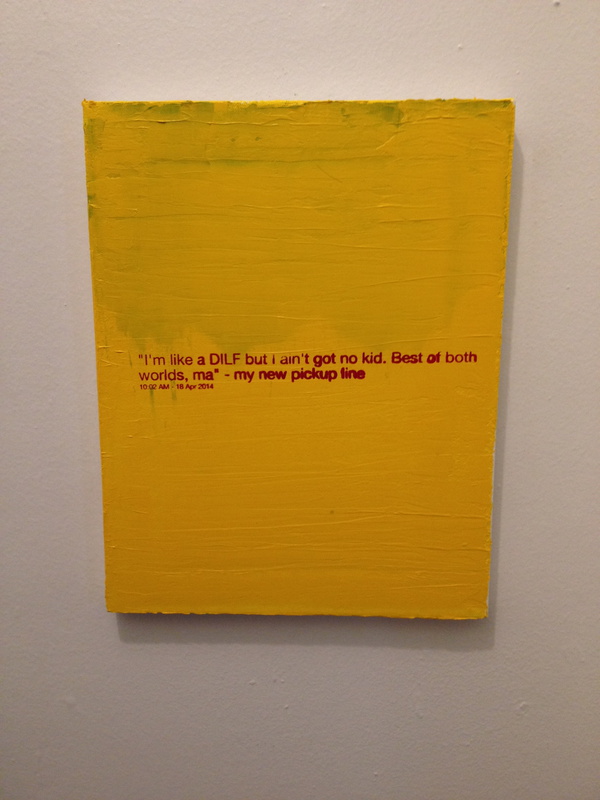
I framed Richard Prince: Study for Untitled (richardprince4), 2014
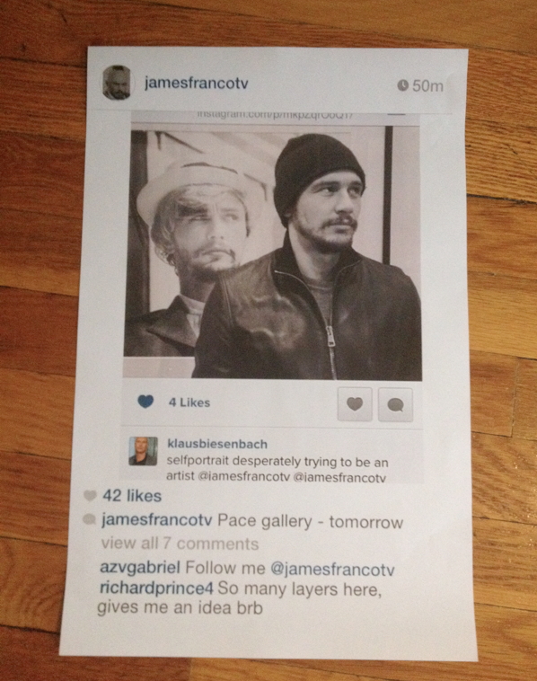
To illustrate the point, and to underscore what I saw as some of the more abject, exposed emotional elements of Prince’s works, I created my own Instagram portrait “by” Prince, using a convoluted, regrammed image of James Franco as Cindy Sherman by Klaus Biesenbach.
I added a flatfooted quote from Prince at the bottom, rolled back the timestamp, and then made a Prince-like print of the screenshot. Which I used as an illustration in the blog post, fictionalized evidence that Prince’s controversial Instagram works had been inspired by Franco’s embarrassing Sherman reboots. I thought my conditionals and qualifiers would be obvious…

Did Prince recognize something of himself through Franco’s[!] layers of mediated desperation [Klaus’s (?) term], not just an artist, but a Shermanesque shapeshifting master? Did he see Franco’s and these other kids’ Instagram personas and want to get in on it? Did he want to be a Nightcore? Or worse, did he want to be a Franco? Is this the lifestyle envy that fuels the whole thing? Or is this just one more image, one more comment, one more layer of media we’re supposed to question but probably won’t?

…but even the satirical suggestion was still too much for Prince, who unfollowed me on Twitter soon afterward. Prince prefers to be in control of the fictions around his works, and I can dig that. But also he was the one who’d declared the unilateral appropriation and manipulation of someone else’s social media presence as a tactic. And as Warhol said about Coca-cola, now everyone has an iPhone, from the president to the bum in the street.
npg_portrait_jury2016.jpg
Dawoud Bey be like, “Jerry…”
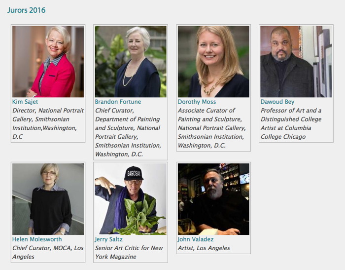
I bring this up now because just days after posting the Prince/Franco/Klaus pileup, I saw an announcement for the National Portrait Gallery’s Outwin Boochever Portrait Competition. I’ve seen previous NPG Portrait Competition exhibitions, and they were numbing, like a state fair for art. And then I saw that this time, one of the jurors was Jerry Saltz. And I decided that it would be hilarious to plant this toxic matryoshka doll of a portrait in the competition, for an audience of one: Jerry.
untitled_richardprince4_npg.jpg
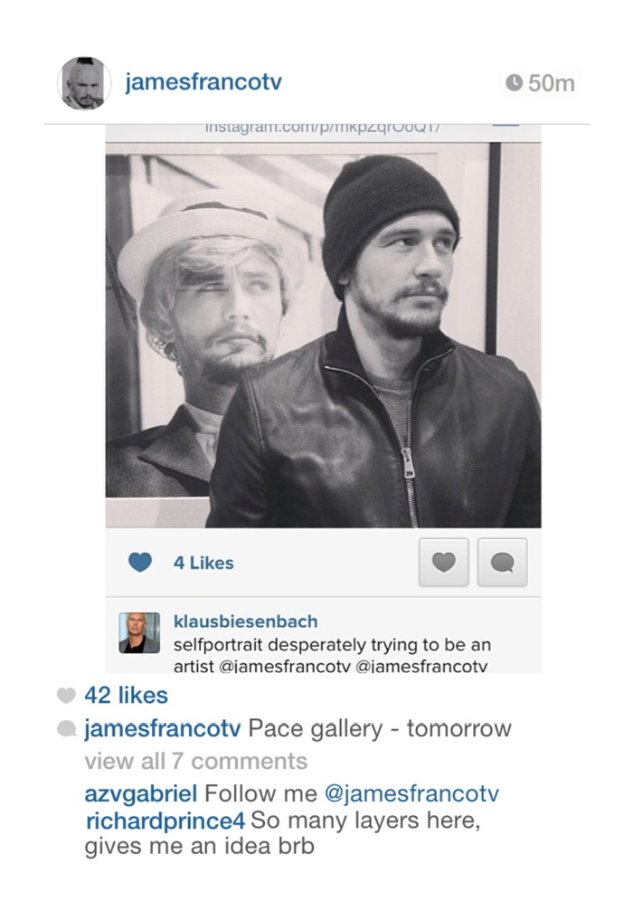
Untitled (richardprince4), 2014, 72×48 in., inkjet on canvas, unrealized
So I entered it. The first round is judging by jpg and a brief explanatory text [below]. The work would be an inkjet, 4-ft wide, the same dimensions as Prince’s, but I would print and stretch it only after it got selected for the in-person judging of the semi-finals. I called it Untitled (richardprince4). It was a portrait of Prince. And not a terribly good one. I didn’t get his comment right; it turns out it takes a lot of effort to appear as awkward as Prince does on Instagram. My portrait of him feels about as successful as that dead-eyed painting of the Duchess of Cambridge a while back.
But that was secondary to its presence in the staid context of the National Portrait Gallery competition, where I imagined it sitting, waiting, like an IED of WTF, to blow up the ideas of portraiture and reality. I kept totally silent about the entry for seven months, because I liked the idea of Jerry stumbling across it in a weary jury slideshow and being momentarily entertained by it way more than I liked the idea of kiss-ass campaigning.
Which wouldn’t help anyway. The nested art world personalities are too insidery, and the references are so contorted, and the text so clumsy, that I didn’t think anyone besides Jerry would ever care about it, and even he was iffy. If he grabbed onto it, great, but I never imagined it would get past that first shock or bemusement in the competition. Maybe a whoopie cushion is a better analogy than an IED.
And sure enough, my rejection notice came today. Whatever reaction he had, I don’t know–there were 2,500+ entries, so maybe he didn’t even see it after all–but I found the months of secret possibility to be quite satisfying. This image has done its job. And the world is a better place without a 4×6 foot canvas version of it in it.
Or maybe…if I print it up and light it on fire, Richard Prince will start following me on Twitter again…
View Source: Richard Prince’s Instagram Portraits
Outwin Boochever Portrait Competition 2016 [portraitcompetition.si.edu]

Continue reading “Untitled (richardprince4), 2014”

How Do You Solve A Problem Like Klaus?

I generally stay out of public arguments about MoMA. I feel too close, yet I’m not an insider. MoMA doesn’t need my apologia, and my firsthand experiences within the museum are not going to sway anyone. Everyone there is a grown-up who should be able to handle the responsibility for their decisions and actions.
Though I won’t see it until next week, I am fully prepared to be disappointed by the Bjork show. The museum went to an extraordinary effort on the show, to some very specific ends, that turned out to be the wrong ones. I would like to find out how things went wrong, and what can be done about it. I’m certain I’m not alone.
But Christian Viveros-Fauné’s artnet column yesterday, which purported to pull back the curtain on Klaus Biesenbach’s reign of curatorial terror at MoMA, is not going to help; it is not only poisonous and pointlessly personal, it’s inaccurate. I’ll give CVF the benefit of the doubt that his outrage skewed his interpretation of every rumor and anecdote, and that he’s not as reactionary or willfully ignorant as his errors make him seem. But it’s a non-credible non-starter for an actual discussion of MoMA’s situation.
Here’s a drive-by of some of the things that made me wince, and then a factcheck on what strikes me as a disqualifying error: the claim that Klaus ruined Marina Abramovic’s entire performance in The Artist Is Present.

Continue reading “How Do You Solve A Problem Like Klaus?”

Redneck-Flown Confederate Flag

soyuz_confederate_flag1_2005.jpg
What’s that? #20 – Soyuz TMA-5 Flown Flag? Oh nothing, just a flag, like you’d see anywhere.
Next month RR Auction is selling a Confederate Flag that flew on the International Space Station. It is signed by Salizhan Sharipov, the Russian cosmonaut who brought at least five of the flags to the ISS in 2004-5, and by NASA’s own Leroy Chiao, who was the commander of the pair’s 6-month expedition.
The flags caused an uproar when they first started appearing on the flown souvenir market in 2006, and both Chiao and Sharipov acted like they had no idea how those flags might’ve–Confederate flags, you say? Well how’d that–who coulda–
Which seems like total crisis PR-driven bullshit, and a lot of needless racist hassle for a couple hundred bucks. But anyway, here one of the apparent five flown is.
#20 – Soyuz TMA-5 Flown Flag, est. $200, sold for $437.33 [rrauction]
How Did A Confederate Flag Get Aboard the International Space Station? [spaceref]

The Social Mirror, Recycled (2015)

recycled_model_2.jpg
study for The Social Mirror, Recycled, 2015
Recently I entered an open call for a public art commission. It was sponsored by the District of Columbia’s Department of Public Works, which was looking for designs in which to vinyl wrap DC’s single-stream recycling trucks.
I was compelled to enter for several reasons. One is my own long-standing interest in the highly under-utilized medium of vinyl wrapping vehicles. The other is a strong sense of responsibility and history surrounding any artistic endeavor involving garbage trucks.
social_mirror_armory_feldmangallery.jpg
The Social Mirror, 1983, Mierle Laderman Ukeles, image: feldmangallery.com
The examples shown in the RFP of vinyl wrapped garbage trucks in other cities were, to put it mildly, atrocious. Maybe underwhelming is more politic. Whatever, it turns out there are jurisdictions in this country who have been putting art on garbage trucks without the slightest apparent regard for the alpha and omega of garbage truck art: Mierle Laderman Ukeles’ 1983 The Social Mirror. It just didn’t seem right. It didn’t seem possible.

Continue reading “The Social Mirror, Recycled (2015)”

Proposte monocrome, eBay, rose

klein_apollinaire_monochromes.jpg
Yves Klein had two shows in 1957 titled Proposte monocrome (Monochrome Proposition): the first was in January at Galerie Apollinaire in Milan [above], the second in October at Galerie Iris Clert in Paris.
In each case, Klein presented a group of eleven blue monochrome paintings of identical size, production, and appearance, but with different prices. Klein argued that despite initial appearances, each painting was in fact quite different:

Each painting’s blue world, although all of the same color blue and treated in the same way, revealed itself to be of an entirely different essence and atmosphere; none resembled the other, not anymore than pictorial moments and poetic moments can resemble one another.

And the prices proved it.

The most sensational observation was that of the buyers. Each selected the one that pleased them the most among the displayed paintings, and paid its price. The prices were all different, of course.

These quotes are from a 1959 lecture Klein gave at the Sorbonne, which was released as a limited edition LP. Klein delivers the last sentence like a punchline, “Et les prix sont tous differents, bien sur,” is followed by applause, gasps, and laughter. [It’s in the first 2:00 on this ubu mp3 excerpt.]
Klein’s Monochrome Propositions were intended as a spiritually enlightening alternative to the polychrome world, a gateway to the mystical energies of the universe. And the pricing, Sotheby’s argued, was “an audacious ploy that demonstrates Klein’s ingenious handling and overcoming of the disjuncture between art and commerce.”
I have never been able to reconcile these two aspects of Klein’s early monochrome shows. Until now.
test_test_no_item_pink.jpg
While searching through thousands of eBay test listings, I found an eBay test store that followed Klein’s strategy. The same monochrome image was used for two dozen separate items–which all had different prices. The only problem was that there could be no buyers with no items for sale. I have solved this by making prints of nine images available at eight different prices.
And now I understand the Monochrome’s Retail Proposition. The visual cacophony of a typical eBay search result is replaced by soothing uniformity. In this Kleinian spiritual paradise, I am left free to focus on the differences, both those I imagine, like shading variations in the jpgs, and those of price. My decisions fall away, all I need to think about is the essence of the transaction: to decide how much I want to spend.
test_test_no_item_pink.jpg
Untitled (Test Test Test Item 16 –DO NOT BUY, NO ITEM FOR SALE), 2015
5×7 in. digital inkjet print
signed and numbered from an edition of 15 plus 2 aps
with price and shipping terms set in the original test listing:
$30+20 freight

Sound familiar? You can try it at home: Why spend $50 when there’s an identical one for $25? But the “freight shipping” is more than the photo itself. Oh, I might buy a photo, if they weren’t so cheap. It really is whichever one pleases you most.
See all nine Test Test Test prints, plus others [ebay/nycgreg]
Previously: Untitled (Do Not Bid Or Buy)

The Tonight Series

dove_moon_diary_AAA.jpg
Arthur Dove moon drawings, from Helen Torr Dove & Arthur Dove’s diary, 1936, image: aaa.si.edu
In 1936 Arthur Dove and his wife Helen “Reds” Torr were living upstate, in Geneva. That fall Reds went to Hartford to take care of her injured mother, and was gone for what turned out to be more than two months. Alone and pining for his wife, Dove eventually began making sketches of the moon each night in the diary they kept together.
From Jennifer Stettler Parsons’ 2012 essay on Dove and the moon:

In addition to recording the temperature and weather conditions, Dove began making drawings in his diary (1936 diary, p. 137). These sketches, with their shadings and mysterious markings, appear to be evidence of the artist tracking the moon. The moon drawings continue each day with notations of temperature and barometric pressure, until Reds returned home on 8 November 1936.13 (1936 diary, p.155, 160). They mysteriously cease for two days on 15 and 16 November, but recommence on 17 November. (1936 diary, p.164-165) Dove continues to draw the moon every day until the end of the year. The new 1937 diary contains no moon drawings.(1937 diary, p.2) The drawings do not directly correspond to any established system of astronomical recording. The lunar notations, with their symbolic shadows and arrows (which change and move in each drawing), might be said to represent an individual system that Dove invented to document his observations in a personal and meaningful way.

Dove and Torr’s papers are at the AAA, which has digitized their diary.
Absence and Presence: Arthur Dove’s Paintings “From the Radio” by Jennifer Parsons [aaa.si.edu]
Helen Torr Dove and Arthur Dove diary, 1936 [aaa.si.edu]

Untitled (Do Not Bid Or Buy)

do_not_bid_or_buy_iris_SHIP_DSCT_2.JPG
Untitled (ANDR Test Auction – DO NOT BID OR BUY – Ship DSCT 2),
2015, 5×7 in. digital inkjet print, ed. 15+2AP, of which
10 are available, $3+6 s/h

3/16 UPDATE: New images are listed at the bottom of the post, check them out.
Yesterday @yunginstitution turned me on to the Test Auction section of eBay, which is amazing. Test listings are for eBay developers to debug different features and settings, or for Power Users to preview and QA their regular listings. These auction listings have esoteric acronyms and abbreviations for titles, and images that range from stock to baffling to perfect. And they are full of warnings like TEST ITEM DO NOT BUY OR BID, and NO ITEM EXISTS NO FEEDBACK GIVEN
Well, these items exist now. And you can bid, and you can buy, and feedback will be given.
I have taken a selection of eBay test listings and recreated them to sell digital inkjet prints. The availability and pricing is determined entirely by the original listing. These 5 x 7 inch prints will be signed, stamped and numbered, and would obviously look best in groups.
Because they have “test” in the lot title, eBay won’t allow the prints to be listed in the regular, searchable categories. But the customer service person I spoke with said they’ll function just fine in the Testing category. They only look unbuyable.
do_not_bid_or_buy_carrier.jpg
Untitled (Andr test auction do not bid do not buy carrier 2)
2015, 5×7 in digital inkjet print, ed. 15+2ap, of which
one is available in this listing, $1 + 5.32 s/h, $15.32 intl [note: updated link to current relisted item

After I created the first several print listings, which are all quite cheap for what they aspire to be, I realized I could sort the thousands of test listings by price. And oh hey, it turns out some were quite expensive for what they are. So I added a few of those to the mix, too. To hit all the price points.
do_not_bid_or_buy_Mbin_Commit.jpg
Untitled (ANDR TEST – JERBEAR – DO NOT BID OR BUY – MBIN COMMIT),
2015, 5×7 in. digital inkjet print, ed. 50+6 aps,
34 of which are available in this listing, $3+5s/h, $15 intl

Right now there are 18 19 images in the series, including a monochrome, one suite of eight prints, one pair, and two that could really work as a pair. Plus a picture of an actual pear.
Shop the entire series on my eBay seller page, or after the jump.

Continue reading “Untitled (Do Not Bid Or Buy)”

Situation: Art School, All Teed Up


This tweet from artist Nayland Blake, who heads ICP-Bard’s advanced photography MFA program, has been sticking with me all day. Blake’s participating in a symposium Friday at Pratt with some other folks I know and respect a lot, on the nature and challenges of art school.
At first Blake’s panel topic, “What is the role of art school in a market driven art world?” sounds like appropriate self-flagellation, and since William Powhida’s also participating, I could imagine who’s wielding the whip. But Bill’s not just an iconoclast, and Blake’s tweet gives hope for a constructive panel, if not quite yet hope for a better world.
Davdi Ross is in the morning, and BHQFU is in the afternoon, so it sounds like a full day. I hope it’s streaming.
Situation: Art School symposium at Pratt, March 6, 2015 [pratt.edu]

Black Boxes, White Cubes

mccracken_black_box_pdx_tinariversryan.jpg

This tweet from Tina Rivers Ryan’s visit to the Portland Art Museum caught my attention tonight like an eBay alert. Everything about McCracken’s 1965 Black Box, starting with the camera angle and the installation itself, felt very familiar.
caleb_larsen_deceive_slaughter.JPG
Because it looks almost identical to the most common image of Caleb Larsen’s 2009 sculpture, A Tool To Deceive And Slaughter. McCracken’s cube is 16 inches, while Larsen’s is only 8 inches on a side. The Box is resin- and fiberglass-coated wood, while the Tool is acrylic. Also Larsen’s has a computer and an ethernet connecton, and automatically tries to resell itself on eBay. It’s the little differences.
Black Box, John McCracken, 1965 [portlandartmuseum.us]
A Tool To Deceive and Slaughter, 2009 [caleblarsen.com]

Art Panels, Or A Stylish Quickie

informedspace_plastic_furniture_1.jpg
Realtors and developers pay several thousand dollars/month to stage properties for sale. Staging companies move out the seller’s accumulated lifetime of crap and move in a whole array of tastefully bland furniture and accessories to make the place look or feel bigger or nicer. Remember that aristo hobo couple in Charleston in the Times a few years ago who basically live for free by moving themselves and their heirlooms into the plantations and spec homes they stage?
informedspace_plastic_furniture_3.jpg
Wow, that was 2011, too. Which turns out to have been peak staging? Because I just found this bonkers story from Curbed in 2011 about InFormed Space, a staging startup that provides gatorboard ghosts of high end furniture, starting with a $14 million townhouse gutjob in Chelsea. From a NYDN story:

it’s easy to move the ultra-lightweight prop furniture in and out of spaces and it minimizes the pitfall of turning off potential buyers because of questionable décor choices.
“This helps you understand the space without confounding you with design,” [InFormed Space founder Douglas] Pinter said. “This shows you scale and volume in a way that doesn’t get in the way of your thinking.”
informedspace_plastic_furniture_4.jpg
The “cool and minimalist” design of Pinter’s creations – many which are modeled after real pieces but aren’t legally copyright infringements because they are faux – may turn off diehard fans of, say, Queen Anne furniture. [emphasis added for awesomeness]

But wait, there’s more. There is art. Or as InFormed Space’s website [tagline: “A Stylish Quickie®”] calls them, “art panels.”
informedspace_plastic_furniture_2.jpg
After Ad Reinhardt’s last paintings, after the monochrome, after the final declaration of the death of painting–for good this time, really, stake in the heart–the ghosts of paintings remain to haunt the walls of the living, until they are released by the exorcism known as the closing.
$14 million Chelsea townhouse gets decked out with fake furniture [nydn via curbed]

Sturtevant’s Relâche

sturtevant_relache.jpg
Relâche, 1967, via Christie’s
Sturtevant’s Relâche poster, from her canceled reperformance of a Picabia original. Or rather, a reperformance of Picabia’s original cancelation.
Either way, I’m kind of reluctant to draw any attention to this silk screened edition before the sale, it seems so approachable.
If you do end up buying it out from under me, let me know, and I’ll trade you a painting or something for it. Nah, it’s got too many condition issues, maybe we trade it for a clean drawing or print instead.
Mar 6, 2015, Lot 197, Sturtevant, Relâche, ed. 7/10, 1967, silkscreen on paper, est. $5-7,000 update:, sold for $12,500, so a $10k final bid, not bad. [christies]

On @TheRealHennessy Tweet Painting, DILF

Thumbnail image for therealhennessy_tweet_dilf.jpg
@TheRealHennessy Tweet Painting, DILF, 2014, 14×11 in., acrylic and screenprint on canvas
Monochromatic with a sharply contrasting silk-screened text, @TheRealHennessy Tweet Painting, DILF belongs to one of greg.org’s most iconic series–the @TheRealHennessy Tweet Paintings.
Distilling his canvases in a humorous simplicity, he has disassembled the process of artistic representation and its interpretive demands. Placing his control over the viewer, we read the tweet, laughing or groaning in response. Echoing the uncluttered monochromes of an esteemed range of artists form Kazimir Malevich to Yves Klein and Ad Reinhardt to Brice Marden, @TheRealHennessy Tweet Painting, DILF has the emphatic simplicity of Minimalism. And yet, deliberately puncturing the seriousness of art history’s great monochromes, he has printed a classic pick up line at its center. Recalling the zips of Barnett Newman’s paintings, greg.org’s selection of a deliberately unobtrusive font places the canvases serious and authoritative appearance in strange tension with the flippant content. “The subject comes first. Then the medium I guess,” he has explained. “Like the tweets. They needed a traditional medium. Stretchers, canvas, paint. The most traditional. Nothing fancy or clever or loud. The subject was already that. So the medium had to cut into the craziness. Make it more normal. Normalize the subject. Normality as the next special effect” (greg.org, quoted in R. Rian, ‘Interview’, pp. 6-24, in R. Brooks, J. Rian & L. Sante, London, greg.org, 2003, p. 20)
Minimal in composition and lacking the painterly presence of the artist’s hand, greg.org’s @TheRealHennessy Tweet Paintings parallel the “rephotography” that he became so well known for in his photographic works. Surreptitiously borrowing, appropriating, or as he refers to it, “stealing” is a trademark of his work. Even the location from which he draws his content has become a staple to his oeuvre. “Tweets are part of any mainstream magazine,” he explains. “Especially magazines like the New Yorker or Playboy. They’re right up there with the editorial and advertisements and table of contents and letters to the editors. They’re part of the layout, part of the ‘sights’ and ‘gags.’ Sometimes they’re political, sometimes they just make fun of everyday life. Once in a while they drive people to protest and storm foreign embassies and kill people.” (greg.org quoted in B. Ruf (ed.) Tweets, n.p.)
Previously: @TheRealHennessy Tweet Paintings
@TheRealHennessy Tweet Paintings, Cont’d.

The Sign Of Las Cruces, Or How Ya Like Me Now? LAND Edition

daniels_malls_landmd.jpg
Chapter 7: Pending Cipher for the Open Present, image: Daniel R. Smalls via hyperallergic
Daniel R. Small’s contribution to LAND’s land were installed in New Mexico, where they have upset the locals with their scary symbols and indecipherable glyphs. From an email Small sent to Hyperallergic’s Kemy Lin:

There was also a very hostile reaction from a local neighborhood when the installers from Lamar were up the billboard ladder. A group of locals surrounded the base of the pole shouting obscenities and claiming that the billboards were either Satanic or Islamic.

Which sounds a lot like what happened when the Washington Project for the Arts installed David Hammons’ How Ya Like Me Now? across from the National Portrait Gallery as part of Richard Powell’s 1989 exhibition on Black Culture and Modernism:

But a billboard-size portrait of a pink-cheeked Jackson suddenly appearing on the streets of DC with no explanation and a Kool Mo Dee lyric for a title was bound to arouse controversy. And when WPA curator Powell, who is black, left three white staffers to finish installing the piece, a crowd of young black men formed, voiced their protest against the artwork–and then took a sledgehammer to it and tore it down.

On the bright side, that work ended up in Glenstone, so maybe Small should just ride it out.
Billboard Art Project Sets Off Terrorism Scare Near US/Mexico Border [hyperallergic]
previously: How Ya Like How Ya Like Me Now?

All Minneapolis Skyways Must Go! Presidents Weekend Sale 106% OFF!

city_desk_skyway_in_situ.jpg
Skyway in situ, before the U of MN bought it for $1, and City Desk Studio bought it for $5,000
City Desk Studio is still selling the epic skyway they rescued in 2006. They originally planned to adapt it into a timeshared Skyway Retreat lakefront cabin for $1.2 million. Then when the economy imploded they offered it for sale for just $79,500. A year later they dropped the price to $49,500.
And now they’re willing to pay $5,000 to whoever removes it from the vacant lot near the UofM where it’s been parked for nearly a decade. There’s an RFP, and if no qualified bidder steps forward by the end of the month, the skyway is slated to be demolished.
skyway_bing_scr.jpg
bird’s eye view via bing
The skyway, designed by Ed Banks, the “father of the skyways,” is W20 x L83 x H14 ft and made of steel, glass and concrete. It weighs 280,000 pounds, roughly half of which had been attributed to the 12-inch concrete floor. But using the standard for reinforced concrete of 150 lb/cu ft, I get a weight for an 18×80 ft floor of 218,000, more than 75%. Maybe the floor’s not an actual foot thick. Or maybe it’s smaller than I’ve estimated. Either way, a significant weight reduction can be achieved by removing the concrete floor before transport.
Which is significant. Because City Desk Studio says it cost them more than their $5,000 purchase price to move the skyway two blocks from UMN to the vacant lot near the railyard where it still sits. But that means it had moved nearly four miles, and across the river, from Nicollet Mall & S 5th St to somewhere near the university stadium site. So put it on a barge and float it down the Mississippi.
load_skyway_onto_barge_here.jpg
load_skyway_onto_barge_here.jpg based on google maps’ hunchback brother google earth
The train right of way goes west and gets very close to the river near a commercial/industrial waterfront site under the 10th Ave Bridge. That’s where you bring your barge and load it on. BAM. Your skyway is now connected to the entire world. You have two weeks to work out the details for removing it, and plenty of time after that to figure out where to take it.
I say you because I have been forbidden from pursuing this perfect plan. But it must happen, and soon. If you use my detailed schematic in your successful rfp, I expect an invitation to your skywaywarming.
Salvaged Minneapolis skyway could be your next home [startribune]
Previously:
2009: Minnesota NICE: Skyway For Sale On Craigslist
2010: That Minnesota Skyway For Sale Again/Still

The Executioner’s Form

utah_firing_squad_installation_2010_nbc.jpg
I think this is the official photo of the firing squad execution chamber for the State of Utah. It was executed in 2010 for the killing of Ronnie Lee Gardner, who had requested death by firing squad. Though the firing squad was banned as a method of state execution in 2004, four other Utah death row inmates who had requested death by firing squad have been permitted to keep their choice. Today one house of the Utah legislature voted to reinstate the firing squad as a method of execution.
The structure consists of a chair made of welded steel square tube and a perforated seat; nylon and Velcro restraining straps for the executed person’s feet, chest, and arms; and a height-adjustable steel neck and head brace, which has a piece of black impact foam where it hits the base of the skull, and a strap.
The chair is welded to a two-tiered pedestal; a steel plate box is bolted to a larger, painted wood box below. The top of the steel pedestal is not level, but is angled slightly toward the back. It is inset on the sides, and appears to have a small lip at the rear edge. A black painted wooden step is aligned with the chair, and is slightly shorter than the wooden pedestal.
A screen sits behind the executed’s chair. Perhaps it is affixed to the wall. It comprises fourteen pieces of 2×4, painted black , and arranged vertically and set into an angle iron frame; and two half-width panels of steel, hinged, and kept open at an obtuse angle with locking brackets on top.
The spaces on either side between the platform and the rear screen panels are filled with sandbags. The sandbags are black nylon, cinched at the top with the tops all facing out. Nine sandbags are stacked vertically on each side and held in place with a single vertical nylon belt, and with horizontal nylon belts tight between every two sandbags. The 9th sandbag on top is lashed separately. At least three sandbags are propped diagonally against this stack to act as buttresses, bringing the total to 24.

Continue reading “The Executioner’s Form”