
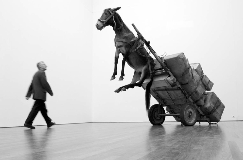
Untitled (Andiron Attr. to Paul Revere, Jr.), 2015
It’s not an easy thing, to meet your maker.
– Roy Batty, Blade Runner
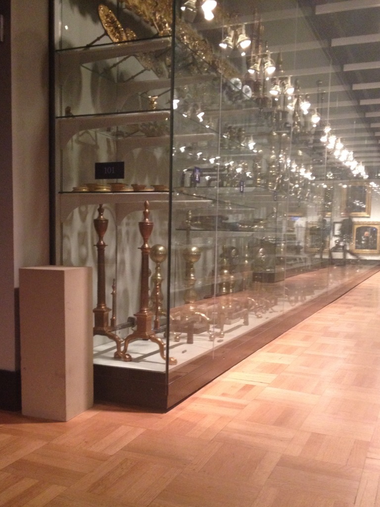
Saturday I went to the Metropolitan Museum to see their installation of my piece, Untitled (Andiron Attributed To Paul Revere Jr.), which until now I’d only known from photos.
I think it’s the one on the right.
The thinking this work has generated for me is immense and entertaining and rather ridiculous. Even in a week when Danh Vo sold basically an entire visible storage unit of Martin Wong’s stuff to the Walker as his own installation.
Danh Vo, I M U U R 2, detail, 2013, 4,000 objects and artworks from the estate of Martin Wong, image: Walker Art Ctr via TAN
Vo showed Wong’s collection and artworks as his Hugo Boss Prize exhibition at the Guggenheim, but he turned it into an artwork in order to save it, to prevent Wong’s ailing mother from being forced to sell and disperse the collected objects at a garage sale. As The Art Newspaper put it, “Vo got the idea of turning it into an installation from a curator who suggested that would increase the chance a museum would acquire it.”
Which technically means I M U U R 2 moved in the opposite direction fromUntitled (Andiron &c.), which was a decorative collectible embedded deep in a museum, and turned into an artwork in order to, uh…
I still don’t know. And of course, I wasn’t thinking of this specific relationship on Saturday, but more about the presence of the andiron’s unknown/unphotographed twin, and which was which. Did they have their accession numbers painted underneath? I was thinking about their attribution, and what it’s based on, who made it, how did they compare to the actual [sic] Paul Revere andirons nearby? I thought about that pedestal which, when I started to move it to take a cleaner picture, turned out to be a fire extinguisher cover, so I left it alone.
How nice their location is–in one sense–on the end, near a wide aisle, right by the doorway, and how crappy it is in another–it’s around the corner of a dead end corridor, through a darkened vestibule lined with fireplace mantles. It really might not be that different from the Lexington Ave. antique shop where I imagine Mrs. Flora T. Whiting first buying them. How far they’ve traveled, and yet almost not at all.
It reminded me of the Costume Institute, and how it was set up to accept the tax-deductible donations of last year’s fashions from Nan Kempner and whomever. The Met’s functioned that way a lot, as the hallowed dumping ground of New York’s ruling class. If the Smithsonian is America’s Attic, the Met is the Upper East Side’s. The soft underbelly of the late Met curator William Lieberman’s professed strategy to “collect collectors,” not paintings. [Actually, huge swaths of the Met’s 20th c./Contemp. collection reflect the same “We’ll take it all!” spirit. But that’s for another day.]
There’s a lot of room between museum quality and garbage: studies, archives, and visible storage collections to the left; destroyed works, misattributions, and garage sales to the right. And value in its various forms accrues accordingly. To the extent that they rejigger these value tallies within the museum-object-author-viewer relationship, I guess I M U U R 2 and Untitled (Andiron) are not opposites at all.
Untitled (Post-It), 2015
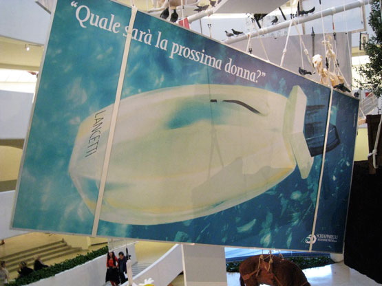
Lavorare e un Brutto Mestiere, (Working is a Bad Job), 1993, installed in Aperto ’93 Emergency/Emergenza, 45th Venice Biennale. image: from all over, but this time via contemporaryartnow
Maurizio Cattelan was invited to contribute work to Aperto ’93 at the Venice Biennale. Aperto’s shows-within-a-show format, conceived by FlashArt editors Helena Kontova and Giancarlo Politi and curated by Kontova and twelve others, focused on emerging artists and would prove highly influential.
Cattelan offered his space to Gruppo Armando Testa in Torino, the head office of Italy’s largest advertising agency, which had just been taken over by the deceased founder’s son Marco. Cattelan said he “assigned” it, but he is often described as having leased his space; he also signed a contract with Testa to promote whatever they decided to display.
According to an article at the time titled “L’Arte Cerca Publicitta [Art Seeks Advertising]” Testa decided to use the Biennale opportunity as a teaser for the launch of a new perfume by Roman fashion designer Pino Lancetti. Though the licensing company Schiapparelli’s logo is in the corner, Lancetti’s name is only visible obliquely on the bottle. The perfume turned out to be called Suspense.
Untitled, 2002, photo: perrotin
Cattelan told FlashArt the project was meant to “encourage people to reflect on the internal working of the Aperto.” In 2005 a nameless Sotheby’s cataloguer wrote, “By allowing an exterior, non-artistic, body to infiltrate this sanctified world he was exploring the hierarchies and politics of choice which selects the participants.” What’s not quite clear is the degree to which the art informed the advertising. It’s hard to tell the cart from the horse, much less tell who’s in front.
The world of the Biennale was not so edenic as the auctioneer imagined, nor was Cattelan’s gesture its Original Sin; biblically speaking, art and advertising already knew each other’s bodies very well. Armando Testa had been prominent in the Italian art world, and aspired to “pure art’s” ability “to play with ambiguity.” Lancetti, the client, trained and identified as a painter, and he was known for creating several collections using imagery from artists like Kandinsky and Picasso. Elsewhere in the Arsenale, another Aperto curator installed crotch shots by Oliviero Toscani, the famously iconoclastic ad man for Benetton. All that was left, directionally, was for an artist to reciprocate the ad love.
Lavorare e un Brutto Mestiere, 1993, installed in the Guggenheim, 2011, photo: jill krementz/nysd
Cattelan eventually sold the 3x6m billboard as an artwork titled Lavorare e un Brutto Mestiere, (Working is a Bad Job). Surprisingly, maybe a little ironically, it later took two attempts, in 2005 and 2006, for Sotheby’s to sell Lavorare for just 10,200GBP. On a square inch basis, that’s probably the cheapest Cattelan of the century. Like everything else, it hung in the Guggenheim rotunda in 2011. [above] [UPDATE: The Rubells got it, well done, as usual.]
I thought of all this this morning [except the auctions, which I hadn’t known, but now regret missing] when I saw the latest addition handwritten Post-It note in Hans Ulrich Obrist’s Instagram feed, which was from Paul Chan. Technically, I saw the autotweet first: “Letter from Paul Chan EROTIC ROMANCE IS THE FUTURE!!”
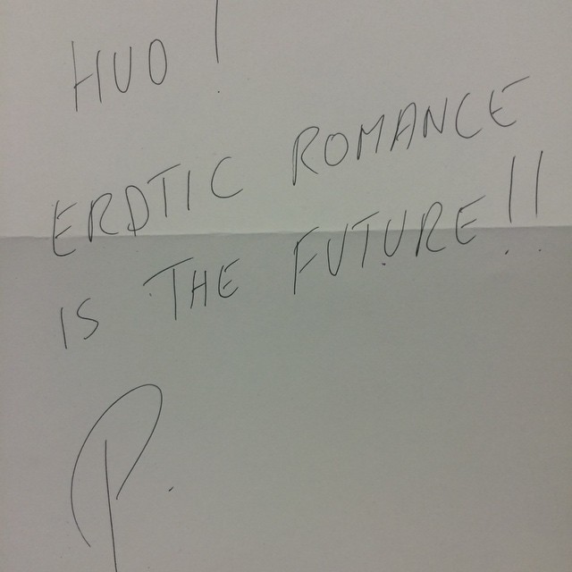
Paul Chan’s @badlandsunlmtd note in @hansulrichobrist’s IG today
Unlike the series’ typical self-conscious banalities or Deep Thoughtz, Paul’s note sounded unexpectedly promotional. Because I’d recently received an invite to the launch of Badlands Unlimited’s New Lovers erotic fiction collection. Then I clicked through to HUO’s pic of Chan’s note, and it’s not a Post-It at all! That’s what he means by “letter.” And “#LilithWes.” Paul sent Hans Ulrich a note with the books. Which, you go, Paul! I’m an admirer of both their work, and have only ever had engaging, genial interactions with either of them. But this felt like a shift, a disruption in the making.
I’m thinking HUO’s leaving a lot of mindshare on the table. Most of HUO’s notes respond to his request for a thought, and most all those thoughts at that moment are non-promotional. [An inevitable exception: Alex Israel, who can never not promote himself.] But HUO’s got like 90,000 followers. Once you move beyond the initial “it’s a personal brand boost to be asked for a Post-It note,” why wouldn’t you artfully pitch your book? Or obliquely reference the work in your upcoming show? There’s a lot of promotional room to travel between HUO’s status quo and Alex Israel.
Which is how and why I came up this project:
Hey #brands and #creatives, I’m preselling a shoutout to you whenever HUO asks me to write that Post-It note hmu
— gregorg (@gregorg) February 5, 2015
Like a director who always has his thank you speech in his pocket if he needs it, I will make sure that whenever Hans Ulrich gets around to asking me, I’ll have something on point and monetizable to scribble down. And that’s the witty brand message or hashtag that I’ve been supplied with, exclusively, by a thinkfluential social media professional. Email for rates and terms.
Your message can’t be too terribly time sensitive, of course, since there’s no telling when HUO’s tap is gonna come. With kids and shows and all, we don’t hang out as much as we used to. But with an/your important message in place, I would definitely make it a subtle priority to make it happen. If it doesn’t, of course, well, that’s HUO. I’ll gladly write your content on a Post-It note and help get the word out in my own channels as a make-good. The important thing is the concept, and that we tried.
Richard Nixon’s Last Look
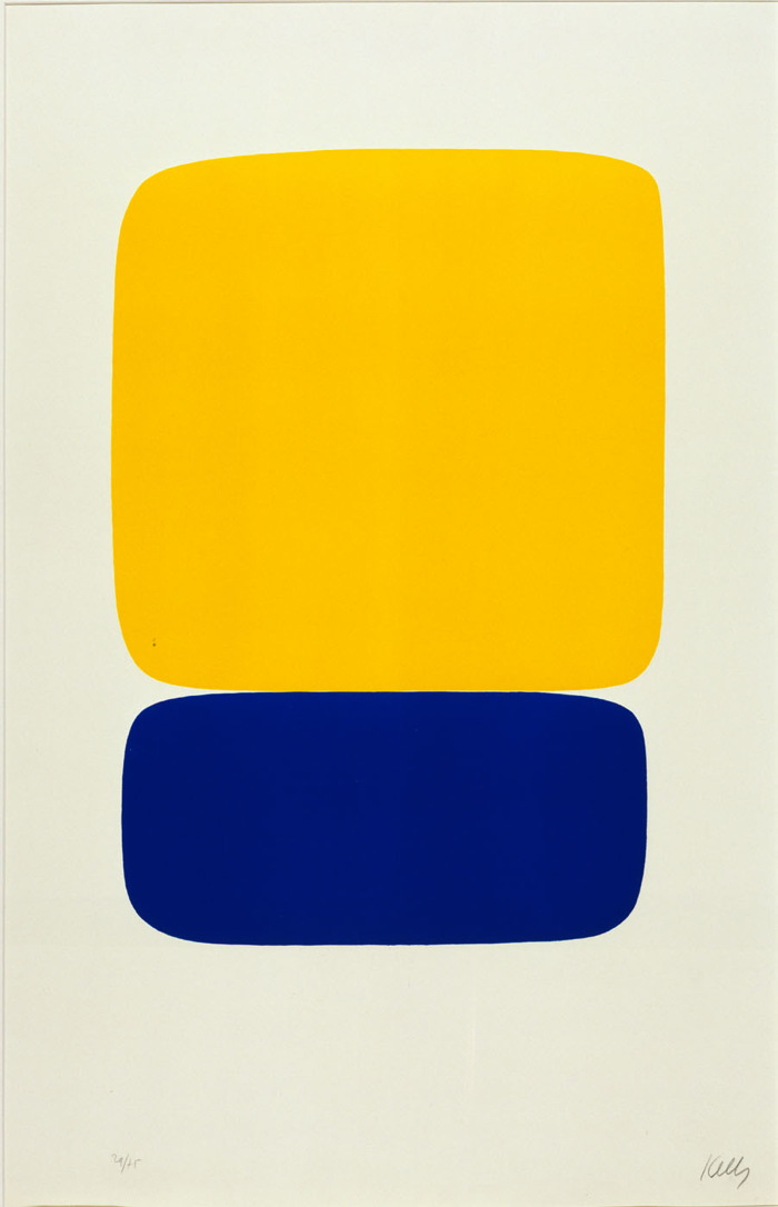
Ellsworth Kelly, Yellow over Dark Blue, 1964-5, from a suite of 27 color lithographs, ed. 29/75, loaned to Henry Kissinger for display in his White House office. Collection: SAAM
Who was Henry Kissinger’s favorite artist? Ellsworth Kelly. But that’s not important now.
While searching through the White House art loan records for the Nixon administration yesterday, I noticed that over the years, Kissinger borrowed several Kelly prints for his office, including the one above. It was a gift of the artist in 1966 to the National Collection of Fine Arts, which became the Smithsonian American Art Museum.
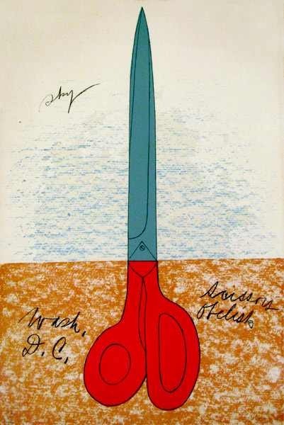
Claes Oldenburg, Scissors Obelisk, aka Scissors as Monument (Scissors Obelisk, Washington, D.C.), 1967 or 1968, ed. 144. Collection: SAAM
I first started wondering about art in the Nixon White House a couple of months ago, after I stumbled across a NY Times article describing a 1978 NCFA White House Loan inventory that showed hundreds of artworks missing, mostly from the Nixon era:
More than 100 prints, including a Claes Oldenburg poster, “Scissors Obelisk,” and an Andy Warhol “Flowers” poster, borrowed and displayed in the White House, at Camp David, and in the Presidential helicopter during the Nixon Administration, have not been found where they were supposed to be.
The reason I’m writing this should now be clear: Richard Nixon had art on his helicopter.
The National Collection of Fine Arts Logo Was Awesome
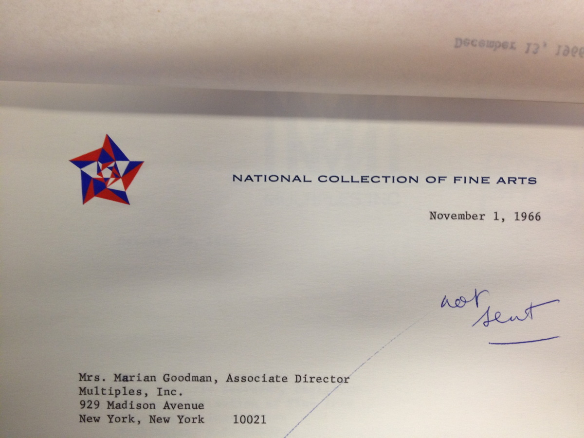
I was doing some research in the Smithsonian Archives this afternoon, and I stumbled across this letterhead from the National Collection of Fine Arts, the precursor to the American Art Museum. That kaleidoscopic star is fantastic, and it still looked like it had been engraved yesterday.
I tried to find the designer, so far to no avail. But I did find this rather slapdash 1965 NCFA flag, where the design of the star outshines the star-eats-earth logo of the Smithsonian itself.
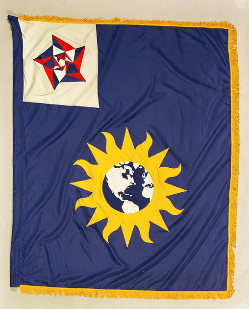
National Collection of Fine Arts Flag, 1965, image: siarchives
That star-within-a-star reminds me of the US Bicentennial logo, which was created by Bruce Blackburn, the same guy at Chermayeff & Geismar who designed NASA’s mod “worm” logotype.
![]()
It also kind of reminds me of Gabriel Orozco’s geometric drawings and paintings. Orozco, of course, shows with Marian Goodman.
Overpainting Photographs
It was the first thing I thought of when I saw them, and so I noticed when Roberta Smith’s otherwise incisive review didn’t mention it, and thought maybe it was just me. Then my very sharp friend Sam emailed, shocked at the omission, and the more general lack of discussion of the connection. Which was a relief, then a puzzle.
Urs Fischer, 2014, huge, image via gavinbrown.biz
Because Urs Fischer’s giant, printed overpainted photos at Gavin’s last month felt like such clear shoutouts to Gerhard Richter’s overpainted photos it was ridiculous.

Gerhard Richter, Overpainted Photograph, image via hatje cantz
The differences actually feel like similarities. Richter has been smearing, wiping, knifing, and dripping paint on 10x15cm snapshots for more than twenty years now. Combining his paint-covered squeegees and family photos, Richter captures a single, quick gesture that works, and the photo lives, or doesn’t, and the mess goes in the trash. The survival rate’s around 50%. The first survivors ended up in Atlas; they proved themselves and became their own thing. A couple of deliberately made series became artist books. He’s given them away to friends and studio visitors; he’s used them as party favors; and he has quietly sold overpainted photos through Fred Jahn, a dealer in Munich. They had their first dedicated show and catalogue in 2009.
Richter’s overpainted photos exist as documents of chance, while Fischer’s show definite marks. Fischer paints on photographs. I would say that this, not the size, or the printing, is the main difference.

Man with palm tree outfit next to Urs Fischer, 2014, image: gbe
On the size: Fischer’s works are gigantic, like 9×11 feet. I imagined the contortions I might undergo to get one in our apartment; which window would I cut out to load them in? Since our ceilings are only barely 9 ft, could we live with it, under it, like a lean to? We’re gonna need a bigger house.
Conversely, in discussing Richter’s works, Markus Heinzelmann writes of the artist’s central interest in monumentality:
The overpainted photographs, despite their extremely small format, make an extremely monumental pictorial impact because the intricate photograph entices viewers into studying microscopic details. Encouraging viewers to increase their visual acuity in this away automatically transfers to photograph-related painting.
Only the Fischers are disoriented by their enlargedness, but both artists clearly like what the disparity between the paint mark and the photographic space underneath it does to a viewer’s sense of scale. [Fischer’s painting-related photographs feel like they began as 8×10-in prints, or maybe even bigger. That’d make them the size of a small but real canvas.]
Gerhard Richter, Overpainted Photograph, image via ndlr
Both artists are also equally interested in their pictures as objects. Heinzelmann entire essay is about Richter’s overpainted photos as “objects of contemplation.” Fischer, meanwhile, forefronts his works’ physicality through description. They’re not merely “prints on aluminum,” but, “Aluminum panel, aluminum honeycomb, two-component epoxy adhesive, two-component epoxy primer, galvanized steel rivet nuts, acrylic primer, gesso, acrylic ink, spray enamel, acrylic silkscreen medium, acrylic paint.”
Which is ironic, given how they converge so completely and float so freely online. I would really like to see the two artists’ work side by side.
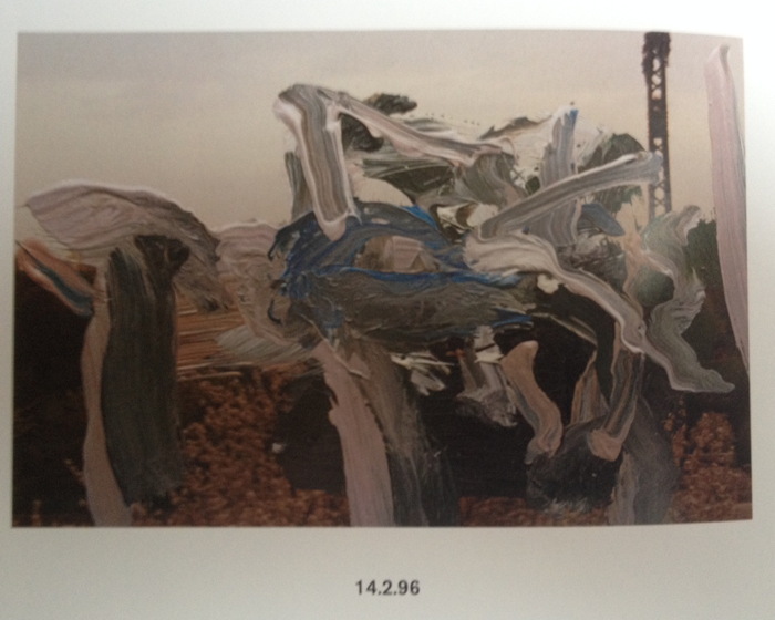
Richter, 14.2.96, from the book
update: I’ve been looking through the Hatje Cantz catalogue again, Richter’s are so fantastic. Several clear typologies emerge, including some that have been scraped after schmearing, but the actively worked over structure of this one, from Valentine’s Day 1996, may be unique. Maybe the thing to do is blow a few of them up, Fischer-size. Or half-Fischer-size, to start. First, though, I’ll wait and see if he sends me one for my birthday. He meaning Richter OR Fischer, I’m open.
Urs Fischer, 2014 exhibition [gavinbrown.biz]
Five years on, Gerhard Richter: Overpainted Photographs is getting expensive and staying awesome [amazon]
Ben-Day Trees
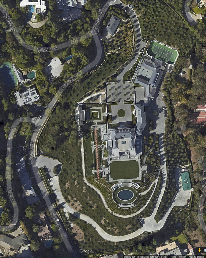
Wow, I’m sure they’ll grow in–what’s the date on this Google Maps image? Maybe they already have–but the trees at Katzenberg’s place have an incredible, all-over, Ben-Day dots feel, like they were laid out by Sigmar Polke. Hope that’s what they were going for.

Bonus points for those courtyards, though; that’s a landscape photo for our times.
In The Beginning
God, Elsa Baroness von Freytag-Loringhoven, photo: Morton Schamberg, 1917, collection: metmuseum.org
The claim that Duchamp “stole” Fountain from Elsa Baroness von Freytag-Loringhoven was brought to the fore recently. The ostensible hook was a criticism of the reissue of Calvin Tomkins’ Duchamp bio, which doesn’t credit Freytag-Loringhoven. But authors Julian Spalding and Glyn Thompson’s real goal is the delegitimization of Duchamp, and with him, the entire post-war art and theory that flowed out of Fountain. It’s the reactionary art historian’s equivalent of traveling back in time to kill teen Hitler. Here is Dr. Thompson trolling his commenters at The Art Newspaper:
Any of the global curatorial elite contemplating changing a label also have the problem of what to attach labels to, because the problem for a work art that draws its legitimacy from the acceptance by Duchamp of the attribution of Mutt’s urinal is that it is now required to obtain it’s legitimacy from somewhere else. Had Duchamp merely exhibited a urinal at the Janis Gallery in 1950 and explained it as homage to Elsa, whose urinal had been rejected by the Independents in 1917, there would be no problem, but there is, because the replica of 1950, attributed to Duchamp, and signed R Mutt, drew its authenticity from the attribution of Mutt’s original to Duchamp, a process which had begun with no complaints from Duchamp in 1935.The implications of this conundrum for the future of avant-garde art must now be addressed…
“Duchamp’s mean and meaningless urinal has acted as a canker in the heart of visual creativity,” they kicked, “Elsa’s puts visual insight back on to the throne of art,” as if they would for a minute support the artistic reign of Queen Elsa, whose outrages and transgressions troubled even the Dada-est of her contemporaries.
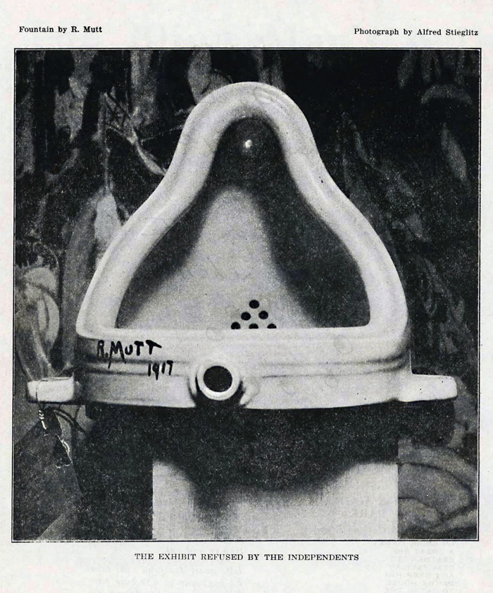
Fountain, 1917 assisted readymade by R. Mutt, apparently photographed by Alfred Stieglitz, as it was first seen and known via its publication in The Blind Man 2, May 1917
Which doesn’t mean they’re wrong. Their claims are not based on their own work, but on many years of carefully researched and argued publications of scholars like William Camfield, Irene Gammel, Amelia Jones, and Francis Naumann. Among the evidence: a letter Duchamp wrote to his sister in April 1917, just days after Fountain was rejected, attributing it to “one of my female friends,” which was only discovered and published in 1983. Also bolstering the case: the similarity of Fountain to God, top, Freytag-Loringhoven’s plumbing fixture-based sculpture of the same period. No brainer, right?
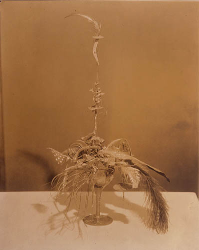
Portrait of Marcel Duchamp, c. 1920, Elsa von Freytag-Loringhoven, photo: Charles Sheeler, via francisnaumann
Except that for decades God was considered to be the work of Dada/precisionist painter Morton Schamberg. Schamberg was a close friend of decidedly un-Dada Charles Sheeler. Both Schamberg and Sheeler photographed artworks for money. Freytag-Loringhoven’s found object assemblage Portrait of Marcel Duchamp exists only in Sheeler’s photo of it, above, which was only discovered in the 1990s. They have separate billing. Naumann, who has written several of The Books On Duchamp, re-attributed God to Elsa in the mid-00’s, but so far she gets, at best, shared credit. One of the photos Schamberg took of God includes his own machine-inspired painting in the background, but two do not. This is the only sculpture associated with Schamberg, who died in the 1918 flu pandemic.
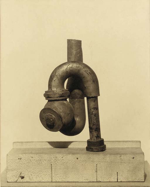
Morton Schamberg photo of God, image via christies
This Schamberg-less Schamberg photo of God sold at Christie’s in 2011. The estimate of $5-7,000 was in line with his market history; the result, $390,000, makes me think that the Baroness’s history was a factor and that someone out there believes in her God.
This God talk was weighing on my mind for a couple of months when I stumbled across a 200+ page oral history from UCLA of the pioneering West Coast abstractionist Lorser Feitelson, whose career began in New York in the 1910s and 20s:
[Freytag-Loringhoven] would come up to visit us, …and she’d bring up all kinds of –I think I told you this–a cluster of pipes that she picked up right around the corner (they had razed one of those buildings), dragging this thing up the stairs. [It sounded like] somebody was busting the building. And she said, “Isn’t this a grand sculpture?” And she wasn’t kidding. Accident made this thing. What the hell difference does it make if the guy intended it or not? It wasn’t difficult to convince us.
The awesomely gossipy Feitelson tells the Baroness’s endless demands for sexual services from men and women alike, and of her many arrests for indecent exposure for “the way she dressed, in batik, with an opening there and dyed pubic hair, walking down Fifth Avenue.” And of how taking his young nieces to Elsa’s studio turned out to be “the worst mistake I ever made in my life,” when she identified the glittery pink nebula painting they were looking at as a belfie.
For all this, though, Feitelson’s most interesting story is of his first, daunting encounter with Freytag-Loringhoven, who picked up the young student at a live modeling session in Gertrude Whitney’s Studio Club and took him home.
Geez, I mean, what the hell kind of a gal is this? And here on the walls were shovels and all kinds of things. I said, “Marcel Duchamp.”* She said, “Yes, I know him very well.” I don’t mean to say that she took it from him–and I’m not sure. She was playing around with “found discoveries.” She would take the shovel and put it up against a background of some kind of a colored paper or materials. She had many such things, and they were wonderful.
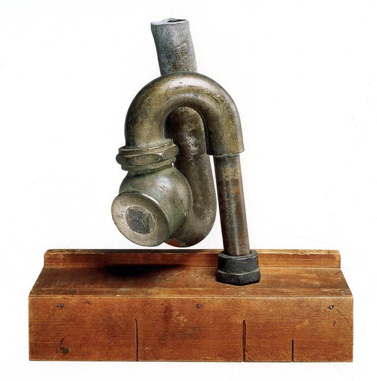
God, cast iron plumbing trap on miter box, 1917, attr. to Schamberg & von Freytag-Loringhoven, collection: philamuseum
In a deal engineered by Duchamp, God was acquired in 1950, along with many major Duchamp works, by the Philadelphia Museum.. The Large Glass joined the museum two years later. God is currently credited to both Schamberg and Freytag-Loringhoven.
What if Elsa took the original In Advance of A Broken Arm? What if she helped make it? What if she and Duchamp conspired to create R. Mutt’s Fountain–which, remember, was identified almost immediately as a Buddha–and submit it to the Independents? Feitelson wrapped up his discussion of the Baroness with a segue to Duchamp: “[s]he had to have this terrific conceit and faith in her convictions. And I still say you cannot talk about Marcel Duchamp detached from other people.” In its own fitful way, the art world’s conversation is starting to shift.
* OK, I’ve wondered about this for a while, and now it’s a year later, and I am still wondering. I have a hard time figuring out how Feitelson would see a shovel hanging in a stranger’s studio and immediately associate it with Duchamp.
Feitelson actually said this drawing studio was before Whitney started her Studio Club, but that was 1914. And Duchamp only hung In Advance Of A Broken Arm in the studio he shared with Jean Crotti in November 1915. So no.
Feitelson said he was in NYC “during the war,” which would be 1918-19 from the US view of things. Whitney Studio Club was on W 4th St, and moved to W 8th in 1923. So that’s a possibility. But again, Duchamp had his shovel in his studio, and Feitelson never seems to have gone there. He never mentioned Crotti. He never mentioned the Arensbergs, the center of Duchamp’s circle, and exactly the kind of folks a namedropper like Feitelson would go on about. Did people talk about Duchamp’s studio objects? Because I don’t think he showed them publicly. Instead, I suspect this Elsa memory is a retrofit, Feitelson trying to make it sound like he knew what was going on in Elsa’s studio. There may have been a shovel, which would be interesting, very interesting! But I highly doubt if he saw it, Lorser Feitelson connected it at the time to Duchamp.
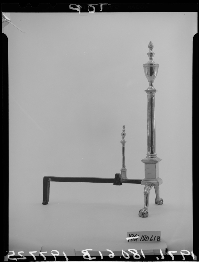
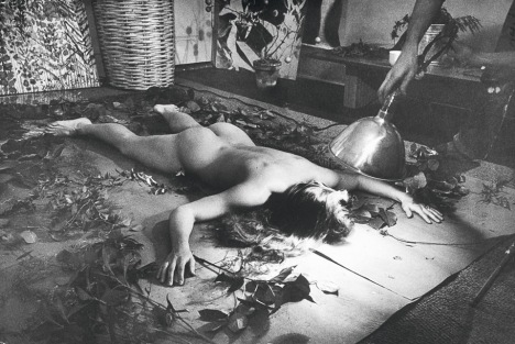
Untitled (Andiron Attributed To Paul Revere Jr.), 2014
Untitled (Andiron Attributed To Paul Revere Jr.), 2014, whoops, 2015, obv
[UPDATED, see below; UPDATED AGAIN, see below that]
I am stoked (pun recognized and allowed to stand) to have a new work in the Metropolitan Museum. Despite its minty freshness, Untitled (Andiron Attributed To Paul Revere Jr.), 2014, is currently on view in The American Wing, Gallery 774, the Luce Visible Storage Gallery, officially known as the Henry R. Luce Center for the Study of American Art.
I have not seen it installed yet–I just made it a few minutes ago, cut me some slack–if you’re at the Met, maybe swing by and send me a pic? Ideally, the piece should be installed just as it’s depicted in this beautiful photo.
Continue reading “Untitled (Andiron Attributed To Paul Revere Jr.), 2014”
Paul Revere (Attr.), Time Capsule Plaque, Silver, Engraved Text, c.1795
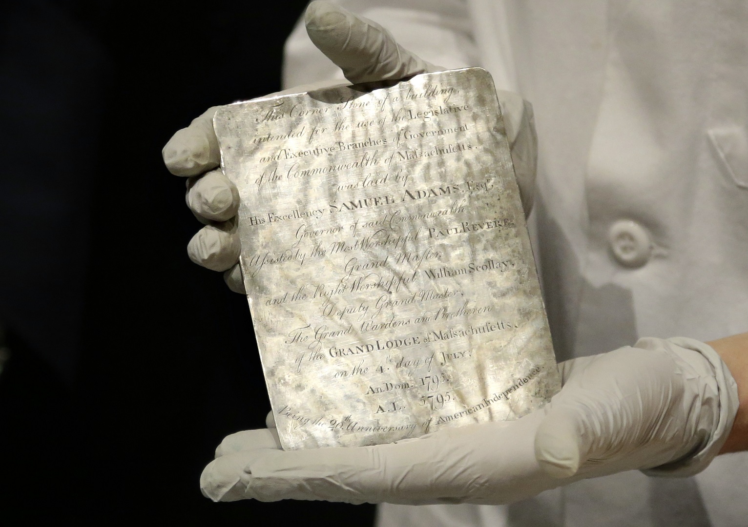
image: via usnews
I may have tweeted smack about it when I thought it was just old newspapers and coins, but that’s only because initial headlines of Samuel Adams’ and Paul Revere’s time capsule in the cornerstone of the Massachusetts State House criminally underplayed the presence of this amazing, engraved silver plaque.
THIS is EXACTLY the kind of thing people should put in time capsules: slightly-precious-but-not-too items handmade to commemorate the occasion. These artifacts capture the moment, but more importantly, they retain an historical significance, and who knows, in time they may accrue an aesthetic aura as well.

image via reuters
The Boston time capsule plaque also benefits from the connection to the still-relevant Revere brand; whether he actually made it or not, it feels plausible, authentic. There is also the handmade aspect: I have an engraved ring, and a stationery die, but a whole engraved plaque? That’s something.
[It’s not the intern who wrote this USNews piece’s fault for describing every item in the time capsule in terms of its market value, and the impact a Revere attribution & provenance might have on it. Every report has that. It’s just another sign of who we’ve become as a culture. Like Antique Roadshow.]
A more interesting cultural change is the invisibility/illegibility of whatever the plaque actually says, and what it might mean. The Masonic context goes unremarked or glossed over in the mainstream coverage of the plaque. He that still hath ears, two hundred years on, let him hear, I guess.
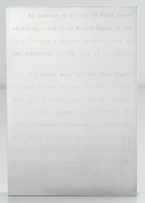
Invisibility was one of the qualities of engraved text that appealed to Walter De Maria early in his career; he made a series of polished steel or aluminum works with engravings on them: Garbo Column (1968) had a list of the reclusive actress’s 27 films; Melville (1968, above, which I have swooned over before) features the opening of the author’s first hit novel, The Confidence Man.
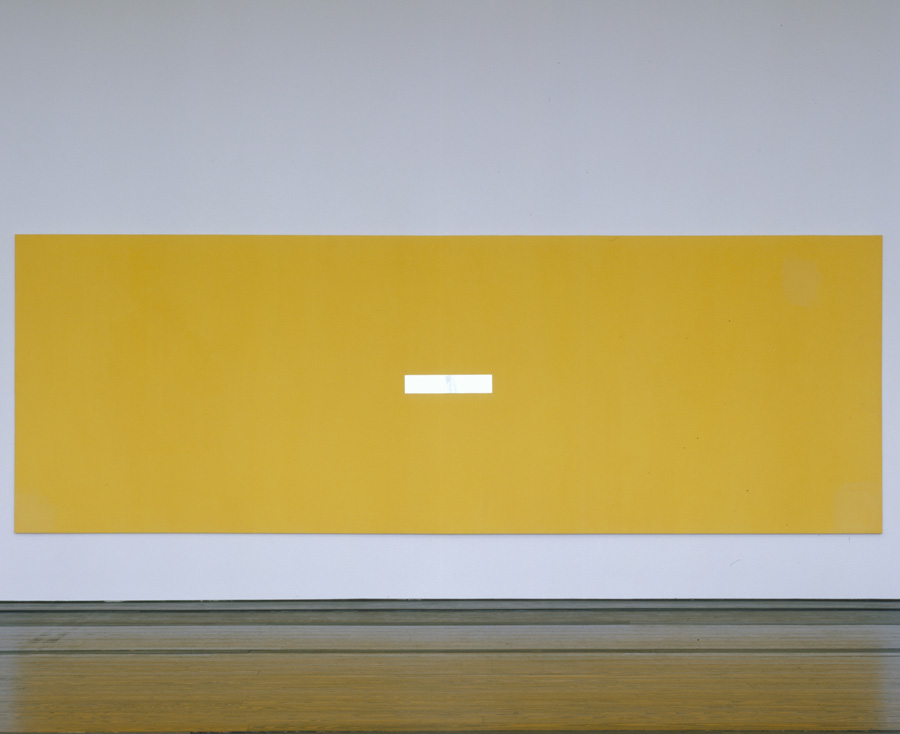
The Barnett Newman-scale monochrome painting De Maria asked Michael Heizer to make for him for Dwan Gallery’s 1968 Earthworks show has its title engraved on a polished steel plaque in the center: The Color Men Choose When They Attack the Earth. Can you read it in this picture?
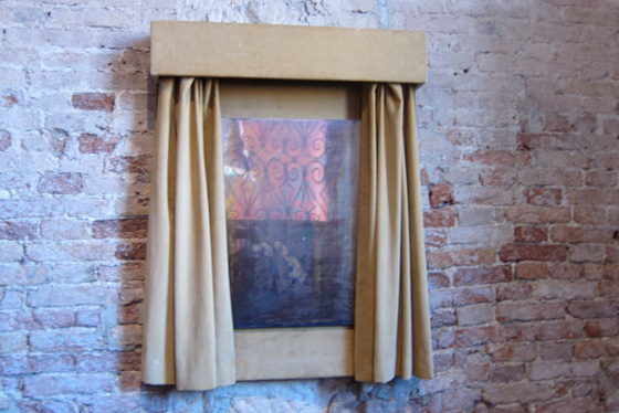
Walter De Maria, Silver Portrait of Dorian Gray, 1965, at the Prada Fndn’s exhibit in Venice in 2011, image: @fabyab
De Maria created at least one work in silver. It was for his patron at the time, Robert Scull, who fronted the dough for the fabrication of a series of polished metal sculptures. Silver Portrait of Dorian Gray (1965) is just that: a mirrored silver plaque behind a velvet curtain that darkens and oxidizes over time. The artist’s instructions on the back offer the owner the chance to wipe away the stains of aging, though: “When the owner judges that enough time has passed, this plaque may be removed to free and clean the silver plate.” The promise of immortality, the opposite of a time capsule, at least for the mirror. Your call, Miuccia!
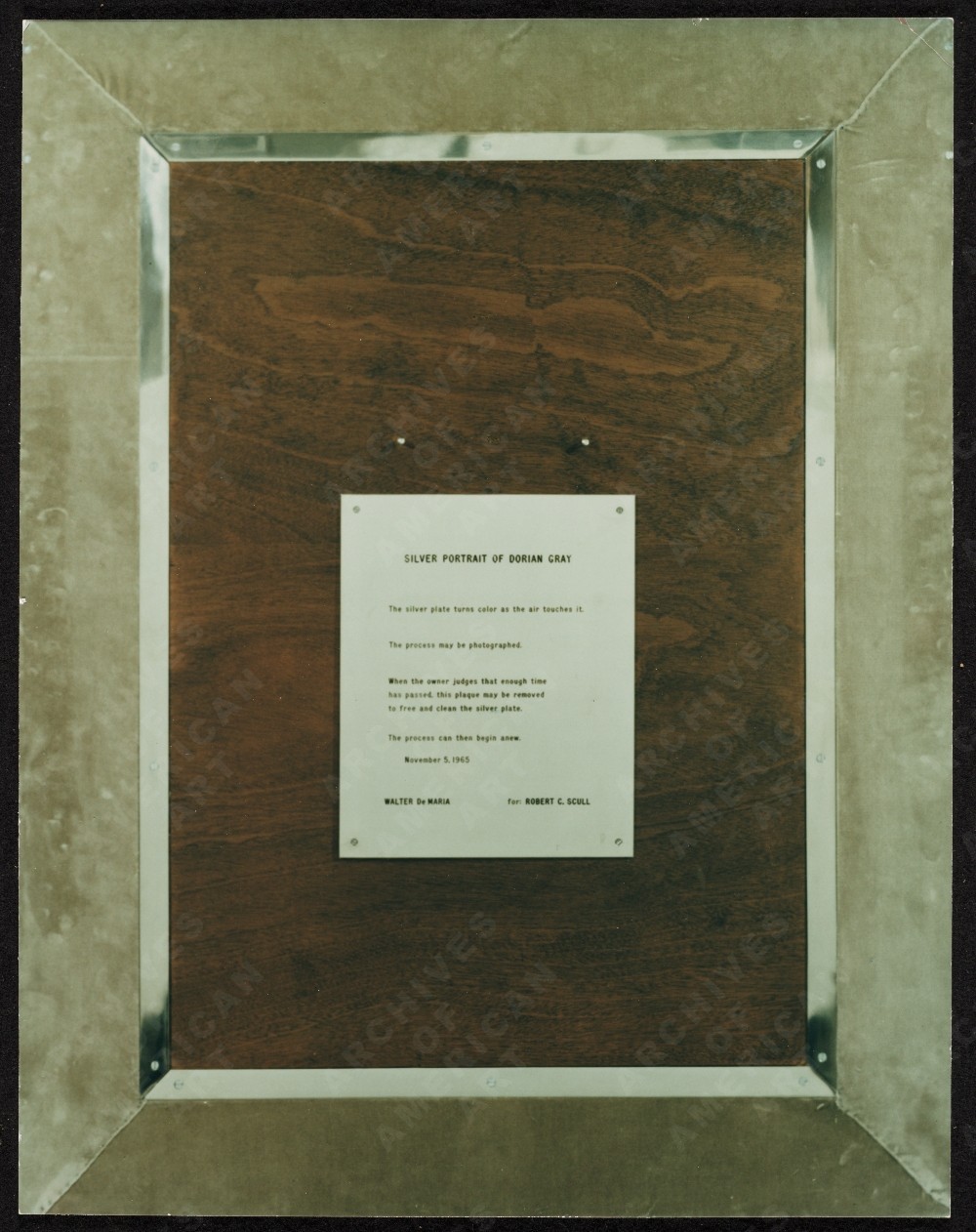
image:
UPDATE A brief dive into the history of time capsules tells us we need to pay more attention to the Masons, and to the Egyptians. The birth of the modern/20th century time capsule is linked to the discoveries of relic-filled Egyptian tombs and pyramids. And in a list of the International Time Capsule Society’s 1991 list of the Top Ten Most Wanted Time Capsules is this:
5. George Washington’s Cornerstone
Today’s custom of burying time capsules is in part an outgrowth of Masonic cornerstone-laying ceremonies. Through the centuries, Masons have officiated at rituals which often include placing memorabilia inside building cornerstones for later recovery.In 1793, George Washington, a Mason, performed the Masonic ritual upon the laying of the original cornerstone of the U.S. Capitol. Over the years, the Capitol has undergone extensive expansion, remodeling and reconstruction, but the original George Washington cornerstone has never been found. It is unknown whether there is anything inside of it.
Here is a Mason’s explanation of the cornerstone laying ceremony, one of the only public Masonic rituals. [“When the brethren are sharply dressed, and well-rehearsed, it’s an awesome thing to behold.” mhmm.] And Wikipedia’s article on cornerstones has a brief account of a 19th century cornerstone laying ceremony in Cork, which involved “a trowel specially made for the occasion by John Hawkesworth, a silversmith and a jeweller.” So maybe these engraved plaques are also a thing?
Coins, Newspapers Found in Time Capsule Buried by Paul Revere [usnews]
Previously, very much related: While We’re On The Subject Of Polished Metal Objects: Walter De Maria
Scott Sforza, Ottoman Cosplayer

Europe and next to Europe. Ho. Ly. Smokes, Turkey, what the hell is going on with your imperial warrior cosplay Sforzian backdrops? After showing Mahmoud Abbas around the new Presidential Palace, Prime Minister Erdogan took him to a feast and a live jousting demonstration at Ottoman Times.
Abbas welcomed at Turkish presidential palace by Erdoğan – and 16 warriors [guardian, image: getty]
Paris Marching In Place: The Sforzian Montage
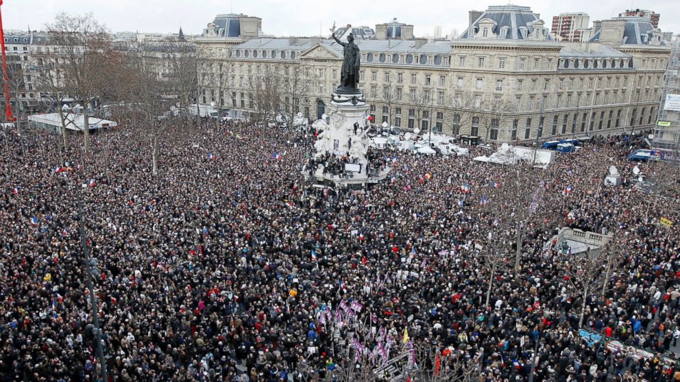
image: crowds at the Place de la Republique, via reuters, I think
Europe. The states of Europe, united against terrorism and intolerance as they marched through the streets of Paris yesterday, led by the families of those killed this week,

image: ap
and the heads of dozens of countries–including those countries where journalists are regularly jailed, flogged, and killed–marching arm in arm, marching, mar–wait, don’t march yet. Everyone in front, look up and…OK, march now.
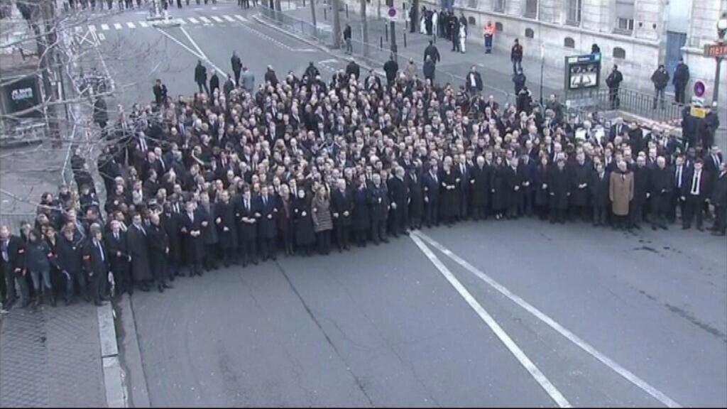
image by unknown, maybe TF1, via @rukhasgunsalu
As anyone who spent a moment contemplating the security nightmare might have guessed, the assembled leaders were actually not among the regular Charlies, but were instead marching in place, for the cameras, on a sealed-off street. If you thought otherwise, it might be because you were meant to. From the photos and slideshows, it sure could have seemed like one Paris March. As Twitter user Gonzalo put it, “Los líderes mundiales no encabezaron la Marcha de París, pero hicieron un montaje para hacernos creer que sí.”
A montage to make us believe they are. Instead of simply crafting a single, standalone image, make a photo-op that blends seamlessly into the broader visual narrative of the event. I believe this colonization of a montage represents an advance in Sforzian technique which warrants more investigation. Stay tuned.
Uber, But For Artists
Monochromes. Why’s it always gotta be monochromes?
In his recent NYT Magazine profile of Stefan Simchowitz Christopher Glazek writes about the emerging artist Kour Pour that “several artists I spoke with had initially assumed that Pour did not in fact exist — that he was a computer-generated figment of Simchowitz’s prodigious imagination.” One reason Glazek gives is that Simcho’s email was the contact link on Pour’s website. Another, he infers, is because Pour’s digital image tapestry paintings seem so perfectly suited to Simcho’s Instagram- and minor tech billionaire collector-centric art dealing operation.
But Glazek saves the biggest reveal for his annotation of his own article on genius.com: he’d heard that Simcho had already fabricated an artist, and had put his work up for show and sale in 2011. That artist’s market-optimized multi-culti name was Chen Obogado.
An artist told me Simchowitz had approached him to make paintings under a false name, though it seems possible that Simchowitz actually painted them himself. I’m not sure if money ever exchanged hands for the paintings. It may have been more of a prank than a scheme, and the art world is forgiving of pranks.
China Art Objects, Mind Games, installation view with Chen Obogado [L] and actual artist Evi Vingerling [R], Jul/Aug 2011
Let’s review Obogado’s known body of work and brief exhibition history. It won’t take long. As far as I can tell, Chen Obogado made his debut in a summer group show at China Art Objects called, appropriately enough, “Mind Games.”
Chen Obogado, MS6 01, 2011, resin, pigment, aluminum, image: caog.la
Like many actual artists at the time, simulated artist Chen Obogado [SimChO?]’s practice interrogated chemical process-based abstraction; two works are pigmented resin slabs, possibly on aluminum panels, but definitely in tray-like aluminum frames. They retain the traces of their skll-less pour [!]: bubbles, pour lines, and pigment mixed unevenly within each batch. I guess this is supposed to be works’ content. If I were trying to sell them, I’d reference the foam scenes from Fischli & Weiss’sThe Way Things Go and let the zombie abstraction momentum do the rest.
Chen Obogado, MS001PB001, 2011, polyurethane, aluminum, image: caog.la
The third, smaller work is made of polyurethane in aluminum. It is glacial, sculptural and reductive, and appears to be a piece of Stingel-ian insulation board that’s been scraped with a solvent-dipped spackling knife. They have inconsistently formulated serial numbers for titles. Their irrelevance is a standout, even among the forgettable flotsam that seems to have washed up in Culver City that summer. [Like car crash videos in drivers ed, anyone starting a new painting series should be forced to surf 3-yr-old group show installation shots.]
Chen Obogado, CO MSM 001 S1, 2011, resin, platinum powder, aluminum, est. $3,000, opening bid: $1,500. image: laxart
Which wasn’t enough to actually forget them. The fourth and last Obogado to make a documented public appearance was in November, at the LAXART benefit auction. This work was made of resin and platinum powder on/in aluminum. Which sounds like it might be kind of metallic and shiny, a poor, stupid, unconnected man’s Jacob Kassay.
It was listed as a “donation of the artist and an anonymous donor,” which makes little sense in the benefit auction context, and even less if he actually didn’t exist. But it does seem like the credit line of an artist who didn’t exist who wasn’t buying his own materials. Last summer Simcho told Artspace, “I help dealers decide which artists to represent, how to represent them.” Was SimChO presented to CAO and LAXART as a Simcho joint? Was he pitching the glorious future where artists-as-brands soared free of the foibles and frailties of actual artists? The next step in the end of authorship? That would be more than a scheme OR a prank.
The Kassay mention above is interesting because Summer 2011 was when Kassay had his first show in LA, and L&M. And Henry Codax had his first show in New York. Is it too late to organize an east coast/west coast monochrome show of these two non-existent artists? Please say no. #Sumer2015
Though rumors of Kassay and Olivier Mosset’s involvement in Codax’s work were reported at the time, I’ve come to think that Codax must be a gallerist’s dream: all that margin without all those hassles. Assuming it sold, of course, and you could keep it moving. And maybe that’s what doomed SimChO’s work: Simcho couldn’t keep up the act well enough to sell it, or maybe it sucked so bad even his buy-it-now yesmen network didn’t click, and so Simcho decided to eat the cost of two buckets of resin and call it a day?
It’s worth considering Chen Obogado in the Simcho’s own preferred, network/platform/disruptor context [My favorite quote, from another of Glazek’s annotations: “All he demanded was a minimum level of respect. ‘You can’t say I’m bad–I created the post-internet movement!'”] Stories of artists feeling exploited by Simcho remind me of reports last year of the drivers who were the pawns in Uber’s anti-competitive attacks against Lyft. Which LOLjobsWTF when Uber’s CEO talked about how psyched he was to replace all the drivers with robot cars. If Chen Obogado’s any indication, Simchowitz may feel the same way about artists.
Christopher Glazek annotates himself [genius.com]
When he has a fawning audience Simchowitz really lets the vision flow. Must read. [artspace]
On Scraper Capitalism
Last summer I wrote about discovering Artisoo, a company selling oil paintings of thousands of artists’ images on Amazon. “Chinese Paint Mill has appropriated Google Images and put it up for sale on Amazon,” I wrote.
Which reminded me of LifeSphere, the Spamerican Apparel botcompany Babak Radboy wrote about that systematically turns every public domain image into every possible Zazzle product.
We have all set our sights way too low.

image via @tomasvh
This week Dutch National Geographic photographer Tomas van Houtryve began posting pictures of iPhone cases featuring a photo of his, which had recently been selected as a Time Magazine photo of the year.

screenshot from pbs.org
PBS reported that NYT photographer Tyler Hicks found iPhone cases for sale featuring several of his images, including dire pics of Ebola patients and Palestinian children being shot by snipers in Gaza:
“Who wants to buy a picture with a dead child on it,” said Tomas van Houtryve…”If any human being in the process had seen that, I don’t see how it could possibly get through”.
Which is exactly the wrong question and the right answer for this situation. They and the outrage associated with them only exist once they’ve been searched for, and the product will only exist after it’s been ordered. Because these images, like tens, hundreds of thousands more, have been scraped from the web and turned into products by bots.

By focusing on the laughably limiting category of public domain images, Spamerican Apparel was too timid and deserves to fail. For these Amazon iPhone case sellers copyright’s no object, and Google Images is just the start. Cropping is strictly default settings, actual image be damned. Among the 6,324 phone cases offered for sale by Lynn A Carter are hundreds printed with the center of PR photos of various cars. They have descriptions like, “Daly R Martinez NVDWiaj2848OHOgq Case Cover Iphone 5c Protective Case Alfa Romeo Giulietta 36.” Daly R Martinez is another Amazon seller. The string is a product ID, different from Amazon’s ASIN. Then there is product + the data that was scraped with the image. SEO enough for Amazon.

They really do just grab any damn image at all. Like this, LvukQDp7415hnQVt Snap On Case Cover Skin For Iphone 6 Plus(kerry Washington). It’s a red carpet photo from October 2013. There are nearly 300 other Kerry Washington phone covers like this.

L to R: “Corner Blocked Kitchen With Stainless Countertops Sleek White Cabinets”; “Kitchen Peninsula With Quartz Countertop In Kitchen”; “Eclectic Kitchen With Artistic Pendant Lights” iphone cases
My favorites so far have to be the kitchens. The scrapers have found Pinterest, and have turned it into iPhone covers. Here’s the one on the right, on a Pinterest board called “Junk Ideas.” Scrapers are turning the great image vortex of our digital ocean into an actual island of plastic garbage on demand. Who are these people?
I will wager they are not the people listed on Amazon, but more digital simulacra. Searching for the sellers turns up a Chinese-language website run on a free .tk domain which is used to manage case returns for various Amazon IDs. Poking around the domain also turns up a quick&dirty Amazon upload management dashboard. It looks to me like a Chinese case manufacturer is flooding Amazon with hundreds or thousands of bogus sellers, each with thousands of scraped data-derived products. That award-winning photographers’ images and names got scraped as well should come as no surprise.
What Amazon will do about this vast, digital garbage dump of a retail offering is not clear. Maybe this is just the way it’s going to be from now on, every image always available on every product. Maybe we will adapt to Scraper Capitalism by becoming Sifters, consumers attuned to the surreal moments, the horrific, the sublime, the sea glass and driftwood of the web. We’ll develop tools for surfacing them, and critical faculties for appreciating them. If we do, Amazon will have them, just 1-Click away.
Wait, What? Jasper Johns Blue Ceiling By Matson Jones??
2020 UPDATE BELOW: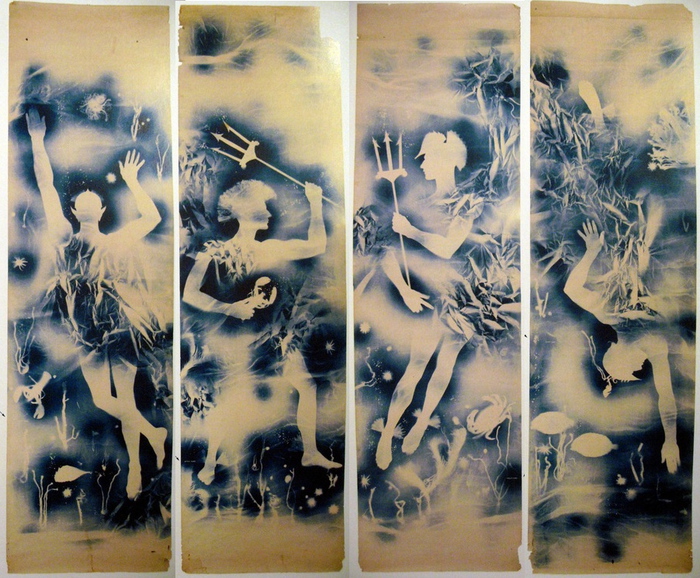
Jasper Johns Blue Ceiling, 1955, 12×10 feet [!], image: postermuseumblog
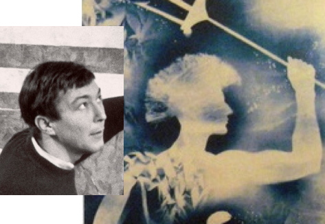
How did I miss this? Just a week after I posted about Matson Jones’ hand-painted plaster melons and pomegranates, poster dealer Philip Williams revealed an incredible Matson Jones find: a set of cyanotype/photograms titled Jasper Johns Blue Ceiling.
Each of the four panels depicts an underwater scene featuring a male figure holding a trident, or with a Trojan-style helmet; the only figure not in profile has pointy, Sub-Mariner-style ears. They’re all signed “Matson Jones” in the image, and apparently, the title, which is apparently a reference to Johns’s bedroom, is written on the back in what Andy Warhol said was Robert Rauschenberg’s handwriting. They surfaced in the 1980s from the office of Gene Moore, the guy who commissioned Matson Jones [the commercial pseudonym of Rauschenberg & Johns] to create window displays for Bonwit Teller. The prints were apparently a backdrop for [Bergdorf Goodman] windows made in 1955.
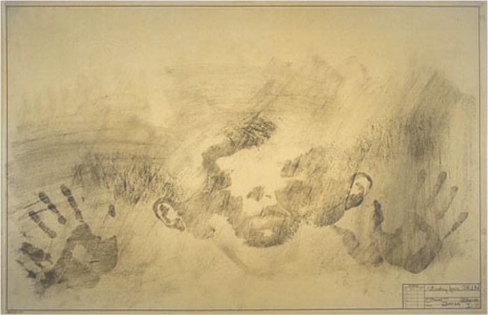
Rauschenberg & Weil making a blueprint photogram, 1951, LIFE Mag via tate
Rauschenberg, of course, had made and shown similar photograms with his wife Susan Weil. She [or a model] would lie on the photosensitive paper in a composition, and he’d swing a lamp around her, Pollock-style, to make the image. [MoMA has one.] Weil kept making photograms after their divorce, but I never realized they shared joint custody of the technique. Or that Rauschenberg would use it with his next model–and that’s the question here, I guess: is that Johns?
Who else could it be, right?* And if it wasn’t Johns in 1955, it certainly was in 1962. These 1-to-1 scale photograms make me think of Johns’s Study for Skin drawings, which he made by pressing his oiled up face and hands against a sheet of drafting paper, then rubbing it out with charcoal. Richard Serra owns a full-body Johns Skin job from 1975, too, so it’s not like he gave it up.
Jasper Johns, Study for Skin I, 1962, image via nga
There’s also Rauschenberg’s large-scale, 1968 print triptych Autobiography, and though it’s a stretch across time, the shadows remind me of Johns’s landmark Seasons paintings and prints of 1986-7, which all feature the artists’ shadow.
Jasper Johns The Seasons print series from ULAE
Connecting Johns’s imprint of the body to Rauschenberg’s–and Weil’s–photogram process would be interesting enough; but these photograms also connect Matson Jones’ production more directly to the art practices of Johns and Rauschenberg.
It does not feel great to not be the first to make this connection. In a Feb. 1959 column in Arts Magazine that is a master class of insiderish gay-bashing, Hilton Kramer denigrated Johns and Rauschenberg as “visual publicists” working in the commercial art “gutter”:
Rauschenberg, for example, is a very deft designer with a sensitive eye for the chic detail, but the range of his sensibility is very small — namely, from good taste to “bad”…Frankly, I see no difference between his work and the decorative displays which often grace the windows of Bonwit Teller and Bloomingdale’s. The latter aim to delight the eye with a bright smartness, and Rauschenberg’s work differs from them only in ‘risking’ some nasty touches. Fundamentally, he shares the window dresser’s aesthetic to tickle the eye, to arrest attention for a momentary dazzle…Jasper Johns too is a designer…Johns, like Rauschenberg, aims to please and confirm the decadent periphery of bourgeois taste.
There are a couple of other examples of gender-coded criticism early on in Johns and Rauschenberg’s careers, but Kramer’s knowing sneers link gayness with non-seriousness, taking a double swipe at the artists’ rapidly growing reputations. Johns wrote an angry letter in response, saying “a kind of rottenness runs through the entire article.”
Which is why Williams’ post of what “may very well be the only known surviving Matson Jones work,” is unsettling. It ends with this shoutout, “Today, Friday May 15th, is Jasper Johns’ 84th birthday. From everyone here at Philip Williams Posters Happy Birthday Mr. Johns!” Almost as if they were inviting the artist–who has a penchant for destroying early work that doesn’t necessarily fit his preferred narrative–to buy it back. Frankly, they belong in a museum. If there is a museum bold enough to take them.
Jasper Johns Blue Ceiling by Matson Jones [postermuseumblog]
Continue reading “Wait, What? Jasper Johns Blue Ceiling By Matson Jones??”
On Lorser Feitelson’s Life Begins
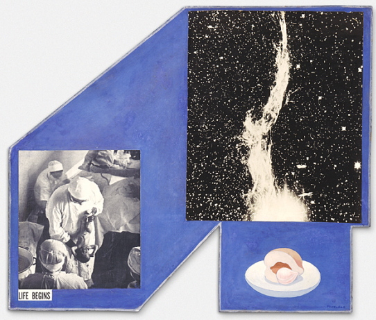
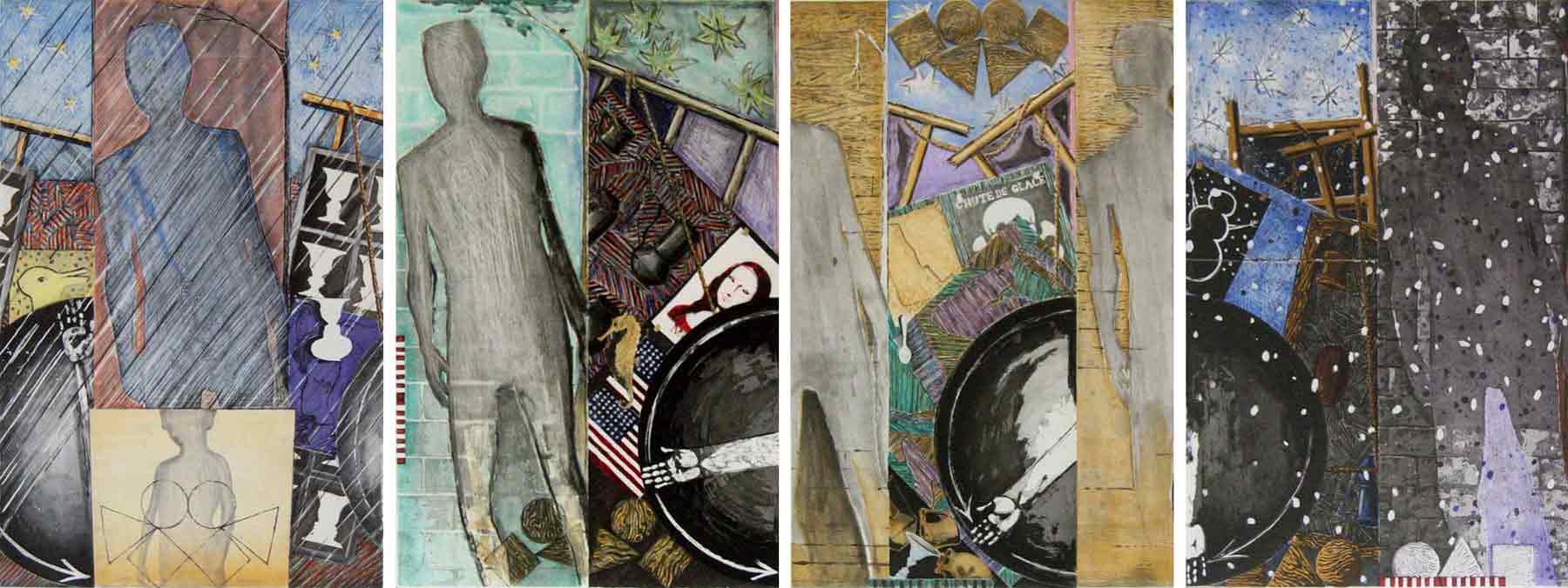
I don’t see or think about it nearly enough, but I’ve been fascinated by Lorser Feitelson’s 1936 collaged photo/painting Life Begins for years. 1936! LACMA acquired it in 1996.
Feitelson’s later, post-war, hard-edge abstraction gets much more attention than the 1930s “Post-surrealist” works, which generally makes sense. Something like Life Begins is just so unusual is almost doesn’t fit into that bucket, either. But seeing images of it again recently made me wonder just what is going on here. I can’t find almost anything written about it, except Steve Roden’s discussion of it in the LA Times a few years ago: “On some days it feels as hermetic as ‘outsider art,’ and on others it seems the most experimental painting he ever made. I’ve been visiting this work for 25 years, and I still don’t understand it. I really love that.”
Which, it’s nice to know it’s not just me who loves it, and who’s baffled by it.
The basics:Life Begins is oil and collage on a shaped masonite panel around two feet square. The painted elements are the blue space, which often gets called a sky, and a half peach and pit on a small plate. The collage elements are two black&white photographs, or close to it, of a doctor holding a newborn baby, cropped to preserve the caption, which gives the work its title; and an astronomical feature.
The “Life Begins” photo in Life Begins is easy enough to source: it’s the first photo printed in the first issue of LIFE Magazine, which began publication on November 23, 1936. [That means Life Begins was not in the Post-Surrealism show Feitelson organized for himself, his wife Helen Lundeberg, and other California-based artists at the Brooklyn Museum in May 1936. And it wasn’t among the Feitelsons included in Alfred Barr’s Fantastic Art, Dada & Surrealism show at The Museum of Modern Art in November 1936.]
The other element has taken more time to track down. When they describe it at all, most sources have called it a photo of a solar flare. But it’s not. While solar flares were being observed along with sunspots, on the face of the sun, there was no technology capable of photographing a solar flare like that in the 1930s. The only online source to identify the image correctly was a letter from an MD/amateur astrophotographer of the Journal of the American Medical Association, which had used Feitelson’s painting on their cover in 2004. It is a detail of the Western Veil Nebula (NGC 6960) in the constellation Cygnus.
We are very used to such images now, but in 1936, there were very few observatories capable of producing such a photo. The scientific understanding of nebulae, and of the universe itself, was in flux. It was only in 1924 that Edwin Hubble announced, first in the New York Times, that many of the objects called nebulae were actually galaxies, which existed far beyond our own Milky Way. As late as 1933, it was still a matter of speculation whether the Veil Nebula surrounded a star, and was actually the remnant of a supernova.
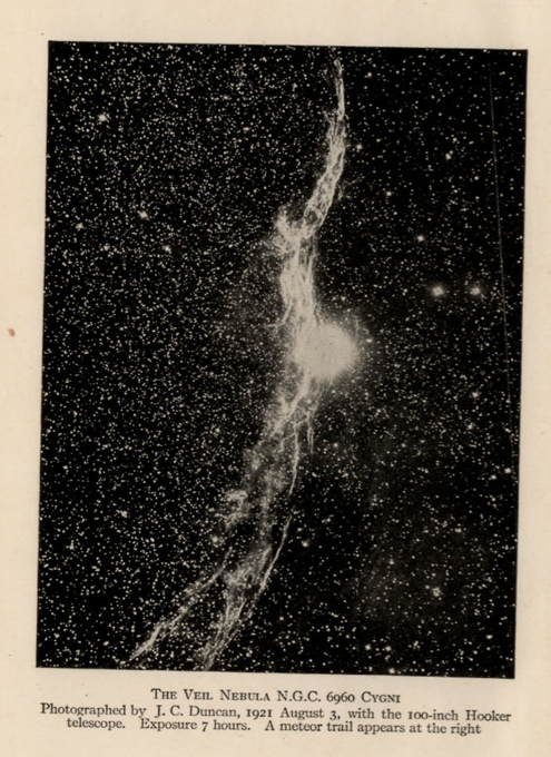
Let’s just say, thanks to Hubble the telescope, it’s difficult to search for historical astronomical images, which have been supplanted by higher resolution, full spectrum glitz. After a couple of evenings, though, I think I found Feitelson’s source. Wellesley astronomer John Charles Duncan, who published several articles on photographing nebulae, made a 7-hour exposure of NGC 6960 in 1921 using the largest telescope in the world, the Hooker Telescope at Mount Wilson Observatory. Duncan used the image as the frontispiece for Astronomy A Textbook, published in 1927. [above]
The image doesn’t match Feitelson’s in size, exposure, or cropping, obviously, but I suspect the artist either rephotographed the detail from the plate, or got access to the negative at Mount Wilson. Duncan later published a fainter, underexposed version of the image, which extrapolates to what an overexposed version like Feitelson’s would look like.
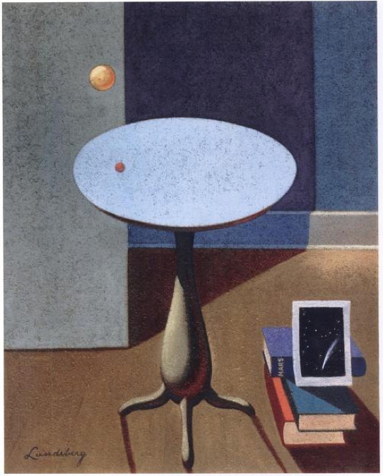
Helen Lundeberg, Red Planet (1934)
This image in Life Begins is not a one-off. Both Feitelson and his wife Helen Lundeberg included astrophotography in their Post-Surrealist paintings in the early 30’s. [Maybe Post-Surrealism feels a bit like Post-Internet: a way for artists to signal to lagging institutions they’ve incorporated something and are moving ahead.] Lundeberg’s Red Planet is a paradoxically lit interior featuring a red planet-looking orange hovering over a telescope mirror-looking tabletop, and a photograph of a comet leaning against a book titled, “Mars.”
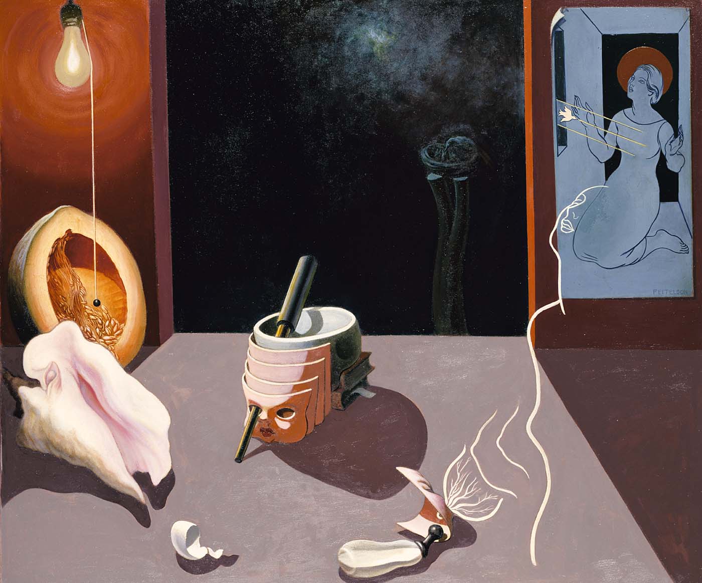
Lorser Feitelson, Genesis #2, 1934, collection Smithsonian American Art Museum
Feitelson’s Genesis #2, also 1934, has a telescope pointing through the eyes of several aging masks and a skull, propped on books, toward a painting of what looks to me like a photograph of the Crab Nebula. There’s also a trompe l’oeil drawing of an Annunciation, a Picabian outline of a woman and her developing breast, a baby bottle, a conch, an eggshell, and a sliced melon and light bulb that immediately make me think of Matson Jones-era Johns. Which, any connection is impossible, I know, but still.
Genesis #2 combines scientific, religious, and metaphorical accounts of birth, which makes it feel closely related to Life Begins. Now the unusual shape of Life Begins feels related to the perspectival lines and sharp, flat planes Feitelson used to define his spaces. Which makes Life Begins a variation on a Genesis II theme; when Life Magazine launched with that photo, of all photos, Feitelson must have really felt like he was onto something big.
Life Begins [lacma.org]
Genesis #2 [americanart.si.edu]